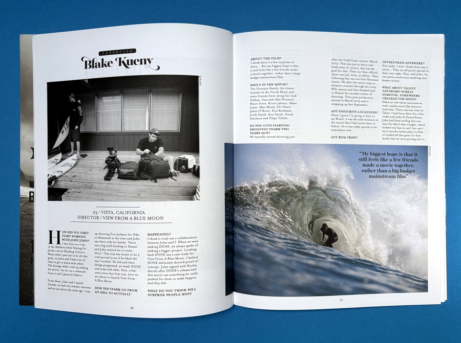
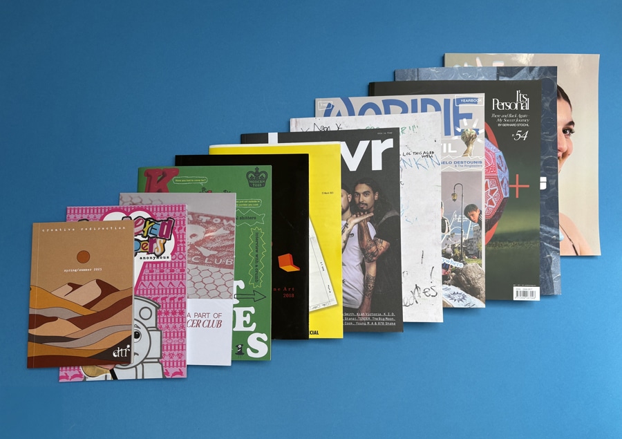
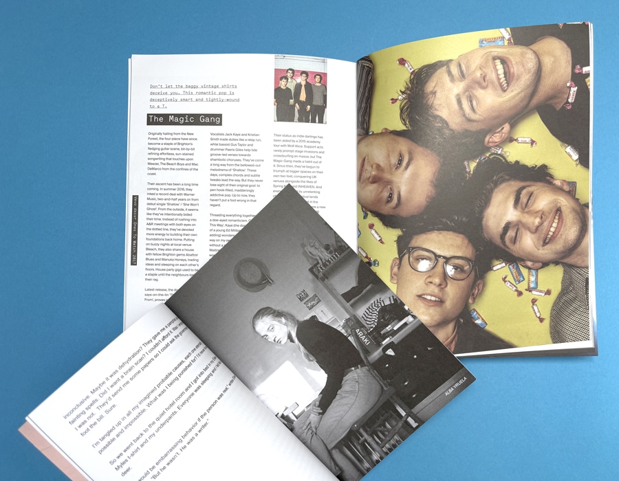
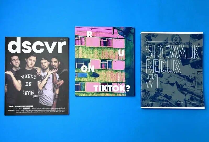
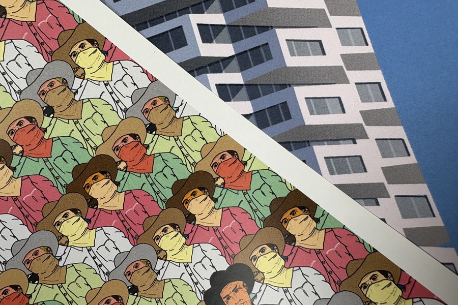
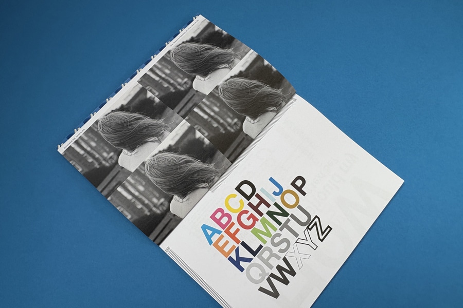
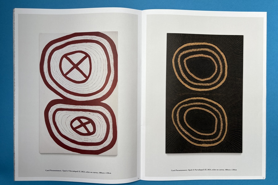
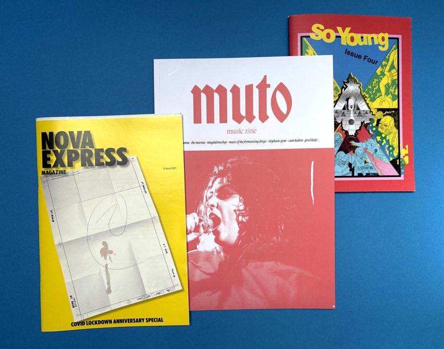
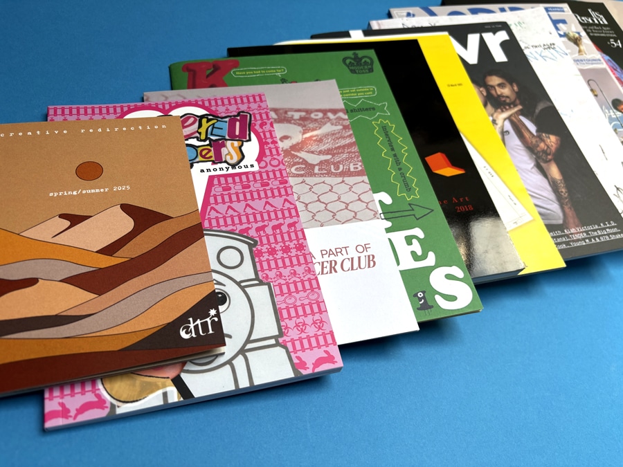
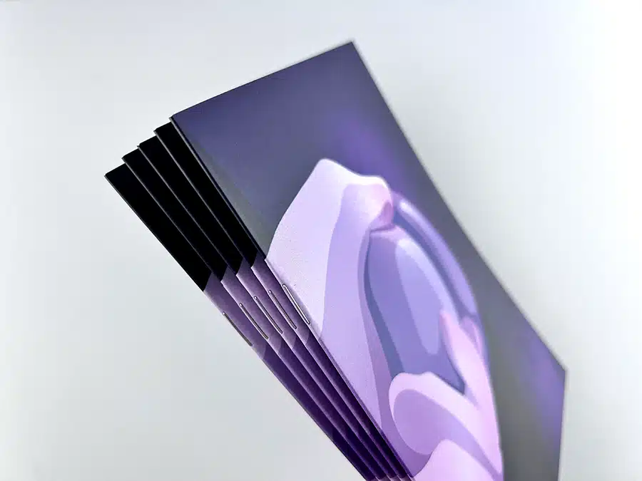
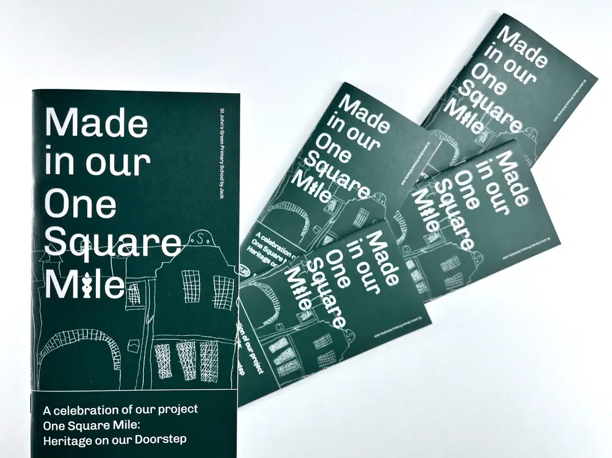
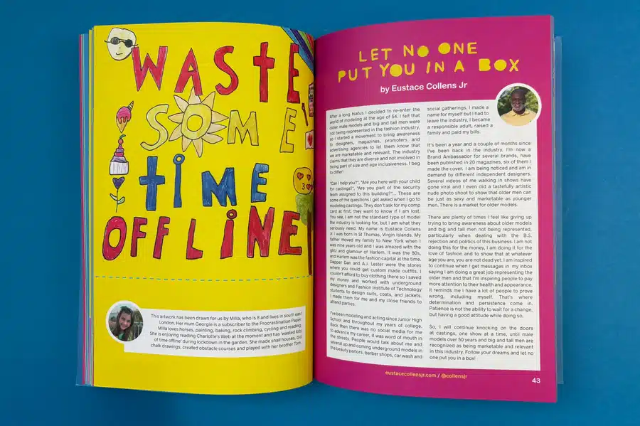
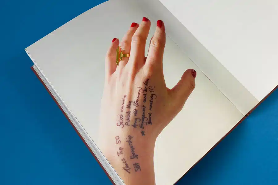
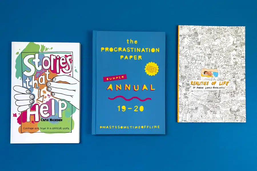
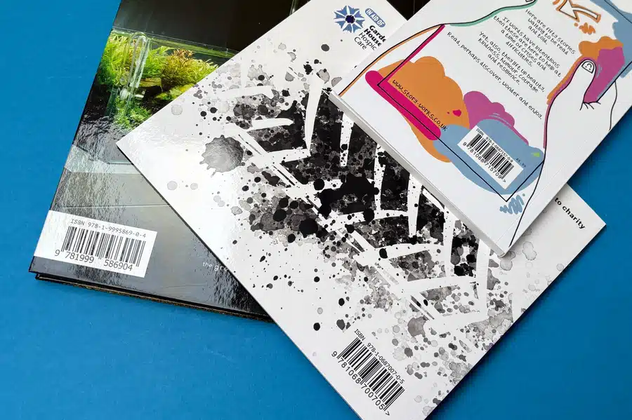
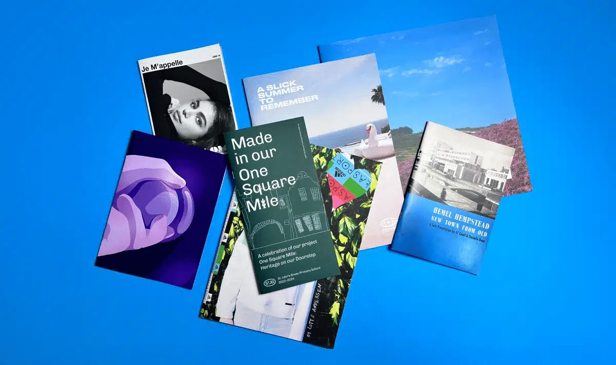
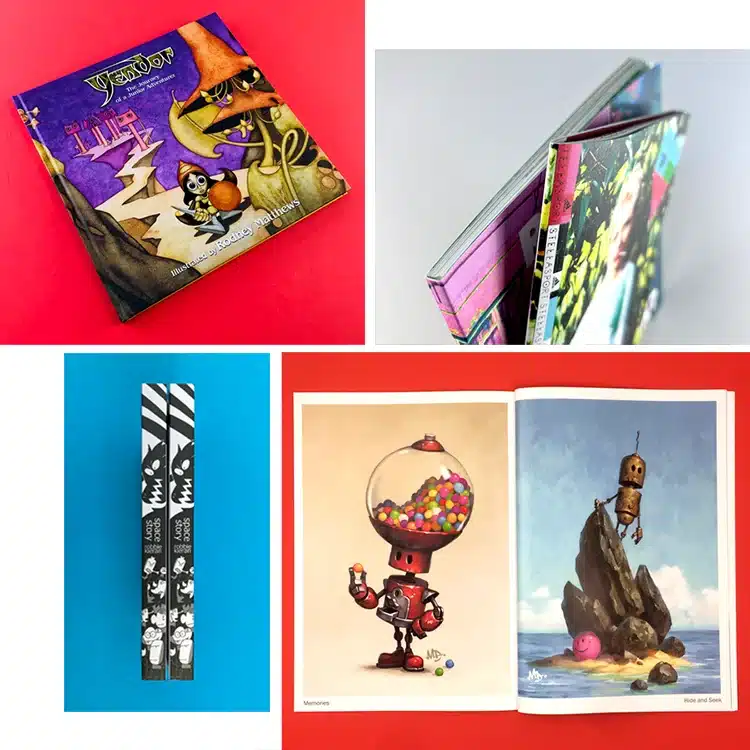
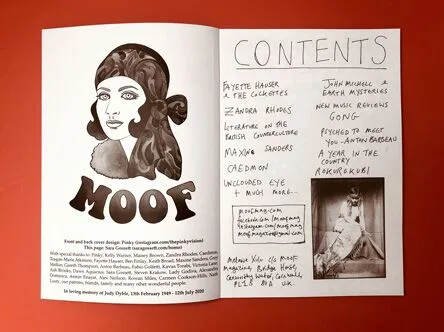
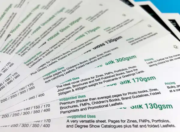
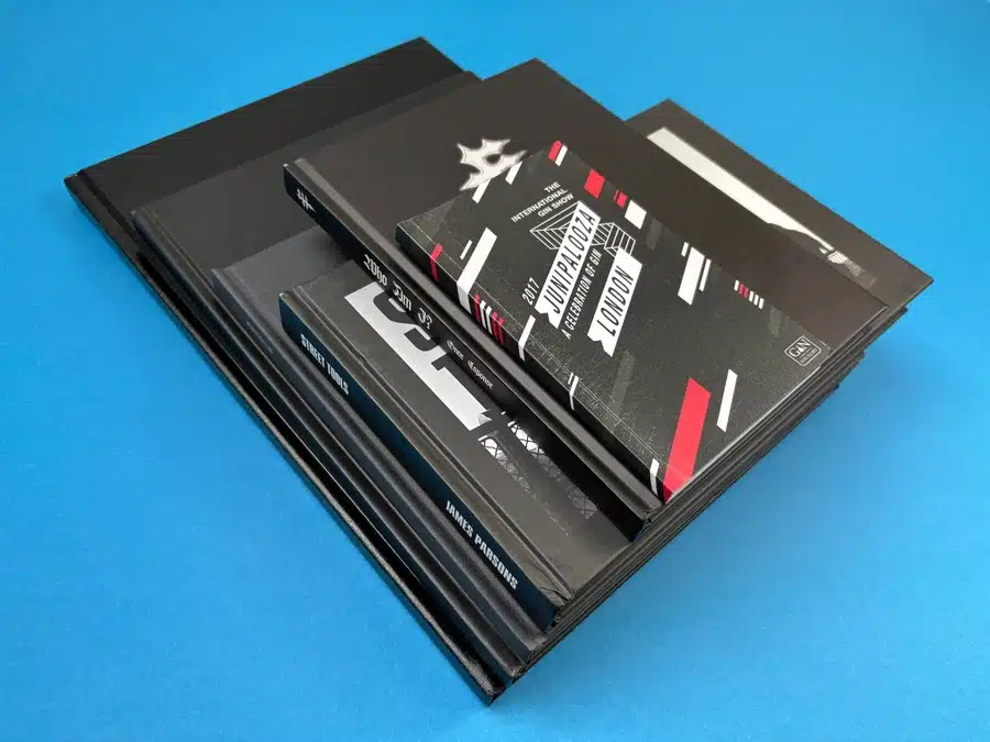
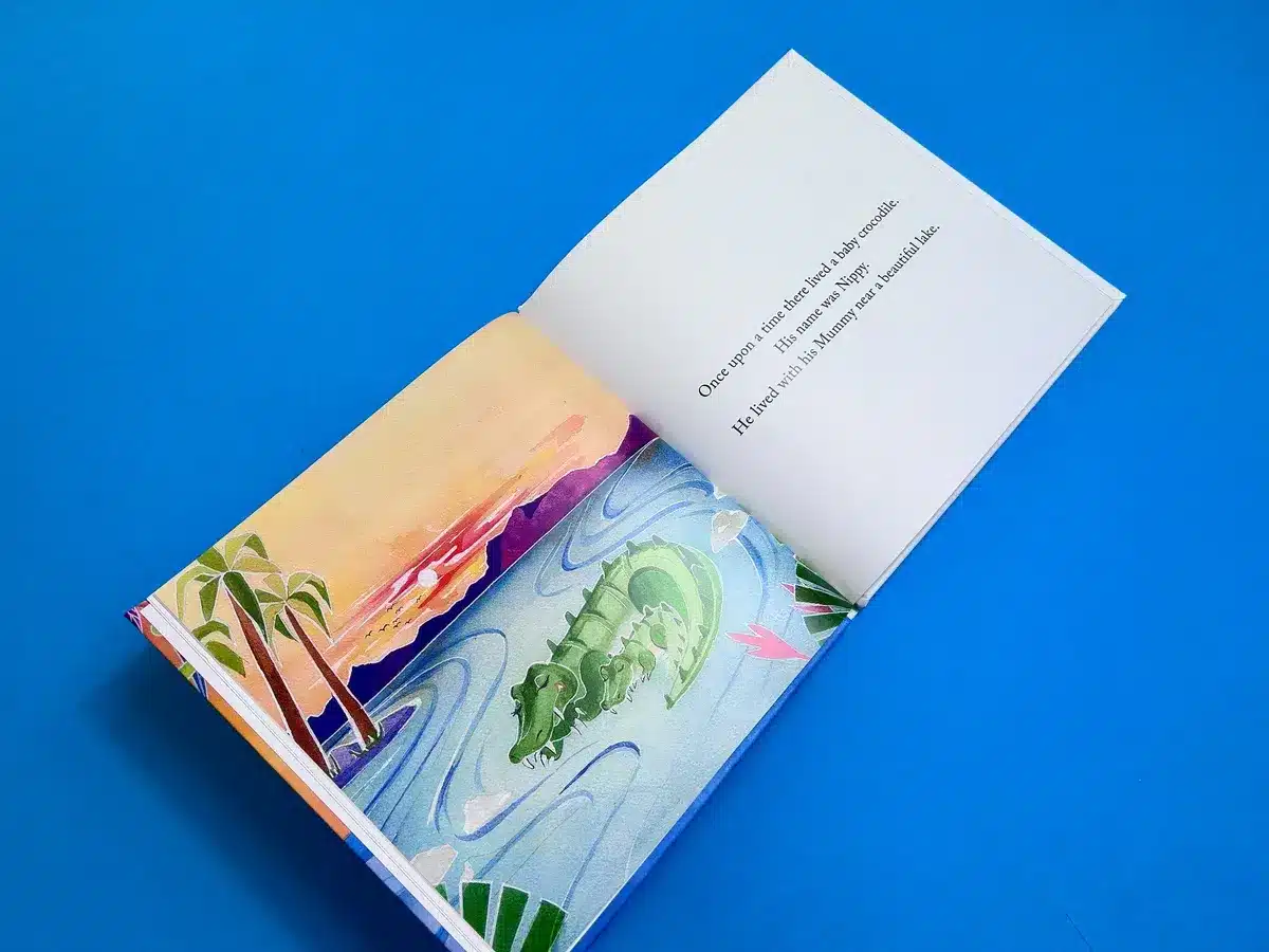
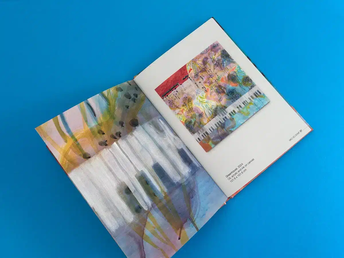
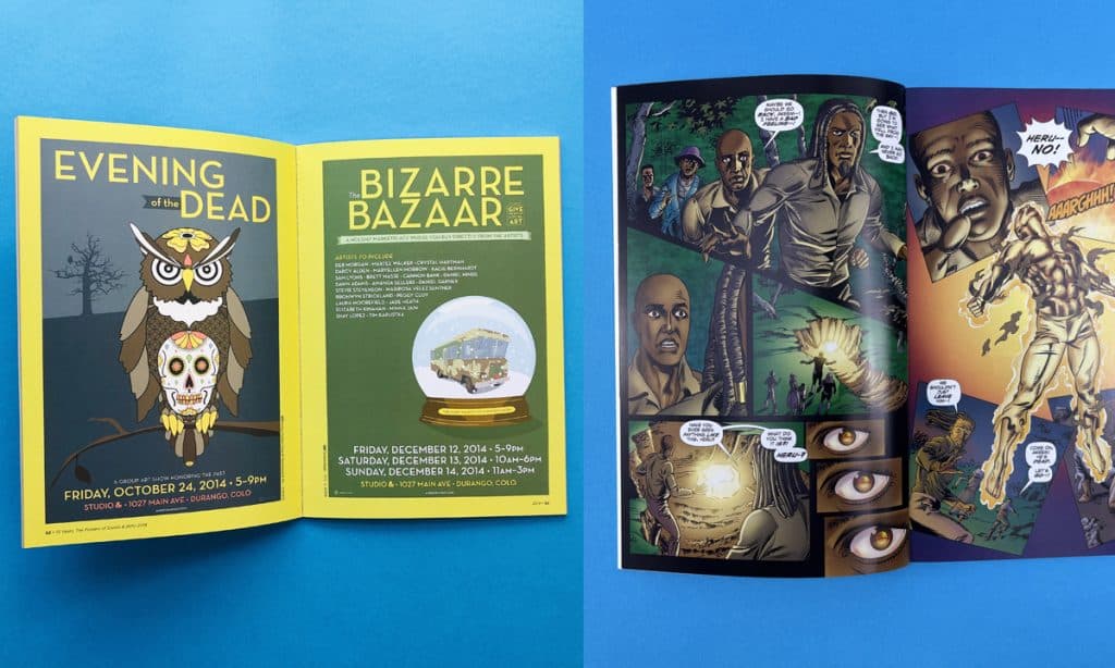
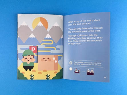
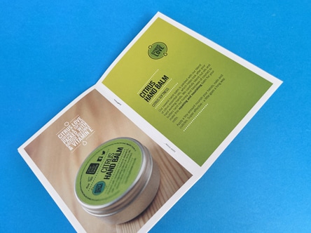
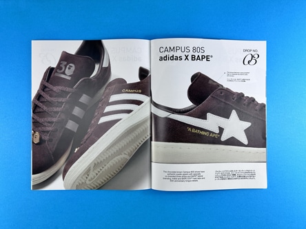
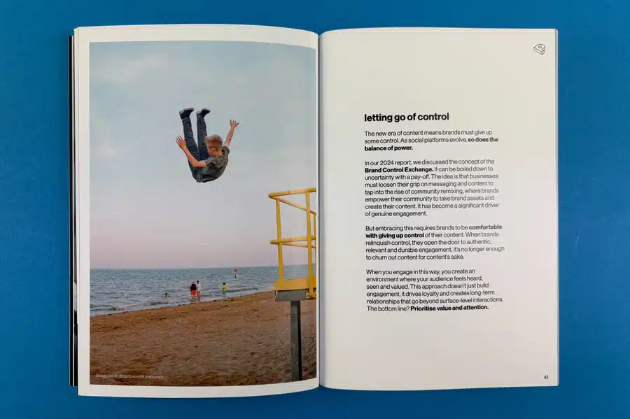
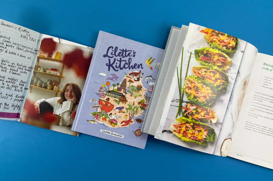
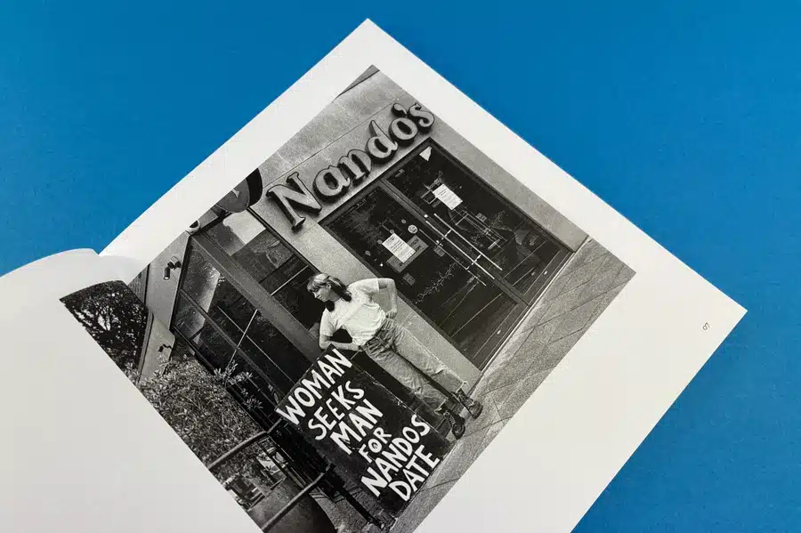
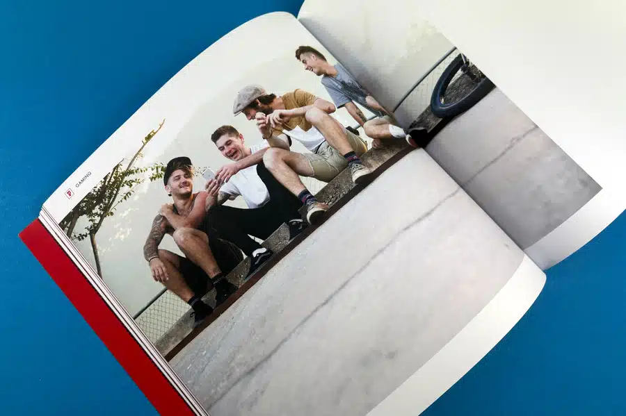
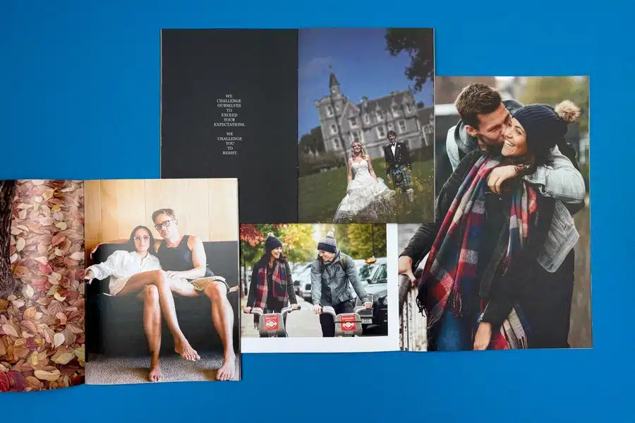
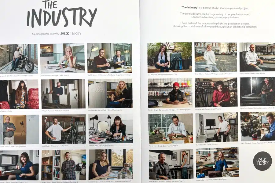
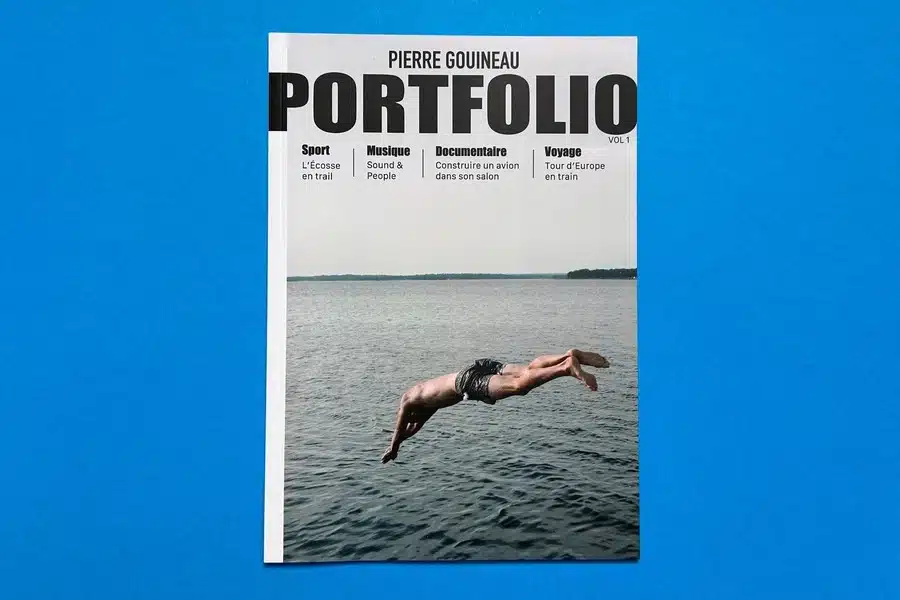
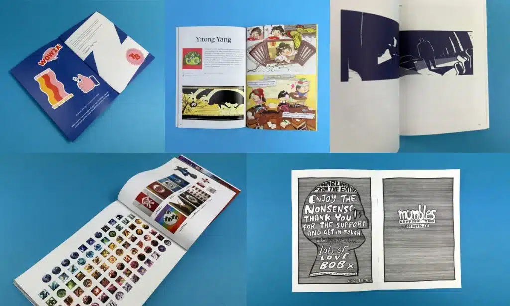
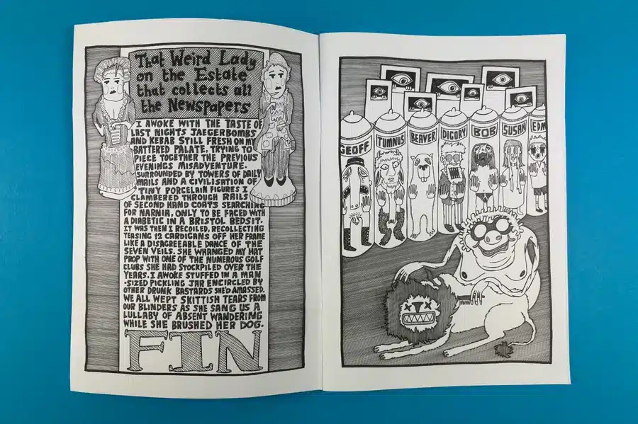
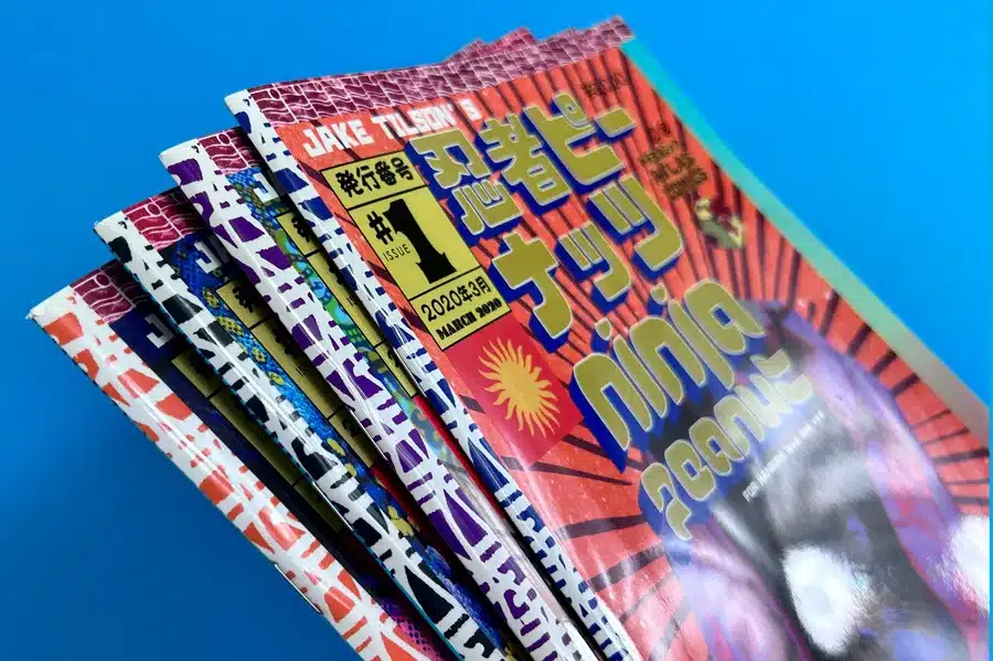
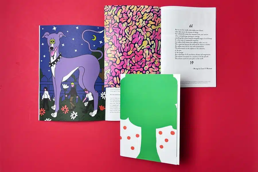
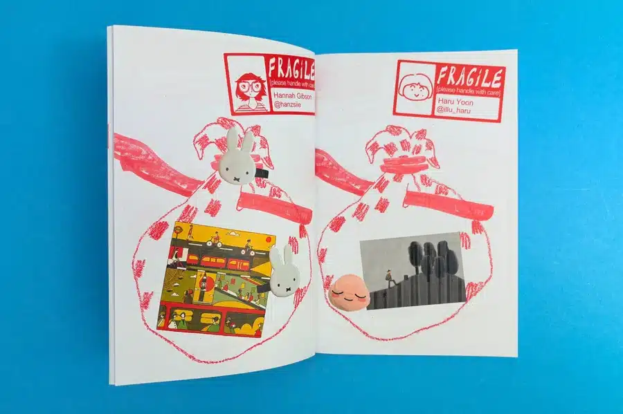
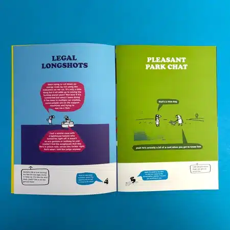
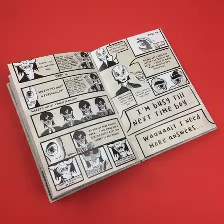
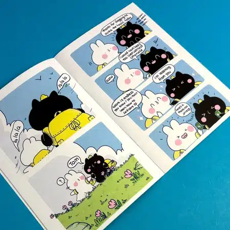
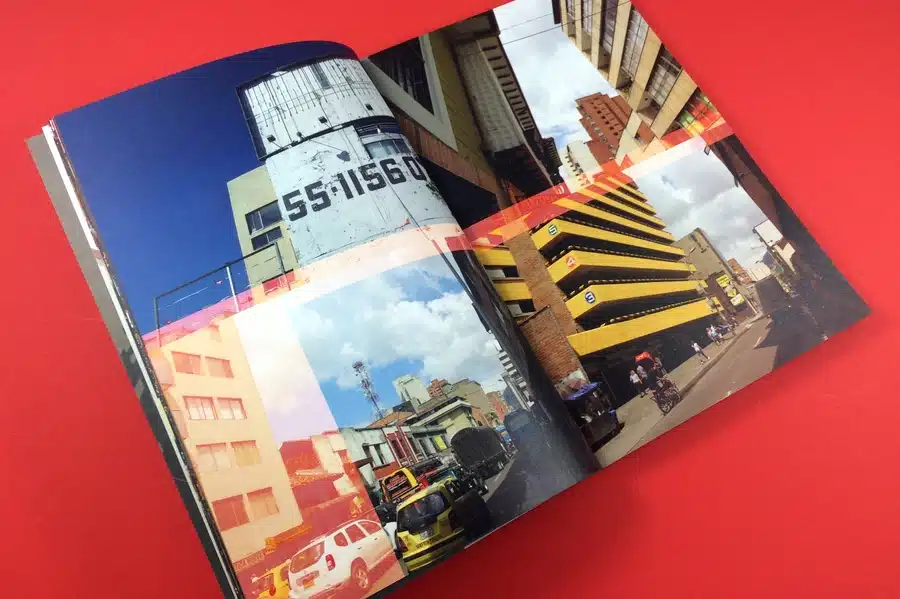
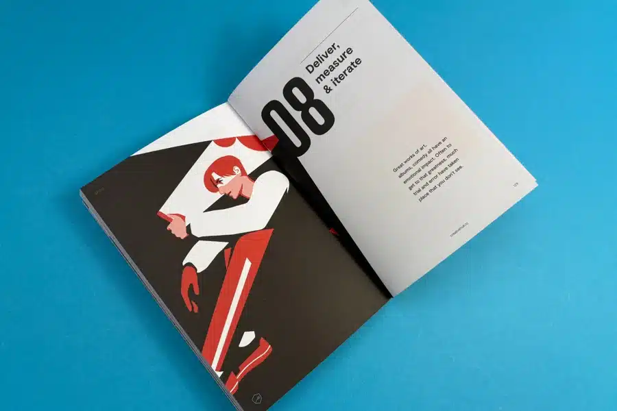
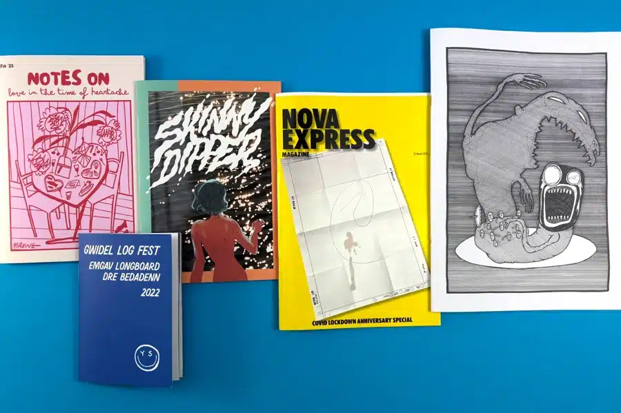
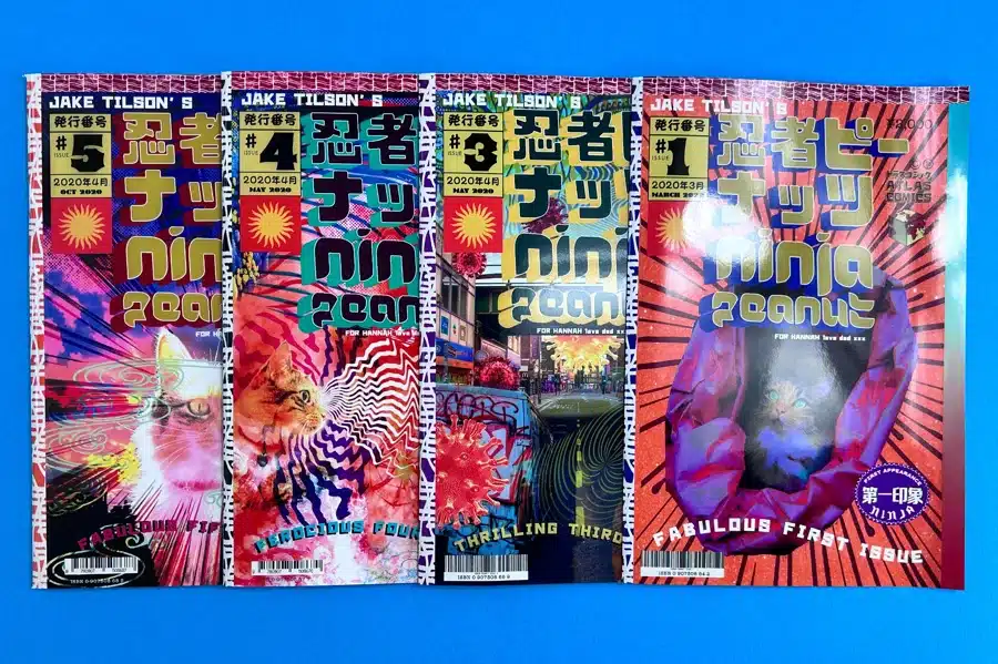
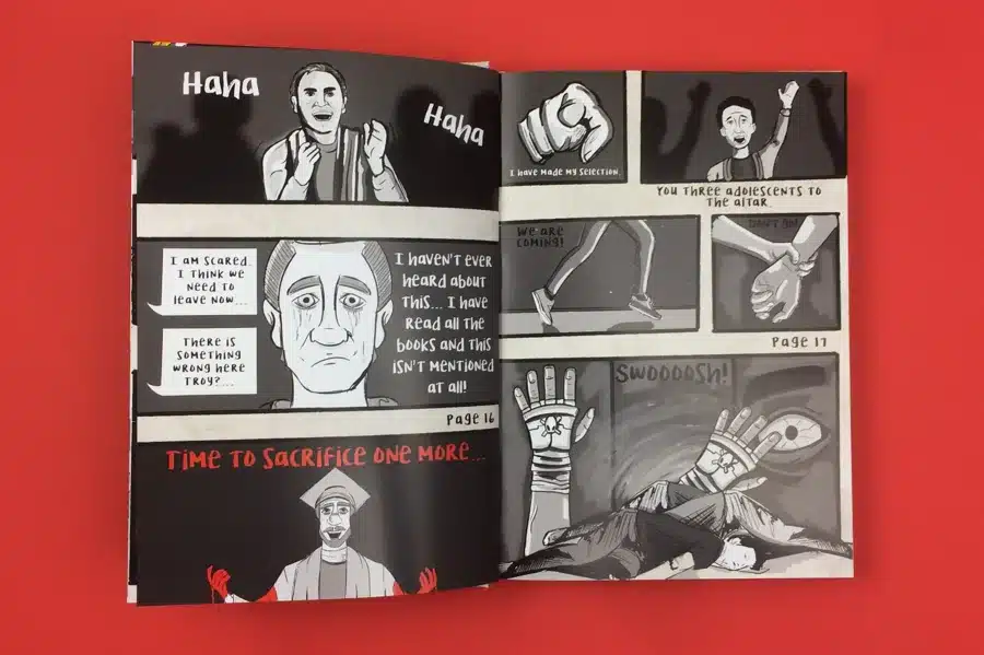
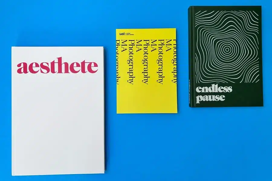
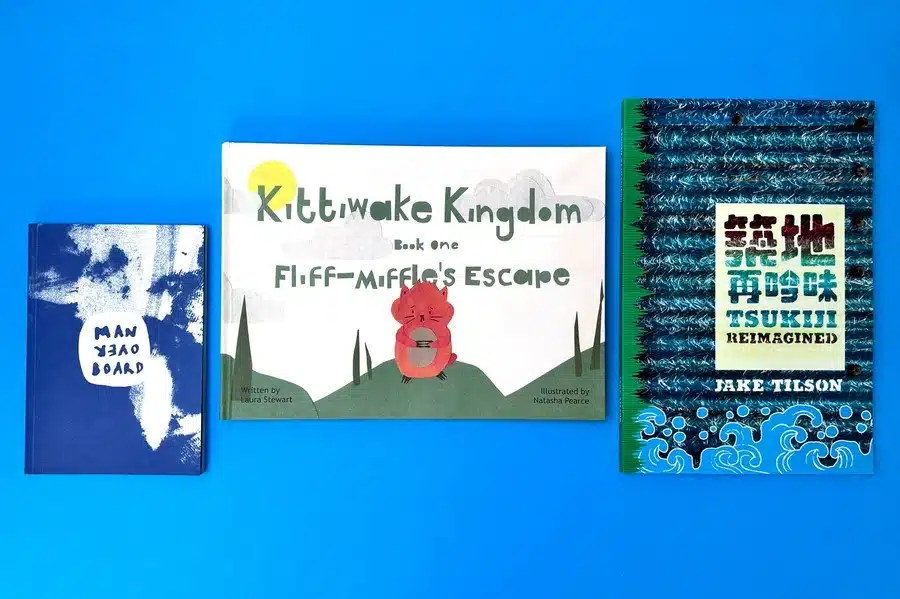
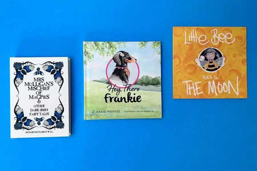
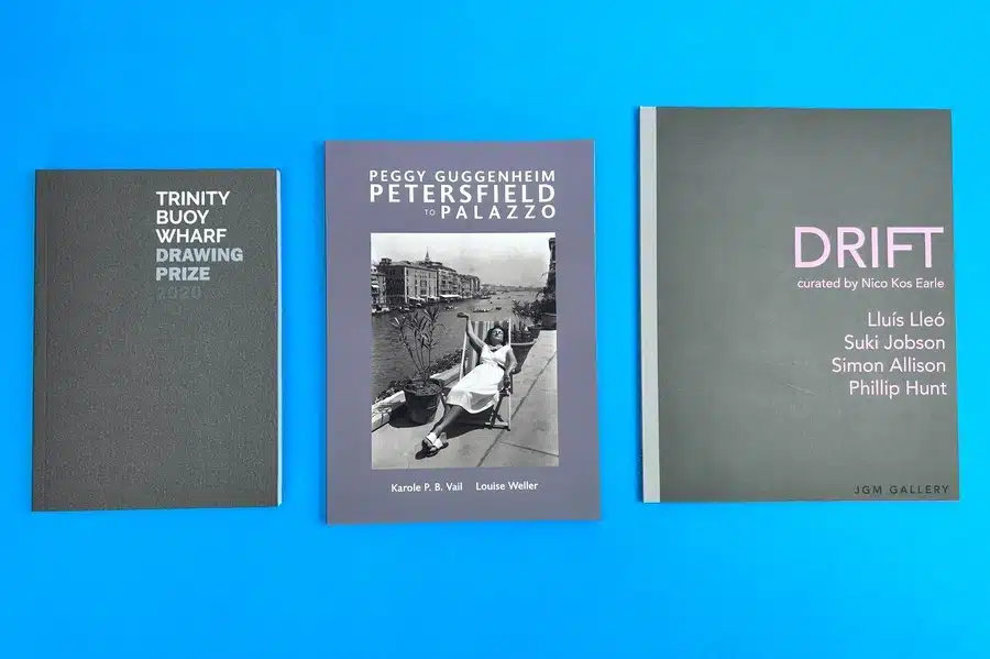
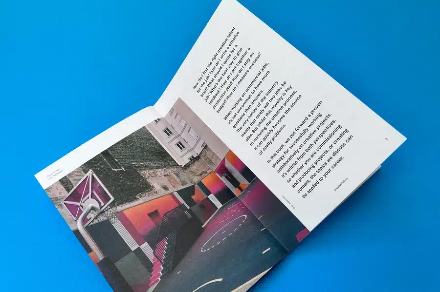
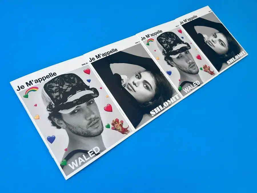
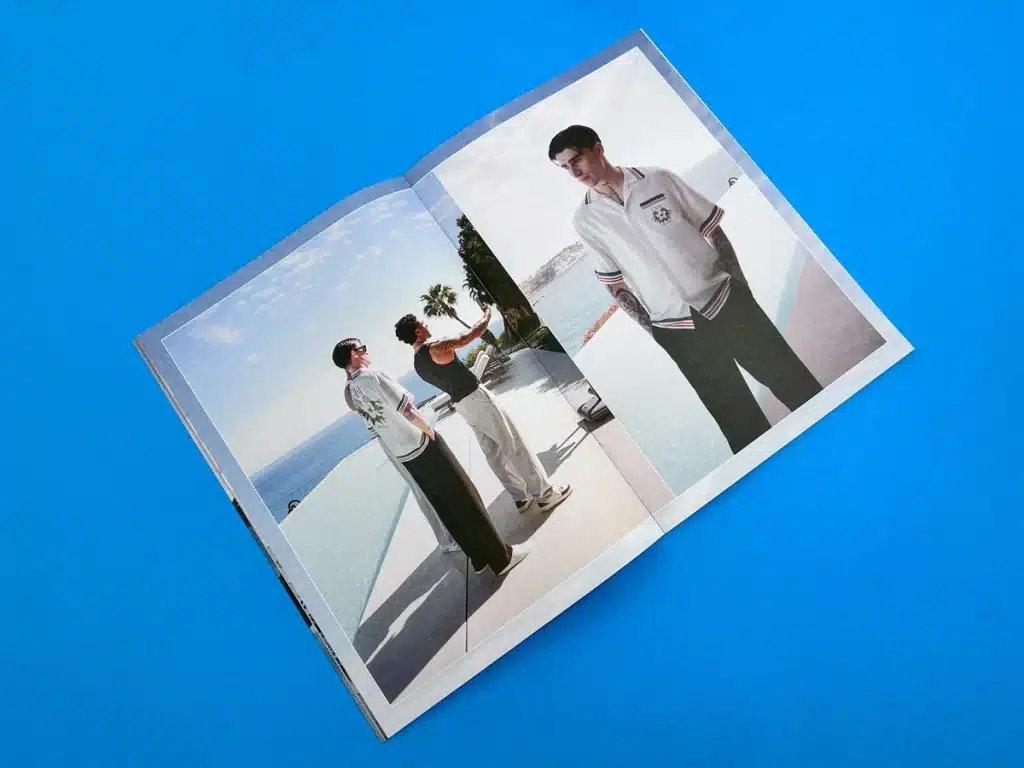
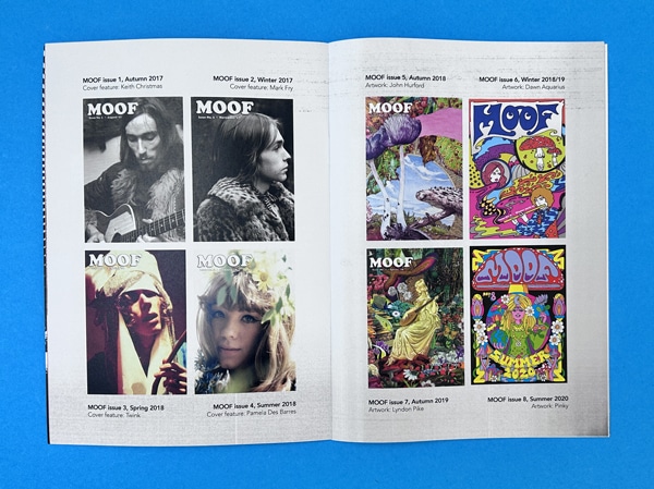
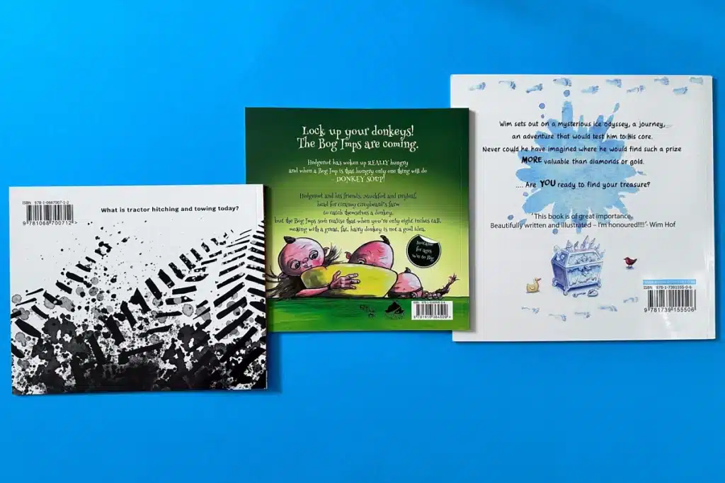
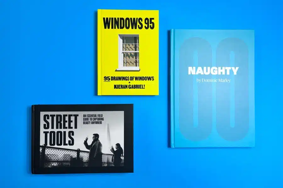
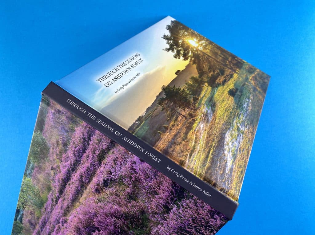
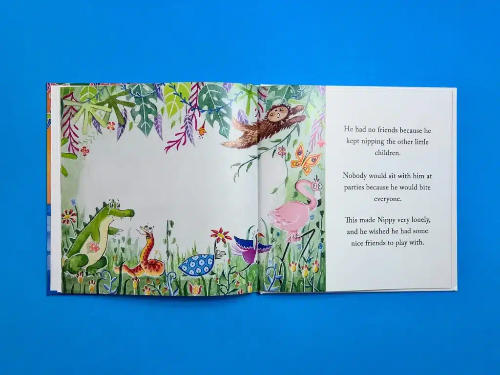
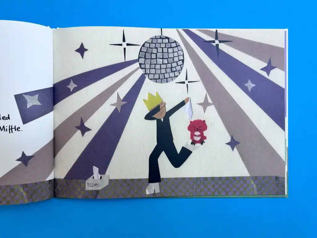
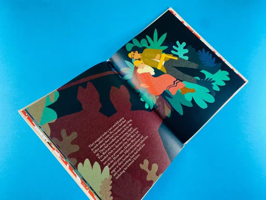
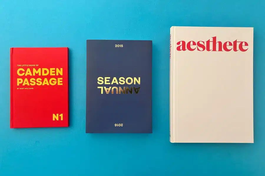
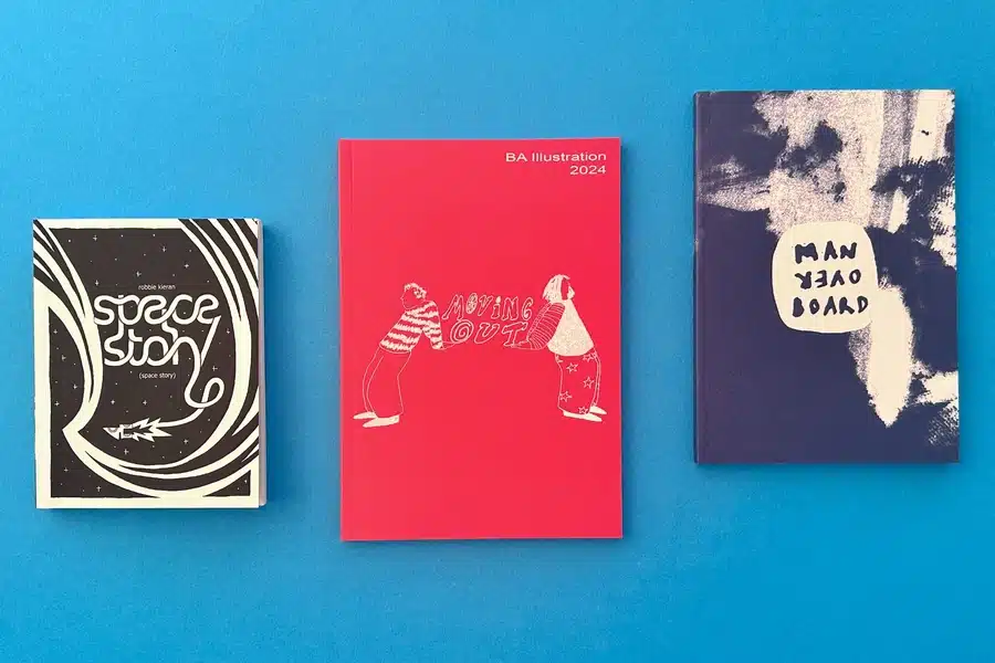
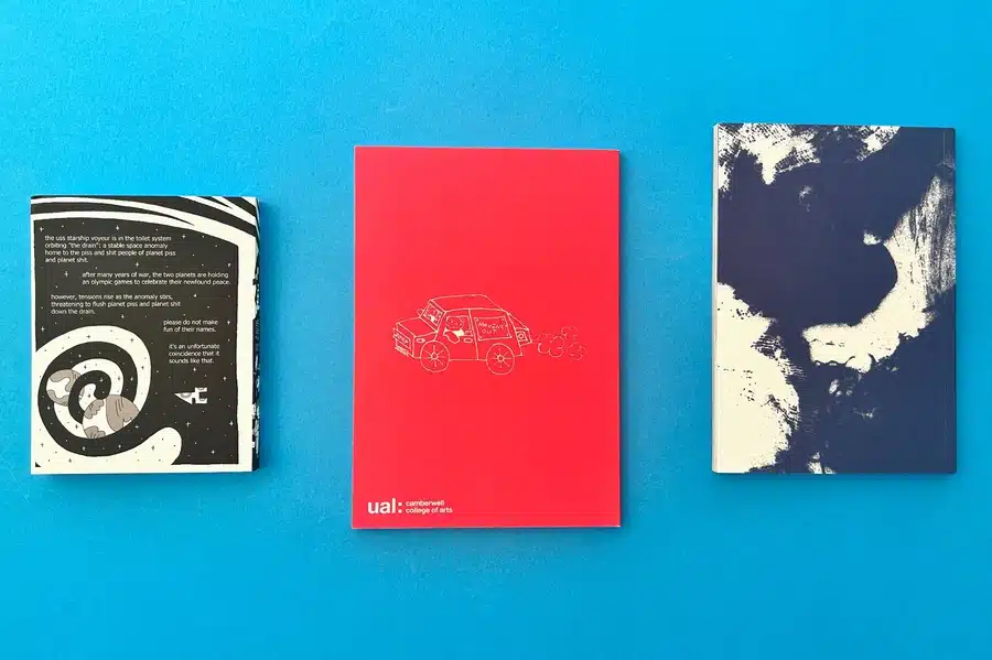
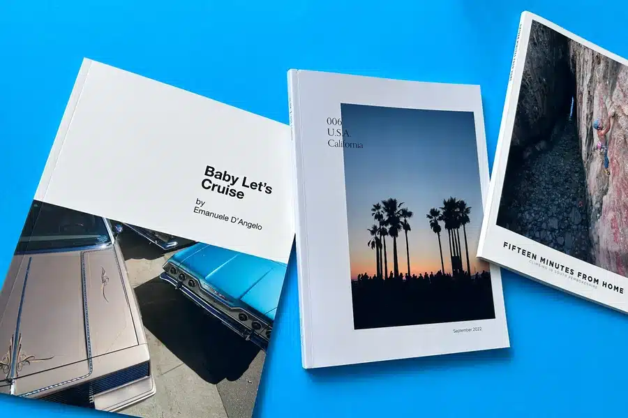
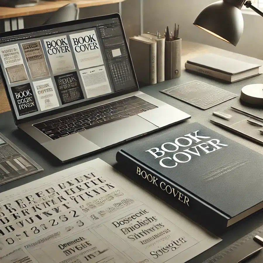
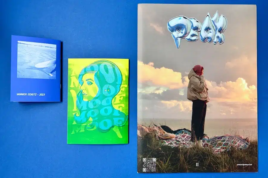
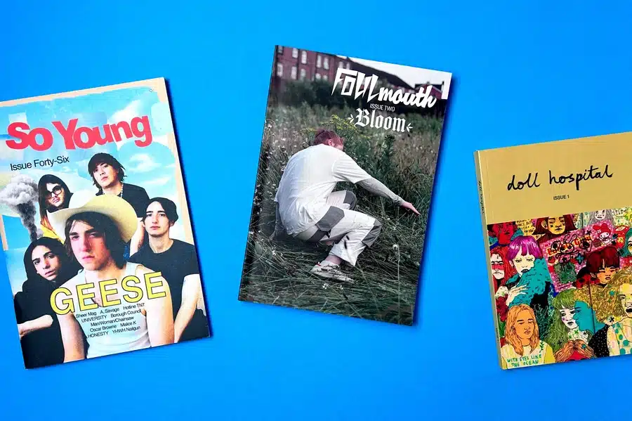
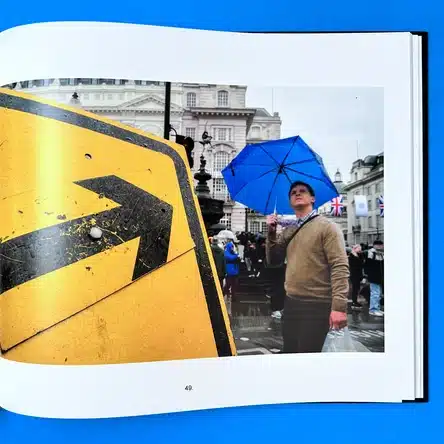
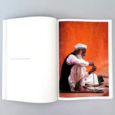
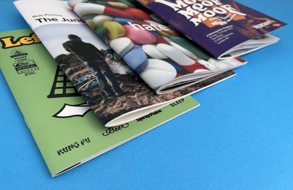
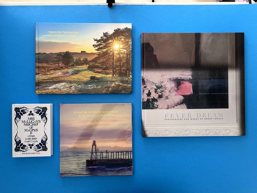
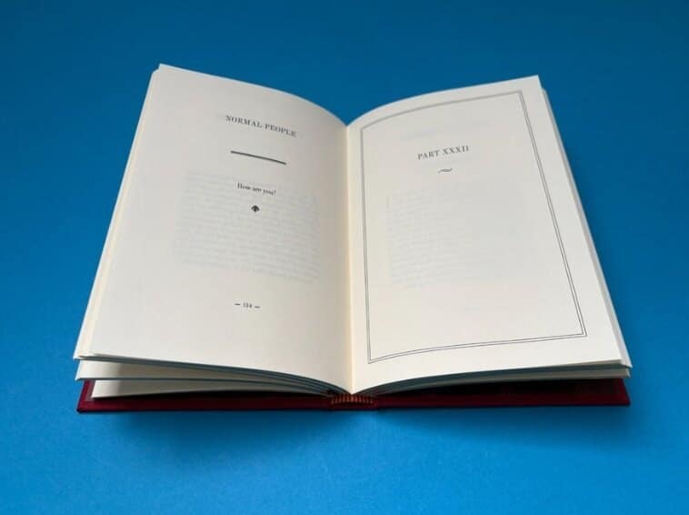
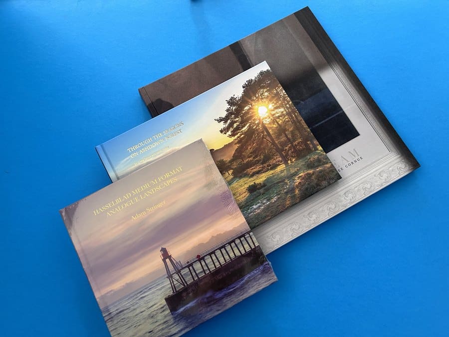
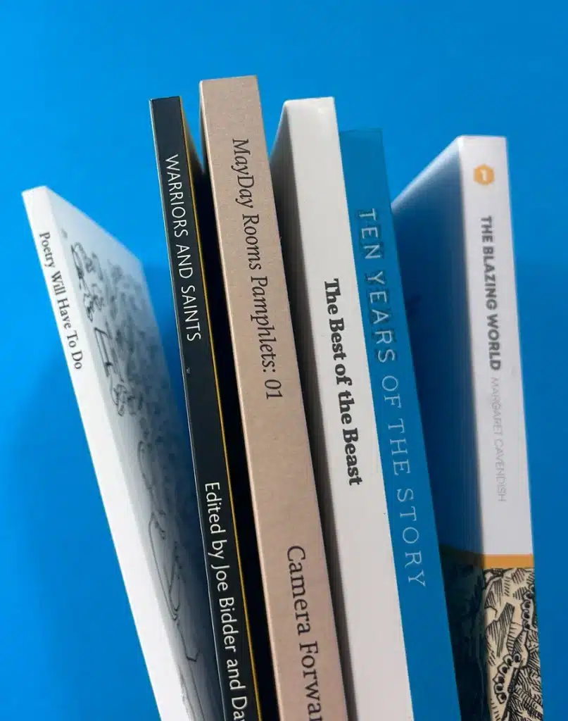
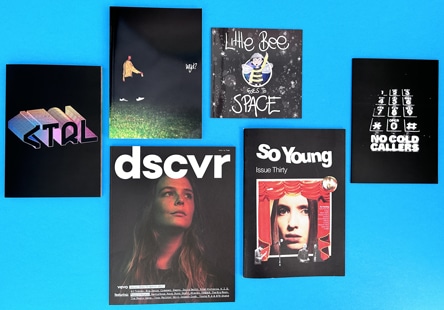
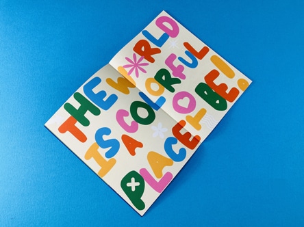
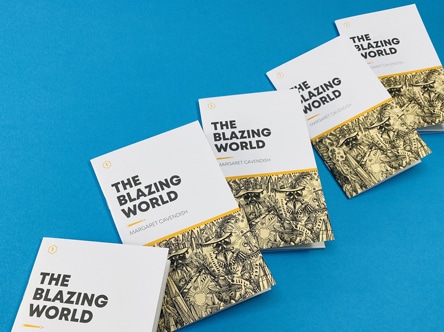
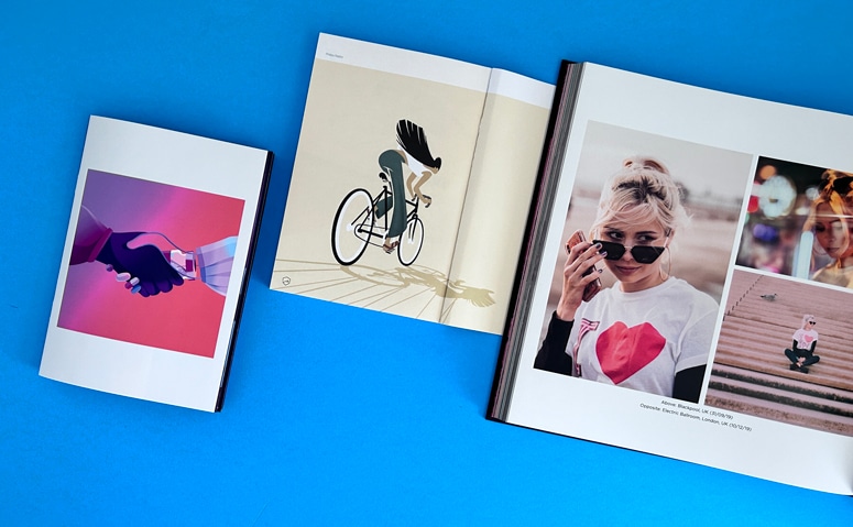
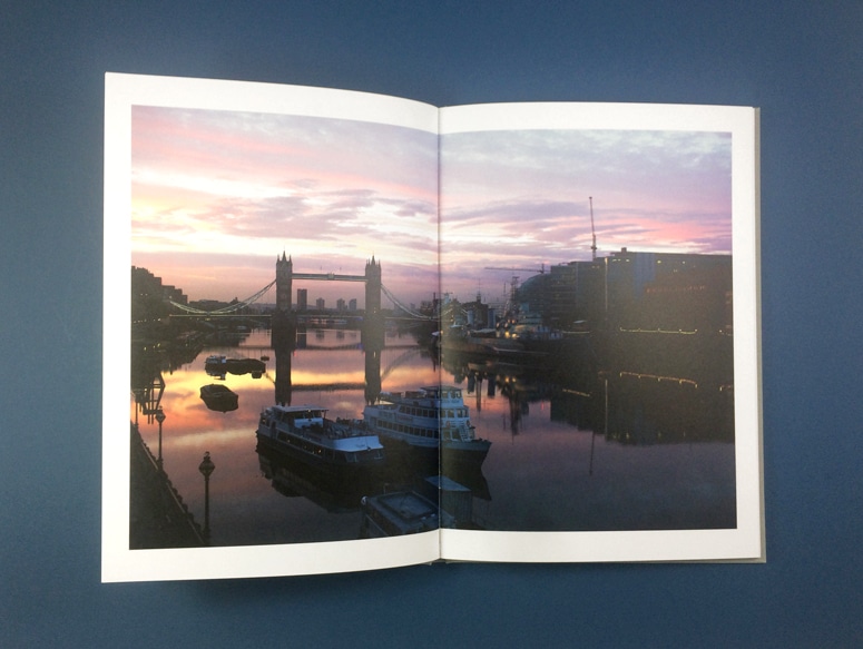
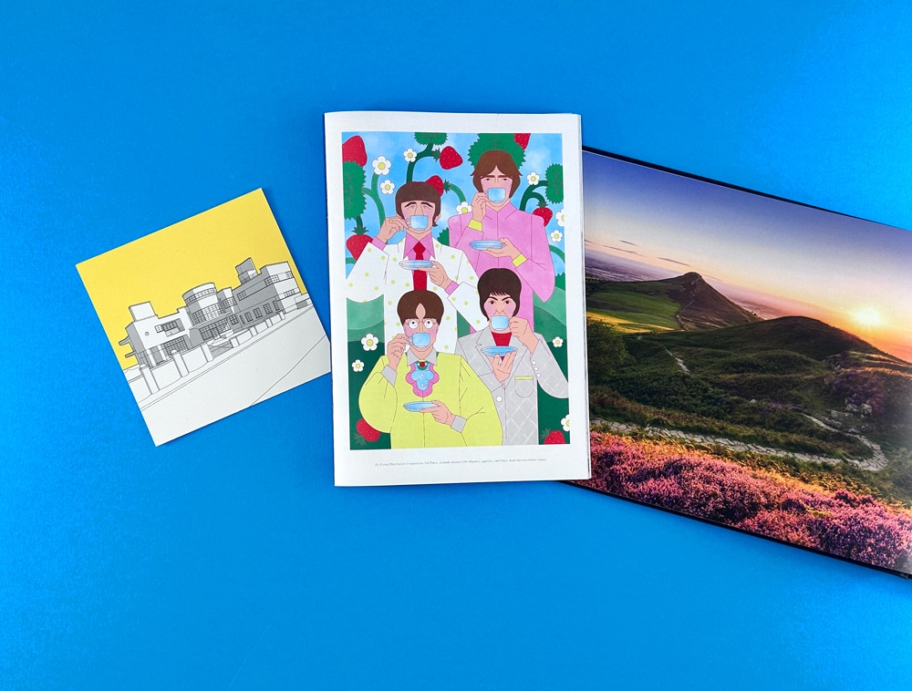
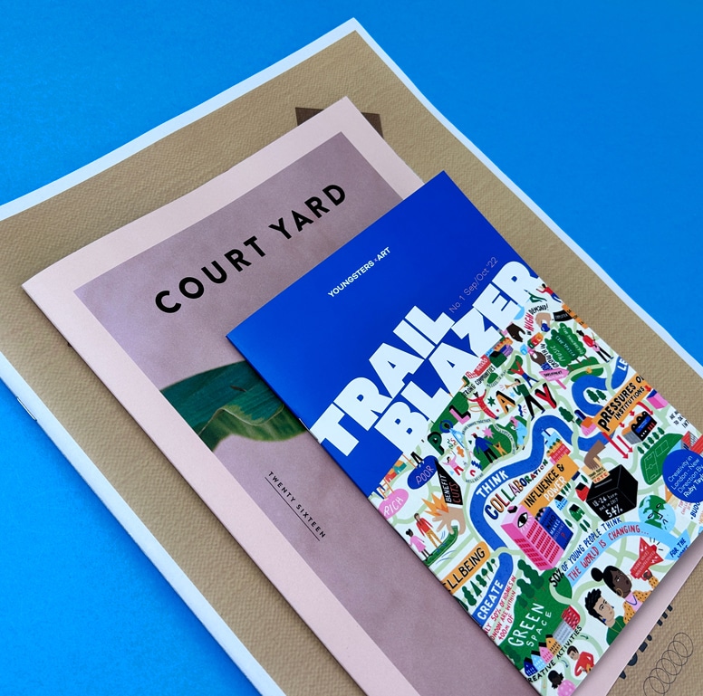
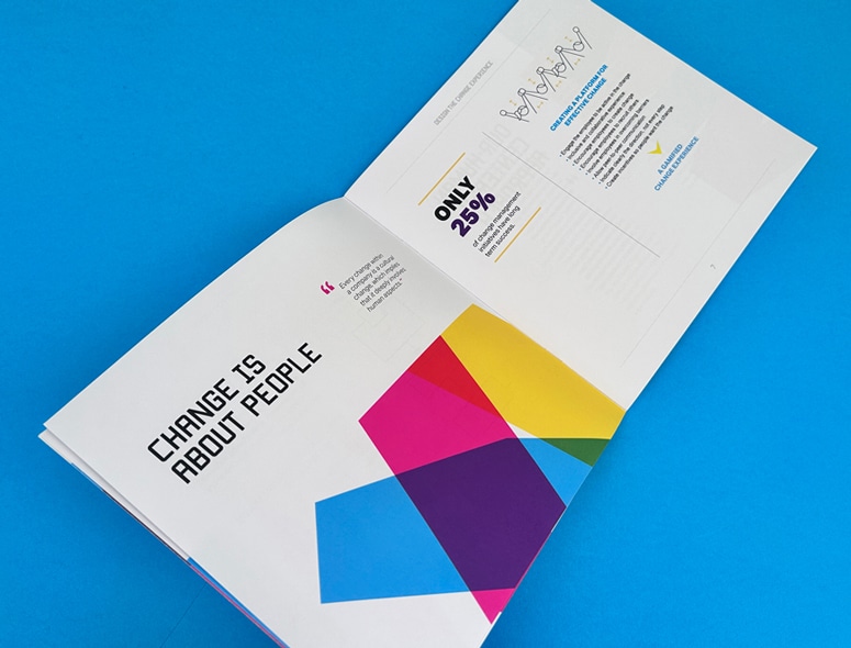
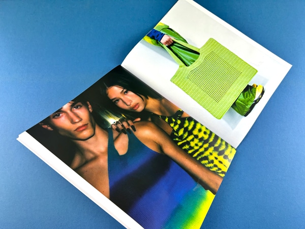
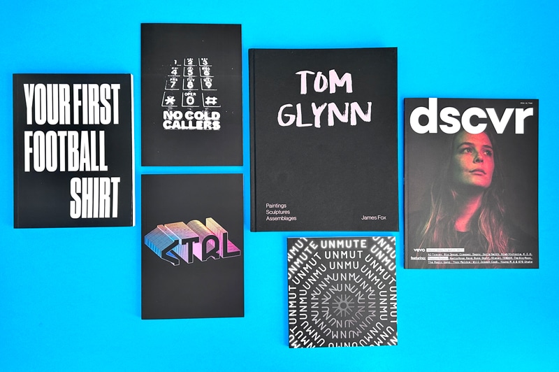
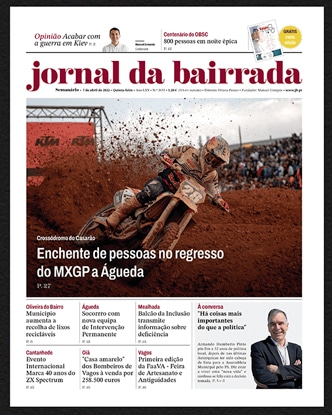
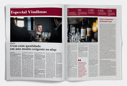
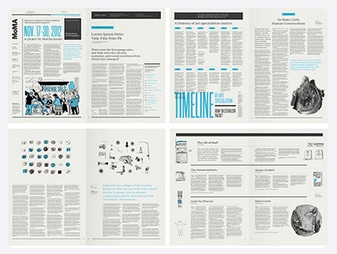
So, you’ve poured your heart into designing your magazine—curated the content, nailed the visuals, and now it’s time to bring it to life. But here’s the thing: a magazine isn’t just about what’s on that piece of paper. It’s about how those pages feel, how the images pop, and how the entire piece holds together in a reader’s hands.
Whether you’re publishing a niche editorial, a creative showcase, or a branded magazine for your audience, the final product should reflect your vision with precision and polish. And to do that, every choice matters—from layout planning and paper texture to binding style and print method.
This blog will walk you through that process—what to consider, what to prioritize, and how to bring your magazine from concept to a printed piece that truly connects with your readers. Let's get started!
How to Plan Your Magazine Print?
Before diving into layouts and paper types, start with a clear plan. Define why you’re printing your own magazine, who it’s for, and how much you can spend on diverse fonts. These decisions will shape everything—from design and content to printing choices, ultimately contributing to a consistent professional look.
Nail Your Purpose and Audience Before You Print
Your magazine’s purpose sets the tone. Long before you think on how to print out a magazine, know the purpose behind it. Are you informing, entertaining, promoting, or educating? Once that’s clear, identify your audience—think beyond age and focus on interests, profession, and lifestyle.
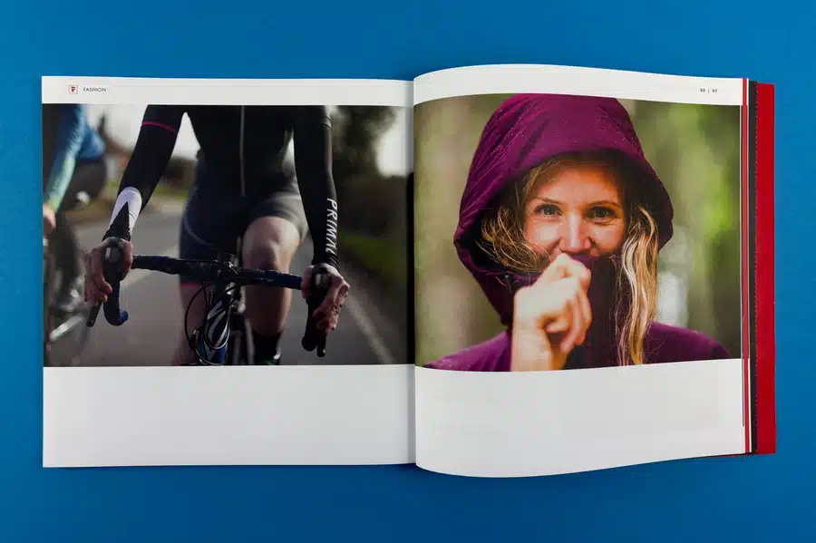
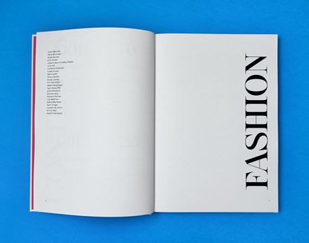
For example, if you're creating a fashion magazine, your audience might include style enthusiasts, fashion students, or industry professionals.
Why this matters:
Content stays relevant
The tone matches the reader's expectations
The design feels visually aligned
The better you know your readers, the better your magazine connects with them.
How to Choose the Right Printing Method?
Now that you’ve nailed down your magazine’s purpose and target audience, it’s time to tackle a big decision: how to print a magazine at home. Your printing method will affect everything—from cost and turnaround time to image quality and paper feel.
While there are multiple printing techniques, most magazine projects come down to two heavy hitters: digital and offset printing. Each has its perks and trade-offs, and the best choice depends on your project’s size, timeline, and quality expectations.
1. Digital Printing
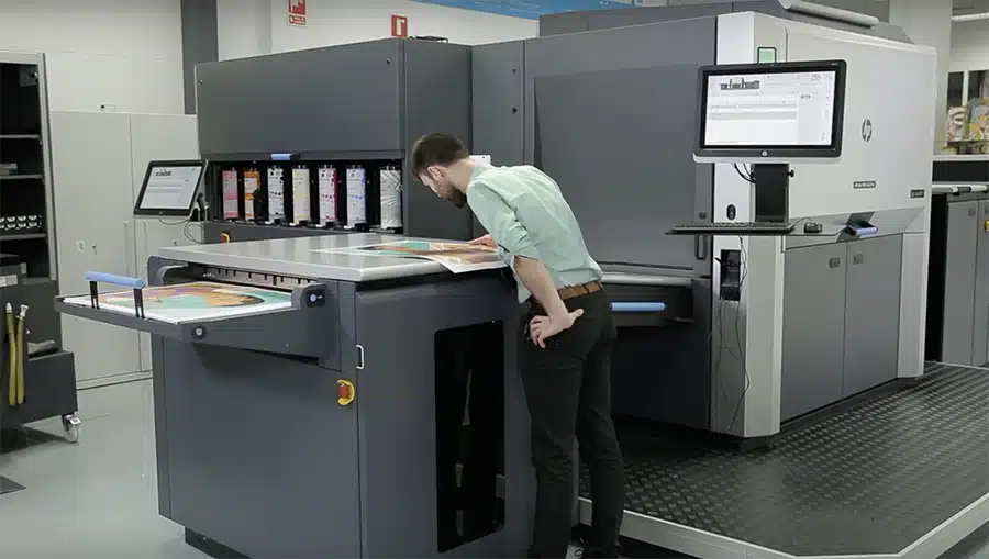
Digital printing is the go-to option for smaller print runs and tight deadlines. It works a lot like your home printer—just way more advanced. Files are sent straight from your computer to the printer, skipping the whole plate-making process.
It’s fast, flexible, and affordable—especially when you're not printing thousands of copies. And while offset printing still holds the crown for razor-sharp image quality, most readers won’t spot the difference in a well-executed digital print. The key is using the right paper and thickness to elevate the final product.
Aspect
Description
Speed
Faster setup and quicker print turnaround
Quality
High-quality prints with minimal compromise
Cost-Effective
Ideal for smaller quantities; lower upfront cost
2. Offset Printing
Offset printing is the old-school master of volume. It’s a bit more of a process—creating plates and transferring ink via rubber blankets—but the result is hard to beat. If your magazine has a high page count or you’re printing in bulk, the offset is likely the more cost-effective route.
The real win here is precision. Offset delivers crisp, vibrant prints with zero smudging or toner streaks. It's the method major publishers swear by for glossy magazines. Just know: it’s slower to set up and usually not worth it for short runs.
Aspect
Description
Speed
Longer setup time; better for scheduled runs
Quality
Exceptional image clarity and color fidelity
Cost-Effective
Best value for large-volume print jobs
No matter which printing method you choose, Ex Why Zed's Magazine Printing Service has got you covered. From rich satin paper (300 gsm cover, 130 gsm inside) to expert binding, we make your vision print-perfect.
Just upload your PDF, and we’ll handle the rest with lightning-speed turnarounds—3 days for stapled, 5 for perfect bound. Need a few copies? Instant pricing makes it simple and hassle-free.
Additionally, with free paper samples, file checks, and actual humans on standby, we don’t just print—we impress.
What Is the Standard Magazine Size?
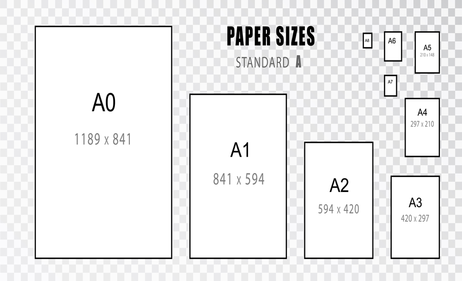
When we talk about standard magazine size in the U.S., 8.5 x 11 inches is the industry go-to. It’s familiar, print-friendly, and fits neatly into shelves, bags, and mailers, making it a practical choice for both readers and distributors.
Internationally, the A4 size (8.27 x 11.69 inches) dominates. It’s slightly taller and narrower than the U.S. standard, offering a sleeker visual appeal. Many global brands prefer A4 for its compatibility with design templates and cost-efficient print setups outside the U.S.
Other formats, like digest size (5.5 x 8.5 inches), are gaining traction for niche or budget-friendly publications. They’re portable, cheaper to print, and ideal for zines, how-to guides, or compact lifestyle mags targeting younger, on-the-go audiences who crave convenience without sacrificing content quality.
How Long Does it Take to Print a Magazine?
The timeline for printing a magazine greatly depends on key factors such as the volume, the printing option you chose, and the complexity of your magazine's design and layout. Short-run printing jobs involving around 1,500 - 2,000 copies generally can expect faster turnaround times due to less demanding equipment setup.
On the other hand, more significant projects requiring more than 2,000 copies usually take more time due to the detailed setup of offset printing. However, digital printing offers faster turnaround times even for substantial projects in scenarios where speed overrules cost.
What Are the Factors That Influence the Cost of Printing?
Print volume and method significantly affect your magazine’s cost, but they’re just the beginning. Several other elements quietly shape your final price tag, including paper type, page count, and binding style. Each choice you make adds up—visually, tactically, and financially. Let’s break down these factors so you can plan smarter.
1. Paper Choices
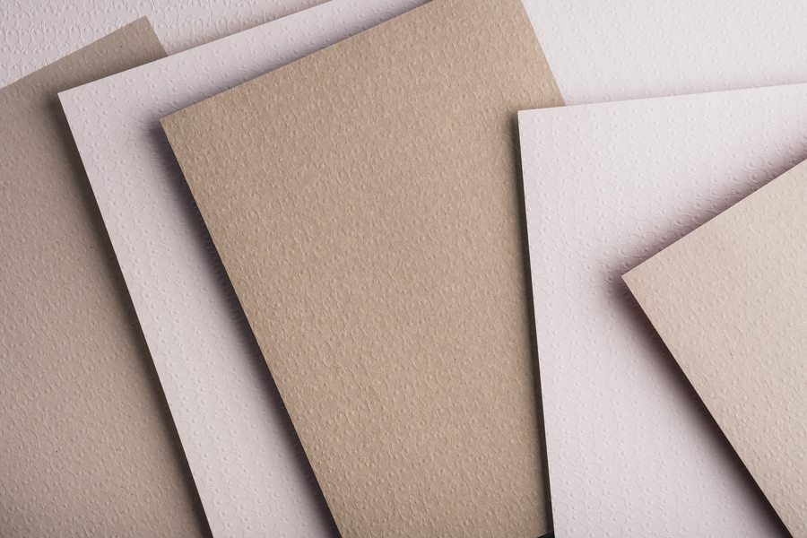
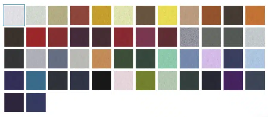
The paper you pick isn’t just about feeling—it’s about first impressions. Want something sleek and photo-forward? Gloss paper delivers punchy colors and crisp images for your artwork. Do you prefer a calmer, high-end vibe? Matte paper mutes the shine and elevates readability for text-heavy layouts. Craving texture? The uncoated paper brings a raw, organic feel that stands out in a digital world.
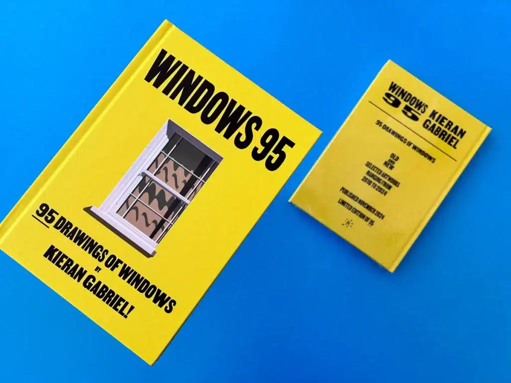
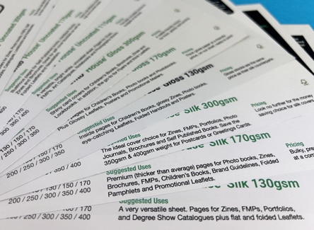
Just remember: thicker or premium-grade paper costs more, including your cover stock. For example, for 100 copies, ExWhyZed offers A4 Softback (also available in 210x210mm) with both Wire Stitched (Saddle Stitched) and Perfect Bound (PUR) options. You can choose from premium paper with a 300gsm Silk cover and 130gsm Silk satin for the inside pages. All of this for just £135.70.
2. Page Count
Every page adds to your story—and also your invoice. The more content you pack in, the more paper, ink, and time it takes to bring your vision to life. Since one sheet equals two pages (front and back), your total count should ideally be divisible by four—this keeps things printer-friendly and cost-efficient.
Also, don’t overlook the physical bulk. A slim 24-page lookbook and a 100-page feature mag won’t use the same binding—and yes, that matters for pricing, too. Aim for a page count that supports your message without bloating your budget.
3. Binding Options
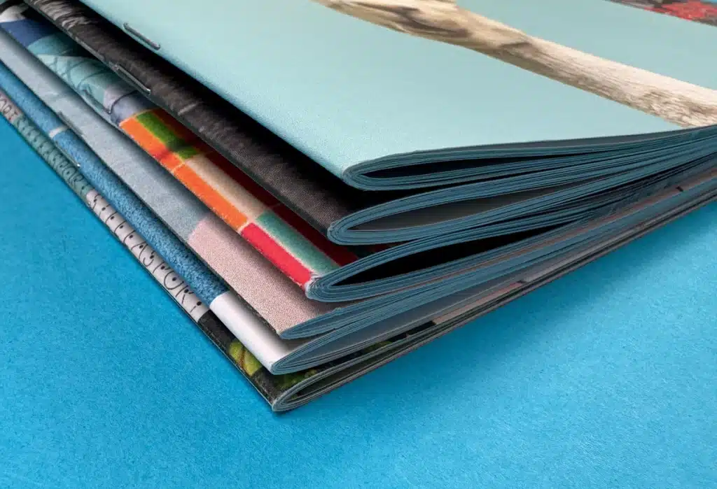
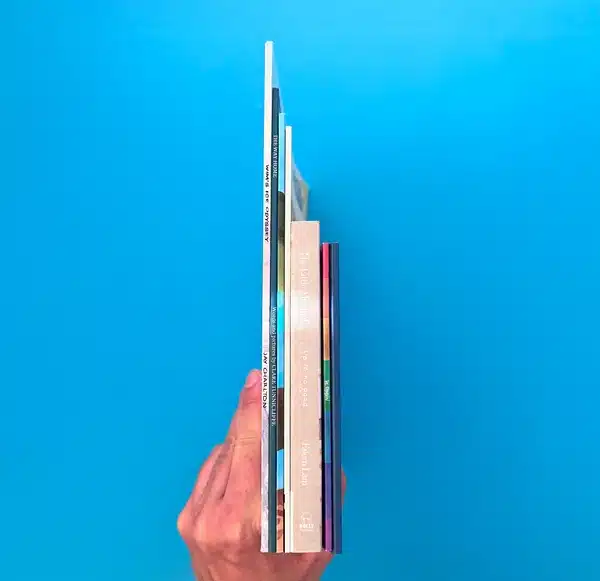
Binding does more than hold your magazine together—it shapes the entire finish. Saddle stitch (stapled fold) is wallet-friendly and ideal for low page counts, specifically great for smaller magazines under 48 pages. But if you’re going thick or want a polished, bookstore-style feel, perfect bound binding (flat spine) delivers that pro edge.
Choose your binding based on function, aesthetics, and how you want readers to experience your publication, from the first glance to the final page flip.
Print Your Magazine with Confidence — Ex Why Zed Has You Covered
At Ex Why Zed, magazine printing isn’t just a service — it’s a partnership. We guide you through every step, from choosing the right materials to delivering a stunning final product that reflects your vision.
Whether you're producing a niche publication, an art magazine, or a corporate issue, our expert team ensures exceptional quality, sharp color accuracy, and reliable turnaround times.
Ready to bring your magazine to life? Contact us today and let us help you create something truly worth flipping through.
Conclusion
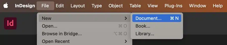
Printing a magazine isn’t just a technical task—it’s a creative journey that blends strategy, design, and thoughtful decision-making. From selecting the proper printing method to choosing the perfect paper and defining the ideal size and page count, each choice shapes the final product’s quality, cost, and impact, especially when considering print magazines as part of the overall strategy, including the use of software like Adobe InDesign for layout design.
By understanding these core elements, you’re not just streamlining your process—you’re setting the stage for a publication that’s visually stunning, cost-effective, and tailored to your audience’s experience. Factor in timelines and prepare for common challenges, and you’re already a step ahead.
The more thoughtfully you plan, the more confidently you’ll produce a magazine that doesn't just inform, but impresses, connects, and leaves a lasting impression.
Frequently Asked Questions
What is the most cost-effective printing method for a magazine?
Digital printing is the most cost-effective for shorter print runs due to its faster setup times and lower initial costs. However, offset printing is often more economical for significant quantities despite the initial setup cost.
How can I reduce costs without compromising quality?
Smartly choosing your paper type, judiciously planning the number of pages, and opting for a cost-effective binding method can help reduce costs. Combine this with an appropriate printing method based on your volume to save costs without sacrificing quality.
Are there alternative materials that help save costs in magazine printing?
Choosing less expensive paper types or reducing paper weight can help minimize costs. However, remember that this might affect your magazine's overall feel and durability.
How do I print a PDF magazine?
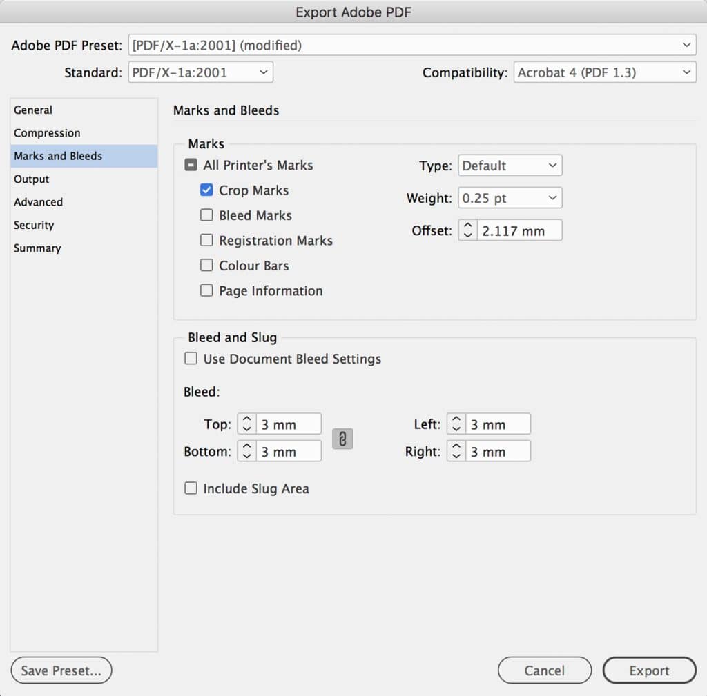
You can print a PDF magazine on your Mac by simply sending the PDF file to your printer via email. Ensure your file complies with the printer's specifications, including correct dimensions, bleed settings, a back cover design, and color encoding, to avoid unprinted edges. It is best to confirm these details with your printer before initiating the print.
Print guides · Magazines
EEx Why Zed·12 min read·Updated July 2026
Key Highlights
✓Magazine printing costs in the UK are mainly influenced by page count, paper stock, binding style, print quantity, and production method.
✓Digital printing is more cost-effective for short runs, while offset printing delivers lower per-unit pricing at higher volumes.
✓Premium finishes, heavier paper, and custom sizes can significantly increase production and distribution costs.
✓Bulk print runs usually reduce magazine printing cost per page by spreading setup expenses more efficiently.
✓Careful production planning helps businesses lower print spend without compromising presentation quality or reader experience.
✓Additional expenses such as proofing, rush production, and shipping are often underestimated during budgeting.
✓Standard formats like A4 and A5 typically provide better production efficiency and lower operational costs.
✓Ex Why Zed helps businesses optimize magazine production through strategic print planning, material selection, and cost-efficient printing solutions.
Magazine printing costs in the UK vary considerably depending on page count, paper stock, quantity, binding, and production method. A short-run digitally printed A5 magazine carries very different production costs from a high-page glossy publication produced using offset printing, yet many businesses underestimate how quickly specifications influence the final quote.
Understanding how commercial print pricing is calculated is far more valuable than simply chasing the cheapest quote.
Premium paper stocks, heavier pagination, and speciality finishes increase production costs quickly, particularly when combined with tight turnaround schedules. Many businesses also underestimate setup, proofing, and distribution charges during early budgeting discussions.
This guide explains what drives production costs, where unnecessary spending typically occurs, and how to control budgets without sacrificing presentation quality or production standards.
The numbers
What Is the Average Cost to Print a Magazine in the UK?
Magazine printing costs in the UK typically range from £0.30 to £3.50 per copy, depending on quantity, page count, paper stock, binding, and production method. A short-run digitally printed magazine will usually cost far more per unit than a large-volume offset print run, where setup costs are spread across thousands of copies.
Magazine Type
Typical Cost Per Copy
5,000-copy A5 promotional magazine, saddle-stitched, standard paper
£0.30–£0.50
1,000-copy A4 business magazine with coated paper
£0.50–£1.20
500-copy lifestyle or retail magazine with premium paper
£1.20–£2.50
100-copy glossy magazine with perfect binding and specialist finishes
£2.50–£3.50+
Production specifications influence pricing quickly. Page count, paper weight, cover finish, and binding style all affect material usage and press time, while premium options such as gloss lamination, heavier cover stocks, and perfect binding increase costs further.
Average Magazine Printing Prices by Quantity
Print volume has one of the strongest effects on unit pricing because setup costs remain relatively stable regardless of order size. Larger print runs reduce the magazine printing cost per page by spreading production expenses more efficiently across the total quantity.
Quantity
Price per Unit
Total Cost
100
£2.45
£245
500
£0.69
£346
1,000
£0.44
£440
5,000
£0.28
£1,389
For businesses producing regular issues or large promotional runs, bulk printing typically delivers stronger long-term value than repeatedly ordering smaller batches. As quantities increase, the cost per copy falls significantly, making larger print runs considerably more economical.
Cost drivers
Why Do Magazine Printing Costs Vary So Much?
Magazine printing costs are shaped primarily by production decisions rather than the printing process itself. Paper quality, page count, binding style, print quantity, and turnaround requirements all influence material usage, press time, finishing complexity, and delivery costs.
Format, paper and finish decisions are what move the price — not the press itself.
Cost Factor
Lower-Cost Option
Higher-Cost Option
Impact on Budget
Printing Method
Digital printing
Offset printing
Offset becomes more economical at higher volumes
Paper Stock
Uncoated or silk paper
Heavy gloss paper
Premium paper increases material and shipping costs
Binding
Saddle stitching
Perfect binding
Premium binding increases production time
Magazine Size
A5
A4 or custom sizes
Larger formats require more paper and ink
Quantity
Bulk print runs
Small print runs
Lower quantities increase unit costs
Turnaround Time
Standard production
Rush printing
Faster production raises operational costs
01
Paper Types and Their Costs
Paper choice directly impacts both print quality and overall magazine printing costs. Heavier stocks and premium finishes increase material, production, and shipping expenses, particularly for larger publications.
Most magazines use 130gsm gloss paper for interior pages because it delivers strong image quality without excessive weight, while a 170gsm gloss cover provides durability and a more professional finish.
Gloss paper enhances colour vibrancy and image sharpness, silk stock balances print quality with readability, and uncoated paper offers a more natural editorial feel.
02
How Printing Method Influences Cost
Digital printing is generally more cost-effective for short runs because it avoids the setup requirements associated with offset production. This makes it suitable for smaller quantities, limited editions, and projects with faster turnaround expectations.
Offset printing carries higher setup costs initially, but unit pricing decreases substantially as print volumes increase, making it more efficient for large-scale distribution and recurring publications.
In most cases, the choice between digital and offset printing depends less on quality and more on quantity, production timelines, and distribution scale.
03
Binding, Size, and Page Count Costs
Binding style affects both production cost and presentation quality. Saddle stitching remains the most economical option for thinner magazines and promotional booklets, while perfect binding creates a more premium spine finish suitable for higher page counts.
Magazine size and pagination also directly influence pricing, as larger formats require more paper, ink, and finishing time.
Many businesses unnecessarily increase production costs by expanding page counts or selecting oversized formats without proportionally improving usability or reader engagement.
04
Quantity and Volume Pricing
Print quantity has one of the strongest effects on unit pricing because production expenses are distributed across the total order. Larger print runs reduce the cost per magazine significantly, particularly when offset printing is used for commercial-scale production.
For publishers producing recurring editions, consolidating print runs usually delivers far better long-term value than repeatedly ordering smaller batches at higher unit costs.
Production quotes often exclude expenses that appear later in the process. Proofing, artwork corrections, specialist finishes, expedited turnaround times, pallet delivery, storage costs, mailing fulfilment services, and VAT can all increase the final print bill beyond the original quote.
File preparation can also create unexpected costs. Low-resolution images, incorrect artwork settings, and poor-quality print files often require additional pre-press work before production can begin. Understanding what DPI is and how it affects print quality helps reduce correction costs, avoid production delays, and ensure artwork is suitable for professional printing.
Shipping is another commonly underestimated expense. Heavier paper stocks, larger formats, and higher print quantities can increase distribution costs significantly, particularly for nationwide circulation or direct mail campaigns.
Planning for these secondary costs early helps businesses budget more accurately and avoid unexpected increases later in the printing process.
Save money
How Can Businesses Reduce Magazine Printing Costs Without Sacrificing Quality?
Reducing magazine printing costs usually depends more on production efficiency than on cutting quality. Businesses that plan specifications carefully, standardise formats, and manage print volumes strategically often lower production spend significantly without affecting presentation standards or reader experience.
1
Choose Standard Sizes and Specifications
Standard magazine sizes such as A4 and A5 are usually more cost-effective because printers can fit them efficiently onto standard paper sheets, reducing material waste during production. Custom sizes often create additional paper offcuts, increase setup complexity, and can require more manual finishing, all of which increase print costs.
Choosing a standard format often delivers the best balance between cost efficiency, professional presentation, and production speed, which is why understanding good print sizes for different types of printed projects before production begins can help avoid unnecessary costs later.
2
Print Larger Quantities Strategically
Larger print runs reduce unit pricing by distributing production expenses more efficiently across the total order. For publishers producing recurring editions, consolidating print runs usually delivers far better long-term value than repeatedly ordering smaller batches at higher per-unit costs.
Accurate forecasting is essential, however. Overprinting can create unnecessary storage and distribution expenses that offset production savings.
3
Reduce Unnecessary Finishing
Specialist finishes such as foil stamping, spot UV, embossing, and custom die-cuts increase production costs quickly, particularly on larger print runs. While these additions can improve visual impact, they are not always necessary for a magazine to feel premium.
In many cases, strong typography, high-quality imagery, and well-selected paper stock create a more effective reader experience than excessive finishing effects.
4
Optimise Page Counts Carefully
Pagination directly affects paper consumption, ink usage, binding requirements, and postage weight. Even relatively small page reductions can lower production costs noticeably across larger print quantities.
Most commercial magazine formats also require page counts in multiples of four, so inefficient pagination can lead to unnecessary blank space or additional production waste.
5
Plan Production Timelines Early
Short turnaround times frequently increase production pricing because expedited printing disrupts scheduling, staffing, and delivery logistics. Rush orders also reduce flexibility for proofing, revisions, and quality checks.
Businesses that finalise artwork early and schedule production in advance usually benefit from lower operational costs, smoother delivery timelines, and fewer last-minute corrections during the print process.
Print Quantity
Cost Efficiency
Small Runs
Higher unit pricing
Medium Runs
Balanced production costs
Large Runs
Lowest cost per copy
Businesses that control specifications strategically rather than cutting quality outright usually achieve the best balance between cost efficiency, production standards, and long-term print value. Careful decisions about sizing, pagination, quantities, finishing, and scheduling can significantly reduce unnecessary spend while still delivering a professional magazine that effectively reflects the brand.
Digital vs offset
Should You Choose Digital or Offset Magazine Printing?
The choice between digital printing and offset printing affects more than just production cost and magazine design alone. Print volume, turnaround expectations, colour consistency, and distribution scale all influence which method delivers better long-term value.
Printing Method
Best Suited For
Main Advantage
Main Limitation
Digital Printing
Small print runs
Lower setup costs and faster turnaround
Higher unit pricing at larger volumes
Offset Printing
High-volume production
Lower per-copy cost and colour consistency
Higher upfront setup expense
01
When Digital Printing Makes More Sense
Digital printing is usually the most practical option for short-run magazines, promotional booklets, event publications, or test editions. Because setup requirements are minimal, smaller quantities can be produced efficiently without committing to large production volumes.
Smaller print quantities
Faster turnaround times
Personalised or variable content
Limited-edition campaigns
Lower upfront production spend
02
When Offset Printing Becomes More Economical
Offset printing becomes substantially more cost-effective as production volumes increase. Although initial setup expenses are higher, unit pricing decreases sharply across larger print runs, making it more efficient for commercial-scale publishing.
High-volume magazine production
Strong colour consistency
Sharper image reproduction
Recurring publication runs
Lower per-unit pricing at scale
03
Which Option Delivers Better Long-Term Value?
Long-term value depends largely on print frequency, distribution scale, and production volume. Businesses producing recurring high-volume editions generally benefit more from offset printing, including zine printing, because lower unit pricing creates substantial savings over time.
In many cases, the most cost-efficient strategy combines both methods, using digital printing for shorter test runs and offset production for larger commercial distribution.
How Can Ex Why Zed Help Reduce Magazine Printing Costs?
Magazine printing costs are heavily influenced by production planning, material selection, and print efficiency. Decisions about page count, paper stock, interior pages, sizing, binding, and print quantities can quickly increase operational spend when not managed strategically.
ExWhyZed helps businesses reduce unnecessary print costs by recommending specifications that balance presentation quality with commercial efficiency.
✓Cost-effective digital and offset printing solutions
✓Guidance on magazine sizes, paper stocks, and finishes
✓Short-run and bulk printing options based on project scale
✓Professional support with print-ready artwork and formatting
✓Production planning that reduces waste and avoidable costs
✓Reliable turnaround scheduling and delivery coordination
Whether producing a small independent publication or a large commercial magazine run, efficient production management helps control budgets while maintaining strong print quality and presentation standards.
Magazine printing costs in the UK are influenced by multiple production factors, including print quantity, paper stock, pagination, binding, and turnaround expectations. Smaller print runs generally carry higher unit pricing, while larger commercial volumes benefit from stronger production efficiency and lower long-term costs. Understanding how these elements affect pricing ultimately helps businesses improve their bottom line and make more informed budgeting and production decisions before printing begins.
Reducing magazine printing costs does not require compromising on presentation quality. Strategic decisions around sizing, finishes, booklet printing methods, and scheduling often improve cost efficiency far more effectively than cutting materials or reducing print standards. Businesses that plan production carefully usually achieve better operational control, more predictable pricing, and stronger long-term value from their magazine printing projects.
FAQ
Frequently Asked Questions
Magazine printing costs in the UK typically range from £0.30 to over £3.50 per copy, depending on print quantity, page count, paper quality, binding style, and production method.
Cost magazine printing in the UK typically ranges from under £1 to several pounds per copy, depending on print quantity, paper stock, binding style, pagination, and production method.
Yes, cheap magazine printing options are available in the UK, especially for standard A5 or A4 formats, bulk print runs, and digitally printed short-run magazines with fewer premium finishes.
Magazine printing prices in the UK are mainly influenced by the quantity of magazines ordered, page count, paper quality, binding style, magazine size, finishing options, turnaround time, and whether digital or offset printing is used for your PDF file.
Affordable UK-based magazine printers often include companies specialising in short-run digital printing, including high quality options for a test print, bulk offset production, or independent publishing support. The best option usually depends on print quantity, turnaround requirements, paper quality, and whether you need premium finishes or budget-focused production.
Glossy magazine printing cost is usually higher because gloss paper and laminated finishes increase material usage, ink vibrancy requirements, and overall production expenses, especially for larger page counts.
Printing magazine service cost is mainly influenced by quantity, paper quality, binding type, turnaround speed, and whether digital or offset printing is used for production.
The cost of printing Birmingham magazine varies depending on local print suppliers, delivery requirements, production scale, and whether businesses require short-run or bulk printing services.
Business magazines usually cost more to print because they often use higher page counts, premium paper stocks, heavier cover options, specialist finishes, and larger print volumes for the best results. Personal or independent magazines generally use simpler specifications and smaller quantities to keep production costs lower.
Yes, same-day magazine printing is usually more expensive in the UK because rush production disrupts standard scheduling, increases operational pressure, and often requires expedited finishing, handling, and delivery services.
When you fall in love with a piece of digital art or find a breathtaking image online, you naturally want to see it hanging on your walls or printed on your favorite book. But merely hitting the print button isn't enough—selecting the optimal file format for printing is crucial to unlock your digital masterpiece's vibrant, striking display.
Additionally, your printer's compatibility with the file format chosen is paramount. Choosing wrongly may result in a below-par print and technical difficulties that could have been easily avoided.
This blog will help you learn about various formats, including JPEGs, PNGs, TIFFs, and PDFs, comparing their strengths and pitfalls in printing. Whether you're giving your living room a facelift or your workspace a new vibe, picking the right file format is indispensable to bringing your digital finds to life, just as you imagine them.
What Are File Formats in Digital Art?
When printing digital art, the file format is crucial for maintaining quality. Formats like JPEG, PNG, TIFF, and PDF each have unique strengths in preserving color, sharpness, and detail. Think of it like choosing the right frame for a painting – the right format enhances your art when printed.
Raster vs. Vector: What’s the Difference?
Raster images consist of pixels, and enlarging them can lead to pixelation. JPEGs are a standard raster format, but repeated saving can degrade quality due to compression.
Meanwhile, Vector images use geometric shapes, maintaining quality no matter how large they are scaled. Formats like EPS and PDF are ideal for large prints, keeping the image crisp.
No matter the format you choose, Ex Why Zed has you covered. Our advanced digital printing setup ensures each file—be it a detailed TIFF or a sharp PDF—translates seamlessly from screen to print. With expert handling and an artist-first approach, ExWhyZed helps bring your digital art to life exactly as you imagined.
Why File Format Matters?
The right file format ensures your print stays true to your digital art. It preserves details, colors, and sharpness, and ensures compatibility with printing devices. Choosing poorly can result in technical issues and disappointing quality, while the right format delivers a vibrant, accurate print.
What Are Some Best File Types for Printing Digital Art?
The file format utilized can significantly influence the output when translating your digital art from the screen to paper for print. Here, we'll break down the four leading players in the world of digital art printing: JPEG, PNG, TIFF, and PDF. This will help you decide best file for printing art for your next project.
1. JPEG (Joint Photographic Experts Group)
JPEG is a widely used image format for digital photos and web graphics. It uses lossy compression, meaning that some image data is discarded to reduce file size, which makes it ideal for sharing and online use.
Pros:
Efficient Compression: JPEG compresses images well, making file sizes smaller and perfect for online sharing and storage.
Widely Supported: Almost all devices and software support JPEG, making it an easily accessible format for both personal and professional use.
Quick Transfers: JPEGs are ideal for fast transfers and emailing due to smaller file sizes.
Cons:
Loss of Quality: Lossy compression can reduce image quality, especially when the file is enlarged for printing.
Artifacts: Repeatedly saving a JPEG file can introduce compression artifacts, which distort image quality.
Pixelation: Enlarging JPEG images too much can lead to pixelation or blurriness, making them less suitable for large-scale prints.
2. TIFF (Tagged Image File Format)
TIFF is preferred for high-quality prints, particularly among professional photographers and publishers. Unlike JPEG, TIFF uses lossless compression, preserving every detail of an image.
Pros:
High-Quality Detail: TIFF maintains all the image data without sacrificing quality, ensuring that the colors and details are preserved.
Non-Lossy Compression: TIFF offers optional lossless compression, meaning no data is lost during the compression process.
Archival Quality: TIFF is an excellent choice for archiving images that need to maintain long-term quality over time.
Cons:
Large File Size: Due to its lossless nature, TIFF files can be huge, making them more challenging to share and store.
Limited Compatibility: Not all devices or software support TIFF, which can cause issues with accessibility, especially in casual or web use.
3. PDF (Portable Document Format)
PDF is a versatile format often used for documents and graphics. It excels at preserving the original layout and design, making it a reliable choice for professional printing.
Pros:
Consistent Layout: PDFs retain the original layout, fonts, and colors, ensuring that your print design looks strictly as intended.
Universal Compatibility: PDF is one of the most universally accepted formats, making it easy to share and open across various platforms and devices.
Professional Standard: It’s widely used for professional print jobs and offers high-quality output without altering the design.
Cons:
Editing Challenges: Editing a PDF file can be complex, especially if you need to change the original content.
Large File Sizes: High-resolution PDFs can become large, making them difficult to email or upload.
Limited Transparency Support: While PDF can handle complex designs, it’s less flexible with transparency than other formats, like PNG.
4. PNG (Portable Network Graphics)
PNG is commonly used for web graphics and images requiring transparency. Unlike JPEG, PNG uses lossless compression, ensuring no image quality is lost during compression.
Pros:
High Image Quality: PNG supports high-quality images with better detail and clarity than JPEG, making it ideal for graphics and illustrations.
Transparency Support: PNG supports transparent backgrounds, making it perfect for logos, icons, and other graphic elements that require flexibility.
Lossless Compression: PNG retains all the original image data, preserving the integrity of the image.
Cons:
Larger File Sizes: PNG files are typically larger than JPEGs, which can be an issue for storage and sharing, especially for high-resolution images.
Compatibility Issues: Some older systems and software may have trouble with PNG files, especially for printing purposes.
Not Ideal for Photographs: PNG is best suited for graphics, logos, and illustrations, but due to its larger file sizes, it may not be the best choice for large photographic images.
Digital Art File Format Comparison Table
Having discussed the various digital art file formats and their pros and cons, let's now compare them more simply in the table below.
What Are the Best Practices for Printing Digital Art?
Printing digital art is not a one-click process. It requires attention to detail and familiarity with file formats and printing techniques. Adopting best practices can help ensure each piece you print is as vibrant and impressive as intended. Let’s explore these practices.
1. Formatting Art for Print
A well-prepared file makes a big difference in the final print quality. Here’s how you can set up your files for the best results:
Set the Correct Resolution: Aim for at least 300 DPI for a sharp print. This ensures the image remains crisp and clear, even at larger sizes.
Choose the Right Color Profile: Using the CMYK color profile is essential. It ensures the colors on paper match what you see on screen, reducing color shifts.
Balance Quality and File Size: High-resolution images are great, but large files can be difficult for online printing services with file size limits. Optimize your images to balance quality and file size.
2. Maintaining Quality in Print
To keep your prints looking their best, consider these tips:
Test Print: Always run a small test print. It lets you check how colors and details translate from screen to paper.
Use Professional Services: Professional printing services like Ex Why Zed have the tools and expertise to handle detailed files and provide guidance on achieving the best results. To get an estimate, request a quote from us now!
Preview Your Files: Preview your files in the format you plan to print. Before printing, spot any adjustments like color, alignment, or layout changes.
Choose the Right Paper: The type of paper you use affects your print. Glossy paper is great for vibrant photos, while matte paper gives prints a softer, textured look. At ExWhyZed, you can choose numerous options, from coated, uncoated, shiny, glossly, and much more. Just tell us your requirement and we are good to go!
Print Your Digital Art Perfectly with Ex Why Zed
When printing your digital art, Ex Why Zed is the trusted partner you need. We specialize in turning your digital files into vibrant, high-quality prints that preserve every color, texture, and detail. ExWhyZed ensures your artwork is prepared with the right resolution, color profiles, and file optimization for flawless results.
Whether you’re printing limited editions or personal pieces, they provide expert support to ensure your digital art looks as stunning on paper as on-screen. Trust us to bring your digital art to life with professional, top-notch prints. Contact us right away!
Conclusion
Printing digital art is more than just hitting print—it’s about choosing the right file format to make your artwork shine. Whether you’re an artist prepping for an exhibition or a hobbyist printing personal pieces, knowing what each format offers is key.
JPEG is great for quick prints, while PNG is perfect for transparency and crisp detail. TIFF delivers high-quality, archival prints, and PDF ensures your work stays true across platforms.
Picking the right format helps bring your digital art to life, preserving its vibrancy from screen to paper. Apply these tips to your next project and watch your art transform into stunning prints. Happy printing!
Frequently Asked Questions
Which file format is most commonly used for print projects?
PDF is the most widely accepted and reliable file format for everyday printing needs. It keeps all aspects intact—fonts, colors, images, and layouts. Hence, what you see on your screen is precisely what you'll get in print.
How do I decide between JPEG and PNG for printing?
If fine details and color ranges are your priority, PNG wins over JPEG. However, with JPEG's superior compression quality and smaller file size, it's a sensible choice for casual prints or situations where quick sharing and efficient storage matter more than supreme quality.
Can using an incorrect file format impact the print quality?
Absolutely! An unsuitable file format can lead to loss of detail, misaligned layouts, or color mismatches. It’s crucial to match the file format with the specific needs of your project to ensure the print reflects your vision accurately and brilliantly.
What is the best type of print for digital art?
The ideal print type for digital art depends on the demands of the artwork. TIFF is an exemplary choice for professional quality and archival prints. However, JPEG and PNG offer practicality for everyday prints, while PDF ensures layout consistency for complex designs.
Choosing the right magazine size can make or break your publication’s appeal. The dimensions you select influence not only the visual impact but also the functionality, cost, and overall reader experience. Thus, the size of your magazine is a key part of its identity—it influences how your content is presented and perceived.
Your chosen dimensions, whether compact or large, play a key role in engaging your audience and shaping the reading experience. Different sizes have distinct advantages, shaping your publication's design and experience.
In this blog, we’ll examine the standard magazine dimensions, offering insights into what works best for various types of content. We’ll also explore how choosing the right size can elevate your magazine and make it stand out on the shelf.
What Are the Common Magazine Sizes and Formats?
Magazine sizes vary based on geography, audience preferences, and content type. Smaller formats are more portable, while larger ones provide ample space for detailed visuals and text. There are common US dimensions, European dimensions, and custom dimension options available in the market.
Common US Magazine Dimensions
The typical magazine size in the United States is a letter size, measuring 8.5 by 11 inches. However, other common US magazine dimensions are also gaining popularity due to their unique advantages. Check out the table below to see the most common US Magazine dimensions:
Portrait
Landscape
Square
3.5" x 8.5"
6" x 4"
5.5" x 5.5"
4" x 6"
8.5" x 5.5"
8.5" x 8.5"
4.25" x 11"
11" x 8.5"
5.5" x 8.5"
6" x 9"
8.5" x 11"
European Size Standards for Magazines
Like in the US, European publishers use a range of sizes too. A crucial factor to appreciate here is the consistent proportion followed among the A series formats, where cutting an A4 sheet in half gives two A5 sheets, each maintaining the same aspect ratio. Let's examine the most commonly used dimensions in European magazines:
European Magazine Format
Dimensions (in mm)
DIN A4
210mm x 297mm
DIN A5
148mm x 210mm
DIN A6
105mm x 148mm
Special Sizes and Custom Dimensions
Apart from the standard sizes, magazines are available in special sizes and custom dimensions. These magazine templates are popular for niche publications or those dealing with artistic subjects that push the boundaries of creativity. Square formats are particularly prevalent among such unique content.
The options vary greatly, from pocket-friendly digests to larger broadsheets. Looking to match the size of your favorite magazine? Ex Why Zed has got you covered. Whether it's the refined proportions of Vogue UK, the soft minimalism of Kinfolk, or the compact creativity of Monocle, we can print it—all from just one copy.
Seen something square like Creative Review? Sure, we can do that too—but heads up: that size runs on our larger presses and can get a bit pricey if you're ordering under 700 copies. Want the same vibe without the sting? Scale it down to 210x210mm and keep it cost-effective.
Planning a bigger run? Let’s talk smart choices. The 280x220mm format (like Grand Designs or Elle Decoration) hits the sweet spot—big on visual impact, easy on production. Whatever you’re inspired by, we’ll help you create something just as iconic.
What Are Some Custom Magazine Print Size Options?
1. Digest size: 5.5 by 8.25 inches
The digest size, 5.5 by 8.25 inches, is popular for compact magazines, newsletters, and shorter publications. Its small footprint makes it cost-effective and easy to handle, perfect for readers on the go. With less binding material required, it’s an economical and convenient option for publishers and consumers.
2. Half letter size: 8.5 by 5.5 inches
The half-letter size, measuring 8.5 by 5.5 inches, is ideal for niche publications. Offering a balance between space and portability, it’s perfect for readers interested in specific topics. This format is incredibly convenient for collectors, as it’s easy to store while providing ample content space.
3. Letter size: 8.5 by 11 inches
The letter size (8.5 by 11 inches) is the standard magazine printing size in the U.S., favored by many publishers for its ample space for content and visuals. While it offers generous dimensions, this size can be more expensive due to higher material and postage costs.
4. A4 size: 8.3 by 11.7 inches
The A4 size, 8.3 by 11.7 inches, is widely used, especially in Europe. It strikes an ideal balance between space and portability, offering plenty of room for content while fitting comfortably into most bags. This size is perfect for general interest magazines, appealing to a broad audience.
5. Square sizes: 5.5 by 5.5 inches or 8.5 by 8.5 inches
Square magazines, often seen in lifestyle and fashion publications, offer a unique visual appeal. Commonly 5.5 by 5.5 or 8.5 by 8.5 inches, their distinct shape makes them stand out on shelves, providing readers with a fresh experience. However, their unconventional format typically comes with higher production costs compared to traditional rectangular magazines.
6. Broadsheet size: 22.5 by 35 inches
The broadsheet size (22.5 by 35 inches) is the largest standard magazine format, often favored for artistic and specialty publications. However, it presents challenges in terms of production costs and reader convenience; its unique, large-scale format appeals to audiences who value a distinctive and immersive reading experience.
7. Tabloid size: 11 by 17 inches
The tabloid size (11 by 17 inches), offering double the space of a standard letter-sized magazine, is popular among publishers in entertainment and celebrity genres. Its larger canvas allows for more content and striking visuals. However, the downside is its bulk, making it less convenient to hold while reading. Read more about this size in our Newspaper size articles.
What Are Some Magazine Binding Options?
Choosing the right binding option becomes crucial for a professional finish to your publication. From saddle-stitching and perfect binding to wire-o options, there's plenty to choose from depending on your budget, page count, and style preference.
Here are key differences between the three:
Saddle Stitching: A cost-effective and quick binding method that is ideal for small magazines or brochures. It uses two staples to bind the pages along the spine, providing a compact and durable finish.
Wire-O Binding: Offers a professional appearance with a clean and organized look. This binding type is known for its durability and allows pages to lie flat and rotate 360 degrees, making it ideal for reference materials and manuals.
Perfect Binding: Provides an upscale, book-like feel with a strong glue-based binding. Perfect for larger publications like magazines or catalogs, it offers a polished, high-end appearance with a durable finish.
Once you've chosen the right binding—whether it’s the sleek, premium feel of perfect binding or the classic simplicity of saddle stitching—the rest should be smooth sailing. With Ex Why Zed's Magazine Services, we make the process hassle-free. Just upload your PDF, and our team will handle the technicalities, from free file checks to lightning-fast delivery. Need a quick turnaround? We can have stapled magazines delivered to you in just 3 days.
Plus, with instant pricing, free paper samples, and hands-on support from real people, you’re not just getting a print service—you’re getting a partner who makes your magazine look and feel its best.
How Thick Should Your Magazine Be?
The thickness or length of a magazine can vary broadly from an eighth of an inch to as much as three centimeters. This primarily depends on the page count, which varies greatly among different publishers and issues. It is worth noting that a magazine's dimensions significantly impact its readability, portability, and production costs.
Print Your Magazine in the Perfect Size with Ex Why Zed
Your magazine deserves to stand out—and Ex Why Zed makes that happen with a full spectrum of format options. Whether you’re going for a sleek portrait design, a bold landscape layout, or a modern square finish, we offer the flexibility to match your creative vision.
Every magazine is printed with sharp detail, vibrant colors, and professional binding. With us, you’re not just picking a size—you’re choosing how your story is told. Contact us now and make your magazine worth publishing!
Conclusion
Magazines are a powerful medium for sharing information, sparking creativity, and engaging readers. While often overlooked, a magazine's size and format are crucial elements that influence how readers experience its content. Magazine companies offer a variety of sizes, from compact digests to expansive broadsheets, tailored to specific content and audience needs.
Selecting the right size and format also allows publishers to craft a visually compelling product that resonates with readers. While understanding standard sizes is a great starting point, modern printing technology offers endless customization possibilities to achieve a professional look. We hope this blog helps you navigate your magazine’s journey, whether refining your format or exploring new dimensions.
Frequently Asked Questions
What Is the Average Size of a Magazine Cover?
Typically, a standard magazine cover in the US measures 8.5 inches by 11 inches. But for publications like Vogue, it usually measures 9.5 inches by 12 inches.
How to Choose the Best Magazine Size for Your Project?
The optimal size choice should ideally depend on the type of content, the target audience, production costs, and the physical convenience for readers to carry and read.
What are the most common print magazine sizes?
The most common print magazine sizes generally include 8.5×11 inches and 5.5×8.5 inches. The European standard measures often use formats like A4, A5, and A6.
How Do You Measure the Size of a Magazine?
A magazine's size is measured by its width and height in inches or millimeters. These measurements are typically established in the initial stages of design and layout.
Printing in the USA: Where Craftsmanship Meets Innovation
In an increasingly digital world, the power of the printed page has never been more profound. From the satisfying weight of a perfectly bound book to the vibrant clarity of fine art reproductions, exceptional printing creates multi-sensory experiences that digital media simply cannot replicate. At Ex Why Zed, we've mastered the delicate balance between traditional craftsmanship and cutting-edge technology, establishing ourselves as America's premier printing partner for those who refuse to compromise on quality.
Our journey across the American printing landscape has revealed a fundamental truth: when visionary clients collaborate with passionate print specialists, ordinary ideas transform into extraordinary physical realities. Whether you're an author preparing to share your literary creation, a church seeking to inspire your congregation, a nonprofit amplifying your mission, or an artist reproducing your masterpiece, our sophisticated approach to printing in the USA ensures that each project receives the technical precision and creative insight it deserves.
Self-Publishing Book Printing: Bringing Literary Dreams to Life
The journey from manuscript to published book represents one of the most profound creative transformations. For authors navigating the self-publishing path in the USA, finding the right printing partner can make all the difference between an ordinary book and an extraordinary literary artefact.
Our innovative solutions for self-publishing authors encompass every aspect of book production encompass every aspect of book production, from paper selection that complements the narrative tone to binding techniques that ensure longevity and readability. We understand that a book is not merely a container for words—it's a physical extension of the author's vision, demanding meticulous attention to every detail.
Through our bespoke approach to printing in the USA for independent authors, we've helped countless literary voices find their physical form. Each project receives our signature blend of technical precision and creative insight, resulting in books that stand proudly on shelves and in readers' hands. The tactile experience of holding a beautifully crafted book creates an immersive connection between author and reader that digital formats simply cannot replicate.
Church Printing Services: Elevating Faith Through Quality Materials
Religious communities across America rely on printed materials that reflect the dignity and significance of their message. Our church printing services address this need with reverence and understanding, delivering materials that support congregations in their spiritual missions.
When partnering with religious organisations for printing in the USA, we approach each project with an appreciation for both tradition and contemporary communication needs. From weekly bulletins that keep congregations informed to commemorative materials that mark significant milestones, our print solutions combine accessibility with aesthetic appeal.
The relationship between content and presentation becomes particularly meaningful in religious contexts, where the medium often reinforces the message. Our careful selection of papers, finishes, and binding methods ensures that devotional materials, educational resources, and administrative documents alike convey the appropriate sense of reverence and professionalism. Through these thoughtful choices, we help churches create cohesive, engaging materials that strengthen community bonds and support their spiritual work.
Nonprofit Printing Services: Maximising Impact Through Effective Communication
For nonprofit organisations operating with limited resources and ambitious goals, effective print communication represents a critical investment. Our nonprofit printing services throughout the USA help these vital organisations extend their reach and amplify their message without compromising on quality or sustainability.
We recognise that every printed piece must work hard for nonprofits, often serving multiple purposes from education to fundraising. By applying strategic thinking to print decisions, we help these organisations achieve maximum impact while maintaining fiscal responsibility. Our experience with printing in the USA for the nonprofit sector has taught us the delicate balance between visual appeal and cost efficiency—a balance we strike with precision on every project.
From compelling annual reports that showcase accomplishments to direct mail campaigns that inspire action, our print solutions help nonprofits tell their stories with clarity and emotional resonance. The tangible nature of printed materials creates lasting impressions that digital communications alone cannot achieve, making them invaluable tools for organisations seeking to build lasting relationships with supporters and beneficiaries alike.
Artist and Photographer Printing Services: Reproducing Vision with Uncompromising Fidelity
Perhaps nowhere is the quality of printing more scrutinised than in the reproduction of visual art. Artists and photographers entrust us with their creative expressions, knowing that our approach to printing in the USA matches their own commitment to excellence and authenticity.
The relationship between artist and printer is one of profound collaboration, requiring technical expertise and aesthetic sensitivity in equal measure. Our team works closely with visual creators to understand the nuances of their work, from colour palettes to textural elements, ensuring that reproductions honour the original vision with striking accuracy.
Through our artist and photographer printing services, we've helped countless creatives share their work through exhibition catalogues, portfolios, and limited-edition prints. Each project receives our signature attention to detail, with careful calibration of colours, thoughtful paper selection, and precise finishing techniques that elevate the final product beyond mere reproduction to become an artistic object in its own right.
The Ex Why Zed Difference in American Printing
What distinguishes Ex Why Zed in the competitive landscape of printing in the USA is our unwavering commitment to both technical excellence and customer satisfaction. We view each project not as a transaction but as a creative partnership, investing our expertise and passion into every piece that leaves our facility.
Our approach combines sophisticated technology with artisanal care, ensuring consistency and quality across projects of every scale. From the initial consultation through to delivery, we maintain transparent communication and responsive service, adapting to changing needs and timelines with professional flexibility.
The transformative potential of exceptional printing extends beyond the physical product to encompass the entire experience of working with a printer who truly understands your vision. By choosing Ex Why Zed for printing in the USA, our clients gain not just a service provider but a dedicated ally in bringing their ideas to life with intelligence, creativity, and uncompromising quality.
As we continue to expand our presence in printing in the USA, we remain steadfast in our commitment to excellence and innovation. The digital age has not diminished the importance of print but rather highlighted its distinctive value as a medium that engages multiple senses and creates lasting impressions.
Whether you're an author ready to share your story with the world, a church seeking to strengthen your community through meaningful materials, a nonprofit working to change lives, or an artist reproducing your creative vision, Ex Why Zed stands ready to transform your ideas into exceptional printed realities. Experience the difference that truly outstanding printing in the USA can make for your next project.
An informative 5 minute read.
At Ex Why Zed, we understand that printing a zine is more than just producing a publication—it’s about bringing a creative vision to life with precision, quality, and a deep understanding of the message it conveys. Zines are unique, personal expressions of art, culture, identity, and activism. Whether you’re aiming to self-publish a zine, create a perfect bound zine, or produce an eye-catching stapled zine, we are here to guide you through the journey, from the first spark of creativity to the final printed masterpiece. Our expertise lies not just in the technical aspects of zine printing, but also in helping creators preserve the essence of their vision, ensuring it resonates through every page.
To help you make informed print choices when you self-publish a zine, we’ve analysed and dissected a series of recent zine printing projects that highlight how different binding methods, paper choices, and design considerations come together to create exceptional zines. Whether you are producing an A5 zine, exploring perfect binding for a polished finish, or opting for a stapled zine for a raw, DIY feel, the following case studies will offer valuable insights into how you can elevate your zine with thoughtful, expert printing. From bold political statements to dynamic art and music explorations, each project reveals the creative potential of zine printing and how Ex Why Zed brings these ideas to life with care and craftsmanship.
Prefer to watch rather than read? Enjoy our Zine Printing Showcase video
Zine Printing Ideas
Let’s dive into the journey of these incredible zines and discover how we helped each project achieve its unique impact through expert printing solutions.
Burnt Roti Issue 5: Provocative Design with a Political Edge
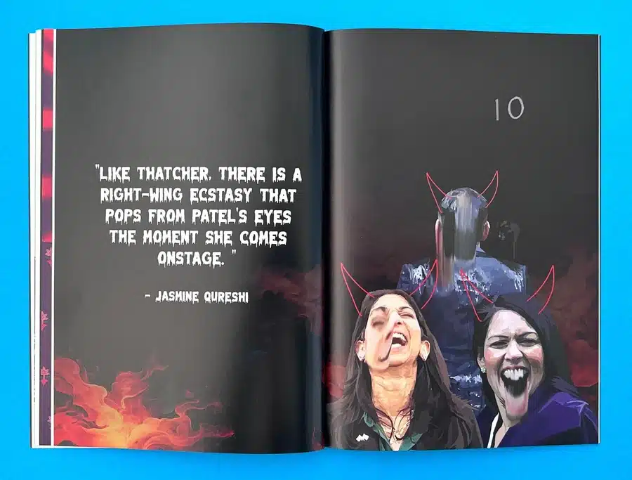
The journey with Burnt Roti Issue 5 was a testament to the power of zine printing in delivering a bold, unflinching narrative. This zine tackles complex issues surrounding British-Asian identity politics, combining fierce political commentary with striking design elements. The cover alone—a vivid, provocative illustration featuring prominent political figures—sets the tone, while the choice of perfect bound zine ensures that the publication has a durable, professional finish while staying true to its rebellious spirit.
From the matte lamination on the cover to the 115gsm silk inner pages, Burnt Roti Issue 5 offers a tactile contrast that enhances the experience. The distressed typography and high-quality full-colour illustrations speak volumes about the zine’s theme of defiance against the status quo. The perfect binding method, paired with Ex Why Zed’s precision in colour printing, allowed for a premium finish that didn’t dilute the raw energy of its content. This project highlights how thoughtful paper and binding choices—coupled with technical advice and collaborative spirit—bring out the zine’s full potential.
So Young Magazine Issue 50: Celebrating Music and Culture
When So Young Magazine reached its 50th issue, Ex Why Zed was there to support them in producing a staple bound zine that not only celebrated the magazine’s milestone but also showcased the energy and vibrancy of the independent music scene. Featuring dynamic photography, bold typography, and an eclectic mix of artists, this issue was designed to resonate with music lovers and culture enthusiasts alike.
The custom 245x172mm zine format combined with staple binding made this publication both compact and substantial, inviting readers to experience its content up close while maintaining a sleek, professional look. The use of full-colour images, interspersed with vivid neon hues and typography, perfectly captured the magazine’s essence. By advising on cost-effective paper types and ensuring the content maintained visual consistency, Ex Why Zed helped So Young Magazine deliver a publication that truly stands out in the world of music journalism.
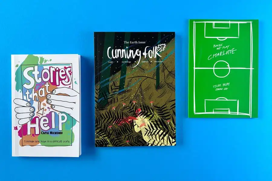
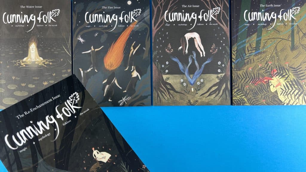
Cunning Folk Magazine: An Efficient, Fast-Paced Print Journey
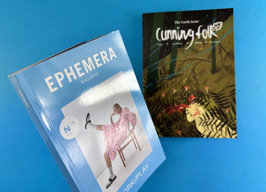
For Cunning Folk Magazine, a publication that blends mystical and folklore-inspired content, the challenge was not only the tight turnaround time but also the need for precision and consistent quality. This 240x170mm zine, produced on FSC-certified paper, needed a professional perfect zine format that would offer both durability and a tactile, portable experience for readers. The use of litho printing for this long-run project ensured cost-effectiveness and gave zine an uncompromising premium look.
Ex Why Zed’s customer-focused approach, along with guidance on digital versus litho printing for a print run of 1200 copies, ensured that Cunning Folk Magazine was produced quickly and effectively. The tactile uncoated paper stock and perfect binding gave the magazine the feel of quality printing, ensuring every page—whether filled with detailed illustrations or insightful text—was printed to perfection.
Shooter Issue 17: Bringing Poetry and Design Together
Shooter Issue 17, a literary journal exploring 'The Unknown', exemplifies how design and content work together to elevate the narrative. Produced with perfect binding and using a premium 120gsm uncoated stock for inner pages, this perfect bound zine seamlessly combined the elegance of poetry with the raw power of visual art. The design choice of pastel greens as a bed for the minimalist typographic choices reinforced the theme of exploration while keeping the visual narrative clean and readable.
At Ex Why Zed, we worked with the editor to navigate technical challenges, from adjusting images for print to ensuring that each page of Shooter Issue 17 felt cohesive with the zine’s artistic vision. The perfect binding method not only preserved the tactile quality of the zine but also elevated its status as a collectible piece. The seamless integration of design and content showcased Ex Why Zed’s ability to handle intricate creative projects with expertise and precision.
In A Flash: A Zine That Captures the Spirit of Sports Fans
Tyler Dolph’s In A Flash, a zine that captures the fervor of Columbus Crew FC’s passionate fans, is an excellent example of how the A5 zine format can bring to life a dynamic, high-energy project. The perfect binding technique used for this project ensured that each page—a stunning collection of full-colour images and bold typography—was beautifully presented and durable enough to withstand heavy handling by fans.
By using smooth silk paper and providing guidance on high-quality full-colour printing, Ex Why Zed helped Tyler create a publication that was as much a collectible piece of art as it was a celebration of sport. The A5 zine format was perfect for this type of project, offering just the right balance between portability and visual impact.
Meat Magazine 8: Crafting a Raw and Eco-Conscious Zine
Meat Magazine 8 is a prime example of how stapled zines can be used to create visually impactful publications that reflect a unique and raw aesthetic. Printed on recycled paper stock with the cover onto a bespoke kraft-style sheet, the magazine aligns with eco-conscious values while presenting cutting-edge design. The stapled binding allows the zine to maintain its zine-like quality while still offering a professional presentation that engages readers through its bold typography and experimental layouts.
Ex Why Zed's expertise in choosing the right materials for the project—FSC-certified recycled stock—ensured that Meat Magazine 8 not only delivered visually but also aligned with sustainable publishing practices. The stapled zine format offered the perfect solution for an indie publication that needed to reflect its DIY roots while maintaining high print standards.
Nominated for a Guardian award speaks volumes about the design, content and styling prowess.
A-Z Lookbook 24 by Zeros Art: A Visual Masterpiece
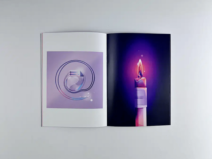
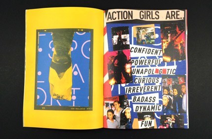
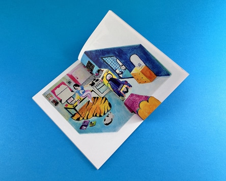
A-Z Lookbook 24 by Zeros Art blends the worlds of pop culture and artistic illustration in a stunning A5 zine format. The perfect binding and use of FSC-certified silk paper ensured that the finished product was both luxurious and tactile. The bright and contrasting colours of the illustrations jump off the pages, while the minimalist typography ensures the art takes centre stage.
Ex Why Zed's input in choosing the right paper stock and providing expert guidance on print quality ensured that every detail—from the vivid colours to the crispness of the typography—was faithfully rendered. This perfect bound zine showcases how powerful design and quality production come together to elevate a creative vision.
Phantasmag Issue 1: Horror and Art in Perfect Harmony
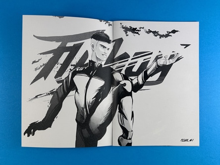
Phantasmag Issue 1—a B5 zine that merges horror, music, and art—was printed with precision to reflect its bold and evocative content. The perfect binding of this 250x176mm zine allowed for a professional finish that didn’t compromise the raw energy of the design. The restrained use of colour, with black-and-white illustrations punctuated by flashes of pink, sets the tone for this dark exploration of horror culture.
The collaboration between Ex Why Zed and Phantasmag ensured that the technical aspects—colour conversion, paper choices, and layout adjustments—were all executed seamlessly, resulting in a visually cohesive publication that aligned with the zine’s unique themes.
Peak Magazine Issue 4: Pushing Boundaries with Large-Scale Printing
Peak Magazine Issue 4 pushes the boundaries of traditional zine design with its oversized A3 format, making it an immersive publication that highlights urban and natural landscapes with stunning visuals. The unbound, nested format enhances the tactile experience, inviting readers to fully engage with the content. The use of vibrant hues, combined with sleek typography and spacious layouts, creates a perfect balance between the text and images. The dynamic layouts, full-page spreads, and bold imagery allow each spread to breathe, while still guiding the reader through the magazine’s visual narrative. The oversized format elevates the storytelling, enabling readers to fully appreciate the detailed photography that captures the urban grit and natural beauty featured throughout.
Still Listening Issue 9: A Music Zine Like No Other
Still Listening Issue 9 combines dynamic design with a celebration of emerging music talent. The zine's experimental approach to typography and its juxtaposition of bold, full-bleed images with clean body text creates a visually engaging experience. With two alternate covers and a strong sense of individuality, this project highlights how A5 zines can reflect the energy of music and subcultures while still maintaining a clear visual identity. The uncoated paper stock adds a tactile dimension to the zine, creating a matte finish that allows the vibrant illustrations and images to shine. The design choices—ranging from bright colour contrasts to a minimalist layout—capture the raw energy of the indie music scene, making it both a collector's piece and a visual feast.
The typography in Still Listening Issue 9 is a standout feature, with its mix of bold sans-serif headings and playful script fonts. The script on the cover adds a personal, handwritten touch, enhancing the indie zine vibe while maintaining readability. Inside, the careful balance between large images and white space ensures that the zine doesn’t overwhelm the reader, despite its bold design. This interplay between text and imagery invites the reader to slow down and fully absorb the content, whether it’s an interview with an emerging artist or a feature on a new music genre. The A5 zine format complements this design, making it both portable and visually compelling—perfect for music enthusiasts and zine collectors alike.
Worldie 23/24 Lookbook: Showcasing Style and Sport
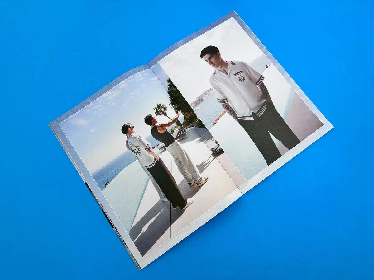
The Worldie 23/24 Lookbook is a visual celebration of artistic expression and football culture. The perfect binding in this A5 zine format elevated the experience, providing a sleek and professional finish while still capturing the vibrant energy of the street football community. The use of vivid colours, combined with sharp typography, helped to make this publication an immersive journey into the style and spirit of Worldie FC. The mix of street fashion photography and dynamic graphic design embodies the fluid, energetic world of football culture, offering a bold contrast between athleticism and style. Each page is carefully designed to draw attention, making the lookbook as much about the art of football as it is about fashion.
Beyond the visuals, Worldie 23/24 Lookbook conveys a deep sense of community and inclusivity, which is reflected in both the design and content. The interplay between full-colour spreads and minimalist text gives the publication a unique rhythm, allowing the reader to be absorbed in both the visuals and the stories. The decision to use FSC-certified materials reinforces the brand’s eco-conscious stance, aligning with the values of sustainability in football culture. The A5 zine format complements the need for a publication that’s accessible, portable, and packed with punch, making it a perfect blend of style, art, and activism.
The Dyke Express: A Bold Zine with a Powerful Message
The Dyke Express is unapologetic, loud, and proud—just like its message. With its hand-drawn, bold typography and powerful illustrations, this zine creates a compelling narrative of lesbian identity and community. The A3 unbound, nested format made it easy to engage with, allowing the bold statements and evocative visuals to dominate the page. The large-scale design choices reflect the raw, unfiltered voice of the zine, with each page demanding attention.
The black-and-white colour scheme, complemented by illustrations of diverse faces and bold typography, reinforces the message of unity within diversity, capturing the strength and power of the lesbian movement. This unbound design invites readers to freely interact with the publication, reinforcing its grassroots, DIY ethos.
We hope this selection of winning zine styles has helped you visualise what can be achieved with zine printing at Ex Why Zed. They were curated to give a wide spectrum of print choices.
Whether you are looking to self-publish a zine, create a perfect bound zine, or explore stapled zine printing, Ex Why Zed’s expertise and commitment to quality ensure your zine project is in expert hands. From the A5 zine to larger formats, every publication benefits from our personalised approach, ensuring that your creative vision is brought to life with precision, care, and high-quality craftsmanship.
Our dedication to sustainability, attention to detail, and expert advice means that we are not just a printer—we are a partner in your creative journey.
🌟 Accessible, Expert, Friendly Advice. If you haven't done this before, don't worry, we have! 👩💻 Free File Check and Preflight. We aim for perfection and will let you know if anything needs changing. 💃🏻 We Talk the Talk, But We Also Walk the Walk. ⏰ Replies in minutes from print experts, not days or weeks. 🌲 All Papers are FSC Certified. Sustainable printing guaranteed and we also use vegetable inks for litho jobs. 🚀 Fast Turnaround. Zine delivery in 3 working days. Perfect bound zine delivered in 4. 🏆 Finest Digital and Litho Print. HP Indigo and Heidelberg Litho - the best possible quality for short, medium and long print runs. 🖨️ Professional Printing process. Best industry practice, not a Mickey Mouse website where you throw JPGs at the screen then keep your fingers crossed. 🛠️ Flexible Custom Options. The answer is "Yes", now what is the question? 🖼️ Enjoy 500 Case Studies in our Portfolio. Not made-up CGI nonsense like the other sites have 🤣 😍 A Solution For Every Budget. We always quote for a range of quantities to help hit your target price. 🎁 FREE Paper Samples. Make the best possible choice from our extensive print options. 🌍 FREE UK Delivery. Your print will arrive by tracked courier, the day after it leaves us. 🌍 Worldwide Shipping at cost price from a network of couriers. ✅ Transforming Your Ideas Into Print Since 2006.
Ready to make your zine a reality?
Start a conversation with us today on hello@exwhyzed.com or 01206 766647 and see how we can transform your idea into a beautifully printed publication that speaks to your audience.
No Storage Fees: Pay only when you sell—no hidden costs or unnecessary charges.
Seamless Integration: Automatic order syncing with your online store for effortless fulfilment.
Superior Quality and Pricing: Bulk printing with us offers better quality and price per copy than print-on-demand.
No More Trips to the Post Office: We store your books and post them when orders arrive.
Scalable Solutions: Whether you ship 10 books or 10,000, our services grow with you.
Focus on What You Love: Let us manage the logistics while you concentrate on creating amazing books.
In today's digital era, traditional marketing tools like booklets often get overlooked. However, businesses still continue to harness the power of booklets for their touchpoint advertising campaigns. A well-designed booklet not only carries detailed information about the company but also helps in building brand image. This blog post will delve deep into understanding what is a booklet, how many pages it should ideally have, the factors that determine its page count, its design and layout, and some stellar examples of successful booklets. We promise you, by the end of this read, you'll be filled with an exhaustive understanding of all things booklet-related!
What is a Booklet?
A booklet can be defined as a small book, often stapled at the center, with fewer pages as compared to a standard book. Its small size and lightweight nature make it incredibly portable and easy to distribute. In marketing terms, booklets are synonymous with brochures or mini-catalogues. They can be used for showcasing company overviews, creating event programs like weddings, conferences, or graduations, and even serving as a recipe book or a training manual.
The main goal of a booklet is to provide information to its reader. Whether it is promotional material like a brochure, informative content like a book, or instructions in a manual, booklets cater to the needs of delivering concise and purpose-specific content. Its extensive use in various industries testifies to its versatility and ease of access. For instance, fitness brands share workout routines through fitness booklets, fashion brands share their latest collection via fashion booklets, and real estate businesses use booklets to showcase their property offerings. Determining the right page count for your booklet all boils down to its goal or purpose. Whether it's a company's profile, an event program or a catalog, the quantity of content that needs to be distributed organizes how many pages you would ideally need.
Minimum and maximum page counts for a booklet
Booklets have a minimum number of pages to be considered as such. Stapled, loop-stitched, wire-o binding requires at least eight pages while perfect bound booklets demand a minimum of 52 pages. Any less, and you might just be looking at a folded leaflet rather than a booklet. While one must adhere to the minimum amount of pages requirement, care should be taken of the maximum page limit as well. Each binding method can accommodate a number of sheets of paper. For instance, stapled, wire-o, and loop-stitched booklets can go up to 64 pages while perfect bound booklets can have up to 200 pages. Exceeding the maximum limit might affect the overall look and feel of your booklet, making it bulky and difficult to handle.
Winning Booklet Examples
To help you make informed print choices when you embark on your exciting booklet printing journey, we have curated, analysed and dissected a series of recent booklet printing examples to show you what can be achieved.
Factors Affecting Booklet Page Count
When planning and designing a booklet, one of the most important considerations is the total number of pages it will include. Several key factors influence the final page count, each playing a vital role in the structure and usability of your booklet.
Purpose of the Booklet
The objective behind creating the booklet is often the first and most defining factor. A brief promotional booklet for a product launch may only require a few pages highlighting key features and benefits. In contrast, instruction manuals, employee handbooks, or training manuals will naturally demand a much more detailed approach, increasing the total number of pages. The more complex the goal, the higher the likelihood of needing additional space to communicate effectively.
Content Volume and Layout
The amount of content you need to include directly impacts the page count. If your message is text-heavy or includes detailed technical data, you'll likely need more pages to avoid cluttering. On the other hand, a visually-led design with minimal text and word count may require fewer pages but more spacing and creative layouts to keep it engaging. The balance between images, infographics, charts, and written content also determines how the information is spaced and presented.
Binding Method
The chosen binding method imposes physical limitations on how many pages your booklet can include. For instance:
Saddle-stitched booklets (stapled along the fold) typically require page counts in multiples of four and often have a minimum of 8 pages.
Perfect binding and Hard Back are better suited for thicker booklets, with a general minimum of 32 pages to ensure structural integrity.
Wire-o or coil binding can accommodate a wide range of page counts but may not be suitable for more formal publications.
Understanding these constraints helps you plan your content to fit within practical production boundaries.
The preferences, expectations, and reading habits of your audience should guide the booklet’s length. For example, a B2B investor-facing booklet may go into greater depth with more pages to build credibility and trust. Conversely, a direct-mail booklet aimed at busy consumers should be concise and visually driven to quickly capture interest. If your audience values quick insights, overly long or dense content might lead to disengagement.
Design and Typography Choices
Font size, spacing, margin widths, and layout style also influence how much content fits on each page. Choosing a more spacious design with large visuals and generous white space naturally increases the number of pages needed. Alternatively, a compact, text-oriented design might help reduce page count, but it risks becoming overwhelming if not executed thoughtfully.
Importance of Selecting the Right Page Count for Your Booklet
Selecting the appropriate page count for your booklet is not just a logistical decision—it’s a strategic one that can influence everything from production costs to user engagement and overall effectiveness. Whether you're designing a promotional brochure, training manual, event guide, or product catalog, getting the page count right ensures your content is presented clearly, professionally, and persuasively.
Balances Content with Readability
The right page count helps strike a balance between delivering all necessary information and maintaining reader engagement. If a booklet is too short, you risk leaving out essential details or cramming too much onto each page, which can overwhelm or confuse your audience. On the flip side, an unnecessarily long booklet might dilute your core message, cause readers to lose interest, or even make the material appear more complicated than it really is. A well-chosen page count supports a clean layout, proper spacing, and a logical flow of content that enhances comprehension.
Impacts First Impressions and Brand Perception
Your booklet often acts as a physical representation of your brand. A well-designed, properly paginated booklet signals professionalism, care, and attention to detail. If the booklet feels too thin or sparse, it may come off as incomplete or rushed. If it’s bulky and overwhelming, it might discourage readers from exploring it fully. Page count plays a role in shaping how your audience perceives your brand—concise and to-the-point for modern, innovative companies; detailed and comprehensive for industries that value depth and trust-building, like finance or healthcare.
Aligns with Production and Budget Constraints
From a production standpoint, page count directly affects printing costs, binding methods, paper selection, and postage fees (especially for mailed booklets). Choosing the optimal number of pages helps you stay within budget while still delivering a high-quality product. For instance, staying within certain page thresholds might allow you to use saddle stitching instead of perfect binding, or help you avoid higher mailing costs due to increased weight. Being intentional about page count helps you maximize impact without overspending.
Ensures Compatibility with Binding and Format
Each binding method has specific requirements and limitations regarding the number of pages it can accommodate. Choosing a page count that aligns with your desired binding style ensures durability, ease of use, and an overall professional finish. For example, saddle-stitched booklets require multiples of four and are ideal for smaller publications, whereas perfect binding is suited for longer-form content like manuals and catalogs. Selecting the right page count ensures the finished booklet functions well and feels appropriate in hand.
Supports User Experience and Navigation
A well-structured booklet with the right number of pages enhances the reader's journey through your content. It allows for thoughtful sectioning, the inclusion of helpful design elements like tables of contents, chapter dividers, callouts, and imagery that break up text. These elements are easier to incorporate when there is sufficient space, and they can greatly improve how your audience absorbs and interacts with the information. Whether your goal is to inform, persuade, or instruct, a clear and comfortable reading experience is key to achieving it.
Helps Define Scope and Focus
Planning the page count early in the design process forces you to clarify your booklet’s scope. How in-depth should each section be? What’s essential, and what can be trimmed? This discipline helps you create a more focused, purposeful booklet where every page adds value. It also prevents content creep—where you add too much just because there’s space—keeping the message on track and relevant to the audience.
Why Print Your Booklet at Ex Why Zed?
If you’re looking to print a booklet that stands out — whether it’s a zine, art book, artist catalog, or self-published project — Ex Why Zed has the tools, experience, and creativity to help make it happen. Here’s what sets us apart:
➡️ Specialist Booklet Printing: Booklets are what we do best. Whether you're printing a one-off zine or a full artist catalog, we bring over a decade of experience to every job. We understand the details that matter, and we’re here to help you get it right. ➡️ Portrait booklets up to A3 (420mm high x 297mm wide), yes A3! ➡️ Landscape formats up to A4 (210mm high x 297mm wide) ➡️Square booklets up to 297mm x 297mm Whatever the orientation, we’ll help you create something beautiful and functional.
➡️ Flexible Sizes to Suit Your Vision: We offer a range of booklet sizes to match your creative goals. ➡️Clear, Friendly Process: We’re here to make booklet printing easy. Our process is straightforward, and we’re always happy to answer your questions — whether you need advice on artwork setup or aren’t quite sure which paper to choose.
Made for Creatives Like You: We’ve worked with thousands of designers, illustrators, students, and publishers. We know what it takes to turn your ideas into a beautifully printed piece — whether it's your first project or your fiftieth.
Ready to bring your booklet to life? We’re here when you are. Request a quote now.
Wrap Up
Booklets might appear simple, yet their significance in marketing strategies continues to be high. Optimum use of booklet pages balancing text, images and making the most out of formatting tools can dramatically increase the effectiveness of your booklet. While there are no strict rules about how many pages a booklet should have, certain parameters like purpose, target audience, and choice of binding method help to define what might work best for you.
Frequently Asked Questions
What is the ideal number of pages for a marketing booklet?
The ideal number of pages for a marketing booklet is not set in stone, and it can greatly vary based on its purpose and content. However, a ballpark figure would be anywhere between 8 to 30 pages.
Can I print a booklet with an odd number of pages?
Booklets must have a total page count that’s a multiple of 4 (e.g., 8, 12, 16). If your content results in an odd number, you’ll need to add blank pages or filler content to meet the formatting requirement.
How do I create a booklet layout using popular software programs like Word, InDesign, or Canva?
These software programs provide a host of layout and design options to create a booklet. You can select from predefined templates or create a custom layout. Make sure to choose appropriate margins, alignments, font sizes, and colors to enhance readability and aesthetic appeal.
As an emerging or established writer, self-publishing offers many opportunities to take control of your narrative literally. It allows you to navigate your literary journey in your style, traversing the publishing process without surrendering your rights or the majority of your royalties to a traditional publishing house.
However, self-publishing is not a path laden with roses; it comes with unique complexities that may seem daunting, especially to first-time authors. This comprehensive blog thus aims to dispel such apprehensions by providing an exhaustive self-publishing checklist.
We have crafted a meticulous checklist outlining a step-by-step roadmap to self-publishing success to ease your self-publishing journey. In the following sections, we will talk about the same.
1. Refine your book manuscript (DIY vs Professional help)
Using tools like Grammarly or ProWritingAid, you can refine your manuscript yourself. This gives you control over the process, though catching errors and improving your writing may take longer.
Meanwhile, a professional editor enhances your manuscript by improving flow and consistency. While more costly, their expertise ensures your work is polished. If on a budget, consider feedback from a trusted friend before opting for professional help.
2. Craft your author bio
An author bio is essential for self-published authors, as it helps build credibility and fosters a connection with readers. Write your bio in the third person, highlighting your qualifications, achievements, and expertise related to the book's topic.
To make it more engaging, you can also add personal touches, such as where you're from, your hobbies, or interesting facts about yourself. Keep it professional yet approachable, and remember, your bio can be used not only in your book but also on your website, social media, and other platforms to introduce yourself to a broader audience.
3. Include a personal dedication
Dedications add a personal and heartfelt touch to your book, usually placed after the copyright page. This is your chance to express gratitude to someone who provided support, motivation, or inspiration during your writing journey—whether it's a family member, friend, mentor, or even a public figure who inspired you.
Though optional, dedications make your book feel more personal and relatable. Whether it's an emotional tribute or a playful shoutout, dedications create a connection with readers, offering a glimpse into your world and making the book feel truly yours.
4. Compiling your book acknowledgments
After the dedication page, the acknowledgments allow you to express gratitude to those who contributed to your book's creation. Unlike brief dedications, acknowledgments allow you to mention everyone who played a part—editors, designers, family, friends, early readers, and anyone who provided support or feedback.
Be specific and sincere about how each person helped. Thoughtful and genuine acknowledgments can foster a connection with readers and highlight your appreciation for those who made your book possible.
5. Pen a Perfect Back Cover Blurb
Seasoned author Stephen King once quipped, "You can't judge a book by its cover," but in the self-publishing world, most readers do! Hence, crafting a compelling book title and description, or blurb, is integral to engaging potential readers. Typically found on the back cover or in your print edition ebook description, your blurb acts as a mini-sales pitch, highlighting the most important things about your book.
A strong blurb grabs attention, offers a brief synopsis without giving too much away, and leaves readers eager to know more. Keep it between 100-200 words, starting with a captivating sentence and highlighting high-stakes conflicts. Include relevant keywords for SEO and target your ideal audience to create an effective marketing tool.
You can also add publisher contact info, credits for the production team, and any necessary disclaimers. While it may seem small, a well-detailed copyright page is an important legal and professional step regarding copyright law.
7. Stand Out with a Professional Headshot
A headshot is essential for connecting with your readers, offering a personal touch that complements your Author Bio and gives a face to your name. It adds credibility and is typically featured on your professional book cover or website. While DIY shots with a high-resolution camera can work, a professional photographer can capture the right tone, emotion, and personality.
Whether a close-up or full-length portrait, ensure your headshot reflects your true self. It should be more than just a picture—it's a glimpse into your world as an author and your unique journey.
8. Choose your book's typography
Typography is crucial in enhancing the reading experience by improving readability. The right typeface draws readers in and makes reading easier, while poor choices can turn them away. Professionals often recommend simple, readable serif fonts like Caslon, Garamond, Jenson, Minion, and Palatino, known for their smooth, flowing lines.
However, matching the font to your book's mood and genre is essential. For example, a horror novel may benefit from a suspenseful serif, while a children's book might need a playful, fun font. Choose a typeface that best complements your content.
9. Edit your book's layout
A well-designed book layout boosts readability and professionalism. Avoid widows, orphans, and runts for a cleaner appearance. In non-fiction, columns and tables improve data comprehension. For example:
Chapter Name
Page Number
Introduction
1
Design
11
Production
33
Marketing
47
Conclusion
65
Ensure images are properly placed to maintain a neat and professional look.
10. Design your book's cover and spine
Designing your book's cover, including the back cover design and spine, is crucial in self-publishing, as it's often the first impression a reader has of your work. A visually striking book design can set your book apart in a crowded market, while a professional designer's design reflects the quality of your content. Ensure the cover aligns with your book's genre and tone, capturing the essence of your story or message.
Conversely, the spine should include your book title and author name for easy identification on bookshelves or digital libraries. Whether you hire a designer or create it yourself, ensure it's eye-catching, clear, and reflective of your book's core theme.
11. Get an ISBN
Acquiring an International Standard Book Number (ISBN) is essential for self-publishing, giving your book a unique identity in the market. It's essential if you plan to sell in bookstores, libraries, or on retail platforms.
While services like IngramSpark offer free ISBNs, buying your own is recommended if you plan to publish in multiple formats (print, ebook, audiobook). , including on platforms like Kobo. and Kindle Direct Publishing. Besides, while eBooks on platforms like Amazon KDP and Google Play don't require an ISBN, having one enhances your book's professionalism and marketability.
For an ISBN in the UK, you should go directly to https://www.nielsenisbnstore.com/ who are the UK suppliers. On their site, you secure the ISBN, then download the barcode which can be added to your artwork.
12. Include book reviews
Crowd validation is crucial in today's market, where social proof drives success. If this is your first book, book reviews serve as testimonials, building credibility and encouraging potential readers to invest in your book. To gather early reviews, reach out to fellow authors, readers, or beta readers within your genre. You can also tap into your existing audience via emails or direct messages for support.
Another key strategy is to create a launch team of dedicated followers on Instagram who help generate buzz and write reviews on launch day. Focus on honest feedback that highlights the value of your book and build excitement around its release, aiming to get it noticed on the bestseller lists.
How to structure your book's content
Structuring your book is akin to planning a meaningful journey for your readers. A meticulously crafted structure guides your writing process and structures the structure of your story to enhance the reader's experience, making it engaging and effortless. The clarity of your structure is reflected in the simplicity with which you convey your story or ideas.
A cheat sheet can be your secret weapon in efficiently planning your content. This organized table detailing your chapters or sections, key points, and word count helps you stay focused, streamline your writing process, and ensure a logical flow of ideas in your manuscript.
How to set a realistic self-publishing budget?
Setting a self-publishing budget helps manage resources and ensures efficient production. Unlike traditional publishing, you're responsible for editing, design, marketing, and distribution costs. A realistic budget is crucial to maximize profits and avoid overspending, allowing extra time to refine your work and enhance its quality.
Editing Costs
Professional editing boosts quality. For an 80,000-word manuscript:
Copyediting: ~$1,200
Line editing: $1,200+
Proofreading: $600-$800
Design Costs
A professional design attracts readers:
Cover design: ~$800
Interior design/formatting: ~$400
Marketing Costs
Effective marketing is key to success:
Email marketing: ~$10/month
Newsletter ads: $20-$100/ad
Social media ads: From $5/day
Investing wisely in these areas can enhance your book's quality and visibility, but adjust strategies based on results.
Of if you would prefer to work with an agency for a more tailored approach then take a look at our top book designers article this article will help.
How to create deadlines and meet them?
Now that you have a comprehensive roadmap, it's time to commit to some realistic deadlines to ensure smooth sailing toward your goal.
Sample deadline schedule for self-publishing a book
Creating a timeline or schedule can motivate and help you manage time effectively. Remember, every book engages a unique journey, and the timelines for each can differ significantly based on complexity.
However, here's a rough sample deadline schedule that should give you a pretty good idea:
Task
Deadline (from the start)
Manuscript Editing & Proofreading
1 month
Cover Design & Formatted Manuscript
2nd month
Promotion Begins (Start Marketing)
2 weeks after formatting
Release Date
1 month after promotion
Speed Up Your Self-Publishing Journey with Professional Help from ExWhyZed 🚀
While self-publishing a book can be exciting and fulfilling, it can also be time-consuming. Why not speed up the process and ensure your book stands out by seeking professional help? At ExWhyZed, we specialize in helping you publish a book that truly captures the essence of your story.
Whether you want a simple design or something more intricate and creative, our team uses expert techniques, including vibrant colors and stylish typography, to make your book look and feel professional. Let us handle your publishing needs so you can focus on what you do best—writing! Get in touch with us today to get started.
Conclusion
Walking the self-publishing road can be demanding, but it could transform into an empowering journey with the right tools and guidance. A comprehensive checklist, like the one provided in this blog, can serve as your compass, guiding you smoothly through this process and helping you find the right place in your publishing journey.
From conceptualizing your idea to finally putting your work out in the world, each stage brings moments of discovery, learning, creativity, and triumph. So, confidently embark on this incredible journey armed with all the essentials detailed in this guide.
Remember, every great author started somewhere, so take that first bold step towards shaping your literary dreams.
Frequently Asked Questions
What are the costs involved in self-publishing?
While self-publishing offers greater control over book profits, it involves upfront costs for professional book editing, cover and layout design, ISBN procurement, print copies (if opting for a print run), and marketing and promotional activities, especially for non-fiction. Costs can vary greatly based on the quality and extent of these services.
How long does it take to self-publish a book?
The duration to self-publish a book varies based on factors like the time to write the first draft, edit, format, design, and devise a marketing strategy for your book launch. At Ex Why Zed, we will aim to deliver your finished books in 1-2 weeks from when we receive print ready artwork. No messing about with 6-12 months like you will experience if going through a Publishing House.
What is the difference between traditional publishing and self-publishing?
Traditional publishing houses manage everything from editing, designing, and marketing to distributing your book while you surrender most of your royalties and creative control. Self-publishing empowers authors to retain all rights and produces higher royalties but involves more hands-on work and self-investment.
Can I publish my book in multiple formats?
Yes, self-publishing allows flexibility to publish your book in multiple formats, such as ebooks, paperback, hardcovers, and audiobooks. At Ex Why Zed, we print softback and hardback to appeal to different price points. You can decide the format(s) based on your book's genre, budget, and target audience's preferences, including options offered through Amazon KDP. and Google Play Store.
Our cherished moments and memories are like treasured gems that deserve to be preserved meticulously. In today's era, we have managed to bottle up these moments in photographs, but often, they are left in the digital world, seldom glanced at or appreciated. An innovative and elegant solution to this is a hardback photo book. These aesthetically pleasing compilations are more than just albums; they are personal galleries that celebrate our lives, milestones, and everyday joys. A hardback photo book brings your digital memories to life, providing them with a physicality that makes them tangible and enduring.
This blog aims to delve into the exquisite world of hardback photo books, guiding you through different types, how to design one, and how to maintain it, ensuring every precious moment is vividly alive within its pages. Whether for personal use or as a thoughtful gift, let's unravel how to immortalise our fleeting moments into a stunning hardback photo book.
What are Hardback Photo Books?
A hardback photo book is a high-quality album with sturdy covers that provide durability and protection for your cherished photos. These books offer a professional look and feel, making them ideal for preserving special memories for years to come.
What are the Different Types of Hardback Photo Books?
There are various types of hardback photobooks available, each catering to different styles and preferences. Be it an elegant standard hardcover for your travel snapshots, a sleek layflat hardcover to showcase your wedding memories seamlessly, or a timeless leather hardcover for a family photo album that exudes class and sophistication. Each type of hardback photo book offers a unique touch to your photos, allowing you to choose the one that best captures the essence of your favourite memories. Let us look at them in detail:
Standard Hardcover
A standard hardcover photo book is popular due to its classic design and robust structure. This type of photo book shines in its versatility, making it suitable for almost any occasion – from family albums and travel adventures to professional portfolios.
Additionally, it offers room for personalisation on the cover, giving you an opportunity to feature your best shot or a chic design. With its durability and class, the standard hardback photo books ensure a perfect harmony of function and aesthetics.
Layflat Hardcover
Want to bring those panoramic shots to life or give your photographs an interrupted full-page display? The layflat photo book is the way to go. As the name suggests, it opens flat, letting your photos stretch across both pages without any break in the spine, allowing a continuous flow of visuals.
This process is achieved at Ex Wy Zed by section sewing the inside pages. Yes, literally sewing the pages in. This gives maximum resilience and allows the reader to open and press the pages flat without any risk of them 'popping out' from the spine.
This allows you to fully appreciate landscapes, group photos or any large image uninterrupted, adding an exclusiveness to your photo viewing experience. It's a fantastic option for travelogues, weddings, or any event with high-impact visuals.
Leather Hardcover
High Impact Photo or your name in lights? Which do you think is the best choice for an engaging photobook cover?
Apt for those who appreciate timeless elegance and luxury, the leather hardcover photo book is the essence of sophistication. The leather-bound hardcover provides added durability and gives the book a vintage charm that pairs well with monochrome photographs or historical snapshots.
If you wish to create a family heirloom or are searching for a special gift for anniversaries or significant milestones, the leather hardcover option is certainly worth considering. Its high-end appeal adds an aura of prestige to your precious memories and keeps them secure for decades.
We buy all of our cover materials from Winter & Company. Check out their range for hundreds of ideas on colour, texture and finish.
How to Design Your Hardback Photo Book
Designing a hardback photo book includes multiple steps, each adding a personalised touch to your creation. Using online editors or photo book makers like Ex Why Zed, you can create a bespoke photo book as a self-curated gallery of your favourite moments. To achieve the best outcome, it is essential to consider the following steps:
Choosing a theme
The theme of your photo book provides a conceptual framework around which your photos are organised. It sets the tone of your narrative and gives your photo book an aesthetic coherence. Themes can be tied to occasions (e.g., weddings, birthdays), locations (e.g., travel photo books), people (e.g., family photo albums), or even timeframes (e.g., yearbooks).
Selecting a theme that aligns with your photos ensures a compelling narrative flow and provides a more holistic experience to anyone flipping through the book.
Selecting the layout
The layout plays a crucial role in determining how your photos are displayed and interacted with. This considers factors like the number of images per page, positioning, orientation, and size. While more photos per page give a collage effect, a single photo per page allows singular focus. A mix of both can provide variety and interest.
Moreover, the layout must be selected strategically to enhance the visual impact of your photos. For instance, wide landscape shots might work best on a two-page spread in a layflat photobook.
Customising the cover
The cover of your hardback photo book is the first point of engagement, making it important to customise it thoughtfully. Your cover image should represent the content inside, and its design should reflect the theme of your photo book.
Be it a significant photo, minimalist design, or an impactful title, ensure it piques the viewer's interest. Some photo book makers also offer options like gloss or matte finishes and add-ons like foil or embossed titling for an additional professional touch.
How to Use Hardback Photo Books for Various Occasions
Hardback photo books offer flexibility in usage and can be customised for a myriad of occasions. They can narrate the story of a beautiful wedding, encapsulate the excitement of globetrotting adventures, or embrace the joy encompassed in family gatherings. They transcend the restrictions of being just albums and transform into timeless keepsakes, celebration memorials, or sentimental gifts. Here are a few ideas on how you can create hardback photo books specific to various occasions:
Wedding photo books
A wedding is an emotional rollercoaster packed with picturesque moments. A hardback photo book provides a beautiful platform to chronicle all these memories – from the laughter and tears to the intimate details. You can design it as a narrative that takes one through the journey of the wedding day or as a collection of the best shots. These wedding photo albums can be cherished as personal keepsakes or shared with loved ones as a wonderful reminder of your special day.
Travel photo books
Venturesome journeys through unknown lands create memories that are worth cherishing forever. A travel-themed hardback photo book can be an engaging diary of your exploration. Featuring significant landmarks, breathtaking panoramas, local experiences or memorable incidents, a travel photo book captures the essence of your journey.
Not only does it allow you to relive your adventures, but it also serves as an inspirational coffee table book, stirring up an intriguing conversation with guests about your travels.
Family photo books
Family is at the heart of our most precious moments, and a family-themed photo book curates these into a single-bound tribute. This could encompass holiday traditions, birthdays, anniversaries, or simply everyday snippets of love and laughter. A personalised hardback family photo book sprinkled with candid shots, humorous moments, and cosy bonding communicates the warmth and charm of familial bonds.
It can be an endearing keepsake that embraces the joys of togetherness and celebrates the love that makes a family, a family.
Hardback Book Pinterest Board
For stacks more inspiration on what can be achieved, dive into our pinterest board and enjoy seeing what your peers have achieved in terms of page layout, finish and winning print specs for their hardback photo book printing.
How to Take Care of Your Hardback Photo Book?
Here are some essential tips to ensure the longevity and beauty of your hardback photo book:
Storing your photo book
Proper storage is paramount to the preservation of your hardback photo book. Here are some recommendations:
Avoid Extreme Conditions: Store your photo books in a place with controlled temperature and humidity, as fluctuations can damage them.
Stay Away from Sunlight: Direct sunlight can cause fading or discolouration. Thus, keeping them out of immediate sunlight can prevent this.
Keep it Upright: Storing your photo books upright, just like other books on a bookshelf, helps maintain their shape and prevents unnecessary bending or warping.
Cleaning your photo book
Maintaining the cleanliness of your hardback photo book ensures that your memories continue to pop brightly off the pages. Here are some cleaning tips:
Wipe Gently: Use a soft, dry, and non-abrasive cloth to wipe your photo book. This aids in removing dust without scratching the surface.
Avoid Chemicals: Refrain from using harsh products or liquids for cleaning as these may damage the ink and paper.
Clean Hands: Always handle your photo books with clean hands to avoid smudging and oil marks.
Best Practices for a Timeless Keep Sake
Designing a hardback photo book is an art that combines creativity, storytelling, and craftsmanship. By following these best practices, you can create a timeless treasure that tells a story, resonates with emotions, and is a testament to printed memories' power. Whether you're a seasoned designer or a novice, remember that every photo book is a journey – one that's worth every page turn.
Prioritise Quality Imagery: Your photo book's essence lies in its images. Ensure you use high-resolution, impactful photographs that captivate the viewer. Remember, every image should tell a story, evoke an emotion, or capture a moment in time.
Embrace Diverse Themes: Variety is the spice of life. Incorporate a range of subjects and themes to keep the content fresh and engaging. From landscapes to portraits, from candid moments to staged shots, diversity will enrich the reader's experience.
Highlight Historical Significance: Every photo has a backstory. Use captions, annotations, or short narratives to provide context. This not only adds depth to the images but also helps in preserving memories and moments in history.
Artistic Presentation is Key: A unique layout, artistic design, and thoughtful sequencing can set your photo book apart. Experiment with layouts, use complementary colours and ensure a coherent flow to guide the reader through a visual journey.
Delve Deep into Themes: If your hardback photo book revolves around a specific theme or subject, provide comprehensive insights. This enriches the reader's experience and offers a more profound connection to the content.
Celebrate Iconic Moments: Highlight and celebrate iconic moments or figures that resonate with a wide audience. This can evoke nostalgia and make the book more relatable.
Collaborate for Quality: Consider collaborating with professional photographers, designers, or writers. Their expertise can elevate the quality of your photo book, ensuring it's top-notch.
Invest in Archival Quality: A photo book is often a keepsake. Prioritise the use of high-quality materials that ensure longevity, from the paper quality to the binding and cover.
Narrative Flow Matters: A coherent story or theme should guide the reader. Whether it's chronological, thematic, or abstract, ensure there's a seamless flow that enhances the visual and informational journey.
Create Your Hardback Photo Book Online with Ex Why Zed
Creating your own hardback photo book is simpler than ever with platforms like 'Ex Why Zed'.
We allow you to design a photo book that not only houses your memories but also reflects your style. With high-quality prints, a wide variety of formats and sizes, and the ability to personalise every aspect of your book from the comfort of your home, 'Ex Why Zed' has made the process of creating a hardback photo book very user-friendly. So whether it's for you or as a thoughtful gift, create an everlasting memoir using Ex Why Zed.
Ready to transform your photos into timeless treasures? Get a Quote Today!
Final Thoughts
Nothing compares to the joy of turning the pages of a hardback photo book, feeling the printed texture of memories under your fingertips, and allowing every photo to narrate a precious moment from your life. Even in our digitised world, the charm of a physical photo book hasn't faded; rather, it's become even more special. From standard, leather to layflat hardcovers, each type provides robust protection, ensuring your pictures remain preserved in prime condition throughout the years.
Furthermore, the process of designing your hardback photo book is now made surprisingly easy with online platforms, where one can put together a personalised photo book right from home. It puts you at the helm, where you can choose themes, lay out your photos, and customise your cover, as well as the entire book. This flexibility in design, coupled with superior printing quality, allows your photos to truly come to life, immortalising the emotions encompassed within them. With their aesthetic appeal and bespoke design, a personalised photo album truly celebrates your life's adventures and cherished moments, making them an exquisite addition to your bookshelf or coffee table.
Frequently Asked Questions
How long does it take to create a hardback photo book?
The time to create a hardback photo book varies depending on the number of photos and the layout and design complexity. However, online editors and convenient photo book makers make it possible to design and order a personalised hardback photo book within hours.
What is the cost of a hardback photo book?
The price of a hardback photobook can vary based on size, quality of paper, cover material and the number of pages. The cost can range from a few pounds for smaller, simpler photobooks to over fifty pounds for larger, premium photo books.
How can I ensure my photos are printed to the best quality?
Ensuring your photos are of high resolution is crucial for excellent print quality. Using professional online photo editing tools can enhance the brightness, contrast and sharpness of your images. Choosing a good-quality photo paper and a reputable printing service can also significantly impact the final outcome.
Can I add messages to my personalised photo book?
Yes, most online photo book makers provide options for adding text or messages within your book. This allows you to describe images and add anecdotes or personal notes, making your photo book more intimate and comprehensive. The text's font, size and positioning can also usually be customised.
How long does it take to make a photo book?
The process time of creating a photo book depends on factors like the number of photos, the complexity of the design and layout, and the speed of the maker's interface. One can create a basic photo book within minutes to hours with easy-to-use online platforms.
Why should you choose hardback over softcover photo books?
Choose hardback over softcover photo books to preserve your memories in style for durability and elegance. Hardbacks offer superior protection, lasting quality, and a luxurious feel that elevates your precious moments. Opt for hardback for a timeless display of your cherished photos.
Choosing the appropriate paper type for book printing is an indispensable, often overlooked aspect of publication. When deciding on different paper types for book printing, several factors come into play. The selection directly impacts the book’s appearance, the ease of reading, and its overall appeal. As content creators, we want to optimize our choices to offer our readers and clients quality, convenience, and value for money. This informative guide's commitment is to elucidate the variety of paper options available for book printing, detailing their respective features, advantages, and ideal use cases.
What are the Paper Types for Book Printing?
With the plethora of paper stocks in the market, choosing the right type can initially seem overwhelming. However, it's vital to acquaint ourselves with specific types of paper primarily adopted in book publishing. They include offset paper, coated papers, uncoated papers, and different finishes. Each type possesses its unique qualities fitting for distinct applications, thus adding diversity to the publishing world. Here is book printing paper types.
Offset Paper
Offset paper is the best paper for book printing, lending compatibly to almost any book and any binding method. Primarily due to its non-smudging property, offset paper is often the go-to for workbooks. Below is a quick summary of what offset paper offers:
Features of Offset Paper
Description
Brightness
94 with a new blue-white shade
Qualities
Superior printability, uniformity, and durable performance
Strength
Excellent strength, bulk, and stiffness
Basis Weights
Comes in 60lb, 70lb, and 80lb variants such as 60lb White or Cream Offset, 70lb White or Cream Offset, and 80lb White Offset
Offset paper not only provides efficient utility but also enhances readability with its bright white finish, offering a touch of professionalism and quality to your content.
Coated Papers
The subject of coated papers covers options like gloss and silk. This type of paper has a clay coating that increases the paper's vibrancy and intensity, making it exceptionally suited for books laden with images or photos and vibrant ink colors. Within the family of coated papers, silk, with its gentle low-gloss sheen, strikes a balance between image highlighting and comfortable text reading. Conversely, for visual-heavy, text-light books, a gloss sheet provides the best vibrancy and contrast for ink applications. A popular use for coated paper is in cookbooks, which often require a wipeable surface resilient to kitchen mishaps.
Uncoated Papers
Often an understated choice, uncoated papers bring their unique charm to printing. Primarily used for novels and other text-heavy publications, uncoated papers offer a classic, authentic vibe with a smooth finish. Their advantages include:
Readability: Uncoated paper is easy on the eyes, making it suitable for prolonged reading.
Print Quality: It delivers high-quality print results, particularly with black-and-white texts.
Cost-Effective: Often more affordable than coated papers, uncoated options provide a cheaper yet valuable choice for publishers.Not sure which paper is right for your next print job? At Ex Why Zed, we make it easy. From silk to recycled, our curated house papers are designed to bring your project to life—beautifully and sustainably. Get a free sample pack delivered next-day and feel the difference before you print.
Comparing Paper Weights: GSM
When discussing paper weights, a term frequently encountered is GSM – grams per square meter. GSM gives an indication of the paper's thickness, which is central in determining the book’s durability and overall feel. Comprehending the differences between various GSM levels aids in selecting the most suitable paper weight to match the style, target audience, and expected handling of the book.
60 lb., 70 lb., and 80 lb. Paper Weights
60 lb., 70 lb., and 80 lb. paper weights are crucial considerations in book printing. These weights determine the thickness and sturdiness of the paper, impacting the overall feel of the final product. Depending on the type of book and its intended use, selecting the appropriate weight is essential for ensuring durability and quality. Print projects requiring a lighter feel may opt for 60 lb., while those desiring more robust pages might lean towards 80 lb. Understanding these distinctions aids in making informed decisions for your printing needs.
80 lb. and 100 lb. Gloss or Silk Text
Choosing between 80 lb. and 100 lb. gloss or silk text paper types can significantly impact the look and feel of your printed material. The higher the weight, the more substantial the paper feels. These paper stocks are ideal for projects requiring a polished finish, such as high-quality magazines or promotional materials. The gloss finish offers a shiny, reflective surface that enhances color vibrancy, while the silk text provides a luxurious feel with a subtle sheen, perfect for premium publications.
What Are The Paper Sizes for Book Printing?
Paper size. Size of. International A series paper size formats from A0 to A8. A0, A1, A2 and even A3 would be MASSIVE for books!
Choosing the right paper size is essential for both the aesthetic and functional success of your printed book. It affects layout, readability, and production cost.
Common Paper Sizes:
Ideal for manuals, reports, and educational booksStandard size for office and business documents
A4 (8.27" × 11.69")
Popular for novels, journals, and pocket guidesCompact and reader-friendly
A5 (5.83" × 8.27")Common in North America for business and academic booksOffers ample space for text and visualsUS Letter (8.5" × 11") Widely used for fiction and non-fiction booksBalanced size for portability and readability6" × 9" (Trade Paperback)
Great for photo books, children’s books, and art catalogsOffers a modern, visual-first layout
8.5" × 8.5" (Square Format)
Preferred for graphic novels and technical manualsProvides extra space without feeling bulky
7" × 10"
Each size choice should reflect your content type, audience, and design goals.
How To Choose the Right Paper for Your Project?
Choosing the right paper for your project means matching its weight, finish, and color to your needs—whether it’s a photo book, manual, or business card. Gloss, silk, and uncoated options each offer different aesthetics and durability. Focus on texture, opacity, and weight to ensure a high-quality final product.
Factors to Consider
Consider the purpose of your project and the intended audience when selecting book printing paper types. Assess the level of durability required based on how the book will be used and stored. Factor in the desired finish – whether a smooth gloss or matte texture would best complement the content. Additionally, evaluate the printing quality needed and the impact of paper type on color reproduction. By weighing these aspects carefully, you can make an informed choice that aligns with your project goals and audience expectations.
Paper Color: White, Cream, and Groundwood
When considering paper color for book printing, choices are typically white, cream, or groundwood. The white paper gives a crisp, clean look suitable for various genres. Cream paper exudes warmth, favored for novels or poetry. Groundwood, often brownish-gray, offers a rustic feel ideal for certain themes. Each color evokes different moods and impressions, impacting how readers perceive your content. Selecting the right paper color is essential in conveying the intended message and enhancing the overall reading experience.
What Is The Importance of Book Cover Material?
The cover material of a book is more than just a protective layer—it’s a crucial element that affects how the book looks, feels, and lasts. Whether you're self-publishing or working with a printer, selecting the right cover material can make a big difference in the book’s appeal and functionality.
Visual Appeal: The material influences first impressions—glossy covers look vibrant, matte feels modern and sleek, while textured or cloth covers give a premium finish.
Durability: Hardcover and laminated covers protect against damage, making the book last longer—especially for books that are handled frequently.
Reader Experience: A soft-touch or textured cover adds a satisfying tactile feel that enhances the overall reading experience, which is crucial for great customer service.
Design Compatibility: Some materials work better with printing techniques like foil stamping, embossing, or spot UV for added visual impact.
Genre and Branding: The cover finish helps signal the book's category—e.g., glossy for children’s books, matte for literary fiction, or leatherette for special editions.
Cost and Production: Hardcovers and specialty materials cost more but add perceived value; paperbacks are more budget-friendly.
Sustainability: Eco-friendly materials, such as recycled or FSC-certified papers, are a great choice for environmentally conscious publishing.
Ex Why Zed: Your Go-To Book Printing Partner in the UK
Ready to turn your manuscript into a finished product? At Ex Why Zed, we specialize in delivering professional book printing services across the UK, helping authors, creatives, educators, and businesses bring their ideas to life with precision and quality.
Whether you’re publishing a novel, producing training manuals, or printing a limited-edition art book, we offer customized printing solutions to match your exact specifications.
Why Choose Ex Why Zed?
High-quality print output with crisp text and accurate color reproduction
Multiple binding options including perfect bound, case bound, stitched, and wire
Print runs ranging from single copies to large-scale production
Fast and reliable delivery across the UK
Sustainable printing using eco-conscious materials
UK-based support team to guide you through every step
ExWhyZed makes book printing straightforward, efficient, and reliable for individuals and organizations of all sizes. Get a quote.
Conclusion
In conclusion, selecting the appropriate paper for book printing types, certified by the Forest Stewardship Council, is crucial for the success of your project. Consider factors like paper weight, color, and environmental impact to make an informed choice. Opt for environmentally friendly options and ensure the book cover material aligns with your vision. By prioritizing quality paper stock and eco-conscious selections, you can enhance the overall appeal and sustainability of your printed materials. Choose wisely to leave a lasting impression on your readers and contribute positively to the environment.
Frequently Asked Questions
What is the significance of paper weight in book printing?
In book printing, paper weight impacts the feel and durability of the final product. Lighter weights like 60 lb. are suitable for novels, while heavier options provide sturdiness for art books. Choosing the right weight ensures your book matches its intended use and aesthetic appeal.
Can you suggest an eco-friendly alternative for book printing paper?
Consider using recycled paper or tree-free options like bamboo or cotton for eco-friendly book printing. These alternatives reduce environmental impact while maintaining quality.
How can I choose the best paper for my book project?
Consider the paper weight, finish (gloss or silk), and color options (white, cream, groundwood). Factor in environmental friendliness and cover material importance for the ideal choice.
Printing booklets shouldn’t be a guessing game, especially when it comes to cost. But with so many options—paper types, binding styles, page counts—it’s easy to feel overwhelmed. How much should you budget? What factors influence the final price? And most importantly, how can you get high-quality booklets without overspending? This guide breaks down booklet printing costs based on different factors, helping you make smart choices that fit your needs and budget. Whether you're printing marketing materials, event programs, or company reports, we’ll show you how to balance quality and affordability effortlessly.
1. Quantity
The number of booklets you order directly impacts the final cost. As a general rule, ordering more booklets will push up the price. For instance, getting 50 booklets printed will be cheaper than 100 booklets. Nevertheless, it's important to remember that saving costs is not just about decreasing quantity.
Here's a crucial point to consider: suppose the size and page count of your custom booklet printing project allows for efficient use of professional press sheets. In that case, you might find that ordering a few extra copies ends up saving you money. Certain quantities require more time to fit on press sheets and need special handling, which can add to the cost.
On the other hand, the more you order, the lower the price per booklet. As an example, if you order 25 booklets of specific dimensions, the cost per piece could be between $3-$5. However, order 1000 of the same booklet, and the price per booklet drops to around $0.40-$0.60. Therefore, if you anticipate needing more booklets in the future, ordering all at once can lead to substantial savings.
At Ex Why Zed, we offer flexible printing solutions with no minimum or maximum order quantities. Our HP Indigo digital press is ideal for short runs, while our extensive litho department ensures competitive pricing for medium and longer print runs. Ordering larger quantities reduces the cost per unit, providing better value for your investment.
2. Paper Quality and Type
When selecting a paper quality and type for your booklets, consider how they complement your booklet design. Factors like thickness, finish, and texture significantly impact the overall look and feel of your final product. Choosing from a variety of paper types can enhance the print quality and durability of your booklets, making them more visually appealing to your target audience. Understanding the different options available and their effects on the overall booklet printing costs is crucial for achieving the desired outcome.
We provide a variety of paper finishes, including silk, gloss, and uncoated options, all of which are FSC-certified. Selecting the right paper type can enhance your booklet's appearance while aligning with your budget.
3. Turnaround Time
Turnaround time refers to the time it takes to print your booklets. Depending on when you need your booklets, there will be different prices associated with different turnaround times. Typically, like ordering anything online, the sooner you need your booklets, the higher the price will be. Faster requirements lead to higher costs as quicker production often implies additional resources and efforts by commercial printers.
By allowing your printer a longer turnaround time, they will have more time to receive similar jobs. These can then be printed alongside your project before cutting, folding, and binding your booklets. This way, the printer can save time, paper, and other resources.
For example, printing 1000 booklets in just four days may add $25-$30 to your bill, compared to if you had given them seven days. Therefore, planning ahead is beneficial to avoid rush orders, which come with increased costs.
Our standard delivery times are 3 working days for stapled booklets and zines, 4 working days for perfect bound books, and 7 working days for hardback books. Planning your project timeline accordingly can help you avoid rush fees and manage costs effectively.
4. Ink and Coating Options
When considering booklet printing costs, exploring various ink and coating options plays a crucial role. Opting for premium quality inks and special coatings can enhance the overall look and feel of your booklets, adding a professional touch. Different finishes like matte, gloss, or high-gloss coatings can impact the final cost, so make your selection wisely based on your budget and desired outcome. Understanding how physical ink colors and coating choices affect the color accuracy and durability of your booklets is key to making an informed decision.
We offer high-quality printing with various coating options to enhance your booklets. While premium finishes add to the cost, they can significantly improve the visual appeal and durability of your materials.
5. Size
Consider the dimensions of your booklets carefully to align with your content and design. Larger booklets may offer more space but could cost more in production. Smaller sizes can be cost-effective for simpler designs with fewer pages.
We can produce booklets in sizes ranging from smaller than A6 to larger than A3, including custom dimensions. Opting for standard sizes can be more cost-effective, but we accommodate custom sizes to meet your specific needs.
6. Page Count for Your Booklets
When determining booklet printing costs, the page count is a crucial factor. The number of pages directly impacts the production expenses, as each additional page requires more paper and ink. Opting for single pages or multiple pages per sheet affects the overall pricing. Therefore, it's essential to consider the content volume carefully to strike a balance between information dissemination and cost-effectiveness. Understanding how the page count influences pricing can help you make informed decisions when planning your booklet printing project.
7. Binding Options and Their Impact on Cost
Consider the binding options carefully as they significantly influence booklet printing costs. From saddle stitch to spiral binding, each choice comes with distinct price implications. Understanding how the binding method aligns with your booklet's purpose and budget is crucial. For instance, coil binding offers durability but may add to costs, especially for larger projects. Opting for comb binding, while cost-effective, might impact the overall look and feel of your booklet. Selecting the right binding option is a balancing act between aesthetics and budget.
We offer various binding options, including saddle stitching for booklets up to 48 pages and perfect binding for thicker publications. Choosing the appropriate binding method can help balance durability, appearance, and cost.
8. Extra Features and Customizations
Explore additional possibilities to enhance your booklet printing. Consider embellishments like foiling, embossing, or spot UV for a touch of sophistication. Opt for special coatings like matte or gloss to elevate the look and feel. Die-cutting adds a unique edge to your design. Adding perforated business cards or coupons can boost interactivity. Incorporate inserts or fold-out sections for versatility. These customizations may increase costs but can significantly impact the overall appeal and effectiveness of your booklets.
To make your booklet stand out, we provide premium extras such as foiling, embossing, spot UV, and die-cutting. While these enhancements increase costs, they can significantly boost the perceived value and impact of your booklets.
9. Shipping and Mailing Considerations
When finalizing your booklet printing, don't overlook shipping and mailing details. Ensure you select suitable shipping preferences to meet delivery times. Review specific file requirements for mailing services. Verify the scope of your printing needs aligns with the company's shipping capabilities. Opt for secure platforms for file uploads and consider sequential order for efficient processing. Prioritize proper formatting to avoid delays in the shipping process. Trust professional booklet printing services to handle shipping logistics seamlessly. Stay organized to receive your booklets on time.
We offer free UK delivery by tracked courier and shipping to the USA and worldwide. Utilizing our shipping options can help you manage delivery costs effectively.
10. File Preparation and Format
Proper file preparation is a critical step in controlling booklet printing costs. Incorrect formatting, low-resolution images, missing trim areas, or incorrect color models (CMYK instead of RGB) can lead to reprints, additional pre-press work, or unexpected delays—adding to your expenses.
To keep costs down, upload files that follow online booklet printing guidelines (or use free downloadable templates), ensuring they are in the proper format (PDF with embedded fonts, high-resolution images, and correct physical ink colors). At Ex Why Zed, we provide digital proof of your booklet before production, helping you avoid costly revisions later.
How Much Does it Cost to Print a Booklet with Ex Why Zed?
Ex Why Zed offers booklet printing services with pricing that depends on several factors, including size, number of pages, quantity, paper type, and binding preference. We provide an intuitive Instant Printing Quote Calculator for orders ranging from 1 to 20 copies, allowing you to customize specifications and receive an instant estimate. For orders exceeding 20 copies or requiring custom options, you can request a bespoke quote by emailing us. Our team is known for prompt responses, often replying within minutes. Additionally, we offer free paper sample packs to help you choose the best materials for your project. Here is our dynamic quote tool -
At Ex Why Zed, we take pride in offering top-quality booklet printing with a seamless and customer-friendly experience. Our range of binding options ensures that your project gets the perfect finish—whether it's staple-bound (ideal for up to 48 pages) or perfect bound for thicker publications with a spine.
Sustainability is at the heart of what we do. We only use FSC-approved papers and print with vegetable-based inks, making our process as eco-friendly as possible, all the while ensuring optimal print quality. This makes us an excellent choice for those who value eco-friendliness. Plus, our dedicated customer service team is known for lightning-fast responses. From information about our extensive range of products to the status of your booklet printing services, you will get answers in minutes.
Wrap Up
Understanding the factors influencing booklet printing costs is crucial for informed decision-making. By considering aspects like paper quality, ink options, size, and binding choices, you can optimize your expenses. Utilizing pricing calculators and requesting custom quotes empower you to plan effectively and obtain competitive rates. Implementing cost-saving tips such as bulk orders and selecting the right printing company can significantly reduce overall expenses. By following these strategies, you can manage booklet printing costs efficiently and enhance your marketing materials' value.
Frequently Asked Questions
1. What are the necessary steps in the booklet printing process?
The booklet printing process involves several key steps, including choosing the right type of booklet, file preparation in the proper format, designing front cover and back cover, ensuring your design follows online booklet printing guidelines, getting a digital proof of your booklet, completing the payment process, and finally receiving the booklet delivered at your doorstep. A critical step is checking the trim area to avoid cutting off important content near the edge of the paper.
2. What file format should I use when I upload files for booklet printing?
For best results, use a high resolution PDF with exact color specifications. If you're using design software like Adobe Photoshop or any other photo booklet maker, make sure your files are set to the correct color model (CMYK) and include bleed areas. This ensures accurate color printing and prevents unwanted trimming issues.
3. What are the most common booklet sizes, and do oversized sheets cost extra?
The most common booklet sizes are A5 and A4, but if you opt for an oversized sheet, it may increase costs due to additional paper and ink usage. Always check with your provider for a detailed breakdown of shipping options and pricing before placing an order.
4. Can booklets be used as valuable sales leads, even in the digital age?
Absolutely! While we are in an era of digital displays and digital ads, professionally printed booklets remain a powerful tool for generating valuable sales leads. High-quality booklets are great promotional marketing materials that help small businesses present their creative vision in a tangible format. Whether used at trade shows or as direct mailers, booklets enhance credibility and leave a lasting impression.
Have you ever wondered how much does it cost to print a comic book?
For many creatives, the thrill of bringing a comic book to life—from concept to printed copy—is unmatched. With digital tools and printing platforms more accessible than ever, transforming your vivid characters and gripping narratives into physical pages is no longer just a dream. Whether working in Adobe Photoshop, sketching on uncoated paper, or uploading individual files to an online platform, self-publishing your comic book has become a realistic and rewarding venture.
But as exciting as it sounds, one critical question stands between you and that first printed copy: How much will it cost? Every decision affects your budget, from your initial quote to your chosen file formats, binding style—be it saddle stitch binding or hardcover items—and details like low paperweights, interior pages, or a detachable outer cover.
Let’s break it all down so you can turn your passion into print as soon as possible, with clarity on both creative choices and costs.
How Much Does It Cost to Print a Comic Book?
Creating your own comic book art can be as affordable—or as premium—as your vision and tools allow. Whether sketching on paper or designing in a graphic design program like Adobe Photoshop, your chosen path impacts your cost, workflow, and even final print results. Let’s explore the three major routes: traditional, digital, and hybrid.
1. Traditional Art Supplies:
If you enjoy the tactile nature of pencil on uncoated paper or the inky finish of a brush stroke, traditional tools might be your go-to. A basic setup typically includes:
Pencils and pens
Brushes and ink
Various paper types for your interior pages
A drawing board or even a professional drafting table
While you can start small for $150–$200, a premium drafting table setup can exceed $1000. Remember, this approach may require scanning individual files, fixing ink transferral issues, and formatting them into the correct file types like a high-resolution CMYK color mode DPI PDF file—especially before using tools like Mixam’s automatic file checker during production.
2. Digital Art Supplies:
Going digital removes the clutter—and sometimes the mess. You’ll mainly need:
A tablet or computer
A free Mixam account
Software like Adobe Photoshop
Pre-built downloadable PDF templates to align your cover spread, inside front cover, and interior pages correctly
Though the initial quote for hardware/software can run high, it’s more scalable for creators handling large offset print runs or uploading individual files for saddle stitch binding, hardcover book orders, or even detachable outer covers. Digital art also allows for online previews, downloadable proofs, and instant re-edits—ideal for creators with high page counts or those seeking a quick estimated date for delivery.
3. Hybrid Method:
Many modern artists blend the best of both worlds. They start with pencil sketches on single pages, then digitize and refine them in Photoshop. This method requires a good scanner and may involve correcting hinge area spacing, extending artwork to avoid blank page errors, and carefully managing your finished trim size.
Using Mixam's file setup support page and finishes support page ensures your front cover design, inside back cover, and inner pages all end up in the correct place.
Scanning and Preparing Artwork
If you’re working with traditional artwork, one crucial step before printing is digitizing your content. Since printers require high-resolution dpi PDF files and specific file formats, your physical illustrations must be converted into digital versions. This is a key consideration when figuring out how much does it cost to print a comic book, especially if you're producing individual files for single pages or double pages.
Professional scanning services typically charge between $60 and $250 per page, depending on quality and turnaround. For creators planning frequent or larger orders, investing in a graphic design program and a high-end reproduction scanner—ranging from $3,000 to $5,000—can be a smarter, long-term solution.
Beyond scanning, you’ll also need to prepare your files to match the printer’s technical specifications. This includes accurate finished trim size, correct CMYK color mode, clean extension of artwork into the hinge area, and ensuring each blank page, interior page, and inside front cover is aligned properly. Tools like Mixam’s automatic file checker, their file setup support page, and downloadable PDF templates can help you avoid costly revisions and ensure your artwork is in the correct place.
Proper preparation not only guarantees a smoother printing process but also enhances your comic’s final appearance, whether you're printing on uncoated paper, choosing low paperweights for low page counts, or selecting finishes like saddle stitch binding, hardcover items, or even a dust jacket. Ensuring that your files are print-ready at the earliest opportunity can significantly reduce the estimated date for delivery and keep your initial quote within budget.
If you’re printing with Ex Why Zed, the process is straightforward. We only need three things to get started: 1️⃣ Your print-ready artwork (as a high-res PDF), 2️⃣ Your print preferences (binding, size, finishes), and 3️⃣ A delivery address.
Just send your files via WeTransfer, and our expert team will do a full check before printing—no worries if it's your first time. Our quick guides on bleed, file size, and double-page spreads make it easy to get everything right the first time. You can explore the Ex Why Zed Print Journey for step-by-step help and ensure your files are in perfect shape before hitting print.
The Printing Process
After the creation stage is complete, you will set the wheels of the printing process in motion. This stage involves making some crucial choices—the comic book sizes you want to offer, whether you opt for color or black-and-white prints, and the quality of paper fit for your purpose. Each decision impacts costs differently, with scenarios often balanced between what you'd like to offer and what is financially viable. Understanding these variables thoroughly will allow you to navigate this phase efficiently.
Comic Book Sizes
The size of your comic book plays a subtle yet significant role in how readers perceive and engage with your story. Although you are free to experiment with unusual-size formats, it's generally safer and more cost-effective to adhere to standard sizes. This is not just about binding expenses but also about matching the expectations of your readership. The most popular comic book size is 6.7" x 10.2", though sizes can range up to 8.5" x 11.5". Larger sizes involve increased printing costs, and custom sizes might incur additional charges.
Here’s a straightforward breakdown of standard comic book sizes:
Standard Size
Dimensions
Pocket Book
4.25" x 6.87"
Golden Age
7.38" x 10.25"
US Trade
6" x 9"
US Standard
6.69" x 10.24"
Color vs. Black-and-White
Another significant factor in determining costs is your decision between printing in color or black-and-white. Printing in full color involves higher costs but is usually preferred for graphic stories that draw significantly on visually vivid storytelling. Many globally acclaimed comics, however, are successfully published with black-and-white interiors. Some even combine both, opting for colorful covers with black-and-white interiors or including selective color pages within a largely black-and-white interior. Considering styles, target demographics, and budget constraints can help you make an informed decision on this vital aspect of the printing process.
Paper Types and Quality
Choosing the right paper stock plays a crucial role in determining how much does it cost to print a comic book. It's more than just aesthetics—it affects the comic's durability, color vibrancy, and overall reading experience. From internal pages to the inside front cover, the right choice ensures your art shines and printing costs stay in check. Here’s a breakdown of some popular options:
70 gsm / 50 lb Offset Paper: A lightweight and budget-friendly option, this is best for black-and-white interior pages and low page counts. However, it may lead to ink transferral if used for colored inner pages. It suits smaller runs or minimalist styles with minimal details.
120 gsm / 80 lb Stock: Ideal for colored interior pages, this medium-weight stock enhances ink saturation and detail. It works well with graphic design programs like Adobe Photoshop, especially when paired with high-resolution dpi PDF files.
Bristol Board or Layout Bond: This option is preferred for original artwork and sketches. It has smooth and vellum finishes that offer excellent ink transferral and precision. Though often used in original work, it can inform your digital file prep when preparing individual files or scanning for upload using Mixam’s automatic file checker.
Uncoated Paper & Recycled Stocks: Eco-conscious choices that offer texture and a natural finish. These are perfect for comics that favor a raw, gritty aesthetic. Ideal for those looking for sustainable hardcover items or detachable outer covers with an organic look.
Binding Options for Comics
The binding of your comic book significantly affects its durability, aesthetic appeal, and production cost. From saddle stitching suitable for smaller books to various forms of perfect binding ideal for larger comics, the options are myriad. Other binding styles such as Wire-O, Spiral, Adhesive Casebound, and Smyth Sewn add unique touches to your comic book, enhancing its visual appeal while ensuring it stays intact over time. Understanding different binding methods and their impact on your budget will help you choose the best option for your comic book.
1. Staple Binding
Staple binding, or saddle stitching, is a cost-effective method and common among comic books with a lower page count. This process involves folding pages in sheets, stacking them, and securing them with metal staples through the "spine". Staple binding renders a lightweight, flexible finish and is an economical alternative to other binding methods. However, since the pages are stacked inside each other in multiples of four, this binding style works best for shorter books (typically under 92 pages). It might not be the best choice for larger, thicker works that require more durable binding.
2. Perfect Binding
Perfect binding, often seen in paperback books, involves gluing the cut pages into a block that is then attached to the spine and separate heavier paper covers. This lends the comic book a sturdy, smooth spine where you can print the title and author’s name, making it great for display. While costing slightly more than saddle stitching, perfect binding accommodates more pages (up to hundreds) and offers a professional finish that’s excellent for long-term usage.
3. Wire-O Binding
Wire-O binding, also known as twin-loop or double-loop binding, is a method where holes are punched on the side of the pages, and a wire spine is threaded through. This style allows the comic book to lay flat when open, providing an uninterrupted view of the artwork across both pages. Although not very common for comics, Wire-O binding can give your product an unconventional edge, setting it apart from traditional comics in the market.
4. Spiral Binding
Spiral binding involves looping a plastic coil through holes on the side of the pages. It offers durability and the significant advantage of allowing the comic book to lie completely flat. This is particularly beneficial when a graphic narrative extends from one page to the next, ensuring the continuity of the artwork isn’t disrupted at the centerfold. However, much like Wire-O binding, it is less commonly used for traditional comic books.
5. Adhesive Casebound Binding
Adhesive casebound binding involves attaching an outer hard casing to the assembled pages using a robust adhesive. This type of binding gives your book a rigid and high-quality feel reminiscent of a classic hardbound novel. While more expensive than other types of binding, casebound binding certainly adds a premium touch to your comic book. It's suitable if you're focusing on crafting collector’s editions or luxury editions or if the graphic novel format is preferable.
Comic Book Printing Cost
When it comes to answering how much does it cost to print a comic book, several factors come into play—from design and material choices to binding style and promotional planning. Let’s break it down for clarity and smarter budgeting.
1. Self-Publishing & Promotional Costs
Beyond just printing, self-publishing your comic means you must promote and distribute it effectively. While you can utilize free online tools like social media or create a website using basic platforms, impactful marketing often comes with a price tag. You may need professionally designed flat items, banner ads, printed posters, or even booths at comic conventions.
According to industry standards, budgeting around $500 to $1,000 for your initial promotional push is a smart starting point. This may cover:
Digital ads
Basic website hosting
Social media boosts
Printed promo materials
Small event participation
Keep an eye on your new estimated delivery date when scheduling promotions—timing is everything that maximizes impact.
Planning to launch your comic on social media? ExWhyZed doesn’t just print your books—they help you think beyond the press. From pre-launch teasers to final product shots, their social media launch guide gives you smart, actionable tips to build hype and drive orders.
2. Comic Book Creation Start-Up Costs
If you’re starting from scratch, the start-up costs to create a comic book can range from $1,000 to $5,000. These estimates cover:
Artist supplies (digital tablets or traditional materials)
Graphic design programs like Adobe Photoshop
Scanning artwork or creating dpi PDF files
Initial perfect bound print run of 100 copies
These numbers are based on a standard 48-page, full-color comic book. If you're planning high page counts, heavy paper stocks, or complex layouts, costs will rise. Ensure your files meet the printer’s specifications to avoid delays—Mixam’s support page and file setup guide are your best allies here.
3. Comic Book Printing Cost Overview
Here’s a general cost breakdown for a standard 6.7" x 10.2" perfect-bound comic book. These estimates use 105 gsm (70 lb) paper for interior pages and a gloss-laminated 200 gsm (80 lb) cover and assume an order of 100 copies.
Prices do not include shipping.
Quantity of Comics
40 Pages
44 Pages
48 Pages
56 Pages
64 Pages
100 pcs
$373
$425
$418
$472
$516
200 pcs
$440
$499
$492
$557
$609
500 pcs
$513
$579
$576
$653
$715
1000 pcs
$630
$711
$706
$817
$892
2000 pcs
$918
$1023
$1043
$1196
$1321
These values are only indicative, and actual costs may vary. You should get a personalized quote for your specific comic book project.
Need Help Bringing Your Comic to Life? Ex Why Zed Will Help!
AtEx Why Zed, we specialize in high-quality comic book printing tailored to independent creators. Whether you're printing a short run for a convention or launching a full-color graphic novel, we offer stunning results, fast turnarounds, and expert support every step of the way. Choose from saddle-stitched, perfect bound, or hardcover options—all at competitive prices. Let Ex Why Zed help you turn your story into a printed masterpiece.Get a free quote today!
Conclusion
From crafting compelling characters to choosing the perfect layout and paper, every detail reflects your artistic vision. But to truly bring that vision to life, it's essential to understand how much does it cost to print a comic book.
From selecting perfect bound formats and heavy paper stocks to preparing your inside covers and ensuring your files are in the correct format, every step impacts your final cost. Utilizing tools like Mixam’s instant quote calculator, support page, and delivery support page helps you stay on top of deadlines and avoid unexpected issues. Whether planning for a new estimated delivery date, fine-tuning flat items, or ensuring your content fits the bottom of your spine, being financially and technically prepared can make all the difference.
With a clear grasp of the printing and publishing process—and leveraging resources like free quotes, file checkers, and setup guides—you can stay within budget while maintaining complete creative control. Knowing the true cost not only protects your investment but also empowers you to tell your story with confidence, quality, and impact.
Frequently Asked Questions
How much does it cost to produce a comic book?
The cost of producing a comic book varies drastically based on individual project specifications—including the method of comic creation, whether traditional or digital, the size and number of pages, color usage, paper selection, and binding style. On average, you might have to invest anywhere between $1,000 to $5,000 to create and print a 48-page, perfect-bound, color-printed comic book.
How much does it cost to print a 300-page book?
The cost to print a 300-page book can significantly vary based on specific project requirements, such as paper type and weight, color or black-and-white printing, and binding method. As every project is unique, it is recommended that you get a custom quotation through an online print cost calculator for the most precise estimate.
How much should a comic artist charge per page?
Charges per page for comic artists can fluctuate greatly, influenced by factors such as the complexity of the artwork, color vs. black-and-white, and the artist's experience level. However, on average, they can range anywhere from $100 to $300 per page. Some established artists may charge considerably more based on their reputation and demand.
Does Image Comics pay for printing?
Image Comics operates under a creator-owned model. Hence, creators are responsible for covering their own production costs (including printing) for their comic books. Profits from the comics' sales are split between the creators and Image Comics, with the majority share going to the creators.
Are you planning on creating a catalog for your new product line, a guide for your event, or a novel for your writing passion? Whatever your need, choosing appropriate dimensions for your booklet is an integral step in the printing process. The book size impacts various factors from your budget to the readability and attractiveness of your publication. In this blog post, we will navigate the sea of different booklet sizes available, delve into their unique benefits, and provide you with tips on choosing the right size for your next book printing project.
Importance of Choosing the Right Booklet Size for Printing
Choosing the right size of book is a critical step in the printing process that significantly impacts your project’s effectiveness, cost, and overall presentation. Whether you're printing marketing brochures, instruction manuals, event programs, or product catalogs, the dimensions you select play a major role in how your content is perceived and how well it serves its purpose.
First Impressions Matter: The size of a booklet often sets the tone before a single page is turned. A compact A5 booklet, for example, feels more personal and portable, making it the correct book size for handouts or quick guides. On the other hand, an A4 or 8.5” x 11” booklet offers ample space for detailed content and impactful visuals, giving it a more professional and comprehensive feel. The size needs to align with the message and the audience’s expectations.
Content Layout and Readability: Booklet size directly influences the way different content type is presented. A smaller format may limit your design options, force cramped layouts, or require a reduction in font size, all of which can affect readability. Larger sizes allow for spacious layouts and visual storytelling, but they may feel excessive for simpler or more text-heavy content. Choosing the right size helps maintain a balance between aesthetics and usability.
Cost Efficiency: Printing costs vary by size, paper usage, and how efficiently the layout fits standard sheet sizes. Larger booklets typically cost more to print and mail due to increased material and postage requirements. By selecting a standard size like A5 or A4, you can often optimize for print efficiency and reduce waste. The right size choice ensures you stay within budget without sacrificing quality. ExWhyZed offers a range of standard sizes and helps you choose the most cost-effective option without compromising on quality—making your comic look great while keeping budgets in check.
Portability and Use Case: Think about how and where your audience will use the booklet. For event handouts or instruction manuals that need to be carried around, a smaller, more portable size makes sense. For sales catalogs or technical documents, a larger format may be necessary to accommodate more detailed information, images, or diagrams.
Branding and Design Consistency: Your booklet size should also reflect your brand’s tone and style. Consistency across marketing materials builds brand recognition and professionalism. A misfit size may clash with other materials in your collateral, diluting your brand image. Choosing a size that complements your design guidelines ensures a cohesive look across all platforms.
Popular Booklet Sizes and Formats
When it comes to printing booklets, several standard book sizes are popular due to their versatility and wide use in various sectors. These range from pocket-sized booklets that are portable and handy, to large square formats that are visually striking and leave a lasting impression. Below, we delve into a variety of sizes offering sufficient space for your creative layouts and critical information.
1. Pocket-sized Booklets (4.25 x 5.5 inches)
Perfect for personal writings like diaries and poetry, the pocket-sized booklets measuring 4.25 x 5.5 inches are compact and user-friendly. Pocket books fit seamlessly into one’s hands and can be easily carried around, making them an ideal choice for smaller manuals or guides. They can also be utilized as promotional handouts or even as notebooks with just blank pages or lined interior pages, providing a practical and minimalistic design option.
2. Tall & Slim (4.25 x 11 inches)
The tall and slim booklets standing at 4.25 x 11 inches offer a unique layout for content that needs to grab a reader’s attention. This size is often preferred for items such as high-end wine lists or restaurant menus. With this format, your brand or business can present information in a distinct manner that sets you apart, enhancing visibility and brand recognition.
3. Standard Novel Size (6 x 9 inches)
The standard novel size of 6 x 9 inches is a favorite amongst publishers and authors. Its optimal text readability and efficient print economics make it a prime choice for novels, biographies, and non-fiction titles. This classically proportioned size ensures a comfortable grip and provides a superior reading experience, encapsulating the essence of a classic book.
4. Balanced Square (8.5 x 8.5 inches)
The balanced square size measuring 8.5 x 8.5 inches offers ample space for creativity and innovation. This spacious design is perfect for coffee table books, extensive art portfolios with international appeal, luxury brand catalogs, or detailed visual narratives. With its attractive proportions and considerable area, it allows for innovative layouts that make each page a visual delight. It embraces creativity without compromising on the reader’s comfort.
5. US Letter Standard (8.5 x 11 inches)
The US Letter Standard, measuring 8.5 x 11 inches, is arguably the most recognizable and commonly used size. It is a practical pick for manuscripts, reports, and other professional documents. Its familiarity makes it a universally accepted choice ensuring consistency across borders. This size offers a comfortable reading experience and is the natural pick depending on the nature of your content and audience.
6. Large Square (8 x 8 inches)
The large square format, offering an 8 x 8 inches canvas, is tailor-made for designers. It provides ample room that is perfect for luxury brand catalogs or detailed visual narratives. The extensive space allows designers to explore different layout options and present visuals in an impactful and engaging way. Despite its large size, this format does not impact user comfort, serving as a visually striking platform.
7. Magazine Standard (9 x 12 inches)
Swarmed by extravagance, the magazine's standard size measuring 9 x 12 inches, is famous for high-end publications or art retrospectives. This format offers a generous amount of space for images and textual content, making the reader experience a luxury.
8. A4 International Standard
Known around the globe, the A4 International Standard measures 8.27 x 11.69 inches. Catering to a broad array of professional documents, this size ensures a consistent layout regardless of your geographical location. Whether you're assembling a professional report, a brochure, or a simple manual, this adaptable option has you covered.
9. A5 Compact Standard
A5 Compact Standard measures 5.83 x 8.27 inches. This dimension strikes the perfect balance between size and substance, offering a condensed reading experience without compromising the content quality. This is an ideal pick for educational resources, instruction manuals, or any booklet intended for frequent use.
How to Choose the Right Booklet Size for Your Project?
Now that you have a fair idea about the common book sizes, let us understand the different steps involved in making the crucial decision of choosing the right size for your booklet -
Understanding Your Audience
Understanding who will be reading your booklet plays an essential role in choosing the right size:
Age of the reader: The age of your target reader can determine the booklet size. For example, larger size works well for children’s books.
Environmental context: If your booklets are to be distributed at a conference or trade show among countless customers, compact sizes that fit in a bag or pocket may prove beneficial.
Purpose and Content of the Booklet
The book’s purpose should also bear heavily on size selection. If it’s meant to be a comprehensive catalog of products, then you’d need a size that accommodates many images and descriptions. On the other hand, if it’s a pocket guide to a small event, a smaller size would work perfectly.
The type of content you want to include will also dictate the size of your booklet. If your material contains complex diagrams or images that need to be seen in detail, larger sizes can accommodate them without reducing impact or readability.
Printing and Binding Options
Printing and binding methods also influence the selection of booklet size.
Saddle Stitching: Suitable for smaller page counts, commonly used on brochures and magazines.
Wire-O: Allows pages to lie flat, ideal for manuals and instructional books.
Perfect Binding: Gives a clean, professional finish to thicker booklets such as annual reports.
All printing options have their specific requirements regarding page counts and dimensions. These elements would need to be considered alongside your booklet's purpose and content.
Total Page Count
The total number of pages in your booklet plays a big role in determining the best size. If you're working with a low page count (for example, 8–24 pages), a smaller format like A5 might feel more substantial and compact. For booklets with a high volume (say, 40 pages or more), larger sizes like A4 or square formats can help maintain readability and avoid overcrowded layouts.
Why Pick Ex Why Zed for Printing Your Booklets?
When you print booklets with print experts like Ex Why Zed , you get several great size options depending on the style and purpose of your project. We have a deep understanding of the demands of commercial printing and will recommend you the best size for your booklet. One of the go-to choices is A5 (148mm x 210mm) — it’s compact, tidy, and perfect for things like event programs, poetry collections, or small brochures. If you’re aiming for something a bit more visually unique, the 210mm x 210mm square format is a brilliant pick. It gives your booklet a modern, balanced look and works especially well for portfolios, art books, or anything design-heavy.
For projects where you want more space to work with — like detailed guides or educational booklets — we support A4 (210mm x 297mm). Print work on this size gives your content room to breathe and looks professional. And if you’re feeling creative, we go beyond standard sizes with custom dimensions. That means you’re free to create booklets that are as unique as your content — whether it's tall and slim or short and wide. Request a quote now to print your booklet.
Wrap Up
Choosing the right size for your printed booklet is often a foundational decision to ensure a well-stitched story. Different sizes influence readability, portability, and aesthetic appeal, thus playing a key role in streamlining the entire printing experience. To select the perfect size, comprehensively understand your audience, assess your content's nature, and define your objectives. These steps will set your booklet on the path to fulfilling its intended purpose adeptly and impressively.
Frequently Asked Questions
How do I know which booklet size is best for my project?
The best size would depend on various factors such as the purpose of your booklet, your target audience, and the type of content you wish to include. It's crucial to consider these aspects and balance them in deciding the optimal size for your booklet.
Can I request custom sizes or get a custom quote for my booklet?
Absolutely. Many high quality commercial printers and independent print designers including Ex Why Zed support custom sizes. We have worked with some of the most creative minds and helped them achieve print excellence regardless of the size of the booklet.
Is there any relation between booklet size and color?
Yes, booklet size and color are related in terms of design impact and print efficiency. Larger sizes allow more space for vibrant colors, premium colors, and detailed color modes, while smaller sizes often benefit from minimal color use to avoid clutter and reduce print costs.
Have you ever held a book in your hands and marveled at its perfection - the feel of the paper, the crispness of the print, and the vibrance of the cover? If so, you are not alone. The allure of a beautifully printed book can fascinate readers and inspire authors alike. Every book, be it a novel, a textbook, or a picture book for children, starts its life as a humble manuscript. It's the magic of the book printing process that transforms these simple files into captivating stories that we can touch, smell, and cherish.
This blog aims to reveal the mystery behind this transformation, taking you on an unforgettable journey from manuscript to print. We'll unveil the meticulous steps involved, learn about different printing methods, and delve into the essentials of a printing press. Additionally, we'll address the importance of quality control and navigate through common challenges faced during the printing process.
Manuscript to Print - What Are The Steps Involved?
The journey from manuscript to print involves careful editing, creative cover design, and precise file preparation in the pre-press stage, all handled by skilled experts. Here's how to print books.
Step 1: Manuscript Finalization
The process begins with the author or publisher ensuring that the manuscript is fully written, edited, and proofread. This includes several rounds of content editing, copyediting, and line editing. At this stage, the final text is saved in a digital format (usually Word or Google Docs), free of typos and structurally sound. All chapters are ordered correctly, and any special elements like footnotes, appendices, or glossaries are included.
Step 2: Typesetting and Interior Layout
The finalized manuscript is imported into a layout and typesetting software such as Adobe InDesign or LaTeX. During this phase, the book’s internal formatting is created, which includes setting the trim size (e.g., 6"x9"), applying fonts, headers, margins, and paragraph styles, adding page numbers, chapter titles, and running headers, and formatting images at a high quality (e.g., 300 dpi), tables, and special sections. The result is a print-ready PDF with a consistent and professional layout throughout the book.
Step 3: Cover Design
A designer creates the full book cover design of the book, which includes the front cover, spine, and back cover. This step involves choosing a design concept that reflects the theme and genre, incorporating the title, subtitle, author name, and publisher logo, adding an ISBN barcode (provided by the publisher or purchased by the author), and including a back cover blurb, author bio, or reviews, if desired. The cover is designed to the exact dimensions of the print size, including bleed and spine width (which is calculated based on the page count and paper thickness).
Step 4: ISBN and Barcode Assignment
If the book is to be distributed commercially to booksellers, it needs an ISBN (International Standard Book Number). The ISBN is obtained from an authorized agency (like Bowker in the US or Raja Rammohun Roy National Agency in India). Once the ISBN is acquired, it is used to generate a barcode, which is placed on the back cover during the design phase.
Step 5: Proof Creation
Before full-scale printing, a printed proof (also called a “print proof” or “advance copy”) is created. This is a single copy of the book printed and bound exactly as the final book will be. It is used to check print quality, validate colors and image clarity, confirm that layout elements appear correctly, and spot any final typos or design flaws. The author and/or publisher review this proof carefully and make any final corrections.
Step 6: Prepress and File Preparation
Once the proof is approved, the final files (interior PDF and cover PDF) are sent to the printer. The printer checks these files during a process called prepress. This includes verifying resolution and bleed margins, checking for font embedding issues, ensuring page count matches the spine design, and making sure the files meet all technical specifications. If any issues are found, the files are sent back for correction before proceeding.
Step 7: Printing
After prepress approval, the book goes into production. Depending on the scale and print method, one of the following is used: offset printing for large print runs (usually 500+ copies), offering lower per-unit cost and high-quality output, or digital printing for smaller runs or print-on-demand, ideal for self-publishers or testing market demand. In offset printing, metal plates are made for each page and used to transfer ink to a huge sheet of paper via rollers. In digital printing, high-speed laser or inkjet printers directly print from digital files.
Step 8: Binding
Once the pages are printed, they are collated and bound. Binding types vary, including perfect binding (common for softcover paperbacks), case binding (hardcover books), and saddle-stitching (used for thinner booklets). In perfect binding, the printed pages are glued at the spine and wrapped with a cover. In hardcover books, the pages are sewn or glued and enclosed in a rigid cover board.
Ex Why Zed has different binding options available for your printing journey. So, if you're interested, please check this guide.
Step 9: Trimming and Finishing
After binding, the book is trimmed on all sides to ensure clean, uniform edges. Then, any special finishes are applied, such as lamination (glossy or matte), spot UV coating, foil stamping, and embossing or debossing, which is crucial for custom book printing. These finishes enhance the visual appeal and durability of the cover.
Step 10: Quality Control
The printer conducts quality checks to ensure consistency across all copies. They check for misaligned text, smudged ink, missing pages, poor binding, or defects in cover finish. Any faulty copies are removed from the batch.
Step 11: Packaging and Distribution
The printed books are packed into boxes for shipping. Depending on the distribution strategy, they may be sent to a warehouse or distributor, shipped directly to retailers (Amazon, bookstores, etc.), or stored by the author or publisher for direct sales. In the case of print-on-demand (POD), individual copies are printed and shipped as orders come in.
Got your book ready to go? Ex Why Zed makes printing and distribution easy with a quick 4-step process. Simply send your artwork via WeTransfer, and we’ll handle the rest. Need help? Our team is just a call, email, or live chat away. Let’s get your book into print!
What is the Printing Press and Its Components?
The printing press is an engineering marvel that brings text and images to life through a series of coordinated actions. Key components include content plates, ink and paper, and a binding system to assemble the pages.
Preparing the Plates
Offset printing commences with the painstaking process of preparing the plates. During this stage, an image of the text is photographically transferred onto thin metal plates. Each plate is dedicated to one color - cyan, magenta, yellow, black, or special inks. Rubber is burned onto each plate, leaving behind a crisp text image of the book. The plates are later positioned onto the cylinder for printing by a laser printer. The high resolution and sharp detail of offset plates contribute to the high-quality color reproduction characteristic of offset printing.
Ink and Paper Selection
Ink and paper selection, including options like white pages, play a significant role in determining the aesthetic appeal and longevity of the book. The ink applied needs to be durable, light-fast, and apt for the paper type chosen. As for paper, it needs to possess the right weight, texture, color, and opacity to complement the content and purpose of the book.
Considerations for Ink Selection
Specifications for Paper Selection
Color Strength
Weight
Drying Speed
Opacity
Lightfastness
Color
Stability
Finish (Glossy, Matte)
Choosing the right combination of ink and paper can significantly influence how the reader interacts with and experiences the book.
Proofreading and Revisions
Safeguarding against typographical errors and layout issues even after pre-press is essential to producing a flawless printed book. Hence, proofreading forms a critical quality control measure. It involves checking the "soft proof" or digital version and the "hard proof" or printed sample of the book for any inadvertent mistakes. If any discrepancies are found during proofreading, the book undergoes revisions until it’s deemed perfect for full-scale production.
Ensuring Print Consistency
Printing a coherent and visually consistent book requires meticulous monitoring and adjustment of numerous factors. These include:
Ink balance: Maintaining consistently well-adjusted levels of ink throughout the print run is essential for uniform color reproduction.
Papertype consistency: Using consistent papertypes across the entire book ensures consistent print quality and feel. Choosing the right typeface is also essential to enhance readability.
Trim size alignment: Keeping the book's dimensions consistent throughout each copy requires precise cutting and trimming practices.
Binding accuracy: All pages need to be bound accurately and neatly for a sturdy, well-aligned book. Ensuring print consistency through meticulous attention to these factors significantly enhances the book's aesthetical appeal and perceived value.
What are the Common Challenges Faced During Book Printing?
While the machinery of the printing press in North America executes a well-coordinated ballet to transform a manuscript into a printed book in Europe, it isn't devoid of potential challenges. From color variations, which can drastically affect the visual unity of images and text, to trim size discrepancies impacting the uniformity and professional appearance of books, these seemingly small issues can have substantial impacts on the final product's quality.
Color Variations
Color variation is one of the most common challenges in book printing. Factors such as fluctuating temperature, humidity levels, variances in paper absorbency, and inconsistencies in ink composition can cause color shifts. These variations are particularly problematic in books like graphic novels or children’s illustrated storybooks, where specific colors often play a critical role in conveying certain moods or themes. To counter these challenges, rigorous color matching and adherence to international color standards like the Pantone Matching System are employed in modern printing setups.
Trim Size Discrepancies
A book's trim size - its final dimensions post-binding and cutting - is significant in determining its portability, readability, and shelf presence. Inaccuracies in trim sizes can result in:
Misalignments in margins cause the content to appear skewed.
Variance in the width of the spine, leading to incorrect placement of spine text.
Inconsistent book sizes within the same print run, make the books appear unprofessional.
Potential wastage of paper if wrongly cut. Hence, maintaining precision during the cutting process and carrying out thorough checks before binding is essential to mitigate such discrepancies.
Bring Your Book to Life with Ex Why Zed – Trusted Book Printing Services in the UK
At Ex Why Zed, we believe every story deserves to be beautifully told—and beautifully printed. As one of the UK’s leading book printing service providers, we offer high-quality, reliable, and cost-effective solutions for authors, publishers, educators, creatives, and businesses looking to publish their work in print.
Whether you're self-publishing your first novel, printing educational material, or creating a high-end art book, Ex Why Zed makes the process simple, fast, and tailored to you.
Flexible Print Runs – From a few copies to thousands, we scale with your needs
Binding Options for Every Style – Including perfect bound, case bound, wiro, and saddle stitched
Eco-Friendly Practices – Sustainable printing with recyclable materials
Expert Support – Real humans ready to help you at every stage, from file setup to delivery
Fast UK Delivery – Dependable turnarounds so your books arrive on time, every time
With a reputation built on trust, transparency, and quality, ExWhyZed is the go-to partner for book printing across the UK. Get a quote now.
Conclusion
A tour through the winding lanes of the book printing process serves to reinforce our admiration for the colossal effort and the fine balance of art and technology that goes into creating each physical book, including the selection of an ISBN and the eBook version. From the meticulous editing and cover design process to the carefully monitored run on the printing press, each stage provides an invaluable contribution to the final masterpiece. In a world that's increasingly turning digital, the tactile pleasure of holding a well-crafted book offers an experience that cannot be replicated. Understanding the intricacies behind the creation of these bound pages of joy, indeed, fosters a deeper appreciation for this extraordinary invention - the printed book.
Frequently Asked Questions
How long does it take to print a book?
Printing duration varies based on the type of printing method used and the complexity of the book. Digital printing can have a turnaround time as quick as 3-5 working days hours while offset printing, particularly for large volumes of paperback books, may take 8-10 days. These timings are very dependent on the print choices of your book.
What factors affect the cost of printing a book?
Several factors impact printing costs, including the number of copies, number of pages, page color (black and white or full-color), paper quality, trim size, type of binding used, and whether any special finishing touches are included, such as embossing on the cover.
How do I choose the best printing method for my book?
The choice of printing method depends on your specific needs such as quantity, budget, quality expectations, and delivery timeline. While offset printing is great for high-volume orders, digital printing works best for shorter runs. Print-on-demand can be an ideal option for self-publishers without upfront inventory investments.
Creating a booklet or a book in Word might be an important requirement at times, especially if you are a writer looking to print the draft of your book. Although it looks daunting initially, you don't need outstanding technical skills to achieve this. All you need is the right set-up and understanding of Word's features—and that’s what we’re going to explore in this blog.
We will walk you through the process of creating a booklet using two methods—the manual method and leveraging pre-built templates. Also, we will look into the detailed steps for both Windows and Mac users, helping everyone get a grasp on creating the perfect booklet.
Prerequisites to Follow Before Making a Booklet in Word
Here are some basic steps you need to follow before you actually start making a booklet in Word -
1. Preparing your Document
Your journey to creating a booklet starts with preparing your document. A well-prepared document ensures that the contents are organized and making necessary adjustments becomes effortless. The page setup plays a major role here. Correctly setting the page size and margins ensures your document transforms smoothly into a booklet. It also helps to select the right font, ensuring your text comes across clear and easy to read. Let's dive deeper into these aspects.
2. Setting up Page Size and Margins
Choosing the correct page size and margins isn't just a matter of aesthetics—it significantly affects the readability and arrangement of your content in the final product: the booklet. For the best results, follow this setup:
Steps
Instructions
1. Open the Layout Tab
==> You can find it at the top of your document window.
2. Launch the Page Setup
==> Click the dialog launch icon in the lower right corner of the Page Setup section of the Layout tab.
3. Adjust the margins
Select 'Book fold' in the Multiple pages menu under the Pages header. Choose your desired Gutter size to leave extra room for binding.
Keep in mind that the final page size will be half of what you set here due to the Book Fold Layout format.
Step 3: Choosing the Right Font and Formatting
Now that the page size and margins are set, you move on to another crucial part of your document— fonts. Fonts can change the entire look of your document and significantly impact its readability. Hence, selecting an appropriate font size and type is essential. Be sure to choose a font that is not too overwhelming but subtly enhances the reading experience. Ensure the fonts are consistent throughout the document for a professional appearance.
Besides, consider the paragraph spacing, indents, and alignments to make sure the text is easy on the eyes. With Word's extensive formatting options at your disposal, you can get your document looking precisely how you have envisioned it!
How do you Create a Booklet in Word using the Manual Method?
Next, we jump into the process of creating a booklet. The manual method comes in handy when you prefer having full control over every aspect of your booklet. This method involves using the "Book Fold" layout— a prebuilt feature in Microsoft Word that automatically orients your document for a printed booklet. To create a booklet manually, you adjust your document’s margins and then consecutively print on both sides of each sheet. And don't worry; we will guide you through both processes as they vary a bit for Windows and Mac users.
For Windows Users
Creating a booklet in Word differs slightly from platform to platform. If you're a Windows user, follow these steps:
Go to the Layout menu, select the Page Setup dialog, and choose 'Book fold' in the Multiple Pages menu to change the document layout to landscape orientation.
Adjust the gutter size to match your binding requirements.
Make sure to select 'Print on Both Sides' when you're ready to print your booklet. If all these settings are perfectly configured as outlined, every page of your document should print like a separate page in a book.
With this, you have completed your process of creating a booklet on a Windows system!
For Mac Users
As for Mac users, here are the steps you need to follow:
Again, start with the Layout tab and select custom margins after clicking on Margins.
Here, you get to select 'Book fold' from the Multiple pages menu to change the orientation of your document.
Increase the gutter size to ensure no text gets hidden after binding.
When printing, remember to select 'Booklet' in the Two-sided options to ensure your printer prints your document as a booklet.
And voila! Your booklet is ready to be printed from your MacOS.
How do you Create a Booklet in Word using Templates in Word?
But what if you want a quicker solution, or simply prefer a ready-to-use design? Word comes with an ample number of templates for booklets that can be customized as per your needs. Using a template could save time and also offer a professional look to your booklet. Regardless of the operating system, Microsoft Word gives everyone a chance to leverage these templates and create eye-catching booklets.
For Windows Users
As a Windows user, here's how you can create a booklet using a template:
Open the File menu
Select New
Enter 'Booklet' in the search box
Choose and download your preferred template.
Begin editing, and your content will automatically be formatted to fit the booklet template.
For Mac Users
On Mac systems, the process is just as simple:
Open the File menu
Choose 'New from Template'
Enter 'Booklet' in the Search All Templates field
By double-clicking the desired template, it downloads to your system, and you can start working on your document right away!
How to Print Your Booklet from Word?
Getting your booklet on screen is just the first half. The second part of the journey begins when you're ready to translate this digital version into a physical one, i.e., printing your booklet. The printing process is a bit trickier as compared to common print tasks. You must prepare the printer to print on both sides and make it understand the sequence of the pages. Here's how to do that.
Print Settings for Windows
Windows users need to follow these steps:
Start by opening the File menu and selecting Print.
Choose the option 'Print on Both Sides' under the Settings header. To ensure the right orientation of pages, select the option that says 'Flip pages on short edge.'
For printers that don't support automatic duplex printing, select 'Manually Print on Both Sides.' You'll then need to manually reload the pages, flipped along the short edge, into the printer when prompted.
With these settings enabled, your booklet is ready to come to life!
Print Settings for Mac
For Mac users, the printing process is slightly different:
Open the File menu and select Print.
Then, in the dialog box, locate the drop-down menu labeled Copies & Pages and select Layout.
In this window, select 'Booklet' from the Two-sided menu.
If your printer doesn’t support two-sided printing, you need to print each page manually, one at a time.
Common Issues Faced During Booklet Printing
Even with all the right settings, you might come across a few hitches while assembling your booklet. However, fret not! A few simple solutions can help you troubleshoot these challenges quickly. Keep in mind that patience and attention to detail are vital while doing this task.
Issue 1: Pagination Problems
Pagination problems can make your booklet appear disorganized and confusing, disrupting the reader's flow. To avoid pagination errors, always remember to double-check your settings in the Page Setup options. Additionally, ensure that each page begins on a new leaf and follows the correct order. If your printer doesn't support automatic duplex printing, take extra care when reinserting the pages to ensure right-side-up printing. It may take a few trials to understand how your printer feeds and ejects paper, so conduct a test run before printing the final copy.
Issue 2: Printing Errors
Certain printing errors like orientation issues, paper jams, or incorrect text alignment can occur during the printing process. To avoid these, always review your print preview before starting the print job. Moreover, ensure you've selected the right options in the print settings, especially 'Print on Both Sides' and 'Flip pages on short edge.' If there's still an issue, checking your printer’s user manual or seeking help from the printer’s manufacturer can prove beneficial.
To avoid such issues, it is always recommended to partner with a printing expert like Ex Why Zed to print your booklets. You can focus on the creative aspects of your booklet while we handle everything else for you.
Why Get Your Booklet Printed from Ex Why Zed?
Ex Why Zed offers comprehensive booklet printing services tailored to diverse needs, from marketing materials to event programs. They provide a wide range of custom sizes, including options from A6 to A3 in portrait orientation, allowing you to select the perfect dimensions for your project. Their expertise encompasses various binding methods, such as saddle-stitched (stapled) and perfect bound booklets, accommodating different page counts and design preferences. With state-of-the-art printing technology and a team dedicated to delivering high-quality results, Ex Why Zed ensures your booklet is produced to the highest standard. Request a quote now to print your booklet.
Conclusion
This quick guide with some helpful tips should equip you with all the necessary knowledge to print your booklet. Whether you prefer to manually format your pages or use the convenience of a template, the ability to develop high-quality, professional-looking booklets for your creative writing project is now within your reach. Remember, the key to formulating an excellent booklet lies primarily in proper preparation—setting your document well and carefully verifying your print settings. Troubleshooting common issues proactively will prevent unnecessary stress and help you accomplish your objective smoothly.
Frequently Asked Questions
Can I make a booklet in Word without a template?
Absolutely! Microsoft Word allows you to manually set up your document size, margins, and orientation to suit your booklet requirement. The feature 'Book Fold' is particularly handy for manual creation, automatically changing the page layout fitting for a printed booklet.
How do I turn a Pages document into a booklet?
Just like the Word documents, you can convert your Pages document into a booklet, too. The process involves adjusting settings like the page size, margins, and printing options. Remember, having a detailed understanding of how your printer feeds and ejects paper can facilitate this process.
How do I ensure proper page numbering in my Word booklet?
To add page numbers, go to the 'Insert' tab and select 'Page Number.' Choose the desired location and format. Ensure that 'Different Odd & Even Pages' is selected in the 'Header & Footer' tools to accommodate the booklet layout.
What are some tips for designing an effective booklet in Word?
Define your purpose and target audience, create a clear plan, and apply good design principles such as contrast, repetition, balance, and appropriate use of white space.
Printing a comic book is a dream for many creators around the world. To bring the characters and stories to life and hold them in your hands is a truly magical experience. But the process of getting there can be overwhelming, especially if you're new to the game.
There's so much to consider, and often, terms like 'bleed,' 'trim line,' 'quiet area,' and 'saddle stitch' can leave you feeling perplexed. That's where we come in to help.
We've put together this guide to walk you through the entire comic book printing process from start to finish. Not only does it break down technical jargon, but it also gives you consolidated advice, making it the perfect blueprint for printing your own custom comic books.
Phase 1: The Pre-Printing Process
This phase kicks off with writing the script and creating an outline for your book. Getting this stage right is pivotal, as it forms the foundation of your entire comic and guides the subsequent stages of visualizing, sketching, and polishing your book for print.
Step 1: Writing and Illustrating the Comic Book
No matter how compelling your story is, it would fall flat without captivating illustrations. That said, writing your script is the first step in creating your own comic book. Use a well-thought-out storyline with intriguing characters, believable dialogues, and a good balance between text and images. Take the time to refine your script before moving on to the illustration phase because your images should complement and enhance your narrative, not confuse it.
Once the script is final, begin sketching the draft version of your comic. You can draw by hand or use graphic software like Adobe Illustrator or Photoshop CC. During the illustrating process, remember to mark spaces for word balloons where your characters' dialogues will go. Also, provide placeholders for sound effects and narrative boxes.
After illustrating, it's time to ink the pages and create the front cover art. The last step is to scan your work into your computer to create a digital art file for easy manipulation during the page layout stage. All drawings must be converted to a digital format to improve image quality and simplify the printing process.
Step 2: Editing and Proofreading
Even after all the writing and illustrating the pre-printing process isn’t over yet. The next crucial step is editing and proofreading. This isn't simply about fixing spelling errors or grammar mistakes. It's about refining the dialogue, ensuring the placement of word balloons and captions make sense, checking that the color scheme complements the mood and tone of the story, and making sure every element of the layout designs work harmoniously.
Showcase your comic to a critical eye—preferably someone who wasn't involved in the creation process—before moving on to printing. Consider feedback, make necessary adjustments, and only once you feel it is perfect, be ready to send it to print.
Step 3: Making Design Decisions
In this step, you need to make some key design decisions. This includes deciding the size, understanding the importance of paper weight and type, determining the binding, selecting color and printing techniques, and making an informed choice about the printing company. All these factors carry immense relevance in affecting the quality, price, and overall look of your comic book. Here are the different aspects of your comic book that you need to make decisions on:
1. Size and Format
One of the first things to consider before printing is the size of your comic book. Size matters because it directly affects your budget. Larger dimensions translate to higher printing costs, while smaller ones are more economical. The industry-standard size for comic books is 6.625” x 10.25”, but you will find comics even in smaller sizes (as small as 5.5” x 7.75”). You can determine the size based on your target audience, distribution methods, and shelves where it would be displayed, among other factors.
Here is a rough guide to help you understand comic book sizes:
Standard Sizes
Dimension
Small Size
5.5" x 7.75"
Standard Size
6.625" x 10.25"
Large Size
9" x 12"
Choose wisely! Your format decision will heavily influence how your readers view and interact with your artwork.
2. Paper Weight and Type
The type and weight of paper play a significant role in the quality and durability of your comic book. Comic book printing typically includes coated (gloss or satin) and uncoated paper options, with paper weights ranging from 50lb to 100lb. Heavier stocks feel more professional and are more durable, but they come with a higher price tag. The best approach is to strike a balance between paper weight and your budget.
Here is a quick comparison table for your reference:
Paper Type
Weight Range
Gloss
70lb-100lb
Satin
70lb-100lb
Uncoated
50lb-100lb
Considering that heavier stock translates into better durability, you may favor it for long-lasting graphic novels or collected volumes. For single issues or short comics, a lighter-weight stock could suffice.
Ex Why Zed offers a diverse selection of paper types to cater to various printing needs, each providing unique characteristics:
Silk Paper: This paper features a smooth finish with a subtle sheen, striking a balance between gloss and matte textures. It's ideal for projects requiring rich color reproduction without excessive reflectivity, such as high-end brochures and catalogs.
Gloss Paper: Known for its shiny and reflective surface, gloss paper enhances color vibrancy and sharpness, making it suitable for materials that aim to capture attention with vivid imagery.
Uncoated Paper: Offering a natural, tactile feel without any coating, uncoated paper is perfect for items where writability is essential, like letterheads and stationery. It provides a classic and understated aesthetic.
Recycled Paper: Committed to sustainability, Ex Why Zed provides recycled paper options that are both eco-friendly and high-quality, allowing clients to reduce their environmental impact without compromising on print standards.
3. Binding Options
Once you have decided on your size and paper type, choosing how to bind your comic book is the next big decision to make. There are a few methods you can choose from:
Saddle-stitch: This method uses small wire staples and is suitable for up to 64-page books.
Perfect binding: Perfect bound books offer a more professional look, produced by using binding glue. This method is generally more expensive.
Hardcover/Sew-bound: Hardcover books are very durable, making them perfect for long-lasting graphic novels or collected volumes.
The binding method largely depends on the number of pages your comic book contains. Choose wisely as it will affect your print’s overall aesthetics, thickness, and durability.
Ex Why Zed offers the following types of binding options:
Your choice of color in printing would be dictated by the artistic style of your comic and your budget. Printing in full color, while more expensive, allows for more engaging visuals and a broader range of emotional tones in your storytelling. On the other hand, black and white printing might be apt for more dramatic or somber stories, and it's also a cost-effective method.
Modern printing processes make use of four-color printing, a system where cyan, magenta, yellow, and black are mixed to create a complete spectrum of colors. This is also known as CMYK color. Proper calibration of these primary colors during the printing process will ensure your artwork looks vibrant and true to your original vision.
5. Printing Company
Selecting a reliable and efficient printing company could make all the difference in turning your dream comic into a reality. Here are a few factors you should bear in mind when shopping around for the right printing partner:
Factors
Description
Quality
Ensure the company consistently produces high-quality products. Consider ordering a sample book first to judge the quality of their book printing services.
Pricing
Evaluate whether the price is reasonable for the services offered
Turnaround time
The speed at which they can deliver the finished product could matter if you have a tight schedule or launch date.
Customer service
Good communication and assistance from the print company are essential, especially for first-time comic creators.
Always ask questions, compare services and costs, and review feedback from previous clients before making your final decision.
Phase 2: Preparing the Comic Book for Print
Now that your comic is written, illustrated, proofread, and all design decisions are made, it's time to prep your comic for printing. This phase involves formatting the layout of the pages, setting up bleeds and margins, and exporting your print files into the required formats. Paying attention to these details and getting them right ensures your comic book will turn out just as you imagined and supports an effortless printing process.
Step 4: Formatting the Layout
Before you start formatting your layout, remember to decide on the size you aim to print. Depending on the dimensions and whether you are using Adobe Photoshop, InDesign, or other graphic design programs, create a new document setting the correct width and height.
Focus on gutters, margins, and text size. Also, you need to think about the amount of space between each panel (gutters), the blank spaces bordering the pages (margins), and the size of your narrative text or dialogue that should be easily readable even after shrinking down to print size.
Total utilization of your bleed area is necessary to prevent unprinted strips when the book is cut to the final size. Ensuring all these aspects are in place during the layout formatting phase can be time-consuming but will definitely pay dividends in the final result.
Step 5: Setting up Bleeds and Margins
Proper setup of bleeds and margins is critical in comic book printing. Bleeds refer to the area where the image extends beyond the final trim size of your page. This is to prevent unwanted white borders from appearing when the pages are cut to size. Generally, a 0.125” bleed on each side of the page is considered a norm.
Margins, or the quiet area, are where nothing crucial (like text or vital parts of an image) lies. This is to ensure nothing important gets accidentally cut off during the printing process. A safety margin of 0.25” from the trim line is typically recommended.
Setting up these correctly ensures that your artwork will look exactly how you want it to, without important details getting chopped off or unprinted edges showing in the finished product.
Step 6: Exporting in Print-Ready File Formats
The final step before sending your comic book to print is exporting your design files in a print-ready format. PDFs are the universally preferred format for this purpose due to their high quality and compatibility with various systems. Whether you're working with Adobe Photoshop, Illustrator or Indesign, exporting your completed comic as a PDF ensures the color and image quality stand up to professional printing standards with a manageable file size.
Ensure your PDF files are in CMYK color format when exporting because this is the format used in commercial printing. Other valuable settings while exporting your file might include including 'crop marks' (that guide where the page will be trimmed) and allowing for the full 'bleed' area you've prepared.
Phase 3: Submitting the Comic Book to the Printer
Your comic book is almost ready for its big debut! At this stage, all you need to do is submit it to the printer. Depending on the printer, you might be asked to upload or email your individual files. Then, you will be asked to review digital proofs and finalize the printing order. It's important to stay thorough and vigilant in this phase, as any missed errors or problems could be reflected in thousands of printed copies.
Step 7: Uploading the Files
Once your files are correctly formatted, the colors are right, and the layouts are properly set, it's time to send them to the printer! Most printers will provide an online platform where you can upload your single PDF files. Label your files clearly before uploading with names like Page_1, Page_2, etc., so the system can place your files chronologically. Drag and drop files from your computer or, if they're larger, upload them from a cloud sharing site like Dropbox.
Remember, it's vital that you check every file before the final upload because any errors that creep into the printing process at this stage can significantly impact the final product.
Step 8: Finalizing the Order and Reviewing Proofs
The last step before printing involves finalizing your order. Take the time to review the digital proofs provided by your printer, which are typically digital copies of how your comic will appear in print.
Look for unnoticed errors or glitches that may have slipped through and also check for formatting issues that might've got overlooked earlier. Confirm if the colors match your expectations and check all the interior pages for clarity in text and images. Remember, this is your final chance to make any corrections.
Once you're happy with everything, approve the proofs and complete your payment. Then, sit back and wait for your labor of love to come to life!
Why Choose Ex Why Zed to Print Your Comic Books?
Ex Why Zed specializes in transforming any creative idea into high-quality print, making it an ideal option for printing your comic books. We offer a progressive and friendly approach to printing, ensuring that each project receives personalized attention and expert advice. By utilizing advanced HP Indigo Digital and Heidelberg Litho presses, we consistently deliver the high print quality that is required for the vibrant and detailed artwork typical of comic books. With a wealth of resources, including file setup guides and video tutorials, we help both novices and seasoned designers achieve outstanding results in comic book printing. Get a quote now for printing your comic book.
Wrap Up
Creating and printing a comic is no child's play—it’s a test of patience, skills, and creativity, all coupled with technical knowledge. But with this guide at hand, we hope the journey from ideation to print becomes smoother for all budding comic creators. It's crucial to factor in all details, from writing an incredible script to getting the trim lines right, picking a suitable paper type to select the right color saturation and preparing print-ready layouts to final proofreading. By paying attention to these details, you ensure a seamless printing process, resulting in a stunning comic that you and your readers alike will adore!
Frequently Asked Questions
What paper type is best for printing a comic book?
The best paper type depends on your style and budget. Glossy paper (80-100 lb) enhances vibrant colors, while uncoated or matte paper (60-80 lb) gives a classic, vintage look.
What is the process of printing a comic book?
Printing a comic book involves preparing the digital files, choosing a reliable print-on-demand service or a local printer, selecting the paper type and print size, approving a print proof for color accuracy, and finalizing the print run to bring your comic book to life with professional quality.
What file format should I use for comic book printing?
Print-ready PDF files with at least 300 DPI resolution and CMYK color mode are ideal. Make sure to include bleed (0.125") to prevent unwanted white edges.
How many pages should a comic book have?
Most traditional comic books have 24-32 pages, while graphic novels can go beyond 100 pages. Ensure your page count is a multiple of four for seamless printing.
What printing method is best for comics: digital or offset?
Digital printing is cost-effective for small print runs (under 500 copies), while offset printing is better for large runs due to lower per-unit costs and higher quality.
A great reading experience goes beyond a gripping plot or groundbreaking research—it's also about quality. The process behind binding plays a crucial role in this, with Perfect Binding being one of the most popular techniques for its durability and sleek finish. Favored by authors, businesses, and organizations alike, this technique ensures a professional look at an affordable price.
From business reports to product brochures, Perfect Binding is the method behind many well-presented materials. Let’s dive into how this efficient and versatile process transforms a simple manuscript or design into a polished, ready-to-use product.
What is Perfect Binding?
Perfect Binding, also known as softcover novel binding, is a popular way to create sleek, professional-looking books. It involves clamping and gluing the interior pages at the spine before wrapping them in a soft cover. Once the glue sets, the edges are trimmed for a crisp, clean finish—hence the name “perfect” binding.
If you've ever picked up a softcover book at a bookstore, chances are it was perfect-bound. These books have a square spine, a sturdy cover (usually made of thicker paper or cardstock), and often a glossy coating for extra durability.
This binding method isn’t just for novels. Businesses and organizations also use perfect binding for reports, catalogs, manuals, and magazines because it looks polished and is cost-effective. Whether you're publishing a book or printing marketing materials, perfect binding offers a great balance of quality and affordability.
What Are the Key Components of Durable Perfect Binding Printing?
Perfect Binding may seem simple, but its success lies in the careful selection of three essential components that work together to create a polished, durable finished product. Let’s break it down:
1. The Book Block (Inner Content)
What It Is: The book block refers to the pages or signatures (folded sheets) that make up the book's interior.
Why It Matters: The pages are typically made of thinner paper stock and are milled at the spine to create a rough surface. This increases the area for the adhesive to bond, ensuring a strong and lasting connection between the pages.
2. The Adhesive (The Glue)
What It Is: The adhesive is a key player in binding the book together. Common choices are Polyvinyl Acetate (PVA) and Polyurethane Reactive (PUR) glues.
Why It Matters: These glues are designed to be both flexible and strong, allowing the book to open and close smoothly without the spine cracking. The right adhesive ensures your book holds together over time, even with frequent use.
3. The Cover (The Protective Shield)
What It Is: The cover is made from heavier, thicker materials like cardstock or paper—it’s what gives your book its final, professional look.
Why It Matters: The cover doesn’t just protect the inner pages; it also provides an opportunity to make a strong visual impression. Often, covers are clear-coated for added durability and an enhanced aesthetic appeal.
Pro-tip- Check out the highly detailed guidelines related to Perfect Binding offered by Ex Why Zed to better understand the process and how to ace it.
What are the Advantages and Disadvantages of Perfect Binding?
Like any other binding method, perfect binding has its own benefits and limitations. We'll explore them below.
Benefits of Perfect Binding
Perfect Binding isn’t just about making books look good—it offers a host of practical benefits for both publishers and readers. Here’s why this binding method is a game-changer:
1. Professional, Polished Look
Why It Matters: Perfectly bound books have a sleek, refined appearance that enhances any publication’s visual appeal. Whether it’s a business report or a novel, the clean spine and sturdy cover, along with appropriate paper thickness, make it feel like a high-quality product, which is crucial in today’s competitive market.
2. Cost-Effective Production
Why It Matters: Perfect Binding is significantly cheaper than hardcover options, making it the ideal choice for publishers who want to create professional-looking materials on a low-cost budget. This is particularly advantageous for self-published authors, small businesses, and companies needing large quantities without the low-cost hefty price tag. You can check out Ex Why Zed's Printed Project Builder tool to better understand the price ranges and make a sound decision.
3. Easy Storage and Stacking
Why It Matters: With a neat, flexible spine, perfect-bound books are easy to stack and store. Their compact nature makes them a perfect fit on bookshelves and display tables, allowing readers to browse or purchase without clutter. This streamlined design keeps things organized and accessible.
4. Perfect for Short Runs and Print-on-Demand
Why It Matters: Need a small batch or on-demand printing? Perfect Binding can handle it. This method works great for print-on-demand services and short print runs, offering publishers flexibility and control over their production needs—whether they’re printing a few copies or hundreds.
5. Easy Identification with Spine Printing
Why It Matters: The square spine isn’t just for aesthetics—it’s also practical. It allows publishers to print titles, author names, or other key info on the spine. This makes books easy to spot and identify, especially when stacked with other publications in stores or libraries.
By combining cost efficiency, flexibility, and visual appeal, Perfect Binding ensures a superior experience for both publishers and readers. Whether you’re creating a small run of custom reports using tools like InDesign or launching a new book, this binding method helps you deliver quality without compromise.
Make sure you reach out to a trusted publishing house like Ex Why Zed, which has a quote request form available to explore efficiency and cost-effectiveness in the publishing industry.
Challenges and Limitations of Perfect Binding
While Perfect Binding is an excellent choice for many projects, it does have some drawbacks and it's not without its challenges. Here’s what you need to keep in mind before choosing this method for your book or publication:
1. Doesn’t Lay Flat
Challenge: Unlike some other binding methods, Perfect Binding doesn’t allow books to lay completely flat when opened. This can be a problem for reference materials like cookbooks, manuals, or instructional guides that need to stay open for easy reading.
Solution: If laying flat is a priority, consider alternatives like spiral binding or saddle stitching.
2. Not Ideal for Low Page Count
Challenge: Perfect Binding works best when there’s enough surface area for the glue to bond effectively. , which is one of the perfect binding needs. Books with very few pages (less than 40) may struggle with durability, as they don’t provide enough spine area for the adhesive.
Solution: For short books, pamphlets, or booklets, you may need to look into other binding methods like saddle stitching or stapling.
3. Not Suitable for Hardcover Books
Challenge: Perfect Binding is designed for softcover publications. If you’re working on a project that requires a hardcover book (think coffee table books or premium editions), this binding method isn’t the right fit.
Solution: Explore hardcover binding techniques such as case binding, which offers the sturdiness and prestige of a hard cover.
4. Requires Careful Adhesive Selection
Challenge: The adhesive you choose plays a critical role in the longevity and flexibility of the finished product, especially for the spine of the book. Striking the right balance between strength (to keep the pages intact) and flexibility (to allow easy opening) can be tricky.
Solution: Work with experienced binders and carefully test adhesive options like Polyvinyl Acetate (PVA) or Polyurethane Reactive (PUR) to ensure the best results for your specific project.
Despite these challenges, Perfect Binding remains a reliable and versatile option for many publishing needs. Understanding its limitations allows you to make more informed decisions and choose the best method based on your specific project requirements.
How Does the Perfect Binding Process Work?
Step 1: Preparing the Book Block
The first and most crucial step in perfect binding is preparing the book block—the collection of pages that make up the book. The pages are gathered flush at the spine and held securely, usually with clamps. Then, a guillotine or manual knife is used to trim the spine edge, and squaring the page edges, ensuring it’s square and aligned.
For a clean, professional look, the spine must be perfectly straight. Any misalignment here can lead to uneven edges once the binding process begins. Think of it like framing a picture—you need precision to make the final product shine.
In high-output settings, machines take over this task, quickly and accurately cutting the spine edge. Once the book block is properly prepared, it’s ready for the next key step.
Step 2: Selecting and Applying Adhesives
The choice of adhesive is crucial in perfect binding as it determines how resilient your book will be and how long it will last. Generally, Polyvinyl Acetate (PVA) or Polyurethane Reactive (PUR) glue is a popular choice among bookbinders due to its excellent adherence and flexibility. This key feature prevents the pages from cracking at the spine when the book is opened.
Criteria
PVA
PUR
Adhesion
Strong
Very strong
Flexibility
High
Very high
Cure Time
Short
Moderately long
Beginning from the middle to each outer edge, a paste brush is used to spread the glue evenly. After the initial coat, it is allowed to dry for about 5-10 minutes. For modest spines, two or three more coats are sufficient. For hefty ones, four to five additional coats might be required.
Step 3: Attaching the Cover
After the adhesive is applied, the cover is attached—a crucial step in determining the final look of your book. Many publishers opt for heavier cardstock or paper, often with a satin, glossy, or textured finish to give the book an extra touch of appeal.
To ensure the cover fits perfectly, pre-scored lines are made on either side of the spine, which helps the cover bend easily and align correctly. The spine of the cover is then pressed evenly against the still-wet glue of the book block. After a minute or two, remove the clamps.
The pre-scored lines allow the front and back covers to fold into place smoothly. Once aligned, apply even pressure using weights or a book press to ensure the cover dries flat and secure. This step guarantees a polished, professional finish—like the final touch of a masterpiece before it’s ready for the shelf.
How to Design a Perfect Bound Binding Book Cover?
The book cover often serves as a reader's first introduction to the content inside, making it a vital part of perfect bound book creation.
Effective Layout and Typography Considerations
When it comes to perfect-bound books, the cover is everything. It’s the first impression, and it needs to grab attention while still being clear and easy to read. Here’s how layout and typography come together to create that perfect cover:
Layout Tips:
Balance is Key: Don’t overcrowd the cover, but don’t leave it too empty either. Find a sweet spot where every element has space to breathe.
Guide the Eye: The placement and size of images, text, and whitespace should lead the reader’s eye naturally from one element to the next. You can use Ex Why Zed's revered free paper samples to find your perfect placement.
Alignment: Keep things neat. Proper alignment helps make the cover look polished and professional.
Typography Tips:
Voice of the Book: Typography is like the voice of your book—it conveys the mood and tone. Choose fonts that reflect the book’s genre or theme.
Hierarchy Matters: Play with type sizes and spacing to make the title stand out and make sure it’s easy to read.
Spacing and Arrangement: The way text is arranged can make or break a cover’s readability. Give it room to breathe!
Matching the Book’s Theme:
Make sure the design and typography fit the book’s content. Use colors and images that reflect the tone or genre of the book, whether it’s serious, playful, dramatic, or professional.
When layout and typography come together just right, they’ll create a cover that not only looks good but also captures the essence of your book, drawing readers in.
Eye-Catching Visuals: The cover should communicate the essence of your book—whether literally or symbolically. A striking image can say a lot with just a glance.
Consistent Color Palette: Choose colors that reflect your book’s theme. A well-thought-out color scheme helps with recognition and makes your book pop on the shelf.
Balance: This doesn’t mean everything has to be symmetrical. Instead, aim for balance in the “visual weight” of your elements—whether that’s through the size of images or the placement of text.
Legibility: Your text needs to be easy to read! Choose simple, clear fonts for the title, author’s name, and any other info. Make sure there’s a good contrast between text and background for maximum readability.
Know Your Audience: Tailor the design to appeal to your readers. Understand their tastes and preferences to make your cover irresistible to them.
When these principles come together, you’ll have a cover that grabs attention and perfectly represents your book’s content!
Paper Types and Cover Stock
The paper and cover stock you select can make or break your perfect-bound book. Here’s what to keep in mind:
Paper for the Book Block:
Lighter Weight: The interior pages are usually made from thinner paper, making the book lighter and more cost-effective.
Balance: You want to keep it easy to handle and affordable without compromising on readability.
Paper for the Cover:
Heavier Stock: The cover uses thicker card stock or paper to protect the pages and give the book a solid feel.
Finish Matters: Covers can be made from a range of materials, from simple craft paper to more luxurious finishes like satin, glossy, or textured papers. This adds to the visual appeal and tactile experience.
Choosing the right paper and cover material is key to creating a book that’s not only visually stunning but also pleasant to hold!
Bring Your Book to Life with ExWhyZed Printing
Ready to turn your book idea into a stunning reality? At Ex Why Zed, we specialize in premium book printing, offering customized solutions to perfectly fit your needs. From eye-catching hardbacks to professional softcovers and unique coffee table books, we’ve got you covered.
Choose from eco-friendly options, premium finishes, and critical attention to detail to ensure your book makes a lasting impression on your readers. We’re here to help you create a standout piece that reflects your vision perfectly!
Email us at hello@exwhyzed.com to get in touch!
Final Thoughts
Perfect Binding is a reliable, cost-effective method that gives books a professional and polished look. While it has some limitations, the perfect binding method's durability, versatility, and affordability make it a top choice for publishers, businesses, and self-published authors. By selecting the right materials and adhesive, you can ensure a high-quality final product. If you're considering Perfect Binding for your next project, working with an experienced printer like ExWhyZed can help you achieve the best results.
Frequently Asked Questions
What types of publications typically use perfect binding?
Perfect binding is widely used for a variety of publications. These include softcover books such as novels and biographies, corporate reports, manuals, catalogs, and thicker product brochures. Its professional appearance and cost-effectiveness make it a popular choice in the publishing industry.
How long-lasting is perfect binding?
The durability of perfect binding can significantly vary based on factors like the quality of the adhesive used and the handling of the book. However, with the use of strong adhesives like PVA or PUR binding glue, perfectly bound books can be quite durable and long-lasting.
Can perfect-bound books lay flat?
Typically, perfect bound books do not lay flat when opened. This is due to the strong adhesive used at the spine which keeps the pages securely bound. Hence, perfect binding might not be the most suitable choice for books that need to lay completely flat, such as cookbooks or art books.
Self-publishing is an exciting journey—you’re in full control, bringing your story directly to readers. But let’s be honest: formatting your book can feel overwhelming. The good news? You don’t need fancy software or a professional designer to make your manuscript look polished and professional. If you’ve got Microsoft Word (which you probably already do), you’ve got everything you need.
This guide will walk you through the exact steps to format your book, whether you’re publishing an eBook for Kindle or a paperback for ExWhyZed. From page layouts to font styles, I’ll show you how to make your manuscript look clean and professional—without the frustration. By the end, you’ll be ready to hit “publish” with confidence, knowing your book meets industry standards and is ready to shine. Let’s dive in!
Set Up Your Word Document for Professional Formatting: How to Format Word for a Book?
Before we discuss the nuances of book formatting, it’s crucial to set up your Word document correctly. A properly formatted document ensures that Times New Roman looks more appealing and that the work is formatted systematically.
1. Choosing the Right Page and Trim Size
The first step in setting up your manuscript is deciding on the appropriate page size for the whole document, also known as the trim size. Your book’s genre and audience will largely determine your choice and the printing method you plan to use.
For instance, most novels and memoirs use a standard US trim size of 6" x 9" (15.24 cm x 22.86 cm), whereas manuals and workbooks are usually larger, ranging from 7" x 10" (17.78 cm x 25.4 cm) to 8.5" x 11" (21.59 cm x 27.94 cm).
Below is a text table showing some standard trim sizes:
Book Genre
Trim Size
Novels, Memoirs
6" x 9" (15.24 cm x 22.86 cm)
Manuals, Workbooks
7" x 10", 8.5" x 11"
Once you've picked the desired trim size, navigate to the Layout tab in Word, select ‘Size,’ and click on 'More Paper Sizes' to enter your chosen dimensions. This effectively kickstarts the Page Setup process.
Choosing the right trim size is just the beginning—selecting the perfect paper type further enhances your book’s quality and reader experience. ExWhyZed offers a range of paper options, from silk to uncoated, ensuring your printed book not only looks great but also feels premium in hand.
2. Calculating Margins and Gutters
The next step is to adjust the margins and gutters, crucial components that can drastically influence your book's readability and professional look. The inside margin, known as the gutter, refers to the extra space left on the sides of the pages where the binding will be conducted. Margins are critical for ensuring none of your text is 'lost' near the binding or cut off at the edges.
Margin
Description
Top & Bottom
Generally set to at least 0.7" (1.78 cm). This space is crucial for readability and aesthetic balance.
Outer margin
Usually 0.5" (1.27 cm) or more, depending on the book size. It gives a comfortable reading space away from the edge of the page.
Inner margin (Gutter)
A gutter of 0.37" (0.94 cm) is sufficient for books under 100 pages. Heavier books require larger gutters.
To adjust the settings in Word, go to the Layout tab > Margins > Custom Margins. Remember that the First Page of each chapter will often have different margins, so ensure that the Margin Size matches our desired dimensions as guided by ExWhyZed's coaches for better navigation.
How to Format Text and Paragraphs to Make Your Book Shine?
Once your pages are correctly sized and laid out, it’s time to turn our attention to the main content – the words on the page. Font size, line spacing, paragraph indentation, and chapter headings all play critical roles in making your book readable and enjoyable.
Selecting Font
Your font choice isn’t just about style; it’s about setting the tone for your entire book. A well-chosen font can make your text easier to read and reflect the mood you want to convey to your readers. For a timeless, professional feel, classic fonts like Times New Roman or Garamond are great options, while modern fonts like Arial or Helvetica offer a cleaner, minimalist aesthetic. The key is to choose a font that complements your book’s genre and voice.
When it comes to size, most books use a font size between 10pt and 12pt, but this can vary based on your specific layout and genre. For instance, larger fonts may work better for children's books, while novels often lean toward a more standard size. Beyond readability, consider how your typography will appear in print—since minor adjustments in size and spacing can impact the final layout after trimming. ExWhyZed’s print specialists can guide you in refining these details to ensure a polished, professional result.
To apply your chosen font throughout your entire manuscript, press Ctrl + A to select all text, then head to the Home tab. From there, select your font in the 'Font' group (consider using the Garamond font for a clean, professional look). For a clean, professional look, use the same font in the font group for both body text and chapter headings, adjusting the size or using bold and italics to create a clear distinction.
Mastering Line Spacing for Maximum Readability
Next, let’s talk about line spacing—an often overlooked but essential element in formatting. Proper line spacing is critical for readability, as it keeps your text from feeling cramped or scattered. Too tight, and your reader may struggle to follow along; too loose, and your pages might look disjointed.
To adjust your line spacing in Word, go to the Home tab, then navigate to Paragraph > Line Spacing. For most manuscripts, the ideal setting is 1.5 lines or Double spacing, depending on your font size and page layout. This gives your text room to breathe without wasting space.
If you want to make more precise adjustments, select Line Spacing Options from the dropdown. Here, you can fine-tune the exact measurements for spacing and indentation, ensuring everything is perfectly aligned with your manuscript’s flow and design.
3. Setting Paragraph Indentations is crucial
Correctly setting your paragraph indents will give your manuscript a professional appearance. In print books, the first line of every paragraph, except the ones that follow a heading or start a new section or chapter, is usually indented.
To change these settings in Word, go to the Home tab > Paragraph > Indentation > Special > First Line. Here, input your preferred indentation measurement, typically around 0.2” (about 0.5 cm). For the first paragraph that follows a chapter title or major break, remember to reset the indent to "None" and ensure the Outline Level is correctly configured.
This way, every subsequent paragraph will automatically be formatted with the first-line indent, saving you from having to hit 'Tab' or spacebar at the start of each new paragraph.
4. Styling Chapter Headings
Chapter headings matter not just for practical reasons — enabling readers to know where they are in your book — but also for aesthetics. They contribute to the overall look and feel of your work.
In Word, begin by placing your cursor on a chapter title and clicking on the Styles tab. From the opening window, select the Heading 1 style to indicate a new chapter. This action formats your chapter titles separately from the rest of the text and your content.
Repeat this process for all the chapter headings in your book. To make your headings stand out, try adjusting the font size, style, or color. With all the changes made, click View tab > Navigation Pane to see an overview of your formatted chapter titles.
Mastering these formatting rules will help you present a professional-looking manuscript ready for publication. Moreover, irrespective of whether you're self-publishing or submitting it to an editor, ExWhyZed has got you covered with its vast array of publishing solutions for new-age authors.
What Important Pages Should You Add When Formatting a Book in Word?
Beyond the core text, there are a few extra pages that help complete and enrich your book. The title page, copyright page, and table of contents each serve unique purposes and add to the reader's journey. Let’s walk through each one of these and understand how to create them in Word.
1. Creating a Title Page
The title page is often the first impression of your book, making its design crucial. This page typically includes the title of the book, your name, and sometimes a publisher's name, if applicable.
Creating a title page is straightforward in Word. Start by adding a Blank Page at the top of your document. Then, type the book title and your name, centering the text vertically and horizontally at the top of the page. Feel free to experiment with the font type, size or color to give your title page a unique character.
Remember to keep it clean and professional. Too much text or graphic design could make your title page look cluttered.
2. Building a Copyright Page
The copyright page is a legal notice providing rights of reproduction, acknowledgments and credits and can include the International Standard Book Number (ISBN).
Remember to align this information in the center for an aesthetically pleasing layout. To be discreet yet functional, you may also choose to print this in a smaller font size than the main body text or in italics.
3. Generating a Table of Contents
The Table of Contents (TOC) is like a detailed map of your book, guiding readers through chapters and helping them navigate your work. It’s especially important in non-fiction books, manuals or textbooks, where finding specific information efficiently is crucial.
If you've used 'Heading 1' for your chapter titles, creating a TOCcustom table of contents in Word is relatively straightforward. Simply place your cursor where you want the TOC, go to the References tab, and click on the Table of Contents. Choose either 'Automatic Table 1' or 'Automatic Table 2' – both automatically populate your TOC based on your applied headings.
Review your TOC for correct chapter titles and sequence. Remember, this page should guide your reader seamlessly, making it worth the time to get it right.
Why is Automating and Designing Page Elements Important for Self-Publishing?
With your text and key pages set, it’s time to focus on the particulars — the small but essential details that complete the formatting process. Automated page numbers and consistent headers or footers contribute to the reader's experience, making your book easier to read and navigate.
1. Inserting Page Numbers
Page numbers help keep track of progress and find specific passages quickly. Luckily, Word makes automating page numbers rather easy. You can exclude the front matter you created earlier by creating a section break before the first page where you want numbers to appear, then deselecting the “continue from previous section” option.
Go to the Insert tab > Page Numbers > Select Position and Alignment > then click on 'Format Page Numbers.' This will provide you with options to format your numbers as digits, numerals, letters, and more. Then, decide where you'd like to place your numbers, typically at the top right or the bottom center.
If you want to exclude the front matter from pagination, simply create a section break at the end of your front matter, deselect 'Link to Previous' in the Header & Footer Tools, and start your numbering at '1' on your first chapter page.
2. Formatting Headers and Footers
Headers and footers are areas in the top and bottom margins of each page in a document. They typically contain information such as chapter titles, author names, or page numbers.
To insert headers or footers in your manuscript, go to the Insert tab and select either 'Header' or 'Footer.' Choose a style from the drop-down menu and start typing the information you want to include, like the book title or your name.
For styling, remember to keep the font size smaller than your main text and opt for a simple font. To differentiate between left and right pages, choose 'Different Odd & Even Pages' under the Options group. Additionally, select 'Different First Page' to customize the header and footer for your document.
By paying close attention to these details, your finished book will hold together cohesively and professionally, both aesthetically and functionally.
How Can You Prepare Your Book for Export and Publishing?
Once you've meticulously formatted your book, ensured coherence in text and style, it’s time for the final touch – preparing your document for export. This step includes the vital task of proofreading, triple-checking everything from page numbers to typos, and then saving your Word document as a PDF suitable for upload to various publishing platforms.
1. Proofreading and Triple-Checking Your Work
Few things can ruin a reader’s experience faster than mistakes in a book. That's why, before exporting your document, conduct a thorough review of your manuscript. First, use Word’s spell-check function under the Review tab > Spell & Grammar Check to catch spelling and grammatical inconsistencies.
Then, take the time to go through your document manually. Check consistency in heading styles, ensure paragraph alignments are correct, and make sure elements like page numbers or headers and footers are uniform across the manuscript.
Lastly, consider getting outside help: a fresh pair of eyes can often spot errors you might have overlooked. You can also reach out to ExWhyZed's service providers to assist you in this daunting task.
2. Exporting as PDF
After intense proofreading, your final step is to export your Word document as a PDF. PDFs maintain your formatting across devices, ensuring that what you see on your screen matches what your readers will see in their e-readers or printed books.
To export as a PDF in Word, simply go to File > Save As > Choose destination > Save as type > PDF.
ExWhyZed offers the best alternative to traditional publishing houses, making the job easier for you.
Ready to take your book from manuscript to polished print with ExWhyZed?
With ExWhyZed, you can transform all your ideas into print.
ExWhyZed is here to help with expert printing advice, instant quotes, and a seamless ordering process. Whether you have a quick question or need a detailed consultation, our team is ready to assist via email, phone, or live chat.
Formatting your book in Word doesn’t have to be overwhelming. With the right settings for trim size, margins, fonts, and paragraph styles, you can create a professional-looking manuscript ready for publication. Taking the time to format your book correctly ensures a polished final product that enhances readability and meets industry standards. Now that you know the essentials, you’re ready to finalize your manuscript and bring your book to life!
Frequently Asked Questions
How do you format a 6x9 book in Word?
To format a 6x9 book in Word, set your trim size to 6”x9” under the 'Page Setup' option. Follow this by adjusting margins, selecting suitable fonts, inserting headers, footers, and page numbers, and finally, exporting as a print-ready PDF.
What is the proper way to format a book?
The proper way to format a book involves several steps, including selecting the right page size, calculating margins, formatting text, paragraphs, and chapter headings, and adding key pages like a title page and table of contents to ensure each chapter title starts on its own page. All these enhance readability and professionalism.
Is there a template in Word for writing a book?
Yes, Word offers several templates designed specifically for writing a book. You can find these under the "New" button in the File tab. While Word's in-built templates provide a useful starting point, they still require customization to fit your specific needs.
How to format a book in Word?
To create a book format in MS Word, start by setting the right page size and margins in the Page Setup. Then, customize your font and paragraph styling, add essential pages like the title and copyright pages, and insert headers, footers and page numbers.
Choosing the right book size can feel like picking an outfit for a first date — too tight and uncomfortable, too loose, and not looking right. But, unlike a date, you don't have a second chance to make a great first impression with your book.
Whether you're a seasoned self-publisher or this is your first literary adventure, your book size impacts everything from readability to printing costs and even how it'll be stacked on a shelf. But hey, we are not saying this to make you feel stressed about what to do next!
If you're already excited with your work but are just stuck with choosing the right book size, don't worry at all as we've got your back! Let's break it down and find the perfect fit for your masterpiece.
What Are Standard Book Sizes?
When considering self-publishing, "trim size" refers to your book's final printed dimensions, usually measured in inches. It's more than just the book's size—it impacts the overall look, feel, readability, and even the cost of printing. A well-chosen trim size can enhance the reader's experience and make your book more straightforward while affecting how it fits on bookstore shelves and competes in your genre.
In essence, trim size helps set the tone of your book and influences everything from design to pricing. Smaller sizes can increase page count, while larger sizes may boost printing costs. It's a balancing act that requires thinking about both aesthetics and practicality.
To make it a bit clearer, let's look at how trim size plays out in familiar industry terms:
Mass-market paperbacks: These are the little guys—compact, affordable, and perfect for tossing in a bag. They usually measure around 4.25" x 6.87" and are often the books you find on grocery store racks or on that table near the checkout. Think of quick reads or impulse buys.
Trade paperbacks: A step up in quality, these are the books you'd find in stores like Barnes & Noble. These range from 5.5" x 8.5" (digest size) to 6" x 9" (the typical "trade" size). It's where most novels, memoirs, and non-fiction books comfortably sit.
Hardcovers: These are your premium "look-at-me" books. Hardcover books come in various sizes, ranging from 6" x 9" to 8.5" x 11". You know, the ones with sturdy bindings that look impressive on a shelf and feel like a treat to hold.
Ideas on Ex Why Zed Book Sizes
In the two images here, we have showcased a wide range of sizes that are possible with hardback book printing.
From left to right:
Gin Foundry Event Books. A6 Portrait. Perfect Bound. Max size possible for Portrait Perfect Bound Books is A4 (297x210mm) or US Letter (279x216mm)
Onoe Caponoe Art Books. A5 Portrait. Hard Back. Printed Cover.
Street Tools Photography Books. 160x240mm Landscape. Hard Back. Printed Cover.
Elemental Photography Books. 210x210mm. Hard Back. Cover onto Buckram Graphite.
No Hands Football Art Books. A4 (297x210mm) Portrait. Hard Back. Printed Cover.
If Nothing Changes Street Photography Books. 340x240mm Portrait. Hard Back. Cover onto Balacron Spectrum. ⚠️ This size is the maximum we can bind as a hardback but is significantly more expensive for 500 copies+ because we have to litho print it.
How Book Sizes Affect Different Aspects of Publishing?
The choice of book size significantly influences various aspects of the publishing process, including different sizes that can shape the reader's experience, affect cover design, impact printing costs, and influence how the book is marketed. Understanding these nuances is essential for making an informed decision.
1. Page Count and Readability
Trim size directly affects how your words fit on each page, influencing page count and readability. A minor trim size results in more pages, while squeezing too many words onto a page can make the text feel cramped. For example, why not get influenced by the 5.2" x 8" used in The Sun Also Rises. It's a compact trim that strikes a balance—giving a short book more substance without sacrificing readability.
2. Cover Design and Overall Presentation
The right trim size enhances your cover's impact. Larger sizes offer space for bold designs, while smaller sizes require more thoughtful proportioning. Your book's cover must be visually appealing in any format—paperback, perfect bound, hardcover, or eBook—so consider the trim size when designing.
At ExWhyZed, we understand the significance of these choices. Our services cater to a variety of formats, including zines, photobooks, children's books, and hardback books. We offer guidance on selecting the right size to enhance your cover's impact and ensure your book stands out in its genre.
For more insights into our offerings and to explore how we can assist with your project's specific needs, please visit our Portfolio section to see how others have printed their books.
3. Printing Expenses
Your trim size can impact printing costs, as these are often linked to page count. Larger book printing sizes can reduce page count, which may cut printing costs. Additionally, various page types can also influence the price. You must thus ensure that your size aligns with your audience's expectations for the genre.
For example, with Ex Why Zed, a softback, perfect bound book featuring a 300gsm uncoated cover and 120gsm or 120gsm uncoated inside pages, a single copy may cost around $112, while printing 100 copies would bring the total to approximately $392. To get a customized quote that best suits your project, request a quote now.
Readers are drawn to familiar sizes in their favorite genres. While unique trim sizes can stand out, they can also make your book feel out of place. Sticking to standard book printing sizes ensures marketability, but if your audience demands something different, don't hesitate to get creative—keep balance in mind.
How to Choose the Right Book Size Based on Genre?
Deciding on the trim size involves multiple factors, but one critical consideration should be the book's genre. Let's examine the average book sizes for various genres.
1. Fiction and Non-Fiction Book Sizes
Fiction books typically measure 5.5" x 8.5" or 6" x 9" to provide a comfortable reading experience.
Depending on the content, nonfiction books have standard sizes of 5.5" x 8.5", 6" x 9", or 7" x 10".
A memoir, usually more personal, can follow smaller trim sizes like 5.25" x 8" or 5.5" x 8.5".
Size selection for these genres should consider the balance between reader comfort, aesthetic appeal, and readability.
2. Children's Book Sizes
Children's books are specifically crafted for younger readers; hence, their sizes are set at 7.5" x 7.5", 7" x 10", or 10" x 8".
The larger format permits vibrant and engaging spreads to showcase the illustrations that are a key element of such books.
Books with more illustrations or fewer text blocks allow for greater flexibility with book sizes.
Essentially, ensure that the chosen trim size allows the imagery to engage children while permitting easy handling by tiny hands.
3. Cookbook and Art Book Sizes
Larger trim sizes, such as 8" x 10" or even more significant, are more suitable for cookbooks and art books known for rich visuals.
Larger sizes allow for a better showcase of vivid imagery or complex art forms, enhancing reader engagement.
The glossy, high-quality paper is generally preferred for these genres to render a premium feel.
However, consider your target market's requirements, as larger books might not fit standard bookshelves.
What Are Some Tips for Picking the Perfect Book Size?
Selecting the right trim size for your book can feel like navigating a maze, but with a few key insights, you can make a well-informed choice that aligns with your vision and audience. Here's how to approach this critical decision in a way that feels intuitive, not overwhelming:
1. Know Your Readers Inside Out
First things first: who are you writing for? Picture your ideal reader—are they like to throw a book in their bag and take it everywhere, or are they the type to carefully study a larger format on a desk, perhaps with a coffee and a highlighter in hand? If you're writing a novel for a young adult audience, they might appreciate a more compact size that fits comfortably into a backpack.
Conversely, if your book is a comprehensive guide or textbook, readers may expect a larger, more spacious design that allows for clear visuals, detailed charts, or room for notes. Understanding this is the key to getting your trim size just right.
2. Consider How You'll Get Your Book Into Readers' Hands
Your distribution channel plays a significant role in shaping your book's format. If you plan to partner with local bookstores or libraries, understanding their shelf space and size preferences is essential. Some stores have size constraints, meaning a smaller or more standardized trim is the most practical.
If you're focusing on online platforms like Amazon KDP or other e-commerce sites, getting creative with size is easier. However, you still want to ensure your book's dimensions comply with their guidelines. Consider your distribution method as the stage where your book will perform—ensure it fits the space.
3. Learn from the Competition
Now, look at the books already out there in your genre when printing your next book. What trim sizes are popular among your competitors? Whether your book is a thriller, a cookbook, or a self-help guide, seeing what has worked for others can spark ideas. Pay close attention to books that have made an impact, not just in content but also in how they're physically presented.
The right trim size can contribute to a book's success, helping it stand out on shelves or in online listings. If a similar-sized book has soared to the top of bestseller lists, there's likely a reason it works well for that audience.
Boost Your Book's Appeal with Ex Why Zed's Ideal Book Size Selection
Although you now have a clear understanding of how to choose the right book size, the process can still feel overwhelming—especially if you're new to it. That’s where we come in, providing expert guidance to make it easier for you. At Ex Why Zed, we specialize in helping authors select the ideal book size that maximizes readability, reduces production costs, and boosts market appeal. Whether you're aiming for a classic format or something unique, our expert team will guide you in choosing the perfect dimensions to make your book shine.
Contact us today to get started and create a book that captivates your readers and stands out in the market!
Conclusion
Every element of your book—from the title and cover design to its content and trim size—plays a crucial role in its success. The right trim size does more than just improve aesthetics and readability; it directly influences printing costs and marketability.
By carefully considering these factors, you can ensure that your book doesn't just capture attention but stands out in a competitive market. Ultimately, your attention to detail will help create a book that resonates with readers and thrives on bookstore shelves.
Frequently Asked Questions
What are the most common and average book sizes?
The common sizes for fiction and nonfiction are 5.5" x 8.5" and 6" x 9". Standard dimensions for children's books are 7.5" x 7.5", 7" x 10", or 10" x 8".
How do I choose the right book size for my manuscript?
Consider your genre, the readability of your content, and your printing budget, and then select a size that best meets industry standards and your prospective readers' expectations.
What size is a six-by-nine book?
A 6" x 9" book measures six inches wide and nine inches tall. This size is often preferred for trade paperbacks, including most novels and non-fiction titles.
What sizes are established publishers using for their books in your category?
Established publishers usually follow genre-specific standard sizes. For instance, fiction and non-fiction books typically measure 5.5" x 8.5" or 6" x 9", while children's books are usually 7.5" x 7.5", 7" x 10", or 10" x 8".
You've poured your heart and soul into your manuscript. Late nights, early mornings, countless revisions—and now, finally, your story is ready to meet the world. But wait. How do you transform that digital document into a physical book that readers will treasure? One that stands proudly on bookstore shelves, catches the eye, and feels professional to the touch?
Welcome to the art and science of book design—where your words become a visual experience.
Whether you're a first-time novelist with a literary gem, a poet crafting a collection of verses, or a photographer assembling a stunning visual narrative, the design of your book speaks volumes before a single word is read. In this comprehensive guide, we'll walk you through the essential resources that will elevate your self-publishing journey from amateur to impressive. From captivating covers to perfectly balanced typography, from spine design to illustration collaboration—we've curated expert advice that puts professional-quality design within your reach.
Let's turn your literary dream into a beautifully designed reality that readers won't be able to resist.
Start Strong: Lay the Foundation for Self-Publishing Success
Your step-by-step guide to self-publishing a book
If you’re at the beginning of your self-publishing journey, our comprehensive How to Self-Publish a Book UK Guide is your roadmap. It breaks down each step—from editing and formatting to ISBNs and marketing—into manageable chunks.
Track your progress with a printable self-publishing checklist
To ensure you don’t miss any critical details, our Self-Publishing Checklist serves as your companion document, offering a systematic approach from manuscript to printed book.
Design Like a Pro: Choosing Tools That Work for You
Select the right graphic design software
When it comes to book layout and covers, having the right tools makes all the difference. Our Essential Graphic Design Software Tools for Success guide helps you choose programs that suit your skill level—whether you're DIYing or working with a pro.
Craft a Captivating Cover: Make Your Book Stand Out
Your back cover is vital real estate. Learn how to write a compelling blurb, position your barcode, and style the layout with Crafting the Perfect Book Back Cover.
Choose the Right Typography: Fonts That Feel Professional
Designing for Young Audiences: Children’s Book Covers That Shine
If you’re publishing a picture book or illustrated story, your cover must appeal to both kids and parents. Discover how to create joyful, colourful covers with Engaging Children’s Book Covers: A Visual Delight, packed with genre-specific design advice.
Bringing It All Together: From Vision to Printed Reality
Designing your self-published book isn’t just about making it look good—it’s about building a meaningful reading experience. Each design decision contributes to how your story is received, remembered, and loved.
With the expert guides linked above, you’re equipped to make confident, informed choices. Good design expresses your unique voice and brings your story to life on the printed page.
Your words deserve to be wrapped in design that amplifies their power. Your story deserves a format that invites readers in. And you deserve to hold a finished book that reflects the care, creativity, and effort you’ve poured into it.
Book Printing from PDF
We will just need a high res PDF file to go ahead. SO do use the program you are most comfortable with laying out the artwork in. Ensure that you are happy with how everything looks on the page, then Export or Save As PDF. Easy!
We'll give the files a thorough check and preflight when they arrive and at that stage we will flag up anything that doesn't look right so you can change it before printing.
Have you ever run your fingers across the embossed title of a beautiful hardcover book and felt that unmistakable thrill? That moment when a story transcends digital pixels to become something you can hold, cherish, and pass down through generations? At Ex Why Zed, we don't just print books—we transform creative visions into tangible treasures that readers can fall in love with page after page.
Reclaim Your Creative Power Through Self-Publishing
The publishing landscape has been democratised, placing unprecedented creative control in your hands. No more compromising your vision to fit a publisher's mold. Our eye-opening exploration of the pros and cons of self-publishing reveals how this path grants you not just creative sovereignty, but direct connection with your audience. We don't shy away from the challenges either—from marketing hurdles to distribution logistics—equipping you with clear strategies to overcome each one so your story reaches precisely who it needs to.
The Sensory Magic of Print Storytelling
In a world of fleeting digital content, printed books offer something increasingly precious: permanence. Our deep dive into storytelling through print explores how the weight of paper, the texture of a cover, and even the sound of turning pages creates an immersive experience digital formats simply cannot replicate. Discover how thoughtful design choices and quality materials transform reading from a mere activity into a multi-sensory journey that readers won't just remember—they'll revisit again and again.
Navigate the Book Printing Process with Confidence
What once seemed like an intimidating technical maze becomes an empowering creative adventure with the right guide. Our meticulously crafted step-by-step guide to printing your book eliminates confusion and builds confidence at every stage. From preparing your manuscript for professional printing to selecting finishing touches that make your book unmistakably yours, you'll move through each phase with clarity and purpose—no publishing degree required.
Book Printing Possibilities Unveiled
Dive into our curated collection of real-world print projects—each analysed to reveal the techniques, materials, and decisions that made them exceptional. Whether you prefer watching videos or reading articles, this resource hub empowers your printing journey with practical insights from diverse specialist niches, helping you envision and achieve your own remarkable printed piece.
The dimensions, format, and physical characteristics of your book are not mere technical decisions—they're powerful storytelling tools. Our accessible breakdowns in book sizes made easy and book format: a beginner's guide translate industry jargon into clear choices that enhance your narrative. Whether you're creating a pocket-sized poetry collection or a coffee table art book, you'll understand exactly how your book's physical form can amplify its emotional impact.
The Art of Booklet Architecture
Creating professional booklets requires a specific expertise in page arrangement that can make or break the reader's experience. Our visual tutorial on how to arrange pages for booklet printing transforms this technical challenge into an intuitive process. With clear examples and practical tips, you'll master the structural elements that ensure your booklet flows naturally, impressing readers with its professional polish.
Perfect Binding: Professional Finishes in Minutes, Not Years
The sleek spine of a perfectly bound book signals quality before a single word is read. Our streamlined guide to mastering perfect bound artwork in 5 minutes distills years of professional knowledge into actionable steps anyone can follow. Learn the precise file setup and design considerations that result in books that not only look professional on a shelf but maintain their integrity through years of reading and sharing.
Bridging Digital and Physical: From Screen to Bookshelf
Your carefully crafted PDF contains a world waiting to be experienced in three dimensions. Our practical article on how to print a PDF as a book ensures nothing is lost in translation during this critical transformation. Follow our guidance to preserve every nuance of your digital creation as it becomes a physical reality that readers can experience with all their senses.
Your Self-Publishing Power Tools
Behind every successful self-published author stands an arsenal of carefully selected tools that amplify their creative capabilities. Our curated collection of top self-publishing tools for success introduces you to platforms and resources that handle everything from professional editing to global distribution. These tools don't just streamline your workflow—they elevate your entire publishing journey, allowing your creative genius to shine without technical frustrations.
The Investment in Your Literary Legacy
Understanding the financial landscape of book printing empowers you to make choices that honor both your vision and your budget. Our transparent analyses of how much it costs to print a book and how much a custom hardcover book costs provide the clarity needed for confident decision-making. We break down every expense category, reveal potential savings opportunities, and help you invest wisely in elements that truly enhance your book's value to readers.
Your Masterpiece Awaits: The Ex Why Zed Difference
The journey from manuscript to masterpiece is one of the most rewarding creative adventures you'll ever undertake. At Ex Why Zed, we walk beside you not just as service providers, but as fellow book lovers who understand the profound significance of what you're creating.
Every page we print carries not just ink, but ideas, emotions, and experiences that will touch lives in ways neither of us can fully imagine. That's why we approach each project with reverence for your vision and commitment to exceptional craftsmanship.
Your book isn't just another product rolling off our presses—it's the culmination of your creative journey, and the beginning of countless reading journeys to come. Let's create something extraordinary together that will find its way into hands, hearts, and bookshelves for generations.
Ready to transform your manuscript into a masterpiece? Explore our resources, reach out with questions, or take that exhilarating first step toward holding your book in your hands. Your readers are waiting.
In today's digital-centric world, print materials like booklets continue to play a crucial role in marketing strategies. While digital content is widely consumed, the tactile nature of a booklet offers a more personal and engaging experience. Booklets allow businesses to present detailed information in a structured, easy-to-digest format that can capture their audience's attention.
Whether used for product catalogues, event programs, or educational materials, they provide an excellent opportunity to communicate a brand's message effectively. Beyond their versatility, booklets offer significant advantages regarding brand visibility and recall. Their physical presence ensures that the message reaches the audience in a memorable way, making it more likely for the content to be retained.
In this blog, we will delve deeper into the various benefits booklets offer to all. Stay tuned to learn these advantages right away!
What Makes Print Media Stand Out In A Sea Of Digital Content?
With digital content dominating the marketing landscape, physical materials like booklets continue to stand out. Print offers a tactile experience that digital platforms can't replicate in a world driven by screens. This resurgence highlights the lasting value of traditional marketing, showing that a well-designed booklet can leave a lasting impression on potential customers.
Moreover, unlike fleeting digital ads, booklets stay in the hands of your audience, fostering greater engagement and stronger brand recall. All in all, booklet printing offers a unique way to build meaningful connections with customers in a digital world.
What Are the Types of Booklets?
Booklets are versatile marketing tools that offer ample space for information and customisation. They cater to different needs, from educational content to advertising strategies, and can be tailored to target specific audiences.
Types of Booklets include:
Informational Booklets: These booklets provide detailed, structured information on a specific topic, product, or service. They are great tools for presenting complex details in a digestible format. Informational booklets help customers make informed decisions by offering straightforward, organised content.
Educational Booklets: Designed to teach or train, educational booklets include lessons, exercises, and assessments. They are commonly used in schools, universities, or corporate training environments. These booklets help facilitate learning and ensure content is easy to follow and absorb.
Marketing Booklets: Marketing booklets are used to promote a product, service, or brand with compelling visuals and persuasive messaging. They aim to capture attention and drive action, such as purchases or engagement. These booklets are ideal for campaigns like direct mail or trade shows.
Welcome Booklets: Welcome booklets introduce new employees or customers to a company's culture and offerings. They provide essential information, such as policies or product details, to ensure a smooth onboarding experience. These booklets create a positive first impression and help establish connections.
Interactive Booklets: Interactive booklets engage readers through features like QR codes, quizzes, or surveys. These elements encourage active participation and enhance the reader's experience. They are particularly effective for marketing campaigns or educational purposes, fostering deeper interaction.
To help you make informed print choices when you embark on your exciting booklet printing journey, we have curated, analysed and dissected a series of recent booklet projects to show you what can be achieved.
What Are the 5 Key Benefits of Booklets?
Tangible and impactful marketing, cost-effective promotion, versatile use across industries, enhanced brand visibility and customer engagement, and environmentally friendly options make booklets valuable in any marketing strategy. Let's discuss these advantages in the following sections.
1. Tangible and impactful marketing
Using booklets for marketing offers a tangible and impactful way to reach potential customers. These physical assets leave a lasting impression and can significantly enhance your marketing strategy. Through booklet printing, you can create a valuable tool that serves as a reference for your target audience.
By including interactive elements such as QR codes, testimonials, quizzes, and more, booklets become a powerful marketing medium that engages customers in a unique and memorable manner. Besides focusing on your print journey, distributing booklets strategically ensures visibility and brand awareness.
2. Cost-effective promotion
Booklets offer a cost-effective way to promote businesses, products, or services. With booklet printing, organisations can reach their target audience efficiently. Booklets serve as valuable tools in marketing strategies without incurring extra costs.
These promotional materials provide ample space for customisation and diverse content, making them a budget-friendly option for brand awareness. In comparison to other forms of advertising, booklet marketing stands out as a sustainable and economical choice for boosting visibility and engaging potential customers.
3. Versatile use across industries
Booklets offer a versatile marketing strategy catering to various industries' needs. From serving as reference tools for assessment opportunities in education to welcome packs for new staff in corporate settings, booklets provide interactive elements and ample space for content.
They are valuable tools at trade shows, offering forms of advertising beyond just brochures. With various custom booklet printing options, it helps organisations effectively tailor messages to target audiences, making them visually appealing marketing solutions across various industries.
4. Enhanced brand visibility and customer engagement
Booklets are valuable tools for enhancing visibility at strategic locations, generating brand awareness, and igniting customer engagement. You can utilise them to elevate brand recognition and foster customer interaction. Additionally, by incorporating interactive elements and providing ample space for content, booklets can captivate your audience effectively.
They even come with customisation options that allow tailored messaging for targeted audiences, enhancing the overall impact. Use the power of booklets to leave a lasting impression on potential customers, reinforcing brand loyalty and maximising marketing effectiveness.
5. Environmentally-friendly options
Booklets can be easily made environmentally friendly. Choosing environmentally friendly options for booklet printing is a commendable step towards sustainability. You can reduce your carbon footprint and demonstrate your commitment to the planet by opting for recycled paper or eco-friendly inks.
Incorporating QR codes or digital elements in your booklets can minimise paper usage while engaging tech-savvy audiences. Embracing sustainable practices showcases your corporate responsibility and resonates positively with eco-conscious consumers, enhancing your brand reputation in an environmentally friendly manner.
Design Smarter: 5 Creative Ways to Elevate Your Booklet with Ex Why Zed
Stuck staring at a blank page? This article unlocks five powerful layout techniques to transform your next booklet from standard to standout. From bold white-on-colour sections and accordion folds to retro-modern hybrids and cut-out reveals, Ex Why Zed’s design-forward approach makes your content sing. You’ll learn pro tips on balancing whitespace, integrating visuals, and choosing fonts that flow. With textured pages, vivid palettes, and expert guides on bleeds and margins, this post is a must-read for zine makers, indie publishers, and creatives looking to make print pop. When you’re ready to turn your ideas into impact, Ex Why Zed has you covered.
Printing a Booklet from Word
It’s not InDesign, but with the right tweaks, Word can still produce a booklet that impresses.
This article takes a refreshingly honest look at using Microsoft Word to create printed booklets—and actually making them look professional. While Word isn’t the ideal design tool, it can get the job done with careful formatting, the right page setup, and proper double-sided print settings. You’ll learn how to manage bleed, avoid misaligned pages, and troubleshoot common preview errors. Plus, the guide covers built-in templates, how to create custom ones, and tips to avoid the most frequent mistakes.
Need top-tier results? Export your PDF and let Ex Why Zed handle the printing. We’ll make sure your Word-made booklet looks like a studio-quality publication.
Reach Out to Ex Why Zed - Your Ideal Partner for Booklet Printing
When it comes to printing booklets that leave a lasting impression, Ex Why Zed is the perfect choice. We go beyond just printing; we work with you to create a high-quality, customised booklet tailored to your needs. Whether it's a small-run project or a large-scale production, we offer a variety of options to ensure your booklet stands out.
Our team provides expert guidance every step of the way, from preparing your artwork to recommending the best layouts. With our professional-grade printing and commitment to quality, your booklet will have a polished, professional appearance. Reach out to us via email, phone, or live chat for personalised assistance to bring your booklet vision to life within your desired budget.
Conclusion
Booklets remain a powerful tool in modern marketing strategies. Their versatility, cost-effectiveness, and tangible nature make them a valuable asset for any business. From trade shows to direct mail campaigns, they provide a unique way to engage with the target audience.
With the option for customisation and eco-friendly printing choices, booklets can also align with the growing focus on sustainability. Lastly, embracing booklet marketing can leave a lasting impression and boost brand awareness effectively. So make them a vital part of your marketing arsenal from now onwards.
Frequently Asked Questions
Are Booklets an Effective Way of Marketing?
Booklets are an effective marketing tool due to their tangible nature and versatility. They offer cost-effective promotion, enhance brand visibility, engage customers, and provide eco-friendly options. Embracing this print medium can significantly boost your marketing strategies.
How do I design an effective marketing booklet?
To design an effective marketing booklet, focus on clear messaging, eye-catching visuals, and a cohesive layout. Incorporate your brand identity, use high-quality images, and ensure engaging content. Consider professional printing for a polished finish.
Which businesses benefit most from booklet marketing?
Businesses in industries like real estate, travel, and education benefit most from booklet marketing. These sectors thrive on detailed information and visuals, making booklets an ideal choice for showcasing services and products effectively.
What are some environmentally friendly printing options for booklets?
Some environmentally friendly booklet printing options include using recycled paper, soy-based inks, and waterless printing techniques. These choices help reduce carbon footprint and promote sustainability in the printing industry.
Can you print your own booklet at Ex Why Zed?
DIY sounds tempting—but will it deliver the quality your content deserves? Let’s break it down.
Sure, printing your own booklet at home seems easy—just fire up Word and hit print, right? But if you’re aiming for professional results, there’s more to consider. This article weighs the trade-offs between DIY booklet printing and pro-grade printing, highlighting the importance of top-tier print quality, proper binding, and the hidden cost of your time. Spoiler: unless you’re confident with bleeds, paper stocks, and saddle-stitching, it’s best to leave it to the experts.
With high-spec digital and litho presses, quick turnaround, and crystal-clear guidance, Ex Why Zed booklet printing ensures your project looks polished, not patchy. Ready to upgrade your print game? Let’s make your booklet shine.
Is There Cheap Brochure Printing in the UK?
Affordable doesn't have to mean amateur—here’s how to cut costs without compromising quality.
Finding budget-friendly brochure printing in the UK can feel like a race to the bottom—but it doesn’t have to be. This blog smartly unpacks three cost-saving routes: ordering in bulk, working with brochure specialists who pass on material savings, or opting for full-service printing for a bit more polish. Crucially, it warns against cutting corners that sabotage your design, finish, or user experience.
At Ex Why Zed, you're not just getting competitive pricing—you’re getting expert design advice, fast turnaround, and premium finishes without the premium price tag. Whether you're printing mini brochures, pamphlets, or full-service folded artwork, your content deserves to shine. Let us help you do it, affordably and brilliantly.
The world of publishing has fundamentally changed in the recent past, primarily due to advancements in technology. For aspiring authors, the path to seeing their work in print is no longer narrowed down to traditional publishing houses, irrespective of their geographic locations. Self-publishing has opened up opportunities, allowing authors the freedom to bring their words alive at their pace, maintaining creative control and earning potentially larger profits. This blog explores self-publishing tools, platforms, marketing strategies, and financial considerations needed to navigate this game-changing landscape effectively.
Self-Publishing Tools You Need to Know About
Self-publishing might seem daunting at first, especially with the many tasks involved – writing, editing, designing, formatting, marketing, and selling your children’s books. Fortunately, many tools have emerged to help authors in this process, including hiring freelancers or professional illustrators for their own children's books. These remarkable publishing services and utilities simplify the different phases of self-publishing a children's book, ensuring a smooth transition from a manuscript to a saleable product, such as creating captivating illustrations.
Writing & Editing
1. Scrivener
Scrivener is one of the most powerful writing tools for authors, particularly for long-form projects like novels and nonfiction books. It allows you to:
Organize your manuscript with a binder system.
Split your book into scenes and chapters for easy navigation.
Store research, notes, and images in one place.
Format and export to multiple formats, including ePub, Kindle, and PDF.
2. Grammarly
Grammarly is an AI-powered grammar and spell checker that helps improve clarity, tone, and engagement. It:
Identifies grammar, punctuation, and spelling mistakes.
Offers style and readability suggestions.
Has a plagiarism checker (premium version).
Works as a browser extension, desktop app and integrates with Microsoft Word and Google Docs.
3. ProWritingAid
A more advanced editing tool compared to Grammarly, ProWritingAid:
Provides in-depth reports on sentence structure, readability, and overused words.
Offers real-time feedback on grammar and style.
Integrates with Scrivener, Word, and Google Docs.
4. Hemingway Editor
Hemingway is designed to improve readability and clarity by:
Highlighting long, complex sentences.
Identifying passive voice and adverbs.
Assigning a readability grade level to your text.
Offering a simple web-based or desktop app.
Formatting & Design
5. Vellum (Mac Only)
Vellum is a premium book formatting tool that makes it easy to create professional-looking ebooks and print books. It allows you to:
Import your manuscript and format it effortlessly.
Generate files for Kindle, Apple Books, and other platforms.
Create print-ready PDFs for paperbacks and hardcovers.
6. Atticus
A cross-platform alternative to Vellum, Atticus works on both Mac and Windows. It:
Combines writing, formatting, and exporting features in one tool.
Offers a user-friendly interface for designing ebooks and print books.
Includes pre-made themes and customization options.
7. Reedsy Book Editor
Reedsy is a free, web-based tool that allows authors to:
Write and format books without additional software.
Export in ePub or PDF formats.
Collaborate with editors and co-authors.
8. Canva
Canva is a popular design tool for creating book covers, promotional graphics, and marketing materials. It:
Offers thousands of customizable templates.
Provides free and premium stock images.
Features drag-and-drop design tools.
9. Adobe InDesign
A professional design tool, Adobe InDesign is used for complex book layouts, such as:
Illustrated books, magazines, and textbooks., featuring elements like Reynard the fox.
Creating print-ready and digital files with precise control over typography and layout.
Advanced formatting for complex book designs.
Cover Design
10. BookBrush
A beginner-friendly tool for authors to create, BookBrush helps in:
Book covers (ebook, paperback, and hardback).
Social media graphics, book trailers, and ad designs.
Build email lists by offering reader magnets (free books).
Distribute ARCs (Advance Review Copies).
Organize newsletter swaps with other authors.
20. MailerLite & ConvertKit
MailerLite and ConvertKit Email marketing tools that:
Help build and manage an author email list.
Offer automation and segmentation for targeted marketing.
Provide landing pages and signup forms.
Marketing and Promoting Your Self-Published Book
Once your book is published, the work doesn’t end there. The success of your book significantly hinges on how effectively you market and promote it. In the vast ocean of published books, ensuring yours stands out and reaches the right audience is imperative. While traditional publishing assigns a marketing team for your book, self-publishers must don this hat themselves. But fret not; there’s a range of successful strategies and avenues to explore.
Building an Audience
Creating a successful self-published book starts well before its release date — building connections, gaining followers, and growing an audience who eagerly anticipates your new work, including valuable book reviews, press releases, and a robust marketing campaign. Today, authors can cultivate a following long before their book hits the shelves by effectively harnessing social media and content marketing.
Authors can use platforms such as Facebook, Twitter, Instagram, and Goodreads to create a strong online presence. Regular posting, engaging with your followers, sharing snippets from your upcoming book, or insights into your writing process can help create buzz around your work. Encourage your followers to share your posts, thereby reaching a larger reader base.
Social Media and Content Marketing
Social media has become a bustling platform for authors to connect with readers personally, share their creative journey and promote their work. Authors can leverage platforms like Facebook, X, formerly known as Twitter, or Instagram, to share content that hooks readers' interest — tidbits of upcoming projects, glimpses into the writing process, cover reveals, launch dates, signings, and more.
Content marketing, developing and sharing relevant, useful, and engaging content, is another powerful strategy. This could be in the form of blogs, guest posts, podcasts, or videos. Tools like YouTube or hosting your podcast can allow you to explore diverse and creative ways of connecting with your audience and stirring interest in your book.
There's something special about meeting your favourite author in person, hearing about their experiences, and getting your book signed that online connections cannot replace.
As a self-published author, you have the opportunity to organize book events, signing sessions, or readings. Local libraries, book clubs, or schools are excellent places to hold such events. Engaging in discussions, sharing anecdotes from your journey, reading passages from your book, and inviting questions can provide a more personal, immersive experience for your readers. However, do remember such events require planning and promotional efforts for a successful turnout.
Financial Aspects of Self-Publishing
Publishing a book comes with its fair share of costs – production, advertisement, promotion, and more. Congratulations! These financial considerations include whether to invest in print books or ebooks and are often decided based on how much you're willing to invest in your book's success. Let's delve into the details of understanding these expenses, potential revenue streams, and budget planning to ensure a profitable venture.
Understanding the Expenses
Self publishing a children's book in the UK and Australia does call for an upfront cost - one needs to spend money before making money. From writing to design and publishing, each stage comes with its associated costs, including the cost of printing, vanity publishing, and marketing at local bookstores.
Here's a breakdown:
Stage
Potential Cost
Writing Software
Free to $200
Editing Tools
Free to $500
Cover Design
$100 to $500
Formatting
Free to $200
Printing
$5-$20 per copy depending on volume
Advertising
Variable depending on budget
Promotion
Variable depending on the mediums used
Writing software typically ranges from free (like Google Docs) to paid versions like Scrivener. Editing tools can also be free or paid, depending on the tool. Cover designs can range from a hundred to several hundred dollars, depending on the designer and the complexity of the design. Formatting your manuscript for publishing can be done with free tools or may require a professional, particularly for more complex formatted books. If you don’t have much time to create your marketing strategy, consider simpler promotion methods. Printing costs will be per copy, decreasing as volume increases. Advertising and promotion costs heavily depend on your approach and strategy.
Remember, the rewards of self-publishing a children's picture book are potentially high, offering significantly higher revenue per book than traditional publishing. However, the upfront costs have to be taken into consideration when you're deciding on the budget.
Revenue Streams
Self-published authors generally have a plethora of revenue streams. You make money from direct sales of your book, earning the majority of the sale price. Platforms like Amazon Kindle Direct Publishing and Draft2Digital take a small portion of your sales, leaving the rest for you. The percentages vary between platforms but are typically favourable compared to traditional publishing royalties.
Beyond book sales, self-published authors also have opportunities for school visits to monetize their knowledge and insights at local schools. Writing workshops, speaking engagements, consulting, or sales of allied products like merchandise can function as additional revenue streams. Librarians and educators can also help promote these events. This diversified income helps in improving your financial balance as an author and supporting your writing endeavours.
Budget Planning and Funding Options
While the financial freedom to self-publish a children's book offers is attractive, it’s crucial for aspiring children’s authors to set up a realistic budget for their book. Consider the potential buyers in relation to the potential costs mentioned above, ascertain what you can afford, and what resources or services you might need to create a good story. Be careful not to overextend yourself, but don’t skimp on essential services like professional editing or design. One last thing, these services directly contribute to your book's quality and appeal.
If funding is an issue, there are options like crowdfunding campaigns on Kickstarter or GoFundMe, where you can raise funds from supporters in return for rewards in October. Other possibilities include personal savings, applying for grants, or seeking sponsorships. These avenues can alleviate some of the financial pressures and put you on the path to successful self-publishing.
ExWhyZed: Premium Book Printing Services in the USA
Looking for high-quality book printing? ExWhyZed delivers exceptional printing solutions for authors, publishers, and businesses. Whether you're self-publishing your novel next year, producing a photography book, or printing company reports, we ensure stunning results with vibrant colors, crisp text, and a professional finish.
With customizable options, fast turnaround times, and expert support, we make the printing process seamless and stress-free. Elevate your book with ExWhyZed—where quality meets creativity.
Self-publishing offers full creative control and entrepreneurial freedom, making it easier than ever to share your story. With the right investment in writing, editing, and marketing, you can create a high-quality book that attracts readers and boosts sales, thanks to advances in digital printing technology. Once your book is ready, you can also opt for physical print copies. Unlike a traditional publisher, you maintain the flexibility to choose the path for your own book publishing process project, which could include querying literary agents later. Now that you know the key self-publishing tools, you're good to embark on the journey of seeing your own name on a book cover.
Self Publishing A Book in the USA
Your Book Deserves Better Than Getting Lost on Amazon
Amazon KDP might be the go-to for self-publishing, but ease of entry doesn’t guarantee success. In fact, with high fees, crowded listings, and unpredictable support, many authors find themselves struggling for visibility and profit. This comprehensive guide explores the full self-publishing process—from manuscript prep to metadata—while revealing why ExWhyZed offers a smarter alternative. You’ll learn how to craft standout covers, format for maximum readability, and market your book beyond the Amazon echo chamber. More importantly, you’ll see how ExWhyZed’s transparent pricing, personal support, and expert design elevate your work from “just published” to truly professional. Whether you’re writing your first novella or launching a full series, this article delivers practical, high-level strategies to avoid rookie mistakes and publish with clarity, confidence, and control. Authors, this is your blueprint to doing self-publishing the right way—from the start.
Top 11 Best Self Publishing Companies
Choosing a self-publishing company can make or break your book’s success—and this expertly curated guide reveals exactly who’s worth your time. It profiles the top 11 platforms, from Amazon KDP to Reedsy, comparing their strengths across pricing, royalties, distribution, and support. But the real insight? Self-publishing success goes beyond picking a platform—it’s about execution. The article highlights why professionally edited content, compelling cover design, and strategic metadata are non-negotiables if you want to stand out in a saturated market. Ex Why Zed emerges as the standout choice, offering a complete author support system: hands-on guidance, transparent pricing, expert formatting, and marketing that actually moves the needle. Whether you're just starting or scaling up, this isn’t another fluffy listicle—it’s a sharp, strategic roadmap that gives you the clarity and confidence to self-publish like a pro. If you want your book to sell, not just exist, start here.
Here’s What It’ll Actually Cost You to Self Publish a Book: 2025 Guide
Self-publishing puts you in the driver’s seat—but every decision, from editing to printing, impacts your bottom line. This expert guide strips away the guesswork and lays out the real costs of self-publishing in 2025, showing what it takes to transform a manuscript into a polished, sellable book. You’ll uncover how genre, word count, and production quality influence editing, cover design, formatting, and illustration costs. It also breaks down the difference between print-on-demand and bulk printing—plus what to expect from ebook conversion, marketing campaigns, and distribution fees. The biggest insight? Budgeting smart doesn’t mean cutting corners—it means knowing where to invest for long-term sales and visibility. And with ExWhyZed’s transparent pricing and hands-on support, you’re not just saving money—you’re setting your book up to succeed. Whether you're aiming for Amazon charts or indie bookstore shelves, this article gives you the financial roadmap to self-publish with confidence.
Pros and Cons of Self Publishing vs Traditional Publishing. Here's What Really Matters.
Every author reaches that pivotal fork in the road: do you pitch to a traditional publisher or take the self-publishing route? This deep-dive comparison lays out both paths with clarity, insight, and no fluff. Traditional publishing offers prestige, built-in marketing muscle, and bookstore access—but at the cost of time, creative control, and lower royalties. Self-publishing flips the script, giving authors autonomy, higher earnings per sale, and speed to market, but demands upfront investment, smart marketing, and serious hustle.
The article expertly dissects key decision points—like who controls your design, how distribution works, and what kind of royalties you can expect—while offering actionable takeaways for every author’s journey. If you thrive on independence and creative freedom, self-publishing might be your perfect fit. Want a team to do the heavy lifting? Traditional might suit you better. Either way, ExWhyZed is ready to help you print like a pro—start your journey here.
From Manuscript to Market: The 12-Step Checklist Every Self-Publisher Needs
Self-publishing in 2025 is less about guesswork and more about strategy—and this smart, step-by-step checklist gives authors everything they need to succeed. From polishing your manuscript with tools like ProWritingAid to creating compelling blurbs, professional headshots, and ISBN-registered covers, every element is covered with clarity and intent. The guide goes beyond the basics, offering insight into typography choices, layout finesse, author branding, and early review strategies—details that distinguish amateur books from truly professional titles.
What sets this guide apart is its focus on readiness and results: it doesn’t just tell you what to do, but why it matters. Want to hit your deadlines, build buzz, and create a book you’re proud to share? Then this 12-step checklist is your launchpad. For authors who want their book to look and feel industry-grade from day one, ExWhyZed is ready to help you print and publish with polish—start your journey here.
Frequently Asked Questions
What are the upfront costs of self-publishing?
The upfront costs include expenditures on writing software, editing, cover design, formatting for publishing, and printing. There are also costs involved in advertising and promoting your book. However, these can greatly vary based on the level of professional services you choose.
How much can I expect to earn from self-publishing?
With self-publishing, authors can earn significantly higher royalties than traditional publishing, often over 60% of the sale price, especially if their first book becomes a bestselling picture book like the Midway Albatross. Additionally, securing reviews from prominent outlets such as the School Library Journal can greatly influence sales. But remember, at the time of writing, the total income will largely depend on how successfully you market your book, so good luck with the volume of sales achieved.
Is it better to focus on one self-publishing platform or use multiple platforms?
This would depend on the author's preference and strategy. Some prefer the exclusivity and benefits provided by a single platform like Amazon company KDP Select, while others might want a broader distribution offered by using multiple platforms, including niche options like combining Amazon KDP, Ingram, IngramSpark, and Draft2Digital.
How long does it take to self-publish a book?
The timeline varies widely depending on the individual author, the complexity of the book, and the services required. A standard guideline regarding paper thickness and page count, or the number of pages and word count, would be around six to twelve months from completing writing to publishing, including time for editing, design, proofreading, and formatting processes.
Print guides · Booklets
EEx Why Zed·12 min read·Updated July 2026
Key Highlights
✓Always set up your file in clear reading order from front cover to back cover, including any required blank pages.
✓You do not need to rearrange pages like 8–1 or 2–7; printers handle this automatically during production.
✓Export your file as a single-page PDF, not spreads, to ensure correct page arrangement during printing.
✓Make sure your page count matches your binding type, such as multiples of four for saddle stitch.
✓Add 3mm bleed to all edge-to-edge designs to avoid visible white edges after trimming.
✓With Ex Why Zed, your file is checked before printing, and page arrangement, imposition, and production are handled for you.
Have you ever wondered if your booklet pages are in the right order for printing? It is one of the most common points of confusion, especially when you start seeing page sequences like 8–1 or 2–7. Many assume they need to manually rearrange everything, and that is exactly where mistakes begin.
In reality, you do not need to rearrange the booklet pages yourself.
Printers automatically handle the imposition process, which places pages in the correct position for folding and binding. Understanding this is the key to learning how to arrange pages for booklet printing properly.
This guide explains the practical side of booklet setup, including page order, spreads vs single pages, bleed, binding requirements, and export settings, so your booklet is ready for print the first time.
Start here
Why Proper Page Arrangement Matters for Booklets?
Most booklet printing problems start with page setup. When learning how to arrange pages for booklet printing, many people assume they need to manually recreate layouts like 8–1 or 2–7. In reality, this is handled during production, so your focus should stay on keeping pages in the correct sequence from front cover to back cover.
A5 saddle stitched booklets printed at Ex Why Zed — page order is kept in reading order and imposed at production.
Why Printed Booklet Pages Look Out Of Order?
Booklets are produced using a process called imposition, where pages are positioned across larger print sheets before trimming and binding.
Because of this, the front cover may appear beside the back cover on the same sheet. While the layout can seem incorrect during printing, the pages fall into the proper order once the booklet is assembled and finished.
Why Manual Page Rearrangement Causes Problems?
Manually recreating printer spreads can disrupt alignment, trimming, and page positioning, especially when layouts continue across multiple pages. It can also interfere with automated pre-press workflows, leading to export corrections, production delays, and unnecessary reprints.
Keeping pages in normal reading order avoids these setup issues and ensures smoother printing.
Why Do Single Pages Work Better Than Spreads For Printing?
Before you decide how to arrange pages for booklet printing, one of the most important things to understand is the difference between spreads and single pages.
Design across the spread if it helps — but export the final PDF as single pages.
01
Spreads
A spread displays two facing pages side by side, similar to how a booklet looks when opened. This can be helpful during the design stage, especially for layouts that continue across both pages.
02
Single pages
Single pages display each page individually in sequence. This is the format printers expect when your file is exported for production.
What Goes Wrong When You Use Spreads Instead Of Single Pages?
The issue is not how you design the booklet, but how the file is exported.
When spreads are exported, pages are combined together instead of remaining as separate pages. This limits how the file can be processed during production and can create setup issues before printing begins.
It can also affect layouts that continue across pages, especially after trimming. In some cases, files exported as spreads are flagged during pre-press checks and need to be corrected before moving forward.
Spreads can still be useful during design, but the final export should always be set up as single pages.
🔍
Quick Check Before You Send Your File
Open your PDF and scroll through the document. If pages appear one at a time, your file is correctly exported. If two pages appear side by side, the file should be re-exported as single pages.
Keeping your export simple makes the print process much smoother and reduces the chances of file setup issues later.
Imposition explained
Do You Need To Rearrange Pages Like 8–1, 2–7?
It’s a common assumption. When you see page pairings like 8–1 or 2–7, it can seem like something you need to recreate in your file. In practice, this is handled during printing, so you don’t need to do this at all.
In booklet printing, multiple pages are placed on one large sheet of paper in a designated size in a specific layout. For an 8-page booklet, pages are positioned so that once the sheet is folded and trimmed, they fall into the correct reading order.
1
On the sheet
Page 8 and Page 1 are printed on the same side of the sheet.
Page 2 and Page 7 are printed on the reverse side.
2
After folding and trimming
Page 1 becomes the front cover.
Page 2 follows inside.
Page 8 becomes the back cover.
This arrangement is called imposition, and it ensures the booklet reads correctly once assembled.
Most tools, including Adobe Acrobat, can handle booklet formatting at the printing stage if needed. Your role is only to provide a clean, correctly ordered file.
How Does Page Arrangement Differ By Binding Type?
The binding type you choose directly impacts the page count requirements for your booklet, which is a key part of page arrangement. While you should always submit your pages in consecutive order, knowing the rules for your chosen binding type helps avoid delays.
For example, saddle stitch binding requires your total page count to be a multiple of four because it uses folded sheets. If your content lands at an odd number and doesn’t meet this number, you’ll need to add blank pages.
Other binding types offer more flexibility. Perfect bound, spiral binding, and wire-o binding work with pages in multiples of two. Your total page count absolutely affects how your booklet is prepared for printing, so it’s essential to get it right from the start.
Binding Type
Page Count Increment
Minimum Page Count
Saddle Stitch
Multiples of 4
8
Perfect Bound
Multiples of 2
28
Spiral Binding
Multiples of 2
8
Wire-O Binding
Multiples of 2
8
Page arrangement itself does not change with binding type, but page count rules do. Choosing the right binding early helps you avoid last-minute adjustments, such as adding blank pages, and ensures your booklet is print-ready without delays.
The workflow
How Do You Arrange Pages For Booklet Printing Step-By-Step?
If you want your booklet to print the first time correctly, the setup needs to be simple and consistent, as it often prints in a different order than expected. The goal is not to control printing layout, but to give the printer a clean, structured file they can process without adjustments.
1
Build Your Document In Sequence
Set up your booklet from front cover to back cover in the exact order it should be read.
Page 1: Front cover
Page 2: Inside front cover
Continue through all content pages
End with the inside back cover and the back cover
Even if some pages are blank, include them. Skipping pages breaks the structure and affects how the booklet is assembled.
2
Match The Final Trim Size
Your document size should match the final booklet size, such as A4 or A5. Setting this page size correctly from the start helps maintain consistent spacing, margins, and image placement throughout the file.
You can design using spreads if needed, but the final exported file should always be saved as single pages for printing.
3
Keep Bleed And Safe Margins In Place
Add 3mm bleed to any design elements that extend to the edge of the page. This helps prevent unwanted white edges after trimming.
Keep important text, logos, and page numbers safely within the margins so they are not positioned too close to the trim edge.
4
Export The File Correctly
When exporting your file, follow the correct settings for how to arrange pages for booklet printing PDF so the document is ready for production.
Avoid export settings that automatically create booklet layouts or printer spreads.
5
Review The PDF Before Submission
Before sending the file for your booklet design:
Scroll through the PDF page by page.
Confirm all pages appear in the correct sequence.
Check that no pages are missing or cropped.
Ensure images and layouts appear consistent throughout.
This step takes a few minutes but prevents delays later.
How To Set Up Your Booklet In Popular Tools
Setting up your booklet file correctly depends more on export settings than the tool you use.
Whether you are designing in InDesign, Affinity Publisher, Word, or Canva, the requirement remains the same: a single-page PDF in correct sequence. Avoid booklet or spread export options, as they interfere with printing. Each tool handles this differently, so following the right setup ensures your file is ready.
01
InDesign
When working out how to arrange pages for booklet printing in InDesign, the main focus should stay on clean page setup and correct export settings.
During setup:
Use parent pages and grids to maintain layout consistency across longer documents.
Set bleed, columns, and margins before placing images or text.
Keep linked images and fonts organised to avoid missing asset issues later.
During export:
Turn off the “Spreads” option before exporting.
Export as a print-ready PDF with embedded fonts.
Review the final PDF to confirm that pages appear individually.
InDesign offers strong control for professional booklet layouts, but the export settings need careful attention before submission.
02
Affinity Publisher
If you are learning how to arrange pages for booklet printing in Publisher, Affinity Publisher gives you strong layout flexibility while keeping the workflow less technical than traditional publishing software.
During setup:
Use master pages carefully to maintain layout consistency.
Optimise large image files to avoid slow exports and oversized PDFs.
Keep text styles and spacing organised across the document.
During export:
Select “All Pages” instead of “Spreads”.
Export the document as a PDF.
Review the final file to confirm alignment and page structure.
Affinity Publisher gives more flexibility for visual layouts while keeping the setup process relatively straightforward.
03
MS Word
When figuring out how to arrange pages for booklet printing, Microsoft Word works best for structured, text-focused booklet projects where readability matters more than complex visual layouts.
During setup:
Keep heading styles, spacing, and margins consistent throughout the document.
Watch for unexpected page shifts caused by images, tables, or manual spacing adjustments.
Avoid using automatic booklet or “Book Fold” layouts for professional printing.
During export:
Save the document as a PDF using “Save As” or “Export”.
Review page breaks and formatting carefully after export.
Confirm pages appear individually and in the correct sequence.
Word works well for simpler booklet layouts, but formatting consistency becomes increasingly important as page count grows.
04
Canva
Canva is commonly used to arrange pages for booklet printing online because the interface is simple to manage and requires minimal setup knowledge.
During setup:
Keep template edits consistent to avoid uneven spacing across pages.
Check alignment carefully after resizing or moving design elements.
Use high-resolution images to maintain print quality.
During export:
Select “PDF Print” before downloading.
Review the exported PDF for spacing and image quality.
Confirm pages export individually and in the correct order.
Canva simplifies the layout process, though it offers fewer advanced print and colour management controls than dedicated publishing software.
💡
Whichever tool you use
Most design tools allow you to define bleed when creating the document — set it before you start designing, not after.
Bleed
Why Do Printers Ask For 3mm Bleed (And What Happens If You Miss It?)
Bleed might seem like a small detail, but it makes a big difference once the booklet is trimmed. It is what ensures your booklet looks clean after trimming.
Edge-to-edge imagery only trims this cleanly when 3mm bleed is built into the artwork.
When booklets are printed, they are produced on larger sheets and then cut down to the final size. This cutting process is precise, but not perfectly exact. Even a slight shift during trimming can expose edges.
01
What 3mm Bleed Actually Does?
Bleed extends your design beyond the final page edge, usually by 3mm on all sides. This creates a buffer zone so that when the booklet is trimmed, the colour or image continues right to the edge.
Without bleed, your design stops exactly at the trim line, leaving no margin for error.
What Happens If You Do Not Include Bleed?
Thin white edges can appear along the sides of the page.
Full-page images may look slightly misaligned.
The final booklet loses its clean, professional finish.
These problems are especially noticeable on pages with background colours or images that are meant to run edge-to-edge.
02
What You Should Do Instead?
Extend all background colours, images, and design elements 3mm beyond the page edge during setup. Most design tools allow you to define bleed when creating the document.
Before exporting, ensure bleed is included in your PDF settings. This ensures the file is ready for trimming without additional adjustments.
Bleed is a small detail, but it has a direct impact on the final result. Including it from the start ensures your booklet prints cleanly, without visible edges or finishing issues.
What Should You Check Before Sending Your Booklet File?
A quick final check can prevent last-minute delays and ensure your booklet prints exactly as intended. This is less about design and more about confirming your file is structured correctly for production.
Run through this before you send your file
✓Single-page PDF: Make sure your file is exported as individual pages, not spreads.
✓Correct page order: The file should start with the front cover page and end with the back cover, ensuring the entire page order is maintained and including any blank inside pages.
✓Page count matches binding: Confirm your total pages align with your binding type, such as multiples of four for saddle stitch or perfect binding.
✓Bleed is included: Check that a 3mm bleed is added wherever content runs to the edge.
✓Images are print-ready: All images should be at least 300 DPI to avoid quality issues.
A structured file check ensures your booklet moves straight into production without adjustments. Taking a few minutes to verify these points gives you confidence that the final print will match your layout exactly.
What Happens After You Send Your File To Print At Ex Why Zed?
Once your file is submitted, it goes through a quick pre-press check to confirm everything is set up correctly, including page order, bleed, and overall file structure.
If anything needs adjusting, you will get clear guidance on what to fix. Once approved, the file moves into production, where page arrangement and printing are handled for you.
Ready To Print Your Booklet?
We like to keep it simple for you. Once your file is ready, everything else is handled for you, from file checks to final delivery.
Here’s what you can expect:
✓Send us a PDF, and we’ll handle the rest.
✓Stapled booklets are delivered in around 3 days.
✓Perfect-bound booklets in around 5 days.
✓Instant pricing for small runs (up to 20 copies).
✓Storage, fulfilment, and distribution support.
✓Friendly advice from real people, not automated replies.
✓Free file check before printing.
✓Free paper samples to help you choose the right finish.
Ready to print your booklet? Upload your file, get a free file check, and let Ex Why Zed handle everything from setup to delivery with fast turnaround and expert support.
Arranging pages for booklet printing, especially for a large booklet, is crucial for producing a professional and visually appealing final product. By understanding the nuances of single pages and spreads, the importance of binding types, and how to effectively use popular tools like InDesign or Canva, you can ensure your booklet stands out.
Additionally, keeping in mind essential aspects like bleed and common pitfalls can save you from headaches down the line. With this step-by-step guide, you’re now equipped to tackle your booklet printing project, including arranging the interior pages, with confidence. Happy printing, and remember, taking these steps can make all the difference in creating a polished and successful booklet!
FAQ
Frequently Asked Questions
Yes. Features like “Print Booklet” can automatically arrange PDF document pages across both sides of the paper during the printing process. Just ensure the number of pages and sheets of paper set up is correct before exporting.
Yes. Saddle stitching usually requires the maximum page count to follow multiples of four because pages are printed on folded sheets of paper. Other binding types often work in multiples of two, depending on the printing process.
Yes. Adobe Acrobat, Microsoft Publisher, and Canva can help manage booklet page numbering automatically. Using the correct default export setting reduces file problems and keeps reader spreads properly structured during the printing process.
Common file problems include exporting reader spreads instead of single pages, incorrect number of pages for saddle stitching, missing inside covers, and poor bleed setup. These issues can affect the binding edge, alignment, and overall print quality.
Create the document as a standard multi-page file with consistent formatting and spacing. Avoid the book fold layout or book fold layout setting, then export as PDF and review the first inside page, last page, and back side carefully.
Booklet page numbering should follow the normal reading sequence from front cover to back cover, with even page numbers placed appropriately. Consistent booklet page numbering helps maintain correct page order and ensures pages align properly after trimming and binding.
Printing a PDF as a book involves more than just pressing print. Choosing the right software, adjusting the layout, and setting up your printer correctly are all crucial for a professional finish.
This guide covers everything—from why printing your PDF as a book is beneficial to preparing your document, selecting margins, print quality, and binding options, including the number of pages you have. Follow these steps, and you'll have a well-formatted, professionally printed book in no time! Ex Why Zed provides premium book printing services in the UK, offering the highest quality paper and binding options, along with a print preview before finalizing your order.
How to Print a PDF as a Book: A Step-by-Step Guide
Turning a digital PDF into a beautifully printed book in PDF format is an excellent way to bring your content to life. Whether you’re a self-published author, a business creating manuals, or a photographer assembling a portfolio, a well-printed book adds a professional touch. However, achieving high-quality results requires careful formatting, choosing the right materials, and selecting a trusted printing partner.
In this guide, we’ll walk you through the entire process, from formatting your PDF to selecting the best printing service—with a special focus on Ex Why Zed, a premier book printing service in the UK that ensures top-tier results.
1. Format Your PDF for Printing
Proper formatting is key to ensuring your book prints exactly as you envision. Here’s what you need to consider:
Set the Page Size & Bleed
Your book’s dimensions should be set before designing the content for pdf printing. Common sizes include:
A5 (148mm × 210mm) – A popular choice for novels and journals, especially when formatted in a PDF file.
A4 (210mm × 297mm) – Ideal for workbooks, manuals, and portfolios.
Custom Sizes – If you have a unique vision, custom dimensions can be accommodated by professional printers like Ex Why Zed.
If your book includes images or background colours that extend to the edge of the page, you need to set a 3-5mm bleed to prevent unwanted white borders during trimming.
Margins & Layout
To avoid content being cut off, leave sufficient inner margins (especially for bound books) and ensure enough spacing for readability. If your book will be perfect bound, the inner margin should be at least 15mm to account for the binding process.
Embed Fonts & Use High-Resolution Images
Fonts should be embedded to maintain consistency across different devices and printers. Additionally, images should be at least 300 DPI to prevent pixelation in print.
Check Page Order & Numbering
Odd-numbered pages should appear on the right, even-numbered pages on the left.
If your book has a blank page, ensure it’s placed correctly to maintain proper flow.
2. Choose the Right Binding Type
Your book’s purpose and page count will determine the best binding option:
Saddle Stitching – Common for booklets, zines, and short-form publications.
Wire-O Binding (Spiral) – Perfect for workbooks, manuals, and notebooks that need to lie flat.
Hardcover Binding – The most durable and premium choice, ideal for special editions and coffee table books.
Pro Tip:Ex Why Zed offers a variety of binding styles to match your project’s needs, ensuring durability and a high-quality finish.
3. Select a Trusted Printing Service
Choosing a reliable and experienced book printing company is crucial. Here’s why Ex Why Zed stands out in the UK printing industry:
Expert Craftsmanship – Whether you need a small batch or bulk printing, Ex Why Zed ensures precision and quality at every step. Customisation Options – From paper types to cover finishes, ExWhyZed provides tailored solutions. Eco-Friendly Printing – If sustainability matters to you, Ex Why Zed offers environmentally conscious printing options. Fast Turnaround – Quick production times without compromising quality, so you get your books when you need them.
Once your document is formatted correctly, it’s time to prepare it for submission and printer settings.
Convert to a Print-Ready PDF
To ensure your file meets printing standards, save it in PDF/X format (such as PDF/X-1a or PDF/X-4), which locks in fonts, colours, and layout.
Request a Proof Copy
Before printing a large order, always ask for a proof copy (digital or physical). A test print allows you to spot errors and make necessary adjustments. We can either bind this or send it out as flat sheets.
Define Printing Preferences
Paper Type: Matte, gloss, or uncoated? Choose based on your book’s purpose.
Cover Finish: Softcover, hardcover, lamination (glossy or matte).
Color vs. Black & White: Full-colour pages cost more but enhance visuals.
Need help deciding?ExWhyZed’s expert team can advise you on the best materials and finishes for your book.
5. Review and Finalise Your Order
Before placing your final order: Proofread thoroughly for typos, misaligned elements, or missing pages. Confirm Binding & Material Choices to match your vision. Check the Delivery Timeline so you receive your books on time. You can pay using a credit card or other payment methods.
Once everything is in place, place your order and track your shipment.
Ex Why Zed offers nationwide UK delivery with excellent customer support to keep you informed every step of the way.
🇺🇸 We now have two print hubs in the States - one on the East Coast, one on the West. So we can now deliver overland in 5/6 working days saving you both time and cost compared with shipping from the UK. Win win! You can choose which shipping method depending on how fast you need the books, but we tend to use UPS.
So our print price will be the same as we have already quoted but shipping will be much faster and cheaper (and no import Tariffs either, in case Trump launches them before you go ahead).
Ex Why Zed: Premium Book Printing in the UK
At Ex Why Zed, we bring your vision to life with beautifully printed books crafted to perfection. Whether you're dreaming of a striking hardback, a sleek softcover, or a bold coffee table book, we provide bespoke printing solutions tailored just for you.
With eco-friendly options, premium finishes, and meticulous attention to detail, your book will truly stand out. Let’s create something amazing together! Feel free to email us at hello@exwhyzed.com or call us on 01206 766647
Conclusion
Printing multiple PDFs as a book at home or in the office is easier than you think. Understanding the printing process, including page sizing, ensures a polished result within the printable area, whether it's a manual, booklet, or blog novel. You can use software like Adobe Reader in the process, including steps like folding.
From preparing your PDF with Adobe Acrobat or Microsoft Publisher to selecting paper size, print quality, and binding options like saddle stitch or perfect binding, each step matters.
We hope this guide helps you create high-quality booklets with confidence. Happy printing!
Frequently Asked Questions
Can I use my home printer to print a PDF as a booklet?
Yes, you can! If your home printer supports automatic duplex printing (double-sided printing) or manual duplex printing, including duplex printers, you can produce a simple booklet by printing on both sides of the paper, including the front side and back side. However, you may be limited by factors such as the maximum paper size your printer can handle and the print output quality.
Can I print a book-style PDF without special software?
Yes, some printers have built-in booklet printing options. However, software like Adobe Acrobat or Microsoft Publisher gives more control over layout and formatting.
How do I avoid blank pages in my printed booklet?
Ensure your page count is a multiple of four. If not, intentionally add blank pages to prevent awkward formatting. Your pdf file should be supplied with all the pages in reading order. If you need blanks in there to ensure the double-page spreads match up, please do include them in the PDF too.
What’s the best paper type for booklet printing?
For a professional look, use 100-120gsm paper for inside pages and 250-300 GSM for covers. Matte paper reduces glare, while glossy paper enhances colors.
Writing a book is a major accomplishment; proper formatting ensures a professional, readable final product. Formatting covers font choice, spacing, alignment, title pages, page numbers, and chapter headings. It enhances both aesthetics and readability.
Even a great story can suffer from poor formatting, making it essential for self-published authors to get it right, especially when considering elements like book cover design. This guide breaks down the basics and offers tips to help you confidently format your best book.
What is the Importance of Proper Formatting in Books?
Proper formatting is an integral part of creating a readable and attractive book. It ensures smooth flow and cohesion throughout the book, making it easier for readers to follow the storyline or grasp the arguments.
Formatting enhances the reader's experience by ensuring intuitive navigation. A well-formatted book signals professionalism and commitment to quality, thus attracting more readers, reviewers, and publishers. Moreover, it meets the technical requirements of different publishing platforms and makes your book inclusive for readers of all abilities. Lastly, it allows for unique author identity across all your books.
What Are The Key Components of Book Formatting?
Formatting is just as important as the story itself when publishing a book. A well-formatted book enhances readability, ensures a professional appearance, and keeps readers engaged from start to finish.
Whether you're self-publishing or preparing a manuscript for traditional publishing, understanding the key components or parts of your book formatting—like margins, font choices, spacing, and chapter structure—can make all the difference.
Let’s break down the essential elements that give a book its polished, reader-friendly look.
The trim size you choose influences the margins you set. To give you a sense of typical margin settings for different page counts, refer to the text table below:
Page Count
Inside (gutter, inside margin) Margins
Outside Margins
24-150 pages
0.375 in (9.6 mm)
0.25 in (6.4 mm) or more if bleed is needed
151-300 pages
0.5 in (12.7 mm)
0.25 in (6.4 mm) or more if bleed is needed
The gutter margin is used to accommodate the space taken up by the binding process.
Mastering Typography: Top Font Choices for Self-Published Authors
Fonts do more than just look good—they shape readability and style! For body text, serif fonts like Times New Roman or Adobe Garamond Pro keep things classic and easy on the eyes. Chapter headings? Keep them distinct and consistent for smooth navigation.
Thinking of a fancy font? Make sure it fits your book’s tone and genre—whimsical for kids, sleek and professional for serious topics. And don’t forget size matters—too small, and it’s a strain; too big, and you lose space.
Our comprehensive guide delves into the nuances of typography, offering insights into how font choices can enhance the visual allure of your book and facilitate a seamless reading experience. We explore the impact of font size, spacing, and style on reader perception, emphasizing the importance of aligning your typography with your book's genre and target audience.
The guide also provides curated recommendations for top fonts suitable for various genres, such as Garamond, Caslon, and Janson for classic elegance, and Arial and Calibri for modern readability. Additionally, we address crucial considerations like font licensing and effective font pairing strategies to ensure a cohesive and professional book design. By following the insights shared in this guide, you'll be equipped to make informed typography decisions that enhance your self-published book's appeal and readability.
Proper Alignment and Spacing
The way text sits on a page affects readability and flow. Most books, including your own books, use justified alignment, which keeps both left and right edges neat and polished.
Spacing matters just as much! A 1.5 or double line spacing ensures readability, while consistent paragraph spacing keeps everything organized. Typically, the first line of each paragraph is indented, except for the first paragraph of a new chapter or section.
A well-formatted book isn’t just easier to read—it looks professional too!
Chapters, Sections, and Scene Breaks
Clear formatting helps readers navigate and absorb your book effortlessly. Chapters serve as main divisions, while sections break them into digestible parts, keeping the flow smooth.
Need to shift time, place, or perspective within a chapter? Scene breaks are your go-to tool! These subtle pauses prevent confusion and maintain engagement.
Well-structured formatting makes your book easier to read—and harder to put down!Here are some points to guide you when formatting these elements:
Provide clear and consistent chapter headings or titles. This could be numeric ("Chapter 1"), alphanumeric ("Chapter One"), or thematic ("The Lost City").
Consider using distinct symbols, blank space, or lines to denote scene breaks. This visually cues the reader about a change in narrative flow.
Ensure that new chapters always start on a new page.
How To Format A Book?
So, how to format a book to print? Different books require different formatting. While core principles apply to all, genres like novels, non-fiction, and anthologies have unique structures. Specialized books—academic, cookbooks, and children's books—demand even more tailored formatting.
Novels and Fiction
In case of novels, nonfiction books, and fiction, formatting should maximize the flow and immersive reading experience. Body text is typically set in a simple, easy-to-read font size of around 9 to 12 points, depending on the chosen font. It is crucial to consider how many lines of text can fit comfortably on a page. Serif fonts are often preferred due to their legibility and classical aesthetic.
The standard practice is to start a new chapter, especially the first chapter, on a new page, usually odd-numbered or right-side pages for print books. Many fiction books also include scene breaks within chapters, denoted by blank space or symbols.
Proper dialogue formatting keeps conversations clear—start a new paragraph for each speaker to avoid confusion. Consistency in tense and viewpoint strengthens the reader’s connection to your story.
Non-fiction Works
Nonfiction works serve to inform and often present complex information in an easy-to-follow format. Clear headings and subheadings are crucial in breaking up the text into digestible sections. Compared to fiction, nonfiction typically uses more line spacing and larger fonts, easing the reading of dense, informative content.
It is common to include design elements such as tables, diagrams, bulleted lists and text boxes. These should be consistently formatted for ease of reference. Chapters may be further divided into sections, each marked out by subheadings.
A detailed table of contents, index, and bibliography are also essential components. They assist in navigation and provide due credit and further reading resources.
Anthologies and Collections
Anthologies are collections of shorter works, like poems, short stories, or essays, by one or multiple authors. Each individual piece usually starts on a new page. The table of contents plays a significant role, providing an easy reference to the diverse inclusions.
Each piece may have its title and author name, often centered on the page. Consider adding distinct dividers, illustrations, or motifs to differentiate each work.
In a multi-author anthology, providing a brief author bio at the start or end of each contribution is standard practice. If the anthology holds an overarching theme, the collection may have an introduction that sets the tone and intention of the assembled works.
The front matter introduces your book with elements like the title page, copyright, acknowledgments, and point of view. The back matter wraps it up with appendices, endnotes, a bibliography, and an author bio. Clear, standard formatting ensures a professional, organized presentation.
Front Matter: Title Page, Copyright Page, and More
The front matter sets the stage for your book. Here are some elements you might consider including:
The title page is generally the first page of your book, presenting the book's title, subtitle (if any), and author’s name.
The copyright page generally follows the title page, carrying the copyright notice, edition information, publication information, and the ISBN.
The dedication page is an optional inclusion, allowing the author to dedicate the book to a person or cause.
The table of contents provides an outline of the sections or chapters in your book.
The visual presentation and order of these components significantly influence initial impressions of the book for potential readers, librarians, and reviewers.
Back Matter: Appendices, Notes, and Index
The back matter concludes your book, with supporting or supplementary material that may be too detailed or tangential to include in the work. Here are some common elements of back matter:
An appendix or appendices offers additional information germane to the text, such as tables, research data, or explanations of jargon.
Notes or endnotes can clarify specific passages or concepts covered in the main content.
The index is particularly central in academic or technical books, where it can help readers find specific topics or keywords within the body of text.
Non-fiction books typically have more elaborate back matter than fiction, owing to their educative purpose.
What Are Some Book Formatting Tools and Software?
Authors use various software to streamline book formatting. Microsoft Word offers accessibility, InDesign provides advanced design tools, with easy to learn basic skills needed to design a book. Choose based on your needs, skills, and budget.
Microsoft Word is a highly accessible and versatile word processor and an excellent tool for basic book formatting for new writers. Its familiarity to many potential authors can make the formatting process significantly less daunting.
Word offers many essential features, including styling and formatting text and paragraphs, inserting images and tables, and setting up page layouts. While it’s a generic office tool and not specifically designed for book formatting, Word is capable of admirably completing the job for most self-published authors.
However, Word doesn't support more sophisticated book designs or formats without substantial manual work or add-ins. Its auto-formatting sometimes contributes to incorrect formatting styles, calling for careful manual checks.
Adobe InDesign is a professional-level graphic design and layout software and considered a standard in the publishing industry. It delivers exceptional control over every aspect of the layout and formatting, catering proficiently to books, magazines, posters, and interactive PDFs.
InDesign supports rich typography, versatile page layouts, and various multicolumn, sidebars, and pull-quote designs. It allows easy management of master pages, nested styles, and object styles, which can greatly accelerate the formatting process of long and complex books.
While InDesign has an extensive set of features, it has a steep learning curve as compared to Word or Scrivener. It may be an overkill for simple text-based novels but is a potent tool for authors seeking highly customized formatting or dealing with heavy graphical content.
Scrivener is a comprehensive writing tool designed specifically for authors. Apart from offering powerful formatting capabilities, Scrivener provides an improved writing experience with its innovative writing workspace. This includes a corkboard view to visualize and restructure your work, a research area to keep reference materials at hand, and advanced composition tools to focus on writing.
Scrivener's Compile feature lets you export your work into multiple formats, including Microsoft Word, PDF, EPUB, and MOBI. The tool’s powerful style system and custom templates allow great flexibility and control during formatting.
However, like InDesign, Scrivener also has a learning curve. New users might find the extensive features somewhat overwhelming. Despite this, many authors swear by Scrivener for managing complex writing projects and producing professionally formatted books.
How To Format for E-books and Print Books?
Digital publishing has made e-books a popular alternative to print. While both follow core formatting principles, print books require trim size and margins, while e-books need reflowable text and linkable navigation. Adapting to each ensures a polished, readable book.
Key Differences between E-book and Print Book Formatting
While at their core, e-books and print books deliver the same content, the way readers interact with them differs significantly. This necessitates different approaches to formatting for each medium:
Aspect
E-book
Print Book
Pagination
Flexible, depends on device settings
Fixed, consistent across all copies
Images & Graphics
Must be compatible with various screens, less emphasis on high-resolution
High-resolution is essential for clear printing, precise positioning and alignment is important
Text
Reflowable, adjusts to various screen sizes
Fixed, does not adjust to book dimensions
Navigation
Interactive Table of Contents, hyperlinks utilized
Non-interactive, physical navigation
Fonts
Limited ability to embed fonts, depends on reader’s device
Full control over font selection
Understanding these nuances will ensure that your work looks and functions well in the chosen format.
Mastering Book Formats: How to Meet Any Publishing Requirement
When transitioning from print to e-book or vice versa, it's crucial to adapt your book to meet the unique formatting requirements of each file format. Reflowable e-book formats such as EPUB and MOBI enable the text to adjust to varying screen sizes, making it reader-friendly. When converting to an e-book, one also needs to replace the static table of contents with a dynamic, linkable one.
Conversely, converting from an e-book to print requires adding elements like page numbers, headers and footers and adhering to strict alignment and positioning for graphics and illustrations. Attention must be paid to trim size and margins, and ensuring high-resolution images for optimal printing while considering printing costs.
While several tools help automate conversion between formats, manual checks and adjustments are usually necessary to maintain high quality.
High-Quality Book Printing Services in the UK – ExWhyZed
At ExWhyZed, we specialize in premium book printing services for authors, publishers, and businesses across the UK. Whether you're producing novels, art books, photography collections, or corporate publications, we deliver exceptional quality with sharp printing, durable binding, and a professional finish.
Our bespoke printing solutions cater to both small and large print runs, offering a range of paper stocks, finishes, and binding options to bring your vision to life. With fast turnaround times, eco-friendly printing options, and dedicated customer support, ExWhyZed ensures a seamless printing experience from start to finish.
Transforming your manuscript into a finished book can feel overwhelming, but understanding the basics of formatting, including the chapter title, makes it easier. Focus on trim size, margins, fonts, alignment, spacing, and chapter structure. Adapt your approach based on the book type—novel, non-fiction, or anthology. Well-formatted front and back matter enhance readability and provide key information.
Use the right tools and software to streamline the process and ensure a polished result. Differentiate between e-book and print formatting to meet their unique requirements, including the necessary ebook format specifications. Book formatting blends aesthetics with technical precision—mastering both ensures a professional, reader-friendly book.
Frequently Asked Questions
What are some common book formatting mistakes?
Common book formatting mistakes include using too many different fonts or font sizes, inconsistent line spacing and indentation, not using scene breaks, having text that is too close to the edges of the page (outside the margins), and not starting new chapters on a new page, which can go a long way in greatly affecting readability.
How long does it take to format a book?
The time it takes to format a book largely depends on its length and complexity, and your familiarity with the process and the software used. Formatting a simple novel using a tool like Microsoft Word might take a beginner a lot of time and a few days.
Should I format an e-book differently than a print book?
Yes, e-books require different formatting than print books. Unlike print books, e-books are reflowable and allow for resizable text, so page numbers, headers and footers, and multi-column layouts don't apply. They also need a clickable table of contents that helps navigate to different sections.
How can I test my e-book's formatting before publishing?
Most self-publishing platforms offer a preview tool to examine your e-book before publishing. This allows you to review the formatting on various virtual devices, including alignment, spacing, and navigation. Ensure that your e-book is compatible with standard e-readers to guarantee a seamless reader experience.
Are you an author with a captivating children's story to tell? Or perhaps, you have a burning desire to stimulate young minds with fascinating tales and life lessons?
While the creative process of self-publishing is undoubtedly thrilling, it does beg the question - how much does it cost to self-publish a children's book? In this detailed guide, we will break down the cost associated with transforming your story from a manuscript into a beautifully written book.
How Much Does It Cost To Publish A Children's Book?
Publishing a children's picture book involves costs like editing, illustration, design, printing, and distribution, which vary based on factors such as illustration complexity and printing method, including the marketing budget. Researching industry rates and creating a detailed budget are essential for a successful launch in the publishing process. We'll make this easier for you, so check the detailed cost breakdown below with us.
ExWhyZed would print your children's book for $180 for 100 copies on A4 softback with wire stitched and perfect bound. This means one book would cost you about $1.8. Mass production of books would be more cost effective as you're printing more while paying less. To get a personalized quote on how much it would cost to print a children's book, get in touch with us now!
Manuscript Editing and Proofreading
Experienced copy editors with years of experience ensure impeccable sentence structure, grammar, and overall coherence. Investing in developmental editing guarantees a polished final product that resonates with young readers. Utilizing NLP tools or hiring professional editors on platforms likeReedsycan streamline this phase.
Authors should allocate a portion of their budget to guarantee a high-quality manuscript, which is vital for a successful book launch. Remember, the effort put into editing and proofreading reflects the book's overall professionalism.
Illustration and Design
Illustration and design costs can vary a lot depending on the complexity of the artwork and the illustrator’s experience. But one thing’s for sure—high-quality illustrations can make your book truly stand out.
When planning your budget, think about how many illustrations you need and the level of detail required. Investing in a skilled illustrator, especially one experienced in children’s books, ensures your visuals perfectly complement your story.
At ExWhyZed, we help bring your vision to life, from stunning covers to beautifully formatted interiors. Let’s make your next book a bestseller! Check out our artist catalog here.
Formatting and Typesetting
For a children’s book, formatting and interior design are just as important as the story itself. A well-structured layout keeps young readers engaged and makes the text easy to follow.
Typesetting—how text and images are arranged on the page—plays a big role in creating a smooth reading experience. Using tools like Adobe InDesign and Photoshop helps ensure a polished, professional look. When done right, formatting makes your book stand out, drawing in both kids and parents. After all, a well-designed book isn’t just read—it’s experienced!
How Much Does Printing and Distribution Cost?
Printing and distribution costs depend on factors like printing method and quantity. Print-on-demand (IngramSpark) keeps upfront costs low, while offset printing is cheaper for large runs. Bulk orders can cut shipping costs, and distribution platforms take a fee or commission.
Print Your Book With ExWhyZed
If you're an author looking for a cost-effective way to print your book, Ex Why Zed is an excellent option. Whether you’re self-publishing or printing copies for an event, we offer high-quality printing at competitive prices.
Our services are designed to give authors flexibility, whether you need a small batch of books or a larger print run. We focus on excellent print quality, professional finishes, and affordability, ensuring your book looks exactly how you envisioned it.
Want to know how much it will cost? Contact us for a personalized quote! We’ll work with you to find the best printing solution for your budget.
Print on Demand vs Offset Printing
Print on demand (POD) and offset printing are two common methods for producing children's books. Offset printing, ideal for large print runs, offers cost efficiency but requires higher initial investments of several dollars.
In contrast, print on demand (POD) allows for smaller quantities, reducing upfront costs and minimizing inventory storage. However, per-unit costs tend to be higher with print on demand. Understanding the differences between these printing options is crucial in determining the most cost-effective approach for publishing children's books. Make an informed decision based on your budget and publishing goals.
Distribution Platforms for Children's Books
When considering distribution platforms for children's books, choosing ones that cater specifically to younger audiences is crucial. Platforms like Amazon Kindle Direct Publishing(KDP) and IngramSpark are popular due to their reach and ease of use.
KDP allows for easy eBook distribution, while IngramSpark offers a broader reach for standard distribution to traditional bookstores and assists authors in connecting with a traditional publisher. Selecting the right platform can significantly impact the visibility and success of your children's book.
What Is The Cost of Hiring a Professional Illustrator?
Quality illustrations are essential for children's books, and costs vary depending on the illustrator's experience, style, and timeline. Researching portfolios, seeking referrals, and exploring platforms like Fiverr can help you find the right illustrator within your budget.
Factors Affecting Illustration Pricing
Illustration costs for children's books can vary based on several key factors. Understanding these can help you budget effectively while maintaining a balance between quality and affordability. Key factors influencing illustration costs:
Complexity of artwork – Intricate or highly detailed illustrations may have higher fees.
Illustrator’s experience and reputation – Established freelancers and illustrators with strong portfolios typically charge more.
Project timeline – Tight deadlines may lead to additional rush fees.
Specialized skills – Unique styles or techniques may increase costs.
Making informed decisions about these factors ensures you get quality illustrations within your budget.
Tips for Hiring an Illustrator for Your Children's Book
Finding the right illustrator can make all the difference in bringing your children's book to life.
Start by exploring their artistic style and past experience with children's books to see if they align with your vision.
Check their portfolio to ensure their work fits your story’s tone.
Clear communication is key—make sure they understand your ideas and can meet deadlines.
Be upfront about your budget and negotiate a fair rate.
A strong collaboration with your illustrator will lead to a beautifully illustrated book that truly connects with young readers.
Want to create a visually stunning children's book? Our informative video guide walks you through the entire printing process—from choosing the right size, paper, and binding to exploring winning design styles used by top illustrators. Plus, get insights from iconic children's books that have stood the test of time. In a competitive market, ExWhyZed helps your book stand out and become a favorite on every child’s bookshelf!
What Are Some Marketing and Promotion Strategies?
Using social media and in-person events like book signings can create buzz for your children's book. Collaborating with bloggers and reviewers further boosts visibility and engagement.
Using Social Media with ExWhyZed
We also provide the perfect avenue for distributing children's books and help spread the word about them on social media. And now, with Ex Why Zed's Book Promotion Social Media Pack, you can take your book launch to the next level!
What's included, you ask?
A professionally crafted press release and blog post to announce your book launch.
A one-week social media calendar to organize your promotional activities.
A month-long social media planner with ideas to maintain momentum.
Social media post suggestions and content ideas for Facebook, Instagram, Threads, X (Twitter), TikTok, LinkedIn, Pinterest, YouTube, and blogs.
A collection of 10-20 high-quality photos of your finished book.
A one-minute landscape flick-through video for YouTube, Facebook, Instagram Grid, and blog posts.
A one-minute portrait flick-through video for YouTube Shorts, TikTok, Instagram Reels and Stories, Threads, Facebook Stories, X (Twitter), and mobile sharing.
An online flipbook of your book for easy sharing and previewing.This packed set of resources allows you to start promoting your book immediately across multiple channels—without the heavy lifting. Simply copy them into your Posts, Feed, Stories, and Blogs, and let the world see what you've created.
In-Person Events and School Visits
Engaging directly with your audience through in-person events and school visits can significantly boost the visibility and sales of your children’s book. These interactions offer a personal touch, connecting you with young readers and decision-makers.
Organizing book readings, signings, or workshops can create a memorable experience for children, parents, and educators, fostering a loyal readership. Collaborating with schools for author visits can also generate word-of-mouth buzz and establish credibility within the educational community. Maximize these opportunities to forge valuable connections and enhance your book's presence.
Collaborating with Book Bloggers and Reviewers
Want to get your children's book in front of more readers? Connecting with book bloggers and reviewers is a great way to boost visibility! Start by reaching out with a personalized pitch—highlight what makes your book special and why their audience would love it.
Focus on bloggers who cover children's books or parenting topics to reach the right readers. Offering review copies or running giveaways can help generate buzz and excitement. Positive reviews build credibility and attract more buyers. Just remember, building relationships takes time, but a solid connection with the right influencers can lead to long-term success!
Bring Your Children's Book to Life with ExWhyZed!
At ExWhyZed, we turn your stories into beautifully printed children's books with stunning colors, durable materials, and professional finishes—right here in the UK. Whether you're a self-publishing author or an independent publisher, we make the process seamless with expert guidance, eco-friendly printing options, and fast turnaround times. To enhance your publishing experience, consider using the Reedsy Book Editor to create a book that captivates young readers and stands out on the shelf! Get a free quote now!
Final Thoughts
Publishing a children's book involves various costs such as manuscript editing, illustration, formatting, printing (including options like paperback), and distribution. Hiring a professional illustrator can significantly impact your budget. Factors like the length of your book, illustrator experience, and complexity of illustrations influence pricing. Tips for hiring include reviewing portfolios and discussing project specifics. Printing costs vary based on print on demand or offset printing. Distribute through platforms like Amazon and IngramSpark. Marketing strategies like social media, in-person events, and collaborations are crucial for promoting your book effectively.
Frequently Asked Questions
What are the most important factors to consider when publishing a children's book?
Consider key factors like target age group, illustration style, printing options, and marketing strategy. Ensure the book aligns with children's interests and preferences. Attention to detail in editing, design, and distribution is crucial for a successful children's book launch.
How much does it cost to self-publish a children's book?
To self-publish a children's book, costs can vary. Expenses include editing, illustrations, formatting, printer services, and cover design, distribution. On average, total expenses may range from $1,000 to $10,000 or more depending on the quality and services chosen.
How much money can you make from a children's book?
Earnings from children's books vary based on sales, royalties, and deals. Success can lead to substantial income through book sales, merchandise, and adaptations, especially when using strategies like Amazon ads. Factors such as marketing efforts and audience engagement play a crucial role.
How much does it cost to self-publish a children's book?
Self-publishing a children's book can cost anywhere from $1,500 to $10,000+, with the average cost depending on expenses like editing, illustration, design, printing, and marketing. This comprehensive guide to self-publishing highlights that the biggest costs are typically illustrations and printing, which vary based on quality and distribution choices.
In the publishing world, hardcover books are often considered the gold standard. They symbolize quality, durability, and prestige, making them a top choice for both self-published authors and traditional publishers.
But with that premium look and feel for the genre of your book comes a significant cost. If you're considering printing a hardcover, you're probably asking yourself: Is it worth it? And what exactly drives up the price?
In this blog, we'll walk you through the essentials of hardcover book printing. From understanding what makes a hardcover book different to uncovering the factors that affect production costs, we'll give you the helpful insights you need to make informed decisions as you progress with your publishing project. Without waiting any longer, let's delve in!
What Are Hardcover Books?
Hardcover books, also known as hardback books, stand out due to their strong construction and elegant hardcover book design. The pages are bound into a text block and glued to thick paperboard covers, which are often reinforced with cloth or protective fabric.
Some hardcovers even have additional stitching for extra strength, ensuring they can be opened flat without damaging the spine.
While they may be heavier, their durability and premium appearance make them a top choice for book lovers, offering longevity and a superior reading experience.
Why Are Hardcover Books Gaining So Much Popularity?
Hardcover books are becoming a favorite for readers, not just for their durability but for the sense of quality, elegant appearance, and authority they convey. With strong binding and luxurious finishes, these covers make a statement on any shelf.
Most importantly, for self-published authors, it offers a chance to stand out and increase sales, providing a tangible connection with readers and boosting visibility.
Overall, in a crowded market, hardcovers aren't just books—they invest in lasting appeal and higher profit margins, ensuring a healthy profit in every venture.
Benefits and Characteristics of Hardcover Books
When it comes to hardcover books, several facets set them apart, making them preferred choices. This includes:
Sturdiness and Longevity: The tough covers and intense binding process guarantee they're built to last.
Easy Handling: The robust nature allows easy handling without the fear of damaging the book.
Enhanced Visual Appeal: High-quality cover materials offer more opportunities to incorporate beautiful and engaging design elements.
Prestige & Authority: Hardcover books signal prestige and authority, often making them the first choice for collectors and literature enthusiasts.
Higher Resale Value: Due to their quality and durability, hardcover books tend to have a better resale value than their softcover counterparts.
What Are Some Factors that Influence Hardcover Book Printing Costs?
Every decision—from book size to paper type—impacts your cost aspect when publishing a hardcover book. For example, larger books require more materials, which increases production costs and leads to higher expenses, especially when considering common trim sizes. Let's look into the various factors that can influence the pricing.
1. Book Size
Opting for a larger trim size means more materials, labor, and increased costs. While a big book may look impressive for specific genres, it can quickly eat into your budget.
However, you can’t just opt for a small book to save cost as it may not attract your targeted audience. Thus, choosing the right size, i.e, 6 x 9 inches, 8.5 x 11 inches, and 7 x 10 inches, among others, can be crucial.
2. Page Count and Paper Type
More pages equals higher costs, and the type of paper you choose adds to the expense. This also includes the number of pages you choose in your selection and the quality of the interior pages. A fairly heavy gloss-coated paper for an art book will do the images justice and be pricier, while a novel can be printed on lighter, uncoated paper to save money.
BookPaper Types
Type of Book
Paper Type
Novel
Uncoated, lighter weight
Art/Coffee table
Gloss coated art paper
Ex Why Zed offers a range of paper types tailored for hardcover book printing, ensuring durability and a premium feel. Options typically include gloss-coated paper for vibrant, high-impact imagery, matte-coated paper for a sophisticated, glare-free finish, and uncoated paper for a more natural, tactile reading experience. We also offer recycled paper for an eco-friendly alternative. To find the best paper type for your hardcover project, explore Ex Why Zed’s paper options and customize your book to match your vision.
3. Cover Materials
Your book's cover sets the tone. Basic materials like cardboard or grayboard are cost-effective, but the choice of cover material, such as luxe options like cloth or leatherette for the cover of your hardcover book, will increase the price and may come at a higher price point.
So what should you do in such a situation? Well, choose a material that enhances the desired aesthetic appeal but fits within your budget.
4. Quantity
The next factor that can influence the pricing is the quantity. Printing more copies lowers the per-unit cost, but large quantities can strain your cash flow if demand is uncertain.
For example, if you want to print 500 copies, expect the budget to be approximately around $3.99 per copy, whereas for 10,000 copies, expect to pay approx $1.65 per copy.
5. Extra Features
Adding just the basics in the book cover isn’t going to attract your readers. Silk ribbons, custom endpapers, and dust jackets can add a premium touch to the book but also incur extra expenses.
Prioritize features that genuinely enhance the reader's experience without cutting too deeply into your profit margins.
6. Color
Using color in the covers of hardcover books increases production costs due to the higher cost of color ink and more complex printing processes. Full-color printing often requires advanced equipment and longer production time.
Printing Type
Estimated Cost (per copy)
Black & White
$5
Spot Color (1-2 colors)
$7
Full Color (4 colors)
$10
Premium Full Color (high-quality)
$15
7. Printing Techniques
Lastly, full-color printing, embossing, or metallic foil stamping can make your book stand out but come at a higher cost.
Evaluate whether these effects align with your creative vision and budget—sometimes, simpler options can achieve the same impact.
What Are Some Available Pricing Options for Hardcover Book Printing?
So far, we've explored the various factors contributing to your hardcover book's cost. Now, let's dive into the common pricing options available. Depending on your specific needs and budget, different service providers deliver the best solution and the highest quality product while offering varying pricing structures, and choosing the right one is key to maximizing both cost-efficiency and quality.
1. Custom Printing Services by Ex Why Zed
If you need a unique, high-quality book, count on custom printing services such as from Ex Why Zed. Ex Why Zed specializes in high-quality custom printing services. We deliver expertly crafted hardcover printing for projects that demand durability and a premium finish. From art books and photo albums to coffee table books and portfolios, we offer high-quality materials, custom binding options, custom cover designs, and professional-grade printing. Benefits include:
2. Print-on-Demand (POD): Great for Small Runs and Flexibility
Print-on-demand services like Amazon's KDP, Lulu, and BookBaby let you print as few as one book at a time. This is perfect for independent authors testing the market. With no upfront costs and competitive pricing, it's budget-friendly, but customization options and quality may be limited. Expect:
- Print as few as one book
- No upfront costs
- Basic material and format options
3. Offset Printing: Ideal for Larger Runs
Offset printing is best for bulk orders (500+ copies) and offers better per-unit prices as quantity increases. It's perfect for authors with an established audience or high demand. Offset books also offer higher quality than POD. Benefits include:
- Lower cost per unit with higher quantities
- Premium quality
- Best for established authors with solid demand
How to Compare and Choose the Right Printing Solution?
Now that you have the details, choosing the right printing solution, including custom offset printing services, can feel overwhelming. Print-on-demand is affordable to start but limits customization and becomes costly with growth.
Meanwhile, offset printing offers cost efficiency for larger quantities but requires a significant upfront commitment. Lastly, custom printing provides flexibility and quality but at a higher cost.
The key is balancing your needs—cost, customization, and quantity—to make the best choice that aligns with your creative vision for your project.
Pros and Cons of Different Printing Options
Choosing the right option can feel overwhelming. But weighing both the pros and cons can help a lot. Let's delve in!
Printing Method
Pros
Cons
POD services
Minimal upfront costs, Flexible quantities
Limited customization options
Offset Printing
Economical for high volumes, High Quality
Higher upfront costs
Custom Printing
Highest quality, Fully customizable
Cost varies greatly
Assessing Your Needs and Budget
It all comes down to understanding your needs and budget. Ask yourself: Are you aiming to make a bold statement with a premium product, or are you testing the market cautiously? Consider your target audience—how big it is, their preferences, and how likely they are to buy. Align this with your creative vision.
Then, calculate the cost-to-profit ratio for each printing method based on projected sales. Remember, while additional features may raise costs, they could attract more buyers, boost demand, and ultimately increase profits.
Create the Perfect Hardcover for Your Next Book with Ex Why Zed
At Ex Why Zed, your hardcover book must grab attention while staying within your budget. Whether you're just starting or already established, we offer affordable, high-quality printing solutions that bring your vision to life. From durable materials to customizable options, we ensure your book stands out without breaking the bank.
We also offer flexible printing methods to fit your needs, whether you're testing the market or preparing for a more significant launch. With Ex Why Zed, you can get a professional hardcover that resonates with your audience without unnecessary costs or complications, ensuring a high-quality final product. Ready to print your next hardcover? Contact us now!
Conclusion
Making your hardcover book a reality with premium hardcover printing doesn't have to be overwhelming. As a creator, you want your first novel to reflect your vision while staying within budget, including the presentation of your author name on the cover. By understanding your options—print-on-demand, offset, or custom printing—you can find the right balance of quality and cost that works for you, such as a beautiful printed paper dust jacket that enhances your book's appearance.
A well-produced hardcover addition boosts your author brand and gives dedicated fans, including an eager fan base, an experience they'll remember, leading to more demand and higher profits. With some careful thought and planning, you can bring your book to life in a way that feels true to you and excites your audience, enhancing your overall author brand.
Frequently Asked Questions
How much to print a hardcover book of 300 pages?
The cost to print a 300-page printed hardcover book varies depending on the size, cover materials, printing options, and the quantity printed, with an average US price impacting overall costs. For an order of 1,000 copies, the starting cost of your hardcover books could be about $2.72 per book.
What is the difference between offset printing and print-on-demand?
Print-on-demand allows for printing one copy at a time, which is ideal for authors testing the market or having limited budgets. On the other hand, offset printing offers high-quality prints and is economical when opting for larger quantities, making it the preferred method for established authors.
Are there any bulk discounts on hardcover book printing?
Yes, most printing services, including offset and custom printing, offer volume discounts and flexible distribution channels. The price per unit decreases as the quantity increases. This pricing structure can be beneficial for those planning to print a large quantity of hardcover books.
Can I use more than one printing option for my hardcover book?
Yes, it may be advantageous to combine different printing options depending on your needs. For example, you could use a Print-on-Demand service for initial test copies and switch to offset printing for larger batches once demand has been established.
How can I get the best printing quality at the right price?
To ensure high-quality results, start by selecting quality materials like gloss art paper, which enhances color vibrancy. Use an instant price calculator to compare the cost of printing across different printing companies and request a free estimate to stay within budget. Careful planning is essential to avoid unexpected costs, and opting for custom designs allows for unique, professional results. Finally, going the extra mile by reviewing detailed information about printing options ensures the best outcome for your project.
Writing a book is a dream for many, but traditional publishing is highly competitive. Self-publishing offers a powerful alternative, with bestsellers like The Martian proving its potential. Between 2018 and 2023, self-published books grew 264%, reaching $1.25 billion in annual sales. This guide simplifies the publishing process, helping you turn your manuscript into a printed book.
What is the Process of Book Printing?
From writing your manuscript to distributing your book, the printing process can be complex. We've simplified it into eight easy steps to help you get your book printed efficiently. Follow this guide, and you'll have your book ready in no time. For a hassle-free experience, consult ExWhyZed for professional printing services in the UK.
Step 1: Finalize Your Manuscript
Before you even think about printing, ensure your manuscript is polished and formatted correctly.
Editing and Proofreading – Revise your manuscript multiple times and, if possible, hire an editor or use editing tools like Grammarly or ProWritingAid.
Formatting – Use software like Microsoft Word, Adobe InDesign, or Scrivener to format your text with proper margins, line spacing, and fonts. Standard book fonts include Garamond, Times New Roman, or Georgia for readability.
Page Numbers and Layout – Ensure correct placement of headers, footers, and page numbers. Fiction books often start each chapter on an odd-numbered page.
Convert to PDF – Since PDFs preserve formatting across devices, save your final manuscript as a high-resolution PDF, preferably in CMYK color mode for printing
Step 2: Choose Your Printing Method
There are multiple ways to print a book, and each has its advantages and disadvantages.
Print-on-Demand (POD) – Services like Amazon KDP print copies only when a customer orders one, including options for an ebook. This is great for self-publishing since it requires no upfront investment. However, the per-unit printing cost is higher than bulk printing, especially when compared to large booksellers.
Offset Printing – This method is best for larger print runs (500+ copies). It provides lower costs per book, superior print quality, and more customization options, but it requires a significant upfront investment. Companies like BookBaby and 48 Hour Books offer offset printing.
ExWhyZed - If you're looking for professional-grade printing with full control over materials, finishes, and design, ExWhyZed is an excellent option. We offer premium printing services with a variety of paper choices, binding styles, and finishing touches to ensure your book stands out. Unlike print-on-demand services, we provide the flexibility of both small and large print runs, which is a great choice for authors who want high-quality results with a personal touch.
Step 3: Select Your Book Size and Paper Type
Choosing the right type of book size and materials affects the book's aesthetics and cost.
Common Book Sizes – Standard sizes include:
5”x8” or 6”x9” – Ideal for novels and general nonfiction books.
8.5”x11” – Used for textbooks, workbooks, or manuals.
Square or custom sizes – Often used for photography, children’s books, or coffee table books.
Paper Quality –
White or cream-colored paper for novels and nonfiction.
Glossy or matte-coated paper for photo-heavy books.
Standard 50-70 lb. paper for typical paperbacks; thicker paper for high-quality prints.
Binding Options –
Perfect-bound (glued spine) for paperbacks.
Case-wrap hardback or dust jacket for premium books.
Spiral or wire-bound for workbooks and notebooks.
ExWhyZed provides premium printing paper to ensure your book is finished to the highest standard and ready to reach your eager readers. We offer House Uncoated, Silk, Gloss, and Evolution Uncoated papers, ranging from 100gsm, a lightweight option, to 350gsm, a thick and sturdy card.
For zine interiors, we can go up to 170gsm, while covers can reach a maximum of 350gsm. However, since 350gsm can be quite rigid, we recommend 300gsm for a better balance, as 350gsm is often unnecessary. To know more about the paper type, check out our in-depth article.
Step 4: Design the Cover
A book’s cover is the first thing readers notice, so it should be professional and eye-catching. Using design software like Canva (user-friendly), Adobe InDesign (professional), or GIMP (a free alternative) can help you create a high-quality cover.
Ensure the cover size matches your book’s dimensions, including a 0.125” bleed to allow for trimming. The spine width should be calculated based on the total page count, with printers providing formulas for accuracy. Finally, export your cover as a high-resolution 300 DPI PDF with embedded fonts and CMYK color settings to ensure optimal print quality.
For a truly professional touch, ExWhyZed offers expert book design services. Our team creates stunning, print-ready covers that align with industry standards while reflecting your book’s unique personality. From precise formatting to high-quality finishes, ExWhyZed ensures your cover is visually striking and meets all printing requirements.
Step 5: Get an ISBN (If Needed)
An ISBN (International Standard Book Number) is essential for books sold through retailers. In the U.S., you can purchase one from Bowker (myidentifiers.com), while in the UK, they are available through Nielsen. Some countries even offer ISBNs for free through national libraries. Print-on-demand services like Amazon KDP provide free ISBNs, but they will list their company as the publisher.
If you want full control over your book’s publishing details, it’s best to buy your own ISBN. Once you have it, convert your ISBN into a scannable barcode using free online generators to ensure easy retail processing.
In the UK, for the ISBN you should go directly to https://www.nielsenisbnstore.com/ who are the UK suppliers. On their site, you secure the ISBN, then download the barcode which can be added to your artwork.
Step 6: Select a Printing Service
Once your book is finalized, you’ll need to choose a printing service.
POD Platforms – Amazon KDP (largest reach), IngramSpark (best for bookstore distribution), Lulu (flexible options), Blurb (photo-heavy books).
Offset Printers – Companies like BookBaby, 48 Hour Books, and PrintNinja, as well as book manufacturers, offer high-quality bulk printing.
Local Print Shops – Check local printers if you want a hands-on approach and quick turnaround.
Upload Files – Submit your interior PDF and cover file. Most platforms provide templates to ensure your files meet specifications.
ExWhyZed offers premium printing services in the UK, using high-quality paper and a range of binding options. We provide Wire Stitching (Saddle Stitching), Perfect Binding, and Case Binding. To learn more about these options, check out this article.
Step 7: Order a Proof Copy
Before committing to a large print run, always order a proof copy to ensure everything looks perfect. A proof allows you to check for printing errors, formatting issues, and color quality. Pay close attention to spelling, grammar, and overall formatting, as well as page alignment, margins, cover color accuracy, and spine text placement. If you spot any issues, make the necessary revisions, adjust your files, and re-upload them before finalizing your order.
This will be good for you to check the layout and overall feel of the book and then you can make all the necessary changes to the files before the final print run, just to advise however these will not be colour matched to the final print run. (What we mean is, we won't have a press minder matching the print pixel for pixel to the printed proof when we come to print the final books).
Step 8: Print and Distribute
Once you’re satisfied with your proof, you can move forward with full printing and distribution. If you’re printing for personal use, simply order your desired number of copies—many printing services offer volume discounts. For self-publishing, you have several distribution options. You can sell directly through your website, social media, or local bookstores, allowing you to bypass traditional distributors. IngramSpark provides access to major bookstores and libraries, expanding your reach. Additionally, consider printing extra copies for events like book signings, conventions, or giveaways to further promote your book.
You can promote your book through ExWhyZed's social media promotion pack, which includes several tools to help you spread the word about your book to a larger audience on social media. If you're interested, you can always read more about it here.
How Much Does It Cost To Print a Book?
The cost of printing a book depends on several factors, including page count, trim size, paper quality, binding type, color vs. black and white, and the quantity printed. Here’s a breakdown of common costs:
1. Print-on-Demand (POD) Services (Small Orders)
Black & White (Paperback, 200 pages): $3–$6 per book
Color (Paperback, 200 pages): $10–$25 per book
Hardcover: Add $5–$10 per book
Examples of POD Services: Amazon KDP, IngramSpark, Blurb
2. Offset Printing (Bulk Orders)
1,000+ copies (Black & White, Paperback): $1–$3 per book
1,000+ copies (Color, Paperback): $5–$15 per book
Hardcover: Add $2–$5 per book
Shipping & Storage: Bulk orders may require warehousing and additional logistics costs.
3. Other Cost Factors
Trim Size: Larger books cost more.
Paper Type: Glossy, thick, or premium paper increases cost.
Binding: Perfect binding (paperback) is cheaper than hardcover or spiral binding.
The cost of each book differs by cover material, cover design, number of pages, and type of paper. To know the exact price, contact ExWhyZed on 01206 766647 and learn how much it would cost.
Bring Your Stories to Life with ExWhyZed – Premier Book Printing in the UK
Looking for high-quality book printing in the UK? ExWhyZed is your go-to partner for exceptional print craftsmanship. Whether you're an independent author, a publishing house, or a business needing professional publications, we bring your vision to life with precision and style.
Why Choose ExWhyZed? Premium Quality – Stunning finishes, vibrant colours, and durable bindings Custom Options – Choose from hardcover, softcover, perfect binding, and more Eco-Friendly Printing – Sustainable materials and ethical production Fast Turnarounds – Reliable delivery to meet your deadlines Personalized Service – Expert guidance from concept to completion
From novels and coffee table books to corporate brochures and art prints, we ensure every page makes an impact. Ready to print your masterpiece? Trust ExWhyZed – where creativity meets craftsmanship. Get a quote now!
Get Ready To Print Your Own Book!
Printing a book is a rewarding journey and a great way to share your stories. Every choice—from editing to format, including selecting a book trim size for custom book printing, paper, ink, binding, and designing a book cover—shapes the final product. This guide helps you navigate the process of printing your own book, turning your manuscript into a meaningful reading experience. Be patient, embrace the journey, and enjoy bringing your book to life!
Frequently Asked Questions
Can I print a single copy of my book?
Yes, indeed! Print-on-Demand services like the ones provided by Amazon KDP or Lulu allow you to print as few as a single print copy of your book. This is an excellent feature, especially for first-time authors or for personal use.
How long does it take to print a book?
Printing time for paperback books can vary significantly based on factors like the size and complexity of your book, but you'll have complete control over the shipping timeline. Print-on-Demand services can typically produce a paperback book within 2-3 weeks, while large print runs could take 4-6 weeks or even longer.
Are there eco-friendly printing options?
Absolutely! Many printers take sustainability seriously and offer eco-friendly options like recycled or FSC certified paper. Print-on-Demand also supports sustainable practices as it eliminates the wastage associated with bulk printing and unsold copies.
How much does it cost to print a hardcover book?
The cost to print a softcover book or hard cover book varies based on factors like page count, print quality, and quantity. On-demand printing typically costs $10–$30 per book, while bulk offset printing can lower the price to $5–$15 per book. Custom features like embossing or dust jackets increase costs.
Self-publication is a great way for chefs, food bloggers, or anyone with a passion for cooking to share their unique recipes with the world. Not only do you get full creative control, but you also have the opportunity to engage directly with your audience. This guide aims to help budding authors navigate the process of creating their own cookbook - from conceptualizing the theme and organizing and writing recipes to publishing and promoting the finished product. Let's dive in.
How to Choose The Right Concept for Your Cookbook?
It all starts with a great idea. What are your special family recipes? Maybe it's your mom's squash casserole or your dad's barbecue sauce that has everyone at parties asking for more. It could also be focused on a specific type of cuisine or diet plan, such as vegan or paleo meals. Creating a unique concept adds originality to your cookbook and distinguishes it from the thousands already available. Ensure this concept resonates with your expertise and personal style to keep your content authentic and engaging.
1. Identifying Your Unique Selling Point (USP)
Your Unique Selling Point (USP) can be any attribute that sets your cookbook apart from others. It's the reason why readers should choose your book over others in the same niche. Here are a few aspects to consider while determining your USP:
The uniqueness of Your Recipes: Whether it's your grandmother’s secret recipe handed down over generations, dishes that celebrate your culture, or your fusion concoctions that are a hit among your friends, use it as your USP. Leverage those recipes that you can confidently say are one-of-a-kind.
Ease of Preparation: Home cooks often appreciate recipes that are easy to prepare yet delicious. If you have mastered the art of simplifying complex dishes, make that your USP. A cookbook filled with simplified and "do-able" recipes will have wide appeal among beginners and time-restricted cooks.
Nutritional Value: In today's health-conscious world, nutritious, high-protein, low-carb, or diet-specific meals have great appeal. If your recipes focus on certain dietary preferences like gluten-free, keto, or vegan, that could be your USP.
Photographs and Presentation: High-quality images showing the final outcome of each dish are not just appealing but also very helpful for readers. Coupled with fun anecdotes or stories behind each dish, it can certainly add value.
2. Determining the Target Audience
Identifying your target audience is crucial in shaping the content and marketing strategies for your self-published cookbook. Certain elements, like the complexity of the recipes, the cooking techniques involved, the type of cuisine, and even the language, all depend on the audience you are targeting. If you primarily have quick and easy recipes, your key audience might be busy professionals or college students who don’t have much time to prepare meals. Alternatively, if you’re writing about elaborate traditional dishes or gourmet meals, then your core audience might consist of experienced cooks or fans of that specific cuisine. Understanding what your target audience needs—and delivering it—is the recipe for a successful cookbook.
How To Plan and Organize Your Cookbook?
Now that you have nailed down your USP and target audience, it's time to plan your cookbook. This step involves organizing your recipes properly. Good organization ensures smooth navigation through the book for the reader and enhances user experience. It is essential to decide on a structure for your cookbook, identify different sections or categories under which recipes will be grouped, and how they will be ordered.
1. Deciding on a Cookbook Structure
An intuitive cookbook structure guides the reader through your culinary world with ease. Start by grouping your recipes into categories like appetizers, main courses, desserts, etc. You can further divide these according to cuisine type, cooking method, occasion, or any classification that aligns with your concept. For example, a diet-centric cookbook could classify recipes under breakfast, lunch, dinner, and snacks and sub-categorise them into vegan, vegetarian, non-vegetarian, keto, paleo, and gluten-free. The structure should reflect your USP and make sense for your targeted readers. Remember, there's no 'one size fits all' approach. Your cookbook structure should be unique to your vision and cater to your audience's expectations.
2. Curating and Testing Recipes
Recipe curation is the core of your cookbook. Choose recipes that align with your concept, resonate with your audience, and reinforce your USP. Every recipe you include should serve a purpose in your cookbook. Beyond listing ingredients and methods, consider including prep time, cook time, yield, and notes on ingredient substitutions or variations. Further, recipes must be tested multiple times to ensure they work and taste as intended. Take notes for each test and refine the recipe till it's foolproof. Remember, consistency in recipe format throughout the cookbook enhances readability and ease of use.
Below is a suggested format:
Recipe Name
Yield
Ingredient list
Steps to follow
Variation/Substitutes
Prep Time
Cook Time
Total Time
Some Tips on Writing and Editing Your Cookbook
Writing a cookbook goes beyond just jotting down ingredients and methods. How you communicate these in your own style is vital in creating an engaging, reader-friendly cookbook. Attention to detail, from recipe explanations to consistency in measurements and terminology, affects the overall quality of your publication. An effectively written and edited cookbook paves the way for a polished, high-quality final product.
1. Creating Engaging and Useful Recipe Descriptions
Creating engaging and useful recipes is all about striking the right balance between providing useful information and keeping it enjoyable for the reader. Aim for clarity and simplicity in your language. Each recipe should begin with a brief description or a personal story about how you discovered or created it. This adds a personal touch and makes your cookbook standout. The ingredients must be listed in the order they are used, and cooking steps should be detailed, ensuring that even beginner cooks can understand them.
2. Ensuring Consistency in Measurements and Terminology
An important feature of an effective cookbook is consistency in the enumeration of measurements and culinary terminologies. Decide on a uniform style for your measurements - whether you will use metric or imperial units or both. Always list quantities before the ingredient (e.g., 2 cups flour, not flour, 2 cups). Use consistent language and terminology for the cooking processes and consider including headnotes that provide helpful insights. If you are using specific or uncommon culinary terms or techniques, consider adding a glossary or explanatory footnotes to provide additional context. This not only makes your book more professional but also significantly enhances the reader's experience.
3. Editing Tips for a Polished Cookbook
Having your cookbook edited professionally can significantly up its game. A well-edited cookbook is not only free of grammatical errors but also carries a consistent tone, style, and structure throughout, thereby enhancing readability. Here are a few tips:
Hire a Professional: Investing in a professional editor experienced in cookbooks can save you time and guarantee a polished final product.
Copy Edits: Pay attention to grammar, punctuation, and spelling. This stage also includes checking the text for consistency in names, places, recipe titles, and ingredients.
Recipe Testing: Ensure all recipes have been tested multiple times to confirm they work as intended.
Peer Review: Get feedback from peers, friends, family, or potential readers. They may catch errors or ambiguities you might have missed.
Proofreading: The final check for typographical errors before going to print. It includes checking page numbers, headings, captions, etc.
How to Design the Layout and Cover?
After editing comes the creative part - designing your cookbook's layout and cover. The design should reflect the overall theme of your cookbook and appeal to your target audience. Remember, a picture speaks a thousand words, and nowhere is this truer than in a cookbook. Engaging visuals paired with an attractive layout, especially if printed in full color, can significantly boost the appeal of your book. A cover that instantly catches the eye can make the difference between someone picking up your cookbook or passing by.
1. Importance of a Professional Layout
A professional layout enhances the readability of your cookbook. High-resolution images of dishes, tidy page layouts, and clear fonts aid in creating an engaging experience for the reader. When designing the layout, consider factors like the sizing of the text, the spacing between lines and margins, and the arrangement of recipes and photos on the pages. The visual flow should guide the reader's eye naturally across the page. Ample whitespace tends to make pages look clean and avoids overwhelming the reader with too much information. Don't forget details like the table of contents and an index. Including these not only makes your cookbook easy to navigate but also adds a professional touch.
2. Creating an Eye-catching Cover Design
The cover is arguably the most significant aspect of your cookbook's design—it's the first thing potential readers see. A well-designed, appealing cover can draw people in, while a bland or unprofessional-looking cover might cause them to pass over your cookbook. It's essential that your cover communicates the core concept of your cookbook. Use high-quality, vibrant food photos, engaging typography, and attractive colors. Your title should be clear and legible, even from a distance or in a thumbnail online. If you're not confident in your design skills, consider hiring a designer with experience in creating cookbook covers. It's an investment that can significantly influence the success of your cookbook.
Self-publishing Options for Cookbooks
Once you've written, edited, and designed your cookbook, the next logical step is self-publishing. Today, there are plenty of self-publishing options available for aspiring authors. These include traditional print-on-demand services, eBook formatting, and distribution. Understanding the differences between these platforms and selecting the right one for your self-publishing cookbook is crucial to ensure its success. Let's dig a bit deeper into these popular self-publishing options:
1. Print-on-Demand Services
Print-on-Demand (POD) is one of the most popular options for self-publishing cookbooks. It allows authors to print books using a printer as needed, which reduces storage needs and mitigates the risk of unsold copies. POD services typically involve printing services, order fulfillment, online bookstore listing, shipping, and even some aspects of marketing and promotion. Amazon Kindle Direct Publishing (KDP), IngramSpark, and BookBaby are popular POD service providers. Choosing the right service depends on several factors, such as the fees involved, royalties offered, distribution range, and additional services provided. Below is a comparison of popular POD services:
Service Provider
Fees
Royalty
Distribution
Amazon KDP
Varies
35%-70%
Worldwide
IngramSpark
$49 setup fee
Ensures maximum profit
Over 39,000 retailers
BookBaby
Varies
Earn maximum profit
Worldwide
2. E-book Formatting and Distribution
E-books are a cost-effective alternative to physical books and can expand your reach to global audiences. They are a great choice if most of your target audience prefers reading recipes on devices like e-readers, tablets, or cell phones. Services like Amazon KDP, IngramSpark, and others offer eBook distribution, making your cookbook available on various platforms like Amazon Kindle, Nook, and iBooks, contributing to increased book sales. Formatting for these digital platforms requires additional attention since it needs to be compatible with different eReader devices. To ensure an optimal viewing experience, many authors rely on professional e-book formatting services.
Marketing and Promoting Your Self-published Cookbook
Now that you've published your book, the next step is marketing and promotion. Promotion is as crucial as writing a fantastic cookbook because even the best books won't sell without visibility. The more people know about your cookbook, the more chances of it being picked off the shelf. Building an online presence, hosting launch events, and collaborating with influencers and food bloggers are just some of the ways you can place your book in front of potential buyers and generate buzz around your cookbook.
1. Building an Online Presence
In today's digital world, building an online presence is crucial for any author. A robust online presence increases your visibility, ensures brand recognition and builds credibility. Starting a blog themed around your cookbook is a great way to engage your readers consistently. You can use this platform to showcase sample recipes, elaborate on certain techniques, and share stories and anecdotes related to cooking. Frequently updating your blog with new content also drives more traffic and improves ranking in search results. Social media platforms like Facebook, Instagram, Twitter, etc., allow you to interact directly with your audience, take feedback, answer queries, and create hype around your cookbook. Remember, engaging custom-made visuals and "behind-the-scenes" content add value and keep your audience hooked.
Hosting a cookbook launch event can be an excellent way to kickstart your promotional efforts. It offers a great platform to showcase your book and generate immediate sales. In addition, it allows you to interact directly with your audience, answer their queries, and receive immediate feedback. You can host a launch party at a local bookstore, a library, a restaurant, or even a cooking school that aligns with your cookbook theme. Think about cooking demonstrations, signing sessions, sample tastings, etc., to make the event more engaging. Remember to plan your launch event in sync with the release date of your cookbook and ensure good media coverage for the event.
3. Collaborating with Influencers and Food Bloggers
Another effective marketing strategy is collaborating with influencers and food bloggers. They already have an engaged audience, interested in cooking, which perfectly aligns with your target market. You can send copies of your book, including your cookbook, for review, guest post on their blogs, or collaborate on a recipe creation. Positive reviews and mentions from these influencers can significantly boost your book's visibility and credibility. Choose influencers whose personality and content match your cookbook's style and audience. This collaboration can be mutually beneficial and open doors for further partnerships.
No Storage Fees: Pay only when you sell—no hidden costs or unnecessary charges.
Seamless Integration: Automatic order syncing with your online store for effortless fulfilment.
Superior Quality and Pricing: Bulk printing with us offers better quality and price per copy than print-on-demand.
No More Trips to the Post Office: We store your books and post them when orders arrive.
Scalable Solutions: Whether you ship 10 books or 10,000, our services grow with you.
Focus on What You Love: Let us manage the logistics while you concentrate on creating amazing books.
Print Stunning Cookbooks with ExWhyZed – Where Recipes Come to Life!
Turn your culinary creations into beautifully printed cookbooks with ExWhyZed! Whether you're a chef, food blogger, or passionate home cook, we bring your recipes to life with vibrant colors, premium paper, and expert craftsmanship.
From sleek modern designs to rustic charm, our high-quality printing ensures that every dish looks as delicious on the page as it does on the plate. With durable binding and professional finishes, your cookbook will be a timeless masterpiece.
Self-publishing a cookbook is an exciting journey that allows you to share your culinary creations with the world. Beyond being just a collection of recipes, your cookbook tells a story— your story, imbued with your passion for food, sprinkled with hard work and garnished with creativity. A free cookbook kit is available to help you get started. There's always a demand for good cookbooks, and there's always room for one more on the shelf! With proper planning, thoughtful writing, appealing design, and comprehensive marketing, you can create a cookbook as successful as those signed by big publishing labels. Remember that no successful journey is ever easy. Starting may be daunting, but the rewards of seeing your passion project come to fruition are ever so satisfying.
Frequently Asked Questions
How much does it cost to self-publish a cookbook?
The cost of self-publishing a cookbook varies widely, depending on factors like professional editing, design and layout, printing options, and marketing expenses. While some authors manage within $1000, others might spend upwards of several thousand dollars—a lot of money—for a more polished product.
Can you self-publish a cookbook?
Yes, you certainly can self-publish a cookbook. Thanks to advancements in technology and changes in the publishing industry, self-publishing is now more accessible and affordable than ever. It provides more creative control and potentially higher royalty rates than traditional publishing.
Is publishing a cookbook profitable?
Yes, publishing a cookbook can be profitable if well-executed and marketed effectively. However, profitability depends on various factors like the book's value proposition, production cost, sales price, and marketing strategy. Self-publishing and selling a high-quality cookbook can indeed supplement an author's income.
Publishing a book is a significant milestone for any author. The path you choose to get your book into readers' hands significantly impacts the overall process. Among the options available, self-publishing has become increasingly attractive for a variety of reasons. This independent publishing route presents both opportunities and challenges, especially in relation to the publishing industry, for authors.
As with any other decision, it's important for authors to consider the pros and cons before embarking on their self-publishing journey. In this blog, we will dive into the benefits and drawbacks of self-publishing, contrasting it with traditional publishing to give you a comprehensive understanding of what each path holds for a new author.
Self-Publishing Overview
Self-publishing is a route in which the author takes on all responsibilities of bringing a book to life. From writing and editing to cover design and marketing, the entire process is in the author's hands. Thanks to platforms like Amazon Kindle Direct Publishing (KDP) and Barnes & Noble Press, self-published authors can easily distribute their work to readers worldwide. With full creative control, authors have the freedom to create their books exactly as they envision, including the capability of focusing on niche markets often overlooked by traditional publishing. However, it's worth noting that the freedom comes with added responsibilities and upfront costs.
What Are The Advantages of Self-Publishing?
Self-publishing offers some significant benefits over traditional publishing. Here are some advantages to self-publishing.
1. Complete Creative Control
One of the primary attractions of self-publishing is that authors retain full creative control over their work, including the creative process itself. Whether it's the storyline, character development, book cover design, or marketing strategies, it’s all up to you! This total control allows for:
Freedom to write your story exactly as you imagined it without any external influences.
Liberty to select a cover designer and other freelancers that fit your vision and budget.
Opportunity to create and implement unique marketing strategies that resonate with your target readers.
Absolute authority to choose the final pricing of your book.
However, it is crucial to consider that with great control comes great responsibility.
2. Faster Time to Market
In the traditional publishing route, the process from signing a book deal to seeing your book on shelves can take months or even years. But with self-publishing, the timeline entirely depends on you. Once your manuscript is final, tasks like editing, cover design, and formatting can be done relatively quickly. Moreover, self-published books can hit the online market almost instantaneously after completion. Thus, self-publishing can dramatically shorten the time from manuscript completion to first sales, allowing for a faster time to market, which subsequently means faster earnings.
3. Higher Royalty Rates
Self-published authors enjoy higher royalty payments and rates compared to their traditionally published counterparts. Traditional publishers typically offer 15% to 25% royalties after the advance is earned out, while self-publishers on platforms like Amazon KDP can earn up to 70%. This difference can be chalked up to the fact that self-publishers bear all the expenses related to producing the book. Here's a simple comparison of possible royalty earnings in both routes:
Publication Path
Royalty Rate
Traditional Publishing
15% - 25%
Self-Publishing
Up to 70%
It is worth noting that these figures are just averages, and exact percentages may vary.
4. Targeting Niche Audiences
Traditional publishers usually focus on mainstream genres due to the larger potential readership. However, for debut authors writing books targeted at niche reader segments, this could mean not being picked up by traditional publishing houses at all. A significant advantage of self-publishing is the ability to target niche audiences with specific interests, such as:
Specific sub-genres that may not have broad appeal.
Unconventional ideas that don't align with mainstream trends.
Books targeting specific demographics, like a specific age group or occupation.
Stories that present controversial or sensitive subjects mainstream markets often avoid.
Remember, even if your target audience is a niche, you can still achieve success by closely catering to their interests.
5. Ownership and Long-Term Benefits
Complete ownership of book rights. Unlike traditional publishing, where publishers often retain rights for years, self-published authors maintain full ownership of their work.
No risk of a book going "out of print." Traditional publishers may stop printing a book if it doesn't meet sales expectations, but self-published books remain available as long as the author wants.
Full control over branding and author career direction. Self-published authors can establish their personal brand, build a dedicated fan base, and shape their long-term careers without interference.
Potential for higher lifetime earnings. While traditional publishing may provide an upfront advance, self-published authors can continue earning indefinitely as their books remain in circulation.
Independence from industry gatekeepers. Authors don’t have to conform to publishing trends, approval processes, or literary agents' preferences to bring their books to readers.
Scalability and growth. Successful self-published authors can expand their reach by translating their books into multiple languages, adapting them into audiobooks, or even negotiating film and television rights.
What Are The Disadvantages of Self-Publishing?
Self-publishing isn't a magic ticket to author success. It's important to consider the potential challenges associated with it. Here are the disadvantages you need to know about.
1. Upfront Costs
Introducing your book to the world comes with a price. This especially holds true for self-published authors, where all upfront production costs involved in the publishing process fall on their shoulders. These upfront costs include:
Professional editing and proofreading services
Cover design and interior formatting costs
Expenses related to the printing of physical books, if chosen
Any marketing and promotional expenses
The decision to undertake these expenses ultimately lies with the author. Self-published authors must weigh the potential return against the initial investment.
2. Marketing and Promotion
Unlike traditional publishing, which provides some degree of marketing efforts and promotional assistance, self-published authors are solely responsible for promoting their books. This includes building a strong online presence, managing social media channels, organizing book launch events, obtaining reviews, and more. While digital marketing avenues offer vast opportunities, effective utilization requires time, effort, and expertise. Authors unfamiliar with marketing tactics might find this aspect exceptionally challenging.
3. Lack of Professional Support
In a traditional publishing house, several industry professionals like editors, proofreaders, cover designers, and marketers contribute to the production and promotion of the book, including a dedicated publishing team. Self-published authors may miss out on such professional support and might face some challenges:
The burden of single-handedly managing all non-writing tasks, including cover design, formatting, and editing.
Understanding how best to market and promote the book.
Lack of guidance in pricing the book and placing it strategically in online stores.
4. Self-Publishing Stigma
While the self-publishing path has gained much recognition and acceptance, a certain degree of stigma still persists. Even though most readers don't distinguish between traditionally published and self-published books, earning recognition within the literary community can be challenging. Some literary awards and respectable lists tend to overlook independently published works. While this may not necessarily impact book sales, it can influence the author's sense of professional legitimacy and satisfaction.
Bring Your Stories to Life with ExWhyZed’s Expert Book Printing!
ExWhyZed is your go-to partner for turning manuscripts into masterpieces. Whether you're an independent author, a publishing house, or a business in need of stunning print materials, we offer premium printing with sharp details, vibrant colors, and exceptional finishes.
With cutting-edge technology and a passion for print, we ensure every page reflects your vision. Choose ExWhyZed for professional, high-quality book printing that makes an impact.
As evident, both self-publishing and traditional publishing come with their unique pros and cons. Your decision should be based on your personal preferences, goals, financial means, and skills. If complete control, speed-to-market, and a higher royalty rate are high on your priority list, self-publishing could be your ideal path. Additionally, consider the importance of the publication of your book and how it aligns with your ambitions. On the other hand, if the prestige of a traditional publisher's branding, access to professional support, and distribution channels allure you, consider the traditional route, bearing in mind the potential trade-offs. Ultimately, there is no one-size-fits-all approach to publishing. Your choice should align best with your personal writing journey and objectives.
Frequently Asked Questions
What is the best path for a new author?
The best path mainly depends on the author's individual goals, capabilities, finances, and patience. Self-publishing offers more freedom and potentially higher earnings, while traditional publishing provides professional support and established distribution channels.
Can a self-published book become traditionally published later on?
Yes, if a self-published book enjoys success and garners high sales, traditional publishers might show interest in acquiring its rights. Authors then have an opportunity to migrate to traditional publishing with their already successful titles.
What is the general cost of self-publishing a book?
The cost of self-publishing can vary greatly depending on the production choices made by the author. It typically ranges from $1,000 to $5,000 but can go higher if the author opts for comprehensive services like professional editing, cover design, and marketing.
How can one market a self-published book effectively?
Effective marketing strategies may include leveraging social media, maintaining a dedicated author website, engaging in active email campaigns, organizing virtual and in-person book tours, or using paid advertising methods. What's essential is to identify and reach out to your target audience strategically.
The world of publishing has fundamentally changed in the recent past, primarily due to advancements in technology. For aspiring authors, the path to seeing their work in print is no longer narrowed down to traditional publishing houses, irrespective of their geographic locations. Self-publishing has opened up opportunities, allowing authors the freedom to bring their words alive at their pace, maintaining creative control and earning potentially larger profits. This blog explores self-publishing tools, platforms, marketing strategies, and financial considerations needed to navigate this game-changing landscape effectively.
Self-Publishing Tools You Need to Know About
Self-publishing might seem daunting at first, especially with the many tasks involved – writing, editing, designing, formatting, marketing, and selling your children’s books. Fortunately, many tools have emerged to help authors in this process, including hiring freelancers or professional illustrators for their own children's books. These remarkable publishing services and utilities simplify the different phases of self-publishing a children's book, ensuring a smooth transition from a manuscript to a saleable product, such as creating captivating illustrations.
Writing & Editing
1. Scrivener
Scrivener is one of the most powerful writing tools for authors, particularly for long-form projects like novels and nonfiction books. It allows you to:
Organize your manuscript with a binder system.
Split your book into scenes and chapters for easy navigation.
Store research, notes, and images in one place.
Format and export to multiple formats, including ePub, Kindle, and PDF.
2. Grammarly
Grammarly is an AI-powered grammar and spell checker that helps improve clarity, tone, and engagement. It:
Identifies grammar, punctuation, and spelling mistakes.
Offers style and readability suggestions.
Has a plagiarism checker (premium version).
Works as a browser extension, desktop app and integrates with Microsoft Word and Google Docs.
3. ProWritingAid
A more advanced editing tool compared to Grammarly, ProWritingAid:
Provides in-depth reports on sentence structure, readability, and overused words.
Offers real-time feedback on grammar and style.
Integrates with Scrivener, Word, and Google Docs.
4. Hemingway Editor
Hemingway is designed to improve readability and clarity by:
Highlighting long, complex sentences.
Identifying passive voice and adverbs.
Assigning a readability grade level to your text.
Offering a simple web-based or desktop app.
Formatting & Design
5. Vellum (Mac Only)
Vellum is a premium book formatting tool that makes it easy to create professional-looking ebooks and print books. It allows you to:
Import your manuscript and format it effortlessly.
Generate files for Kindle, Apple Books, and other platforms.
Create print-ready PDFs for paperbacks and hardcovers.
6. Atticus
A cross-platform alternative to Vellum, Atticus works on both Mac and Windows. It:
Combines writing, formatting, and exporting features in one tool.
Offers a user-friendly interface for designing ebooks and print books.
Includes pre-made themes and customization options.
7. Reedsy Book Editor
Reedsy is a free, web-based tool that allows authors to:
Write and format books without additional software.
Export in ePub or PDF formats.
Collaborate with editors and co-authors.
8. Canva
Canva is a popular design tool for creating book covers, promotional graphics, and marketing materials. It:
Offers thousands of customizable templates.
Provides free and premium stock images.
Features drag-and-drop design tools.
9. Adobe InDesign
A professional design tool, Adobe InDesign is used for complex book layouts, such as:
Illustrated books, magazines, and textbooks., featuring elements like Reynard the fox.
Creating print-ready and digital files with precise control over typography and layout.
Advanced formatting for complex book designs.
Cover Design
10. BookBrush
A beginner-friendly tool for authors to create, BookBrush helps in:
Book covers (ebook, paperback, and hardback).
Social media graphics, book trailers, and ad designs.
Build email lists by offering reader magnets (free books).
Distribute ARCs (Advance Review Copies).
Organize newsletter swaps with other authors.
20. MailerLite & ConvertKit
MailerLite and ConvertKit Email marketing tools that:
Help build and manage an author email list.
Offer automation and segmentation for targeted marketing.
Provide landing pages and signup forms.
Marketing and Promoting Your Self-Published Book
Once your book is published, the work doesn’t end there. The success of your book significantly hinges on how effectively you market and promote it. In the vast ocean of published books, ensuring yours stands out and reaches the right audience is imperative. While traditional publishing assigns a marketing team for your book, self-publishers must don this hat themselves. But fret not; there’s a range of successful strategies and avenues to explore.
Building an Audience
Creating a successful self-published book starts well before its release date — building connections, gaining followers, and growing an audience who eagerly anticipates your new work, including valuable book reviews, press releases, and a robust marketing campaign. Today, authors can cultivate a following long before their book hits the shelves by effectively harnessing social media and content marketing.
Authors can use platforms such as Facebook, Twitter, Instagram, and Goodreads to create a strong online presence. Regular posting, engaging with your followers, sharing snippets from your upcoming book, or insights into your writing process can help create buzz around your work. Encourage your followers to share your posts, thereby reaching a larger reader base.
Social Media and Content Marketing
Social media has become a bustling platform for authors to connect with readers personally, share their creative journey and promote their work. Authors can leverage platforms like Facebook, X, formerly known as Twitter, or Instagram, to share content that hooks readers' interest — tidbits of upcoming projects, glimpses into the writing process, cover reveals, launch dates, signings, and more.
Content marketing, developing and sharing relevant, useful, and engaging content, is another powerful strategy. This could be in the form of blogs, guest posts, podcasts, or videos. Tools like YouTube or hosting your podcast can allow you to explore diverse and creative ways of connecting with your audience and stirring interest in your book.
There's something special about meeting your favourite author in person, hearing about their experiences, and getting your book signed that online connections cannot replace.
As a self-published author, you have the opportunity to organize book events, signing sessions, or readings. Local libraries, book clubs, or schools are excellent places to hold such events. Engaging in discussions, sharing anecdotes from your journey, reading passages from your book, and inviting questions can provide a more personal, immersive experience for your readers. However, do remember such events require planning and promotional efforts for a successful turnout.
Financial Aspects of Self-Publishing
Publishing a book comes with its fair share of costs – production, advertisement, promotion, and more. Congratulations! These financial considerations include whether to invest in print books or ebooks and are often decided based on how much you're willing to invest in your book's success. Let's delve into the details of understanding these expenses, potential revenue streams, and budget planning to ensure a profitable venture.
Understanding the Expenses
Self publishing a children's book in the UK and Australia does call for an upfront cost - one needs to spend money before making money. From writing to design and publishing, each stage comes with its associated costs, including the cost of printing, vanity publishing, and marketing at local bookstores.
Here's a breakdown:
Stage
Potential Cost
Writing Software
Free to $200
Editing Tools
Free to $500
Cover Design
$100 to $500
Formatting
Free to $200
Printing
$5-$20 per copy depending on volume
Advertising
Variable depending on budget
Promotion
Variable depending on the mediums used
Writing software typically ranges from free (like Google Docs) to paid versions like Scrivener. Editing tools can also be free or paid, depending on the tool. Cover designs can range from a hundred to several hundred dollars, depending on the designer and the complexity of the design. Formatting your manuscript for publishing can be done with free tools or may require a professional, particularly for more complex formatted books. If you don’t have much time to create your marketing strategy, consider simpler promotion methods. Printing costs will be per copy, decreasing as volume increases. Advertising and promotion costs heavily depend on your approach and strategy.
Remember, the rewards of self-publishing a children's picture book are potentially high, offering significantly higher revenue per book than traditional publishing. However, the upfront costs have to be taken into consideration when you're deciding on the budget.
Revenue Streams
Self-published authors generally have a plethora of revenue streams. You make money from direct sales of your book, earning the majority of the sale price. Platforms like Amazon Kindle Direct Publishing and Draft2Digital take a small portion of your sales, leaving the rest for you. The percentages vary between platforms but are typically favourable compared to traditional publishing royalties.
Beyond book sales, self-published authors also have opportunities for school visits to monetize their knowledge and insights at local schools. Writing workshops, speaking engagements, consulting, or sales of allied products like merchandise can function as additional revenue streams. Librarians and educators can also help promote these events. This diversified income helps in improving your financial balance as an author and supporting your writing endeavours.
Budget Planning and Funding Options
While the financial freedom to self-publish a children's book offers is attractive, it’s crucial for aspiring children’s authors to set up a realistic budget for their book. Consider the potential buyers in relation to the potential costs mentioned above, ascertain what you can afford, and what resources or services you might need to create a good story. Be careful not to overextend yourself, but don’t skimp on essential services like professional editing or design. One last thing, these services directly contribute to your book's quality and appeal.
If funding is an issue, there are options like crowdfunding campaigns on Kickstarter or GoFundMe, where you can raise funds from supporters in return for rewards in October. Other possibilities include personal savings, applying for grants, or seeking sponsorships. These avenues can alleviate some of the financial pressures and put you on the path to successful self-publishing.
ExWhyZed: Premium Book Printing Services in the UK
Looking for high-quality book printing in the UK? ExWhyZed delivers exceptional printing solutions for authors, publishers, and businesses. Whether you're self-publishing your novel next year, producing a photography book, or printing company reports, we ensure stunning results with vibrant colors, crisp text, and a professional finish.
With customizable options, fast turnaround times, and expert support, we make the printing process seamless and stress-free. Elevate your book with ExWhyZed—where quality meets creativity.
How to Self-Publish a Book in the USA: An Insider's Perspective Don’t Let Your Book Get Buried in the Algorithm While Amazon KDP remains a popular choice for indie authors, it's far from a guarantee of visibility or revenue. With steep competition, hidden costs, and inconsistent support, many writers struggle to get noticed. This in-depth guide breaks down the self-publishing journey step-by-step—from manuscript refinement to metadata strategy—and uncovers why publishing with ExWhyZed can offer a more rewarding and personal route.
The 11 Best Self-Publishing Services Reviewed and Ranked Not All Self-Publishing Companies Are Created Equal Choosing the right platform is one of the most important decisions an author will make. This definitive roundup compares the top 11 self-publishing companies—from the reach of Amazon KDP to the personalisation of Reedsy—benchmarking them on pricing transparency, royalty rates, distribution scope, and author support to help you choose wisely.
What Does It Really Cost to Self-Publish a Book in 2025? Budgeting for Your Book the Smart Way Forget vague estimates—this no-nonsense breakdown details the true costs of bringing your book to life in 2025. From editing and design to ISBNs and print runs, learn exactly where to invest and how to plan a realistic self-publishing budget that gets results without surprise expenses.
Your 12-Point Publishing Plan: A Self-Publisher’s Roadmap From First Draft to Bookstore Shelf, One Step at a Time Publishing your own book doesn’t have to be overwhelming. This practical, action-oriented checklist outlines the 12 key stages of self-publishing in 2025—from editing and cover design to choosing fonts, writing blurbs, and launching your book like a pro. With insights into budget planning, ISBNs, and building early buzz, it’s the roadmap every independent author needs to stay on track and succeed.
Conclusion
Self-publishing offers full creative control and entrepreneurial freedom, making it easier than ever to share your story. With the right investment in writing, editing, and marketing, you can create a high-quality book that attracts readers and boosts sales, thanks to advances in digital printing technology. Once your book is ready, you can also opt for physical print copies. Unlike a traditional publisher, you maintain the flexibility to choose the path for your own book publishing process project, which could include querying literary agents later. Now that you know the key self-publishing tools, you're good to embark on the journey of seeing your own name on a book cover.
Frequently Asked Questions
What are the upfront costs of self-publishing?
The upfront costs include expenditures on writing software, editing, cover design, formatting for publishing, and printing. There are also costs involved in advertising and promoting your book. However, these can greatly vary based on the level of professional services you choose.
How much can I expect to earn from self-publishing?
With self-publishing, authors can earn significantly higher royalties than traditional publishing, often over 60% of the sale price, especially if their first book becomes a bestselling picture book like the Midway Albatross. Additionally, securing reviews from prominent outlets such as the School Library Journal can greatly influence sales. But remember, at the time of writing, the total income will largely depend on how successfully you market your book, so good luck with the volume of sales achieved.
Is it better to focus on one self-publishing platform or use multiple platforms?
This would depend on the author's preference and strategy. Some prefer the exclusivity and benefits provided by a single platform like Amazon company KDP Select, while others might want a broader distribution offered by using multiple platforms, including niche options like combining Amazon KDP, Ingram, IngramSpark, and Draft2Digital.
How long does it take to self-publish a book?
The timeline varies widely depending on the individual author, the complexity of the book, and the services required. A standard guideline regarding paper thickness and page count, or the number of pages and word count, would be around six to twelve months from completing writing to publishing, including time for editing, design, proofreading, and formatting processes.
Do the names Rupi Kaur, Atticus, Nayyirah Waheed, and Nikita Gill ring a bell? They are world-renowned poets who chose the path of self-publishing to present their work to the world. This avenue allowed them control over the aesthetics of their finished product and enabled a quicker means to reach their audiences in comparison to traditional publishing. This guide is designed to walk novice poets through the step-by-step process of self-publishing, from preparing your manuscript to promoting and marketing your poetry book.
What Are The Different Types of Poetry Books?
Broadly, there are three types of poetry books that feature numerous poems – pamphlets of poems, collections of poems, and poetry anthologies. Each type serves a unique purpose and differs in size and scope.
1. Pamphlet of Poems
A pamphlet of poems acts as a short compilation of an author’s work, containing anywhere between 3-25 poems. Its small and manageable nature allows poets to effectively announce their arrival on the scene, making it a great way to showcase their talent. Not too long nor too short, pamphlets enable creators to give a taste of their work to critics, publishers, and audiences.
2. A Collection of Poems
When poems reach considerable volume, a collection becomes a suitable choice. Like books, they sport the title and author's name on the front cover and spine. A poetry collection may contain many poems - from four or five long-form pieces to hundreds in shorter formats like haikus. On average, an average poetry collection houses between 30-100 poems.
A poetry anthology showcases a variety of works from various poets, unified by a central theme. The selected works could be on desire, borrowing contributions from great love poets, or focusing on more ominous themes like death and loss. An anthology often breathes life into past poetry by integrating them under different themes.
How To Prepare Your Manuscript?
Once you have decided on the type of book, the next step is to prepare your manuscript. This foundational stage involves writing and revising your poems, choosing and grouping them cohesively, along with rigorous editing and proofreading.
1. Write and Revise Your Poems
Creating a comprehensive poetry collection requires your dedication to writing a significant number of poems. Consider these steps:
Steadily expound on your portfolio of work.
The principal substance of a poem arises from its emotional depth and not merely the use of grandiose words.
Experiment with different styles and themes to avoid monotony.
Seek critiques from trusted sources or poetry communities to gain various perspectives.
Incorporate revisions based on feedback without losing your artistic voice.
2. Choose and Organize Your Poems
Another crucial aspect is judiciously choosing your poems and their organization in the book. The layout should facilitate a conversation among the poems, leading to an impactful reading journey.
Identify your top poems based on a unifying theme, idea, style, or subject.
Discern the commonality among your chosen poems.
Experiment with the arrangement of your poems until you find the sequence that best presents a coherent narrative.
Begin and end with strong poems to give a profound early impression and leave the readers craving for more.
Place visually similar poems together to create visual harmony throughout the book.
3. Edit and Proofread Your Collection
Thorough editing and proofreading fortify your poetry book's content quality. This increases its chance of being appreciated by readers who grasp the underlying messages of creative writing and prevents distractions caused by errors. It is advisable to take breaks between the rounds of edits to return with a fresh perspective.
Design and Layout
Following proofreading, we head towards the next rung of the publishing ladder - designing the layout. Here, aesthetics go hand in hand with the written content to enhance the reader’s journey.
1. Choosing a Book Format
The format of your book partly determines the number of poems it should contain. While black-and-white pages of text require only a trade book, correlating poems with visual work like drawings or photographs necessitates a photo book. Consider your objectives for your poetry book and your target audience when selecting the size and format.
Types of Poetry Books
Description
Pamphlet/Chapbook
It's the next level after a pamphlet, containing a significant amount of your work, usually around 30-100 poems and can also be available in ebook format.
Collection of Poems
It's the next level after a pamphlet, containing a significant amount of your work, usually around 30-100 poems and can also be available in ebook format.
Anthology of Poems
This one is a compilation of poems contributed by various authors. An anthology can revolve around a theme or literary period.
2. Designing Page Layouts
Designing page layouts involves aligning your content and visual elements in a manner that enhances readability while maintaining aesthetic allure. Remember, each poem should have its space for maximum impact. Avoid crowding more than one poem on a page unless it’s deliberately done to create a link between them.
3. Creating a Book Cover
They say not to judge a book by its cover, but a captivating book cover is an effective marketing tool. You can finalize a cover design that complements the tone, theme, and style of the poems you’ve compiled inside.
Self-Publishing Platforms
Once your manuscript and design are ready, it's time to explore self-publishing platforms. Each platform has a set of features, pricing models, and distribution networks, so thorough research is called for to find the right fit.
1. Research the Best Platform for Your Needs
During your quest for the perfect publishing platform, consider the following:
Assess the user-friendliness of each platform.
Look into their distribution networks. Some platforms have wider distribution networks (like Ingram, which gives you access to Amazon, Barnes & Noble, and over 39,000 retailers globally).
Check customer and author reviews to gain insights about their services and support.
Understand their royalty policies to gauge your possible earnings from the sales.
Consider their book printing capabilities (like offering a wide array of sizes, formats, and print quality).
2. Setting Up Your Book for Sale
Once you have chosen your publishing platform, setting up your book for sale entails filling out information about your book (like title, author, pricing, etc.) and uploading your manuscript along with the cover design. Depending on the platform, you may also decide on elements like the type of paper and finish for the printed version. Ensure that all entered details are correct before proceeding since changes are often not permitted after the book goes into distribution.
Promotion and Marketing
With your book ready for sale, it's time to promote and market it using various platforms and strategies. Effectively marketing your book can enhance visibility, pique impress readers' interest, and accelerate sales.
1. Utilize Social Media
Social media platforms like Instagram, Facebook, and Twitter can be instrumental in promoting your self-published poetry books. Key strategies include:
Share snippets or quotes from your poems.
Inform followers about launch dates, signings, and public readings.
Engage in dialogues with followers by asking for their interpretations or experiences with specific poems.
Respond promptly and thoughtfully to comments and messages.
Collaborate with other poets or literary influencers for giveaways, shoutouts, and reviews.
2. Connect with Poetry and Literary Communities
Connecting with poetry and literary communities, both online and offline, can amplify your voice and visibility. Ways to do this include:
Join poetry forums and engage in conversations.
Attend poetry readings, open mics, and writing workshops to network with fellow poets, publishers, and literature enthusiasts.
Submit your work to poetry magazines or literary journals.
Collaborate with community organizers for joint events or promotions.
3. Enter Competitions and Submit to Magazines
Competitions offer an opportunity to test your work against others,’ gaining exposure and possible monetary rewards. Publications like small presses, magazines, or anthologies tend to have a broad readership that can enhance your reach. Always follow submission guidelines when approaching these avenues.
How Much Does It Cost To Publish a Poetry Collection?
The cost of publishing a poetry collection can vary widely depending on factors like editing, formatting, cover design, and marketing. Here’s a breakdown of potential expenses:
1. Editing & Proofreading ($200 - $1,500)
Poetry editing is often less expensive than novel editing, but hiring a professional editor can still be crucial for refining your work.
Proofreading alone may cost $200-$500, while more in-depth editing (like line editing) can range from $500-$1,500.
2. Cover Design ($100 - $800)
A high-quality custom cover typically costs between $250 and $800, though pre-made covers can be found for as little as $100.
3. Interior Formatting & Typesetting ($50 - $500)
Poetry books often require specialized formatting, which can cost between $100-$500, depending on complexity.
DIY options (using tools like Vellum or Reedsy) can reduce costs.
4. ISBN & Copyright Registration ($100 - $200)
An ISBN (International Standard Book Number) costs about $125 in the U.S., or you can buy multiple ISBNs for a discount.
Copyright registration costs around $65 in the U.S. but is optional.
Print-on-demand (POD) services like Amazon KDP or IngramSpark keep upfront costs low. However, if you prefer offset printing, expect to spend several thousand dollars.
POD setup fees (e.g., IngramSpark charges around $49 per title).
6. Marketing & Promotion ($100 - $5,000)
Basic marketing (social media ads, website, book launch) might cost $100-$500.
Paid promotions, book tours, or hiring a publicist can push costs above $5,000.
The Average Cost of Publishing a Poetry Book
Budget-Friendly (DIY & POD): $200 - $1,500
Moderate (Professional Editing, Cover, and Formatting): $1,500 - $3,500
Are you ready to transform your poetry into a beautifully printed book? At ExWhyZed, we specialize in high-quality printing services for self-publishing poets. Whether you’re creating a small personal collection or a professional release, we bring your words to life with exceptional craftsmanship, vibrant colors, and premium paper options.
With our expert guidance, custom printing solutions, and affordable pricing, your poetry book will stand out on any shelf. Let your creativity shine—partner with ExWhyZed and turn your vision into reality.
Get in touch today and start your self-publishing journey with confidence!
Conclusion
Self-publishing your poetry books might seem daunting, but with proper research, planning, and execution, it can lead to rewarding results. It offers creative control, faster publishing times, and potentially higher profit margins compared to traditional publishing. By preparing your manuscript, selecting a suitable layout, adjusting the design, choosing the right publishing platform, and then promoting and marketing appropriately through resources such as the National Poetry Library, you can ensure your poetic works reach the audiences they deserve.
Dive Into Some Of Our Recent Poetry Publications
If the Forest Could Speak, It Would Look Like This Charlotte Bellamy’s If The Woods Whispered is a poetic-photographic symphony, where design, print, and emotion converge. With 150gsm uncoated pages echoing the natural world and a silk-laminated cover that softens the visuals, this 180-page piece showcases how material choices can deepen narrative tone. The collaboration nailed every detail—right down to spine width. Designers take note: let content breathe, proof meticulously, and always match your materials to the mood. This project is a blueprint in turning artful intent into a tactile, emotionally resonant book. Read the full story.
A Love Letter to the Unfinished An Ode to Works in Progress celebrates imperfection with clarity and care. Gut Feeling Collective’s debut poetry book combines a monochrome aesthetic with silk-stock tactility and a bold, minimalist cover. Every element—from justified inner text to a precisely aligned spine—serves the evolving narrative. When last-minute tweaks came in, Ex Why Zed adapted with ease, ensuring the book stayed true to its message. For self-publishers: simplicity isn’t basic—it’s bold. Spine cohesion, tactile finish, and design restraint are your allies. Discover the full case study.
Small Format, Big Impact Buoy Press’s Poetry Will Have To Do proves that compact design can carry emotional weight. At just 180x100mm, this collection feels intimate—like a secret passed between hands. Printed entirely in black on 100gsm Evolution Uncoated, with a tactile 300gsm cover, the book pairs eco-conscious material with thoughtful layout. Perfect binding enhances durability, while carefully chosen typography lets the words breathe. The seamless reprint process highlights how strong client-printer rapport leads to flawless execution. For indie poets: size can be a statement, and uncoated stocks deliver unmatched warmth. Explore the full Buoy Press journey.
How to Self-Publish a Poetry Book—The Smart Way This guide distills everything a modern poet needs to self-publish with impact—from shaping your manuscript to designing a standout cover and choosing the right format. It dives deep into practicalities like editing costs, ISBNs, and print options (POD vs. offset), while delivering pro-level insights: use uncoated paper for warmth, don’t cram poems onto pages, and treat your layout like a stage for each piece. Ideal for first-timers and seasoned poets alike, it’s a blueprint for building a book that looks and feels as powerful as your words.
Your No-Fuss Guide to Poetry in Print Forget the gatekeepers—this hands-on guide empowers you to turn raw poems into a bound poetry zine that’s bursting with personality. From idea-storming and mood boards to layout finesse and bold binding choices, it shows how to shape your style into something tangible. Top takeaways? Keep typography readable but expressive, give poems room to breathe, and match your binding to your vibe. Whether you're printing a one-off zine for a poetry night or scaling up with POD, this is creative freedom at its finest.
Frequently Asked Questions
Can I self-publish a poetry book?
Yes, you certainly can. Self-publishing a poetry book has been made easy and affordable thanks to various self-publishing platforms available today. Many famous poets, including Walt Whitman, initially self-published their poetry.
How much does it cost to self-publish a book of poems?
The cost to self-publish a poetry book can vary greatly depending on factors like book format, page count, design elements, and the chosen self-publishing platform. Some platforms provide free tools for designing and creating your book, only charging for the actual printing and distribution.
Is it worth publishing a poetry book?
Absolutely! Publishing a poetry book, whether self-published or through a traditional publisher, allows your work to reach a broader audience. It not only serves as a platform for self-expression and creativity but can also provide opportunities for recognition and revenue.
How to self-publish a poetry book for free?
Several self-publishing platforms offer free-to-use software for formatting your book. The cost comes in when you choose to print physical copies or distribute through their network, including local bookstores. Hence, while completely free self-publishing is a stretch, low-cost options are certainly available.
Choosing how to publish your book is a significant decision that can shape an author's career. From traditional publishing houses to independent publishing, each route offers its own benefits and challenges. This blog post aims to provide an unbiased analysis of both pathways, traditional vs. self-publishing, to empower you, the author, with the knowledge you need to decide which route suits you best.
What is Traditional Publishing?
Traditional publishing involves selling your finished manuscript to a publishing company. The publisher, upon accepting your work, takes charge of the book's production process, from editing, cover and interior design to managing printing costs, distribution, and marketing. In return, the author is typically paid an advance against future royalties. The traditional route allows the author to focus on the writing while leaving the sales and marketing to seasoned industry professionals.
What is Self-publishing?
Self-publishing offers a radically different approach to publishing your book, including managing foreign rights. As an independent author, you retain full control and rights over your work without needing a stamp of approval from traditional publishing houses. You take on the roles traditionally assigned to a publishing house, from editing and cover design to distribution and book promotion. While this gives you more control over your work, it also insists that you invest time, money, and effort beyond the writing process ‒ into elements like cover design, formatting, and marketing strategies.
Traditional Publishing vs Self Publishing: How Each Version of Publishing Works
Traditional publishing usually entails selling the rights of your book to a publisher, who then handles all subsequent stages, including editing, design, printing, distribution, and marketing. On the contrary, self-publishing requires the author to manage these stages independently or hire professionals to do so. Let's break down these processes more succinctly for each version, providing a clear breakdown of the steps involved.
The process of traditional publishing
In traditional publishing, the journey begins with pitching your manuscript to literary agents, who advocate for you and present your work to publishers, including any potential audio rights. If a publisher buys the rights, they pay an advance against future profits. The publishing house then sets a release date and handles editing, design, marketing, and distribution. Once book sales recoup the advance, you start earning royalties.
The process of self-publishing
Self-publishing means taking on roles traditionally handled by a publisher while retaining full rights and control. After polishing your manuscript, you may need to hire experts for proofreading, cover design, and marketing. Formatting your ebook is essential, and print-on-demand services like Amazon KDP Print help manage physical copies. While self-publishing requires upfront investment in editing, marketing, and printing, higher royalties (35-70%) and creative control make it an appealing choice for many authors.
What are the Pros and Cons of Self-Publishing Versus Traditional Publishing?
Self-publishing offers creative control, higher royalties, and quicker publishing. However, traditional publishing provides broader distribution, marketing support, and validation. Authors must weigh factors like autonomy vs. resources to choose the best publishing route for their goals and circumstances.
Comparing Traditional Publishing vs Self-Publishing
Comparing traditional and self-publishing routes involves examining key factors such as cost, control, earnings, time to publication, and distribution. Each path offers unique pros and cons, which are crucial to consider before charting your publishing journey, depending on your unique goals as an author. Let us now dive deeper into these crucial aspects of traditional and self-publishing.
1. Costs and Earnings
Understanding the costs and potential earnings involved in both traditional and self-publishing is vital to making an informed decision.
Traditional Publishing :
You don't pay anything upfront. The publisher takes care of all costs related to editing, cover design, marketing, printing, and distribution. In return, you're paid an advance on future royalties.
After earning back your advance through book sales, you'll start receiving royalty payments. These can vary, but they often range from 8% to 15%.
Self-Publishing :
Self-publishing can require significant upfront investments. You may pay for services like proofreading, editing, cover design, marketing strategy, and possibly print-on-demand services for physical books.
Royalty rates for self-published authors are generally higher, ranging from 35% to 70%. This is because you've assumed the financial risk of publishing, which includes production costs.Do you want to start your print journey as a self-publishing author? Get a quote now.
2. Control over the process
Control over the process varies drastically between the traditional publishing route and self-publishing.
Traditional Publishing :
Once you sell the rights to your book to a publisher, they have the final say in the process. This includes disk making decisions on cover design, interior formatting, and marketing budget or approach.
While your input may be asked, there's no guarantee that your submission will sway the final decision.
Self-Publishing :
By retaining the rights, you have near-total control over your book's pre-publication decisions, including cover and interior design, editorial choices, and selling channels.
However, control over pricing might be limited, especially if you're publishing via platforms like Amazon, which tend to have set rules for book pricing.
3. Time to publication
Time to publication is a significant factor when considering your publishing route.
Traditional Publishing :
In traditional publishing, a book can take anywhere from one to two years from the moment the rights are sold until it finally hits the shelves, allowing the author to focus on their next book.
Self-Publishing :
Self-publishing can see your work in readers' hands in considerably less time. You control the timeline, and once the book is finished, formatted, and properly reviewed, it can be available for sale almost instantly.
4. Distribution and visibility
The level of distribution and visibility your book receives also hinges on your chosen publication route.
Traditional Publishing :
With traditional publishing, your book can get wide distribution, available anywhere books are sold, including brick-and-mortar bookstores.
Your book can enjoy nationwide distribution and possibly even international exposure, depending on the reach of your publishing house.
Self-Publishing :
Self-publishing mainly results in online sales, either as e-books or print-on-demand paperbacks.
Distributing your self-published book to physical bookstores nationwide or globally is extremely difficult and rare for indie authors.
5. Barriers to entry
Entering the publishing industry through traditional channels or as a self-publisher comes with differing barriers.
Traditional Publishing :
This process tends to have high barriers. Many authors struggle to land a book deal due to competition and the stringent requirements of traditional publishing houses.
Self-Publishing :
There are fewer barriers to entry in self-publishing. The primary requirement is the discipline to finish a book. However, the challenge lies in marketing and selling the book to make it stand out amidst the competition.
Self-publishing decisions that shape your book long after launch
Self-publishing gives authors far more control, but the route you choose affects print quality, pricing, distribution and the day-to-day reality of selling your book. Our guide to self-publishing book publishers helps authors compare the main options with a clearer eye, while IngramSpark vs Ex Why Zed breaks down a key choice: broad print-on-demand distribution or a more hands-on route built around distinctive, high-quality printed books. For authors weighing up direct sales, stock, reader relationships and the freedom to create a book that feels truly their own, those differences matter early.
That same spirit of control runs through our guide on how to self-publish without Amazon, which explores alternative platforms and routes to market for authors who want to build sales on their own terms. We also look ahead to practical responsibilities that can affect future book production, including the EUDR and what it means for self-publishers. Together, these articles give a fuller picture of modern self-publishing: choosing the right publishing route, understanding where costs and margins sit, planning distribution with purpose, and keeping an eye on the paper and compliance questions that may shape books sold into Europe.
Advantages and Disadvantages of Both Approaches
Both traditional and self-publishing approaches offer definite pros and cons. There's no inherently superior choice; the best decision is dependent on your goals, needs, and personal strengths as an author. Let’s explore the main strengths and drawbacks of each route.
Pros of traditional publishing
Traditional publishing comes with several benefits, making it an advantageous choice for certain authors:
Professional assistance: With traditional publishing, you have access to experts for each part of book creation and promotion. This includes editors, cover designers, publicists, and marketers.
Advance payment: Authors are paid an advance against royalties. This can offer financial security while the publishing house works towards making the book successful throughout the entire publishing process.
Advance payment: Authors are paid an advance against royalties. This can offer financial security while the publishing house works towards making the book successful throughout the entire publishing process.
Validation: Getting your work accepted by a traditional publisher can be a great validation of your writing craft, adding credibility to your author's name.
Cons of traditional publishing
Despite the advantages, traditional publishing also has its drawbacks:
Limited control: Traditional publishers take over control of the book once they buy the rights. Decisions about cover design, pricing, or editorial changes are made by the publisher.
Sharing Royalties: Traditional publishers offer lower royalty rates, typically between 8% and 15%. This means you make less per book sold than you would when self-publishing, which is often a concern for serious novelists.
Time-consuming process: The traditional publishing journey is often lengthy, from finding a literary agent, getting a book deal, editing, and finally publishing.
Hard to break into: Breaking into the traditional publishing scene can be hard due to the high level of competition and stringent requirements.
Pros of self-publishing
For certain writers, self-publishing can be the way to go, given its distinct benefits:
Complete control: Self-publishing gives you complete control over your book's content, cover design, pricing, and marketing.
Higher royalties: When self-publishing, authors can enjoy higher royalty rates, usually between 35% and 70%. Once you've recouped your initial costs, this can make self-publishing more profitable per book sold.
Fast to market: One of the main advantages of self-publishing is the speed. After finishing your book, it can be available for readers almost immediately.
Open to all: Unlike the competitive world of traditional publishing, anyone can self-publish a book if they have the discipline to complete it.
Cons of self-publishing
But self-publishing also has its share of challenges:
Marketing burden: Authors have to undertake the significant task of marketing their book. This includes promoting the book, building a reader base, and managing sales channels.
Upfront costs: Self-publishing can entail high upfront costs. Quality editing, proofreading, including additional proofreader services, cover design, potential marketing, advertising expenses, and even an audiobook all come out of the author’s pocket initially.
Limited physical distribution: Physical distributions are mostly impractical in self-publishing, which can limit your book mainly to online platforms.
Non-eligibility for some awards: Self-published books are generally ineligible for certain literary awards, which can hinder overall visibility and reputation.
Here’s a detailed comparison table highlighting the key differences between self-publishing and traditional publishing:
Factor
Self-Publishing
Traditional Publishing
Creative Control
Full control over content, cover design, formatting, and marketing strategies.
Limited control; publishers may request changes to fit market trends.
Time to Publish
Fast—can publish within days or weeks once the manuscript is ready.
Slow—can take months or years due to agent queries, contracts, and publishing schedules.
Upfront Costs
The author bears all costs (editing, cover design, formatting, marketing, etc.).
No upfront costs; the publisher covers expenses.
Earnings & Royalties
Higher royalties (up to 70% on platforms like Amazon KDP).
Lower royalties (typically 15%-25% after the advance is earned out).
Advance Payment
No advance; income is based solely on book sales.
Authors may receive an advance, but royalties are paid only after it’s earned back.
Marketing & Promotion
The author is responsible for all marketing and promotion efforts.
Publisher provides some marketing but usually expect authors to handle personal branding and book promotion.
Distribution
Primarily online (Amazon, Apple Books, Kobo, etc.), print-on-demand services can be distributed to bookstores.
Wider access to brick-and-mortar bookstores, libraries, and international markets.
Rights Ownership
The author retains full rights to the book (including film, translations, audiobooks, etc.).
The publisher often controls rights for a set period or indefinitely.
Book Quality
Quality depends on the author’s budget for professional editing, book editors, design, and formatting.
High-quality editing, design, and production overseen by industry professionals.
Niche & Experimental Topics
Easier to publish niche, experimental, or controversial topics.
Publishers favor books with mass-market appeal, making niche topics harder to publish, unlike authors like Tucker, who offer unique perspectives.
Revisions & Updates
Authors can update their books anytime (new editions, cover changes, etc.).
Changes require publisher approval and may not be possible after publication.
Control Over Pricing
Authors set and adjust prices as they see fit.
The publisher determines pricing with little input from the author.
Longevity & Availability
Books remain available as long as the author chooses.
Books can go out of print if sales decline.
Barrier to Entry
No gatekeepers—anyone can publish a book.
Requires approval from agents and publishers; high rejection rates.
Revenue Potential
Higher earning potential in the long run if successful, as the author keeps more of the profits.
It can be profitable if the book is a bestseller, but royalties are shared with the publisher and agents.
Factors to Consider when Choosing the Best Route for You
Your decision to opt for traditional or self-publishing should hinge on your personal needs, career goals, and specific circumstances. There are several factors to take into account, such as your book's market potential, your inclination for creative control, and the various facets of control you want over how much control you have regarding your ability to invest time, money, and marketing skills. Let’s delve deeper into these considerations.
1. Your book's market potential
Understanding your book's market potential is a key factor in deciding which path to take. If your book fits within a mainstream genre and has a broad market appeal, traditional publishing could be the right route, especially if you aim for prestigious lists like the New York Times bestseller list. The good news is that if your book addresses a niche audience or is of a unique genre, self-publishing might provide the flexibility and control required to effectively target your specific readership, allowing for the possibility of gaining recognition through literary prizes.
2. Your need for creative control
Your preference regarding creative control over your work should guide your choice between traditional and self-publishing. If you desire total control over every aspect of your first book ‒ from editing to cover design, fonts, and pricing ‒ self-publishing is likely your best bet. On the contrary, if you are amenable to guidance, feedback, and ceding some control to experienced professionals, traditional publishing might serve you well.
3. Your willingness to invest time and money
How much time, effort, and money you are willing to invest into your book can guide your publishing decision. Self-publishing often requires significant upfront costs and necessitates a lot of time devoted to management and marketing duties on top of writing. However, it does offer higher royalty rates. On the other hand, traditional publishing involves sharing earnings with a publishing company but allows for more focus on your core competency – writing.
4. Your marketing and self-promotion abilities
Your strength in marketing and self-promotion, especially in social media, is pivotal when choosing the best publishing route. Traditional publishers provide marketing support, enabling you to focus more on writing than advertising. However, in self-publishing, strong marketing and promotion skills are crucial. This not only involves promoting your book but also building a strong author platform and reader base, demanding considerable effort and dedication.
High-Quality Book Printing Services in the UK with ExWhyZed
Looking for top-quality book printing services in the UK? ExWhyZed delivers exceptional printing solutions for authors, businesses, and creatives looking to bring their stories to life. Whether you need hardcover, paperback, or custom-printed books, we offer premium materials, vibrant colors, and precise finishing to ensure your book stands out. With a commitment to fast turnaround times, competitive pricing, and eco-friendly printing, we make the self-publishing journey smooth and hassle-free. From short-run prints to large-scale publishing projects, ExWhyZed is your trusted partner for high-quality book printing. Get a quote now!
Self Publishing A Book in the USA - A Deeper Dive
Your Book Deserves Better Than Getting Lost on Amazon
Amazon KDP might be the go-to for self-publishing, but ease of entry doesn’t guarantee success. In fact, with high fees, crowded listings, and unpredictable support, many authors find themselves struggling for visibility and profit. This comprehensive guide explores the full self-publishing process—from manuscript prep to metadata—while revealing why ExWhyZed offers a smarter alternative.
Top 11 Best Self Publishing Companies
Choosing a self-publishing company can make or break your book’s success—and this expertly curated guide reveals exactly who’s worth your time. It profiles the top 11 platforms, from Amazon KDP to Reedsy, comparing their strengths across pricing, royalties, distribution, and support.
Here’s What It’ll Actually Cost You to Self Publish a Book: 2025 Guide
This expert guide strips away the guesswork and lays out the real costs of self-publishing in 2025, showing what it takes to transform a manuscript into a polished, sellable book.
Your Essential Self-Publishing Toolkit for Success
Self-publishing today is about more than hitting "publish"—it's about mastering the tools that shape your book’s quality, visibility, and long-term success. This article lays out the definitive tech stack for modern indie authors, covering every phase from manuscript to marketing. Whether you're a first-timer or a seasoned indie, this resource is your launchpad to doing self-publishing smarter, faster, and with lasting impact. Ready to go pro? Start with ExWhyZed.
From Manuscript to Market: The 12-Step Checklist Every Self-Publisher Needs
Self-publishing in 2025 is less about guesswork and more about strategy—and this smart, step-by-step checklist gives authors everything they need to succeed. From polishing your manuscript with tools like ProWritingAid to creating compelling blurbs, professional headshots, and ISBN-registered covers, every element is covered with clarity and intent.
Conclusion
The decision to opt for traditional publishing or self-publishing is a significant one, hinging on various factors unique to each author. In recent years, understanding the pros and cons of both approaches can empower you to make an informed choice. Each author's journey is unique and shaped by their objectives, abilities, and resources. Some may thrive off the control and potential earnings in self-publishing, while others might prefer the editing and marketing support that comes with traditional publishing. At the end of the day, the most successful authors are those who have thoroughly assessed their options, recognized their strengths and abilities, and chosen a publishing pathway aligned with their goals.
Frequently Asked Questions
What is the difference between self publishing and traditional publishing?
Self-publishing gives authors full control over their work, from content and cover design to pricing and marketing, but they must also handle all costs and promotion efforts. In contrast, traditional publishing involves securing a deal with a publishing house, which takes care of editing, design, distribution, and marketing. While this route provides wider reach and industry expertise, authors have less creative control and earn lower royalties.
Can a self-published book be picked up by a traditional publisher?
Yes. If a self-published book gains substantial success, it can potentially attract attention from traditional publishers, who might then offer a publishing deal to the author. However, this scenario requires significant initial success.
Does self-publishing hurt your chances of getting a traditional publishing deal?
No, self-publishing does not adversely affect your prospects of landing a traditional publishing deal. In fact, demonstrating success as a self-published author can make you more attractive to traditional publishers.
Why is self-publishing better?
Self-publishing is better for authors who want full creative control, faster publication, higher royalties, and the ability to reach an audience without relying on a publisher’s approval.
With the rise of online platforms, self-publishing has become increasingly popular among authors worldwide. Authors can set their budgets and retain creative control. However, self-publishing comes with production costs that vary based on various factors. In this blog post, we'll detail self-publishing costs approaching 2025 to help you manage your budget effectively for a successful self-publishing journey.
Factors Affecting Self-Publishing Costs in 2025
Multiple factors influence the cost of self-publishing of your own book in 2025. Key factors include the type of book and its genre, production quality, marketing and distribution efforts, and developmental costs like editing and cover design. Let's examine these determinants in-depth to understand how they contribute to the overall cost of book production.
1. Types of books and genres
Book type and genre significantly impact self-publishing costs.
For example, text-heavy nonfiction books may incur high editing costs for fact validation and indexing, placing them in a higher price range. Similarly, historical fiction novels may require thorough research and fact-checking, leading to increased editing expenses. In contrast, genres like Science Fiction and fantasy often have more extended word counts, nearly double that of an average novel, resulting in higher overall publishing costs.
Children's books, including children’s book genres, also present unique editing and publishing challenges when working with a literary agent.
2. Quality of production
Production quality impacts self-publishing costs. Investing in a high-quality cover design enhances marketability but increases costs, including the cover price.
Superior interior layout and formatting services give a book a professional look, potentially boosting sales. Genres like children's books or comic books, which rely on illustrations, may incur higher costs due to expensive illustrators, affecting royalty arrangements.
3. Marketing and distribution efforts
Marketing and distribution are key self-publishing costs associated with various publishing companies. They include marketing services such as advertising, email marketing, social media management, book reviews, blogger outreach, and author events to boost visibility and sales.
Costs vary based on platforms, campaign intensity, and hired services. Distribution also incurs expenses like shipping, online retail sales, and distribution network fees for physical stores. Each method has its costs that impact self-publishing total costs.
Want to start your print book journey at a reasonable cost? Get a quote now!
Book Development Costs
Turning your manuscript into a professionally finished product involves several development steps. These steps include substantial stages of editing, designing an intriguing book cover, and meticulously formatting your book for print and digital versions, including clarifying the page numbers and the number of revisions you may need. Let's examine these development costs in more detail.
1. Editing costs
Professional editing is crucial in self-publishing, but it can be expensive. The cost of a professional editor varies significantly as editors provide developmental guidance, copy editing, and proofreading to ensure error-free manuscripts during the editing process. Depending on the editing type, the editor's experience, and the book genre, costs range from $0.01 to $0.12 per word. Nonfiction or historical fiction books requiring extensive fact-checking may incur higher costs.
Service
Cost per Word
Developmental Editing
$0.07-$0.12
Copy Editing
$0.02-$0.04
Proofreading
$0.01-$0.02
These costs can vary based on factors like the need for increased fact-checking and the length of your book.
2. Cover design costs
First impressions matter, even for print book cover design. The cover is the reader's first encounter with your book, so a practical and attractive design is essential. Depending on whether you design it yourself in Adobe InDesign or hire a professional, the average cost of cover design for a book cover can be between $200 and $3,000 . A striking cover enhances your book's value and marketability, making the investment worthwhile.
3. Interior formatting and layout
Formatting your book interior design for print and digital versions and utilizing book cover design services is crucial for a smooth reading experience. DIY book formatting tools save costs but may not yield professional results. Hiring a formatter can cost up to $1,000 but ensures a polished look. Consider cost-effectiveness and quality when choosing between DIY or professional services.
4. Illustrations and image licensing
Adding illustrations or stock images to your book can increase self-publishing costs. Custom illustrations, especially color or detailed ones, can be expensive due to the illustrator's skill level and requirements. Licensing images from stock photo websites is cost-effective but may limit creativity. Knowing these costs can help you budget for self-publishing accurately.
Book Production Costs
Once your manuscript is ready to be transformed into a physical or digital book, it's time to consider the production costs. Production costs primarily encompass the actual printing of the book. Let’s explore the various production options and their respective costs.
1. Print-on-demand (POD) services
Print-on-demand (POD) is a cost-effective method for self-publishing authors, including options like Ingram Spark. Books are printed on demand, reducing upfront costs. Authors can avoid bulk printing expenses and storage fees. Depending on size, color, and paper quality, POD services typically cost between $4-$14 per book. Costs are deducted from royalties with every purchase.
Book Type
Cost Per Book
Black and white interior
$4-$6
Colour Interior
$7-$10
Premium color interior
$10-$14
Remember, the perceived cost-effectiveness of POD depends on the scale of your book project and the expected number of copies to be sold.
2. Bulk printing options
Bulk printing can be cost-effective for selling large quantities of your book. It reduces production costs per book but requires upfront investment and additional inventory management. Consider storage and shipping costs when calculating total expenses for bulk printing.
Quantity
Cost per Book
100-499 books
$5-$8
500-999 books
$4-$7
1000+ books
$3-$6
These figures fluctuate based on the type of book, its size, and the print quality desired.
3. eBook conversion and publishing
Ebooks eliminate physical production costs for self-publishing. However, converting your manuscript to EPUB or MOBI format may incur expenses for device compatibility. You’ll need different formats for the eBooks to ensure compatibility. DIY conversion with free software like Calibre or Sigil is an option but comes with a learning curve. Professional eBook conversion can cost $50 to $500, depending on complexity. Remember, while eBooks reduce production costs, distribution and marketing challenges remain.
Book Distribution Costs
Once the book is ready, it's time for it to reach the hands of readers. The cost of distributing your self-published book depends mainly on how much profit you aim to make and your chosen distribution channels. Whether you decide to distribute via print-on-demand services, sell through online retailers, or utilize distribution networks for physical bookstores, each option has costs and considerations. Let's delve into this further.
1. Managing shipping and fulfillment
If you choose bulk printing, managing shipment and fulfillment is crucial. If you lack space at home, storage fees can add up. Hiring a fulfillment services company can streamline distribution, freeing you to focus on marketing. These companies handle storage, packing, and shipping, easing logistical challenges. Fees vary based on service level, usually from $1 to $5 per order plus warehousing costs.
2. Selling through online retailers
Online retailers such as Amazon, Kobo, and Barnes & Noble provide global exposure for your book. Amazon's Kindle Direct Publishing (KDP) offers access to millions of readers worldwide. However, these platforms charge distribution fees that may affect your revenue. For instance, Amazon KDP deducts a percentage of the listed price as a fee, which varies depending on the sale's location and the book's price. Despite these costs, online retailers offer wide distribution and visibility that can increase sales opportunities and profits.
3. Utilizing distribution networks for physical bookstores
Getting your self-published book into physical bookstores can be challenging. Authors negotiate consignment deals, risking payment only upon sales. Additionally, authors handle delivery and retrieval, increasing distribution costs in theself-publishing industry. Despite challenges, in-store display enhances credibility and reaches new audiences.
Book Marketing and Promotion Costs
Depending on your marketing strategy, the costs can range from a few hundred to several thousand dollars. Book marketing includes advertising campaigns, maintaining a social media presence, sending press releases to local outlets, outreach to book reviewers, and organizing author events. Let's delve into these aspects to understand better the costs involved.
1. Advertising campaigns
Advertising campaigns are vital for promoting your book and attracting readers. They can range from online platforms like search engines and social media, including Amazon and Facebook ads, to offline channels like newspapers or trade fairs. While online ads can start cheaply, broader campaigns may need a significant budget. A successful campaign will boost sales and contribute to your book's success. Key aspects include selecting the right platforms, creating compelling ads, and continuous monitoring for effectiveness and adjustments.
2. Social media presence and management
Authors need a strong social media presence to connect with readers, build a fan base, and promote their books. However, managing multiple accounts efficiently can be time-consuming and costly. Key factors in social media management include profile setup, content creation, and paid promotions to increase visibility for your book.
Book reviews can enhance Yahoo's credibility, convincing potential buyers to purchase. Authors often send review copies of their books to prominent reviewers, bloggers, and influencers in their genre to boost exposure. Some services offer paid options for guaranteed reviews within a set timeframe, costing between $100-$ and $600.
4. Book clubs and author events
Connecting with book clubs and hosting author events locally can effectively promote your book and enhance word of mouth. While some book clubs may feature your book for free, renting a venue for an author event can be costly. However, these events allow direct interaction with readers, potentially boosting sales. Providing signed copies or organizing giveaways can generate interest in your book, making it a valuable investment.
How to Calculate Potential Revenue and Royalties?
Understanding potential revenue and how royalties work is critical in determining the profitability of self-publishing your book. This involves analyzing book sales data, learning about print-on-demand and eBook royalties, and leveraging bulk printing for higher profit margins. Let’s delve into these areas in detail.
1. Analyzing book sales data
Tracking book sales data is crucial for understanding what works and where improvements are needed. Sales reports from publishing platforms offer insights into your book's performance, helping refine marketing efforts. Analyzing sales patterns, identifying peak periods, and targeting demographics can enhance your sales strategy and boost profits. Use this data, including insights from Google, to make informed decisions on pricing, marketing campaigns, and content improvements to maximize revenue.
2. Utilizing print-on-demand and eBook royalties
Platforms offering print-on-demand (POD) or eBook publishing typically calculate royalties based on the book's list price minus its share and production costs. Amazon KDP, for example, provides up to a 70% royalty rate for eBooks within a set price range, and authors can purchase author copies for resale. Opting for POD or eBook publishing eliminates warehouse expenses, with printing costs deducted upfront, requiring minimal effort post-publication. However, higher royalty rates may require a higher book price to ensure significant profits after cost coverage.
3. Leveraging bulk printing for higher profit margins
Bulk printing is a cost-effective option for selling in volume. Although the upfront cost is higher, the per-copy cost decreases for print runs over 1,000 copies. While managing inventory and distribution may be challenging, bulk printing can be profitable if you have established sales channels or prefer complete control over distribution.
How much does it cost to self-publish your book? ExWhyZed offers flexible pricing to fit your budget, whether you need professional editing, stunning cover design, or strategic marketing. With precise upfront costs and competitive royalty rates, we ensure you get the best value for your investment. No hidden fees—just expert support to help you publish with confidence. Take control of your publishing journey today! Contact us athello@exwhyzed.com or call +44 1206 766647 for more details.
Self Publishing A Book in the USA - A Deeper Dive
Your Book Deserves Better Than Getting Lost on Amazon
Amazon KDP might be the go-to for self-publishing, but ease of entry doesn’t guarantee success. In fact, with high fees, crowded listings, and unpredictable support, many authors find themselves struggling for visibility and profit. This comprehensive guide explores the full self-publishing process—from manuscript prep to metadata—while revealing why ExWhyZed offers a smarter alternative. You’ll learn how to craft standout covers, format for maximum readability, and market your book beyond the Amazon echo chamber. More importantly, you’ll see how ExWhyZed’s transparent pricing, personal support, and expert design elevate your work from “just published” to truly professional. Whether you’re writing your first novella or launching a full series, this article delivers practical, high-level strategies to avoid rookie mistakes and publish with clarity, confidence, and control. Authors, this is your blueprint to doing self-publishing the right way—from the start.
Top 11 Best Self Publishing Companies
Choosing a self-publishing company can make or break your book’s success—and this expertly curated guide reveals exactly who’s worth your time. It profiles the top 11 platforms, from Amazon KDP to Reedsy, comparing their strengths across pricing, royalties, distribution, and support. But the real insight? Self-publishing success goes beyond picking a platform—it’s about execution. The article highlights why professionally edited content, compelling cover design, and strategic metadata are non-negotiables if you want to stand out in a saturated market. Ex Why Zed emerges as the standout choice, offering a complete author support system: hands-on guidance, transparent pricing, expert formatting, and marketing that actually moves the needle. Whether you're just starting or scaling up, this isn’t another fluffy listicle—it’s a sharp, strategic roadmap that gives you the clarity and confidence to self-publish like a pro. If you want your book to sell, not just exist, start here.
Pros and Cons of Self Publishing vs Traditional Publishing. Here's What Really Matters.
Every author reaches that pivotal fork in the road: do you pitch to a traditional publisher or take the self-publishing route? This deep-dive comparison lays out both paths with clarity, insight, and no fluff. Traditional publishing offers prestige, built-in marketing muscle, and bookstore access—but at the cost of time, creative control, and lower royalties. Self-publishing flips the script, giving authors autonomy, higher earnings per sale, and speed to market, but demands upfront investment, smart marketing, and serious hustle.
The article expertly dissects key decision points—like who controls your design, how distribution works, and what kind of royalties you can expect—while offering actionable takeaways for every author’s journey. If you thrive on independence and creative freedom, self-publishing might be your perfect fit. Want a team to do the heavy lifting? Traditional might suit you better. Either way, ExWhyZed is ready to help you print like a pro—start your journey here.
Your Essential Self-Publishing Toolkit for Success
Self-publishing today is about more than hitting "publish"—it's about mastering the tools that shape your book’s quality, visibility, and long-term success. This article lays out the definitive tech stack for modern indie authors, covering every phase from manuscript to marketing. You’ll discover powerhouse writing apps like Scrivener, design essentials like Vellum and Canva, and marketing game-changers such as BookBub, StoryOrigin, and MailerLite. Beyond the list, the guide offers strategic advice on where to invest your time and budget—whether it's hiring freelance designers or running email campaigns that convert. The key insight? Successful self-publishing isn't luck—it's leverage. With the right tools, authors retain creative control and produce polished, professional books that stand toe-to-toe with traditionally published titles. Whether you're a first-timer or a seasoned indie, this resource is your launchpad to doing self-publishing smarter, faster, and with lasting impact. Ready to go pro? Start with ExWhyZed.
From Manuscript to Market: The 12-Step Checklist Every Self-Publisher Needs
Self-publishing in 2025 is less about guesswork and more about strategy—and this smart, step-by-step checklist gives authors everything they need to succeed. From polishing your manuscript with tools like ProWritingAid to creating compelling blurbs, professional headshots, and ISBN-registered covers, every element is covered with clarity and intent. The guide goes beyond the basics, offering insight into typography choices, layout finesse, author branding, and early review strategies—details that distinguish amateur books from truly professional titles.What sets this guide apart is its focus on readiness and results: it doesn’t just tell you what to do, but why it matters. Want to hit your deadlines, build buzz, and create a book you’re proud to share? Then this 12-step checklist is your launchpad. For authors who want their book to look and feel industry-grade from day one, ExWhyZed is ready to help you print and publish with polish—start your journey here.
Conclusion
Navigating self-publishing in 2025 is complex and costly. Still, strategic planning can be the best way for authors to achieve a feasible and profitable path compared to traditional publishers without spending a lot of money. Each step, from manuscript to marketing strategy, affects costs and success. Balancing cost-effective strategies, quality content, and effective marketing is crucial for a fulfilling and profitable self publishing journey.
Frequently Asked Questions
What are the main factors affecting self-publishing costs?
Key factors affecting self-publishing costs include the main costs related to the type of book and its genre, traditional publishing production quality, marketing costs and distribution efforts, editing and cover designer and design costs, and whether you choose bulk printing or print-on-demand services.
Is print-on-demand or bulk printing more cost-effective?
While print-on-demand reduces upfront costs and eliminates the need for inventory, bulk printing offers a lower cost per unit but requires a more significant upfront investment. Depending on the scale of your book project and expected sales to a wide audience, both can be cost-effective.
How do royalties for self-published books work?
Royalties for self-published books are primarily based on the book's list price minus the platform's share and production costs. Specific royalty rates vary between platforms, with services like Amazon KDP offering up to 70% royalties on eBooks priced within specific brackets.
Can you make a profit from self-publishing a book in 2025?
Yes, it is possible to profit from self-publishing in 2025, provided you manage costs effectively, price your book competitively, execute a robust marketing strategy, and have a book people want to read. Though success requires substantial effort and time, self-publishing can be profitable.
Print guides · Self-publishing
EEx Why Zed·13 min read·Updated July 2026
Key Highlights
✓The best self-publishing platform depends on your goals, budget, and publishing format.
✓Some companies focus on ebooks and distribution, while others specialise in premium print production.
✓Royalty rates, publishing costs, and author support vary widely between platforms.
✓Print quality, customisation, and distribution reach are key factors when comparing publishers.
✓Many self-publishing companies now offer editing, formatting, design, and marketing support.
✓Independent publishing gives authors more control over pricing, branding, and creative direction.
✓ExWhyZed helps authors and creatives produce premium-quality books with hands-on print and publishing support.
Self-publishing has opened more opportunities for authors than ever before, but choosing the right platform can still feel confusing. With so many self-publishing companies offering different royalty structures, distribution models, pricing plans, and publishing services, many authors worry about making the wrong decision for their book.
Choosing the wrong platform can lead to limited reach, poor print results, lower royalties, or paying for services you don’t actually need.
Some platforms are designed for fast ebook publishing, while others focus on global distribution, premium print quality, or hands-on publishing support.
This guide breaks down the best self-publishing companies in 2026, comparing their strengths, pricing models, publishing features, and ideal use cases, so you can confidently choose the right platform for your publishing goals.
Looking to Publish a Book? Here Are the Best 15 Self-Publishing Companies
The self-publishing industry offers everything from beginner-friendly ebook platforms to premium full-service publishing support. The key is finding a company that matches your publishing goals, budget, and the type of book you want to create.
Here are 15 of the best self-publishing companies authors should consider in 2026:
01 · Self-publishing company
1. ExWhyZed
ExWhyZed is a UK-based creative print and publishing company helping independent authors, artists, photographers, and brands turn ideas into professionally printed books. At ExWhyZed, the focus is on making premium-quality publishing more accessible through hands-on support, expert print guidance, and visually impressive production without the usual publishing complexity.
Why Authors and Creatives Choose ExWhyZed?
✓Premium-quality printing using HP Indigo digital and Heidelberg litho presses
✓Support for photobooks, magazines, zines, hardback books, artist catalogues, children’s books, and more
✓Free file checks before printing to help avoid costly formatting mistakes
✓One-on-one support from our experienced team throughout the process
✓No minimum order quantities for smaller projects or test runs
✓Fast turnaround times with worldwide delivery options
✓Helpful video guides, tutorials, and print setup resources for beginners
✓Sustainable printing options with FSC-certified papers
✓Custom finishes, bindings, paper stocks, and cover materials available
✓Strong reputation for print quality and customer support among independent creators
✅
Best For
Independent authors, photographers, artists, designers, and brands looking for premium-quality printed books with creative flexibility and hands-on publishing support.
Explore Real Book Projects by ExWhyZed
Take a look at some of our premium print and publishing projects to see how authors, artists, photographers, and brands bring creative ideas to life through high-quality book production.
Kindle Direct Publishing (KDP) is Amazon’s self-publishing platform that allows independent authors to publish ebooks, paperbacks, and hardcovers directly to Amazon marketplaces worldwide. Known for its accessibility, fast publishing process, and massive global reach, KDP has become one of the most popular platforms for writers who want to self-publish without upfront publishing costs.
Why Authors and Creatives Choose Kindle Direct Publishing (KDP)?
✓Direct access to Amazon’s global marketplace
✓Free ebook and print publishing
✓Supports ebooks, paperbacks, and hardcovers
✓Beginner-friendly publishing dashboard
✓Print-on-demand without inventory management
✓Royalty options of up to 70% on eligible ebooks
✅
Best For
Independent authors looking for a simple and cost-effective way to publish on Amazon.
KDP remains one of the most accessible options for authors focused on ebook publishing, Amazon visibility, and fast market entry.
03 · Self-publishing company
3. IngramSpark
IngramSpark is a professional self-publishing platform that helps authors and independent publishers distribute books globally through bookstores, libraries, and online retailers. Often included among the best self-publishing companies, UK authors consider for wide distribution, the platform is known for its strong print quality, bookstore reach, and professional publishing standards.
Authors and publishers focused on wide distribution and bookstore availability.
IngramSpark is often preferred by authors who want broader retail distribution beyond a single online marketplace.
💡
Glossy or matte?
Not sure whether to choose a glossy or matte finish for your book or print project? Our guide on Glossy vs Matte Prints breaks down the differences, pros, and best use cases for each finish to help you make the right choice for your publication.
04 · Self-publishing company
4. Draft2Digital
Draft2Digital is a self-publishing and distribution platform designed to simplify the publishing process for independent authors. Often featured in a best self-publishing companies list for beginners, the platform is known for its easy-to-use dashboard, automated formatting tools, and streamlined ebook distribution process.
Why Authors and Creatives Choose Draft2Digital?
✓Beginner-friendly publishing workflow
✓Automatic manuscript formatting tools
✓Wide ebook distribution network
✓Free publishing with no upfront fees
✓Consolidated royalty reporting
✓Helpful publishing resources for authors
✅
Best For
First-time authors looking for a simple self-publishing experience.
Draft2Digital is ideal for authors who want an easy and streamlined route into self-publishing.
05 · Self-publishing company
5. Lulu
Lulu is a flexible print-on-demand publishing platform that supports a wide range of book formats, including novels, workbooks, magazines, photo books, and educational materials. The company is known for giving creators more customisation and printing flexibility compared to many standard publishing platforms.
Why Authors and Creatives Choose Lulu?
✓Flexible print-on-demand publishing
✓Wide range of book formats and sizes
✓No minimum order requirements
✓Hardcover, paperback, and coil-bound options
✓Ecommerce integrations for direct selling
✓Strong print customisation features
✅
Best For
Creators, educators, and businesses needing flexible print publishing.
Lulu works particularly well for niche publishing projects that require greater print flexibility.
06 · Self-publishing company
6. BookBaby
BookBaby is a full-service publishing company that helps authors manage editing, cover design, printing, distribution, and marketing under one platform. Frequently mentioned among the best full-service self-publishing companies, BookBaby is designed for writers who want more guided support throughout the publishing process.
Why Authors and Creatives Choose BookBaby?
✓Full-service publishing support
✓Editing and cover design services available
✓Ebook, print, and audiobook publishing
✓Distribution to major online retailers
✓Marketing support for authors
✓Custom publishing packages available
✅
Best For
Authors looking for guided publishing and done-for-you services.
BookBaby appeals to writers who want professional support throughout the publishing process.
🔍
Sharp images every time
Want to avoid blurry images and low-quality prints? Our guide on print resolution explained breaks down DPI, image quality, and file setup tips to help your book or print project look sharp and professional from screen to print.
07 · Self-publishing company
7. Reedsy
Reedsy is a publishing marketplace that connects authors with experienced editors, designers, marketers, ghostwriters, and publishing professionals. Rather than functioning as a traditional publishing platform, Reedsy focuses on helping authors build professionally produced books through expert collaboration.
Why Authors and Creatives Choose Reedsy?
✓Access to experienced publishing professionals
✓Professional editing and design services
✓Flexible freelancer hiring options
✓Transparent reviews and portfolios
✓Collaboration tools for authors
✓Strong educational publishing resources
✅
Best For
Authors wanting professional creative support before publishing.
Reedsy is often best suited for authors who want to improve the overall quality and professionalism of their book before publishing.
08 · Self-publishing company
8. Barnes & Noble Press
Barnes & Noble Press is the self-publishing platform operated by Barnes & Noble, allowing authors to publish ebooks and print books directly to the retailer’s marketplace. It is often considered one of the best book self-publishing companies for authors who want direct access to Barnes & Noble readers and Nook users.
Why Authors and Creatives Choose Barnes & Noble Press?
✓Direct access to Barnes & Noble readers
✓Free ebook and print publishing
✓Supports paperback and hardcover formats
✓Competitive ebook royalty options
✓Simple publishing dashboard
✓No exclusivity requirements
✅
Best For
Authors targeting readers beyond Amazon.
Publishing through Barnes & Noble Press can help authors expand visibility beyond Amazon-focused audiences.
09 · Self-publishing company
9. Kobo Writing Life
Kobo Writing Life is Rakuten Kobo’s self-publishing platform that helps independent authors distribute ebooks and audiobooks internationally. Frequently included in the top 10 best self-publishing companies UK rankings, the platform is especially popular among authors looking to expand beyond Amazon and reach readers across global ebook markets.
Why Authors and Creatives Choose Kobo Writing Life?
✓Strong international ebook distribution
✓Free ebook and audiobook publishing
✓Author-friendly royalty structure
✓Flexible pricing controls
✓Promotional opportunities through Kobo
✓Useful sales analytics and reporting
✅
Best For
Authors looking to grow internationally.
Kobo Writing Life is particularly useful for authors looking to strengthen their international ebook reach.
📢
Print as a marketing tool
Looking to turn your printed book into a stronger marketing tool? Our guide on how to promote your business with printing explores creative ways to use print to boost brand visibility, engage customers, and create a more memorable offline experience.
10 · Self-publishing company
10. PublishDrive
PublishDrive is a subscription-based self-publishing and distribution platform that helps authors and publishers manage ebooks, print books, and audiobooks across global retailers. Known for its automation tools and scalable publishing features, it is often recommended in discussions around the top 10 best self-publishing companies in the UK for authors managing multiple titles.
Why Authors and Creatives Choose PublishDrive?
✓Wide global distribution network
✓Subscription-based pricing model
✓AI-powered analytics and marketing tools
✓Supports ebooks, print, and audiobooks
✓Automated royalty management
✓Scalable tools for larger catalogues
✅
Best For
Authors and publishers managing multiple titles.
For authors managing multiple titles, PublishDrive offers tools designed to simplify scaling and distribution management.
11 · Self-publishing company
11. Blurb
Blurb is a creative publishing platform that specialises in high-quality visual books, magazines, portfolios, and photo-heavy publishing projects. The platform is widely used by photographers, artists, and designers who want greater creative control over print presentation.
Why Authors and Creatives Choose Blurb?
✓High-quality visual book printing
✓Excellent for photobooks and portfolios
✓Adobe InDesign and Lightroom integration
✓Flexible layouts and customisation
✓Premium paper and finish options
✓Print-on-demand ordering available
✅
Best For
Photographers, artists, and designers creating visual publications.
Blurb remains a strong option for visually driven publishing projects where presentation and print quality matter most.
12 · Self-publishing company
12. Smashwords
Smashwords is one of the longest-running independent ebook publishing and distribution platforms, helping authors distribute digital books to online retailers, libraries, and subscription services. The platform is especially popular among indie authors focused primarily on ebook publishing.
Why Authors and Creatives Choose Smashwords?
✓Wide ebook distribution network
✓Free publishing with no upfront fees
✓Supports multiple ebook formats
✓Flexible pricing and promotional tools
✓Access to libraries and subscription platforms
✓Non-exclusive publishing agreements
✅
Best For
Indie authors focused primarily on ebooks.
Smashwords continues to appeal to indie authors focused heavily on ebook publishing and digital distribution.
✨
What’s next in print
Curious about where print and publishing are heading next? Explore the biggest print trends shaping 2026, from premium finishes and sustainable printing to evolving design styles and creative publishing innovations.
13 · Self-publishing company
13. Apple Books for Authors
Apple Books for Authors is Apple’s direct publishing platform that allows writers and publishers to distribute ebooks through Apple Books. The platform is known for its polished reading experience and strong visibility among Apple device users worldwide.
Why Authors and Creatives Choose Apple Books for Authors?
✓Direct access to Apple Books readers
✓Free ebook publishing
✓Strong visibility across Apple devices
✓Flexible pricing and promotions
✓Supports pre-orders and scheduled launches
✓Clean premium reading experience
✅
Best For
Authors targeting Apple ecosystem users.
Authors targeting premium digital audiences may benefit from Apple Books’ strong presence across Apple devices.
14 · Self-publishing company
14. StreetLib
StreetLib is a global self-publishing platform focused on multilingual publishing, international distribution, and accessibility. The platform helps authors and publishers distribute ebooks, audiobooks, and print books across a wide range of international marketplaces.
Why Authors and Creatives Choose StreetLib?
✓Strong multilingual publishing support
✓Ebook, audiobook, and print distribution
✓Access to emerging international markets
✓Flexible royalty and pricing controls
✓Accessibility-focused publishing features
✓Global payment support for creators
✅
Best For
Authors and publishers targeting multilingual audiences.
StreetLib works particularly well for multilingual publishing strategies and broader international accessibility.
🔧
Edge-to-edge printing
Want your designs to print edge-to-edge without unwanted white borders? Our guide on full bleed printing explained covers everything you need to know about bleed setup, trim lines, and preparing files correctly for professional-quality printing.
15 · Self-publishing company
15. XinXii
XinXii is a European-based self-publishing platform that helps authors distribute ebooks to major digital bookstores and online retailers worldwide. The platform focuses heavily on ebook publishing and international digital distribution, particularly across European markets.
Why Authors and Creatives Choose XinXii?
✓Strong European ebook distribution
✓Free publishing with revenue-share pricing
✓Supports multiple ebook formats
✓Fast and simple publishing process
✓Distribution to major online bookstores
✓Beginner-friendly publishing dashboard
✅
Best For
Authors focused on European ebook distribution.
XinXii is a useful option for authors aiming to grow their ebook presence across European markets.
With so many publishing options available today, choosing the right platform can make a major difference in your book’s quality, reach, and long-term success.
Best Self-Publishing Companies in 2026 (Quick Comparison)
Before diving into detailed reviews, here’s a quick comparison of some of the most popular self-publishing platforms and service providers available to authors in 2026.
Platform
Best For
Formats Supported
Pricing Model
Key Strength
ExWhyZed
Premium printed books
Photobooks, magazines, hardbacks, catalogues
Custom pricing
High-end print quality & creative support
Kindle Direct Publishing (KDP)
Amazon publishing
eBooks, paperbacks, hardcovers
Free
Massive Amazon reach
IngramSpark
Global distribution
eBooks, paperbacks, hardcovers
Setup fees apply
Bookstore & library distribution
Draft2Digital
Beginner-friendly publishing
eBooks, print
Free
Easy publishing workflow
Lulu
Flexible print-on-demand
Books, magazines, workbooks
Free + print costs
Print customisation
BookBaby
Full-service publishing
eBooks, print, audiobooks
Paid packages
Done-for-you publishing
Reedsy
Professional publishing services
Editing, design, formatting
Service-based pricing
Access to publishing experts
Barnes & Noble Press
B&N marketplace publishing
eBooks, paperbacks, hardcovers
Free
Access to Nook readers
Kobo Writing Life
International ebook sales
eBooks, audiobooks
Free
Global ebook reach
PublishDrive
Multi-platform distribution
eBooks, print, audiobooks
Subscription-based
Automation & scalability
Blurb
Photography & art books
Photobooks, magazines, portfolios
Print-based pricing
Premium visual publishing
Smashwords
Ebook distribution
eBooks
Free
Indie ebook distribution
Apple Books for Authors
Apple ecosystem publishing
eBooks
Free
Premium Apple audience
StreetLib
Multilingual publishing
eBooks, audiobooks, print
Revenue share
International accessibility
XinXii
European ebook distribution
eBooks
Free + revenue share
Strong European reach
How to choose
What Should You Look for in a Self-Publishing Company?
Choosing the right publishing platform is about more than just uploading your manuscript. The best option should support your publishing goals, give you creative control, and help your book reach the right audience.
Here are some of the most important things to compare before choosing a self-publishing company:
01
Distribution Reach
Some platforms only publish to a single marketplace, while others distribute to bookstores, libraries, and online retailers worldwide. Wider distribution can help increase your visibility and long-term sales potential.
02
Publishing Formats
Not every platform supports the same formats. If you plan to publish ebooks, hardcovers, paperbacks, audiobooks, or visual books, make sure the platform matches your publishing needs.
03
Royalties and Pricing
Always compare royalty structures, upfront costs, and additional service fees. Some platforms are free to use, while others offer paid publishing packages or subscription-based pricing.
04
Print Quality and Customisation
For photography books, portfolios, magazines, or premium publications, print quality matters. Look for platforms that offer better paper stocks, finishes, binding options, and creative flexibility.
05
Ease of Use
A beginner-friendly dashboard, simple publishing workflow, and clear reporting tools can make the process much easier, especially for first-time authors.
06
Publishing Support
Some authors prefer complete independence, while others want help with editing, formatting, cover design, printing, or marketing. Choosing the right level of support can save time and improve the final result.
The right platform should not only help you publish your current book, but also support your long-term growth as an author or creative professional.
💰
What will it cost?
Wondering how much it actually costs to self-publish a book? Our guide on how much it costs to self-publish a book breaks down editing, design, printing, formatting, and marketing expenses so you can budget your publishing project more confidently.
Final Thoughts
The best publishing platform depends on the kind of book you want to create and how much support you need along the way. Some authors want fast ebook publishing and wide distribution, while others are looking for premium print quality, creative flexibility, or full-service publishing support.
The good news is that there are more opportunities for independent authors than ever before. Whether you’re publishing a novel, photobook, magazine, children’s book, or creative portfolio, the right platform can make the entire process smoother and more professional.
If you’re looking for expert guidance and beautifully printed books, ExWhyZed helps authors, artists, photographers, and brands bring creative publishing projects to life with premium-quality production and hands-on support.
FAQ
Frequently Asked Questions
The best fit depends on your publishing journey, budget, and goals. Amazon Kindle Direct Publishing is a popular choice for ebook sales and Amazon Kindle reach, while ExWhyZed is ideal for premium printed books that require professional assistance and creative flexibility.
The number depends on royalties, printing costs, and book pricing. If authors earn around $5 profit per book through Amazon KDP or other book publishing platforms, they would typically need roughly 20,000 book sales to reach $100,000.
Author earnings vary based on printing costs, distribution services, and royalty structure. Through Amazon Kindle Direct Publishing, authors may earn between $4 and $12 per $20 book, depending on format, production expenses, and retailer commissions.
The 90/10 rule suggests that a small percentage of authors generate most book sales and visibility. Consistent book marketing, strong social media presence, quality book covers, and reaching a global audience often play a major role in long-term success.
Self-publishing costs can range from a few hundred to several thousand dollars, depending on editing, book cover design, printing costs, and marketing services. Platforms like ExWhyZed offer professional assistance for authors creating premium-quality printed books and visual publications.
Royalty rates vary based on format, distribution services, and retailer fees. Amazon Kindle Direct Publishing offers competitive ebook royalties, while platforms with direct sales or lower distribution costs may provide authors with greater long-term book sales earnings.
Yes. Some companies charge high fees while offering limited publishing support or poor customer service. Authors should carefully review contracts, distribution services, royalty terms, and the actual range of services before committing to any publishing platform.
Author communities, social media groups, publishing forums, YouTube reviews, and Reddit discussions are popular places to compare experiences. Many new authors also look at customer service quality, user interface, and real publishing results before choosing a platform.
Dreaming of publishing your new book? Amazon Self-Publishing is the answer for indie authors! With ease and flexibility, it offers authors full control over their publishing journey.
Authors worldwide use Kindle Direct Publishing (KDP) to share their thoughts. This blog post provides a detailed guide on starting with Amazon Self-Publishing. Learn about self-publishing benefits, book publishing steps, design and formatting tips, marketing strategies, and more.
What Are the Benefits of Amazon Self-Publishing?
Self-publishing through Amazon comes with numerous benefits. It gives authors complete control over the publishing process, enabling creatives to dictate the terms of their book's publication. Amazon self-publishing is often viewed as the only option for those seeking higher royalties compared to the traditional publishing route. Moreover, authors have the flexibility to set and change their own book prices and decide on promotions, which can save them a lot of time and give them a significant advantage over their earnings.
1. Control over the Publishing Process
Authors aiming for traditional publishing often compromise on their content due to input from agents, traditional publishers, and editors. Self-publishing on Amazon offers authors complete control over the entire book creation process, from concept to design. This freedom allows authors to make decisions aligned with their vision for the book without restrictions imposed by publishers.
2. Higher Royalties
Authors, whether established or new, aim to earn higher royalties. Traditional publishing typically offers 10-15% royalties, while Amazon publishing, specifically through self-publishing, offers up to 70% on eBooks and up to 60% on print books. Despite potentially lower book sales volume, the higher royalties from Amazon self-publishing make it a financially attractive option.
3. Flexibility in Pricing and Promotions
Authors have more control over pricing and promotion with Amazon self-publishing than with traditional publishing. They can set list prices strategically, adjust based on competitors, and target different markets. KDP Select offers promotional tools like free book promotions to attract readers and boost earnings. This flexibility is crucial for authors to succeed in the market.
What Are the Disadvantages of Amazon & Why Is ExWhyZed a Better Choice?
Amazon’s overcrowded marketplace, high fees, and restrictive policies make it difficult for small sellers to thrive. ExWhyZed offers a curated platform, transparent pricing, and hands-on support, ensuring a smoother publishing experience. With fair policies, quality-based rankings, and dedicated assistance, ExWhyZed empowers authors and businesses to succeed without the challenges of Amazon.
Overcrowded Marketplace vs. Curated Platform
Amazon’s oversaturated marketplace makes it difficult for sellers to stand out, with millions of listings and Amazon’s own products taking priority. Even great products get buried without costly ads.
ExWhyZed offers a curated platform highlighting quality over quantity, giving sellers better visibility without excessive competition. By showcasing unique, high-quality products, ExWhyZed helps businesses gain recognition, attract loyal customers, and succeed without getting lost in a sea of similar listings.
High Fees vs. Transparent Pricing
Amazon’s high commissions and hidden fees cut into seller profits, making it difficult to maximize earnings.
ExWhyZed offers a transparent, low-cost pricing model, ensuring sellers retain more revenue without unexpected deductions or excessive charges.
Feature
Amazon
ExWhyZed
Commission Fees
8% – 45% per sale, depending on category
Flat, low-cost commission
Hidden Fees
Additional fees for storage, fulfilment, and refunds
No hidden fees
Subscription Cost
$39.99/month for Pro Sellers + other costs
Transparent, predictable pricing
Profit Retention
Reduced due to various deductions
Higher profit retention
Pricing Transparency
Complex and often unclear
Fully transparent
Limited Branding vs. Strong Brand Presence
Amazon prioritizes its brand, often overshadowing individual sellers and limiting their growth.
ExWhyZed empowers businesses to showcase their unique identity, helping them build recognition, credibility, and a loyal customer base. With ExWhyZed, businesses can stand out and grow on their terms.
Unfair Disputes vs. Balanced Support
Amazon often favours buyers in disputes, leaving sellers vulnerable.
ExWhyZed ensures a fair, transparent resolution process, offering equal support to buyers and sellers. For example, if a buyer claims an item was not received but tracking shows delivery, Amazon might issue a refund at the seller’s expense. ExWhyZed investigates both sides, verifying evidence before deciding and ensuring a balanced outcome for all parties.
Pay-to-Play Ads vs. Fair Ranking
Amazon's A9 algorithm prioritizes products from large sellers and those investing heavily in advertising, often overshadowing smaller vendors.
In contrast, ExWhyZed emphasizes quality and customer satisfaction, ensuring fair visibility for all authors without necessitating substantial advertising budgets. The commitment to high-quality printing and personalized service empowers self-publishers to showcase their work effectively, levelling the playing field in the publishing industry.
Unstable Policies vs. Seller-Friendly Support
Amazon’s ever-changing policies and sudden account suspensions create uncertainty for authors and sellers, often disrupting business without warning.
ExWhyZed, on the other hand, provides stability with transparent policies, terms and conditions, and dedicated seller support. Their consistent approach ensures you always know where you stand, allowing you to focus on creating and selling without fear of unexpected shutdowns. With ExWhyZed, you get reliability and peace of mind.
Counterfeits vs. Trusted Marketplace
Amazon has long struggled with counterfeit products, causing frustration for genuine sellers and eroding customer trust. Many businesses face unfair competition from low-quality knockoffs, impacting their sales and reputation.
ExWhyZed takes a different approach by carefully vetting all sellers and products to ensure authenticity. Their commitment to a secure, trustworthy marketplace allows businesses to thrive while buyers receive only professionally crafted, high-quality publications.
Slow Support vs. Dedicated Assistance
Amazon’s seller support is often slow and unhelpful, frustrating many authors with delays and unresolved issues.
In contrast, ExWhyZed offers fast, responsive customer service with expert account managers who guide you through every step of the publishing process. Our hands-on approach ensures clear communication, timely assistance, and a stress-free experience. With glowing reviews from satisfied authors, ExWhyZed stands out as a reliable, author-focused alternative.
What Are the Steps to Begin Your Amazon Self-Publishing Journey?
From initial planning, drafting your book, proofreading, and finalizing the manuscript, each step is crucial in paving the way toward successful publication. All of this requires hard work, and understanding these steps helps authors avoid pitfalls and reduce frustrations that may come along the publishing process. Let's delve into this process and understand what each step entails.
1. Research and Planning
Before you start writing, thorough research and planning are crucial. Research involves understanding your audience, subject matter, and current trends. Key research points include defining your audience, exploring your subject deeply, and conducting a market analysis. Effective planning entails outlining the main ideas or chapters, deciding on the book's length, and allocating sufficient time for writing, proofreading, and editing. A well-planned outline supports a smoother writing process and logical flow of ideas.
2. Writing Your Book Draft
Once your research is done and you have a solid plan, start writing your book. Use your outline as a guide, and let your creativity flow without worrying about perfection. Ensure each chapter aligns with the outline and maintains a consistent style and theme. Write for your target audience, keeping their preferences in mind. Aim for a word count between 60,000 to 100,000 words for a novel or around 20,000 words for a novella.
3. Proofreading and Editing
Once your draft is done, the next step is proofreading and editing to correct errors, refine language, and enhance readability. Start by proofreading for typos and grammar mistakes. Reading aloud helps spot phrasing issues or tone inconsistencies. Consider hiring an external editor for a fresh perspective and thorough review. Professional proofreaders elevate the grammar, structure, and overall quality of your manuscript, making it more polished and appealing to readers.
Essential Components of a Self-Published Book
After finalizing your manuscript, the focus shifts to key elements of self-publishing a book: designing an appealing cover, formatting correctly, and selecting relevant metadata and keywords. These aspects impact online visibility, reader impressions, and overall success. Let's explore these vital components further.
1. Cover Design
"Don't judge a book by its cover" doesn’t apply to actual books—your cover is the first thing potential readers see, and it must be eye-catching, professional, and reflective of the book’s contents. A well-designed cover can distinguish between a reader clicking on your book or passing it by. If you lack design skills, hiring a professional cover designer is essential, as they understand market trends and genre expectations.
ExWhyZed helps by connecting authors with expert designers who create high-quality, market-ready covers that stand out digitally and physically. From selecting the right typography to incorporating key elements like the title, author name, and series number, ExWhyZed ensures your book cover attracts attention, aligns with industry standards, and increases reader engagement on platforms like Amazon.
2. Formatting
Text formatting is crucial for self-published books to enhance the reader’s experience, ensuring readability through proper font choice, spacing, margins, and alignment. Chapters should start on new pages with clear labels, and elements like images and tables must be well-positioned and appropriately sized. A professional layout includes a properly formatted copyright page, table of contents, dedication, introduction, and conclusion. ExWhyZed simplifies this process by offering expert formatting services, ensuring your book meets industry standards and provides a seamless reading experience, whether in print or digital format.
Component
Description
Title Page
Includes title, subtitle, and author name
Copyright Page
Essential legal information
Dedication Page
An optional page to dedicate your book
Table of Contents
A list of chapters and sections that may indicate if your book is part of a series
Body Text
The main content of the book
Conclusion
Final thoughts or summary
Acknowledgment Page
A page to thank people who helped in the book creation
3. Metadata and Keywords
Metadata and keywords are crucial for boosting your book's discoverability. When uploading your book to Amazon, provide relevant details like title, author name, book description, and keywords. Choose keywords that align with what your potential readers would search for. Tools like Google Keyword Planner or Kindle Spy can assist in finding effective keywords. Accurate metadata and keywords enhance discoverability and impact your book's categorization on Amazon, potentially increasing visibility and sales.
Amazon Kindle Direct Publishing (KDP) for Self Publishing: A Step Guide
Once your book is ready, it's time for publishing. This is where Amazon Kindle Direct Publishing (KDP) comes in. KDP is an easy-to-use, self-service platform letting you publish e-books and paperbacks for free in Amazon Stores. It offers tools and resources to assist you throughout the publishing process and allows you to maintain control over your book's rights and pricing. You'll need to create a KDP account and set it up correctly before you can publish your book.
Step 1: Create Your Amazon Kindle Direct Publishing (KDP) Account
Visit kdp.amazon.com to sign in with your Amazon account or create a new one. Accept the terms of use, and you’ll access your Author dashboard to begin publishing your book.
Click “+ Kindle eBook” to add your book title. If needed, save your progress as a draft to continue later. You’ll enter details like title, author name, and book description.
Choose the language in which your book is written. KDP offers several language options to ensure proper categorization and distribution to the right audience.
Select a captivating title and subtitle for your book, as it will be the first impression readers have. A well-thought-out title helps grab attention and boost sales potential.
Input your author name, which will appear on the cover. This could be your real name or a pen name, depending on how you wish to be identified as an author.
Step 6: Write Your Book Description
Source Write a compelling description of your book to engage potential readers. Limit to 4,000 characters and ensure it accurately represents your content while also encouraging interest and purchase.
Select keywords relevant to your book that readers might search for. These keywords will help your book appear in relevant search results, increasing visibility.
Choose two appropriate categories that best describe your book’s genre or content. This step helps Amazon correctly place your book in the right market segment and improve discoverability.
Decide whether to release your book immediately or set a future release date. If uncertain, save it as a draft and finalize it once your marketing plan is ready.
Enable Digital Rights Management (DRM) to protect your book from unauthorized sharing or piracy. This ensures only authorized purchasers can access the content.
Step 13: Upload Your Manuscript
Format your eBook into an appropriate file type (preferably ePub) and upload it to KDP. Ensure it’s properly formatted to display correctly on Kindle devices.
Upload a professionally designed book cover. A high-quality, attractive cover is crucial for attracting potential readers and should reflect your book's content and tone.
Use the Kindle Previewer tool to check your eBook’s layout and appearance across various devices. Ensure all elements (text, images, links) are displayed correctly before publishing.
KDP Select offers benefits like Kindle Unlimited but requires exclusivity on Amazon. You can opt in later, but make sure your marketing plan aligns with the program's restrictions.
Select “All territories (worldwide rights)” to make your book available globally. You can limit distribution to specific countries, but broader availability generally increases sales potential.
Choose between a 35% or 70% royalty rate for your book. Set a price for your eBook, considering factors like market demand and competitor pricing for similar books.
Book lending allows readers to lend your eBook to others within a limited timeframe. This feature is optional but helps increase exposure, especially when participating in KDP Select.
You can save your book as a draft until you’ve finalized all the details, such as pricing and marketing. Once ready, click "Publish Your Kindle eBook" to go live.
Step 22: Self-Publish Your Print Book
To publish a print version, use KDP's print-on-demand service. This allows you to offer physical copies without upfront printing costs, reaching readers who prefer paperbacks over eBooks.
For a more personalized and cost-effective alternative, ExWhyZed offers high-quality printing with transparent pricing, ensuring better profit margins for authors. Explore their Project Builder for instant pricing estimates, or visit their Contact Us page for expert guidance on bringing your book to life.
Launching and Marketing Your Book on Amazon
Once your book is live on Amazon, the next phase is launching and marketing. Optimal marketing on Amazon can significantly boost your book's visibility and, subsequently, its sales. Whether it's using KDP Select for promotions, leveraging Amazon advertising, or creating an author platform, these strategies help enhance your book's reach to the target audience. Let's delve deeper to understand each approach to effective book marketing on Amazon.
1. KDP Select and Kindle Unlimited
Kindle Direct Publishing's 'KDP Select' program extends your book's reach, increases earnings, and offers benefits like royalties from Kindle Unlimited (KU) and the Kindle Owners’ Lending Library (KOLL). Enrollment grants access to tools such as 'Free Book Promotion' and 'Kindle Countdown Deals', boosting visibility and rankings on Amazon.
2. Amazon Advertising and Promotions
Amazon advertising and promotions can boost your book's visibility, leading to increased sales and higher rankings. Techniques to maximize these features include Sponsored Products for individual book promotion, lockscreen ads for KDP Select eBooks, maintaining an active author page on Amazon Author Central, and hosting giveaway contests for buzz and reviews. Implementing these tactics can enhance your book's visibility and attract new readers.
3. Building an Author Platform
An author platform is essential for building your brand and engaging readers. It includes a website, blog, and social media like Facebook, Twitter, and Instagram. Blogging about your writing journey and book-related topics keeps readers interested. Email newsletters help maintain a loyal audience and update them on new releases. A well-developed platform boosts your book’s visibility and increases sales.
Alternatives to Amazon KDP & Why ExWhyZed Stands Out?
While Amazon KDP dominates the self-publishing space, several alternatives offer different advantages. Platforms like IngramSpark provide wide distribution to bookstores and libraries, Draft2Digital simplifies eBook publishing across multiple retailers, and Barnes & Noble Press focuses on reaching Nook readers. Other options like Apple Books, Kobo Writing Life, and Google Play Books allow authors to sell directly to readers on specific platforms.
Why ExWhyZed? Unlike these broad distribution platforms, ExWhyZed is tailored to give authors a more personalized and practical publishing experience. It provides publishing tools and connects authors with professional designers, formatters, and marketers, ensuring high-quality book production. With ExWhyZed, authors receive hands-on support, market-ready formatting, custom cover design, and strategic guidance—helping them stand out in a crowded market. Instead of just being another self-publishing tool, ExWhyZed is a complete author support system, ensuring your book gets the attention it deserves.
Publish Your Book with Confidence – Ex Why Zed Makes It Easy!
Bringing your book to life shouldn’t be overwhelming—that’s where ExWhyZed comes in. We simplify self-publishing by providing expert editing, stunning cover design, professional formatting, and strategic marketing to ensure your book stands out. Whether you’re publishing an eBook, a paperback, or a hardcover, our seamless process guarantees a polished, market-ready product. With transparent pricing and competitive royalties, you can control your work without hidden fees or complicated contracts.
Beyond just publishing, ExWhyZed helps authors succeed by offering hands-on support, personalized branding, and marketing strategies to increase visibility and sales. From editing to distribution, we handle the technical details so you can focus on what matters most—your writing. Whether you're a first-time author or an experienced writer, we’re here to guide you every step of the way. Take the next step in your publishing journey today! Contact us at hello@exwhyzed.com or call +44 1206 766647 to get started.
Self Publishing A Book in the USA - Some Further Resources
Top 11 Best Self Publishing Companies
Choosing a self-publishing company can make or break your book’s success—and this expertly curated guide reveals exactly who’s worth your time. It profiles the top 11 platforms, from Amazon KDP to Reedsy, comparing their strengths across pricing, royalties, distribution, and support. But the real insight? Self-publishing success goes beyond picking a platform—it’s about execution. The article highlights why professionally edited content, compelling cover design, and strategic metadata are non-negotiables if you want to stand out in a saturated market. Ex Why Zed emerges as the standout choice, offering a complete author support system: hands-on guidance, transparent pricing, expert formatting, and marketing that actually moves the needle. Whether you're just starting or scaling up, this isn’t another fluffy listicle—it’s a sharp, strategic roadmap that gives you the clarity and confidence to self-publish like a pro. If you want your book to sell, not just exist, start here.
Here’s What It’ll Actually Cost You to Self Publish a Book: 2025 Guide
Self-publishing puts you in the driver’s seat—but every decision, from editing to printing, impacts your bottom line. This expert guide strips away the guesswork and lays out the real costs of self-publishing in 2025, showing what it takes to transform a manuscript into a polished, sellable book. You’ll uncover how genre, word count, and production quality influence editing, cover design, formatting, and illustration costs. It also breaks down the difference between print-on-demand and bulk printing—plus what to expect from ebook conversion, marketing campaigns, and distribution fees. The biggest insight? Budgeting smart doesn’t mean cutting corners—it means knowing where to invest for long-term sales and visibility. And with ExWhyZed’s transparent pricing and hands-on support, you’re not just saving money—you’re setting your book up to succeed. Whether you're aiming for Amazon charts or indie bookstore shelves, this article gives you the financial roadmap to self-publish with confidence.
Pros and Cons of Self Publishing vs Traditional Publishing. Here's What Really Matters.
Every author reaches that pivotal fork in the road: do you pitch to a traditional publisher or take the self-publishing route? This deep-dive comparison lays out both paths with clarity, insight, and no fluff. Traditional publishing offers prestige, built-in marketing muscle, and bookstore access—but at the cost of time, creative control, and lower royalties. Self-publishing flips the script, giving authors autonomy, higher earnings per sale, and speed to market, but demands upfront investment, smart marketing, and serious hustle.
The article expertly dissects key decision points—like who controls your design, how distribution works, and what kind of royalties you can expect—while offering actionable takeaways for every author’s journey. If you thrive on independence and creative freedom, self-publishing might be your perfect fit. Want a team to do the heavy lifting? Traditional might suit you better. Either way, ExWhyZed is ready to help you print like a pro—start your journey here.
Your Essential Self-Publishing Toolkit for Success
Self-publishing today is about more than hitting "publish"—it's about mastering the tools that shape your book’s quality, visibility, and long-term success. This article lays out the definitive tech stack for modern indie authors, covering every phase from manuscript to marketing. You’ll discover powerhouse writing apps like Scrivener, design essentials like Vellum and Canva, and marketing game-changers such as BookBub, StoryOrigin, and MailerLite. Beyond the list, the guide offers strategic advice on where to invest your time and budget—whether it's hiring freelance designers or running email campaigns that convert. The key insight? Successful self-publishing isn't luck—it's leverage. With the right tools, authors retain creative control and produce polished, professional books that stand toe-to-toe with traditionally published titles. Whether you're a first-timer or a seasoned indie, this resource is your launchpad to doing self-publishing smarter, faster, and with lasting impact. Ready to go pro? Start with ExWhyZed.
From Manuscript to Market: The 12-Step Checklist Every Self-Publisher Needs
Self-publishing in 2025 is less about guesswork and more about strategy—and this smart, step-by-step checklist gives authors everything they need to succeed. From polishing your manuscript with tools like ProWritingAid to creating compelling blurbs, professional headshots, and ISBN-registered covers, every element is covered with clarity and intent. The guide goes beyond the basics, offering insight into typography choices, layout finesse, author branding, and early review strategies—details that distinguish amateur books from truly professional titles.
What sets this guide apart is its focus on readiness and results: it doesn’t just tell you what to do, but why it matters. Want to hit your deadlines, build buzz, and create a book you’re proud to share? Then this 12-step checklist is your launchpad. For authors who want their book to look and feel industry-grade from day one, ExWhyZed is ready to help you print and publish with polish—start your journey here.
Conclusion
Amazon self-publishing is exciting yet challenging for aspiring authors. You can successfully navigate this journey by researching, planning, and understanding key elements like book cover design and metadata. Start and keep going with determination and the right strategies to turn your ideas into a published book, a rewarding experience.
Frequently Asked Questions
Do I Need to Copyright My Book Before Publishing on Amazon?
Not necessarily. Once your book is written by you and is in a tangible form, it is automatically protected by copyright law and you hold the necessary publishing rights. You need not seek formal copyright registration before publishing it on Amazon unless you want additional protection measures.
How Much Does It Cost to Publish a Book on Amazon KDP?
Publishing a book on Amazon KDP is free. However, if you decide to hire professional services for editing, cover design, formatting, or marketing, you will need to bear those expenses separately.
Should I Enroll in KDP Select?
Enrollment in KDP Select can be highly beneficial for new or unknown authors, but it has a significant con. It provides exposure through Kindle Unlimited, increased royalties in some instances, and access to powerful promotional tools. However, your eBook must be exclusively available on Kindle.
How Long Does It Take to Self-Publish a Book on Amazon?
The self-publishing process can vary greatly depending on the author. It includes steps such as writing, editing, designing, formatting, and recording your audiobook. Once your book is uploaded on KDP, it typically takes up to 72 hours for approval and for it to go live.
Are you struggling with a great way to create a professional photography portfolio book that reflects your creative journey? It can be a challenge to showcase your work in a way that resonates with potential clients, galleries, and collaborators, but it doesn't have to be overwhelming. If you're wondering how to create a photo portfolio, the right materials, and a clear vision can make all the difference.
A well-designed photo portfolio book is more than just a collection of images; it’s a marketing tool that can open doors to new opportunities! Let’s explore the top tips to help you craft a stunning portfolio book with a captivating layout that captivates and inspires.
5 Steps Guide to Building a Stunning Photo Portfolio
Creating a standout photo portfolio doesn't take a lot of time and begins with a clear plan and a consistent style. Follow this five-step guide to craft a portfolio that showcases your talent and attracts opportunities.
Creating a standout photo portfolio begins with a clear plan and a consistent style. The style of your portfolio book plays a big role in how your work is presented and perceived. Whether you choose one of the following options, the choice should reflect the tone and theme of your work:
It’s about matching the design to the story you’re telling. Follow this five-step guide to craft a portfolio that not only showcases your talent but also aligns with the visual identity of your work, attracting meaningful opportunities.
Step 1: Decide The Purpose and Goals of Your Photo Portfolio
Understanding the purpose of your photo portfolio is crucial to showcasing impressive work, including your proficiency in Photoshop and using platforms like Adobe Portfolio. By asking key questions about your target audience, the type of photography to showcase, and your goals, you can create a portfolio that serves as a reference point and aligns with your professional objectives. Consider seeking a second opinion from a trusted colleague if necessary.
Defining your niche and target audience
The first key step in curating a successful photo portfolio is defining your niche and understanding your target audience.
Identify Your Niche: What are your strengths in photography? Are you particularly skilled in landscapes, portraits, or product photography? Do you now focus on specific areas like weddings or sports events? Knowing your niche helps you specialise in producing exceptional work around that theme.
Understand Your Audience: Who will view your portfolio? Potential clients, employers, or an online audience? Understanding their preferences allows you to select images that resonate with them more effectively.
Align Your Photos with Your Niche and Audience: Once you've identified your niche and audience, tailor your photos to showcase your expertise. This will highlight your skills and help your viewers understand your specialisation.
Support Your Career Growth: A well-defined niche attracts more specific assignments, which can drive progress in your photography career. Keeping your audience's interests in mind throughout the creative process ensures a smoother path forward.
Establishing your personal brand
Your photo portfolio should reflect your personal brand, whether you're a portrait photographer, a landscape photographer, or a commercial photographer. It should showcase your unique style, skills, and the best images demonstrating your value to potential employers and future clients.
Since clients have limited time, choosing images and photo portfolio book designs that align with your strengths and maintain a consistent look is a good idea. Whether you specialise in black-and-white portraits or wedding photography, ensure your portfolio represents your contact information and includes your contact info to attract the right audience.
Step 2: Selecting and Showcasing Your Images
Picking the best images for your portfolio is a meticulous process and perhaps a hard part of the art of photography. It's all about showcasing top-notch images that represent you as a photographer. The key is to choose attractive photos, find those that reflect your distinctive style and photographic exploration, and consider suggestions from a photo editor. It’s important to handpick images that are consistently high quality, have a definite style, exhibit diversity, and can hold their merit individually.
Choose high-quality images
In any portfolio book, quality matters more than quantity. Select sharp, well-composed photographs with strong dynamics and tones to set a professional tone and leave a lasting impression.
When selecting images, pay attention to the following:
Composition: Is the arrangement of elements within the photo appealing?
Focus: Is the subject of the photo clearly visible and in focus? Is there any unnecessary blur?
Lighting: Does the photo exhibit good use of light, whether it's natural or artificial?
Post-Production: Have the photos been edited appropriately? Is the colour balance pleasing?
Not every photo portfolio book needs to be technically flawless. An image that reflects your style or sparks strong emotions can still be a valuable addition. However, ensure that the overall selection meets a high standard of quality.
Keep consistent style and direction
The consistent design of your hardback book photo portfolio defines your niche and creates a cohesive flow, showcasing your skills and passion. This clarity highlights your expertise and helps attract opportunities in your field.
Showcase versatility and creativity
While maintaining consistency is crucial, showcasing your versatility and creativity, including videography skills, is equally important. Prospective clients or employers often value a photographer's ability to effectively capture a wide range of subjects and styles. It demonstrates your adaptability to different assignments and your ability to think outside the box.
Here are a few ways to display your versatility:
Showcase diverse subject matter: If you specialise in travel photography, include cityscapes, landscapes, portraits of locals, and images of food and markets.
Experiment with various photographic techniques: Show off your skills by including long-exposure shots, macro images, aerial photos, or photos taken during golden hour.
Try different post-production styles. Sometimes, the same photo can look drastically different based on editing. Including a colour and black-and-white version of a photo could be an option.
Include pictures from personal projects. Personal projects often offer creative freedom, and such images can add a unique perspective to your portfolio.
Step 3: Creating a Visual Flow and Organising Your Portfolio
Visual flow involves arranging your photos to guide the viewer’s eye smoothly from one image to the next, creating a cohesive and engaging story. Techniques like colour coordination, thematic links, and varying complexity help make your portfolio a great option for being more impactful and leaving a lasting impression.
Story flow: building a narrative through your images
A strong narrative is key to a captivating portfolio. Each photo should contribute to a broader story, evoking emotions and responses as viewers progress through the collection. Start with a striking 'hero' image to grab attention, then build momentum by introducing different elements or subjects. Balance thematic consistency with a variety of images and colours.
For example, a travel photographer might begin with sweeping landscapes, transition to vibrant cityscapes, feature local cuisine, and conclude with portraits of locals, creating a dynamic yet cohesive story.
Visual flow: harmonising colours, tones, and compositions
To achieve visual harmony, ensure your images complement each other by consistently using colours, tones, and compositions. Arrange your photos so that colours flow smoothly, perhaps transitioning from warm to cool tones or grouping similar palettes. This creates a seamless and aesthetically pleasing viewing experience that draws the audience in and keeps them engaged.
While online portfolios are convenient, nothing compares to the impact of a printed photo portfolio. A printed portfolio allows your audience, including industry professionals and a professional photographer, to engage with your work more personally. They can appreciate your images' texture, quality, and detail in a way that online formats simply can’t replicate. A high-quality printed portfolio leaves a lasting impression, showcasing your work with a tangible and professional touch.
At Ex Why Zed, we specialise in printing customised photo portfolios that reflect your unique style. Whether you need a small batch of portfolios for a few key clients or a larger exhibition run, we ensure that your images are printed to the highest quality, preserving colour accuracy and detail. With various binding and paper options, we can help you create a photo portfolio that stands out and captures the essence of your work.
Get a quote today and let Ex Why Zed help you create a customised photo portfolio that truly reflects your style and vision.
Create a Photography Portfolio Book
A personalised photo book is an impactful way to present your portfolio. The tactile experience of flipping through high-quality prints can spark a deeper emotional connection with your work. A well-crafted portfolio book also becomes a keepsake, adding a sense of permanence to your photography journey.
Why Choose Printed Over Digital?
While digital formats such as PDFs and personal websites offer flexibility and global reach, printed portfolios provide a physical presence that digital versions cannot match. Printed photo portfolios create a memorable, hands-on experience that highlights the fine details of your work. With Ex Why Zed, you can create a portfolio book that elevates your photography, offering a personalised and lasting impression for clients and galleries.
Let us help you bring your photo portfolio to life with our expert printing services, ensuring your work is presented best.
Step 5: Presenting Your Photo Portfolio
Presenting your portfolio skillfully with effective captions is as important as creating it. The right presentation can set the tone for your engagement with your audience. It’s crucial to tailor your portfolio to your target audience and present only the most relevant and impressive works.
Regularly updating and improving your portfolio also helps keep it dynamic and relevant. Ultimately, your presentation should underline your commitment to quality, attention to detail, and professionalism -qualities that potential clients, employers, and collaborators seek and appreciate.
Tailor your portfolio to your target audience
Your portfolio should not be a one-size-fits-all collection. Tailoring it to your viewers' interests can significantly enhance its effectiveness.
Understand Your Audience's Interests: Research your potential audience thoroughly. What kind of photography resonates with them?
Modify Your Portfolio Accordingly: Customise your portfolio based on your audience's interests. Aim to highlight the particular style or content that appeals to them the most.
Include Relevant Work: If you're applying for a job in a magazine that primarily features travel photography, ensure you showcase your best landscapes and travel portraits.
Keep It Focused: Stay true to your style while keeping the portfolio focused on the genre relevant to your audience. This lets viewers know exactly what they can expect from you.
Adapting your portfolio to suit your viewers' preferences ensures you hit the right notes with your audience and increases your chances of establishing successful collaborations.
Regularly update and improve your portfolio
Your photo portfolio should reflect your growth as an artist. Regular updates keep it fresh, exciting, and aligned with your current skills.
Update Every 6-12 Months: This allows time to gather new work that adds value to your portfolio.
Remove Outdated Work: Replace old photos with recent ones that better showcase your improved skills.
Adjust the Order: Update the sequence to maintain a smooth, engaging flow.
Include New Styles or Genres: Add examples of any new photography styles or genres you’ve explored to show versatility.
Regular revisions ensure your portfolio stays relevant and accurately represents your evolving style and capabilities.
Your portfolio is a powerful tool for communicating who you are as a photographer, but creating one that effectively reflects your brand can be challenging. At Ex Why Zed, we understand how crucial it is to have a portfolio that aligns with your professional image, including typography and fonts. Our customised printing services ensure your portfolio is crafted to highlight your best work using the highest-quality materials.
We’ll help you create a stunning, personalised photo book or printed portfolio that reflects your unique brand and makes an impact on potential clients, collaborators, and galleries.
Get a quote or contact us at 01206 766647 or hello@exwhyzed.com to showcase your photography with customised and professional photo book printing services!
Final Words
Creating a portfolio to curate your photography business is an ongoing process reflecting your photography growth. It showcases a collection of your best work, technical skills, style, and evolution, serving as both a marketing tool and a personal milestone. By understanding your goals, taking your photography business to the next level, defining your niche, and selecting high-quality images, you can create a portfolio that truly represents your abilities.
A well-curated portfolio can lead to exciting opportunities, such as attracting potential clients, securing exhibitions, or collaborating with other creatives. Revisiting and refining your portfolio regularly to ensure it always showcases your best and most current work is essential.
Frequently Asked Questions
Should I showcase only my best work or include a variety of styles in my photo portfolio?
The answer depends on your goals and target audience. If you have a range of skills, include a variety. However, maintain consistency in quality and style while showcasing diverse genres, making your collection interesting and cohesive.
How many images should be included in a photo portfolio?
Typically, an impressive portfolio contains 12 to 25 photos. However, remember quality over quantity. Maintaining a balanced selection that truly represents your stunning photographic skills is key.
What is the importance of visual flow in a photo portfolio?
Visual flow is integral to creating a compelling narrative through your images. Coherent transitions and a carefully managed sequence hold the viewer's attention, making your collection more aesthetically pleasing and impactful. Overall, it ensures that the portfolio is perceived as a collective whole rather than individual snapshots.
Are print portfolios still relevant in today’s digital age?
Absolutely! Although digital portfolios are more popular, print portfolios, also known as physical portfolios, can provide a tactile and personalised experience. They offer viewers a chance to experience texture and quality. Print portfolios are remembered because they give your work a physical form, making it tangible and timeless.
The comic book medium has been praised for its distinctive combination of dynamic artwork and captivating storytelling since its beginnings. It offers readers an immersive experience that fuses visual art with written narrative, drawing them into compelling tales. This unique format has allowed creators to explore a vast range of genres and themes, pushing the boundaries of conventional storytelling.
Comic books, especially those from major publishing houses, have birthed some of the most iconic characters and stories. These comics have shaped the pop culture landscape, from superhero tales by Stan Lee at Marvel Comics to thought-provoking graphic novels like Alan Moore's Watchmen.
Contrary to popular belief, creating a captivating comic involves more than just impressive illustrations. It demands a deep understanding of storytelling mechanics, character development, narrative settings, and dialogue crafting; essentially, it's a labour of love that intertwines art and narrative in its purest form. Dive into this comprehensive guide to understand comic book characteristics and begin your path towards creating engrossing comic adventures.
What is a comic?
A comic, short for comic strip or comic book, is a form of storytelling that combines illustrative art and descriptive prose along with text. Comic art, as an integral comics art form, ranges from simplistic sketches to highly detailed full-colour illustrations and spans various genres like superhero comics, manga, graphic novels, and webcomics. Such comics represent this versatile medium that allows creators to express diverse themes, emotions, and narratives visually compellingly.
The distinctive aspect of a comic book lies in its sequential panels that guide the reader through scenes full of speech bubbles (dialogue), captions (narration), sound effects (onomatopoeia), complementing the visuals to craft a cohesive narrative.
The 5 Characteristics of Comic Books:
1. How do the Comic's Themes Bring its Story to Life?
Themes play a pivotal role in any narrative, and within the universe of comic books, they serve as the backbone for building the characters and world around them. Whether it's the age-old battle of good versus evil, the pursuit of justice, survival, love, power, themes provide context, enrich plotlines, and intensify conflicts within a comic book story. They foster a sense of relatability, allowing readers to emotionally connect with the depicted realities, experiences, and struggles of characters – ultimately making the comic's story resonate on an emotional and psychological level.
Importance of Strong Storylines
A compelling storyline is critical to driving any narrative, more so in comics. The plot forms the scaffolding on which the entire structure of a comic book story rests. Here are some strategies to craft gripping storylines:
Brainstorming: Write down any and every idea, no matter how unconventional it may sound.
Mind mapping: Begin with a central concept and branch out with related themes, characters, and plot points.
Genre blending: Merge elements from different genres, like fantasy with science fiction or romance with mystery, leading to innovative storylines.
Real-life adaptations: Drawing themes from your experiences or historical events can give your storyline a touch of authenticity.
Common Comic Book Themes
Throughout the history of comic books, certain themes have resonated powerfully with readers. These include:
Superheroes and vigilantes: Superman, Batman, and Wonder Woman encapsulate these classic themes underpinned by notions of justice, honor, and duty.
Inner conflict: Protagonists often grapple with personal strife, moral quandaries, or secrets, amplifying the intrigue.
Romance: Intimate relationships add depth to characters, making them more relatable and human.
Social issues: Whether it's racial discrimination or environmental concerns, comic books such as 'Black Panther' and "Swamp Thing," tackle societal issues head-on, acting as a mirror to reality.
2. What Makes a Comic's Character Design Truly Unforgettable?
Creating an unforgettable comic character requires more than just unique superpowers or snappy one-liners. It demands a holistic approach that factors in personality traits, physical attributes, backstory, motivation, and character development. Characters should leave a lasting impression with their striking visual design that complements their personality and role in the story. A brooding character might be symbolized using darker shades, while a cheerful character might feature bright, vivid colors. Equally important is the dynamic evolution of characters forged through adversity, emphasizing their journey, and maintaining reader interest.
Essential Components of a Comic Book Character
Designing a captivating comic book character involves tying together various elements. Let's explore some of them through this illustrative table:
Component
Description
Backstory
The history of the character, influences their motivations and choices.
Physical Appearance
Visual representation that reflects the character's personality traits.
Personality
Clearly defined traits add depth to characters and shape their actions.
Motivations
Understanding what drives a character adds relatability.
Development
Characters must undergo change over time, reflecting the journey.
These components create an intricate blueprint for your comic book characters that makes them unforgettable.
Character Development Process
The process of developing a compelling character for your comic is multi-layered. It kickstarts with brainstorming the core attributes: their physical appearance, personality traits, background, motivations, fears, etc. Dive deeper to explore relationships, professions, skills, and even hobbies to give your characters an edge. After the initial groundwork, portray consistent and believable interactions between your character and the world you've built around them. As your narrative unfolds, have your characters grow, evolve, and transform - all while staying true to their core essence. This evolution could stem from facing adversities, achieving personal victories, or even experiencing defeat. Consistency is key; Revisit these character outlines frequently to ensure you stay faithful to their demeanour throughout your comic's storyline.
3. Panel Layout and Composition
Panel composition plays a significant role in guiding the reader's eye and setting the pace of your comic's narrative. A panel layout includes the arrangement and size of individual panels, as well as the space between them, known as the gutters. Traditional uniform, grid-like layouts offer a steady narrative flow, while unconventional layouts with diverse panel presentations emphasise key story moments. The composition within these panels shapes the focus of each scene, filling it with detailed artwork or open spaces accordingly to influence the pacing and mood of the story.
Types of Panel Layouts
There are several panel layout styles in comics, especially when it comes to paper printing. Here are a few common ones:
Grid Layout: Standard-size panels arranged in a grid-like structure, ideal for linear narrative progression.
Splash Layout: A single, large panel occupies an entire page or spread to emphasize dramatic moments.
Panoramic Layout: Wide panels stretching across a page depict expansive scenes or action sequences.
Non-Rectangular Layout: Panels in unexpected shapes add an interesting visual appeal, allowing more creative leeway.
Your choice of layout can define the flow and rhythm of your comic, lending it a distinct visual identity.
Effective Composition Techniques
The composition within a comic panel works in multiple ways. Initially, it sets the scene, giving the reader's eye its first focal point. It then directs the eye along a path of sequential attention points, guiding it through story progression with a logical growth in tension or narrative detail. The effective use of perspective is critical to establishing the depth and scale within a scene. Techniques like one-point, two-point, or three-point perspectives can make a scene feel real or dramatically exaggerated. Furthermore, strategic placement of characters and objects within various layers - foreground, middle ground, and background - can build a visual hierarchy, conveying spatial relationships. The crafty use of leading lines also helps direct the reader's attention to specific areas.
4. How Do Dialogue and Narration Shape a Comic's World?
In comics, dialogue and narration act as essential building blocks structuring the narrative and fleshing out the characters. Constructed within speech bubbles and captions respectively, these tools give voice to characters, reveal their inner thoughts, and provide broader context to the story. They bring the comic book's world to life, engaging readers in the unfolding plot while skillfully steering clear of the visuals. Like an intricate dance, the text and artwork cohabit on each comic page, conjuring vivid scenes, dynamic exchanges and a mutually enriching narrative experience.
Crafting Authentic Dialogue
In a comic, the dialogue is the lifeline of a character – it gives them a distinct voice, unveils their personality, and propels the story forward. Crafting the idyllic dialogue circles around brevity and lucidity. Since comics combine visuals and text, dialogues should be concise and impactful, never overshadowing the art. Short, punchy sentences that accurately capture a character's demeanour strike a chord with readers. Speech patterns, dialects, and unique language quirks can differentiate diverse characters, adding a flavour of realism to conversations. Balancing dialogue with silence allows the artwork to carry the narrative, giving readers breathing space between dialogues.
The Role of Narration in a Comic Book
Narration plays a crucial role in shaping a comic's world by providing vital background information, context or revealing a character's inner thoughts. Rendered through captions, narration works as the invisible storyteller, weaving together the visuals and dialogue. The true magic lies in strategically using narration where visuals or dialogue can't communicate the depth of the scene effectively. Over-narration might overcrowd the panels, so let the art do the talking whenever possible, reserving narration for critical junctures where additional context could enhance the reader's understanding or appreciation of the story. The narration also aids in the transition between scenes, maintaining a smooth progression of the plotline.
5. Colour Palette
The colour palette in comic books plays a vital role in setting the tone and atmosphere of the story. It helps convey emotions, distinguish characters, and enhance the overall visual appeal. Whether it's vibrant hues for action-packed scenes or muted tones for more serious moments, the choice of colours can deeply influence how readers connect with the narrative.
A well-thought-out colour palette can also guide the reader's focus, highlighting key moments or essential characters. For instance, contrasting colours can draw attention to action or emotional intensity, while softer shades evoke calm or introspection. In essence, the colour scheme complements the artwork and narration, amplifying the impact of the comic's storyline.
What is a webcomic?
A webcomic is a digital version of traditional printed comic books, designed specifically for online viewing. These comics are usually self published on websites, social media platforms, or digital comic apps. The ease of distribution has allowed webcomics to cover a wider range of genres and topics, often featuring content that might be difficult to publish through traditional channels. Webcomics can take various forms, from episodic story arcs to standalone strips, and cover everything from humor to horror. Despite the differences in format, they maintain the same storytelling principles as traditional comics.
Bring Your Comic Vision to Life with Ex Why Zed
Engage in the creative process of blending storytelling with visuals to craft captivating comic content with the use of Ex Why Zed. This platform offers a platform to enhance your comic vision, allowing for seamless integration of speech bubbles, sound effects, and character developments.
Whether you are delving into superhero comics or exploring graphic novels, Ex Why Zed empowers creators to bring their narratives to life with precision and flair, akin to the masters like Stan Lee and Alan Moore. Start creating comics that inspire today!
Conclusion
Stepping into the world of comic creation is a beautiful venture, blending elements of vibrant illustrations with captivating storytelling. Whether you're producing a superhero comic, exploring graphic novels, or diving into the world of webcomics - understanding the foundational pillars of a successful comic book is crucial. From selecting the right format and dimensions to crafting compelling characters and layouts, every detail plays a vital role. These elements work together to bring your vision to life and create a masterpiece that resonates with readers.
From incorporating engaging themes, crafting memorable characters, devising effective panel layouts, to mastering the subtle art of narration and dialogue, each component breathes life into your comic. The blend of these factors, along with the use of Natural Language Processing (NLP) terms, enriches your comic and ensures it ranks high in search engine visibility. On your journey of comic creation, remember the power that this medium holds to enchant readers. Above all, find joy in the process of bringing your unique comic vision to life, one panel at a time!
A Deeper Dive into Comic Book Printing in the USA
25 Comic Book Ideas That’ll Actually Spark Your Next Big Story
If your sketchbook is full but your brain feels blank, this guide is the creative jumpstart you need. Packed with 25 genre-spanning comic book ideas—from superhero origin flips to cosmic dream manipulation—this post isn’t just a list, it’s a blueprint for storytelling greatness. Whether you’re dreaming of your work on the shelves of Midtown Comics or crafting your first zine at home, these prompts unlock your imagination while grounding you in practical tips for writing, world-building, and visual storytelling. It’s more than ideas—it’s a permission slip to get weird, get bold, and start.
So, You Want to Make a Comic? Here's How to Actually Do It Right
Bringing your comic book idea to life can feel like a mammoth task—but this comprehensive step-by-step guide breaks it down into achievable, confidence-boosting stages. From crafting compelling characters and writing dialogue that snaps, to sketching, inking, colouring and—yes—finally printing your masterpiece, this article is a one-stop blueprint for comic creators at any level. What makes it truly special is its blend of technical walkthroughs with real-world advice for overcoming imposter syndrome, refining your art style, and managing time like a pro.
From Pixel to Print: How to Make Your Comic Look Incredible on Paper
So you’ve finished your comic—story locked, panels polished—and now you’re wondering, how do I actually print this thing? This detailed, jargon-free guide walks you through every step of printing a comic book, from trim lines and colour modes to choosing between saddle stitch and perfect binding. Whether you're publishing a 24-page zine or a 100-page graphic novel, it demystifies the process with smart tips for layout, sizing, colour handling, and paper selection. The ultimate goal? Turning your digital masterpiece into something tangible you’re proud to hold in your hands.
Does Size Matter in Comics? Absolutely—Here’s Why
You might think a comic's impact is all about the story and artwork—but the dimensions of the book itself? Game-changing. Whether you’re going digest-sized for a zine-style vibe or stretching into a bold magazine format, the trim size affects everything from layout to visual pacing to shelf appeal. This in-depth guide explores the most common comic sizes—from Golden Age classics (7.75" x 10.5") to compact digest formats (5.5" x 8.5")—and shows how creators can use dimensions as a deliberate storytelling tool.
Frequently Asked Questions
Is comic a storybook?
No, comics are not storybooks. Comics combine illustrations and text to tell a story visually, while storybooks rely mostly on written text. Comics offer a dynamic, visual experience, whereas storybooks are more text-driven with occasional illustrations.
What is the difference between a comic book and a graphic novel?
While both comic books and graphic novels use visual art and text to tell stories, their primary difference lies in their length and depth. Comic books are typically shorter, serialized narratives, whereas graphic novels tend to be longer, complete stories with more complex plots.
What skills do I need to create a comic?
Creating compelling comics demands a blend of artistic flair and narrative ingenuity. Basic drawing skills, storytelling ability, character design, panel composition, and the knack of crafting authentic dialogues contribute to successful comic creation. Additionally, consistency in style and patience for meticulous ink work helps in realising your comic vision.
What are the key elements that define a comic book?
Comic books are defined by their use of sequential art, speech bubbles, panel layouts, engaging storytelling, and compelling characters. These elements work together to create a unique visual and narrative experience.
In the captivating world of comic books and graphic novels, where captivating stories and vibrant art collide, the page size plays a crucial role. While we often get lost in the adventures unfolding panel by panel, the physical dimensions of a comic book significantly impact the reading experience. Whether you're a seasoned collector or an aspiring creator, understanding the nuances of comic book dimensions can make all the difference.
Understanding Comic Book Sizes and Their Importance
From the iconic Golden Age of Comics to the contemporary graphic novels gracing bookshelves, comic book size has evolved. While a standard size has emerged, variations abound, each serving specific purposes and artistic considerations. But why is getting those measurements right so important?
The answer lies in the delicate balance between aesthetic appeal and practical considerations. The comic book size influences the flow of panels, the impact of splash pages, and even the cost of printing and distribution. Finding the ideal dimensions for your project is about creating a seamless reading experience without compromising artistic vision or breaking the bank.
Why Size Matters for Collectors and Creators?
For collectors, a comic book's size often dictates its rarity and collectible value, with the paper quality also playing a key role. Deviations from the standard comic page size, especially those from earlier eras, can significantly impact a comic's worth. Golden Age and Silver Age comics, with their unique dimensions, are highly sought after by enthusiasts and often command a premium in the market.
Comic artists pour their heart and soul into every panel, and the page size serves as their canvas. The dimensions influence their artistic choices, from the layout of individual panels to the overall pacing of the story. A larger page might allow for breathtaking splash pages and intricate details, while a smaller format could lend itself to a more intimate and character-driven narrative.
Furthermore, a comic's size can influence its shelf presence and appeal to potential readers. The choice of dimensions can make a statement about the comic's genre, target audience, and overall tone, significantly impacting its reception in the market.
A Closer Look at Common Comic Book Sizes
The world of comic book sizes extends beyond the standard, offering a variety of dimensions to suit different creative visions. Let's explore some of the common comic book sizes that have graced comic book stands and bookshelves throughout the years:
From the compact digest size to the expansive magazine format, each size has its own unique characteristics and appeal. Understanding the pros and cons of each option can help creators make informed decisions that align with their artistic goals and target audience.
Digest Size (5.5″ x 8.5″)
Digest size comic books, measuring 5.5" x 8.5", offer a compact yet visually captivating experience for readers. This size is popular for its portability and ease of handling. Authors and illustrators often choose this format for its convenient dimensions, balancing content with reader comfort. The digest size allows for a streamlined layout, optimising the reading flow and enhancing the overall aesthetic appeal of the comic book. The smaller trim size encourages creativity in storytelling while ensuring a delightful reading experience for comic enthusiasts.
Magazine Size (8.5″ x 11″)
For magazine size (8.5″ x 11″) comic books, the larger dimensions offer ample space for artwork and text, enhancing the visual experience. This size is commonly used for graphic novels and special edition comics, allowing for detailed illustrations and intricate layouts. The standard dimensions cater to a broader audience, making it a popular choice in the comic book industry. With a generous page size, magazine-sized comics provide creators with creative freedom to experiment with layout designs while ensuring a visually appealing final product.
Golden Age Size (7.75″ x 10.5″)
During the Golden Age of comics, a prevalent size for comic books was 7.75" x 10.5". This dimension offered creators a canvas to showcase iconic characters and stories that laid the foundation for the comic book industry. Golden age size comics often featured vibrant cover artwork and compelling narratives within the interior pages. Understanding the dimensions of your comic book is crucial to ensuring a seamless reading experience and resonating with readers who appreciate the historical significance of these classic sizes.
Choosing the Right Dimensions for Your Comic Book Project
Embarking on a comic book project is an exciting endeavour, and selecting the right dimensions is a crucial step in bringing your vision to life. The trim size, which refers to the final size of the pages after printing and trimming, plays a significant role in the reading experience, printing costs, and overall aesthetic of your comic.
Factors like the genre, art style, target audience, and even the number of pages can influence the ideal dimensions for your project. A well-chosen trim size can enhance the impact of your artwork, ensure comfortable readability, and contribute to a polished and professional final product.
Explore our range of options to select the ideal size for your project. Start your journey today with Ex Why Zed!
Factors to Consider When Selecting Comic Book Size
When choosing the right comic book size, careful consideration of various factors is crucial. These factors extend beyond aesthetics and delve into the practical aspects of printing, binding, and ultimately, the reader's experience.
Page Count: The length of your story directly impacts the choice of size. A shorter story might fit comfortably in a digest format, while a longer narrative might necessitate a magazine size or a higher page count in a standard format.
Safe Area and Live Area: Understanding printing terminology is key. The "safe area" ensures that crucial elements like text and essential artwork are not cut off during trimming. Meanwhile, the "live area" refers to the space where you can extend background images or create bleed effects.
Artwork and Panel Layout: Consider the complexity and style of your artwork. A larger size might be necessary for detailed drawings and intricate panel layouts, while a smaller format could complement a minimalist art style.
Considering these factors ensures that your creative vision aligns with the practical aspects of comic book production, resulting in a final product that's both visually appealing and reader-friendly.
Perfect Your Comic Book Dimensions with Ex Why Zed
Designing your comic book involves understanding key elements like dimensions, paper selection, and terminology—tasks that can feel overwhelming. That’s where Ex Why Zed comes in. We provide tailored printing solutions to ensure your comic meets industry standards while bringing your creative vision to life. Explore our range of services and let Ex Why Zed simplify the process, helping you craft a professional and captivating masterpiece.
Conclusion
Whether you're a fan seeking insights into your childhood favourites or a budding author looking to self-publish, comprehending the dimensions of comic books is indeed exciting. The choice of dimensions impacts not only the visual appeal, emotional connection to the reader, but also practical aspects like cost and shelf-presence. It's fantastic how a seemingly simple decision on dimensions can profoundly influence the power and effectiveness of the narratives hidden within the pages - making something magical out of ink and paper.
Frequently Asked Questions
Are comic books A4 size? No, comic books are typically not A4 size. The standard comic book size in the U.S. is 6.625 x 10.25 inches, which is smaller than A4 (8.27 x 11.7 inches). However, sizes can vary depending on the publisher or the type of comic, such as manga, which often has different dimensions.
What size frame is a comic book? The most common frame size for a comic book is 9 x 12 inches, which is slightly larger than the standard comic book dimensions (6.625 x 10.25 inches). This size allows the comic to fit comfortably in the frame while providing space for matting. Custom frames can also be made to fit specific comic book sizes.
What is the aspect ratio of a comic book? The aspect ratio of a standard comic book is approximately 2:3, meaning the width is about two-thirds the height. For example, the typical comic book size of 6.625 x 10.25 inches maintains this ratio, which is ideal for both the artistic layout and the readability of the comic.
A Deeper Dive into Comic Book Printing in the USA
Want to Create a Comic Book That Actually Hooks Readers? Start Here.
Ever wondered what separates a good comic from one that sticks with readers long after the last panel? This deep dive into comic book fundamentals—covering everything from character arcs to panel layouts—cracks open the craft behind visual storytelling that packs a punch. Through expert guidance and rich visual examples (including those printed at Ex Why Zed), this guide isn’t just theory—it’s a practical toolkit for creators ready to elevate their comics. Whether you’re building a bold superhero saga or an introspective indie graphic novel, you’ll find the insight here is as vibrant and layered as your future panels.
From emotionally charged themes and unforgettable character designs to the nitty-gritty of panel composition, speech bubble placement, and colour psychology, this post offers a goldmine of creative tips. Want your panels to flow seamlessly and your dialogue to sound real? Learn the impact of grid vs. splash layouts and how strategic narration deepens your storytelling. Discover why printed comics from Ex Why Zed stand out for their colour vibrancy and precision in line detail.
25 Comic Book Ideas That’ll Actually Spark Your Next Big Story
If your sketchbook is full but your brain feels blank, this guide is the creative jumpstart you need. Packed with 25 genre-spanning comic book ideas—from superhero origin flips to cosmic dream manipulation—this post isn’t just a list, it’s a blueprint for storytelling greatness. Whether you’re dreaming of your work on the shelves of Midtown Comics or crafting your first zine at home, these prompts unlock your imagination while grounding you in practical tips for writing, world-building, and visual storytelling. It’s more than ideas—it’s a permission slip to get weird, get bold, and start.
What makes this resource sing is how it balances blue-sky inspiration with feet-on-the-ground execution. You'll learn how to merge genres, twist history, and break clichés to make stories that actually feel new. Techniques like character-first plotting, “what if” scenario building, and collaborative idea swapping can turn a single spark into an entire series. Once your narrative’s in place, remember: presentation matters.
So, You Want to Make a Comic? Here's How to Actually Do It Right
Bringing your comic book idea to life can feel like a mammoth task—but this comprehensive step-by-step guide breaks it down into achievable, confidence-boosting stages. From crafting compelling characters and writing dialogue that snaps, to sketching, inking, colouring and—yes—finally printing your masterpiece, this article is a one-stop blueprint for comic creators at any level. What makes it truly special is its blend of technical walkthroughs with real-world advice for overcoming imposter syndrome, refining your art style, and managing time like a pro. It's not just how to make a comic—it's how to make a comic you’re proud of.
Want a pro tip? Start with clear character sheets and thumbnail layouts to lock in visual consistency. If you’re unsure about finishes or formats, we even offer free paper samples—because great storytelling deserves great paper.
From Pixel to Print: How to Make Your Comic Look Incredible on Paper
So you’ve finished your comic—story locked, panels polished—and now you’re wondering, how do I actually print this thing? This detailed, jargon-free guide walks you through every step of printing a comic book, from trim lines and colour modes to choosing between saddle stitch and perfect binding. Whether you're publishing a 24-page zine or a 100-page graphic novel, it demystifies the process with smart tips for layout, sizing, colour handling, and paper selection. The ultimate goal? Turning your digital masterpiece into something tangible you’re proud to hold in your hands.
On the technical side, the guide dives deep into essential considerations like using CMYK colour profiles, setting your bleed and safe zones, and why 300dpi resolution is non-negotiable. It breaks down standard formats (UK A5, US 170x260mm, Manga) and binding methods—saddle stitch for short runs, perfect binding for graphic novels, and hardcover for collector’s editions. Paper choices also matter: gloss for bold colour, silk for subtlety, and uncoated for a vintage feel. And when you’re ready to go to print, Ex Why Zed offers all of these options—plus free paper samples, bespoke sizes, and test copy printing. See how others have done it with Phantasmag Issue 1, The Dyke Express, and The Modern Toss Print Journey—then start your own print journey today.
Have you ever dreamed of bringing your own comic book to life but felt overwhelmed by the process? Whether you're an aspiring artist or a passionate fan, learning how to make a comic book can seem daunting. But with the right approach, it’s entirely possible.
Understanding the basic elements of a comic book is the first step in transforming your vision into a finished product. In this step-by-step guide, we'll walk you through each stage of the process, helping you bring your comic to life from start to finish. Let’s begin by defining what a comic book is.
What is a Comic Book?
Comic books combine illustrations and brief text to tell stories. They capture our imaginations and cover various genres, including superheroes, sci-fi, humour, and horror. Comics use both images and text in sequence to bring characters and their journeys to life. Creating a comic involves blending visual art with storytelling, making it a unique form of creative writing and expression.
Ready to see your comic POP? Let Ex Why Zed turn your passion project into a reality with affordable, professional printing services.
Comic Book vs. Graphic Novel vs. Manga
To understand how to create a comic book, it's important to know the differences between comic books, graphic novels, and manga. Each format has its own unique features and appeals to different audiences.
Format
Characteristics
Comic Book
Typically shorter, serialised narratives explore genres like superheroes, fantasy, or crime. They are often part of an ongoing series. Examples include Marvel and DC comics.
Graphic Novel
Self-contained, longer narratives that lean towards sophistication and maturity. They resemble a standard novel but in comic strip format. They can cover any genre and are often intended for older readers. Examples include "Watchmen" or "Persepolis".
Manga
Manga is a Japanese style of art and storytelling originating from Japan. It's often serialised and spans genres like action, drama, romance, and horror. Manga stories range from light-hearted stories aimed at young readers (Shonen and Shojo) to more complex narratives for adults (Seinen and Josei). Examples include Naruto, One Piece, and Attack on Titan.
What Makes a Comic Book?
Comic books comprise four key elements: a strong story, engaging characters, an immersive setting, and the layout of panels. These work together to create a compelling narrative that grabs the reader’s attention.
Story
Every comic begins with a strong story. It guides the events and defines the characters' emotions and conflicts. A well-crafted plot is essential, with key elements like background, rising action, conflict, and resolution. A good story pulls readers in, whether it's about superheroes, horror, or real-life experiences.
Characters
Characters are the heart of the story. Comics are not just text; they are visuals that readers connect with. Well-developed characters have distinct personalities, motivations, and challenges that make them believable. The reader should care about what happens to them. Consider character design, including appearance and body language, to make them stand out.
Setting
The setting isn’t just a background; it adds depth to the story. Whether it’s a cityscape, a fantasy world, or everyday life, the setting frames the narrative and immerses readers in your world. A well-developed setting enhances the story and helps readers emotionally connect to it.
Panels and Layout
The structure of the comic is based on panels and layout. The arrangement of panels guides the reader’s eye and controls the pacing of the story. Depending on the narrative, panels can vary in size and shape, and the layout helps set the rhythm. A good layout creates suspense, emphasises emotions, and delivers impactful moments.
Creating Your Own Comic Book - A Step-by-Step Guide
Now that you understand the basics of comic books, it's time to start creating your own! The process requires skill, patience, and planning, but the satisfaction of seeing your vision come together makes it worth it. Here's a simple breakdown of how do you make a comic book:
1. Research and Inspiration
Before starting your comic, immerse yourself in the world of comics, graphic novels, and manga. Study different genres, art styles, and formats to understand what’s possible in the medium. This will help spark your creativity and guide you toward fresh ideas and new techniques. Pay attention to how established creators craft narratives, characters, and visuals.
Researching doesn’t mean copying others; it means understanding their approaches to create something uniquely yours. It’s about defining your own style while avoiding overused tropes, ensuring your comic stands out in a crowded landscape.
2. Develop a Concept
A strong concept is the foundation of your comic. It should excite and motivate you, guiding the creative process from start to finish. Begin by brainstorming a variety of ideas, whether narrative-driven or visual-based. Jot down thoughts in a notebook, collecting dialogue snippets, character traits, or setting ideas.
Allow your concept to evolve naturally. Keep refining it until it becomes something you can fully commit to, as this will set the tone and direction of your comic. A clear, flexible concept provides the structure needed to make your comic resonate with readers.
3. Write a Compelling Story
A good comic needs a compelling, well-structured story. Ensure that your narrative has a clear beginning, middle, and end, with moments of conflict and resolution to keep the reader hooked. Write dialogue that complements the artwork, keeping it concise yet meaningful.
Crafting a story for a comic differs from traditional writing. The text should enhance the visuals, not overshadow them. Through multiple revisions, focus on perfecting character motivations, pacing, and tone to ensure your story is engaging and visually stimulating.
4. Create a Comic Book Outline
Before you dive into the script, create a rough outline of your comic or children's book. This outline is your roadmap, identifying key plot points, character arcs, and major events. Think of it as the skeleton of your story, offering direction while allowing room for creativity.
A solid outline simplifies scriptwriting, ensuring consistency and logical progression throughout your comic. It also helps identify potential gaps in the narrative early on, saving you time and frustration later.
5. Design Your Characters
Your characters are the heart of the story, so make sure each one is well-designed and memorable. Develop their personalities, backgrounds, and motivations. Think about how they’ll look visually—clothing, facial expressions, and posture all communicate who they are.
Consistency in character design is key. Keep details like expressions and movements consistent throughout the comic, ensuring they reflect the character’s role and evolution. A well-designed character will stay in the reader’s mind long after the comic ends.
6. Visualise the Setting
The setting plays a crucial role in shaping the mood of your story. Your setting should enhance the narrative, whether it is a futuristic city or a quiet village. Consider the architecture, landscapes, and lighting that will reflect the story's tone.
Use the environment to create an emotional backdrop. Dark, angular buildings and harsh lighting create a dystopian feel, while softer colours and flowing forms suggest a whimsical or peaceful world. A well-executed setting will immerse readers in the comic’s world, making the story feel more real.
7. Plan the Layout
The layout controls the pacing and flow of your comic. Arrange the panels to guide the eye through the action. Play with different panel sizes and shapes to emphasise key moments, ensuring the layout matches the rhythm of the story.
Start with thumbnails or rough drafts to experiment with layout variations. This helps avoid overcrowding or confusing the reader. The layout should feel natural, allowing readers to follow the story without being distracted by clutter.
8. Writing the Script
The script is your comic’s blueprint, detailing every visual and verbal element. Write for clarity and impact, describing each panel’s action, setting, and emotions. Keep dialogue succinct, ensuring it complements the artwork and moves the story forward.
A well-written script ensures continuity and smooth transitions from one panel to the next. It should guide the artist, providing enough detail while leaving room for their interpretation. To prevent inconsistencies, always track finer details, such as time, place, and character movements.
9. Break Down Your Script Into Pages and Panels
Once the script is written, break it down into pages and panels. Determine where key events occur and how many panels each scene requires. This will help you identify areas where the pacing might feel rushed or dragged.
By breaking the script into manageable chunks, you can refine the pacing and ensure each moment has the necessary visual space. This is essential in ensuring the comic flows smoothly from one scene to the next.
10. Drawing the Illustrations
Now, it’s time to draw your comic. Begin with rough sketches and pencil sketches to lay out the basic structure of each page. Focus on character proportions, backgrounds, and key actions, even if it takes multiple drafts to get things right.
Remember to leave room for text boxes in each panel. This ensures that when you add dialogue later, the artwork doesn’t overcrowd. Once satisfied with the sketches, move on to inking to refine the details and prepare the artwork for colouring and lettering. If you're unsure where to start, check out 9 Must-Have Graphic Design Software Tools for a better understanding.
11. Inking, Colouring, and Lettering
After sketching, ink your illustrations to add depth and definition. The inking process will refine the lines and give your comic a more polished look. Then, apply colour, using a palette that reflects the mood of your story. Colours help set the emotional tone and enhance the narrative.
Finally, add the lettering. Ensure the dialogue is legible and placed thoughtfully so it doesn’t detract from the artwork. Sound effects and narration captions should integrate seamlessly with the visuals, guiding the reader’s eye without disrupting the flow.
12. Refine Dialogue, Text, and Lettering Placement
With the artwork almost complete, fine-tune the dialogue and lettering. Ensure the speech bubbles are placed naturally without cluttering the page. Pay attention to how the text flows within the panels and the overall pacing of the dialogue.
Minor adjustments at this stage can have a big impact. Ensure that each word serves a purpose and that the text complements the visual narrative, creating a cohesive and immersive reading experience.
13. Test Pages
Before finalising, test your comic with a small group of readers. Gather feedback on the clarity of the story, pacing, and artwork. It’s helpful to get an outsider’s perspective, as they may spot issues you missed.
Testing your pages gives you a chance to refine aspects that may not be working, whether it’s the flow, dialogue, or artwork. It’s an essential step to ensure the comic resonates with your audience.
14. Final Review and Editing
Conduct a final review of your comic. Look for inconsistencies in the art, text, or story. Taking a break before this step can give you a fresh perspective and help you spot mistakes or areas for improvement.
Editing is crucial to ensuring everything aligns. Adjust pacing, dialogue, or artwork to create a seamless and polished comic ready for publication.
15. Printing Your Comic Book
Once your comic is complete, it’s time to publish. Choose whether to self-publish, go digital, or work with a publisher based on your goals. Each option has its pros and cons, so research what will work best for you.
Ensure your comic is formatted correctly for your chosen publishing route, with high-quality artwork and readable text. Whether printed or digital, promote your comic on social media platforms like Facebook and engage with readers to ensure its success.
What Tools and Software Are Needed to Create a Comic Book?
Creating a comic book requires the right tools for drawing, layout, or lettering. These tools help bring your story to life and give you creative control, whether you're using traditional art supplies or digital software.
Drawing Tools
Quality drawing tools are essential for creating a professional-looking comic. The following are key items to consider:
Pencils: Ideal for initial drafts and sketches, varying grades of pencils can help with different levels of detail.
Inking Pens and Markers: After sketching, inking pens or markers are used to add depth and permanence to the drawings. Ensure high-quality pens to avoid smudging.
Colours: Whether using coloured pencils, markers, or watercolours, select the medium that best suits your style. Experiment with different combinations to find your preferred palette.
Brushes: High-quality brushes of various sizes are necessary to create the desired effect if using inks or watercolours.
Paper: Choose smooth, thick paper that can withstand multiple layers of ink and colouring. Consider the paper's texture and weight to ensure the best finish for your project. Ex Why Zed Paper can help you select the ideal paper for your needs.
Digital tools have streamlined the comic creation process, offering a more efficient and precise way to bring your comic to life. Some popular software options include:
Adobe Illustrator: This versatile software is ideal for digital drawing, inking, and lettering, and it is perfect for various comic creation needs.
Photoshop: Best known for colouring and effects, Photoshop can also handle digital drawing and inking.
Clip Studio Paint: A favourite for comic and manga creation, it offers features like panel creation, speech bubbles, and special effects.
Procreate: A digital drawing app for iOS, Procreate offers a natural feel for sketching, painting, and inking with a wide range of brushes.
InDesign: Widely used for comic book layout, InDesign allows seamless manipulation of text and images within a comic template.
Using these software tools can help speed up the process and improve the accuracy and presentation of your comic.
Printing and Binding Options
When self-publishing a comic, it's important to understand your printing and binding options, as these will influence the quality and cost of your final product.
Digital Printing: Perfect for small print runs, offering fast turnaround and lower initial costs.
Offset Printing: Best for large quantities, as it reduces per-unit costs and ensures high-quality images.
Binding: Popular binding methods for comics include staple (saddle-stitch) binding, while perfect binding (glued spine) is commonly used for graphic novels.
Web-Print Services: Platforms like Lulu and Blurb offer printing and distribution services for independent creators.
Local Printers: Working with local printers can offer personalised service, with the opportunity to inspect physical proofs before printing.
Your printing and binding choices will affect not only the look and feel of your comic but also its overall cost, so it’s essential to explore and select the options that best suit your needs.
Overcoming Challenges as a Beginner
Creating your first comic book is an exciting challenge but can also come with its share of hurdles. Here’s how to overcome the challenges while creating your own comic book:
1. Improving Drawing Skills
Learn fundamentals like shapes, proportions, and perspective to enhance your drawing. To improve, use online tutorials, art classes, or workshops. Practice drawing everyday objects and breaking down comic characters to understand their structure. Keep practising for speed and precision, and be patient with your progress.
2. Hacking the Writing Process
Writing a comic book involves conveying a story concisely and using visual storytelling. Start with short stories focusing on clarity. Create well-rounded characters and build tension, ensuring each character plays an important role in the storyline. Read various comics to learn scripting techniques, and remember that every dialogue should add value to the plot.
3. Finding Your Unique Style
Your style is more than just art; it includes your storytelling, character creation, and themes. Experiment with different techniques, genres, and colours. Draw inspiration from comics, but avoid copying. Embrace evolution over time, allowing your style to emerge naturally through consistent practice.
4. Managing Time and Resources
Create a schedule, break tasks into smaller goals, and set realistic deadlines. Use tools like calendars to stay organised. If needed, seek help with tasks like lettering or inking to stay on track.
5. Overcoming Self-Doubt
Combat self-doubt by focusing on small accomplishments. Break the project into manageable steps and celebrate progress. Avoid comparisons to others, and concentrate on improving with each page.
6. Maintaining Consistency
Ensure your characters, settings, and style stay consistent throughout the comic. Create character sheets and reference materials to maintain visual continuity.
7. Balancing Art and Story
Focus on both the artwork and narrative equally. Don't let one overshadow the other; ensure they complement each other to tell a cohesive and engaging story.
Bring Your Comic Vision to Life with Ex Why Zed
Creating a comic book can feel like a daunting task, but the right printing partner can make all the difference. At Ex Why Zed, we take the hassle out of comic book printing. From free paper samples to help you choose the best material to detailed setup guides and the opportunity to print a test copy, we ensure your project is set up for success.
Our team offers personalised support throughout the process, so you’re never alone in your comic creation journey. With no minimum order and the flexibility to print just the number of copies you need, you're in control. Plus, we offer bespoke sizing to give your comic that unique touch.
Get a quote and start turning your comic into a tangible work of art!
Conclusion
Creating a comic book is exciting but can feel overwhelming at first. The process is demanding yet rewarding, from crafting a great story to designing unique characters and layouts. You can overcome everyday struggles by breaking them down into manageable steps and using the right tools. Keep refining your skills, learn from experienced creators, and stay open to feedback.
Every page you create brings you closer to captivating your audience. Don’t be afraid to take creative risks or experiment with new techniques. Remember, progress is more important than perfection; each challenge you overcome strengthens your skills as a storyteller and artist!
Frequently Asked Questions
How long does it take to create a comic book?
Creating a comic book involves several stages, including conceptualisation, scripting, illustrating, inking, colouring, and lettering, each consuming variable amounts of time. Producing a single comic book for an independent creator could take a few weeks to several months.
Can I create a comic book if I can't draw?
Absolutely! While drawing skills are advantageous, they're not strictly necessary for creating a comic book. Collaborating with an artist who can visually bring your stories to life is a popular approach. Some creators even choose minimalist, abstract, or non-traditional comic illustrations.
How do I protect my comic book from copyright infringement?
While getting published by a recognised comic book publisher can be beneficial, it's not a necessity. Many creators choose self-publishing options, using facilities offered by platforms like Amazon KDP or print-on-demand services.
Can I make money from my comic book?
Yes, it's possible to monetise your comic book. You can sell physical copies, create a paid webcomic, or use platforms like Patreon for fan contributions. Additionally, licensing and merchandise can also be profitable. Success largely depends on the quality and reception of your work.
Making A Comic in the USA - More Articles to Enjoy
Want to Create a Comic Book That Actually Hooks Readers? Start Here.
Ever wondered what separates a good comic from one that sticks with readers long after the last panel? This deep dive into comic book fundamentals—covering everything from character arcs to panel layouts—cracks open the craft behind visual storytelling that packs a punch.
25 Comic Book Ideas That’ll Actually Spark Your Next Big Story
If your sketchbook is full but your brain feels blank, this guide is the creative jumpstart you need. Packed with 25 genre-spanning comic book ideas—from superhero origin flips to cosmic dream manipulation—this post isn’t just a list, it’s a blueprint for storytelling greatness.
So, You Want to Make a Comic? Here's How to Actually Do It Right
Whether you’re going digest-sized for a zine-style vibe or stretching into a bold magazine format, the trim size affects everything from layout to visual pacing to shelf appeal. This in-depth guide explores the most common comic sizes—from Golden Age classics (7.75" x 10.5") to compact digest formats (5.5" x 8.5")—and shows how creators can use dimensions as a deliberate storytelling tool.
Imagine holding your own comic book in your hands, its pages filled with characters and stories you’ve brought to life. It’s an exciting prospect, but the technical aspects of printing can initially feel overwhelming. From choosing the right paper to understanding print layouts and binding options, the process may seem complex, especially for new publishers.
This guide simplifies each step, helping you turn your vision into beautifully printed comic books. By the end, you’ll be ready to print a professional-looking comic without unnecessary costs or complications. Let’s dive in and bring your comic book dream to life!
Step-by-Step Guide to Print Your First Comic Book
Step 1: Preparing Your Comic for Printing
Your journey to bringing your comic to life begins with preparing it for printing. This stage can feel overwhelming, especially when faced with decisions about size, layout, and technical details like trim lines, bleed, and important content in quiet areas. These elements might seem minor, but they’re crucial for ensuring your printed comic matches your creative vision.
While modern printing techniques have made the process more accessible, a solid understanding of these basics helps avoid common pitfalls. It ensures your comic looks as stunning in print as it does in your imagination.
Step 2: Design and layout tips
Designing a captivating comic requires thoughtful planning and a clear understanding of the narrative flow. Here are some tips that can help with how to print your own comic book:
Sizing: The size of your comic will affect your artwork. Standard comic sizes in the United Kingdom, A4 (8.3" x 11.7") and A5 (5.8" x 8.3") are standard. In other countries like the United States, comic books typically measure 6.7″ x 10.2″, while in Japan, manga comics are usually 5″ x 7.5″.
Artwork: Design your artwork with trim lines, bleed, and quiet areas in mind to ensure optimal print quality.
CMYK colour: Computers display red, Green, and Blue (RGB), while printers use Cyan, Magenta, Yellow, and Key/Black (CMYK colour). Ensure your designs are converted to CMYK before printing for accurate colour representation.
Image resolution: Use a resolution of at least 300 dpi (dots per inch) for crisp and clear images.
Font choice: Select legible fonts that complement your artwork.
Step 3: Choosing the right format
Choosing the right format starts with deciding the size of your comic. In the UK, standard comic book sizes include A4 (8.3" x 11.7") or the smaller B5 (6.9" x 9.8"). The size you select can greatly impact your comic's market appeal and how it’s displayed in comic book shops.
Here’s a look at what each size has to offer:
Comic Sizes
Width (mm)
Height (mm)
UK Standard
157
240
US Standard
170
260
Manga Standard
127
191
B6
125
176
DL
99
210
210 square
210
210
A4
210
297
A5
148
120
Custom sizes may need additional adjustments, so it’s wise to settle on your preferred format early in the process.
Colour vs. black-and-white printing
Choosing between colour and black-and-white (monochrome) printing is important in the comic printing process. Here’s what to consider:
Aesthetic appeal: Colour comics can be visually striking, adding depth to the story and enriching the overall reading experience.
Artistic style: Certain genres, such as noir or vintage or specific storylines, may be better suited to a monochrome presentation.
Costs: Black-and-white printing is generally more affordable than colour printing.
Get in touch with Ex Why Zed and start turning your comic into reality. Get a Quote
Bleed, trim, and safe zones.
Understanding the concept of bleed, trim, and quiet (or safe) zones is essential when designing a print-ready comic. These elements help ensure precise printing and proper design placement.
Bleed: This is the area extending beyond the trim lines, ensuring there are no white edges after the final trimming. The bleed typically measures 0.125 inches.
Trim: This marks the final size of your comic after the bleed has been cut off.
Quiet (Safe) Zone: This refers to the area inside the main body of your page where all important elements should be placed to prevent them from being cut off during trimming.
Here’s a simplified representation of these key aspects:
Design Area
Description
Bleed
Necessary to avoid unwanted white borders in your final product.
Trim
This is where your comic will be cut, removing the bleed area.
Quiet Zone
Ensure none of your core design elements come within these boundaries.
Step 4: Paper Quality & Types
The quality and types of paper you choose can greatly affect your comic book's display, durability, and overall look and feel, especially if you want a sketch cover.
Different paper types can create various aesthetics, from the shiny gloss often seen in superhero comics to the more rustic charm of vintage styles. Additionally, your paper choice's weight, texture, and finish impact how readers experience your comic. Let’s explore the different paper grades and how to choose the right one for your comic.
Understanding different paper grades
Paper quality is categorised into different grades, each with its own unique characteristics. Here are the most common ones used in comic printing:
Gloss: This paper has a shiny finish, enhancing contrast and making the artwork stand out.
Silk: Also known as satin, this paper is the industry standard for printing, providing accurate, high-quality results.
Uncoated: With a rougher texture, this paper gives a vintage feel with slightly muted colours and a more natural look.
Each publisher can choose from a broad range of weights for every type of paper, affecting the thickness and robustness of the pages.
Paper Type
Description
Gloss
Offers shiny and visually striking results; Best for vibrant, full-colour comics.
Silk
It balances colour saturation and readability. It is popular for its affordability and versatility.
Uncoated
Delivers a rustic and tactile feel, Ideal for vintage-style or black-and-white comics.
Selecting the right paper for your comic book
There’s no hard-and-fast rule for choosing the best paper for your comic. Your decision should reflect your specific goals, your audience's preferences, and your budget.
If you're aiming for a classic comic look with a shiny, vibrant cover, gloss paper for the cover and satin for the interior pages would be an excellent combination. Uncoated paper is ideal for a more eco-friendly, unique, and rustic feel, especially for monochrome comics. If your comic features heavy ink coverage or lots of dark colours, opting for a thicker, higher-quality paper is recommended to prevent any see-through or bleed-through issues. The success of your comic largely depends on how well your paper choice aligns with the overall experience you want to offer your readers.
Ex Why Zed provides a wide range of high-quality paper options tailored to suit every comic book style, whether you’re looking for a bold, glossy finish or a subtle, uncoated look for a vintage feel.
Printing technologies have advanced greatly, introducing various printing methods, each with its own advantages. Two commonly used processes are Digital Printing and Offset Printing, and both can greatly influence the price, speed, quality, and overall production of your comic. Choosing the right method of printing can improve your publication's quality while aligning with your budget. Let’s take a closer look at these two primary printing methods.
Digital Printing
Digital printing technology is fast and cost-effective, making it ideal for high-quality short-run print jobs. It works by converting digital files directly into print without the need for plates. Some key advantages include:
Cost-effectiveness: With no plates to set up, production costs are significantly lower, especially for short runs.
Speed: Digital printing offers quick turnaround times, getting your comics to the market faster.
Versatility: It allows easy updates and customisation of content.
However, digital printing may not be the best choice for large print runs, as the costs can rise quickly for higher volumes.
Offset Printing
Offset printing, also known as lithography, is a traditional method renowned for its high-quality output. In this process, ink is transferred onto plates, which then press against the paper, creating sharp and vibrant images. Key benefits include:
Quality: Offset printing delivers superior colour reproduction, which is ideal for comics that aim to provide a premium experience.
Cost-effective for large runs: While initial setup costs can be high due to plate creation, the per-unit cost decreases significantly for larger print runs.
Flexibility: It supports a wide range of paper types, finishes, and special inks.
However, offset printing can be costly and time-consuming for smaller projects.
Which method is best for your comic book?
Every comic book is one-of-a-kind, and the perfect printing method depends on your particular requirements. If you're working with a limited budget, launching a new series, or requiring fewer copies, digital printing would be your best bet.
On the other hand, offset printing could offer better cost-effectiveness and higher quality for established publishers requiring large runs. Understanding and aligning your printing needs with the appropriate method will ensure optimal results for your comic book printing project.
Binding Options
Binding is the process of securing loose pages into a book. Primarily, three binding methods are used for comic books:
Your preferred binding option primarily depends on the page count of your comic, its overall aesthetics, and how you want your readers to experience it.
Let us understand each of these binding methods in detail to aid in choosing the one that suits your comic book the best.
Staple binding (aka Saddle Stitching or Wire Stitching)
Staple, or saddle-stitched (also known as saddle-stitched) binding, is one of the most common binding methods. It involves folding the pages of the comic in half and fastening them together with staples in the centrefold. Key points of this method include:
Page Count: Suitable for comics with a lower page count (generally under 64 pages).
Cost-Effective: Comparatively cheaper than other binding methods.
Appearance: The flattened spine allows the book to lay flat, making it easy to read, but it doesn't offer room for printing the comic's title or author.
Application
Consideration
Number of Pages
Up to 64 pages
Pricing
More economical
Appearance
Flat spine, no printing on spine
Perfect binding
Perfect binding offers a higher-end look, making it ideal for perfect-bound comic books, graphic novels, or anthology collections. This process entails glueing the pages to a flat spine, creating a seamless, square-edged, book-like appearance. It is essential to understand that perfect binding requires a minimum number of pages. Here’s what to note about perfect binding:
Page Count: Ideal for books containing between 40 to 400 pages.
Pricing: More expensive due to the premium appearance and complex process.
Appearance: A square spine allows title or author printing, showcasing a professional finish.
Application
Consideration
Number of Pages
Between 40 to 400 pages
Pricing
More expensive
Appearance
Square spine with printing option
Hardcover (Case Bound) binding
Hardcover or case-bound binding is primarily used for special editions or collector’s items, presenting a high-quality, robust finish associated with hardcover books. In this binding method, pages are stitched together and then attached to a hardcover. Features of this method include:
Page Count: Suitable for comics with higher page counts, similar to perfect binding.
Cost: It is one of the most expensive binding methods due to its increased durability and premium look.
Appearance: A hard, protective cover lends the comic an upscale, book-like feel.
Application
Consideration
Number of Pages
Minimum of 40 pages
Pricing
Highest cost
Appearance
Premium feel and look
How to Find the Right Print Service?
Choosing the right online printing service is just as important as the careful preparation that goes into creating your comic book.
Online vs. Local Printers
Convenience: Online printers allow you to place orders, submit files, and proof from home, while local printers require travel.
Client Support: Local printers often provide face-to-face customer service, but online printers typically offer strong support through phone or chat.
Pricing: Online printers generally offer more competitive rates due to lower overhead costs.
Turnaround Time: High-quality online printers can often provide faster turnaround and direct delivery to your doorstep.
We specialise in printing premium comic books, offering flexibility with no minimum order requirements and the option to print test copies.
When comparing various printing services, don't fall into the trap of basing your decision solely on pricing. Make sure to consider other factors that could influence the final outcome of your comic book. Here’s a quick guide on what to look for:
Criteria
Consideration
Pricing
Consider quality against cost. Cheaper isn't always better.
Experience
Look for a printer with a proven track record in comic book printing, emphasising quality and punctuality.
Customer service
Assess response times, ease of communication, and willingness to assist or advise.
Additional Services
Some printers may offer extras like online proofing, file checks, and even design services.
Delivery options
Check for the availability of standard, express, national, and international delivery options.
From Concept to Print: Your Comic Journey with Ex Why Zed
At Ex Why Zed, we take the hassle out of comic book printing. From free paper samples that allow you to feel and see the options firsthand to detailed setup guides and the chance to print a test copy, we ensure your project is set up for success.
Our team is always on hand to offer personalised support and answer any questions, ensuring you’re confident throughout the process. With no minimum order and the flexibility to print just the number of copies you need, you’re in control. Plus, we offer bespoke sizing to make your comic truly unique.
Get a quote and bring your comic into the hands of your readers!
Printing A Comic in the USA - The Ultimates Guides
Want to Create a Comic Book That Actually Hooks Readers? Start Here.
Ever wondered what separates a good comic from one that sticks with readers long after the last panel? This deep dive into comic book fundamentals—covering everything from character arcs to panel layouts—cracks open the craft behind visual storytelling that packs a punch.
25 Comic Book Ideas That’ll Actually Spark Your Next Big Story
If your sketchbook is full but your brain feels blank, this guide is the creative jumpstart you need. Packed with 25 genre-spanning comic book ideas—from superhero origin flips to cosmic dream manipulation—this post isn’t just a list, it’s a blueprint for storytelling greatness.
So, You Want to Make a Comic? Here's How to Actually Do It Right
Whether you’re going digest-sized for a zine-style vibe or stretching into a bold magazine format, the trim size affects everything from layout to visual pacing to shelf appeal. This in-depth guide explores the most common comic sizes—from Golden Age classics (7.75" x 10.5") to compact digest formats (5.5" x 8.5")—and shows how creators can use dimensions as a deliberate storytelling tool.
Final Thought
Printing your comic can be an exciting endnote to your creative process, opening a new chapter in networking and marketing your unique narrative and artistry. Equipped with this comprehensive guide, you now have the tools to print a remarkable comic book using Adobe Photoshop and get your story out there!
Remember, key decisions regarding your comic's format, design, and layout play a significant role in creating an appealing printed product. Your choice of paper types and quality, printing method, binding style, and the right print service are equally crucial in translating your vision onto the pages.
It's important to balance quality, cost, and functionality in your choices throughout the printing process. The first thing to consider is whether you're publishing your first mini-comic or releasing a complete graphic novel. Understanding the ins and outs of printing can transform complexity into an enjoyable, rewarding journey. Now, you're all set to watch your imaginative narratives and characters come to life through a professionally printed comic book!
Frequently Asked Questions
What is the cheapest way to get into comics?
The cheapest way to get into comics is by using digital printing for small runs, choosing affordable paper, and opting for simple binding like saddle stitch. Saddle stitching or staple binding is more cost-effective than perfect binding which in turn is a lot cheaper than hardback.
Silk and Gloss papers are slightly cheaper than Uncoated.
Editing the number of pages also helps bring the cost down - less paper and printing equals a lower print price.
Are comics printed in A4?
Sometimes, although comics are generally not printed in A4 size. Standard comic book sizes are usually smaller sizes, like 6.7" x 10.2" in the US or A5 (5.8" x 8.3") in the UK. However, A4 can be used for specific formats or indie projects.
How to print a comic book at home?
To print a comic book at home, design your pages using software like Adobe InDesign or a similar tool. Print the pages on high-quality paper, ensuring they are correctly formatted. Bind the pages together using stapling, perfect binding, or other DIY methods. Finally, trim the edges for a professional finish.
An informative 5 minute read.
At Ex Why Zed, children’s book printing is more than just a technical service—it’s a deeply creative endeavour that merges imaginative storytelling with expert craftsmanship. Whether you’re an author, illustrator, or an independent creator looking to self publish a book, each children’s title that comes through our doors is treated with care and precision. We understand that printing a children’s book isn’t merely about getting ink on paper; it’s about building stories that captivate, educate, and endure.
To help you make informed print choices when you self publish a book, we’ve analysed and dissected a series of recent children’s book printing projects. Across hardbacks, paperbacks, and stapled booklets, our goal is to showcase the breadth of printing possibilities and the winning design decisions that can transform a manuscript and illustrations into a truly impactful reader experience. Below, you’ll find detailed insights into each project, complete with the nuances that made them shine.
Prefer to watch rather than read? Enjoy our Children's Book Printing Showcase video
The “Where Are You Going Today?” series—featuring Summer Tractor, Christmas Tractor, and Excavator—exemplifies clever print design anchored in a perfect bound children’s book format. Each title taps into distinct seasonal themes, which keeps audiences returning year after year. Beyond the appealing illustrations, the standout choice was a landscape orientation and a gloss-laminated cover—both decisions that instantly evoke a sense of quality while protecting against spills and sticky fingers. Inside, uncoated text pages make the colours appear soft and inviting, perfectly suited to a younger readership.
Crucially, the binding depth and page layout were designed to accommodate large, playful illustrations without overwhelming the text. Bright imagery paired with clean, readable typography keeps the storyline engaging for children. This series is also a testament to how seasonal hooks can foster ongoing reader curiosity. As summer blends into winter festivities and back to everyday adventure, the print choices—like gloss-laminated covers—ensure each book remains sturdy through repeated reads, while the uncoated stock inside gives parents and children a tactile reading experience.
Hurricane Brain tackles a sensitive subject—loss and bereavement—through a thoughtful blend of emotive artwork and carefully chosen finishes. Opting for a perfect bound children’s book gave the project a polished feel, enhanced by a softly textured matt lamination on the cover that gently sets the book’s gentle, contemplative tone. Inside, uncoated paper stock was used to bring depth and warmth to the subdued colour palette, mirroring the emotional weight of the storyline. This design choice allowed the illustrations and text to breathe, showing sensitivity to the book’s difficult theme.
The print specification intentionally centred on user experience. Wider margins around the text and ample white space were incorporated to ensure the layout felt calming and not visually overwhelming for a child dealing with grief. The interior spreads underscore how a carefully balanced approach—e.g., combining child-friendly typography with earnest, hand-drawn images—can help children process heavy topics. The production approach demonstrates how an empathetic design and finishing method can be instrumental in creating books that guide readers through challenging emotional journeys.
“Rose Loses Her Nose” captures the quintessential heart of a self-published children’s book by balancing budget considerations with a polished outcome. The client chose a heavier cover stock to give the book a sturdy, “grown-up” feel while retaining lighter silk pages inside, ensuring the overall weight remained manageable. This thoughtful binding decision gave the story a real sense of identity—it feels more like a treasured keepsake than a flimsy booklet.
The print design pivots around child-friendly illustrations and typefaces that exude warmth. The covers were colour-matched meticulously to maintain vibrancy, a vital detail that ensures the titular “nose” stands out among the pastel backgrounds. Meanwhile, perfect binding accommodates enough pages to showcase large illustrations alongside the text without compromising structural integrity. The result is a cherished children’s book that looks and feels professional, effectively dispelling any preconceived notions about self-publish quality.
“Kittiwake Kingdom: Fliff-Miffle’s Escape” is a prime example of how going the extra mile with a casebound solution can generate a strong “wow” factor. By wrapping a vibrant cover illustration around greyboard and finishing it with matt lamination, this project immediately stands out on the shelf. The decision to include 4pp printed endpapers further enhances the sense of immersion. Upon opening, readers are greeted with thematic designs that hint at the story’s whimsical realm—a triumph of cohesive, thorough design.
Inside, the choice of uncoated paper adds textural depth, which, in turn, intensifies the colours of the lively illustrations. This format gives readers a tangible connection to the magical world, while the robust binding ensures the book can handle repeated reading without wear. By merging attractive casebound engineering with meticulous artistic vision, the creators of “Kittiwake Kingdom” have turned a children’s story into something bordering on collector’s-item quality—demonstrating how premium materials can elevate a project to new heights.
“Duffy’s Lucky Escape” stands out for its stapled children’s book printing approach (wire-stitched binding), reinforcing that litho printed booklets look polished and impactful. The author made the clever decision to apply gloss lamination just to the cover’s exterior, creating an appealing shine that reflects underwater light for their sea turtle tale. Internally, a silk paper finish provides clarity to the oceanic colour scheme, allowing each page to pop with aquatic life and environmental messaging.
This booklet has secured national publicity, not just for its engaging narrative but also for its durable, kid-friendly format. Wire-stitched spines are a great fit for stories under 40 pages, particularly when you want to keep costs manageable without sacrificing quality. The vivid artwork connects with children on an emotional level, and the straightforward, staple-bound structure ensures easy page turns—crucial for school readings and environmental awareness campaigns. Overall, the design underscores how short, focused children’s books can remain visually compelling.
“Nippy the Baby Crocodile” takes the durability of a hardback design to heart, combining 170gsm silk pages with a matt-laminated cover for a sturdy yet inviting tactile experience. This choice was essential for a children’s story about an adventurous crocodile, as it ensures the book remains in prime condition despite rough-and-tumble usage by little hands. The thick greyboard spine supports the integrity of the binding, reinforcing the book’s premium feel.
Inside, the cohesive visual identity is carried by animated watercolour illustrations, each emphasised by a slightly glossy sheen on the silk pages. The carefully balanced text-to-illustration ratio keeps readers engaged, while easy-to-read fonts cater to younger audiences. The author’s decision to go casebound underscores the book’s lasting value—an ideal approach for authors who want to communicate that their titles are meant to be treasured for years to come.
“The Fascinating Adventures of Little Bee” is a vibrant mix of music, rhyme, and story spread across ten titles, each with its own cover design. This project shows how a self-published series can remain cohesive while giving each instalment a distinct look. By choosing a smaller, square format (148×153mm), the creator gave each book a unique footprint, lending a collectable charm. The silk covers pop with colour, while the uncoated text pages maintain a pleasant grip that kids love.
Perfect binding these slender volumes underscores their standalone appeal while still presenting them as a set. The synergy of music, rhyme, and energetic visuals demands high-quality print reproduction—something that was achieved by meticulously calibrating vibrant inks. Each cover’s individually themed artwork helps distinguish the separate adventures while supporting brand identity across all ten titles. This clever combo of multiple covers, accessible design, and robust binding showcases the boundless creativity possible within children’s book printing.
The Tale of Tzarevich Ivan, The Fire Bird, and The Grey Wolf
This folklore-inspired title merges modern aesthetics with traditional Slavic motifs, demonstrating how cultural narratives can receive fresh visual life. The matt-laminated casebound design offers a satisfying heft, highlighting the depth and intricacy of the illustrations. Uncoated endpapers introduce the reader to silhouettes of the Fire Bird and Wolf right from the start—an impactful nod to the story’s mythical elements.
Inside, rich, textured visuals leap off the pages thanks to thoughtful colour control during production. Striking reds and golds dominate, balanced by a cream background, so the text remains legible without undermining the artwork. By harmonising folklore motifs with contemporary layout structures, this project proves that timeless tales can connect with modern audiences—especially when anchored by purposeful print choices like premium binding and quality paper stocks.
“Wily Beasts” expertly leverages a 210×210mm casebound format to house vividly drawn animals and whimsical storylines. One of its key design triumphs is the fully utilised hardcover, allowing high-impact illustrations on the front, back, and spine, with printed endpapers adding a theatrical opening sequence for the reader. This sense of continuity from cover to endpapers fosters an instant engagement, as though stepping into a richly imagined world.
Opting for sturdy greyboard covered in silk-finish paper and topped with a matte laminate ensures each page turn is an immersive, uninterrupted experience. The 9mm spine also supports a heftier page count, ideal for in-depth storytelling. By integrating colour bursts and imaginative typography, the design encourages young readers to linger on each spread. Taken together, these decisions yield a polished, stand-out children’s book perfect for authors or illustrators who see their creations as enduring art pieces.
“My Wonder Line” offers an uplifting message of self-acceptance for children who have scars, achieved through a visually gentle yet striking design. The 265×210mm format—a comfortable middle ground between A5 and A4—ensures broad, bright illustrations can shine without making the book cumbersome for small hands. A silk cover packs in vibrant colours, while the uncoated interior pages add a comforting texture that feels just right for delicate subject matter.
Central to the book’s visual impact is how seamlessly the text floats alongside the beautiful illustrations by Angela Mayers. The choice of a perfect-bound spine maintains a clean profile, and the short-run printing format accommodates a heartfelt story of roughly 32 pages. It’s proof that meaningful narratives can be underscored by equally thoughtful print production, reinforcing a message of hope and representation for children everywhere.
“Mars and Mara Explore The Stars” embraces an impressive square 230×230mm children’s book printing style, emphasising large, full-bleed space illustrations. The binding choice—a sturdy, casebound finish—supports the book’s adventurous theme, allowing cosmic backdrops to flow across double-page spreads without disruption. The heavy greyboard interior, wrapped in a matt-laminated cover, feels premium and appealingly robust in young hands.
Inside, deep blues and bright oranges form a visually powerful contrast that underscores the journey through distant planets. Generous margins on text sections guarantee readability, while the vibrant images command centre stage. The creative team’s choice to include printing on the endpapers further immerses readers, hinting at star-filled exploration from the moment the cover is lifted. Overall, it’s a model example of how thoughtful design choices—from page size to paper weight—can support and elevate a thematic narrative.
Why Partner with Ex Why Zed?
End-to-End Expertise We guide you from file setup and design adjustments through to proofing and final delivery. Our curated paper stocks and finishes ensure your project meets both creative and budget goals.
Flexible Binding Options Whether you’re after stapled children’s book printing for short, impactful stories, a perfect bound children’s book for that polished feel, or a lavish casebound edition, we provide the binding solution that best complements your story.
Collaborative Approach Every project is a conversation. We offer personalised tips on colour fidelity, pagination, bleed, and cover design—so you’ll feel confident as your book comes to life.
High-Quality Production Our modern printing technology captures the full vibrancy of your illustrations while maintaining eco-friendly practices. From small-scale runs to large print orders, consistency and precision remain at the forefront.
Ready to Bring Your Children’s Book to Life?
If you’re keen to self publish a children’s book or explore different binding and finishing options—like perfect bound children’s books or stapled children’s book printing—we’re here to help. Our passion is transforming imaginative stories into tangible, page-turning adventures.
Contact us today to embark on your own children’s book printing journey with Ex Why Zed. Let’s turn your ideas into enchanting books that readers will treasure for years to come.
No Storage Fees: Pay only when you sell—no hidden costs or unnecessary charges.
Seamless Integration: Automatic order syncing with your online store for effortless fulfilment.
Superior Quality and Pricing: Bulk printing with us offers better quality and price per copy than print-on-demand.
No More Trips to the Post Office: We store your books and post them when orders arrive.
Scalable Solutions: Whether you ship 10 books or 10,000, our services grow with you.
Focus on What You Love: Let us manage the logistics while you concentrate on creating amazing books.
In the digital age, where flicking through images on a screen has become second nature, the tangible allure of a beautifully printed photography book remains unmatched. The subtle sound of a turning page, the gentle texture of premium paper, and the richness of ink-soaked images all contribute to a reading experience that no online gallery can replicate. At Ex Why Zed, we believe in the enduring power of print as a medium that adds depth, permanence, and intimacy to every photograph. Our process goes beyond ink on paper—we collaborate closely with creators, advising on paper stock, colour fidelity, layout precision, and binding methods, ensuring that each book is a timeless testament to the photographer’s vision.
To help you make informed print choices when you self publish a book, we have analysed and dissected a series of recent projects. Each case study offers a window into the intricate considerations behind photography book printing: from selecting the right bindings for perfect bound photography books and choosing formats like A5 photobook editions, to the subtle artistry of finishing touches such as foil stamping and the careful management of colour profiles. Whether you’re producing a landscape photo book, experimenting with stapled photography books, or aiming to showcase stunning street photography in a hardback format, these examples will guide you through the nuances of bringing your printed vision to life.
Prefer watching rather than reading? Enjoy our must see Photo Book Printing Showcase video
Street Tools: Harnessing the Grit of Urban Photography
Street Tools epitomises what happens when a photographer’s artistic intent meets exceptional print craftsmanship. Designed as a landscape casebound book, this project demonstrates how cover materials, lamination, and interior stock choices can reinforce the raw energy of street photography. With a matte-laminated cover wrapped over greyboard, the book conveys substance and durability, allowing it to hold its own among well-thumbed collections. The interior pages, printed on uncoated stock, complement the gritty aesthetic, giving each full-colour image a tactile, organic feel. Bold typography and strategic annotations highlight compositional techniques, making the book both an educational tool and a gallery-quality showcase.
Print Insights and Challenges: The design of Street Tools is a masterclass in balancing aesthetics with practical instruction. The bold headers and annotated images show how text and visuals can coexist harmoniously, ensuring readers gain immediate value from each spread. Instead of dazzling readers with gloss or varnish, the project relies on a minimalist layout that places full trust in the imagery and typography. Colour management is critical in maintaining the tonal depth and contrast so integral to street imagery. Here, the uncoated paper not only softens glare but also translates subtle greyscales and vibrant hues with pleasing authenticity. The result is a photo book printing triumph that guides readers to truly "see" as they learn.
Key Takeaways for Self Publishers: Street Tools reminds us that sometimes the quiet confidence of a matte finish and an uncoated interior can speak volumes. If you’re looking to self publish a photo book focusing on dynamic cityscapes, consider how tactile stocks and bold, minimalist layouts can heighten engagement. Let your design choices serve the content, ensuring readers can immerse themselves in your images without distraction.
Avanipok by Conor McDonnell: Compact, Colourful, and Immersive
Avanipok by Conor McDonnell is a shining example of an A5 photobook delivering monumental visual impact. Printed on uncoated stock with a sturdy 300gsm laminated cover, this small-format book harnesses the power of colour photography to immerse readers in wildlife and natural scenes. The compact size complements the sense of intimacy, encouraging readers to hold the book close and savour each image. Vibrant landscapes and animal portraits spring to life through careful colour management, proving that even a smaller format can exude gallery-grade quality.
Print Insights and Challenges: A key challenge with Avanipok was retaining the vibrancy of its wildlife shots on uncoated paper, a stock that tends to absorb more ink and can slightly mute colours. By leveraging the precision of our HP Indigo digital press, we ensured that each hue—be it a lush green rainforest or the deep blue of ocean waters—maintained its integrity. The result? A tactile, visually compelling object that sold out rapidly, demonstrating that photo book printing done right can create instant demand. This project is a testament to the power of mixing sustainable materials, premium lamination, and four-colour reproduction on a petite scale.
Key Takeaways for Self Publishers: Avanipok underlines the importance of testing and fine-tuning your print approach for maximum colour fidelity, especially in smaller formats. When aiming for a pocket-friendly, self publish a photo book endeavour, remember that size need not limit impact. With thoughtful paper choices and impeccable colour management, even a compact volume can deliver outsized visual punch.
The 100 by Tom Lee: Monochrome Elegance in a Perfect Bound Format
The 100 by Tom Lee is a monochrome gem demonstrating the elegance of perfect bound photography books. Its softcover design at approximately 210x210mm, coupled with 170gsm gloss pages, creates an immersive visual flow through a carefully curated selection of black-and-white images. The understated cover design and lack of distraction ensure readers focus on the interplay of light and shadow captured in each photograph. By scaling the images uniformly and maintaining consistent spacing, The 100 presents a cohesive narrative that pays homage to the timeless aesthetic of monochrome photography.
Print Insights and Challenges: Black-and-white photography demands absolute precision in print. Any colour cast or tonal inconsistency can disrupt the desired mood. Here, converting images required meticulous attention, ensuring that deep blacks and crisp highlights reproduced faithfully. The gloss pages imbue the images with subtle sheen, enhancing contrast while preserving texture and mid-tone detail. Perfect binding provides a sleek spine, creating a streamlined visual presence that underscores the modernity and simplicity of Lee’s work.
Key Takeaways for Self Publishers: For those producing monochrome images, do not underestimate the importance of test prints and proofs to fine-tune contrast and tone. The 100 illustrates how minimal graphic design and a solid binding approach can transform a compilation of images into a beautifully unified whole, ideal for anyone looking to produce an elegant, monochrome photo book printing masterpiece.
Opera In The Dark by Robert James: Annotated Insights in Black and White
Opera In The Dark by Robert James pairs atmospheric black-and-white photography with poetry and annotations, resulting in a layered, educational experience. Printed as a zine-like book with perfect binding and silk stock, it offers a tactile quality that enhances the drama of urban landscapes and industrial textures. The thoughtfully arranged text and images maintain a delicate equilibrium—allowing readers to pause at each spread, interpret visual cues, and then read annotations to deepen their understanding.
Print Insights and Challenges: Maintaining crisp contrasts in a book that heavily relies on black, white, and grey tones can be challenging. By opting for a silk stock, the project achieved a subtle sheen that enriched the tonal range. The annotations, set in understated typography, required careful placement to avoid overshadowing the imagery. Opera In The Dark showcases how typography, layout, and print material selection collectively influence a reader’s interaction, offering a balance between instruction and inspiration.
Key Takeaways for Self Publishers: If you plan to integrate annotations or instructional text into a self publish a photo book project, Opera In The Dark exemplifies how to weave text and imagery together without compromising visual integrity. By using high-quality stock and minimalist design, you can guide readers’ understanding without diluting the power of the photographs themselves.
Sorrento and Puglia by Francesco Bizzaro: Immersive Travel Storytelling
Sorrento and Puglia is a travel-inspired landscape photo book, merging photography and minimal typography to create an oasis of calm. With uncoated stock and a perfect-bound format, the images—ranging from rustic coastal scenes to intricate village details—feel textured and authentic. The generous white margins and minimal captions allow readers to linger in each moment, evoking the serenity of the Italian countryside.
Print Insights and Challenges: Achieving cohesive colour fidelity across a diverse range of landscapes, from azure coastlines to earthen village façades, required careful colour calibration. The uncoated stock toned down overly saturated hues, ensuring a natural and soothing palette. This approach captures the essence of slow travel, allowing images to speak for themselves. Sorrento and Puglia also demonstrates how strategic use of negative space can enhance a book’s pacing, making page turns feel like contemplative pauses.
Key Takeaways for Self Publishers: For projects that rely on atmosphere and mood, consider uncoated stock for a softer, more intimate aesthetic. Minimal typography and ample breathing space can guide readers into a meditative journey, reinforcing your thematic vision and encouraging reflection—ideal when creating your own tranquil photo book printing experience.
Learning to See by Mike Chudley: Hardback Elegance and Reflective Foiling
Learning to See by Mike Chudley exemplifies the premium end of photography book printing, featuring a hardback casebound cover with foiled details. Bound with Winter&Co fabric and adorned with reflective silver and black foils, the cover is a tactile and visual feast, setting a high-end tone even before the pages are turned. Inside, 170gsm silk pages capture street photography scenes with crisp clarity and balanced contrast, giving readers a front-row seat to candid urban narratives.
Print Insights and Challenges: Hardback binding, especially when incorporating foils and custom fabrics, involves detailed planning and absolute precision. Ensuring foil alignment, testing different foils for best legibility, and colour matching images to maintain authenticity are critical steps. The result is a book that both looks and feels luxurious, with the durability to remain a cherished keepsake. Learning to See proves that finishing techniques aren’t just embellishments; they communicate the book’s ethos and elevate the overall reader experience.
Key Takeaways for Self Publishers: For those eyeing a premium look, investing in specialty covers, foil stamping, or embossed titles can transform your self publish a photo book project into a collector’s item. High-quality internal stock ensures that the content matches the cover’s promise, delivering a well-rounded presentation worthy of gallery shelves.
Illumination by Adam Karnacz: Nature’s Nuance in a Collector’s Edition
Illumination by Adam Karnacz weds exquisite materials—Wibalin Napura Canvas, bespoke endpapers—with a four-colour print process that honours the subtle tonal shifts of natural landscapes. Presenting a hardback collector’s edition that feels as graceful as the scenes it contains, this is photography book printing at its most refined. The design balances text and imagery, giving viewers room to contemplate each panoramic scene, while the lush materials reflect the richness of the world Karnacz captures.
Print Insights and Challenges: Reproducing nuanced hues—soft dawn light, misty horizons, and lush greenery—required delicate calibration to maintain natural realism. Premium binding materials and flawless section sewing ensured that the book would lie flat, providing uninterrupted vistas. Illumination demonstrates how every production choice, from cover fabric to paper grain, influences the reading experience. The end result is both a gallery in book form and a tactile journey into the heart of the landscape.
Key Takeaways for Self Publishers: When aiming for a collector’s feel, consider premium fabrics, high-end paper stocks, and thoughtful finishing touches. Illumination proves that with careful planning, you can create a book that feels less like a product and more like an heirloom.
Fifteen Minutes from Home by Stefan Morris: Outdoor Adventures Unbound
Fifteen Minutes from Home captures outdoor climbing scenes in South Pembrokeshire. At A4 size, perfect bound, and printed in full colour on silk stock, it conveys scale and depth, providing readers with an immersive sense of place. Double-page spreads highlight the soaring cliff lines and minute details of climbing gear, while minimal text gently orients viewers without distracting from the raw power of nature.
Print Insights and Challenges: Translating the grandeur of natural landscapes onto the printed page involves balancing large format images with binding integrity. Perfect binding here supports seamless spreads without losing crucial details in the gutter. Managing colour accuracy for landscapes—ensuring the rugged cliffs, vibrant skies, and deep ocean hues remain authentic—was key. Fifteen Minutes from Home shows how thoughtful sizing and paper choices can turn an adventurous theme into a dynamic visual story.
Key Takeaways for Self Publishers: If your images rely on scale and detail, consider a larger format to give them breathing room. An A4 size, combined with a suitable paper stock and minimal typography, can accentuate the immersive nature of your content, drawing readers into your photographic narrative.
Colorado by Alex Matragos: Texture and Sustainability in Perfect Binding
Colorado by Alex Matragos proves that eco-conscious materials can complement stunning visuals. Printed on 100% recycled uncoated paper, this perfect bound volume celebrates the rugged textures and organic forms of the Colorado landscape. Unlike glossy finishes, the uncoated stock accentuates the earthy feel of the images, making them more tangible and grounded. Readers experience a pleasing interplay between the sustainable material choices and the natural subject matter.
Print Insights and Challenges: Maintaining colour vibrancy on recycled uncoated stock is no small feat. By meticulously adjusting ink levels and reviewing proofs, we preserved the visual integrity of each scene. The result is a book that marries sustainability with artistry, resonating with readers who value environmental considerations. Colorado shows that eco-friendliness and technical excellence can go hand in hand, broadening the appeal of photo book printing for conscientious creators.
Key Takeaways for Self Publishers: If environmental responsibility is a priority, consider recycled or FSC-certified stocks. With the right print partner, you won’t sacrifice colour fidelity or image quality. This approach enhances storytelling by harmonising subject matter, materials, and message into a cohesive whole.
Tiffany Roubert Photobooks: Limited Editions for Personal Connection
Tiffany Roubert’s photobooks embody the charm of limited runs and personal touches. These A5, perfect-bound editions feature a 300gsm silk cover with matte lamination and 130gsm silk interiors that display intimate travel images spanning Europe to Brazil. Hand-signed by Tiffany, each copy feels like a keepsake, forging a personal connection between creator and reader. The silk finish gives images a smooth polish, subtly enhancing colours without overshadowing delicate details.
Print Insights and Challenges: Combining the precision of four-colour print with a manageable A5 size, these books effortlessly slip into personal collections. Ensuring that portraits and landscapes retain their authenticity on silk stock required careful proofing and minor tonal adjustments. The end product is a vivid yet intimate publication that engages readers both visually and emotionally. This project stands as a testament to how limited editions and personal signatures can add genuine value and exclusivity.
Key Takeaways for Self Publishers: If you’re aiming to create a personal bond with your audience, limited editions and hand-signed copies can elevate your brand. Compact formats, quality lamination, and carefully selected stock ensure that your self publish a photo book project has a professional finish, encouraging readers to treasure it for years to come.
In Bohemia by Willem Jaspert: Hardback Casebound Luxury
In Bohemia by Willem Jaspert is the epitome of hardback photography printing. Bound in Wicotex Dunkengelb with red foiling, this book exudes immediate character before a single page is turned. Inside, the four-colour print on 150gsm silk pages showcases a quiet, rural corner of Bohemia. The combination of Colorplan Vermillion endpapers, carefully chosen binding materials, and vibrant foils results in a book that’s as much a design statement as it is a photographic record.
Print Insights and Challenges: Hardback binding requires great attention to detail—material textures, foil stamping precision, and consistent trimming are all crucial. The consistent reproduction of lush fields and subdued village life demanded careful colour management. By blending artisanal binding with technical expertise, In Bohemia emerges as a collector’s item that inspires many to follow its lead. It’s an example often referenced by those seeking to replicate its striking, off-kilter size and tactile appeal.
Key Takeaways for Self Publishers: For those aiming high, a hardback edition with specialty materials and bespoke formatting can set your book apart. Consider unique sizing, bold colour contrasts, and foiling to elevate the visual dialogue between cover and content.
Why Choose Ex Why Zed for Photography Book Printing?
At Ex Why Zed, we’re passionate about more than just producing beautiful books—we’re dedicated to empowering creators. Our commitment to communication, technical guidance, and craftsmanship ensures that every client feels supported, whether they’re producing their first stapled photography book or a high-end collector’s edition. We understand that photography book printing is both an art and a science, requiring expertise in paper stocks, binding methods, colour management, and finishing techniques.
As we look at our office shelves for examples of photography books and photo books, it is easy to spot that the majority of them are A5. 240x170mm and 280x200mm are popular sizes and very few are at unwieldy and predictable A4 dimensions.
Our case studies highlight how we help clients navigate these decisions. Together, we can transform your vision into a tactile narrative that resonates deeply with audiences—one that stands the test of time on any bookshelf.
Start Your Print Journey with Ex Why Zed
Whether you’re planning a personal project, a commercial release, or simply exploring the possibilities of self publish a photo book, Ex Why Zed is here to guide you. Reach out to us today for a bespoke consultation and let’s bring your images to life in print, creating a work of art your readers will treasure, revisit, and celebrate.
No Storage Fees: Pay only when you sell—no hidden costs or unnecessary charges.
Seamless Integration: Automatic order syncing with your online store for effortless fulfilment.
Superior Quality and Pricing: Bulk printing with us offers better quality and price per copy than print-on-demand.
No More Trips to the Post Office: We store your books and post them when orders arrive.
Scalable Solutions: Whether you ship 10 books or 10,000, our services grow with you.
Focus on What You Love: Let us manage the logistics while you concentrate on creating amazing books.
An informative 5 minute read.
We have two U.S print hubs 🇺🇸
Our two print factories in the States - one on the East Coast, one on the West, are specialists at transforming your artwork into print. So we can now deliver overland in a few working days saving you both time and cost compared with shipping from the UK. Win win! You can choose which shipping method depending on how fast you need the printing, but we tend to use UPS.
No Import Tariffs to pay
Your printing will be produced in the United States and shipped to you in 1 or 2 days after it leaves our factory so you don't have to worry about the hassle and expense of paying any import Tariffs.
Printing in the United States with Ex Why Zed
At Ex Why Zed, we’ve built our reputation on elevating creative visions through exceptional print services. Whether you’re looking to produce a promotional piece, a one-of-a-kind coffee table book, or a compelling photobook to showcase your work, our process combines artistry, efficiency, and reliability. If you’re planning your next printing project in the USA, we understand that quality, timeliness, and seamless delivery are top priorities. To help you make informed choices when you are planning your USA printing and shipping, we’ve analysed and dissected a series of recent creative printing projects that we shipped to the States. Each case study reveals how strategic design decisions, thoughtful material selections, and our commitment to smooth logistics can transform an idea into a stunning final product.
Below, you’ll discover 13 examples that highlight not just the final look and feel of these printed works, but also the collaborative journey—our conversations with clients, our creative solutions, and how we managed to ship them successfully to the USA. These stories illustrate the importance of tailoring your print run to suit the unique needs of your project, right down to the paper types, finishing techniques, and binding choices. We hope these insights inspire you to reimagine what’s possible with a well-executed print project and give you the confidence to explore new ideas for your own creative work.
Enjoy our USA Printing Showcase video
Get inspired with previous projects we have delivered to self-publishers, designers and companies in the States.
Rewild Ojai – Native Garden Tour 2024: A Promotional Book Printing Success
Project Overview Environmental passion intertwines with artistic storytelling in Rewild Ojai – Native Garden Tour 2024, an inspired promotional book that merges conservation messages with tactile print elements. From the outset, the client was keen to use an eco-friendly paper stock to honour the project’s commitment to sustainability. We recommended Revive 100 Uncoated, a choice that aligns perfectly with the book’s earthy, nature-centric ethos. The final publication features stunning full-colour photography of Ojai’s vibrant landscapes, each page shining with flora and fauna rendered in rich detail. Perfect binding ensures a polished spine, while the uncoated pages invite the reader to feel closer to nature.
Creative Print Choices & Winning Design Decisions One of the most distinctive aspects of this project lies in the cover design, which features deep blues and lush silhouettes that evoke Ojai’s wilderness. The client’s request for a textured yet premium look guided us toward uncoated stock—a brilliant way to emphasise a commitment to the environment. Throughout the book, typography remains bold yet unobtrusive, foregrounding the stunning imagery and informative text. This thoughtful synergy of design, paper choice, and packaging ensures a seamless reading experience, with each page conjuring the sensory delight of a walk through the Californian wild.
Corona Diary 2: A Self-Published Book Printing Triumph
Project Overview Photographer Reuben Radding returned to us with Corona Diary 2, an evocative black-and-white zine capturing life in Brooklyn and Manhattan during the height of the pandemic. The zine’s A5 wire-stitched booklet format proved both cost-effective and visually striking, using 170gsm silk pages for a crisp yet tactile finish. This approach let Radding’s raw street photography speak for itself—each image printed with an arresting clarity that underscores the project’s emotive subject matter.
Creative Print Choices & Winning Design Decisions Opting for a self-cover (where the cover and inner pages share the same stock) was a masterstroke, making the zine affordable and cohesive. Monochrome printing in black ink throughout accentuates the grittiness of Radding’s images, turning each page into a brooding snapshot of urban life under lockdown. With swift transatlantic shipping to the USA, the client could distribute these diaries without delays, demonstrating our knack for smooth, fast delivery in complex times.
Now and Forever Zine by Valerie Bower: A Zine Printing Gem
Project Overview Now and Forever Zine captures the energetic world of street and concert photography in an instantly memorable monochrome style. Published in a compact zine format, it expertly melds minimal text with bold imagery, inviting readers into a raw, almost cinematic experience. The black-and-white aesthetic references the look of 1970s and 1980s photo magazines, while the glossy cover adds a layer of modern sophistication.
Creative Print Choices & Winning Design Decisions Bower’s playful use of negative space and classic typography let the photographs breathe, ensuring each image commands attention without distraction. A perfect binding, combined with smooth interior stock, contributes to the zine’s tactile appeal. Even subtle details, such as aligning text blocks precisely with the images, speak to the photographer’s meticulous creative direction. Shipped swiftly to the USA, these booklets encapsulate how a forward-thinking zine can bring timeless authenticity to contemporary photo projects.
Phoenix to San Antonio: A Transatlantic Photobook Printing Adventure
Project Overview In Phoenix to San Antonio, two talented photographers embarked on a road trip across the American Southwest, documenting dynamic communities and landscapes along the way. Keen to retain a hands-on, indie vibe, the creators chose a 203×152mm zine format on 100% recycled uncoated paper. The result? A tactile publication that resonates with the rugged yet soulful tone of the journey itself.
Creative Print Choices & Winning Design Decisions Perfect binding offers a polished finish, ensuring the images flow seamlessly from one page to the next. Meanwhile, the slightly off-white surface of the recycled stock underscores the authenticity of the road trip theme, giving each photo a natural warmth. From shipping logistics to final proof checks, our team ensured a stress-free process for delivering these photobooks to the USA, uniting cultural storytelling with eco-conscious production.
Vevo dscvr Ones to Watch: A Cutting-Edge Magazine Printing Case
Project Overview Music video giant Vevo reached out to produce their very first print publication, spotlighting 20 up-and-coming artists. Their 254×203mm magazines needed to align with Vevo’s digital-forward brand ethos and the cutting-edge style of the featured musicians. With a 300gsm uncoated cover and interior text pages featuring four-colour printing, each edition resonates with Vevo’s signature cool factor.
Creative Print Choices & Winning Design Decisions The matt lamination on the cover delivers a contemporary, tactile effect, setting a premium stage for the bold artist photography within. By varying cover designs for each of the 20 artists, the publication feels both curated and collectible. Balancing a tight turnaround and shipping copies to both the UK and the USA required impeccable coordination—an area where we thrive. The final magazines arrived just after Thanksgiving, ready to dazzle music fans across multiple time zones.
Ephemera Magazine Issue 7/8: Fashion Magazine Printing at Its Finest
Project Overview Ephemera Magazine Issue 7/8 is an intricate fusion of fashion, art, and cultural essays. Sporting a 190×127mm format, it’s distinctively sized to stand out in a sea of standard glossies. The cover’s glossy lamination on 300gsm stock contrasts beautifully with the 150gsm uncoated interior pages—an intentional choice to highlight the editorial’s dual focus on glam aesthetics and tactile storytelling.
Creative Print Choices & Winning Design Decisions We used four-colour printing to capture the subtle hues of each fashion spread and the delicate artwork that characterises the magazine. Perfect binding adds a sleek, refined finish, ensuring the publication exudes high-end appeal while still feeling approachable. By maintaining consistent branding elements—such as unified typography and strategic use of white space—the magazine remains cohesive yet visually rich. Shipped quickly and reliably to the USA, these stunning issues uphold the spirit of experimental fashion.
Fever Dream by Renee Cornue: A Premium Hardback Book Printing Journey
Project Overview A testament to grandeur and creativity, Fever Dream is a 304×304mm photography book that offers expansive page spreads. Each turn of the page reveals ethereal images, printed on 200gsm uncoated stock and section-sewn for a lay-flat experience. Designed in Durango, Colorado and printed in Colchester, this project culminated in a seamless FedEx shipment to the States.
Creative Print Choices & Winning Design Decisions The matt-laminated cover and sturdy greyboard underlay combine to form a hardback that feels luxurious from the first touch. The uncoated paper further complements the soft, dreamlike mood of Cornue’s images, enhancing their depth and emotional appeal. By opting for section-sewn binding, the photographer ensured that her dramatic full-bleed spreads open fully without losing detail in the gutter, proving how thoughtful binding choices can elevate the entire viewing experience.
Ankaret Ilhaam by Annie Brooks: Myth Meets Bespoke Book Printing
Project Overview Ankaret Ilhaam is a case-bound masterpiece drenched in mythical allure. Its terracotta-coloured linen cover wraps seamlessly over greyboard, accentuated by glimmering gold foil. Inside, 50 pages of uncoated 170gsm stock feature sweeping illustrations that pair beautifully with the book’s ancient narrative. The design choices reflect a harmonious blend of traditional craftsmanship and modern printing techniques.
Creative Print Choices & Winning Design Decisions By utilising Wibalin Finelinen, the book exudes a tactile warmth that instantly transports readers to a world steeped in lore. The interior layouts are meticulously paced, with text and illustrations dancing in sync across each page to reveal Annie Brooks’ intricately woven mythos. Topping it off, a full-colour dust jacket printed on 170gsm silk with matt lamination adds protection and panache. Shipped safely to the USA, this bespoke work exemplifies how artisanal finishes can underscore a book’s thematic gravitas.
Mars and Mara Explore The Stars: Children’s Story Book Printing for Young Explorers
Project Overview This cosmic tale follows Mara and her trusty dog, Mars, on interplanetary adventures. Crafted with vibrant full-bleed illustrations, the children’s storybook features 170gsm silk pages and a sturdy case-bound cover—perfect for young, enthusiastic hands. The 230×230mm format offers enough room for large, eye-catching artwork, while still being easy for children to hold.
Creative Print Choices & Winning Design Decisions High-quality binding was non-negotiable, given the expected frequency of re-reads. We combined a matt-laminated cover over greyboard for a soft yet durable finish, ensuring longevity and child-friendliness. Typography is kept simple, guiding early readers without distracting from the colourful cosmic backdrops. Delivered promptly to the USA, Mars and Mara Explore The Stars exemplifies how clever design and robust construction can produce a visually enchanting, child-focused publication.
First Words: Educational Phonics Book Printing with a Cultural Twist
Project Overview Rachelle Luna’s First Words: Mixing ABCs & Filipino Heritage merges language lessons with vibrant cultural snapshots. Aiming to inspire bilingual growth and foster pride in Filipino-American communities, Luna envisioned a hardcover children’s book that stands up to frequent use while radiating energy and warmth.
Creative Print Choices & Winning Design Decisions The cover’s playful illustration sets the tone, inviting young readers to immerse themselves in bright colours and approachable typography. Our uncoated interior pages ensure easy readability and a friendly feel to each spread. The final case-bound format, shipped securely to the States, showcases how a high-quality hardcover can enrich the educational experience.
The Skate Art of Yaia: Skateboard Art Book Printing in Motion
Project Overview Capturing a subculture known for its energetic style, The Skate Art of Yaia merges skateboard deck designs with behind-the-scenes sketches and commentary. A matt-laminated, hardback cover accented by gloss Spot UV creates a tactile play of matte and shine—mirroring the rough-meets-sleek aesthetic of modern skateboarding culture.
Creative Print Choices & Winning Design Decisions Inside, silk paper pages lend the artwork a vibrant sheen, and the carefully chosen size allows each skateboard design to be displayed in full detail. The chronological layout provides readers with a clear narrative of the artist’s evolution. Our team ensured that all shipping and customs details were addressed upfront, so the final books arrived in the USA seamlessly, spotlighting the synergy of rebellious design and polished execution.
Je M’appelle by Studio Jordan NYC: Fashion Photography Booklet Printing
Project Overview Je M’appelle is a capsule series of fashion photography booklets that pairs minimalist design with striking, statement imagery. Studio Jordan NYC’s signature monochrome shots align with occasional splashes of colour, manifesting a subtle tension between edgy modernity and timeless glamour. Staple binding suited the zine format, making it both budget-friendly and delightfully portable.
Creative Print Choices & Winning Design Decisions The handheld size and open layout draw attention to each photo’s emotional intensity. By maintaining ample white space and a straightforward typographic approach, Studio Jordan emphasises the photographic content. Subtly placed emojis and graphical accents tie the design to contemporary pop culture, ensuring a fresh vibe. Finally, our robust proofing process helped correct initial visual mistakes, guaranteeing that these beauties arrived in the USA looking sharp and cohesive.
Colorado by Alex Matragos: A Perfect Bound Photobook Printing Marvel
Project Overview A love letter to the sweeping landscapes of the Centennial State, Colorado by Alex Matragos harnesses perfect binding to present 94 pages of high-quality imagery. Printed on 170gsm uncoated stock with a 250gsm uncoated cover, the photobook achieves a delicate balance between durability and the organic feel of natural textures—mirroring the rugged softness of Colorado’s terrain.
Creative Print Choices & Winning Design Decisions By using uncoated pages, Matragos retained the “earthy” warmth that underscores each landscape photograph. Perfect binding ensured clean lines along the spine, presenting a cohesive story arc across high-altitude vistas, winding trails, and sunlit mountainsides. Once approved, we took care of swift shipping to the USA, completing a collaboration that demonstrates how purposeful material selection can amplify a photographer’s artistic vision.
Why Ex Why Zed for Your Next USA Printing and Shipping Project?
Across all these case studies, we’ve strived to highlight how each project’s success stems from open dialogue, creative synergy, and thorough production planning. When it comes to USA printing and shipping, our track record speaks volumes—we consistently handle international delivery logistics, navigate customs with ease, and offer strategic advice on print specs for clients abroad.
Get Your Vision on Paper with our seamless USA Printing and Shipping
Our holistic approach ensures that you’ll receive not only a beautifully finished product but also a smooth experience from quote to delivery. Ready to see your project soar across the Atlantic and land in readers’ hands? We’re here to guide you through every phase, from the first spark of inspiration to the moment your book, zine, or magazine is unpacked stateside. Get in touch to explore how we can bring your ideas to life and make USA printing and shipping a hassle-free reality.
Other Superb Printing Projects we have shipped to the States
From Concept to Coffee Table: Inspiring Book Printing Projects from the USA
Embarking on your book printing journey can be both exciting and daunting. At Ex Why Zed, we've had the privilege of working with incredible creatives—self-publishers, authors, and photographers—transforming bold ideas into professionally printed books. Here’s a look at some standout projects from across the USA to inspire your next masterpiece.
Elevating Visual Art Through Print: Aaron Siegel's A4 Masterpiece Aaron Siegel’s A4 creative book celebrates bold illustration, typographic play, and rich colour across its carefully structured spreads. His project demonstrates how a well-executed layout and high-grade paper can bring an artist’s vision to life. It’s a must-see for any designer or creative looking to make a strong impact in print.
Street Photography Meets Storytelling: Valerie Bower’s Zines Valerie Bower captures the energy of everyday life in two compelling projects. In ‘Wrecking Europe’, her quiet, observational lens tells stories from across the continent, while ‘On My Side’ dives into community and identity closer to home. Both zines show how self-published formats are perfect for documentary-style photography.
Kickstarting Creativity: A Fairytale with a Modern Twist The creators behind ‘The Tale of Tzarevich Ivan, the Fire Bird, and the Grey Wolf’ used Kickstarter to fund their beautiful illustrated book, combining classic storytelling with detailed, expressive artwork. It’s a fantastic example of how crowdfunding and quality print can go hand in hand.
Zine Culture Throwback: Rayner Books’ Early Hit One of our earliest collaborations, ‘Slutever’ by Rayner Books, remains iconic. The punk-inspired zine is raw, expressive, and authentic—a bold reminder that DIY publishing continues to thrive as a platform for new voices.
Celebrating Football’s Finest Moments: Worldie FC The ‘Worldie FC Yearbook’ is a joyful celebration of football fandom. With matchday stories, player highlights, and behind-the-scenes imagery, this magazine-style print shows how sports storytelling can thrive beyond the pitch.
Sultan Shepard’s A4 Zine: Where Music Meets Print Blending audio and visuals, Sultan Shepard’s perfect bound A4 zine complements his music with candid photography and reflections. The premium format makes it collectible, reinforcing the link between physical media and fan connection.
Capturing Surf Culture: 'View from a Blue Moon' Produced by Surf Europe, ‘View from a Blue Moon’ is a high-impact surf photobook filled with cinematic waves and sun-drenched coastlines. It’s the kind of visual storytelling that demands top-end print to match the movement it documents.
The Grand Buffet: Art Catalogue Excellence ‘The Grand Buffet’ showcases a dynamic range of artwork in a gallery-style format. This catalogue shows how print can document and distribute visual art in an elegant and accessible way—ideal for galleries and curators.
Telling Stories in Small Format: James Knudsen’s A5 Zine A5 zines like James Knudsen’s are proof that big ideas don’t need big books. With intimate scale and clear sequencing, this zine format is great for personal work or small-run storytelling.
Pandemic Documentation: Reuben Radding’s ‘Corona Diary 2’ ‘Corona Diary 2’ captures the emotional pulse of New York during lockdown. Shot in black and white, the book is both a historical record and an introspective photo essay—a powerful reminder of what photo books can preserve.
Professional Presentation: Michael Borchard’s Photography Portfolios Michael Borchard’s printed photography portfolios combine pristine layouts with carefully chosen papers to reflect his clean, architectural photography style. For photographers building their brand, this is how you present work with clarity and polish.
Documenting NYC’s Subways: Keith Baugh’s Underground Legacy Keith Baugh’s ‘New York Subway Art 1973–1975’ is a gritty and vibrant chronicle of New York’s underground scene. With graffiti, chaos and raw character, the book shows the power of photography in capturing cultural history.
Urban Energy Captured: Sixstreetunder’s ‘New York’ Sixstreetunder’s photobook ‘New York’ presents an insider's view of city life. With dynamic framing and spontaneous street moments, it’s a love letter to the pulse of the metropolis, captured one frame at a time.
Snowboarding in Print: ‘Send Off Session’ ‘Send Off Session’ is a hardback photobook packed with snowboarding action. Printed on heavyweight paper with a layflat-style look, it’s the perfect example of how action sports photography deserves a premium physical format.
Cruising Culture: Emanuele D’Angelo’s Photo Book ‘Baby Let’s Cruise’ by Emanuele D’Angelo captures dreamy Americana with warmth and style. This lifestyle photobook makes excellent use of sequencing and contrast, showing how to build atmosphere through layout.
Touring Toronto: Derek Bremner’s Visual Diary Derek Bremner’s ‘I Tourist Toronto’ is a visual journey through Toronto’s streets. With editorial-style design and clean photographic storytelling, it’s a strong example of personal travel work done right.
Whether you're producing an art catalogue, a zine, or a hardback photo book, each of these projects proves that great printing elevates your story. At Ex Why Zed, we help creatives across the USA bring their work to life in print—on time, on spec, and with craftsmanship that matches your ambition. Let’s turn your project into a printed reality.
With growing concerns about climate change and dwindling natural resources, industries worldwide are taking steps toward sustainable practices. The print industry is adopting sustainable methods to reduce waste, such as UV printing and uncoated recycled paper. These innovations are one of the best ways to combat the high risk of unused white paper. Additionally, digital printing produces much less waste, helping to reduce their environmental footprint.
Sustainable printing focuses on the most environmentally friendly paper materials and processes, such as recycled paper, FSC-certified paper, and biodegradable inks. These methods are not only eco-conscious but also cost-effective and efficient. This blog delves into the latest advancements in sustainable printing, their benefits, and actionable steps businesses can take to implement them.
Why Sustainable Printing is the Future of Eco-Friendly Innovation?
Sustainability in the printing industry is essential for reducing environmental harm caused by traditional types of printing methods, including conventional printing inks and friendly ink options. Conventional printing often results in significant resource wastage, energy consumption, and high carbon emissions, leading to much less waste. Adopting sustainable techniques benefits both the planet and businesses.
Key Benefits of Sustainable Printing:
Minimised Waste: Eco-friendly materials like recycled paper reduce waste production.
Reduced Carbon Footprint: Carbon-neutral processes and green materials lower emissions.
Conservation of Resources: Renewable and recyclable materials limit the depletion of natural resources.
Energy Efficiency: Sustainable inks and methods require less energy, saving costs and resources.
Beyond environmental benefits, sustainable printing demonstrates a company’s commitment to responsible practices. It boosts brand reputation, aligns with consumer preferences for green initiatives, and contributes to long-term cost savings.
The printing industry has embraced several cutting-edge sustainable methods. These techniques aim to minimise environmental impact while maintaining or enhancing the quality of print outputs. Let’s discuss 5 sustainable printing techniques below.
Recycled Paper
Using recycled paper significantly reduces the demand for virgin paper production, which involves deforestation and high energy consumption. Recycled paper is made from 100% recycled pulp and is biodegradable.
Key Features of this paper:
Unique Texture: Soft and subtle, with a natural, appealing tone.
Eco-Friendly Colour: A slight greyish hue, distinct from the traditional yellow tint.
Durability: Recycled paper, especially in 350gsm weight, is firm compared to coated paper.
Sustainability: This material helps divert waste from landfills while conserving energy and water in production.
FSC-Certified Paper
The Forest Stewardship Council (FSC) certifies paper sourced from responsibly managed forests. The FSC-certified paper ensures sustainable harvesting, supports reforestation and maintains biodiversity.
Key Features of this paper:
Silky Finish: Ideal for detailed, high-quality prints with vibrant imagery.
Natural Tone: A warmer off-white base often includes tiny flecks of recycled material.
Sustainable Credentials: Incorporates recycled fibres, renewable energy use, and carbon offsetting.
Biodegradable Inks
Traditional petroleum-based inks release volatile organic compounds (VOCs) that harm the environment. Biodegradable inks derived from renewable sources eliminate these risks.
Key Features of this paper:
Low Toxicity: Safer for the environment and workplace.
Decomposability: Breaks down naturally without leaving harmful residues.
Reduced Fossil Fuel Dependency: Cuts down reliance on non-renewable resources.
Plant-Based Inks
Plant-based inks, made from renewable resources like soy, corn, and other vegetables, are a sustainable alternative to petroleum-based inks.
Key Features of this paper:
Eco-Friendly Production: Low VOC emissions and minimal environmental impact.
Recyclability: Performs exceptionally well on recycled paper.
Benefits of Sustainable Printing: A Greener Path Forward
Sustainable printing offers a wide range of benefits for businesses and the environment. Below, we will discuss them in detail.
Environmental Benefits
The printing industry can significantly reduce its ecological footprint by adopting green practices, such as using carbon-balanced paper, which is one of the most sustainable print solutions available today.
Benefit
Details
Minimal Waste
Recycled paper and renewable inks cut down waste.
Lower Carbon Footprint
Processes like carbon offsetting reduce harmful emissions.
Resource Conservation
Utilising recyclable and renewable materials protects natural resources.
Energy Efficiency
Digital printing and biodegradable inks consume less energy.
Cost Savings
Sustainable printing not only benefits the planet but also helps businesses save money:
Maximised Resource Productivity: Efficient use of materials reduces waste and increases output.
Long-Term Savings: Investing in sustainable methods yields cost benefits over time.
Brand Reputation
Adopting sustainable practices enhances a company’s image by showcasing its commitment to environmental responsibility. Consumers increasingly prefer brands that prioritise eco-consciousness, making sustainability a competitive advantage.
Mastering the Art of Sustainable Printing: A Step-by-Step Guide
Implementing sustainable printing practices requires strategic planning and a focus on eco-friendly initiatives.
Choose Eco-Friendly Materials
Start with sustainable materials that reduce environmental impact:
Recycled Paper: Opt for 100% recycled options to minimise waste.
FSC-Certified Paper: Ensure responsible sourcing of raw materials.
Biodegradable and Plant-Based Inks: Reduce toxicity and emissions.
Optimise Printing Processes
Streamlining processes can significantly improve efficiency:
Digital Printing: Reduces waste and requires less setup time.
Direct-to-Garment Printing: Ideal for small orders and custom designs.
Proofing Efficiency: Aim for accurate proofs on the first attempt to avoid paper wastage.
Collaborate with printing providers that prioritise sustainability. Look for companies that:
Are carbon-neutral.
Use renewable energy.
Offer recycled and FSC-certified materials.
Follow ethical supply chain practices.
Sustainable Printing Solutions with ExWhyZed
At ExWhyZed, we are committed to delivering high-quality printing solutions that prioritise environmental responsibilities and showcase our environmental credentials. Our sustainable printing practices utilise eco-friendly materials, recyclable resources, and energy-efficient processes to minimise environmental impact without compromising on quality.
By choosing ExWhyZed, businesses can reduce their carbon footprint while showcasing their commitment to a greener future. Let us help you bring your vision to life with sustainable printing that benefits both your brand and the planet. Contact us today to explore our eco-friendly printing options for your next project!
Conclusion
Sustainable printing is transforming the industry by combining innovation with eco-conscious practices, including a group of high quality high white silk techniques, like recycled paper, biodegradable inks, and the recycling process involved in direct-to-garment printing. These methods enable businesses to reduce waste, save costs, and minimise environmental impact, including options for larger jobs that often require the use of high amounts of ink and standard Saturday delivery with Royal Mail or Parcel Force. By adopting sustainable practices, companies can improve their operational efficiency and contribute to a greener, more sustainable future. It’s a win-win for the planet and businesses alike—showing that profitability and environmental responsibility can go hand in hand.
Frequently Asked Questions
What makes a printing process sustainable?
A sustainable printing process uses renewable resources, minimises waste, and reduces energy consumption. Examples include recycled paper, FSC-certified materials, and biodegradable inks.
How can businesses implement sustainable printing methods?
Businesses can implement sustainable printing methods by using recycled paper, eco-friendly inks, printing double-sided, and opting for digital proofs to reduce waste. Additionally, choosing local printing services and minimising packaging can further enhance sustainability efforts in printing practices.
How can businesses promote sustainable printing?
Companies can adopt eco-friendly materials, optimise processes to reduce waste, and partner with green printing providers.
What are the benefits of sustainable printing practices?
Sustainable printing practices benefit the environment by reducing waste, conserving resources, and minimising pollution in print materials, which is essential for environmental protection. Additionally, with the support of the World Land Trust, they help companies enhance their reputation, meet regulatory requirements, and appeal to eco-conscious consumers who prioritise sustainable products and services.
What should you look for in an eco-friendly printing company?
Look for certifications like FSC, carbon-neutral initiatives, renewable energy usage, and sustainable material offerings.
As we navigate through the digital age, where immediate access to information becomes more effortless and consumer demands evolve, the print industry retains its relevance by integrating new technologies, such as QR codes, and responding creatively to these shifts in behaviour. The industry saw major transitions in recent years but continues to show resilience and adaptability, constantly reinventing itself as technology advances.
This blog post thus sheds light on the top 10 printing industry trends shaping the future of the print business. We'll delve into the rise of on-demand printing, sustainability practices, digital printing advancements, product personalisation, and how AI and machine learning are revolutionising printing processes.
These trends are set to redefine the industry, offering both opportunities for growth and challenges that demand innovative solutions. So let’s get started!
Why Should You Stay Updated With Printing Industry Trends?
Keeping abreast with the latest industry trends allows printing businesses to anticipate changes, adapt strategies, and stay competitive in a fast-paced, evolving industry. Understanding these trends in the print industry provides insights into changing customer demands, technological developments, and market dynamics.
With this knowledge, businesses can make informed decisions, seize new opportunities, and defy potential threats. Staying updated also ensures survival, competitiveness, and growth in a constantly progressing print industry.
What Are the Top 10 Printing Industry Trends?
The printing industry continues to evolve dynamically, shaped by new technologies, consumer preferences, and sustainability considerations, driven by digital transformation. There are several top printing industry trends available today. Let's delve deeper into each of these trends, understanding how they shape printing's future landscape.
1. Print on Demand (POD)
Print-on-demand (POD) is a transformative trend in the printing industry. This model allows the printing of customised items as and when orders come in, eliminating the need for bulk production and ample inventory storage. The primary appeal of this trend lies in its ability to create personalised, unique products without substantial upfront investment.
Advantages of POD include:
Lower Costs: Traditional print methods involve high setup costs. POD allows for a cost-effective model by printing only what is needed, reducing warehousing and inventory management costs.
Waste Reduction: Printing in bulk inevitably results in unsold items, leading to unnecessary paper waste. The POD model avoids such waste by printing only what is sold.
Quick Turnaround Time: By eliminating the need to manufacture and store large volumes, POD drastically shortens the time from order placement to delivery.
Creative Freedom: With no requirement to produce in bulk, consumers have more creative freedom to design and print unique, individual items.
Supported by industry statistics, the Print-on-demand industry is expected to witness exponential growth, reaching a value of $45.6 billion by 2031. Clearly, as a trend, POD shows no signs of slowing down.
2. Eco-friendly Printing and Sustainability
In the face of increasing environmental awareness, eco-conscious practices are no longer just a trend but an essential element of the modern print industry. Eco-friendly printing and sustainability ensure that the planet's valuable resources are not exploited at the cost of business operations.
Recycled Materials: Using recycled paper and other eco-friendly materials helps minimise waste and reduce the demand for virgin resources, supporting a more sustainable approach to printing.
Vegetable-Based Inks: Switching to vegetable-based inks instead of traditional petroleum-based ones reduces harmful emissions and contributes to a cleaner, more sustainable production process.
Energy Efficiency: Adopting energy-efficient printing technologies and practices helps lower energy consumption, reducing the overall carbon footprint of the printing process.
Waste Reduction: Sustainable printing involves reducing waste through better planning, recycling excess materials, and minimising scrap, contributing to a more eco-conscious production cycle.
Businesses that demonstrate a commitment to reducing their environmental footprint are predicted to gain a competitive edge and gain more market share as consumers demand more responsible behaviour from their vendors.
3. Digital Printing Advancements
Digital printing technology has recently evolved significantly, quickly becoming a preferred choice for commercial and individual needs. This is primarily due to its unparalleled quality, speed, variety, and output expansion, which are better than those of analogue printing.
To better understand the difference between the two, check out the below table:
Analogue Printing
Digital Printing
Traditional methods use high-powered presses and ink plates.
Uses digital files and inkjet technology for printing.
Time-consuming setup and production process.
Fast and efficient print production.
Suitable for mass production.
Ideal for individual or small-batch printing.
Limited customisation options.
Highly flexible, enabling personalisation and customisation.
While analogue printing still exists, its growth rate is expected to be only 0.8% by 2027. In contrast, the digital printing market is expected to grow by 5.7% and reach an estimated value of $189.8 billion by 2027.
4. Product Personalisation
Product personalisation is another major trend driving the variable data printing industry. As designing and shipping custom products becomes easier and faster, people now prefer personalised items over mass-produced, generic counterparts.
Key reasons why product personalisation is trending:
Uniqueness: Personalisation allows consumers to express their unique identities or creative ideas through print products, differentiating them from mass-produced goods.
Emotional Connection: Customising a product can create an emotional connection to the item, making it more meaningful for the consumer.
Value for Money: Customers perceive personalised products as of higher value, resulting in increased willingness to pay.
E-commerce Impact: Online shopping platforms have fueled the growth of product personalisation. Customers can preview their personalised designs before purchase, improving the shopping experience.
This trend is here to stay as digital printing advancements further boost customised product creation, making it an enjoyable process for customers.
5. Artificial Intelligence and Machine Learning in Printing
Incorporating Artificial Intelligence (AI) and Machine Learning (ML) is transforming the commercial printing industry. From automating design processes to cutting manual tasks and time wastes, AI and ML contribute significantly to enhancing the customer experience.
Here’s how both of them help:
AI-Driven Workflow Efficiency: AI-powered automation streamlines print workflows, reducing manual errors and improving resource allocation, leading to faster and more efficient production.
Personalised Marketing: Machine learning algorithms analyse customer data to create personalised print materials, enhancing targeted marketing efforts and increasing customer engagement.
Enhanced Print Quality: AI-based image processing techniques automatically adjust colours, resolutions, and sharpness, ensuring high-quality print for every job.
Predictive Equipment Maintenance: Machine learning algorithms monitor equipment performance in real-time, predicting maintenance needs and preventing costly breakdowns by addressing issues before they arise.
AI and machine learning have revolutionised various aspects of print production, bringing significant efficiency to processing times and increasing overall profitability.
6. Smart Factory Technologies
Harnessing innovative factory technologies has become a cornerstone for modern print businesses. It drives efficiency, scalability, and agility in print production processes, helping businesses thrive amidst industry changes.
The benefits of Smart Factory Technologies include:
Automation: Robotics and automated systems streamline printing workflows, reduce manual labour, and increase production throughput.
IoT integration: Internet of Things devices monitor equipment performance and gather real-time data, enabling predictive maintenance and optimising resource utilisation.
Data analytics: Advanced analytics tools analyse production data to identify inefficiencies, optimise workflows, and improve decision-making.
Agile manufacturing: Flexible production lines and adaptive processes enable quick adjustments to meet changing customer demands and market trends.
By applying innovative factory technology to their operations, print businesses can optimise production, reduce waste, minimise downtime, and ultimately improve profitability.
7. Web-to-Print Solutions
Web-to-print solutions are gaining popularity, providing customers with a seamless experience where they can create, edit, and order print products directly from their web browser.
Here’s how this trend works:
Democratising Design: Web-to-print platforms allow customers to easily access design tools, enabling them to create customised print materials without needing professional design expertise.
Global Reach: Print businesses can expand their geographical reach by offering online storefronts, allowing customers to order and receive products from anywhere in the world.
Immediate Service: The web-to-print model caters to the modern demand for quick, digital-first services, ensuring customers can place orders and receive their products promptly.
Convenience and Accessibility: By offering a fully digital experience, web-to-print solutions provide users with the convenience of designing, ordering, and shipping all from an online platform, making print services more accessible than ever.
This trend is not just a passing phase. It's an innovative approach to robust and sustainable growth.
8. 3D Printing Innovations
3D printing or additive manufacturing is an innovation transforming the printing industry and various sectors like healthcare, manufacturing, aerospace, and more. Its ability to create three-dimensional objects from digital design files allows printing with unprecedented complexity and precision.
Here are the benefits of 3D printing:
Cost Efficiency: Reduces material waste and shortens manufacturing times, lowering production costs.
Versatility: Capable of creating intricate and complex designs that are difficult or impossible with traditional methods.
Sustainability: Uses only the required materials, promoting eco-friendly production practices.
Rapid Prototyping: Speeds up the design-to-production cycle, helping businesses bring ideas to market faster.
Overall, 3D printing is set to capture new market opportunities and expand product offerings for printing businesses.
9. Special Effects and Finishings
Innovative special effects and finishings are revolutionising the print industry landscape to several extent.
Here's how:
Tactile Finishes: Print businesses use tactile finishes like soft-touch laminates and textured surfaces to give customers a more engaging and sensory experience.
Holographic Effects: Incorporating holographic effects into print materials adds a modern, eye-catching element that enhances visual appeal and attracts attention in competitive markets.
Spot Varnishes: Spot varnishes are applied to specific areas of print materials to create a glossy contrast, highlighting key elements and adding a sophisticated touch to designs.
Embossing: Embossing techniques raise certain parts of the design, giving print materials a three-dimensional quality that adds elegance and depth, improving overall aesthetic appeal.
By embracing these special effects and finishings, printing companies can differentiate themselves in the market and cater to the growing preference for unique and engaging printed materials.
10. Gen Z's robust impact
Gen Z is significantly impacting the print industry by bringing a fresh, tech-savvy approach to the workforce. Their digital expertise and innovative mindset are transforming print businesses, helping them adapt to new trends and meet customers' evolving demands through interactive content.
How Gen Z impacts the printing industry:
Tech-Savvy Workforce: Gen Z's comfort with technology drives the adoption of digital workflows and IT services, improving operational efficiency and streamlining processes within print businesses.
Innovation and Fresh Perspectives: Gen Z professionals bring new ideas and perspectives with their forward-thinking approach, encouraging innovation and modern solutions in print production and customer service.
Sustainability Focus: Gen Z is passionate about sustainability and plays a key role in implementing eco-friendly printing practices, ensuring that businesses meet environmental goals.
Enhanced Customer Satisfaction: By embracing digital tools and focusing on customer needs, Gen Z professionals help improve service delivery and customer experiences, making businesses more adaptable to evolving market demands.
Their integration of new technology and data analytics ushers in a transformative era in the printing industry.
Stay Ahead with Ex Why Zed: Printing Innovation at Its Best
Ex Why Zed is all about printing with a future-forward mindset. As the printing industry evolves, we stay ahead of the curve by embracing the latest trends and technologies, ensuring that your print materials reflect the most current innovations. From sustainable materials to advanced digital techniques, we're always exploring new ways to elevate your prints.
Whether you need business cards, brochures, or large-scale marketing materials, we have the expertise and tools to bring your vision to life. Reach out to us, and let's create something extraordinary together—on trend and beyond expectation.
Conclusion
The printing industry is adapting dynamically to the changing landscape by embracing technological advancements, accommodating changing consumer behaviour, and committing to environmental sustainability. As these trends evolve, businesses must understand their implications and maintain their competitive edge.
From on-demand printing and eco-friendly practices to digital advancements and artificial intelligence, staying on top of these printing operations trends can shape the future. These emerging trends influence business operations, market offerings, customer experience, and business growth.
By leveraging these top industry trends, print businesses can meet customer expectations, increase operational efficiency, achieve sustainable growth, and dictate industry direction.
Frequently Asked Questions
How is print-on-demand revolutionising the printing industry?
Print on Demand (POD) is revolutionising the printing industry by enabling businesses to offer quick-turnaround, highly customised print products without stockpiling inventory. This approach aligns perfectly with evolving customer demands for personalised products and faster delivery times.
What role does data analytics play in the modern printing industry?
Data analytics plays a critical role in optimising print operations in the modern printing industry. It provides actionable insights into customer behaviour, identifies inefficiencies in production processes, improves decision-making, and drives targeted marketing efforts, thereby enhancing overall business performance.
How can AI and machine learning enhance printing processes?
Artificial Intelligence (AI) and Machine Learning (ML) enhance printing processes by automating complex tasks, optimising print workflows, and improving quality control. These technologies allow real-time adjustments during printing and predictive maintenance, increasing efficiency and reducing costs.
What are the environmental benefits of eco-friendly printing?
Eco-friendly printing practices reduce the environmental footprint of the printing industry by utilising sustainable materials, implementing efficient printing processes, and minimising waste. This not only conserves natural resources but also promotes a healthier planet.
How does digital printing differ from traditional printing methods?
Unlike traditional analogue printing methods that require time-consuming setup processes and are suited for mass production, digital printing works with digital files, offering faster and more efficient print production. It's ideal for individual or small-batch printing and allows high flexibility for personalisation and customisation.
An action-packed and informative 5 minute read.
Skateboarding isn’t just a sport—it’s a lifestyle, a creative movement, and a thriving subculture. At its core lies a rich tapestry of self-expression, storytelling, and artistry, all of which can be captured beautifully through print. From gritty street scenes to high-flying tricks and the personalities behind them, skate zines and art books serve as lasting tributes to the skateboarding community. Whether you’re looking to create a Perfect Bound Skate Zine, a Stapled Skate Zine, or a Hardback Skateboard Art Book, print is the perfect medium to immortalise the energy, stories, and visuals of skateboarding.
Make Informed Printing Choices
At Ex Why Zed, we’ve had the privilege of collaborating with some of the most innovative creators in the skateboarding world. Through our expertise, we help turn bold ideas into stunning physical publications, each one tailored to reflect the individuality of the project. To help you make informed choices about the best zine printing and skate art books, we’ve analysed and dissected a series of recent printing projects. These case studies showcase the variety of materials, formats, and finishes available, offering insight and inspiration for your next creative endeavour.
Dive into these success stories and discover how thoughtful design and expert printing bring skateboarding’s vibrant culture to life.
Watching is more fun than reading, right?! Enjoy our Skate Zine Printing Showcase video
Skate Zines That Push Boundaries
The Skate Art of Yaia
Julio Cesar Battistelli’s hardback art book is a feast for the senses. Featuring a matt laminated cover with Spot UV varnish and Colorplan Ebony endpapers, the design reflects the bold and underground spirit of skateboarding. Inside, the silk paper pages chronicle Yaia’s evolution as an artist, blending gritty monochrome sketches with bursts of colour. This Hardback Skateboard Art Book exemplifies how material and finish choices enhance storytelling.
Key takeaway: Pair tactile elements like Spot UV and silk paper with bold design to capture the spirit of skateboarding art.
Chris Emery’s Perfect Bound Skate Zine blends immersive visuals with high-gloss lamination to create a magazine that feels substantial and dynamic. The use of full-bleed photography and high-contrast layouts makes this project leap off the page. Printed on 170gsm gloss paper, it’s a tactile celebration of urban subculture.
Key takeaway: Full-bleed imagery and contrasting colour palettes create a rhythm and narrative that engage the reader.
Dominic Marley’s Hardback Skateboard Art Book is a minimalist masterpiece. With anti-scuff laminated covers and FSC-certified silk paper, this project balances bold cover typography with timeless black-and-white photography. The full-page spreads highlight the energy of skateboarding while the thoughtful layout provides space for each shot to breathe.
Key takeaway: A minimalist design paired with premium materials creates a timeless tribute to skateboarding culture.
These bi-annual Perfect Bound Skate Zines encapsulate skateboarding culture in a tactile format. Both editions feature 350gsm Silk covers with matt lamination and 170gsm Silk pages, allowing vivid full-colour imagery to shine. Designed to bring online issues into physical form, these publications prove that the power of print is unmatched in creating a lasting impression.
Key takeaway: Repurposing digital content into a tactile publication makes it more personal and enduring.
This retro-inspired series honours the DIY skate zine printing ethos of the 1980s. With uncoated paper and a muted colour palette, these Stapled Skate Zines evoke nostalgia while capturing modern skateboarding narratives. The contributors’ blend of photography, letters, and artwork creates a dynamic, multi-layered experience.
Key takeaway: Uncoated stock and DIY-inspired design amplify authenticity in niche skate zines.
This collaboration between Lost Art and Nike epitomises raw creativity. The A4 Stapled Skate Zine, printed in black and white on uncoated stock, resonates with the underground energy of skateboarding. The tactile simplicity underscores the rebellious spirit of the culture.
Key takeaway: Black-and-white printing on uncoated stock emphasises grit and authenticity.
A standout example of concertina postcard printing, "Lobster Tales" blends a perforated postcard set with a complementary zine. Printed on 280gsm Chromocard with a gloss front and uncoated reverse, the postcards create a tactile and interactive experience. Paired with an A5 zine and a sustainable kraft belly band, the project celebrates skateboarding in a playful, multi-format package.
Key takeaway: Experimenting with formats like concertina folds and perforation adds layers of engagement to printed materials.
This series bridges the gap between Skate Zines and Art Books. Issue 1’s Perfect Bound Skate Zine format showcases dynamic photography across 150gsm Silk pages, while Issue 2’s Case Bound format elevates it to a premium collector’s piece. The consistent 250x200mm size offers a unique, manageable format for skate photography.
Key takeaway: Adapting a consistent format while experimenting with binding methods builds brand identity across a series.
Skate zines and art books are more than publications—they’re artefacts of skateboarding culture. At Ex Why Zed, we specialise in creating these artefacts with unmatched quality and care. Here’s why we’re the go-to choice:
🌟Accessible, Expert, Friendly Advice. If you haven't done this before, don't worry, we have! 👩💻 Free File Check and Preflight. We aim for perfection and will let you know if anything needs changing. 💃🏻 We Talk the Talk, But We Also Walk the Walk. ⏰ Replies in minutes from print experts, not days or weeks. 🌲 All Papers are FSC Certified. Sustainable printing guaranteed and we also use vegetable inks for litho jobs. 🚀 Fast Turnaround. Booklet delivery in 3 working days. Perfect bound books delivered in 4 and hardback books delivered in 6. 🏆 Finest Digital and Litho Print. HP Indigo and Heidelberg Litho - the best possible quality for short, medium and long print runs. 🖨️ Professional Printing process. Best industry practice, not a mickey mouse website where you throw JPGs at the screen then keep your fingers crossed. 🛠️ Flexible Custom Options. The answer is "Yes", now what is the question? 🖼️ Enjoy 500 Case Studies in our Portfolio. Not made-up CGI nonsense like the other sites have 🤣 😍 A Solution For Every Budget. We always quote for a range of quantities to help hit your target price.🎁 FREE Paper Samples. Make the best possible choice from our extensive print options. 🌍 FREE UK Delivery. Your print will arrive by tracked courier, the day after it leaves us. 🌍 Worldwide Shipping at cost price from a network of couriers. ✅ Transforming Your Ideas Into Print Since 2006.
Start a conversation with us today on hello@exwhyzed.com or 01206 766647.
Ready to Self Publish a Skate Book? Let’s Get Started!
Whether you’re creating a niche skate zine, a collaborative art book, or a collector’s edition, Ex Why Zed is here to help you make your vision a reality. Our commitment to quality, sustainability, and creativity ensures your project stands out.
Explore our portfolio or get in touch to start your skate zine printing journey. Together, let’s create something extraordinary.
Contact us today and discover why Ex Why Zed is the number one choice for Skate Zine Printing in the UK.
At Ex Why Zed, we believe that Business Printing should transcend the ordinary and create meaningful, tangible connections between brands and their audiences. In a world dominated by digital screens, expertly printed materials can instantly captivate the senses, establish credibility, and reflect the true essence of a company’s vision. Whether you are a fashion label looking to transform your seasonal collection into a stunning lookbook, an arts organisation producing a commemorative catalogue, or an entrepreneur aiming to add polish to your annual report, the right print choices can significantly enhance your brand’s impact. From careful stock selection and considered formats to vibrant colour reproduction and durable binding, every element matters when bringing your story to life on paper.
To help you make informed print choices when you need business printing, we have analysed and dissected a series of recent book printing projects for SMEs, design agencies and our corporate clients. Each case study highlights not only the production techniques and materials that have proven successful but also how thoughtful design decisions can influence a publication’s reception. By examining these diverse projects—ranging from high-end fashion lookbooks and community programme booklets to boundary-pushing zines—we aim to demonstrate the remarkable possibilities of well-executed Business Printing. With these insights, you can move forward with confidence, knowing exactly how to craft printed pieces that resonate with readers and stand the test of time.
An interesting takeaway is that the vast majority of the books we print for businesses and brands are perfect bound. This allows you more pages and creates a professional looking bound book.
Prefer to watch rather than read? Enjoy our Business Printing Showcase video
Sabina Savage’s intricate scarf designs are world-renowned, and her A5 collection lookbooks required a printed format that would mirror the elegance and detail of her work. We chose 300gsm uncoated cover stock with matt lamination for a delicate yet durable finish. Inside, the 46pp text pages printed on 170gsm uncoated paper allowed the nuanced illustrations and sumptuous patterns to speak for themselves. This approach ensured that the textures, hues, and line work of each scarf were faithfully reproduced, enabling readers to experience the evolution of designs from rough sketches to richly detailed artworks.
These neat, perfect-bound books guide readers on a narrative journey through Sabina’s imaginative themes. Each collection tells a story—of fortune, prophecy, or festive revelry—unfolding page by page with carefully composed still-life photography and draft illustrations in progress. The combination of high-quality printing and sympathetic design transforms the lookbooks into collectible pieces that align perfectly with Sabina Savage’s luxury brand identity, inspiring customers not just to buy a scarf, but to engage with the artistry and storytelling behind it.
Slick Gorilla’s “A Slick Summer to Remember” is a lifestyle lookbook that immerses readers in a breezy, beachside narrative of fashion, grooming, and relaxation. Printed as a wire-stitched A4 zine on uncoated stock, the piece leverages warm colour palettes, tactile textures, and film-like photography to evoke the languid pace of summer holidays. The subtle integration of branding and product placement within aspirational images allows readers to envision themselves enjoying their own carefree escapes, while maintaining a modern, style-conscious edge that resonates with younger audiences.
Carefully chosen typography and generous white space ensure that the visuals command attention, while the four-colour print process preserves the subtle gradients and depth of each image. The result is more than a mere promotional piece—it is an immersive sensory journey that aligns perfectly with Slick Gorilla’s ethos. This approach shows how Business Printing can shape perceptions, inviting readers to connect emotionally with a brand’s story and ultimately leading to stronger, more meaningful relationships with the audience.
In “Forward Thinking Hair Colour,” Slick Gorilla challenged conventions by blending bold aesthetics, vegan values, and innovative hairstyling concepts into an A5 zine that feels both contemporary and ethically conscious. Uncoated stock forms the perfect canvas for vibrant, four-colour printed imagery, ensuring the dynamic, saturated tones pop off the page. This material choice not only enhances the tactile allure but also underscores the brand’s sustainable, cruelty-free credentials—qualities that today’s discerning consumers increasingly demand.
Inside, editorial-style photography sits alongside bold typography, weaving a narrative that champions individuality and expressive self-care. The seamless harmony of design elements—from colour contrast and strategic font selection to full-bleed photography—creates a confident and energetic aesthetic. This publication reminds us that considered Business Printing can galvanise a brand’s message, translating abstract concepts like “innovation” and “ethical production” into a tangible, shareable, and memorable form.
For Our Tiny Bees, a brand rooted in nature and sustainability, we created A6 self-cover booklets on 120gsm uncoated paper that reflect the simplicity and purity of their products. Uncoated stock was selected to maintain a rustic, organic feel that resonates with their 100% British honey and beeswax skincare range. By trimming, collating, and wire-stitching the booklets, we ensured they would be easy to handle and distribute, making them ideal as product guides at markets, fairs, or in-store promotions.
The four-colour printing throughout brings out subtle hues and delicate textures in the photography, perfectly complementing the brand’s ethos. By crafting lookbooks that allow the natural beauty of Our Tiny Bees’ ingredients and packaging to shine, we’ve shown that effective Business Printing isn’t always about lavish embellishments—sometimes it’s about letting authenticity and craftsmanship speak for themselves. The result is a piece that feels honest, tactile, and worthy of prolonged engagement.
The “What’s Happening at The Place” booklet embodies the spirit of community interaction at a vibrant Welsh arts hub. Produced at 250x170mm, wire-stitched, and printed on uncoated stock, it fosters accessibility and inclusivity through an inviting design. Bright speech bubbles, bilingual text, and modern typography encourage engagement, while a consistent colour scheme and carefully structured layouts ensure that event listings are easy to navigate and enjoy.
This Business Printing project demonstrates how design choices can reflect and reinforce a venue’s identity. By combining white space with dynamic visuals, the publication resonates with readers, making them feel welcomed and informed. The result is not simply an events guide—it’s a tool for building connections, celebrating cultural diversity, and inspiring the community to come together for shared experiences.
For the Stella McCartney Sport x Adidas lookbooks, we crafted A4, 40pp self-cover publications on evolution uncoated stock to reflect the collaborative brand’s commitment to sustainability and style. By using recycled, environmentally conscious materials, we ensured these lookbooks mirrored the values of a forward-thinking fashion audience. The uncoated texture offers a natural, matte finish that complements the dynamic athletic imagery and conveys an air of conscious luxury.
Inside, vivid photography captures the energy of the designs, from functional leggings to statement accessories. Bold yet refined typography guides readers through product information without detracting from the visual storytelling. This project is proof that Business Printing can elegantly merge form, function, and responsibility, reinforcing a brand’s image while ensuring the finished piece contributes positively to the narrative of eco-friendly production.
Raoul Orazabal’s A4 landscape case-bound art book “When is Enough” demanded meticulous attention to detail from start to finish. We combined a matt-laminated silk cover with uncoated endpapers and 170gsm silk inner pages, striking a balance between tactile variety and premium presentation. The careful binding, exact spine calculation, and precise colour reproduction ensured each painting’s layered complexity and depth came through on the printed page.
This project demonstrates how Business Printing can heighten an artistic narrative. Orazabal’s surreal, fractured cityscapes and environmental themes benefit from thoughtful layouts that highlight both macro compositions and intricate brushwork. The result is a gallery-quality book that celebrates the artist’s vision, inviting viewers to linger, reflect, and appreciate his oeuvre in a format that stands the test of time.
Action Sport Photography Book - A Year in Review at Factory Media
Capturing the energy of action sports in print requires a careful interplay of format, paper choice, and colour fidelity. For Factory Media’s 250x250mm perfect-bound annual, we used uncoated stock to let vivid four-colour images pop naturally, preserving the intensity of boarders in silhouette against bright skies, BMXers mid-trick, and skateboarders defying gravity. The result is a tactile, immersive publication that mirrors the rush of the sports themselves.
This piece highlights how considered Business Printing decisions can ensure images of fast-paced action retain their dynamism. By prioritising crisp reproduction and balanced layouts, we transformed these annuals into coveted keepsakes—perfect for building anticipation, celebrating achievements, and inspiring readers to become part of the action. Every page turn fuels excitement, ensuring the brand’s connection with its audience remains strong and vibrant.
Commemorating Shelter’s 50th anniversary called for a publication that would honour the organisation’s legacy while maintaining a respectful tone. We produced a slightly smaller than A4, perfect-bound book entirely on uncoated stock for an archival feel, allowing historical photographs and documentary images to stand out with honest clarity. The understated choice of materials, combined with a dignified design, emphasises the gravity and importance of Shelter’s work over half a century.
By running a hard copy proof and involving multiple stakeholders before the final print run, we ensured that everyone’s expectations were met. This careful approach to Business Printing resulted in a collection of pages that not only serve as a documentary record but also encapsulate the values and impact of an organisation dedicated to improving lives. In doing so, this commemorative book becomes a cherished artefact, reflecting both past achievements and future ambitions.
Castrads’ premium cast iron radiators merit a printed presentation that aligns with their timeless, industrial-chic appeal. For these 150x150mm lookbooks and product cards, we used uncoated stocks to introduce a pleasant, tactile quality that resonates with the brand’s heritage aesthetic. The neat, compact square format and matt-laminated covers give the publications durability and presence—ideal for in-store displays or on-site consultations with discerning customers.
Inside, the minimalist design focuses on showcasing the radiators’ shape, finish, and customisation options without clutter. By balancing white space with carefully selected typography and four-colour images, we allowed the products’ elegance to speak for itself. This approach to Business Printing emphasises that sometimes, less is indeed more. A refined, tactile publication encourages readers to appreciate craftsmanship and consider the infinite possibilities of a product designed to last for generations.
Vevo’s first-ever print magazine was a true international endeavour, celebrating 20 emerging artists to watch in a unique 254x203mm perfect-bound format. Printed on uncoated stock, the publication carried a tactile richness that balanced cutting-edge music culture with the warmth of a physical artefact. Handling multiple cover variations and coordinating with teams in London and New York demanded precision and adaptability—a challenge we embraced wholeheartedly.
Through careful communication, preflighting, and logistical management, we ensured the magazine arrived on both sides of the Atlantic, capturing the vibrancy of the featured artists with crisp, four-colour reproduction. This project exemplifies how expert Business Printing can serve as a global ambassador, bridging digital trends with print tradition, and connecting audiences to new voices in music through a uniquely tangible medium.
The “R U on TikTok” zine by Ok Cool embraced innovation and experimentation in print. Featuring multiple paper stocks, translucent pages, Pantone spot colours, and a bespoke size of 230x195mm, this project broke the mould of traditional book design. Such complexity required careful coordination to ensure every element—from vivid neon inks to see-through overlays—contributed to a cohesive, visually stimulating narrative.
This zine demonstrates the power of unconventional Business Printing. By blending digital culture references with physical mediums, Ok Cool effectively translated the intangible energy of social media into a handheld conversation piece. The result is a provocative exploration of how the virtual can be made tactile, ultimately reminding readers that even in a hyper-connected age, the charm of print remains alive and well.
A5 Fashion Book Printing for Jewels of Soho by Footpatrol
Footpatrol’s “Jewels of Soho” merges street culture with refined design, encapsulated in an A5 perfect-bound book printed on silk stock with a matt-laminated cover. By integrating bold typography, crisp photography, and restrained colour accents, we echoed the edgy authenticity of London’s Soho neighbourhood. The final piece possesses a sense of modernity and grit that mirrors the city streets, while still offering a premium, collectible finish that stands out in any environment.
This project underlines how Business Printing can help a brand articulate its identity in tangible form. Every design choice—from paper weight to lamination—reflects the brand’s ethos, allowing readers to immerse themselves in Footpatrol’s narrative. In doing so, “Jewels of Soho” becomes more than a promotional tool; it becomes a creative artefact that deepens the brand’s connection with its audience and inspires ongoing dialogue around fashion, culture, and place.
Partner with Ex Why Zed for Your Next Business Printing Project
As these expanded case studies show, printing is far more than putting ink on paper. It’s about combining the right materials, formats, colours, and finishes to create an object that resonates, informs, and inspires. Our projects—from compact lookbooks and commemorative publications to cutting-edge zines and high-end product brochures—demonstrate Ex Why Zed’s unwavering commitment to excellence, innovation, and personalisation.
When you’re ready to self publish a book or produce a printed piece that truly stands out, Contact Ex Why Zed. Our team will provide expert advice, guide you through material selections, and work closely with you to ensure your project exceeds expectations. Business Printing is about more than practicality—it’s about creating something memorable, meaningful, and worthy of being held in someone’s hands. Let us help you tell your story through print.
In the dynamic world of design and storytelling, creative industry printing has become the bridge between abstract ideas and tangible, impactful creations. At Ex Why Zed, we pride ourselves on bringing creative visions to life with precision, creativity, and care. From Perfect Bound books to Stapled Booklets and bespoke Design Agency Printing projects, we specialise in transforming concepts into polished, high-quality print pieces. Our clients trust us not just for our technical expertise, but for our collaborative approach that ensures their ideas are celebrated in every detail.
Informed Printing Choices
To help you make informed print choices on your creative industry printing, we have analysed and dissected a series of recent projects. Each case study highlights the unique challenges, creative decisions, and innovative print solutions that define our work. By exploring these projects, you’ll gain insight into the possibilities of creative printing and how tailored print choices can elevate your design projects.
Prefer to watch rather than read? Enjoy our Creative Printing Showcase video
A5 Booklet Printing: Showcasing Artistry with Ollie Hirst
Ollie Hirst’s A5 booklet is a perfect example of how Stapled Booklets can be both functional and striking. Designed to serve as a professional portfolio, this 20-page booklet features a 4pp 300gsm Silk cover with Matt Lamination, paired with 130gsm Silk text pages. The cover’s lamination provides a sleek, smooth finish that enhances durability while exuding professionalism, making it ideal for frequent handling. Inside, the silk pages offer a vibrant surface that ensures Ollie’s bold, intricate illustrations are reproduced with exceptional clarity and depth.
The booklet balances aesthetic and practicality. The choice of stapled binding not only keeps the production lightweight and cost-effective but also ensures that the pages lay flat for easy perusal. This thoughtful integration of form and function highlights how print choices can enhance usability without compromising on visual impact. Learn more about how this project exemplifies the sophistication of creative printing.
Bold Character and Vibrant Design: A-Z Lookbook 24 by Zeros Art
Zeros Art’s A-Z Lookbook 24 demonstrates the transformative power of Perfect Bound books for showcasing creative work. With a 300gsm Silk cover and Matt Lamination, complemented by 130gsm Silk text pages, this A5 book is a polished and professional portfolio. The cover’s tactile finish invites readers in, while the perfect binding lends durability and a high-end feel, making it a valuable collector’s item.
Inside, the vibrant colours and bold typography reflect the dynamic nature of Zeros Art’s character-driven illustrations. The strategic use of white space ensures the imagery takes centre stage, while the high-quality silk stock enhances the vibrancy of the colours and the sharpness of the details. This project is a testament to how well-executed design and precise printing in London can transform a portfolio into a visually arresting narrative. Learn more about how Zeros Art’s creative vision came to life.
Tactile Luxury: Sabina Savage Collection Lookbooks
For Sabina Savage’s collection lookbooks, the emphasis was on creating a tactile, luxurious experience that aligns with the brand’s handcrafted ethos. These A5 Perfect Bound books feature Matt Laminated 300gsm Uncoated covers paired with 170gsm Uncoated text pages. The uncoated stock provides a natural, organic feel, reflecting the brand’s attention to detail and artistry.
Inside, the layouts showcase fashion illustrations and intricate designs with clarity and elegance. The heavier text stock adds weight and a sense of quality, while the perfect binding ensures a seamless, professional finish. These lookbooks are more than just marketing materials; they are extensions of the brand, reinforcing its commitment to craftsmanship and luxury. Learn more about how creative printing elevated this fashion-forward project.
Vevo’s DSCVR ‘Ones to Watch’ magazines showcase the versatility of Perfect Bound books for bespoke, limited-edition projects. With 20 distinct cover designs, these magazines required precision and consistency across all variations. The Matt Laminated 300gsm Uncoated covers paired with 120gsm Uncoated text pages provided a premium, tactile feel. The perfect binding added durability, ensuring the magazines could withstand repeated handling while maintaining their polished look.
The vibrant imagery and typography of these magazines were enhanced by high-quality printing techniques, ensuring every detail was vivid and sharp. The collaboration with Vevo extended to seamless coordination with their London and New York offices, highlighting Ex Why Zed’s ability to deliver on global projects while maintaining impeccable standards. Learn more about how these limited-edition magazines redefined creative printing.
The CRI Juvenile Album Zine blended tactile elegance with functional design. Featuring a 250gsm Silk cover with flaps and 120gsm Uncoated text pages, this zine housed additional elements, including a CD pocket and tattoo sheet. The orange bubble envelope added a vibrant, protective touch, making the zine a comprehensive, immersive experience for fans.
The zine’s creative packaging and integration of multi-sensory elements highlight the possibilities of combining music and print. Its durable binding and thoughtful design choices reflect Ex Why Zed’s expertise in crafting products that resonate both emotionally and visually. Learn more about how this project demonstrated the innovation of limited-edition printing.
Celebrating Artistic Evolution: The Skate Art of Yaia
Julio Cesar Battistelli’s The Skate Art of Yaia is a tribute to skateboarding culture and art. This casebound hardcover book features Matt Lamination and Spot UV Varnish, creating a tactile, high-quality finish that mirrors the grit and elegance of skateboarding. The greyboard case provides durability, while the silk pages ensure vibrant colour reproduction, bringing Yaia’s artistic evolution to life.
The book's vibrant endpapers and robust construction make it both a collector’s item and a functional showcase of Yaia’s journey from intricate monochrome sketches to bold, colourful works. The seamless integration of design and content reflects the harmony between artistic vision and meticulous print execution. Learn more about how this hardback book elevated Yaia’s work.
In contrast, Lovers and Enemies by Rocco Ritchie uses minimalist design to amplify the raw emotion of its charcoal portraits. The wire-stitched A5 catalogue pairs 250gsm Uncoated covers with 115gsm Uncoated text pages, creating a natural, textured feel that complements the stark, monochromatic art.
The book’s understated elegance ensures that each portrait remains the focal point, with layouts that allow the viewer to engage deeply with the artwork. The choice of materials and binding reflects a perfect balance of simplicity and sophistication. Learn more about how this project showcased the power of minimalist creative printing.
Burnt Roti’s latest issue is a political and visual tour de force. With bold covers on 200gsm Silk and 115gsm Silk text pages, this perfect-bound zine uses vibrant illustrations and striking typography to challenge conventional narratives. The choice of materials ensures durability while maintaining a premium look and feel.
The provocative content is mirrored in the design, with distressed typography and full-colour spreads that demand attention. This project is a testament to how creative printing can amplify the impact of bold storytelling. Learn more about how Burnt Roti’s zine pushes boundaries in print.
Danielle Dean’s Hemel Hempstead: New Town from Old uses Stapled Booklet printing to tell a story of architectural and cultural evolution. The 170gsm Gloss covers and 100gsm Uncoated text pages provide a balance of durability and archival quality, making it a perfect medium for blending historical imagery with modern design.
The booklet’s structured layout and combination of gloss and uncoated stocks create a tactile contrast that mirrors its theme of intersecting past and present. This thoughtful approach to materials and design reflects Ex Why Zed’s ability to enhance storytelling through creative printing. Learn more about how this booklet bridged history and modernity.
Kieran Gabriel’s Windows 95 uses a bright yellow casebound cover with Matt Lamination to present 95 imaginative illustrations. The 130gsm silk pages enhance the vibrancy of the colours, while the minimalist layout ensures each illustration takes centre stage.
This limited-edition run exemplifies how thoughtful design choices can elevate a seemingly simple concept into a collector’s item. The high-quality printing and carefully curated materials make this project a standout example of art book publishing. Learn more about how this creative industry printing project brought Kieran’s vision to life.
Our projects reflect a commitment to elevating design through exceptional craftsmanship and collaborative expertise. Whether it’s enhancing tactile experiences, balancing bold visuals with subtle finishes, or ensuring sustainable production, Ex Why Zed delivers tailored solutions for every creative need.
Why Choose Ex Why Zed?
Diverse Expertise: From Perfect Bound books to Stapled Booklets and bespoke solutions, we adapt to any creative challenge.
Sustainability: We prioritise FSC-certified materials and ethical production practices.
Precision and Quality: Our state-of-the-art printing ensures accurate colour reproduction and meticulous attention to detail.
Collaborative Approach: We work closely with clients to align production with their creative vision.
Ready to Bring Your Vision to Life?
Whether you’re crafting a zine, an art catalogue, or a bespoke promotional piece, Ex Why Zed is your partner for creative industry printing. Let’s transform your ideas into unforgettable print masterpieces—get in touch today to start your next project.
Are you looking to elevate the presentation of your written works or personal projects? Hardback binding might just be the solution you've been searching for. In this comprehensive guide, we delve into the intricate art of hardback binding, exploring the materials and tools essential for a successful endeavour. From selecting cover materials to understanding different paper types and weights, we've got you covered every step of the way.
Follow our expert step-by-step instructions to master the hardback binding process, ensuring a professional and durable finish. Discover the nuances of creating endpapers, attaching book blocks, and adding those final touches that truly make your project shine.
Let's set foot in the world of binding, where durability meets aesthetics to make physical copies of your work stand out. Stay tuned for valuable insights into achieving top-quality hardback binding results!
What are the Materials and Tools Used for Hardback Binding?
Hardback binding requires specific materials and tools to get the job done correctly. Be it the right quality of paper or the suitable glue; every material plays a critical role. These include the cover material, different paper types, and weights depending upon the need and usage of the book, as well as binding tools such as bone folders, brushes, and cutters. Let's discuss these in detail.
Classy, durable and with a textured surface - ideal for premium books and albums but less adept at taking foiling on it's coarse surface.
A closer look at Wibalin Natural
Wibalin® Natural by Winter & Company is a high-quality, uncoated, dyed-through paper that is 100% recyclable. Available in 50 vibrant colours, it serves as an excellent choice for book covers, premium packaging, stationery, hang tags, and labels. Its versatility allows for various printing techniques, including offset, digital, and screen printing, as well as finishing options like blind or hot foil stamping. Produced according to ISO 14001 standards, Wibalin® Natural is FSC™ certified (FSC-C007992), vegan, and REACH compliant, making it an environmentally responsible option for high-quality cover work.
Paper Types and Weights
Paper Type
Usage
90gsm Uncoated
Lightweight, ideal for black and white documents like thesis. Think, photocopier paper thickness.
120gsm Uncoated
Good for coloured documents, business reports
130gsm Silk
Gives a professional sheen, fitting for colour-printed books
Essential Binding Tools
Binding tools are indispensable for a successful binding process. Some of the vital tools include:
Bone folders, a versatile tool for folding and creasing.
Knives and cutters for clean and precise cuts.
Brushes to apply the glue evenly without any lumps.
A binding press or clamps to hold everything together while drying.
An awl or punch to make holes for threading in Smyth-Sewn binding.
Step-by-Step Guide to Hardback Binding
Ready to transform your written words into a tangible, beautiful book? This step-by-step guide will walk you through the process of hardback bookbinding. From preparing your pages to adding the finishing touches, you'll learn how to create a unique and personalised book that you can cherish for years to come. Let's get started.
Step 1: Prepare the Pages for Binding
Before we dive into the binding process, it's essential to prepare your pages. This involves collating your printed pages, ensuring they're in the correct order, and making any necessary adjustments to the page edges. Let's get started!
Print and Trim the Pages
To start the hardback binding process, the pages need careful printing and trimming. Precision is key in ensuring a professional finish. Whether it's for a thesis or a dissertation, accurate trimming is crucial for a polished outcome. The front cover, back cover, and book spine should all align perfectly once the pages are trimmed to size. This step sets the foundation for the entire binding process to follow. Utilise the right tools and techniques for crisp edges and a tidy final product.
Align the Pages
Ensure precise alignment of the pages before binding to maintain a professional look. Utilise a straightedge or aligning tool for accuracy. Proper page alignment is crucial for a flawless end result, especially in perfect binding. Pay attention to the edges and corners to avoid any misalignments that can detract from the overall quality of the final hardback binding. Take your time with this step to guarantee a clean and polished finish.
Sew or Glue the Pages
To ensure a secure binding, consider either sewing or glueing the pages together. Sewing provides durability and flexibility, ideal for thick or frequently referenced books. Conversely, Glueing offers a simpler and quicker method, often preferred for lightweight publications like booklets. Experiment with both techniques to find what suits your project best. Remember, the choice between sewing and glueing impacts the overall quality and longevity of your hardback binding. Explore different options before proceeding with your final decision.
Step 2: Prepare the Cover Board
The cover board is the backbone of your hardbound book. In this step, we'll guide you through the process of selecting the right materials, cutting the boards to size, and preparing them for the binding process. A strong and well-constructed cover will protect your book for years to come.
Select and Cut the Cover Boards as well as the Spine Board
For hardback binding, selecting and cutting the cover boards and spine boards is crucial. Choose durable materials for longevity. Cut the boards to the appropriate size, ensuring they fit the book snugly. The spine board is essential for the book's structural integrity. Precision in cutting is key to achieving a professional look. Take time to measure accurately and use sharp tools for clean cuts. Careful selection and cutting set the foundation for a well-bound hardback book.
Step 3: Choose and Prepare the Cover Material
The cover material is the face of your book. In this step, we'll explore various options for covering your book boards, from classic cloth to modern faux leather. We'll also discuss how to cut and apply the cover material to create a professional and attractive finish.
Select a Cover Material
When selecting a cover material for hardback binding, consider options like durable hard covers or flexible soft covers. Choose materials that complement your content, whether it's for reference books or artistic thesis projects. Ensure the cover colour and printing match the theme. In the UK, London-based services offer a range of cover options for booklets and dissertations.
Cut the Cover Material
When cutting the cover material for hardback binding, precision is key. Use a sharp blade and a cutting mat to ensure clean edges. Measure and mark the material according to the size of your book covers, adding extra for wrapping around the edges. Carefully trim along the marked lines to create precise covers for your hardback project. This step is crucial for achieving a professional and polished look for your finished book.
Glue the Cover Material to the Boards
To secure the cover material to the boards, apply a thin, even layer of adhesive using a brush or roller for a smooth finish. Carefully position the cover material over the boards, starting from one edge, to prevent wrinkles or bubbles. Press firmly to ensure proper adhesion, especially around the edges and spine. Trim any excess material for a clean look. Allow sufficient drying time before proceeding to the next step in the hardback binding process.
Wrap the Edges
To wrap the edges of a hardback binding, carefully fold the cover material over the boards' edges. Ensure a snug fit without bunching or overstretching. Use a bone folder to create crisp, neat folds for a professional finish. Secure the material by applying adhesive along the edges before neatly folding it in place. This step not only reinforces the durability of the binding but also adds a polished look to the overall presentation of the hardback book. Mastering this technique elevates your hardback binding project's aesthetic appeal and longevity.
Step 4: Attach the Book Block to the Cover
Now that we have our prepared book block and cover, it's time to combine them. This step involves attaching the book block to the cover, ensuring a strong and durable bond. We'll guide you through the process of glueing and pressing the book to achieve a professional finish.
Create Endpapers
To create endpapers, select a durable paper that complements your hardback binding. Endpapers provide a strong foundation and aesthetic appeal to your book. They are crucial for reinforcing the front and back covers, ensuring a professional finish. Carefully glue the endpapers to the book block, aligning them neatly for a seamless look. This step enhances the overall durability and presentation of your hardbound masterpiece. Choose quality endpapers that elevate the visual appeal and longevity of your project.
Glue Endpapers to the Book Block
To secure the endpapers to the book block, carefully apply a thin layer of adhesive on the trimmed endpaper edges. Position the pasted side of the endpapers against the first and last pages, ensuring a smooth attachment without any creases. Gently press the endpapers onto the pages to guarantee a firm bond, taking care not to affect the paper quality. This process contributes significantly to the hardback binding's overall stability and aesthetic appeal.
Attach the Book Block to the Cover
Carefully align the book block with the prepared cover. Securely attach the book block by glueing the endpapers to it, ensuring a tight bond. Press gently to set the binding in place and allow adequate drying time. Monitor the alignment and binding security to guarantee a professional finish. Add any final embellishments or trim excess material for a polished look. This step is critical in ensuring the durability and quality of the hardback binding. Success lies in meticulous attention to detail.
Step 5: Press and Let the Book Dry
After carefully assembling the book, pivotal step involves pressing the hardback to set the adhesive and allow it to dry thoroughly and firmly. This crucial step ensures that all components bond seamlessly, enhancing the finished product's durability. Patience is key here; allowing ample time for the book to dry naturally guarantees a professional outcome. A well-pressed and dried hardback speaks volumes about the precision and care invested in the binding process.
Step 6: Final Touches and Quality Check
The final step in the hardback binding process involves adding those finishing touches that elevate your book from good to great. We'll explore techniques like headbands, endpapers, and edge gilding to enhance the aesthetic appeal and durability of your book.
Check for Alignment and Binding Security
Inspecting alignment and binding security is crucial in hardback binding. Ensure the book spine aligns correctly with the front and back cover. Verify that all pages are secure and evenly bound within the cover. Additionally, check for any loose pages or potential weak spots in the binding. This attention to detail guarantees a professionally finished hardback book that looks appealing and stands the test of time. Quality checks in alignment and binding security are vital for a durable and aesthetically pleasing final product.
Add Finishing Touches
Take your hardback binding to the next level by adding elegant finishing touches. For a sophisticated touch, consider incorporating foil stamping or embossing on the front cover. Round off the look with a dust jacket for that extra layer of protection and style. These final details can elevate your hardcover book's aesthetic appeal, making it stand out on any shelf. Make sure to carefully inspect the alignment and overall quality before finalising your project. Finish strong with these expert touches.
Trim Excess Material (if necessary)
Removing excess material is crucial to give your hardback binding a professional finish. Using a sharp blade, carefully trim any protruding edges from the cover boards and book block to ensure a clean and neat appearance. Pay close attention to the corners and edges to maintain a consistent look. Precision in trimming excess material is key to enhancing the overall aesthetics and durability of your hardback-bound project. Always strive for a polished final product with no loose ends.
What are the 5 Most Common Types of Hardback Binding?
There are several types of hardback binding, each with its unique characteristics. The common types include Case-Bound Binding, Smyth-Sewn Binding, Perfect Binding, Library Binding, and Board Binding. Each type functions to cater to different requirements and purposes, offering a variety of aesthetics, durability, and functionality factors. Let's delve deeper into understanding these types.
Examples of Successful Hardback Books from Ex Why Zed
To help you make informed print choices when you embark on your hardback book printing journey, we have curated, analysed and dissected a series of recent hardback book projects to show you what can be achieved.
Case-Bound Binding
Case-bound binding, also known as hardcover binding, is a popular method for creating durable and professional-looking books. This technique involves attaching the book block to a sturdy cover made of rigid boards, typically wrapped with decorative materials like cloth or leather. Case binding ensures the book's longevity and enhances its aesthetic appeal, making it a preferred choice for high-quality publications such as novels, reference books, and art books. The process demands precision and attention to detail to achieve a flawless final product.
Smyth-Sewn Binding
Smyth-Sewn Binding is a durable and high-quality bookbinding method. It involves sewing together the gathered signatures of a book before attaching them to the cover. This technique ensures a strong and long-lasting binding that is commonly used for reference books and any publication requiring frequent use. The Smyth-Sewn Binding provides a professional finish, making it a preferred choice for those seeking a top-quality hardback binding solution.
Perfect Binding
When opting for perfect binding, the pages are glued to a cover along the spine, creating a clean and professional finish. This method is commonly used for paperback books, magazines, and catalogues, providing a sharp and modern look. Perfect binding offers a cost-effective solution for various printing projects, ensuring durability and a polished appearance. With its versatility in accommodating different paper weights and sizes, perfect binding is a popular choice for projects requiring a sleek and uniform finish.
Library Binding
Library Binding involves a durable, high-quality hardcover, making it ideal for reference books and dissertations. Typically seen in libraries, this method prioritises longevity and sturdiness. The process includes sturdy case binding that ensures the book's resilience. For reliable library binding, consider leveraging professional services that offer various delivery options. When opting for library binding, durability is key, guaranteeing that your content remains intact for an extended period.
Board Binding
For board binding, rigid boards like chipboard or binder board are utilised for the cover. This method is sturdy and commonly used for hardback books, especially for reference materials and photo albums. The cover boards provide strong support and protection for the book's content. Board binding ensures durability and a professional finish, making it a preferred choice for high-quality publications that require robust construction. This type of binding is ideal for projects that necessitate a solid and long-lasting hardcover solution.
Why Should You Choose a Professional Binding Service Provider Over Doing It Yourself?
Professional binding service providers offer a valuable solution for individuals and businesses seeking high-quality results in their hardback binding projects. Utilising these professionals' expertise, specialised tools, and experience can save time and ensure a flawless finish that exudes durability and professionalism.
One of the key benefits of engaging in a professional binding service is their ability to handle various types of binding techniques, such as perfect binding, saddle stitching, spiral binding, or case binding. These experts have in-depth knowledge of different materials and methods required for each type of project, ensuring that your final product meets the highest standards.
Moreover, professional binders can offer customisation options to suit your specific needs, whether it involves embossing, foil stamping, debossing, or other finishing touches. This level of personalisation adds a unique and professional touch to your bound documents or books.
Additionally, working with a professional binding service provider allows you access to a wide range of paper stocks, covers, colours, and textures to enhance your project's overall look and feel. Whether you are binding high quality annual reports, presentations, manuscripts, portfolios, or any other document, these experts can guide you in selecting the most suitable materials for your desired outcome.
Hence, opting for a professional binding service provider not only ensures high-quality results but also saves you time and effort in achieving a polished and professional finish for your hardback binding projects.
Leverage Ex Why Zed for Top-Quality Hardback Binding Services
For those wanting a professional finish to their hardback binding projects, look no further than Ex Why Zed for top-quality hardback binding services. With a reputation for excellence and precision, Ex Why Zed offers a wide range of paper coatings to ensure the best results for your hardback book printing. Our online ordering system is user-friendly, allowing for maximum file uploads and efficient processing.
We have a customer service team with print experts who can guide you through every step of the process, from selecting the correct number of pages to ensuring the clearest printed text. Choose Ex Why Zed for a premium hardback binding that exceeds expectations.
If you have any questions or need assistance, please reach out to our customer services team via phone at 01206 766647 or email us at hello@exwhyzed.com.
Hardback Book Printing Showcase Video
To help you make informed print choices when you embark on your hardback book printing journey, we have curated, analysed and dissected a series of recent projects to show you what can be achieved.
Final Thoughts
Creating a hardbound book is an experience in itself. It requires attention to detail, practice, and the correct materials and tools. The sophistication, durability, and quality that a well-bound hardback book provides are unparalleled. Whether you are looking to collate your thesis, create a memorable yearbook, or publish a novel, hardback binding can set your work apart.
By being mindful of the common mistakes and adopting measures to ensure longevity, you can successfully create a hardback project that stands the test of time. After all, a book is not just a collection of single pages held together; it's a seamless blend of information, creativity, hard work, experience, and a testament to the writer's dedication.
Frequently Asked Questions
How do I choose the right material for my project?
The choice of material chiefly depends upon the type of project and its intended usage. Use durable materials while opting for a classy, delicate appearance for special projects or books.
Can I bind my work with different types of bindings?
Yes, you can bind your work with various types of bindings, such as perfect binding, saddle stitching, wire-o binding, spiral binding, and hardcover binding. The best binding method depends on the specific requirements of your project, such as the number of pages, the desired look, and the intended use of the document.
How long does the binding process take?
The time frame varies depending on the type of binding, number of books, size, the service provider's capacity, and other factors. At Ex Why Zed, we aim to deliver hardback books in 7 working days if you are ordering up to 500 copies. For larger orders, litho printing the books will be most cost-effective and maximum quality. Rome wasn't built in a day so allow 4-6 weeks for this but in October to December we get super busy and turnaround on long run hardback books (700 copies+) can drift to 2-3 months. So, plan early!
Can you print a book online?
Yes, companies like Ex Why Zed offer an online printing system that allows you to upload your PDF file and have your books printed and delivered, offering maximum convenience without compromising on quality. Plus, they offer very competitive prices, so you can get your project printed without breaking the bank.
How much does it cost to bind a hardback book?
The cost varies greatly depending on the type of binding, size, page count, cover finish, and other features. However, companies like Ex Why Zed offer competitive, cost-effective pricing based on your specifications.
Congratulations on finishing your manuscript! As a new author, you may be confused about whether to go for traditional or self-publishing. This helpful guide will show you the steps to successful self-publishing. It will help you take that first step to becoming a published author. From improving your story to launching your book, we will offer a clear plan to help you on this exciting journey.
Why Choose Self-Publishing Over Traditional Publishing?
Self-publishing has some great benefits, especially for authors who want to be independent and keep control over their work. You can choose the cover art, set the pricing, and plan your marketing. This lets you create your book exactly how you want it.
Another big plus is the higher royalties. With self-publishing, you keep a larger share of the profits from each sale. This means that more of your hard work pays off without a traditional publisher taking a percentage.
Self-publishing also allows authors to launch their books much faster than going the traditional route. This means you don’t have to spend a long time trying to get a publisher’s attention. Instead, you can reach readers in a much shorter time.
Traditional publishing is still respected, but you will not have complete control over your book. The publishers handle things like editorial choices and cover design, which may not fit your vision. You could benefit from their marketing and distribution channels, but royalties are usually lower, and the time needed for a book launch is much longer.
Choosing between traditional and self-publishing comes down to your personal goals and what matters to you. Think about how comfortable you are with marketing, your preferred royalty rates, and how much control you want to keep during the publishing process.
How to Prepare for the Self-Publishing Journey?
Before you start the details of self-publishing, prepare for success. Write an interesting author bio that attracts readers and makes them want to know your story. Think about what makes you different as an author and how your personal experiences come through in your writing.
Next, picture the ideal book cover design for your book. This is the first thing potential readers will see. Aim for a design that grabs attention and shows the book's genre and core message. Lastly, sharpen your book description. This is your small sales pitch that tells others about your book quickly.
Essential Resources and Tools for Aspiring Authors
To succeed in self-publishing, you need the right tools. Here are some key resources to help you out:
Editing Tools: Use Grammarly and ProWritingAid to find typos and grammar mistakes. This will help make your manuscript look excellent and professional.
Cover Design Platforms: If you cannot hire a professional designer, Canva has easy-to-use templates and tools to help you create lovely covers.
Amazon KDP:Amazon KDP is the top self-publishing platform. It offers everything you need to format, upload, and sell your ebook and print edition.
These tools can help you with your book, but remember that getting professional editing and design services can take your book even further.
Setting Your Publishing Goals and Timeline
Establishing clear goals for publishing and a timeline is very important. This helps you stay motivated and organised. Start by thinking about what success means to you. Is it selling a certain number of copies and becoming a bestseller? Is it getting good reviews? Or is it about being known as an expert in your genre?
After you set your goals, create a timeline by working backwards. Make sure to include time for editing, cover design, formatting, marketing, and other essential steps. Remember, when you launch your book, that’s just the start. You also need to build a website, connect on social media, and keep up your marketing efforts. A clear timeline will help your project stay on track.
Design and Printing Choices
To help you make informed print choices when you embark on your printing journey, we have curated, analysed and dissected a series of recent projects to show you what can be achieved.
Ultimate Checklist for Self-Publishing a Book: 10 Steps
Now that you have a good base, let's simplify the self-publishing process into easy steps to ensure your project reaches completion. This checklist will be your guide to make your journey to becoming a published author easier.
Step 1: Refining Your Manuscript
Even the most experienced writers will say that improving your manuscript is a continuous journey. Before sharing your story with others, ensure it's the best version possible. First, take a moment to step back and view it again. Read through your manuscript carefully. Pay special attention to the structure of your story and how it flows.
Think about getting feedback from beta readers. These are people you trust who can give you honest opinions and ideas. Are there plot holes you need to fix? Do any characters seem inconsistent? Is there any place where the pacing feels slow? Their insights can help you find ways to improve your work.
Remember, editing is not just about fixing grammar and punctuation. It’s also about making sure your story grabs readers' attention from start to finish.
Step 2: Designing Your Book Cover and Layout
A good cover design is crucial in self-publishing. It is the first thing potential readers see, and it can decide if they want to know more about your book.
If you are not great at designing, consider hiring a professional book cover designer. It should match your genre and target audience. A professional will ensure your cover shows what your story is about and helps it stand out.
Pay close attention to details. Pick a font that is easy to read. Think about how the colours will look together, and ensure the spine width is correct if you want a print edition. Remember, your cover design is key to attracting readers.
Once you are happy with your manuscript and cover design, it's time for editing and proofreading. Even careful writers can miss mistakes, so it's important to have someone else look at it.
Think about hiring a professional editor to check your manuscript. They can find mistakes, make it clearer, and help your writing stand out.
Lastly, remember to proofread. After editing your manuscript, look closely at each word, sentence, and paragraph for typos and grammar mistakes. Check your blurb and author bio to make sure they are also correct. This is important for making a strong first impression.
Step 4: Formatting Your Book for Various Platforms
With your polished manuscript and catchy cover, you need to format your book for different platforms. Will you offer an ebook, a print edition, or even an audiobook? Each format has its own rules and needs.
For ebooks, learn about the formatting guidelines on popular sites like Amazon KDP. This way, your ebook will look good on different devices.
Think about the interior design of your print edition. Ebooks usually keep it simple, but print books give you more room to play around with typography, margins, and chapter headings.
Step 5: Obtaining an ISBN and Copyrights
Before officially publishing your book, obtaining an International Standard Book Number (ISBN) and registering your copyright is essential. An ISBN is a unique identifier for books, facilitating sales tracking and distribution. It will be displayed on the back cover of your book alongside the barcode.
While not mandatory, registering your copyright provides legal protection for your work, safeguarding it from unauthorised duplication.
For the ISBN you should go directly to https://www.nielsenisbnstore.com/ who are the UK suppliers. On their site, you secure the ISBN, then download the barcode which can be added to your artwork.
Remember to research specific requirements and costs for obtaining an ISBN in your country.
Step 6: Choosing the Right Distribution Channels
Once you have a finished manuscript, a great cover, and the proper legal stuff done, it's time to pick where to share your book. Will you stick with Amazon or try other places like Kobo, Apple Books, or Barnes & Noble?
Each place has its pros and cons, like how much money you make, your marketing options, and who you can reach. Look into each platform closely. Think about which one works best for your goals.
Also, remember that using more than one place to distribute your book can help more people see your book, which could lead to more sales.
Step 7: Pricing Your Book Competitively
Pricing your book in a smart way is important for getting readers and making sure you get paid fairly. Look at similar books in your genre to see how much they cost.
Think about the costs of making your book, the royalties you want, and the value your book gives to readers.
Try different pricing ideas like discounts, special sales, or package deals. This can help you see what your target audience likes the most.
Step 8: Developing a Marketing and Promotion Strategy
In self-publishing, having a good marketing plan is as important as having a great story. First, find out who your target audience is. Think about the readers who would most enjoy your book. Once you know what they like and how they read, you can change your marketing efforts to match.
Social media sites like Instagram, Facebook, and TikTok can help you reach potential readers. You can talk to book bloggers and influencers, join online book groups, and think about running special ads to get more of an audience.
Email marketing is also a smart way to talk directly to readers. Create an email list by giving away a free chapter or extra content for those who sign up. After that, keep your subscribers interested with engaging content and exclusive looks at your writing journey.
Step 9: Launching Your Book
The day you launch your book is exciting! But it needs careful planning to create buzz and get noticed. You might think about hosting a virtual launch event. Use social media to connect with your readers and share the news.
You can give special discounts on launch day and run giveaways. Also, ask readers to share their excitement with a special hashtag. Getting good reviews is very important. So, reach out to early readers and send them copies of your book in exchange for their honest opinions.
Keep in mind that the book launch is just the start. You should keep engaging with your readers. Look for new ways to promote your book and work on building a strong group of loyal fans.
Step 10: Post-Launch Activities and Keeping Momentum
Basking in the joy of your successful book launch is great, but you should not relax just yet! What you do after the launch is important for keeping interest and building a strong group of readers. Keep connecting with your email list. Share updates, behind-the-scenes looks, and special offers to keep readers engaged.
Look for chances to work with other authors in your genre. You can join online events or guest blogs to reach new people. Think about offering signed copies, merchandise, or even creating extra workbooks or courses that relate to your book's themes to earn more.
Remember, being a self-published author means you will always be learning and adjusting. By staying active, open, and listening to reader feedback, you can build a loyal reader base and find long-term success.
How to Market Your Self-Published Book?
Marketing your book well is very important in the busy self-publishing world. Use social media sites like Instagram, Twitter, and Facebook to connect with potential readers. Share parts of your book and join online literary groups.
Creating a strong author platform is crucial. Remember, when it comes to marketing, consistency is key.
Building an Author Platform
Building a strong author platform is key for lasting success. Think of it as your online home, where readers find your work, connect with you, and become part of your community. Start with a professional website that shows your books, shares helpful content like blog posts or author interviews, and allows readers to sign up for your email list.
Leveraging Social Media for Book Promotion
Social media is a great way to promote your book. It gives you direct access to potential readers from all over the world. Find out which platforms are a good fit for your target audience. If your book is for visually-driven readers, Instagram can be a great choice. You can share eye-catching graphics, behind-the-scenes content, and beautiful quotes there.
Think about running ads on Facebook and Instagram to reach the right groups of people. Connect with book bloggers and reviewers. Offer them free copies of your book in return for honest reviews and to share with their followers.
Good social media marketing means being consistent and real. Engage with your followers, reply to their comments, and create a community around your book.
Engaging with Your Readers Through Email Marketing
Building an email list is very important for creating strong relationships with your readers. You can attract sign-ups by offering a valuable lead magnet, like a free chapter, deleted scenes, or special author interviews. It’s also good to divide your email list by readers' interests. This way, you can send content that they really enjoy.
Make sure to provide value with your emails. You can share behind-the-scenes updates about your writing, exclusive pieces from future books, or hold Q&A sessions. These actions will help keep your readers engaged and interested in your journey.
What is the Importance of Reviews and How to Get Them?
In today's world, online reviews are very important. Positive reviews act as social proof, making potential readers feel good about your book. This can help more people find it.
Encouraging Readers to Leave Reviews
Positive reviews are very important for a good book launch. Encourage happy readers to share their opinions by adding a gentle request at the end of your ebook and print edition.
Always respond to reviews, whether they are good or bad, in a polite and professional way. Show appreciation for the time readers take to share their thoughts.
Strategies for Gathering Reviews from Other Authors and Readers
To boost your book's credibility, engage with fellow authors for review exchanges. Tap into writing groups or online communities for mutually beneficial feedback. Additionally, reach out to potential readers through book bloggers or reviewers. Offer free copies in exchange for honest reviews on platforms like Amazon or Goodreads. Remember, building social proof through authentic reviews is key to attracting new readers and enhancing your book's visibility in a crowded market. Utilise these strategies efficiently to harness the power of positive reviews for your self-published book.
How to Navigate the Challenges of Self-Publishing?
Self-publishing can be a great experience, but it has its challenges. You might face issues like writer’s block or difficulties in marketing. Surprises may come up at any time. It is important to deal with these problems by being strong, open to change, and believing in what you want to do.
Common Pitfalls and How to Avoid Them
Self-publishing gives you great freedom. However, there are important steps you should not skip. One common mistake is not getting professional editing and proofreading. A well-polished manuscript is crucial for building trust.
Another mistake is not spending enough time on marketing. Think of your book launch as a business. Make a good plan to connect with your target audience. Use social media to talk to readers. You can also look into paid ads.
Lastly, be careful of having unrealistic expectations. Getting readers takes time and effort. Celebrate each achievement, learn from your mistakes, and keep working on your skills.
Overcoming Writer’s Block and Other Creative Challenges
Writer's block can happen to any writer. It can make you feel stuck and unmotivated. Don’t let it stop your work. Try using different creative ways to get your inspiration back. Step away from your manuscript for a bit. Do things that make you happy and boost your creativity.
Try reading new genres, testing out different writing styles, or joining writing prompts or challenges. This can help spark new ideas. Remember, the best thoughts often come when you let your mind wander freely.
Make sure to be around a supportive group of other writers, whether online or face-to-face. Share your stories, give each other feedback, and lift each other up during the good and tough times of writing.
Ready to start self-publishing your book with Ex Why Zed?
Self-publishing a book is an exciting and rewarding journey, but it can also feel challenging at times. That's where Ex Why Zed comes in—making the process smoother and turning your vision into reality.
Our team of experts is with you every step of the way, offering professional guidance throughout the entire publishing process. We’re committed to delivering exceptional quality, using the finest materials and cutting-edge printing techniques. To give your book an extra edge, we also offer premium options like foil-blocking and embossing.
Ready to take your self-publishing journey to the next level? Get a Quote now!
Conclusion
Self-publishing a book can be a rewarding adventure. It needs good planning and smart action. By using the checklist, new authors can feel confident in the self-publishing process. Make sure to focus on refining your manuscript, creating an eye-catching cover, and marketing your book well. These steps are key to success. Face the challenges ahead, get support from other authors, and stick to your goals. Your self-published book can reach many readers and make an impact. Are you ready to start this great journey? Begin your self-publishing journey today!
Frequently Asked Questions
How Much Does It Cost to Self-Publish a Book in the UK?
Self-publishing in the UK can have different costs. The cost of printing is entirely dependent on the print spec you choose for your book and how many copies you print. This amount covers editing, cover design, and printing if needed. Keep in mind that a wise investment can help you earn more royalties!
Can I Self-Publish a Book for Free?
It can be tough, but you can self-publish an ebook for free with Amazon KDP. You will have to manage everything on your own. This way is great for saving money, but it does take a lot of time.
How Long Does the Self-Publishing Process Take?
The time it takes to self-publish can be very different. It is best to plan for about 6 to 12 months to have a good final product. Your release date depends on things like editing, cover design, and marketing. This means careful planning is important!
If you self-publish with Ex Why Zed, then expect your book to arrive in 5-7 working days from when we receive your print ready artwork. Yes! Really that fast.
In the exciting world of self-publishing, choosing the right font may seem small, but it plays a significant role in how readers enjoy your book. Picking the right fonts can make your book look better, help people read it more efficiently, and catch their attention.
However, the process of deciding on the right font can sometimes be overwhelming. This blog will help you learn more about typography. It will give you the tools to choose the best fonts for your self-published work.
Imagine you are sitting down with a great book, ready to get lost in it. Now, think about that same book being in a font that is hard to read or does not match the story. The wrong font can ruin the reading experience. It can pull your readers out of the story and may even make them stop reading.
In traditional publishing, a lot of time and effort goes into choosing the right font for your manuscript. They make sure it looks good and is easy to read. With self-publishing, you get to make these choices on your own. Knowing how different fonts affect your book can create a pleasant and engaging reading experience for your readers.
How do Fonts, Especially Font Size and Spacing, Impact the Reader Experience?
Different fonts show different feelings and ideas. A classic serif font, like Times New Roman, can make a historical fiction novel feel sophisticated and traditional. On the other hand, a clean sans-serif font, like Arial, might work better for a modern thriller. The small details of each typeface can influence how readers feel about your writing without them even noticing.
Besides how fonts look, practical things like font size and spacing are essential for readability. A lot of text with tight spacing can be hard to read and strain the eyes. Very large fonts can hurt the reading flow and make the text seem strange. Finding the right balance is important for a good and enjoyable reading experience.
Choosing the right font can help your book flow better and make it easier to understand. When the typography matches the genre and content, the reader gets lost in the story without any distractions.
The Psychology Behind Font Choices Like Sans-Serif
The way you choose a font can significantly affect how readers feel about your book. Many classic books and major newspapers use serif fonts to show authority and timelessness.
In contrast, sans-serif fonts are known for their clean lines and simple look. These fonts feel modern, easy to read, and friendly. You will usually find them in digital media, tech companies, and modern publications.
When picking a font, think about which type best matches the mood and message of your book. Choosing the right font can enhance the content and support the emotional reaction you want your readers to have.
What are the Fundamentals When Selecting the Best Font for Self-Published Books?
Choosing the right font can be overwhelming. There are many options to consider. It's important to think about your book's genre, target audience, and the look you want to achieve.
What appears nice on your screen may look different when printed or on an e-reader. The font size, line length, and character spacing change how easy it is to read and the overall experience for readers.
Legibility and Readability of a Typeface: Ensuring Comfort for Your Audience
Legibility is how easy it is to tell different letters apart. Readability is how comfortable it is to read long sections of text. Both of these are very important when picking fonts for your book.
Fancy or complicated fonts may look nice at first, but they can make reading stressful, especially in the body text. This is where good readability matters the most.
Choose clear and simple fonts, especially for long passages and chapters. Simple does not mean dull. Classic fonts like Garamond, Baskerville, or Palatino give a timeless look and ensure that reading is easy and enjoyable.
Genre-Specific Font Recommendations: Tailoring Your Typography
Different types of books often need different font styles that match what readers expect.
Fiction books, like historical fiction or literary stories, usually look good with classic serif fonts. Some popular choices are Garamond, Baskerville, or Times New Roman.
Thrillers and mysteries might prefer modern serif fonts. Fonts like Minion Pro or Sabon can be great options.
Non-fiction books may work best with clean sans-serif fonts. Examples are Helvetica, Arial, or Calibri, especially for topics where it's important to be clear and direct.q
Remember, these are just suggestions. The best font choices for your book should reflect your own ideas and style.
What are some of the best fonts for self-published books?
Some of the best fonts for self-published books include Garamond, Caslon, and Janson for classic elegance, while fonts like Arial, Calibri, Bodoni, or Helvetica are great for modern readability. Balance aesthetics with legibility to enhance the reading experience and make your book visually appealing.
Keep reading for an in-depth breakdown of the best fonts to use based on the type of publication you are printing, the niche it is aimed at and the audience.
What are the Top Font Choices for Different Types of Self-Published Books?
Choosing the right fonts for your self-published book is very important. It helps you connect with your readers and makes your book look professional. When considering different styles, think about how a full page of text will appear to your audience.
This exhaustive and informativesection will look at the best book fonts and font choices for different genres. It will help you find a good balance that improves readability and looks nice.
Font Styles for Photography Book Covers
What is the best font for a photography book?
For a monochromatic photography book like The Beautifully Mundane Cornwall, the aesthetic is grounded in simplicity and raw emotion. This design calls for a serif font, such as Garamond or Baskerville, which pairs well with the traditional and timeless feel of black-and-white imagery. These fonts convey elegance and complement the book's nostalgic tone. Serif fonts also enhance the readability of titles while maintaining a connection to the subject's authenticity. Choosing a classic serif font ensures that the design stays understated, letting the photography take centre stage.
What is the best font for a family photography book?
When designing a cover for a family-focused book like When We All Stayed At Home, playful and approachable fonts work best. A slab serif or modern sans-serif font, such as Century Gothic or Montserrat, mirrors the warmth and relatability of the subject matter. The font on this cover communicates joy while keeping a polished look. A slightly rounded sans-serif font would also enhance the welcoming feel while maintaining professional credibility. A consistent font selection across the book lends harmony to the narrative and visuals.
What is the best font for an artistic or conceptual photography book?
For a conceptual photography book like In-Between, minimalist and contemporary typography is key. A modern sans-serif font like Helvetica or Futura pairs beautifully with abstract and experimental imagery. These fonts are versatile, clean, and emphasise the stark contrasts often seen in conceptual works. They allow the design to feel modern and cutting-edge while keeping the reader focused on the emotional depth of the imagery. Avoid ornate or decorative fonts here; simplicity and clarity are paramount for a bold, artistic impact.
Use Bold White Text for Immediate Impact
What is the best font for a magazine cover?
For a contemporary magazine like dscvr, a bold sans-serif font, such as Helvetica Bold or Proxima Nova, works perfectly. These fonts create a striking and modern look, immediately grabbing attention while maintaining clarity. The large, uppercase typography on the cover sets a dynamic tone that appeals to younger, design-conscious readers. The choice of sans-serif fonts with clean edges is ideal for highlighting feature articles and aligning with the minimal yet impactful aesthetic of this type of publication.
What is the best font for a travel guide?
The cover of Chamonix demonstrates how bold typography paired with subtle design elements can create a professional and engaging travel guide. A geometric sans-serif font like Avenir or Gotham is an excellent choice here, as it balances readability with sophistication. The minimalist design emphasises the topographical map, while the bold white font ensures the title stands out without overwhelming the design. These fonts work well for a travel guide's dual purpose of inspiring and informing readers.
What is the best font for a corporate photo book?
For a corporate-style photo book like Our People, the minimalist cover design benefits from a bold and clean sans-serif font such as Futura or Univers. The typography conveys professionalism and trustworthiness, aligning with the themes often found in corporate publications. Bold white text on a dark background creates a strong contrast, ensuring the title remains the focal point. These fonts lend an authoritative tone to the book, making it a powerful representation of brand identity.
Book Cover Fonts which Become Part of the Design
What is the best font for an illustration book?
For a creative illustration book like Moving Out, the font becomes part of the artwork itself. Hand-drawn or custom fonts that mimic the illustrative style of the cover, such as Marker Felt or a bespoke handwritten font, are ideal. These fonts bring an organic and playful touch that aligns seamlessly with the theme of the book. By integrating the typography into the design, the font reinforces the creative and personal nature of the content, drawing readers into the artistic world inside.
What is the best font for an art catalogue?
The cover of Sculpture & Environmental Art showcases how clean and minimalist fonts, such as Helvetica Neue or Gill Sans, work beautifully for an academic or gallery-style book. Here, the simplicity of the typography complements the subtle, abstract design elements without overshadowing them. A slightly lighter weight font adds an air of refinement, allowing the reader's focus to remain on the subject while ensuring the text remains accessible and professional.
What is the best font for a street photography book?
For a gritty and grounded photography book like The 100: A Street Photography Project, bold sans-serif fonts such as Impact or Franklin Gothic are the perfect choice. These fonts create a sense of immediacy and boldness, mirroring the raw and authentic feel of street photography. The capitalised, heavy-weight font used on this cover dominates the black-and-white imagery without clashing, ensuring the title is immediately eye-catching and evocative of the urban themes within.
Strong Serif Fonts for Book Covers
What is the best font for an artistic zine?
For a creative and emotional zine like Doll Hospital, a playful serif or handwritten-inspired font works perfectly. While the cover uses a more casual, script-style font, a subtle serif font like Georgia or Minion Pro would provide an alternative that maintains an air of sophistication while complementing the artistic nature of the content. These fonts blend personality with clarity, allowing the cover to feel intimate while still drawing the reader's eye to the title.
What is the best font for an independent magazine?
Cunning Folk demonstrates how a blend of serif and handwritten typography adds depth and charm to independent publications. For similar magazines, a modern serif font like Playfair Display or Adobe Caslon combined with a whimsical hand-drawn accent can evoke a sense of storytelling and authenticity. The serif type brings an element of timelessness, while the hand-drawn script adds a touch of creativity and individuality, perfectly matching the earthy and mystical themes.
What is the best font for an elegant hardcover book?
For a hardcover book like Endless Pause, bold serif fonts like Garamond or EB Garamond bring sophistication and authority to the cover. The serif typography balances the intricate linework, creating a harmonious and timeless design. The strength and clarity of these fonts make them ideal for conveying the importance and depth of the book’s subject matter, while their classic feel aligns beautifully with premium, hardcover editions.
Typography Only Book Covers
What is the best font for a minimalist art book?
For a striking art book like Aesthete, the typography itself becomes the artwork. A bold serif font like Cooper Black or ITC Lubalin Graph captures attention with its strong, curvaceous forms while maintaining an artistic and retro aesthetic. The oversized and centred placement of the text on the cover reinforces the minimalist design. For books where the font takes centre stage, it’s crucial to select one with a unique personality that resonates with the book's theme.
What is the best font for an academic photography book?
The MA Photography cover demonstrates how repetition and alignment can make typography the star of the design. A clean serif font like Times New Roman or Baskerville achieves a balance between professionalism and creativity. The vertical arrangement adds visual intrigue while emphasising the academic nature of the publication. Using strong, readable fonts in unconventional layouts ensures both design impact and functional clarity.
What is the best font for a conceptual hardcover book?
Endless Pause reappears in this set as a stellar example of using bold serif fonts as part of the design narrative. Fonts like Clarendon or GT Super offer a modern twist on classic serif styles, merging authority with a contemporary edge. By giving equal weight to typography and graphical elements, the cover achieves a cohesive, conceptual feel that enhances the book’s message. The font selection elevates the design, making it memorable and impactful.
Use of Handwritten and Calligraphy Fonts on Book Covers
What is the best font for an experimental photography project?
For an unconventional project like Do I Look Like I Care, the jagged, calligraphic font mirrors the raw and rebellious tone of the content. Fonts that feel hand-drawn or distressed, such as Impact Label or Scratch My Back, create an edgy aesthetic that complements the black-and-white photography. These fonts lend a sense of authenticity and defiance, making them ideal for projects with a gritty, avant-garde message.
What is the best font for a music-themed publication?
The cover of The Issue by Mystery Jets pairs sleek, handwritten-style fonts for the title with a clean sans-serif font for the band name. This combination works well for music-related publications, offering both personality and professionalism. Fonts like Pacifico or Playlist Script bring a casual, handwritten vibe to the title, while pairing them with fonts like Futura or Helvetica for additional text ensures readability and balance.
What is the best font for an art book?
For a visually rich book like A Game of Two Halves, the curved, artistic font wrapping around the imagery adds an element of playfulness. Fonts like Circular Hand or Papyrus-style calligraphy work well for this kind of design, providing a handmade and whimsical touch. By blending the font with the art on the cover, the typography feels integrated and unique, enhancing the overall creative appeal of the book.
Choosing a Playful Font for Your Book Cover
What is the best font for an abstract art book?
For a visually abstract book like Man Yao Board, the handwritten, organic font enhances the raw, experimental feel of the cover. Fonts like Rough Brush or Pangram Sans Rounded capture a similar handmade quality while maintaining readability. These styles work beautifully for art books, as they mirror the spontaneity and emotion of the artistic process while letting the cover’s imagery shine.
What is the best font for a children’s illustrated book?
Kittiwake Kingdom: Fliff-Miffle’s Escape employs playful and rounded typography that perfectly aligns with the whimsical illustrations. Fonts like Comic Sans Pro or Fredoka One are ideal for children’s books, offering a lighthearted and approachable aesthetic. The slightly uneven, soft edges of these fonts add a touch of charm that appeals to younger audiences and supports the narrative’s fun and adventurous tone.
What is the best font for a cultural or travel-themed book?
For a cultural exploration like Tsukiji Reimagined, a blend of decorative and bold fonts works brilliantly to reflect the book’s theme. Fonts with cultural influences, such as Mincho-inspired typefaces for Japanese themes, paired with strong sans-serif fonts like Helvetica, create a balanced, eye-catching design. This approach draws attention to the cultural essence of the book while maintaining a modern and professional look.
Colourful and Fun Fonts for Children's Book Covers
What is the best font for a Fairy Tale book?
For Mrs Mulligan's Mischief of Magpies & Other Dark Irish Fairy Tales, the intricate serif font paired with decorative flourishes perfectly complements the mystical and traditional nature of the stories. Fonts like Baskerville or Playfair Display, with their elegant and timeless quality, are excellent choices for fairy tale books. These fonts evoke a sense of history and enchantment, aligning seamlessly with the intricate illustrations and ornate design.
What is the best font for a children’s animal story?
Hey There Frankie uses a playful, handwritten font that feels friendly and relatable for young readers. Fonts like Amatic SC or Comic Sans Pro are ideal for such books, as their informal and rounded style creates an approachable aesthetic. This type of font adds warmth to the story, making the characters come alive and engaging young audiences. A balance between bold and soft edges ensures the title stands out while remaining fun.
What is the best font for a whimsical space adventure?
Little Bee Goes to the Moon demonstrates how curvy, whimsical fonts can amplify the fun and imaginative tone of a story. Fonts like Luna or Fredoka One are excellent for space-themed children’s books, offering a sense of wonder and excitement. The lighthearted font pairs well with vibrant illustrations, encouraging young readers to dive into the adventurous world. A dynamic font style enhances the story’s playful and energetic vibe.
Clean Sans Serif Fonts for Professional Book Printing
What is the best font for a drawing prize or exhibition catalogue?
For Trinity Buoy Wharf Drawing Prize 2020, the minimalist sans-serif font exudes professionalism and modernity. Fonts like Helvetica or Univers are ideal for this kind of publication, as they offer clean lines and excellent readability. The understated yet impactful typography allows the content to shine while reinforcing the prestige of the prize. By keeping the design simple and bold, the font communicates authority and clarity.
What is the best font for an art or photography retrospective?
The cover of Peggy Guggenheim: Petersfield to Palazzo uses a modern sans-serif font to balance its historical and artistic themes. Fonts like Futura or Avenir work beautifully for retrospectives, providing a clean, timeless look that doesn’t distract from the imagery. These fonts ensure the title is elegant and legible, aligning with the sophistication of an art or photography retrospective while appealing to a broad audience.
What is the best font for a contemporary art book?
For a contemporary art book like Drift, a sans-serif font with a softer, more modern edge—such as Century Gothic or Lato—creates a polished and refined look. The pastel-coloured text adds a subtle yet stylish touch, emphasising the modernity of the book. Sans-serif fonts are perfect for art books as they maintain a sleek, professional appearance, ensuring the text complements rather than competes with the artwork.
Ideal Fonts for Fiction: From Romance to Thrillers
The world of fiction invites readers to explore their imagination and go on adventures. Choosing the right font type can help bring your story's tone to life. For a classic and elegant look, great for literary fiction, historical novels, or romances, you can use Times New Roman, Garamond, or Baskerville for body text.
If your book is more about mystery, suspense, or modern themes, try Minion Pro or Sabon. They have a more up-to-date feel but are still easy to read. Playing around with different font sizes and spacing is also a good idea for better visual comfort.
Consider using bolder fonts to catch the eye when it comes to chapter titles and headings. Just be careful not to use a font that is too fancy, as it may take away from the style of the body text.
Nonfiction Fonts: Enhancing Clarity and Authority
Non-fiction needs to be clear and easy to read. This helps readers understand the information without any trouble. Choosing the right fonts is very important for good readability. Adobe Garamond is a great font. It combines traditional and modern styles. This makes it suitable for historical accounts, biographies, or academic texts.
If your non-fiction work talks about modern topics or wants to reach a wider audience, use sans-serif fonts like Helvetica or Arial for a more modern look. These fonts are clean and direct. They work well for memoirs, self-help books, or how-to guides.
Always keep your fonts the same throughout your book. This includes the chapter headings, subheadings, and footnotes. Consistency makes your book look polished and professional.
What Do You Need to Know Regarding Font Licensing?
While looking at different fonts, it's crucial to pay attention to licensing agreements. Not all fonts are free to use, especially if you are using them for commercial purposes like self-publishing. Some fonts are only available for personal use, so you can use them for projects that are not meant for sale or sharing.
But when you want to publish your book, you must ensure you have the proper license for any fonts you choose. Many professional designers often use trusted sources like Google Fonts, which has many high-quality free fonts for both personal and commercial use. Always check the licensing terms before adding any font to your book to avoid any problems later on.
Sources for Acquiring Fonts Legally
Using fonts legally in your self-published book is very important. It helps you avoid breaking copyright laws and facing possible legal issues. Luckily, there are many trusted places where you can find a wide range of fonts with different licenses.
Google Fonts is an excellent resource for high-quality fonts that you can use for free. You can use them in both personal and commercial projects. They have a large collection that includes classic serif fonts, sans-serif fonts, and even some modern styles.
Other well-known websites like Font Squirrel and DaFont also offer both free and paid fonts. Make sure to check their license terms closely before you download and use any font. Always use fonts from trusted sources to keep your self-published work legal and proper.
Understanding Font Licenses: A Primer
Understanding font licensing is important for self-publishers. This helps you follow the rules and stay legal. Different licenses give users different rights to use fonts.
Some licenses allow only personal use. This means you can use the font for personal projects but not for selling books. Other licenses let you use the font for commercial purposes, but there may be limits on how many copies you can sell or share.
Always read and understand the license agreement linked to each font type before adding it to your book. You must know the license terms to protect you from copyright issues. Respecting the rights of the font creators is good for both you and them.
What are the Font Pairing Strategies for a Cohesive Book Design?
Effective font pairing is an art that can change a book's design. It makes the design more attractive. When done correctly, it creates harmony and makes the text visually interesting. This helps to guide readers through different information levels and improves the reading experience.
A popular way to pair fonts is to use one serif font and one sans-serif font, including an italics version for emphasis. This choice gives a nice contrast. For example, you can use a classic serif like Garamond for the body text. Then, you can use a clean sans-serif like Helvetica for chapter headings and subheadings.
Complementary Fonts for Body Text and Headings (including subtitles)
Selecting the right typefaces for the body text and headings of your book is essential. This choice helps create a design that is nice to look at and easy to read. The mix of different font styles can lead the reader's eye and improve the reading experience.
When picking fonts for your headings, choose bolder and slightly larger types. These should stand out from the body text but not overpower it. For example, if you use a classic serif like Garamond for the body text, try pairing it with a sans-serif like Futura or Myriad for the headings. The simple lines of the sans-serif will match the style of the serif, making a balanced and appealing look.
It is vital to keep a consistent font hierarchy in your book. Use different sizes and weights for chapter titles, subheadings, and body text. This way, you ensure the information is presented clearly and organised.
Tips for Mixing Fonts Without Clashing
A common mistake is to think that mixing fonts means picking styles that are very different. The real key is to find the right mix of contrast and flow. Here are some easy tips on how to mix fonts well:
Limit your font choices. Use only two or three fonts. Change their weight and size for a professional and smooth look.
Consider the x-height. Fonts with similar x-heights, which is the height of a lowercase "x," usually look good when paired together, even if they come from different font families.
Test your font pairings. Before you decide on your final fonts, make sample pages with your chosen fonts. This way, you can see how they look together.
How Can Ex Why Zed Help You Overcome Self-Publishing Obstacles?
While self-publishing is an easier alternative to traditional publishing, it still comes with its own challenges. But with Ex Why Zed, your publishing journey can be even easier. Ex Why Zed is a UK-based print company specialising in high-quality book printing services. Here, we provide a wide range of services to meet the diverse publishing needs of authors. If you are looking for a cost and time-efficient printing service while maintaining complete control of your self-publishing journey, Ex Why Zed can be the ideal partner to bring your vision to life.
Ready to accelerate your project to new heights? Get a quote now!
Conclusion
In conclusion, picking the right font for your self-published book is very important for engaging readers. Fonts affect how easy it is to read and can show the tone and genre of your work. By knowing how fonts work and thinking about legibility and the type of book you are writing, you can make your book more appealing. Remember that pairing fonts and understanding licenses are important in design. Whether your book is fiction or non-fiction, the fonts you pick significantly shape how readers see it. So, make good choices when selecting fonts to improve the quality of your self-published book.
Frequently Asked Questions
What’s the Best Font Size for Self-Published eBooks?
The best font size for eBooks is usually between 10 and 12 points. This range is good for reading easily. Remember that the line of text and page size can change with the reader's settings. So, it is important to focus on using clear and easy-to-read fonts above anything else.
What’s the Best Font Size for a professional Self-Published?
The best font size for body text in a book is usually between 8 and 10 points. This range is good for reading easily. Remember that the line of text and page size can change with the reader's settings. So, it is important to focus on using clear and easy-to-read fonts above anything else.
For a header, you can choose anything from 16 point up to 100+ depending on how much impact you wold like to make.
In self-publishing, creating a captivating book cover is as important as writing the book itself. It gives the first impression and is a visual entry to the story you’ve written in the copies of your book.
However, finding the most effective approach to creating a professional-looking book cover can be challenging, especially while trying to keep the self publishing costs low and meet the right readers. This blog will explore important parts of book design tips and help you learn how to make a beautiful book cover that attracts readers.
What is the Importance of a Book Cover?
'First impressions last a long time' is a true statement in the competitive book world. Whether it's ebook covers or a physical copy, impressions shape your book. A professional book cover can affect a reader's choice to pick up your book, whether in ebook format or print copies. It quickly shows the quality of the writing, the tone of your book, and what kind of reading experience to expect.
A good book cover tells you what kind of genre the book is. Whether it's a touching romance, an exciting thriller, a smart non-fiction piece, or even a collection of humorous essays, the cover art says a lot before the first word is read.
First Impressions Matter: The Role of a Cover in a Book’s Success
Imagine you are looking at many books, both online and in a store like Amazon. What makes you take a closer look? It’s usually the cover art that catches your eye. A great book cover is not just about how it looks. It also gives you a peek into the story, making you curious to know more.
A good cover design can really help your book sales and bring in positive book reviews. Readers are more likely to talk about a book that looks nice and is well-designed. This can help you reach more people.
When you design your own cover, think about how each part makes a difference. The main parts of your front cover, which includes imagery and typography, need to grab attention. The back cover gives you a chance to share more about the story. This includes a short and exciting book description, some meaningful book reviews, a nice author bio, and a barcode. Similarly, this information should be reflected on your ebook's description page.
People should be able to see what genre your book is right away. This can be done using specific imagery, typography, or colours, ensuring a distinct style.
How to Make a Book Cover for Self Publishing: Step-by-Step Guide
Now that you have the tools and ideas, let’s make the design process easier. Go through the steps below and incorporate them in your book cover design process to create exceptional book covers.
Step 1: Define Your Book’s Core Message
Before you think about fonts or colours, make sure to outline the main message of your book. What is the key feeling or thought you want your readers to remember? This clarity will help you with every design choice you make.
Think about how your book’s title and subtitle help share your main message. Your title should be clear and short to catch the reader's attention. The subtitle can add more information or spark curiosity.
Step 2: Choose the Design Elements Wisely for Your Self Publishing Book Cover
This is where the real fun starts! Think about each design element. Make sure it fits well with your book's genre and audience. Do you want a bold and eye-catching image or a soft and classy one?
Consider how you will treat the images. Would a vintage look work for your story, or does it need something modern and clean? Pay attention to text hierarchy. The title text of your book should be the most noticeable part. Then comes the author's name, and you might add a tagline, too.
You can also gather some inspiration by browsing sites like Pinterest for ideas. In addition to Pinterest, websites like Behance and Dribbble can also provide inspiration for your book cover.
Step 3: Experiment with Layouts and Typography
Try different layouts to see which looks best for your design. Look at various grid systems to keep everything balanced and in harmony.
Fonts are important for setting the mood of your cover. Think about the type of book you have when choosing fonts. For example, a classic serif font is good for a historical fiction novel. On the other hand, a bold sans-serif font is great for a contemporary thriller.
Step 4: Select Your Book Cover Dimensions
Selecting the right book cover dimensions is crucial. It is also important to ensure that your book cover dimensions meet the marketing requirements of the publishing platform where you choose to publish your book.
On perfect bound books you always need to allow for the spine which runs through the centre of your cover artwork PDF. The spine size is dictated by the number of inside pages - more pages means a bigger spine. The bigger the spine, the larger then text you can have on it. Generally less than 4mm, it is best to keep the spine text free.
Similarly, on the spine side of the page, any content within 2-3mm will be slightly obscured unless the reader presses the pages completely flat (and risks breaking the spine). To get around this, best practice is to keep any important content like faces, eyes and crucial text out of that area.
Step 5: Choose Your Book Trim Size
Selecting the right trim size is an essential step in the design process, as it impacts the overall look and feel of the finished product. Trim size refers to the physical dimensions of the pages, and it influences everything from readability to printing costs. Common trim sizes for self-published books include 6” x 9” for standard novels, 5.5” x 8.5” for a slightly smaller, more compact format, and 8.5” x 11” for larger works like textbooks or art books. If you are wondering what size 8.5x11" is in metric or for printing in the UK, it is 216x279mm.
Also, keep in mind that some self-publishing platforms like Amazon KDP have specific trim size options. Ultimately, the trim size should complement your book's content, presentation, and budget.
Step 6: Selecting the Right Colours and Imagery
Colours can stir feelings. Choose a colour palette that matches the mood of your story. Look into colour psychology to learn what feelings different colours can bring out. For example, blue is often seen as trustworthy and calming, while red can mean passion or danger.
Imagery should grab attention and fit well with your plot. You can use photos, illustrations, or even an interesting play on abstract art. Keep in mind that good-quality images are key for a polished cover.
If designing a book cover gets stressful, remember you can always consider hiring a professional book cover designer. A professional designer can bring valuable skills and expertise to the table, ensuring that your book cover not only looks visually appealing but also effectively conveys the essence of your book.
Alternatively, you can also make a DIY book cover. Making a DIY book cover can be very satisfying. It lets you take part in how your work looks. Before you start with your DIY book cover design, you should find some inspiration. It's also important to learn about the tools that will help you create a great book cover design.
Essential Tools and Software Like GIMP for Beginners
You don’t need to be a tech expert to be a book cover creator. There are many tools and software available that are perfect for beginners. Here are some popular options:
Canva: This easy-to-use platform has many templates, free images, and design tools.
GIMP: If you want a free alternative to Photoshop, GIMP is a strong option for editing images.
Adobe Spark: This platform makes it simple to create with many templates and free images.
Don’t hesitate to look for ready-made book cover templates. Many websites sell these templates at low prices. Pick one that matches your book’s genre and change it so it tells your own unique story.
Gathering Inspiration: Resources to Spark Creativity
Gathering ideas for design is an important part of making your book cover. Dive into book covers by looking at different resources.
Browse Bestseller Lists: Look at the covers of the top-selling books in your type of writing. See what catches your eye.
Follow Book Cover Artists: Social media sites like Instagram and Behance are great for discovering skilled book cover artists. You can get ideas from their projects.
Explore Online Marketplaces: Websites like Creative Market and Etsy have many premade book covers created by independent artists.
Step 8: Finalising Your Book Cover Design for Self publishing and Getting Feedback
Once you have a design you like, take a moment to look at it again. It can be useful to print a mock-up of your cover. This way, you can see how it looks for real.
Ask for feedback from good designers and people you trust. These can be other authors, beta readers, or members of online writing groups. Be open to suggestions. Feedbacks can help you understand where to make improvements.
Looking for Book Cover Inspiration? Explore Ex Why Zed!
If you plan to design your own book cover, check out Ex Why Zed’s Pinterest Boards, where you can find thousands of book designs, printed by Ex Why Zed to draw inspiration and ideas. You can also go through our Video Showcase Snippets to find some great examples of colours, layouts, typography and imagery necessary to create a stunning book cover.Looking for a high-quality printer in the UK? Ex Why Zed can be the perfect partner in turning your self-publishing vision into a reality. Get a quote!
Conclusion
A great book cover is essential for self-publishing success, as it’s the first thing readers notice. It can greatly affect how they feel about your book. To make a good cover, start by defining your message. Choose design elements carefully and try out different layouts. Once you have a layout you like, finalise your design.
Colours, images, image treatment, and typography are important in your cover. Getting feedback on every detail of your cover is also crucial to improve your design even more. Use your creativity and make sure your cover matches the feel of your book. A good cover can help sell your book and attract more readers. Start working on your eye-catching book cover today!
Frequently Asked Questions
How important is the spine design in paperback book covers for self publishing?
The design of the spine is very important for printed books, especially hardcover books and paperbacks, as most bookstores have bookshelves that feature vertical displays. It is the first thing readers notice when they look at bookshelves. To make sure your title and author name fit nicely, use a spine-width calculator.
What are common mistakes to avoid in book cover design?
Avoid putting too much information on the cover. Ensure that you follow the rules of design and use high-quality images. Also, keep the book description short and interesting.
There is a 7mm hinge which joins the cover to the inside pages. This is glued from the inside front cover to the first inside page. Then at the back of the book from the last inside page to the inside back cover. It is best practise to avoid running an image over either of these double-page spreads because it can be confusing, frustrating and time-consuming to get the two halves to match up on the join.
Can I get professional book cover designers on Fiverr?
Yes, Fiverr is a good platform for professional book cover designs for as little as $5! You can review different designers’ portfolios and see the ratings and reviews left by other clients before deciding on a profile that seems best for you.
An informative 5 minute read.
In the dynamic world of design and storytelling, creative industry printing has become the bridge between abstract ideas and tangible, impactful creations. At Ex Why Zed, we pride ourselves on bringing creative visions to life with precision, creativity, and care. From Perfect Bound books to Stapled Booklets and bespoke Design Agency Printing projects, we specialise in transforming concepts into polished, high-quality print pieces. Our clients trust us not just for our technical expertise, but for our collaborative approach that ensures their ideas are celebrated in every detail.
Informed Printing Choices
To help you make informed print choices on your creative industry printing, we have analysed and dissected a series of recent projects. Each case study highlights the unique challenges, creative decisions, and innovative print solutions that define our work. By exploring these projects, you’ll gain insight into the possibilities of creative printing and how tailored print choices can elevate your design projects.
Prefer to watch rather than read? Enjoy our Creative Printing Showcase video
A5 Booklet Printing: Showcasing Artistry with Ollie Hirst
Ollie Hirst’s A5 booklet is a perfect example of how Stapled Booklets can be both functional and striking. Designed to serve as a professional portfolio, this 20-page booklet features a 4pp 300gsm Silk cover with Matt Lamination, paired with 130gsm Silk text pages. The cover’s lamination provides a sleek, smooth finish that enhances durability while exuding professionalism, making it ideal for frequent handling. Inside, the silk pages offer a vibrant surface that ensures Ollie’s bold, intricate illustrations are reproduced with exceptional clarity and depth.
The booklet balances aesthetic and practicality. The choice of stapled binding not only keeps the production lightweight and cost-effective but also ensures that the pages lay flat for easy perusal. This thoughtful integration of form and function highlights how print choices can enhance usability without compromising on visual impact. Learn more about how this project exemplifies the sophistication of creative printing.
Bold Character and Vibrant Design: A-Z Lookbook 24 by Zeros Art
Zeros Art’s A-Z Lookbook 24 demonstrates the transformative power of Perfect Bound books for showcasing creative work. With a 300gsm Silk cover and Matt Lamination, complemented by 130gsm Silk text pages, this A5 book is a polished and professional portfolio. The cover’s tactile finish invites readers in, while the perfect binding lends durability and a high-end feel, making it a valuable collector’s item.
Inside, the vibrant colours and bold typography reflect the dynamic nature of Zeros Art’s character-driven illustrations. The strategic use of white space ensures the imagery takes centre stage, while the high-quality silk stock enhances the vibrancy of the colours and the sharpness of the details. This project is a testament to how well-executed design and precise printing can transform a portfolio into a visually arresting narrative. Learn more about how Zeros Art’s creative vision came to life.
Tactile Luxury: Sabina Savage Collection Lookbooks
For Sabina Savage’s collection lookbooks, the emphasis was on creating a tactile, luxurious experience that aligns with the brand’s handcrafted ethos. These A5 Perfect Bound books feature Matt Laminated 300gsm Uncoated covers paired with 170gsm Uncoated text pages. The uncoated stock provides a natural, organic feel, reflecting the brand’s attention to detail and artistry.
Inside, the layouts showcase fashion illustrations and intricate designs with clarity and elegance. The heavier text stock adds weight and a sense of quality, while the perfect binding ensures a seamless, professional finish. These lookbooks are more than just marketing materials; they are extensions of the brand, reinforcing its commitment to craftsmanship and luxury. Learn more about how creative printing elevated this fashion-forward project.
Vevo’s DSCVR ‘Ones to Watch’ magazines showcase the versatility of Perfect Bound books for bespoke, limited-edition projects. With 20 distinct cover designs, these magazines required precision and consistency across all variations. The Matt Laminated 300gsm Uncoated covers paired with 120gsm Uncoated text pages provided a premium, tactile feel. The perfect binding added durability, ensuring the magazines could withstand repeated handling while maintaining their polished look.
The vibrant imagery and typography of these magazines were enhanced by high-quality printing techniques, ensuring every detail was vivid and sharp. The collaboration with Vevo extended to seamless coordination with their London and New York offices, highlighting Ex Why Zed’s ability to deliver on global projects while maintaining impeccable standards. Learn more about how these limited-edition magazines redefined creative printing.
The CRI Juvenile Album Zine blended tactile elegance with functional design. Featuring a 250gsm Silk cover with flaps and 120gsm Uncoated text pages, this zine housed additional elements, including a CD pocket and tattoo sheet. The orange bubble envelope added a vibrant, protective touch, making the zine a comprehensive, immersive experience for fans.
The zine’s creative packaging and integration of multi-sensory elements highlight the possibilities of combining music and print. Its durable binding and thoughtful design choices reflect Ex Why Zed’s expertise in crafting products that resonate both emotionally and visually. Learn more about how this project demonstrated the innovation of limited-edition printing.
Celebrating Artistic Evolution: The Skate Art of Yaia
Julio Cesar Battistelli’s The Skate Art of Yaia is a tribute to skateboarding culture and art. This casebound hardcover book features Matt Lamination and Spot UV Varnish, creating a tactile, high-quality finish that mirrors the grit and elegance of skateboarding. The greyboard case provides durability, while the silk pages ensure vibrant colour reproduction, bringing Yaia’s artistic evolution to life.
The book's vibrant endpapers and robust construction make it both a collector’s item and a functional showcase of Yaia’s journey from intricate monochrome sketches to bold, colourful works. The seamless integration of design and content reflects the harmony between artistic vision and meticulous print execution. Learn more about how this hardback book elevated Yaia’s work.
In contrast, Lovers and Enemies by Rocco Ritchie uses minimalist design to amplify the raw emotion of its charcoal portraits. The wire-stitched A5 catalogue pairs 250gsm Uncoated covers with 115gsm Uncoated text pages, creating a natural, textured feel that complements the stark, monochromatic art.
The book’s understated elegance ensures that each portrait remains the focal point, with layouts that allow the viewer to engage deeply with the artwork. The choice of materials and binding reflects a perfect balance of simplicity and sophistication. Learn more about how this project showcased the power of minimalist creative printing.
Burnt Roti’s latest issue is a political and visual tour de force. With bold covers on 200gsm Silk and 115gsm Silk text pages, this perfect-bound zine uses vibrant illustrations and striking typography to challenge conventional narratives. The choice of materials ensures durability while maintaining a premium look and feel.
The provocative content is mirrored in the design, with distressed typography and full-colour spreads that demand attention. This project is a testament to how creative printing can amplify the impact of bold storytelling. Learn more about how Burnt Roti’s zine pushes boundaries in print.
Danielle Dean’s Hemel Hempstead: New Town from Old uses Stapled Booklet printing to tell a story of architectural and cultural evolution. The 170gsm Gloss covers and 100gsm Uncoated text pages provide a balance of durability and archival quality, making it a perfect medium for blending historical imagery with modern design.
The booklet’s structured layout and combination of gloss and uncoated stocks create a tactile contrast that mirrors its theme of intersecting past and present. This thoughtful approach to materials and design reflects Ex Why Zed’s ability to enhance storytelling through creative printing. Learn more about how this booklet bridged history and modernity.
Kieran Gabriel’s Windows 95 uses a bright yellow casebound cover with Matt Lamination to present 95 imaginative illustrations. The 130gsm silk pages enhance the vibrancy of the colours, while the minimalist layout ensures each illustration takes centre stage.
This limited-edition run exemplifies how thoughtful design choices can elevate a seemingly simple concept into a collector’s item. The high-quality printing and carefully curated materials make this project a standout example of art book publishing. Learn more about how this creative industry printing project brought Kieran’s vision to life.
Our projects reflect a commitment to elevating design through exceptional craftsmanship and collaborative expertise. Whether it’s enhancing tactile experiences, balancing bold visuals with subtle finishes, or ensuring sustainable production, Ex Why Zed delivers tailored solutions for every creative need.
Why Choose Ex Why Zed?
Diverse Expertise: From Perfect Bound books to Stapled Booklets and bespoke solutions, we adapt to any creative challenge.
Sustainability: We prioritise FSC-certified materials and ethical production practices.
Precision and Quality: Our state-of-the-art printing ensures accurate colour reproduction and meticulous attention to detail.
Collaborative Approach: We work closely with clients to align production with their creative vision.
Ready to Bring Your Vision to Life?
Whether you’re crafting a zine, an art catalogue, or a bespoke promotional piece, Ex Why Zed is your partner for creative industry printing. Let’s transform your ideas into unforgettable print masterpieces—get in touch today to start your next project.
At Ex Why Zed, we understand that booklet printing is more than just putting pages together—it's about crafting a tangible narrative that resonates with your audience. A well-designed booklet serves as a powerful medium to showcase your brand's story, highlight your products, or celebrate your community's heritage. Whether you're unveiling a new fashion collection, promoting innovative products, or commemorating local history, the quality and design of your booklet can significantly impact how your message is received and remembered.
Educating You on Printing Choices
To help you make informed print choices when you embark on your booklet printing journey, we have analysed and dissected a series of recent booklet projects. These case studies demonstrate the diverse applications of booklet printing and highlight our expertise in transforming creative visions into high-quality, impactful publications. From fashion lookbooks and artist portfolios to community heritage booklets and bold, message-driven publications, our portfolio showcases the breadth and depth of our capabilities. Let’s delve into some of our standout projects that exemplify our commitment to excellence in booklet printing.
Fashion and Artistry: Capturing Visual Excellence
Je M’appelle by Studio Jordan NYC
In collaboration with Studio Jordan NYC, we brought the stunning "Je M’appelle" series to life. This visually striking project required meticulous design and high-quality printing to showcase intimate, authentic portrayals of individual models. Studio Jordan’s minimalist yet impactful aesthetic was perfectly complemented by our clean layouts and high-precision printing. The use of monochrome photography with selective colour accents created a powerful visual contrast that made each page a compelling visual narrative.
Our choice of a small, handheld format enhanced the booklet’s intimate feel, making it a personal artefact that clients could easily carry and share. The 300gsm silk cover with matt lamination not only provided durability but also added a sophisticated touch that elevated the overall presentation. Read the full case study here.
A Slick Summer to Remember by Slick Gorilla
Slick Gorilla’s "A Slick Summer to Remember" is a vibrant lookbook that blends beachside leisure with urban sophistication. This project required a dynamic balance between playful branding elements and high-fashion aesthetics. Our selection of uncoated paper and wire-stitched binding provided a tactile, organic feel that perfectly complemented the lookbook’s film-like photography and warm, summery colour palette.
The clean layout with ample white space allowed the vibrant images to dominate, while the bold typography and consistent colour scheme ensured a cohesive and engaging reader experience. The result was a sensory journey that not only showcased Slick Gorilla’s products but also reinforced their brand identity as both aspirational and attainable. Discover more about this project.
Forward Thinking Hair Colour by Slick Gorilla
With "Forward Thinking Hair Colour," Slick Gorilla sought to empower self-expression through innovative hairstyling. We delivered a high-quality A5 zine that featured bold, modern typography and vibrant, expressive photography. The choice of sustainable materials, including 300gsm gloss stock and 130gsm silk paper for the interior, aligned with the brand’s commitment to ethical practices.
Our precise colour calibration ensured that the vibrant hair colours were faithfully reproduced, enhancing the visual impact of each page. The strategic use of white space and minimalist design elements allowed the stunning photography to take centre stage, creating a publication that was both visually appealing and true to Slick Gorilla’s forward-thinking ethos. Explore the full story.
Showcasing Creativity: Artists and Illustrators
A5 Booklet Printing Made Easy for Illustrator Ollie Hirst
Illustrator Ollie Hirst partnered with us to create a visually stunning A5 booklet that serves as both a personal archive and a professional showcase. Ollie’s versatile artistic abilities were beautifully highlighted through our expert guidance on paper selection and binding choices. We recommended a 300gsm silk cover with matt lamination and a 130gsm silk interior, ensuring that each page provided a tactile experience that complemented Ollie’s intricate illustrations.
The wire-stitched binding not only provided durability but also allowed the booklet to lie flat, making it easy for readers to engage with Ollie’s artwork. The four-colour printing process ensured vibrant, high-resolution images that captured the essence of his creative vision. The result was a refined, tactile publication that beautifully highlighted Ollie’s diverse portfolio, making it an impressive tool for both personal and professional use. Learn more about this booklet printing collaboration.
Large Format Booklet Printing – Showcasing Tiwi Artistry at JGM Gallery
Our work with JGM Gallery on the "Yoi" exhibition catalogue showcased the enchanting artworks of the Munupi Arts and Crafts Association. This large-format A3 booklet featured bold, immersive design choices and high-quality, sustainable materials that honoured the integrity of Tiwi artistry. We utilised 100% recycled uncoated paper and employed a staple-bound finish to ensure durability without compromising the booklet’s aesthetic.
The full-colour prints were meticulously calibrated to preserve the vibrant hues and intricate details of each artwork, allowing them to shine through the expansive pages. The design balanced large, bold graphics with minimalist typographic elements, creating a cohesive and visually stunning narrative that celebrated the rich cultural heritage of the Tiwi people. Read the full artist booklet case study.
Community and Heritage: Celebrating Local Stories
Made In Our One Square Mile
In collaboration with Kate Goodall and supported by the Heritage Fund, "Made In Our One Square Mile" celebrates local history with vivid storytelling and innovative design. This compact, wire-stitched booklet captured the essence of community heritage, blending archival images with modern design elements to create an engaging narrative. Our choice of 120gsm uncoated paper provided a tactile quality that enhanced the storytelling experience, making the booklet both durable and aesthetically pleasing.
The thoughtful use of colour palettes and minimalistic typography ensured that the content was both accessible and visually appealing. Each page was designed to balance text with imagery, creating a harmonious flow that kept readers engaged. The result was a publication that not only preserved local history but also instilled pride and curiosity within the community. Discover the details here.
Hemel Hempstead: New Town from Old by Danielle Dean Studio
Working with Danielle Dean Studio, we produced "Hemel Hempstead: New Town from Old," a thoughtfully crafted A5 booklet that blends nostalgia with critical examination. This project required a deep understanding of Hemel Hempstead’s history and the ability to translate complex narratives into a visually compelling format. Our use of FSC-certified paper and wire stitching ensured a sustainable and durable product that beautifully showcased the town’s legacy.
The booklet featured a combination of sepia-toned and duotone imagery, creating a visual bridge between the past and present. The clean, sans-serif typography provided clarity and readability, guiding readers seamlessly through the content. Our meticulous attention to detail in layout and colour calibration ensured that every page was a testament to Hemel Hempstead’s rich heritage and our client’s artistic vision. Learn more about this project.
Programme Booklet Printing for What's Happening at The Place
Our collaboration with The Place Newport resulted in a vibrant programme booklet that effectively communicates upcoming events with playful design and dynamic typography. The wire-stitched, A3 format ensured durability and ease of use, making it an ideal tool for community engagement. The bilingual design, incorporating both Welsh and English, fostered inclusivity and reflected the diverse nature of Newport’s community.
The use of bold typography and speech bubbles on the cover created an inviting and conversational tone, while the consistent colour scheme and structured layout inside ensured that event listings were easy to navigate. The inclusion of illustrations and photos of community members added a personal touch, making the booklet feel more like an invitation than a formal programme. Read the full case study.
Promoting Sustainability and Innovation
Sustainable Printing - Stella McCartney Sport x Adidas Lookbooks
Partnering with Stella McCartney and Adidas, we produced lookbooks that marry sustainability with style. Printed on recycled Evolution Uncoated paper using eco-friendly processes, these A4 booklets showcased vibrant sportswear collections while adhering to stringent sustainability standards. Our commitment to environmentally conscious printing was reflected in every aspect of the project, from paper selection to the use of vegetable-based inks.
The large format allowed for expansive, high-resolution images that highlighted the intricate details and vibrant colours of the StellaSport collection. Our four-colour printing process ensured that each piece of apparel was represented with exceptional clarity and vibrancy, reinforcing the brands' dedication to quality and sustainability. The result was a stunning, eco-friendly publication that effectively promoted the collection and aligned with Stella McCartney’s sustainable fashion ethos. Explore the full story of our booklet printing for Stella and Adidas.
Our Tiny Bees Product Lookbooks
For Our Tiny Bees, a natural skincare and candle company, we crafted A6 promotional booklets that encapsulate their commitment to sustainability and quality. These 24-page self-cover booklets, printed on 120gsm uncoated paper, beautifully showcased their product range made with 100% British honey and beeswax. Our high-quality, four-colour printing brought their products to life, creating a tactile marketing tool that effectively increased brand awareness and drove sales.
The clean, minimalist design with ample white space allowed the vibrant product images and detailed descriptions to stand out. Our wire-stitched binding ensured durability, making the booklets easy to distribute and handle. The consistent use of the brand’s colour palette and thoughtful layout design reinforced Our Tiny Bees’ identity as a sustainable and quality-focused brand, resulting in a promotional booklet that was both beautiful and functional. Discover more about this project.
Empowering Voices: Bold and Unapologetic
The Dyke Express
"The Dyke Express" is a bold publication celebrating lesbian identity and community. Our A3 booklet printing provided a large canvas for impactful, hand-drawn typography and expressive black-and-white imagery. The oversized format amplified the visual impact
, allowing bold statements like "A Big Strong Mass of Lesbian Fury" and "Dykes to the Front" to take center stage. The choice of 100gsm Revive Uncoated paper not only provided a raw, authentic feel but also reinforced the publication’s grassroots, DIY ethos. The unbound, nested design made the booklet easily portable and shareable, embodying the rebellious spirit of the lesbian movement.
The stark black-and-white colour scheme ensured high contrast, drawing attention to the powerful messages and minimalist illustrations that reflect the diversity within the community. Each page was meticulously designed to balance bold typography with evocative imagery, creating an emotionally charged narrative that resonates deeply with readers. The result is a publication that serves as both a visual and textual celebration of lesbian pride, empowerment, and community. Read the full case study.
Natural Beauty: Celebrating the Great Outdoors
Ashdown Forest: Through the Seasons by Craig Payne
Craig Payne’s "Ashdown Forest: Through the Seasons" is a visually immersive booklet that captures the forest’s seasonal transformations. Our choice of uncoated paper and large-format printing enhanced the tactile and visual experience, allowing readers to fully appreciate the serene beauty of Ashdown Forest. The 290x290mm square format provided a bold, symmetrical canvas for Craig’s landscape photography, ensuring each image was presented in its full glory.
The wire-stitched binding ensured durability, allowing readers to immerse themselves in the panoramic spreads without worrying about wear and tear. The 300gsm silk cover with matt lamination offered a sophisticated and tactile finish that complemented the natural, velvety texture of the interior pages. Each spread was thoughtfully designed to balance whitespace with expansive imagery, creating a harmonious flow that guided readers through the forest’s tranquil landscapes. Learn more about this project.
Why Choose Ex Why Zed for Your Booklet Printing Needs
At Ex Why Zed, we pride ourselves on transforming creative visions into tangible, high-quality publications. Our expertise in booklet printing spans various industries and project types, from fashion lookbooks and artist portfolios to community heritage booklets and bold, message-driven publications. Each project we undertake is approached with meticulous attention to detail, sustainable practices, and a commitment to exceeding client expectations.
Choosing Ex Why Zed means partnering with a team that values your vision, understands your needs, and delivers exceptional print solutions tailored to your unique requirements. Whether you’re looking to create an immersive lookbook, celebrate local history, or empower community voices, Ex Why Zed is your number one choice for booklet printing.
Ready to elevate your next project with unparalleled precision and quality? Contact us today to discover how Ex Why Zed can bring your booklet printing dreams to life.
At Ex Why Zed, we recognise that an artist's catalogue is far more than a mere compilation of artworks—it is a meticulously curated narrative that encapsulates the essence of an artist's creative journey. Artist Catalogue Printing plays a pivotal role in bridging the gap between the artist's vision and the audience's appreciation, transforming intangible ideas into tangible masterpieces. Whether you're an emerging illustrator, a seasoned painter, or a visionary sculptor, our bespoke printing solutions are tailored to highlight the unique nuances of your work, ensuring that every detail resonates with authenticity and elegance.
Our commitment to excellence is reflected in every project we undertake, blending innovative printing technologies with an unwavering attention to detail. From selecting the perfect paper stock to perfecting the layout and design, we collaborate closely with artists to bring their visions to life. Our expertise in both softback and hardback artist catalogues allows us to cater to a diverse range of artistic styles and requirements, making us the preferred choice for artists seeking high-quality, impactful publications.
To help you make informed print choices when creating an artist catalogue, we have analyzed and dissected a series of recent softback and hardback artist projects. These case studies provide valuable insights into the various design and print specifications that can elevate your catalogue, ensuring that your art is presented in the best possible light. Explore how our tailored solutions have brought artists' visions to life, setting new benchmarks in the print industry.
Showcasing Tiwi Artistry at JGM Gallery: The "Yoi" Catalogue
Dive into the captivating world of “Yoi,” a stellar exhibition catalogue from JGM Gallery that showcases the enchanting artworks of the Munupi Arts and Crafts Association. Crafted by Ex Why Zed, this large-format masterpiece measures 380x289mm and features full-colour prints throughout its 52-page self-cover. Printed on 100gsm 100% recycled uncoated paper, the booklet is trimmed, collated, and wire-stitched to perfection.
Yoi transcends mere visual representation, offering a chronicle of the Tiwi people's rich traditions and resonant stories. The meticulous line work and textured finish honor the authenticity of indigenous art, while the minimalist typographic interplay allows the artists' voices to resonate powerfully. This collaboration between JGM Gallery and Ex Why Zed exemplifies unparalleled booklet printing for art galleries, ensuring each page serves as a tribute to cultural reverence and artistic excellence.
Dominic Beattie’s Cascade: A Symphony of Art and Print
When embodying the synergy of art and print, Dominic Beattie's “Cascade” exhibition catalogue stands out as a testament to Ex Why Zed's expertise in Artist Catalogue Printing. This 253x203mm portrait book features a 4-page cover printed on 300gsm silk with matt lamination, and 36 pages of vibrant, four-colour print on 150gsm silk. Perfectly trimmed, collated, and perfect bound, Cascade reflects the exhibition's artistic brilliance and aligns seamlessly with JGM Gallery’s esteemed style.
Dominic Beattie's intricate, abstract works explore rhythm and continuity, and our high-end HP Indigo digital press ensured that each illustration's precision and vibrancy were impeccably reproduced. This project not only encapsulated Beattie’s artistic vision but also solidified Ex Why Zed’s position as a leading provider of artist catalogue printing services in London, showcasing our unwavering commitment to quality and attention to detail.
Rocco Ritchie’s Lovers and Enemies: Minimalism Meets Emotion
Lovers and Enemies, designed by Ivan Listo for artist Rocco Ritchie, exemplifies how minimalistic design can convey profound emotional narratives. This A5 booklet, bound with wire stitching, features a monochromatic, textured cover printed on 250gsm uncoated stock with matte lamination. The interior pages, printed on 115gsm uncoated stock, highlight Ritchie's expressive charcoal portraits with ample white space, ensuring each artwork stands out with stunning clarity.
The collaboration between Rocco Ritchie and Ex Why Zed showcased our ability to handle tight deadlines and multiple specification changes without compromising on quality. Our expert guidance and flexible approach ensured that Lovers and Enemies not only met but exceeded the client's expectations, resulting in a premium booklet that serves as both a gallery of art and a piece of art in itself.
PVC Sunset by Kieran Gabriel: Urban Minimalism Perfected
PVC Sunset by Kieran Gabriel is a bold exploration of urban landscapes, brought to life through Ex Why Zed’s meticulous Artist Catalogue Printing. This A4 case-bound book features a striking greyboard binding, allowing it to open flat and showcase Gabriel’s panoramic illustrations in all their glory. The cover, printed on 170gsm silk paper with matt lamination, exudes a sleek, professional touch, while the interior pages, printed on 130gsm silk stock, maintain a consistent aesthetic focus with vibrant, high-contrast colours.
Our collaboration with Kieran Gabriel highlighted our commitment to quality and client satisfaction. From initial consultations to final delivery, Ex Why Zed provided expert guidance on paper choices, binding options, and layout design, ensuring that PVC Sunset not only met but enhanced Gabriel’s artistic vision. The result is a visually impactful publication that resonates emotionally and aesthetically with its audience.
At Ex Why Zed, we integrate creativity and precision to ensure every detail—from paper texture and binding method to design aesthetics—enhances the essence of the art itself. Our collaboration with illustrator Ollie Hirst on his “A5 Booklet Printing Made Easy” exemplifies this holistic approach. We produced a 4pp cover onto 300gsm Silk with matt lamination for a refined feel, complemented by 20pp of text on 130gsm Silk. This specification perfectly balanced sharp image reproduction with a comfortable reader experience, while the wire-stitched binding allowed the booklet to lay flat—a crucial feature for showcasing Ollie’s expressive illustrations and narratives.
The result is a striking portfolio that aligns with Ollie’s vision, demonstrating his fusion of contemporary and traditional styles. Vibrant four colour printing throughout highlights each intricate detail, drawing the viewer into a dialogue about culture and identity. The choice of A5 format serves as a user-centric approach, making the booklet portable yet visually compelling. By guiding Ollie through every print decision—paper weight, lamination, binding—our team ensured his final publication stands out for both its aesthetic allure and practical design. If you’re seeking a similarly bespoke solution for your Artist Catalogue Printing, we’re here to transform your ideas into a sophisticated, memorable publication.
Windows 95 by Kieran Gabriel: A Masterclass in Hardback Art Book Printing
Windows 95 by Kieran Gabriel is a bold and imaginative exploration of an everyday subject—windows. This vibrant A5 casebound book showcases 95 stunning illustrations of windows, blending nostalgia and contemporary design in a unique artistic format. Designed to captivate and inspire, the project exemplifies the finest qualities of art book publishing and reflects Kieran’s flair for transforming the mundane into art. At Ex Why Zed, we partnered with Kieran to deliver a publication that matches his creative energy in every detail.
The meticulous selection of materials and precise four-colour printing on our Indigo digital presses, ensured that each illustration was rendered with punchy colours and crisp detail. Windows 95 is not just a book; it’s an artistic statement that stands as a work of art in its own right.
Within Hebridean Seas: Capturing the Essence of the Scottish Coast
Immerse yourself in the tranquil beauty of the Scottish shoreline with “Within Hebridean Seas,” a stunning softback artist catalogue by Margaret Soraya. Crafted meticulously by Ex Why Zed, this 210x210mm book is a celebration of nature’s artistry, blending impeccable design with expert printing techniques to bring Margaret’s vision to life. Artist Catalogue Printing at its finest, this publication serves as a tangible tribute to the serene landscapes of the Hebrides, inviting readers to embark on a visual and sensory journey.
Each photograph in “Within Hebridean Seas” is framed within generous white borders, providing a moment of pause and contemplation. Printed on 170gsm silk FSC-certified paper, the vibrant four-colour images capture the dynamic hues of the seascapes with exceptional clarity and depth. The matt laminated cover offers durability and an elegant texture that mirrors the scholarly and artistic nature of the content.
The Pram in the Hall by Alice Instone is a brilliantly simple yet hugely creative publication celebrating our national obsession with making lists at the expense of actually doing the work. This A5 booklet, printed by Ex Why Zed, showcases a curated collection of ‘To Do Lists’ from influential women, offering thought-provoking insights into the daily routines of women in the public eye.
Alice Instone, a prominent portrait artist and Chiltern Firehouse artist in residence, collaborated with Ex Why Zed to bring this project to life. The book features a cover using Winter & Company book binding material wrapped over a greyboard case. Inside, 144pp of text on 170gsm silk pages are complemented by foil-embossed details, enhancing the visual and tactile experience.
From initial consultations to final delivery, Ex Why Zed ensured that every detail—from the dusty pink Wicotex Brillianta #4235 cover to the precise colour reproduction of Alice’s giclee paintings—was meticulously executed. The result is a stunning publication that sets new benchmarks for production values and creative content.
Landscape in Weaving by Rachel Scott: A Sophisticated Exploration of Craft and Design
Landscape in Weaving by Rachel Scott is a masterclass in presenting traditional craftsmanship through a contemporary design lens. This A4 landscape case-bound hardback features Rachel’s intricate woven designs, printed on 170gsm silk and uncoated endpapers. The matt-laminated cover, adorned with rhythmic geometric patterns, mirrors the earthy landscapes that inspire Rachel’s work.
Ex Why Zed collaborated closely with Rachel to ensure that every aspect of the book—from the precise four-colour printing to the thoughtful layout—enhanced the multi-dimensional effect of her paintings. The result is a publication that not only showcases Rachel’s artistry but also invites readers to explore the depth and complexity of her woven landscapes.
When is Enough by Raoul Orazabal is a visually striking A4 landscape case-bound publication that beautifully encapsulates the complexity and depth of Orazabal's multi-dimensional paintings. The book features a textured casebound hardback with a matt-laminated silk cover, printed on 170gsm uncoated endpapers and 170gsm silk for the 38 internal pages.
Ex Why Zed partnered with Raoul to deliver a publication that reflects his surreal, fractured cityscapes and the tension between natural and man-made elements. From precise colour reproduction to dynamic page layouts, every detail was meticulously crafted to ensure that When is Enough stands as a testament to both Raoul’s artistry and Ex Why Zed’s print excellence.
Women & Freud: Patients, Pioneers, and Artists is an insightful blend of history, psychoanalysis, and art, exploring women’s multifaceted contributions to and engagements with Freud’s work. This softback publication features a 350gsm uncoated cover with matt lamination, debossed with geometric patterns that reflect the book’s layered narrative.
Inside, the layout alternates between 115gsm uncoated FSC-certified pages for text and 130gsm silk for art reproductions, ensuring a balance between readability and visual impact. The strategic use of colour accents and clean typography guides the reader through complex material with ease, while the full-colour printing on FSC-certified silk paper preserves the vibrancy of Tracey Emin's evocative artwork.
Our collaboration with the Freud Museum highlighted Ex Why Zed’s ability to handle intricate design requirements and tight deadlines, delivering a publication that not only informs but also immerses the reader in its narrative.
Why Choose Ex Why Zed for Your Artist Catalogue Printing?
At Ex Why Zed, we blend technical expertise with a deep appreciation for the arts, ensuring that each Artist Catalogue we produce is a true reflection of the artist's vision. Here’s what sets us apart:
Innovative Solutions
We employ cutting-edge printing technologies, like our high-end HP Indigo digital press, to deliver vibrant, precise reproductions of your artwork. Our innovative approach ensures that every detail is captured with exceptional clarity.
High-Quality Materials
From premium silk stock to recycled uncoated paper, we carefully select materials that enhance the tactile and visual experience of your catalogue. Our commitment to quality ensures a luxurious finish that complements your artistic creations.
Bespoke Design and Layout
Our team works closely with you to create a layout that highlights your work while maintaining a cohesive and engaging narrative. Whether you prefer minimalist elegance or bold, dynamic visuals, we tailor our designs to suit your unique style.
Sustainable Practices
We prioritize sustainability by offering eco-friendly printing options, such as 100% recycled paper, ensuring that your catalogue not only looks good but also aligns with ethical practices.
Exceptional Customer Service
From the initial consultation to the final delivery, our dedicated team provides personalized support, ensuring a seamless and stress-free printing experience. We listen to your needs, offer expert advice, and adapt to your specifications to achieve the best possible outcome.
Transform Your Artistic Vision into a Stunning Catalogue
Your art deserves to be showcased in the best possible light, and Ex Why Zed is here to make that happen. Our comprehensive Artist Catalogue Printing services are designed to elevate your work, engage your audience, and leave a lasting impression. Let us help you create a publication that not only displays your art but also tells your unique story.
Ready to bring your artistic vision to life? Contact us today to discuss your next project and discover why Ex Why Zed is the number one choice for artist catalogue printing.
By leveraging our extensive experience and dedication to excellence, Ex Why Zed ensures that every artist's catalogue we produce is a masterpiece in its own right. From large-format booklets to sophisticated portrait books, our tailored printing solutions cater to a diverse range of artistic styles and requirements. Trust us to deliver a publication that truly reflects the sophistication and effectiveness that Ex Why Zed is celebrated for.
Ever stared at a blank booklet page, feeling a tad overwhelmed? Pssst, you're not alone! ?♂️ But what if we told you that with the right layout and a sprinkle of creativity, you could transform that page into a masterpiece? Dive in as we unravel five game-changing ways to use Ex Why Zed's booklet layout for printing, turning your ordinary into extraordinary. Ready to go from print novice to print rockstar? Let’s roll!
Quick Links
Know what you are looking for? Great, let's get you there quickly.
The Magic of Ex Why Zed's Layout and Booklet printing
Why Ex Why Zed Stands Out We're not your run-of-the-mill print shop. At Ex Why Zed, we infuse creativity at every step. Our layouts aren't just about aesthetics; they're about telling a story, your story. It’s the reason print spotters are raving about us.
Why Print Rockstars Love Us Imagine a world where your ideas take shape, where your content dances off the page. That’s the Ex Why Zed experience. From first-time publishers to print veterans, our layouts have been the launchpad for countless creative journeys. Dive deeper into our range of offerings at Ex Why Zed Booklet Printing.
"Ex Why Zed have everything you need to be able to produce great zines. A choice of paper stock, easy to follow step by step guides that mean you can obtain the best results using your own design skills. I've just had my fifth publication made by them. I keep returning because of the friendly and helpful communication, the beautiful print quality and the very fast turnaround times. I'm sure to be back again." Stephen Jarvis, 20 Nov 2022.
Innovative Booklet Layout Designs for Ex Why Zed
Dive into Innovation ? In a world swamped with content, standing out is the name of the game. Our booklet layouts are the secret sauce to creating print materials that not only inform but also enchant. Think bold designs, interactive elements, and layouts that are anything but ordinary.
Examples of Cool Layouts From accordion folds to cut-out windows, the possibilities are endless. And if you're feeling a tad retro, how about a vintage layout with a modern twist? Not sure where to start? Here's a list of the best graphic design software in 2023 to kickstart your design journey.
Tips for Booklet Printing at Ex Why Zed
Setting the Stage for Success Printing isn’t just pushing a button. It's an art. The right format, quality of paper, and design intricacies play a pivotal role in the final product. Avoid rookie mistakes like mismatched page sizes or low-res images.
A well-designed artist's booklet is more than just words on paper; it's a story waiting to be told. Here's how to ensure your story shines:
1. Balance whitespace with content for a clean look.
2. Use consistent fonts and colours. Choose a house style for the first edition of your booklet then roll it out for future incarnations.
3. Integrate engaging visuals like infographics or illustrations.
4. Adding coloured backgrounds and adding the text in white can add accents to the flow of your booklet.
5. Remember, it's all about harmonising content with design to captivate your audience. Each page should feel like it belongs rather than just a series of independent elements fighting for attention.
Get Inspired by Award-Winning Book Designs
Need a dose of inspiration? The Book Design Jury 2023 at D&AD has curated a list of stunning book designs that have not only wowed readers but also set new benchmarks in creativity. From minimalist designs to intricate details, these award-winning creations offer a goldmine of ideas for anyone looking to elevate their booklet game. So, whether you're just starting out or a seasoned pro, or an art student who needs an FMP, immerse yourself in these masterpieces and let the creative juices flow!
Trending Now: Latest in Booklet and Brochure Design
Feeling a bit stuck? Dive into this Pinterest board that's brimming with the latest and greatest in booklet and brochure design trends. From retro vibes to futuristic layouts, there's something for everyone. It’s a visual feast that's sure to spark that 'Aha!' moment for your next project. So, go on, get pinning and let these designs be the wind beneath your creative wings!
Finding the Perfect Designer for Your Booklet
Got the vision but missing the design skills? No worries! PeoplePerHour is your go-to platform to find a designer who's just right for you. Browse through a plethora of talented individuals, each with their unique style and flair. Whether you're on a budget or looking to splurge, there's someone out there ready to bring your vision to life.
And hey, if you're looking for more options, don't forget to check out Fiverr. With a diverse community of designers from across the globe, you're sure to find a match that resonates with your style.
Maximising Impact with Ex Why Zed Booklet Layouts
Impact Redefined Gone are the days when a booklet was just a booklet. With Ex Why Zed, every page is an opportunity to leave an impression. Whether it's through textured pages, vivid colour palettes, or interactive elements, we ensure your booklet doesn’t just get seen; it gets remembered.
Effective Ex Why Zed Booklet Printing Techniques
The Techniques That Count From selecting the right colour profiles to understanding bleeds and margins, the nuances of printing can be overwhelming. But fear not! We have a treasure trove of expert printing video guides to ease you into the process.
Benefits of Using Ex Why Zed for Booklets
Beyond Aesthetics Our formats are not just about looking good; they're about longevity, usability, and creating an experience. From the tactile pleasure of quality paper to the interactive joy of unique folds, Ex Why Zed booklets are a class apart.
What sets Ex Why Zed apart in the vast ocean of printing? - Precision: We ensure every colour pops and every line is crisp. - Flexibility: From glossy finishes to textured paper, we offer a plethora of options. - Reliability: Our testimonials speak volumes about our commitment to quality.
With Ex Why Zed, every booklet becomes a masterpiece in its own right. So, what’s stopping you from creating your next print masterpiece? Catch us on our next printing adventure, and let's create something epic together! Dive into our booklet printing services and give your content the Ex Why Zed touch!
FAQ Section
What is good booklet layout in printing? A good booklet layout is both functional and aesthetically pleasing. It should have a logical flow, be easy to read, and enhance the overall message with its design elements.
Where is a good place to start with designing a booklet? Start by understanding your content and audience. Once you have a clear idea, explore layouts that best communicate your message. Tools like graphic design software can be immensely helpful.
How do I print a double-sided booklet? When setting up your print job, select the "double-sided" or "duplex" option in your printer settings. Ensure your pages are in the correct order for binding.
How do I print a booklet on my printer? Choose the "booklet" option in your print settings. This will arrange your pages in a sequence, ready for folding. Always do a test print first!
What size is a booklet? Booklets can come in various sizes. Popular sizes include A4, A5, and A6. However, custom sizes can also be created based on your design needs.
How do I print a booklet with two pages per sheet? In your print settings, select "2 pages per sheet" or "booklet layout". Ensure your content is formatted correctly to fit this layout.
Booklet printing using Adobe InDesign can seem like a daunting endeavour if you are unfamiliar with the printing process. However, it can be a hassle-free experience with the right knowledge and practice. This step-by-step guide will empower you with the confidence and know-how to print a booklet from InDesign like a pro.
We'll delve into the nitty-gritty of setting up your InDesign document for booklet printing, adjusting text frames and images, selecting the 'Print Booklet' from the file menu, and much more. You will also learn how to handle the hurdles that may arise during the process, like paper jams or colour issues, making the entire experience smooth sailing.
Whether you're a novice or a seasoned professional, this comprehensive guide can equip you with the essential skills needed for a seamless booklet printing operation.
How to Print a Booklet from InDesign?
Printing a booklet from Adobe InDesign involves a series of sequential steps, including setting up your InDesign document with a normal layout spread, preparing your content for professional printing, configuring the print settings, including creating a printer spread, and finally, printing the booklet in sequential order. Let's walk you through these steps in detail and provide insights on how to troubleshoot any issues that might pop up during the procedure. It all starts with creating a new document or working with an existing one that meets your requirements.
Phase 01: Setting Up Your InDesign Document for Booklet Printing
The initial step towards printing your booklet involves the proper imposition and setup of your InDesign document. This aspect entails a few components like creating a new document, setting up the page size, margins and bleed. It also involves applying master pages and styles for uniformity across the pages. Let's delve deeper into each of these steps to better understand how to do it.
Create a New Document
Kicking off the process begins with creating a new document in InDesign. If you're starting fresh, go to File -> New -> Document. Here, specify the number of pages, orientation, and other details based on your requirements. For a booklet, ensure you have an even number of pages and select 'Facing Pages' for a better visual representation of your layout.
Set Up Page Size, Margins, and Bleed
After creating the document, the next step involves setting up the page size, margins, and bleed. The page size will depend on the final size of your booklet, and you can set it under 'File -> Document Setup.' Margins should provide adequate space for your content without crowding the page. You should always supply artwork with 3mm bleed on each edge.
Bleed is the extra area beyond your page size that allows for variances in trimming and ensures your images or colours extend all the way to the edge of your printed page.
Master pages in InDesign are like templates that maintain consistency across your booklet. They contain the layout elements you want to repeat on multiple pages, like page numbers, headers or footers. You can apply master pages by navigating to 'Window -> Pages' and then dragging the master page to your document pages.
Styles ensure uniformity in text formatting throughout your booklet. InDesign has Paragraph styles and Character styles, which can be applied through the 'Window -> Styles -> Paragraph Styles or Character Styles' option.
Our experience is that these Master pages can take a while to get used to and learn. We find they are not as intuitive as they could be or should be.
Phase 02: Prepare Your Content for Print
Once your document is set up, the next phase revolves around preparing your content for printing. This involves adjusting text frames and images to your decided specifications and checking for potential print errors using the preflight tool in InDesign. These steps ensure that your final printed booklet appears professional and is free of any formatting mess-ups. Let's break down these steps.
Adjust Text Frames and Images
Properly aligned text frames and images are essential to creating a professional-looking booklet. To adjust text frames, select the Text Tool from the toolbox, click on the text box and drag its corners for resizing. Resizing images can be done by selecting the image with the Selection Tool and dragging the corners while holding the Shift key to maintain proportions. Ensure there is appropriate spacing between your text and images for a clean look.
Check for Print Errors with the Preflight Tool
Before you go ahead with printing, it's advisable to run your document through InDesign's Preflight Tool. This tool checks for potential issues like missing fonts, overset text, low-resolution images, etc., that could mess up your final print. You can find this option in the bottom panel of your screen, indicated by a green dot if there are no errors or a red dot if it found errors. By clicking on it, you will get a detailed error report, which you can fix before you create your print folder.
Phase 03: Configure Print Settings
After preparing your content, it's time to configure the print settings in Adobe InDesign. This step ensures that your document is printed correctly and to your specifications. The process involves selecting 'Print Booklet' from the File Menu, customising the print settings according to your printer and adjusting the print preview for the desired layout. These steps are critical to avoid any printing mishaps. Let's delve further into these steps.
Select 'Print Booklet' from the File Menu
Go to 'File -> Print Booklet' to begin with your InDesign booklet print settings. Here, you'll see options to select the booklet type. If you're making a standard booklet, choosing the 2-up Saddle Stitch option mostly works well. Alternatively, selecting the Consecutive type would be more appropriate if you're creating a fold-out brochure or pamphlet. Make sure to select the option best suited to your design and requirements.
Configure Print Settings and Choose Printer
Next, click 'Print Settings' in the Print Booklet dialog box. Here, you can select the printer you will use under 'Printer' and decide the orientation and paper size according to your design under 'Setup.' Ensure that these settings match your printer's capabilities. You can also select the print marks, like crop marks, under 'Marks and Bleed' if necessary. It's recommended that you preview your settings before confirming.
Adjust the Print Preview for Desired Layout
While in the Print Booklet dialogue box, you can preview the final layout by clicking on 'Preview.' Here, you'll see small page thumbnails showing you how your pages will look when printed and put together. You can scroll through these pages and check if everything looks correct. This step helps you spot any layout mismatches or errors before printing, saving you valuable time and resources.
Phase 04: Printing the Booklet
After checking the print preview and ensuring all details are correct, including the front and back page, it's finally time to print your booklet. The final steps involve reviewing and confirming printing settings in the left column and starting the actual printing process. These steps will bring your InDesign document to life in a physical form and represent the fruition of your design project.
Review and Confirm Printing Settings
Before hitting the 'Print' button, reviewing and confirming all the print settings is paramount. Click on the "Preview" tab on the left side. This will display a layout preview of your pages. The first sheet should contain your inside front cover as well as the inside back cover. Cross-check the page size, orientation, printer selection, and any other settings you've configured. Be especially cautious about paper quality and colour settings if these aspects are essential for your project.
Click 'Print' to Start the Process
Once you're satisfied with all the settings, it's time to click on 'Print' and set the ball rolling. Your prepared document will be processed, and the printing process will kick-start. The printing time will vary depending on the number of pages and your printer's capacity. Stay patient and wait for your shiny new booklet to come out!
Phase 05: Troubleshooting Common Printing Issues
Despite meticulous planning and careful execution, you might encounter some common printing issues. These could range from paper jams to colour discrepancies or font inconsistencies. Instead of panicking, it's essential to resolve these issues systematically. Here, we will cover two of the most common printing-related problems and their potential solutions.
Addressing Paper Jams or Misalignment
Paper jams or misalignment can halt your printing process unexpectedly. If this occurs, carefully remove the jammed papers without harming your printer. For misalignment issues, make sure the paper tray is loaded correctly, and the printer settings match your actual paper size. Checking the printer manual can also provide solutions tailored to your specific printer model.
Fixing Colour and Font Issues
Colour discrepancies may arise due to inconsistencies between your screen display and printer output. Always make sure you're working in the right colour mode suitable for printing (CMYK) and that your printer's colour settings are correctly configured. For font issues, ensure all fonts used are installed on the system and correctly embedded in your InDesign file.
Take Your Designs to the Next Level with Ex Why Zed's Expert Solutions
While Adobe InDesign offers numerous tools and features to create and print a booklet, sometimes, the project might call for a more professional touch or expertise. This is where the experts at Ex Why Zed can help. With our extensive experience and robust solutions, even the most complex design projects can be brought to life effortlessly.
Be it portfolio booklet printing or a large-scale job, partnering with Ex Why Zed can propel your designs to the next level.
Contact us to start a conversation about your booklet printing today!
Final Thoughts
Creating and printing a booklet using Adobe InDesign might seem intimidating, especially if you are tackling it for the first time. However, if armed with a proper understanding of the associated steps, the process can be made simpler and less daunting. Our comprehensive guide outlined the step-by-step process, from creating the document, adjusting text frames & images to configuring print settings, and finally, printing the booklet. We also highlighted possible challenges you might face during the process and how to tackle them efficiently.
As you work through each step, keep checking your progress against your desired output. With patience and practice, you will soon be creating professional-quality booklets using InDesign with ease. Remember, every masterpiece starts with a single step – and with this guide, you've already taken yours towards printing perfection.
We will just need a high res PDF file to go ahead. SO do use the program you are most comfortable with laying out the artwork in. Ensure that you are happy with how everything looks on the page, then Export or Save As PDF. Easy!
We'll give the files a thorough check and preflight when they arrive and at that stage we will flag up anything that doesn't look right so you can change it before printing.
Frequently Asked Questions
Can I print double-sided booklets in InDesign?
Yes, you can. Adobe InDesign comes with functionalities to facilitate double-sided or duplex printing. For this, under Printer, select 'Two-Sided' during the print settings configuration and choose 'Short-Edge binding.' This will print your booklet on both sides of the paper.
How do I make an A4 booklet in InDesign?
Creating an A4 booklet in InDesign is similar to any other booklet. The main difference lies in setting the page size. Choose the 'A4' size from the options in the Document Setup menu. The rest of the steps remain the same, as described above in the blog.
What do I do if my printer isn't supported in InDesign?
In such a case, consider exporting your InDesign document as a PDF file and then print the PDF using your printer software. Using a PDF also gives you a portable version of your booklet that can be shared or printed anytime.
There's a certain thrill you get when you turn over a book to study its back cover, as it holds the enticing summary, vibrant testimonials, and engaging taglines containing answers to your curiosity. It’s essentially saying, ‘Reader, pick me! I promise I’m worth your time’. Crucial details such as the book blurb, author bio, and critical reviews reside on the back cover, each playing its part in beckoning potential readers.
Armed with the right elements and appropriate design tactics, the back cover of your book can significantly boost your book sales and pique readers' interest. Whether you're a debut author or a seasoned novelist, nailing your book's back cover can be a challenging but rewarding task, refining your marketing strategy.
This blog will dive into the importance of a well-crafted book back cover, its indispensable elements, some great examples, and useful tips to enhance your back-cover creation process.
What is the Importance of a Well-Crafted Book Back Cover?
An engaging back cover serves as your book’s sales pitch. It's the bear hug that follows the inviting handshake that a mesmerising front cover offers. It reinforces your reader’s attention, providing essential information about the book in a clear, concise manner. A well-crafted back cover garners curiosity, instigates intrigue, and sways the reader's decision to purchase and eventually read the book. Hence, it plays a pivotal role in the lifecycle of a book, from securing sales to garnering a dedicated fanbase or readership for subsequent books.
What are the Essential Elements for the Perfect Back Cover?
The perfect back cover is a harmonious blend of essential elements, each telling a compelling part of your book’s narrative. These components include the book blurb, author bio, book reviews, testimonials, taglines, ISBN and barcode, and publisher information. Each of these elements shoulders the responsibility of creating an engaging narrative about your book, enticing the potential reader to delve into the enriching experience your book promises to offer.
Book Blurb
The book blurb is your book's elevator pitch. This is where you pack an intriguing punch in your own words, highlighting the book’s premise, main characters, setting, conflicts, and the emotional journey the book intends to take the reader on.
Every word counts in the back cover blurb, so make sure it encapsulates the essence of your book and resonates with your potential reader. It's akin to treading a tightrope, spilling just enough information to pique curiosity while withholding crucial twists and turns that make the actual reading experience worthwhile.
Author Bio and Photo
Giving your readers a peak at the enigmatic brain behind the creation is an integral part of the book’s back cover. The author bio allows you to connect with your readers personally, sharing a bit about your background, credentials, passions, and other works. Keeping it focused, relevant, and brief is crucial.
A professional author photo accompanying the author bio can build familiarity with the readers, adding a real-life human face to the imaginative world you have crafted. Remember, this is where you're not just promoting your book; you're promoting 'you' as an author, reinforcing your author brand and personal journey.
Book Reviews, Testimonials, Endorsements, and Awards
Enhancing the value and credibility of your book with social proof is a powerful tactic that can sway prospective readers in your favour. Here’s how:
Book reviews: Words of praise from industry experts, authors, or publications positioned carefully can significantly impact your sales pitch. Recognisable names and positive remarks can create an air of legitimacy around your book.
Endorsements and testimonials: Positive experiences of fellow readers or fans can greatly influence purchase decisions, acting as personal recommendations.
Awards: Featuring any accolades you’ve received can add weight to your back cover. They hint at the quality of writing and create an allure around your book even before the reader flips it open.
Taglines
Compelling taglines can act as the first hook that catches your potential reader's attention. Whether it's a cryptic phrase, a teasing line, a question or simply an allusion to your story’s central theme- a well-crafted tagline can mark the first step of your reader’s journey towards buying your book.
This one-liner may carry a heavy load; it should incite curiosity, insinuate the genre or vibe of your book, and be captivating enough for the potential reader to want to know more.
ISBN and Barcode
Although not artistic or dramatic elements, the ISBN (International Standard Book Number) and its scannable counterpart, the ISBN barcode, are essential features of a professionally published book. These are unique to each book version, functioning as global identifiers in the bookselling industry. Their proper placement according to the printer or publisher's specifications lends authenticity, facilitating the efficient retail sale of your book in brick-and-mortar stores and online platforms.
Publisher Information
Publisher details carry weight in the literary world. They add credibility and authenticate your book in the eyes of discerning readers, librarians, bookstores, and critics.
Small press, indie, and self-published authors can feature their logo and imprint name. This information is usually placed near the barcode, capitalising on the space without overshadowing the main elements of your back cover.
Great Examples of Back Cover Of A Book
Creating an engaging back cover might seem daunting. However, understanding successful examples from various genres can ignite inspiration and make this task palpable. The following examples embrace the balance of creativity and strategy in crafting their back covers. They successfully utilise the essential elements, captivate their target audience, and reflect their unique narrative and author brand flawlessly.
Icebreaker by Hannah Grace
'Icebreaker' by Hannah Grace masterfully uses a combination of striking colours, curvy fonts, and a spacious layout to convey a romance-filled atmosphere.
Grace's compelling book blurb expertly entices the target audience, setting the stage for an immersive reading experience. The author bio on the back cover provides a personal touch, establishing a connection with potential readers. With engaging book reviews, testimonials, and endorsements, "Icebreaker" stands out as a must-read, garnering praise from fellow authors and critics alike.
Stop Overthinking by Nick Trenton
'Stop Overthinking' by Nick Trenton embraces simplicity as its key strategy. The book is designed to provide practical solutions, as evidenced by the concise and direct back cover.
At the top, a compelling tagline grabs the reader's attention, followed by a brief blurb that conveys the essence and objectives of the book. While no specific reviews are included, the author's bio shines a spotlight on their expertise and credibility in the subject matter. The ISBN, barcode, and publisher information are neatly positioned at the bottom.
The clean design and bold typography of the back cover serve as a visual cue that this book offers actionable advice for conquering overthinking.
The New Couple by Alison James
'New Couple' by Alison James uses suspenseful copywriting effectively in the thriller genre:
Tagline: Sets a thrilling tone from the start.
Blurb: Builds suspense and showcases the central conflict.
Reviews: Enhance suspense seamlessly with blurbs and taglines.
Author Bio: Not included, maintaining focus on the book's mystery.
ISBN and Barcode: Professionally placed without detracting from the cover's essence.
The back cover design smoothly transitions between suspenseful elements, enticing readers to unravel the mystery within.
Children Who Dance in the Rain by Susan Justice
'Children Who Dance in the Rain' by Susan Justice is a charming children's book that skillfully combines vivid artwork and engaging text within a creatively designed layout.
The tagline engages readers with intriguing questions, while the blurb stands out amidst adorable illustrations of animals and flowers. Reviews are highlighted in like colours, emphasising the celebratory remarks. The author's bio is omitted to focus on appealing directly to young readers. The ISBN and barcode are neatly positioned at the bottom, seamlessly integrated into the artwork.
The bright colour palette, lovable illustrations, and playful fonts cater perfectly to young readers, making the book an enticing visual treat offering valuable life lessons.
The Clockmaker’s Daughter by Kate Morton
'The Clockmaker’s Daughter' by Kate Morton exemplifies a well-crafted historical fiction back cover.
It features a clear tagline that sets the genre and setting, an engaging blurb highlighting the book's premise, and reviews praising the author's previous works to entice potential readers. Despite the absence of an author bio, the author's credibility is established through positive reviews. The strategic placement of the ISBN and barcode ensures they do not overpower other cover elements.
The overall design subtly reflects the historical theme of the book, with a thoughtful contrast of gold and black that appeals to fans of historical fiction.
The Science of Spice by Dr. Stuart Farrimond
For a non-fiction cooking book like 'The Science of Spice' by Dr. Stuart Farrimond, an effective back cover delivers a mix of culinary content that sparks curiosity by including a tagline, a concise blurb highlighting the unique offering of the book, reviews from well-known chefs, the author's bio showcasing credibility in cookery, and tastefully incorporated ISBN and Barcode.
With select quotes from culinary authorities and precise descriptions, the back cover successfully entices readers, inviting them to delve into the world of spices from a scientific perspective.
The Food Lab by J. Kenji López-Alt
For 'The Food Lab' by J. Kenji López-Alt, the back cover strategically utilises the author's renowned expertise to establish credibility and convey the book's value to prospective readers.
Through hearty endorsements from culinary giants, a confident tagline, and a display of the author's culinary authority, it effectively persuades individuals to consider adding it to their kitchen library as a must-have book.
Lightlark by Alex Aster
'Lightlark' by Alex Aster is a fine example of a back book cover within the young adult fantasy genre.
The tagline entices readers with intriguing phrases, drawing them into the plot. The blurb creatively presents a synopsis, narrating it in a captivating layout. The author's bio provides a personal insight, hinting at the author's connection with the story. The ISBN and barcode seamlessly blend into the overall design scheme, enhancing the visual appeal.
This back cover effectively brings the realm of adventure and mysticism to life, sparking anticipation and curiosity among young adult readers.
November 9 by Colleen Hoover
'November 9' by Colleen Hoover delves deep into the complexities of love and profound connections. The back cover of this book intriguingly presents the emotional rollercoaster of the characters, enticing potential readers with a compelling book blurb. Colleen Hoover's masterful storytelling and engaging book cover design promise a captivating read.
The back cover elements, including the book blurb and select quotes, are strategically crafted to grab the reader's attention and leave them eager to discover the intricate storyline within the pages of this novel.
The Only Woman in the Room by Marie Benedict
Space is used effectively on 'The Only Woman in the Room' by Marie Benedict’s back cover to display a wealth of information without overwhelming the reader.
Balancing captivating taglines, creative blurbs introducing the plot with powerful wording, endorsements from reputable sources, and highlighting the author's other best-sellers to validate her expertise, this cover delivers an enticing introduction to potential readers. The placement of the ISBN and barcode at the bottom of the cover ensures that the main elements remain the focal point, maintaining a clean and visually appealing design that is sure to intrigue readers about the book's protagonist.
Tips and Tricks for Crafting an Effective Back Cover
A well-crafted book back cover is more than just a summary; it's a powerful marketing tool that can entice potential readers and drive sales. By understanding the key elements of a compelling back cover, you can create a design that grabs attention, informs readers, and inspires them to turn the page. Here are some essential tips and tricks to help you craft effective book back covers.
Researching your genre
Understanding your genre is crucial for creating a back cover that resonates with your readers. Analyse successful back covers in your genre for insights on how to effectively convey your book's narrative. Take note of their word choice, imagery, design, colours, fonts, and layout, as these elements are carefully chosen to appeal to the target audience.
Whether it's youth fiction, business books, or personal development guides, specific design and copywriting tactics tailored to your genre will help your back cover attract the right readers by reflecting the content effectively.
Consistency with front cover design
Consistent design between your book's front and back covers is crucial for a seamless reader experience. Elements like colour schemes, fonts, and design patterns should flow harmoniously from front to back of a book, creating a cohesive narrative.
While they don't need to be identical, they should feel connected. The front cover visually captivates, while the back cover persuades with curated information. Cohesive design enhances and distinguishes your book's brand identity in a crowded market.
Prioritising layout and readability
While striving to include helpful and engaging content on your back cover, it's crucial not to sacrifice readability. Here are a few key points:
Keep it clean: Avoid cluttering your back cover with too much information or complex design. Simplicity often proves superior, making your cover easy to digest at a glance.
Organise well: Plan your layout wisely. Taglines or blurbs should ideally be placed at the top, given their significance in grabbing attention.
Readable fonts: Choose fonts that are legible, even from a distance or in thumbnail view.
Remember, an overcrowded back cover can be overwhelming and may discourage your potential readers from reading the content.
Using style to convey your story
Just like the front cover, your back cover should also tell a part of your story. Use your genre and book's theme as inspiration, considering the atmosphere and tone you want to convey. For example, a romance novel might use warmer colours and elegant fonts, while a suspense thriller may opt for darker tones and sharper designs.
By skillfully blending your style elements with your book’s premise, you can create a back cover that pulls prospective readers into your story world right from their first encounter.
Create Compelling Book Back Covers with Ex Why Zed
Creating the perfect back cover can seem overwhelming. Fortunately, expert services like Ex Why Zedoffer comprehensive solutions to authors. Our team of experienced designers understand the nuances of crafting effective book covers. From understanding your genre, audience and book's premise to conceptualising and executing an engaging design, we take care of it all.
With Ex Why Zed onboard, you can focus on your core strength - writing, while they transform your narrative into a visually inviting back cover, primed to captivate potential readers and boost your book sales. Contact us today for further queries.
Conclusion
Getting the back cover of your book to effectively talk to your potential readers can seem daunting. However, you can transform this challenge into a significant opportunity by merging clever copywriting techniques with strategic design choices. Remember - each element on your back cover, from the tagline to the author bio, has a specific role. When created thoughtfully, they come together to convey compelling narratives about your book, gripping your potential reader's attention in those crucial few seconds.
To ensure your book makes it into the reader’s hands from the shelf, you need to make sure they’re sold just by studying the back cover. Consider the advice and examples outlined in this blog post while crafting your book's back cover, and give it the winning edge it deserves.
Frequently Asked Questions
What is the primary purpose of a book's back cover?
The primary purpose of a book's back cover is to act as a sales pitch for the potential reader. It aims to give a teaser of what the book entails, showcase endorsement from respected sources, and provide information about the author. It tries to pique curiosity and entice the reader to buy the book.
How do I make my book blurb more engaging?
To make your book blurb more engaging, focus on hooking your target reader by revealing your story's main setting, characters, and conflicts without giving away spoilers. Maintain a balance between divulging and withholding information. Tease the premise, tap into the reader’s emotions, and end with a compelling question or statement.
Should I include award information on my book cover?
Yes, featuring awards and accolades on your book cover can enhance its credibility and appeal. It acts as an endorsement of your work's quality, giving potential readers a favourable initial impression. However, ensure the awards are relevant and recognised in the literary domain to truly impact your book's appeal.
What are the best practices for featuring an author's photo and bio?
Consider using a professional headshot that matches your book's tone when featuring an author's photo. The author bio should be brief and relevant, focusing on aspects of your writing journey and your book's subject matter. Aim to keep it friendly yet authoritative, connecting with the reader personally.
What are some common mistakes that must be avoided?
Common mistakes to avoid while crafting the back cover include overloading with unnecessary information, using complex jargon or difficult fonts, mismatch between front and back cover design, lack of a clear call to action, and inconsistency in the visual branding or tone of the cover elements.
In the vast realm of book publishing, every facet matters – from compelling content to engaging promotion efforts. A key yet often overlooked aspect is the book cover size. The dimensions of your masterpiece don't just affect its shelf presence but also significantly impact the distribution, aesthetics, and overall appeal.
The world of book design can be intricate and might seem labyrinthine to navigate, especially with the multiple requirements of various publishing platforms. But fear not; this guide aims to simplify the journey, providing you comprehensive insights on standard book cover sizes, why they matter, and how to choose the ideal one for your unique masterpiece.
Why is it Essential to Choose the Right Book Cover Size?
A meticulously crafted cover design captures attention, hints at the story within, and essentially becomes the face of your work. The size of this visual marvel, however, plays an equally crucial role. It's a balancing act between conforming to industry standards and effectively portraying your tale. So why exactly is picking a fitting book cover size so vital?
For starters, it's about the first impression. Books, whether displayed in physical stores or online marketplaces, vie for attention among thousands. The correct dimensions ensure your book stands out yet fits in seamlessly among its peers, visually inviting readers to venture into the journey within.
When we delve into the world of print, cover size significantly influences production costs. A giant, full-colour cover on premium paper stock might seem tantalising, but it can take a toll on your budget. It's crucial to align your cover size decisions with your printing costs and market price points.
In the realm of digital publishing, the cover's aspect ratio (height to width) becomes pivotal. A well-optimized eBook or audiobook cover size ensures your artwork appears pleasing and undistorted across different e-readers and digital devices.
Lastly, certain genres follow implicit sizing rules. Readers subconsciously expect a sci-fi novel to align with the familiar sizes of the genre. Deviations can result in a perceived disconnect. By adhering to your genre's conventional dimensions, your book offers a custom-fit feel, increasing the probability of leaving the shelf – virtual or physical – snuggled in the reader's hands.
What are the Standard Sizes of Book Covers in Publishing?
The size of a book cover is crucial for its overall presentation and readability. Standard book cover sizes are typically determined by the book's dimensions and intended format. Common sizes include paperback, hardcover, and digital formats. Understanding these standard sizes is essential for designers and publishers to ensure that their book covers are visually appealing and professionally formatted. Let's delve into the specifics of standard book cover sizes and their applications.
Paperback Book Cover Sizes
Paperback books, popular for their affordability and lightweight nature, require specific cover dimensions. Your cover design for a paperback would ideally correspond with your trim size, essentially the final page dimensions. Genres have their respective norms, too. For instance, fiction often utilises dimensions like 5.5" x 8.5" or 6" x 9". If you're creating children's books or picture books, smaller size options like 7.5" x 7.5" to 10" x 8" can be considered. Always remember your trim size choice will directly affect your printing costs and should ideally align with your genre's standards.
Common Trim Sizes
Choosing your book's trim size is the first essential step while settling on your cover size. These measurements will significantly affect your printing costs, as larger trims tend to have higher per-page costs. However, a substantial trim could also mean fewer pages, which might reduce the overall cost. Here's a quick primer on common paperback cover sizes by genre:
Genre
Standard dimensions
Fiction
4.25” x 6.87”, 5” x 8”, 5.25” x 8”, 5.5” x 8.5”, 6” x 9”
Novella
5” x 8”
Children's
7.5” x 7.5”, 7” x 10”, 10” x 8”
Textbooks
6” x 9”, 7” x 10”, 8.5” x 11”
Non-fiction
5.5" x 8.5", 6” x 9", 7" x 10"
Memoir
5.25" x 8", 5.5" x 8.5"
Photography and Art
Whatever you see fit!
Remember, the front cover of your paperback will mirror these dimensions. However, once you account for the back cover, spine, and bleed, the complete cover design file you submit to printers will need broader dimensions.
Hardback Book Cover Sizes
Offering durability and an upscale feel, hardcover books are typically larger than paperbacks, falling within the range of 6 x 9" to 8.5 x 11". However, trim size isn't the only consideration. Elements such as margin size, wrap area (part of the cover that folds inside), and spine width can significantly influence your final hardcover book cover dimensions. Keep in mind that the dimensions might vary more erratically than paperback since the hardcover design requirements can differ more substantially among printers.
Calculation for Hardback Covers
Calculating your hardback cover dimensions might appear daunting, but rest assured, it's simpler than it sounds. Ask us for the spine size and you can go ahead with designing your cover.
For the width, you need to consider the Trim (the actual size of the book pages), Margin (additional area beyond the Trim size), 17mm Wrap (the area past the rigid board glued inside the cover) and Spine. The generalised calculation would be (Trim width x 2) + (Margin x 2) + (Wrap x 2) + Spine.
For the height, contemplate the Trim, Margin, and Wrap, working out to Trim height+ (Margin) + (Wrap x2). Note that your spine width will depend on your book's total page count and paper thickness.
This might seem complex, but designing software and print service providers often have layout templates or calculators handy to ease this process.
Dust Jacket Dimensions
A dust jacket adds a touch of sophistication to your hardcover book yet requires additional calculation. Creating a dust jacket involves adjusting for bleed and incorporating flaps (which usually encase the blurb and author bio).
In this case, the critical calculations involved are:
Width = (Trim width x 2) + Spine width + (Flaps x 2) + (Bleed x 2)
Height = Trim Height + Margin + (Bleed x 2)
Here, flaps are usually between ⅓ and ½ the width of your trim size. Most printers request a 3mm bleed size on all sides to allow for minor errors, ensuring that critical content is safeguarded. While this might sound daunting, fortunately, many printers provide precise specifications based on your book's specifics, significantly smoothing out the tailoring process.
eBook Cover Dimensions
Unlike their print counterparts, eBooks rely on aspect ratios instead of physical measurements. The 'golden ratio' for standard eBook covers is 1.6:1, meaning that for every 1,000 pixels in width, the height should be 1,600 pixels. This dimensioning is essential to ensure your cover art appears attractive and undistorted across various e-readers and digital devices. However, one crucial element to prioritise is how your cover looks as a thumbnail on the retail platform, thus influencing a potential reader's first impression of your book.
Amazon KDP Recommended Size
For those seeking to self-publish on Amazon's Kindle Direct Publishing (KDP), pay heed to their specific recommendations for eBook cover sizes to ensure optimal display. Amazon suggests an ideal height/width ratio of 1.6:1, which corresponds to traditional paperback fiction books, particularly the smaller, mass-market formats.
However, their precise suggestion for cover files is 2,560 x 1,600 pixels to ensure the best quality, especially on high-definition devices. Even though this results in a somewhat 'narrow' book cover design, it's suggested that you adhere to this aspect ratio for the best outcomes.
However, some publishers may choose to display the original hardcover design on the book's Kindle page, which often sports a 1.5:1 ratio. This more comprehensive design offers more 'real estate' for the cover design, a critical advantage when displayed in thumbnail form. In this case, we suggest setting your cover's dimensions to 2500 x 3750 px.
Resolution for eBook Covers
The resolution of your eBook cover is equally essential to ensure it looks attractive and sharp. Amazon advises that cover images must be less than 50MB in size and that you should avoid compressing your files, as it could impact the quality when displayed on reading devices.
According to Amazon's specifications, images should have a minimum resolution of 300 PPI (pixels per inch); however, ensure your platform of choice's resolution requirement is met.
For a clear and detailed cover image, employing a high-resolution picture is recommended. However, striking the right balance between an image that is highly detailed and one that doesn't exceed file size limitations can be tricky. Ensuring you meet these requirements will result in a professional look and feel to your eBook cover.
Audiobook Cover Dimensions
When creating an audiobook, the cover dimensions are just as essential as for a physical book. Audiobook platforms, like Audible and Apple Books, have specific requirements for cover size, typically favouring a square format to display well across devices. Unlike traditional book covers, which include a front, spine, and back, audiobook covers focus solely on a single image or graphic to catch listeners' attention.
Getting these dimensions right not only helps meet platform requirements but also ensures that your audiobook looks professional and stands out. In this section, we will cover the ideal dimensions for an audiobook cover and tips for creating a compelling cover that resonates with your audience.
Audible's Recommended Size
When fashioning a cover for your audiobook, Audible's recommendation provides a helpful guideline. Emphasising an aspect ratio of 1:1, audiobook covers strongly resemble a perfect square. This maintains consistency with traditional formats, like CDs. The current suggestion involves setting your cover's dimensions to 3200 x 3200 pixels, providing an aesthetically pleasing, uncluttered image for the listener to associate with your audiobook.
Bear in mind that while the dimensions matter, it's equally important that the design remains visually impactful, even when reduced to a thumbnail size on the platform.
If you're developing an audiobook version after the original book's launch, avoid merely cropping the original paperback or hardcover design of the printed book to fit these specifications. Instead, consider collaborating with your original designer to adjust the visual elements to balance and accommodate this square layout.
What are Some Common Mistakes to Avoid with Book Cover Sizes?
Even when equipped with a thorough understanding of sizing requirements, some pitfalls could compromise your book cover's allure. Recognising these potential blunders upfront can prevent several roadblocks during your publishing journey, ensuring a smooth transition from a manuscript to a beautifully presented book. Here are a few common mistakes that you must avoid.
Designing without bleed, resulting in cut-off edges
The bleed area is a critical component of your cover design that often gets overlooked. It refers to that extra margin around your cover, extending beyond the book's actual dimensions. This prevents elements from being cut off at the edges when it's trimmed down to their final size. Designing without considering this bleed could result in crucial elements being unintentionally chopped off. By disregarding this, you risk compromising the professional appearance of your final product, making your book less appealing to potential readers.
Ignoring spine width adjustments for thicker books
Adjusting the spine width based on your book's thickness is another crucial aspect that authors can miss. More pages mean a thicker book, which directly impacts your book cover's spine width – a crucial part of the overall design. Misjudging this could cause your cover design to wrap awkwardly around the edges, ruining the symmetry and balance of your cover art. To avoid this, be sure to adjust your spine width to accommodate the thickness of your book while creating your front and back cover layout.
Choosing unusual sizes that may limit distribution options
We're all for originality and standing out from the crowd, but opting for unusual sizes can be more detrimental than beneficial for your own books. Unique, non-standard book sizes might appear appealing, but they can often hamper your book's distribution options, especially in physical bookstores and libraries. Sticking with industry standards, or the norm prevalent in your genre, not only ensures your book appears professional and aligned but also increases your chances of wider distribution and acceptance.
Need the Perfect Book Cover Size? Ex Why Zed Has Got You Covered!
Struggling with dimensions, resolution, and aspect ratios can be overwhelming. If you're looking for a partner to tackle these complexities, Ex Why Zed is at your service. Renowned for our commitment to transforming your artistic vision into reality, we excel in guiding self-published authors through the sea of print options. Providing a one-stop solution, our dedicated team is equipped to ably tackle nuances relating to cover size, type, formatting, and more, ensuring that the spotlight firmly stays on what truly matters: your compelling narrative.
Ready to Take Your Project to the Next Level? Get a Quote Now!
Conclusion
Choosing the right book cover size is critical in your publishing journey. It's about coordinating various facets— the type of your book, the platform for publishing, the standard norms of your genre, and above all, the impeccable display of your cover design. This guide aims to navigate you through this process, from understanding why the correct size is crucial and acknowledging common paperbacks and hardcover sizes to specifics for eBooks and audiobooks.
While a daunting process filled with measurements and calculations might lay ahead, following it ensures that your reader's first impression remains undistorted and authentic. Or, seek assistance and let a professional service like Ex Why Zed help you through this crucial step.
Every masterpiece deserves the perfect frame - and in the case of your book, it starts with determining the perfect cover size.
Frequently Asked Questions
Why is aspect ratio important for a book cover?
The aspect ratio determines the dimensions of your eBook or eBook cover. Ensuring the correct ratio is essential to prevent your cover art from appearing distorted across various e-readers and digital devices. The standard for eBook covers is a 1.6:1 ratio.
What's the difference between print and digital book cover dimensions?
Print book cover dimensions adhere to fixed measurements (such as inches), considering factors like trim size, bleeds, and spine width. Digital book cover dimensions depend more on aspect ratios to ensure a pleasing appearance across various digital devices and platforms, specifically for eBooks.
How to choose a book cover designer?
Choosing a book cover designer involves considering their portfolio, the genres they specialise in, their understanding of the publishing industry, and their ability to translate your story into an alluring visual. It's also crucial to discuss their design process, timeline, cost, and revision policies upfront.
What is the difference between trim size and cover size?
Trim size refers to the final dimensions of each page in your book post-printing and binding. The cover size, particularly for physical books, includes these dimensions but also accounts for extra elements like the back cover, spine, and bleeds.
At Ex Why Zed, we believe that a book is more than just ink on paper—it's a tangible extension of your vision, creativity, and brand. In an age of fleeting digital content, holding a meticulously crafted hardback book or A4 hardcover book in your hands provides a sense of permanence, distinction, and authenticity that no screen can replicate. Our commitment to hardback book printing, especially within the UK, extends beyond technical precision; it encompasses creative problem-solving, sustainable materials, respectful collaboration, and a shared ambition to make every project—be it an A5 hardback book, a limited edition art volume, or a coffee table book printing masterpiece—unforgettable.
To help you make informed print choices when you print a hardback book, we have analysed and dissected a series of recent printing projects. Each case study highlights the unique challenges, design nuances, and technical considerations that led to exceptional outcomes. From bold minimalism and cutting-edge typography to vivid photography and tactile paper stocks, these projects represent the full spectrum of what’s possible with art book printing, self-publish a hardback book endeavours, and beyond. Below, you’ll find a curated journey through a variety of remarkable publications—each with its own story, its own distinctive print specifications, and its own lessons for anyone embarking on their next printing adventure.
Prefer to watch rather than read? Enjoy our Hardback Book Printing Showcase video
Windows 95 by Kieran Gabriel: Transforming Mundane Moments into Collector’s Items
Overview & Objectives: "Windows 95" by Kieran Gabriel is a perfect example of how art book printing can elevate the ordinary into the extraordinary. The A5 hardback format was chosen to give a compact, intimate feel to this collection of 95 illustrations featuring windows—an everyday object reimagined as dynamic, engaging art. Kieran wanted each page to emphasise isolation and detail, celebrating the beauty of what we often overlook. Opting for a matt-laminated cover on FSC-certified silk stock created a visually striking yet durable finish. By focusing on minimalistic typography and ample white space, the design team ensured the artwork took centre stage, turning each page turn into a small revelation.
Print Specifications & Nuances: Our approach to hardcover book printing UK standards meant pairing 170gsm silk pages inside with a balanced spine that allowed the book to open flat, encouraging close examination of each illustration’s fine lines and subtle colours. The limited edition print run of just 95 copies enhanced collectability, while four-colour printing on the silk stock preserved delicate shading and ensured faithful colour reproduction. The combination of minimalist layouts and vibrant illustrations exemplifies how careful material and layout choices can transform an art concept into a treasured keepsake.
The winning print spec is
A5 Casebound Books Cover onto 170gsm Silk FSC Certified Wrapped over greyboard case Matt laminated to the outer 2x 4pp End Papers Printed onto 170gsm Uncoated FSC Certified 192 inside pages onto 130gsm Silk FSC Certified (16mm spine) Four colour print throughout Trimmed, collated and case bound
21 Remarkable People by Mark Adam Copeland: A Timeless Tribute to History
Overview & Objectives: This coffee table book printing project required a luxurious finish that matched the significance of its subject matter: a tribute to 21 extraordinary individuals. Mark Adam Copeland envisioned a hardback volume that would appeal to history aficionados, museum shops, and collectors. We guided him towards a casebound, A4-format solution that would showcase each portrait’s depth and detail. Silk pages and uncoated endpapers combined to deliver a premium tactile experience—essential for a publication meant to be admired, handled, and discussed.
Print Specifications & Nuances: The careful selection of a 170gsm silk interior maintained colour vibrancy while ensuring the printed imagery felt rich and substantial. The choice of an A4 hardback format gave each image room to breathe, enabling readers to appreciate subtle details. Foil blocking on the cover and spine underscored the book’s sense of refinement. The result was an heirloom-quality edition that underscored how hardcover book printing can authentically capture and preserve cultural and historical narratives for generations to come.
The winning print spec is:
270x210mm Case Bound Books. Cover onto 170gsm Silk. Wrapped over greyboard case. Matt laminated to the outer. 2x 4pp End Papers Printed onto 170gsm Uncoated. 120 inside pages onto 170gsm Silk. Four colour print throughout. Trimmed, collated and case bound
Fever Dream by Renee Cornue: Immersive Photography Meets Impeccable Craft
Overview & Objectives: "Fever Dream" demanded a production approach that could handle oversized dimensions and international logistics. As a photography-led coffee table book printing project, this 304x304mm volume needed to immerse readers in a transcendent visual experience. Thick 200gsm uncoated paper for the inside pages created a subtle texture that elevated the images’ depth and luminosity. The designer’s choice of section-sewn binding allowed the pages to lie flat, making panoramic images impactful.
Print Specifications & Nuances: The cover, printed onto 170gsm silk and wrapped over a sturdy greyboard case, received a matt lamination for protection and a soft, almost velvety finish. By producing a robust, large-format hardcover, we captured the ethereal quality of Renee’s photography. Even the delivery involved meticulous planning, as the books were shipped seamlessly across the Atlantic, demonstrating that with the right expertise, hardcover book printing UK standards can reach a global audience without compromising quality.
The print choices of this impressive square hardback art book are:
304.8 x 304.8mm Case Bound Books. Cover onto 170gsm Silk. Wrapped over greyboard case. Matt laminated to the outer. 2x 4pp End Papers unprinted onto 170gsm Uncoated. 104 inside pages onto 200gsm Uncoated. Four colour print throughout. Trimmed, collated and case bound.
Street Tools by James Parsons: Instruction and Aesthetics Collide in Hardcover
Overview & Objectives: James Parsons’ "Street Tools" straddles the line between educational guide and visual manifesto of street photography. He aimed for a durable A5 hardback book that could withstand frequent use, handle full-colour imagery, and present clear, bold typography. We opted for uncoated interior stock to give the images a tactile, authentic feel—reflecting the raw energy of street photography—while maintaining crisp legibility for instructional text.
Print Specifications & Nuances: Our four-colour printing techniques ensured accurate reproduction of both monochrome and colour imagery. Casebound with a matt-laminated cover, the book balanced robustness and refined aesthetics. By integrating annotated visuals and large typographic headers, the final product guides readers from concept to execution with ease. "Street Tools" proves that art book printing can simultaneously inspire visually and inform practically, serving as a comprehensive learning tool that you’ll keep on your shelf.
One of our favourite photo books and the print choices are:
160x240mm (16x24cm) Landscape Casebound Books Cover onto 170gsm Silk FSC Certified Wrapped over greyboard case Matt laminated to the outer Black print single-sided 2x 4pp End Papers unprinted onto 170gsm Uncoated FSC Certified 204 inside pages onto 150gsm Uncoated Full colour print throughout Trimmed, collated and case bound.
If Nothing Changes by Jamie Keith: Monochrome Narrative in Fine-Tuned Precision
Overview & Objectives: Jamie Keith’s documentary photography underscores the power of black-and-white images to convey raw human experience. The design approach prioritised printing fidelity: every subtle gradient and shadow needed perfect rendering. To achieve this, we selected silk stock with section-sewn binding, ensuring pages lay flat and viewers could fully immerse in each image’s emotional core.
Print Specifications & Nuances: The A4 hardback format offered generous space, while careful CMYK conversions preserved the integrity of Jamie’s grayscale palette. A discreet, modern typeface allowed the visuals to dominate, and the chosen lamination gave the cover a subdued elegance. By providing meticulous guidance, from file setup to final proofing, we demonstrated how hardcover book printing can faithfully capture the nuanced tonal shifts crucial in monochrome photography.
The print specification of this impressive photography hardback book is:
340x240mm Case Bound Books Cover onto Black Balacron Spectrum Ismara with Black Gloss Foiling Wrapped over greyboard case 2x 4pp End Papers Unprinted onto Wibalin Natural Black 88 inside pages onto 170gsm Magno Volume Four colour print throughout Trimmed, collated and case bound
The Little Book of Camden Passage by Gary Williams: London Charm in Compact Form
Overview & Objectives: Gary Williams needed to capture the essence of a historic London street—Camden Passage—in a delightful, portable format. By creating an A5 hardback featuring vibrant red cloth covers and yellow foil blocking, we lent a distinctive personality to the publication. The choice of 130gsm silk pages preserved clarity and colour accuracy in the photography, ensuring each shot—whether of antique shops or bustling cafés—shone with local character.
Print Specifications & Nuances: A neat 11mm spine and a balanced case binding ensured durability and a premium hand-feel. The project exemplified how a well-chosen format and finishing touches like cloth covers and foil stamping can transform a small-volume hardcover book printing UK project into a must-have collectible. The synergy between bold cover contrasts and lovingly captured images made the final book a tactile piece of London’s cultural memory.
The print choices are:
200x140mm Case Bound Books. Cover onto Winter & Company Binding material with Foil Blocking. Wrapped over greyboard case. 2x 4pp End Papers Printed onto 170gsm Uncoated. 98 inside pages onto 130gsm Silk (11mm spine). Four colour print throughout. Trimmed, collated and case bound.
Illumination by Adam Karnacz: Collector’s Edition Meets Elegance
Overview & Objectives: Adam Karnacz’s landscape photography warranted a sophisticated, gallery-standard presentation. The final product was a bespoke hardcover with Wibalin, Napura Canvas finishes, and gloss white foiling to capture the interplay of light. Each panoramic landscape demanded impeccable print fidelity, so we used four-colour litho printing on carefully selected silk paper. This combination turned sweeping vistas into intimate, immersive experiences.
Print Specifications & Nuances: The collector’s edition approach involved advising on spine width adjustments, recalculating page counts, and ensuring the final piece met tight deadlines. Section-sewn binding and sustainably sourced materials aligned with the photographer’s values. "Illumination" stands as a testament to how coffee table book printing can produce an object as treasured as the original artworks themselves.
To mirror this stunning hardback photo book, choose these options:
223×297 Landscape Case Bound Books. Standard Case: Wibalin Natural Black. Collector’s Edition Case : Napura Canvas Charcoal. Wrapped over greyboard case. White foiling to outer cover. 2x 4pp End Papers onto Wibalin Natural Sapphire Blue. Four colour print throughout. Trimmed, collated and case bound.
Learning to See by Mike Chudley: Vivid Street Photography in Hardback Form
Overview & Objectives: Mike Chudley’s exploration of street photography needed a visually arresting, durable edition. The brief called for a 210x210mm hardcover that could convey vibrant colours and subtle compositions. Our solution included silk pages for crisp imagery and a buckram-style cover fabric paired with foiling to add understated sophistication. Test prints and proofs ensured confidence before the final run.
Print Specifications & Nuances: We guided Mike through each step, from setting proper bleed to understanding how laminated covers differ from embossing. The result was a self-publish a hardback book triumph: a stable, visually cohesive product that balanced street-level grit with polished presentation, demonstrating that careful consultation and open communication can yield world-class results.
The print choices of Mike's hardback photography book are:
252x297mm Landscape Case Bound Books Cover onto Winter&Co Wicotex Brillianta BRI4000 Black Silver and Gloss Black Foiling to outer Wrapped over greyboard case 2x 4pp End Papers Unprinted onto 170gsm Uncoated 90 inside pages onto 170gsm Silk Four colour print throughout Trimmed, collated and case bound.
Naughty by Dominic Marley: Skateboarding Culture Reimagined
Overview & Objectives: Dominic Marley’s skateboarding photography needed a format blending toughness and elegance. We crafted a robust hardcover with anti-scuff lamination and a 148-page silk interior to honour the sport’s raw energy and the photographer’s eye for detail. The book’s production navigated budget considerations without sacrificing quality, reinforcing that hardcover book printing can be both cost-effective and luxurious.
Print Specifications & Nuances: Attention to details like spine thickness and cover templates ensured accurate reproduction of Dominic’s carefully composed spreads. The final product felt authentic and honest—like the skate culture itself. Its success proves that even gritty subject matter benefits from a premium, considered approach to material selection and layout planning.
Dominic's skate art hardback book has the following spec:
A4 Case Bound Books Cover onto 170gsm Silk FSC Certified Wrapped over greyboard case Anti Scuff Laminated to the outer 2x 4pp End Papers Unprinted onto 170gsm Uncoated FSC Certified 128 inside pages onto 130gsm Silk FSC Certified Four colour print throughout Trimmed, collated and case bound.
When is Enough by Raoul Orazabal: Fine Art Echoing Through Paper Choices
Overview & Objectives: Orazabal’s art teeters between natural and constructed worlds, requiring subtle textural interplay in print. We chose a landscape A4 hardback format and a combination of silk and uncoated stocks to reflect this duality. Matt-laminated covers and section-sewn binding promoted longevity and allowed each painting’s layered textures to speak for themselves.
Print Specifications & Nuances: Printed endpapers and careful colour management ensured artwork reproduced faithfully, capturing brushstrokes and hues accurately. From concept to delivery, the project showcased how A4 hardback book printing can complement and even enhance the thematic complexity of an artist’s body of work.
The winning print choices of this hardback artist book is:
A4 Landscape Case Bound Books Cover onto 170gsm Silk Wrapped over greyboard case Matt laminated to the outer 2x 4pp End Papers Printed onto 170gsm Uncoated 38 inside pages onto 170gsm Silk (9mm Spine) Four colour print throughout Trimmed, collated and case bound
Miko Veldkamp: Buketan. Cultural Layers on Display
Overview & Objectives: "Miko Veldkamp: Buketan" explored memory, identity, and global culture through paint. An A5 hardcover format provided an intimate scale that embraced viewers in Veldkamp’s layered compositions. Uncoated endpapers and silk interiors preserved vibrant colours, while minimalist typography let the art breathe, creating a balanced interplay between image and text.
Print Specifications & Nuances: Subtle design choices like selective use of white space, full-bleed images, and unobtrusive captions reinforced the thematic narratives. This art book printing project demonstrated that even smaller formats can carry significant conceptual weight when materials, layout, and finishing harmonise.
The print spec of this hardback art book is:
A5 Casebound Books Cover Printed onto 170gsm Silk Matt Lamination to outer Wrapped over greyboard case 2x 4pp End Papers Printed onto 170gsm Uncoated 40 inside pages onto 170gsm Uncoated (9mm Spine) Four colour print throughout Trimmed, collated and case bound
Ashdown Forest by Craig Payne & James Adler: Seasons Captured in Print
Overview & Objectives: Documenting seasonal transformations demanded clarity, fidelity, and a sense of place. The 280x205mm casebound format with silk stock enabled flawless reproduction of subtle textures—morning mist, heather in bloom, snow-covered valleys. A gold-foiled cover offered a touch of luxury while uncoated endpapers invited readers into a journey through time and nature.
Print Specifications & Nuances: The project exemplified how coffee table book printing can become a sensory experience, encouraging readers to linger. Precision trimming, section sewing, and expert handling of full-colour printing made every page a window into Ashdown Forest’s changing face.
The winning print spec for Craig was
280x205mm Case Bound Books Cover onto 170gsm Silk Wrapped over greyboard case Matt laminated and Gold Foiling to the outer 2x 4pp End Papers Printed onto 170gsm Uncoated 128 inside pages onto 170gsm Silk Four colour print throughout Trimmed, collated and case bound
Nippy the Baby Crocodile by Jessi Cox: Child-Friendly Durability
Overview & Objectives: Children’s books must withstand curious hands and repeated readings. For "Nippy the Baby Crocodile," we produced a 210x210mm hardback with matt lamination and 170gsm silk pages. The four-colour print process brought adorable illustrations to life, while the casebound structure ensured the book remained intact through countless story times.
Print Specifications & Nuances: We collaborated with the author to navigate cover templates, spine measurements, and even test prints. The final outcome radiates warmth, charm, and durability—essential qualities in a children’s publication that’s as visually engaging as it is physically resilient.
The winning print spec is:
210x210mm Books Cover onto 170gsm Silk Matt laminated to the outer 2x 4pp End Papers printed onto 170gsm Uncoated 28 inside pages onto 170gsm Silk Full colour print, case bound
Kittiwake Kingdom by Tash Pearce: A Playful, Immersive Experience
Overview & Objectives: Tash Pearce envisioned a magical A4 landscape hardcover where illustrations and narratives blend seamlessly. Using uncoated stock for endpapers and silk for interior pages, we preserved colour vibrancy while introducing textural variety. The print process needed to reflect the whimsical, otherworldly charm of Kittiwake Kingdom.
Print Specifications & Nuances: From file setup to colour management, we worked closely with the client to ensure silhouettes, abstract planetary themes, and geometric patterns printed flawlessly. This project highlights how thoughtful stock selection and a collaborative approach to print a hardback book can unlock a universe of creative possibilities.
The winning print spec is:
A4 Landscape Hardback book Cover onto 170gsm Silk Matt laminated to the outer Wrapped over greyboard case 2x 4pp End Papers printed onto 170gsm Uncoated 30 inside pages onto 170gsm Uncoated (9mm spine) Full-colour print throughout Case Bound
The Tale of Tzarevich Ivan by Izzy Carroll: Folklore Enhanced by Print Integrity
Overview & Objectives: Izzy Carroll’s illustrated folklore required a delicate touch. Vivid colours, intricate line art, and symbolic motifs demanded precise registration and top-notch colour fidelity. The chosen A4 hardback format and subtle matt lamination framed the narrative beautifully, while four-colour printing preserved the integrity of each brushstroke.
Print Specifications & Nuances: By advising on bleed and page layouts, we ensured text and imagery co-existed harmoniously. The end result was an enchanting volume that proves art book printing techniques can elevate cultural heritage, bridging old-world storytelling with contemporary print quality.
The winning print spec is:
286x236mm Books Cover onto 170gsm Silk Wrapped over greyboard case Matt laminated to the outer 2x 4pp End Papers printed onto 170gsm Uncoated 32 inside pages onto 170gsm Silk Full colour print throughout Trimmed, collated and case bound
First Words by Rachelle Luna: Educational Content with Cultural Depth
Overview & Objectives: A bilingual children’s book blending English and Filipino heritage words, "First Words" united cultural storytelling with phonics-based learning. A robust hardcover finish and bright colours encouraged young readers to engage playfully. Balancing text, illustration, and typography, the design nurtured bilingual literacy and inspired curiosity about cultural roots.
Print Specifications & Nuances: High-quality four-colour printing rendered bright hues faithfully, while careful page composition kept the reading experience intuitive. This project demonstrates that self publish a hardback book can also be a tool for education, identity formation, and intergenerational connection, offering more than just a printed product—it’s a cultural artefact.
The winning print spec is:
203x203mm (8x8") Casebound Books Cover onto 170gsm Silk FSC Certified Wrapped over greyboard case Matt laminated to the outer 2x 4pp End Papers unprinted onto 170gsm Uncoated FSC Certified 56 inside pages onto 130gsm Silk FSC Certified Full colour print throughout Trimmed, collated and case bound.
Wily Beasts by Oliver James: Clever Creatures in a Sturdy Format
Overview & Objectives: "Wily Beasts" demanded a playful, square 210x210mm hardcover to showcase charming critters and their adventures. Printed endpapers added immediate intrigue upon opening, while 170gsm silk pages enabled crisp linework and vibrant colour reproduction. The casebound approach guaranteed resilience, reinforcing the book’s role as a cherished, read-aloud favourite.
Print Specifications & Nuances: The synergy of materials—from matt lamination to section-sewn binding—ensured each illustration felt alive and engaging. This project highlights how thoughtful design and hardcover book printing create tactile, welcoming worlds for young readers to explore, reflecting an author’s vision in every detail.
The winning print spec for this illustrated book is
210x210 Casebound Books Cover onto 170gsm Silk Wrapped over greyboard case Matt laminated to the outer 2x 4pp End Papers Printed onto 170gsm Uncoated 94 inside pages onto 170gsm Uncoated Four colour print throughout Trimmed, collated and case bound
The Skate Art of Yaia by Julio Cesar Battistelli: Subculture in Print
Overview & Objectives: Skateboard art thrives on contrasts—raw and refined, street and studio. "The Skate Art of Yaia" embraced this duality by integrating Spot UV varnish on a matt-laminated cover, Colorplan Ebony endpapers, and a vibrant yellow cover. This interplay of materials mirrored the skate world’s balance between rebellion and craft.
Print Specifications & Nuances: Each skateboard deck design needed faithful colour reproduction and precise alignment. Our guidance on templates, bleed, and final proofs ensured that nothing felt compromised. The result was a visually arresting testament to how hardcover book printing UK can immortalise underground culture in a format that resonates with both collectors and casual fans.
The winning print spec is:
A4 Casebound Books. Cover onto 170gsm Silk. Wrapped over greyboard case. Matt laminated to the outer. Gloss Spot UV Varnish to outer. 2x 4pp End Papers unprinted onto 175gsm Colorplan Ebony. 144 inside pages onto 150gsm Silk (15mm spine). Full colour print throughout. Trimmed, collated and case bound
Partner with Ex Why Zed for Your Hardback Book Printing Journey
These case studies represent the breadth of what’s possible when creativity and craftsmanship converge in hardback book printing, A5 hardback book editions, A4 hardback book prints, or coffee table book printing projects. Whether you’re a seasoned author, a photographer capturing fleeting moments, a designer crafting a cultural record, or an artist seeking to self publish a hardback book, Ex Why Zed stands ready to guide you through every step.
Our UK-based studio not only meets global standards in hardcover book printing but also provides tailored support, ensuring your project’s story, aesthetic, and purpose shine through. Ready to turn your idea into a lasting, tactile legacy? Get in touch, and let’s create something extraordinary together.
By analysing these diverse projects, we’ve revealed how careful material choices, technical expertise, and collaborative problem-solving can elevate the simple act of printing into an art form. As you plan your next hardcover publication, remember that each decision—from paper stock to lamination—shapes the reader’s experience. With Ex Why Zed, you’re choosing more than a printer; you’re choosing a partner committed to helping you make informed print choices and crafting a book that resonates deeply with your audience.
Are You Facing These Challenges with Your Book Fulfilment?
Have you run out of space at home for boxes of books?
Tired of lugging heavy packages to the post office every day?
Struggling to keep up with packing orders and managing inventory?
Feeling overwhelmed by the logistics of international shipping?
Looking to free up more time for creativity and audience engagement?
If any of these sound familiar, Ex Why Zed is here to help. Let us take care of the fulfilment, storage, and distribution, so you can focus on what you love—creating amazing books, booklets, zines and magazines.
Overview of Book Printing and Fulfilment at Ex Why Zed
When it comes to bringing your book project to life, the final step isn't just about printing quality pages—it's about making sure those books reach readers seamlessly. At Ex Why Zed, we provide a comprehensive fulfilment, storage, and distribution service that ensures your book finds its way from our printing presses to your customers' hands, hassle-free. Whether you need a solution for large print runs or a way to keep your titles organised and ready to ship, our fulfilment options offer both convenience and peace of mind.
Want to get started or find out more? Contact today on hello@exwhyzed.com or 01206 766647
Light Years Ahead of Print On-Demand
Our book printing and fulfilment model is a win-win solution. When you bulk print your books with us, you achieve a significantly better price per copy and at far better quality than you receive from sub standard POD printers if you buy one copy at a time.
Seamless Book Fulfilment Services
At Ex Why Zed, we handle every aspect of the fulfilment process following your book printing. After printing, your new publications are stored securely in our fulfilment facility, ready for rapid dispatch whenever an order is received.
Flexible Pricing Model
No Orders, No Fees: If you have a slow period, you won't incur unnecessary costs.
Simple Rates: Transparent pricing per order makes it easy to manage expenses.
Bulk Discounts: High-volume senders can benefit from reduced rates.
Empowering Your Business Growth
By handling the logistics of storage and distribution, we enable you to dedicate more time to expanding your brand. Whether you're an author, publisher, or retailer, our services are designed to support your success.
Why Choose Ex Why Zed for Your Fulfilment Needs?
You already know Ex Why Zed is THE place to self-publish and print your books, now let us take on the next step of the journey too. Fulfilment with Ex Why Zed isn't just about logistics; it's about enabling your business to grow without the headaches of managing your own warehouse, staff, or shipping. Our fulfilment services allow you to focus on what you do best—creating great books—while we take care of the rest.
Key benefits include:
Cost-Efficiency: No storage fees or complex pricing—just a simple per-order fee. If you don’t sell, you don’t pay.
Scalability: Whether you're shipping ten books or ten thousand, our model scales effortlessly to meet your needs, allowing you to expand your reach without overhead worries.
Peace of Mind: We understand the challenges of self-publishing and small-scale publishing. Our service is here to give you the reliability and security you need to serve your readers confidently.
The Ex Why Zed Fulfilment Process
Receive and Store: Once your books are printed, they are securely stored at our facility. We log each product using its barcode, allowing for precise tracking and availability. Each book, each order, and each address is scanned and linked, meaning 99.99% of our orders reach the right doorstep.
Automatic Order Import: Our system is designed to automatically sync with popular e-commerce platforms such as Squarespace and Shopify. Once a customer places an order on your website, it gets pulled into our fulfilment system within minutes.
Pick, Pack, and Dispatch: Our team picks each order, carefully packs it to ensure the book's safety during transit, and dispatches it on the same day if the order is placed before our shipping cut-off.
Shipping Options: Orders are generally shipped via Royal Mail, but we also offer FedEx for international or more time-sensitive shipments. With both tracked and untracked options available, you can choose what's best for you and your readers.
Advantages of our Fulfilment and Distribution
Barcode Tracking System: Precision fulfilment with minimal errors.
Simple Cost Model: Pay per order, no storage fees.
Integrated Orders: Seamless order imports via APIs, ready for dispatch within minutes.
Fast Turnaround Times: Orders are processed and shipped quickly, enhancing customer satisfaction.
Flexible Shipping: Domestic and international options to suit any scale or budget.
Scalable Storage: Keep your books safe with us until they are ready to ship, without worrying about space or inventory management.
Custom Packing Solutions: From book wraps to custom-designed boxes, we ensure that your books arrive in pristine condition.
Customer Service and Real-Time Support: We respond quickly to address any issues—from resending a missed package to dealing directly with customers to make their experience positive.
Shipping Options
Shipping Type
Service Used
Estimated Cost (GBP)
Delivery Time
Royal Mail First Class
1-3 Days
2.00
Standard UK deliveries
Royal Mail Second Class
2-4 Days
5.50
Cost-effective UK deliveries
FedEx Next Day
Next Day
20.00
Urgent or valuable items
International Tracked
Varies by destination
Overseas customers seeking tracking
A Client Story: Simplifying the Process for Independent Creators
We worked with an independent publisher who was fulfilling orders directly from their home—a time-consuming process involving trips to the post office and constant worries about the order processing workflow. After partnering with us, they transitioned from handling ten orders a day to shipping up to one hundred orders without the hassle. We took care of all fulfilment aspects, allowing them to focus entirely on promoting their title and engaging with their audience.
This transition illustrates how our services can alleviate stress, cut costs, and allow you to concentrate on what truly matters—creating amazing books. Let Ex Why Zed handle the logistics, so you can bring your vision to life without compromise.
Our services can really help alleviate stress, cut costs and allow you to concentrate on what truly matters.
Who Can Use the Service?
Our fulfilment, storage, and distribution services are designed to cater to a wide range of clients, from self-publishers and indie authors to small and medium-sized enterprises (SMEs) and large companies. No matter the scale of your publishing operation, we have the tools and expertise to make sure your books reach readers smoothly and efficiently.
Self-Publishers: Self-publishers often have the challenge of managing both the creative and logistical aspects of book production. Our fulfilment services allow you to focus on your passion—writing—while we handle storage, packaging, and shipping. You don’t need to worry about warehousing or spending time at the post office; we’ve got it all covered.
Indie Authors: Independent authors looking to connect with readers directly can benefit immensely from our fulfilment services. By automating the fulfilment process, you can grow your audience without being bogged down by the logistics of packaging and shipping. Whether you have a handful of books or a growing list of titles, we make it easy for you to distribute your work to your readers.
SMEs (Small and Medium Enterprises): SMEs often deal with niche publications or specialised content. Our services are perfect for businesses that want to add book products to their offerings without having to handle fulfilment themselves. We integrate seamlessly with your existing e-commerce platform, offering you the flexibility to scale as your business grows.
Large Companies: Larger companies with bulk publishing needs will find our scalable services ideal for managing large volumes of inventory. With barcode tracking, integrated order systems, and various shipping options, we provide the reliability and efficiency required to handle high-order volumes and meet customer expectations.
Our service is flexible and scalable, allowing creators and businesses of all sizes to access professional fulfilment without any hassle. Whether you're an individual author just getting started, a small business expanding your offerings, or a larger company with significant distribution needs, Ex Why Zed is here to support your journey.
Do I have to print with you first?
Ideally yes, but if your job has already been printed then we’re inclusive and accept all publications for fulfilment.
Ready to take the next step?
Reach out to us today to discuss your book printing and fulfilment needs. We're here to simplify the process and help your books reach readers seamlessly. Get in touch to start the conversation!
FAQs About Fulfilment, Storage, and Distribution at Ex Why Zed
How does Ex Why Zed’s fulfilment service work?
Once your books are printed, they are stored securely at our fulfilment facility. Orders are automatically synced from your e-commerce platform to our system, where they are picked, packed, and dispatched to customers. We use barcode tracking to ensure accuracy at every step.
What platforms does Ex Why Zed integrate with for fulfilment?
We integrate with popular e-commerce platforms such as Squarespace and Shopify. If you use a different platform, reach out to us, and we’ll discuss integration options.
Do I need to have an API or Online Store Integration?
No. We will work with you to create a solution that suits your ordering process, sales funnel and workflow.
Do I need to barcode my books?
No. If your books are not printed with a barcode or ISBN number we can generate one internally to ensure your work moves seamlessly through our process. This allows for accurate scanning and tracking of each item, ensuring the right product reaches your customer every time.
What if I don't have a high volume of orders?
Our pricing model is flexible. You only pay per order fulfilled, and there are no charges during periods when you have no orders. This makes our service ideal for both high-volume sellers and those just starting out.
Are there storage fees for keeping my books at Ex Why Zed’s facility?
No, we do not charge storage fees. You only pay per order, meaning if you don’t sell, you don’t pay.
What shipping options are available?
We offer various shipping options, including untracked domestic (Royal Mail 2nd class), tracked domestic (Royal Mail 24), and international shipping (FedEx). You can choose between tracked and untracked options based on your preferences and budget.
How quickly are orders dispatched?
Orders received before our shipping cut-off are typically processed and dispatched on the same day. We aim to process orders within an hour of them being received.
Can Ex Why Zed handle international fulfilment?
Absolutely! We offer international tracked shipping options, allowing you to reach customers worldwide. Our team can advise on the best shipping methods based on your needs and the destination country.
How is order accuracy ensured?
We use a state of the art barcode-driven fulfilment software system to help ensure accurate stock figures in our warehouse and 99.99% order processing accuracy. Every order is scanned multiple times throughout the process to minimise errors.
How do you handle customer service and support?
We assign a dedicated contact person for your account. You can reach out to them directly during office hours for any queries or special requests, ensuring personalised and prompt support.
What happens if an order goes missing?
If an order goes astray, we will work with yourself and the delivery partner to help locate the order. In the unlikely event that an order is deemed lost, we can of course resend the order for you.
How are shipping costs calculated?
Shipping costs depend on the type of service chosen (e.g., untracked, tracked, or international) and the weight and size of the parcel. We provide an overview of estimated shipping costs, and our team can help determine the best option for your needs.
Can I use my own packaging for fulfilment?
Yes, if you have specific packaging preferences, we can accommodate them. We also offer custom packing solutions, including book wraps and custom boxes, to ensure your books arrive in perfect condition.
How often will I be billed for fulfilment services?
We typically bill weekly. Our goal is to keep cash flow predictable and transparent for our clients.
Is there a minimum storage requirement or fee?
No, we don't impose minimum storage requirements or fees. Our storage solutions are designed to be flexible, dovetailing your inventory levels with your order volumes to ensure maximum efficiency.
Is there a minimum order requirement for fulfilment?
No, there is no minimum order requirement. Whether you need to fulfil one book or a thousand, we are here to help.
What if I need to update an order or change the shipping address?
Our team is available to assist with urgent changes. Since we offer direct communication with our warehouse staff, we will make every effort to accommodate any last-minute updates before dispatch where possible.
How do I get started with your fulfilment services?
Simply contact us to discuss your needs. We'll guide you through the setup process, including integrating your website, organising your stock, and choosing the best shipping options.
Contact Today on hello@exwhyzed.com or 01206 766647
Embarking on the journey to self publish a book is both thrilling and daunting. It's a venture filled with creative possibilities and important decisions that can shape the success of your publication. At Ex Why Zed, we understand the myriad of choices and challenges that await you. From selecting the right paper stock and binding style to designing an eye-catching cover that captures your book's essence, every detail matters in bringing your vision to life. We believe that your book printing should not only meet but exceed your expectations, reflecting the passion and effort you've invested in your work.
To help you make informed print choices when you decide to self publish a book, we've analysed and dissected a series of recent book printing projects. These case studies highlight the diverse range of publications we've had the privilege to bring to fruition, each with its unique goals, challenges, and triumphs. By sharing these experiences, we aim to provide valuable insights into the self published book printing process, showcase the innovative solutions we've implemented, and inspire you with possibilities for your own project.
Stories That Help by Chris Nickolay
Innovative solutions and a user-centric approach defined our collaboration with Chris Nickolay on his uplifting collection, Stories That Help. Chris envisioned a book that was both comforting and engaging, resonating with readers seeking solace and courage.
Bold Visuals: The cover features playful, hand-drawn illustrations with smiling fingertips, creating an immediate sense of community and support.
Sustainable Choices: Printed on FSC-certified uncoated stock, the tactile feel of the paper adds a natural touch, aligning with environmentally conscious values.
Engaging Experience: The interior boasts a clean layout with generous margins, enhancing readability and allowing the heartfelt stories to shine.
Our strategic thinking ensured that every design element—from the timeless aesthetic of the typography to the seamless integration of illustrations—worked harmoniously. Chris's journey to self publish a book was transformed into a rewarding experience, culminating in a product that truly helps and inspires.
Make Extra by Kitty Coles
When Kitty Coles approached us to print her culinary masterpiece, Make Extra, we embraced the opportunity to deliver cutting-edge design and innovative solutions.
Vibrant Colour Palette: Bold and dynamic colours were used to capture the essence of her recipes, creating a visually stimulating experience.
Perfect Binding: A winning styling choice that provided durability and allowed the cookbook to lay flat—essential for any kitchen companion.
Bold Typography: Large, expressive fonts added personality and made key information easily accessible.
Our client-centric focus ensured that Kitty's unique vision was realised. By combining bold visuals with strategic thinking, we crafted a cookbook that not only delights the senses but also stands out in the realm of self-published books.
Women & Freud: Patients, Pioneers, and Artists
The Freud Museum's catalogue, Women & Freud, required a blend of academic rigor and artistic elegance. Our collaboration was marked by innovative solutions and attention to detail.
Debossed Cover: A timeless aesthetic that added depth and sophistication, reflecting the nuanced content within.
Mixed Paper Stocks: Utilising both uncoated and silk FSC-certified papers, we achieved a balance between textual clarity and vibrant image reproduction.
Sustainable Practices: Emphasising our commitment to sustainability, we used environmentally friendly materials without compromising on quality.
By employing a storytelling approach, we helped the Freud Museum to self publish a book that serves as a lasting tribute to the exhibition, enhancing its impact on audiences and reinforcing the museum's esteemed reputation.
PVC Sunset by Kieran Gabriel
Artist Kieran Gabriel sought to create a premium art book with bold visuals and seamless integration of his work. PVC Sunset is a testament to our ability to deliver on ambitious projects.
Case-Bound Excellence: The premium case-bound format provided durability and a luxurious feel, essential for an art book of this calibre.
Silk Stock Pages: High-quality 170gsm silk paper was chosen to make the vibrant illustrations jump off the page.
Minimalist Design: A user-centric approach ensured that the artwork remained the focal point, with clean layouts and minimal distractions.
Our collaboration with Kieran exemplifies our dedication to helping artists self publish books that are both visually stunning and physically enduring. The result is a piece that not only showcases his talent but also elevates the standard of art book printing.
No Hands 3 by Ryu Voelkel
Embarking on the journey to self publish a book often involves capturing a unique vision with precision and care. Photographer Ryu Voelkel did just that with No Hands 3, a powerful visual narrative that delves into the raw emotion and artistry of football through stark, high-contrast black-and-white imagery.
Premium Production Quality: Utilising innovative solutions, we crafted a hardback book with anti-scratch lamination and foiling on the cover, delivering a timeless aesthetic that mirrors the intensity of Ryu's photography.
Immersive Visuals: Printed on 170gsm gloss paper, each photograph is rendered with exceptional clarity, allowing the images to jump off the page and fully immerse the reader in the moment.
Minimalist Design: Adopting a user-centric approach, we maintained clean layouts with minimal text, ensuring that the powerful imagery takes centre stage and provides an engaging experience.
Our strategic thinking addressed the challenges of reproducing high-contrast black-and-white photos without unwanted colour casts. Through meticulous attention to detail and close collaboration, we achieved a final product that not only met but exceeded Ryu's expectations.
Client-Centric Focus: Ryu's journey to self publish a book was supported at every stage. We provided expert guidance on image adjustments and printing techniques, ensuring that the emotional impact of his photography was preserved and enhanced in print.
Peak Magazine: Issue 4
With Peak Magazine: Issue 4, we embraced an opportunity to merge innovative solutions with sustainable practices, crafting a publication that pushes the boundaries of traditional magazine printing. This project allowed us to showcase how bold design choices can create an engaging experience that resonates with modern readers.
Oversized A3 Format: The decision to print in an A3 size provided a bold visual platform, enhancing the immersive quality of the magazine's adventurous and urban storytelling. This winning styling choice allowed for detailed appreciation of the stunning photography and design elements.
Nested Layout: Departing from conventional binding, we implemented a nested, folded design. This cutting-edge approach offered readers a tactile and fluid interaction with the content, perfectly aligning with the magazine's avant-garde ethos.
Vibrant Colour Printing: Utilising our expertise in seamless integration of colours, we achieved vivid contrasts that breathe life into every page. The strategic use of vibrant hues amplifies the magazine's storytelling, creating an engaging experience for readers.
Sustainable Materials: Committed to sustainability, we used FSC-certified paper stocks. This not only reduced the environmental impact but also added a timeless aesthetic to the publication, aligning with modern ethical values.
By combining strategic thinking with bold visuals and sustainable practices, we helped Peak Magazine deliver an issue that stands out in both design and substance. This collaboration exemplifies how stepping beyond traditional formats can result in a publication that is both visually stunning and environmentally conscious.
Hurricane Brain by Louise Hale
At Ex Why Zed, we are passionate about helping authors tackle profound themes with sensitivity and care. Hurricane Brain by Louise Hale is a poignant illustrated children's book that addresses the delicate subject of loss and bereavement, offering guidance for both children and adults navigating difficult times.
Thoughtful Design Choices: Understanding the emotional depth of the content, we chose a perfect bound format with uncoated 115gsm paper. This timeless aesthetic provides a natural, tactile feel that complements the heartfelt illustrations by Anna Gorenmyka.
Engaging Visuals: Utilising full-colour printing on uncoated stock enhanced the soft, emotive artwork, creating an immersive experience that resonates with readers of all ages.
Client-Centric Focus: Louise's journey to self publish a book came with unique challenges, especially in conveying complex emotions to a young audience. Our team provided innovative solutions and expert guidance on material choices, ensuring the final product was both impactful and accessible.
Sustainable Practices: Committed to sustainability, we used environmentally friendly materials without compromising on quality, aligning with modern values and the book's compassionate message.
Our collaboration with Louise exemplifies our dedication to projects that make a meaningful difference. By combining strategic thinking with compassionate design, we helped bring Hurricane Brain to life—a resource that supports healing and understanding during challenging times.
Learning to See by Mike Chudley
In Learning to See by photographer Mike Chudley invites readers to observe the world through his lens, capturing candid moments of everyday life with striking clarity. This street photography book exemplifies how thoughtful design and premium materials can elevate a project when you choose to self publish a book.
Premium Case-Bound Format: We utilised a case-bound hardback cover wrapped in Winter & Co Wicotex Brillianta fabric, providing a timeless aesthetic that exudes sophistication and durability.
Elegant Foiling Details: The cover features both silver and gloss black foiling for the title, a bold visual choice that reflects the reflective nature of photography and adds a tactile dimension to the book.
High-Quality Paper Selection: Printed on 170gsm silk paper, each photograph is rendered with exceptional clarity and vibrancy. This winning styling choice ensures that the intricate details of Mike's street photography are showcased to their fullest potential.
Minimalist Design Approach: Adopting a user-centric approach, the layout emphasises full-bleed images with generous white space, allowing the photography to take centre stage without distractions. This seamless integration of design elements enhances the reader's immersive experience.
We provided expert guidance on material selection and printing techniques, ensuring that the final product not only met but exceeded his vision. By focusing on subtle yet impactful design choices, we helped Mike to self publish a book that stands out in the realm of photography publications.
My Vulva And I by Lydia Reeves
My Vulva And I by Lydia Reeves is a profound exploration of body diversity and self-love, encapsulated in a beautifully crafted art book. When Lydia chose to self publish a book that celebrates individuality and empowers readers, she entrusted us to bring her vision to life with the utmost care and precision.
Premium Case-Bound Format: The book features a 260x210mm case-bound cover wrapped in Wicotex Brillianta fabric, providing a luxurious and durable finish. The cover is adorned with gold foiling, adding an elegant touch that reflects the book's significance.
High-Quality Interior Pages: With 296 pages printed on 170gsm silk paper, the book showcases stunning photographs of 200 artistic casts. This winning styling choice ensures that each image is presented with exceptional clarity and vibrancy.
Thoughtful Design Elements: The inclusion of 2x 4pp endpapers printed on 170gsm uncoated paper adds to the timeless aesthetic of the book. This blend of materials creates a tactile experience that engages readers from the moment they open the cover.
Seamless Integration of Stories and Art: Employing a user-centric approach, we worked closely with Lydia to seamlessly integrate personal narratives alongside the artwork. This engaging experience invites readers to connect deeply with the content.
By focusing on high-quality materials and meticulous craftsmanship, we helped Lydia to self publish a book that is not only visually stunning but also meaningful and impactful.
Rose Loses Her Nose by Jane Tarrant
Rose Loses Her Nose is a delightful children's book that seamlessly blends entertainment with education, exemplifying how to self publish a book that makes a meaningful impact. Author Jane Tarrant, an industry-leading educator on healthy breathing habits, crafted this story to instill positive practices in young readers.
Engaging Storytelling: The narrative follows Rose on a whimsical journey, capturing children's imaginations while subtly promoting healthy living. This user-centric approach ensures the story is both fun and informative.
Vibrant Illustrations: Illustrated by Carolina Banza, the book features bold visuals with a warm and inviting colour palette. The artwork provides a winning styling choice that complements the educational content, making it accessible and engaging for young readers.
Thoughtful Design Elements: We utilised a perfect bound format with a 254x203mm size, ideal for children's hands. The cover, printed on 300gsm uncoated paper with matt lamination, offers durability and a tactile experience that children love.
High-Quality Interior Pages: The 36 pages are printed on 130gsm silk paper, ensuring that the illustrations are vibrant and the text is crisp. This seamless integration of high-quality materials enhances the overall reading experience.
We provided expert guidance on paper choices and printing techniques, ensuring that the book not only met but exceeded her expectations. By focusing on both form and function, we helped Jane to self publish a book that stands out in the realm of educational children's literature.
The Skate Art of Yaia by Julio Cesar Battistelli
The Skate Art of Yaia is a vibrant celebration of skateboard culture, encapsulating the dynamic and edgy spirit of the art form. When artist Julio Cesar Battistelli decided to self publish a book showcasing his compelling journey through skateboard art, he sought a partner who could bring his vision to life with precision and flair. At Ex Why Zed, we embraced the opportunity to collaborate with Julio, delivering a publication that is as immersive and striking as his artwork.
Premium Hardback Edition: We crafted a case-bound hardback book, wrapped over a sturdy greyboard case. The matt laminated cover provides a tactile sensation that mirrors the textured surfaces of urban landscapes integral to skateboarding culture.
Gloss Spot UV Varnish: Employing cutting-edge design techniques, we added a gloss Spot UV varnish to the artist's emblem on the cover. This bold visual choice creates a subtle yet impactful contrast against the matt finish, drawing attention and inviting readers to explore further.
Vibrant Interior Pages: The book's content is printed on high-quality silk paper, ensuring that the evolution of Yaia's artwork—from hyper-detailed black and white sketches to explosive bursts of colour—is presented with exceptional clarity and vibrancy.
Thoughtful Design Elements: With meticulous attention to typographic usage and page layout, we seamlessly integrated neat page numbers and chapter titles, enhancing the reader's journey through the artist's creative progression.
Client-Centric Focus: Julio's journey to self publish a book was supported at every stage. From addressing technical queries to accommodating budget considerations, our team demonstrated flexibility and commitment without compromising on quality.
Street Tools by James Parsons
Street Tools by James Parsons is a captivating exploration of urban life through the lens of street photography. When James set out to self publish a book that encapsulates the raw essence of everyday moments, he turned to Ex Why Zed to bring his vision to fruition with precision and artistry.
Premium Landscape Format: The book features a 160x240mm landscape orientation, allowing ample space for images to breathe and providing an immersive experience for the reader. The case-bound hardback enhances durability and adds a timeless aesthetic to the publication.
High-Quality Materials: Utilising 170gsm silk FSC-certified paper for the cover and 150gsm uncoated paper for the interior pages, we ensured that each photograph is presented with clarity and depth. This choice of materials reflects our commitment to sustainability without compromising on quality.
Thoughtful Design Elements: The inclusion of unprinted endpapers on 170gsm uncoated FSC-certified paper adds a subtle touch of elegance. Our strategic thinking in page layout and typography allows the visual narrative to flow seamlessly, enhancing the engaging experience for readers.
Bold Visuals and Clarity: We employed full-color printing throughout, capturing the vivid contrasts and dynamic scenes typical of street photography. The matt laminated cover provides a sleek finish that complements the bold visuals within.
Client-Centric Focus: Understanding the importance of timing and quality, we worked closely with James to meet tight deadlines without compromising on excellence. His satisfaction with the final product is a testament to our dedication to helping photographers self publish books that truly resonate.
The Little Book of Camden Passage by Gary Williams
The Little Book of Camden Passage is a captivating visual journey through one of London's most iconic streets. When photographer Gary Williams sought to self publish a book that encapsulates the vibrant life and charm of Camden Passage, he partnered with Ex Why Zed to bring his vision to reality with meticulous attention to detail.
Premium Hardback Format: The book features a 200x140mm case-bound cover, wrapped in high-quality Winter & Company cloth. The use of greyboard casing adds durability and a timeless aesthetic that complements the rich content within.
Elegant Foil Blocking: The cover is adorned with yellow foil blocking against a striking red cloth background—a bold visual choice that captures the eye and reflects the lively atmosphere of Camden Passage.
High-Quality Interior Pages: Printed on 130gsm silk paper, the 98 inside pages showcase Gary's photography with exceptional clarity and vibrancy. This winning styling choice ensures that each image is presented in the best possible light.
Thoughtful Design Elements: We included 2x 4pp endpapers printed on 170gsm uncoated paper, adding a subtle touch of elegance to the book's opening and closing. Our strategic thinking in page layout and typography enhances the reader's journey through Camden Passage.
Sustainable Practices: Committed to sustainability, we utilised FSC-certified materials throughout the production process, aligning with modern values without compromising on quality.
Client-Centric Focus: By combining cutting-edge design with personalised service, we helped Gary to self publish a book that not only captures the essence of Camden Passage but also stands out as a beautifully crafted piece of art.
Why Choose Ex Why Zed for Self Publishing Your Book
At Ex Why Zed, we are dedicated to transforming your creative vision into a tangible reality that resonates with readers. Here's why we're the ideal partner for your self-publishing journey:
Expert Guidance: Our team offers personalised advice on every aspect of the publishing process, bringing strategic thinking to ensure your book stands out.
Premium Quality: We use the finest materials and state-of-the-art printing techniques to deliver a product that meets the highest standards of excellence.
Innovative Solutions: From special finishes like foil blocking and embossing to custom sizes and bindings, we provide cutting-edge design options that elevate your book.
Sustainable Practices: Reflecting our commitment to sustainability, we prioritise environmentally friendly materials, aligning with modern values.
Client-Centric Focus: Your goals are our priority. We work closely with you throughout the process, embracing your vision and providing support at every step.
Embark on Your Self Publishing Journey Today
Your story deserves to be told with the quality and care that reflects its significance. Contact us at Ex Why Zed to discuss how we can help you self publish a book that not only meets but exceeds your expectations.
Frequently Asked Questions about Self Publishing a Book
What services does Ex Why Zed offer for self-publishing authors? Ex Why Zed provides expert guidance on every aspect of the publishing process, including cover design, material selection, and printing techniques. We offer options like foil blocking, embossing, and custom sizes to differentiate your book.
How does Ex Why Zed ensure the quality of self-published books? We use premium materials and state-of-the-art printing techniques to deliver high-quality products. Our friendly, expert team of account managers offer personalised advice to make sure your book meets the highest standards of excellence.
Can Ex Why Zed accommodate sustainable printing practices? Yes, we prioritise sustainability by using environmentally friendly materials, including FSC-certified papers, without compromising on quality.
What types of binding options are available for my book? We offer various binding options, including case-bound, perfect bound, stapled and nested formats, depending on the style and purpose of your book.
How does Ex Why Zed handle unique design requests? We provide creative solutions tailored to your unique vision. Our team works closely with you to integrate features like debossed covers, Spot UV varnish, and mixed paper stocks to enhance the visual appeal of your book.
Can Ex Why Zed help with children’s book printing? Absolutely! We specialise in thoughtful design choices and vibrant printing to create engaging children’s books that are both durable and visually appealing.
What is the typical process for collaborating with Ex Why Zed? We begin by understanding your vision and goals. From there, we provide guidance on materials, design elements, and printing techniques, working closely with you at every step to ensure a successful outcome.
How does Ex Why Zed support authors throughout the self-publishing journey? Our client-centric focus means we are committed to supporting you at every stage, from initial consultation to final printing. We provide expert guidance and personalised attention to bring your creative vision to life.
What makes Ex Why Zed different from other self-publishing printers? Our emphasis on premium quality, creative solutions, sustainability, and a client-centric approach sets us apart. We offer a wide range of advanced design options to ensure your book stands out in the market.
How do I get started with Ex Why Zed to self publish my book? Simply contact us to discuss your project. We will guide you through the options and provide personalised support to help you bring your book to life.
The advent of technology has drastically changed how documents are created, shared, and printed. One such revolutionary file format that has made document handling seamless is PDF (Portable Document Format). The ability to print from a PDF has not only improved the workflow of numerous industries but has also added convenience to our everyday tasks, be it office work, education, or personal usage.
This blog aims to provide a thorough guide on how to make your journey of printing from a PDF easier. From understanding the basics of a PDF file to using Adobe Acrobat Pro for the task, we'll navigate through all facets. Moreover, we'll delve into customising your print settings and troubleshooting common issues experienced while printing from a PDF. Lastly, we'll discuss why Ex Why Zed could be your ideal choice for all your printing needs.
We just need a high res PDF file to go ahead with your printing. SO do use the program you are most comfortable with laying out the artwork in. Ensure that you are happy with how everything looks on the page, then Export or Save As PDF. Easy!
We also give the files a thorough check and preflight when they arrive so don't worry if you have never done this before. At the preflight stage we will flag up anything that doesn't look right so you can change it before printing.
What is a PDF File?
A PDF or Portable Document Format is a file type developed by Adobe. It's precisely crafted to present documents that encompass text formatting and images in a manner independent of applications, software, hardware, and operating systems.
Simply put, a PDF file can be opened and viewed on any device without its content being distorted, offering universal accessibility.
Moreover, a PDF can consist of multiple pages and, just like a physical book, allows users to navigate through these pages, making it a great format for manuals, books, and large reports. Besides, PDF files also support interactive elements like buttons, hyperlinks, and embedded media, making it a versatile file format.
Why print from PDF?
Perhaps you might wonder, 'Why should I print from a PDF?' Well, PDF files are designed to maintain content integrity, ensuring your document appears the same on screen as it will in print, which is not always the case with other formats. This format resulted from the growing need for a universal file type that could maintain the fidelity of documents across all hardware and software setups.
PDF files guarantee that your document's layout, fonts, and graphics do not change or shift when transferred between devices or printed, providing consistency. This reliability and conservatism make PDFs a popular choice for businesses and individuals who require precise control of their document representation, both on screen and paper.
How Do I Export to PDF and Email My Printer Ex Why Zed?
To export a document and email it to Ex Why Zed, follow the steps below:
Save as PDF: Use software like InDesign or Word. Choose "Save As" and select PDF format.
Embed Fonts and Images: Ensure proper printing by embedding all fonts and images in the PDF.
Adjust Settings (Optional): Adjust page size, orientation, or resolution if needed.
Large Files: If your PDF exceeds 10MB (due to images), upload it via WeTransfer.com (free and easy). Mention print specs, number of copies, and desired delivery address in the comments. We'll do a free preflight check and advise on any issues before printing.
What is Adobe Acrobat Pro?
Adobe Acrobat Pro is a renowned PDF editor developed by the creators of the PDF format, Adobe Systems. Going beyond simple PDF reading, Adobe Acrobat Pro enables you to edit, create, export, and organise PDF files. It gives you the flexibility to make significant changes and corrections directly within your PDF file. You can edit text and graphics, add or delete pages, add multimedia files, and more. Not just limited to editing, Adobe Acrobat Pro also possesses impressive PDF creation and conversion features, allowing you to convert different file types into PDF and vice versa. Its advanced security settings enable you to protect your sensitive information. Of course, when it comes to printing, this tool equips users with advanced options to manage how their PDF prints.
How to Print from PDF using Adobe Acrobat Pro?
Steps to Print from PDF using Adobe Acrobat Pro:
Open your PDF file in Adobe Acrobat Pro.
Click on the 'File' option in the menu.
Select 'Print'.
In the print dialogue box, choose a Printer.
Set the number of Copies you need to print.
Click the 'Properties' button to manage Printer properties for more control.
Use the 'Pages to Print' option to select the range of pages you want to print.
Adjust settings as needed, with the print preview updating to show changes.
Once satisfied with the settings, click 'Print' to execute the task.
How to Customise Print Settings?
Customising your print settings allows you to tailor your printed documents to your specific needs. Whether you're printing a photo, a document, or a web page, understanding how to adjust print settings can help you achieve the best possible results. In this section, we'll discuss the critical print settings you can customise to optimise your printing experience.
Print in Black and White
While colour printing offers visual vibrancy, there are times when you might prefer or need to print a colour PDF in grayscale. Adobe Acrobat Pro provides this customisation:
In the 'Print' dialogue box, click the 'Properties' button.
Go to the 'Colour' tab.
Select the 'Print in Grayscale' checkbox.
This will convert the colour content of your PDF into varying shades of grey, ideal for drafts or conserving colour ink.
Print on Both Sides
Double-sided or duplex printing can save paper, making it an environmentally friendly option. To enable this:
Access the Print dialogue box, and click 'Properties' to open your printer's properties.
Generally, under a tab labelled 'Finishing' or 'Features', you will find an option labelled 'Print on both sides' or 'Duplex printing'. Enable this setting.
Please note that the exact labelling and location of options might differ based on your printer model.
Print Multiple Pages on a Sheet
Printing multiple pages on a single sheet is known as n-up printing (2-up, 4-up, etc.), useful for miniature handouts or storyboarding:
In the Print dialogue box, click the 'Multiple' button under 'Page Sizing & Handling'.
Specify the number of pages to print per sheet under 'Pages Per Sheet'.
You can also set the page order as horizontal or vertical.
Each sheet will now contain more than one page condensed appropriately.
Print at a Different Size
When the need arises for your PDF page to fit a specific paper size, Acrobat aids you in resizing:
Start by accessing the Print dialog box. Click on 'Size'.
Select the desired scaling option: 'Fit' or 'Actual size'.
With 'Fit', Acrobat Pro scales the PDF to fit the selected paper size. 'Actual size' prints the pages without scaling.
Custom printing size is particularly useful when dealing with non-standard paper sizes or specific printing needs.
Print Large-Size Documents
Big format documents like posters can be printed by partitioning the page across multiple papers, known as 'Tiling'. Here's how:
The PDF content is divided into several sheets of paper. You can assemble these 'tiles' later to make your large-format printout.
Locate the 'Poster' button under 'Page Sizing & Handling' in the Print dialogue box.
Specify the tiling options, such as overlap, cut marks, labels, and tile scale.
How to Print Comments Available on the PDF Document?
PDF files tend to carry annotations and comments that serve as helpful notations. However, these comments might not be printed by default when you hit print. Adobe Acrobat has a workaround for this.
In the Print dialogue box, in the 'Comments & Forms' dropdown menu, select your preferred choice – 'Document and Markups', 'Document and Stamps', or 'Summarise Comments'. The first option prints the document along with all its annotations, while the second one prints only stamps. The 'Summarise Comments' generates a new PDF with the summary of comments. Now, you might have annotations such as pop-up notes that don't print by default, even with the 'Document and Markups' selected. To navigate around this, first access' Edit > Preferences', select 'Commenting' from the categories list and enable 'Print notes and pop-ups'. Doing so will allow all your comments to be printed.
How to Troubleshoot Common Printing Issues?
Printing can sometimes come across as a demanding task courtesy of unexpected issues that might surface unexpectedly. In order to maintain a smooth workflow, Adobe offers an array of solutions to some of the common challenges you might face while printing a PDF. The following sections will exhibit how to address these issues head-on.
Print Button Missing
If you find your Print and Cancel buttons missing, it might hint at your monitor being set to a low screen resolution. Adobe Reader works well with a minimum recommended resolution of 1024 x 768. Try pressing Enter or Return as a workaround, or simply hide the Taskbar to reveal the Print button.
Why Can't I Print My Document
Printing issues may arise for various reasons, such as PDF file restrictions, printer settings, or software glitches. Ensure the PDF is not password-protected and check printer properties. Verify the printer is set to the default and connected correctly. If printing from a browser, save the webpage as a PDF first. If unable to print, try opening the PDF with a different reader. Double-check the print dialog box settings, such as the number of copies and page range. Troubleshoot issues step by step for a smooth printing experience.
Why Choose Ex Why Zed for Your Printing Needs?
Looking for professional printing services? Ex Why Zed offers a wide range of options to meet your needs. With a focus on quality, reliability, and customer satisfaction, we offer a wide range of advanced printing options tailored to your needs. From professional book and booklet printing to eye-catching promotional materials, our team of experts ensures stunning results. With our easy-to-use platform, fast turnaround times, and friendly customer support, you can bring your creative vision to life.
Experience the difference of working with a trusted printing partner. Contact Ex Why Zed for all your printing needs.
Conclusion
From presentational files to detailed reports and books, the PDF format has firmly clutched its position as a universal standard for sharing and printing different types of documents due to its ability to maintain content integrity across different devices and platforms.
Understanding the nuances of printing from a PDF, as guided in this blog, helps ensure that you gain consistent, high-quality printouts corresponding to your desired settings. The indispensable role of Adobe Acrobat Pro in the process cannot be overstated, given its advanced PDF management capabilities that enable customised and tailored printing.
Remember, whether you're printing on premium-coated stocks or a simple piece of office paper, the key to successful printing from a PDF lies in understanding and properly implementing the tools at hand.
Frequently Asked Questions
How much does printing from PDF cost?
The cost of printing from a PDF can depend on various factors, including the number of printouts, the complexity of the document, the type of printer used, and costs associated with ink toner and paper. Services like Ex Why Zed offer competitive rates for printing needs.
What can I print from a PDF?
Virtually anything that is saved or converted into a PDF document can be printed. This includes text documents, graphics, images, and even interactive forms. PDFs are also commonly used for printing booklets, manuals, brochures, and other multi-page documents.
Why does my printed PDF look different than on the screen?
A printed PDF might look different than on screen due to differences in screen and printer calibrations, variations in printer models, or incorrect print settings. Ensuring Adobe Acrobat Pro settings match your actual printer and paper type can improve the consistency of your printouts.
Saving to PDF from Your Favourite Design Program
For in-depth guides to saving a PDF from the most popular programs, dive into our detailed guide here and learn how to make your file from Adobe Indesign, Affinity Publisher, Microsoft Word amongst others.
Free PDF Pre-Flight before printing
Take advantage of our complimentary PDF pre-flight service to ensure error-free printing. Our experts review your PDF file, catching potential issues before printing. Save time and money with our thorough pre-flight checks and enjoy a smooth printing process.
Advanced Tips for PDF Printing Success
For high-quality prints, utilise the "Save as PDF X1a:2001" setting. Achieve optimal print results by exporting documents to PDF format. Enhance your printing experience with these advanced tips.
Save as PDF X1a:2001
Save your PDF files hassle-free with the "PDF X1a:2001" preset from the top menu bar, ensuring compatibility with professional printing systems. This preset guarantees colour consistency and accurate reproductions by converting colours to CMYK. Say goodbye to printing errors and hello to high-quality prints.
How Do I Export to PDF then Email My Printer Ex Why Zed?
To export a document to PDF format, use software like Adobe Indesign or Microsoft Word. Select "Save As" and choose PDF as the file format. Embed all fonts and images for proper printing. Adjust settings for page size, orientation, and resolution if needed. Exporting to PDF preserves formatting and layout.
The PDF should be too large to email your printed Ex Why Zed. The images should make it more than 10mb. So, you'll need to upload the files using the WeTransfer.com web page (it's super easy, you don’t need an account and it is free). In the comments box, do remind us of the print spec you are going for, the number of copies and the best address for us to deliver to. We will then give your artwork a free preflight check to highlight any potential issues and will email any recommendations before going to production.
Perfect Binding is Ideal for Children's Books: Explore the magic of perfect binding, a professional and durable binding method perfect for children's books of all shapes and sizes.
From Manuscript to Masterpiece: This comprehensive guide takes you through every step, from preparing your manuscript to choosing the right paper and finding a reliable printer.
Eye-Catching Designs: Discover tips for captivating young readers with vibrant illustrations, a standout cover design, and a layout that enhances their reading experience.
Understanding Print Options: Learn about different paper types, weights, and finishes to make informed decisions that align with your vision and budget.
Bringing Your Book to Life: Get insights into working with printers, estimating costs, and navigating the printing process to make your dream a reality.
Introduction
So, you wrote a children’s book? That’s great! Get ready to explore your creative side and your printing skills. This guide will take you through the process of high-quality children’s book printing and activity books. It will help you see how to create a professional perfect bound book, ensuring it is a masterpiece. Let's turn your fun stories into real treasures that young readers will enjoy for a long time!
Understanding Perfect Bound Children's Book Printing
In bookbinding, it feels great to see your creative work all put together. For children's books, it is important that they last well. We know that kids can be very… energetic!
This is where perfect binding is helpful. It provides a nice mix of strength and style for those special stories. Don't worry, it's not as scary as it seems. Let's look at this popular binding method and see why it suits your children's book so well.
What is Perfect Binding?
Imagine this: your children's book has pages that flow easily as small hands turn each one. That is the magic of perfect binding.
In simple terms, perfect binding is when the edges of your single pages are glued together. This creates a smooth flat spine. To help the glue stick better, the spine gets a rough surface. After that, your cover, which you created as a PDF file, wraps around the glued edges. This gives your book a professional look and feel.
And there’s more! With this method, you can print on the spine. This means your book can proudly stand on a shelf, showing off its title and making young readers curious about the adventures inside.
The image below shows perfect binding in the middle (with the neat square spine), hardback (with the cover extending beyond the inside pages) and staple binding (where the pages are folded and stapled twice down the spine).
Benefits of Choosing Perfect Binding for Your Children's Book
Okay, perfect binding is a great choice for your children's book. Let's see why!
First, it gives your book a professional look. This makes it feel right at home on a bookstore shelf. And that spine design we talked about? It's a prime spot for catching young readers' eyes with a catchy title and your great front cover design.
It's not just about looks, though! Perfect bound books are tough. They can resist the wear and tear from little hands, ensuring your book lasts longer. Plus, the smooth spine lets you add special touches, like your author name or a nice little illustration. It’s all about those charming details!
Preparing Your Manuscript for Printing
Alright, you are ready to turn your manuscript into a real book that you can hold! But wait a moment! Before you press that “print” button, it is time to get your manuscript looking its best.
Just like a freshly sharpened pencil, your words need to be prepared and polished for their big moment. This means doing some careful editing, picking the right font (yes, it is important!), and making sure your layout is as interesting as your story. Think of it as getting your manuscript ready to impress!
Editing and Proofreading Tips
Remember those red pens your teachers used? It’s time to channel your inner grammar expert. Go through your manuscript carefully to fix grammar, spelling, and punctuation. A misplaced comma may seem small, but even minor errors can confuse a young reader. We want them to stay focused on the story!
Next, make sure you have enough content for a great book. Children’s books need a good mix of words and pictures. Check if your story has enough to fill the pages. If not, think about adding fun elements like coloring pages, puzzles, or activities.
Finally, get a fresh pair of eyes (or even two) to read your work. Those tricky mistakes can hide well. Having someone else look at your writing helps you catch any remaining errors before they end up in print forever.
Selecting the Right Font and Layout
Choosing the right font is not just about how it looks. It is also about how easy it is to read. This is important, especially for kids who are just starting to read. Pick clear and simple fonts that match the style of your story.
Once you pick the perfect font, think about the layout of your pages. Try different layouts. Make sure there is good space around the text and that illustrations have enough room, paying attention to trim lines. Remember, the total page count can change your binding options. If you have too many pages, you might need perfect binding, but I will talk about that later.
Also, think about colors! Bright and fun pictures are great, but save your files in CMYK colour mode. This way, the colors will look right when printed. We want those colours to really stand out!
Designing Your Children's Book
Get ready to tap into your creative side! Designing a children’s book is where fun stories spring to life with bright colors, interesting characters, and lots of imagination.
Before you begin drawing talking animals and exciting adventures, keep in mind that your design should look good and be enjoyable for kids. You want your pictures to bring joy and excitement to young readers!
Illustration Tips for Engaging Young Readers
First, illustration quality is really important. Don’t use grainy images. Make sure your pictures are high-resolution and ready to print. Also, remember those CMYK colour settings? They help you get bright and true colours that pop on the page.
Next, let’s think about engagement! Who is your audience? Are you making a book for toddlers, preschoolers, or older kids? Each group has different likes and ways they pay attention, so adjust your illustrations for them.
Lastly, be creative! Think about adding fun, interactive parts to your illustrations. You can include hidden objects, flaps to lift, or textures to feel. Reading should be exciting and involve different senses!
Choosing a Cover Design That Stands Out
Think of your cover as a friendly face that welcomes young readers. It is the first thing they will see, so make it special! A great cover design is important to catch their attention among many other books.
Don't forget the chances with the spine and front cover designs. Use these spots wisely! Create a title that is catchy and shows some of the adventure inside. Consider the colours, fonts, and pictures that will attract your readers.
The back cover is important too! It is your chance to grab those readers with a fun blurb, a playful drawing, or a sneak peek at some characters they will meet in the book.
Selecting the Best Paper and Print Options
It's time to chat about paper! Not the kind we fold into paper airplanes (though that was fun!). We're exploring paper stocks and how your choices can change your book's look and feel. The type of paper you pick can really change everything.
From the nice shine of gloss paper to the natural feel of uncoated paper, each option has something special to offer.
Paper Types and Their Impact on Your Book's Look and Feel
First, let’s talk about paper stocks for the interior pages. Think of this as the character of your paper. Do you want a classic and smooth touch? If so, silk paper stocks might be just right for you! If your book has a more natural theme, uncoated paper could be a better match. And we can’t ignore glossy pages, which are great for bright colours and a touch of luxury.
Next, there is paper weight, which shows how thick your pages are. This choice affects both how strong your book is and how it feels in a reader's hands. Heavier paper weight shows quality and strength. On the other hand, lighter paper weight may work well for thicker books (like those amazing long stories!).
Keep in mind that picking the right paper stock and paper weight can improve your print quality. It also helps to make the lovely illustrations shine, making your children's book a pleasure to hold and look at!
Understanding Print Finishes: Matte vs. Gloss
Now that you’ve chosen the perfect paper, it's time to add the finishing touches– literally. Print finishes, like matte or gloss, are like adding a magical coating to your book’s cover, enhancing its visual appeal and durability.
Shiny, eye-catching, vibrant, reflects light, can make colours appear more vivid
Feel
Soft, velvety texture
Smooth, sleek texture
Practicality
Resistant to fingerprints and smudges, ideal for books with more text
Susceptible to fingerprints and smudges, great for showcasing photography or illustrations with bold colours and details
Ultimately, the choice is yours! Whether you opt for the understated elegance of matte or the dazzling shine of gloss, choosing the right finish is like putting the cherry on top of a delicious print sundae!
Navigating the Printing Process
Take a deep breath in and let it out. You have put a lot of effort into this book. Now, it's time to give it to the printing experts. There’s no need to set up a printing press at home—unless that is something you really want to do!
However, choosing the right printer and understanding the printing process can be challenging. Don’t worry! With some help, you will soon be able to hold your nicely printed children’s book in your hands.
How to Print a Perfect Bound Children's Book with Ex Why Zed
Start by doing your research. Look for good printers in the United Kingdom that focus on children’s books. Check their websites and read reviews. Don’t hesitate to ask their customer services teams if you have questions.
Many printers now have easy online printing systems. You can easily upload your files, choose your print specifications, and even see a preview of your book before it prints. It is a big help!
Make sure to talk clearly with your printer. Give them all the files they need, like the cover file, the inner file pages, and the spine file as part of your cover file if you choose perfect binding. Check your proofs carefully before you say it is okay to print. Clear communication is important for a smooth and easy printing experience!
Cost Estimation: Budgeting for Your Project
Let's discuss money! Budgeting may not be the most exciting part of making children's books, but it's very important. It helps keep your project on track.
First, ask different printers for quotes. Remember, prices can change based on things like how many pages you have, the type of paper, finishing touches, and how many books you want. Also, include extra costs, like shipping - those books won't get to you on their own!
It's smart to add some extra money to your budget for surprises. Life can be full of unexpected turns. With careful planning and some math, you can finish your book without spending too much.
Conclusion
In conclusion, when you print a perfect bound childrens book, it does needs care and creativity. Choosing the right paper and fun illustrations are important steps. Each part helps create the final product. By learning about the perfect binding process and working well with printers, you can make your ideas come true. A good cover and interesting content can help your children's book shine. So, enjoy the adventure of creating a book that will amaze young readers and inspire their imaginations. Get ready to print a children's book that has a professional look and feels full of charm and creativity!
FAQs to Help Print a Perfect Bound Childrens Book
How Long Does the Perfect Binding Process Take?
The time it takes for perfect binding can change based on the printer and the size of your single order. Usually, you should expect it to take a few days to a couple of weeks. Keep this in mind when you plan your project timeline.
Can I Print a Perfect Bound Book in Small Quantities?
Yes, many online printers focus on short runs of printing. They offer perfect bound books in small amounts. This is great for authors who want to try things out or make custom size books for special events.
Creative solutions for Children’s Book Printing
Let us begin with guiding you through the children's book printing sizes, layout and paper choices you can choose for your project. We try not to restrict you in any way apart from what the physical impossibilities are. Our ethos at Ex Why Zed is “The answer is Yes, now what is the question?”.
So impressive! Everything worked brilliantly with Ex Why Zed. From now on they will always be my chosen printer. I can’t see how anyone could improve on them! Waldemar Januszczak. Self-Publisher, Art Critic and TV Producer.
Key Takeaways on Children's Book Sizes
Portrait Stapled Booklet (also known as wire stitched and saddle stitched) • Choose any size from A6 (148x105mm) up to a massive A3 (420x297mm). • Pricing Hack>>> There is a price break at A4 (297x210mm). Any size larger than A4 is in the next bracket up and has to be printed on our B2 press. So if you are going for a small print run, say under 100 copies, then A3 can be expensive per copy.
Portrait Perfect Bound • Choose any size from A6 to A4. • You need an absolute minimum or 32 pages to make the spine thick enough to glue.
Portrait Hardcover (Case Bound, Hardback) • Choose any size from A6 to A4. • You need an absolute minimum of 28 pages inside pages, plus the front cover, back cover and you also have the option of printing the 3 'end paper' sides at the front and back of the book too. Check out our quick video on the process of making a hardback book to learn where the endpapers are positioned.
Square Staple Bound (wire stitched) • Choose any size from 148x148mm up to 297x297mm. • Pricing Hack>>> There is a price break at 210x210mm and any square larger than 210mm is in the next price bracket up.
Square Perfect Bound • Choose any size from 148x148mm up to 297x297mm. • Again, there is a price break at 210x210mm.
Square Hardcover (Case Bound, Hardback) • Choose any size from 148x148mm to 294x294mm and once again, there is a price break at 210x210mm.
Landscape Staple Bound (wire stitched) • Choose any size from A5 (148mm high x 210mm wide) up to A4 (210mm high x 297mm wide) • Pricing Hack. There is a price break at A5 (297x210mm) so if you are printing a smaller number of copies (under 100) then A4 Landscape can be expensive per copy.
Landscape Perfect Bound • Choose any size from A5 to A4.
Landscape Hardcover (Case Bound, Hardback) • Choose any size from A5 to A4.
Chat with Harriet or Mike about your Book Printing project
Start a conversation on hello@exwhyzed.com or 01206 766647
Quick Links
Lets get you some help to move your project forward. (Or do continue reading this page for stacks more information)
Portrait children's books are an excellent choice for combining vibrant illustrations, educational content, and storytelling. The versatility of portrait formats allows for both standard and custom sizing, offering flexibility to meet different design goals. A5-sized books (210×148mm) remain a popular option due to their compact nature and cost-effective printing. This size strikes a perfect balance between portability and readability, making it ideal for young readers.
However, custom-sized portrait books open up new possibilities for creative expression. For instance, "What Football Job Can You Do?" by Emma Juhasz, printed in a handy 198x129mm format, demonstrates how a smaller, pocket-sized book can be engaging and interactive, perfect for children to carry around. "Tales of Great Cities London" uses a slightly shorter height (180mm) to create a compact yet informative book, utilising infographic-style designs to present historical facts in an accessible way.
Larger custom portrait sizes, like "Vlad and the Great Fire of London" (280x216mm), provide a more expansive canvas for detailed illustrations and in-depth storytelling. This larger format allows for immersive visual experiences, which is particularly effective for books that blend history with narrative, making events like the Great Fire of London more engaging for young readers. Similarly, "Hurricane Brain" (270x210mm) takes advantage of a slightly smaller, but still substantial, portrait format, offering enough space for intricate artwork while remaining easy to handle. These varied custom sizes allow designers and authors to tailor their books precisely to the content, providing a unique reading experience that stands out from standard formats.
A5 is a medium, compact children’s book size.
The A5 dimensions are 210×148mm. The page size is plenty large enough for your content to be legible and this is a cost-effective and standard size for precision print.
Custom Size Portrait Book Options
Alternatively, you could make the publication more unique by shaving a few of millimetres off the height to make it 180mm high and 148mm wide which they have done here on Tales of Great Cities London. This is a superb example of infographic printing enabling youngsters to learn and expand their knowledge through reading a larger book.
Emma Juhasz's What Football Job Can You Do? is an innovative book and more than a collection of facts. It's a fun, interactive journey filled with illustrations, games, and fascinating insights about football. It's an educational tool that keeps children engaged while nurturing their passion for the beautiful game. The custom children's book size of 198x129mm is a handy pocket book companion.
Square children's books offer a visually appealing and balanced format, ideal for creating immersive and engaging experiences for young readers. The square shape provides a perfect canvas for designers to experiment with layouts, allowing illustrations and text to be evenly distributed across the page. This versatility makes square books suitable for both narrative-driven stories and educational content.
Larger square books, such as "Wim's Ice Odyssey" (216x216mm) and "Helping Earth" (210x210mm), showcase how this format can be used effectively to deliver vivid illustrations and educational themes. "Wim's Ice Odyssey" takes advantage of its larger size to present detailed, expansive artwork, which helps immerse readers in the story's adventures. Similarly, "Helping Earth" uses the square layout to integrate informative text with vibrant illustrations, making complex environmental topics accessible and engaging for children.
The smaller, compact square books like "Wednesday's Child" emphasise a more intimate storytelling approach, where the balanced design and concentrated visuals create a focused and cohesive reading experience. Designers should consider the overall balance of content on each page, adapting the space to enhance the storytelling or educational narrative. Square books offer a unique edge over other styles by combining visual appeal with functional design, ensuring that each page captivates and maintains the reader's attention.
The Little Bee books shown here are 148x153mm (so slightly off-square). You can see the series, each with a similar styling and the same size to breed familiarity and consistency throughout the set.
Pouch’s Magical Worry Cheeks, shown below, is 210x210mm. Gloss Lamination on the front cover and uncoated inside pages make for a nice contrast – the bright colours on the front cover and the more tactile feel of the interior.
Rodney opted for an imposing 240x240mm square size in hardback. This gives you a huge double-page spread of 480x240mm. We can even print as large as 295x295mm on square hardback and soft back, perfect bound or wire stitched children’s book. These options create a super impressive finished piece.
Landscape Book Size Options
Landscape children's books are an excellent choice for designs that benefit from a wider format, such as books with panoramic illustrations, educational layouts, or interactive storytelling. The A5 landscape size (210×148mm) is a compact yet spacious format, providing a great balance between portability and readability. An example of this is "Flo The Fish," which uses the A5 landscape format to bring a fun, vibrant underwater world to life, making the content engaging and easy for young readers to follow.
Custom landscape sizes allow for even greater creativity. "Not A Drop in the Ocean," with dimensions of 203x254mm, utilises the broader canvas to integrate illustrations and text seamlessly, making it perfect for educational stories that require more visual space. Larger formats, like the A4 (210x297mm) landscape hardback "Radio Jones," offer even more room for detailed artwork and in-depth storytelling, creating an immersive experience for readers.
Additionally, the flexibility to print between A5 and A4 or go for custom sizes like the US Letter (216x279mm) or Wild Tribe Heroes’ 210x272mm option, opens up a myriad of possibilities. Designers can experiment with layouts that are wide and visually rich, ensuring that each book stands out on the shelf. The landscape orientation's unique appeal lies in its ability to showcase artwork and diagrams that stretch across the pages, making it ideal for educational books, illustrated stories, and visually captivating narratives.
A5 is a medium, compact children’s book size.
The A5 dimensions are 210×148mm. The page size is plenty large enough for your content to be legible and this is a cost-effective and standard size for precision print.
A reminder that you choose any custom size between A5 and A4. This flexibility opens up a myriad of possible options to tailor your book to a unique aesthetic that captures the buyer's attention and lends itself perfectly to the size of your text and illustrations. The Wild Tribe Heroes book here is 210x272mm.
Another option for a custom children's book size is 216x279mm which equates to the US Letter favourite of 8.5x11".
Hardcover versus Paperback Aesthetics
Diving further into the square book format, we take a look at Monster Tea Party and Troll's Amazing Day...Aren't the titles of kid's story books just the best! Both are 210x210mm but Monster is hardback and Troll's is soft back, perfect bound.
There is no right or wrong answer about which binding method and cover style to choose. It could be argued that you can charge a higher cover price for the hardback, but in turn, it is also more expensive to print.
On the softback, the book has a trim size of 210x210mm. On the the hardback, there is a 3mm overhang on each side of the cover, so the inside pages are 210mm but the actual book ends up being around 216x216mm making it slightly more imposing.
Choosing a Binding Method for Children's Book Printing
Here is a short video discussing the 3 possibilities of saddle stitched (stapled), perfect bound and case bound (hardback). The page count does affect which options are available.
Binding Options For Your Children's Book
There are three main binding methods to choose from when printing a children’s book: saddle stitched, perfect bound, and case bound. The best option for you will depend on the page count and the overall aesthetic you’re hoping to achieve.
Saddle Stitched (Stapled)
Saddle stitched is the most cost-effective binding method and is a good option for books with a lower page count. A wire stitched book will lay completely flat, which is ideal for showcasing double-page spreads and illustrations. If you're considering an A3-sized booklet, keep in mind that there's a price increase at the A4 threshold due to the larger printing press required.
Perfect Bound
Perfect bound gives a more professional look than saddle stitched, and is the standard binding method for books with 40 pages or more. One thing to consider with perfect bound books is that you will lose 2-3mm in the spine gutter, which can slightly impact the visibility of double-page illustrations.
Hardback, Hard Cover or Case Bound
Case bound, also known as hardback, is the most expensive binding method, but it also produces the most durable and visually impressive book. Hardback books can command a higher cover price. You will need a minimum of 28 pages for a hardback book, plus the front and back covers, and optional endpapers. A hardback book will also be slightly larger than the specified trim size due to the cover overhang. For example, a 210 x 210mm book will actually be around 216 x 216 mm.
For a landscape book, you can go for any size from A5 up to and including A4. You can again, opt for a bespoke size such as 8 x 10 or 10 x 8, which are standard children’s book sizes. Taking a little bit off the height or width makes it more eye-catching for the reader and visually stimulating rather than the standard A size. A wire stitched kids book means the pages can be opened completely flat so you get the full benefit of the double-page spread for your spectacular illustrations and storytelling. On perfect bound storybooks, you do lose 2-3mm in the spine gutter so it is not possible to press the pages completely flat but this is the go-to and professional looking method of binding for 40 pages or more.
Consideration of Size Versus Binding Type
A3 Book Printing
There is slightly more scope on a portrait stapled booklet. You can choose any book page size from A6 (148x105mm) right up to A3 booklet printing (420mm high x 297mm wide). However, there is a price point cut off when you reach A4. Anything larger than A4, up to and including A3 has to be printed onto our B2 press which has higher setup costs. In turn, though, your storybook will be a hugely impressive size and can be sold for a higher cover price...although parents might need big muscles to lift it at bedtime!
For portrait perfect bound kid's book, then our size options are all sizes from A6 to A4 portrait.
A6 Children's Book Dimensions
A6 makes nice neat postcard size, smaller books that fit in your pocket. Think Postcard Size - that is A6. This can be sold for a lower cover price so might make for an instinctive purchase for potential readers at art fairs, in gift shops or when visiting your online store.
Made Your Choices?
If you have refined down the many options and chosen what would work for your next book. Jump on our Printed Project Builder, let us know the print spec and one of our friendly team will be back asap with a quote and an email packed full of information.
We understand if this is your first book printing project then all the options can be a little daunting. Would it help if we sent you out a paper sample pack so you can see and feel the different options?
Or maybe some video help would let you visually work out which options would best suit your artwork and project. Our 1-2 minute showcase snippet videos on YouTube are ideal for this. We list the print spec, flick through a previous book printing project and you will immediately be able to decide if that style will work for your book.
How to Successfully Launch a Cohesive Series of Children’s Books
The image depicts a bright, cohesive series of children’s books that exude charm and playfulness. Launching a new range of children's books like this involves more than just storytelling; it's about creating a visual identity that young readers and parents can instantly recognise. The use of consistent design elements, such as a unified colour palette, similar typography, and a recurring style of illustration, ensures that each title feels like a part of a larger collection. This helps build brand loyalty, making it easier for children (and parents) to spot and collect every book in the series. The designs in this series, with characters like Joey, Roary, and Emy, are vibrant and friendly, inviting kids to join their adventures while parents appreciate the polished, high-quality print.
Actionable Insights for Designers
Develop a Cohesive Design Template: Use a consistent layout across all titles in the series, including similar font styles, page structures, and colour schemes. This creates a sense of unity and makes it easier for readers to recognise the series.
Engaging Illustrations: Illustrations should be colourful, simple, and expressive to capture children's attention. Consistent character designs help in creating memorable stories and maintaining brand continuity.
Choose Durable, Child-Friendly Paper: Opt for thicker, durable paper that can withstand frequent handling by little hands. Consider matte finishes for a softer, child-friendly look and feel.
Bright and Cheerful Colour Palette: Use a vibrant colour scheme that matches the tone of the stories. Bright colours are particularly appealing to children and help convey the fun, lively spirit of the books.
Ensure Legibility with Child-Friendly Fonts: Choose fonts that are easy to read and age-appropriate. Consider using larger text sizes and a font that is clear and straightforward, which will help early readers follow along effortlessly.
A Deep Dive into Matt and Gloss Lamination on Book Covers
Here in ‘Oi Who Are You Calling Rubbish’ we have a full colour cover with matt lamination to give the books more longevity and black print on uncoated pages inside.Black line art which the children can spend time lovingly colouring in.
Paper does prefer to be laid flat and when you start folding paper in half to get the cover of your book, it will immediately start to crack. When it’s flat it is perfect, but when folded the fibres of the paper crack and this produces a white line and scuffed ink along the fold. The paper roughens up and it doesn’t look great.
So, we recommend laminating the front cover of books to prevent this happened. This lamination acts as a protective film over the front cover to stop it cracking meaning it arrives in pristine condition for the reader. You can choose from matt, gloss, anti-scuff or soft-touch.
Gloss lamination gives your colours real punch and vibrancy. Matt lamination is slightly more subdued with a smooth and professional-looking surface. Anti-scuff is used very rarely. Soft-Touch Lamination is probably more suited to corporate brochures with a velvet feel than it is to children’s books. We would suggest you go for matt or gloss on your new book.
The difference is subtle (at least on our photo 🙂 with "I'll Just Be Me!" having a slightly shinier gloss lamination while the 'Eddie' book behind has matt lamination for a more subtle, less intrusive finish.
Premium finishes are the extra flourishes and premium extras you can add to the book cover making it really stand out. We offer a number of these and printing with gold foil isn’t the limit anymore – foiling comes in a range of up to 200 colours. You could also consider gloss spot UV varnish to a logo, title or vector illustration. How about embossing or debossing of the book title so it jumps towards the reader?
How to Order Your Book with Ex Why Zed
Our Print Journey is a great place to start. Depending on where you are up to, we have provided extensive guides at each stage.
The Ex Why Zed Print Journey
Once the design is completed and you are ready to print your children's book, get in touch with us and we’ll come back to you asap with a range of print quotes. You might not be a printing expert yet, but we will change that with our advice, setup guides and inspirational portfolio. Your artwork would look great on paper and the printing of a book journey is both full of learning and ultimately exciting at Ex Why Zed. Pdf to book printing is what we are print experts at, aiming to give you a pureprint reproduction of your artwork with our book design services. We offer digital printing for small runs and we are also litho printers for run lengths of 700 copies or more where that method becomes more friendly on your budget.
Well done on getting your artwork ready for print! Now go ahead and upload the file/s using WeTransfer.com
It is super easy, free and you don’t need an account. Add hello@exwhyzed.com in the 'Email to' box. In the message area, tell us your print spec, number of copies you would like to print and the best address for delivery. We then get a download link with your files, simple as that!
Thank you for taking the time to read this blog post. If you have any questions do get in touch on hello@exwhyzed.com or call on 01206 76667 and we look forward to helping you transform your ideas into print!
To watch our action packed, hour long video guide on Children’s Book printing then grab your drink of choice and a notepad >>>
Kids Book Sizes FAQs
Should I Work with Inches or Millimetres in Book Design?
When it comes to deciding whether to work in inches or millimetres for designing a children's book, there are a few factors to consider. According to expert book designers, millimetres tend to be the preferred unit of measurement due to their precision and accuracy. Millimetres offer a greater level of detail and control in terms of layout and sizing, which is especially important when designing for a younger audience. Additionally, many printing companies use millimetres as their standard unit of measurement, making it easier to communicate and collaborate with them throughout the printing process. Ultimately, the choice between inches and millimetres comes down to personal preference and familiarity with the units, but for those looking for a more precise and streamlined approach to book design, millimetres may be the way to go.
Is Your Printing As Good as Amazon KDP or Ingramspark?
We do have a steady stream of keen authors who arrive in our inbox with comments like:
"I have published a book with Amazon KDP and was also looking into signing up with IngramSpark. However my proof copy from both was not the quality I expected so am just looking at alternative options." Sue, self-published author.
"I am currently getting supplied through Amazon KDP. I have my first few events coming up where I am hoping to sell some and would like to step away from Amazon where the quality is questionable and inconsistent. Your prices seem very reasonable and I am keen to look into this further!" Sam, self-published author.
At Ex Why Zed we have the top of the range HP Indigo and Heidelberg litho presses so what comes off our machines will be the best your work can possibly look in print. We have over 250 happy reviews on Reviews.io, know the idiosyncrasies to look for in children's book structure and our friendly, expert team will help you on your Print Journey from day 1 until the books arrive.
Can You Help With My Book Layout?
We have complied a series of super helpful articles on finding a designer to work with you on the children's book structure. We understand file set-up and graphic design can be quite technical so the following insightful pages will help you research and approach a designer to artwork and layout your book.
What Advice Do You Have For Promoting My Book on Social Media?
Here are 10 ideas to ensure your children's book get maximum exposure on social media:
Create Engaging Videos: Utilise YouTube, the second largest search engine, to connect with your audience through videos that highlight your book's unique features.
Use Hashtags Wisely: Choose relevant and trending hashtags to maximise your post reach on platforms like Instagram, Twitter, and YouTube.
Engage in Conversations: Monitor and answer questions about your book to give your brand a personality and connect with potential readers.
Host Contests and Giveaways: Attract new followers and appreciate existing ones by organising contests and giveaways.
Network with Influencers: Follow and interact with influencers and authors who have succeeded in your niche to build valuable relationships.
Share Reviews: Build trust by sharing testimonials and reviews from readers and industry experts.
Build a Community: Stay active and engage with your followers to create a community of supporters around your book.
Offer Pre-Order Discounts: Incentivise people to pre-order your book with special offers and discounts.
Use Visual Content: Leverage images, book covers, and inside shots to visually promote your book.
Share Behind-the-Scenes: Offering a glimpse into the writing and revision process can deepen your connection with your audience.
If you’re targeting a young age group, like babies and toddlers age 0>3, you should rely heavily on pictures, rather than text.
While there are many factors that influence the cost of printing, page count is one of the biggest.
Over 250.76 million (yes, million!) children's books were sold in 2022. This compared with 201.9m in 2021 and 184.2m in 2020. So the market is growing and your new book would look great on the shelves too! (Sales figures from wordsrated.com)
The largest selling children's book of all time is The Little Prince by Antoine de Saint-Exupéry (published in 1943) is the best-selling children's book of all time, selling over 200 million copies. A quick look around on Google shows that it has been published many times in all manner of styles and iterations. Here are a few of the exquisite cover designs.
Once the design is completed and you are ready to print get in touch with us and we'll come back to you asap with a range of print quotes.You might not be a printing expert yet, but we will change that with our advice, setup guides and inspirational portfolio. Your artwork would look great on paper and the printing of a book journey is both full of learning and ultimately exciting at Ex Why Zed. Pdf to book printing is what we are print experts at, aiming to give you a pure print reproduction of your artwork. We offer digital printing for small runs and we are also litho printers for run lengths of 700 copies or more where that method becomes more friendly on your budget.
Thank you for taking the time to read this blog post. If you have any questions do get in touch on hello@exwhyzed.com or call on 01206 76667 and we look forward to helping you transform your ideas into print!
To watch our full action packed, hour long guide on Children's book printing then here is the magical link you will need:
Can You Print My Book in Full Colour or Black and White?
We either print your work in black ink throughout or in full colour where we use (four colour) CMYK inks to make up the millions of possible colours within the gamut. Full colour is going to give you far more impact for your images so they jump out at the reader. Black ink printing is cheaper because we are only using one ‘colour’. One example where you might want to print in black ink is for a colouring book. Colouring books are an increasingly simple way of illustrators getting their already completed artwork out there and bringing in some more money.
If you are looking to print a book featuring images that appear black & white or monochrome on screen but are actually in full colour then this is a crucial video for you to watch, absorb and act on.
It can be extremely hard to effectively print black-and-white images in digital print. Thankfully, this isn't our first rodeo so in the video below we take a deep dive into how to get around this and why it is so difficult. This is an issue that you will encounter at every printer but at Ex Why Zed we are keen to point it out and help before going ahead.
Are you trying to figure out different ways to enhance your next book cover? Well, a book cover does far more than serve as a protective jacket for your book. In many ways, it is the gateway to your story, the first page that a reader turns.
As author Holly Lisle rightly said, "Your book's cover is not its face. It is its handshake. It is the first message about itself your book sends to the reader." Thus, we have come up with a guide for you to grasp all the proven strategies to create engaging, interest-generating book cover templates.
Through this piece, we will explore the crucial role of the book cover and provide ten distinctive book cover design ideas that will set your work apart from others.
Why is implementing book cover design ideas important?
A good book cover design is crucial for making a solid first impression on your target readers. The distinct style can either draw in potential readers or deter them from exploring further. An effective book cover captures the story, offers a glimpse of the narrative, and connects emotionally with readers, making it crucial for commercial success. Let’s uncover more about it in the following sections.
First impressions matter
Making a powerful first impression is essential in the world of book publishing. When a potential reader is browsing through hundreds of options in a bookstore or online, they'll be naturally drawn to books that visually appeal to them at first glance, especially those with good book design and cover design.
If your book cover captures their attention and evokes curiosity, they're more likely to pick it up and explore further. Conversely, a poorly designed cover may get overlooked entirely - regardless of how engaging the content might be.
The power of first impressions hinges on our psychological tendency to form instant judgments. According to research, an impression is formed within 50 milliseconds. This all-important first impression can be instrumental in a potential reader's buying decision.
Attracting the right audience
A compelling book cover isn't just visually appealing; it should also signal to potential readers what to expect from the book, effectively attracting the right readers and audience. This involves understanding your target audience's interests, preferences, and reading habits.
For instance, a great book cover might appeal to a thriller reader who enjoys shadowy imagery, bold typography, and dark colour schemes. In contrast, a romance reader might prefer softer hues, romantic imagery, and elegant fonts.
Capturing the essence of your book and resonating with your target readership's expectations is critical. A discrepancy between the cover design and the book's content could attract the wrong readers and disappoint those who would enjoy your book.
10 Eye-catching Book Cover Ideas
Designing a stellar book cover is part art, part science. Not only does it require an excellent aesthetic eye and an interesting play in design, but it should also conform to genre conventions, including different genres, to appeal to its target audience.
So, if you're searching for eye-catching book cover ideas, these ten versatile concepts can be your ultimate guide.
1. Minimalist designs
First on our list are minimalist graphic design approaches, which have gained popularity in recent years. Minimalist design cuts out the noise and zeroes in on the core message by focusing on simple, uncluttered designs with a restricted colour palette and essential typographic elements. The simplicity and sophistication of minimalism in designs can lend a modern and elegant feel to your book cover.
This book cover design style is especially prevalent for hardback books. Material and linen covers are not printable so lend themselves to having strong typography foiled to the book cover.
The minimalist design of these book covers leverages bold typography, solid colour schemes, and minimal graphics to convey a powerful and elegant aesthetic. The absence of clutter allows each element to stand out, making the design eye-catching without overwhelming the viewer. For example, the book titled "IN BOHEMIA" uses a bright yellow cover with striking red typography, creating a contrast that is both bold and sophisticated. "Brit Gritain" features a black cover with gothic-style lettering, evoking a sense of classic or alternative culture, while "No Hands" employs a vivid pink background with a small, subtle circular graphic, hinting at a focal theme without revealing too much.
Actionable Insights for Designers:
Use Bold, Contrasting Typography: Opt for bold, straightforward fonts that stand out against a solid background. This ensures the title is immediately noticeable, even from a distance.
Employ a Restricted Colour Palette: Choose one or two strong colours for the cover. This creates a cleaner, more cohesive look that remains memorable without overwhelming the viewer.
Minimal Graphics or Illustrations: If using graphics, keep them subtle and symbolic. A minimalist design thrives on suggestion rather than detailed illustrations, allowing the viewer's imagination to engage.
Leverage Texture for Visual Interest: Consider textured or matte finishes to add a tactile element to the design, enhancing the minimalist appeal without adding visual complexity.
Focus on Negative Space: Allowing ample negative space around text and graphics ensures that each element can breathe, leading to a more refined and polished presentation.
2. Bold typography
Next up is bold typography, a design choice emphasising words' power. With this approach, the bold typography on these book covers makes a striking visual impact by letting the text take centre stage. Each cover uses strong, oversized fonts to ensure the title captures the viewer's attention immediately.
For example, "Camden Passage" employs a vibrant red background with large yellow text, creating a vivid contrast that is impossible to ignore. The "Season Annual" cover features a reflective gold typeface on a dark navy backdrop, utilising both shine and simplicity to draw in the viewer. Meanwhile, "Aesthete" opts for a minimalist white cover with the word in elegant red, balancing boldness with sophistication. This approach ensures the books' titles remain the focal point, making a statement without needing elaborate graphics.
Actionable Insights for Designers:
Choose High-Contrast Colour Combinations: Use colours that contrast sharply to make the text stand out. This technique ensures maximum visibility and impact.
Opt for Large, Readable Fonts: Select bold, oversized fonts that make the title or author’s name the primary visual element. This reinforces the book’s identity at a glance.
Incorporate Reflective or Metallic Finishes: Using reflective or metallic text can add a touch of luxury and attract attention by catching the light, as seen with the gold text on "Season Annual."
Minimal Background Elements: Keep the background simple and uncluttered to ensure the typography remains the focal point. Solid colours or subtle textures work best for this style.
Experiment with Typeface Styles: Use unique or custom fonts that reflect the tone of the book, ensuring the typography communicates the book’s message and personality beyond just the words.
3. Creative illustrations
Creative illustrations breathe life into new book covers with their unique sense of style and story. These book covers effectively use illustration to engage the viewer's imagination, hinting at the narrative or theme within. Each cover employs a unique illustrative style, ranging from whimsical line art to abstract patterns, creating an emotional and visual connection with potential readers.
For instance, "Space Story" uses curving, space-themed illustrations that evoke a sense of movement and cosmic exploration, while "Moving Out" features a simple yet playful depiction of two figures pulling apart, illustrating a dynamic human story. "Man Over Board" opts for a more abstract, expressive design, leaving interpretation open and inviting curiosity. Together, these covers show how illustrations can be tailored to convey different moods, genres, and stories.
Back covers don't get as much love as their frontal compatriots, so lets include a photo here to give them some love!
Actionable Insights for Designers:
Match Illustration Style to Book Theme: Choose an illustration style that complements the book’s theme or narrative. Whether abstract, whimsical, or realistic, the style should hint at the story inside.
Use Colour to Enhance Mood: Employ colour schemes that reinforce the emotional tone of the book. Bright, bold colours can add a playful or adventurous feel, while muted tones may suggest a more introspective or serious theme.
Balance Illustrations with Typography: Ensure the illustrations do not overwhelm the text. Maintain a clear hierarchy where the title and author's name are still legible and prominent.
Incorporate Movement or Action: Use dynamic lines or figures to imply movement, capturing attention and adding energy to the cover. This can make the design feel more alive and intriguing.
Experiment with Artistic Techniques: Explore different artistic techniques, such as sketching, watercolour, or digital painting, to find a style that aligns with the book’s message. Mixed media can also add a unique texture or depth to the design.
4. Conceptual artwork
Conceptual artwork incorporates symbolic imagery or abstract designs to signify deeper meanings or themes in the book. These cover designs can often be multi-layered, provoking thought and curiosity among readers.
Here’s the book that summarises key points for designing or selecting a conceptual cover:
The famous "Twilight" series by Stephenie Meyer uses conceptual artwork brilliantly. Each cover features an obscure image, like hands holding an apple, a single red ribbon, or a white chess piece, symbolising subtle themes within each novel.
5. Photographic elements
Photographic elements can bring an air of realism to your book cover, showing people, places, or objects that closely relate to your book's content. The arrangement and treatment of these elements can add intrigue and appeal to the hardcover book design.
These book covers use photography to instantly evoke a sense of place, mood, or activity, making the content more relatable and engaging. Each cover presents a carefully chosen image that captures a moment or setting relevant to the book's subject. "Baby Let's Cruise" features a photograph of classic cars, suggesting a theme of travel, nostalgia, and culture. "006 U.S.A. California" uses a serene image of palm trees against a sunset, evoking a laid-back, atmospheric feel synonymous with California's lifestyle. "Fifteen Minutes from Home" shows a climber on a rock face, bringing an adventurous, action-oriented element to the cover. The combination of photography with clean, minimalist typography ensures the images remain the focal point, providing a direct visual cue to the book’s theme.
Actionable Insights for Designers:
Select Images That Tell a Story: Choose photos that capture a significant moment, theme, or emotion from the book. The image should serve as a visual summary of the book’s content, drawing readers in with a glimpse of what to expect.
Utilise Clean, Minimalist Typography: Complement the photograph with simple, clear text. This allows the image to remain the focal point while ensuring the title and author's name are easily readable.
Consider the Colour Palette: Ensure the colours in the photograph and typography harmonize. The overall aesthetic should be cohesive, creating a seamless look that reinforces the book’s tone and message.
Use High-Quality, High-Resolution Images: Sharp, vibrant photos can significantly enhance the cover's appeal. Ensure the image quality is high to maintain a professional and polished appearance, especially for printed covers.
Experiment With Cropping and Composition: Play with different ways of framing the image to create more visual interest. Close-ups, unique angles, or partial cropping can add an element of intrigue, inviting the viewer to pick up the book and explore further.
6. Retro and vintage styles
Retro and vintage styles bring a sense of nostalgia and old-world charm to the book covers. They replicate design elements from a bygone era, making books stand out with their unique aesthetic appeal.
These book covers masterfully channel retro and vintage aesthetics, each evoking a sense of nostalgia and timelessness. "Happy Days in Pixieland" uses vibrant colours, cartoonish characters, and playful fonts reminiscent of classic children's books, instantly transporting readers to a whimsical, fairy-tale world. "21 Remarkable People" presents a more classical, painterly cover, with a portrait that feels straight out of a Renaissance or Baroque painting, offering a sophisticated and artful touch. The third book, with its depiction of a traditional village scene, captures a nostalgic, almost pastoral charm, drawing from historical European artwork. Each cover’s design elements, including typeface, colour palette, and imagery, echo the styles of different eras, making them visually distinct and rich with character.
Actionable Insights for Designers:
Incorporate Vintage Typography: Choose fonts that reflect the period you're emulating. Script, serif, or hand-drawn typefaces can immediately add a retro flair to the design.
Utilize Soft, Muted Colour Palettes: Vintage designs often feature subdued colours, earthy tones, or pastel hues, which lend a gentle, aged feel to the cover. These colours help evoke a sense of history and nostalgia.
Recreate Classic Illustration Styles: Whether through cartoon-like drawings, detailed portraits, or rustic scenes, aim to mimic the illustrative techniques from the era you wish to evoke. This can add an authentic and immersive touch.
Add Textures and Effects: Consider adding textures, such as grain, halftone, or a slight fade, to simulate the look of aged paper, faded ink, or worn-out prints. This gives the cover a tangible, well-loved appearance.
Balance Modern and Vintage Elements: While maintaining the vintage aesthetic, integrate subtle modern touches for a fresh twist. This blend can make the design feel timeless and relevant, appealing to both classic and contemporary sensibilities.
7. Abstract patterns
Abstract patterns allow you to play with shapes, lines, and colours to create eye-catching designs. Abstract designs can be versatile, interpreting and subtly representing complex themes and emotions, which literal representations might fail to do.
Abstract patterns are used to craft designs that are visually striking yet open to interpretation, allowing readers to draw their own connections to the book’s content. Each cover plays with geometric shapes, lines, and minimalist forms, creating a sense of movement, rhythm, or texture. For instance, the yellow cover for "ksa" features a network of intricate lines and dots, suggesting structure and connection, ideal for a subject related to architecture. "BA Sculpture & Environmental Art" uses soft, scattered curves and dashes, evoking a sense of fluidity and creative exploration. The green and red covers each employ white line art, with the former mimicking bent pipe-like shapes and the latter featuring contour-like waves, adding depth and suggesting layered meanings. Together, these covers show how abstract designs can be both playful and sophisticated, hinting at themes without directly depicting them.
Actionable Insights for Designers:
Use Geometric Shapes to Convey Structure: Abstract patterns can hint at themes of order, connection, or movement by playing with geometric forms. Consider how lines, circles, or grids might subtly reflect the subject matter.
Leverage Negative Space: Balance is key in abstract design. Use ample negative space around shapes to allow the pattern to stand out, making the cover feel clean and intentional rather than chaotic.
Experiment With Colour Combinations: Abstract patterns are a playground for bold or contrasting colours. Choose shades that complement each other or play against expectations to create a dynamic, engaging visual.
Create a Sense of Movement: Lines and curves can be arranged to guide the viewer’s eye across the cover, suggesting fluidity or energy. This can add a sense of life and direction to the design.
Think About Textural Depth: Abstract patterns can also mimic textures (like waves, grids, or scattered marks) to give the cover a tactile feel. This adds an extra layer of engagement, drawing readers closer to explore the book’s details.
8. Collage and mixed media
Using collage and mixed media techniques provides book covers with rich texture and depth. It involves combining various materials and mediums—photographic elements, illustrations, textures, and typefaces—to create a layered and dynamic visual landscape.
These book covers leverage the collage and mixed media style to create a chaotic yet cohesive visual experience that draws in the viewer with its rich textures and playful compositions. "Je M'appelle Waled" uses a mix of photographic elements, stickers, and emojis, giving it a personal, zine-like aesthetic that feels raw and expressive. The middle cover, "The Zords A-Z Lookbook," features a chaotic yet vibrant assemblage of ripped paper, graffiti, and bold typography, which captures a sense of urban culture and artistic rebellion. The third cover, "Worldie," combines photographs, cut-outs, and typography to create a yearbook-like feel, brimming with cultural references and layered imagery. Together, these covers show how mixed media can be used to convey multiple messages, themes, and emotions, making each cover a piece of art in itself.
Actionable Insights for Designers:
Combine Different Visual Elements: Mix photographs, illustrations, stickers, and textures to create a dynamic, multi-layered cover. This approach adds depth and visual intrigue, encouraging viewers to look closer.
Play With Overlapping and Layering: Let elements overlap and interact, creating a sense of chaos or unity depending on the theme. This can mimic the feel of a scrapbook or collage, adding a tactile quality to the design.
Use Bold, Contrasting Typography: In collage designs, where the visuals can be complex, ensure that the typography stands out. Choose bold, simple fonts that can break through the layers of imagery without getting lost.
Embrace Imperfections: Collage is about embracing the irregularities and spontaneity of the elements. Torn edges, rough cuts, and uneven arrangements can add character and authenticity to the design.
Reflect the Book’s Themes Through Juxtaposition: Use juxtaposition to combine contrasting elements (like classic and modern, serious and playful) to hint at the book’s themes. This can create a visually compelling narrative even before the reader opens the book.
9. Monochromatic colour schemes
Using different shades, tones, and tints within a specific colour palette, monochromatic colour schemes can create a compelling and eye-catching book cover design. Additionally, balancing the design with a neutral colour to prevent it from becoming overwhelming.
These book covers demonstrate the power of monochromatic palettes, using different shades of grey to evoke mood and atmosphere. "Intrepid" features a black-and-white photograph of two surfers, bringing a sense of simplicity and focus to the subject, with subtle gradients adding depth to the image. "The Beautifully Mundane: Cornwall" also uses a grayscale image of a caravan, evoking a sense of nostalgia and quiet reflection, making the ordinary appear intriguing. "Opera In The Dark" captures a moody lighthouse scene, with dark, cloudy skies creating a dramatic effect that pairs beautifully with the monochrome aesthetic. Each cover utilizes various shades, tones, and tints within a single colour palette, proving how monochromatic schemes can be versatile, setting the tone of the book effectively without overwhelming the design.
Actionable Insights for Designers:
Leverage Shades and Gradients for Depth: Use varying shades within the monochromatic palette to create visual depth and subtle contrast. This approach adds texture and interest without breaking the cohesive colour scheme.
Select Images That Suit a Single Colour Palette: Choose photos or illustrations that naturally lend themselves to a monochrome palette. High-contrast images work well, as they emphasize details and lines.
Balance with Neutral Backgrounds: Incorporate neutral colours (like black, white, or grey) to ensure the design does not appear monotonous. This helps in maintaining clarity and enhancing the focal elements of the cover.
Use Monochrome to Enhance Mood: Different shades within a single hue can evoke different emotions. Darker tones may feel moody and intense, while lighter ones may convey calmness or nostalgia. Tailor your shades to match the book’s theme.
Incorporate Simple, Clean Typography: In monochromatic designs, clarity is key. Opt for minimal, clean fonts that complement the colour palette without overshadowing the visual harmony of the design.
10. Hand-drawn elements
Hand-drawn elements lend a personal and unique touch to book covers. Be it intricate doodles, whimsical illustrations, or handwritten typography, this style provides a distinct charm, making your book cover feel special and one-of-a-kind. The hand-drawn elements on these book covers convey a sense of authenticity, creativity, and warmth.
Each cover utilises this approach to create a design that feels personal and engaging. "Stories That Help" uses playful, doodle-like illustrations and colourful, hand-lettered typography, evoking a sense of support and positivity. "Cunning Folk" features intricate, hand-drawn patterns of plants and foliage, setting a mystical and earthy tone that hints at the themes of folklore and magic. Lastly, "Places We Play: Charlotte" mimics a hand-drawn football pitch, adding a touch of simplicity and nostalgia, reminiscent of sketching on a notepad. These covers show how hand-drawn elements can make a book feel approachable and unique, inviting readers into a more intimate and crafted experience.
Actionable Insights for Designers:
Use Hand-Lettered Typography for a Personal Touch: Opt for handwritten fonts or custom lettering to give the cover a more personal, handcrafted feel. It makes the text feel more authentic and less formal.
Combine Doodles or Sketches with Vibrant Colours: Mixing simple hand-drawn sketches with bold colours can create a playful, lively cover design that captures attention and communicates a sense of fun.
Create Illustrations That Reflect the Book’s Theme: Ensure the hand-drawn elements relate to the book's content, like the mystical plants on "Cunning Folk" that hint at folklore themes. This helps reinforce the book’s subject matter visually.
Embrace Imperfections: One of the charms of hand-drawn design is the imperfections—wobbly lines, uneven text, and asymmetry can add character, making the cover feel more genuine and inviting.
Experiment with Layering and Texture: Layering hand-drawn illustrations over textured backgrounds or combining them with other graphic elements can add depth and complexity to the design, making it more visually compelling.
Why Choose ExWhyZed?
ExWhyZed is a creative print company run by people who love their work. We embrace the process and d genuinely get excited when we see a well designed book land in our inbox.
We offer helpful resources, subject matter cover design ideas, and friendly advice from the beginning. You’ll talk to experts who know your project and can assist everyone, from beginners to experienced designers.
A great book cover is a crucial marketing asset that can significantly influence your book's success. It forms the critical first impression and is essential in attracting the right audience.
Whether you favour minimalist designs, bold typography, abstract patterns, or retro styles, the key is to create a cover that is visually striking, emotionally evocative, and aligned with your book's genre and content.
Lastly, remember, the cover is not just an adornment for your book; it's a powerful communication tool. You may create it all by yourself or just hire top cover designers like ExWhyZed for your next cover art!
Frequently Asked Questions
How to format a book cover?
Consider elements like typography, imagery, and layout cohesion to format a book cover effectively. Strive for a visually appealing design that encapsulates the essence of the book's great cover. For precise execution, use professional tools such as Adobe InDesign, Affinity Publisher, Photoshop or Canva....hey, even Word or Publisher! All we need to print your book is a PDF file so do use the program you are most used to and comfortable with.
How do you create an eye-catching book cover?
Creating an eye-catching book cover combines engaging visuals, clear and readable typography, and a thoughtful colour scheme. The design should reflect the book's theme, have perfect title text, a great logo, emotionally resonate with the target audience, and stand out in a sea of other books in the same genre.
What elements are crucial for a successful cover design?
A successful cover design includes a compelling image or illustration, engaging typography featuring the book's title and author's name, a harmonious colour scheme, and a design that convincingly portrays the book's theme or mood. It should also be visually appealing, contextually relevant, and resonate with the target audience.
Should I hire a professional designer or create my own design for a book cover?
The answer depends on your design skill level and budget. Creating your custom book cover can offer complete creative control if you have design skills. If not, hiring a professional designer ensures a polished and visually compelling cover that meets industry standards and attracts readers.
How important is a book cover in attracting readers?
A book cover is crucial in attracting readers, whether they look at the back cover or the front cover. It provides potential readers with their first impression of your book and can significantly influence their decision to explore it further. Hence, a high-quality, captivating book cover is pivotal in piquing interest and boosting book sales.
Should I judge a book by its cover?
Well, we say go right ahead! In a world where first impressions matter, a book cover is like the Tinder profile of the literary world—it's got one shot to grab your attention, and if it doesn’t swipe you off your feet, it's back to the shelf. A brilliantly designed cover can capture the soul of the book, hinting at the mysteries within, the characters you’ll fall in love with, or the whimsical adventures you’re about to embark on. So yes, judge away! After all, those monochrome moods, playful collages, and bold typographies didn’t spend hours in design just to be ignored.
But let’s not get carried away—there’s always a little more to the story. A great cover can entice, intrigue, and set the mood, but it’s not a replacement for the rich, delicious prose that lies beneath. Think of it as the gourmet appetiser that whets your appetite for the full feast. So, while judging a book by its cover might make for a delightful start, don’t forget to read past the introduction. Trust us, it’ll be worth it!
When it comes to tight deadlines, rush orders, and last-minute printing, Ex Why Zed is here to help.
If you have a project that is being sent to print today, great, let us provide you with a quote for a fast turnaround, high quality solution.
Chat to us on 01206 766647, hello@exwhyzed.com or through the Live Chat box on our website.
We will get your work back to you when you need it at a good price point.
We have all been there…
• Your usual go-to printer has let you down and just cannot do the turnaround or print specification you need.
• You fell for the maxims of a cheap online printer (don't worry you're not the only one 🙂 but the printing they sent is shocking quality and need a quick replacement.
• There is an important business meeting coming up and you just discovered the business cards are running dry.
Going to print today need not be stressful when you turn to us. Our decades of expertise in the printing industry gives us unparalleled experience in providing the best end product, even with a quick turnaround time. Thanks for stopping by and welcome to Ex Why Zed.
Your Printing Delivered When You Need It
You are in a hurry and need book and booklet printing? No problem, Ex Why Zed are your UK express printing experts. We are aware of the fast-paced nature of life thus our dedicated creative team always works to provide quick solutions and respond to your needs and demands. We offer express printing and delivery at a price within your budget.
Just give us a call, email or make your print choices on our Printed Project Builder. Within a few minutes, our friendly Account Managers will be at your service helping you have all your material printed and delivered in just a few days. It is just that simple!
At Ex Why Zed, we use environmentally friendly printing materials and products. If you need just a few copies of your next project, maybe for a student project, design pitch or Companies House submission, we can do that as well. From brochures to postcards, children’s books to zines, artist books and catalogues, you can get everything printed today at cost-effective prices.
We look forward to transforming your idea into print!
In the highly competitive world of literature and publishing, not all authors immediately unlock the doors of major publishing houses. But that hasn't stopped hundreds of talented writers from bypassing the gatekeepers and reaching their audiences directly. Thanks to the advent of digital platforms and self-publishing tools, the publishing industry's landscape has dramatically transformed.
Self-publishing has unearthed a wealth of unrecognised talents, giving way to a new wave of best-selling authors and chart-topping books that significantly impacted popular culture.
This article lists ten of the most successful self-published book printing examples that defied odds, broke barriers, and redefined success in the book world. It will also outline the factors that contributed to the growth and success of self-publishing. So, let's dive in!
What factors have led to the growth of self-publishing in recent years?
Technology and the internet have transformed self-publishing, allowing many to become most successful self published authors and bypass traditional gatekeepers like agents and editors. Once considered "vanity publishing," it now rivals traditional publishing, with many self-published books achieving impressive sales.
Factors driving this shift include advancements in print-on-demand technology, the popularity of ebooks and audiobooks, and streamlined platforms like Ex Why Zed who are a great alternative to traditional publishing houses. Authors enjoy greater creative control, faster time-to-market, and higher royalties, enabling niche genres and experimental works to find success and a large readership.
What are some factors that contribute to self-publishing success?
The path to successful self-publishing isn't just about bypassing traditional publishing houses or leveraging online platforms. It requires an interplay of several critical factors, which are as follows:
High-Quality Content: The book's quality is paramount regardless of the platform used. Engaging narratives, well-drawn characters, and impeccable language use can ensure readers' affinity and build strong word-of-mouth marketing.
Professional Editing and Design: A polished, error-free manuscript and a compelling book cover design are crucial to making an excellent first impression and maintaining readers' interest.
Strategic Pricing: Self publishing platforms allow authors to control their book pricing. This autonomy helps implement strategies like competitive pricing or free promotional periods to boost initial uptake.
Effective Marketing: Leveraging social media, author websites, book blogs, and email marketing can create anticipation, drive initial sales, and gather reviews.
Frequent Publishing: Releasing new books regularly, especially in series, cultivates an eager fan base and maintains momentum, increasing overall sales.
What are the top 10 Most Successful Self-Published Books?
Now, let's delve into the stories of ten authors who took the self-publishing route to create best-selling masterpieces. As we revisit their journeys to becoming the most successful indie authors, from writing each word with hope and determination to witnessing their creations become global sensations, we affirm that every book holds a universe within.
1. The Martian by Andy Weir
A standout in the self-publishing realm is "The Martian" by Andy Weir. Weir's journey from a computer programmer to a best-selling author showcases the power of perseverance and ingenuity. The gripping tale of survival on Mars captivated readers globally.
Weir's meticulous research, scientific accuracy, and relatable main character, Mark Watney, drew in audiences across diverse demographics. "The Martian" depicts how a compelling narrative, coupled with strategic marketing, can propel a self-published book to unprecedented success.
2. Fifty Shades of Grey by E.L. James
Fifty Shades of Grey by E.L. James swiftly captivated readers worldwide, emerging from self-publishing origins to bestseller fame. The unconventional romance stirred both controversy and intrigue, showcasing the power of self-promotion and word-of-mouth in today's literary landscape.
E.L. James took the publishing world by storm, paving the way for self-published authors to break into the mainstream market with daring narratives. In an industry dominated by traditional publisher routes, Fifty Shades of Grey's success stands as a testament to the changing dynamics of modern publishing.
3. Wool by Hugh Howey
Hugh Howey's "Wool" captivates readers with its dystopian setting and gripping narrative. The book gained momentum as one of the most successful KDP books, proving the power of independent authors in the literary world.
Howey's success story echoes the rise of self-publishing giants like Amanda Hocking and Mark Dawson, who took their careers into their own hands and reached the top of Amazon charts. "Wool" showcases how NLP can transform authors from unknown to acclaimed within the competitive publishing industry.
4. The Celestine Prophecy by James Redfield
The Celestine Prophecy by James Redfield took the publishing world by storm with its unique spiritual insights and captivating narrative. Redfield's journey from self-publishing to becoming a New York Times bestseller is a testament to the impact of compelling storytelling.
The book's ability to engage readers on a deep level and explore profound philosophical themes resonated with a wide audience, propelling it to remarkable success in the literary world.
5. Rich Dad Poor Dad by Robert Kiyosaki
Robert Kiyosaki's "Rich Dad Poor Dad" revolutionised financial literature, challenging conventional beliefs about money management. Kiyosaki's straightforward approach and unique perspective on wealth accumulation have resonated with readers worldwide.
Through his engaging narrative, he emphasises the importance of financial education and investing in oneself. "Rich Dad Poor Dad" remains a timeless classic, offering practical wisdom for achieving financial success and freedom.
6. Still Alice by Lisa Genova
This poignant story by Lisa Genova delves into the heartbreaking reality of early-onset Alzheimer's disease. Genova's background in neuroscience brings a unique depth to the narrative, portraying the challenges the protagonist, Alice Howland, faces.
"Still Alice" captivates readers with its authenticity and emotional resonance, shedding light on the impact of this neurodegenerative condition on individuals and their loved ones. Genova's storytelling prowess in capturing the complexities of memory and identity sets this self-published work apart.
7. The Shack by William P. Young
"The Shack" by William P. Young delves into deep emotional themes, presenting a thought-provoking story that resonates with readers. Young's ability to intertwine spirituality with human struggles creates a profound narrative that captivates audiences.
The book invites readers to explore profound questions about life, faith, and forgiveness through innovative storytelling and relatable characters. Young's unique approach to storytelling and the raw emotions portrayed in "The Shack" has contributed significantly to its success in self-publishing.
8. The War of Art by Steven Pressfield
Released in 2002, Steven Pressfield's "The War of Art" delves into the concept of overcoming creative resistance. Pressfield's insightful exploration resonates with many aspiring writers and artists. By addressing the internal battles creators face, he offers practical strategies to conquer self-doubt and procrastination.
Drawing parallels to Sun Tzu's "The Art of War," Pressfield's book has garnered a strong following within the creative community, empowering individuals to pursue their artistic endeavours with renewed vigour and determination.
9. The Joy of Cooking by Irma Rombauer
Irma Rombauer's "The Joy of Cooking" stands out among self-published books. Its enduring success lies in its resonance with aspiring chefs and seasoned cooks alike. Rombauer's meticulous approach to recipes and culinary guidance has garnered a devoted following.
By infusing practicality and passion into her work, she has carved a niche for herself in the culinary world and inspired a generation of home cooks to explore their culinary prowess. Her book remains a timeless masterpiece in the world of self-publishing.
10. LEGENDS: Fifteen Tales of Sword and Sorcery by multiple authors
Legends: Fifteen Tales of Sword and Sorcery, a collaboration by multiple authors, captivates readers with its diverse narratives and mythical adventures. This anthology showcases the creativity and artistry of various writers, offering a rich tapestry of epic tales that transport readers to fantastical realms filled with magic and heroism.
Each story within this collection brings a unique perspective to the genre, satisfying readers' cravings for adventure and imagination. Legends is a true testament to the power of collaboration in creating captivating and immersive storytelling experiences.
How did these books achieve success?
Now that we have gone through the ten successful self-published books and read about their authors let’s explore a few points that made these books popular.
1. Compelling stories and unique perspectives
With compelling narratives and fresh viewpoints, these self-published books captivate readers with their unique storytelling. From the gripping survival tale in "The Martian" to the provocative romance of "Fifty Shades of Grey," each book offers something distinct that resonates with audiences.
The innovative plots and engaging characters set these works apart, showcasing the creativity and originality of self-published authors in the literary world. These stories prove that success in publishing is not solely reserved for traditional avenues, inspiring aspiring writers to explore self-publishing as a viable route to sharing their tales.
2. Effective marketing and promotion
Effective marketing and promotion play pivotal roles in achieving success in self-publishing. Utilising platforms like Amazon Kindle Direct Publishing or engaging with readers through social media can significantly boost visibility. Many successful authors have leveraged strategies to reach larger audiences, such as book signings, virtual events, and influencer collaborations.
Crafting a compelling online presence and utilising email marketing to build a loyal readership base is crucial to promoting self-published books. Implementing targeted marketing campaigns and staying engaged with your audience are also key elements.
3. Engagement with readers and building a following
While you do self published book printing, know that a solid reader engagement and loyal following is paramount for successful self-published authors. Interacting with readers through book signings, social media, and newsletters creates a personal connection. Engage in discussions, respond to comments, and seek feedback to foster a dedicated reader base.
Additionally, offering exclusive content or behind-the-scenes insights can further deepen the bond with your audience. Utilise tools like email marketing to keep followers informed of new releases and maintain their interest. Cultivating this relationship can turn readers into fans and advocates of your work.
Ready to self-publish? Let Ex Why Zed guide you!
Ex Why Zed is a creative print company run by people who love their work. We offer helpful resources, excellent ideas on professionally printing your self-published book, and friendly advice from the beginning. When you get in touch with us, you’ll talk to experts who know your project and can assist everyone, from beginners to experienced designers.
Conclusion
In the ever-evolving publishing landscape, self-published authors continue to make an indelible mark. These success stories exemplify the power of perseverance, creativity, and strategic marketing.
Aspiring writers can find inspiration in these pioneers by embracing new ideas, practising their skills consistently, and using the digital world for publishing. The future of publishing is full of opportunities for those willing to take them. With hard work and a clear vision, anyone can create their own path to success, proving that the power to achieve it is in their hands.
Frequently Asked Questions
What are the benefits of self-publishing over traditional publishing?
By self-publishing, authors retain creative control, earn higher royalties, and can publish at their own pace. They are also free to choose marketing strategies and reach a global audience directly.
How can I promote my self-published book effectively?
Authors can effectively promote their self-published books to reach a wider audience by leveraging social media platforms, collaborating with book bloggers for reviews, utilising book promotion websites, and attending book fairs and events.
What is the most critical factor for self-publishing success?
Engaging storytelling and effective marketing are essential for self-publishing success. Building reader engagement, unique perspectives, and a solid promotional strategy are crucial. These factors propel self-published books toward success in a competitive market.
How much money can be earned through self-publishing?
Self-publishing can lead to varying earnings based on book sales, pricing, and royalties. Successful self-published authors have earned from a few thousand to millions. To maximise profits, a solid marketing strategy is essential.
How do self-published books become best sellers?
Self-published authors turn their books into best sellers by crafting compelling narratives, employing effective marketing strategies, and engaging with their audience. Understanding readers' preferences and market trends also plays a crucial role in achieving success.
Just as we form an opinion about a stranger by their appearance, our perception of a book is heavily influenced by its cover design, especially in the context of independent self publishing. A good old proverb may caution us not to judge a book by its cover, but the reality is that a compelling cover does matter. The book cover design acts as the marketing front for the manuscript content inside. It beckons potential readers with vivid colours, subconscious symbolic cues, and creative typography.
This blog presents some of the generation's most awe-inspiring book covers. From timeless classics like "The Great Gatsby" and "1984" to modern sensational works like "The Hunger Games" and "The Fault in Our Stars," we explore how these best book covers invite readers into their narratives even before flipping open the first page.
How does the Book Cover Impact a Reader?
A book cover impacts readers by setting expectations, conveying themes, and attracting attention. It serves as the first impression of a book, influencing readers' interest and perception even before they delve into the content.
First Impressions
First impressions are vital in a world full of choices. A unique book cover is essential for grabbing readers' attention on crowded shelves or online platforms like Amazon and Goodreads. Elements like the colour scheme, typography, graphic elements, and layout create this crucial first impression, influencing the reader's curiosity and interest.
Emotional Connections
Book cover designs create emotional connections through colour psychology, cultural symbols, and visual metaphors. For example, children's book covers use vibrant colours and whimsical illustrations to evoke joy and wonder. A well-designed cover can connect the viewer to the book before reading it, acting as a silent yet influential salesperson.
Visual Communication of Theme
The book covers act as a visual translation of the narrative within a book. They distil the story, characters, and themes into a powerful image. A science fiction novel may use futuristic imagery, sleek typography, and cool tones to hint at exploration and discovery. A historical fiction novel might use vintage fonts and sepia tones to indicate its time period and setting. The cover design offers the first glimpse into the world created by the author, enticing the reader to dive into the memoir-like experience.
20 Best Book Covers That Will Leave You in Awe
Each book in this list boasts its unique voice, luring readers with its mesmerising tales. These narratives warrant equally captivating covers that appropriately depict the book's soul, often bursting with amazing colours. Stay tuned as we dig into the magic of exceptional book cover design and showcase many of the best book covers. These 20 scintillating covers have encapsulated each book's essence within their creative expanse, charming readers and standing out in the archives of literary history.
1. The Great Gatsby
Francis Cugat's luminous cover for F. Scott Fitzgerald's The Great Gatsby perfectly embodies the decadence of the Jazz Age described in the novel.
The iconic cover features colossal, sad eyes and glowing celestial visuals superimposed on a midnight blue backdrop.
This image reflects the themes of wealth, love, and despair central to the novel.
Despite being created before the book was finished, Fitzgerald is believed to have liked the cover so much that he wrote it into the story.
This timeless cover is a shining beacon of the era, enveloping viewers with an inherent sense of longing and disillusionment.
2. The Hitchhiker's Guide to the Galaxy
Alt text: The book cover for Douglas Adams's "The Hitchhiker's Guide to the Galaxy" perfectly captures the whimsy and quirkiness of this beloved science fiction comedy.
The iconic 'Earth in a Bag' design playfully sets expectations for the spacefaring misadventures within.
Bold, funky typography speaks to the humorous tone of the novel.
Lastly, the bright colour scheme and planet images create an aura of cosmic extravaganza.
With its simple yet striking visual elements, this iconic cover transports us effortlessly into Adams's peculiar galaxy, promising readers an entertaining journey through his unique literary universe.
3. To Kill a Mockingbird
The book cover for Harper Lee's "To Kill a Mockingbird" is thought-provoking, adorned with elements carefully chosen to reflect its themes.
Drawn with the raw simplicity of a child's scribbles, the cover depicts two children and a mockingbird, signifying innocence and victimisation, which are mirrored in the story.
The sprawling letters for the title evoke the sense of a child's handiwork, echoing the novel's narrative seen through the eyes of young Scout Finch.
The deep hue of purple and black suggests the darkness and severity of the societal issues explored in the book.
This cover, as simple as it may appear, speaks volumes about the poignant narrative contained within the pages of this classic novel.
4. 1984
Published in 1949, George Orwell's "1984" boasts a cover design that captures the essence of the novel's dystopian themes. The iconic cover features a striking image of a watchful Big Brother, symbolising the omnipresent surveillance within the narrative. The bold typography and subdued colour palette evoke a sense of oppression and control, perfectly aligning with the book's cautionary tale of totalitarianism. This cover stands the test of time, remaining a classic example of how cover design can encapsulate the core message of a book.
5. The Lord of the Rings
J.R.R. Tolkien's epic fantasy saga, "The Lord of the Rings," boasts some of the most iconic and recognisable book covers in literary history. The cover designs beautifully capture the essence of the magical world of Middle-earth, with intricate illustrations and typography that transport readers into a realm of adventure and heroism. The use of vivid colours, intricate details, and symbolic imagery on the covers perfectly encapsulates this beloved fantasy masterpiece's grand scope and enduring appeal.
6. The Catcher in the Rye
Holden Caulfield's angsty journey in "The Catcher in the Rye" is encapsulated on its cover with a blend of simplicity and depth. The cover's minimalistic design with a solitary figure captures the essence of the protagonist's isolated worldview. The red accent symbolises Holden's inner turmoil, creating a visually striking contrast. Incorporating NLP terms like the colour scheme, simple image, and depiction, the book cover resonates with readers, offering a glimpse into the profound themes explored within the pages.
7. Pride and Prejudice
"Pride and Prejudice" features a cover that has been redesigned numerous times to appeal to contemporary readers. The iconic silhouette of Elizabeth Bennet and Mr. Darcy has become a classic in book cover design. The use of negative space and elegant typography captures the essence of the novel's romantic and social themes. The cover art often blends traditional elements with a modern twist, making it a favourite among readers.
8. The Shining
A mesmerising book cover, "The Shining," captivates with its eerie design. The cover features a striking visual of an isolated hotel set against a snowy backdrop, evoking a sense of foreboding. Negative space and bold typography enhance the ominous tone, perfectly mirroring the book's chilling narrative. With its stark imagery and subtle details, this cover design effectively conveys the psychological thriller genre, making it a standout in the realm of best book covers.
9. The Harry Potter Series
Exploring the best book covers wouldn't be complete without mentioning the Harry Potter series. These covers, with their stunning cover design and captivating illustrations, have become iconic in the book world. Each cover perfectly captures the essence of the corresponding novel, drawing readers into the magical world of Hogwarts and its inhabitants. From the bold choices in the colour palette to the intricate typography, the Harry Potter covers are a perfect example of how cover art can enhance the reader's experience and bring the story to life.
10. The Hunger Games
In "The Hunger Games," the best book covers play a crucial role in capturing the essence of the dystopian world created by Suzanne Collins. The cover design instantly grabs the reader's attention, featuring the iconic Mockingjay symbol and a striking colour scheme. The image of the bird in flames, set against a backdrop of darkness, perfectly conveys the theme of rebellion, survival, and important issues in a society plagued by oppression. This cover art is a prime example of how book covers can evoke emotions and set the tone for the gripping narrative within.
11. The Alchemist
"The Alchemist" by Paulo Coelho boasts a mystical and captivating cover design that perfectly mirrors the essence of the story. The rich colours and intricate details tap into the book's spiritual and adventurous themes, making it a standout in any collection. The cover art seamlessly blends elements of typography and illustration, creating an enchanting visual appeal that draws readers in at first glance. The exquisite design of "The Alchemist" cover truly captures the essence of the novel's profound journey.
12. The Girl with the Dragon Tattoo
Larsson's "The Girl with the Dragon Tattoo" showcases a striking cover design. Using a dark colour scheme combined with a simple yet intriguing image of a dragon tattoo creates a modern and captivating feel. The cover's bold choice of colours and graphic elements, reminiscent of a movie poster, immediately grabs the reader's attention. It cleverly incorporates negative space and geometric shapes, making it a standout among book covers. Overall, it's a perfect example of how cover design can enhance the reading experience.
13. The Martian
Andy Weir's "The Martian" features a striking cover design that resonates with its theme of survival on Mars. The red planet as the backdrop, juxtaposed with the astronaut silhouette, captures the essence of isolation and determination. The minimalist yet captivating design reflects the intense storyline of the protagonist stranded in space. The choice of colours and imagery perfectly sets the tone for the thrilling narrative that awaits readers. This cover exemplifies how visual elements can enhance the reader's perception of the story.
14. The Fault in Our Stars
The cover design of "The Fault in Our Stars " captures the essence of the emotional journey portrayed in the book. Using a simple image of a swing set against a starry backdrop beautifully conveys the theme of love and loss. The colour scheme of blues and whites evokes a sense of both hope and sadness, reflecting the poignant story within. This cover is a perfect example of how a book cover can encapsulate the core of the book's narrative in a visually compelling way.
15. The Handmaid's Tale
Margaret Atwood's The Handmaid's Tale boasts a haunting cover design that aligns perfectly with the dystopian narrative. The cover's use of negative space and bold choice of colours, like the iconic red robe, evoke a sense of oppression and urgency. The simplistic yet powerful imagery of a woman's silhouette against a red backdrop encapsulates the book's core themes. This cover art stands out as a prime example of how design can encapsulate the essence of a story with striking visuals.
16. The Goldfinch
"The Goldfinch" by Donna Tartt features a cover design that captivates with its intricate artwork. The cover showcases a gorgeous book cover art that draws inspiration from classic book covers. The depiction of a delicate and detailed goldfinch on a bright yellow background is a perfect example of how a cover can convey the essence of a book. The typography and colour scheme used in this cover art make it stand out as one of the best book covers of all time.
17. The Life of Pi
The book cover of "The Life of Pi" is a perfect example of how cover design can capture the essence of a story. With its gorgeous artwork depicting a young man in a boat with a tiger, it instantly draws the reader into the world of adventure and survival. The use of bold colours and intricate details make it one of the best book covers in terms of visual storytelling. This cover art truly reflects the core themes and emotions of the book, creating a lasting impact on anyone who sees it.
18. The Time Traveler's Wife
The Time Traveler's Wife book cover beautifully captures the essence of the intricate time-travelling love story. With its dreamlike design and subtle colour palette, it intrigues readers with its mysterious allure. The cover art skillfully portrays the central themes of love and the passage of time through its elegant typography and evocative illustration. This cover is a perfect example of how cover design can artfully mirror the book's core, drawing readers into the enchanting world of the novel.
19. The Book Thief
"The Book Thief" by Markus Zusak showcases a unique and captivating book cover design. With its striking illustration of a girl reaching for a falling book against a backdrop of bold colours, this cover art immediately grabs the reader's attention. The use of negative space and typography adds depth to the overall design, making it a perfect example of a cover that reflects the core themes of the book, such as love, loss, and the power of words.
20. The Martian Chronicles
"The Martian Chronicles" is a classic example of a captivating cover design. The cover art perfectly captures the essence of the book, blending sci-fi elements with a hint of mystery. The use of colours and typography is striking, drawing readers in with its modern feel. The silhouette of Mars against a backdrop of stars creates a sense of adventure and exploration, enticing readers to delve into the intriguing world of the novel. This cover truly exemplifies the power of visual storytelling in the world of books.
Why Choose Ex Why Zed for the Best Book Covers?
Ex Why Zed is renowned for curating captivating book covers that blend creativity with storytelling, leaving readers mesmerised. With a keen eye for design and a passion for literature, our covers enhance the reading experience, making them the top choice for authors looking to make a lasting impression.
Conclusion
While the best book covers captivate with their stunning design, it's crucial to recognise their profound impact on readers and note the latest trends.
The book cover design industry continually evolves, propelled by technological advancements and changing reader tastes. Today's designers experiment with various elements, from bold colour schemes and typography to intricate illustrations and digital art. Additionally, the rise of eBooks and online distribution channels has further broadened the horizons, prompting designers to create eye-catching covers that stand out even at thumbnail sizes.
By exploring the intricate connection between cover design and reader engagement, you can unveil the power of visuals in shaping our literary journey and craft the best book cover.
Frequently Asked Questions
What are the essential elements of an effective book cover?
An effective book cover should have eye-catching visuals that are relevant to the story and should have clear typography. It must evoke emotions and intrigue, ensuring it stands out on shelves and online.
How much does a professionally designed book cover cost?
A professionally designed book cover can cost anywhere from £230 to £2300, depending on the design's complexity, the designer's experience and additional services included. Quality covers are an essential investment for authors looking to make a strong first impression.
How can I find a talented book cover designer?
You can find talented book cover designers by exploring online platforms like freelance websites, design agencies, and social media groups. Review portfolios, check reviews, and communicate your vision to select the right designer for your book cover needs.
What makes the best book covers?
A great book cover combines captivating visuals, relevant imagery, and a design that reflects the essence of the story. It should intrigue the reader, convey the genre, and leave a lasting impression. Exceptional covers enhance the overall reading experience.
What is the best material for a book cover?
The best material for book covers depends on durability, aesthetics, and cost. Common choices include paper for softcovers and hardcovers, cloth for a classic look, and synthetic materials for durability.
Books, they say, are judged by their covers. Despite the adage warning us against doing so, a well-designed, engaging, and vibrant cover can give potential readers a sneak peek, piquing their curiosity. Book cover design is an art—a delicate balance of creativity, understanding of market trends, and knowledge of the genre, including the essential rules of design. It is a collaborative task that often involves not just designers but also editors and other teams contributing to nurture and refine the idea into a visually appealing package.
In other words, a book's cover is the visual representation of its manuscript, appealing to its potential audience and communicating the essence of the story within.
Through this blog, we aim to walk you through mastering the art of book cover design, understanding its importance, and creating an effective design in 6 easy steps.
What is the Importance of a Book Cover Design?
A well-designed book cover art is not just appealing; it serves as a window into the story within. It communicates to the reader the book's genre, tone, and content, forming an initial impression in their minds. The book cover design influences the reader's decision to pick up the book from the bookshelf, thus impacting sales.
First impressions matter
A book cover is the first contact point between readers and books. Like with people, the first impression is critical. An outstanding book cover creates immediate curiosity, encourages the reader to explore further, and can significantly influence the decision to purchase. The colours, images, and typography all play subtle roles in conveying the essence of what lies within, creating a memorable initial connection with the potential reader.
Attracting the right audience
Understanding the target readership is crucial when designing a book cover. A romance novel's cover will vastly differ from a horror thriller's. A compelling book cover design not only conveys the book's genre but subtly communicates to its intended audience. It is a balance of aesthetic appeal and strategically positioning the book to be visible and attractive to its target readers.
How to Design a Book Cover in 6 Easy Steps?
So, how do you create a striking book cover that can sell your book? While designing a book cover involves creativity and design skills, it's not a task exclusively for professional authors. With the right resources, such as book cover templates, book details, and planning, even a newbie can craft an appealing book design with just an understanding of the basic skills. Making a stunning book cover design is a great way to achieve a distinct style.
Let's walk you through the easy-to-follow, six-step process to design a book cover that is attractive and a visual synopsis of your book.
Step 1 - Research your genre and target audience
Research is the bedrock of any design process. In the context of a book cover, this involves understanding your genre and audience. Analyse successful books in your genre and notice common design elements, visual cues, and popular trends.
Examine what makes these book covers appealing to the target audience.
Look into the colour schemes, fonts, graphics, and layouts commonly seen in your genre.
Understand what kind of imagery resonates with readers of your genre.
This research stage is crucial. It helps you align your design to meet the expectations of your target readers and ensures your book fits into its genre while still standing out.
Step 2 - Develop a compelling concept
The strong concept of your book cover should be compelling and must mirror your book's fundamental theme or narrative. This does not mean you provide a literal representation of your storyline. On the contrary, your cover should serve as a teaser, sparking curiosity and interest without giving away much. For instance, if your book is a fantasy novel set in a magic kingdom, you could hint at it through fantastical elements and intriguing symbols.
This step is crucial when you sketch out your ideas and brainstorm various design elements that could translate your first concept strongly and visually onto the cover.
Step 3 - Choose images and illustrations that evoke emotions
Images and illustrations, including geometric shapes, are powerful tools for capturing attention and evoking emotions. The right image can instantly connect with the right readers, echoing the dominant tone of your story. Whether you opt for abstract artwork, detailed illustrations, or an interesting play of vivid photography, ensure they align with your book's mood and genre, especially if you're preparing them for Kindle.
For instance, moody, atmospheric images might work well for a mystery novel, while vibrant illustrations may be perfect for a children's book. Avoid clichés; steer clear of overused images in your genre. Aim to use images that not only resonate with your target audience but also add a unique flavour to your book cover.
Step 4 - Select the right typography and fonts
The typography and font you choose for your book cover carry significant weight. They need to be readable and should complement your book's genre. Remember that your book's title and name should be clearly legible, even in thumbnail-size cover images - as often seen on online platforms.
Genre
Ideal Fonts
Thriller
Block, Sans-serif fonts with bold weight
Romance
Cursive, Script fonts
Non-fiction
Serif fonts with a formal and straightforward appeal
Fantasy
Stylised, decorative fonts
Children’s Book
Fun, playful fonts
Typography is an integral part of your book cover and plays a crucial role in communicating your story's tone, setting, and mood.
Step 5 - Combine design elements to create a visual hierarchy
After gathering all the essential elements, the next step is to assemble them to create a visual hierarchy and text hierarchy on your cover. Typically, the title text and subtitle, along with the author's name, should occupy more space than other elements unless you're a well-known author, so your name should grab more attention. Incorporate size, colour, and space to guide the viewer's eye across the cover. The most critical information should be the most eye-catching. You want to ensure a balance; the cover should not be crowded or sparse. A poorly arranged cover can confuse potential buyers and make your book appear less professional.
Step 6 - Ensure consistency between the front cover, spine and back cover
Quality book cover design requires consistency across the front, spine, and back cover, especially if you are designing a print book. Ensure that the main parts of your front cover design elements seamlessly flow from one part to the next, creating a cohesive look for your book. A compelling book description is crucial, alongside consistency in typography, image treatment, and colour palette, as it is essential for a professional finish.
Additionally, remember to include important details like the ISBN and a barcode, along with an author bio on your back cover. Pay attention to the detail of your cover, such as spine width, to align perfectly with your book layout. By harmonising these elements, your book cover will exude a polished and unified impression, enticing readers to explore further.
What are Some Key Considerations for Book Cover Designing?
Consider key elements like typography, imagery, color scheme, and target audience when designing a book cover. Balance visual appeal with conveying the book's essence to attract readers.
1. Size and resolution
The size and resolution of your book cover are crucial for it to look professional. Ensure the dimensions match industry standards and the resolution is high enough to avoid pixelation in printed versions.
Book Size (Genre)
Dimension
Photo Book or Photography Zine
210x148mm / 240x170mm
Promotional Portfolio
297x210mm / 280x200mm
Hardcover Art Book
297x210mm
Children's Book
210x297mm Landscape / 210x210mm
Notebook or Journal
210x148mm
At Ex Why Zed, we print all custom sizes too! The majority of the options listed above are A-sizes but these can look slightly contrived. So why not embrace creativity and make your book a few millimetres less on the height or width to produce a dynamic aesthetic. For example, rather than A4 (297x210mm), how about 280x210mm.
Remember, digital platforms may have specific size requirements. Always check and adhere to these guidelines to maintain image quality.
2. Legibility
No matter how artistically designed your book cover is, it defeats its purpose if it's not legible. The book’s title, author name, and any other text on your book cover must be clear and easy to read. This is essential even when the cover is seen as a small thumbnail image on e-commerce and e-reader platforms. Less clutter and wise font choices can immensely enhance legibility.
3. Digital and print requirements
The requirements for digital (ebook) and print versions of your book cover may vary. For instance, while a minimalistic design with a strong colour contrast might work for an ebook, you could experiment more with textures, embossing, or gloss effects in a print version, giving you full control over creative choices.
Additionally, it’s crucial to consider how the ebook’s description page will present your book, as realising these differences in digital and print design requirements can significantly impact the effectiveness of your book cover.
What are the Benefits of Hiring a Book Cover Designer?
Considering the importance and technicalities of book cover design, hiring a professional book cover designer is often beneficial. Let's delve into some key benefits:
Expert Knowledge: Professionals understand market trends and genre-specific designs.
Technical Skills: They have the necessary skills to ensure your book cover meets specific technical requirements.
Time-Saving: Delegating to a professional can save your valuable time.
Market Appeal: A professionally designed cover enhances your book's marketability, potentially increasing sales.
Why Choose Ex Why Zed for Book Printing?
When considering professional help, look no further than Ex Why Zed. We are known for our expertise in great cover design and book printing. We offer customised solutions to match your unique requirements. Our proficient team focuses on encapsulating the essence of your story visually while keeping in view the current market trends and genre-related aesthetics. With us, you can expect high-quality, compelling designs that stand out and appeal to your target audience, significantly boosting your book's market presence and potential sales.
For further information, click here and start a conversation with us today.
Wrapping Up
Book cover design plays a critical role in attracting readers and driving sales of your book— making it a key component in self-publishing. Your book cover is a dynamic marketing tool; it communicates to your readers what they can expect from your book and why they should choose it over others.
However, given the technicalities involved, engaging professional help is often beneficial. Opting for skilled cover design services can give your book a competitive edge in the market, capturing attention and ensuring it finds its place in your reader's hands and hearts.
As you set out on your journey towards conceiving the perfect cover for your book, remember, ultimately, the cover reflects the magic within your pages. Make it count!
Frequently Asked Questions
How much does it cost to get a custom book cover design?
The cost of a custom book cover design can vary based on complexity, designer expertise, and specific requirements. Local prices can range anywhere between £200 to upwards of £1000. Always discuss pricing upfront with your designer to avoid surprises.
How do you choose the right book cover dimensions?
Choosing the right book cover dimensions depends on your book's genre and industry standards. Popular options often include the mass-market paperback size (4.1 x 6.8 inches), trade paperback size (5.5 x 8.5 inches), and hardcover sizes (6 x 9 inches or 7 x 10 inches).
What are the different types of book covers?
Book covers vary depending on the binding and include types such as dust jackets (removable paper covers for hardcover books), case-bound covers (integral covers for hardcover books), and perfect-bound covers (used in softcover or paperback books).
Can you customise a book cover?
Absolutely! Customising your book cover allows you to create a unique design that best represents your story, appeals to your target audience, and stands out in the market. A professional designer can help you design a custom cover that aligns with your vision.
What to use as a book cover?
Your book cover should ideally combine elements like apt imagery or illustrations, compelling typography, and a layout that corresponds to your book's genre and catches your audience's eye. Remember to maintain consistency in design across the front, back cover, and spine.
Welcome to our guide on inspiring photo book examples! Whether you’re a professional photographer or a hobbyist, we’ll explore 10 stunning ideas, from travel and weddings to family events and portfolios.
Photo books blend digital convenience with the joy of a physical album, turning fleeting moments into lasting treasures. They serve as narrative tools that capture what matters most.
With limitless creativity, photo book styles can range from playful themes for children to sophisticated wedding albums. Each style tells a unique story, reflecting emotions and memories. Let’s dive in and find your next source of inspiration!
Travel Photo Book Examples
If you're a keen traveller, your Instagram camera roll is likely bursting with snapshots from various adventures, including your Airbnb stays. These photos aren’t just random images but stories of new discoveries, thrilling experiences, and unexpected encounters.
Travel photo books, inspired by traditional bookmaking, are a fantastic way to weave these individual shots into a meaningful memento narrative. In the following examples, you’ll see the beauty and versatility of travel photo books with themes like 'Adventure Trip' and 'Road Trip Memories.'
Adventure Trip Photo Book
The adventure trip photo book is made for those who find profound joy in exploring the unknown and seeking thrills outside their comfort zones. Here’s what sets an adventure trip photo book apart: Such a photo book not only documents an exhilarating journey but becomes a powerful, tangible reminder of the experience.
Road Trip Memories
Road trips are all about the journey, not just the destination. A road trip photo book captures this special essence masterfully, presenting a beautiful visual chronicle of your meandering voyages.
With every turn of the page, one can relive moments speckled with the spontaneity of roadside stops, candid laughs, scenic detours, unique landmarks and miles and miles of ever-changing landscapes. As you sift through such an album, it’s like undertaking the journey from the comfort of your home all over again.
Wedding and Relationship Photo Book Examples
The journey of love and commitment leaves behind a trail of treasured memories captured in photographs. These moments deserve to be celebrated in today’s beautiful wedding and bridesmaid relationship photo books. Whether it’s a couture wedding album, an engagement journey book, or a photo book for anniversaries, each one curates a unique love story visually stunningly. Let’s look at some of these delightful photo book examples!
Couture Wedding Album
A couture wedding album extends beyond merely compiling wedding photos. It's a luxurious keepsake, encapsulating your wedding day’s elegance, romance, and uniqueness. Here are a few characteristics that make a couture wedding album extra special:
Key Aspects of a Couture Wedding Album
Explanation
High-Quality Photo Prints
Ensures that every image captures the beauty, emotion, and detail vividly
Elegant Design
Minimalist layouts and clean lines highlight the elegance of the occasion
Storytelling Approach
The images are curated and arranged to narrate the wedding day chronologically
Personalised Details
Details like monograms or motifs add a personalised touch
Such a photo book converts your wedding day into a timeless tale, allowing you to relive your most special moments anytime.
Engagement Journey
An engagement journey book beautifully captures the sweet rituals, overwhelming emotions, and unforgettable moments leading to one of life’s biggest milestones. Every image tells a story from the grand proposal and the joyful reaction to behind-the-scenes glimpses of ring shopping. You’ll also find candid moments shared while preparing for this monumental journey, captivating pictures from the engagement party, and loving interactions with family and friends during this special time.
Celebrating Anniversaries
Anniversaries are a beautiful testament to enduring companionship. Celebrating these special occasions with a beautiful yearbook birthday photo book is a heartwarming way to highlight the golden moments, significant milestones, and shared triumphs that have strengthened your bond over the years. Whether a picture from your first home, birthdays celebrated together, or snapshots from memorable holidays, each beautiful photo book speaks volumes about your love and life together.
Family and Life Events Photo Book Examples
Life’s pivotal moments are meaningful not just for their happening but also for how we preserve them. That’s where Family and Life Events Photo Books come in, including a family tree that creates tangible timelines, capturing everything from your baby’s first steps to your child’s high school graduation and every family reunion in a beautifully curated photo album.
These photo books become treasured keepsakes, showcasing the essence of family bonds and shared milestones. Let’s explore some thematic examples in the next sections!
Baby's First Year
Creating a photo book to celebrate your infant's first year is a lovely idea. This magical period is filled with growth, surprises, and countless "firsts." Your album could include the baby’s first smile or laugh captured candidly, along with pictures documenting their growth month by month.
Also, highlight special traditions, rituals, and landmark moments like the first steps or the first tooth. Don’t forget to include family interactions that showcase the love and joy surrounding your new arrival. This photo book becomes a precious time capsule, capturing the unparalleled joy of your baby's first year.
Family History and Genealogy
A family history and genealogy photo book serves to pass down familial narratives, preserve ancestral lineage, and uphold traditions. Crucial elements of this unique format can include:
Key Aspects of a Family History Photo Book
Explanation
Tree Diagram
A visual representation of family generations
Old Family Portraits
Preserving and showcasing hereditary likeness
Historical Context
Text contents providing context to significant family events
Personal Narratives
Incorporating stories, anecdotes, or personal experiences from family members
Such an album manifests as a legacy, reflecting cultural heritage, cherished bonds and shared history for generations to look back upon and learn from.
Graduation Memories
Graduation is a huge milestone, representing hard work, determination, and achievement. A graduation photo book is the perfect way to showcase these triumphant moments and encourage gratitude.
It can include vibrant images from the ceremony, group photos with friends and faculty, snapshots of your decorated cap and prized diploma, and candid shots that capture the sheer joy and relief after years of effort. The smiles, hugs, tears, and unforgettable commencement speeches resonate with pride and accomplishment.
Thematic and Seasonal Photo Book Examples
Thematic and seasonal photo books offer a fresh way to showcase your photos. Whether capturing the changing hues of the seasons or documenting wildlife adventures in various habitats, these unique photo book ideas create stunning visuals and provide a unique perspective on how setting and context add dynamism to your images.
Instead of following a typical chronological order, these photo books can incorporate different ways of theme ideas that focus on thematic continuity. Let’s dive in and explore a few distinctive themes!
Capturing the Four Seasons
A photo book that takes you through the four seasons is a visual delight. This theme beautifully captures the transformation and fleeting beauty of the natural world around us. You can showcase vibrant blossoms that herald the arrival of spring, azure skies and bright sunlight that reflect summer's brilliance, autumn leaves shedding to create a canvas of golden hues; and winter’s serene, snowy landscapes that are simply enchanting. You might also highlight the remarkable foliage and unique wildlife that define each season.
A Year in the Garden
A photo book themed 'A Year in the Garden' beautifully chronicles a garden’s life cycle and evolution throughout the year. It captures striking transformations, from the first buds of spring and vibrant summer blooms to the rustic foliage of autumn and the serene, snow-laced garden in winter. This theme pays tribute to every gardener's passion, showcasing the hard work, dedication, and love that bring a garden to life.
Wildlife Adventures
A wildlife adventure photo book takes you right into the heart of the wilderness. Whether it's the silent watch of a predator, the playful antics of primates, or the majestic flight of exotic birds, it captures charismatic animals in their natural environment, making it an ideal hobby for nature lovers. This collection balances time, patience, and the thrilling chance sightings that every naturalist or wildlife photographer experiences. More than just a showcase of passion for wildlife, it also serves as a reminder of the importance of preserving and respecting these magnificent creatures.
Professional and Portfolio Photo Book Examples
For creatives like photographers, designers, or artists, a professional portfolio photo book is a true testament to their best work and vision. These books capture the essence of their unique style, thematic diversity, and mastery of techniques over time.
They serve as a great way to showcase their work and provide a credible platform for engaging with potential clients, curators, or collaborators. Let’s look at some examples, including a photography portfolio book and a creative project showcase book!
Photography Portfolio
A photography portfolio book stands as a cornerstone for any photographer. It’s a compilation that showcases their skills, versatility, and artistic vision. The key components of an ideal photography portfolio book are:
Core Features of a Photography Portfolio
Explanation
Diversity of Work
Captures a wide spectrum of themes, lights, moods, compositions, etc.
Exceptional Quality
Ensures high resolution and an excellent print to mirror your mastery
Aesthetic Appeal
Arrangement and design that matches and elevates the content
Personal Style
Reflects your unique perspective and voice artistically
Such curated collections express and elevate your artistic vision, setting you apart in the industry landscape.
Creative Projects Showcase
Artists, illustrators, designers, and creative professionals often use a 'Creative Projects Showcase' photo book as a visual diary of their work. This book features a range of DIY projects, offering insights into the creative process, influences, and outcomes, much like a recipe book for creativity.
It captures the evolution of an artist's journey, showcasing their adaptability across different genres, styles, techniques, and mediums. This tangible collection not only stands as a testament to their creativity but also opens up opportunities for exhibitions, collaborations, and commissions, all while inspiring other aspiring artists.
Choose Ex Why Zed for Your Perfect Photo Book Prints
Turn your photography into a gorgeous custom photo photobook with Ex Why Zed! We are all about printing stylish, contemporary photography books that get rave reviews. Our simple Print Journey will guide you through every step, helping you make smart choices about design and styling.
With loads of sizes, bindings, and finishes to pick from, you can create a photobook that really captures your vision and fits your budget. Ready to self-publish in 2024? Drop us a line at hello@exwhyzed.com or give us a ring at 01206 766647, and let’s make your creative dreams a reality!
Conclusion
As we wrap up our look at stunning photo book examples, it’s clear that photo books have changed how we perceive, present, and preserve our cherished memories. Whether celebrating love, reminiscing about adventures, capturing the beauty of changing seasons, or showcasing an artist's portfolio, these collections serve multiple purposes.
Each page tells a story, evokes emotion, and shares a piece of the creator's world. Creating a photo book is a unique blend of art, storytelling, and memory preservation. We hope these examples have inspired your next project! Remember, a photo book is more than just a collection of images; it’s a curated narrative of what truly matters to you. Each one is a unique artistic expression.
Frequently Asked Questions
How to choose the best photos for a photo book?
Choosing the best photos for a photo book involves focusing on image quality, relevance to your theme, and emotional resonance. They should weave together cohesively and sequentially to narrate a compelling story, with each image contributing to progressing that narrative.
What software or tools can I use to create a photo book?
Several online tools and software applications allow you to design personalised photo books. These include Blurb, PikPerfect, Mixbook, and iBooks Author. They offer a variety of templates, layouts, customisation options, and photo editing tools to assist you in creating your unique photo book.
Can I write in a photo book?
Yes, adding captions, quotes, descriptions, or anecdotes enhances the storytelling aspect of a photo book. These textual elements provide context, evoke emotions, and assist in narrating a compelling story across the images.
Are there any innovative layouts or designs for showcasing photos in a book?
Yes, innovative designs range from minimalist to elaborate, thematic layouts. You can experiment with asymmetry, juxtaposition of images, or creative utilisation of white spaces. Some layouts emphasise a single striking image, while others incorporate a collage of smaller images in a graphical or geometric pattern.
Zines are self-published mini-magazines that offer a platform for creative expression. They allow you to share your ideas, stories, and art in a unique and personal way. Whether you're an experienced artist or just starting, zines provide a welcoming space to experiment and connect with others.
This guide will help you discover popular zine ideas and master techniques to craft your zines in different styles.
What are zines and their importance?
Zines, derived from 'magazines,' are self-published, DIY (Do It Yourself) style mini-magazines. These independently published, often photocopied booklets allow creators to express ideas and share stories outside mainstream media.
Zines attract a variety of creators and readers alike as they play a vital role in fostering creativity, promoting freedom of speech, and developing a sense of community among like-minded individuals.
What are the popular themes and topics for your zine?
The beauty of Zines lies in their diversity, as there are no guidelines or limitations; you can create a zine about literally anything.
Some popular themes encapsulate personal experiences, social and political issues, music and fanzines, food and recipes, comic books and graphic narratives. The theme could be as profound as mental health awareness or as simple as a collection of your favourite Instagram stories.
Your chosen theme should resonate with you and reflect your passion or viewpoint, making the zine a personal and meaningful expression of yourself.
Personal expression (Perzines): Share your travel stories, mental health journey, or those quiet, introspective reflections. Perzines are a great way to document your personal experiences, whether it’s through mini diaries, confessional poetry, or snapshots of self-discovery. This format lets you dive deep into who you are and what moves you.
Social & political issues: If you’re passionate about social justice, activism, or governmental critiques, use your zine to shine a light on these critical issues. You can write essays, conduct interviews, or create comics to cover human rights topics or grassroots movements. It's a powerful way to give a voice to marginalized communities and spread awareness.
Music & fanzines: Love music? A zine is a perfect way to express that passion! You can write about your favourite bands, review concerts you’ve attended, or even share those underground music discoveries no one else seems to know about. And if you're a fan of movies or games, why not add a fan art collection to showcase your love for those, too?
Food & recipes: Combine your love of food with creativity by making a zine focused on recipes and cooking tips. Whether it's personal food memories or a week-long meal journal, you can share your love for all things culinary. You can also create diet-specific zines for keto, vegan, or other dietary needs. A “food hacks” zine is another fun, practical idea!
Comics & graphic stories: Whether you’re an experienced artist or love storytelling, a comic or graphic novel zine is a fun, creative outlet. Short comics or simple illustrations with bold, meaningful storytelling can captivate readers while showcasing your unique style and vision.
Photography zine: Showcase your photography in a zine dedicated to a specific theme like urban life, nature, or portrait photography. You could even make event-specific zines, like highlights from a wedding or other memorable moments. It's a beautiful way to turn your photos into something tangible.
DIY craft zine: If you’re a hands-on, crafty person, why not create a zine that teaches others how to make something? From simple crafts like egg tray pots to more significant projects like building a treehouse, we offer step-by-step guides encouraging creativity and hands-on learning.
Creative writing zine: If storytelling is your thing, fill your zine with short stories, poems, or flash fiction centred around a theme. Whether it’s about dreams, nostalgia, or something else that sparks your imagination, this is your space to let the words flow.
Pop culture zine: Are you obsessed with certain TV shows, movies, or games? Turn that love into a pop culture zine! You can analyse shows or films, give honest opinions, and even add fan theories or reviews to make your zine interactive for other fans.
Nature & outdoor adventures: If you're an outdoor enthusiast, create a nature zine filled with hiking tales, plant identification guides, or eco-friendly living tips. Your zine can inspire others to connect with nature and explore the outdoors.
Mental health tips zine: Help others by sharing your mental health tips and experiences. A mental health zine could include self-care routines, coping mechanisms, or personal stories about your mental health journey, offering comfort and support to readers.
Travel guide zine: Create a mini-guide for your favourite city or destination. Highlight the hidden gems, local eateries, and off-the-beaten-path spots to give readers a sense of place. It’s like sharing your travel diary with the world!
Fashion & style zine: For fashion-forward young people, a style zine is a great way to showcase unique outfits, share DIY fashion hacks, or give tips for thrifting sustainable fashion. You can explore trends or offer advice on building a conscious wardrobe.
Pet zine: Dedicate an entire zine to your pet’s adventures or create guides on adopting rescue animals and caring for them. It’s a fun and heartwarming way to share your love for animals while helping others understand pet ownership's joys and responsibilities.
Science & curiosities zine: Fascinated by science? Why not create a zine that explores cool facts, space exploration, or fun DIY experiments? Whether diving into the wonders of the universe or everyday science curiosities, it’s a great way to make learning fun.
Obsessed zine (literally the best thing ever): We all have that one thing we’re obsessed with—whether it's a TV show, a snack, or a hobby. Use this zine to write about why it’s the best thing in your life and share what makes it essential to your happiness.
Genius zine: Is there something or someone you think is pure genius? Create a zine highlighting why this person, idea, or invention blows your mind. You can go deep into your admiration and show others what makes this genius shine.
Rant zine (so annoying): Got a lot to vent about? A rant zine is your chance to get all those annoyances off your chest—whether they’re serious issues or just silly things that drive you up the wall. It’s cathartic and relatable, and your readers will definitely get where you’re coming from.
Found object zine: Ever find exciting things in your everyday life? Collect fantastic papers, notes, or random objects and use them to create a zine. It’s a quirky way to reimagine these items and give them new meaning in a creative format.
Treasure hunter zine: Love hunting for treasures at thrift stores or garage sales? Use your zine to share your best finds and offer tips for discovering hidden gems. It’s a fun way to share your passion for thrifting with others.
The punk bible zine: Dive into the different aesthetics and philosophies of punk, exploring the movement’s history and rule-breaking beauty. This zine could cover fashion, music, and the rebellious spirit that defines punk culture.
Mini-manifesto zine: Got something you’re passionate about? Write a mini-manifesto in your zine—mixing humour with seriousness—to tell the world exactly how you feel. It’s your chance to boldly share your beliefs, ideas, or even pet peeves.
Public transportation stories zine (on the bus again): If you spend much time on public transport, you’ve probably seen some quirky, strange, or insightful things. Share those experiences in a zine dedicated to public transportation stories—it’s a great way to capture everyday life.
Yard sale zine: Turn your home decluttering into a zine! Repurpose old materials from your house or closet, and make a DIY collage or zine using these items. It’s a creative way to give new life to things you no longer need.
Lost & found zine: Ever see funny or exciting lost and found signs? Collect them, add your commentary, and turn them into a visual collage. It’s a playful way to turn something ordinary into something artful.
Embarrassing moment zine (I can’t believe I just did that): We’ve all had cringeworthy moments we’d rather forget—but sharing them can make for a lighthearted, relatable read. Create a zine full of embarrassing stories that others will laugh and cringe at along with you!
Zines offer endless possibilities for creative expression, whether you're sharing personal stories, diving into social issues, or just having fun with quirky topics. The best part is there are no rules, so let your imagination run wild and create something uniquely yours.
Whether you focus on art, writing, or found materials, your zine will reflect your passions and ideas, making it a truly personal project. Now, it’s time to get started!
What are the techniques or tips to draft a zine?
Creating a zine can be a rewarding experience if you approach it thoughtfully. Plan your design, choose the right medium, and incorporate visual elements that reflect your theme. Promote your zine and share it with others to reach a wider audience.
Let's delve into some practical tips and techniques that can aid in crafting your zine:
Designing Engaging Layouts
Creating a visually appealing layout is essential for a captivating zine. Here are some ideas to help you design engaging layouts:
Use images that support your text. For example, if you're writing about a specific place, include a photo of that location.
Choose visuals that are relevant to your theme and enhance your message.
Visual storytelling
Use visuals to tell a story without words.
Combine images and text to create a more immersive experience.
Typography as a visual element
Experiment with different fonts and typefaces to create a visually engaging layout.
Use typography to convey the tone and mood of your zine.
By incorporating a mix of visual and written elements, you can create a visually appealing and informative zine.
Promoting and Sharing Your Zine with Others
Once you've created your zine, it's time to share it with the world! Here are some practical ways to promote and distribute your zine:
Social media
Create a dedicated social media account for your zine.
Share regular updates about your zine's progress, release date, and events.
Use relevant hashtags to reach a wider audience.
Engage with other zine creators and communities online.
Zine fairs and festivals
Attend local zine fairs and festivals to connect with other zine makers and potential readers.
Set up a booth to sell and promote your zine.
Local bookstores and coffee shops
Approach local bookstores and coffee shops to see if they want to carry your zine.
Offer to host a zine launch event at one of these locations.
Online zine distributors
List your zine on online zine distributors like Lulu, Blurb, or Issuu.
Promote your zine on these platforms to reach a wider audience.
Using these strategies, you can effectively promote your zine and reach a wider audience.
How Ex Why Zed can help you with your Zine ideas?
Ex Why Zed can be a valuable resource for creating a zine. Our website offers an excellent resource for anyone interested in creating a zine. It provides information on a zine, the process of creating one, and zine printing options.
We also offer a variety of paper types, sizes, and binding options to choose from. Additionally, Ex Why Zed has resources available for those who want to learn more about zine printing. This makes them a one-stop shop for all your zine printing needs.
Final Thoughts
Creating your zine is a great way to embark on a rewarding journey that offers endless possibilities for showcasing your artwork, lyrics, musings, ideas, etc., on the pages of your zine. From personal narratives to social commentary, zines provide a platform for self-expression and exploration.
There are no standard rules, so you can freely explore your interests, passions, and stories. Whether you're a seasoned creator or a curious beginner, the magic of zines lies in their uniquely personal expression. So, tap into your creative spirit and let your zine journey begin!
Frequently Asked Questions
How do I get started with creating my first zine?
To start with your first zine, choose a theme that interests you. Gather materials like paper, pens, scissors, and glue. If you're tech-savvy, digital tools or an online PDF builder can be helpful. Sketch a rough layout, write your content, add visuals, assemble the pages, and you've got your zine!
Where can I find inspiration for zine ideas?
Inspiration can come from personal experiences, interests, or passions. Social media platforms like Instagram, Pinterest, online blogs, or other zines can provide visual inspiration. Current events, conversations, books, movies, or music could spark zine ideas.
What is a creative zine?
A creative Zine encompasses various artistic forms like stories, poetry, photography, illustrations, or comics. It's a platform to showcase your creativity and personal style. You can experiment with the layout, design elements, and formats to give your zine a unique look and feel.
Do zines have themes?
Yes, most zines have a central theme that ties the content together. Themes can range widely, from personal experiences, music, and food to social issues. However, your zine doesn't necessarily need a specific theme – an eclectic mix of ideas can create a fascinating zine!
How do you make a zine enjoyable?
To make your zine enjoyable, hone in on a theme or topic that you're passionate about. Keep the content engaging, personal, and authentic. Experiment with different visual elements, layouts, and materials. Add interactive components like puzzles, interviews, or DIY tips to make your zine more interactive and relatable.
In our digital age, where photos often live on screens or make it straight to social media, putting happy memories in print in a personalised photobook feels so much more special. A well-curated photobook is a beautiful keepsake, a tangible way to revisit your favourite moments, instilling them with renewed life and appreciation.
This step-by-step guide will equip you with the necessary know-how to create a visually appealing and meaningful photobook printing. So, gear up and press pause on scrolling through your endless camera roll as we dive into the enlightening expedition of making a photobook.
Creating a photobook is like putting together a visual storybook of your favourite memories. It's a fun and creative way to showcase and share your favourite photos with others. From organising your photos to selecting the perfect photobook style, theme, and cover design, each step of making a photobook adds a personal touch to your photobook. As you flip through the pages, adding captions and special features, you'll see your memories come to life in a unique and meaningful way. So, let's dive in and discover how to make a photobook easily, step by step!
Step 1: Choose a Photobook Theme
Selecting a theme is essential to crafting a cohesive and engaging narrative when creating a photobook. Your theme sets the tone for your photobook, guiding the selection of photos and influencing the overall design. From documenting special occasions like weddings or birthdays to creating thematic collections, the theme you choose will shape your photobook's visual and emotional impact. Embrace your creativity and choose a theme that resonates with your memories.
Step 2: Select and Organise Your Photos
Once you have identified your theme, it's time to select and organise your photos from your desktop with special embellishments and fun illustrations. This step involves careful scrutiny, ensuring you only include photos that fit your theme and tell the story you want to share. From candid moments to posed portraits, each picture is a memory snapshot, lending individual character to your photobook. Always opt for high-resolution photos to avoid pixelation and blurriness in your final book, as this will save you a lot of time in the printing process. Use your smartphone's photo software or editing apps to enhance each frame and add the finishing touches for optimum print quality.
Use High-Quality Photos
The quality of your photos is essential for a stunning photobook template. To ensure top-notch images, always choose high-resolution pictures that print well. Avoid dark photos, as they may not look good in print. Use photo editing apps to brighten up any dark images that you want to include in your photobook.
Think About Your Story
Once you have selected high-quality photos, consider the story you want to tell. Frame your photobook as a journey, with photos as milestones. Arrange them chronologically or by elements like colour schemes or subject content. Ensure a visually engaging narrative that reflects your unique experience.
Get Friends and Family Involved
Involving friends and family in creating your photobook can add depth and variety to your collection of memories. Ask loved ones for their photos to provide diverse perspectives on weddings or get-togethers. Gathering more photos enhances the storytelling in your book and turns the project into a collaborative effort, ensuring every moment is captured from different viewpoints.
Step 3: Pick a Cover Design
The cover of your photobook is the first impression anyone will have of your memory collection. It sets the tone and evokes interest, drawing the viewer to explore your narrative. Choosing the right cover involves aligning it with the contents of your photobook. Choose a minimalist design for a modern tale, or be bold with patterned covers for fun-filled narratives.
Softcover
A softcover is a versatile option, providing lightweight flexibility and durability, perfect for frequent use. It is ideal for children's photobooks or albums intended for regular viewing. A softcover's casual and approachable nature is well-suited for themes showcasing everyday moments or informal gatherings. It is also a budget-friendly option for printing numerous books for school projects, community events, or reunions, especially when paired with a fitting design and colour scheme to capture attention.
Photo Hardcover
Consider opting for a durable photo hardcover scrapbook made with the highest quality for a touch of elegance and durability in your photobook. These sturdy covers protect your cherished memories, making them ideal for milestone events like weddings or anniversaries. Choose a standout photo for the cover and complement it with creative typography to enhance the visual appeal of your photobook.
Window Cover
A window cover creates anticipation by providing a glimpse into the photobook's contents, captivating viewers with a compelling photo. This interactive design sparks curiosity and encourages exploration of the visual story you've crafted.
Step 4: Customise Your Layout
Designing your ideal photobook is far more than arranging photos. Customising your layout provides an opportunity to experiment with different layouts, presentation styles, and fun stickers. It's not just about the images; it's about how they interact on the page, including considerations for the range of sizes and book size. With our guidance, you'll find what will work best for your photobook, identifying the aesthetic harmony among your selected photos, their spatial relationship, and open space usage.
Less is More
When creating your photobook layout, remember that simplicity is key. Avoid overcrowding by giving each hand-picked image its own space to shine. Make sure to find the right size for each image and group complementary photos together on each page while showcasing standout shots on full pages for maximum impact. This minimalist approach allows your photos to stand out and create a visually appealing photobook.
Find That Balance
A well-designed photobook relies on achieving visual balance, ensuring each photograph is appreciated and guiding the viewer smoothly across the page. To achieve this, distribute photos evenly, blend different image types, create a rhythm with layouts, and incorporate variance in photo sizes for dynamic pages. Striking a good balance enhances the photobook's attractiveness and viewer experience.
White Space is Good
White or negative space is the empty area around design elements like photos in a photobook. It provides breathing room, preventing a cluttered feel. Utilising white space can give visual contrast, aid readability, and create a clean, sophisticated look. Consider including blank pages for personal messages or mementoes to add intimacy and intrigue for readers.
Step 5: Add Captions and Text to Your Photobook
Incorporating text captions into your photobook is crucial for enhancing the storytelling potential of your images. Captions should be concise and informative, providing context without overwhelming the reader. Consider using text captions as chapter headings to organise your photobook into sections. Beyond captions and headings, include quotes, lyrics, or personal anecdotes to deepen the emotional impact of your photos. Choose a typeface that complements your design and mood. Shutterfly offers a variety of font options for a seamless text integration process. Remember, a well-crafted photobook blends words and pictures that create lasting memories.
Step 6: Enhance Your PhotoBook with Special Features
While a compilation of beautiful photos and engaging text makes for a great photobook, enhancing your book with special features can make it exceptional. Consider integrating unique elements like layflat pages and glossy pages to elevate your photobook's appeal. Such features add great quality, professionalism, and aesthetic appeal, providing a more luxurious and immersive browsing experience.
Glossy Pages
Opt for glossy pages to enhance your photobook's impact. The high-sheen finish deepens colours, adds elegance, and amplifies vibrancy. Vivid hues pop on glossy pages, perfect for colourful events like festivals or parties. Your photos will come to life with crystal-clear sharpness and radiant details, creating a polished, impressive photobook.
Leverage Ex Why Zed for Your PhotoBook
Now that you have the steps and tips for creating your own photobook, it's time to bring your plans to life. Ex Why Zed is a highly accessible platform you can use for your photobook project. Renowned for their Mixed-Discipline Printers, we offer a wide range of photobook styles and special features to cater to various customer needs and preferences.
With an intuitive interface for designing and ordering, as well as an app for on-the-go creation, Ex Why Zed makes the photobook creation process seamless and enjoyable. Our photo editing features further enhance the customisation options available to you. Partner with Ex Why Zed for your photobook project and experience premium quality printing, various styles and features, and user-friendly design tools.
Conclusion
Whether you're creating a photobook to capture snapshots of everyday life or crafting an elegant wedding album, the process can be a fulfilling mix of creativity and nostalgia. Poring over treasured photographs and artfully arranging them in a tangible collection offers an intimate journey of reminiscing the most cherished moments of your life.
Though the process might seem daunting initially, with a clear thematic focus, organised photos, and a dose of creativity, you can create a visually stunning narrative that does justice to your special memories. Remember, patience and persistence are your allies in this creative endeavour. After all, the craft of immortalising memories in a photobook is as much about the journey as the outcome. Happy crafting!
Frequently Asked Questions
What are the best ways to create a photobook online?
The best way to create a photobook online is to choose a reliable platform like Ex Why Zed, organise high-resolution photos, choose a theme, select engaging layouts, and accessorise them with suitable captions. Remember to systematically follow the steps provided in our guide for the best outcomes.
How many photos should be in a photobook?
There is no hard-and-fast rule regarding the number of photos in a photobook. It depends on your book's size, the number of pages, and your personal preference. However, try not to crowd your pages to ensure every picture gets the attention it deserves.
What is the difference between a layflat photobook and a traditional one?
A traditional photobook has pages that turn at a crease. In contrast, a layflat photobook features pages that lay completely flat, providing a seamless transition from the left to the right page, resulting in an uninterrupted visual flow.
Can I have more than one photo on a page?
Yes, absolutely! You can choose from various layout options, including one or multiple photos per page. However, remember to balance and not overstuff your pages, ensuring each photo gets the attention it merits.
How can I make my photo album stand out?
To make your photo album stand out, consider using high-quality photos, choosing a unique theme, personalising your layouts, adding fascinating captions and incorporating special features like glossy pages or a layflat design. Creative involvement from family and friends can also add a unique touch to your photobook.
Want to add a personal touch to your next creative project? This tutorial will help you make a hardcover book from the beginning.
You will find easy instructions and need basic materials like PVA (Polyvinyl Acetate) glue and book cloth. Following this guide, you can create a professional-looking book showing your unique style. Get ready to show your skills in bookbinding!
What preparations are required to create a hardcover book?
Start by gathering all the tools and materials you need. Make sure you have everything close by. You will need things like a book cloth, cardboard for the cover, PVA glue, a bone folder, and a cutting mat.
Creating a workspace is also very important. Pick a clean, flat surface where you can work without being disturbed. It's smart to protect this area from glue spills and make sure you have enough light for careful cutting and gluing. Now that your tools are ready and your workspace is set, let's start our bookbinding journey!
1. Tools and materials you will need
Alt text: A person working at a wooden table with various art supplies to take a measurement of a hardcover.
You need some essential tools and materials to make a nice and strong hardcover book. Get these things ready before you start how to make a hardcover book process:
For the cover:
Book cloth or decorative paper: This will cover your hardcover.
Greyboard (bookbinders cardboard): This strong cardboard is the base for your book's front, back, and spine.
PVA glue: This glue works well for bookbinding because it sticks strongly.
Cutting mat: This protects your work area when you use sharp knives.
For the text block:
Text block: These are the printed pages of your book.
Bone folder: A tool you can use to make clean folds and it also helps glue stick better when working with paper.
2. Setting up your workspace
Creating a tidy and functional workspace is very important for smooth bookbinding. First, choose a flat, clean surface with enough space for your tools and materials. A large table or desk works best. Make sure to remove any clutter and provide good lighting. This helps avoid eye strain when you work on detailed tasks.
Next, protect your workspace from glue and ink by placing a cutting mat or a piece of wax paper on the surface. This will make cleaning up easier later. Finally, keep some heavy objects, like books, nearby. You will use these to press down on the glued pieces. This ensures a strong bond while the glue is drying.
What are the steps to creating a hardcover book?
Now that you have set up your workspace and collected your materials, it's time to make your hardcover book. These simple steps will guide you in the process and help you create a durable and beautiful book.
Each step, from putting together your content to adding final touches, is essential for getting a professional look. Pay attention and enjoy the rewarding experience of making your own hardcover book.
Step 1: Gathering content for your book
Before you start with the book cloth or cardboard, think about what your hardcover book will be about. Are you making short stories, a photo album, or a personalised journal? Once you know, decide on the number of pages you need.
Keep in mind that a hardcover book is different from a paperback. The first page you see when you open a hardcover is the right side of the first sheet of paper. You can add a blank page at the start and end for an excellent finish. After completing your content, make sure it is formatted for printing.
Step 2: Measure & mark board placement
Measure the height and width of the text block. This is the area of the bound pages in your book.
Use these measurements to cut two pieces of greyboard for the front and back covers. Make sure they are a little bigger than the text block on all sides, allowing for a small overhang.
Next, measure the width of the spine. This measurement tells you how thick your book will be.
Cut a strip of greyboard to this exact width, and it should be the same height as your cover boards.
A ruler marked with sixteenths of an inch can help you take accurate measurements. This way, you get a professional-looking book.
Step 3: Formatting your pages for printing
Once you have your content ready and take the measurement of the board, set up your pages to fit the size of your book. If you use a word processing program, change the page margins and size as needed. Don't forget to add any blank pages you want at the start or the end of your text block.
It’s smart to print a test copy. This helps you find any errors in the format. When you are happy with how it looks, save your document as a PDF. This format works with most printers. It also keeps your font, layout, and image quality the same in your printed text block.
Step 4: Printing your book pages
Now that your pages are ready, it's time to see your hard work in tangible form! Choose a printer that fits your project needs. A good-quality home printer will be enough if you need just a few copies. Consider using a professional printing service for more copies or a neater look.
Use strong, acid-free paper to ensure your book lasts a long time. If you're unsure which paper to pick, ask your local print shop for suggestions. The quality of your printing really affects the final product. Taking your time and being careful in these first steps will help you create a hardcover book you'll love.
Step 5: Assembling the book spine
With your text block ready, you can now make the spine board. This is the backbone of your hardcover book. First, figure out the thickness of the book’s spine. This is based on the number of pages and how thick the paper is in the text block. A thicker book will need a wider spine board.
Now, use a ruler and a bone folder to mark the cardboard along the lines you made before. This will create a hinge for attaching the cover boards. The scored line should be a bit wider than the thickness of the book spine. This makes it easier to turn the pages and helps the book spine stay flat and open smoothly.
Step 6: Creating and attaching the cover
To create the cover of the book, start by placing your chosen book cloth or decorative paper face down. Next, position the spine board and cover boards on the material. Make sure to leave some space between them for the spine. Take a pencil and lightly trace around the boards. This will give you a template for cutting.
Then, apply some PVA glue to the back of each board. Carefully align the boards on the book cloth, using the pencil marks to guide you. Use a bone folder to smooth out any air bubbles or wrinkles. Start from the centre and work your way out to keep it looking clean and professional. Finally, let the glue dry completely before you move on to the next step.
Step 7: Binding the pages to the cover
Now, it's time to attach the cover to the content by binding your printed pages. This step is very important for making your book look complete and professional. Start by putting a thin layer of glue on the spine of your text block. Make sure to cover it evenly. Don't use too much glue because it can leak into the pages and make them wrinkled.
Next, carefully line up the spine of your text block with the spine board of the cover. Press down firmly to make a strong connection. Use your bone folder to smooth out any air bubbles. This will help the pages stick well to the spine board. You need to be patient and steady during this part.
Step 8: Adding finishing touches
It's time to put the final special touches on your hardcover book. One great way to make it personal is by adding a dust jacket. A dust jacket protects your book and gives you space to show your creative side.
You can also add a ribbon bookmark. Pick a ribbon that matches your cover design and attach it to the spine of your book. Finally, consider using decorations, corner protectors, and other design elements to make your handmade book even more beautiful.
How ex why zed can help you make a professional-looking hardcover book?
Ex Why Zed can significantly assist you in creating a professional-looking hardcover book through a range of tailored services and resources. You can get a customised cover design, ensuring your book cover is visually appealing and resonates with your target audience.
For printing, Ex Why Zed delivers high-quality prints that capture vibrant colours and sharp text, along with various material options to suit your aesthetic preferences. Their expertise in hardcover binding includes customisation choices with additional options for foiling and embossing to enhance the book's overall appearance.
Their user-friendly online platform allows for easy file uploads, selection of options, and tracking of the production process. By leveraging these comprehensive services, you can streamline the creation of a hardcover book that looks professional and meets your specific needs.
Final thoughts
Making a hardcover book at home can be fun and satisfying. If you follow the step-by-step guide, you can create a nice-looking book just as you want. Handmade hardcovers are also a great gift or a personal treasure. If you want help to get a smooth finish, check out how Ex Why Zed can improve your hardcover book-making. Enjoy the art of bookbinding and show off your creativity with custom hardcovers that highlight your skills.
Frequently Asked Questions
What is the Best Paper Type for Hardcover Books?
The best paper for hardcover books is strong and thick. It is acid-free and lasts a long time. High-quality paper helps your book stay in good shape for many years. It will not turn yellow or become fragile.
How Long Does It Take to Make a Hardcover Book at Home?
The time required to make a DIY hardcover book can differ based on how complicated it is. Usually, it takes a few hours to a couple of days. This includes time for the glue to dry and for adding any extra decorations.
How does one turn paperback books into hardcover books?
Turning paperbacks into hardcovers needs special bookbinding methods. You first take off the old binding. Then, you make the spine stronger. Lastly, you attach new hardcover boards.
What is the best binding method for hardcover books?
The best way to bind hardcover books depends on how thick the book is and how strong you want it to be. Some popular binding methods are case binding, perfect binding, and saddle-stitching. Case binding usually gives the strongest and longest-lasting result.
In our digital-driven world, physical forms of communication and marketing continue to prove their value. One such longstanding tool is the booklet. Whether held in an event goers' hands containing helpful information or kept on coffee tables with glossy product details, booklets are deeply woven into our daily engagements thanks to their adaptability and convenience.
In this blog, we will share everything you need to know about booklets - what they are, their different types, and how they contrast with similar print products like books, brochures, and pamphlets. Aside from these, we will share information on proper design and printing considerations to help you understand the differences and dynamics of a booklet and its related tools.
What is a Booklet?
A booklet is a mini book - copying the physical attributes of a book but on a smaller scale and with fewer pages. The Cambridge Dictionary describes a booklet as "a very thin book with a small number of pages and a paper cover, giving information about something."
The two primary ways to distinguish a booklet are its size and the page count, which usually goes up to 36. It’s safe to say booklets are 'little books with large potential.'
1. Purpose of Booklets
The primary purpose of booklets is to provide information in an organised, compact, and easily distributable format. Given their relatively smaller size than standard books, they are transportable and efficient for sharing information. Booklets are your go-to ally if you need to provide product specifications, present a portfolio, guide through an event program, or even serve up some tasty recipes.
Their multi-page nature allows an effective way to divide and lay out information, enhancing readability and engagement. Intrinsically, booklets aim to simplify complex information and serve it in a digestible, reader-friendly manner.
2. Common Usage and Benefits
Booklets find their application in many contexts and for varied purposes. Here are some areas where they are commonly used and the benefits they bring:
Product Catalogues: Booklets showcase products attractively, with ample room to describe features and display images. They effectively enhance purchase decisions.
Event Programmes: They offer a consolidated schedule of the event's festivities, programs, maps, and more - a handy tool for attendees.
Training Manuals: In businesses, booklets serve as right-sized, portable training references that simplify new-hire orientations or introduce new policies.
Marketing Material: They allow businesses to physically engage with potential customers with tangible information that drives action- a priceless attribute for advertising campaigns!
What are the different types of booklets?
Booklets are the definition of 'one-size-does-not-fit-all.' From marketing and informational booklets to event booklets and more, each type is uniquely tailored to communicate its intended content best. With each variation comes the freedom to customise in terms of size, designs, binding methods, and other factors, assuring that every distinct type of booklet effectively fulfils its purpose.
1. Marketing and promotional booklets
Marketing and promotional booklets are power-packing advertising tools widely exploited by businesses. These are typically employed to announce a new product line, introduce a new service, or spotlight sale items. The versatility of a marketing booklet allows the packaging of a lot more information that guides the reader through the narrative promoting a product or service.
Given their direct mail-friendly nature, they can be mailed straight to your clients if accompanied by a mailing list. These compact print products can help increase sales, build brand loyalty, and foster customer relationships, keeping an audience informed about the latest offerings.
2. Event booklets
Event booklets are efficient, organised means of sharing vital information about an event. Whether it's a music festival, an academic conference, or a trade fair. These encapsulate a broad spectrum of information from detailed schedules, location maps, speaker or performer bios, sponsor logos, and other key content.
Their handy size, commonly portrayed as portrait 5.5 in x 8.5 in, proves to be an instant hit, with event-goers helping them in event navigation, maximising event experiences, and even serving as souvenirs long after the event.
3. Other booklet types
Besides marketing and event booklets, numerous other types of booklets cater to distinct uses:
Educational Booklets: From school assignments and project reports to university prospectuses, they provide a structured way of presenting an array of educational content.
Training Manuals: Providing step-by-step instructions or valuable reference material to employees in a practical, portable format.
Coffee-Table Booklets: Emphasising the value of visual content over textual and designed to get attention, start a conversation, or have joy amongst guests.
CDs/DVDs Booklets: Accompany these optical discs and provide users with key information about the content.
What are the pros and cons of booklets?
Pros
Cons
Booklets offer a structured format that allows for a clear and organised presentation of information.
Producing booklets can be more expensive than other printed materials, especially if they require complex binding or high-quality paper.
Bound booklets are more durable than loose sheets, making them suitable for long-term reference.
Creating and printing booklets can take longer than other options, as they require careful design and production processes.
Booklets can give a professional and polished appearance, enhancing credibility.
Booklets can be bulkier than other formats, making them less convenient to carry or distribute in large quantities.
Booklets can be used for a variety of purposes, including product catalogues, manuals, and reports.
What's the difference between a booklet and book?
A booklet is a smaller version of a book, typically containing fewer pages and often having a simpler format. It might be a pamphlet, brochure, or small notebook. A book, on the other hand, is a larger publication with more pages, usually bound in a more substantial way. It might be a novel, textbook, or reference book.
1. Definitions and key features
Books: Books, as defined by the Cambridge Dictionary, are "a set of pages fastened together inside a cover to be read or written in." They commonly bear hard or thick cardstock paper covers and carry a substantial page count that usually extends beyond 36.
Booklets: Booklets have the readability of a book, the essence of a brochure, and the succinctness of a pamphlet.
2. Visual aspects
The visual elements of booklets often distinguish them from other print media. While books usually carry a thicker, durable cover with an extensive page count, creating room for depth, pamphlets lean towards simplicity with a single sheet of paper usually printed on both sides and tri-folded.
3. Usage Scenarios
Books tend to dominate scenarios that require in-depth understanding, like academic studies, novels, or recipe books. On the other hand, booklets slot into multiple roles - product catalogues, event programs, information guides, training manuals, and much more. Their versatility is highlighted in this ability to cater to varied usage scenarios.
4. Page Count
The page count is a distinguishing feature among booklets, books, brochures, and pamphlets. Here's a comparison of their typical page counts:
Print Media
Typical Page Count
Book
36 and beyond
Booklet
Usually, up to 36
These counts can vary based on the specific requirements of the situation, but they provide a general idea. Books and booklets offer extended narratives or vast amounts of information using increased page counts.
5. Size
Size is another important differentiator.
The standard book size is generally 8.5 in x 11 in, which provides ample room for extensive content.
Booklet sizes usually range between 5.5" x 8.5" and 6" x 9", offering a more compact alternative.
The choice of size, in turn, links directly to the intended usage - whether it's meant for long, immersive reading sessions or quick, on-the-go perusing.
6. Examples
The real-world applications of these print media types reflect their internal differences and strengths.
Booklets, in their flexibility, span across various examples - marketing and sales booklets, event itineraries, educational handouts for schools or seminars, and even instruction manuals accompanying products.
Books predominantly cover substantive literature - novels, encyclopaedias, cookbooks, academic textbooks and so forth.
Each print document has its primary purpose and effectiveness, and recognising this is important to leverage its benefits.
What design and printing considerations are relevant to a booklet?
Now that you're well-versed in a booklet and its purposes, knowing how you craft one is crucial. The design and printing considerations substantially influence the booklet’s impact and effectiveness. These factors significantly shape the final booklet product, including decisions about design principles, sizes, binding methods, and paper options.
1. Importance of professional design
While good content is king, it needs a good design to rule effectively. The design encapsulates your booklet's first impression – it draws readers in and makes them want to flip pages. A professional design ensures your visuals, fonts, colours, and layouts contribute cohesively to make your booklet aesthetically pleasing and easy to navigate and comprehend. This harmony between content and design significantly enhances readability, comprehension and overall user experience, directly impacting engagement levels and shaping audience perceptions.
2. Common sizes and binding methods
Booklets come in common sizes like 5.5" x 8.5", 6" x 9", and even as large as 8.5" x 11". Choosing the right dimensions depends entirely on the purpose, content volume, and audience preference. Binding, the method of securing loose pages using adhesive, staples, wire, or other techniques, further characterises booklets.
Perfect bound, spiral bound, and wire-o bound are additional popular styles worth exploring when considering the binding of a booklet. Each of these binding options offers distinct advantages that can enhance the booklet’s usability and overall presentation.
Saddle Stitching: Saddle stitching is a widely utilised binding method in the printing industry, favoured for its cost-effectiveness and straightforward process. This technique involves folding pages in half and stapling them along the fold to create a booklet or brochure. While saddle stitching is commonly used for magazines, catalogues, and pamphlets with a lower page count, it offers a professional finish and allows publications to lay flat when opened.
Perfect Bound: Perfect bound booklets provide a professional and sleek finish, making them ideal for formal documents or publications. The square spine of a perfect-bound booklet allows for easy printing of text and graphics along the spine, creating a polished look.
Spiral Bound: Spiral bound booklets are versatile and allow for easy flipping through pages, making them suitable for notebooks, manuals, or reference guides. The spiral binding also enables the booklet to lay flat when opened, ensuring convenience for users.
Wire-o-Bound: Wire-o bound booklets offer durability and flexibility, as the pages can be turned a full 360 degrees without damaging the spine. This style is often preferred for calendars, cookbooks, or presentations where it is essential to have a booklet that stays open and remains intact during frequent use.
Choosing the right binding style depends on the purpose and design of the booklet. Assessing factors such as budget, intended use, and visual appeal can help determine which binding option best suits the project at hand.
3. Paper and print options
Choosing the right paper for your booklet plays a significant role in your booklet's final look and feel. Basic qualities to consider include weight, texture, and finish, while lighter weight paper ensures portability, higher weights add to durability and premium feel.
Matte, uncoated, or glossy finishes can be chosen based on the desired aesthetic. The printing method - digital, offset, or nanographic - impacts quality and cost, offering choices from vibrant colours to solid blacks. Planning these options is crucial, as each component culminates into a booklet that aligns with your vision and purpose.
How can Ex Why Zed help you make a booklet?
Ex Why Zed can be a valuable resource for creating booklets due to its user-friendly interface and versatile features. The platform offers a wide range of templates specifically designed for booklet creation, making it easy to produce professional-looking booklets quickly and efficiently.
Additionally, ExWhyZed provides customisation options that allow users to tailor their booklets to suit their specific needs and branding requirements. With ExWhyZed's tools and resources, users can easily add images, text, graphics, and other elements to enhance their booklets’ visual appeal and effectiveness.
Whether you want to create informational pamphlets, marketing materials, or event programs, ExWhyZed can streamline the process and help you achieve your booklet design goals effectively.
To Sum it Up
Booklets are undoubtedly an indispensable tool in communication and marketing landscapes. Within their compact form is their profound ability to package a wealth of information coherently and conveniently. Their various types, like marketing booklets and event booklets, cater to various needs while offering customisable options such as different sizes, paper quality, and binding methods to personalise your content delivery fully.
By understanding their distinction from other print materials such as books, brochures, and pamphlets, you can harness their specific benefits for optimal results. Considering how booklets compress complex information, enhance promotional strategies and foster connection with audiences, it's evident that these 'little books' pack a mighty punch.
Frequently asked questions
How do I choose the right type of booklet for my needs?
The choice of a booklet depends on your needs. Consider factors like the amount of information to be conveyed, target audience, budget, and distribution plans. Analysing your requirements against the strengths of different booklet types will guide you towards the most effective choice.
What is the difference between saddle stitch and perfect binding?
Saddle stitch involves folding pages and stapling along the fold, ideal for smaller page counts. Perfect binding, on the other hand, involves glueing the pages to the cover's spine, suitable for larger page counts, offering a more book-like appearance.
Which book binding is best for a booklet?
The best binding type depends on your specific requirements. Saddle stitch is often the best choice for smaller booklets with fewer pages. Perfect binding or spiral binding provides a more robust and professional finish for larger booklets.
What is the purpose of a booklet?
Booklets convey information in an organised, compact format. They are widely used in marketing for product catalogues, brochures, event programs, instruction manuals, and other contexts where presenting information in a reader-friendly way is crucial.
How do booklets differ from pamphlets and brochures?
Booklets are the most structured and bound and contain multiple pages for in-depth information. Pamphlets can be bound or unbound, are smaller, and have fewer pages for versatile use. Brochures are folded sheets, visually appealing, and ideal for promotional purposes. The choice depends on the amount of information, desired format, and budget.
When it comes to captivating the attention of your audience and leaving a lasting impression, A1 poster printing stands out as a superior choice. With the ability to feature vibrant, full-colour artwork on large format posters, businesses and creatives alike can communicate their message effectively and aesthetically. This comprehensive guide explores the multitude of benefits and considerations associated with A1 printing services, as well as practical advice on design and insights into the future trends of poster printing.
Why Choose A1 Poster Printing for Your Marketing Needs?
Benefits of Large Format Posters in Advertising
In the realm of advertising, size and visibility are paramount. A1 posters, with their generous 594x840mm dimensions (precise A1 is actually 594x841mm), offer a large canvas that greatly enhances visual impact. This sizeable format ensures that your advertising messages are seen from a distance, making them perfect for high-traffic areas. Moreover, large format printing allows for detailed, high-resolution artwork, ensuring that your designs look crisp and compelling, which is essential for capturing and retaining audience attention.
Advantages of Poster Printing at Different Sizes
Bring your ideas to life with our exceptional poster printing services. Whether you're looking to captivate your audience with a grand A1 poster printing, make a bold statement with an eye-catching A2 poster printing, or convey your message succinctly with a compact A3 poster printing, we have the perfect size for every need. Each poster size offers unique advantages: A1 posters are ideal for large-scale displays and events, A2 posters strike the perfect balance between visibility and convenience, and A3 posters are perfect for indoor promotions and personal projects. Explore our services to find the perfect fit for your next project.
The Impact of Full Colour Printing on Audience Engagement
Colour plays a pivotal role in human psychology and can significantly influence moods and perceptions. At Ex Why Zed, we use full colour CMYK printing to produce vivid and dynamic prints that attract and engage viewers. These colourful impressions can encapsulate your brand's essence and evoke specific responses, making full colour an invaluable tool in capturing the essence of your message and engaging your target audience effectively.
Comparing Printing with Other Advertising Mediums
While digital media has its advantages posters offer a tangible and engaging alternative that can complement online marketing strategies. Unlike transient digital ads, posters provide a physical presence that can resonate more deeply with audiences, creating a lasting impact. Additionally, when comparing costs, A1 posters are an affordable option, offering wide coverage at best prices, including benefits such as free UK delivery and fast turnaround times, making them a cost-effective solution for both small and large-scale campaigns.
Ex Why Zed Sustainable Printing Facts
• 100% of our jobs are printed onto FSC Papers • All our litho printed jobs utilise vegetable inks • We offer FSC and Recycled Paper Choices • No minimum order quantity means no excess wastage • Fast press set-up ensures low material and energy usage
Understanding the 190gsm Satin Finish and Its Advantages
The choice of poster material plays a significant role in the overall quality and appeal of the printed poster. The 190gsm satin finish is a popular choice for posters due to its smooth, semi-gloss surface which enhances the vibrancy of colours. This premium paper weight offers a balance between durability and visual appeal, making it perfect for posters intended for indoor use, exhibitions, or promotional displays. The satin finish also minimises glare, ensuring your poster remains legible and visually striking under various lighting conditions.
For longer print runs of 250 copies or more, then we would print your A1 Art Prints on our B1 litho press which opens up the full range of papers types: silk. Choose from silk, uncoated or gloss posters from a lightweight 100gsm to a chunky 350gsm card.
Why Ink Choice Matters in Achieving High-Quality A1 Posters
The longevity and vibrance of a poster significantly depend on the quality of ink used. Our large format machine uses superior inks that are fade-resistant and capable of producing a wide spectrum of colours. Durable, pigment-based inks will ensure your posters maintain their colour depth and clarity over time, even when exposed to light or harsh environmental conditions, thus preserving the integrity and impact of your message.
Navigating Between CMYK and RGB for A1 Poster Printing
The digital world predominantly uses RGB colour space, while the printing industry relies on CMYK. This distinction is crucial when preparing artwork for A1 poster printing. To achieve accurate colour representation, converting your designs from RGB to CMYK is essential. This will ensure that the colours you see on your screen are as closely matched in print as is possible but there will never be an exact match.
What to Look for When Choosing A1 Poster Printing Services in the UK?
Evaluating Printing Options: Matt vs. Satin Poster Paper
Deciding between matt and satin poster paper hinges on the intended use and desired aesthetic of your A1 poster. Matt paper provides a flat, more muted finish that can be easier to read and lend itself to being written on. In contrast, satin paper offers a more subtle sheen, reducing glare and providing a professional finish that is easier on the eyes for posters with heavy text or detailed designs. Both options are available from Ex Why Zed at 840x594mm.
You can see the slight grain on the Pick Me Up poster here which is printed onto our 'house' uncoated.
Finding a balance between cost and quality is key when selecting a printing service. Look for A1 poster printing services that offer competitive pricing without compromising on the quality of materials and printing technology. Affordable options should also include perks such as fast turnaround, order online convenience, and free UK delivery. Reading customer reviews and examining samples can help you assess the quality of a service, ensuring you receive high-quality A1 poster printing that meets your expectations and budget.
The Importance of Turnaround Time and Customer Service
Whether promoting an upcoming event or launching a new product, timely delivery of your A1 posters is crucial. Choose a poster printing service with a proven track record of fast turnaround times and reliable delivery. Excellent customer service is also vital, as it ensures any queries or issues you have can be swiftly addressed. A responsive and helpful customer service team can significantly enhance your printing experience, ensuring your needs are met with professionalism and care.
Design Tips for Stunning A1 Posters
Maximising Visual Impact with the 594mm x 841mm Size
The substantial size of A1 posters offers a fantastic canvas for showcasing your creative designs. To maximise this space, focus on creating a balanced composition that guides the viewer’s eye across the poster. Utilise high-quality, high-resolution images and bold, legible typography to ensure that your message is clear, even from a distance. Additionally, consider the use of negative space to prevent your design from appearing cluttered, allowing your key message to stand out.
Choosing the Right Artwork and Photos for A1 Print
Selecting appropriate artwork and photos is crucial for the success of your A1 poster. These elements should not only be visually striking but also resonant with your brand identity and the message you wish to convey. Ensure that all visuals are of high resolution to avoid pixelation when printed at the large A1 size. Additionally, considering the colour scheme in relation to the CMYK printing process will help in achieving vibrant and accurate colour reproduction.
Tips on Ensuring Your Design Is Print-Ready
Before sending your design for printing, several steps must be taken to ensure it is print-ready. This includes converting colours to the CMYK colour model, ensuring all fonts are embedded or converted to outlines, and setting the correct resolution. Providing a bleed in the design can also be crucial, as it prevents any unintentional white borders from appearing after cutting. Checking with your chosen A1 poster printing service for specific file requirements can save time and ensure your posters come out exactly as intended.
Future of A1 Poster Printing: Trends and Innovations
How Digital Technologies are Redefining A1 Poster Printing
The advancement of digital technologies has significantly impacted A1 poster printing, offering new possibilities for creativity and efficiency. Innovative printing techniques now allow for faster printing speeds, higher quality outputs, and reduced costs. Additionally, digital platforms facilitate easy customization and order online capabilities, enabling customers to design and print a1 posters seamlessly from the comfort of their homes or offices. These technological advancements are streamlining the printing process, making high quality a1 poster printing more accessible and versatile than ever.
Sustainability in Printing: Eco-Friendly Materials and Practices
Environmental sustainability has become a crucial concern in the printing industry. In response, many A1 poster printing services are adopting eco-friendly practices, such as using recycled poster paper or sustainable inks. These green initiatives not only reduce the environmental impact of printing but also appeal to environmentally conscious consumers. As sustainability continues to gain prominence, choosing a printing service that prioritises eco-friendly materials and practices can enhance your brand image and contribute to a healthier planet.
Emerging Needs: Custom Printing Options and Indoor vs. Outdoor Posters
As businesses and creatives seek to stand out in a crowded marketplace, the demand for custom printing options is on the rise. A1 poster printing services are evolving to meet these needs by offering a wide range of customisation options, from unique finishes like gloss or lamination to specialised materials for indoor or outdoor use. With these advancements, customers can tailor their posters to specific requirements, ensuring their advertising or artistic endeavours make the strongest possible impact.
A1 Art Print Frequently Asked Questions
Q: What is Ex Why Zed's process for A1 poster printing in the UK?
A: At Ex Why Zed, we've simplified the process to make getting your A1 poster prints as easy as possible. Simply upload your artwork through our website, and a member of our team will contact you to confirm the details. Our state-of-the-art large format printing ensures your posters are of the highest quality and ready to make a statement wherever they're displayed.
Q: Can I print A1 posters suitable for outdoor use?
A: Absolutely! Our A1 posters are ideal for both indoor and outdoor settings. We offer a variety of paper types, including outdoor poster paper that is perfect for outdoor use. This ensures your posters can withstand the elements and remain vibrant and impactful over time.
Q: What size poster printing options do you offer besides A1?
A: While A1 size posters are among the most visually stunning, we also offer a range of sizes to suit your needs, including A0, A2 posters, a3 posters, and A4. Our team can help you choose the best size for your project, ensuring your message is viewed from a distance or up close, as needed.
Q: How can I ensure high quality A1 poster printing for my photo prints?
A: For high-quality photo prints, we recommend selecting our 190gsm satin paper which provides excellent colour reproduction and is suitable for a wide variety of poster designs. This option ensures your pieces of artwork are showcased in stunning detail and colour depth, perfect for galleries, exhibitions, or retail environments.
Q: Are cheap A1 poster printing services available without compromising on quality?
A: Absolutely! We believe in providing our customers with affordable options without sacrificing quality. Our cheap A1 poster printing services are designed to offer competitive prices while ensuring your posters are printed on high-quality materials with vibrant, accurate colors.
Q: Can Ex Why Zed handle large format printing for projects near London?
A: Yes, regardless of your location in the UK, whether that be London, Colchester or further afield, Ex Why Zed has the capabilities to handle large format printing for any project. Our skilled team uses the latest in printing technology to produce quality prints that suit your needs, whether for personal or professional use.
Q: How do I choose the right paper type for my A1 posters to be printed on?
A: Choosing the right paper type depends on the purpose of your poster. For indoor posters, we have a variety of options that will suit different indoor conditions. For posters that need to be durable and suitable for outdoor use, we recommend our outdoor poster paper options. Our team is always available to advise on the best paper type to match your poster designs and application.
Q: Is it possible to print A1 size posters from my own artwork?
A: Yes, it certainly is! At Ex Why Zed, we encourage you to upload your artwork for your custom A1 size posters. This way, you can truly make a statement with your custom designs. Our team is here to ensure the printing process brings your vision to life with quality prints and vibrant colours.
We want to get across that zine printing with Ex Why Zed, the answer is “Yes”, now what is the question.
Can you print bespoke sizes? Yes!
Can you send me a sample pack to help choose my papers? Yes!
Is printing black, cheaper than full colour? Yes!
Do you ship to the States? Yes!
Can you print one copy as a test before we go ahead with the final print run? Yes!
Can you print me 38 copies because on your website it only says 50. Yes we can and we’re going to go full on Greta Thunberg with this. If you only need 38 we’ll print you 38 to save some paper. If you need 111 we can print that as well.
Is printing and binding my zine at Ex Why Zed easier than it is on the college photocopier? Yes, but you knew that already right.
Introduction
In the world of self-publishing, zines have emerged as a powerful platform for illustrators to showcase their creativity. These small, self-made publications offer a unique canvas for visual storytelling, allowing artists to share their work in a tangible format that can be easily distributed and enjoyed. In this guide, we'll explore the essential tools for zine publishing for illustrators, offering tips and insights to help you transform your artwork into print.
The Art of Illustrated Zines
Illustrated zines are a celebration of creativity, a testament to the power of visual narratives. They can range from simple sketchbooks to elaborate comic book printing uk, each one a unique expression of the artist's vision. Whether you're a seasoned illustrator or a budding artist exploring new mediums, creating a zine can be a rewarding and fulfilling experience.
These Could Be The Best Days of Our Lives: A Children's Zine
This children's zine features stunning full-colour illustrations, charmingly arranged on the page with a little bit of text opposite to guide the reader through the narrative. The gloss laminated cover instantly draws the reader in, making it a perfect choice for this vibrant and playful publication.
Shell Suit Zombie: A Zine for Creatives
Shell Suit Zombie is a zine for the creative market, designed to help creatives decide what they're going to do after they finish university. The zine features high-end illustrations on uncoated paper, which means the images sit flatter and softer on the matt surface. It's A5 perfect bound, giving it a neat and professional appearance.
Essential Tools for Zine Publishing for Illustrators
Creating a zine involves more than just drawing beautiful illustrations. It requires careful planning, design, and production to ensure that your artwork is presented in the best possible way. Here are some essential tools and resources that can help you navigate the process of zine publishing:
Art Supplies
As an illustrator, your art supplies are your most important tools. Depending on your preferred illustration style, you might need a variety of pencils, pens, markers, paints, and brushes. You'll also need high-quality paper that can handle your chosen medium. Increasingly we are starting to see people create unique illustrations using Canva directly onto their tablet. Export them as high res pdfs and we'll be able to print them.
Design Software
Adobe Illustrator
Let's dive into the world of Adobe Illustrator, a powerhouse of vector graphics software that's got everything you need to create jaw-dropping designs, logos, icons, typography, and complex illustrations for any medium. It's a part of the Adobe Creative Cloud, which means it plays nicely with all of Adobe's other design tools, giving your creativity the freedom to soar!
With Illustrator, you're stepping into a precision drawing environment that can scale your designs up to billboard size or down to mobile screen size, all while keeping your artwork as crisp and clear as the day you created it. It's packed with a treasure trove of tools and features, including gradient effects, opacity controls, brushes, and drawing tools, that let you craft intricate vector artwork with a level of detail and control that's simply unmatched.
But the fun doesn't stop at your desktop! Adobe Illustrator also supports a mobile app, Illustrator on the iPad, giving you the flexibility to work your design magic from anywhere. And thanks to the cloud-based nature of the software, all your files, fonts, and assets are always right there when you need them, whether you're working from your home office or on the go.
Plus, Adobe Illustrator isn't just a tool, it's a community. With a wealth of learning resources and a vibrant community of users, it's a comprehensive platform that welcomes designers of all levels. So whether you're a seasoned pro or just starting out, Illustrator has got your back.
Ready to start your Adobe Illustrator journey? Head on over to Adobe's official Illustrator page and get ready to unleash your creativity. Happy designing!
Adobe InDesign
Adobe InDesign is a top-notch design tool in Adobe's Creative Cloud suite. It's perfect for creating eye-catching layouts for both print and digital media, from flyers to magazines. With precise typography control and integrated creative tools, InDesign makes design, preflighting, and publishing a breeze. Plus, it syncs beautifully with Adobe Illustrator, Photoshop, and Acrobat. Fancy working on the go? The InDesign mobile app has got you covered. It's a must-have for design pros, making layout design and publishing a piece of cake.
Best alternatives to Adobe Creative Suite
Hey there, creative superstar! Are you on the hunt for some alternatives to Adobe's suite of design tools? We get it, Adobe's software is top-notch, but it might not always fit into everyone's budget or specific needs. So, let's dive into some fantastic alternatives that can help you create stunning designs without breaking the bank.
First up, let's talk about Photoshop alternatives. Have you heard of Affinity Photo? It's a brilliant tool that offers high-end photo editing capabilities, and it's a one-time purchase, which means no monthly subscription fees. It's a win-win!
Next, if you're looking for an Illustrator alternative, Sketch is your go-to. It's a vector-based design tool that's perfect for UI and UX design. Plus, it's user-friendly and comes with a collaborative platform for teams.
Now, if you're into layout design, you might be using Adobe InDesign. But guess what? Affinity Publisher, Quark Express and Canva can be great alternatives. They are design tool that are super easy to use and offer most of the capabilities of InDesign. And the best part? Some are even free to use, with premium elements available for a small fee.
So, there you have it, folks! These are just a few alternatives to Adobe's suite of design tools. Remember, the best tool is the one that fits your needs and budget. So, don't be afraid to explore and try out different options. Happy designing!
Scanner or Digital Camera
If you're creating your illustrations by hand, you'll need a scanner or a digital camera to digitise your artwork. Make sure to use a high-resolution setting to capture all the details of your illustrations. There are options available for all budget levels but a £50-100 from Argos or Amazon would be plenty good enough to scan A4 artwork at 300dpi then save it to your computer for editing.
Online Platforms
Online platforms like Etsy, Big Cartel, and Not On The High Street can be useful tools for selling and distributing your zines. They allow you to reach a global audience and handle transactions securely.
Before you start drawing, take some time to plan your zine. Decide on the theme, format, and layout. Sketch out a rough idea of each page to guide your illustrations.
Step 2: Create Your Artwork
Now it's time to create your illustrations. Remember, your zine is a reflection of your unique style and vision, so don't be afraid to experiment and push your creative boundaries.
Step 3: Scan or Photograph Your Artwork
Once your illustrations are complete, you'll need to digitise them. Use a scanner or a digital camera to capture high-resolution images of your artwork.
Step 4: Layout Your Zine
Using design software, arrange your scanned illustrations on the page. Add text if necessary, and play around with the layout until you're happy with the look of your zine.
Step 5: Print and Bind Your Zine
Finally, print your zine using a high-quality printer. Choose a binding method that suits your zine's style and format. You can do this at home, or use a professional zine printing service like Ex Why Zed for a high-quality finish.
Zine Layout and Design Tips for Illustrators: Maximising Visual Impact
The layout and design of your zine can greatly enhance the visual impact of your illustrations. Here are some tips to help you create a visually captivating zine:
Use a Consistent Style
Consistency is key in zine design. Whether it's your illustration style, colour palette, or typography, maintaining a consistent style throughout your zine can create a cohesive and professional look.
Balance Your Layout
Balance your layout by evenly distributing elements on the page. This doesn't necessarily mean that everything has to be symmetrical – it's more about creating a sense of harmony and stability in your design.
Use White Space Effectively
Don't be afraid to leave some areas of your page empty. White space can help to highlight your illustrations and make your zine more readable.
Choose the Right Paper
The paper you choose for your zine can greatly affect the look and feel of your illustrations. Uncoated paper can soften the lines and colours of your illustrations, making it a great choice for pencil or crayon drawings. For sharp, crisp illustrations, a silk finish might be the winning choice. If your zine is a graphic novel with dynamic characters, a gloss finish might give them the punch you're looking for.
DIY Printing Methods for Zine Publishing: Options and Considerations
When it comes to printing your zine, you have several options. You can print at home using a high-quality printer, or you can use a professional printing service like Ex Why Zed. Each option has its pros and cons, and the best choice depends on your specific needs and resources.
Printing at home gives you full control over the printing process, and it can be a cost-effective option if you're making a small number of zines. However, it can be time-consuming, and the print quality may not be as high as with professional printing.
Professional printing services can provide high-quality prints and a variety of binding styles which you can check out at our Styling hub. They can also handle large print runs, making them a good choice if you plan to distribute your zine widely. However, they can be more expensive than printing at home, and you'll need to factor in the time it takes to ship your zines.
Collaborative Zine Projects: Inspiring Connections for Illustrators
Collaborating on a zine project can be a rewarding experience, offering opportunities to learn from other artists, gain new perspectives, and create something truly unique. Collaborative zines often feature work from multiple illustrators, each contributing their own style and vision to the project. This can result in a diverse and engaging publication that showcases a range of artistic talents.
FAQs
How do you make a zine in Illustrator?
Adobe Illustrator is a powerful tool for creating zines. Start by setting up your document with the correct page size and number of pages. Then, use the drawing tools to create your illustrations, and the text tools to add any written content. Once your design is complete, you can export it as a PDF for printing.
Do You Know Any Good Illustrators Who Can Design it for me?
Publishing an art zine involves several steps. First, create your artwork and layout your zine using design software. Next, print your zine, either at home or using a professional printing service. Finally, distribute your zine, either by selling it online, at zine fairs, or in local bookstores and art shops.
What software do you use for zine?
There are several software options for creating zines, including Adobe Illustrator, InDesign, and Photoshop. These programs offer a range of tools for drawing, layout, and text editing, making them ideal for zine creation.
What supplies do you need to make a zine?
The supplies you need to make a zine depend on your chosen method of creation and printing. At a minimum, you'll need art supplies or a digital drawing tool, design software, a printer, and paper. If you're binding your zine at home, you'll also need a stapler or glue.
Do zines make money?
While some zine creators do make money from their publications, many zines are not created with profit in mind. Instead, they are often a labour of love, a way for artists to share their work and connect with a community of like-minded individuals.
How much should I charge for my zine?
The price of your zine should reflect the cost of materials, printing, and your time. However, it's also important to consider what your audience is willing to pay. Research other zines in your genre or style to get an idea of typical pricing.
Conclusion
Zine publishing offers a unique platform for illustrators to showcase their artwork and connect with a community of readers and fellow artists. With the right tools and resources, you can transform your illustrations into a tangible publication that reflects your unique style and vision. So why wait? Start your zine publishing journey today and let your creativity take flight!
Embarking on the journey of self-publishing can be both exhilarating and daunting. One of the most crucial steps in this process is finding the right designer to bring your vision to life. With platforms like PeoplePerHour (PPH), a world of talent is at your fingertips. But how do you navigate this vast sea of options? Fear not! This guide will walk you through the steps of finding, approaching, briefing, and managing a book design or illustration project with a designer on PPH.
We found over 250 book designers when searching - plenty for every type of style and budget. Do also take a look at our guide to finding a designer on Fiverr and our article on Top Book Design Solutions.
X
We can provide them full guidance for how we need to artwork set-up for printing at Ex Why Zed.
1. Dive into the PeoplePerHour Pool:
PPH is a treasure trove of talented designers from all over the world, each offering unique styles, experiences, and price points. We found 227 book design options here. Start by:
Searching: Use keywords like "book designer" or "illustrator" in the search bar.
Filtering: Narrow down your options based on budget, reviews, and delivery time.
Exploring Portfolios: Take your time to browse through designers' portfolios to get a feel for their style and expertise.
2. Making the First Move: The Interview Phase
Reaching out to a potential designer can feel a bit like setting up a job interview. Given that they might be located anywhere in the world, this initial conversation is crucial to gauge if they're the right fit for your project. While you might start your discussions on the platform's messaging service, consider progressing to a more direct form of communication like a phone call, Google Meet, or Zoom as the project advances. This can help in building rapport and understanding finer project details.
Here are 10 essential questions to ask during this "interview" phase:
Experience & Portfolio: "Can you share some book design projects you've completed that are similar to my requirements?"
Design Process: "What's your typical design process for a project like mine?"
Communication: "How do you prefer to communicate during the project? How often can I expect updates?"
Revisions: "How many rounds of revisions are included in your fee? What's the cost for additional changes?"
Timeline: "Given my project's scope, what's the estimated timeline for completion?"
Collaboration Tools: "Do you use any specific tools or software for collaboration and sharing drafts?"
Challenges: "What challenges do you foresee with my project, and how would you address them?"
Print-Ready Deliverables: "Will you provide the final design in a print-ready format? Can you ensure it aligns with my printer's specifications?"
Copyright & Ownership: "Once the project is completed and paid for, who holds the copyright to the designs?"
Feedback & Iteration: "How do you handle feedback? What if my vision differs from your initial designs?"
Remember, the goal of these questions isn't just to get answers but to gauge the designer's professionalism, responsiveness, and fit for your project. Their responses will give you insights into their work ethic, design philosophy, and how they handle challenges – all crucial factors in ensuring a successful collaboration.
3. Crafting a Comprehensive Brief:
A well-thought-out brief is the foundation of a successful collaboration. Ensure you include:
Project Overview: What's your book about? Who's your target audience?
Design Preferences: Share any specific styles, colors, or themes you have in mind.
Budget & Timeline: Be transparent about your budget and any deadlines you're working towards.
Reference Material: If you have any mood boards, sketches, or inspiration, share them!
We have crafted some solid design briefs which you can copy and paste into a message on PPH as an initial approach to a handful of designers you are keen to open discussions with.
Once you've selected a designer and they're on board, it's essential to manage the project effectively.
Open Communication: Regular check-ins can ensure both parties are on the same page.
Feedback: Constructive feedback helps the designer align more closely with your vision.
Use PPH's Tools: The platform offers various tools for project management, communication, and payment. Familiarise yourself with them to streamline the process.
5. Celebrate & Collaborate:
Remember, this is a collaborative journey. Celebrate milestones, appreciate the designer's efforts, and always approach challenges as a team.
Wrapping Up
PeoplePerHour offers a plethora of choices, but with the right approach, you can find the perfect designer to bring your book to life. Embrace the process, stay positive, and before you know it, you'll have a beautifully designed book ready for the world to see. Happy publishing!
Embarking on the journey of self-publishing can be both exhilarating and daunting. One of the most crucial steps in this process is finding the right designer to bring your vision to life. With platforms like PeoplePerHour (PPH), a world of talent is at your fingertips. But how do you navigate this vast sea of options? Fear not! This guide will walk you through the steps of finding, approaching, briefing, and managing a book design or illustration project with a designer on PPH.
We found over 250 book designers when searching - plenty for every type of style and budget. Do also take a look at our guide to finding a designer on Fiverr and our article on Top Book Design Solutions.
X
We can provide them full guidance for how we need to artwork set-up for printing at Ex Why Zed.
1. Dive into the PeoplePerHour Pool:
PPH is a treasure trove of talented designers from all over the world, each offering unique styles, experiences, and price points. We found 227 book design options here. Start by:
Searching: Use keywords like "book designer" or "illustrator" in the search bar.
Filtering: Narrow down your options based on budget, reviews, and delivery time.
Exploring Portfolios: Take your time to browse through designers' portfolios to get a feel for their style and expertise.
2. Making the First Move: The Interview Phase
Reaching out to a potential designer can feel a bit like setting up a job interview. Given that they might be located anywhere in the world, this initial conversation is crucial to gauge if they're the right fit for your project. While you might start your discussions on the platform's messaging service, consider progressing to a more direct form of communication like a phone call, Google Meet, or Zoom as the project advances. This can help in building rapport and understanding finer project details.
Here are 10 essential questions to ask during this "interview" phase:
Experience & Portfolio: "Can you share some book design projects you've completed that are similar to my requirements?"
Design Process: "What's your typical design process for a project like mine?"
Communication: "How do you prefer to communicate during the project? How often can I expect updates?"
Revisions: "How many rounds of revisions are included in your fee? What's the cost for additional changes?"
Timeline: "Given my project's scope, what's the estimated timeline for completion?"
Collaboration Tools: "Do you use any specific tools or software for collaboration and sharing drafts?"
Challenges: "What challenges do you foresee with my project, and how would you address them?"
Print-Ready Deliverables: "Will you provide the final design in a print-ready format? Can you ensure it aligns with my printer's specifications?"
Copyright & Ownership: "Once the project is completed and paid for, who holds the copyright to the designs?"
Feedback & Iteration: "How do you handle feedback? What if my vision differs from your initial designs?"
Remember, the goal of these questions isn't just to get answers but to gauge the designer's professionalism, responsiveness, and fit for your project. Their responses will give you insights into their work ethic, design philosophy, and how they handle challenges – all crucial factors in ensuring a successful collaboration.
3. Crafting a Comprehensive Brief:
A well-thought-out brief is the foundation of a successful collaboration. Ensure you include:
Project Overview: What's your book about? Who's your target audience?
Design Preferences: Share any specific styles, colors, or themes you have in mind.
Budget & Timeline: Be transparent about your budget and any deadlines you're working towards.
Reference Material: If you have any mood boards, sketches, or inspiration, share them!
We have crafted some solid design briefs which you can copy and paste into a message on PPH as an initial approach to a handful of designers you are keen to open discussions with.
Once you've selected a designer and they're on board, it's essential to manage the project effectively.
Open Communication: Regular check-ins can ensure both parties are on the same page.
Feedback: Constructive feedback helps the designer align more closely with your vision.
Use PPH's Tools: The platform offers various tools for project management, communication, and payment. Familiarise yourself with them to streamline the process.
5. Celebrate & Collaborate:
Remember, this is a collaborative journey. Celebrate milestones, appreciate the designer's efforts, and always approach challenges as a team.
Wrapping Up
PeoplePerHour offers a plethora of choices, but with the right approach, you can find the perfect designer to bring your book to life. Embrace the process, stay positive, and before you know it, you'll have a beautifully designed book ready for the world to see. Happy publishing!
Welcome to the definitive guide on choosing the right paper for your zine printing. We're Ex Why Zed, the print company you've been looking for, run by creatives for creatives. We're here to transform your ideas into print, and we're going to do it with a smile. So, buckle up and let's dive into the world of paper types for zine printing.
What Are the Options for Custom Zine Printing?
At Ex Why Zed, we believe in giving you as much freedom as possible. We're not here to restrict you, but to guide you. We have a paper sample pack we can send out to you, which contains our house papers. These are called our house papers because we keep them on the shelf, ready to go at all times. The rates that we get from these on the paper mill are exceptionally good. So we've got House Uncoated, Silk, Gloss and we've got Evolution Uncoated. All of them come in a range from about 100gsm (which is a flimsy paper) up to 350gsm, which is a really chunky card. The inside pages of your zine, we can max out at 170gsm, the cover we can max out at 350gsm. 350 can be too rigid, so we'd suggest you limit it really at 300gsm. 350 is overkill.
Zine Printing Paper: A Closer Look
Let's take a closer look at our house papers. Our House Uncoated is a bright white finish. It's got no shine, it lends itself well to colour reproduction. The images sit on the paper well and they're quite vibrant. If you compare it against Evolution Uncoated, which is slightly off white and has got a bit of a grain. It is 100% recycled, but we will be honest, Evolution Uncoated soaks up the ink. So if you've got dark images that are already lacking in contrast, if you print them onto Evolution Uncoated, the contrast is going to be muted even more. It's not great for colour reproduction, but it is 100% recycled and it is slightly off white, so a lot of people are looking for that solution.
Personalised Zine Production Choices: Silk and Gloss
Next up is silk. Silk is just a good middle ground paper. It's going to make your colours jump off the page, it's got a slight coating and slight sheen on the surface. It feels smooth, is quite bright white and comes in a good range of weights. The 130gsm weight is your go-to for the inside pages, 300gsm for the cover. Again, we'd recommend matt lamination.
We move onto gloss. Gloss paper is exactly what it says on the tin, glossy. It's going to have a lot of shine. Gloss zines do look really cool. We print them so rarely (probably because our website really leads people away from gloss) but if you want your images to be really bright and colourful that is a winner. It looks impressive and striking. So, gloss again, 130gsm for the inside pages, 300gsm for the cover. You can then even add gloss lamination, or you could mix it up and go for a matt lamination, which would be quite a nice dynamic between the matt lamination on one side and the gloss card on the other.
Zine Printing Ideas: Choosing the Right Paper
Choosing the right paper for your zine can be a game-changer. Depending on your subject matter, some of the paper choices are probably going to be better solutions than others. Black and white images in particular are always tricky. You either print the images in CMYK and they might end up with a green or a magenta colour cast, because we are printing the black ink in four colour, so there is cyan, magenta, yellow and black ink going into making up those solids. Or you drop your images into Photoshop and convert them to grayscale, that will mean that we're only using black ink to print the images. This is discusses in far more detail on our Battle with Black and White printing video.
Unfortunately, we are going to be pragmatic and honest here: they're never going to look the same in print as they do on screen. Your screen is probably an RGB monitor and it's backlit. Obviously ink goes on to paper. Paper is a flat surface, it hasn't got a light behind it. But if you give somebody your Zine, sell them a Zine, the images are going to have a charm and a tactility that they just don't have if you send them a PDF. Nobody wants to look at a PDF, do they, and smile over it? They'd rather have a Zine in their hand. They can flick through it, it's something to hold, something to cherish. A PDF is just a file that you can look at on screen. So while your images might not look identical to how they originally were when they were taken, they're still going to look great and we can play with it with the hard copy proof to ensure that they do look as good as possible in print.
What Are the Paper Options for Zine Printing?
Black and white images, you probably are safer going for our house uncoated or our house silk. I would strongly avoid Evolution Uncoated. Full colour images would absolutely fine on any of our paper types. If you are unsure, we’ll run a hard copy proof as a safety net so you can see exactly what you're going to get. Do allow an extra week for that and then an extra week for the final print run with a little bit of wiggle room in between. Maybe a day or so for you to actually digest it, look at it and make changes. So altogether two, two and a half weeks for the whole process. If you just went ahead with a print run straight away, then we can probably get a Zine back to you in three to five working days, depending on the number of pages and the number of copies you go for.
Best Zine Printing Companies: Why Choose Ex Why Zed?
With our years of experience and a keen eye for detail, we've earned our spot as one of the best zine printing companies out there. We're not just about printing; we're about creating a product that reflects your imagination and enthusiasm. We're about making your zine the best selling piece of art it can be.
Zine Paper Types FAQs
What paper should I print my zine on?
The best paper for your zine depends on your content and the look you're going for. Our house papers offer a range of options, from uncoated and silk to gloss and Evolution Uncoated. We can send you a sample pack to help you make the best choice for your zine.
What is the best paper size for zine?
The best paper size for your zine depends on your content and design. We offer a range of sizes and can print bespoke sizes to fit your unique vision. Whether you're creating a pocket-sized zine or a larger publication, we've got you covered.
How many sheets of paper should you use to make your zine?
The number of sheets in your zine can vary greatly depending on your content and design. Some zines are just a single sheet of paper folded into a booklet, while others can be dozens of pages long. The length of your zine should be determined by your content and your creative vision.
What is the best paper GSM for zine?
The best paper GSM (grams per square meter) for your zine depends on your design and the feel you want for your publication. For the inside pages, we can bind up to 170gsm and for the cover, we can max out at 350gsm. However, 350gsm can be too rigid, so we'd suggest you limit it really at 300gsm. For a more ergonomic, reader friendly cover, you could choose 200 or 250gsm which are easier to open and becoming more of a favourite at Ex Why Zed HQ rather than a thicker option. Here is an example of a zine with a thinner cover which we really like:
So there you have it, a comprehensive guide to understanding paper types for zine printing. Whether you're an artist looking to share your work, a storyteller with a tale to tell, or simply someone with a passion for self-publishing, we hope this guide has given you some insight into the process of choosing the right paper for your zine. Remember, at Ex Why Zed, we're here to help you transform your ideas into print. So, what are you waiting for?
Are you an aspiring author looking to bring your literary masterpiece to life? Or perhaps you're a business owner wanting to publish a company handbook? Whatever your reason for needing to print a book, navigating the world of self-published book printing in the UK is made easy at Ex Why Zed. This article aims to guide you through the intricate process of book printing, equipping you with the knowledge to make informed decisions and achieve outstanding print results.
What is Book Printing?
Book printing is the process of reproducing literary content in a bound format for distribution and sale. It encompasses a series of steps that transform digital or physical manuscripts into tangible books ready for readers' consumption. Understanding the nuances of the book printing process is crucial to ensure the final product meets your expectations and quality standards.
Understanding the Book Printing Process
The book printing process involves several key stages, from prepress preparation to actual printing and binding. It starts with the submission of print-ready files, followed by digital or offset litho printing depending on the volume and printing technology. After printing, the bound books undergo quality checks before being delivered to the customer.
Benefits of Online Book Printing
Online ordering has revolutionised the book printing industry, offering convenience and accessibility to a wider audience. By partnering with a real UK printer like Ex Why Zed that provides online ordering and customer services, authors and publishers can streamline the entire printing process from the comfort of their own space.
Custom Book Printing Services
When seeking a book printing service, it's essential to work with a team of print experts who can offer custom solutions tailored to your specific needs. Whether it's short run book printing or high-quality booklet printing, a reputable printing company should have the capabilities to deliver on your requirements with precision and professionalism.
At the heart of our process at Ex Why Zed is the Print Journey. Each of the 5 steps has its own hub where you can enjoy comprehensive guides, illustrated articles, captivating videos and insightful blog posts. These resources empower you to make well-informed decisions about design and styling, propelling your project from an initial idea to a polished publication.
Revisit the Journey to stay on track as your project unfolds.
GET INSPIRED Begin with a spark of creativity. Dive into our vast portfolio of case studies, video showcases, and product descriptions to discover the potential of print. Explore binding, size, and paper options, and if you want a tangible feel, request our paper sample pack. ➡️ exwhyzed.com/resources/get-inspired/
HOW MUCH DOES IT COST TO PRINT? Once you've honed in on your design preferences, use our Printed Project Builder to get a tailored quote. We prioritise personal conversations over generic online pricing, ensuring a more dedicated and engaging customer experience. ➡️ exwhyzed.com/resources/how-much-does-it-cost/
WE ARE HERE TO HELP Need guidance on design, style, or print solutions? We've got you covered. Whether you're a novice self-publisher, an art student looking for FMP printing or a seasoned designer, our proactive customer service, from emails to Zoom calls, ensures your questions are answered promptly and expertly. ➡️ exwhyzed.com/resources/we-are-here-to-help/
FILE SET-UP KNOWLEDGE BASE Dive into the world of print production with our educational tools. With illustrated guides and video tutorials, learn the essentials of preparing print-ready artwork and become proficient in ensuring your designs are perfect for printing. ➡️ exwhyzed.com/resources/file-set-up-knowledge-base/
PLACING AN ORDER Congratulations on prepping your artwork! Simply upload your files via WeTransfer.com, share your printing specs and delivery address, and wait for the magic. Soon, you'll be unboxing your printed masterpiece, ready to share with the world. ➡️ exwhyzed.com/resources/ready-to-go-ahead/
Choosing Between Paperback and Hardback
One of the fundamental decisions in book printing is choosing between paperback and hardback formats. Each option comes with its unique characteristics and benefits, catering to different preferences and purposes.
Differences in Print Finishes
Paperback and hardback books exhibit distinct print finishes, with paperbacks typically featuring a softer, flexible cover and hardbacks showcasing a more robust, durable cover. Understanding these differences allows you to select the most suitable format for your book.
Benefits of Paperback Book Printing
Paperback book printing offers cost-effective solutions for authors and publishers, making it an ideal choice for those on a budget or looking to print larger quantities. The flexibility and lightweight nature of paperback books also make them convenient for readers to carry and store.
Exploring Hardcover Book Options
While hardback book printing may involve higher production costs, it exudes a sense of prestige and durability, making it a preferred choice for special editions, collectors' items, or certain literary genres. Understanding the nuances of each format empowers you to make informed decisions in line with your book's vision and target audience.
Understanding Book Printing Services in the UK
As you delve into the world of book printing, familiarizing yourself with the available services in the UK is crucial for finding the right printing partner. From digital book production to short run book printing, exploring the diverse array of services can help you identify the most suitable options for your project.
Finding a Quality Book Printing Service
In a market saturated with printing companies, finding a quality book printing service requires thorough research and discernment. Look for a printer that boasts a strong track record, positive customer testimonials, and a comprehensive range of printing capabilities.
Exploring Short Run Book Printing
Short run book printing is an ideal solution for authors and publishers seeking smaller print quantities or testing the market with new literary works. It allows for greater flexibility and cost control, minimizing the risks associated with large print runs while still maintaining impressive print quality.
Benefits of Perfect Binding for Paperbacks
Perfect binding, commonly used in paperback book printing, offers a clean and professional finish to the book's spine. This method not only enhances the visual appeal of the book but also provides durability and longevity, ensuring that the bound pages withstand repeated handling and reading.
Print Your Own Book: Tips and Considerations
If you're contemplating the endeavour of print your book, there are essential tips and considerations to take into account to ensure a successful and gratifying outcome. From choosing the right book size to designing an eye-catching book cover, every detail plays a vital role in the overall impression and marketability of your printed work.
Choosing the Right Book Size
The dimensions of your book profoundly impact its visual presentation and reader experience. Selecting the appropriate book size involves considering the genre, content, and reader preferences to create a harmonious and appealing layout. Look for a printing company that offers various book sizes to accommodate diverse publishing needs.
Exploring Different Book Binding Options
Diverse book binding options, such as saddle stitching, spiral binding, and case binding, offer distinct characteristics suited for different types of publications. Understanding the attributes and advantages of each binding method enables you to make informed decisions aligned with your book's aesthetic and functional requirements.
Designing an Eye-Catching Book Cover
The book cover serves as the initial point of contact with potential readers, making it a critical element in the book printing process. Collaborating with a printing company that offers comprehensive design services and print quality assurance can elevate your book cover's visual impact and appeal.
Exploring High-Quality Book Printing Options
When seeking high-quality book printing options, it's essential to partner with a reputable printing company that prioritizes print excellence and customer satisfaction. The combination of advanced printing technology, premium paper selections, and meticulous attention to detail contributes to the production of outstanding printed books.
Benefits of Custom Booklet Printing
Custom booklet printing provides a versatile and impactful format for various literary works, marketing materials, or informational publications. Tailored to specific size and finishing preferences, custom booklets enable authors and businesses to convey their messages with clarity and visual flair.
Understanding Digital Book Production
Digital book production leverages cutting-edge printing technology to create high-fidelity reproductions with precise color accuracy and image clarity. This modern approach to book printing offers efficient turnaround times and cost-effective solutions for authors and publishers seeking quality and convenience.
Choosing the Right Paper for Your Book
The selection of paper for your book significantly influences its tactile feel, visual appeal, and overall print quality. Working with a printing company that offers a diverse range of paper options allows you to customise the look and feel of your book, ensuring it aligns with your creative vision and readers' preferences.
Empowered with the knowledge of book printing processes, format options, and quality considerations, you are well-equipped to embark on your book printing journey with confidence. By collaborating with a reputable printing company that offers comprehensive services, cheap book printing services, and real UK printer expertise, you can bring your literary aspirations to fruition and introduce your printed books to the world with pride and distinction.
Can You Help Me Promote My Book?
Absolutely! At Ex Why Zed, we offer a Book Promotion on Social Media pack which gives you a turnkey solution to start promoting your new publication immediately. The pack includes videos, photos, blog posts and press release to save you all the time and creative thinking. We've done all the heavy lifting for you!
Q: What services do you offer for book printing in the UK?
A: We offer high-quality paperback book printing services in the UK, including both paperback and hardback book options.
Q: How do I order a single copy of my book?
A: Ordering a single copy of your book is simple. Just place your order as a single page or single pages, depending on your book's specifications.
Ready to place an order?
Well done on getting your artwork ready for print! Now go ahead and upload the file/s using WeTransfer.com
It is super easy, free and you don’t need an account. Add hello@exwhyzed.com in the 'Email to' box. In the message area, tell us your print spec, number of copies you would like to print and the best address for delivery. We then get a download link with your files, simple as that!
Q: What are the requirements for the cover file when printing a book with your company?
A: When working with us, you'll need to upload two print files in PDF format, one for the cover and one for the book's content.
Q: Is the book printing available to everyone in the UK?
A: Yes, our book printing services are available to everyone online. Whether you're an author, publisher, or individual looking to print a book, we're committed to achieving the print quality you desire. We will even pay the UK delivery for you but also ship worldwide.
Q: Do you offer perfect bound book options?
A: Absolutely, our book printing services include perfect bound options to ensure a professional and polished finish for your publication. Dive into our Styling Hub for ideas on binding - paperback, softback and hardback.
Q: What is the minimum order quantity for book printing?
A: We understand that sometimes you may only need a single copy, so there's no minimum order quantity. You can print as few or as many copies as you need.
Q: What type of printing do you use for book production?
A: We have both litho offset and HP Indigo digital machines allowing us to maintain high quality and flexibility for all book printing projects.
Q: Do you offer a book proofing feature to help with the printing process?
A: Yes, we preflight all artwork when your PDFs arrive and will always let you know if there are any technical issues which need changing before the printing process begins.
Q: Can I design my own book and then have it printed with your services?
A: Yes, you have the creative freedom to design your book as you wish, and we will ensure that your book design fits perfectly inside the printed publication.
Take a dive into our Styling Hub for ideas or approach one of the recommended designers for some help putting your artwork together.
All we need to print your work is a PDF file. Every software program will let you save as a PDF.
Not having a graphic designer can lead to unpolished and inconsistent visuals, which can hurt your brand's image and engagement. We’re sure nobody wants to hurt their brand image like that!
Creating quality graphics on your own might seem daunting, especially if you're not familiar with design tools. It might even seem complicated in the beginning.
But don’t worry—there are user-friendly graphic design software options that can simplify the process. We will review the top 9 graphic design softwares that make it easy to create stunning visuals, even if you’re new to design.
Why learn about graphics design software tools?
Graphic design software tools are powerful resources for designers, offering a range of functions such as drawing, text design, photo editing, layout creation, and even 3D modelling. You can think of them as digital canvases with a variety of brushes and features, allowing you to craft anything from simple logos and icons to intricate illustrations and animations. While some tools might seem complex initially, mastering them can significantly enhance your design skills.
What are the graphic design software must-have tools in 2024?
Here’s a list of ten fantastic graphic design software tools worth considering, whether you’re just starting out or are already a pro. The list includes Adobe Photoshop, Adobe Illustrator, CorelDRAW Graphics Suite, Affinity Designer, Sketch, Canva, Inkscape, Procreate, and GIMP.
Adobe InDesign: The Industry Standard
Adobe InDesign is a professional desktop publishing application that allows you to create stunning page layouts, logo design, creative print media, e-books, and other digital publications. It supports integration with Adobe Creative Cloud, which means you can access your projects from any device. It also offers features like alternate layouts, liquid layout, content collector tools, and more.
InDesign is a powerful tool with a wide range of features. It supports a variety of file formats, has excellent typography tools, and integrates well with other Adobe products, for example Illustrator and Photoshop. It’s also widely used, which means there are many resources and tutorials available. However, InDesign can be eye opening for beginners but is quick to learn and the best graphic design software once you get to grips with the basics.
Adobe Photoshop is a well-known graphic design software used globally. It is excellent for image editing and putting together different images. This design software helps users change and improve their images until they look just right.
Key Features of Adobe Photoshop
Advanced Editing Tools: Photoshop offers many tools to change colours, retouch photos, and add special effects. It can easily combine several images, making it perfect for complex edits.
Intuitive Interface: Despite its powerful features, Photoshop has a clean and easy interface. This helps new users learn quickly and makes the editing process smooth.
Generative Fill: You can use text prompts with Photoshop's generative fill feature to create new designs and ideas. This gives you more choices for your creativity.
Team Collaboration: The software has strong tools to manage feedback and editing rights. This makes it easier to work with others on projects.
Effortless Editing: Photoshop simplifies editing with easy layer management, selection tools, and masking options.
Pros:
A big bunch of stock images, templates, adobe fonts, videos, and icons.
Powerful toolkit for pros
Clean UI
It works well with other Adobe Creative Cloud apps.
Cons:
The pricing plans of the paid version are expensive.
May overwhelm design beginners
The loading times are not as fast as some other tools.
Adobe Illustrator is a powerful vector graphics editor widely recognised as an industry-standard tool, particularly popular for creating illustrations, designing complex graphics, and developing brand logos. Professionals across various fields rely on Adobe Illustrator to produce high-quality work for their projects, thanks to its precision and extensive range of creative tools.
Key Features of Adobe Illustrator
Versatile Toolset: Illustrator has many tools to use. These tools allow for simple drawing and advanced path editing. Designers can create almost any idea with skill and creativity.
Image Trace: This feature lets you easily change artwork into vector images. It takes away colours and limits anchor points. This makes tracing faster and easier.
Artwork Export: You can save your designs in WebP format. This format is good for apps and websites. It ensures your visuals are clear and high quality.
Hand Lettering: You can convert hand-drawn text into digital fonts. This gives a unique feel to your designs.
Preserve PDF Hyperlinks: When you export your designs as PDFs, clickable links stay active. This is useful for creating interactive documents.
Pros:
It works well with other Adobe Creative Cloud apps.
You can start with a blank page or pick from templates.
It has many vector design tools for different graphic designs.
It supports several file formats for easier compatibility.
IOS and Android users can access it using web browsers.
CorelDRAW Graphics Suite proves to be a good alternative to Adobe's products. It is not only a vector graphics editor but is also flexible and can manage various design tasks. This includes image editing, typography, and page layout.
Key Features of CorelDRAW Graphics Suite
All-in-One Design Tools: CorelDRAW Graphics Suite has several tools for drawing, layout, photo editing, and text work.
Top Illustration Features: You can design with Corel vector, and the suite includes 3D modelling and advanced viewing options.
Great File Support: CorelDRAW can open many file types, such as PDF, SVG, EPS, JPEG, PNG, and GIF.
Ample Cloud Storage: It has a lot of cloud storage space. You can save and manage your design files without worrying about running out of space.
Pros:
A wide choice of fonts and templates.
Support for many languages to help different users.
Tools to work together well as a team.
Cons:
It may be more expensive than other tools.
There could be a steep learning curve for beginners.
Affinity Designer has an easy-to-use user interface and powerful features. This makes it perfect for both beginners and experts. The app provides a wide range of design elements and tools, allowing you to create great visuals. With Affinity Designer, you can create professional designs with ease. Its vector graphics options and smart workflow allow you to design freely.
Key features of Affinity designer
Color Management: It uses CMYK for print and RGB for digital images. This way, colors look true in different formats.
Time-Saving Tools: It includes grids and guides. These tools make graphic design easier and improve your workflow.
Zoom Capability: It has a zoom feature that can go up to 1,000,000%. This helps with detailed designing and editing.
X-Ray View: It shows the layout of your work. This is helpful for being precise on complex projects.
Pros
You can make as many artboards as your project requires.
It has a fair price, making it easy to use.
Installing and using it is simple and quick.
You receive strong support whenever you need it.
Cons
The installation and setup guides should be easier to understand.
There are no options for cloud storage or services.
Sketch is a popular graphic design software loved by many designers for its easy-to-use interface and advanced features. You can find a wide range of design elements and assets to create professional designs for different purposes.
With Sketch, you can excel in web design, vector graphics, image editing, and making social media design templates. Its keyboard shortcuts and tools for working together in real time help you get more done.
Key Features of Sketch
Simple Interface: A clear and easy design helps you create without any distractions.
Mobile Design Focus: It focuses on mobile-first design. This is good for making interfaces that work well on phones.
Guest Collaboration: You can give temporary access to guests. This allows freelancers or team members to join projects for a short time.
Pros
It is an easy tool for beginners to work hassle-free.
There are helpful guides available that will assist you in understanding the software better.
There is a busy community that offers support and extra resources.
Platforms: Web browser, Windows, Mac, Android, iOS
Canva makes creating great graphics very easy with its simple interface and large library of design elements and free templates. You can make social media posts, marketing materials, or personal projects. Canva has many templates to get your ideas started. The free version includes basic tools. If you want more options, Canva Pro offers advanced features for a small fee.
Key Features of Canva
Drag-and-Drop Design: A user-friendly layout that makes it easy for beginners to start designing quickly.
Collaboration Tools: Real time editing tools help you work well with your team.
Social Media Integration: Share your Canva designs directly on popular social media sites without leaving the app.
Pros
It’s simple, so anyone can create designs without difficulty.
A free plan comes with useful basic features.
There are many tutorials and resources to help you learn.
For people who enjoy vector graphics, Inkscape is one of the best graphic design software option. This free graphic design software has many tools and design elements. Its user-friendly interface makes it easy for anyone to use, no matter their skill level. It offers features like real-time editing and a wide range of design assets.
Key Features of Inkscape
Useful Text Tools: This has features like adjustable line spacing, support for text over several lines, and letter spacing that you can modify to suit your needs.
Advanced Drawing Tools: You will find tools such as Bézier curves, a calligraphy tool, and Node selection. These tools give you more control over your drawings.
Pros
The tool allows you to export files directly from the command line.
It comes with an XML editor for users needing advanced features.
Procreate is a loved graphic design app made for iPad app users. The app is simple to use and has a wide range of design elements. Procreate also has tools for image manipulation and works with different design assets, helping illustrators and graphic designers in their creative journey.
GIMP stands for GNU Image Manipulation Program. It has many advanced features for image editing and image manipulation. It helps create professional designs at a low cost, making it a great option for small businesses and freelance designers. The software is user-friendly, and you can customise its features to meet your needs.
Key Features of GIMP
Strong Set of Tools: Good photo editor with several photo editing tools. These tools include a channel mixer and a perspective clone tool for better editing.
Various Drawing Choices: You can create custom designs in 2D or use ready-made templates.
Pros
This software is light. It has no extra features, so it runs well.
It gets updates often. These updates improve the software and keep it current.
It provides good support from both the community and the developers.
Cons
It can be tough for new people to learn.
CMYK image support is not as smooth as other software, which may be an issue for print design.
How to choose the right graphics design software?
Choosing the right graphic design software means looking at your skill level and what you need. There are different factors to consider, which we will discuss below.
Matching your needs & skill level
You should think about the software's purpose and your skill level above anything. Are you creating social media posts, web design, or something else like video editing? Make sure the software has the tools you need for your projects. Finding a good balance between how complicated a tool is and how well it works will help improve your design process.
For example, if you’re a beginner, tools like Canva are great because they are easy to learn. For more experienced users, Affinity Designer is a better choice.
Premium tools have their own perk
Investing in good graphic design software has clear benefits because it offers you a wide feature range. You can also expect these tools to offer great customer support and regular updates. This keeps your workflow smooth and keeps you in touch with the latest in graphic design.
Tools like Adobe Illustrator and Canva Pro have special features that improve your designs. They allow for advanced image manipulation and include many different design elements. You can also go for Adobe Illustrator, which is a pro at image manipulation.
Professional results matter
Why do we invest in a graphic designer? Of course, the professional results they deliver are a priority. So, if you are a graphic designer, you must use tools that help you in the process.
Using the special features of softwares like Adobe or Affinity Designer can improve your work a lot. These platforms provide diverse design elements, like vector graphics and advanced image manipulation, helping your designs look polished and professional.
Why leave the free alternatives?
If you’re a student, freelancer, or someone with a small business, wanting to make great carousels or social media posts, free software or tools is what you should be looking for. These tools offer great features and are mostly beginner -friendly so you can work with it easily.
Canva has an option for a free graphic designing tool since it offers a free trial. You can also consider Inkscape. Both are great options, and you can definitely try working with them.
Weight down on the pros and cons
No matter which tools you decide to go with, it’s always better to look out for its benefits and downsides. Free versions usually offer basic tools. They are great for beginners or people who use them occasionally.
Free Canva is a great option but so is Canva pro. It all depends on your needs and skill set so be wise.
Making your workflow efficient
At the end of the day, all you need as a graphic designer is to be able to work with a graphic software that makes your workflow efficient. You should knowhow to combine multiple tools to significantly enhance your productivity.
For example, using Affinity Designer for vector graphics alongside Adobe Photoshop for image editing allows you to use the strengths of both tools, streamlining your design process.
Conclusion: Which graphics design software to go for?
If you’re in the graphic designing industry, you have unlimited options to choose from. However, the key is to choose the tool that offers you the most benefits, whether you are just starting out or have lots of experience.
We believe, you can start with free and beginner-friendly tools and then eventually try out the more complex ones which might take more time to learn. In the end, what matters is you pick a software that boosts your creativity and makes your design work easier.
Frequently Asked Questions
What is the difference between vector and raster graphics?
Vector graphics use math to make shapes. You can scale them up or down without losing quality. Raster graphics, however, are made of tiny dots called pixels. Raster image editing can look blurry when you try to resize them. Knowing these differences is important. It helps you choose the right design software for your graphic needs.
How often should I update my design tools?
Regularly updating your design tools is important to keep your work up-to-date and effective. Think about updating once a year or whenever new features match what you need. Keep yourself updated on changes in the industry to help you make smart choices.
How can I develop expertise in using these software tools?
You can become good at using these software tools by setting aside time to practice. Follow tutorials and try out different features. Joining online communities and finding a mentor can also help you improve your skills a lot.
Are there any professional certifications available for graphic design software?
Yes, you can find several professional certifications for graphic design software. Some examples include Adobe Certified Expert (ACE) and Autodesk Certified Professional (ACP). These certifications show that you have the skills and knowledge needed in graphic design. This can help improve your reputation in the design industry.
What other resources can help me improve my skill set as a graphic designer?
Explore online tutorials and design forums to improve your graphic design skills.
Attend workshops and industry events to learn more.
Join creative communities and keep up with design trends.
Look for mentorship to gain helpful advice.
Using these resources can give you new ideas and enhance your knowledge of graphic design.
Is it worth investing in subscription-based tools, or are free tools sufficient?
When you are choosing between subscription tools and free tools, think about your design needs, how much money you have, and what features you want. Subscription tools provide advanced options and support. Free tools can work well for simple tasks. Look at how complex your projects are and what your long-term goals are before making a choice.
Pros and Cons of Popular Graphic Design Software
SOFTWARE
PROS
CONS
Adobe InDesign
Integration with Adobe Suite, advanced features, reliable performance, support for print and digital publishing, regular updates. File Set-UP guides on Ex Why Zed website and YouTube. One week free trialwhile you get up-to speed.
Complex for beginners, subscription-based pricing can be expensive
Affinity Publisher
User-friendly interface, affordable one-time purchase, good range of features, integration with other Affinity products
Not as widely used as InDesign, fewer resources and tutorials
QuarkXPress
Robust features for print design, good typography tools, one-time purchase
Less intuitive interface compared to InDesign and Publisher. The go-to design software of the 2000s
Scribus
Free and open-source, decent range of features for a free tool, supports a variety of file formats
Lacks advanced features and sleek interface of paid counterparts, fewer resources and tutorials
Pricing Details
Adobe InDesign is available through Adobe's Creative Cloud subscription service. The cost for InDesign alone is £19.97 per month, and for all Adobe Creative Cloud apps, the cost would be £51.98 per month. Remember within that Creative Cloud cost you also get the world’s best creative apps including Photoshop, Illustrator, Premiere Pro, Acrobat Pro and more.. They also serve regular updates too which you can download i seconds so the software is always up-to-date. For InDesign there is initially a one week free trial so you can trial before you buy.
Students and teachers can buy ALL the Creative Cloud apps for a hugely discounted £16.24 per month. This includes the full versions of all the programs.
Affinity Publisher is available for a one-time purchase of £67.99 allowing you to create stunning page layouts for brochures, posters, reports and other projects and never pay again. Alternatively you can pay a one off fee of £159.99 and secure Designer 2, Photo 2 and Publisher 2 within one pack.
The cost for a new, full license of QuarkXPress is £259 pre year on an Annual Subscription.
Scribus is free to download and use. So if you are looking for free graphic design software then jump in with Scribus or use the one week free trial of Adobe InDesign.
For a free graphic design app on your phone or tablet, you could try Canva but our experience has been that is is fiddly and not very conducive to designing for print.
*Prices correct at 16th January 2024.
Recommendations for Different User Profiles
For a complete novice, Affinity Publisher is likely the best choice due to its intuitive and user-friendly interface, affordability, and a good range of features that can meet the needs of most design projects.
For art students aiming to become great designers, Adobe InDesign is considered the industry standard and is widely used in professional settings. Learning it now will be extra content and a powerful USP you can add to your C.V when you come to apply for a job after Uni or college. InDesign offers a wide range of advanced features that can help you create high-quality, professional designs. For those preparing high-quality, print-ready PDF files, Adobe InDesign and QuarkXPress are often considered the industry standards for professional print design, largely due to their advanced features and precise control over layout and typography.
All of the file set-up guides on the Ex Why Zed website are aimed at InDesign users as are the downloadable cover templates.
All these software packages can be used to design for print and create page layouts for books. Once you've created your design, you can then go ahead and print at Ex Why Zed, a professional printing service known for its quality and reliability. Whether you're creating a magazine, a brochure, or a book, these software can help you create a professional-looking design that's ready for print.
Perfect Binding and Wire Stitching
If you're designing a book or a magazine, you might want to consider perfect binding or wire stitching. Perfect binding is a method of bookbinding where the pages and cover are glued together at the spine with a strong yet flexible adhesive. To learn more about how to set up your design for perfect binding, check out this perfect binding set-up guide.
Wire stitching, on the other hand, is a method of binding where the pages are secured with staples down the spine of the book or magazine. For more information on how to set up your design for wire stitching, check out this wire stitching set-up guide.
File Set-Up Guide
Before you send your design for print, make sure to check out this file set-up guide from Ex Why Zed. This guide will help you ensure that your design meets all the technical requirements for printing.
Understanding Perfect Bound Zines
If you're interested in creating a zine, you might want to consider perfect binding. Perfect bound zines have a professional look and feel, and they're great for showcasing your artwork or writing. Learn more about perfect bound zines here.
Essential Tools for Zine Publishing
Creating a zine can be a fun and rewarding project. If you're an illustrator looking to publish your own zine, check out these essential tools for zine publishing.
Which do you think is the best software of 2024?
Choosing the right graphic design software is a crucial step in your journey as a designer. Whether you're a complete novice, an art student, or a professional preparing high-quality, print-ready PDF files, there's a tool out there that's perfect for you. Remember, the best app for graphic design is the one that fits your needs, budget, and workflow. So go ahead, explore these tools, and unleash your creativity.
In the realm of design, the possibilities are as boundless as your imagination. So, whether you're crafting a compelling narrative in a zine, capturing a moment in a brochure, or bringing a story to life in a book, remember that every page you design is a new opportunity to inspire, to challenge, and to create something truly unforgettable.
Print guides · Book printing costs
EEx Why Zed·10 min read·Updated July 2026
Key Highlights
✓UK book printing costs depend on format, pages, materials, and quantity.
✓Paperback pricing varies widely based on specifications and print volume.
✓Colour printing increases costs compared to black-and-white books.
✓Standard sizes like A5 help reduce production and setup expenses.
✓Extra costs may include design, shipping, proofs, storage, and rush fees.
✓Print-on-demand reduces upfront investment and avoids inventory storage.
✓Bulk printing lowers per-copy cost but requires stock planning.
✓Selecting standard formats and black-and-white interiors can help keep printing costs under control.
Many UK authors and businesses find it difficult to anticipate their book printing expenses, often facing unexpected charges further down the line. Factors such as paper quality, binding, print quantity, and finishing options can significantly affect the final price.
Understanding these cost drivers can help you budget accurately, avoid unexpected charges, and choose the most cost-effective printing option.
In this guide, we will break down average book printing costs in the UK, the factors that influence pricing, hidden expenses to watch for, and practical ways to keep your printing costs under control.
Format, page count, paper and quantity — four levers that set the price of a printed book.
Average cost
What Is the Average Cost to Print a Book in the UK?
The cost to print a book in the UK typically ranges from £1.50 to £10 per copy, depending on the format, specifications, and print quantity.
What Factors Influence the Cost of Printing a Book in the UK?
Several elements affect how much does it cost to print a book, from the physical specifications of your book to the additional services required before and after printing.
1
Page Count
Page count directly impacts printing costs because more pages require additional paper, ink, and production time. As the number of pages increases, the cost per book rises accordingly. Reducing unnecessary pages can be an effective way to keep your printing budget under control.
2
Book Size and Trim Dimensions
Standard UK sizes like A5 (148 × 210 mm) are often the most cost-efficient because printers optimise their presses for them. Custom or oversized formats can generate more material waste and require additional setup, making them more expensive than standard trim sizes.
3
Paper Type and Quality
Paper selection affects both the appearance and cost of your book. Lightweight uncoated paper is typically the most economical option, while thicker, coated, recycled, or premium papers increase production costs. The right choice depends on your book’s purpose and audience expectations.
80gsm uncoated: standard, affordable, ideal for text-heavy books
100–120gsm bookwove: premium feel, popular for fiction and non-fiction
150gsm coated (gloss/silk/matt): best for illustrated or photo books, costs more
FSC-certified or recycled: eco-friendly option with a slight price premium
4
Black-and-White vs Colour Printing
Colour printing requires additional ink and more complex production processes, making it more expensive than black-and-white printing. A 200-page colour paperback can cost significantly more than the same book in black and white. While colour is essential for books with illustrations or photographs, black-and-white remains the most cost-effective choice for text-focused publications.
5
Cover Finish Options
A standard gloss or matt laminate cover is included in most base prices. Premium upgrades that add to the cost include:
Soft-touch matt laminate: velvety, tactile feel
Spot UV coating: gloss highlights on selected areas
Foil stamping: metallic finish, typically £15–£20 extra for the plate
Dust jacket: removable outer cover for hardbacks
6
Binding Method
The binding style affects a book’s durability, appearance, and production cost.
Saddle stitching: stapled spine, best for books under 80 pages (£0.15–£0.30/copy).
Perfect binding: standard paperback spine, most popular (£0.40–£0.80/copy).
Thread-sewn hardback: offers stronger durability and a premium finish, though availability may be more limited for short-run printing.
7
Proof Copies and Revisions
Don’t skip the proof. Most UK printers charge £10–£30 for a physical proof copy before your full run. Proof copies allow you to review the book before full production and help prevent costly mistakes. However, ordering physical proofs and making multiple file revisions can add extra charges, particularly if changes are requested after the printing process has begun. Fixing a single typo across three formats can quickly add £30–£60 to your bill.
8
Book Design and Formatting
Many authors overlook this entirely. Professional interior typesetting costs £150–£400, and a custom cover design can run £250–£600 in the UK. If your book files are not properly prepared for printing, the printer may need to make corrections before production, which can lead to additional charges. Budget for design before you budget for print.
9
Shipping and Delivery
Delivery is rarely free for small orders. UK couriers typically charge £8 to £25 for low-quantity shipments, and international deliveries, especially to EU countries, may include additional customs duties and VAT. Some printers offer free UK delivery once you meet a minimum order value, commonly £30 to £50, making it worthwhile to plan your order accordingly.
10
Storage and Inventory
Ordering in bulk saves per-copy cost, but creates a storage problem. If the books don’t sell quickly, your money remains tied up in unsold copies. For authors or businesses with uncertain demand, print-on-demand can be a more flexible option because books are only printed when an order is placed.
11
Rush Printing Services
Urgency costs money. Standard UK print turnaround is 5–10 working days. Requesting express or next-day production typically adds a 20–40% surcharge on the base print price. If you’re printing for a launch, event, or deadline, planning ahead can help you avoid unnecessary rush charges and keep costs down.
Every spec you choose lands somewhere on the invoice.
Book printing costs depend on production choices, quantity, and add-on services. Knowing these factors helps you compare quotes accurately, control your budget, and select the right printing option.
Before you print
What are the Legal and Ethical Considerations When Printing a Book in the UK?
Printing a book involves more than choosing paper, binding, and print quantities. Authors and publishers must also ensure their content complies with legal requirements and ethical publishing standards. Addressing these considerations before printing can help prevent disputes, delays, and potential legal issues.
1. Copyright and Intellectual Property Rights
Before printing your book, ensure you own the rights to all content included within it. This applies not only to the manuscript itself but also to images, illustrations, charts, and other creative materials. Using copyrighted content without permission could result in legal action or financial penalties.
2. Permissions for Third-Party Content
If your book includes quotations, photographs, artwork, song lyrics, or content created by someone else, you may need permission from the copyright holder before publication. Securing the necessary permissions in advance helps avoid copyright infringement issues later.
3. ISBN and Publishing Requirements
While an ISBN is not legally required to print a book, it is often necessary for distribution through bookshops, libraries, and online retailers. Obtaining an ISBN can make your book easier to identify, track, and sell through commercial channels.
4. Accuracy and Defamation Risks
Authors should ensure that any factual claims, opinions about identifiable individuals, or potentially sensitive statements are accurate and supported where necessary. Publishing false or misleading information about a person or organisation could expose you to defamation claims.
5. Ethical Use of AI and Generated Content
If you use AI tools during the publishing process, review all generated content carefully before printing. AI outputs may contain factual errors, unverified information, or material that raises copyright and originality concerns. Authors remain responsible for ensuring content is accurate, original, and suitable for publication.
6. Sustainable and Responsible Printing
Many authors and businesses are increasingly considering the environmental impact of book production. Choosing responsibly sourced paper, recycled materials, or printers with recognised sustainability practices can help reduce your project’s environmental footprint while supporting ethical publishing standards.
7. Privacy and Personal Information
If your book contains real-life stories, case studies, interviews, or personal information about identifiable individuals, ensure you have the appropriate consent to publish that information. Respecting privacy rights is particularly important when discussing sensitive or personal topics.
Get the rights, the ISBN and the files right before the press runs.
By addressing these legal and ethical considerations early in the publishing process, you can move forward with greater confidence and reduce the risk of costly issues after your book goes to print.
Save money
How to Reduce Your Book Printing Costs Without Sacrificing Quality?
Reducing book printing costs is about making smarter production choices rather than cutting quality.
With the right decisions around format, materials, and planning, you can significantly lower expenses while still producing a professional-standard book that meets reader expectations.
1
Avoid Unnecessary Premium Finishes
Premium upgrades such as foil blocking, spot UV, embossed covers, and dust jackets can quickly increase production costs. Consider whether these features will genuinely add value for your audience before including them. A professionally designed cover with a standard laminate often delivers strong results without added expense.
2
Consolidate Your Print Requirements
Making changes after requesting quotes or approving proofs can lead to additional charges and production delays. Finalising your specifications, artwork, and content before production begins helps avoid revision costs and keeps your project within budget.
3
Balance Print Quantity Against Storage Costs
Lower per-copy prices are attractive, but larger print runs require storage space and tie up cash in inventory. Before ordering, estimate realistic demand and compare bulk printing against shorter runs or print-on-demand to determine which option offers the best overall value.
4
Select Cost-Effective Paper Options
Paper choice has a direct impact on both cost and reader experience. Standard uncoated or book wove paper is usually more affordable than premium coated or heavyweight options. While higher-quality paper improves feel and durability, it also increases expenses across the entire print run. Choosing a balanced paper type that suits your genre ensures you maintain quality while keeping production costs under control.
5
Order the Right Quantity
Print quantity plays a major role in determining cost per copy. Larger print runs typically reduce the unit price due to economies of scale, but over-ordering can lead to unnecessary storage costs and unsold stock. Estimating realistic demand is essential. Finding the right balance between bulk savings and inventory risk helps maximise profitability and reduce financial waste.
6
Use Print-on-Demand for Smaller Volumes
Print-on-demand eliminates the need for upfront bulk printing by producing copies only when orders are placed. This reduces financial risk, removes storage concerns, and is ideal for new authors or low-volume sales. Although the per-unit cost is higher compared to bulk printing, it offers flexibility and ensures you only pay for what you actually sell, making it a practical option for uncertain demand.
7
Ensure Files Are Print-Ready
Submitting properly formatted, print-ready files helps avoid additional correction charges and delays. Incorrect bleed settings, low-resolution images, or missing fonts can result in extra fees from printers. Taking time to prepare accurate files ensures smooth production and prevents unexpected costs. It also reduces the risk of reprints, which can significantly increase your overall budget if mistakes are discovered after printing.
8
Compare Multiple Quotes
Printing costs can vary widely between providers, even for identical specifications. Requesting multiple quotes allows you to compare pricing, turnaround times, and included services. This helps identify the best value rather than just the lowest price. Careful comparison also highlights hidden fees or differences in quality standards, ensuring you make a more informed and cost-effective printing decision.
9
Plan Ahead
Planning your printing schedule helps you avoid expensive rush fees and last-minute production charges. Standard turnaround times are usually more affordable than expedited services. Early preparation also gives you time to review proofs, make corrections, and finalise decisions without pressure. This reduces the risk of costly mistakes and ensures a smoother, more controlled printing process from start to finish.
Standard sizes, print-ready files and the right quantity do most of the saving.
By applying these strategies, you can reduce printing expenses while maintaining the quality and professionalism readers expect from a published book.
Why Choose Ex Why Zed for Book Printing?
Ex Why Zed offers reliable UK book printing with consistent quality and flexible options for authors, businesses, and publishers. Our team supports paperbacks, hardbacks, and colour books in both short and bulk runs.
We ensure sharp print quality, accurate colours, and durable binding, giving your book a professional finish that meets industry standards.
Flexible print quantities help control costs, letting you start small and scale as needed without storage pressure. We also provide file setup support to reduce errors, delays, and extra correction charges.
The best way to control book printing costs is to make informed decisions before you request a quote. Finalise your page count, choose a suitable trim size, decide whether print-on-demand or bulk printing fits your goals, and prepare print-ready files to avoid unnecessary expenses.
Once you have your specifications, compare quotes from several UK printers and review what is included beyond the base print price. If you are still planning your project, explore our guides on book design, paper options, binding types, and self-publishing to help you make the right choices before placing your order.
FAQ
Frequently Asked Questions
Print-on-demand has a lower upfront cost as you only print books when they are ordered, but the unit price is much higher. Bulk printing requires a larger initial investment but offers a significantly lower cost per book due to economies of scale, which can lead to better profit margins on retail prices.
Yes, printing a book can be a worthwhile investment. It allows you to control the print quality and offer a tangible product to readers. By carefully managing production costs and focusing on creating a high-quality book project, you can achieve the best value and create a product that readers will love.
Absolutely. The best way to reduce your printing cost is to take advantage of economies of scale with bulk printing. You can also make a thoughtful paper choice, stick to standard book sizes, and limit the use of colour printing to keep expenses down without sacrificing too much quality.
Yes, if you plan to sell your book through traditional retailers, you need to purchase official ISBNs in the UK. Barcodes are also necessary for retail sales. While some services like a KDP account offer free ISBNs, purchasing your own provides greater flexibility and is a key part of meeting legal requirements.
Digital printing is generally cheaper for small print runs (typically under 500 copies) as it has lower setup costs. For large orders, offset printing becomes more cost-effective, offering a lower per-unit price and consistent print quality, which makes it ideal for managing production costs on bigger projects.
Are you a new writer looking into publishing options? If so, you might have heard of Amazon's self-publishing. Amazon's Kindle Direct Publishing (KDP) has given writers around the world new choices.
But is this platform right for you or is it better to self-publish with Ex Why Zed? You need to think about several important factors. Some authors like the higher royalty rates and control that KDP provides. However, others feel worried about having to edit and market their new book by themselves or how much it costs to self-publish on Amazon. This blog will help you learn about all the pros and cons of self-publishing on Amazon, a platform popular among indie authors and publishers.
The Advantages of using Ex Why Zed versus Amazon KDP
Criteria
Ex Why Zed
Amazon KDP
Expert Guidance and Support
Accessible, expert, and friendly advice with free file checks and preflights.
No personalised guidance; self-service platform with limited support.
Turnaround Time
Fast delivery: 3 days for booklets, 4 days for perfect bound books, 6 days for hardback books.
Faster publishing process but subject to delays in approval and distribution.
Sustainability
All papers are FSC certified and vegetable inks are used for litho jobs.
No specific mention of sustainability practices.
Print Quality
Finest digital and litho print with industry-leading equipment (HP Indigo, Heidelberg Litho).
Quality depends on the author's uploaded files; limited by the platform's print-on-demand service.
Customisation Options
Flexible custom options with a focus on professional printing practices.
Limited customisation options; mainly standardised templates and formats.
Customer Service
Replies in minutes from print experts.
Customer service is slower and less personalised.
Portfolio and Experience
500+ case studies available, showcasing real work, with extensive experience since 2006.
No visible portfolio or proof of work quality beyond user reviews.
Budget Flexibility
Solutions for every budget with multiple quotes to fit your needs.
Pricing can be higher due to delivery costs and Amazon's share; no flexible quoting.
Paper Samples and Shipping
Free paper samples and free UK delivery; worldwide shipping at cost.
No free samples; shipping costs vary and are charged per digital file delivery.
Retention of Rights
You keep all rights to your print work and designs.
You retain rights, but exclusivity may be required if you join KDP Select.
Marketing Tools
No built-in marketing, but you maintain full control over all marketing efforts.
Access to Amazon Ads, but effectiveness depends on your marketing skills.
Distribution Reach
Printed books can be distributed worldwide; free UK delivery and cost-price worldwide shipping.
Wide global reach through Amazon but limited to their ecosystem; no access to other eBook platforms.
Sustainability of Business
Over a decade of experience, proving long-term stability and reliability.
Amazon KDP is newer and dependent on Amazon’s broader business model, which could shift.
Visibility and Competition
Competition is based on quality and service, with Ex Why Zed standing out for its bespoke printing.
High competition on Amazon; visibility relies heavily on marketing and initial sales performance.
A quick guide to self-publishing on Amazon
Amazon is the largest bookstore in the world, holding a huge 60% share of the book market. A big reason for this success is its self-publishing service, Amazon Kindle Direct Publishing (KDP). KDP is easy to use for authors who want to publish their books independently.
With KDP, authors can share their work worldwide, which means more books and pages can be sold. Authors also have the chance to make more money from royalties, have control over their work, and reach a large number of readers.
🌟Accessible, Expert, Friendly Advice. If you haven't done this before, don't worry, we have! 👩💻 Free File Check and Preflight. We aim for perfection and will let you know if anything needs changing. 💃🏻 We Talk the Talk, But We Also Walk the Walk. ⏰ Replies in minutes from print experts, not days or weeks. 🌲 All Papers are FSC Certified. Sustainable printing guaranteed and we also use vegetable inks for litho jobs. 🚀 Fast Turnaround. Booklet delivery in 3 working days. Perfect bound books delivered in 4 and hardback books delivered in 6. 🏆 Finest Digital and Litho Print. HP Indigo and Heidelberg Litho - the best possible quality for short, medium and long print runs. 🖨️ Professional Printing process. Best industry practice, not a mickey mouse website where you throw JPGs at the screen then keep your fingers crossed. 🛠️ Flexible Custom Options. The answer is "Yes", now what is the question? 🖼️ Enjoy 500 Case Studies in our Portfolio. Not made-up CGI nonsense like the other sites have 🤣 😍 A Solution For Every Budget. We always quote for a range of quantities to help hit your target price. 🎁 FREE Paper Samples. Make the best possible choice from our extensive print options. 🌍 FREE UK Delivery. Your print will arrive by tracked courier, the day after it leaves us. 🌍 Worldwide Shipping at cost price from a network of couriers. ✅ Transforming Your Ideas Into Print Since 2006.
Start a conversation with us today on hello@exwhyzed.com or 01206 766647.
Why Choose Amazon for Self-Publishing?
Self-publishing on Amazon is one choice. It has millions of potential readers and an easy publishing process. Authors can take advantage of the wide global reach and strong tools provided by Kindle Direct Publishing (KDP).
It is a business decision you have to weigh up...more exposure and a bigger audience versus losing a higher percentage of your profit.
Amazon's global reach
Amazon has a big impact on the retail sector and also on the publishing industry. Books are Amazon's most popular product category, accounting for 57.2 million sales.
In the UK, Amazon holds about 50% of all print book sales, with 70-80% of online print book purchases happening through the platform. Notably, self-published books make up 31% of Amazon's eBook sales, highlighting the tremendous opportunities this platform offers to independent authors around the world.
Kindle Direct Publishing (KDP) platform
Amazon's Kindle Direct Publishing (KDP) is a powerful tool for indie authors. It is the biggest publisher of self-published eBooks. With KDP, you can control your book's content, design, price, audience, and advertising. You can get your book on virtual shelves in just 72 hours after you upload your manuscript.
With KDP, your eBook will be available all over the world in Kindle stores. You can even earn royalties of up to 70%. If you join KDP Select, your book can be read by Kindle Unlimited (KU) subscribers, which helps you reach more readers.
What are the Pros of Self-Publishing on Amazon?
There are different pros to self-publishing on Amazon! We’ll explore each benefit in more detail, starting with creative control and flexibility, followed by ease of use, financial perks, powerful marketing tools, and so much more. So, stay tuned!
Creative control and flexibility
One great benefit is your creative control and freedom as an author. You can lead your work. This includes designing the book cover, setting your book's price, and shaping its content. You don't have to change your true voice due to a publisher's edits or follow their marketing plans. Instead, you can have full control over your story and show it exactly how you want.
Ease
Self-publishing on Amazon is really easy. You can upload your manuscript and pick your book format, like eBook or print. You can do all this with just a few clicks. You can also change your manuscript and upload a new version for free anytime you want!
Accessibility
With Amazon, your published work can reach millions of readers worldwide. Amazon's wide reach helps ensure your book is seen by many different people worldwide.
Securing Your Book Rights
Self-publishing on Amazon is different from traditional publishing via publishing houses. In traditional publishing, the publisher usually owns the rights to your book. But with self-publishing, you keep all the rights. You can manage your book rights and even buy copyrights for any artwork you include. This control lets you think about future options, like translations, audiobooks, or sequels. So, self-publishing is a great choice for authors who want to keep their book rights.
Profit from Page Reads
One major benefit of Amazon's self-publishing program is that you can earn money for page reads through Kindle Unlimited. You get paid based on the number of pages read, even if the reader doesn't finish your book. This is helpful, especially for people with longer books.
Fast-Track Your Publishing Process
Amazon's self-publishing makes it faster to publish your book. You can get your book out much quicker than with traditional publishing. Traditional publishing often comes with long waiting times.
Higher royalties
As a self-published author on Amazon, you can earn more money than the usual 10% given by traditional publishing. Depending on where you are, self-published authors on Amazon can make about 60-70% of royalties on most book types. Here's a quick comparison to help you understand better:
Self-Publishing with Ex Why Zed
Self-Publishing on Amazon
You set the cover price, sell through your own channels and keep ALL the profit.
Amazon takes a percentage of the sale. This is their payment for letting you list on their platform.
Kindle Unlimited and KDP Select benefits
By joining KDP Select, your book will be available to Kindle Unlimited (KU) subscribers. These subscribers can read unlimited books for a set monthly cost. When they read your book, you earn extra royalties depending on the number of pages read. This can be a good way to increase your income.
Tap into Kindle Unlimited Subscribers
Kindle Unlimited has about 4.5 million subscribers worldwide. This means a big audience for your book. Having your book on Kindle Unlimited can help you reach more readers. This is especially true if you already have fans who read on Kindle.
Access powerful marketing and promotion tools
Self-publishing on Amazon gives you special marketing tools and promotions. You can use Amazon Ads to make your book more visible. There are also tools that help you see how well your book is doing. Plus, you can run countdown deals and free book promotions. Another benefit is access to the Kindle Lending Library. All these features work together to help increase your Amazon sales.
What are the Cons of Self-Publishing on Amazon?
Self-publishing on Amazon comes with challenges like tough competition, limited distribution, and the need to manage production and marketing. Authors must also stay updated on Amazon's policies and handle potential costs. The sections below explore these issues in more detail.
Increased competition
As Amazon's self-publishing platform gets more popular, more people join in the competition. There are millions of titles out there, so it's hard to stand out. Authors need to write a great story, design an attractive book cover, and pick good keywords. These steps will help them get noticed in a crowded search.
Limited access to distribution channels
Amazon can reach many readers, but selling only on Amazon restricts your book's availability. This means your book won't be on other eBook platforms. It won't be on Apple Books, Google Play, or Kobo. This could limit how many people see your book.
Taking charge of editing, formatting, and cover design
Being a self-published author means you have to handle editing, formatting, and cover design yourself. This extra work can be tough for authors who don't have the right skills or resources. If you choose to hire professionals, it will increase your expenses.
Efforts needed for successful marketing
Successful self-publishing on Amazon requires good marketing. This means you need to run social media campaigns, connect with readers, go to author events, and use advertising services. For authors who are not used to these activities, this can be hard.
Potential changes in Amazon's terms
As an author who self-publishes on Amazon, you need to pay attention to any changes in Amazon's terms and conditions. Amazon has changed its policies several times. These changes can affect how your book is classified, how easy it is to find, and how much money you make from it. So, it's important to stay informed about these updates to remain competitive.
Visibility growth depends on the view count
Typically, to get more visibility, you need a lot of views or high sales. This is because Amazon's system pushes books that sell well. As a self-published author, it can be hard at first to reach that number of readers.
Per-book payment for digital delivery
Finally, in digital publishing, authors must pay for each book they deliver based on the size of the file. If the files are larger or if the book has a complex design, the delivery costs can take a big chunk out of your profits.
Conclusion
The self-publishing journey gives authors many opportunities today. Ex Why Zed allows you to avoid the pitfalls of traditional publishing companies. Our speed means you will receive your books in a few days, delivered for Free within the UK after you have chosen all the options yourself and retained maximum control over the project. With Ex Why Zed, we will ship the books to you, or a distributor for fulfilment when the orders come flooding in. We can also send to an Amazon warehouse so you can list your books on the platform but take advantage of our much higher print quality, lower costs and attentive, expert customer service.
Deciding to self-publish with Ex Why Zed or Amazon depends on a few things. You need to consider your goals, how much work you want to do, your budget, and if you feel confident using just one platform.
For many indie authors, the benefits are usually worth it. Still, it's important to make a smart choice based on your situation. Keep in mind that every challenge you face can help you gain new readers and become a better self-published author on Amazon.
Frequently Asked Questions
Can I make money self-publishing on Amazon?
Yes, you can make money by self-publishing on Amazon. The answer depends on many factors. You must put out quality content, have a solid pricing strategy, and effectively promote your book.
What is the 10% rule for KDP?
The 10% rule for Amazon KDP means that authors in the KDP Select program can't share more than 10% of their book's content anywhere else, including blogs or other websites.
Does KDP ever reject books?
KDP can reject books that break Amazon's rules. This can happen if the content is rude, not properly formatted, contains wrong information, or is a public domain book that is already on Amazon.
Can I self-publish a book on Amazon and other platforms simultaneously?
Yes. You can publish your book on Amazon and other platforms at the same time. But if you join KDP Select, you must make your eBook exclusive to Amazon for 90 days.
What are the best practices for Kindle eBook formatting?
The best ways to format your Kindle eBook are to use a clear font, organise chapters and headings well, include a table of contents, add page breaks after each chapter, keep footnotes to a minimum, and ensure images follow the guidelines. Kindle Create is a free tool from Kindle that makes this easier for writers.
You might think that hardback book printing is a thing of the past. Well, it's not! In fact, it is now more popular than ever before. Why? Because of the many tactile benefits that they offer. Some of these include the following:
High-quality material
Hardback books are made from high-quality materials that contribute to their durability and longevity. As a result, you will be able to print hardcover book UK-wide and let readers enjoy it for many years to come.
The cover of the book is durable and flexible, allowing it to withstand wear and tear over time. The pages are thick so that they do not tear easily when dog-eared or turned down and keep the information inside readable. The binding of the book is strong and sturdy—you can hold it open with one finger if need be. Additionally, the cover is often water-resistant, which means your book will stay dry even when exposed to moisture or raindrops while reading outside in inclement weather conditions. Finally, there's no need to worry about spills since cleaning up stains on your hardcover books only requires wiping them off with a damp cloth!
There are several benefits of printing a hardback book. Collectors love them because they're more durable than paperbacks, and they're often more expensive as well. If you're looking for an investment that will appreciate over time, hardcover books are the way to go.
First-time writers are also encouraged to publish a hardback edition of their book whenever possible. It makes them look serious about their craft and allows them to build up their reputation as an author. Yes, there's still a chance that the paperback could outsell the hardcover or vice versa (and if this happens in your case as an author, don't worry—because you can still make some profit from both editions).
Of course, there's another benefit to buying a hardback over buying a paperback – collectability! Just like any other collectible item like baseball cards or comic books, there's something special about owning something that was printed on high-quality paper in large quantities for many years especially if they eventually fall out of print completely.
Show off your book on the shop shelf
Hardback books are more expensive, and it shows. They look more professional and refined, which makes them perfect for your top shelf. When people see your collection of hardbooks, they’ll know that you care about the quality of products and services. After all, hardcover books are more durable, so they can last longer than paperbacks and eBooks.
Additional options for your cover artwork and colour
Any custom size hardback book print UK-wide is more expensive than paperback. While this may be a downside to some, it’s worth it to know that hardcover books can be more durable and attractive than paperbacks.
Also, when it comes to cover design, you have a few different options. If you want to keep things simple, you can choose from a variety of standard colours. However, if you want something that really stands out, you can opt for a full-colour design then go for a matte finish. This is a great way to make your book look more professional and attract attention. Choose between gloss, matt or soft touch lamination to give the cover protection during the rigours of the binding process.
Book Cover with Foiling
The pinnacle of book printing in the UK is hardback book printing. This method produces exquisite books suited for both personal collections and professional distribution. Whether your requirement is a handful or a bulk order, short run printing offers the most cost-effective and trustworthy solution.
We buy all of our materials from Winter & Co so do take a look through their range for hundreds of options on texture, finish and colour for linen cover hardback books:
These cannot be printed onto so any content, like a logo or title, will need to be foiled. To be transparent from the off, the material will be around £180-220 and the foiling adds a further £280. So while it will make for a visually great hardback book, it is an expensive addition on small print runs.
A hardback book is a great way to publish your work
A A4 hardback book is a great way to publish your work, whether it be a collection of short stories, poetry, a full-length novel, dissertation or short run of graphics book. The format is unique and eye-catching, helping you stand out from the crowd. If you’re looking for a way to show off your writing in a different light than what people are used to seeing online, consider having your next project printed as an actual book.
These are just some of the benefits that come with publishing a hardcover book print dust cover custom UK-wide, but it’s important to remember that every book is different and has its own needs. Whether you want something simple or elaborate in terms of design, there are many options available depending on your budget. If you still have questions about this format, feel free to reach out! We’re always happy to help with any questions related to printing hardback books.
Contact Ex Why Zed, the best printing company for a number of reasons. Firstly, their customer service is excellent, and they are always willing to go the extra mile to make sure that their clients are happy. Secondly, they have a great range of products, including business cards, brochures, flyers, and posters. They are always updating their offerings to make sure that they are up-to-date with the latest trends. Thirdly, their prices are very competitive, and they often offer discounts and special offers to their clients. Finally, their turnaround times are always very quick, so you can be sure that your print job will be completed on time.
Here are some most frequently asked questions about how to print hardback books UK-wide.
Why do authors prefer hardback book printing?
There are a few reasons why authors might prefer hardcover book printing from firms like Ex Why Zed. First, hardbacks tend to be of higher quality than paperbacks, both in terms of the paper and the binding. This makes them more durable and longer-lasting, which is important for collectors or anyone who wants to keep their books in good condition. Hardbacks also have a more prestigious feel to them and are often seen as more professional than paperbacks. Finally, hardbacks do cost more to print than paperback and soft cover, so authors may make more money per book sold if they go with hardback printing.
What is the best type of hardback book printing in the UK?
Single hardback book printing is a cost-effective and efficient way to print hardback book UK. Why print more if you only need one? This printing method produces high-quality books that are perfect for both personal and professional use. Whether you need a few copies for your office or hundreds for distribution, single hardback book printing is the most affordable and reliable option.
Where to find cheap custom hardback book printing UK-wide?
There are a number of printing services that offer custom hardback book printing online. Prices will vary depending on the size and complexity of the project, but most services offer competitive rates.
When choosing a printer, it's important to review all of the specifics of the job before making a decision. Be sure to ask about turnaround time, shipping options, and any other special requirements.
Hardback books boast top-tier materials, ensuring both durability and longevity. Thus, when you produce a hardback book in the UK, readers can cherish it for generations.
The book's cover is both robust and flexible, standing up to regular wear and tear. Its pages are designed to resist easy tearing, even when frequently dog-eared or flipped. The binding is solid and dependable.
Why do authors gravitate towards hardback book printing?
Authors often prefer hardback printing, courtesy of firms like Ex Why Zed. Hardbacks inherently exude superior quality, both in paper and binding, making them more enduring and perfect for those who treasure their books. Furthermore, hardbacks carry a sense of prestige and are typically priced higher than paperbacks, potentially leading to greater earnings for authors.
Where can you discover affordable custom hardback book printing across the UK?
Several printing services provide custom hardback book printing online. Costs can fluctuate based on project specifics, but most services present competitive rates.
When selecting a service, scrutinise the job details. Inquire about delivery timelines, shipping alternatives, and any unique requisites. With diligent research, you can find a top-notch printing service capable of crafting stunning hardback books, often at a fraction of traditional publishing costs.
At Ex Why Zed, we often get asked if we know anyone who can help design covers, page layouts and prepare artwork for print. Equally as many customers tell us their designer has gone awol and they can't get hold of them to make the last few changes needed before printing at Ex Why Zed.
Are you looking for the best book design solutions 2024 to elevate your writing and make it stand out in the market? Look no further! A well-designed cover, effective page layouts, and artwork can engage readers and leave them with a lasting impression. In this blog post, we will delve into the importance of professional design and explore our top 4 book design solutions for 2024. We will also guide you through how to choose the perfect designer based on their skills, portfolio, pricing, and services. Whether it's children's books, annual reports, zine printing, photobooks or self-published projects, we’ve got you covered! Along with exploring the latest trends and styles that are making waves in 2024, we also answer frequently asked questions about book design. So what are you waiting for? Let's get started on finding the right designer to bring your vision to life!
Understanding the Need for Professional Book Design
When it comes to creating visually appealing design, expert tips can make all the difference. Book design plays a crucial role in reader engagement and perception, shaping the overall reading experience. Typography, for example, conveys the tone and style of a book, while illustrations and graphics enhance the visual appeal. Real-life case studies showcasing successful book design projects provide valuable insights into what works and what doesn't. Understanding the need for professional book design goes beyond just aesthetics; it requires design thinking and a practical guide to ensure that every element complements the content and resonates with the target audience.
Importance of a Well-Designed Cover
A visually striking cover that captures attention is essential in today's competitive market. By utilising graphic design principles, a well-designed cover for your publication can effectively convey the book's genre and theme to potential readers. The choice of typography and layout plays a significant role in creating a compelling cover that entices people to pick up the book. Moreover, a well-designed book cover can significantly impact book sales, attracting more readers and increasing visibility in the crowded marketplace.
Role of Effective Page Layouts and Artwork in Engaging Readers
When it comes to engaging readers, the role of effective page layouts and artwork cannot be underestimated. Designing reader-friendly page layouts is crucial for creating an optimal reading experience. By incorporating visual elements such as illustrations and images, the text becomes more visually appealing and helps break up the content. Font choice and size also play a significant role in both readability and visual appeal. Achieving a pleasing layout involves finding the right balance between text and negative space. Design principles can guide readers' eyes through the book's content, ensuring a seamless and engaging reading experience.
Our Top 5 Book Design Solutions
Looking for the best book design solutions? Look no further! We've curated a list of other book design solutions to help you find the perfect fit for your project. With these top book design solutions, you'll be on your way to creating a visually stunning and professionally designed book that will captivate your readers. So go ahead and explore these options to find the one that suits your needs best.
These four options offer a mix of full-service design agency, talented designer, and curated designer listings, ensuring that our clients have access to top-tier design talent for their next book project. ?
Bear With Us
Website:Bear With Us USP: A highly talented and creative team. We specialise in the illustration, design, production, and marketing of children’s literature. They create visually engaging books. Why they stand out: Bear With Us Productions is an award-winning company that specialises in children’s book illustration and development.
They cover everything from initial character designs through to fully finished illustrations; each one is designed to bring your book to spectacular life. They offer a range of services that covers every aspect of self-publishing production & promotion, these include all-inclusive, cost-effective packages that come with staggered easy payment plans.
They will create something that both you and your little readers will love and enjoy reading time and time again.
Reedsy
Website:Reedsy USP: Lists over 100 vetted book designers available for hire. Why they stand out: Reedsy's platform is curated, ensuring that every designer is a vetted professional. Clients can browse through extensive portfolios and directly engage with designers that align with their vision. The platform's focus on book design and its user-friendly interface make it a top choice for those looking to collaborate closely with a designer.
Brunch Design
Website: Brunch USP: A small, but nimble design studio based in Cardiff, specialising in page layout, creativity and delivering great design solutions. Why they stand out: They are responsive, accessible and UK based, three key factors that might make the running of your project smoother and easier to manage.
99designs
Website:99designs USP: Provides book design services and solutions through a competitive design process. Why they stand out: The platform's unique design contest format allows clients to receive multiple design options tailored to their brief. This gives clients the flexibility to choose a design that truly resonates with their vision. Plus, the platform has a vast pool of talented designers, ensuring diverse and high-quality design submissions.
The Book Designers
Website:The Book Designers USP: Specialises in book design from cover to cover. Why they stand out: Their full-service design approach ensures that every aspect of the book, from the cover to the inner pages, is meticulously crafted. Their experienced team and custom solutions make them a top choice for those who want a cohesive and professional design throughout their book.
These four options offer a mix of full-service design agency, talented designer, and curated designer listings, ensuring that our clients have access to top-tier design talent for their next book project. ?✨
Looking for the perfect book designer? Here's how to find the right one for your project: understand your design requirements, check their portfolio, read reviews, assess communication skills, and consider their familiarity with printing and digital publishing processes.
While often get asked if we know anyone who can help design book covers, equally as many customers tell us their designer has gone awol and they can't get hold of them to make the last few changes needed before printing at Ex Why Zed. So do your due diligence and find a companion that you feel comfortable dealing with.
Skills to Look for in a Book Designer
When it comes to finding the perfect book designer, there are several key skills and qualities you should look for. First and foremost, prioritise designers who have a strong understanding of book design and page layout principles. This will ensure that your book is designed with the reader in mind, creating a seamless and enjoyable reading experience. Additionally, seek out designers who have expertise in layout and composition, as this will greatly impact the visual appeal and readability of your book.
Research their portfolio which serves as a showcase of their previous work and design capabilities, giving you a glimpse into their skills and creativity. By evaluating the diversity and quality of their portfolio, you can determine whether they can meet your expectations and bring your vision to life. Look for real-world examples and case studies that demonstrate the designer's expertise, and consider the range of genres and styles represented in their portfolio.
Understanding Pricing and Services
When working with book designers, it's crucial to have a clear understanding of their pricing structures and payment terms. You should also inquire about the services included in their package, such as cover design, interior layout, and revisions. It's important to clarify any additional costs that may arise, such as stock images or illustrations. Transparency in pricing is essential to avoid any surprises during the design process. By discussing these aspects, you can find the right book designer for your project without any unexpected costs or misunderstandings.
Different Types of Book Design Projects
Expert insights into designing children's books that capture the imagination of young readers. Exploring best practices in annual report design to effectively convey data and information. Embracing the unique design opportunities and challenges of zines, a popular alternative print medium. Tips for creating visually captivating photobooks that tell a compelling visual story. Considerations for self-publishing project design, tailored specifically for indie authors. Whether it's captivating young readers or conveying complex data, understanding the different types of book design projects is essential for creating visually stunning and impactful publications.
Children's Books and Illustrations
Captivating young readers is all about vibrant illustrations and colours that spark their imagination. Typography plays a crucial role in conveying the book's intended reading level, ensuring it matches their developmental stage. Designing interactive elements further engages children in the reading experience, making it fun and interactive. Successful children's book designs serve as excellent examples to inspire creativity. So, whether it's a whimsical adventure or an educational journey, children's book design brings stories to life for young minds.
Self-Published Projects
Designing a book as a self-published author can be a daunting task, especially if you don't have a design background. But fear not! There are plenty of online tools and resources available to help you create professional-looking book designs. From eye-catching book covers to engaging interior layouts, there are tips and tricks to make your self-published project stand out. And don't worry, you're not alone. Many successful self-published authors have paved the way with their beautiful book designs. Additionally, marketing and promotion strategies are essential for getting your self-published book into the hands of readers. At Ex Why Zed we offer a Social Media Promotion Pack with helps you hit the ground running.
Zines
Embracing creative freedom and unconventional layouts, design for zine printing offers a refreshing approach to storytelling. By creating a cohesive visual language, designers can captivate readers and immerse them in a unique experience. Typography choices play a key role in setting the tone and enhancing the overall aesthetic of the zine. Experimentation with different printing techniques adds an element of surprise and texture to the final product. From handcrafted zines to digital creations, there is no shortage of inspiration when it comes to showcasing unique and inspiring designs. Get ready to explore a world of artistic expression within the pages of zines.
Photobooks and Photography Journals
When it comes to photobook design, the key is to combine photography and design elements in order to create visually stunning and captivating books. By carefully choosing the right layout and sequencing, you can effectively tell a compelling visual story that engages readers. Don't forget to incorporate text and captions to provide context and enhance the narrative. Remember to include white space - it frees the reader's mind and draw their attention to the photography.
Annual Reports Design, Infographic and Accessibility
Annual reports are more than just a collection of financial data. They require a careful balance between aesthetics, functionality and UX. By using data visualisation techniques, complex information can be presented in a visually appealing manner. Incorporating branding elements into the design helps to create a cohesive and professional look. Innovative annual report designs feature creative infographics and capture the attention of stakeholders. An effective annual report is not just a document but a storytelling tool that communicates your company's achievements and future goals.
Prefer to Design The Book Yourself?
Here are some ideas for instant inspiration on cover design, page layout and winning solutions.
The Ex Why Zed Pinterest Boards are packed full of previous work we have printed. Out of thousands of projects we have printed, these are some of the best examples of book design.
Our Video Showcase Snippets are 1-2 minute gems which dive into the winning elements of recent hardback and softback publications from the niches of self-published children's books, photobooks, coffee table art books as well as stacks of zines. Enjoy browsing through and make a note of what you consider to be great examples of page layout, typography and styling.
Promote Your Book After It Is Printed
We are now offering Book Promotion Social Media packs to help you hit the ground running and ensure your book gets its cover seen in public from day one. Our packs are packed full of plans, ideas and ready-to-go content meaning you can immediately show the world your new publication.
The design industry is witnessing exciting trends and innovations that are shaping its landscape. With the rise of digital publishing, book design and distribution have undergone a significant transformation. This shift has opened up new opportunities for collaboration between designers, authors, and publishers, fostering a creative ecosystem.
Top Typography, Logo and UX Trends to Watch Out For
Stay ahead by diving into the latest design and typography trends for compelling book visuals. Integrating modernism with logo elements and strategic typography not only enhances the appeal of your books but also improves the UX for readers. Venture into inventive layouts and illustrations for an unmatched reading experience. Opt for bold typefaces that draw attention effortlessly. Embrace inclusive design to appeal to a diverse readership. By staying updated with these evolving trends, your book designs will remain fresh, engaging, and relevant in 2024.
Prominent Book Design Styles and Themes
In the world of book design, there are numerous styles and themes that can bring life to your literary masterpiece. Designing books goes beyond just visuals; it's about creating an immersive experience for readers. From minimalist to vintage or futuristic, you have a plethora of design styles to choose from. And don't forget about the importance of matching the book's content with the right theme, whether it's romance, mystery, or fantasy. Visual language plays a significant role in capturing the essence of your story, so experiment with different graphics and illustrations to enhance the storytelling. Lastly, don't be afraid to play with creative typeface combinations that bring your chosen theme to life. So, go ahead and explore the endless possibilities of book design!
Can a Cohesive Design Impact Sales?
Yes! A well-crafted book style can have a significant impact on sales. Eye-catching cover designs attract potential buyers and help books stand out in a crowded market. Thoughtfully laid out inside pages enhance the reading experience and encourage recommendations. You should feel proud to show off on your work.
Where Else Can I Look for a Book Designer?
Social media is a great starting point for your search in the digital world. LinkedIn, Facebook, Instagram and X formerly known as Twitter are must-read channels and full of talented UX designers offering logo, storyboards, visual design and great book layout experience.
The Final Word
In conclusion, finding the perfect book designer is crucial for creating a visually appealing and engaging book. A well-designed book cover, effective page layouts, and artwork play a vital role in capturing readers' attention and making a lasting impression. Our top 4 book design solutions, including Reedsy, Brunch Design, 99designs, and The Book Designers, offer a range of skills and services to meet your specific needs.
Good luck and if your designer has any questions about how we need the artwork formatted for printing at Ex Why Zed, do give us a shout, remember we are here to help on email, phone and live chat.
Choosing Your Design Partner for Self-Publishing
Fantastic! If you're looking to craft a book that's a visual masterpiece, you'll want to draw inspiration from the best in the business. Here are ten top-notch design agencies, graphic design companies, and iconic designers specialising in book design. Let's delve into the unique selling points, pros, and cons of each of these agencies and designers:
Each of these platforms and designers brings something unique to the table. Depending on the specific needs and preferences, one might be a better fit than the others. It's always a good idea to research and reach out to multiple options before making a final decision. ?✨
FAQs
Q: What if I want to self-publish my book?
A: Self-publishers are welcomed by most of these agencies. They understand the unique requirements and challenges that come with self-publishing a book and provide all necessary support. Many agencies also offer services like ebook conversion and print-on-demand, which are often essential for self-publishers. Once your design is complete, you'll need to upload the files to Ex Why Zed using WeTransfer.com (it's super easy, you don’t need an account and it is free). In the comments box, do remind us of the print spec you are going for, the number of copies and the best address for us to deliver to. We will then give your artwork a free preflight check to highlight any potential issues and will email any recommendations before going to production. If you need us to chat to your designer at any stage of the process then do feel free to pass on our contact details: hello@exwhyzed.com or 01206 766647.
Q: What does it mean to design a book for print?
A: Designing a book for print is the process of creative and technical tasks such as cover design, layout, typography, font selection and print management. It’s about making a book visually appealing and conveying the right message to attract the target audience. It's integral to the publishing process as it ensures the final product, whether it's a paperback, hardcover or ebook, is stunning and engages readers.
Q: Why do I need a design agency to create my book's cover?
A: A design agency has a team of experienced freelancers and graphic designers who focus specifically on book cover design. They have mastered the art of creating timeless and creative covers that promote the essence of your book and appeal to readers. They understand how to use creative and innovative imagery to catch a viewer's attention.
Q: Can these agencies also help with the layout of my book?
A: Yes, many of these agencies offer a range of services including layout design. They ensure the interior layout is visually attractive and reader friendly in both digital and print formats. This can also include the selection of relevant fonts, copyright and ISBN placement, and number of pages determination.
Q: Is it essential to create an innovative cover design?
A: Definitely! An innovative cover design can significantly influence a reader's decision to select your book. It is what your readers will see first and it needs to convey the feel and content of your book. A creative and bold cover design can enhance your book's appeal and promote its success.
Q: How long does it usually take to design a book for print?
A: The timeline can vary greatly depending on the extent of the services you require, the agency's workflow, and your own responsiveness. However, many agencies aim to deliver the book design in a timely manner without compromising on the creativity and quality of the design.
Q: Can these agencies provide designs for academic books?
A: Absolutely! These agencies tailor their services to meet the needs of all types of authors, including those who write academic books. They can produce designs suitable for such publications, ensuring that the design is relevant and effective for the target audience.
Q: Will the agencies help me to promote my book?
A: While the primary role of these agencies is to create compelling book design and layout, many also offer promotional services. This could include creating promotional material like promotional imagery, book’s features, newsletters, etc. You can contact them directly to learn more about their promotional services.
Q: How do I begin working with a book design agency?
A: You can initiate the process by reaching out to the agency via their "contact us" feature. After learning more about your book and your specific needs, they will tailor a contract and a unique approach for your project. Communication is usually seamless, ranging from traditional email communication to inbox messaging on various devices.
Q: Can I update my choices even after the book design process has started?
A: Most design agencies are flexible and will allow you to update your choices throughout the process. However, it's essential to communicate effectively and in a timely manner to ensure that changes can be made seamlessly, and the final product meets your satisfaction.
Alt text: Poster for a social media influencer
Whether you're a graphic designer, a marketing professional, or someone working on your own project, understanding the specifics of paper sizes, such as A3, can significantly improve the quality of your output. Throughout this blog, we dig deep into the various aspects of A3 poster size, highlight common uses, review printing materials and techniques, and share necessary details about bleed and orientations.
We aim to resolve common queries that users often have regarding the A3 poster size. So, let's begin our journey to understand the world of A3 poster size.
A3 Paper Size is a standard defined by the International Standard ISO 216, and it is consistently used worldwide except in Canada, the USA, Mexico, and the Dominican Republic. This A series standard classifies paper into two series – A and B- while maintaining the same aspect ratio. In terms of dimensions, an A3 poster size measures 29.7 x 42 cm, 297 x 420 mm or 11.7 x 16.5 inches, making it widely used for posters, placemats, menus, and folded leaflets.
A3 Size in cm, mm, and inches
The dimensions of A3 paper can be represented in centimetres, millimetres, or inches. Here's a quick reference text table (including the bleed):
When designing for print, you should create your artwork at a resolution of 300 DPI (dots per inch) to avoid any pixelation. At 300 DPI, an A3 artwork without bleed should be 3508 x 4961 pixels. However, with an additional 3mm bleed, your design should be 3579 x 5031 pixels.
What are the Common Uses of A3 Poster Size?
A3 paper size is used in various applications due to its convenient dimensions and adequate space for detailing. The most common uses include designing impressive posters, placemats, leaflets, and menus. This size is also favoured for architectural and technical drawings and marketing materials like brochures and flyers. Businesses leverage A3-size paper for creating eye-catching indoor advertisements, which are ideal for corridors or hallways due to their perfect balance of visible area and compactness.
Artwork and Design
The A3 poster size provides a solid canvas for artists and designers. Artists often choose this size for artwork reproductions or original art pieces as it offers ample space for detailing without being cumbersome. In the graphic design world, A3 is preferred for detailed infographics, diagrams or design prototypes due to the balance between visibility and portability.
Marketing Materials
Regarding marketing materials, A3 poster size is a go-to choice for many. Its dimensions are large enough to capture attention yet small enough to place on counters, tables, and bulletin boards. Brochures, leaflets, and flyers printed on A3-size paper offer enough real estate to hold captivating designs, compelling CTAs, and relevant information that effectively promotes brand offerings.
Presentations and Displays
For presentations and displays, the A3 poster size provides a visually appealing platform to share thorough details and complex graphics. Whether it's an educational presentation, trade show display, or a business proposal, A3 posters ensure your content stands out. Their portable size makes them an excellent choice for handouts or informational event giveaways.
What are the Best Techniques and Materials for A3 Poster Printing?
The choice of techniques and materials can significantly impact the final product in A3 poster printing. The commonly adopted printing methods include Digital Printing and Offset Printing, each boasting advantages. The selection of paper material, including Gloss, Matte, and Uncoated Paper, is crucial in boosting the posters’ aesthetic appeal while aligning with their purpose. Let's discuss these methods and materials in detail.
Digital Printing
Digital Printing is a fast, flexible, and cost-effective method for printing A3 posters. Here are some key features:
Speed: It allows for quick turnaround times, making it ideal for urgent orders.
Quality: It guarantees high-quality prints, especially for designs with detailed graphics and many colours.
Economy: Digital printing tends to be more cost-effective for short-run print jobs.
Customisation: Digital printing supports variable data, allowing for customisation of individual prints.
Offset Printing
Offset Printing provides high-resolution prints on a large scale, making it perfect for bulk A3 poster printing. Its defining features include:
Quality: Offset printing results in crisp, clean, and professional-looking images.
Cost-effectiveness: For large order volumes, offset printing can be more economical.
Precision: This technique ensures colour accuracy and consistency throughout the print run.
Variety: It allows printing on a wide range of printing surfaces, including wood, cloth, metal, leather, and plastic.
Gloss, Matte, and Uncoated Paper
The choice of material heavily influences the look and feel of your A3 posters. Options include:
Gloss: Ideal for vibrant colour reproduction, making images pop off the page. It can sometimes cause glare under harsh light.
Matte: Provides a smooth, non-glare finish that gives a sense of luxury and sophistication. Perfect for text-heavy designs.
Uncoated Paper: Offers a natural, textured feel. Highly suitable for writing, it is often used for menus or presentation handouts where people might need to make notes.
Orientation and Bleed for A3 Posters
Designing an impressive A3 poster requires a wise choice of orientation and a thorough understanding of bleed. Depending on the design direction and context of use, one might choose between Portrait and Landscape orientations. Bleed, on the other hand, refers to an extra 3mm of space around the design, ensuring no unwanted white borders around your poster after trimming. This allows elements of your design to reach right to the edge of the paper.
Portrait vs. Landscape
The orientation of the A3 poster should align with the intended purpose and content orientation. Portrait orientation, longer than it's wide, is ideal for displaying detailed content, allowing easy readability. It works well for menus, informational posters, and technical diagrams. Conversely, wider than long landscape orientation works better for expansive graphics or panoramic views, making it a great fit for artwork reproductions, landscape photographs, or wide-format presentation slides.
Importance of Bleed
Bleed is paramount in professional printing. It ensures that your backgrounds and images reach the edge of the page after the print is trimmed, eliminating any awkward white borders. A typically recommended bleed for A3 poster size is 3mm. Therefore, while designing your poster, adjust and extend your background or images to the bleed margins to avoid any unintentional cropping of your design during the cutting process.
Choose Ex Why Zed for your a3 Poster Size Printing Needs
In the digital age, A3 posters still pack a punch. They're the perfect mix of visibility and portability, making them versatile for marketing, artwork, or presentations.
Understanding the dimensions, bleed, and orientation is key to designing a standout poster. The right printing techniques and the series of paper used also make all the difference, so it's important to choose wisely.
With this knowledge, you can create impressive A3 posters that grab attention and leave a lasting impression. Let your creativity shine on the A3 canvas!
Frequently Asked Questions
How do I resize an image to A3 without losing quality?
To ensure high-quality prints, maintain an image resolution of at least 300 dpi while resizing to A3 dimensions. You can resize your image without losing quality using professional image editing tools like Adobe Photoshop or Illustrator.
What are the common binding options for A3 posters?
Common binding options for A3 posters include saddle stitching, perfect binding, or wiro-binding. The selection heavily depends on the number of pages, usage, and desired aesthetics.
What is paper size A3 in?
A3 paper size, following the ISO 216 international standard, measures 297 x 420 millimetres, 29.7 x 42 centimetres or 11.7 x 16.5 inches. This makes it a versatile size for creating promotional materials or artistic prints.
What size is a poster in the UK?
In the UK, the most commonly used poster sizes follow the ISO 216 standard, including the popular A3 (297 x 420 mm), A2 (420 x 594 mm), and A1 (594 x 841 mm) sizes.
Transform mundane daily routines into a source of endless positivity and mindfulness with custom gratitude journal printing. Whether it's turning your unique art into a beautifully bound notebook or selecting the perfect prompts to guide your gratitude practice, these personalised tools are more than just stationery—they're a gateway to greater happiness, focus, and a positive outlook on life. Embark on this inspiring journey to unlock the myriad benefits of maintaining a gratitude journal, personalised to reflect your unique path towards positivity and mindfulness.
How Can a Custom Gratitude Journal Enhance Your Daily Mindfulness Practice?
Exploring the Benefits of a Gratitude Journal
Integrating a gratitude journal into your daily life isn't just about noting down the things you're grateful for; it's a profound practice that can shift your focus from what's lacking to the abundance that surrounds you. The act of writing down grateful thoughts daily encourages a positive outlook, improving feelings of happiness and reducing stress. A daily gratitude journal, especially one that's personalised, isn't merely a notebook—it's a mindfulness tool that brings your focus to the present moment, recognising the value in the ordinary and the extraordinary alike.
Tips to Personalise Your Gratitude Journal for Daily Inspiration
To truly make your gratitude journal a source of daily inspiration, consider personalising it with elements that speak to you. This could range from choosing a cover that reflects your personal style to including favourite quotes or affirmations that resonate with your journey. Incorporating motifs or colours that inspire positivity can make the act of journaling something you look forward to every day. Moreover, customising your gratitude journal with specific prompts or themes that interest you can enhance your practice by making it more engaging and relevant.
Integrating Gratitude Journals into Your Daily Routine
Making your gratitude journal a part of your daily routine ensures that practicing gratitude becomes a habit, infusing your life with mindfulness. Set aside a specific time each day—whether it's in the peaceful morning hours or a quiet moment before bed—to reflect on the day and pen down the moments or things you're grateful for. This consistent practice not only cultivates a habit but also creates a record of positivity that can be a source of comfort and inspiration during tougher times.
14 Reasons to Trust Ex Why Zed with Gratitude Journal Printing
🌟Accessible, Expert, Friendly Advice. If you haven't done this before, don't worry, we have! 👩💻 Free File Check and Preflight. We aim for perfection and will let you know if anything needs changing. 💃🏻 We Talk the Talk, But We Also Walk the Walk. ⏰ Replies in minutes from print experts, not days or weeks. 🌲 All Papers are FSC Certified. Sustainable printing guaranteed and we also use vegetable inks for litho jobs. 🚀 Fast Turnaround. Softback journals delivered in 5 working days. Hardcover journals delivered in 7. Add more time for premium extras like foiling. 🏆 Finest Digital and Litho Print. HP Indigo and Heidelberg Litho - the best possible quality for short, medium and long print runs. 🖨️ Professional Printing process. Best industry practice, not a mickey mouse website where you throw JPGs at the screen then keep your fingers crossed. 🛠️ Flexible Custom Options. The answer is "Yes", now what is the question? 🖼️ Enjoy 500 Case Studies in our Portfolio. Not made-up CGI nonsense like the other sites have 🤣 😍 A Solution For Every Budget. We always quote for a range of quantities to help hit your target price. 🎁 FREE Paper Samples. Make the best possible choice from our extensive print options. 🌍 FREE UK Delivery. Your print will arrive by tracked courier, the day after it leaves us. 🌍 Worldwide Shipping at cost price from a network of couriers. ✅ Transforming Your Ideas Into Print Since 2006.
Start a conversation with us today on hello@exwhyzed.com or 01206 766647.
Starting Your Day Gratitude Printing Journey: What You Need to Know
Choosing Between Hardback and Paperback for Your Gratitude Journal
In deciding whether a paperback or hardback journal suits your needs best, consider durability, usage, and personal preference. A hardback notebook, whether it's an A4, A5, or A6 hardback notebook, tends to be more durable and may be the best gratitude journal choice for someone looking to keep their writings for years. On the other hand, a paperback might be more flexible and lightweight, ideal for those always on the go. However, both choices offer the opportunity for beautiful personalisation and can be a joy to use daily.
Page Ideas to Fuel Your Daily Gratitude Practice
To enrich your gratitude journal with variety and depth, think beyond the list of daily thankful moments. Include pages for long-form reflections on specific experiences that left a profound impact, artwork or doodles that express your feelings, and prompts that challenge you to think about gratitude in different contexts. Mixing up your page ideas can keep the exercise fresh and continuously inspire growth and mindfulness in your gratitude practice.
How to Select the Right Product Details for Your Gratitude Journal
When selecting your gratitude journal, it's essential to focus on product details that align with your preferences and needs. Consider paper quality, as smooth, high-quality paper can make writing a joy and turn your gratitude practice into a luxurious ritual. Size is another important aspect—whether you prefer the portability of an A6 notebook or the expansiveness of an A4—allowing for easy inclusion in your daily routine. Lastly, look for personalisation options, such as the ability to add your art, favourite quotes, or custom prompts, to ensure your journal truly inspires gratitude.
Transforming Your Art into a Personalised Gratitude Journal
Step-by-Step Guide to Print Your Custom Journal
Turning your art into a gratitude journal is a straightforward process that brings a personal touch to your mindfulness practice. Start by selecting high-resolution images of your artwork. Shop around for notebook printing services that offer the personalisation options you need, such as binding style, paper type, and cover customisation. Once you've made your selections, upload your images, tweak the design as necessary, and place your order. This process not only creates a meaningful item for your daily gratitude practice but also a lovely keepsake or gift.
Design Ideas to Make Your Gratitude Journal Stand Out
Incorporate design elements that reflect your personality and inspire positivity. Use vibrant colours, meaningful symbols, or elements from nature to create a cover that draws you in. The interior pages can also be customised with light watermarks of your art, lines for guidance, or designated spaces for doodles, making each journal entry a creative and inspiring experience.
Using Downloads and Templates to Get Started
For those looking to begin their gratitude journal journey but unsure where to start, numerous resources are available online. Look for downloads and templates that offer structured guidance and inspiration. These resources can provide a starting point, from daily prompts to beautifully designed page layouts, easing you into the practice of journaling and allowing you to gradually personalise your journal as you become more comfortable.
How to place a Journal Printing order
Well done on getting your artwork ready for print! Now go ahead and upload the file/s using WeTransfer.com
It is super easy, free and you don’t need an account. Add hello@exwhyzed.com in the 'Email to' box. In the message area, tell us your print spec, number of copies you would like to print and the best address for delivery. We then get a download link with your files, simple as that!
Maintaining Your Gratitude Journal: Tips and Tricks for Long-Term Success
Incorporating Daily Prompts to Strengthen Your Practice
Daily prompts can be an effective way to deepen your gratitude practice. These can range from simple reminders to reflect on the positive aspects of your day to more thought-provoking questions that encourage you to contemplate gratitude in different areas of your life. Incorporating these prompts into your journal can help maintain focus and prevent your practice from becoming stagnant, ensuring long-term success.
Overcoming Challenges in Maintaining Consistency
Maintaining consistency in any practice can be challenging, and gratitude journaling is no exception. To overcome these challenges, set realistic expectations for your journaling routine. Remember, the goal is mindfulness and positivity, not perfection. If you miss a day or two, don't fret. Pick up where you left off, and continue to build this beneficial habit at your own pace.
Adapting Your Gratitude Journal as Your Needs Evolve
As you continue on your gratitude journal journey, your needs and preferences may evolve. Perhaps you started with a simple diary but now crave more space for artistic expression or deeper reflection. Allow your journal to grow with you, experimenting with different formats, prompts, and personalisation options. This flexibility ensures your gratitude practice remains meaningful, engaging, and tailored to your journey of self-discovery and growth.
From Idea to Delivery: Ordering Your Custom Gratitude Journal Made Easy
Navigating Product Details and Customisation Options
Ordering your custom gratitude journal should be an enjoyable process, from selecting the perfect product details to receiving the final item. Online journal printing shops typically offer a range of customisation options, allowing you to select the size, paper quality, and personalisation features that best suit your needs. By focusing on these options, you can create a gratitude journal that's not only a tool for mindfulness but also a cherished item reflecting your unique path to positivity.
The Importance of Customer Support Throughout the Printing Process
Effective customer service is crucial throughout the journal printing process, ensuring your questions are answered and your needs are met. Choose a printing service that offers excellent customer support, guiding you through each step of the process, from design selection to final delivery. This support not only makes the experience smooth and stress-free but also ensures the final product meets your expectations.
Understanding Delivery Times and What to Expect with Your Order
Finally, understanding delivery times is essential when ordering your custom gratitude journal. Most printing services provide an estimated timeline for production and delivery, allowing you to plan accordingly. Keep in mind that custom items may take longer to produce than standard products, so patience is key. Once your journal arrives, the wait will be worthwhile, as you hold in your hands a beautifully crafted item that promises to enrich your practice of gratitude and mindfulness.
Q: How do I review before printing?
A: We will send over PDF proofs to check on screen and approve before we go ahead to print.
Q: Can I personalise the gratitude journal with my art for a specific item purchased from you?
A: Absolutely! You can personalise your gratitude journal by sending us your own bespoke with your artwork for the cover and inside pages plus the end papers if your journal is hardcover. We will review your design and confirm the details with you to ensure the final product is exactly what you envision. Please allow us a little extra time to calculate the postage for custom items in the UK.
Q: What are the dimensions and page count of the custom gratitude journals?
A: Our standard custom gratitude journals are 120 pages of bright, matt stock that’s perfect for writing. The dimensions are designed to be portable yet spacious enough for your daily entries. Take a look at the specific product details for each journal or contact us directly for mini or oversized options.
Q: How can I view the different styles and covers available for custom notebooks in 2024?
A: To view our latest collection of custom notebooks for 2024, please visit the shop section on our website. We regularly update our stock with new styles, including silver, bright, and matt covers that reflect mindfulness and gratitude. You can take a look at each item’s specific page for more details on design and stock available.
Q: What should I do if I want to purchase a gratitude journal but need it shipped outside the UK?
A: For purchases requiring shipping outside the UK, please send us a message before completing your checkout. We'll calculate the postage and inform you about the eligibility of the item for international shipping. Once confirmed, we will proceed to ensure your gratitude journal makes it to you no matter where you are.
Q: How long does it take from purchase to delivery for a custom gratitude journal in the UK?
A: Following your artwork on WeTransfer, our team will give it a free preflight check. We then book the job in. Soft back journals will be delivered in 5 working days. Hardback with foiling do take 2 weeks. If you go for a longer, litho printed run, then best to allow 3/4 weeks. We get exceptionally busy though from September to Christmas so pre-plan and send the order to us before that time. Turnaround time during that period tends to slip to 8-10 weeks.
Our timeframes are realistic and allow for the careful crafting of your journal, postage calculation, and shipping. If there are any delays or changes, we will keep you informed throughout the process.
Q: Why should I consider keeping a gratitude journal from your line of stationery?
A: Keeping a gratitude journal from our line of stationery is the perfect way to acknowledge the good things in life, no matter how difficult life may seem. It's been shown that writing down things you’re grateful for can help your brain cope better with stress, improve your relationship with others, and enable you to look back and appreciate your journey. Our custom-designed journals are not just a piece of stationery; they are a tool for mindful living and a brighter future.
Opening the Book on Printing and Design
Thanks for stopping by Ex Why Zed, where we're eager to share insightful information and best practices to aid your phonics book printing journey. The magic of teaching spelling and language lies in how expertly crafted phonics books stimulate young minds, building a solid foundation for literacy.
Delightful and engaging, phonics books aren't just any ordinary school book printing project. They require a special touch, a thoughtful consideration of design elements, and a careful selection of printing styles and materials.
So, whether you're an author, an educator, or a parent looking to create customised classroom resources, let's dive into the first half of the technical aspects of producing phonics books that are not just educational, but also best-sellers in their own right.
Imaginative Design: Laying the Foundation for Success
Enthralling Illustrations
Phonics books are a storytelling journey, a vibrant canvas where letters and sounds come to life. Each page should house illustrations that are as captivating as they are informative. Draw your young readers into the story with illustrations that mirror the sounds and words being taught. Remember, in the realm of phonics books, imagination reigns supreme!
Eye-Catching Typography
Just as rhyming adds rhythm to reading, a good choice of typeface can amplify the impact of your phonics book. Keep your lettering clear, with distinct shapes for each letter, so children can easily recognise and learn them. Pair this with an appropriate font size to ensure readability, and you'll have a typeface that not only communicates but also engages.
Strategic Colour Use
In the world of phonics book design, colours are your best friends. Not only do they make the pages eye-catching, but they can also play a part in comprehension. Associate different sounds or letters with different colours to give children a visual cue to remember them by.
Layout Considerations
A well-thought-out layout ensures that your book is easy to follow and engaging. Make sure there's a balance between text and imagery, allowing for plenty of whitespace so your readers don't get overwhelmed. A clear, clean layout allows the important elements - the phonetic sounds and words - to really stand out.
I hope you're finding this insightful so far. It's a good time to take a breather and digest these initial design considerations. We'll delve deeper into the production side of phonics book printing in the next part. Are you ready to proceed?
Production Excellence: Printing Your Phonics Masterpiece
Once you've nailed the design, it's time to bring your creation to life. The next stage of your journey delves into the realm of printing – where your engaging designs take physical form. Let's explore the different printing options and material choices that can truly set your phonics book apart.
Choosing the Right Printing Method
Two common methods used in the educational publishing sector are digital and offset printing. Digital printing is an ideal choice for short runs and personalised books, where each copy might be slightly different. Offset printing, on the other hand, is excellent for large quantities, delivering consistent, top-tier results.
Selecting Quality Materials
The materials used in your book can greatly impact its longevity and user experience. A sturdy paper type can handle eager little hands turning pages. A glossy finish might make your colourful images pop, but a matte finish could reduce glare, making it easier on young eyes. Carefully consider what materials best suit the purpose and audience of your book.
Binding: Keeping It Together
Binding options can dictate how well your phonics book withstands its adventurous journey with a child. Options such as saddle stitching, perfect binding, or spiral binding each have their advantages. For instance, a spiral-bound book can lay flat, making it easier for a child to handle while reading.
FAQs: Best Practices in Phonics Instruction
Finally, let's address some frequently asked questions related to teaching phonics and producing phonics books.
Q1: What are the best practices for teaching phonics? Teaching phonics involves a multi-sensory approach that engages auditory, visual, and kinesthetic pathways. Involving children in active learning with engaging phonics books, song, dance, and games is a notable best practice.
Q2: What teaching practices are considered best when teaching phonics and phonemic awareness? Systematic and explicit instruction, combined with individualized attention and the use of engaging phonics books, are considered effective practices when teaching phonics and phonemic awareness.
Q3: What are the four key principles of effective phonics instruction? The four key principles of effective phonics instruction include explicit and systematic instruction, integrating phonics with reading comprehension strategies, providing ample practice opportunities, and individualized instruction.
Q4: What are the three methods of teaching phonics? There are three primary methods of teaching phonics: synthetic, analytic, and analogy phonics. Each approach has its merits, and often a variety of these methods is used.
Phonics books are more than just a resource for learning. They're a passport to a world of literacy for young learners. Taking the time to carefully design and produce these books can greatly impact their effectiveness and the learning journey they provide.
Booklet printers are companies that provide printing services. They can print various materials, such as brochures, pamphlets, or menus. Different printers may have different techniques and design philosophies, so it is important to choose the right one for your needs. Some printers are better for larger jobs, while others could only accommodate minimal print outs. No matter your needs, there is sure to be a booklet solution at Ex Why Zed that fits the bill.
Ex Why Zed is a top booklet printer in the UK because it offers high-quality printing at an affordable price. Whether you need a large or small booklet, or a colourful brochure, Ex Why Zed has you covered. So why wait? Get started printing your booklets today with Ex Why Zed!
There are a few different ways to create a booklet. One way is to use a website like Ex Why Zed, which allows you to create a booklet by uploading the elements you want to use like images and text. Alternatively, you can go the DIY route and use a software program such as InDesign or Adobe Acrobat to create your booklet. From there, you could also print out multiple pages and bind them together using staples or a binding machine. This takes a lot of time though, so it might not be the best approach if you need multiple copies or would like to see a more professional output.
What is the cheapest way to print a book?
Booklet printing is a great way to print a book without spending a lot of money. You can find companies that offer low-cost printing services, and you can usually get your books printed for a fraction of the cost of traditional printing methods.
Printing booklets is perfect for small runs or short print jobs, and it's a great way to get your book printed quickly and inexpensively. You can even order online and have your books delivered right to your door. So if you're looking for an affordable way to print your book, this is the way to go.
How do I print a double-sided booklet?
If you want to go the DIY route, you'll need to set up your document as a two-page spread to print a double-sided booklet. You would need to figure out which page should go with the other in one spread so that when you print it out, the pages will be in the correct order and alignment for stapling and folding. Use a heavier paper stock for best results so your pages won't wrinkle or tear when folded.
If you're planning on printing a lot of double-sided booklets, it may be worth investing in a booklet printer that offers stapled booklet printing UK-wide services. You won't have to worry about which pages to put together or manually stapling your pages together. Just send your document to Ex Why Zed and they'll take care of the rest.
How do I turn a PDF into a booklet?
You can print a PDF as a booklet in a few different ways. One option is to export the PDF as an Adobe InDesign document, which you can then configure to print as a booklet. Another option is a PDF printer driver, which allows printing booklet copies from a PDF or your preferred word processing or page layout program. However, these options could take a lot of work. To get the results you want with minimal effort, you can use online printing services offered by Ex Why Zed to create your booklet electronically without having to print and bind it yourself.
What is the content of a booklet?
A booklet is essentially a short, printed publication that is folded in half to create four pages. Booklets can be used for a variety of purposes, such as promoting a product or service, providing information on a particular topic, or serving as an advertising tool.
If you're looking to get booklets printed for your business or organisation, be sure to consider the quality and type of paper you'd like to use. You'll also need to decide on the booklet's dimensions and how many pages you want it to have. Once you've settled on these details, you can begin submitting your print order and selecting a delivery timeframe.
A copy and paste design brief for your book designer
You have reached at the stage where you have identified a book designer or a few possible graphic designers on Fiverr or PeoplePerHour for your upcoming project. You would now like to reach out and see if they have availability, if their pricing structure matches your budget and if they have experience of similar projects.
Here is an initial email you can copy and paste in as an initial design brief for children's book layout and design. Use the structure and adapt the details for your own book title and expectations.
Project Overview:
Hello [Designer's Name],
I hope this message finds you well. I am excited to embark on this journey of bringing my children's book to life, and I believe your expertise and creativity can help make this dream a reality. I have completed all the illustrations and written content for the book. Now, I'm looking for a talented designer like you to weave them together into a cohesive, visually engaging publication.
Book Details:
Title: "The Adventures of Luna the Lively Lemur"
Target Audience: Children aged 4-8 years
Number of Pages: 32 (including front and back cover)
Dimensions: 8.5 x 11 inches
Design Requirements:
Layout: The book will be a mix of full-page illustrations, double-page spreads, and pages with both text and illustrations. The flow should be intuitive and guide young readers through the story seamlessly.
Typography: The font should be legible for young readers, with playful elements that match the book's tone. Please ensure the text doesn't overshadow the illustrations and vice versa.
Colour Palette: The illustrations are vibrant and colourful. The design should complement this by using a harmonious colour palette for the text and any additional design elements.
Additional Elements: Consider adding design elements like borders, patterns, or motifs that can enhance the overall look without overwhelming the primary content.
A Word document with the complete text, clearly indicating the intended placement with respective illustrations.
Ultimately I will need to receive high quality, print ready PDF files as per the guidelines set out on exwhyzed.com
Communication & Feedback:
Open communication is crucial for me. I'd appreciate regular updates and drafts, allowing for collaborative feedback. While I trust your expertise, I'd like to be involved in the design decisions to ensure the final product aligns with my vision.
Timeline & Budget:
I am aiming to have the design finalised within [specific time frame, e.g., "4 weeks"]. Please let me know if this is feasible. Additionally, I'd appreciate a breakdown of your pricing, including any additional costs for revisions or add-ons.
Signing Off:
Thank you for considering this project. I've admired your previous work and I believe your design sensibilities align with what I envision for my book. I'm looking forward to potentially collaborating with you and creating a memorable book that children and parents will cherish.
Warm regards,
[Your Name]
What's next?
Well, fingers crossed they come back to you in a few hours or days with an enthusiastic response that helps you move the project forward and one of the designers you approached can be chosen as the winning candidate.
Are you a successful YouTuber looking to expand your brand and engage with your audience in a new, exciting way? Have you ever considered self-publishing a book?
A book can be a powerful tool to promote your channel, share your journey, and offer exclusive content to your subscribers. It's a tangible way for your fans to connect with you beyond the screen. Plus, it's a fantastic opportunity to generate additional revenue.
Why Self-Publish?
Self-publishing gives you complete creative control over your content, design, and marketing. You decide what to share, how to share it, and when. You're not bound by traditional publishing rules or timelines. Amplify Your YouTube Success with a Self-Published Book.
Case Study 1: First Man Photography
In this case study we look at the debut book from First Man Photography, Illumination. An illustrious hardback book, part photography journal, part autobiography. It showcases the highest production values with cover materials from Winter&Co, white foiling, GF Smith Colorplan endpapers and section sewing.
The winning print spec is: 223x297 Landscape Case Bound Books. Standard Case: Wibalin Natural Black. Collector's Edition Case : Napura Canvas Charcoal.
Wrapped over greyboard case. White foiling to outer cover. 2x 4pp End Papers onto Wibalin Natural Sapphire Blue. Four colour print throughout. Trimmed, collated and case bound.
The front cover is understated and very classy. The inside pages are onto 170gsm Silk at a bespoke size of 223x297mm. This is A4 width and a little bit extra on the height. It affords the luxury of displaying the photography at a more prominent size and showing enhanced details with a more engrossing experience of the subject matter. It creates wide double-page spreads which are great for landscape photography.
We worked tirelessly with the author to produce a book he was really proud of and the finished publication is testament to the work put in on both sides. Do enjoy looking at the First Man Photography YouTube channel which is a tremendous resource for inspiration. Check out the print spec in the description below and do get in touch if you would like to print a similar book to showcase your finest photography, illustrations or artwork.
Case Study 2: Romell Henry
Take a look at Romell Henry, a successful YouTuber who took the plunge into self-publishing with his book "Just Die." Romell, known for his daring and often outrageous content, used his book to delve deeper into his creative process and offer his fans an intimate look at his life and work.
The book was a hit, garnering attention from major outlets like Dazed Digital and Ignant. It allowed Romell to reach his audience in a new way, strengthening his brand and creating a new revenue stream.
The Benefits of Self-Publishing
Brand Expansion: A book can help you expand your brand beyond YouTube. It's a tangible product that fans can hold, display, and share.
Deeper Connection: A book allows you to share more of your story, giving fans a deeper insight into your life and work.
Revenue Stream: Selling a book can be a significant source of income, especially if you have a large, dedicated fan base.
Credibility: Having a published book can boost your credibility and establish you as an authority in your field.
Creative Control: When you self-publish, you have complete control over your book's content, design, and marketing.
The Power of Booktube
BookTube is a thriving community on YouTube where individuals share their love for books. Some of the most influential BookTubers include Christine Riccio of 'PolandBananasBooks', who is known for her enthusiastic and humorous book reviews, and Ariel Bissett, a Canadian BookTuber who hosts thoughtful discussions and creative book-related content. Another notable BookTuber is Jesse George from 'jessethereader', who is loved for his engaging and passionate book talks. These BookTubers have a significant impact on their viewers' reading habits and the overall book industry.
Many YouTubers have also ventured into the world of authorship, writing books that often become bestsellers due to their established fanbase. Some notable books by YouTubers include "Binge" by Tyler Oakley, "A Work in Progress" by Connor Franta, "The Amazing Book Is Not on Fire" by Daniel Howell, "Girl Online" by Zoe Sugg, and "I Hate Myselfie: A Collection of Essays" by Shane Dawson. These books span various genres, from memoirs to fiction, reflecting the diverse interests and talents of YouTubers.
Printing for Instagram Influencers
On Instagram, influencers are shaping trends and promoting brands in various niches. Some of the top Instagram influencers include Huda Kattan, a beauty influencer with a makeup line called Huda Beauty, and Cameron Dallas, who rose to fame through Vine and YouTube and now has a significant Instagram following. There's also Nikkie de Jager, a Dutch makeup artist and beauty vlogger known as NikkieTutorials, who inspires her followers with her makeup skills and personal journey.
20 Topics a YouTuber could write a book about
Behind the Scenes: A detailed account of what goes into making their YouTube videos.
Personal Memoir: Sharing personal stories, experiences, and life lessons.
Influencer Marketing: Insights into the world of influencer marketing and brand collaborations.
Content Creation: A guide on creating engaging content for YouTube and other social media platforms.
Travel Diaries: Sharing experiences and tips from their travels around the world.
Cookbook: If they're a food YouTuber, they could share their favorite recipes.
Beauty and Fashion: Tips, tutorials, and personal style advice.
Fitness and Health: Workout routines, diet plans, and wellness tips.
Tech Guide: Reviews and recommendations on the latest tech gadgets and software.
Comedy: A collection of humorous essays or anecdotes.
Motivational: Sharing personal growth experiences and motivational advice.
DIY Projects: Step-by-step guides on various DIY projects featured on their channel.
Gaming Strategies: Tips and strategies for popular video games.
Photography/Videography: A guide on how to take and edit photos and videos.
Entrepreneurship: Sharing their journey of becoming a successful YouTuber and entrepreneur.
Parenting: If they're a parent, they could share their experiences and advice on parenting.
Home Decor: Ideas and tips for decorating and organizing your home.
Personal Finance: Advice on budgeting, saving, and investing money.
Mental Health: Sharing their experiences and advice on dealing with mental health issues.
Sustainability: Tips and advice on living a more sustainable and eco-friendly lifestyle.
A Book is a Tangible Addition to Your Channel
A book is a fantastic tangible extension of a YouTuber's brand. While digital content is consumed and then often quickly forgotten, a book is a physical object that fans can hold, display, and return to time and time again. It's a lasting, tactile representation of a YouTuber's work and creativity, and it allows fans to engage with their favourite content creator in a new and more intimate way. A book can contain behind-the-scenes stories, exclusive content, or deeper dives into topics that can't be fully explored in a video format. It's a way for YouTubers to share more of themselves and their knowledge with their audience, and it's a keepsake that fans can treasure.
Moreover, publishing a book can open up a new revenue stream for YouTubers. In an online world where ad revenue can be unpredictable and fluctuate, a book provides a more stable income source. It's a product that can be sold directly to fans, at speaking engagements, or through online retailers. Plus, a book can also attract new audiences who may discover the YouTuber through their book, leading to increased viewership and subscriber count on their channel. In essence, a book allows YouTubers to diversify their income, reach a wider audience, and solidify their brand in the physical world as well as the digital one.
You Don't Need to Worry About Algorithm Changes
Absolutely! In the ever-changing digital landscape, where visibility is often at the mercy of algorithms and fleeting trends, a book stands as a solid, unchanging testament to a YouTuber's creativity and hard work. It's immune to algorithm shifts, hashtag trends, or Google updates. Once printed, it's out there in the world, ready to be discovered, enjoyed, and shared, independent of the whims of digital platforms.
At Ex Why Zed, we specialise in turning ideas into beautifully printed realities. We can guide you through the process of becoming a published author, helping you create a book that not only complements your digital content but also stands as a work of art in its own right. Whether it's a collection of your best scripts, a behind-the-scenes look at your creative process, or a deep dive into a topic you're passionate about, we can help you create a book that you and your fans will be proud of.
In a world where digital content can be ephemeral, a book is a lasting statement. It's a way to make your mark, to say, "I was here, and I created something of value." And in the process, it can open up new opportunities for revenue and audience growth. So why not take your content offline and into the world of print? With Ex Why Zed, becoming a published author is more achievable than you might think.
How Ex Why Zed Can Help
We specialise in helping influencers and online creators like you bring their visions to life. We offer high-quality, affordable printing services tailored to your needs. We worked with Romell Henry on his book "Just Die Trie" and we can help you create a book that reflects your brand and resonates with your audience.
Ready to take your YouTube channel to the next level? Contact us today to start your self-publishing journey.
Are you looking to make your prints pop and grab the attention of your target audience? Look no further than screaming colour printing at Ex Why Zed!
We have been transforming the creative ideas of companies, agencies, designers and students into print since 2006. Our 450+ reviews on Trustpilot inspire us to produce great work for a range of clients throughout London and the UK. Nothing gets us more excited than when a project lands in our inbox from a brand we love or an artist whose work we are fans of.
With our expertise, we can help you transform your ideas into stunningly vibrant prints that will leave a lasting impression. Our knowledgeable team is always on hand to guide you through every step of the process, from selecting the perfect CMYK ink to choosing between our HP Indigo and Heidelberg Litho presses. With screaming colour printing, you don't have to settle for less when it comes to capturing your audience's attention. Plus, with nationwide delivery for free and international shipping at cost price, there's no reason not to dive into the world of screaming colour printing today!
The Power of Screaming Colour Printing at Ex Why Zed
Transform your prints from muted to vibrant. Make illustrations and photography pop with eye-catching colours. Create impact, stand out, and take creativity to new heights with screaming colour printing.
CMYK Ink: The Secret Behind Vibrant Prints
Unlock the full potential of your designs with CMYK ink, creating a zillion colour options for vibrant prints. Experience professional print quality using the industry-standard four-colour process.
Top Quality Professional Printing
Experience outstanding results with our state-of-the-art machines. Trust our expertise to elevate your brand and impress clients with professional-quality printing.
We Transform Your Ideas Into Print
Watch your ideas come to life with our expert printing services. Our skilled team brings your vision to reality with precision and care, capturing the essence of your imagination in vibrant prints.
Our Knowledgeable Expert Team Are Always On Hand
Need assistance? Our team is friendly, knowledgeable and we are here to help. Count on us for guidance, personalised support, and expert advice. Trust our expertise to achieve printing success!
HP Indigo and Heidelberg Litho Presses: Your Tools for Success
Unleash the printing potential with HP Indigo and Heidelberg Litho Presses - where outstanding quality, superior accuracy, and advanced technology meet reliability and exceptional performance. Elevate your designs today!
To find about more about our Digital Printing, jump over to the dedicated product page.
Transforming Black and White Books with Screaming Colour Printing
Add a pop of colour to monochrome books with screaming colour printing, creating visually stunning and engaging reads that bring stories to life.
Why Settle for Less When Screaming Colour is Achievable?
Why compromise on print quality when you can have screaming colour? Say goodbye to dull prints and embrace the possibilities of vibrant colours. Make a lasting impression and captivate your audience with the impact of screaming colour. Don't miss out on showcasing your creativity in its truest form.
Screaming Colour is more vibrant than Black ink printing
Experience the vibrant and intense colours of screaming colour printing. Discover the difference it brings to your prints, leaving a lasting impression and bringing designs to life. Embrace the richness and stand out from the crowd.
In a world full of colour, why limit yourself to black and white? Screaming colour London is not just a trend; it's a statement. Opting for full printing makes your work stand out, attracting more eyes and creating a lasting impression.
Capture Your Audience's Attention
Grab attention with eye-catching books, booklets, and art posters designed brilliantly digital printing. Make a memorable impact and engage your audience with visually striking aesthetics. Be the talk of social media with captivating content.
Don't Restrict Your Creativity with just Greyscale Artwork
Break free from greyscale and explore limitless possibilities with vibrant colours. Unleash your creativity and experiment with colour in designs. Goodbye monotony, hello artistic freedom!
Setting Up Your Artwork for CMYK
Before you send your designs for printing, make sure they are set up for CMYK colour mode. Here's a quick guide:
Open your design software: Whether you're using Adobe Illustrator, Photoshop, or any other design software, make sure to set your document to CMYK mode.
Check your colour swatches: Ensure that all the colours you're using are compatible with CMYK.
Save your files correctly: Save your artwork in a format that supports CMYK, such as TIFF, PDF, or EPS.
For a deep dive in to Pro Tips, Expert Help and Best Practice, let's move over to our File Set-Up Knowledge Base.
How Does Screaming Colour Printing Benefit Your Creative Design?
Enhance your creative designs with the vibrant and visually impactful results achieved through screaming colour printing. Transform your artistic vision into reality by harnessing the power of screaming colour printing.
Enjoy These Case Studies of Our Recent Creative Projects
Step into a world of creativity and inspiration with our recent case studies, showcasing how screaming colour printing transformed client projects. Get inspired by innovative solutions and real-world examples.
Join our TikTok revolution! Follow us for exclusive behind-the-scenes footage, creative printing ideas, and valuable tips. Be part of the fun and stay connected with London's go-to printing company!
Discover how we helped create captivating annual reports for Wagamama and Pizza Express, elevating their image and leaving a lasting impression. Let us bring your vision to life!
Hardcover Art Book Printing for Photographers
Unlock the potential of your photography with our high-quality printing, showcasing your work in beautifully printed art books that capture your artistic vision. Discover why photographers like Anthony Epes rely on us for stunning detail and expert guidance in creating masterpieces that impress clients.
How to get started with Screaming Colour Printing?
Discover the simple steps to kickstart your Screaming Colour Printing journey. Our streamlined ordering process ensures a seamless experience. Our printing experts will guide you in selecting the right options and materials for your project needs. Let us bring your vision to life.
Dive into our Print Journey for a step-by-step guide
Discover the secrets to successful printing with our step-by-step print journey. Unlock insider tips and tricks for achieving professional-quality prints. Learn how to navigate the world of printing like a pro. Get expert guidance on every stage of the print process. Dive into the world of print and unleash your creativity.
Get Inspiration, Expert Design Help, Become a File Set-Up Guru
Unleash your creativity with our vast collection of design ideas. Our expert design help will bring your vision to life. Become a file set-up guru with our easy-to-follow tutorials and guides.
Not sure where to start with your designing? Our Get Inspired hub is packed full of insight and expert help.
Nationwide Delivery for Free
Enjoy the convenience of complimentary nationwide delivery for all your prints, brought right to your doorstep without any additional charges. We handle the shipping so you can focus on your creative projects.
We don't charge for delivery to one UK address
Free UK delivery to your chosen address, so you can enjoy the convenience of having your work shipped at no extra cost. Your prints will arrive promptly after leaving our HQ.
Tracked courier delivery
Track your prints' progress with our reliable courier service. Rest easy, knowing they're in safe hands. Enjoy peace of mind with secure and dependable delivery.
International shipping to the States at cost price
Shipping your prints internationally to the US is now easier than ever. Take advantage of our competitive rates for affordable and reliable shipping options. Seamlessly send your prints overseas without breaking the bank.
Shipping in 2/3 days to Europe (some parts)
Fast and efficient shipping to select European destinations, ensuring your prints arrive quickly and safely within 2/3 days. Enjoy the convenience of prompt delivery!
Wrapping Up
Why choose Black Ink, Mono or RGB when you can upgrade your artwork to screaming colour printing at Ex Why Zed - an art form that can truly make your designs come to life. With the power of CMYK ink and top-quality professional printing, you can transform your ideas into vibrant prints that capture your audience's attention. Don't settle for less when screaming colour is achievable. Let your creativity soar and explore the benefits for your creative designs. And when it comes to getting started, our expert team is always on hand to guide you through the print journey. Plus, with nationwide delivery for free and international shipping options, getting your creative print project has never been easier. So why wait? Dive into the world of screaming colour printing and see your designs shine like never before!
Looking for high-quality printing services in London? Look no further than Ex Why Zed! Our screaming colour printing will take your project to the next level. Whatever your creative print idea, from a bespoke publication, a high-end book or promotional materials, we've got you covered. Our friendly team of experts are print Jedis and will ensure that your prints come out looking exactly as intended. Plus, with our fair pricing and free delivery within London, top quality printing is accessible to everyone. We pride ourselves on our commitment to quality beyond just the colours we create. At Ex Why Zed, we believe that every project deserves a personal touch, and we work closely with our clients to make sure their vision is brought to life. So why settle for ordinary when you can have screaming colours?
Unlocking the Potential of Screaming Colour Printing
Discover the captivating power of vibrant colours in your print projects. Stand out with attention-grabbing screaming colour prints that leave a lasting impression on your audience.
The Versatility of Projects Handled by Ex Why Zed
From bound publications to promotional printing, Ex Why Zed handles a wide range of projects. Trust us for your unique printing needs. Experience the versatility of our screaming colour printing on various print products. We bring your ideas to life.
Unleash your creativity with Ex Why Zed, experts in screaming colour printing. Elevate your business and personal projects with vibrant and eye-catching prints.
Screaming Colour Printing and Beyond
When it comes to bringing your print vision to life, few companies in London can match the expertise and versatility offered by Ex Why Zed. As specialists in screaming colour printing London, we pride ourselves on our ability to transform your work into tangible, vibrant masterpieces. But what decisions can you make to your print spec with us? Let's dive in.
Diverse Project Offerings
From art books that capture the essence of a painter's vision to detailed financial reports that need to make an impact, we've got you covered. We specialise in:
Whether you're a self-publisher or looking to promote your brand, our colour printing ensures your project stands out from the crowd.
Customisation at its Best
We understand that one size doesn't fit all. That's why we offer a plethora of size options to cater to your unique needs:
Stapled booklets ranging from A6 to A3 portrait
Perfect bound books from A6 to A4
Hardback books up to 295x295mm
And if you're feeling particularly creative? Break the mould! Choose any custom size your heart desires, and we'll make it a reality.
The Ex Why Zed Print Journey ?
At the heart of Ex Why Zed's approach is the Print Journey. This process provides comprehensive resources at every phase, helping transform your initial idea into a polished publication. Ready to embark on this journey?
Here's a quick guide to each step:
✨ Get Inspired Begin with a spark of creativity. Dive into our vast portfolio of case studies, video showcases, and product descriptions to discover the potential of print. Explore binding, size, and paper options, and if you want a tangible feel, request our paper sample pack.
? How Much Does It Cost To Print? Once you've honed in on your design preferences, use our Printed Project Builder to get a tailored quote. We prioritise personal conversations over generic online pricing, ensuring a more dedicated and engaging customer experience.
? We Are Here To Help Need guidance on design, style, or print solutions? We've got you covered. Whether you're a newbie or a seasoned designer, our proactive customer service, from emails to Zoom calls, ensures your questions are answered promptly and expertly.
? File Set-Up Knowledge Base Dive into the world of print production with our educational tools. With illustrated guides and video tutorials, learn the essentials of preparing print-ready artwork and become proficient in ensuring your designs are perfect for printing.
? Placing An Order Congratulations on prepping your artwork! Simply upload your files via WeTransfer.com, share your printing specs and delivery address then wait for the magic. Soon, you'll be unboxing your printed masterpiece, ready to share with the world.
Delivery is on Us!
Yes, you read that right. If you're in London or anywhere in the UK, we'll deliver your print projects to your doorstep, absolutely FREE. Because at Ex Why Zed, we believe in going the extra mile for our customers.
Transparent and Fair Pricing
We're passionate about printing, and we want to share that passion with you without burning a hole in your pocket. With no hidden express charges or exorbitant surcharges, we promise to deliver your projects quickly and in the best quality possible, all at a fair price.
Optimal Printing for All Volumes
Whether you're printing a limited edition or a large volume, we've got the right tools for the job. For print runs under 500 copies, our HP Indigo digital presses (SRA3 or SRA2) are at your service. For bulkier projects, we rely on the precision of the Heidelberg B2 litho or the Komori B1, ensuring the pinnacle of print quality.
At Ex Why Zed, we're not just about 'screaming colour printing London'; we're about bringing your vision to life, with a level of quality and dedication that's unparalleled. So, what's your next print project? Let's make it exceptional together.
How does our fair pricing set us apart?
Discover the unique advantage of Ex Why Zed's fair pricing structure, which offers affordability without compromising quality. Our transparent pricing ensures no hidden costs or surprises, allowing you to enjoy competitive rates for screaming colour printing services in London.
Ex Why Zed's Mastery in Colour Management
At Ex Why Zed, we have mastered colour management to ensure the best results for your prints. From printing in CMYK for more control to recommending the FOGRA39 colour profile for accuracy, our expertise guarantees vibrant and precise colours. And if you're curious about the battle of printing in black ink, be sure to check out our eye-opening video!
Quality Commitment: Beyond Screaming Colours
At Ex Why Zed, our commitment to quality goes beyond just screaming colours. Our above-the-call-of-duty customer service ensures that you'll speak to an expert. Don't just take our word for it, read our 480+ Trustpilot reviews! We're always accessible through phone, email, or Live Chat - it's like we anticipate your needs before you even reach out. Experience the difference of working with a printing company that prioritises excellence in every print, going beyond just screaming colour.
Wrapping Up
Master screaming colour printing at Ex Why Zed. Our services go beyond ordinary printing, offering vibrancy, quality, and customer satisfaction that make an impact. Choose us for a printing partner that exceeds expectations.
In conclusion, if you are looking for top-notch screaming colour printing services in London, look no further than Ex Why Zed. With our expertise in colour management and commitment to quality, we have mastered the art of producing vibrant and eye-catching prints that stand out. Whether you have a small or large project, Ex Why Zed can handle it all with their versatile printing capabilities. What sets them apart is not only their fair pricing but also their dedication to customer satisfaction, offering free delivery in London. So why settle for ordinary prints when you can have screaming colours that make a statement? Trust Ex Why Zed to bring your vision to life and deliver prints that exceed your expectations. Get ready to make a bold impression with your new favourite printer.
Q: What services does your company provide?
A: We are a creative production house that offers a wide range of printing services, including litho and digital printing. We specialise in art book printing, but we also provide printing services for various other materials such as posters, brochures, flyers, and more.
Q: How can I contact your company?
Any questions, do give us a shout, remember we are here to help on email, phone and live chat. Find us on hello@exwhyzed.com, 01206 766647 or the Live Chat button in the bottom right of our website.
Q: What is the turnaround time for your printing services?
A: The turnaround time depends on the complexity and quantity of the project. We strive to provide quick and efficient service, and we will give you an estimated turnaround time based on your specific requirements.
Q: Do you offer any finishing options for printed materials?
A: Yes, we offer a range of finishing options, including laminating, binding, foiling, and spot UV. These options can add a professional touch to your printed materials and enhance their overall appearance.
A. We have curated an easy to follow, hugely informative Print Journey to help you move the project forward from initial idea and pdf artwork to finished printing.
A: Yes, we have the capacity to handle large quantity print runs. Our state-of-the-art printing equipment allows us to efficiently produce high volumes of printed materials without compromising on quality. We will print your long print runs on our B2 or B1 litho machine depending on the precise print specifications.
Q: Do you offer printing services for marketing at events?
A: Yes, we provide printing services for events, such as conferences, exhibitions, and trade shows. Whether you need promotional materials, brochures, postcards, books or booklet printing we can help you make a lasting impression with eye-catching materials.
Q: Have you won any awards for your printing services?
A: Yes, we are proud to have received the Photobook of the Year at the Digital Printer Awards for our outstanding art book printing, Skylogue by Jess Sutton. This recognition highlights our commitment to excellence and our ability to deliver exceptional print results.
It is 2024 and the good news is that it has never been easier to self publish a book.
You are a creative genius and have been working on a photography magazine printing, an illustrated comic, graphic novel or an impressive coffee table publication. You have done the hard part and come up with a concept and the artwork for your magazine, children's book or creative publication and now is the time to consider self-publishing a book.
The world is no barrier anymore so if you are self-publishing in the UK in Manchester or you are in the Biddles community of southeastern Powder River County, Montana, United States we can deliver a finished print project to your door.
Our aim of this blog is to dive deep into the process and talk through ideas on how to self publish a book. There are a number of routes and one we like best is to launch your project on Kickstarter, indiegogo or another crowdfunding website.
All are a brilliant way to test the water, gauge the response to your idea and achieve full funding before you go to print.I’ll repeat that again, once the project is finished, if it has been successful then the crowdfunding website release the funds from your backers and you will have the money in place to pay Ex Why Zed for the printing without any financial risk.It is just a great way to go about it.There are so many advantages and it saves paying a publisher 40-50% of your earnings when in reality you don’t actually need them to gain the exposure anymore - the worldwide market is your oyster! Maybe you are a children's book illustrator working with an author, between yourselves you can keep ownership of the project, maintain a much better grasp over the finances and control much money is available to pay yourselves rather than having your terms dictated by a third party.
Funding A Book On Kickstarter
On Kickstarter, you create a video showcasing yourselves and the fun challenges you have had designing your project. (After the lockdown in 2020 we were well up to speed as a nation with filming ourselves and creating videos on Zoom, so creating a video for Kickstarter is much less daunting than it might have been even a few months back.)You also provide an accompanying written oversight into the book and your processes to really sell it to the potential audience.
We have customers who aimed to make £2500 on Kickstarter and ended up securing over £25k! That is a serious amount of money and definitely justification for in depth consideration.Here are links for a couple of examples to get a feel for the kind of content which works and creates a winning campaign:
Children’s book, hardback art books and football art books seemingly do particularly well on this platform. Following the conclusion of your campaign you will know exactly how many books to print for your backers and can print a few more copies in addition, which can be sold the books through your own website, on Etsy, or on Amazon to reach a wide audience. When selling a book on Amazon and Etsy will take a percentage though so check this first. The advantage you have on listing your self published books on those platforms is the sheer size of their website traffic.I mean, taking 50% profit from the sales of 500 books through Amazon is better than taking 100% of the sales of 10 books through your own website right?Admittedly, their percentage might be high so this is something to research and mull over.
Self-Publishing in 2024 Trumps Using a Publisher
For a comparison, the time honoured route to print would be aspiring authors who have written a book and then get in touch with an illustrator to illustrate said book in order to pitch it to publishers - is one of the most common requests book illustrators get! The illustration process, as you may well have already found out can take months. On culmination, the approach to a publisher and waiting for a decision can take a year! Yes a year - they are super busy people. After the excitement of finishing the book, a wait that long really does pop the creative balloon.
So, the standard protocol in traditional publishing (with an established publisher, not self-published) is the writer would submit the manuscript without illustrations, and then the publisher would pair them with an illustrator of their choosing. They will have a bank of trusted partners on their books who they will assess and allocate based on the subject matter and intended illustrative style. The writer is more than welcome to make suggestions too for the book deal once it is acquired, but usually the writer has no say in the matter.
It’s a common misconception that authors need an illustrator in order to ‘sell’ their book to a publisher, as they think it will improve their pitch. But this is not the case, and the publisher will want to make this pairing decision themselves.
To give you a wealth of ideas and inspiration on what can be achieved with digital printing and litho printing at Ex Why Zed do spend a few minutes looking through our Portfolio section. It is packed with examples of recent work very similar to yours.
Here are a few links of recent digital printing and litho printed children’s books:
Once your book is complete and released, the real top calibre publications will be featured on itsnicethat, Creative Review and Creative Boom.These are all exceptional outlets showcasing and promoting the best talent and to be included within the reviews and blog posts is the pinnacle of ambition.Back in the day, when we studied graphic design at University they were out bible and provided a daily source of inspiration. Our social media book promotion pack is a great starting point to hit the ground running.
You might be looking into the cost of printing a book or maybe it is all designed and now you are ready to print. Get in touch with us and we'll come back to you asap with a range of print quotes and an extensive set of guides to help you along the way in your print journey. You might not be a printing expert yet, but we will change that with our advice, setup guides and inspirational portfolio.
Brilliantly, we don’t even charge for delivery so don’t worry about finding a local printers near you, the finished books will arrive the day after they leave us. We deliver throughout the UK but regularly send self published books to the USA as well.
In view of all this information, we believe it only strengthens the case of self publishing and keeping control of the design process and the timeline. Your creative idea would look great on paper and the printing of a book journey is both full of learning and ultimately exciting at Ex Why Zed.
Thank you for taking the time to read this blog post. If you have any questions do get in touch on hello@exwhyzed.com or call on 01206 76667 and we look forward to helping you transform your ideas into print!
Are you tired of designing your newspaper from scratch every time? Why not use a template to enhance your design and save time? In this blog, we will explore iconic newspaper designs from all over the world and learn how you can style your template using global trends. We will draw inspiration from The Telegraph, La Repubblica, and The Hindu to create a unique look for your newspaper. Additionally, we will analyse Monocle, Kinfolk, and The Gourmand's styling to gain further insight into the art of newspaper design. To help you get started, we have also listed some resources to dive into page layout and provided a step-by-step guide on creating Master pages in Adobe InDesign. With these tips and tricks up your sleeve, you'll be rolling out stunning newspapers in no time!
Exploring the World's Iconic Newspaper Designs
Step into the captivating world of newspaper design and explore iconic creations from across the globe. Immerse yourself in the unique and innovative designs that have captivated readers everywhere.
Gain inspiration from newspapers renowned for their exceptional design, and elevate your own creations to new heights. Discover the different layout styles and techniques used by these iconic newspapers, allowing you to infuse your own newspaper templates with fresh creativity and ingenuity.
By studying successful newspaper designs, you can enhance your skills and develop a deep understanding of what makes a design truly standout. Adapt and incorporate global design trends into your newspaper templates, giving them a contemporary edge that will captivate your readers and keep them coming back for more.
There's no need to reinvent the wheel when it comes to designing your newspaper template. Instead, dive into the rich tapestry of iconic newspaper designs from around the world and infuse your own creations with the knowledge and inspiration you gain. By using free templates available online, you can save valuable time while still creating eye-catching designs that grab the attention of a lot of people.
Let your creativity flow as you explore the world's most iconic newspaper designs and create stunning templates that leave a lasting impression.
How Can You Style Your Newspaper Template Using Global Trends?
Stay ahead of the design game by incorporating the latest global trends into your newspaper template. Experiment with modern colour schemes, fonts, and layouts inspired by international newspapers. Infuse your template with creative graphics that resonate with a wide audience.
How Much Does Printing a Newspaper with Ex Why Zed Cost?
Drawing Inspiration from The Telegraph, La Repubblica, and The Hindu
When it comes to creating a captivating newspaper template, studying the design elements of renowned publications like The Telegraph, La Repubblica, and The Hindu can offer valuable inspiration. Analysing their effective use of typography, images, and colour schemes can help elevate your own design. These iconic newspapers are known for their visually appealing layouts and captivating headlines, so taking note of their techniques can greatly enhance your template.
In addition to the visual aspects, these newspapers have mastered the art of storytelling to engage their readers. Incorporating storytelling techniques into your newspaper template can make it more compelling and enjoyable for your audience. By borrowing design cues from the successful branding strategies of The Telegraph, La Repubblica, and The Hindu, you can create a template that resonates with a wide range of readers.
Remember, a well-designed newspaper template not only catches the eye but also delivers information effectively. By drawing inspiration from these renowned publications, you can create a design that combines visual appeal and storytelling to captivate your audience.
Take a deep dive into this fascinating Behance article featuring the redesign of La Repubblica. Award winning redesign, no less. You decide - what makes this a cohesive and stunning piece of work? What is the relationship between the headings, body text and imagery?
What Can We Learn from Monocle, Kinfolk, and The Gourmand's Styling?
Discover the unique and artistic styling of publications like Monocle, Kinfolk, and The Gourmand. Learn how they create a distinct visual identity by striking a balance between minimalism and creativity. Incorporate elegant design elements inspired by these magazines to captivate your readers.
Inspiration for Newspaper Template Design
Looking for inspiration for your newspaper template design? Look no further! There are plenty of sources to explore and discover creative ideas. Start by exploring websites that dissect newspaper design, blogs, and design galleries that showcase unique and well-designed newspaper templates. Pay attention to the use of grids, columns, and whitespace in these templates, as they play a crucial role in creating a visually appealing layout.
We enjoyed looking through Behance and finding stacks of real-life newspaper redesign and creative artist impressions of how new newspapers could be styled.
Enjoy Young World by Marium Ayub which is a newspaper that inspires young minds and is almost hand-drawn in it's free flowing typographic style and layout. The limited colour pallet is also attention grabbing.
What are winning elements from this design? The masthead is easy to spot and has just enough white space around it to stand out. There is a neat section across the top which guides the reader to other feature content. The cover image is very prominent and is punctuated with reversed out white text for the headline. The inside page works on a grid layout with the title reversed out on the maroon colour bar which adds unity between the inside pages and cover. Be careful about adding too much colour - the bar is almost too large and dominates the page. This can get repetitive if it is repeated on every double page spread.
Can Duran redesigns Sozcu Newspaper and KiTAP freeing the content from over crowded clutter and using attention grabbing orange blocks to accentuate key stories and the masthead. You can instantly breathe as the content takes centre stage and the clashing typefaces are reduced to a much clearer, more structured approach.
Comparing the old style of each on the left and the redesign on the right it is instantly obvious of the aesthetic improvements. You can follow this layout to create a strong front cover.
Don't limit yourself to just newspapers either. Take inspiration from different industries like fashion, technology, and sports. These industries often have innovative and eye-catching designs that can be adapted to your newspaper template. Additionally, don't forget to study successful online publications and borrow design elements that resonate with your vision.
When it comes to designing your template, consider using tools you are familiar with like Google Docs or Adobe InDesign for ease and efficiency. Printing your newspaper can be done professionally or even through free templates available online. So let your creativity flow and create a newspaper template that stands out!
Dive into these resources and immerse yourself in page layout.
Ready to take your page layout skills to the next level? Dive into these resources and immerse yourself in the art of designing eye-catching newspaper layouts. By exploring insights from experts, you'll learn how to create hierarchy and structure through strategic content placement.
Organising your articles, images, captions, and headlines is crucial to capturing your readers' attention and guiding them through your publication. Discover useful tips and tricks for effectively organising your content, ensuring a seamless flow from one section to another. Visual balance and consistency play a vital role in attracting and retaining your audience, so be sure to master these concepts.
The Dribbble Encyclopedia
We're massive fans of the inspiration served up by searching for newspaper design on dribbble. Thousands of ideas light up your page. Take a breather and enjoy looking through them all for page layout, masthead and styling solutions.
Streamline your design process with Adobe InDesign by creating a master page for your newspaper template. With this feature, you can set up consistent elements that will be applied across multiple pages, saving you time and effort. By making changes to the master page, such as modifying headers or footers, those modifications will automatically be reflected on all related pages. This ensures a cohesive and professional look throughout your entire newspaper.
Ready to elevate your InDesign game? Dive into the world of Master Pages, the unsung heroes of consistent design layouts. Let's embark on this journey together, and by the end, you'll be wielding the power of Master Pages like a true print rockstar!
Create a Master Page in Adobe InDesign
? Step 1: Launch Adobe InDesign Open up Adobe InDesign. Feel the creative energy? That's the universe telling you you're about to craft something epic.
? Step 2: Open Your Document
Navigate to File > New > Document.
Choose your desired settings (size, orientation, margins, etc.).
Click OK.
? Step 3: Meet the Pages Panel On the right side, you'll spot the Pages panel. If it's playing hide and seek, simply go to Window > Pages to bring it into the spotlight.
? Step 4: Behold the Master Page By default, InDesign blesses you with a Master Page labelled 'A-Master'. Think of it as your canvas, ready to be adorned with your genius.
? Step 5: Design Your Master Page
Double-click the 'A-Master' thumbnail in the Pages panel.
Unleash your creativity! Add headers, footers, page numbers, or any recurring elements. Remember, anything you place here will grace all pages linked to this Master.
? Step 6: Applying the Master
Return to the Pages panel.
Drag the 'A-Master' thumbnail onto any page thumbnail where you want your masterly design to appear. Watch as your pages transform before your very eyes!
? Step 7: Crafting Additional Master Pages Need more than one Master Page? No worries!
In the Pages panel, click the New Master button (it looks like a little page with a plus sign).
Give it a name, and voilà! Another canvas awaits your touch.
? Step 8: Override Master Page Items Sometimes, rules are meant to be broken.
On a document page, hold down Shift+Cmd (Mac) or Shift+Ctrl (Windows) and double-click the item you wish to override.
Modify away! This won't affect the Master Page, just the page you're on.
? Step 9: Revel in Your Mastery Take a moment. Breathe in. You've just unlocked a new level in your InDesign journey. Go on, give yourself a pat on the back!
So, if you want to create a professional-looking newspaper template, Adobe InDesign's master page feature is the way to go. It provides you with the tools and flexibility to streamline your design process, save time, and achieve a cohesive and polished look for your newspaper. Happy designing!
Save significant time by rolling out the Master throughout your newspaper
Want to save significant time and streamline your workflow when designing your newspaper? Look no further than the master page feature. By applying the master page to multiple pages in your newspaper, you can maximise efficiency and ensure consistency in design elements such as headers, footers, and page layouts.
The beauty of the master page lies in its ability to make global changes effortlessly. By editing the master page, you can instantly update all related pages, saving you valuable time and effort. This feature allows you to maintain a professional and polished look throughout your entire newspaper, providing a cohesive experience for your readers.
Whether you're working on a university newspaper, a local publication, or even a personal project, incorporating the master page feature into your design process is a game-changer. Not only does it save you time, but it also provides a seamless way to implement changes and keep your newspaper looking fresh and up-to-date.
So why spend hours manually adjusting each page when you can easily roll out the master throughout your newspaper? With just a few clicks, you'll be on your way to a beautifully designed and efficiently produced publication. Streamline your workflow today and see the difference the master page can make.
A Grid Layout is your Best Friend
When it comes to designing your newspaper template, embracing the power of a grid layout is a game-changer. By aligning your content to a grid, you create a sense of order and structure that not only enhances the visual appeal but also improves readability. The grid serves as a guide for readers, directing their attention and establishing a clear visual hierarchy.
Experimenting with different grid systems allows you to find the most suitable layout for your newspaper. Each grid system offers its own set of benefits and can be tailored to fit your specific design needs. Whether you opt for a traditional modular grid or a more dynamic asymmetrical grid, the key is to leverage the flexibility and versatility of grid layouts to enhance your overall design.
Not only do grid layouts offer aesthetic appeal, but they also provide a practical advantage. With a grid in place, you can easily align and position elements on your page, ensuring a cohesive and professional look. This becomes particularly useful when you have multiple articles, images, and other visual elements to organise.
So, next time you're working on your newspaper template, remember that a grid layout is your best friend. It brings order, structure, and visual appeal to your design while guiding readers' attention and enhancing overall readability. With the flexibility to experiment and the ability to streamline your workflow, a grid layout is a powerful tool in your design arsenal. Embrace it and take your newspaper template to the next level.
The Back Page
In conclusion, a well-designed newspaper template can elevate your design to new heights. By drawing inspiration from iconic newspaper designs you can incorporate global trends and create a visually stunning layout. Take cues from winning publications to infuse creativity and style into your design. Sometimes simplicity is the best strategy - use a reduced colour, white space and clear typography to allow the reader to breathe and navigate around the content without feeling bombarded.
Don't forget to create a master page in Adobe InDesign to streamline your workflow and save time. A grid layout is your best friend for organising content and maintaining consistency throughout your newspaper. So, dive into these resources, let your creativity flow, and create a captivating newspaper design that grabs attention and engages readers. Happy designing!