The Vivid Tapestry of Moof Magazine Issue 12: A Retro-Modern Triumph
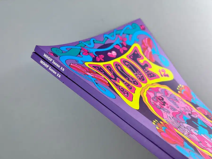
As one opens the vibrant cover of Moof Magazine Issue 12, they are immediately enveloped in a psychedelic homage to the ’70s, yet it presents a refreshingly modern twist. The cover artwork is a heady mix of intense hues – pinks, blues, and yellows, conspiring to arrest the eye with a flourish of nostalgia. It's not just a cover; it's a portal, a promise of the kaleidoscopic journey within.
Binding and Paper: The Sensory Delight
The publication is tactile bliss – an A4 portrait book, bound with precision, offering a perfect-bound spine that speaks to the magazine's quality and durability. The outer cover, a sturdy 160gsm Evolution Uncoated and 100% Recycled, adds to its eco-conscious charm, juxtaposed with the ethereal, lightweight feel of the 90gsm pages whispering through one's fingers as they turn. This choice of paper is not merely for aesthetics; it reflects a deep commitment to sustainability without compromising on print quality.
Typography and Layout: An Ode to the ’70s
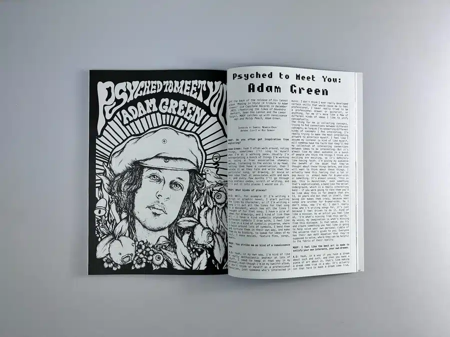
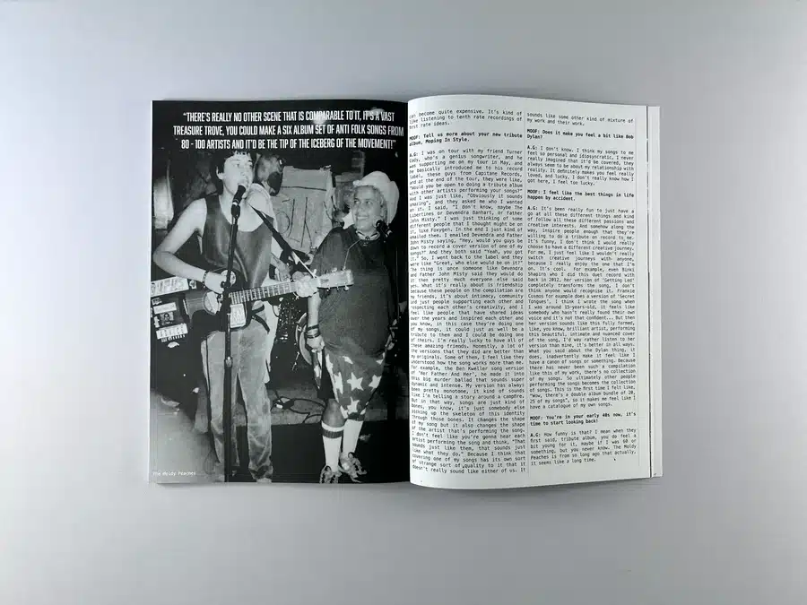
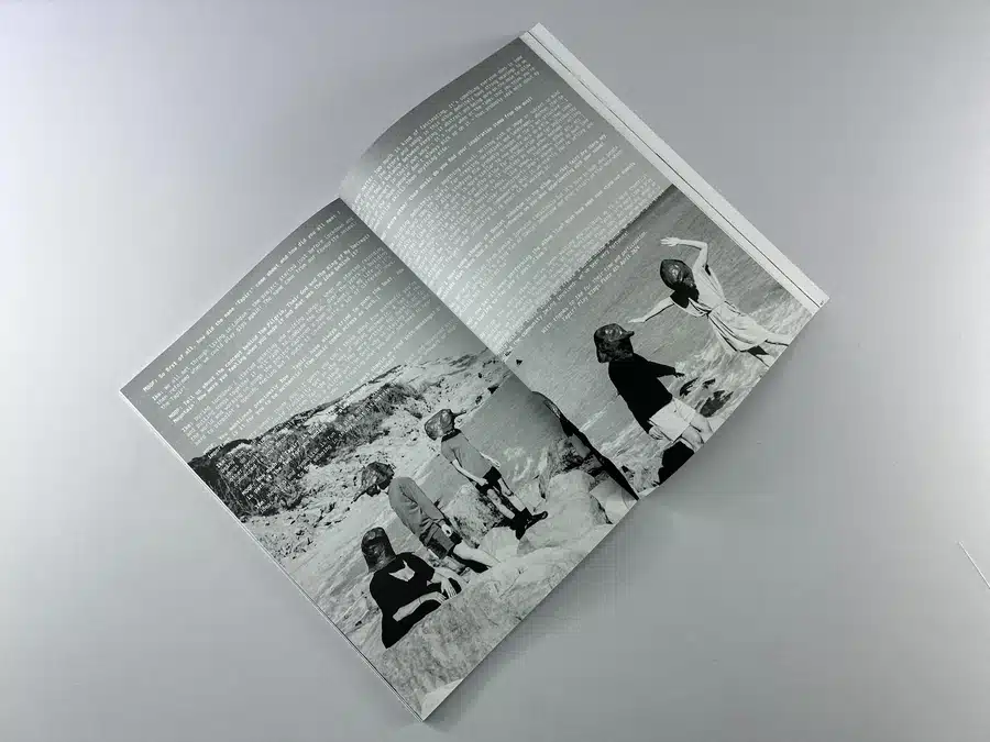
Flipping through the pages of Moof Magazine, one is greeted with a blend of rich black and white text, punctuating the importance of the content over the allure of colour. The typography does more than deliver words; it conjures an era. The fonts dance between the classic and whimsical, paying tribute to the era of the magazine’s inspiration while ensuring clarity and readability.
Storytelling through Imagery
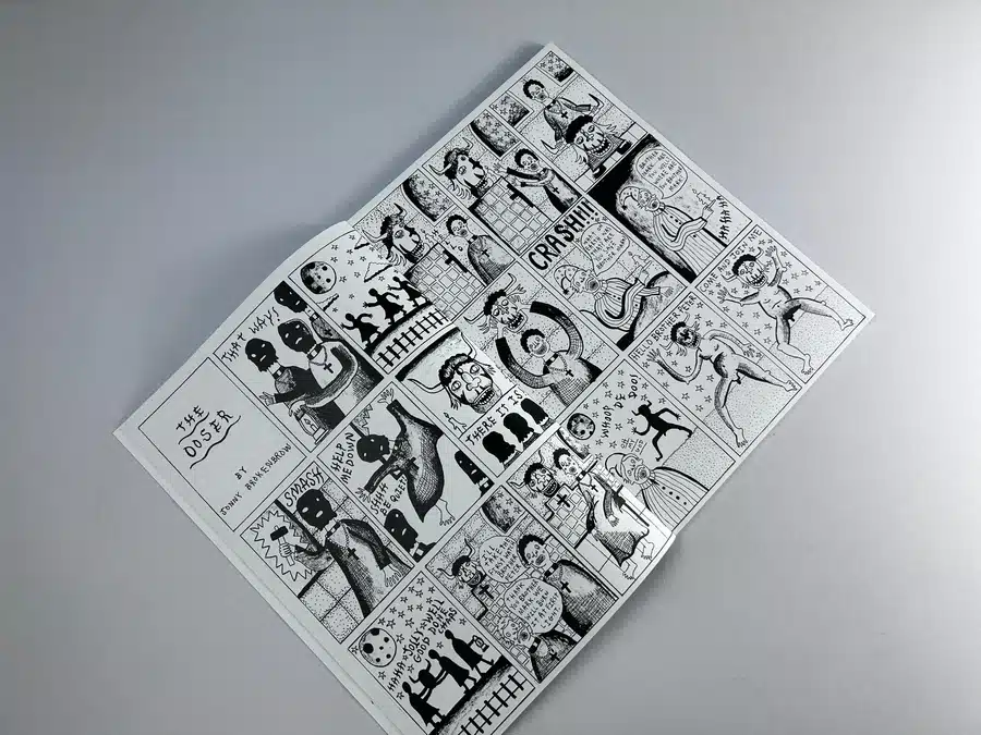
The pages are a pastiche of articles, interviews, and features, each graced with illustrations that are as much a part of the storytelling as the words they accompany. The black and white photographs are not mere visual breaks but narrative tools that offer a glimpse into the subjects' souls.
Actionable Insights for Aspiring Designers
• Embrace vibrant, thematic cover designs that attract and promise a journey.
• Utilise eco-friendly paper options to align with sustainable values.
• Balance retro typography with modern design for a timeless look.
• Consider perfect binding for a clean, professional finish.
• Let imagery drive narrative to create engaging visual stories.
Delve into the zine printing magic of Moof Magazine Issue 12, a print spectacle that bridges the nostalgic allure of the '70s with the crispness of modern design. This case study peels back the pages to reveal the collaboration between Moof Magazine and Ex Why Zed, a premier London-based magazine printing company. Together, they bring to life a publication characterised by vibrant colour, sustainable material choices, and impeccable print quality. Witness how Moof Magazine Printing transcends the ordinary, leaving a lasting impression on the art and music aficionados it caters to.
Key Takeaways from Moof Mag's Issue 12 Production
• Exemplary client-service provider collaboration
• Tailored solutions to specific print requirements
• Prompt and constructive feedback loops
• Efficient problem-solving throughout the pre-production process
• Adherence to tight deadlines without compromising on quality
Crafting a Vision: The Aspirations of Moof Magazine Issue 12
From the initial inquiry to the final delivery, the email exchange between Melanie Xulu of Moof Magazine and Ex Why Zed Print Company unravels a tale of creative collaboration and meticulous production. Melanie approached with a clear vision for Moof's Issue 12, seeking the same paper specs as the previous edition and anticipating a print run of 110 inside pages. She sought a quote to set in motion the tangible realisation of her vision.
Navigating the Print Journey: Solutions, Expertise, and Assurance
Ex Why Zed's response was prompt and encouraging. They provided comprehensive details and pricing for different quantities, ensuring Melanie had all the necessary information to make an informed decision. With expertise, they guided the client through technical aspects, from paper choices to delivery logistics, showcasing their ability to handle the intricacies of custom magazine printing in the UK.
The Art of Detail: Perfecting Moof's Print Narrative
Through a series of emails, Melanie and Ex Why Zed navigated the nitty-gritty of magazine production. This included adjusting the cover setup from A5 to A4, ensuring font consistency, and resolving image resolution challenges. Ex Why Zed offered actionable advice on how to enhance image quality, demonstrating their commitment to both print perfection and client empowerment.
The process was a harmonious blend of professional guidance and client autonomy, leading to a product that perfectly encapsulated the essence of Moof Magazine. Despite a tight deadline, the dialogue remained focused on achieving high-quality results without haste.
Testimonial of Satisfaction: The Closing Appreciation
Upon completion, Melanie's message beamed with gratitude, "They’re all here safe and sound - thanks again! :)" This punctuated the successful partnership between Moof Magazine and Ex Why Zed, highlighting the print company’s commitment to meeting client expectations and the joy of bringing a creative project to fruition.
From the vibrant, attention-commanding cover to the meticulously bound pages, Moof Magazine Issue 12 stands as a testament to the power of collaboration and expertise in magazine printing. Ex Why Zed's role was pivotal, steering the project through the challenges of design adjustments and pre-production nuances to meet pressing deadlines. The result is a publication that not only celebrates music and art but also embodies the meticulous care and eco-friendly practices of magazine printing in the UK. It is a showcase of dedication from both the publisher and the printer, culminating in a launch that was as timely as it was successful.


