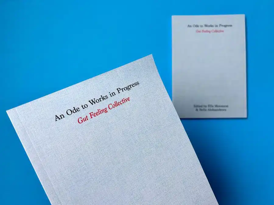
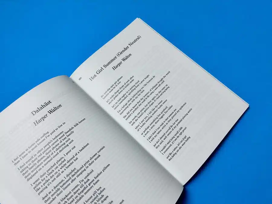
A5 Books
4pp Cover onto 250gsm Silk
Matt laminated to outer
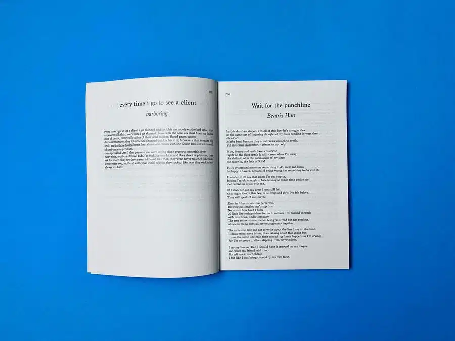
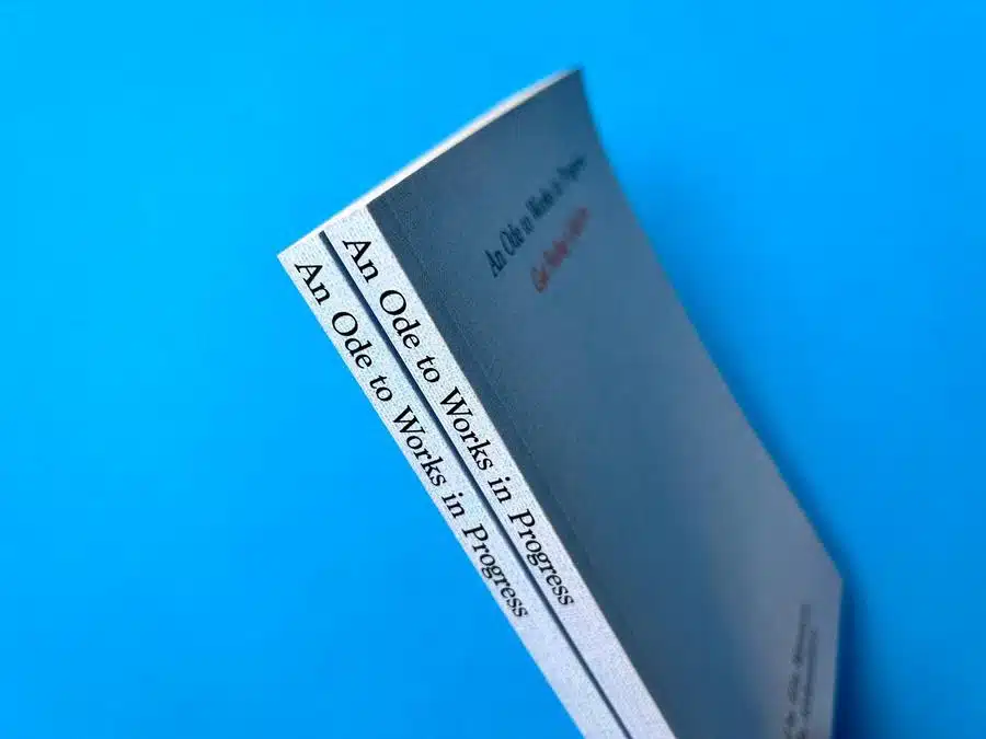
172pp Text onto 115gsm Silk (9mm spine)
Cover printed in full colour
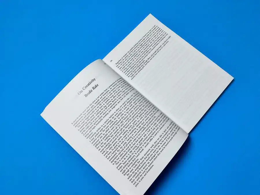
Inner pages printed in Black throughout
Trimmed, collated and perfect bound.
Introduction
Welcome to an insightful journey through the creation and realisation of "An Ode to Works in Progress," a poetry book brought to life by the Gut Feeling Collective and expertly printed by Ex Why Zed. This case study delves into the intricate processes of poetry book printing, exploring the collaborative efforts between the creative minds at Gut Feeling Collective and the seasoned printing professionals at Ex Why Zed. Discover how meticulous design choices, from typography to binding, coupled with responsive client communication, culminate in a printed poetry book that not only tells a story but also showcases the pinnacle of printing craftsmanship. Experience firsthand how Ex Why Zed's commitment to excellence and client collaboration makes them a leader in poetry book printing.
Thematic Significance: A Tapestry of Emotions and Journeys
"An Ode to Works in Progress" transcends beyond a mere collection of writings. It represents a journey through various emotional landscapes, portraying the essence of life’s unfinished, evolving narratives. Each page turns to reveal stories of desires, struggles, and reflections - a true homage to the ever-evolving nature of human experiences.
Styling Aesthetics: A Symphony of Simplicity and Elegance
The book’s design aesthetic is a masterful blend of simplicity and sophistication. The deliberate choice of a minimalistic cover speaks volumes, drawing readers into the depth of the content with an unspoken promise of rich, layered stories within.
Design Choices: Crafting an Inviting Experience
The use of 250gsm Silk for the cover and 115gsm Silk for the text pages creates a tactile experience that invites readers to immerse themselves in the book. The matte lamination adds a subtle, elegant touch, enhancing the overall feel and durability of the book.
Colour Palette: A Canvas of Monochromatic Brilliance
The choice of a monochromatic colour scheme for the book is a stroke of genius. It creates a timeless elegance, allowing the content to shine without the distraction of vibrant colours. This design decision underscores the importance of the written word in "An Ode to Works in Progress."
Typographic Usage: A Dance of Words
The typography on the cover sets the stage for the content within. The bold, black ink stands out against the silky background, making a statement of confidence and clarity. Inside, the justified text layout offers a harmonious reading experience, guiding the reader’s eye seamlessly through the stories.
Page Layout: An Ode to Organised Structure
The book's layout strikes a perfect balance between structure and creative freedom. The left-justified text layout on the silk pages creates an organised yet dynamic flow, mirroring the book's theme of finding solace in the unfinished and unexplored.
Binding Style: Perfect Bound Perfection
The choice of perfect binding for this book is apt, as it not only provides a sleek, professional look but also aligns with the theme of works in progress. The binding style allows the book to lay flat when opened, offering an unobstructed view of every word and emotion.
Actionable Insights for Future Designers
- Embrace Simplicity: Let your content speak for itself. A simple cover can create a powerful impact.
- Consider Tactile Experience: Choose paper and lamination that enhance the physical interaction with your book.
- Monochromatic Colour Schemes: Utilise monochrome to highlight content and create timeless elegance.
- Bold Typography: Use bold, clear typography on covers to make an immediate impression.
- Justified Text Layout: For a clean and organised look, consider left-justified layouts.
- Perfect Binding: For a professional finish and ease of reading, perfect binding is an excellent choice.
- Reflect Theme in Design: Let your design choices mirror the thematic elements of your content.
Gut Feeling Collective and Ex Why Zed A Poetry Journey
Key Takeaways:
- Client's Inquiry and Specifications: The client, represented by Ella from Gut Feeling Collective, inquired about the spine design and shared their preference for it to match the cover and back cover with the title included.
- Responsive Collaboration: Ex Why Zed, through Mike, demonstrated flexibility and responsiveness, accommodating the client's request for spine artwork and providing guidance on the spine size (9mm).
- Problem-Solving and Adaptability: The team at Ex Why Zed efficiently handled a last-minute change request by the client to reprint a page, including providing a quote for the additional work.
- Communication and Client Support: Throughout the process, Ex Why Zed maintained clear and supportive communication, addressing each of the client's concerns and queries promptly.
- Delivery Coordination and Assurance: Ex Why Zed actively coordinated the delivery process, addressing challenges like missed deliveries and ensuring that the client's deadlines were met.
Client's Aims and Aspirations:
- Visual Consistency: The client desired a cohesive visual appeal, particularly for the book's spine to match the cover.
- Accuracy and Quality: Attention to detail was crucial, as evidenced by their request to correct an error on specific pages.
- Timely Delivery: Ensuring the timely receipt of the books was critical for the client's launch plans.
Ex Why Zed's Solutions and Assistance:
- Design Execution: Mike at Ex Why Zed helped in finalising the spine design, ensuring it aligned with the client's vision.
- Addressing Change Requests: The team adeptly managed last-minute changes, including reprinting pages, to maintain the quality of the final product.
- Delivery Management: Ex Why Zed navigated delivery challenges, offering solutions and reassurance to meet the client's timeline.
Positive Client Testimonial:
- Client Satisfaction: The client, Ella, expressed gratitude and satisfaction with Ex Why Zed's helpfulness and effective problem-solving throughout the project.
Conclusion
Reflecting on "An Ode to Works in Progress," this case study highlights the harmonious blend of creative vision and technical expertise. The journey of this poetry book printing project with the Gut Feeling Collective encapsulates the essence of successful collaboration, attention to detail, and customer-centric solutions. From addressing design intricacies to overcoming logistical hurdles, Ex Why Zed's approach exemplifies their dedication to bringing each client's vision to fruition, reaffirming their status as a top choice for self-publishing authors seeking exceptional quality in poetry book printing.
How to Self-Publish a Poetry Book—The Smart Way
This guide distills everything a modern poet needs to self-publish with impact—from shaping your manuscript to designing a standout cover and choosing the right format. It dives deep into practicalities like editing costs, ISBNs, and print options (POD vs. offset), while delivering pro-level insights: use uncoated paper for warmth, don’t cram poems onto pages, and treat your layout like a stage for each piece. Ideal for first-timers and seasoned poets alike, it’s a blueprint for building a book that looks and feels as powerful as your words.
Your No-Fuss Guide to Poetry in Print
Forget the gatekeepers—this hands-on guide empowers you to turn raw poems into a bound poetry zine that’s bursting with personality. From idea-storming and mood boards to layout finesse and bold binding choices, it shows how to shape your style into something tangible. Top takeaways? Keep typography readable but expressive, give poems room to breathe, and match your binding to your vibe. Whether you're printing a one-off zine for a poetry night or scaling up with POD, this is creative freedom at its finest.


