“Thank you so much for helping make our Kickstarter dream come true!”
We Reach for the Sky is one of the longest-running self-publish projects we’ve handled — and genuinely one of the most rewarding to finally hold in our hands. It’s a bold, generous hardback that pairs inspiring first-person stories with jaw-dropping night-sky imagery, then ties it all together with a confident, clean layout and a classy finishing touch: navy head and tail bands on a section sewn text block. If you’re planning something similar, our hardback book printing service is a good starting point.
About the Book
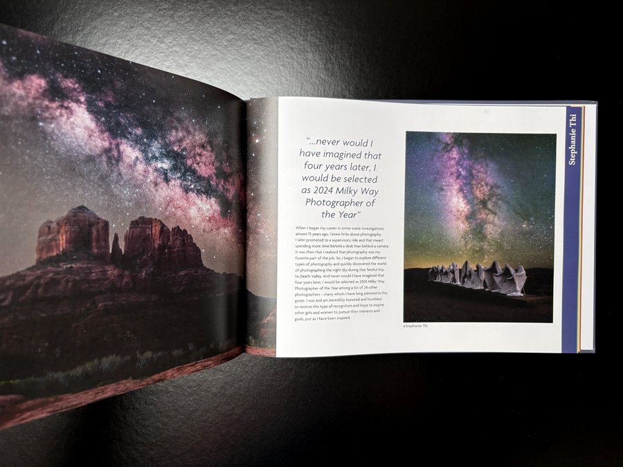
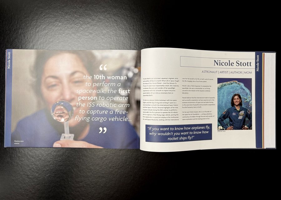
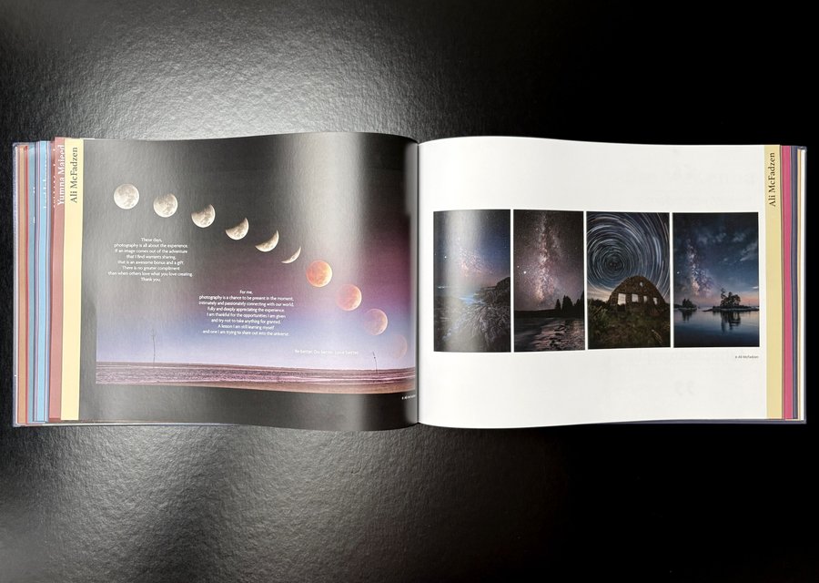
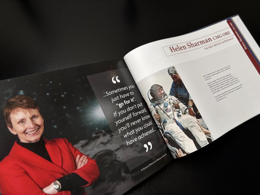
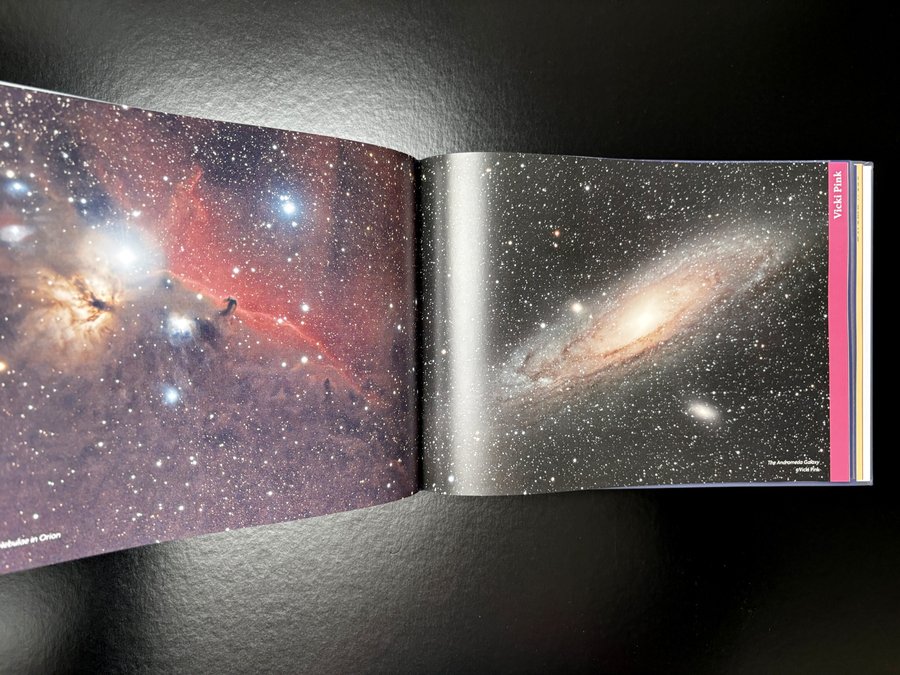
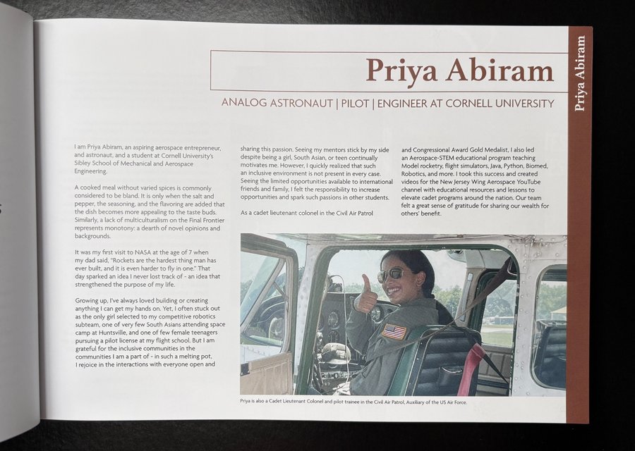
Created by Claire Bradshaw, We Reach for the Sky brings together “successful women in STEM and beyond” in their own words — made for Kickstarter backers, astronomy and space enthusiasts, and the contributors themselves. The tone is celebratory and human: portraits of women in their working worlds, strong pull-quotes, and full-bleed space photography that’s given room to breathe.
You can see from the spreads that it’s designed to be dipped into and shared — the kind of book that lives on a coffee table, then keeps pulling people back in for “just one more story”.
Print Specification & Materials
This is an A4 landscape, case bound hardback with 288pp inner pages, four colour throughout, and a build that’s made for longevity:
- Cover: 170gsm silk, wrapped over greyboard, matt laminated
- Endpapers: 2 × 4pp printed onto 170gsm uncoated
- Text: 288pp onto 130gsm silk
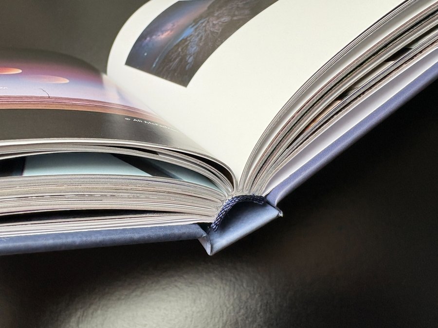
- Binding: case bound with section sewn inside pages
- Extras: dark blue head and tail bands (a sharp bit of “extra branding” on the shelf-edge)
We often point self-publishers to paper samples early on, because it turns “I think I want…” into a clear decision fast. That hands-on step mattered here too.
Design Details
A few things jump out from the finished book:
- Landscape A4 gives the astro imagery proper scale. Full-bleed spreads feel immersive, and the star fields hold detail without looking cramped.
- The layout balances personality with pace. You’ve got structured profile pages (name/role, readable columns) alongside big visual moments and quote-led “breathers”.
- The cover is calm but confident. That misty, starry scene with the bold title does what a good cover should: clear from across a room, and intriguing up close.
From our side, we also kept a practical eye on production realities — like how large areas of dark colour behave in print, and how to build “black” so it looks right on press.
The Client’s Print Journey
This project has a proper arc — from first idea to finished hardbacks landing with a fulfilment partner.
1) The first email (and the big questions).
Claire first reached out after seeing a self-publishing video, with the classic early-stage questions: how does printing work, do we print-on-demand, where does distribution sit, and how do we make Kickstarter viable? We talked through the most realistic route: use Kickstarter to confirm demand, then print a batch at a sensible unit cost and fulfil from there.
2) Samples, templates, and choosing a workable format.
We sent paper samples and helped narrow down format, including confirming landscape binding on the short edge and supplying InDesign templates so the team could build pages correctly from day one.
3) Design feedback while it was still flexible.
As spreads started coming together, we fed back on layout decisions — how much “real estate” portraits needed, how to give intricate imagery room, and how typography could be made easier to read over long sessions.
4) Real-world bumps (and keeping momentum).
Over a long timeline, teams change and projects pause. Claire flagged a reset after losing key project roles — then rebuilt with a new PM and multiple designers, using the layout file we’d already supplied to get moving again.
5) Kickstarter realities: page counts, spine width, file set-up, colour.
As the book approached launch, we supported with page-count logic (keeping pagination in workable signatures), spine guidance, and file export basics — PDFs with crop marks and bleed.
We also handled practical print questions like CMYK profile choices for logos (so colours don’t drift unexpectedly).
6) The final production push (late 2025).
When the order landed, it was for 340 copies, case bound, section sewn, with a note that many images were supplied in RGB (so we reiterated how that can shift when converted to CMYK inks).
As a finishing touch, we offered head and tail bands as a gift, and Claire chose dark blue.
How Ex Why Zed Helped
This wasn’t just “print it and ship it”. Over the life of the project, our role looked like:
- Explaining a Kickstarter-friendly print workflow (batch print after funding, then fulfil).
- Sending samples + steering specs so the book would feel premium but still readable and robust.
- Templates and file set-up support (including bleed/export guidance). If you’re setting files up now, this guide to setting up 3mm bleed saves headaches.
- Practical production advice (colour profiles, RGB-to-CMYK expectations, and pagination structure).
- Planning for fulfilment with all copies going to a fulfilment partner once delivered.
For anyone doing this for the first time, it’s also worth reading through the broader print journey so you can see what happens at each stage.
Takeaways for Your Next Self-Published Hardback
- Start with samples and one “anchor” reference book. Your paper choice affects everything: image contrast, readability, and how heavy the finished book feels.
- Lock the format early (trim size + orientation). Landscape books are brilliant for photography, but they need proper planning for binding edge, margins, and spine.
- Use PDFs for print sign-off, not working files. Build in InDesign, but export a clean print PDF with bleed and marks for checking.
- Expect colour shifts if assets are RGB. It’s normal — just flag it early, and proof carefully.
If it’s a “legacy” book, consider section sewing. The book opens better and holds up longer — ideal for something that will be passed around, kept, and revisited.