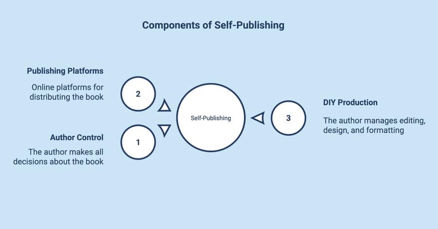
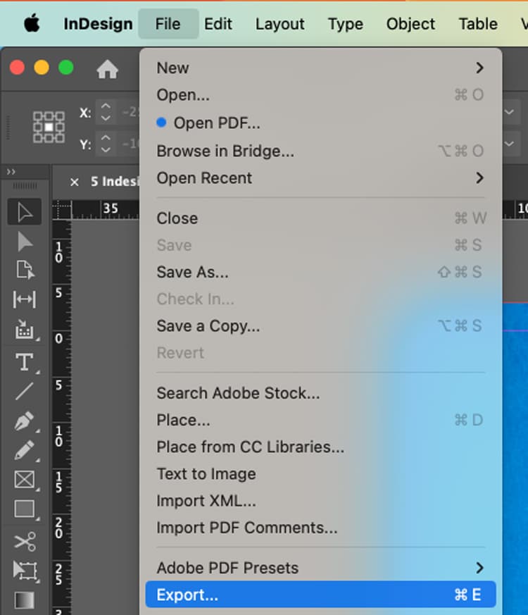
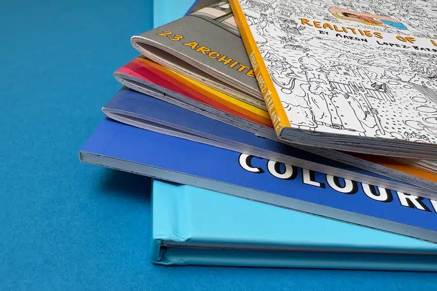
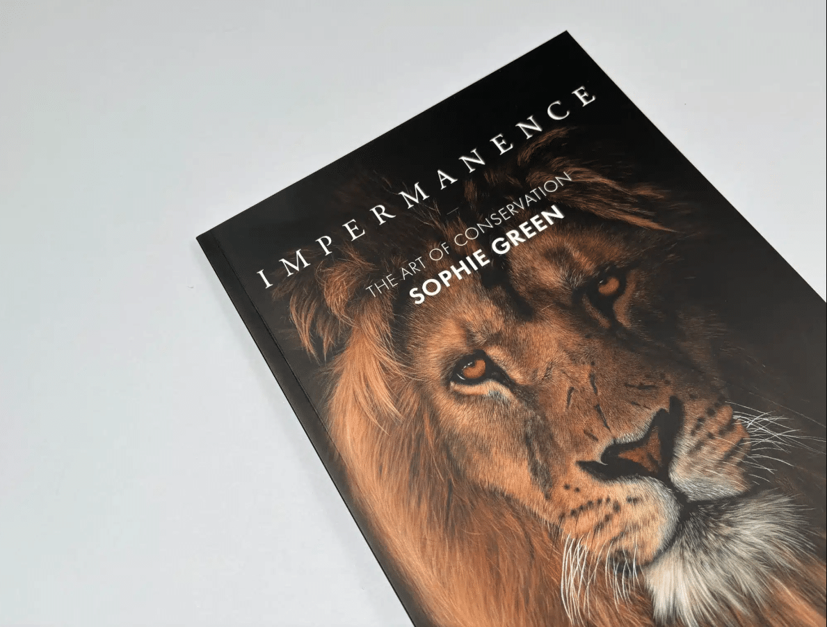
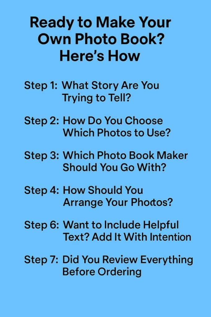
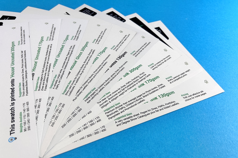
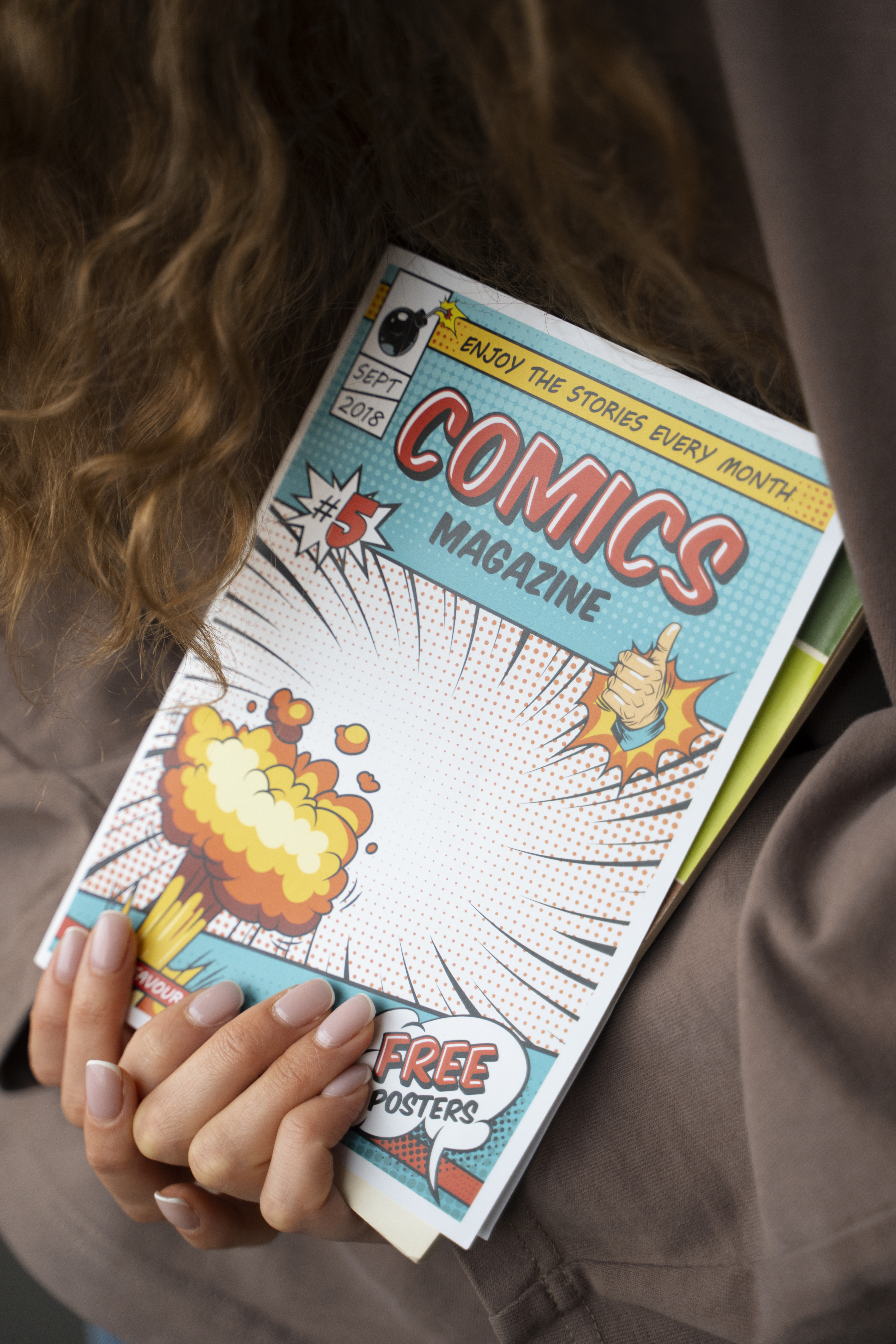
Fine art photo book printing relies on archival paper, precise colour accuracy, and premium binding to achieve gallery-quality results.
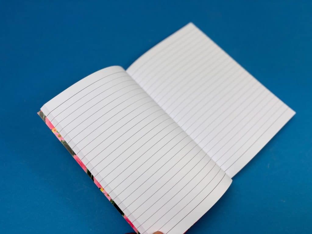
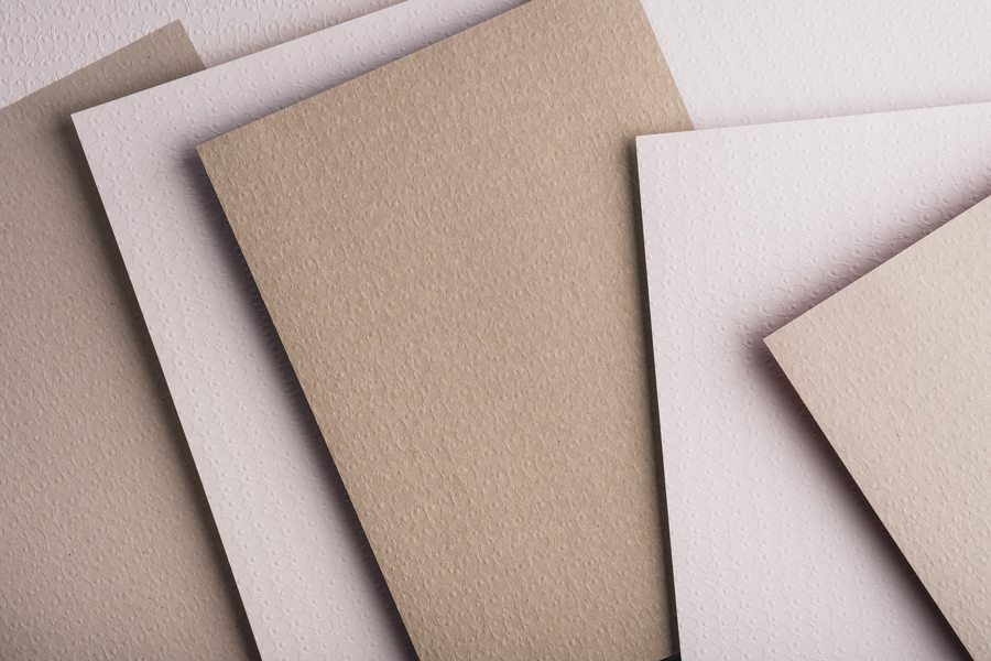
Paper choice (170–300gsm, coated vs uncoated) directly impacts how images look, feel, and last over time.
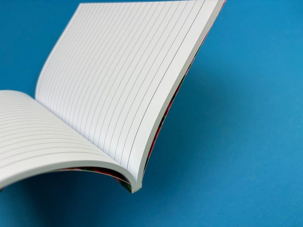
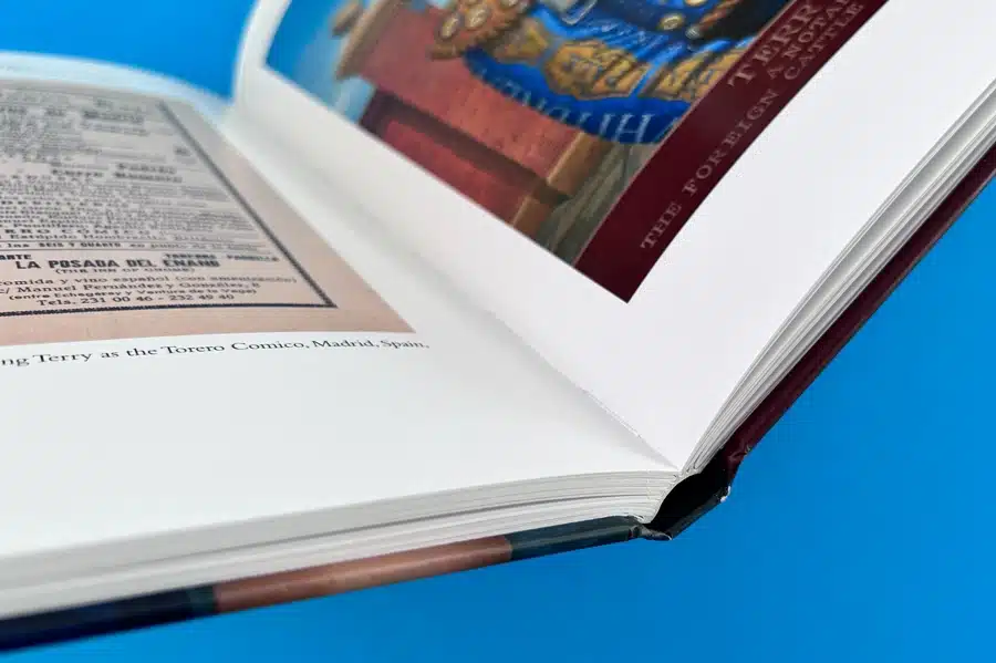
Binding styles like layflat and perfect bound significantly influence presentation, durability, and usability.
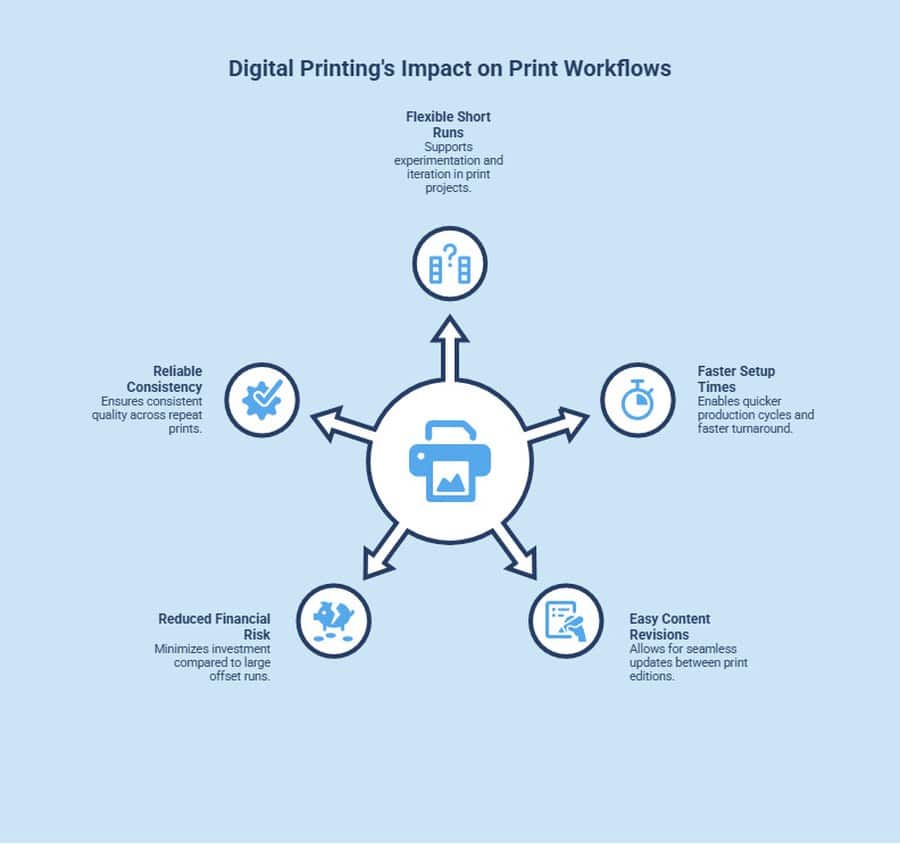
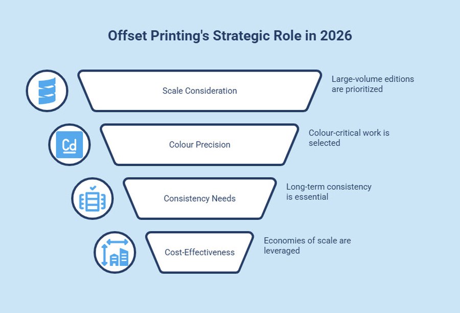
Digital printing ensures consistent quality for short runs, while litho becomes cost-effective at higher volumes.
Print-ready PDFs with correct colour profiles and setup are essential for accurate output.
Turnaround times typically range from 3–7 working days in the UK, depending on format and complexity.
Ex Why Zed offers free file checks, direct human support, and flexible formats from single copies to commercial runs.
The UK market for fine art photo book printing is crowded and, at times, difficult to navigate. You will find everything from consumer-friendly photo book makers and mobile app-based tools to specialist print studios producing high quality, handcrafted editions. Options range from softcover photo books to premium hardcover books made with the finest papers, but not all deliver the same standard.
For photographers, designers, and anyone creating a coffee table book or personalised photo album, the stakes are high. Poor colour accuracy, lack of detail, or substandard materials can undermine the quality of the images and the effort behind your work. Whether you are printing a wedding photo book, a large landscape photo book, or a collection of favourite memories, the difference between average and exceptional printing is immediately visible.
This guide cuts through the noise. We compare the best fine art photo book printing options in the UK based on what actually matters: paper quality, binding (including layflat pages and traditional binding), colour reproduction, turnaround times, and customer service. The aim is to help you choose a printer that can do justice to your own photos and produce a book that stands the test of time.
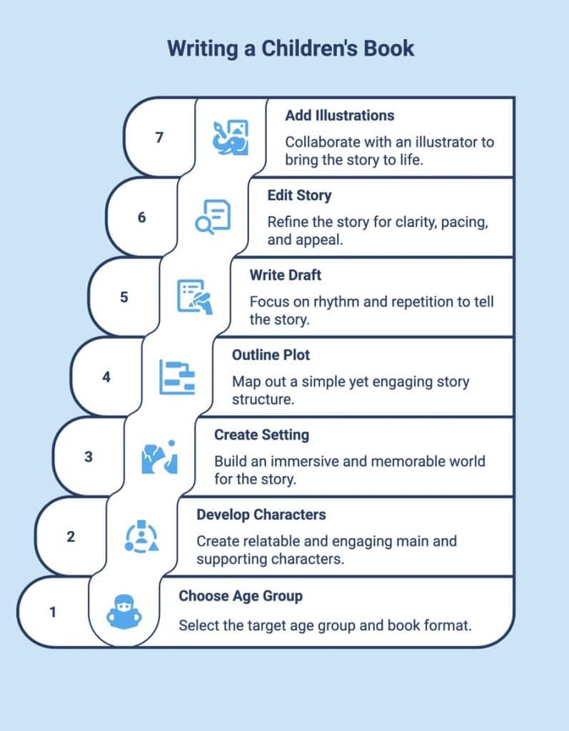
What is Fine Art Photo Book Printing?
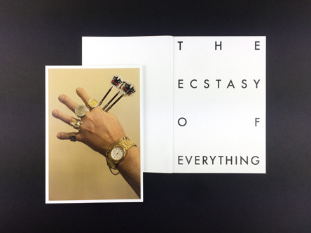
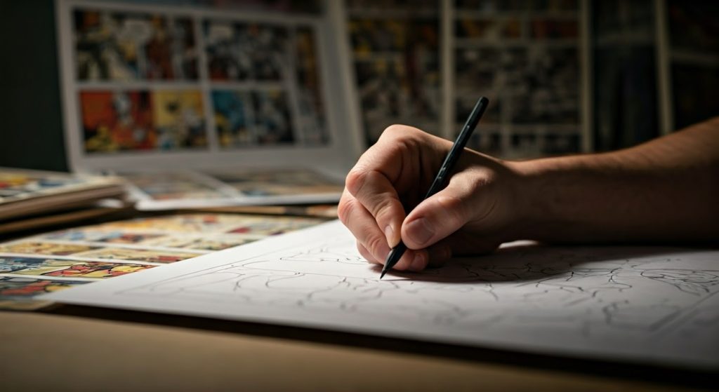
Fine art photo book printing is the production of photo books using archival-quality paper, high-fidelity inks, and considered binding. It prioritises colour accuracy, material longevity, and craft. The result is a printed object that presents photography as a lasting, collectible work rather than a consumer keepsake.
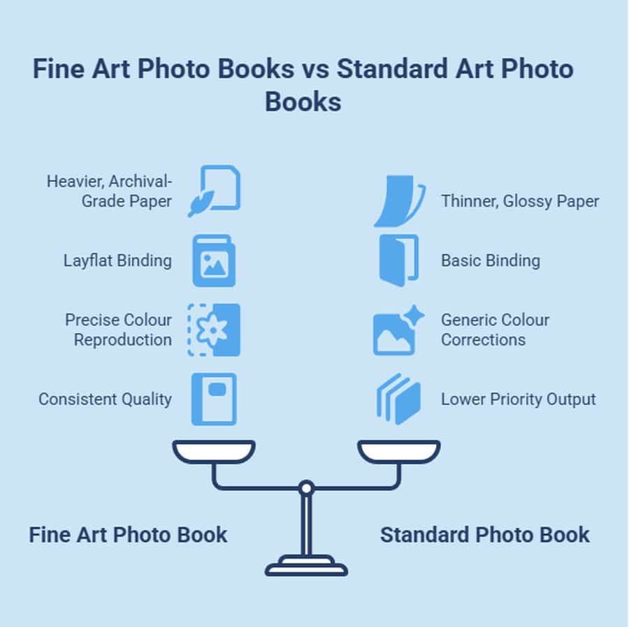
What Makes a Fine Art Photo Book Different from a Standard One?
Here’s what actually sets a fine art photo book apart from a standard photo book or consumer photo products.
Is Paper Quality the Biggest Difference in Fine Art Photo Book Printing?
Yes, and it’s the most noticeable upgrade from a standard photo book maker. Fine art books use heavier, archival-grade papers that enhance the quality of the images and ensure they stand the test of time.
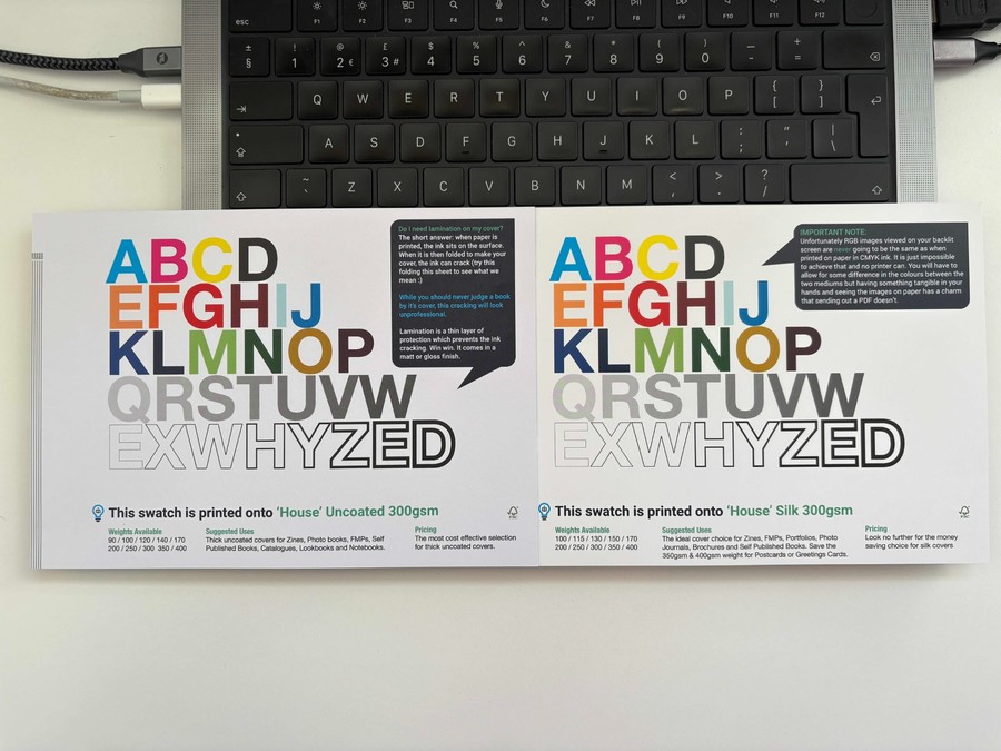
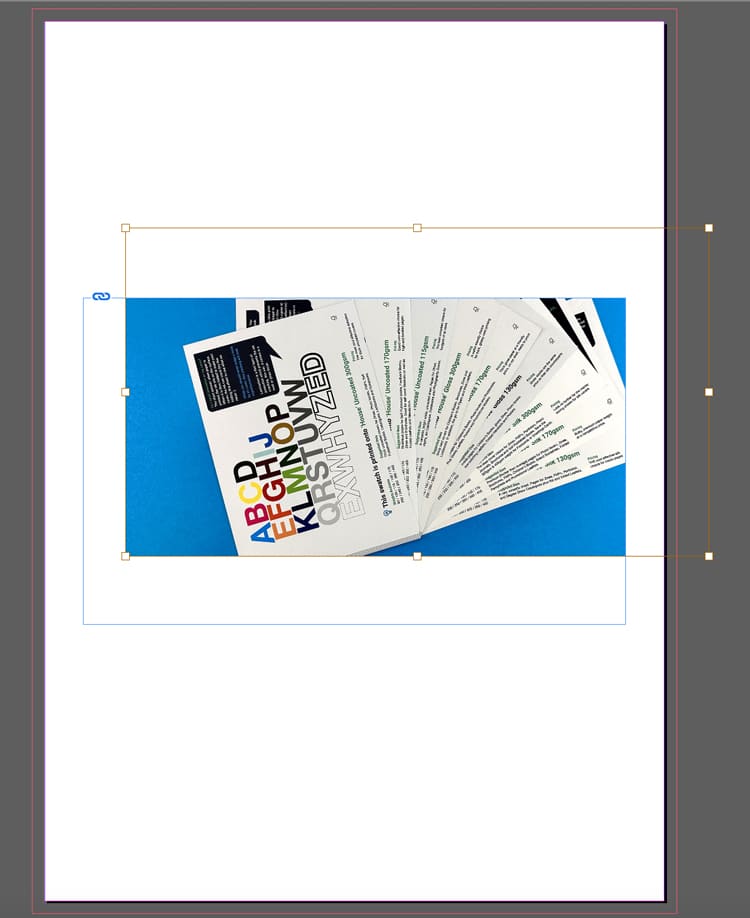
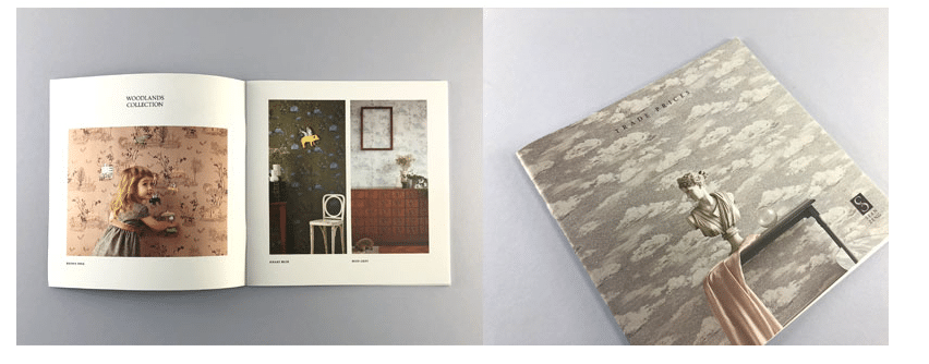
While many consumer platforms use thinner stock, fine art printing typically starts at 170gsm and goes up to 300gsm for a more substantial feel. You’ll also find premium options like cotton rag and uncoated papers, which give a softer, gallery-style finish compared to the glossy look of mass-market books.
How Does Binding Differ in a Fine Art Photo Book?
Binding is a key distinction between a fine art photo book and a standard personalised photo album. Fine art books are designed for presentation, not just storage.
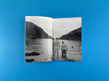
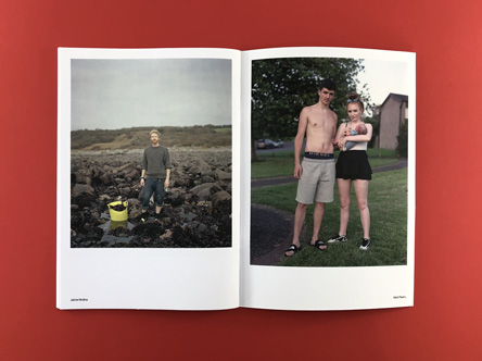
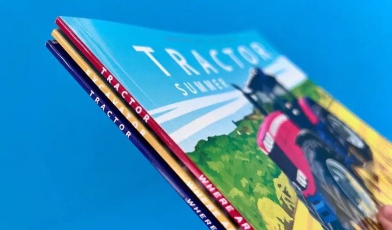
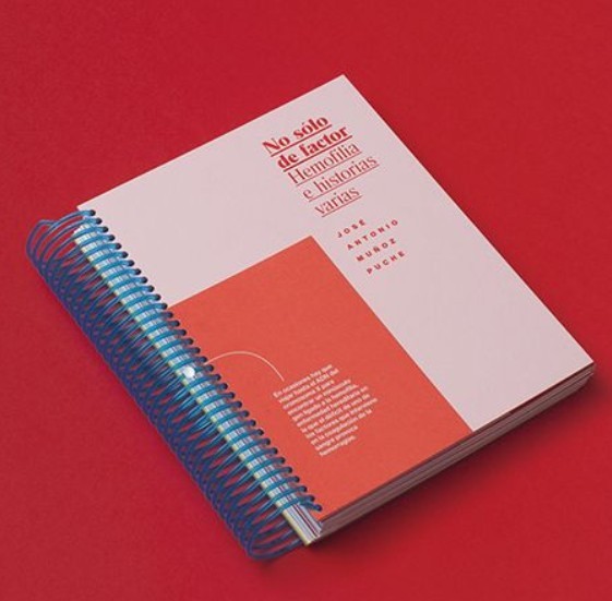
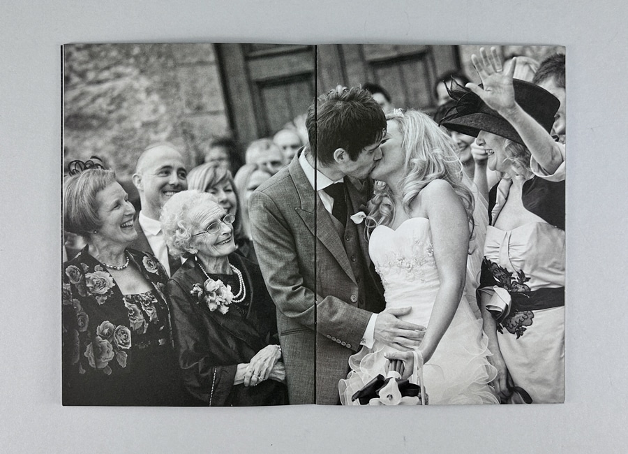
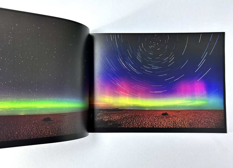
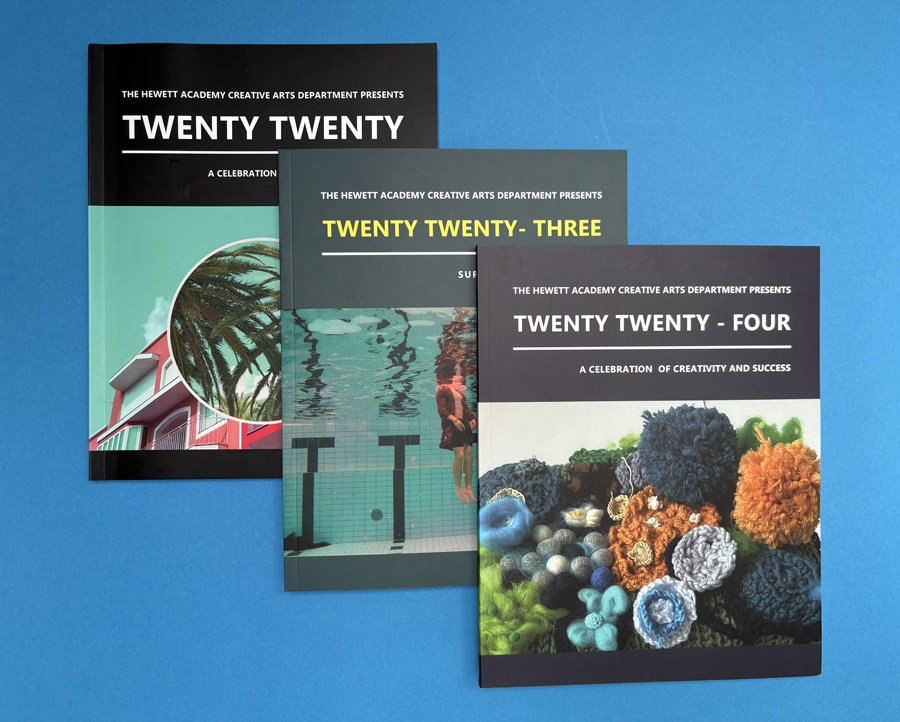
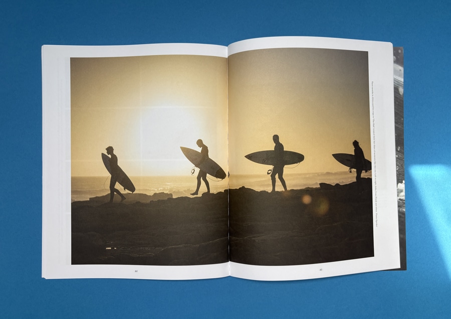
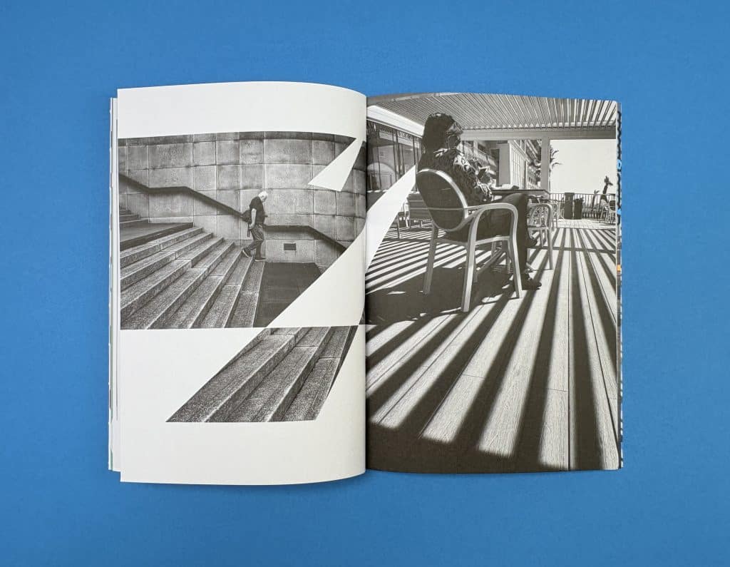
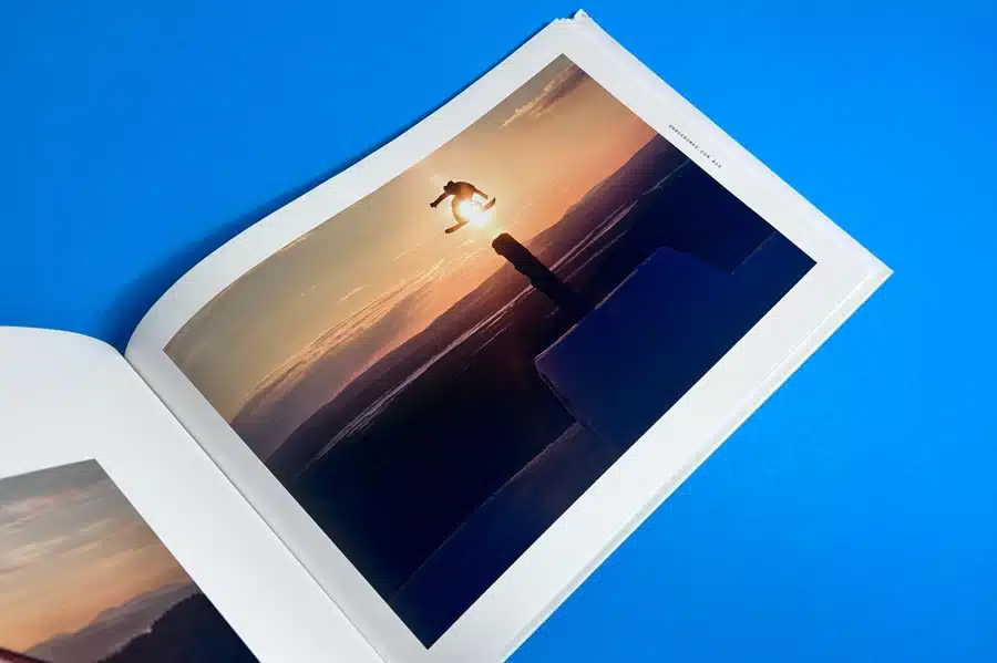
Layflat pages are a major upgrade, allowing images to stretch seamlessly across spreads; ideal for large landscape photo books or coffee table books. In contrast, standard books often use basic binding that interrupts images at the fold.
Options like hardcover books, traditional binding, or even layflat photo books add durability and elevate the overall experience, especially for portfolios or wedding photo books.
Why is Colour Accuracy Better in Fine Art Photo Book Printing?
Fine art printing focuses on precise colour reproduction, ensuring your own photos look exactly as intended. This is where many standard photo book services fall short.
Specialist printers use calibrated workflows and ICC profiles to maintain vibrant colours, accurate skin tones, and detail. Consumer platforms, especially those relying on automated tools or mobile app uploads, often apply generic corrections that can alter the final result.
Does Print Quantity Affect Quality in Fine Art Photo Books?
In true fine art photo book printing, quality remains consistent whether you print one copy or a full run. This is a major difference from standard photo book services, where single copies can feel like lower-priority output.
Using professional digital presses, a single custom photo book can match the highest quality of larger runs. This makes it ideal for everything from a one-off portfolio to a premium coffee table book without compromising on finish.
Which Are the Best Fine Art Photo Book Printers in the UK?
Choosing the right printer comes down to how well they balance paper quality, colour accuracy, binding options, and support — not just price. Here are some of the best fine art photo book printers in the UK worth considering:
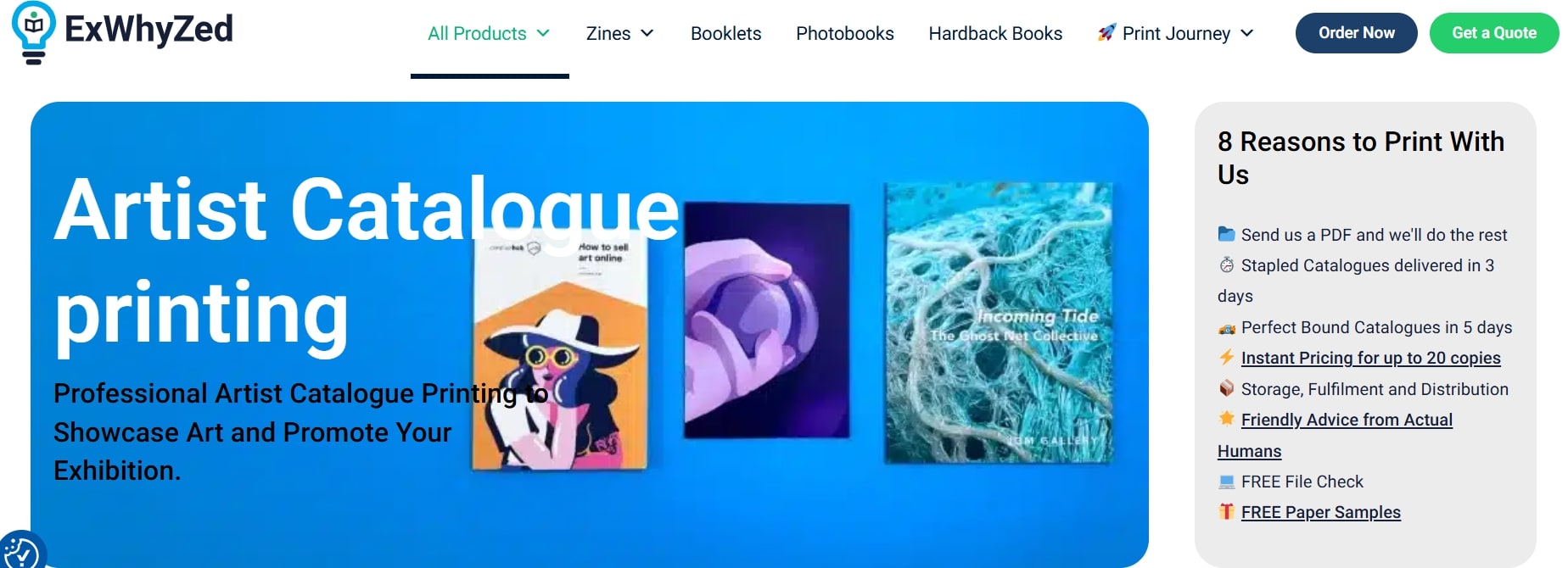
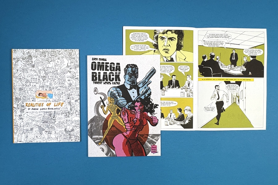
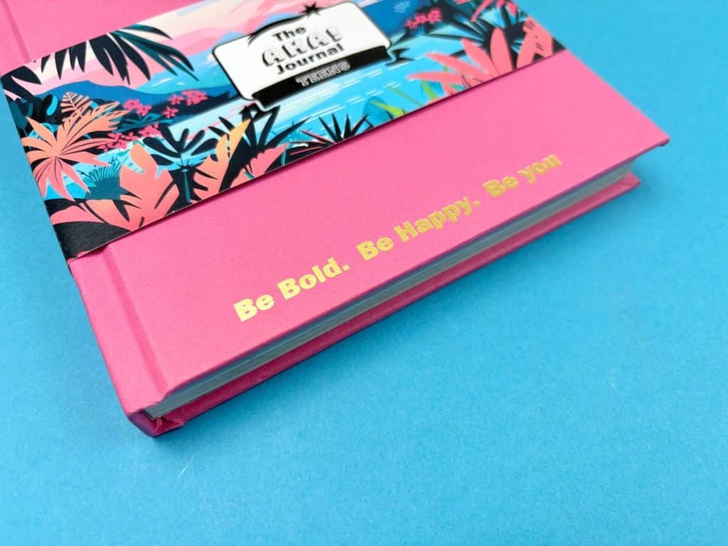
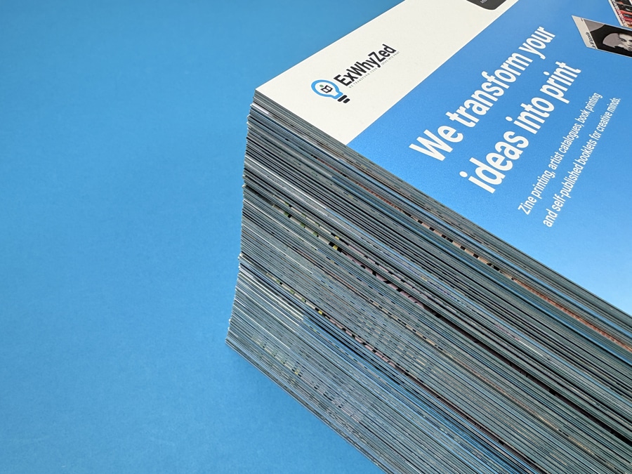
1. Ex Why Zed
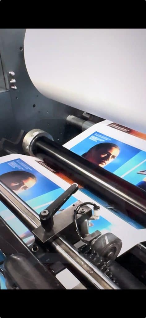
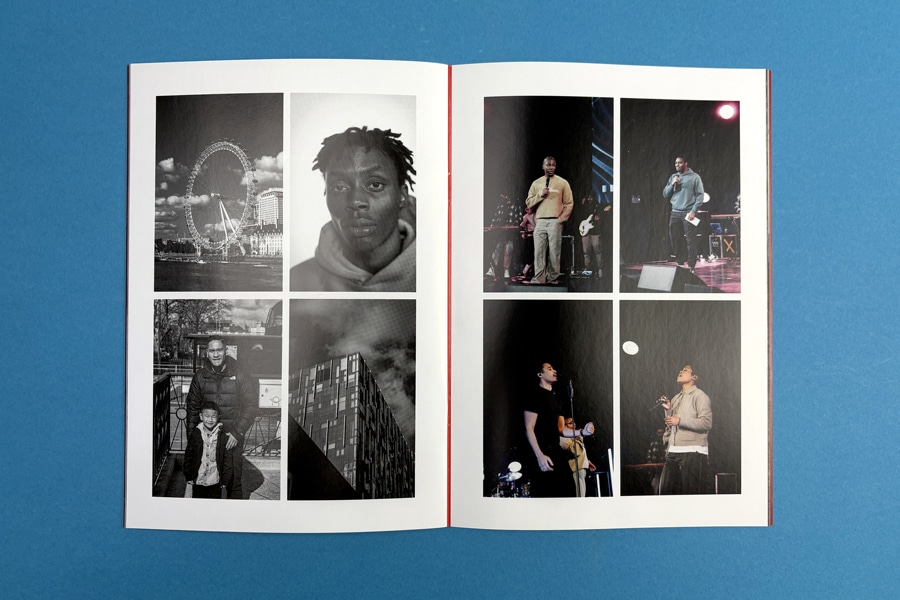
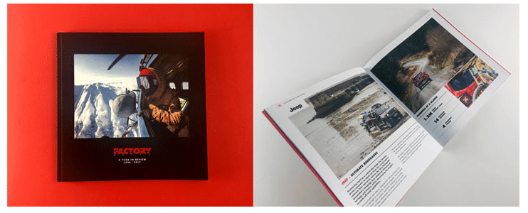
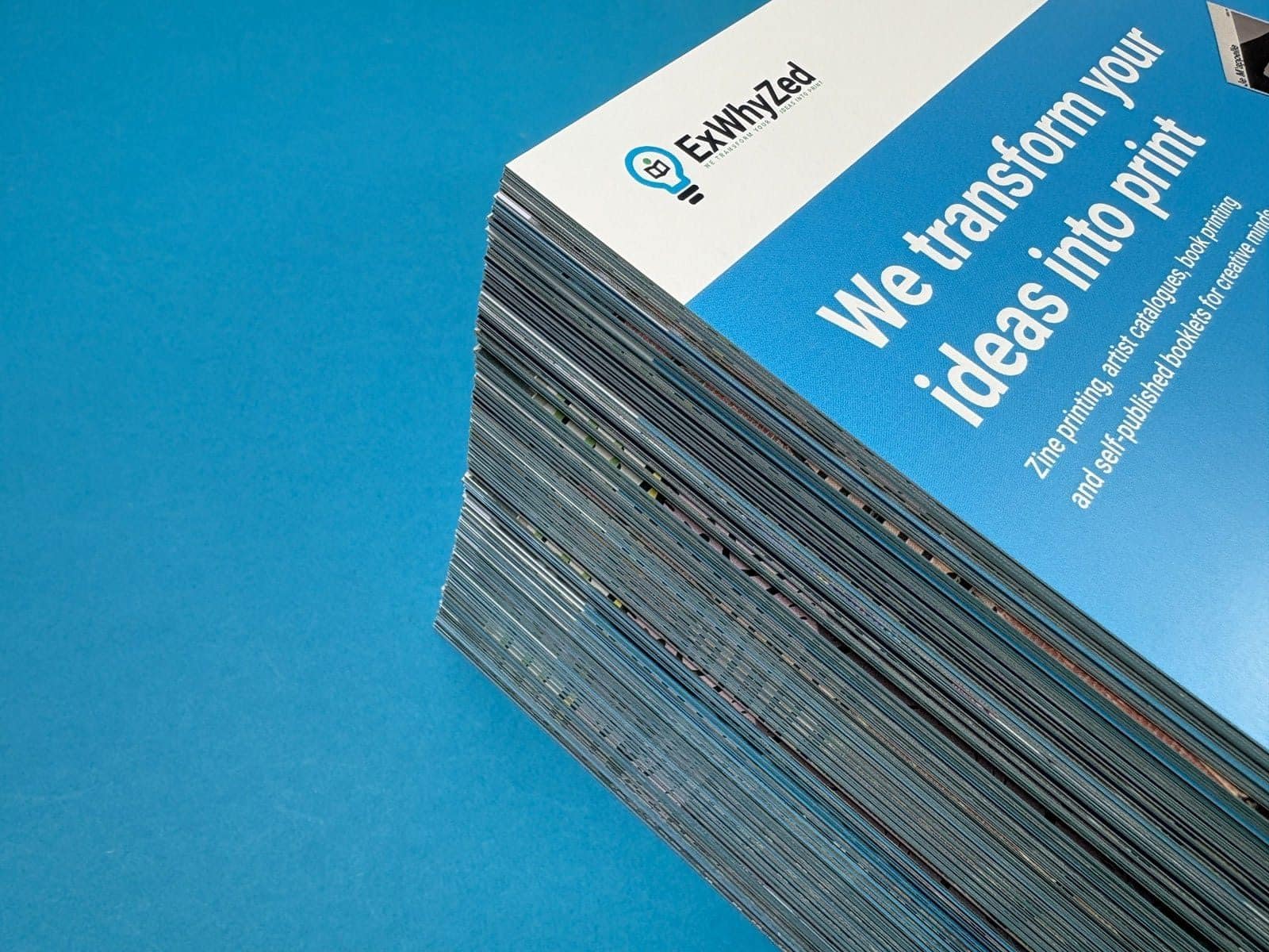
Ex Why Zed has been printing for photographers, designers, and artists since 2006. We run HP Indigo digital presses and Heidelberg litho presses, and we print photo books every single week. We won Photobook of the Year at the Digital Printer Awards.
Our workflow is built around designers and photographers who know what they want. You supply a print-ready PDF, we check it for free, and we print it. No templates, no auto-corrections, no surprises.
Here's why you should choose Ex Why Zed:
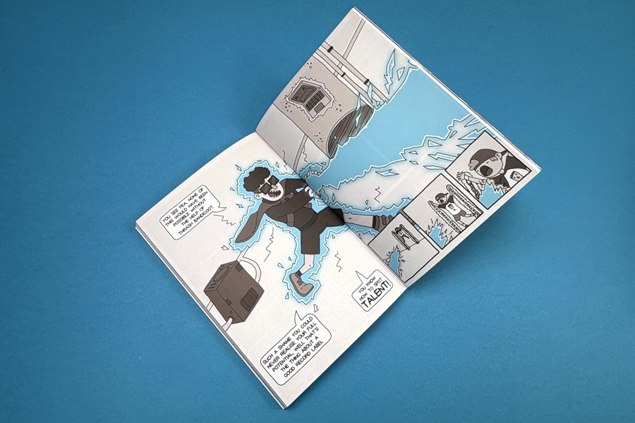
1. Paper and print quality
We offer a wide range of paper stocks, from silk and gloss coated papers for colour-saturated photography to uncoated art papers for black-and-white or fine art work. HP Indigo digital printing produces highly consistent colour across short and long runs, which means a single copy looks as good as a box of fifty.
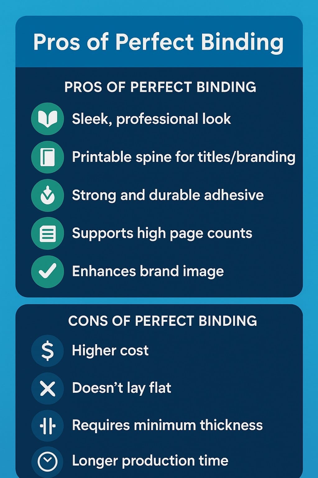
2. Binding Options
We offer saddle-stitched (stapled) booklets, and perfect-bound books from 32 pages. Custom sizes are also available. We'll advise on which format suits your project if you're not sure.
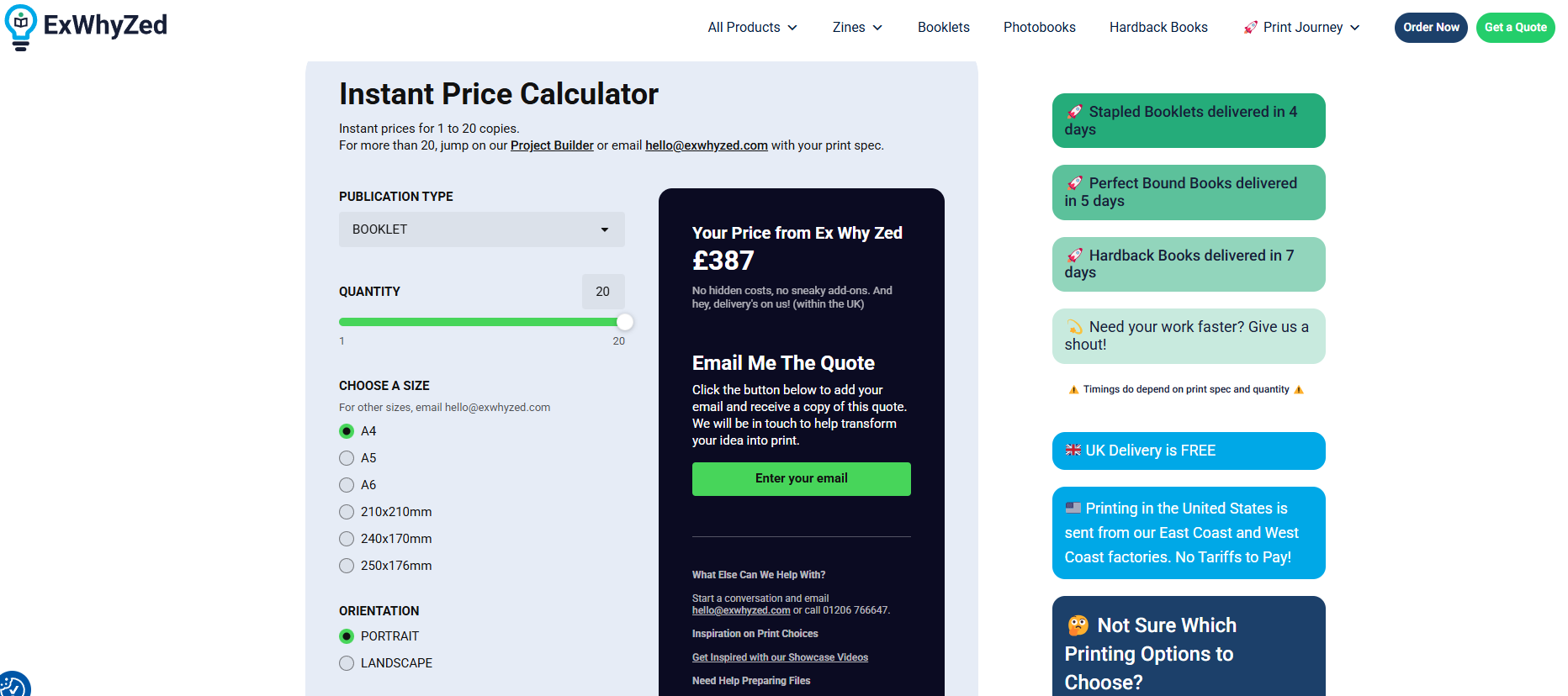
4. Turnaround
Turnaround time is often the deciding factor, especially when you’re working to a fixed deadline or event date.
Stapled books: approximately 3 working days
Perfect bound: approximately 5 working days
Tight deadline? Drop us a message at hello@exwhyzed.com, and we’ll see what we can do.
5. Affordable Fine art photo book printing UK prices
Fine art photo book printing UK prices at Ex Why Zed start from around £30 for shorter stapled books and scale with paper, page count, and quantity. Use our Project Builder for a quote specific to your requirement.
6. Support
You can speak to someone who prints books for a living. Phone, email, and our Project Builder are all available. We have detailed file set-up guides, videos, and illustrated articles for every stage of the process.
Who is Ex Why Zed Best for?
Photographers and designers supplying their own print-ready PDF
Short-run portfolios, exhibition editions, and client-facing work
Anyone who wants to speak to a human being who knows print
Fine art photo books for weddings, where the couple wants something genuinely special
Bruno "Fantastic print service. I have had an absolutely fantastic experience with Ex Why Zed Print from start to finish. I feel like the staff went the extra mile for me, helping me to prepare my files to print and guiding me through the process. Friendly, quick to respond to any questions with thorough, easy-to-follow answers, and the prices are reasonable. My postcards turned out better than I could have imagined - I will definitely be using them again for my next print run. Couldn't recommend highly enough!"
Stephen Jarvis "Ex Why Zed; printing made easy. Ex Why Zed has everything you need to be able to produce great zines. A choice of paper stock, easy to follow step by step guides that mean you can obtain the best results using your own design skills. I've just had my fifth publication made by them. I keep returning because of the friendly and helpful communication, the beautiful print quality, and the very fast turnaround times. I'm sure to be back again."
Ready to print? Upload your artwork, choose your spec, and place your order today.
2. SIM Imaging
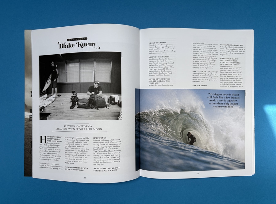
SIM Imaging is a UK-based specialist focused on professional photographers, particularly in the wedding and portrait market. Their fine art photo books use giclée paper and archival inkjet printing, with edge-to-edge printing across double-page spreads. Books are hand-bound by specialist bookbinders in the UK.
Why Should You Choose SIM Imaging?
Five cover types, including leather and linen, with embossed and UV-printed options
Six book sizes; production time of 10 working days standard, fast-track to 6 days available
Primarily B2B, aimed at established wedding and portrait photographers
Strong handmade positioning, with each book checked before dispatch
Who is SIM Imaging Best for?
Professional wedding photographers creating premium client albums for the big day
Portrait photographers who need consistent, high quality output for paying clients
Creatives looking for handcrafted, archival photo books with a luxury finish
Studios that value strong customer service and manual quality checks over automation
Projects where presentation matters, such as heirloom albums or high-end personalised photo albums
Photographers who prioritise layflat pages and seamless spreads for storytelling
Those willing to trade a slightly longer delivery time for artisanal production quality
3. Saal Digital
Saal Digital is a German lab that ships to the UK and has developed a strong following among photographers who prioritise photo paper quality. Their books are printed on genuine Fuji Crystal Archive silver halide paper, with layflat binding as standard on all products.
Why Should You Choose Saal Digital?
Fuji Crystal Archive paper, the same technology used for traditional photographic prints
ICC profiles available to download for precise colour matching
All books include layflat binding as standard; thick, stiff pages
Design software required; limited PDF upload capability on standard products
Production and shipping from Germany adds 2 to 3 days on top of UK lab turnarounds
Who is Saal Digital Best for?
Photographers who prioritise highest quality photo paper over press printing
Projects where colour accuracy and ICC-controlled workflow are critical
Creatives producing layflat photo books with seamless panoramic spreads
Those comfortable using dedicated design software instead of PDF upload
Portfolio or exhibition books where image sharpness and detail matter most
4. Blurb
Blurb is popular with photographers who use Adobe Lightroom because the two integrate directly. It's a strong option for personal projects and self-published titles where distribution or low per-unit cost matters more than premium materials.
Why Should You Choose Blurb?
Native Lightroom integration; also accepts PDF uploads via their PDF to Book tool
Wide format range and optional global distribution via Blurb's bookstore and Amazon
Paper weights are lighter than specialist labs; quality is decent at mid-tier
Pricing without a discount code can be steep relative to quality
Printed in the EU or USA; UK delivery times vary
Who is Blurb Best for?
Photographers using Adobe Lightroom who want a smooth workflow
Self-publishers creating books for sale via Amazon or Blurb’s bookstore
Personal projects or yearbook-style collections of favourite moments
Those balancing cost and flexibility over premium materials
Anyone looking for a scalable print magazine, UK, or book-style distribution
5. Inkifi
Inkifi is a UK-printed photo book service with a clear sustainability focus. They use FSC-certified materials and print in the UK, which keeps their supply chain short and their delivery reliable. Their layflat and luxury fabric books are well-made for their price point.
Why Should You Choose Inkifi?
UK-printed on FSC-certified materials; strong environmental credentials
Layflat and linen-cover books are their premium products
Primarily consumer-facing: weddings, family albums, gifts
No PDF upload option; you design using their online tool
Not aimed at professional photographers supplying their own artwork
Who is Inkifi Best for?
Individuals creating personalised photo albums, gifts, or wedding photo books
Environment-conscious users who value sustainable photo products
Consumers who prefer simple online photo book creation tools
Projects like coffee table decor or memory books using favourite photos
Those seeking affordable, well-made layflat photo books without pro-level setup
6. CEWE
CEWE is Europe's largest photo book producer. Their quality, particularly in their photographic paper range, is genuinely good for the price. They're a solid choice for personal projects, gifts, and everyday photo albums.
Why Should You Choose CEWE?
Photographic paper options available (Classic, Gloss, Matte at 370 to 382gsm)
Layflat binding on premium range; wide range of sizes and layouts
Automatic Image Correction applied by default, which can override your own colour decisions
No PDF upload; you design within their software
If you're searching for fine art photo book printing UK cheap options, CEWE's range starts from around £15
Who is CEWE Best for?
Everyday users creating a custom photo book or family photo album
Gift buyers looking for affordable and reliable photo products
Beginners using mobile apps or desktop tools for photo book design
Those wanting a wide variety of sizes, including large landscape and square formats
Anyone exploring cheap magazine printing-style alternatives for personal use
How Do the Best Fine Art Photo Book Printers in the UK Compare?
The table below gives a quick-reference summary of the main fine art photo book printing UK options. For a fuller picture of each service, read the individual entries above.
Printer
Based in
PDF Upload
Turnaround
Printing Method
Paper Type
Layflat Option
Best for
Ex Why Zed
UK
Yes
3 to 7 days
HP Indigo digital / Litho
Silk, uncoated, specialist stocks
Optional
Professionals, designers, artists
SIM Imaging
UK
Via order form
6 to 10 days
Giclée inkjet
Fine art / archival papers
Yes
Luxury handmade, wedding photographers
Saal Digital
Germany
Limited
5 to 8 days (+ shipping)
Silver halide (photo printing)
Fuji Crystal Archive photo paper
Yes (standard)
Photo paper enthusiasts, layflat priority
Blurb
USA / EU
Yes
7 to 14 days
Digital press (HP Indigo)
Standard & premium coated papers
Limited (specific formats)
Lightroom users, print-on-demand
Inkifi
UK
No
2 to 5 days
Digital press
FSC-certified papers
Yes (premium range)
Consumer layflat, gifts, weddings
CEWE
UK / Europe
No
3 to 7 days
Digital/ photo printing
Photographic & standard papers
Yes (premium range)
Budget consumer, everyday memories
What Does Fine Art Photo Book Printing in the UK Cost?
Fine art photo book printing UK cost varies considerably depending on paper weight, binding style, page count, and quantity. The table below gives approximate entry prices for each service, though the real cost of your project will depend on its specific requirements.
A useful rule of thumb: fine art photo book printing UK prices at the specialist end typically start between £30 and £70 for a single copy, scaling with specification. Budget services start lower but often compromise on materials. Use the individual printer's quote tool for accurate pricing on your job.
Printer
Entry price (approx.)
Fine art range
Ex Why Zed
From approx. £30
Mid to premium
SIM Imaging
From approx. £60
Premium to luxury
Saal Digital
From approx. £40
Premium
Blurb
From approx. £18
Mid range
Inkifi
From approx. £35
Mid range
CEWE
From approx. £15
Budget to mid
Is UK Fine Art Photo Book Printing Better than Ordering from an Overseas Lab?
It's a fair question. German labs like Saal Digital and US services like Blurb are well-regarded and used by photographers all over the world. Here's why provenance still matters for professional work.
How Does Turnaround Time Differ Between UK and Overseas Labs?
UK-based production gives you a reliable, trackable timeline without cross-border variables. A lab in Germany printing on Monday might ship on Tuesday, but the parcel still has to cross the Channel. For a tight deadline around an exhibition opening, a client delivery, or a fine art photo book wedding UK delivery, that extra uncertainty matters.
Most UK labs offer 3 to 7 working-day turnarounds from artwork approval. Overseas labs often match production times but add 2 to 4 days of international shipping. That buffer can feel comfortable until it isn't.
What About Support When Something Needs Adjusting?
When a colour looks slightly off, or you need to tweak the bleed before printing starts, you want to speak to someone quickly. A UK-based print team is in your time zone, speaks your language in the print sense as well as the literal one, and can make decisions in real time.
Overseas labs typically offer excellent email support, but response windows and the practicalities of getting a replacement shipped internationally all add friction. For professional work, that friction has a cost.
Are There Hidden Costs When Ordering from Overseas Labs?
Post-Brexit, orders shipped from EU labs to the UK can incur import VAT and, depending on the value, customs duties. These charges aren't always clear at the point of ordering. A book quoted at £60 from a German lab can arrive with an additional £15 to £20 in charges.
UK-based printing has no cross-border complications. What you're quoted is what you pay.
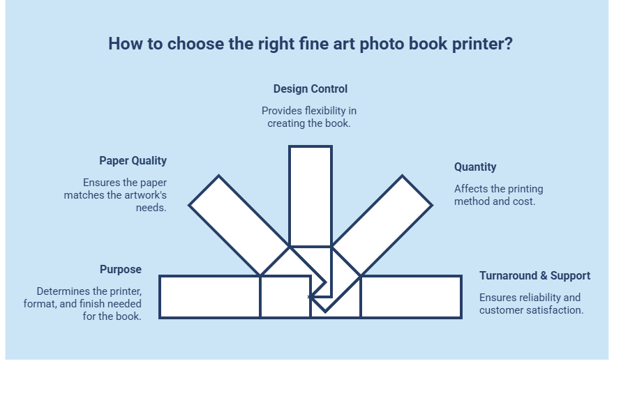
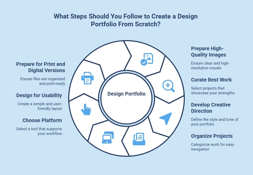
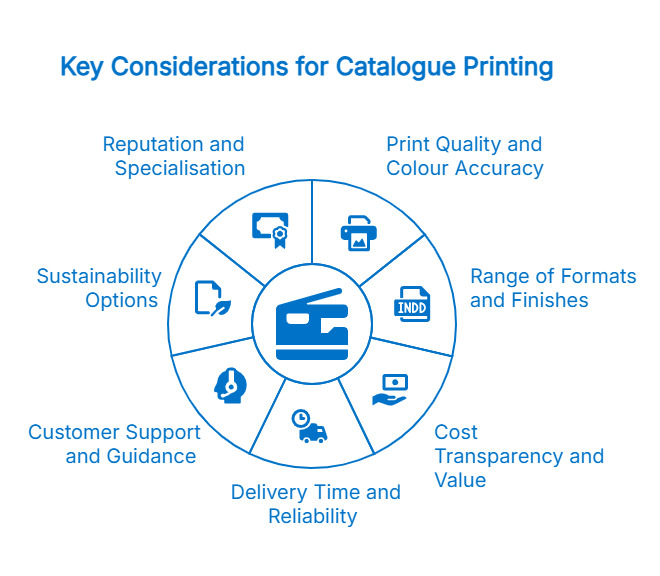
How Do You Choose the Right Fine Art Photo Book Printer for Your Project?
The best fine art photo book printing UK option depends on your purpose, quantity, preferred materials, and how much control you want over the final result. Use this framework to make the right call.
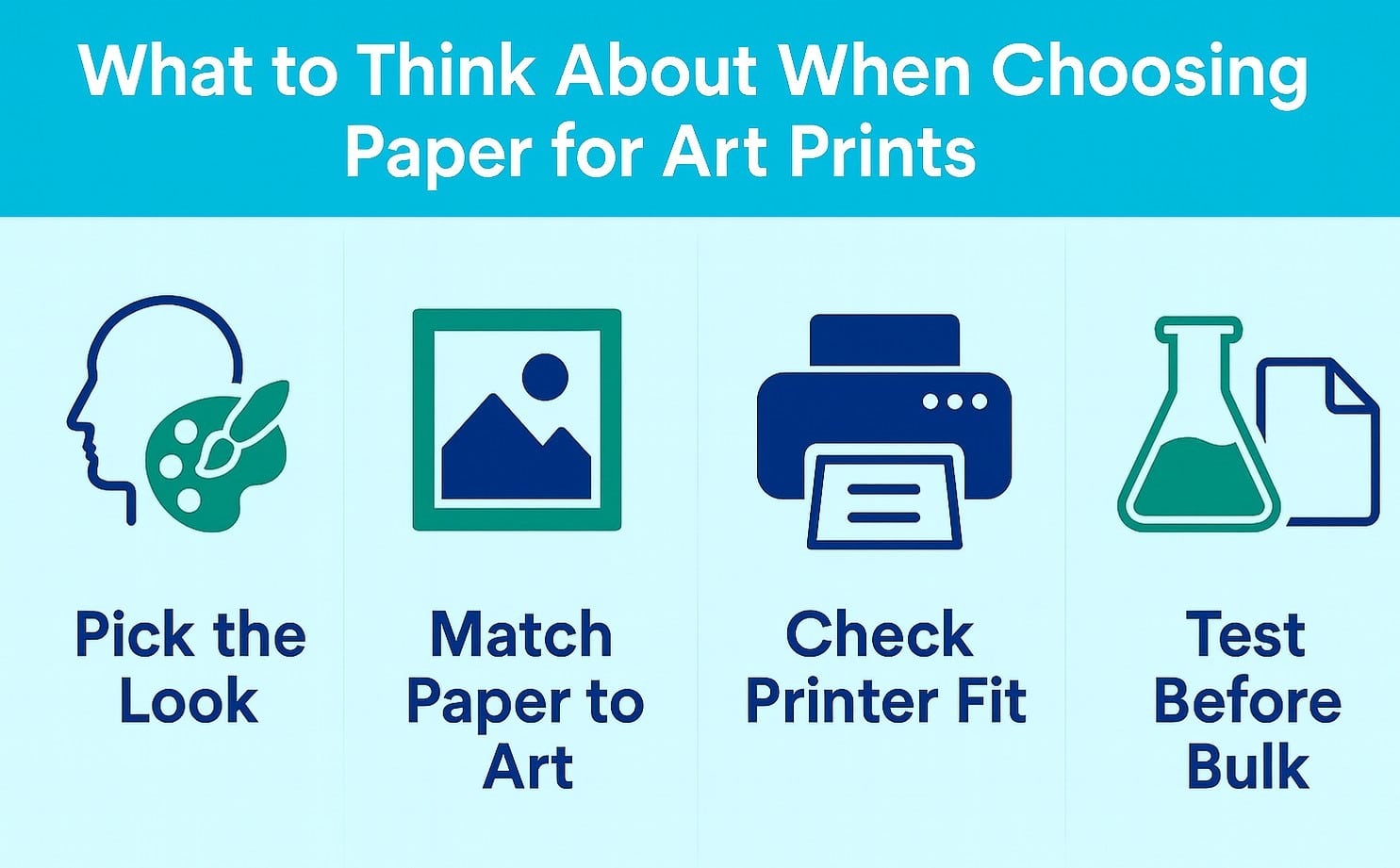
1. What is the Primary Purpose of Your Photo Book?
Start with the end use; it determines the right printer, format, and finish.
Portfolio for client meetings: Choose a printer offering durable hardcover books with layflat pages. You need something professional, portable, and built for repeat handling.
Exhibition edition: Look for printers specialising in fine art papers and short runs. Paper texture, print quality, and presentation matter more than speed.
Artist book or self-published title: Prioritise consistent quality across multiple copies with cost control. Perfect binding and reliable digital or litho printing are key.
Wedding photo book or client album: Go for layflat photo books with premium cover options and strong personalisation. Presentation and longevity are critical.
2. Does the Printer Match Your Paper and Print Quality Expectations?
Not all printers offer the same level of material quality.
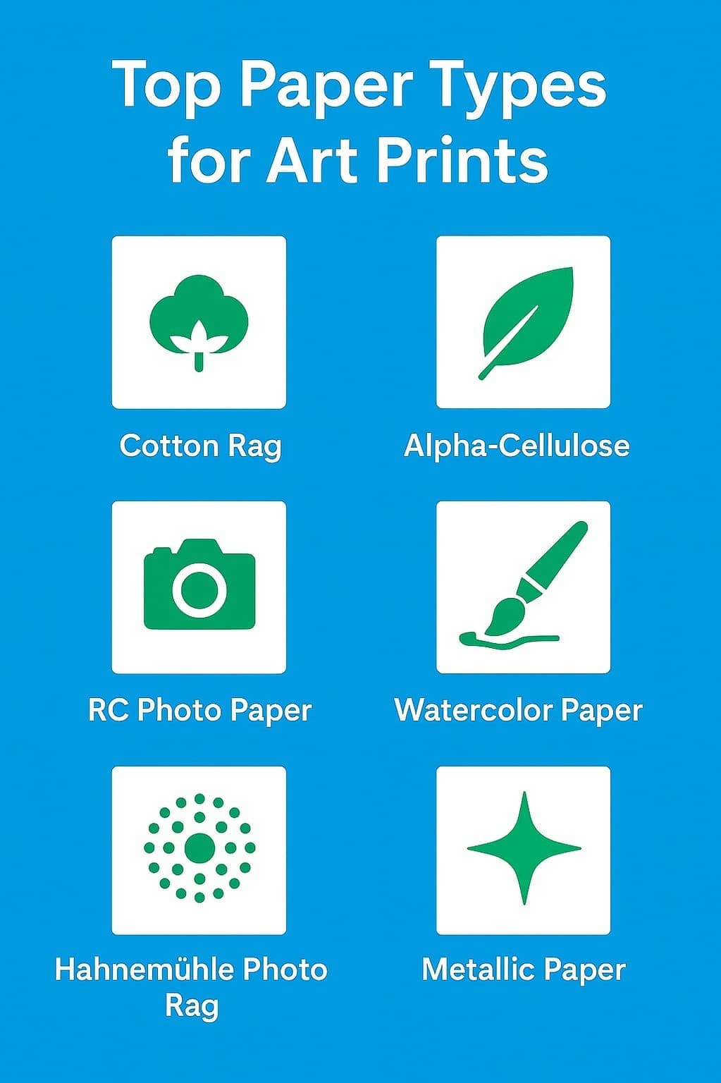
For black-and-white or fine art work, choose printers offering uncoated or cotton-based fine art papers
For colour-rich photography, look for silk or coated stocks that deliver vibrant colours and sharp detail
For archival projects, confirm acid-free papers and long-lasting inks
If paper matters to your work, shortlist printers that offer sample packs before committing.
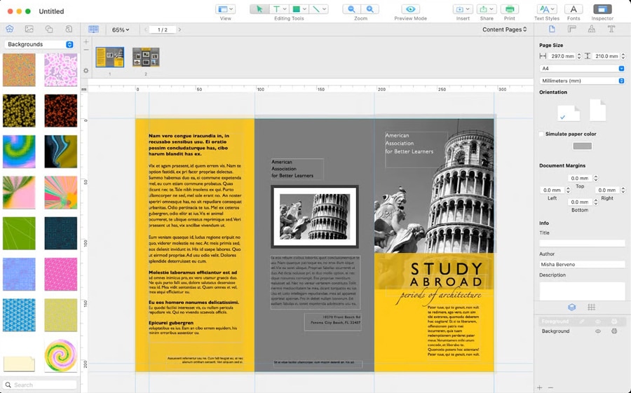
3. What Level of Control Do You Want Over Design and Files?
This is a major differentiator between consumer and professional services.
Full control (recommended for professionals): Choose printers that accept print-ready PDFs from tools like InDesign or Lightroom
Guided design experience: Some platforms require you to use their software or mobile app, which limits flexibility but simplifies the process
Colour accuracy control: Look for printers offering ICC profiles and preflight checks to protect the quality of your images
4. What Quantity Do You Need, and How Does it Affect Cost?
Your print run directly impacts which printer makes sense.
Single copy or short runs (1–50): Digital printing is ideal and should maintain high quality
Medium runs (50–500): Balance between cost and consistency becomes important
Large runs (500+): Litho printing reduces per-unit cost significantly
Avoid printers with high minimum order requirements if you only need a small quantity.
5. Can the Printer Meet Your Turnaround and Support Expectations?
Reliability matters just as much as print quality.
Check standard delivery time and whether rush options are available
Look for clear communication and customer service, especially for first-time projects
Confirm whether they offer file checks or proofs before printing
A good printer doesn’t just produce the book; they help you avoid mistakes before it goes to press.
What Questions Should You Ask Before Placing an Order?
Use these to quickly evaluate any fine art photo book printer:
What paper types and GSM options do you offer?
Do you accept print-ready PDFs or require your own software?
Can I order a single proof copy before committing?
What is your turnaround time and flexibility on deadlines?
Is there a minimum order quantity?
Are your materials archival and colour-managed?
What happens if there’s a quality issue?
Which Printer Should You Choose for Fine Art Photo Book Printing in the UK?
Choosing the right fine art photo book printing in the UK comes down to four key factors: print quality, paper and binding options, quantity, and budget. Each printer excels in different areas, from handmade luxury to photo paper precision or flexible print-on-demand. The best choice depends on what you’re creating and how much control you need over the final result.
If you’re working with print-ready PDFs and want consistent quality, material flexibility, and reliable support, a specialist UK printer like Ex Why Zed is a strong fit. Review your priorities, request samples where possible, and start with a single test copy before committing to a full run.
Frequently Asked Questions
What is fine art photo book printing?
Fine art photo book printing is the production of photo books using archival paper, high-fidelity inks, and expert binding. Unlike consumer photo book services, it prioritises colour accuracy, material longevity, and craft. The result is a printed object built to last and worthy of gallery presentation.
How much does fine art photo book printing in the UK cost?
Fine art photo book printing UK cost depends on paper weight, binding, page count, and quantity. Single copies from specialist UK labs typically start between £30 and £70. Budget platforms offer lower prices but often compromise on materials and colour accuracy.
Can I get cheap fine art photo book printing in the UK without sacrificing quality?
Fine art photo book printing UK cheap options exist, but quality trade-offs are common below a certain price point: thinner paper, automatic colour correction, no human support. Short-run digital printing keeps per-copy costs reasonable even for single orders from specialist labs.
What is the best paper for a fine art photo book?
Uncoated fine art paper (cotton rag or photo rag) suits black-and-white photography and work where texture matters. Coated silk or satin papers at 170gsm or above work well for colour photography. Request paper samples from your printer before committing to a full run.
Are fine art photo books suitable for weddings?
Fine art photo books for weddings are an excellent choice for couples who want something beyond a standard consumer album. Layflat binding ensures wedding images span double pages without loss in the gutter. Hardback covers and premium paper create a book built to be kept for decades.
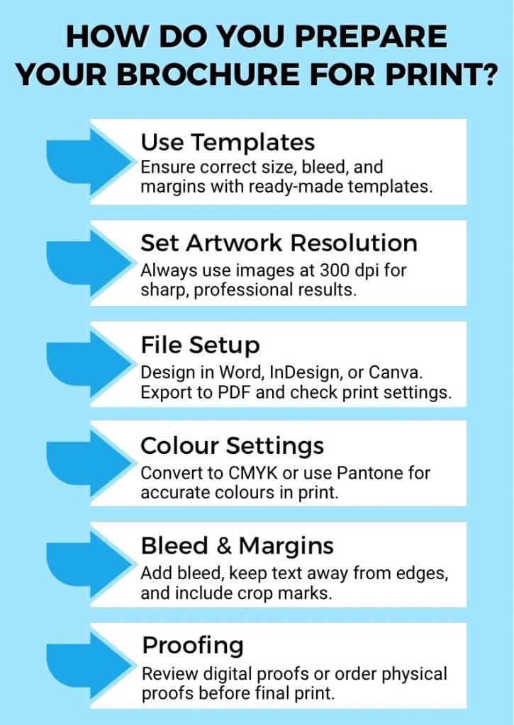
How do I prepare my files for fine art photo book printing?
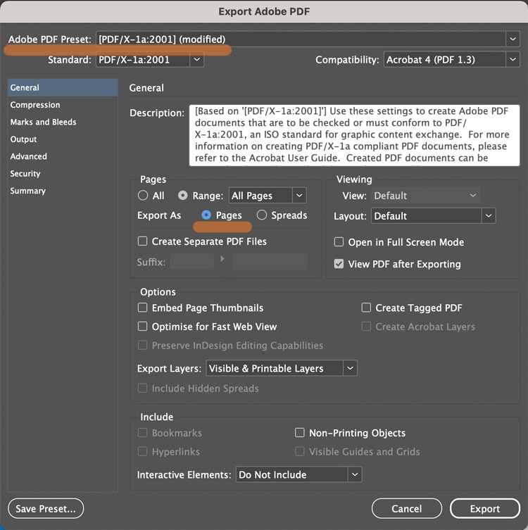
Export a print-ready PDF set to CMYK, with 3mm bleed, fonts embedded, and images at a minimum of 300dpi. Ex Why Zed provides detailed file set-up guides for InDesign, Illustrator, and Lightroom, and includes a free file check with every order.
What is the difference between digital and giclée printing for photo books?
Giclée printing uses high-resolution inkjet technology with pigment-based archival inks on fine art paper, associated with gallery-quality output. Digital press printing (HP Indigo) is optimised for consistent colour across short and long runs. Both can produce excellent results; the right choice depends on your paper and quantities.
Can I print just one copy of a fine art photo book in the UK?
Yes. Digital press printing makes single-copy orders economically viable, with no quality penalty relative to a short run of 10 to 25. Ex Why Zed, SIM Imaging, and Saal Digital all support single-copy orders. Offset printing only becomes cost-effective at runs of 500 or more.
Is it worth choosing a UK printer over an overseas lab?
For most professional use cases, yes. UK-based printing gives you a reliable turnaround, direct support in your time zone, no cross-border shipping delays, and no risk of import VAT charges. Quality from top UK labs is equivalent to the best European alternatives.
How long does fine art photo book printing take in the UK?
Most UK specialist labs turn around orders in 3 to 10 working days from artwork approval. At Ex Why Zed, stapled books take approximately 3 working days, perfect-bound books approximately 5, and hardback editions approximately 7. Tight deadlines can often be accommodated: get in touch, and we'll see what we can do.
Does UK printing support sustainability goals?
A shorter supply chain means lower transport emissions. UK-produced books support the domestic print industry and craft economy. For photographers whose clients or galleries are increasingly attentive to environmental considerations, being able to say your work was printed in the UK is a genuinely meaningful point of difference.
Key Highlights
Oxford has several local print shops, but few specialise in magazine printing for creative publishers.
Local options range from same-day walk-in shops to established trade printers, each with different strengths.
For print quality, paper choice, and creative support, online UK specialists often outperform local shops.
Ex Why Zed has been printing for creative people across the UK since 2006, with HP Indigo digital and Heidelberg litho presses.
Free file checks, free paper samples, no minimum order, and free tracked UK delivery set Ex Why Zed apart.
Stapled magazines are typically with you in 3 to 4 working days; perfect bound in 4 to 5.
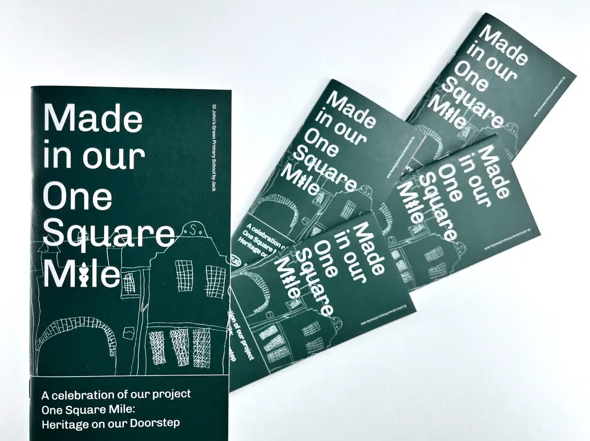
Oxford is one of the UK’s most creative and academically active cities, with art students, indie publishers, researchers, and zine makers constantly producing new work. But when it comes to finding the best magazine printing in Oxford, many creators face the same challenges: limited local options, inconsistent print quality, and uncertainty around paper types, binding choices, and how the final product will actually look and feel.
A magazine is more than printed pages; decisions around paper, colour accuracy, number of pages, and finishes can make a significant impact on whether your work feels professional or disappointing. Without clear guidance, choosing the right printer can quickly become overwhelming.
This guide explores Oxford’s main magazine printing options, explains what truly matters when comparing printers, and introduces experienced UK specialists like Ex Why Zed as part of the wider landscape worth considering.
What Should You Look for in a Magazine Printer?
Before committing to any printer, local or online, here are the key factors worth checking to ensure a smooth process and a professional final product.
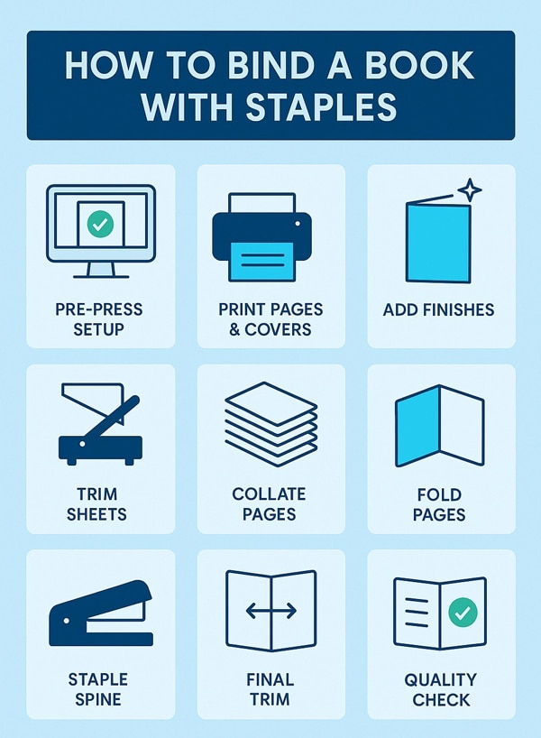
1. Print Quality
Start by asking what print technology a provider uses.
HP Indigo digital printing is ideal for short print runs and single issues, delivering consistent colour from copy one with no strict minimum quantity of magazines. Heidelberg litho printing is better suited to higher volumes, where unit costs improve at scale. A reliable printer should help you choose the right method based on your project rather than defaulting to one process.
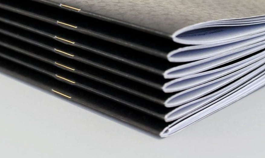
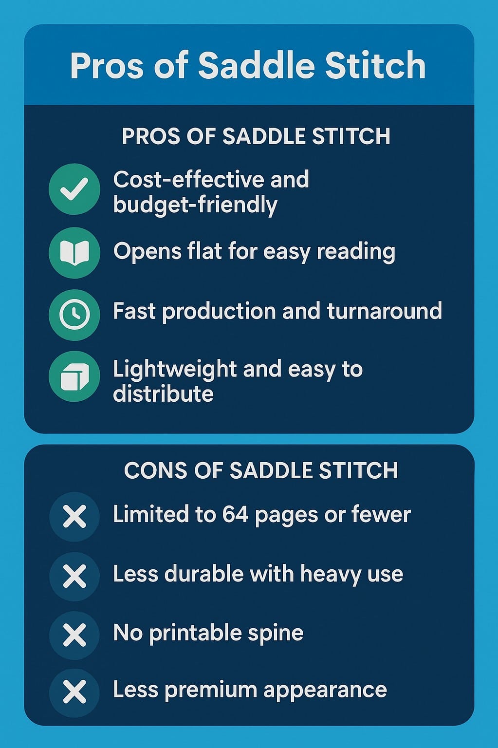
2. Binding Options
Binding affects both durability and how your magazine feels to read.
Saddle stitch binding remains the common choice for magazines up to around 40 pages, offering a clean and cost-effective finish. Perfect binding creates a square spine and suits thicker publications with a higher number of pages. Choosing the right binding option ensures your interior pages sit correctly and the final product holds together over time.
3. Paper Stock and Cover Choices
Paper types play a significant role in how readers experience your work. Coated silk or gloss stocks work well for image-led magazine design where colour vibrancy matters, while uncoated paper offers a tactile feel popular with zine printing and creative publications.
A heavier cover paper, typically 250gsm or above, adds structure and helps elevate the professional magazine printing finish.
4. Format and Size Options
Most printers offer standard A4 and A5 booklet printing formats, which suit editorial and text-led layouts. Creative publishers may prefer square or custom sizes for greater visual impact. Discuss format early, as custom sizing can influence pricing, trim lines, and estimated delivery date expectations.
5. File Setup and Preflight Support
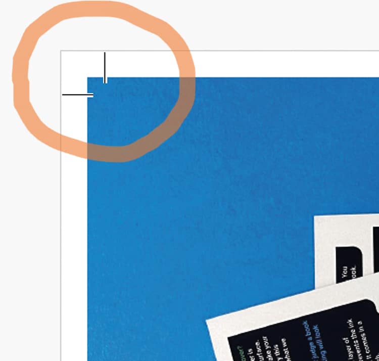
A good printer should guide you through preparing a correct print file. Typically, this means submitting a single PDF or properly organised single pages with 3mm bleed, 300dpi images, embedded fonts, and CMYK colour mode. A free proof or file check is especially valuable, helping identify issues before printing and improving customer satisfaction.
6. Eco Credentials
Sustainability is increasingly important, particularly within Oxford’s creative and academic community. Look for FSC-certified paper types, responsible ink processes, and flexible short print runs that reduce waste. Transparent production practices often reflect a printer focused on long-term quality rather than cheap magazine printing alone.
Who is Printing Magazines in Oxford?
Before choosing a printer, it's important to understand how Oxford’s local options compare in terms of paper types, saddle stitch binding, short print runs, and overall professional magazine printing quality. Below, we look at 7 providers offering different strengths depending on deadlines, quantity of magazines, and final product expectations.
1. Ex Why Zed
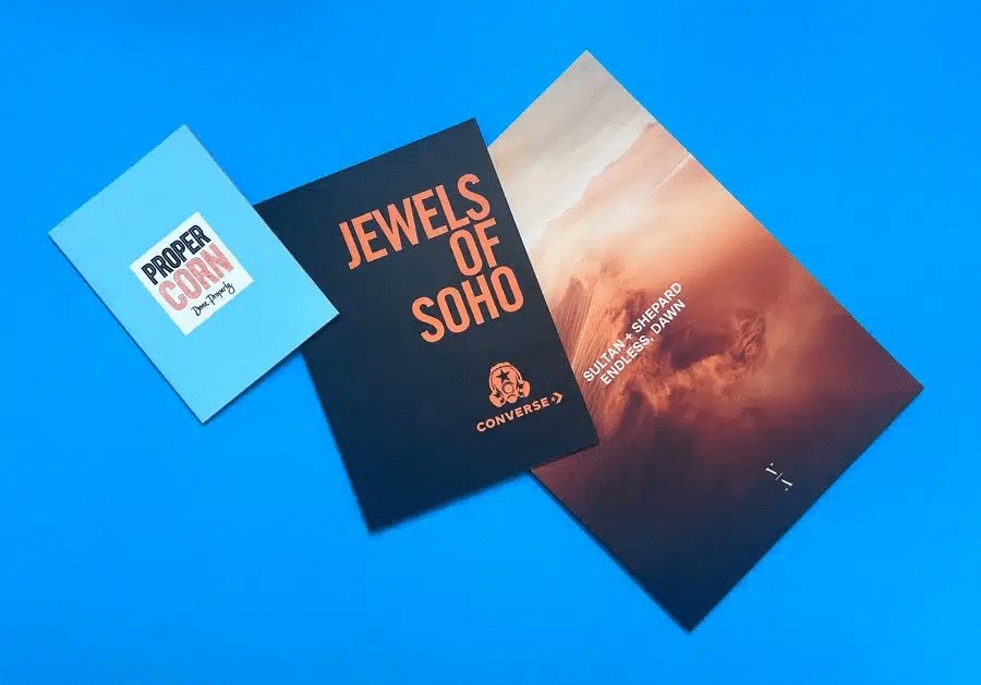
We've been printing for creative people since 2006. Not business stationery with magazines squeezed in at the end of the menu. Our UK magazine printing service is built entirely around magazines, zines, art books, degree show catalogues, and independent publications.
Here's what that means in practice.
Specialists in Creative Print Since 2006
Based in Colchester, built for creative people from the start. Over 500 real portfolio case studies and 400+ Trustpilot reviews from photographers, art students, indie publishers, designers, and agencies.
Curious about the kind of magazines we produce? Browse our portfolio to see real projects and print finishes up close.
HP Indigo Digital & Heidelberg Litho: The Right Kit
We use HP Indigo digital presses for short to medium runs, delivering consistent, accurate colour from the first copy. For longer runs, our Heidelberg litho presses bring the quality and economy of scale that commercial magazine printing demands.
No Minimum Order
Print one copy if that's what you need. Our DIY magazine printing service is ideal for independent publishers testing a first issue, proofing before a large run, student final major projects, or artists producing a small edition.
No financial risk, no waste, no commitment beyond the job in hand.
Free File Check & Free Paper Samples
We check your file before printing and flag any issues before they become problems.
Never printed before? No bother. We'll walk you through file prep, paper choices, and binding options. And if you want to feel the stock before committing, we'll send you paper samples free of charge.
Stapled magazines are typically with you in 3 to 4 working days. Perfect-bound magazines in 4 to 5 working days. Free tracked delivery across the UK. Got a tight deadline? Give us a shout, and we'll see what we can do.
Real support from people who know print
Phone, email, and live chat. Replies in minutes, not days. Whether you're an art student printing your first issue or a designer with a very specific brief, we'll walk you through paper choices, file setup, binding options, and anything else you need. No automated responses. No guesswork.
We've been working with independent magazine publishers from the very first issue, helping them grow from a small stapled run to full litho production. Here's what they say:
"Fantastic print service. I have had an absolutely fantastic experience with Ex Why Zed Print from start to finish. I feel like the staff went the extra mile for me, helping me to prepare my files to print and guiding me through the process. Friendly, quick to respond to any questions with thorough, easy-to-follow answers, and the prices are reasonable. My postcards turned out better than I could have imagined - I will definitely be using them again for my next print run. Couldn't recommend highly enough!"
"Ex Why Zed; printing made easy. Ex Why Zed has everything you need to be able to produce great zines. A choice of paper stock, easy to follow step by step guides that mean you can obtain the best results using your own design skills. I've just had my fifth publication made by them. I keep returning because of the friendly and helpful communication, the beautiful print quality, and the very fast turnaround times. I'm sure to be back again."
Who is Ex Why Zed Best for?
Ex Why Zed is well-suited to creatives, indie publishers, agencies, and organisations looking for professional magazine printing with greater control over paper types, finishes, and short print runs. We are particularly useful for projects where colour accuracy, thoughtful guidance, and a polished final product matter more than simply printing at speed.
Ready to get a price? Use our Instant Quote Calculator for small runs, or call us at 01206 694689 and we'll put a custom quote together for you.
2. Printing Oxford (24/7 Print)
A same-day, round-the-clock print shop serving Oxford and the surrounding area. No minimum order, open on weekends and bank holidays. Offers A4, A5, saddle-stitched, and perfect-bound magazine formats, and handles a wide mix of print products.
Who is this Best-Suited For?
Last-minute magazine printing in Oxford city centre, where speed is the priority. If you need a handful of copies collected on the same day, this is a solid option.
What Should You Consider Before Choosing?
The focus is speed and volume rather than creative consultation. For image-led or design-heavy magazines where colour accuracy and paper feel matter, you may find the finish options limited.
3. Parchments Print of Oxford
A short-run digital specialist with two colour printers and a mono press. Mainly handles booklets, newsletters, and basic magazines. Has an on-site booklet maker that folds and staples pages as they come off the press.
Who is this Best-Suited For?
Simple, stapled publications with a modest page count. Good if you want something functional and local at a low cost.
What Should You Consider Before Choosing?
Limited format choices and a fairly basic finish range. If your magazine is colour-heavy or needs a considered paper stock, the options here may feel restrictive.
4. Mayfield Press
An established Oxford printer with more than 25 years of experience. Handles magazines and journals alongside brochures, catalogues, and annual reports. Offers a range of materials and finishes and can work to tight deadlines.
Who is this Best-Suited For?
Corporate or institutional publishers who need a reliable, professional trade printer with a full-service offering and a long track record.
What Should You Consider Before Choosing?
More geared toward business and corporate clients than indie or creative publishers. Less likely to engage with bespoke creative projects or first-time self-publishers.
5. Kall Kwik Oxford
A business print specialist based in Kidlington. Covers a wide product range including booklets, brochures, and some same-day options. Has an in-house design team and local delivery across Oxford and beyond.
Who is this Best-Suited For?
Oxford businesses that need a reliable local printer for a mix of marketing materials, with magazine printing as one of several requirements.
What Should You Consider Before Choosing?
Magazine printing is part of a wide menu rather than a specialism. Creative guidance specific to magazine production may be limited compared to a dedicated print specialist.
6. Media Print Hub
A budget-focused printer with an Oxford address. Offers A4, A5, and A6 booklets with stapled binding and a range of laminated cover options, including silk, gloss, matt laminated, spot UV, and spot UV with die-cut.
Who is this Best-Suited For?
Very price-sensitive jobs where you need a basic stapled booklet with a laminated cover and no design complexity.
What Should You Consider Before Choosing?
Finish options lean towards standard commercial lamination rather than editorial-quality paper stocks. Not the right fit for creative or art-led publications.
7. University of Oxford Print Studio
The university's own digital print facility, based at Wellington Square. Prints on FSC-certified, carbon-balanced paper and has skilled graphic designers on site. A genuinely high-quality operation.
Who is this Best-Suited For?
University staff, departments, and students who can access the studio through the university network and internal cost centre system.
What Should You Consider Before Choosing?
Not open to independent publishers or the general public without direct arrangement. If you're not affiliated with the university, this one isn't available to you.
How Does Ex Why Zed Compare to Other Oxford Magazine Printers?
To save you some research time, here's how the main options stack up across the things that matter most for a magazine project.
Printer
Magazine Specialist
Binding Options
Print Technology
Free File Check
Paper Samples
FSC / Eco Options
Delivery
Ex Why Zed
Yes
Saddle stitch, perfect, hardback
HP Indigo + Heidelberg litho
Yes, free
Yes, free
Yes, FSC options
Free UK delivery
Printing Oxford (24/7 Print)
No
Saddle stitch, perfect
Digital
Yes
No
Limited
Collection / local
Parchments Print of Oxford
No
Saddle stitch
Digital
Unknown
No
Unknown
Local collection
Mayfield Press
Partial
Multiple options
Digital + litho
Unknown
On request
Yes
Delivery available
Kall Kwik Oxford
No
Multiple options
Digital
Unknown
No
Partial
Local delivery
Media Print Hub
No
Saddle stitch
Digital
Unknown
No
Limited
Delivery available
University of Oxford Print Studio
Institutional only
Multiple options
Digital
Internal support
Internal only
Yes, carbon-balanced
Internal distribution
Note: This is a general guide based on publicly available information. Always check directly with any printer for your specific requirements and current lead times.
How Much Does Magazine Printing in Oxford Cost?
Magazine printing cost in the UK typically ranges from around £0.30 to £3.60 per copy for custom magazines, depending on quantity, page count, size, paper stock, and binding method.
A few things that affect your magazine printing cost:
• Quantity: Larger runs bring the per-copy price down significantly. • Page count: More pages mean more paper and a longer binding process. • Binding method: Saddle-stitching is the more cost-effective option for thinner magazines; perfect binding adds a small premium. • Paper stock: Coated stocks (silk, gloss) cost a little more than uncoated; heavier cover weights add a modest amount. • Size: Standard sizes (A4, A5) are more cost-effective than custom sizes. • Finish: Matt lamination on the cover adds durability and a premium feel for a small additional cost.
Tip: For a more considered magazine with proper paper and colour, you'll generally get better value from a specialist UK printer like Ex Why Zed, where pricing is transparent.
Where Can I Get the Best Single Magazine Printing in the UK?
Printing a single copy of a magazine, whether for proofing, a portfolio, or a one-off edition, is something not all printers handle well. Many have minimum order quantities that make single-copy printing uneconomical.
Ex Why Zed has no minimum order. You can print one copy of a magazine and receive it with the same care, quality, and finish as a run of 500.
If you need single magazine printing near you in Oxford, most local shops will produce one copy, but the finish quality and paper options available at a specialist level are a step up. And with free, tracked UK delivery from Ex Why Zed, location stops mattering.
How Do You Get Started with Magazine Printing in the UK?
If you've got your design ready, here's how the process works with Ex Why Zed. It's straightforward.
Step 1: Get your PDF Ready
You'll need a print-ready PDF with 3mm bleed on all sides, a resolution of at least 300dpi for images, embedded fonts, and CMYK colour mode. If you're new to this, our file setup guides and video walkthroughs cover everything. Take five minutes to read through them before you export your final file.
Step 2: Get a Quote
For 1 to 20 copies, our instant pricing tool gives you an immediate price as you adjust your spec. For larger or more bespoke runs, send us your spec by email: hello@exwhyzed.com, and we'll put a custom quote together, usually the same day. No price tables with dozens of confusing columns.
Step 3: Request Paper Samples
Free, and worth doing for any publication where the feel of the stock matters. Once you've had a read through our guide on choosing the right paper for your publication, you'll know exactly what to ask for. It can save you from a choice you'd regret when the finished copies land.
Step 4: Approve and Go
You can request an optional proof copy before the full run goes to print. It's a good call for a first issue or when colour accuracy is critical. Once you're happy, production starts, and your magazines are with you by free tracked delivery within your agreed lead time.
Order now and get your magazine printing underway today.
Frequently Asked Questions
How much does magazine printing cost in the UK?
Magazine printing in the UK typically costs between £0.30 and £3.60 per copy for custom magazines. The actual price for your project depends on quantity, page count, size, paper stock, and binding. Larger print runs bring the cost per copy down significantly. Ex Why Zed offers an instant pricing tool for small runs and custom quotes for anything more bespoke.
How long does magazine printing take?
At Ex Why Zed, stapled magazines are typically ready in 3 to 4 working days and perfect-bound magazines in 4 to 5 working days, including free tracked UK delivery. Local Oxford same-day printers can turn around basic jobs within hours, but for more considered, creative print, a few days is a more worthwhile timeline.
What is the difference between saddle-stitching and perfect binding?
Saddle-stitching uses staples through the spine. It's the standard approach for magazines up to around 40 pages and is the more cost-effective option. Perfect binding glues pages to a flat square spine, giving a more book-like look and feel. It suits magazines with 40 pages or more.
What paper should I use for magazine printing?
Coated silk or gloss papers suit image-heavy publications where you want colours to pop. Uncoated stocks feel more tactile and work well for photography, art, or editorial-style magazines. A heavier cover stock, around 250gsm or above, gives the magazine structure and a more premium feel. If you're not sure, request free paper samples from Ex Why Zed before you commit.
Can I print just one copy of a magazine?
Yes. Ex Why Zed has no minimum order, so you can print a single copy if that's what you need. It's useful for proofing a design, producing a portfolio piece, or testing paper and format choices before committing to a full print run.
What file format do I need for magazine printing?
A print-ready PDF is the standard. Your file should include 3mm bleed on all sides, a resolution of at least 300dpi for images, embedded fonts, and CMYK colour mode. Ex Why Zed checks your file free of charge before printing and flags any issues before the job goes to press.
Is it better to use a local Oxford printer or an online UK printer for magazines?
A local Oxford printer makes sense if you need something on the same day or want to collect in person. For quality, paper choice, creative support, and magazine printing specialism, an online UK specialist like Ex Why Zed often delivers more. And with free UK delivery, location stops being the deciding factor.
Do magazine printers in Oxford offer eco-friendly printing?
Some do. Ex Why Zed prints 100% of its jobs on FSC-certified paper and uses vegetable inks on all litho print runs. Its no-minimum-order policy also means no excess print runs and no unnecessary waste.
What sizes can I print a magazine in?
Standard sizes include A4, A5, and A6. Ex Why Zed also offers square formats such as 210x210mm, and custom rectangle sizes like 40x170mm and 250x176mm, which suit image-led publications.
Can I get a proof copy before printing the full run?
Yes. Ex Why Zed offers an optional proof copy before your full order goes to press. It's a sensible step for a first issue or any project where colour accuracy and paper feel are important. Once you're happy with the proof, production starts on the full run.
What is the best glossy magazine printing option in the UK?
Glossy magazine printing uses coated silk or gloss paper for vibrant colour and a smooth finish. For best results in the UK, choose printers like Ex Why Zed who use HP Indigo digital or Heidelberg litho presses.
Key Highlights
A captivating children’s book cover can spark curiosity, set the tone, and draw young readers in before they turn the first page.
Colour, typography, illustration style, and layout work together to create visual balance and emotional connection.
The blog features 20 standout examples of childrens book covers that range from timeless classics to playful modern designs.
Each example shows how visual storytelling and thoughtful design bring a story’s theme and main character to life.
Common cover mistakes include unreadable fonts, cluttered layouts, mismatched tones, and designs unsuited to the target age group.
The guide explains when to collaborate with book cover designers and how to make the most of professional resources like templates and size guides.
Authors can find actionable tips to create covers that are visually appealing, age-appropriate, and emotionally true to their story.
The takeaway: a well-designed cover is more than art; it’s the bridge between your story and its readers.
You know that feeling when you hold your finished story for the first time? The one you’ve poured your heart into, crafting every rhyme, character, and twist until it feels just right. It’s a moment of pride, but also one of uncertainty. How do you make sure your children’s book catches a reader’s eye before they even turn the first page?
Every author faces that same question. The words may be full of magic, but it’s the cover that makes the first impression. The wrong colours, fonts, or illustrations can hide a beautiful story from view. Maybe the design feels too crowded, or the tone doesn’t quite fit the age group. In a world full of bright, imaginative stories, the challenge isn’t just writing one; it’s making it look like one too.
The good news is you don’t need to be a design expert to create something special. With a bit of guidance and a clear sense of your story’s heart, you can craft a cover that truly connects. In this guide, we’ll explore what makes a great children’s book cover, common pitfalls to avoid, and inspiring examples that show how design can bring imagination to life.
Why Is a Captivating Book Cover So Important For Children’s Books?
For children, a book’s cover is the first spark of curiosity. Before they can read the title or know the story, it’s the colours, characters, and emotions on the cover that pull them in. A well-crafted design doesn’t just decorate a story; it invites young readers into it.
A memorable cover helps children connect emotionally, whether through playful illustrations, expressive faces, or a sense of adventure. In bookshops and classrooms, childrens book covers images with warmth or humour often stand out, encouraging little hands to reach for them.
Simply put, a captivating cover can turn a book into a beloved favourite before the first page is even turned.
What Are The 20 Most Captivating Children’s Book Covers That Inspire Young Readers?
A beautifully designed book cover can transport children into a story before they even turn the first page. From timeless classics to bright, modern favourites, these children’s book covers capture emotion, imagination, and the pure joy of reading. Let’s take a closer look at 20 exceptional examples that continue to delight young readers and adults alike.
Classic And Timeless Children’s Book Covers
These covers have a charm that never fades. Their illustrations, colours, and typography instantly remind readers of simpler, more magical times that feel as comforting today as they did decades ago.
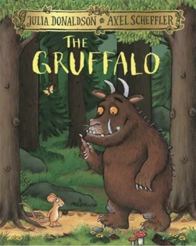
1. The Gruffalo by Julia Donaldson & Axel Scheffler
With its warm woodland tones and expressive characters, this children's book front cover perfectly captures the charm of storytelling. The forest scene feels alive with detail, from the textured bark and leafy greens to the small, curious mouse.
The Gruffalo’s friendly yet slightly fearsome face strikes the ideal balance between humour and a touch of tension, sparking curiosity about the story ahead. Every visual element feels intentional, inviting children to explore a world that is both magical and mischievous in equal measure.
2. The Very Hungry Caterpillar by Eric Carle
Bright, textured collage art gives this children's book cover design an instantly recognisable charm. The colourful caterpillar, set against a clean white background, stands out with a handmade, tactile quality that appeals across generations. Its simplicity is its strength, with no distractions, just bold shapes and cheerful energy that pull the reader in.
The balance of colour and white space gives it timeless appeal, while the playful brushstrokes remind us of the joy found in curiosity and transformation, perfectly reflecting the story within.
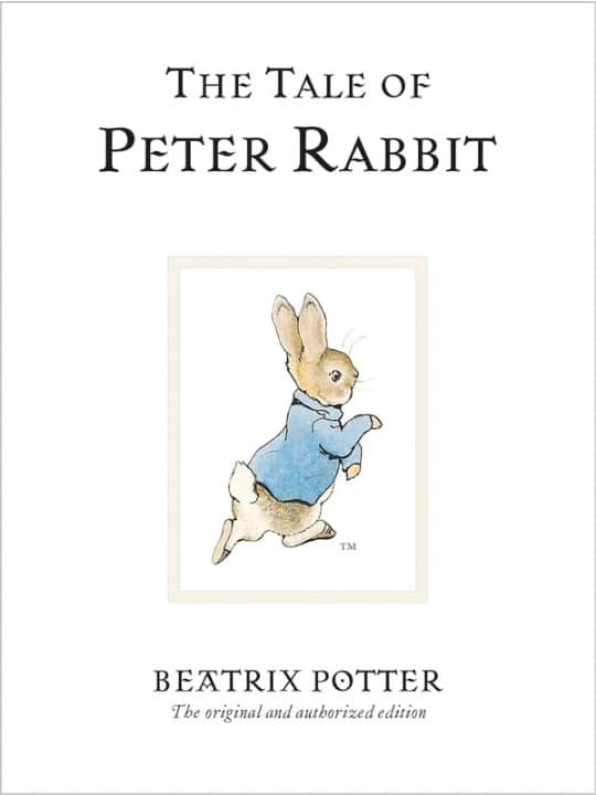
3. The Tale of Peter Rabbit by Beatrix Potter
This classic children's book cover blends soft watercolours with elegant serif typography, creating a sense of timeless grace. The gentle hues and delicate illustration of Peter capture innocence and adventure in perfect harmony.
Every brushstroke adds warmth, echoing the rural calm of the English countryside where the tale unfolds. Its simplicity is both its beauty and its power, proving that subtlety can hold more magic than excess. The design feels both familiar and refined, a comforting nod to generations of storytelling tradition.
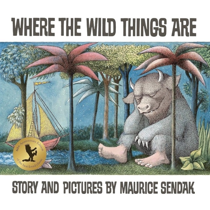
4. Where the Wild Things Are by Maurice Sendak
This iconic children's book cover design sets the tone for adventure and imagination with its earthy palette and intricate detail. The image of Max resting among the Wild Things captures the quiet after chaos, a moment of reflection and curiosity. The slightly muted tones evoke nostalgia and depth, balancing wildness with calm.
It beautifully mirrors childhood emotions such as curiosity, rebellion, and wonder. The composition draws you in slowly, hinting that there is more beyond the page, making it one of the most emotionally resonant covers in children’s literature.
5. Goodnight Moon by Margaret Wise Brown & Clement Hurd
Rich greens and warm oranges fill this famous childrens book cover design with comfort and familiarity. The cosy room scene glows softly under the moonlight, creating a peaceful bedtime atmosphere. Every tiny detail, from the little bunny to the flicker of the fire, adds to its charm.
The composition is simple yet endlessly inviting, with a nostalgic quality that feels like a warm embrace. It perfectly captures the soothing rhythm of bedtime, wrapping readers in calm before they drift into dreams.
6. One Fish, Two Fish, Red Fish, Blue Fish by Dr Seuss
This popular childrens book cover design bursts with colour and movement, instantly catching the eye of both children and adults. The playful fish characters dance across the page in bright, contrasting shades that perfectly reflect Dr Seuss’s whimsical storytelling. The bold typography adds rhythm and fun, echoing the sing-song verses inside.
Every element feels light-hearted and joyful, reminding readers that imagination has no limits. It is a design that celebrates creativity, laughter, and the freedom to see the world a little differently.
Modern And Playful Cover Designs
These covers use bold colour palettes, quirky illustrations, and humour to spark excitement and curiosity in today’s readers. They’re lively, joyful, and full of personality, just like the stories they introduce.
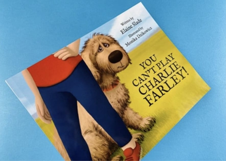
7. You Can’t Play, Charlie Farley! by Elaine Slade & Monika Dzikowicz
This children's book front cover captures emotion through a simple yet powerful image of a shy dog peeking from behind his owner. The expressive eyes and soft, textured details instantly connect with readers, conveying Charlie’s longing to belong. Gentle countryside colours bring warmth, while clean typography keeps the focus on the heartfelt illustration.
The balance between innocence and hope is beautifully handled, showing how visual simplicity can express deep emotion. It is a tender and relatable design that mirrors the story’s gentle message of friendship and acceptance.
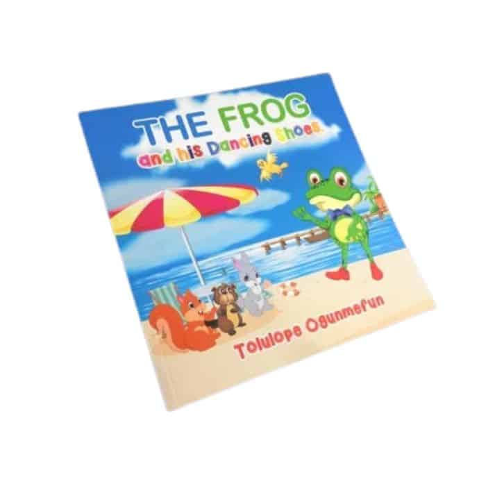
8. The Frog and His Dancing Shoes by Tolulope Ogunmefun
This children’s book front cover shines with cheerful energy and bold character design. The confident frog, dressed in his bow tie and bright shoes, instantly radiates joy and playfulness. The sunny beach backdrop adds a sense of movement and adventure, while the lively colour palette of yellows, blues, and greens draws the eye.
Each detail feels full of life, perfectly reflecting the story’s upbeat tone. It is a design that captures the joy of dancing, the fun of friendship, and the spirit of self-expression.
9. The Smart Cookie by Jory John & Pete Oswald
This childrens book cover is a wonderful example of how minimalism can feel full of warmth and personality. The bright yellow background and cheerful cookie character immediately communicate optimism and positivity. The simple composition gives space for the expression and typography to shine, creating balance and clarity.
It feels clean, modern, and approachable, reflecting a message of kindness and self-belief. The design proves that sometimes the simplest covers can make the biggest emotional impact, reminding readers that confidence begins from within.
10. Tiny T. Rex and the Impossible Hug by Jonathan Stutzman & Jay Fleck
Soft pastel tones and an irresistibly cute dinosaur make this cover an instant favourite among young readers. Tiny T. Rex’s determined expression adds emotion and humour, perfectly capturing the story’s uplifting spirit. The gentle background hues of pink, teal, and cream give it a soothing yet playful quality.
Its simplicity allows the character’s personality to shine through, making it feel both intimate and inviting. This is a design that radiates warmth, showing how perseverance and love can feel larger than life, even in small packages.
11. Nippy the Baby Crocodile by David Markee
This children's book front cover bursts with vibrant blues and greens that mirror the lively setting of the story. The cheerful crocodile, with his wide grin and bright eyes, feels both friendly and full of character. The surrounding water and playful ripples give a sense of movement, instantly drawing readers into Nippy’s adventure.
The typography is clear and inviting, complementing the joyful illustration. The cover’s warmth and energy capture the curiosity of childhood perfectly, making it an endearing and memorable design.
Whimsical And Artistic Children’s Book Covers
These covers blend emotion and artistry, drawing children into gentle, imaginative worlds with every brushstroke. They’re the kind you linger over, enjoying the artwork as much as the words.
12. Returning Home by Cat O’Neil
This children’s book front cover blends emotional depth with stunning artistry. The intricate linework and soft coral and green tones create a rich visual landscape that speaks of heritage, belonging, and self-discovery. The layered design, with a city skyline merging into rolling hills, reflects the book’s message about home and identity.
Every detail feels intentional and reflective. It is a thoughtful, beautifully balanced piece that resonates with both children and adults, showing how illustration can bridge personal emotion and universal themes.
13. Lost and Found by Oliver Jeffers
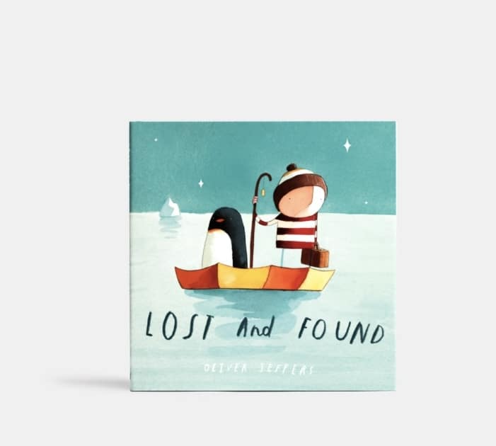
Muted blues and delicate textures make this children's book front and back cover unforgettable in its simplicity. The small boy and his penguin companion instantly evoke feelings of friendship, curiosity, and gentle adventure. The vast, open sea creates both a sense of wonder and quiet loneliness, allowing readers to feel the story before reading it.
The understated typography and clean layout enhance its emotional depth. It is a design that proves how restraint and emotion can create something timeless and deeply moving.
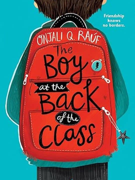
14. The Boy at the Back of the Class by Onjali Q. Raúf
The red backpack against the cool blue background makes this cover instantly iconic. The contrast draws the eye while the faceless character invites readers to see themselves in the story. The simple design and thoughtful colour palette reflect both innocence and resilience.
The clean typography adds modernity without losing warmth. It captures the emotional heart of the story with subtlety and strength, symbolising empathy, courage, and understanding. This is a cover that speaks volumes before a single page is turned.
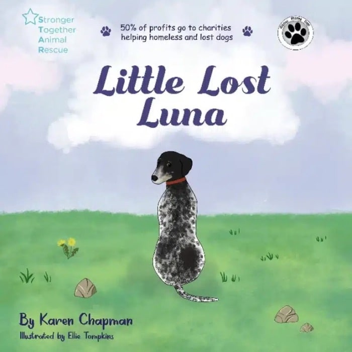
15. Little Lost Luna by Karen Chapman & Ellie Tompkins
This children's book front cover radiates tenderness through its soft watercolour textures and gentle pastel tones. Luna’s kind expression and the dreamy sky behind her create a feeling of hope and comfort. The composition is simple but powerful, drawing the viewer straight to her eyes and the quiet strength they convey.
The design perfectly mirrors the story’s themes of compassion, rescue, and belonging. It is a delicate yet emotionally rich cover that reminds readers how small acts of kindness can light the darkest moments.
Diverse And Imaginative Cover Art
These covers celebrate inclusivity, courage, and creativity. They’re visually bold, emotionally expressive, and designed to reflect the world as children see it today.
16. Hair Love by Matthew A. Cherry
This childrens book cover design radiates warmth, confidence, and joy. The tender illustration of a father and daughter celebrating natural hair tells a powerful story of love and identity before a word is even read.
The rich purples and golds add depth and vibrancy, while the characters’ expressive faces capture the closeness of their bond. The artwork feels uplifting and proud, inspiring children to embrace who they are. It is both a visual celebration and an empowering reflection of modern family life.
17. A Long Walk to Water by Linda Sue Park
This children's book front cover uses muted browns and sandy tones to tell a story of strength and perseverance. The lone figure walking beneath the vast sky evokes solitude and hope, mirroring the emotional depth of the story inside. Its minimalist composition leaves room for reflection, inviting readers to pause and feel.
The simplicity of the design captures the magnitude of the journey, showing that quiet visuals can convey powerful messages. It is a moving, contemplative cover that speaks of endurance and courage.
18. The Lightning Thief by Rick Riordan
This popular childrens book cover explodes with energy and drama, setting the stage for an epic adventure. The stormy sea, swirling clouds, and towering city skyline create a sense of danger and excitement. The young hero, standing tall with a lightning bolt, captures the courage and determination that drive the story.
The dynamic perspective and bold colours pull the viewer straight into the action. It is a design that perfectly combines fantasy and realism, promising readers a thrilling journey into another world.
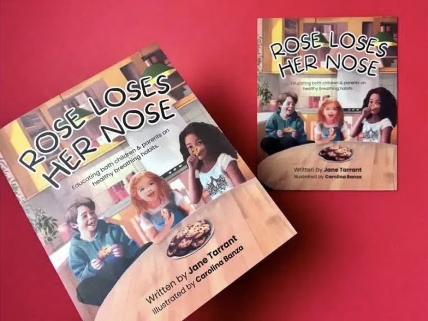
19. Rose Loses Her Nose by Jane Tarrant & Carolina Banza
This book cover design bursts with personality, blending humour and education through bright, cheerful illustrations. The expressive characters and colourful setting make learning feel fun and approachable. The clear layout keeps the focus on Rose and her curious expression, giving the cover instant appeal.
Every detail feels alive and engaging, perfectly suited for young readers. It is a cover that teaches while entertaining, showing that storytelling and playfulness can work hand in hand to make learning truly enjoyable.
20. My Wonder Line by Vicky Gooden & Angela Mayers
This children's book front cover uses soft pastel tones and gentle illustrations to create an atmosphere of calm and confidence. The smiling girl at its centre radiates positivity, surrounded by sparkles that suggest growth and self-discovery.
The composition is uncluttered, giving space for emotion to shine through. Its soothing colour palette mirrors the story’s themes of self-acceptance and healing. It is a graceful, empowering design that feels both tender and hopeful, encouraging children to see beauty in their uniqueness.
A great children’s book cover doesn’t just look good; it feels good. It stirs curiosity, joy, and wonder before a single word is read. Every colour, shape, and line plays a part in creating that spark of connection, inviting young readers to dream, explore, and imagine what might happen next.
1. Colour
Colour is often the heartbeat of a children’s cover. Bright, playful hues bring excitement and energy, while soft tones create calm and comfort. Think of the bold greens and oranges in The Gruffalo that burst with woodland life, or the soothing blues in Lost and Found that whisper of friendship and discovery. The right palette doesn’t just decorate a story; it captures its emotion.
2. Typography
Words on a children’s book cover do more than name the story; they join in the fun. Rounded, bouncy letters feel welcoming, while handwritten styles add a touch of personality and warmth. The best typography feels alive, as if it could jump right off the page and start talking to you.
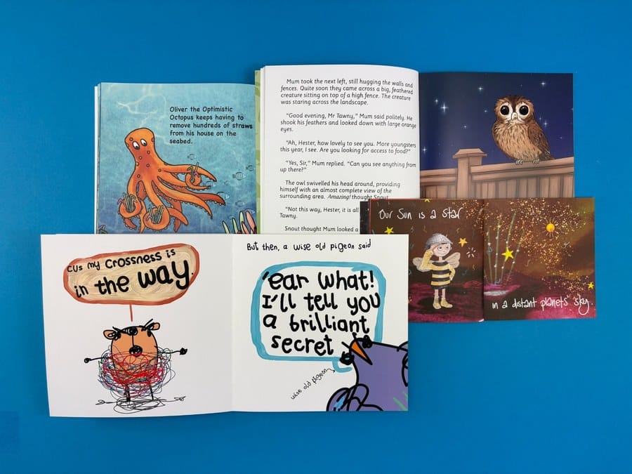
3. Illustration Style
Illustration is where the magic truly begins. From soft watercolours that feel like dreams to bold digital art that pops with personality, illustration sets the emotional tone. A smiling character, a swirl of clouds, or a mischievous wink can tell more of the story than words ever could.
4. Composition and Layout
A good layout guides the eye and heart at once. The placement of the title, the space around the character, even a trail of stars can lead the reader into the story world. The best covers use simplicity to create focus, where every detail has a reason to be there.
The most memorable childrens book covers don’t just show a story; they share it. They spark curiosity, invite laughter, and wrap readers in wonder. When a child feels something before they even turn the first page, that’s when you know you’ve created a truly great book cover.
What Mistakes Should You Avoid When Designing a Children’s Book Cover?
Designing a children’s book cover can feel like a joyful mix of art and storytelling. But sometimes, even with the best intentions, a few small choices can make your design feel off balance. Understanding what to look out for helps you create something that feels just right for your readers and your story.
1. Hard-To-Read Fonts
It’s easy to get drawn to decorative fonts, especially when you want your cover to look unique. But if the title is hard to read, it loses its magic. For the best font for your book, choose clear, friendly typography that fits your story’s tone and helps young children recognise your title easily.
2. Too Many Elements
When you love your story, you want every detail on the cover to shine. But sometimes, less really is more. A single character, a strong image, or a simple background can say more than a crowded design ever could. Clarity lets your message breathe and your story’s heart shine through.
3. Ignoring Age Appropriateness
Children connect to colours, shapes, and styles differently as they grow. What delights a toddler might not resonate with a ten-year-old. Think about your target age group and design for their world, whether that means soft watercolours for a bedtime story or bold, playful energy for an adventure tale.
4. Mismatch With The Story
Your cover should feel like a reflection of what’s inside. If the imagery or colours don’t match your story’s tone, readers can feel confused before they even open the book. Let your cover echo your story’s heart, its emotions, lessons, and magic, so the first glance feels like a promise of what’s to come.
At Ex Why Zed, we know how much heart goes into creating a children’s book. From the first sketch to the final printed copy, every detail matters, especially the cover. That’s why we’re here to help you turn your vision into something young readers will love to pick up again and again.
Whether you already have your artwork ready or need guidance setting up your files, we make printing simple and stress-free. You can use our free book cover templates, choose from premium finishes, and even print short runs to see your story come to life exactly as you imagined.
If you’re ready to create a children’s book that looks as magical as it reads, get an instant quote today and start bringing your story to life with Ex Why Zed.
Conclusion: Bringing Your Children’s Book Cover to Life
A captivating cover is the doorway into your story. Every detail, from colour to layout, helps young readers connect before they even begin to read.
If you are creating a children’s book, start by deciding what emotion you want your cover to spark. Collaborate with an illustrator who understands your story and can bring its spirit to life. Explore childrens book covers images for inspiration and note what captures your attention.
Before finalising your design, share it with parents, teachers, or children to see what resonates. A thoughtful, well-designed cover not only attracts attention but also builds excitement for the story waiting inside.
Frequently Asked Questions
How to design children’s book covers that stand out in the UK market?
A standout cover connects instantly with its target audience through vivid colours, engaging visual elements, and thoughtful design elements. The style of the cover should reflect the story’s tone, helping potential readers feel curious before they even open the book.
Where to get professional help with children’s book covers in the UK?
You can find skilled book cover designers and illustrators who specialise in children’s publishing. Many UK services, like Ex Why Zed, provide printing, templates, and file setup for printable childrens book covers, ensuring professional-quality results for authors and publishers.
Should I hire a professional or design my own children’s book cover?
Hiring a professional or graphic designer is often the best choice, as they understand cover illustration, typography, and layout. However, designing your own can work for a first book if you study what makes a good book cover appealing to younger readers.
What are the key elements of a successful children’s book cover?
A successful cover highlights the main character, uses clear imagery, and balances colour, text, and composition. Great book cover design plays a pivotal role in storytelling, helping communicate emotion and theme to both early readers and older kids.
How much does a children’s book cover cost in the UK?
Costs vary depending on experience, style, and detail. Simple, funny childrens book covers may start from around £150, while a great book cover with bespoke illustration and finishing can reach several hundred pounds for professional-quality design work.
How do I find a children’s book illustrator in the UK?
Look for illustrators whose work suits your target age group and the book’s content. Review portfolios focusing on book cover art or childrens books covers to ensure their cover image style aligns with your story’s theme, tone, and central character.
Key Highlights
Photobook quality in 2026 is shaped by colour accuracy, premium paper stocks, lay-flat binding, and durable materials that preserve professional work.
Ex Why Zed leads the list of top printing services with fast turnaround, reliable colour consistency, and flexible formats for both single copies and large runs.
Real photobook examples from Ex Why Zed demonstrate how thoughtful layouts, calibrated colour profiles, and curated sequencing elevate portfolios and long-term photography projects.
The selection process becomes easier when photographers define their purpose, preferred size, binding, and print finish before choosing a provider.
Proofing tools, realistic turnaround expectations, and quality checks help avoid reprints and ensure the final photobook accurately represents the original images.
Many photographers spend hours capturing, editing, and polishing their images, but the final step of choosing a trustworthy photobook printing service often feels uncertain. You want colours that stay true, paper that complements your style, and a printer that offers consistent quality without delays or unexpected costs. Yet printing services vary widely in finish, reliability, and overall value.
This is why the right printing partner matters. A well-printed photobook presents your work with clarity and intention. It helps you build a strong portfolio, share client projects, or showcase personal work in a way that feels professional and polished. The materials, binding, colour accuracy, and print process all play a part in shaping the final result.
In this guide, you will explore the best photobook printing services in the UK for 2026. You will see how they compare in quality, pricing, paper choices, turnaround times, and overall user experience, so you can select a printing service that brings your images to life with confidence.
What Makes a Photobook 'The Best'?
Choosing the best photobook printing serviceis not just about uploading images and hoping for a good result. The quality of materials, print accuracy, design flexibility, and overall finish all play a direct role in how your work is presented. Whether you are a wedding photographer, travel photographer, or visual artist, the final book should feel consistent, premium, and ready to show to clients or galleries.
Here's what makes a photobook stand out:
1. Colour Accuracy and Tonal Range
Accurate colour reproduction is essential. Leading services ensure your photos match your digital files, maintaining vibrant hues and natural skin tones.
Maintains tonal integrity for black-and-white photography.
Avoids oversaturation or washed-out blacks.
Ensures professional-looking results for clients or exhibitions.
High-quality colour reproduction enhances the impact of every photobook, making it a true representation of your photography.
2. Premium Paper Stocks & Layflat Photo Books Binding
The tactile experience matters. Using silk, lustre, or deep matte finish paper, combined with lay-flat binding, elevates a photobook’s presentation.
Thick paper improves durability and prevents image bleed.
Premium finishes create a professional, luxurious feel.
Investing in high-quality paper and binding ensures photobooks look and feel exceptional, adding credibility to your work.
3. Print Durability for Client Delivery & Exhibitions
Professional photobooks must withstand handling and repeated use. Durable photo cover and robust bindings maintain cover quality and overall quality over time.
Protects pages from wear, tear, and fading.
Maintains pristine condition across multiple views, preserving your favourite memories. Critical for client deliveries or exhibition books. Durability safeguards your work, reinforcing your reputation for professional-quality products.
Critical for client deliveries or exhibition books.
Durability safeguards your work, reinforcing your reputation for professional-quality products.
4. Customisation Options for Unique Storytelling
A photobook should reflect your creative vision. Top services balance simplicity with advanced design tools.
Pre-designed templates allow fast creation.
Advanced options enable full custom layouts.
Compatibility with professional software like Adobe InDesign.
Flexible design options let photographers tell their stories uniquely, creating photobooks that are both personal and professional.
5. Consistency Across Multiple Copies
If you order several copies, uniform quality is crucial. Reputable printers maintain strict quality control across batches, including the number of pages in each copy.
Ensures identical colour and cropping.
Supports professional projects needing multiple copies.
Reduces errors, saves time, and may offer bulk discounts.
Consistency ensures every copy meets your standards, which is essential for client satisfaction and repeat projects.
6. Sustainable & Archival Materials
Eco-conscious and archival materials protect both your work and the environment.
FSC-certified and recycled papers reduce environmental impact.
Acid-free pages resist fading and yellowing over time.
Long-term preservation ensures your photobooks remain vibrant for years.
Sustainable and archival materials create photobooks that are durable, responsible, and high-quality, appealing to environmentally conscious clients.
What Are the Top 5 Best Photobook Printing Services in 2026 with Fast Turnaround?
Finding the best photo book printing service can feel overwhelming because the options continue to grow each year. Whether you are a professional photographer or someone creating the best photo book for your family album, you can choose a service that matches your style, budget, and expectations.
Below are the best photobook printing companies to consider in 2026.
1. Ex Why Zed: Premium Quality with Fast Turnaround
Consistent experience shows that Ex Why Zed stands out among photobook printing options in the UK, particularly for photographers who value precise colour, sharp detail, and a polished finish. Our combination of high-quality materials and fair pricing makes creating photobooks both reliable and affordable.
Here's why Ex Why Zed works well for professional photobooks:
We offer fast turnaround: stapled books in 3 days, perfect-bound in 5, and hardback in 7 days after artwork approval.
Uploaded PDFs are checked for resolution, colour, and margins before printing to ensure professional quality.
Orders can be single copies or larger runs without affecting print consistency.
Wide selection of paper stocks, covers, and binding styles suits professional portfolios.
Custom sizes and formats accommodate portfolio books, exhibition editions, and other specialized prints.
High-quality presses maintain accurate colour tones and sharp image detail.
UK delivery is tracked to ensure safe and timely arrival.
Paper samples are available to preview before full production.
Bring your photobook project to life with expert printing that elevates every image. Place your order with Ex Why Zed and print with confidence.
2. Cewe
Cewe is a well-known option for photographers seeking the best Cewe photo book printing. It offers multiple paper types, including classic, high gloss, and fine photographic papers, as well as layflat binding for seamless two-page spreads. The service provides flexible book cover options such as hardcover, softcover, linen, or leather look with premium finishes like gloss or metallic highlights.
Why Cewe Is a Great Choice for Professional Photobooks:
Bright, detailed prints with strong colour accuracy
Flexible sizes and formats suitable for portfolios, travel photobooks, or wedding albums
Intuitive design tools, including a downloadable application with advanced features and a simpler online editor
Creative finishes and personalisation with embossing, metallic cover,s and photo text layouts
Photobook printing offers the UK discounts and promotions for affordable, high-quality books
Sustainable choices using FSC-certified recycled papers and eco-friendly printing options
Cewe provides a solid combination of quality, variety, and value, making it suitable for photographers who want professional results on a budget.
3. Printique
Printique is a popular choice for photographers seeking the best options for photobook printing and the perfect photo book with high-quality photobooks. The service offers thick, archival-quality pages and sturdy hardcover or softcover options, giving books a professional and durable feel. All photobooks feature lay-flat binding, which makes panoramic spreads or multi-page layouts easy to view without losing any detail in the gutter.
Here's why Printique works well:
Accurate and vibrant colour reproduction ensures prints remain true to your original images.
Variety of formats and sizes suitable for portfolios, wedding albums, travel photobooks, or personal projects.
Customisable layouts and templates allow photographers to creatively arrange images, add captions, and design multi-image spreads.
Professional finishes and personalisation options include premium covers, fabric or leather-look finishes, and embossed titles.
Photobook printing offers UK discounts occasionally, providing affordable options for high-quality books, ideal for photographers searching for the best price for photobooks printing services.
Reliable production and delivery, with secure packaging and consistent print quality across orders.
Printique provides a solid combination of quality, variety, and flexibility, making it a suitable choice for photographers who want professional results and durable photobooks.
4. Photobox
Photobox is a popular choice for photographers looking for the best photobook printing that combines ease of use with cost-effective options, such as the Mixbook photo book. The service offers a wide selection of formats and sizes, making the end result suitable for portfolios, personal projects, or gifts.
Why Photobox works:
Softcover, hardcover, and premium hardcover with optional lay-flat binding, ideal for panoramic spreads or multi-page layouts.
Simple drag-and-drop interface with a variety of templates and styles, enabling quick and creative photobook creation, making the design process easy and enjoyable.
Photobooks page options range from 24 to 120 pages, allowing both short and extensive projects.
Colour and print quality are vibrant and clear, though professional photographers may occasionally seek more precise colour reproduction.
Frequent photobook printing offers regular discounts, making Photobox an affordable choice for high-quality photobooks.
Photobox provides a balanced mix of affordability, convenience, and creative flexibility, making it a solid option for photographers searching for photobook printing offers UK or the best price for photobook printing services.
5. Mixbook
Mixbook is a popular photobook printing service for both personal and professional projects, offering flexible formats and an intuitive online design platform. Whether creating a travel book, family album, or a small photography portfolio, Mixbook makes the process smooth and reliable.
What Mixbook Offers:
Frequent discounts and promotional deals, including volume discounts on multiple photobooks
User-friendly online editor for drag-and-drop photo arrangement, customizable layouts, and cover options
Flexible book formats from small landscape albums to large square or oversized photobooks, with hard cover, soft cover, and glossy page options
Fast production and delivery, with many customers receiving orders within days of approval
Environmentally conscious materials using FSC-certified paper for responsible sourcing
Mixbook combines convenience and quality, making it suitable for photographers and creators who want visually appealing photobooks with dependable turnaround times..
Want to create a photobook yourself? Dive into our step‑by‑step guide on how to make a photobook from start to finish, perfect for photographers ready to bring their images into print.
Which Are the Top 10 Photobooks Ex Why Zed Printed?
Over the years, photographers have trusted Ex Why Zed to create high-quality photobooks. Personalised photobooks turn digital images into tangible works of art, capturing special moments with print quality, cover options, and layout making a real difference.
Here are 10 photobooks from our portfolio that showcase excellent design, print options, colour accuracy, and storytelling, highlighting what the right photobook printing service can achieve.
1. Skylogue by Jess Sutton
Skylogue is a 96-page hardback photobook built from Jess Sutton’s long-term project documenting skies across the UK. The book’s clean layout and subtle sequencing earned it Photobook of the Year at the Digital Printer Awards 2010.
Key Details
96 page hardback format
Matte laminated cover
170gsm silk stock for smooth tones
Precise colour management to avoid gradient banding
Full bleed spreads mixed with clean white margins
Why It Works
Strong sequencing creates an atmospheric flow
Silk stock preserves detail in cloudscapes
Matte lamination protects colour accuracy
Shows how focused themes benefit from careful design
2. Monochrome Monday by Vero
Monochrome Monday brings together the best black-and-white images from the #momo community on Vero. The book is designed to highlight contrast, tone, and composition through clean layout choices and high-quality print materials.
Key Details
260 × 196 mm softcover, perfect bound
270gsm Colorplan Ebony Black cover with embossing
104 pages on 150gsm uncoated paper
White ink spine text
Simple spacing and uncluttered layout
Why It Works
Textured cover and embossing create a premium feel
Uncoated stock enhances midtones and soft blacks
Minimal design keeps attention on form and contrast
A cohesive presentation for monochrome projects
3. Of Kent: England Re-Opening by Marianne Dissard
Of Kent: England Re-Opening is a 210 x 148 mm perfect-bound photobook that captures Kent after lockdown through calm landscapes and everyday moments.
Key Details
210 × 148 mm perfect bound
56 pages on 130gsm silk
250gsm matt laminated cover
Full colour CMYK (Fogra39 profile)
Mix of panoramic and detail shots
Why It Works
Soft colour accuracy matches natural scenes
Simple layouts keep focus on storytelling
Matte lamination adds durability and clarity
Ideal reference for travel and documentary photobooks
4. The Ecstasy of Everything by Luke Stephenson
This photobook, The Ecstasy, collects almost ten years of Luke Stephenson’s work in a compact 240 x 170 mm format. The book runs to 62 pages and is perfect bound for a neat and professional finish. The images move between portraits, everyday British scenes, and playful documentary moments. The sequencing keeps the viewer engaged without crowding the visuals.
Key Details
240 × 170 mm format
300gsm silk cover with matte lamination
170gsm silk interior pages
Perfect bound finish
Balanced mix of portrait and documentary images
Why It Works
Silk stock delivers rich colour depth
Matte lamination keeps the cover protected
Compact size suits varied visual content
Sequencing creates an easy, engaging flow
5. The Sun Will Come Out Again by Tom Krawczyk
The Sun Will Come Out Again by Tom Krawczyk is a small square book sized at 152 x 152 mm. It has a four-page cover printed on 250 gsm uncoated paper with a matt laminated finish. Inside, the 38 pages are printed on 115 gsm uncoated stock, which gives the images a soft, natural look. The colours reproduce accurately through four colour printing, and the perfect bound finish keeps the book neat and easy to handle.
Key Details
152 × 152 mm square format
4 page 250gsm uncoated cover with matte lamination
38 pages on 115gsm uncoated stock
Four colour printing for accurate tones
Perfect bound style
Why It Works
Compact size feels personal and approachable
Uncoated paper suits natural lighting and soft tones
Clean sequence supports storytelling
A practical format for travel or documentary work
6. Intimacy by Ashton Thorp
Intimacy is a small, quiet photobook centred on close portraits and soft moments. The A5 perfect-bound format and 140gsm uncoated pages give it a calm, tactile feel.
Key Details
A5 perfect-bound format
140gsm uncoated interior pages
Soft-touch matte cover
Mixed full-bleed and centred compositions
Calibrated CMYK for uncoated paper
Why It Works
Paper choice enhances gentle tones
The layout supports the intimate theme
Soft touch cover adds a tactile element
Ideal for portrait or personal projects
7. Elemental by Adam Sheridan
Elemental captures the raw forces of nature, land, air, fire, and water, through dramatic landscapes and abstract textures
Key Details
80 pages with panoramic and inset images
Clean minimalist typography
200gsm matte art paper
Select glossy spreads for water and fire
High resolution production for fine textures
Why It Works
Matte paper preserves detail without glare
Gloss highlights amplify dramatic moments
Visual pacing creates a cinematic effect
Shows how print finishes elevate storytelling
8. Don't You Forget About Me by Ricky Adam
Don’t You Forget About Me brings together digital photos and old film scans to create a simple record of everyday memories.
Key Details
Opens with film frames transitioning to digital shots
Paired spreads based on mood or theme
170gsm uncoated art paper
Warm colour reproduction with matte finish
Case bound with cloth spine and soft-touch jacket
Why It Works
Print choices support emotional tone
Consistent pacing creates a gentle rhythm
Natural paper adds softness
Ideal for memory, tribute, or personal archive projects
9. A Collection of Portrait & Documentary Photographers
A Collection of Portrait and Documentary Photographers brings together work from several portrait and documentary photographers in one cohesive publication. It presents a mix of styles while keeping a smooth and consistent reading flow.
Ideal for studios, collectives, and curated showcases
10. View by Marton Gosztonyi
View is a simple staple-bound photobook printed with a soft-touch 350 350gsm cover and 170gsm uncoated pages. The matte finish suits calm landscapes and keeps tones soft and natural.
How to Choose the Right Photobook Printing Service Provider?
Choosing the right photobook printing service becomes easier when you know what matters most to your project. Instead of comparing everything at once, focus on the features that shape quality, workflow, and the final look of your book.
1. What Are Your Photobook Needs? Occasion, Size, and Style
Before selecting a photobook printer, clarify the purpose, size, and style of your book. Knowing whether it’s for a wedding, portfolio, or personal archive helps you choose the right format, design software, paper, and layout.
This approach ensures decisions are intentional, reduces overwhelm, and results in a book that fits both your vision and the content perfectly.
2. How Do Print Quality, Paper Type, and Binding Affect the Final Result?
Print quality, paper choice, and binding style directly impact how your images appear and feel. Glossy, matte, or lustre papers influence colour and texture, while lay-flat or perfect-bound designs affect presentation and longevity.
Understanding these options ensures your hardcover books photobook delivers sharp, vibrant images and a polished, professional finish that matches your expectations.
3. How Fast Are Turnaround Times and Which Proofing Options Matter?
Production speed and proofing options are essential for timely, accurate results. Standard timelines vary, while express services and local studios offer faster delivery. Proofing tools, like on-screen previews, test prints, and colour guidance, help catch errors early, ensuring the final photobook meets quality standards without costly reprints or delays.
Final Thoughts on Choosing the Right Photobook Printer
A well-made photobook turns your digital images into something real, meaningful, and lasting, capturing your favourite moments. The right printing service helps your colours stay true, your layouts stay clean, and your story comes through on every page. Whether you are creating a client album, a personal keepsake, or an artistic project, your choice of printer shapes the final result.
As you explore the options, focus on print quality, paper, binding, design flexibility, and turnaround times, which typically span several business days. With the right fit, you can create a photobook that feels intentional, durable, and worth returning to again and again.
Frequently Asked Questions
Which photobook printing service offers the highest quality prints in the UK?
Ex Why Zed and Cewe are among the UK's best online photo book makers for high-quality photo books. They offer sharp prints, accurate colours, and premium finishes, making them reliable choices for photographers who want professional, polished results.
Are there photobook printing London companies with fast delivery options?
Many London photobook printers, including Ex Why Zed, offer fast turnaround options. Local services shorten delivery times and provide reliable support, making them ideal when you need a high-quality personalised photo album book that reflects the final product on a tight deadline.
What features matter most when choosing a photobook printing company?
Focus on print quality, paper, cover materials, binding options like lay flat, and a range of options for easy design tools. Strong customer support also matters. Reviewing these factors helps you choose a photo book service that delivers a high quality album.
What is the best photo quality for photobooks?
Use high-resolution images of at least 300 DPI for large XL Square Photo Book photobooks. This keeps your photos sharp and clear. Most good photobook makers alert you if an image is too low in resolution for quality printing.
What is the best company to make a photo book?
The best choice depends on your needs. Ex Why Zed is ideal for premium print quality and service. Cewe offers strong quality at a fair price, while Photobox suits simple, budget-friendly projects. Choose based on quality, cost, and ease.
What is the best photo quality for photobooks?
Use original, high-resolution files for the best print quality. Aim for 300 DPI at the final print size to keep images sharp and avoid any blurriness in your photo album book filled with your favourite photos.
What binding options are available for the photobooks?
Most photo book printing services offer options like perfect binding, hardcover binding, and premium layflat binding. Layflat books open fully flat, making them ideal for seamless double-page spreads and giving your large landscape photo album a more premium, polished feel.
Are there any customer reviews comparing different online photobook printing services?
Yes, many users share reviews comparing online photobook printing services, highlighting print quality, paper and binding options, colour accuracy, turnaround times, pricing, and customer support, helping you choose the service that best fits your photography needs.
Key Highlights
A design portfolio is your most powerful tool for showcasing your skills, visual identity, and creative thinking.
Curating your strongest work helps you make a sharper, more memorable impression.
Detailed case studies and clear project descriptions reveal your process and problem-solving approach.
A user-friendly, visually consistent layout ensures your portfolio feels professional and easy to navigate.
Different design fields require tailored portfolio styles, from UX case studies to interior or fashion storytelling.
Creating an online design portfolio helps you reach more clients through a polished, accessible digital format.
Keeping your portfolio updated regularly shows growth, commitment, and evolving design expertise.
A printed, professionally bound portfolio from Ex Why Zed can elevate your presentation and leave a lasting impression.
Every designer wants their work to be noticed, but standing out in a crowded creative industry can feel incredibly challenging. Even with strong ideas and polished skills, your work can fall flat if it isn't presented with clarity and intention. That disconnect often leads to frustration; you know you're capable, yet your current presentation doesn't fully reflect your talent.
The struggle usually begins with figuring out what to include, how to organise your projects, and how to express your process without overwhelming the viewer. Many designers also feel unsure about how to shape a narrative that feels cohesive, professional, and true to their design style, especially when starting from scratch or updating an outdated portfolio.
This blog will walk you through how to create a design portfolio that genuinely represents your abilities, strengthens your personal brand, and helps you stand out with confidence, both online and in print.
What Makes a Design Portfolio Essential for Your Creative Career Today?
A well-crafted portfolio shapes how the world sees you as a designer. Before we explore the deeper sections, here are the key ways your portfolio plays a crucial role in elevating your creative career, whether it's presented digitally or as a beautifully finished printed book with perfect binding for a polished, professional feel:
Establishes Your Creative Identity: Your portfolio expresses your style, thinking, and visual voice, giving people a clear sense of who you are as a designer.
Helps Aspiring Designers Break Into the Industry: Self-initiated projects and redesigns show your ability to create purposeful work even without client briefs.
Becomes the Centrepiece of Your Professional Brand: A strong portfolio shows your evolution, making it easier for clients to trust your expertise and creative direction.
Demonstrates How You Solve Real Problems: Case studies reveal your process, from research to refinement, proving you can think strategically, not just aesthetically.
Shows Your Versatility and Strengths Clearly: Curated projects highlight the range of styles or disciplines you work in, helping clients decide if you're the right fit.
Acts as Your Visual CV: Instead of listing responsibilities, your portfolio shows real outcomes, giving employers a richer understanding of your abilities.
Which Elements Are Crucial for a Professional Design Portfolio?
A portfolio only makes an impact when its structure supports the work inside it. To help you build one that feels clear, confident, and well-thought-out, here are the key elements every designer should include:
A Curated Selection of Your Best Projects: Choose quality over quantity by highlighting the most relevant work that represents your strongest creative skills. Whether you're experienced or just starting, focus on pieces that align with the roles or clients you want to attract.
Clear and Insightful Project Descriptions: Go beyond visual elements by explaining the brief, your crucial role, the challenges involved, and the outcomes. These short narratives help viewers understand your thinking and the value you brought to the project.
A Transparent Look at Your Design Process: Include moodboards, early sketches, wireframes, drafts, prototypes, and explorations. Showing how your ideas evolved builds trust and demonstrates that you can think critically, not just design beautifully.
Consistent Layout and Visual Styling: Cohesive colours, typography, spacing, and layout rhythm make your portfolio feel polished. Clean navigation and thoughtful structure ensure your work is easy to browse and leaves a strong impression.
Accessible Contact and About Information: Make it simple for viewers to get in touch or learn more about your background. A clear bio, links to your digital portfolio website menu or socials, and a visible email help build trust and open opportunities.
Smooth, User-Friendly Navigation: Whether digital or printed, a portfolio should feel effortless to move through. Simple menus, logical structure, and clean page transitions keep attention on your work, not the interface.
What Steps Should You Follow to Create a Design Portfolio From Scratch?
Before you begin designing your portfolio, lay the foundations so your work is easy to present both online and in print. Here are the essentials you need to start strong:
Prepare High-Quality Images and Files: Clear photos and high-resolution exports ensure your projects look polished on screen and transition easily into a print-ready format later.
Curate Work That Reflects Your Best Thinking: Gather academic, freelance, and personal projects, then keep only the pieces that truly represent your unique style, process, and creative strengths.
Develop a Clear Creative Direction: Explore other designers' portfolios to define the tone and layout style you want to achieve, whether minimalist, editorial, or expressive.
Organise Projects Into Clean Categories: Sorting your work into groups like branding, UX, interiors, or fashion helps viewers navigate smoothly and see your strengths at a glance.
Choose a Platform That Supports Your Workflow: Website builders, portfolio platforms, or AI tools make it easy to create clean layouts you can update regularly as your work evolves.
Design With Simplicity and Usability in Mind: Use consistent spacing, hierarchy, and short descriptions so your projects are easy to follow and leave a strong first impression.
Prepare for Both Digital and Printed Versions: Keeping files organised and print-ready from the start makes it effortless to create a beautifully bound physical portfolio in standard paper sizes later on.
How Do You Decide What Type of Design Portfolio You Need?
The type of design portfolio you need depends heavily on your specialisation and career goals. A graphic designer might focus on branding projects and illustrations, while an interior designer will showcase finished spaces and design concepts. A UX designer targeting a product manager role, on the other hand, should emphasise case studies that detail user research and problem-solving. When creating a design portfolio, your digital showcase should be tailored to highlight the skills most relevant to your field.
Customising your portfolio for a specific job or client is a powerful strategy. Before applying for a role, research the company and identify the type of work they do. Then, adjust your portfolio to showcase the range of projects that are most relevant to their needs and style. This shows you've done your homework and are genuinely interested in the opportunity. By curating your content this way, you can demonstrate how your unique skills are a perfect fit for that specific role.
How To Create a Graphic Design Portfolio?
A professional graphic design portfolio should present your visual thinking with clarity and intention. Here are the important elements that help your work feel polished and professional:
Select Projects That Reflect Strong Visual Strategy: Choose pieces that show purposeful decisions and a clear design rationale. This helps clients see that every choice you make serves a strategic purpose.
Create Clear Before-and-After Comparisons: Showing the original versus your redesign demonstrates your ability to solve problems visually. It also highlights how your work improves clarity and impact.
Use Consistent Presentation Frames for Your Work: Keeping margins, backgrounds, and mock-up styles uniform creates harmony across your portfolio. This consistency helps your projects feel part of a cohesive identity.
Highlight Multi-Platform Applications of Your Designs: Show how a single concept adapts to print, social, and digital formats. This proves your versatility and understanding of brand systems.
Add Short Insights on Challenges You Solved: Mention colour limitations, layout issues, or messaging constraints you worked through. These details show how you turn creative obstacles into thoughtful solutions.
How To Create an Interior Design Portfolio?
An interior design portfolio should communicate atmosphere, detail, and spatial intelligence. These points offer a great way to help you bring your spaces to life when creating an interior design portfolio:
Present Spaces From Multiple Angles for Depth: Wide shots paired with close-ups help viewers understand both the overall layout and the details that complete the space. This reveals the fullness of your creative approach.
Include Lighting Variations to Show Mood and Ambience: Displaying daytime, evening, and artificial lighting highlights your sensitivity to how environments shift. This demonstrates your understanding of mood and spatial experience.
Show Sample Boards to Reveal Material Awareness: Including textures, surfaces, and colour schemes helps convey how you build atmosphere through material choices. It also shows clients your attention to physical detail.
Explain Zoning and Layout Decisions Clearly: Discuss how you improved flow, defined functions, or maximised space usage. This communicates your ability to balance beauty with practical needs.
Use Annotated Diagrams for Quick Visual Clarity: Adding subtle labels to images makes your expertise instantly understandable. These annotations guide viewers through your reasoning without overwhelming them.
How To Create a Web Design Portfolio?
A web design portfolio should reflect usability, structure, and modern visual design. These elements communicate your digital expertise effectively:
Show Full User Creative Journeys Instead of Static Screens: Displaying step-by-step pathways helps viewers understand how your designs support users through tasks. It highlights your ability to create intuitive navigation flows.
Document Accessibility Considerations You Applied: Mentioning colour contrast decisions, font sizing, or ARIA labels shows that you design with inclusivity in mind. This instantly elevates your credibility in a digital-first world.
Create Visual Breakdowns of Your Layout Grid: Sharing the underlying grid or spacing system proves your mastery of structure. It also gives clients insight into how you maintain alignment and consistency.
Use Animated GIFs to Display Interactions: Showing hover states, button transitions, and micro-interactions reveals your attention to detail. These small moments help define the overall user experience.
Present Redesigns With Clear Justifications: If showcasing conceptual work, explain what wasn't working and how your changes improved clarity or usability. This shows strategic thinking beyond aesthetics.
How To Create a Fashion Design Portfolio?
A fashion design portfolio should express style, craftsmanship, and storytelling. The following points help you communicate your creative identity with depth while creating a fashion design portfolioeffectively.
Combine Digital Illustrations With Hand-Drawn Sketches: Showing both mediums proves you can ideate through multiple techniques. This blend also gives viewers insight into how your concepts evolve.
Show Development of Silhouettes Across Collections: Presenting early shape studies after final garments reveals your ability to refine ideas. It highlights progression and consistency in your design language.
Use Fabric Movement Shots to Show Fit and Flow: Dynamic images demonstrate how your garments behave in motion, which is essential in fashion storytelling. They also bring energy and life to your photo portfolio.
Create Colour and Trend Analysis Boards: Include research boards that show how you study palettes, seasons, and cultural influences. This demonstrates awareness of industry trends and design direction.
Add Notes About Construction Challenges You Solved: Mention specific stitching choices, pattern corrections, or material adjustments. These details show craftsmanship and technical understanding.
How To Create a UX Design Portfolio?
A UX portfolio should communicate process, iteration, and user-centred thinking. So, these points help you present your skills with clarity:
Share Problem Statements With Clear Success Metrics: Defining what you aimed to solve and how success was measured sets a strong context. It also shows that your solutions are tied to real outcomes.
Include User Interview Highlights and Relevant Quotes: Pull short insights from your research that shaped your designs. These snippets prove you base decisions on real user behaviour, not assumptions.
Show Multiple Iteration Rounds for Transparency: Present early sketches, mid-fidelity wireframes, and final prototypes side-by-side. This visual progression highlights your ability to evolve ideas thoughtfully.
Explain How You Compared and Evaluated Concepts: Share why some ideas were rejected and others refined. This demonstrates strategic decision-making and your ability to prioritise user needs.
End Each Case Study With Reflection and Learning: Briefly outline what you gained from the project or what you'd improve next time. This shows maturity and a growth mindset that employers value.
How Can You Leverage AI Tools for Portfolio Creation?
AI tools can streamline and elevate the way you build a standout design portfolio. They help you organise projects, refine layouts, and even generate clean visual mockups that enhance presentation quality. AI writing assistants can support you in crafting concise project descriptions, improving clarity without losing your creative voice. Image-enhancing tools can also correct lighting, remove distractions, or upscale visuals to ensure every project looks polished.
These tools don't replace your creativity, but they can save time and strengthen the overall impact of your portfolio. By using AI to handle repetitive tasks, you can focus more on storytelling, curation, and showcasing the thinking behind your work. When used intentionally, AI becomes a valuable partner in building a portfolio that truly stands out.
How To Create Your Online Design Portfolio?
Creating your online portfolio starts with choosing a platform that showcases your work effectively. A dedicated website gives you full control over your branding, layout, and the overall viewing experience. Tools like Wix make it easy to create design portfolio online using customisable templates, even if you don't code.
As you build your site, keep navigation simple, visuals consistent, and your contact details easy to find. While your own website offers the most creative freedom, portfolio platforms can also boost your visibility within design communities.
Platform Options to Create a Design Portfolio Online
Platform Type
Pros
Cons
Personal Website Builder (e.g., Wix)
Full customisation, professional domain, integrated tools.
May have subscription costs.
Portfolio Platforms (e.g., Behance)
Large creative community, easy to upload projects.
Limited customisation, high competition.
Social Media (e.g., Instagram)
Great for visual sharing and engagement.
Not a professional portfolio format, lacks case study features.
Although your online presence is essential, pairing it with a printed portfolio can strengthen your overall presentation. Many creative leads still appreciate the tactile experience of a well-crafted physical book, especially during interviews or detailed project reviews. Preparing your work in print-ready formats, with binding options such as wire-stitched, perfect-bound, or spiral binding, ensures you can confidently showcase your designs in both digital and physical settings.
What to Include and Avoid in a Design Portfolio?
To help you refine your selection with confidence, here's a clear look at what belongs in a strong portfolio and what's better left out.
Include
Why It Matters
Avoid
Why It Hurts Your Portfolio
A clear introduction that defines your design focus
Helps employers instantly understand your strengths, specialism, and creative direction.
Generic introductions without a defined niche
Leaves clients unsure about your expertise or the type of work you excel in.
Process work that shows how your ideas develop
Reveals your thinking, problem-solving, and the evolution of your concepts.
Only showcasing polished final outputs
Makes your portfolio feel surface-level and doesn't reflect your full capability.
Cohesive layouts suitable for both digital and print
Ensures your portfolio is easy to browse online and ready to convert into a printed format.
Disorganised spacing or inconsistent layouts
Creates a fragmented viewing experience and weakens professionalism.
Short explanations centred on decisions, not tools
Demonstrates your reasoning and design maturity beyond software knowledge.
Long paragraphs that focus on software lists
Makes your work appear technical rather than strategic or thoughtful.
A downloadable PDF or print-ready version
Gives clients and employers an easy way to review your work offline or during meetings.
Unoptimised files that are slow or awkward to open
Signals poor attention to detail and reduces your chances in formal reviews.
What Final Checks Should You Do Before Sharing Your Portfolio?
Before publishing your portfolio, take time for a careful final review. Treat it like proofreading a vital document. A clean, error-free portfolio reflects professionalism and strong attention to detail. Check every page to ensure visuals, links, and layouts work perfectly.
For an extra layer of polish, ask a friend, mentor, or colleague to review it. Fresh eyes can spot broken links, typos, or gaps you might overlook. This matters even more when you're about to start an application process where first impressions are everything.
Before sharing, make sure you check:
All links are working correctly.
There are no typos or grammatical errors in your case studies.
Your contact details are correct and easy to find.
Your website is responsive and looks great on mobile devices.
All images are high-quality and load quickly.
How Can You Keep Your Portfolio Updated as Your Skills Grow?
Your portfolio should be a living document that grows with you. As you complete new projects and gain more work experience, it's important to add them to your online portfolio. This not only keeps your content fresh but also demonstrates your continuous development and evolving design skills. Set a schedule for yourself, perhaps every 3-6 months, to review and refresh your work.
Don't just add new work; also consider removing older pieces that no longer represent your best abilities or current style. Each project is a learning experience, and your digital art portfolio should reflect that growth. Regularly updating your portfolio shows potential clients that you are an active and engaged designer who is constantly honing your craft and staying current with industry trends.
What Makes Ex Why Zed the Ideal Choice for Portfolio Printing?
Once your online portfolio is complete, translating it into a beautifully printed book can add a new dimension to how people experience your work. A physical portfolio feels intentional, immersive, and memorable, offering the kind of tactile engagement that the print industrycontinues to excel at. This shift from digital to print creates a stronger connection and sets the stage for a more polished presentation.
That's where Ex Why Zed shines. Our Printed Project Builder makes it effortless to turn a simple PDF into a professionally bound portfolio, complete with free file checks, designer-led support, and beautifully finished formats. From stapled booklets to perfect-bound showcases, we help you choose the right size, paper, and structure for your style.
With fast turnaround times, free sample packs, and meticulous attention to detail, we ensure your portfolio looks every bit as polished as the work inside. If you're ready to present your creativity with confidence, now is the perfect moment to start your print journey today at Ex Why Zedand bring your portfolio to life.
Conclusion
Creating a standout design portfolio comes down to presenting your work with clarity and intention. When your projects are well-curated and supported by strong storytelling, your portfolio becomes a true expression of your creative identity and the way you think.
As your skills grow, keep refining and updating your portfolio so it evolves with you. Treat it as a living document that highlights your best ideas and aligns you with the opportunities you want.
And when you're ready to take your presentation beyond the screen, a beautifully printed portfolio can add an extra layer of impact. High-quality prints make your work feel tangible, memorable, and unmistakably professional.
Frequently Asked Questions
How many projects should I include in my portfolio?
Include 8–12 of your strongest projects to showcase range and skill. Beginners can start with 3–6 solid case studies. Focus on quality over quantity and choose work that reflects your style and aligns with your target audience.
Can you give examples of standout design portfolios for inspiration?
Great examples include designers who combine strong visuals with clear process storytelling, such as those on Behance and Dribbble. Look for portfolios with balanced layouts, well-structured case studies, and consistent branding to inspire your own approach.
How can I tailor my portfolio for specific jobs or clients?
Research the company, understand their style, and select projects that match their needs. Reorder or adjust case studies to highlight relevant strengths. This customisation shows intention, preparation, and a clear connection between your work and their expectations.
How Should You Structure Each Case Study for Maximum Impact?
Use a simple story format: define the problem, explain your role, outline your process, and present the final outcome. Include visuals that show evolution, insights, and results. This structure clearly communicates your thinking and design value.
How can I create a design portfolio if I'm just starting out and have no client work?
Create personal projects, redesign existing brands, or participate in design challenges. These self-initiated pieces demonstrate creativity, skill development, and passion. They effectively showcase your process and thinking, even without formal client work.
How should I organise and lay out my graphic design portfolio for maximum impact?
Use a clean, consistent layout with clear sections and logical project categories. Prioritise user-friendly navigation, cohesive colours, and readable typography. This ensures viewers can explore your work effortlessly and quickly understand your strengths.
What common mistakes should I avoid when creating my design portfolio?
Avoid overcrowding your portfolio with outdated work or writing long, unclear descriptions. Check for broken links, typos, and confusing navigation. These mistakes weaken professionalism and distract from your strongest projects.
What is the best way to showcase my process and skills in a portfolio?
Present your process through sketches, moodboards, iterations, and prototypes. Explain design decisions and highlight challenges you solved. Showing evolution and reasoning helps clients understand your approach and strengthens the impact of your final work.
How to create a good design portfolio?
A good portfolio highlights your best work, uses clear case studies, and reflects your personality. Focus on strong visuals, simple navigation, and concise descriptions. Make sure your contact details are accessible so viewers can easily reach you.
Should you include personal projects or only client work?
Include both of them. Personal projects showcase curiosity, passion, and experimentation, while client work demonstrates professionalism and real-world application. Together, they create a balanced, authentic picture of your abilities and creative growth.
Key Highlights
The UK has many reliable zine printing companies, each suited for different budgets, print runs, and creative needs.
Ex Why Zed is a top specialist for premium art, photography, and independent publishing projects.
For design-heavy or high-quality colour publications, platforms like Pixartprinting and Tradeprint are strong choices.
Typical UK zine printing costs range from £60–£180 for small black-and-white zines to £500–£1500+ for premium photo zines.
Choosing the right printer depends on print quality, paper options, order quantity, turnaround time, and support.
Publishing a zine is an exciting creative process, but finding the right printing company can be challenging. Many creators struggle with choosing between quality, affordability, and flexible print options, especially when producing independent publications or small creative runs.
Whether you're an artist, photographer, illustrator, or DIY publisher, the printer you choose can directly impact how your zine looks and feels. Paper quality, colour accuracy, binding style, and turnaround time all play an important role in the final result.
In this guide, we explore some of the best zine printing companies in the UK, along with pricing insights, printing options, and practical tips to help you choose the right service for your project.
Which Are the Best Zine Printing Companies in the UK for Quality and Affordable Prices?
Zines continue to thrive across the UK’s independent art, photography, illustration, and DIY publishing scenes. From small-batch creative projects to gallery-quality photo books, choosing the right zine printing service in the UK can significantly influence print quality, paper feel, and overall presentation.
If you want to print zines in the UK, this guide highlights reliable printers used by artists, photographers, and independent publishers. We also look at zine printing UK prices, production styles, and key things to consider when choosing a printer.
Below are some of the best zine printing UK services available today.
Ex Why Zed
Ex Why Zed is one of the UK’s most recognised specialist printers for creative publications, photo zines, and artist books. The studio focuses heavily on independent publishing, working with illustrators, photographers, designers, galleries, and creative brands that need high-quality print production.
Unlike generic online print platforms, Ex Why Zed provides hands-on support throughout the printing process, helping creators choose the right paper stocks, formats, and binding styles to enhance their publications.
With hundreds of positive reviews and an extensive portfolio of real zine projects, the company has built strong credibility within the UK creative community.
What Makes Ex Why Zed Stand Out for UK Zine Printing?
Send your PDF and have everything handled smoothly from initial setup right through to final print.
Choose stapled zines and enjoy fast delivery within just three days for tight deadlines.
Select perfect-bound zines and have them professionally produced and delivered within five working days.
Access reliable storage, fulfilment, and distribution support designed to grow alongside your zine projects.
Get friendly, expert advice from real people who genuinely understand creative print and publishing needs.
Upload your files and receive a free check to make sure everything is perfectly print-ready.
Request free paper samples and confidently choose the ideal finish, texture, and feel.
Who Should Opt For Ex Why Zed's Services?
Creators looking for professional photo zine printing services in the UK with premium print quality.
Artists and illustrators producing design-heavy zines and visually rich creative publications.
Publishers needing premium custom-printed zines in the UK with flexible paper and format options.
Independent publishers, photographers, and creative studios producing high-quality limited-run publications and art books.
Got a zine idea ready to go? Get an instant quote and see it come to life. Fast, flexible, and built around your creative vision.
Hear What Our Clients Are Saying
“I take great pleasure in writing a review for Ex Why Zed. They are an amazing company in every way. From their first friendly contact to the finished product, they are exceptional. I cannot speak highly enough of their services! They are personable, efficient, incredibly reliable and just the best company to work with. I am so grateful for the day I came across their website. I have never looked back!" - Linda
"Fast, efficient turnaround, and great communication on details. I was having difficulty finding a printer able to produce a map-style folded conference programme. Mike and the team came to the rescue; they fully understood my requirements and were able to provide me with previous work as samples, which was very reassuring. My customer was delighted with the final printed product, which was delivered on time. Very happy with the order. Highly recommend." - John
Watch Our Zine Showcase Video!
Get inspired by a curated collection of bold, creative zine projects brought to life through print. This showcase highlights diverse formats, finishes, and ideas to help you plan your own standout zine.
Explore Ex Why Zed's Zine Portfolio
Browse a diverse collection of printed zines that showcase creative formats, bold designs, and unique finishes. See what’s possible and gather inspiration for your own zine project.
QinPrinting
QinPrinting is a professional printing company known for delivering high-quality booklet and publication printing at competitive prices. It is widely used by independent creators, publishers, and small magazines that need reliable production without high costs.
The brand focuses on combining professional offset printing standards with flexible customisation options, making it easier to produce visually polished zines, magazines, and creative publications.
With a range of paper stocks, binding styles, and printing methods, QinPrinting allows creators to maintain design quality while managing production budgets effectively for medium and larger print runs.
What Key Features Make QinPrinting a Strong Option for Zine Printing?
Offers both offset and digital printing, allowing creators to choose the most cost-efficient method based on volume.
Provides a wide selection of paper stocks and finishes to match different artistic styles and publication aesthetics.
Supports multiple binding options, including saddle stitch and perfect binding, for professional, magazine-style zine production.
Ideal for medium to large print runs where consistent quality, colour accuracy, and cost efficiency are important.
Overall, QinPrinting is a dependable option for creators who want professional-grade zine printing at scalable production costs.
Pixartprinting
Pixartprinting is a popular European online printing service known for producing high-quality booklets, magazines, and creative print materials.
It is widely used by designers, artists, and independent publishers who want visually striking printed publications with flexible customisation options.
The platform stands out for its easy online configuration system that allows creators to design and order print products with precision.
With a large selection of paper types, custom booklet formats, and advanced colour printing technology, Pixartprinting makes it simple to produce design-heavy zines and visually rich creative publications.
What Key Features Make Pixartprinting Ideal for Creative Zine Printing?
Offers a wide variety of paper types, enabling creators to experiment with textures, weights, and visual presentation.
Supports fully customizable booklet sizes and formats, allowing unique layouts suited for creative zines and art publications.
Provides a streamlined online configuration system that simplifies the process of customising specifications and placing print orders.
Uses advanced colour printing technology to deliver vibrant, detailed visuals ideal for illustration-heavy or design-focused zines.
Overall, Pixartprinting is a strong choice for creators looking to produce visually bold zines with flexible formatting and professional colour quality.
Tradeprint
Tradeprint is a well-known UK printing provider trusted by design studios, agencies, and creative professionals who require reliable, high-quality publication printing.
The company specialises in producing booklets, brochures, and magazines with strong colour accuracy and premium materials. Their combination of digital and lithographic printing allows businesses and creators to scale projects efficiently while maintaining consistent print standards.
With flexible production capacity and high-end paper options, Tradeprint is particularly suitable for larger zine runs and professionally designed independent publications.
What Key Features Make Tradeprint Ideal for Professional Zine Printing?
Offers both digital and lithographic printing methods, providing flexibility for short runs or high-volume publication printing.
Delivers precise colour reproduction, ensuring artwork, illustrations, and photography appear sharp, vibrant, and professionally printed.
Provides a range of premium paper stocks that enhance the overall feel and durability of creative publications.
Supports scalable print runs, making it practical for growing zine projects, design studios, and agency-led publications.
Overall, Tradeprint is a strong option for creators and studios that need consistent, professional-quality zine printing at larger production scales.
Doxzoo
Doxzoo is a UK-based online printing service known for its straightforward booklet and document printing. It’s especially popular among students, independent creators, and small creative groups producing simple zines or DIY publications.
The platform focuses on ease of use, allowing users to upload files quickly and configure basic booklet formats without complex setup.
With affordable pricing and fast turnaround times, Doxzoo makes small-scale publishing accessible for people who want to print short-run zines, portfolios, or creative booklets without a large production budget.
What Key Features Make Doxzoo a Practical Choice for Student Zine Printing?
Offers simple file upload tools that make it easy for beginners to submit designs and prepare files quickly.
Provides stapled booklet formats that work well for classic DIY zines and small creative publications.
Delivers fast production turnaround, helping students meet project deadlines and event timelines without long wait times.
Maintains accessible pricing, making small print runs affordable for student projects and independent creative publishing.
Overall, Doxzoo is a convenient option for students and creators looking for quick, budget-friendly zine printing.
Print In London
Print In London specialises in fast, reliable printing services designed for creators, businesses, and event organisers who need materials produced quickly.
The company is particularly known for its same-day printing capabilities, making it a practical choice for last-minute zine production. Whether creators are preparing for exhibitions, launches, or pop-up events, Print In London provides quick turnaround without sacrificing print quality.
With simple file uploads and local delivery options across London, the service helps creators produce and distribute zines efficiently under tight deadlines.
What Key Features Make Print In London Ideal for Same-Day Zine Printing?
Offers same-day printing services, allowing creators to produce zines quickly when working with tight deadlines.
Provides local London delivery options, making it easier to receive printed zines before exhibitions, launches, or events.
Supports booklet-style zine printing that suits classic independent publications and small creative magazine formats.
Includes quick file upload and streamlined ordering to reduce delays during urgent printing requests.
Overall, Print In London is a reliable choice for creators who need fast, same-day zine printing for events or exhibitions.
Helloprint
Helloprint is a large European online printing platform that provides affordable booklet and magazine printing services for creators, businesses, and publishers.
The platform is widely used for projects that require simple, cost-effective print production without sacrificing basic quality. With a strong focus on competitive pricing and easy online ordering, Helloprint makes it convenient for creators to produce small magazines, promotional booklets, and independent zines.
Its flexible configuration tools, paper choices, and booklet formats make it a practical option for budget-friendly zine printing in the UK.
What Key Features Make Helloprint a Good Option for Affordable Zine Printing?
Offers competitive online pricing, making it easier for creators to print zines without exceeding tight project budgets.
Provides multiple booklet formats that support traditional magazine-style zines and simple creative publications.
Includes a variety of paper stocks, allowing creators to choose materials that match different visual styles.
Features online configuration tools that simplify customising specifications and placing orders through a streamlined digital platform.
Overall, Helloprint is a practical option for creators looking for cheap zine printing in the UK with flexible online ordering.
ZinePrinter
ZinePrinter is a niche printing service dedicated specifically to zines and small independent publications. Unlike general commercial printers, the platform focuses on the needs of DIY creators, artists, and independent publishers who want straightforward zine production without unnecessary complexity.
Its services are designed around typical zine formats, making it easier to print small creative projects with minimal setup. With flexible size options and classic booklet binding, ZinePrinter provides a simple and accessible solution for creators producing short-run zines or experimental publications.
What Key Features Make ZinePrinter a Good Choice for DIY Zine Printing?
Specialises in dedicated zine printing services designed specifically for independent creators and small publication projects.
Offers multiple size options that allow creators to experiment with different layouts and visual storytelling formats.
Supports saddle-stitched booklet binding, a classic format widely used in traditional DIY zine production.
Optimised for small creative print runs, making it practical for independent publishers and limited-edition zines.
Overall, ZinePrinter is a focused option for creators who want simple, creator-friendly printing for small independent zine projects.
Doxdirect
Doxdirect is an online printing service that specialises in document, booklet, and short publication printing, making it a convenient option for creators producing zines or small magazines.
The platform focuses on simplicity and efficiency, allowing users to upload files, configure booklet options, and place orders quickly through its online system.
With digital printing designed for short runs and fast UK delivery, Doxdirect is particularly useful for independent publishers, students, and creators who need reliable online zine printing without complicated production processes.
What Key Features Make Doxdirect a Convenient Option for Online Zine Printing?
Provides a simple PDF upload system that allows creators to quickly submit and configure zine files online.
Offers multiple booklet binding options, enabling flexibility for different zine styles and publication formats.
Supports fast production with UK delivery, helping creators receive printed zines without long turnaround times.
Uses digital printing technology optimised for short runs, making it practical for small publications and limited editions.
Overall, Doxdirect is a convenient choice for creators looking for straightforward online zine printing in the UK.
Nevex Printing Centre
Nevex Printing Centre is a London-based print shop that provides booklet and zine printing services for creators, artists, and small publishers.
Known for its local accessibility and practical print solutions, the company supports independent projects that require quick and reliable production. With booklet-style printing and a range of paper options, Nevex helps creators produce visually clean and professional zines without large print commitments.
Its location and short-run capabilities make it especially useful for local creators working on exhibitions, creative projects, or independent publications.
What Key Features Make Nevex Printing Centre Suitable for Local Zine Printing?
Provides a local London print service, making it convenient for creators who prefer working with nearby printers.
Supports booklet-style zine printing commonly used for independent publications and small creative magazines.
Offers multiple paper options that allow creators to choose materials matching their design and visual style.
Suitable for short print runs, making it practical for limited editions, local projects, and experimental publications.
Overall, Nevex Printing Centre is a useful option for independent creators looking for local zine printing in Central London.
How Much Does Zine Printing Cost in the UK?
The cost of zine printing in the UK can vary depending on factors such as page count, paper quality, binding style, colour printing, and order quantity. Whether you’re looking for cheap zine printing UK options or premium art production, understanding typical pricing helps creators plan realistic budgets.
Below are some typical pricing ranges you can expect.
Small black-and-white zines (A5, 20-32 pages): Many creators start with simple A5 black-and-white booklets. For around 50 copies, the cost usually ranges from £60 to £100, making this one of the most accessible formats for independent zine creators.
Colour art zines (40-60 pages): Full-colour art publications increase production costs because they require higher-quality paper and printing. For about 100 copies, the typical zine printing UK cost ranges between £250 and £700, depending on paper stock, colour quality, and binding.
Premium photography zines: High-end photo zine printing UK projects often require premium coated paper, colour-accurate printing, and professional finishing. These types of publications generally cost between £500 and £1500+, depending on size, page count and production quality.
Overall, UK zine printing prices vary widely depending on the level of quality and customisation you choose, but understanding these ranges can help creators estimate costs before starting a print project.
How Do You Choose the Best Zine Printer in the UK?
Choosing the right printing partner can make a significant difference in the quality and success of your zine project. Different printers offer varying levels of expertise, materials, and support, so evaluating a few key factors can help you select the best option for your publication.
When comparing zine printing services, it’s helpful to review several aspects that influence both the printing experience and the final result.
Print quality and paper options: High-quality printers offer a variety of paper stocks and finishing options. The right paper choice can enhance artwork, photography, and readability, making it important to review sample prints or paper options before selecting a printer.
Experience with creative publications: Printers that regularly work with independent publications often understand the unique needs of zines, including layout considerations, colour accuracy, and creative formats that may not be common in standard commercial printing.
Minimum order quantities: Some printing companies require large minimum orders, while others support smaller print runs. Choosing a printer that accommodates your desired quantity is important, especially for independent creators producing limited editions.
Customer support and guidance: Reliable customer support can be extremely helpful during the printing process. Printers who offer guidance on file setup, paper selection, and binding options can help prevent costly mistakes and ensure smoother production.
Portfolio of previous zine projects: Reviewing a printer’s past work provides insight into their experience and printing quality. Looking at examples of previously produced zines can help you determine whether their style and capabilities match your vision.
Taking time to evaluate these factors can help creators choose a printer that understands independent publishing and delivers a final product that reflects the quality and creativity of the original zine project.
How Do You Print a Zine in the UK?
If you're wondering how to print a zine in the UK, the process is simpler than it might seem. Whether you're creating a small DIY project or planning a larger print run, following a structured approach ensures your zine looks polished and professional.
From choosing the right format to preparing a print-ready file, each step plays a key role in the final result. The guide below walks you through everything you need to know to get your zine ready for print.
Step 1: Start with Your Idea
Every zine begins with a strong concept. This could include photography, illustration, written content, or a mix of formats that represent your creative vision. Making zines UK printing projects typically start by gathering and organising your content into a clear direction before moving into the layout and design stages.
Step 2: Choose Your Zine Format
Selecting the right format is essential for both design and cost. A5 is the most popular option, while A6 works well for compact zines, and square formats suit visual-heavy projects. Your choice will influence layout decisions, readability, and overall presentation of your printed publication.
Step 3: Plan Your Page Count
Zines usually range between 16 and 64 pages, depending on content type and purpose. Smaller page counts are ideal for short-run or DIY projects, while larger zines work better for storytelling, portfolios, or photography series that require more space to showcase creative work.
Step 4: Design Your Layout
Create your zine layout using software such as Adobe InDesign, ensuring proper structure, spacing, and visual flow across pages. Pay attention to margins, typography, and image placement. Many printers provide setup guides, helping you avoid common errors and ensuring your file is ready for print.
Step 5: Choose Your Paper Type
Paper selection plays a major role in how your zine looks and feels. Uncoated paper is ideal for text and illustration, while silk paper enhances colour for photography. Heavier stocks are often used for covers to improve durability and create a more premium finish.
Step 6: Select Your Binding Style
Binding determines how your zine is assembled and presented. Stapled binding works best for smaller page counts, while perfect binding suits thicker publications. Custom printed zines in the UK often use higher-end binding styles to create a more refined and professional final product.
Step 7: Export a Print-Ready File
Before printing, export your artwork as a print-ready PDF with correct bleed, sizing, and page order. A properly prepared file ensures accurate trimming, correct alignment, and a clean, professional finish in the final printed zine.
Step 8: Finalise Your Print Specifications
Review all key details, including format, paper type, binding, and quantity, before placing your order. This step ensures everything aligns with your vision and budget. Many creators use this stage to compare options and refine their choices for the best possible printed outcome.
Step 9: Submit Your Artwork
Upload your print-ready file to your chosen printer and confirm your order. Most professional printers will carry out a file check to identify any potential issues, helping ensure your zine is printed accurately and meets expected quality standards before production begins.
Step 10: Approve Your Proof
Once your proof is ready, review it carefully to check layout, colours, and overall appearance. This step is your opportunity to make final adjustments. After approval, your zine moves into full production, where it is printed, trimmed, and assembled professionally.
Step 11: Receive Your Printed Zines
After production is complete, your zines are packaged and delivered to your chosen address. You can now distribute, sell, or showcase your work. Following this structured process ensures your zine arrives exactly as planned, with professional print quality throughout.
Bring your ideas to life with expert support from Ex Why Zed. Get a fast quote, explore paper options, and start your zine printing journey today with a team that specialises in creative publications.
Conclusion
Finding the right zine printer in the UK comes down to understanding your project’s needs. Consider factors like print quality, paper options, binding styles, turnaround time, and order quantities before making a decision. Some printers are better suited for short DIY runs, while others specialise in premium art or photography publications.
Reviewing portfolios, requesting samples, and comparing quotes can help you make a confident choice. With the right preparation and printer, your zine can be produced exactly the way you imagined.
Frequently Asked Questions
How do I get the best zine printing UK prices?
To get the best price, compare quote tools and request a custom quote if your project has unique specifications. Prices depend on the number of pages, paper choice, binding types, and whether you choose colour print or black-and-white. Larger quantities usually reduce the cost per copy.
Are central London zine printers available for walk-in orders?
Most modern zine printers operate online rather than through walk-in shops. Instead of visiting central London locations, you can order through live chat support or online forms. Many companies also provide sample packs, helping creators review paper types and print quality before placing an order.
What is the typical turnaround for zine printing services in the UK?
Turnaround depends on complexity and finishing choices. Simple booklet printing projects with standard paper may take a few days, while full colour publications or thicker paperback books may require longer production times depending on printing schedules and delivery options.
Are there eco-friendly or FSC-certified zine printing options in the UK?
Many UK printers now provide environmentally responsible materials. These options may include recycled paper for inside pages, sustainably sourced stock for the front cover, and eco-friendly inks. Choosing certified paper helps reduce environmental impact while maintaining professional print quality.
What is the best paper type to use for printing zines in the UK?
The best paper depends on the style of publication. Smooth stock works well for detailed interior pages, while thicker paper is commonly used for the back cover. Photography and illustration projects often benefit from coated paper that improves colour reproduction.
How much does it cost to print a 20-page zine?
Printing a 20-page zine varies depending on materials and colour choices. Projects produced with saddle stitching and standard paper tend to be more affordable, especially when placing a single order, while premium finishes or heavier stock can increase the total cost.
How do I print my own zine?
Printing your own zine typically starts by designing single pages, including elements like the front cover design and inside front cover content. Once the layout is complete, you export your design file and upload it to a printing service that supports short-run projects.
Why are saddle stitched zines the most popular binding option?
Saddle-stitched zines are widely used because the binding method is simple and cost-effective. Staples along the spine securely hold single pages together while allowing the zine to open easily, making it ideal for creative publications like art magazines or skate zines.
How do I prepare and upload my zine files for printing with a UK company?
Most printers require a properly formatted PDF file created in tools like Adobe InDesign. The document should include a bleed area, correctly arranged inner pages, and sections such as the inside back cover, with an optional blank page if required for layout alignment.
Can I get an instant online quote for zine printing in the UK?
Yes, many platforms offering online zine printing services provide an instant quote based on page count, custom sizes, paper choice, and binding, such as perfect bound. Their customer service team can guide your print journey and review files to ensure your zine design prints correctly.
Key Highlights
Learn to create a zine from a single sheet of paper using the simple slit and fold method.
This guide shows you how to fold, cut a slit in the middle of the page, and assemble your zine easily.
All you need to start are basic materials like paper, scissors, and a printer.
Discover creative ideas to fill your zine, from collage and stickers to Photoshop designs.
We'll cover everything from preparing your paper to designing the cover page and printing.
Making a zine is a great way for young adults to express themselves and support mental health.
Have you ever wanted to create your own mini-magazine? A zine is a fantastic way to share your thoughts, art, or stories with the world.
Made from just a single sheet of paper, a zine can be about anything you care about. The process itself is both creative and personal, giving you space to explore ideas, experiment with design, and express what matters to you in a hands-on way.
This guide will walk you through the simple and rewarding process of making your very own slit and fold zine.
What is a Slit and Fold Zine?
A slit-and-fold zine is a type of miniature magazine created from a single sheet of paper. The magic is in the method: a series of specific folding steps combined with one strategic cut, or slit, allows the paper to be transformed into a small, multi-page booklet.
There’s no need for staples or complex binding. This technique is incredibly popular because it’s accessible, cheap, and easy to learn, making it perfect for beginners and seasoned creators alike.
The beauty of a zine lies in its versatility. You can fill its pages with personal stories, poetry, comics or collages, shaping it into whatever reflects your ideas and creativity. With nothing more than a single sheet of paper and a clever folding technique, you can transform simple materials into a powerful, self-made publication that brings your voice to life.
Prefer to watch the folding process in action? We’ve embedded a short overhead video tutorial that shows the full method from start to finish, so you can see exactly how a single sheet transforms into a neat eight-page mini zine. It’s especially useful for the trickiest part of the process: bringing the folds together in the centre and shaping the booklet cleanly without forcing the paper. Watching the movement unfold on screen can make the whole technique click in seconds.
The video works beautifully alongside the written guide. You can read the article for the full breakdown on materials, paper sizes, layout planning and creative finishing ideas, then use the video as a visual companion while you fold your own zine step by step. Whether you learn best by reading, watching or doing, this gives you both routes into the process, and gets you closer to a finished zine that feels crisp, clever and ready to print.
What Do You Need to Get Started with Folding a Zine?
Starting your first zine project is refreshingly straightforward and does not require specialist equipment. Most of the materials are commonly found at home or in a basic stationery drawer. With just a few simple tools, you can begin folding, designing and assembling your own miniature publication.
To keep things clear and easy to follow, here’s what you actually need:
1. Essential Tools
These are the only items required to create a basic slit and fold zine successfully.
A single sheet of paper: Standard A4 printer paper works perfectly for beginners and is ideal for practising your folds.
Scissors or a craft knife: You will use this to create the central slit that allows the booklet to form correctly.
A pen or pencil: Simple writing tools are all you need to sketch ideas or add text to your pages.
A printer (optional): Helpful if you want to print a digital layout or create multiple copies, but not necessary for a handmade version.
2. Creative Extras
These additions are optional and can enhance your design once you are comfortable with the basics.
Colour tools: Coloured pencils, markers or highlighters can add personality and detail to your pages.
Collage materials: Magazine cut-outs, printed images and a glue stick allow you to experiment with layered designs.
Stickers or decorative elements: Optional additions that enhance the visual style and give your zine a handmade feel.
With these simple materials prepared, you are ready to begin folding and designing your own slit and fold zine with confidence.
What Paper Sizes Work Best for Slit and Fold Zines?
The paper size you choose determines the final dimensions, portability and overall impact of your finished zine. Because the slit and fold method uses a single sheet divided into eight panels, the starting size directly affects how large each page will be once folded. Choosing the right format early ensures your design, printing and folding process runs smoothly.
Here is a simple comparison to help you decide:
Paper Size
Final Zine Dimensions (approx.)
Best For
A4
A7 (74 x 105 mm)
Standard, highly portable mini zines and easy home printing
A3
A6 (105 x 148 mm)
Larger, postcard-sized zines with more visual presence
Smaller or custom sizes
Varies
Unique mini formats and experimental designs
1. Printing Considerations
Before printing, confirm that your printer supports the chosen paper size. A4 is the most convenient option for home printers, while A3 may require specific printer settings. Check ink levels as well, especially if your cover design includes bold colours or detailed graphics.
2. Audience and Portability
Think about how your zine will be shared. Smaller formats such as A7 are easy to carry, distribute and store, making them ideal for events or casual sharing. Slightly larger sizes offer more room for artwork and typography, creating a stronger visual impact but slightly less portability.
Selecting the right paper size from the start will make the folding process easier and help your finished zine feel intentional and well-proportioned.
Curious how paper choice affects the look and feel of your zine? Learn the key differences to pick the best paper to print zines in this guide!
How to Set Up Your Zine Page Layout Correctly
Before you start adding artwork, text or page numbers, it’s important to understand how the flat sheet will behave once it has been folded into a booklet. A one-page zine does not read in a simple left-to-right sequence while it is laid out flat. Instead, each panel has to be placed in a very specific position so that, once folded, the pages appear in the correct order. In this layout, the front cover sits on the lower far-right panel, while the back cover sits immediately to its left on the lower row. The remaining lower panels form the inside pages that follow through the booklet.
The four panels across the top row need to be designed upside down in relation to the bottom row. That might feel counterintuitive at first, but it is essential for the booklet to fold correctly and for the pages to read the right way up in the finished zine. Creating a quick paper mock-up first is the smartest move, because it lets you map the panels visually before committing to your final design. Once you understand where the covers, inside pages and inverted top-row panels belong, the whole layout process becomes far easier, and your finished zine will feel sharp, intentional and print-ready.
Step-by-Step Guide: How to Fold a Slit and Fold Zine?
Turning a single sheet into a small, eight-page booklet is easier than it looks. With a few careful folds and one central cut, you can create a neat mini publication ready for writing, drawing or printing. No glue or staples required.
Follow these clear steps below to master the technique.
Step 1: Gather Your Paper and Tools
Before starting, prepare everything you need so the process runs smoothly. You will need:
One rectangular sheet of paper (A4 works perfectly).
A pair of scissors (or craft knife, used carefully).
A ruler for sharper creases (optional).
Pens, pencils or decorative materials if you plan to design immediately.
Choose standard printer paper for practice, then experiment with heavier stock once confident.
Step 2: Create the Base Folds
This stage forms the structure of your booklet and explains exactly how to fold paper for a zine correctly.
Place your sheet of paper flat on a table. First, fold it in half lengthways, matching the long edges together.
Press down firmly to make a clear crease.
Next, fold it in half the other way, matching the short edges together.
Fold it the same way once more if you wish to create eight equal sections on the page.
Step 3: Make the Central Slit Safely
This is the crucial transformation step in learning how to fold paper into a zine.
Fold the sheet in half widthwise (short edges together).
Locate the centre crease along the folded edge.
Cut from the folded edge along the middle crease line, stopping at the first vertical crease intersection.
Only cut through the middle two panels, no further. The slit should sit neatly in the centre of the sheet.
Step 4: Collapse and Form the Booklet
Now you’ll complete the structure and see how to fold a zine booklet properly.
➡️ Unfold the paper completely again.
➡️ Fold it lengthwise along the long central crease (the one containing the slit).
➡️ Hold each short end and gently push them towards one another. The slit will open into a cross or “mouth” shape.
➡️ Allow the sections to fold naturally inward, stacking into booklet form.
➡️ Fold the booklet in half to form a spine.
Press all edges firmly to secure clean folds. Your front cover should now sit correctly at the front.
With just one sheet and a careful sequence of folds, you’ve transformed flat paper into a finished mini publication. Now fill it, print it or share it, and enjoy creating your own handmade zines.
How Can You Design and Finish Your Zine Creatively?
Once you have learned how to fold a zine (slit and fold zines), the most rewarding stage begins. Your blank booklet becomes a space for ideas, artwork and storytelling. Careful planning combined with creative freedom will help you produce a zine that feels thoughtful, original and well presented.
Follow the steps below to shape and refine your finished piece.
Step 1: Decide Your Theme and Creative Direction
Before adding any artwork or writing, take time to decide what your zine will focus on and the tone you want it to have. A clear theme gives structure and purpose to your pages, making the final result feel cohesive and intentional rather than random.
You might choose to explore one of the following ideas:
Write poetry or short reflective pieces.
Create a short illustrated comic strip.
Share personal experiences or hobbies.
Design fan art inspired by favourite books or films.
Compile simple recipes or practical tips.
Whether you are practising how to fold a mini zine for enjoyment or improving how to cut and fold a zine accurately, meaningful content will always strengthen the finished booklet.
Step 2: Create a Numbered Mock-Up to Plan Layout
Proper page planning is essential if you want a clean and professional outcome. This is particularly important when learning how to fold a one-page zine, as the panels appear in a different sequence once the sheet is unfolded and laid flat.
To prepare your layout guide, follow these steps:
Fold a blank practice copy completely.
Number every page clearly in pencil.
Draw a small arrow on each page to indicate the correct orientation.
Unfold the sheet and review how the numbered panels appear when flat.
This mock-up will act as a reliable template and will prevent upside-down pages, misplaced artwork or unexpected layout issues.
Step 3: Align Text and Images with Care and Precision
Achieving a polished appearance depends on accurate alignment, thoughtful spacing and an understanding of your fold lines. When designing on the unfolded master sheet, you must pay close attention to the eight sections created by your folds so that nothing important is trimmed or hidden.
Keep the following in mind during layout:
Ensure all essential text remains within panel boundaries.
Avoid placing important details directly across fold lines.
Leave small margins near the outer edges of each panel.
Use a digital grid if designing on a computer.
Complete a test print before producing final copies.
This approach is helpful whether you are practising how to fold a zine A4 for standard printing or experimenting with how to fold a zine A3 for a larger format design.
Step 4: Experiment with Materials and Creative Techniques
Zines provide freedom to explore different artistic styles and materials, allowing you to create something that reflects your personality and creative voice. Mixing techniques can add texture, contrast and visual interest throughout the booklet.
Consider experimenting with:
Collage using magazine cut-outs and glue.
Stickers, stamps or patterned paper.
Hand lettering and illustrated titles.
Digital layouts you'll prepare before printing.
Different paper weights or finishes.
Once you are confident in how to fold a mini zine accurately, trying new materials can elevate the overall look and feel of your publication.
Step 5: Consider Colour Choices and Hidden Details
Thoughtful colour choices and layout decisions can enhance readability while adding personality to your zine. Although the slit and fold format usually uses a single-sided sheet, you can still incorporate creative surprises into the design process.
You might choose to include:
A hidden full-page poster that is revealed when unfolded.
A background pattern that is printed on the reverse side.
A secret message for readers to discover.
High-contrast imagery for clear black and white printing.
Remember that colour printing is generally more expensive than black and white, particularly if producing multiple copies. Planning ahead will help you balance cost and creativity effectively.
Designing a zine combines structure with imagination. Once you understand the folding method and page arrangement, you can confidently experiment and produce a finished piece that is both technically precise and creatively expressive.
At Ex Why Zed, we live and breathe zine printing. Whether your project features photography, illustration, writing or bold graphic design, we make self-publishing simple and exciting.
Just send us your PDF, and we handle the rest, from free file checks to expert advice from real humans. Enjoy stapled zines delivered in three days or perfect-bound editions in five, plus free UK tracked delivery and optional storage and fulfilment.
Explore inspiring case studies, request free paper samples and follow our easy Print Journey guides to get started with confidence.
Folding a zine using the slit and fold method is not just a fun, creative exercise; it’s an opportunity to express your thoughts and ideas in a tangible format. With the right materials and techniques, you can craft a unique piece that reflects your personality and artistic vision.
Remember to be patient with the folding process, and don’t hesitate to experiment with different designs and layouts to make your zine truly yours. Whether you’re making a mini zine or an A4 masterpiece, the joy of creating something by hand is unparalleled.
Frequently Asked Questions
How many pages does a typical slit-and-fold zine have?
A standard slit-and-fold zine made from one sheet of paper always contains eight pages. These include a front cover, a back cover and six interior pages. The folding process divides the sheet evenly before one central cut forms the booklet.
What are common mistakes to avoid when folding a zine?
One common mistake is cutting beyond the centre crease, which weakens the structure. Another is making uneven folds that cause misaligned pages. Always crease carefully, line up edges precisely and stop cutting exactly at the marked fold intersections.
Is the slit and fold method suitable for double-sided printing?
The slit-and-fold method is traditionally designed for single-sided printing. However, you can print on the reverse side to create hidden artwork or bonus material revealed when unfolded. Careful alignment is essential to prevent upside-down or misplaced content.
How do I make sure my images and text appear in the right order?
Create a blank folded mock-up before designing your final version. Number each page clearly from one to eight, then unfold the sheet. This layout guide shows exactly where to position text, images and any upside-down elements.
Are there tips for making sure the pages line up correctly when folding a zine?
Yes. Always start with precise initial folds, aligning corners carefully before creasing firmly. Use a ruler to sharpen folds if needed. Smooth the paper flat before collapsing it into booklet form to prevent shifting and uneven page edges.
What size paper works best for making a one-page slit-and-fold zine?
Standard A4 paper works best for most beginners because it fits home printers and folds into a compact booklet size. A3 paper creates larger pages and bolder layouts. Any rectangular sheet works if the proportions remain consistent.
How to fold a quarter zine?
A quarter zine is made by folding a sheet in half, then in half again, creating four sections. Instead of cutting a central slit, you keep the folds intact. This produces a simple four-page booklet structure.
How to fold an 8-page mini zine?
Fold the paper lengthwise, then widthwise twice to create eight equal panels. Unfold, cut along the centre crease between the middle panels, then refold lengthwise and push the ends together to form the booklet.
Key Highlights
Indie publishing involves working with a small, independent press, while self-publishing means the author manages the entire process.
The key difference lies in control and support; indie publishing offers a team, whereas self-publishing provides complete autonomy.
Costs vary significantly, with indie publishing having minimal upfront costs for the author, unlike self-publishing, where the author bears all expenses.
The publishing industry is evolving, with both paths offering viable routes to market, moving away from the sole option of a traditional publisher.
Royalty structures differ, with self-publishing often yielding higher per-unit earnings but requiring more initial investment.
Both options require author involvement in marketing, but the level of support differs, from professional editing to distribution.
Are you an author trying to understand the complex publishing industry? Deciding on the right path for your book can feel overwhelming, especially with the rise of options beyond traditional publishing.
You've likely heard the terms 'indie publishing' and 'self-publishing' used, sometimes interchangeably. While they both offer alternatives to large publishing houses, they are distinct routes.
This guide will help you understand the differences between working with indie publishers and going it alone with self-publishing, empowering you to choose the best fit for your writing career.
What Is Indie vs Self Publishing?
Indie publishing, short for independent publishing, means you partner with a small press. These publishers operate outside the major corporate publishing houses, often called the "Big Five." They have their own team to handle parts of the publishing process, much like a traditional publisher, but on a smaller, more curated scale.
On the other hand, self-publishing puts you, the author, in the driver's seat. You manage every aspect of the publishing process, from editing and cover design to marketing and distribution. You are the publisher, making all the decisions and hiring freelancers as needed.
How Does Indie Publishing Work?
Indie publishing sits between traditional publishing and self-publishing. You send your manuscript to an independent press, and if they like it, they choose to publish it. The publisher then invests their time, money and skills to help turn your book into a finished product.
Here is a simple breakdown of how it works.
1. Working with Independent Publishers
When you work with an independent publisher, you become part of a smaller and carefully selected group of authors. Unlike large publishing houses that release thousands of titles, indie presses usually focus on specific genres or unique voices.
Here is what that typically means:
Selective process. You submit your manuscript, and the publisher decides whether it fits their list.
More personal attention. Smaller catalogues mean more time and support for your book.
Shared investment. The publisher pays for editing, design and production.
Team partnership. You work together to shape and promote the book.
Genre focus. Many indie presses specialise in certain types of books.
You may have slightly less control than with self-publishing, but you gain a team that supports your work.
2. Editorial and Design Support in Indie Publishing
One of the biggest benefits of indie publishing is the professional support you receive. You do not need to hire editors or designers yourself, as the publisher provides these services as part of the agreement.
This support usually includes:
Developmental editing. Help improve the structure, pacing and clarity of your manuscript.
Copy editing. Checking grammar, spelling and consistency.
Professional cover design. Creating a cover that suits your genre and attracts readers.
Interior layout. Formatting the book so it looks clean and easy to read.
Quality control. Ensuring the final product meets publishing standards.
This process helps make your book look and feel professional.
3. Distribution Channels for Indie Authors
Getting your book in front of readers is very important. Independent publishers usually have systems in place to help distribute your book to shops and online platforms.
Distribution support often includes:
Bookshop access. Connections with retailers and wholesalers.
Online sales platforms. Listing your book on major online stores.
Ebook publishing. Making your book available in digital format.
Library outreach. Presenting titles to libraries where possible.
Rights opportunities. Exploring audiobook or translation deals.
While indie publishers may not have the global reach of large companies, they can still provide strong and practical access to readers.
Indie publishing offers a supportive middle path. You receive professional help and industry guidance, while still working closely with a smaller, more focused publishing team.
How Does Self-Publishing Work?
Self-publishing is the process of independently publishing your own book, managing editing, design, formatting, uploading and marketing yourself. Unlike indie publishing, where you work with an independent press, self-publishing means you act as the publisher.
Below is a clear explanation of how self-publishing works.
1. Complete Author Control in Self-Publishing
One of the biggest reasons authors choose self-publishing is full control. You make every decision about your book without needing approval from a publishing house. This gives you flexibility but also places responsibility firmly in your hands.
Here is what you control:
Creative direction. You decide the title, final manuscript, cover design and overall style.
Publishing timeline. You choose exactly when to release your book.
Pricing strategy. You set the price and adjust it whenever needed.
Marketing decisions. You decide how and where to promote your work.
Rights ownership. You normally retain full rights to your book.
When discussing indie author vs self-published pathways, the key difference is that a self-published writer works independently, while an indie author published by a small press collaborates with a publisher.
2. Choosing Platforms for Self-Publishing
After preparing your manuscript and cover, you must decide where to publish your book. Several online platforms allow authors to upload their work directly and sell it to readers worldwide.
Common platforms include:
Amazon Kindle Direct Publishing. A popular platform offering ebook and print-on-demand paperback distribution through Amazon’s global marketplace.
Kobo Writing Life. Well known in Canada and international markets for ebook sales.
Google Play Books. Provides access to a wide global audience of Android users.
Aggregators. These services distribute your ebook to multiple online stores and library systems at once.
Some authors choose to publish exclusively with Amazon for simplicity. Others distribute widely across several retailers to increase reach. Your choice depends on your goals and target audience.
3. DIY Production and Formatting
In self-publishing, the do-it-yourself approach is strong, but it does not mean you must complete every task alone. You act as the project manager, which means you can either learn skills such as cover design and ebook formatting yourself or hire professionals to handle them.
Many self-published authors build their own small team to ensure quality. This may include:
Freelance editors. To improve structure, clarity and grammar.
Professional cover designers. To create a market-ready and genre-appropriate cover.
Formatters. To prepare files correctly for print and digital platforms.
Proofreaders. To catch final errors before publication.
Many writers comparing self-publishing vs indie publishing often ask, is indie publishing the same as self-publishing. The answer is no. With self-publishing, you are the publisher. With indie publishing, you work with an independent press that selects and supports your book.
Self-publishing offers freedom, flexibility and full ownership. However, it also means you are responsible for quality, production and promotion. Understanding the differences between self publishing vs indie publishing can help you decide which path best fits your goals as an author.
How Do Costs Compare Between Indie and Self-Publishing?
Money plays a major role when choosing your publishing path. With indie publishing, the publisher usually covers production costs. With self-publishing, you pay upfront but keep a larger share of earnings. Understanding both risk and reward will help you make a confident, informed decision.
Below is a simple comparison of the financial differences.
1. Upfront Expenses with Indie Publishing
One of the main advantages of working with an independent publisher is that you usually do not pay upfront production costs. When a small press accepts your manuscript, they are investing in your book and covering the expenses needed to publish it professionally.
Typical costs covered by the publisher include:
Professional editing. Developmental and copy editing to refine your manuscript.
Cover design. Creating a professional, market-ready cover.
Interior formatting. Preparing files for print and digital formats.
Printing costs. Managing print production where required.
Distribution setup. Organising retail and online availability.
In some cases, you may also receive:
An advance against royalties. A payment made before publication, which is later earned back through book sales.
The publisher takes the financial risk, hoping to recover costs through successful sales.
2. Typical Costs for Self-Publishing
Self-publishing requires you to finance every stage of the publishing journey, from editing and design to final production. While costs vary, producing a high-quality, professional book typically involves a considerable investment.
Common expenses include:
Professional editing. Essential for improving structure, clarity and grammar.
Cover design. A strong cover is crucial for attracting readers.
Formatting. Preparing the manuscript for ebook and print platforms.
ISBN purchase. Required in some cases for official book identification.
Printing costs. If ordering physical copies in bulk.
Marketing expenses. Advertising, promotional tools and author branding.
While you can complete some tasks yourself to reduce costs, investing in professional services often improves quality and sales potential.
3. Royalties and Earnings in Both Models
Earnings work differently in each publishing route. Indie publishers pay you royalties, which are a percentage of book sales. These rates are generally higher than those of large traditional publishers but lower than those of self-publishing platforms.
With indie publishing:
Royalty percentage. Often between 10% and 25% of net receipts.
Advance payments. You may receive an advance that must be earned back through sales.
Lower financial risk. The publisher absorbs production costs.
With self-publishing:
Higher royalty rates. Ebook royalties can reach up to 70% on some platforms.
Full revenue share. You keep a larger portion of each sale.
Higher financial risk. You must first recover your upfront investment.
Although self-publishing offers higher royalties, earnings depend entirely on sales performance. A higher percentage does not guarantee higher income without strong marketing and visibility.
Choosing between indie and self-publishing involves balancing risk, control and long-term earning potential. Consider your budget, confidence in marketing and willingness to invest before deciding which model suits you best.
No matter which publishing route you choose, marketing is essential. A book cannot sell if readers do not know it exists. The key difference between indie and self-publishing is who leads, funds and manages promotional efforts.
Below is a clear look at how marketing works in both models.
1. Marketing Support in Indie Publishing
When you sign with an indie publisher, you gain structured marketing support. Although you are still expected to promote your book personally, the publisher provides professional backing and industry connections that can give your book a stronger launch.
Typical support may include:
Publicity outreach. Pitching your book to reviewers, bloggers and media outlets.
Advance review copies. Sending early copies to critics and influencers.
Press materials. Creating press releases and sales sheets for retailers.
Catalogue inclusion. Featuring your book in seasonal catalogues sent to booksellers and libraries.
Event coordination. Helping arrange book signings or festival appearances where possible.
The level of marketing support varies between publishers, but you usually benefit from an organised foundation that would be difficult to create alone.
2. Self-Promotion in Self-Publishing
In self-publishing, all promotional efforts fall on you. There is no in-house team planning campaigns or driving visibility. Your results largely depend on how effectively and consistently you market your book.
Common self-promotion methods include:
Social media marketing. Building a community on platforms such as Facebook or Instagram.
Email newsletters. Creating a mailing list to announce new releases and updates.
Paid advertising. Running targeted adverts through platforms such as Amazon Ads or social media.
Author website or blog. Creating a central space where readers can learn about you and your books.
Reader engagement. Connecting directly with your audience through online events or discussions.
The learning curve can be steep, but you maintain full control over your marketing strategy and budget.
3. Reaching Readers in the UK and Beyond
Both indie and self-publishing can help you reach readers internationally, but the methods differ. Indie publishers may have distribution partners and rights teams that support wider physical and translation opportunities.
Ways books reach global readers include:
International distribution networks. Indie publishers may place books in overseas bookshops through established partners.
Digital distribution. Self-published authors can sell ebooks worldwide through platforms like Amazon, Kobo and Google Play Books.
Print-on-demand services. Books are printed and shipped locally to reduce costs.
Translation rights sales. Publishers may negotiate foreign language editions.
Audiobook production. Expanding into audio formats to reach new audiences.
Digital platforms make global access easier than ever, especially for self-published authors. However, securing physical bookstore placement abroad is usually easier with a publisher’s support.
Marketing plays a crucial role regardless of your publishing path. The difference lies in how much support you receive and how much responsibility you are willing to take on yourself.
Want to turn your verses into a printed keepsake that resonates? Learn the step-by-step process in: How to Make a Poetry Zine.
What Are the Advantages and Downsides of Indie Publishing?
Indie publishing offers a balance between professional support and creative collaboration. It can feel more personal than large traditional publishing while still providing industry expertise. However, it also involves compromises in control, earnings and decision-making.
Below is a simple overview of the benefits and potential drawbacks.
1. Advantages of Indie Publishing
Working with an independent publisher can provide structure, credibility and practical support. You gain access to a professional team without having to manage every stage of production alone.
Key advantages include:
Professional editing and design. Experienced editors and designers help produce a high-quality book.
Financial investment from the publisher. You usually do not pay upfront production costs.
Distribution support. Greater access to physical bookshops and established retail networks.
Industry credibility. Being selected by a publisher can add legitimacy to your work.
Collaborative partnership. You work closely with a smaller team that is invested in your success.
Reduced financial risk. The publisher absorbs most production expenses.
For many authors, this combination of support and shared responsibility makes indie publishing appealing.
2. Downsides of Indie Publishing
While indie publishing offers strong support, it also requires compromise. You do not have full control, and your share of earnings is lower compared to self-publishing.
Common disadvantages include:
Less creative control. Final decisions on cover design, title or edits may not be entirely yours.
Lower royalty rates. You earn a smaller percentage per sale than in self-publishing.
Slower publishing timeline. The process can take longer due to production schedules.
Limited marketing budgets. Smaller presses may offer modest promotional support.
Shared decision-making. You must collaborate and sometimes compromise with the publisher.
Although indie publishing reduces financial risk, it also limits autonomy and earning potential.
Indie publishing can be a strong choice for authors who value professional guidance and partnership. However, it is important to weigh creative freedom and profit share carefully before deciding which route best suits your goals.
What Are the Benefits and Challenges of Self-Publishing?
Self-publishing gives authors independence and flexibility, but it also demands responsibility and investment. You control every stage of the journey, from manuscript to marketing. However, that freedom comes with financial risk and workload.
Below is a simple breakdown of the advantages and challenges.
1. Benefits of Self-Publishing
The biggest advantage of self-publishing is complete control. You decide how your book looks, when it is released and how it is promoted. This freedom appeals strongly to authors who want independence and faster results.
Key benefits include:
Full creative control. You choose the final text, cover design, title and layout.
Flexible timeline. You can publish within weeks rather than waiting months or years.
Higher royalty rates. You may earn a much larger percentage per sale compared to traditional models.
Ownership of rights. You usually retain full control over your intellectual property.
Direct reader connection. You manage communication and build your own audience.
Business independence. You make pricing and promotional decisions without outside approval.
For authors with an entrepreneurial mindset, this combination of control and earning potential is highly attractive.
2. Challenges of Self-Publishing
While self-publishing offers freedom, it also requires significant effort, planning and financial commitment. You are responsible for every stage of production and promotion.
Common challenges include:
Upfront costs. Professional editing, cover design and formatting require investment.
Financial risk. There is no guarantee you will recover your expenses.
Marketing responsibility. You must promote the book yourself and maintain visibility.
Time commitment. Managing production, distribution and promotion can be demanding.
Bookstore access limitations. Getting physical copies into bookshops can be difficult.
Discoverability issues. Standing out in a crowded online marketplace requires strategy and persistence.
Although the rewards can be high, success depends on strong planning, consistent promotion and quality presentation.
Self-publishing offers freedom and higher earning potential, but it also requires resilience and business awareness. Carefully consider your resources, skills and long-term goals before deciding if this path is right for you.
Thinking About Publishing Your Own Book?
At Ex Why Zed, we support independent authors in turning manuscripts into beautifully printed books that feel professional and market-ready. Whether you are publishing a novel, art book, children’s title or creative project, our team guides you from file setup to final print.
Enjoy free file checks, helpful artwork guides and access to premium paper samples so you can make confident decisions. Choose from perfect bound, hardback or bespoke formats, all produced with fast turnaround and free UK tracked delivery. With optional storage and fulfilment services, you stay focused on writing while we handle the printing expertise.
Choosing between indie publishing and self-publishing depends on your goals, budget, and how much control you want. Some authors prefer the traditional route or hope for a traditional publishing deal through the traditional publishing process, which is part of the reason they hesitate.
Indie publishing can support distribution to indie bookstores and sometimes the rest of the world, though it may print fewer copies. Self-publishing offers full control over cover art and your next book, but it involves a lot of work. Both paths offer good things when chosen wisely.
Frequently Asked Questions
Can a self-published author also be an indie author?
Yes. A self-published writer is considered an indie author because they publish outside traditional publishing houses. However, indie authors also include those signed with small presses, so not every indie author handles the entire publishing process independently.
How do I decide if indie vs self-publishing is right for me?
The main reasons to choose either path depend on control, budget and support. If you want independence and higher royalties, self-publishing may suit you. If you prefer guidance similar to a traditionally published author, indie publishing could be better.
Is it possible to change publishing routes after releasing my first book?
Yes. Many writers move between publishing models during their careers. You might self-publish first, then partner with an independent press later, or shift direction entirely, depending on new opportunities, audience growth and professional goals.
Are there any publishing paths that combine aspects of both indie and self-publishing?
Yes. Some writers follow a hybrid approach, combining elements of both models. They may self-publish selected projects while collaborating with independent or larger publishers for others, balancing creative control with professional expertise when appropriate.
What is the difference between indie and a publisher?
An indie author publishes independently or with a small press outside large corporate houses. A publisher is an organisation that manages editing, production and distribution. The difference lies in who controls funding, decisions and responsibility.
Key Highlights
Brochures are concise marketing tools, ideal for introducing your brand or a specific product.
Catalogues provide a comprehensive, detailed list of your entire range of products.
The primary difference lies in their purpose: brochures generate interest, while catalogues drive sales.
Your choice depends on your marketing goals, target audience, and the amount of information you need to share.
Design and layout differ significantly, with brochures focusing on high-impact visuals and catalogues on structured clarity.
Both can be powerful marketing materials when used correctly for your business.
Choosing the right marketing materials can feel overwhelming, can't it? When developing your marketing strategy, you might wonder about the difference between a catalogue and a brochure.
They might seem similar, but they serve very different purposes. Understanding these differences is key to effectively reaching your target audience.
This article will break down the specifics of both, helping you decide which tool is the perfect fit for your business needs. Let's get you ready to make an informed choice!
What Is A Brochure?
A brochure acts as a powerful promotional tool, commonly printed as a folded single sheet but also available in multi-page formats depending on purpose and budget. This flexibility allows for a wide range of designs, from simple bi-folds to more detailed stitched or Z-fold layouts.
Think of it as an informational pamphlet designed to grab attention.
Companies use a brochure to introduce their services, highlight a new product, or share key information about their business at events like exhibitions and conferences.
A brochure is designed to be concise and impactful, aiming to create interest and awareness. It uses memorable slogans, high-quality images, and a compact layout to connect with new customers and represent the brand's identity.
The goal is to provide just enough information to entice a reader to take the next step, rather than listing every single product.
You can choose a specific type of brochure depending on the message you want to convey.
Want to see how high-impact print collateral drives real engagement? Check out this standout campaign in our portfolios: Brixton House Promotional Brochures
How Can You Use Brochures For Your Business?
Brochures are excellent for introducing your company and its offerings to potential customers. They act as a silent salesperson, providing key information in an easy-to-digest format. The main goals of a brochure are to build brand awareness and generate leads rather than achieve direct sales.
They are particularly effective in specific situations. You can use them to:
Attract new customers at trade shows and conferences.
Announce a new product or special promotion.
Provide a quick overview of your business in a reception area.
Support a sales pitch with a tangible leave-behind.
Ultimately, a well-designed brochure should always include a clear call-to-action (CTA). This prompts the reader to take the next step, whether that's visiting your website, calling for more information, or stopping by your store.
It bridges the gap between initial interest and becoming an engaged customer.
What Is A Catalogue?
A catalogue is a much more comprehensive document than a brochure. It serves as a detailed showcase of a company's entire range of products or services.
Think of product catalogues as a portable showroom, giving customers an in-depth look at everything you offer. A catalogue usually contains multiple pages bound together, allowing for extensive information on each item.
A catalogue provides detailed specifications, descriptions, prices, and high-quality images for each product. The type of information included is far more exhaustive.
This makes it an invaluable tool for customers who are further along in the buying process and need specific details to make a purchase decision.
It's designed for browsing and comparison, helping people find exactly what they're looking for.
If you want to showcase a wide range of products, a catalogue is definitely the better choice. Its multi-page format is designed to present detailed information in a structured and organised way, making it easy for potential clients to browse your offerings.
A well-designed catalogue with a clear layout can act as a powerful sales tool. Here’s how you can use it:
As a direct mail piece sent to existing or potential customers.
As an in-store reference guide for both staff and shoppers.
As a digital download on your website for easy access.
To support your sales team during client meetings.
By providing comprehensive details, you empower customers to make informed decisions. This builds trust and can lead directly to sales, as the catalogue contains everything a buyer needs to place an order.
What Is the Key Difference Between a Catalogue and a Brochure?
Although both formats are printed marketing tools, they serve very different purposes. The differences go beyond layout and extend to how they communicate brand identity, support sales and present information. Each format plays a distinct role within your overall marketing strategy.
1. Content and Information Depth
The most noticeable difference lies in how information is presented and how much detail is included. One format prioritises messaging and visual impact, while the other prioritises clarity and completeness.
Brochure: A brochure focuses on communicating your brand identity, core values and key selling points in a persuasive and visually engaging way. It uses carefully selected graphics, strong headlines and clear messaging to introduce your business without overwhelming readers.
Catalogue: A catalogue provides structured and detailed product information. It includes descriptions, specifications, pricing and item references, allowing customers to compare options carefully and make informed purchasing decisions. The emphasis is on usability rather than storytelling.
2. Length and Structure
The number of pages and structural layout differ significantly between the two formats. These differences reflect how each is intended to be used.
Brochure: Often shorter, though available in many designs of brochures, including folded sheets and stitched booklets. The layout guides the reader through a narrative flow, using balanced text and graphics to deliver key messages efficiently.
Catalogue: Typically multi-page and more extensive in length. The higher number of pages allows space for organised sections, product categories and detailed listings, often structured for quick reference and comparison.
3. Audience Intent and Sales Stage
Each format supports a different stage of the customer journey and responds to varying levels of buyer intent.
Brochure: Most effective when engaging new prospects who need an introduction to your business. It builds familiarity by highlighting benefits, reinforcing your logo and visual identity, and encouraging further interaction.
Catalogue: Better suited to customers who are already interested and require comprehensive information before purchasing. It supports careful evaluation and confident decision-making.
4. Distribution and Usage Context
Where and how these materials are distributed also shapes their design and content approach.
Brochure: Ideal for trade shows, networking events, reception areas or digital downloads, where portability and immediate visual impact are important. It is designed to be picked up, skimmed and retained easily.
Catalogue: Often used in direct mail campaigns, sales meetings or as a detailed online resource. Customers may keep it as a reference document to revisit multiple times before placing orders.
5. Production and Cost Considerations
Practical production factors such as materials, binding and update frequency also vary.
Brochure: Generally more cost-effective to produce due to fewer pages and simpler finishing options. Premium paper stocks and bold graphics are often used to create a strong first impression.
Catalogue: Requires greater production investment because of its extended length and binding needs. Updates may be necessary when pricing or inventory changes, particularly for product-heavy businesses.
Ultimately, the decision depends on your communication goal, the depth of information required and how you want to present your brand identity to your audience.
Struggling to estimate quantities for your next campaign? Get practical guidance on how many brochures you should actually print: How Many Brochures Should I Print?
Which Should You Choose: Catalogue or Brochure?
Deciding between a catalogue and a brochure depends entirely on your purpose. Consider whether your focus is awareness, engagement, product detail or information depth.
Let’s look at the ideal uses for each.
1. Ideal Uses for a Brochure in Business
A brochure is a versatile and cost-effective part of any marketing strategy. It's perfect for making a strong first impression and conveying key information quickly. You should use a brochure when your goal is to introduce your business or a specific aspect of it to a new audience.
A brochure is generally the right choice when the following factors apply:
Goal: Awareness and brand introduction. If your primary objective is to introduce your brand, service or campaign, a brochure delivers key messages quickly and clearly without overwhelming the reader with excessive detail.
Product range: Narrow or focused offering. When you are promoting a single service, a limited product line or a specific campaign, a brochure provides enough space to explain value without needing extensive listings.
Audience: Cold prospects or new leads. Brochures work well for people who are discovering your business for the first time. They provide a concise overview that builds interest and encourages further engagement.
Sales cycle: Short or impulse-driven. If customers can make decisions quickly or need only high-level information before enquiring, a brochure supports a faster conversion path.
Distribution: Events, handouts or website downloads. Brochures are ideal for trade shows, networking events, reception areas or downloadable PDFs, where quick communication and portability matter.
A brochure is ideal when you want to capture attention and generate interest without overwhelming the reader with too many details. It’s the perfect tool for starting a conversation with potential customers.
2. When a Catalogue is More Suitable
A catalogue is more suitable when your primary goal is to showcase an extensive range of products and facilitate sales. If your business has a large inventory, product catalogues are essential for giving customers all the details they need in one place.
A catalogue becomes more appropriate when your needs align with these conditions:
Goal: Ordering and detailed evaluation. If your objective is to help customers compare options and place orders, a catalogue provides structured, in-depth information to support purchasing decisions.
Product range: Broad or multi-variation inventory. Businesses offering numerous products, models or configurations benefit from the organised layout a catalogue provides.
Audience: Warm leads or existing customers. Catalogues are often used by customers who already understand your brand and are actively considering a purchase.
Sales cycle: Longer and comparison-based. When buyers require time to evaluate specifications, pricing or features, a catalogue supports a more considered decision-making process.
Distribution: Direct mail, sales meetings or detailed downloads. Catalogues work well in targeted campaigns, structured presentations or as comprehensive digital references.
When detailed information is crucial for the purchasing decision, a catalogue is indispensable. The investment in design and printing pays off by providing a complete and user-friendly shopping experience that a brochure simply cannot offer.
What Are the Best Brochure Design Ideas?
Brochures are designed to capture attention quickly and communicate brand value at a glance. Whether you operate in professional services, retail, manufacturing or hospitality, your brochure should highlight expertise, strengths and unique advantages while encouraging further engagement.
Here’s how to design an impactful brochure:
Use bold visuals that reflect your brand personality.
Apply a striking but brand-aligned colour palette.
Focus on customer benefits rather than information overload.
Keep content concise and visually balanced.
Include strong headlines that spark curiosity.
Showcase testimonials, certifications or achievements.
End with a clear and compelling call-to-action.
Industry examples:
Manufacturing. Highlight production capabilities, certifications and technical strengths.
Professional services. Emphasise expertise, case studies and measurable client results.
Retail and e-commerce. Focus on product appeal, promotions and lifestyle imagery.
Hospitality and travel. Showcase experiences, ambience and customer reviews.
A well-designed brochure builds credibility and opens conversations with potential clients.
Looking for budget-friendly print options in the UK that still look professional? Explore cost-effective solutions without compromising on quality in this guide.
What Are the Best Catalogue Design Ideas?
Catalogues act as detailed product or service guides, helping customers compare options and make informed decisions. Across industries such as retail, wholesale, manufacturing and distribution, clarity and organisation are essential for usability.
Here’s how to design a functional catalogue:
Structure content into clear product or service categories.
Maintain clean layouts with consistent grid systems.
Use readable typography for specifications or pricing.
Include high-quality images to support understanding.
Add comparison tables where relevant.
Keep branding consistent but not overwhelming.
Provide ordering or enquiry information throughout.
Industry examples:
Manufacturing and engineering. Organise technical specifications clearly for buyers.
Retail and fashion. Use strong visuals and seasonal groupings to guide purchasing.
Wholesale suppliers. Include bulk pricing and product comparison tables.
Education and training providers. Present course listings and programme details logically.
A strong catalogue simplifies decision-making and supports your sales process effectively.
Ready to Print High-Impact Catalogues & Brochures With Ex Why Zed?
Need professionally printed catalogues and brochures that truly reflect your brand and impress clients? Ex Why Zed makes commercial printing fast, simple, and stress-free. Send your print-ready PDF, and their expert team handles everything, including a free file check and real human support.
Enjoy instant pricing for short runs, quick turnaround times, premium paper stocks, and high-quality finishes that elevate your marketing materials. From bold, creative brochures to clean, structured catalogues, every project is produced with precision and care.
Ready to make your print marketing stand out? Contact us todayto print catalogues and brochures for your business!
Conclusion
When deciding between a catalogue and a brochure, it's essential to consider your specific business needs and objectives. Both serve unique purposes and can be effective in different contexts. While a brochure is perfect for succinctly conveying your brand message and promoting specific offerings, a catalogue provides a comprehensive overview of your products or services.
By understanding the strengths of each format, you can create impactful marketing materials that resonate with your audience. Whether you opt for a visually appealing brochure or a detailed catalogue, the right choice can elevate your brand's presence and engagement.
Frequently Asked Questions
Are catalogues always printed or can they be digital like brochures?
Both formats can be printed or digital, depending on distribution goals and audience preferences. When evaluating catalogue vs brochure formats, businesses increasingly choose digital flipbooks or interactive PDFs for flexibility, lower costs, analytics tracking, and easier updates across marketing channels.
Is there a cost difference between creating a catalogue and a brochure?
Yes, catalogues typically cost more due to greater page counts, detailed product listings, photography, and complex brochure and catalogue design requirements. Printing expenses, layout time, and content volume increase production budgets compared to shorter, more focused brochures.
Can a small business benefit more from a brochure or a catalogue?
Small businesses often start with brochures because they are affordable and targeted. However, understanding is catalogue and brochure the same helps clarify strategy; catalogues suit larger product ranges, while brochures work best for focused campaigns or brand introductions.
Which is better for showcasing a range of products: a catalogue or a brochure?
A catalogue is better for showcasing extensive product ranges because it allows detailed descriptions, pricing, and organised sections. Brochures are more concise and promotional, while catalogues provide structured listings that support browsing and informed purchasing decisions.
What is the difference between a catalogue and a pamphlet?
A catalogue provides structured product listings with specifications and pricing, designed for browsing and purchasing decisions. A pamphlet is shorter, informational, and promotional, often used to introduce a service, event, or campaign without detailed product documentation.
What's the difference between a brochure and a booklet?
A brochure is typically folded, concise, and promotional, highlighting key benefits or services. A booklet contains multiple bound pages with expanded information, storytelling, or guides. Booklets allow deeper explanations, while brochures focus on quick engagement and persuasive messaging.
What are the five design principles for brochures?
Effective brochure design follows clarity, hierarchy, consistency, balance, and strong visuals. Clear headings guide readers, organised layouts improve readability, and compelling imagery enhances impact. Strategic typography and spacing ensure the message remains engaging and easy to understand.
Key Highlights
Understanding your target audience and the appropriate age range is the first step in the book-writing process.
Developing a memorable main character is crucial for engaging young readers.
The journey from the first draft to a polished manuscript requires careful editing and feedback.
A successful children’s book author considers everything from story structure to word choice.
Illustrations and book design play a vital role in bringing your story to life for children.
Avoiding common mistakes like overcomplicated plots ensures your book resonates with its audience.
Have you ever dreamt of writing a story that captivates young minds? Many people feel the pull to create a tale that delights children, but the book-writing process can seem daunting.
Writing your first children’s book is an exciting journey, and understanding the beginning of the process is a good way to start. Unlike adult fiction, children’s book writers must consider both genre and age.
This guide will walk you through creating a good picture book, from your initial idea to a finished story.
How To Write A Children’s Book In 7 Easy Steps?
Writing a children’s book may feel overwhelming at first, but the process becomes manageable when broken into clear stages. Whether you're aiming for traditional publishing or self-publishing, the main paths to a finished book share fundamental stages. Let's have a look at them.
Step 1: Choose Your Target Age Group and Book Format
The very first step is to decide on your target age group. This choice will dictate the book format, complexity, and subject matter of your story.
Different age groups have different needs and reading abilities. For example:
Narrow down your category carefully: Decide your exact age range, study reading levels and comprehension abilities, compare picture book versus chapter formats, assess vocabulary complexity and sentence length, research market trends, seek advice from educators and clarify your publishing goals before writing.
Board Book (Ages 0-3): These are durable books with simple concepts and very few words, perfect for tiny hands.
Picture Book Story (Ages 2-8): These books use illustrations to help tell a more developed story, with a word count typically between 500 and 1,000 words.
Chapter Books (Ages 6-12): These are for older children who are ready for longer narratives with fewer illustrations.
Familiarise yourself with the different formats by visiting a library or bookshop. Notice the page counts, illustration styles, and topics for each age group. This research will help you make an informed decision and set a clear direction for your project.
Step 2: Develop Your Main Character and Supporting Cast
An unforgettable main character is the heart of any great children's book. Your young reader will spend the entire story with this character, so they need to be relatable and engaging.
To create a compelling character, you should:
Give them clear strengths and flaws. A perfect character is boring. Flaws make them human (or animal!) and give them room to grow.
Set a clear objective. What does your character want more than anything? This desire will drive the plot forward.
Make us care for them. Explore their feelings and motivations so the reader forms an emotional connection.
Don't forget the supporting cast of friends and foes. These characters help reveal more about your main character and add depth to the story. Think of your favourite book or TV show; the relationships between characters are often what make it special.
As a children's book author, your job is to create characters that feel as real and unique as the children reading about them.
Step 3: Create a Memorable Setting and World
The setting of your story is more than just a backdrop; it's the world your characters inhabit. Whether it's a fantastical land or a realistic school playground, your world-building efforts should make the setting feel alive and immersive.
Think about how the setting can enhance your story idea. A vivid world can:
Create a specific mood or atmosphere. A dark, twisting forest feels very different from a bright, sunny meadow.
Present challenges or opportunities for your characters. The environment can be a source of conflict or a tool for solving problems.
Beautiful books are often considered works of art, and a well-described setting contributes to that. Use sensory details to paint a picture in the reader's mind. What does the world look, sound, and smell like? A memorable setting makes your story more engaging and helps it stick in the reader's imagination long after the book is closed.
Step 4: Outline a Simple Yet Engaging Plot Structure
At the beginning of the process, it's wise to map out your story. A clear story structure acts as your guide, ensuring your plot flows logically from start to finish. For children's books, a simple structure is often the most effective.
Most children's stories follow a classic three-part structure:
Beginning: Start in the action. Introduce your main character and their world, and present the central problem or goal.
Middle: This is where your character faces obstacles and tries to solve the problem. Build tension and show your character's growth.
End: Bring the story to a satisfying conclusion. The problem is resolved, and the character has learned something valuable.
While outlining might feel like hard work, it saves you from getting lost later. You don't need an exhaustive plan, but knowing your key plot points will help you write a cohesive and engaging story, no matter your chosen book category.
Step 5: Write Your First Draft with Rhythm and Repetition
Now it's time to write your first draft. Don't worry about perfection at this stage; just get the story down on the page. Focus on telling the story and bringing your characters to life.
When writing for young children, pay special attention to two key elements:
Rhythm and Cadence: Read your sentences aloud. Do they have a pleasant flow? A good rhythm makes the book enjoyable for adults to read and for children to hear.
Repetition: Repeating key phrases or ideas helps reinforce the story's message and is great for early literacy. It creates a sense of predictability that children love.
Choose the Right Writing Style: Match vocabulary to the child’s developmental stage, craft a strong opening sentence, use short sentences for clarity, introduce selective advanced words for learning growth, incorporate rhyme where suitable, and keep structure simple but emotionally meaningful.
From the first page to the second page and beyond, let your creativity flow. If you only have a little time each day, try to write one scene or even just a few sentences. The goal is to build momentum and complete the draft.
Step 6: Edit for Clarity, Pacing, and Appeal
Once your first draft is complete, the editing process begins. This is where you refine your story to make it shine. Editing for a children's book involves looking at both the big picture and the small details.
You'll want to focus on:
Clarity and Pacing: Is the story easy to understand? Does the plot move at a good pace, keeping the reader engaged without rushing? Remove any confusing language or scenes that slow the story down.
Word Choice and Appeal: Every word counts in a good picture book. Ensure your language is age-appropriate and engaging.
Craft a Compelling Title: Reflect the core theme and emotional tone, use playful and easy-to-pronounce language, keep it short and rhythmic, consider the age range, experiment with gentle wordplay and test reactions with children, parents or even your illustrator.
Consider hiring a professional editor. A developmental editor can help with the overall story structure and themes, while a copy editor will polish your manuscript line by line. This feedback is invaluable for turning your draft into a polished, appealing story.
Step 7: Add Illustrations and Design Elements
Illustrations are essential for a picture book, helping to tell the story and capture a child's imagination. If you're not an illustrator yourself, you'll need to hire a professional illustrator.
When working with an illustrator and book designer, you'll make several key decisions about the book design:
Art Style: Choose a style that matches the tone of your story, whether it's soft watercolours or bright, bold graphics.
Character and Setting Design: Work with your illustrator to bring your characters and world to life visually.
Number of Illustrations and Layout: Plan how the text and images will work together on each page. A standard picture book is 32 pages.
The book designer will handle the layout, font choices, and technical details like the copyright page. Your choices here contribute to the book's overall 'package' and appeal.
What Are The Common Mistakes to Avoid in Children’s Book Writing?
Writing for children calls for clarity, warmth and a strong understanding of how young minds work. Many first-time authors unintentionally fall into patterns that weaken their storytelling. Spotting these early helps you shape a book that feels natural, engaging and age-appropriate.
1. Using Language That Is Too Complex
Children read for enjoyment, not to decode difficult vocabulary. Long sentences, abstract concepts or overly advanced word choices can quickly create frustration instead of curiosity. Aim for language that feels clear, vivid and conversational, matching the reading level and emotional maturity of your intended audience.
2. Creating Overly Complicated Plots
When too many characters, twists or side stories appear, young readers can lose interest or feel confused. Children respond best to a strong central storyline with a clear beginning, middle and end. Keep the conflict focused and the resolution satisfying without unnecessary distractions.
3. Writing from an Adult Perspective
It is easy to slip into an instructive tone without realising it. Stories feel more authentic when they reflect how children actually think, feel and react. Avoid sounding preachy or overly moralistic, and instead centre the narrative around relatable child experiences.
4. Ignoring Age-Specific Development
Different age groups process stories in very different ways. A toddler’s attention span and vocabulary differ greatly from those of an older child. Decide your target age group early, then shape pacing, themes and language so they suit developmental expectations.
5. Overloading the Message
Trying to teach too many lessons in one story can make it feel heavy or forced. Children often connect more deeply with a single, gently delivered theme. Let the message emerge naturally through character actions rather than spelling everything out directly.
6. Neglecting Visual Appeal
In picture books especially, illustrations are part of the storytelling itself. Poor layout, cluttered design or inconsistent artwork can distract from the narrative. Ensure text and visuals work together smoothly to guide the reader’s eye and support emotional impact.
7. Overcrowding the Page
Large blocks of uninterrupted text can overwhelm young readers and reduce engagement. White space makes a book feel inviting and easier to process. Give illustrations room to breathe and allow children time to absorb each moment on the page.
8. Forgetting Rhythm and Read-Aloud Flow
Many children’s books are experienced through reading aloud. If sentences feel awkward or unnatural when spoken, the story loses its charm. Reading your manuscript aloud helps you identify pacing issues and refine the rhythm for smoother storytelling.
Avoiding these common mistakes will help you create a children’s book that feels joyful, accessible and memorable for your young audience.
Looking for a real-world example of a children’s book brought to life with expert print design? See our portfolio: Tailless Children’s Book.
Why Self-Publish Your Children’s Book with Ex Why Zed?
Looking to turn your story into a beautifully printed book without stress or delays? Ex Why Zed makes children’s book printing simple, fast, and professional. Just send a PDF and their expert team handles the rest, from free file checks to friendly human support.
Enjoy instant pricing for small print runs, stapled booklets delivered in three days, and perfect-bound books in five. You’ll also receive free paper samples, storage and fulfilment options, plus practical guides covering design tips, cover ideas, and self-publishing insights.
Ready to see your book in print? Contact us today and get started with your dream project!
Conclusion
Writing a children’s book is a gratifying journey that requires creativity, understanding of your audience, and attention to detail. By following these seven simple steps, you can craft a story that captivates young readers and encourages their love for reading.
Remember to keep your language accessible, focus on engaging plots, and incorporate delightful illustrations. Avoid common pitfalls like overcomplicating your storyline or neglecting the visual aspects that draw in children.
With dedication and passion, you'll have a unique children's book ready to inspire the next generation. So, gather your ideas, start writing, and embark on this exciting adventure today!
Frequently Asked Questions
How do I choose the right age group for my children’s book?
Choosing the right age group requires understanding developmental stages, vocabulary levels, and attention spans. Study categories like board books, picture books, and middle-grade titles. Compare themes, sentence complexity, and length to ensure your story aligns with readers’ interests and comprehension abilities.
What are the basic steps to write a children’s book from idea to finished manuscript?
Start by selecting your target age group and defining a relatable main character. Outline a simple beginning, middle, and end. Write a strong first draft, revise for clarity and pacing, refine dialogue, and collaborate with an illustrator before finalising your manuscript.
What advice would you give to a first-time writer starting a children’s book?
Read extensively within your chosen category to understand tone and structure. Focus on clear storytelling and emotional resonance. Accept that editing requires patience and persistence. Stay consistent, seek feedback, and remember authenticity and heart often matter more than complex plots.
Is there an easy way to make and publish a children’s picture book online?
Self-publishing platforms simplify the process by offering templates, printing options, and global distribution. You’ll need professional illustrations and careful formatting. After publishing, promote your book through social media, author websites, and school outreach to reach parents and young readers effectively.
Are there any useful resources or links for beginners writing children's picture books?
Yes, beginners can explore writing communities, online courses, and publishing blogs focused on children’s literature. Organisations like SCBWI provide workshops and networking opportunities. Studying successful picture books and analysing structure, pacing, and illustration integration also offers valuable practical guidance.
What advice would you give to a first-time writer starting a children's book?
Begin with a simple idea rooted in emotion or curiosity. Keep language age-appropriate and avoid overcomplicating the plot. Revise repeatedly, read aloud to test rhythm, and gather constructive feedback. Persistence and openness to improvement are essential for long-term writing growth.
How much is it to publish a children's book in the UK?
Costs vary depending on illustration quality, editing, formatting, and printing choices. Self-publishing may range from several hundred to several thousand pounds. Traditional publishing may reduce upfront costs, but it involves agent fees and competitive submissions before acceptance.
What are the 5 stages of writing for kids?
The five stages typically include idea generation, outlining the story structure, drafting the manuscript, revising for clarity and engagement, and final editing with illustrations integrated. Each stage builds progressively to ensure the story remains age-appropriate, engaging, and cohesive.
Key Highlights
Zines prioritise creative expression, community building, and the exchange of ideas beyond mainstream media and commercial interests.
Comics are a powerful medium for structured storytelling, built around sequential panels, pacing, and narrative clarity.
The key difference is intent, with zines embracing content diversity and an imperfect nature, while comics focus on cohesive story development.
Comic zines blend DIY creative culture with visual narrative, accessible to both a complete beginner and an experienced artist.
Design choices matter, especially comic zine font selection and small dimensions that affect readability and tone.
Production strategy differs, with zines favouring short, flexible runs and comics often aligning with broader distribution goals.
Ex Why Zed offers tailored UK printing solutions for both zines and comics, supporting independent creators at every stage.
If you are planning a print project and feel unsure whether it should be a zine or a comic, you are not alone. Many UK creators blur the lines between the two, especially when experimenting with visual storytelling and self-publishing.
The confusion often begins with format. Both can be illustrated. Both can be independently produced. Both can be printed in small runs. However, their structure, purpose, and audience expectations differ more than many first-time creators realise.
In this guide, you will understand the real differences between a zine and a comic, how comic zines fit into the UK creative scene, which fonts and print specifications work best, and how to choose the right format for your project.
What Is a Zine?
A zine, short for fanzine, is a small, self-published booklet created independently, usually in limited print runs. It is rooted in DIY culture and prioritises creative freedom over commercial goals.
Zines are often produced using accessible tools such as photocopiers, home printers, or short-run digital printing. Because there are no strict rules, creators can experiment with layout, tone, and content.
Typical features of a zine include:
Small circulation
DIY production
Flexible structure
Personal, political, or niche themes
Stapled or folded binding
Historically, zines emerged from early science fiction fan communities and later became central to punk and alternative culture in the 1970s and 80s. They continue to provide a platform for independent voices and community-driven publishing.
Want to take your project from idea to print? Explore our practical guide on how to print a zine and learn the production steps, paper choices, and binding options that bring your vision to life.
How Did Ex Why Zed Print So Young Magazine’s 50th Issue?
So Young Magazine’s 50th issue demonstrates how an independent publication can achieve premium print quality while retaining a bold creative identity.
Print specs: 245 x 172mm format, 200gsm uncoated cover, 56pp on 120gsm uncoated text, full colour throughout, wire stitched binding.
Featuring a striking neon cover and clean interior layouts, the issue balanced visual impact with readability. Despite tight deadlines, Ex Why Zed ensured smooth production, on-time delivery, and added 50 complimentary copies to celebrate the milestone.
What Is a Comic?
A comic is a storytelling medium that uses sequential images, often combined with text, to convey narrative. Its defining feature is structured visual progression through panels.
Comics rely on:
Sequential panel layout
Narrative continuity
Speech bubbles and captions
Defined characters and plot development
While many associate comics with superheroes, the format includes memoir, journalism, literary fiction, and experimental work.
Unlike most zines, comics are frequently produced for wider distribution. They may appear as single issues, ongoing series, or graphic novels, and are often supported by established publishing and retail networks.
In short, zines prioritise independent expression, while comics prioritise structured storytelling.
How Was It Came From Beyond the Stars Printed by Ex Why Zed?
Kevin McHugh’s self-published comic, It Came From Beyond the Stars, shows how a visually bold story can be elevated through thoughtful print production.
Print specs: 210 x 210mm square format 300gsm silk cover with matt lamination 36pp on 170gsm silk Full colour throughout 3mm spine Perfect bound
The square format allowed cinematic spreads and poster-style compositions to stand out. Silk stock enhanced colour depth, while matt lamination added durability for conventional sales.
With a tight festival deadline, Ex Why Zed confirmed spine width, provided transparent quotes, supplied digital proofs, and delivered 300 copies on schedule for Enniskillen Comic Fest.
This project highlights how professional materials, binding, and print guidance transform a self-published comic into a bookshop-ready graphic title.
Zine vs Comic: What Are the Key Differences?
At first glance, zines and comics can look similar. Both may feature illustration, short print runs, and independent creators. However, once you examine creative intent, structure, audience positioning, and distribution in relation to current events, the differences become far clearer.
The table below breaks this down in practical terms for UK creators deciding which format best suits their project.
Category
Zine
Comic
Core Purpose
Built around self-expression, idea sharing, and creative experimentation. Often non-commercial and community-focused.
Built around structured storytelling designed to engage readers and sustain interest across issues or volumes.
Creative Intent
Personal, independent, and exploratory. Prioritises authenticity over market expectations.
Narrative-driven and reader-oriented. Prioritises clarity, pacing, and story development.
Narrative Structure
Flexible or optional. May include essays, poetry, photography, collage, or illustration without a defined storyline.
Defined by sequential art. Panels guide readers through a clear beginning, middle, and end.
Layout & Panel Design
Free-form layouts with varied formatting. Panels are not required.
Structured panel grids that control pacing and visual flow. Panels are essential.
Art Style
Can vary widely from hand-drawn sketches to collage, photography, or mixed media. Style is experimental and unrestricted.
Usually consistent and cohesive to support narrative clarity. Character design and visual continuity are important.
Tone & Aesthetic
Often raw, intimate, and handmade in feel. Imperfection can be intentional.
Typically polished and consistent to support narrative readability.
Audience Positioning
Niche communities or specific cultural groups. Smaller but deeply engaged readership.
Broader readership, often genre-based, from independent fans to mainstream markets.
Distribution Channels
Zine fairs, independent bookshops, creator websites, art festivals, small print batches.
Comic shops, conventions, online retailers, and formal distribution networks.
Commercial Orientation
Frequently passion-driven with little expectation of profit.
Often commercially structured, especially within established publishing systems.
How Do Printing Specifications Differ?
Once you move into production, the difference between a zine and a comic becomes practical. The format you choose determines whether you are optimising for experimentation or scalability.
1. Binding and Format Options
Binding signals intent. It shapes lifespan, presentation, and where your publication can realistically be sold.
Zines prioritise flexibility and low-cost assembly. Most use saddle stitching or folded formats, allowing small batch production and creative freedom.
Common zine traits:
Stapled spines
Flexible trim sizes
Experimental formats that embrace digital tools
Experimental formats
This approach supports agility and low financial risk.
Comics follow more standardised formats, especially for retail. Single issues are saddle-stitched, while graphic novels use perfect or case binding for durability.
Comic production typically ensures:
Consistent sizing
Shelf-stable spines
Professional presentation
Long-term durability
Structure matters more when distribution expands.
2. Paper Stock and Cover Choices
Paper affects perceived value and artwork clarity, and there are different types of paper that can impact this.
Zines often use uncoated, cost-effective stock. Texture and minor imperfections are part of the aesthetic, especially in black and white interiors.
Zines are typically printed in runs of 10 to 100 copies. This keeps upfront investment low and allows easy iteration.
Zine economics focus on:
Small batch production
Low financial exposure
Community distribution
Flexible reprints
Comics operate at larger scale. Print runs may reach hundreds or thousands, reducing unit cost but increasing financial commitment.
Comic production planning involves:
Sales forecasting
Volume-based pricing
Retail distribution
Margin planning
Printing specifications are not technical details. They reflect strategy. Zines optimise for flexibility and experimentation. Comics optimise for durability and market readiness. Your production choices should align with how you intend to distribute and position your work.
Yes. A comic zine is a hybrid format that blends structured visual storytelling with the independent, DIY spirit of a zine.
It features sequential art and graphic narratives like a comic, but it is self-published and creatively unrestricted like a zine. Creators keep full control over:
Story and pacing
Visual style
Layout and format
Print run and distribution
Unlike traditionally published comics, comic zines do not need to follow commercial genre rules. That freedom makes them ideal for:
Testing new story concepts
Publishing short runs
Experimenting with layout
Building an audience in small press spaces
They combine narrative discipline with creative independence, which is why the format continues to grow in the UK independent publishing scene.
Looking for inspiration before you start designing? Explore these unique zine ideas to spark your creativity and turn your concept into a standout printed publication.
What Font Works Best for a Comic Zine?
Font choice shapes tone and readability. It should support the artwork, not compete with it.
Depending on your style, you might choose:
A traditional all-caps comic font for a classic feel
Hand lettering for a raw, personal look
A clean sans serif for modern or serious stories
However, clarity always comes first. When selecting a comic zine font, ensure:
It is legible at small sizes
It prints clearly in black and white
Speech bubbles are easy to read
Spacing remains consistent
Test print a sample page before final production. The best font is one that enhances the mood while keeping the story effortless to follow.
Curious about how comic book style influences layout, pacing, and visual storytelling? Explore how professional design choices shape impactful, print-ready comic publications.
Which Format Should You Choose for Your Project?
With the differences between a zine and a comic defined, the decision comes down to purpose. The format you choose shapes how your work is structured, printed in various sizes, and received. Before committing, clarify what matters most: creative freedom or narrative structure.
Choose a Zine for Creative Freedom
If your goal is self-expression without formal constraints, a zine is the better fit. It gives you flexibility in layout, tone, and content.
A zine makes sense if you:
Want an open, experimental page design
Plan to mix art, writing, and visual elements
Are you creating for a niche audience
Prefer small print runs and independent distribution
There is no requirement for structured storytelling. The emphasis is on voice and concept.
Choose a Comic for Structured Storytelling
If you are telling a clear story with character development and plot progression, a comic is more suitable. It relies on sequential panels and deliberate pacing.
A comic is the right choice if you:
Have a defined narrative arc
Use dialogue and panel flow to move the story forward
Want consistency in visual storytelling
Intend to reach comic readers or retailers
Here, structure supports clarity and reader expectation.
Consider a Comic Zine as a Hybrid
If your project blends experimentation with storytelling, a comic zine can bridge the two. It allows narrative structure within a smaller, independent format.
This works well for short stories, concept testing, or limited runs.
Ultimately, choose the format that strengthens your idea. If the expression leads, choose a zine. If the story leads, choose a comic. The clearer your intent, the stronger your final publication will be.
Ready to Print Your Zine or Comic?
Choosing between a zine, comic, or comic zine is only the first step in this labour of love. The production quality, along with essential tools, will ultimately shape how your work is read, handled, and valued.
At Ex Why Zed, we help creators move from concept to finished publication with practical print expertise. We can support you with:
Trim size guidance and format planning
Binding advice, from saddle stitch to perfect bound
Paper stock selection for black and white or full colour artwork
Cover finishes, laminations, and durability options
Font and layout checks for print legibility
File setup support, including bleed and margin guidance
Short-run digital printing or larger volume production
Advice on cost efficiency without compromising quality
If you are ready to produce a zine, comic, or comic zine that looks as strong in print as it does on screen, contact us and start planning your project with confidence.
Final Thoughts
Zines and comics may appear similar, but their foundations differ. Zines, often referred to as fan magazines, champion independence, flexibility, and community-driven publishing, fostering a closer connection with their audiences and contributing to a rich print culture. Comics prioritise structured storytelling, visual pacing, and reader continuity. Comic zines sit confidently between the two, blending narrative with DIY ethos.
Your decision should reflect your creative intent, audience, and distribution plans. Once that is clear, format, typography, and print specifications naturally follow, ensuring your publication feels cohesive, purposeful, and professionally produced for the creative landscape.
Frequently Asked Questions
How does the purpose of a zine differ from that of a comic?
Zines prioritise independent spirit, low production costs, and a strong sense of community, often emerging from underground communities like punk zines or small groups involved in riot grrrl movements. Comics, shaped by the history of comics and comic books in the early 20th century United States, focus on structured storytelling and a broader reading experience.
What are the best graphic novels of all time and why?
Titles such as Watchmen, Maus, and Persepolis are widely recognised for expanding the history of comics through powerful themes, graphic design innovation, and layered storytelling. Many explore mental health, politics, and identity, earning places in extensive collections across print media and the digital age.
Would you like to learn to create your own comic strips based on personal experiences?
Creating comic strips from personal stories and experience is a valuable resource for self-expression. You can begin with simple design elements and experiment with different formats. Many creators share work through social media or zine festivals, building zine communities and gaining significant momentum.
How do you distinguish between zines and magazines?
Zines are self-published by zine creators with wide creative control, low production costs, and niche circulation within zine communities, often showcasing an artist’s recent works, allowing them to reach a wider audience. Magazines are commercial print media backed by large corporations, designed for wide circulation, advertising revenue, and polished graphic design standards across a variety of topics.
Is it common for zines to include comic-style art or stories?
Yes, many art zines include comic-style storytelling, reflecting crossover within underground communities. From Harlem Renaissance-influenced publications by African Americans to early fanzines and modern comic zines, creators blend independent spirit with narrative structure, producing hybrid works often showcased at zine festivals or on a zine's product page.
Are there any popular examples of zines that are often confused with comics?
Yes. Many comic zines and small press publications blur the line between formats. Short-run illustrated booklets sold at UK zine fairs or indie comic festivals are often mistaken for traditional comics. Titles featuring sequential art but self-published in small dimensions frequently sit between DIY zine culture and structured comic storytelling.
Key Highlights
Print resolution refers to how many dots of ink appear per inch on paper (DPI).
PPI describes screen pixel density, while DPI applies specifically to physical print output.
300 DPI is the professional benchmark for high-quality print work viewed at close range.
Pixel dimensions determine how large an image can print without losing detail or sharpness.
Viewing distance affects required resolution, with 150 DPI often sufficient for large-format printed images.
A0 and 24 megapixel print sizes must be calculated strategically based on output context.
Compressed social media images rarely meet professional printing standards.
If you have ever asked, “What is the resolution of a photo?” or wondered whether your image is good enough for print, you are not alone. Print resolution is one of the most misunderstood parts of professional production. Terms like DPI, PPI, megapixels, and scaling are often used interchangeably, yet they mean very different things.
For photographers, publishers, designers, and creative teams, misunderstanding image resolution for printing can lead to blurred edges, visible pixelation, and expensive reprints. A file that looks perfect on screen may fall apart when enlarged for a gallery wall, an art book, or a large-format exhibition print.
This guide breaks down print resolution in clear, practical terms. You will learn what good print resolution DPI actually means, how to calculate 24 megapixel resolution print size, and what A0 print resolution requires.
What Is Print Resolution?
Print resolution defines how much detail a digital image can reproduce on paper or canvas. It is measured in dots per inch, or DPI, which indicates how many ink dots are placed within one inch of surface area.
Higher DPI means:
Finer dot placement
Smoother tonal transitions
Sharper visual output
At professional standards, individual dots are invisible at normal viewing distance.
DPI vs PPI: What’s the Difference?
Although often used interchangeably, DPI and PPI refer to different stages of image reproduction. One relates to your screen. The other relates to physical print output.
Term
Stands For
Applies To
What It Measures
PPI
Pixels Per Inch
Digital screens
Pixel density in an image file
DPI
Dots Per Inch
Printed output
Ink dot density placed on paper
Your image file contains pixels measured in PPI. The printer converts those pixels into ink dots measured in DPI. If the file does not contain enough pixel data, increasing DPI in print settings will not improve quality.
Watch this quick video to see how print resolution really impacts final output and why DPI decisions matter more than most creatives realise. It’s a practical visual breakdown that makes technical concepts instantly clearer before you send your next file to print.
Why Does Print Resolution Affect Print Quality?
Print resolution directly influences how sharp, smooth, and professional your final piece appears. When resolution is properly matched to output size, images look crisp and detailed, thus enhancing overall image quality. When it is not, flaws become immediately visible.
Here is why resolution matters:
Detail retention: Higher effective resolution preserves fine lines, textures, and subtle gradients.
Edge clarity: Text and graphics appear sharper rather than soft or pixelated.
Tonal smoothness: Skin tones and colour transitions print without visible banding.
Professional finish: Adequate resolution ensures the print reflects the quality of the original design.
If an image is stretched beyond its pixel capacity, the printer must interpolate data, which can lead to softness or visible pixelation. Increasing DPI in settings cannot create missing detail. The underlying pixel dimensions must support the final print size.
In short, print quality is not determined by DPI alone. It is determined by whether the image resolution aligns correctly with the intended output scale.
How Do You Evaluate a Photo File Before Printing?
Before approving any file for print, evaluate the underlying data, not just its screen appearance. Monitors often reduce display scale, masking potential resolution issues that only become visible once the image is enlarged for physical production.
1. Check Pixel Dimensions and Aspect Ratio
Pixel dimensions determine how large an image can print without losing clarity. A 4,000 x 3,000 pixel file contains 12 million pixels, which defines its enlargement capacity. Ensure the aspect ratio matches the final trim size to avoid unnecessary cropping and resolution loss.
2. Review Image Size in Software or File Properties
Verify pixel width and height through file properties or image size settings in design software. Focus on pixel dimensions and effective resolution at the final size of the image. File size in megabytes does not indicate print readiness or output quality.
3. Confirm Metadata and Resolution Settings
Check embedded metadata for pixel dimensions, resolution values, and colour profiles. This confirms whether the image resolution for printing supports the intended physical size without forced scaling or compromised detail.
4. Avoid Unnecessary Resampling
Resampling artificially adds or removes pixels when resizing an image. Upsampling attempts to create new data that does not exist, often resulting in softness or visible artefacts. Always calculate whether your existing pixel dimensions support the required print size before enabling resampling in software.
A structured file evaluation before print approval prevents pixelation, protects budgets, and ensures professional-quality output.
What Is a Good Print Resolution DPI for Professional Work?
For most professional print applications, 300 DPI is the industry benchmark. At this density, ink dots are tightly packed enough that the human eye perceives a smooth, continuous image with sharp detail and clean tonal transitions.
This standard applies to:
Business cards and brochures
Art books and editorial layouts
Portfolio prints and photographic reproductions
Marketing materials viewed at close range
At normal reading distance, 300 DPI delivers clarity without visible dot structure. It is reliable, repeatable, and widely recommended because it removes the risk of softness or pixelation in high-impact print work.
That said, resolution is not about blindly applying a number. Context matters.
In a highly detailed fine art reproduction, slightly higher effective resolution may be appropriate. In most commercial and publishing environments, however, 300 DPI remains the safest professional target, with 240 DPI often functioning as an acceptable tolerance where needed.
Want to go beyond resolution and get your entire file print-ready? Explore our comprehensive guide to designing artwork for digital printing and avoid common production pitfalls from the start.
What Resolution Is Required for Large Format Printing?
Large-format printing follows a different logic from small-scale printing. While brochures or art books demand high-density detail at close range, large graphics are rarely viewed up close. Viewing distance fundamentally changes how much detail the human eye can resolve.
As print size increases:
Viewing distance typically increases
Required DPI decreases
Perceived sharpness can remain high
This is why maximising DPI is not the goal. Matching resolution to real-world interaction is.
Recommended DPI for Common Large Format Applications
Different environments require different resolution strategies. Below are general professional guidelines:
Wall graphics: 100 to 150 DPI is typically effective
Exhibition panels: Around 150 DPI for moderate viewing distances
Stage backdrops or large banners: 72 to 100 DPI often works well
Billboards: 15 to 30 DPI due to extreme viewing distance
These ranges are not compromises. They are optimisations based on scale and context.
For professional production teams, the conversation shifts from “What is the highest DPI possible?” to “What DPI delivers the strongest visual result in this environment?”
How Does Viewing Distance Change DPI Requirements?
Human visual perception has limits. The further away a viewer stands, the less fine detail they can distinguish.
This explains why:
A 300 DPI book page looks sharp at arm’s length
A 150 DPI poster looks sharp on a wall
A billboard printed at 30 DPI looks crisp from a motorway
The dots do not become higher quality at a distance. They simply become indistinguishable.
As a practical framework:
Close viewing, under one metre: 300 DPI
Moderate viewing, one to three metres: 150 to 240 DPI
Long-distance viewing, several metres or more: below 150 DPI may be acceptable
Understanding this relationship prevents unnecessary file inflation and production inefficiency.
Explore how high-quality printing elevates brand perception, marketing impact, and long-term business value in this comprehensive guide. Discover practical insights to turn everyday print materials into powerful brand assets.
What Is the Ideal A0 Print Resolution?
When working at the A0 scale, print resolution must be calculated deliberately. A0 measures 841 x 1189 mm, or 33.1 x 46.8 inches. At this size, small miscalculations in the resolution of the image become highly visible in the final output.
What Pixel Dimensions Are Required for A0?
If you want true high-resolution printing at A0 and expect close viewing, calculate using 300 DPI:
33.1 inches × 300 DPI = 9,930 pixels
46.8 inches × 300 DPI = 14,040 pixels
That means an ideal file size of 9,930 x 14,040 pixels for maximum clarity.
This level of A0 print resolution is typically reserved for:
Fine art exhibition prints
Technical drawings with small detail
Presentation boards viewed up close
What Is a Practical A0 Print Resolution Range?
In most real-world applications, A0 prints are viewed from several feet away. This changes the required image resolution for printing.
A practical range for resolution for large format printing at A0 is:
180 to 240 DPI for exhibitions and mixed viewing distances
150 DPI for posters and wall graphics
At 150 DPI, the required pixel size drops to approximately 4,965 x 7,020 pixels, which still produces sharp results at a distance.
When Should You Optimise Resolution?
Choosing a good print resolution dpi for A0 depends on the environment:
Close inspection with fine typography → optimise toward 300 DPI
Gallery or corridor wall display → 180 to 240 DPI
Large poster viewed from distance → 150 DPI
The key is aligning print resolution with viewing behaviour. Higher numbers are not always necessary. Strategic optimisation prevents oversized files while maintaining professional output.
How Large Can You Print a 24 Megapixel Image?
A 24 megapixel file is typically 6,000 x 4,000 pixels. The 24 megapixel resolution print size depends entirely on the DPI selected during output. The pixel data stays the same. The physical dimensions change based on the chosen print resolution.
1. 24 Megapixel Resolution Print Size at 300 DPI
At 300 DPI:
6,000 ÷ 300 = 20 inches
4,000 ÷ 300 = 13.3 inches
Maximum print size: 20 x 13.3 inches
This is ideal for high-resolution printing where the image will be examined closely, such as framed photography or editorial layouts.
2. 24 Megapixel Resolution Print Size at 240 DPI
At 240 DPI:
6,000 ÷ 240 = 25 inches
4,000 ÷ 240 = 16.7 inches
Maximum print size: 25 x 16.7 inches
This provides a larger physical presence while maintaining strong clarity. For wall art or high-resolution canvas prints, this range often delivers excellent results.
3. 24 Megapixel Resolution Print Size at 150 DPI
At 150 DPI:
6,000 ÷ 150 = 40 inches
4,000 ÷ 150 = 26.7 inches
Maximum print size: 40 x 26.7 inches
This works well for posters and decorative displays viewed from a few feet away. It is a practical example of resolution for large-format printing where distance reduces the need for higher dot density.
In both A0 sizing and 24 megapixel scaling, the principle remains consistent: match print resolution to viewing distance, output material, and intended use.
File Formats vs Compression: Why It Still Matters
Even if your 24 megapixel file supports large printing dimensions, output quality also depends on file format and compression.
A 6,000 x 4,000 pixel TIFF retains full image data. A heavily compressed JPEG of the same dimensions may contain visible artefacts, reduced tonal smoothness, and softened detail. The pixel count may look correct, but the underlying image integrity can be compromised.
For professional printing:
Use TIFF or press-ready PDF when possible
Avoid social media downloads or messaging app exports
Check that compression has not reduced fine detail
Tip: Avoid exporting JPEGs repeatedly, as each save permanently reduces image data and limits enlargement quality.
How Do You Prepare Files for High-Resolution Printing?
Strong print results begin long before files reach production. Careful preparation ensures your image resolution for printing translates accurately into sharp, consistent output without avoidable delays or costly corrections.
1. Start With The Highest Quality Source File
Always work from the original, full-resolution file. Avoid compressed versions from social media, messaging apps, or screenshots, as they often reduce pixel dimensions and permanently remove image detail needed for high-resolution printing.
2. Confirm Pixel Dimensions And Effective DPI
Check pixel width and height against your intended print size. Calculate effective DPI at final scale to ensure the file supports the required output quality without overstretching or degrading sharpness.
3. Maintain Aspect Ratio During Scaling
Resize proportionally to prevent distortion. Cropping or stretching incorrectly can reduce usable resolution and compromise clarity, especially in professional print and design projects.
4. Optimise Colour and Apply Subtle Sharpening
Make careful adjustments to colour balance, contrast, and brightness. Apply controlled output sharpening designed for print, not screen, to preserve edge definition without introducing artefacts.
5. Export in The Correct Format and Embed Profiles
Use TIFF or press-ready PDF formats to retain maximum detail. Embed the correct colour profile and align your file with the printer’s specifications to ensure accurate reproduction.
Preparing files methodically protects quality, avoids reprints, and ensures your final output reflects professional high-resolution standards.
Why Trust Ex Why Zed With Your Print Resolution?
Getting DPI right on paper is not just a technical step. It determines whether your work looks considered and premium, or compromised.
Ex Why Zed helps photographers, publishers, and creative teams translate digital files into print with clarity and confidence. The difference is in the production detail.
Why creatives choose Ex Why Zed:
Specialist in custom photobook and art book printing
Wide choice of paper stocks, finishes, and binding options
High resolution printing for detailed, full-bleed imagery
Accurate colour reproduction and premium print quality
Short-run flexibility for independent projects
Transparent pricing and fast turnaround
Full control over layout, sequencing, and materials
Professional finishes that elevate portfolios and exhibitions
Working with Ex Why Zed means your files are assessed, optimised, and produced with precision, so the final result looks intentional, sharp, and professionally executed.
Ready to ensure your next project prints exactly as intended? Speak to our team before going to press.
Final Thoughts
Understanding print resolution is crucial for achieving high-quality prints that meet professional standards. Whether you’re preparing images for large format displays or fine-tuning photographs for an exhibition, knowing the right DPI settings and how to evaluate your files can make all the difference.
Remember, the clarity and vibrancy of your final product are directly linked to the resolution of your images. By keeping these concepts in mind, you position yourself to create stunning visual work that captures attention and communicates effectively.
Frequently Asked Questions
Why do printing services commonly recommend 300 DPI for good print resolution?
Printing services recommend 300 DPI because, at normal viewing distance, the human eye cannot distinguish individual ink dots. This density produces smooth tonal transitions, sharp detail, and professional clarity, making it the reliable benchmark for high-quality commercial and editorial print work.
How do I check if my image is high enough resolution for professional printing?
Check the file’s pixel dimensions in properties or image size settings. Divide pixel width and height by 300 to estimate the maximum high-quality print size in inches. Ensure the effective DPI at final dimensions meets professional standards before sending to print.
What print resolution do I need for an A4 image to avoid losing quality?
For an A4 print at high quality, aim for 300 DPI. Since A4 measures 8.3 x 11.7 inches, your image should be approximately 2,490 x 3,510 pixels. This ensures sharp text, clear images, and no visible pixelation at close viewing distance.
What is a good resolution for printing?
A good print resolution depends on viewing distance. For close viewing materials like brochures and photographs, 300 DPI is ideal. For larger posters viewed from farther away, 150 to 240 DPI often delivers strong visual quality while keeping file sizes manageable.
What is the resolution of an image?
Image resolution refers to the amount of detail captured in a digital file, measured by pixel dimensions such as 4,000 x 3,000 pixels. Higher pixel counts allow larger, clearer prints. On screens, resolution is described in pixels per inch, or PPI.
How are image size and print resolution interrelated?
Image size in pixels and print resolution in DPI determine final physical dimensions. Increasing print size lowers effective DPI, which can reduce sharpness. Maintaining balance between pixel dimensions and output size ensures clarity and professional print quality.
What happens if the image resolution is too low?
If the resolution is too low for the intended size, pixels become visible when enlarged. This causes pixelation, blurred edges, and loss of detail. The missing information cannot be fully restored, often resulting in reprints, increased costs, and compromised visual credibility.
How does storage capacity affect high-resolution images?
High-resolution images create larger file sizes, which require more storage space. While this may increase storage demands, keeping original high-resolution files is essential. Downsized or compressed versions permanently reduce print flexibility and limit future enlargement options.
Is 72 DPI high resolution?
No, 72 DPI is suitable only for screen display. It does not provide enough detail for print. For physical output, aim for at least 150 DPI for larger formats and 300 DPI for close viewing to ensure professional results.
Are high-resolution canvas prints different from paper prints?
Yes. Paper surfaces are smooth and reveal fine detail clearly, making 300 DPI ideal for close viewing. Canvas texture softens micro detail, so 150 to 240 DPI often performs well for larger formats. Adequate resolution remains essential for both.
How does resolution impact print and design projects?
Resolution directly influences perceived quality and brand credibility. High-resolution assets enhance marketing and publishing materials, while low-resolution images reduce professionalism. Correct resolution protects budgets, prevents reprints, supports production standards, and preserves long-term value across print projects.
Key Highlights
Glossy prints deliver vibrant colours, high contrast, and sharp detail, but they show glare and fingerprints, making them better for photo books, portfolios, and controlled lighting.
Matte prints offer a non-reflective, softer look with fewer smudges, making them ideal for wall displays, galleries, planners, and frequently handled prints.
Lighting matters: glossy works best in controlled or low-light settings, while matte performs better in bright or uneven lighting.
For photos, glossy suits bold, colourful images, while matte works well for portraits, black-and-white photography, and everyday viewing.
For art prints, matte is usually preferred because it preserves detail and avoids glare, especially in framed or gallery displays.
Durability depends on use: matte handles wear and handling better, while glossy lasts well when protected and minimally touched.
If you want expert guidance and reliable results for both glossy and matte finishes, Ex Why Zed offers high-quality creative printing with no minimum orders and hands-on support.
You are ready to print a photo or artwork, everything looks perfect on screen, and then you hit the final question. Glossy or matte? That one choice can change everything. A stunning image can end up with harsh glare, visible fingerprints, or colours that do not look the way you expected once it is printed and displayed.
The confusion comes from the fact that both finishes are designed for different outcomes. Glossy prints are known for bold colours and sharp detail, while matte prints offer a softer, non-reflective look that works better in certain lighting and display conditions.
This blog is here to make that decision easy. We will clearly explain the difference between glossy and matte prints, show when each option works best for photos and art, and help you choose the right finish based on how and where your prints will be used.
What Is a Glossy Print?
A glossy print has a smooth, shiny finish that reflects light. This surface enhances color vibrancy, contrast, and sharpness, making images look bright and detailed.
Glossy prints are commonly used for photos where visual impact matters, such as portraits and high-colour images. The trade-off is that the reflective surface can cause glare and show fingerprints, especially under strong lighting.
What Are the Advantages of Glossy Prints?
Glossy prints are often chosen for one simple reason: they make images stand out immediately. Here’s why many people prefer them:
Richer colours and contrast: The shiny surface enhances colour depth and makes blacks look deeper.
Sharper detail: Fine lines and textures appear more defined, which is ideal for detailed photos.
High visual impact: Glossy prints tend to look bold and eye-catching at first glance.
Best in controlled lighting: They perform well in photo albums, portfolios, or spaces without direct light.
Discover how glossy finishes enhance storytelling in creative projects from Ex Why Zed, like Arthur and the Elephant, a striking example of vibrant imagery and polished presentation.
What Are the Downsides of Glossy Prints?
While glossy prints look striking, they are not ideal for every situation. Before choosing this finish, it helps to understand the limitations:
Glare under strong lighting: Reflections from windows, lights, or frames can make the print hard to view.
Visible fingerprints and smudges: The shiny surface shows marks easily, especially with frequent handling.
Less suitable for wall displays: Glossy prints can be distracting when displayed in bright or uneven lighting.
Not always ideal for art prints: The shine can overpower subtle details, textures, or softer tones in artwork.
What Is a Matte Print?
A matte print has a smooth but non-shiny surface that absorbs light instead of reflecting it. This reduces glare and gives prints a softer, more natural appearance.
Matte finishes are commonly used for art prints and photos meant for wall display, especially in bright rooms. While colours appear slightly more muted than glossy, the print remains easy to view from any angle and handles fingerprints far better.
What Are the Advantages of Matte Prints?
Matte prints are chosen when clarity and viewing comfort matter more than shine. They offer a clean, professional look that works well in many real-world settings.
No glare or reflections: The non-reflective surface makes prints easy to view under any lighting.
Ideal for wall displays: Matte prints look consistent in bright rooms, galleries, and framed setups.
Fewer fingerprints and smudges: The surface handles frequent handling much better than glossy.
Well-suited for art and text-heavy prints: Subtle tones, textures, and fine details remain easy to see without distraction.
What Are the Disadvantages of Matte Prints?
Matte prints offer great viewing comfort, but they come with a few trade-offs that are worth considering.
Less colour vibrancy: Colours can appear slightly softer compared to glossy finishes.
Lower contrast: Blacks may not look as deep, especially in images with strong shadows.
Details appear more subtle: Fine highlights and sharp edges do not stand out as much.
Not ideal for high-impact photos: Images meant to look bold or dramatic may feel flatter in matte.
Glossy Print vs Matte Print: At a Glance
Choosing between a glossy print and a matte print becomes much easier when you can see the differences side by side. This quick comparison table breaks down how each finish performs in terms of colour, glare, texture, and everyday use.
Feature
Glossy Prints
Matte Prints
Surface finish
Shiny and reflective
Flat and non-reflective
Color appearance
Brighter colours with high saturation
Soffter, more natural colours
Contrast
Deep blacks and strong contrast
Lower contrast with gentler transitions
Glare under light
Prone to glare and reflections
No glare, easy to view
Fingerprints & smudges
Shows fingerprints easily
Resists fingerprints
Best for photos
High-impact, vibrant images
Portraits and subtle photography
Best for art prints
Less ideal for detailed or textured art
Ideal for art and illustrations
Wall display
Not ideal in bright rooms
Excellent for framed wall displays
Handling & durability
Needs careful handling
More forgiving for frequent handling
How Do Glossy and Matte Prints Differ in Texture and Shine?
The most noticeable difference between glossy and matte prints lies in how their surfaces interact with light and touch. This directly affects how the print looks when displayed and how comfortable it is to view.
Glossy prints have a smooth, polished surface that reflects light. This creates a shiny, eye-catching look that enhances contrast and detail, but it can also lead to glare under direct lighting.
Matte prints feature a subtle, lightly textured surface that diffuses light rather than reflecting it. This reduces shine and makes the print easier to view from different angles and in brighter spaces.
The choice between these finishes often comes down to the display environment. Glossy works best where lighting is controlled, and reflections are minimal, while matte is better suited for everyday viewing and wall displays where glare would be distracting.
How Do Glossy and Matte Prints Affect Colour and Detail?
The finish you choose plays a major role in how colours, contrast, and fine details appear in your print. The same image can look dramatically different depending on whether it is printed glossy or matte.
Glossy prints enhance colour saturation and contrast. Bright colours appear richer, blacks look deeper, and highlights appear crisper. This makes glossy finishes ideal for high-contrast images, vibrant photography, and photos where sharp detail and visual impact matter most.
Matte prints present colours in a softer, more natural way. Because the surface does not reflect light, saturation appears slightly reduced, giving the image a more artistic and understated look. Fine details are still visible, but without the sharp pop that glossy provides.
In short, glossy is best when you want maximum colour vibrancy and sharpness. Matte is the better choice when you prefer subtle tones, balanced contrast, and a classic, refined appearance.
See how exceptional design meets precision print in Artist Catalogue Printing Redefined, where Ex Why Zed’s finest projects showcase what is possible when creativity and craftsmanship come together.
How Do Glossy and Matte Prints Perform Under Different Lighting?
Lighting plays a big role in how your prints look once they are displayed. Even a perfectly printed image can lose its appeal if the finish does not suit the lighting conditions.
Glossy prints reflect light from windows, lamps, and overhead fixtures. In controlled or low-light settings, this reflection enhances brightness and makes images look vibrant. In bright rooms, however, glare can distract from the image and make details harder to see.
Matte prints handle light far better in everyday environments. The non-reflective surface absorbs and diffuses light, allowing the image to remain clear and consistent from any angle, even in rooms with strong or uneven lighting.
If your print will be displayed near windows or under bright lights, matte is usually the safer choice. Glossy works best when lighting is controlled, and reflections are not an issue.
How Do Fingerprints, Glare, and Maintenance Differ Between Glossy and Matte Prints?
Once a print leaves the printer, everyday use starts to matter. How often it is touched, where it is displayed, and how much light hits it can quickly change how it looks over time.
Glossy prints show fingerprints almost immediately. Even light handling can leave visible smudges, which is why glossy is better suited for framed prints or photo albums that are not touched often. In bright rooms, the reflective surface can also create strong glare that hides parts of the image unless you view it from the right angle.
Matte prints handle real-world conditions much better. The non-reflective surface does not attract fingerprints and stays readable under direct or uneven lighting. This makes matte a safer choice for wall art, notice boards, portfolios, and prints that will be handled or viewed frequently.
If your print will be passed around, displayed near windows, or viewed from multiple angles, matte requires far less upkeep. Glossy is best reserved for situations where handling is minimal and lighting can be controlled to avoid glare.
Ready to create something unforgettable? Check out How to Make a Photo Bookfor step-by-step tips on designing a beautiful story with your photos.
Which Print Finish Works Best for Different Types of Photos?
Different photos benefit from different finishes because the subject, colour depth, lighting conditions, and display environment all affect how the final print appears. Choosing the right surface enhances detail, improves visual impact, and ensures your image looks its best over time.
Here’s a quick comparison table to help you decide:
Photo Type
Recommended Finish
Why It Works Best
Wedding Photos
Glossy
Enhances rich colours, bright whites, and intricate details. Creates a polished, vibrant look that highlights emotion and elegance.
Fine Art / Black & White Photographs
Matte
Reduces glare and reflections. Provides a soft, timeless, gallery-style finish that emphasizes texture and tonal contrast.
Photo Albums
Glossy
Makes images pop with strong colour saturation and sharp detail, ideal for storytelling and preserving memories.
Gallery Displays / Poster Prints
Matte
Offers a professional, glare-free finish that looks refined under display lighting and reduces fingerprints.
Quick Tip: If your photos will be displayed under strong lighting or behind glass, matte is usually safer. If you want bold colour and sharp clarity, glossy is the better choice.
Framing and Display: Which Finish Works Best?
How a print is framed and displayed can make a bigger difference than the image itself. The finish you choose should work with the lighting, placement, and viewing distance of the print.
Matte prints are best for framed wall displays. The non-reflective surface prevents glare from glass, windows, and overhead lighting, ensuring the image remains clear from every angle.
Glossy prints can struggle behind glass. When combined with a reflective frame, glossy prints often create double glare, which can distract from the image and reduce visibility.
Matte works better for open and well-lit spaces. Living rooms, hallways, offices, and galleries benefit from matte prints because they maintain a consistent appearance throughout the day.
Glossy prints suit albums and unframed displays. When viewed up close and in controlled lighting, glossy finishes provide strong colour and contrast without reflection issues.
For most framed and wall-mounted displays, matte is the safer and more practical choice, while glossy works best when framing and lighting are carefully controlled.
Which Lasts Longer: Glossy or Matte Prints?
When choosing between glossy and matte, it is also important to consider how well the print will hold up over time. Durability depends on handling, display conditions, and how much exposure the print has to light and touch.
Glossy prints are more vulnerable to surface damage. The smooth, coated finish can be scratched easily, and shows wear faster if handled often. Smudges and fine marks become visible over time, especially on frequently touched areas.
Matte prints are more forgiving and long-lasting. Their textured surface hides minor scratches and resists fingerprints, making them better suited for long-term display and repeated handling.
Both finishes can last for years with proper care. Framing, UV-protective glass, and avoiding direct sunlight help preserve colour and prevent fading, regardless of finish.
Which Finish Lasts Longer for Posters, Art Prints, and Albums?
Longevity depends not just on the paper finish, but also on how and where the print is used. Posters, framed art prints, and photo albums all place different demands on the surface.
For posters and wall displays, matte lasts longer. Posters are often exposed to light and viewed from multiple angles. Matte finishes resist glare, hide minor wear, and maintain a consistent appearance over time.
For art prints, matte is generally the most durable choice. Framed art benefits from a non-reflective surface that does not show handling marks and holds up well in changing lighting conditions.
For photo albums, glossy paper can last well with limited handling. When pages are protected and handled carefully, glossy prints retain colour vibrancy for a long time, making them popular for albums and portfolios.
Handling makes the biggest difference. Prints that are touched frequently tend to age better in matte, while glossy performs best when contact is minimal.
Choosing between glossy and matte is only half the decision. The print partner you choose determines whether that finish actually delivers the result you expect. At Ex Why Zed, we are built specifically for high-quality creative printing.
Here’s what makes us a strong choice for glossy and matte prints:
Designed for creative work: We specialise in art prints, photobooks, zines, and short-run publications where paper and finish truly matter.
Glossy and matte done properly: We ensure colours stay vibrant on glossy finishes, while matte prints remain clean, detailed, and glare-free.
Expert support, not guesswork: We offer free file checks and clear guidance to help you choose the right finish before anything goes to print.
No minimum orders: We make it easy to print one copy, a small test run, or a full production batch without pressure.
If you want your glossy prints to pop or your matte prints to feel gallery-ready, we help you print with confidence from start to finish.
Choosing between glossy and matte does not have to feel confusing anymore. Now that you understand how each finish affects colour, detail, lighting, durability, and display, you can choose based on what you want your final print to look and feel like.
If you love bold colours and sharp detail, glossy is a strong choice. If you prefer a clean, glare-free, gallery-style look, matte is usually the better option.
In the end, there is no single right answer. The best finish is the one that suits your image, your space, and how the print will be used. Choose with intention, and your prints will look exactly the way you imagined.
Frequently Asked Questions
Are fingerprints and glare more prominent on glossy prints than matte?
Yes. Glossy photo paper has a reflective glossy surface that shows fingerprints and glare easily. Matte photo prints use a matte surface with subtle texture, reducing reflections and smudges, making them easier to handle and view.
Does glossy or matte paper make colours look more vibrant in prints?
Glossy photo paper enhances vibrant colours and high contrast through its glossy coating, making images appear bold and striking. Matte photo paper softens tones, giving white photos and images a more natural, balanced image finish that works well for everyday viewing.
What type of finish do customers usually prefer for prints?
The customer's personal preference depends on the use case. Glossy photo prints are popular for photobooks and landscape photography. While matte photo finishes and lustre finishes are an excellent choice for art photography and gallery settings, requiring a professional appearance.
Are matte prints better than glossy for planners and diaries?
Yes. Matte photo paper is a great option for planners and diaries because its matte surface reduces glare, resists fingerprints, and allows easy writing. Glossy photo paper is less practical for this subject matter and ideal for uses involving frequent handling.
Is it better to print photos matte or glossy?
Glossy photo finish suits photo books, vibrant colours, white photography, and high contrast images. Matte works better for everyday viewing and framed photos. Key differences depend on lighting and ideal uses.
Should art prints be glossy or matte?
For most artwork, matte or glossy for art prints comes down to viewing conditions. Matte is usually preferred for fine art prints and gallery displays because it reduces glare and preserves detail. Glossy suits bold, high-contrast art with vibrant colours.
Should I get glossy or matte prints as a professional photographer?
For professional work, photo printing glossy or matte depends on the use. Glossy suit portfolios, photobooks, and high-impact images, including promotional materials. Matte is better for fine art photography, exhibitions, and client displays where glare-free viewing and professional appearance matter.
How does glossy paper compare to matte paper?
Glossy paper delivers bold visuals and higher contrast, performing well in bright lighting and marketing materials. Matte paper softens white images and reduces glare, making it better for canvas prints. The key difference depends on intended use and viewing conditions.
Key Highlights
Offset printing in 2026 is adapting to rising costs, shorter print runs, faster turnaround expectations, and stronger sustainability requirements.
Automation, smart press technology, and integrated workflows are improving efficiency, reducing waste, and maintaining high print quality.
Hybrid offset and digital workflows allow printers to handle both high-volume and short-run jobs without sacrificing consistency.
Packaging and specialty printing are driving growth, with demand for premium finishes, durability, and customisation.
Workforce skills are shifting toward software, automation, colour management, and data-driven production.
Businesses that invest in automation, hybrid workflows, sustainability, and team upskilling are best positioned for long-term growth.
Ex Why Zed helps brands and businesses apply these trends through modern offset, digital, and hybrid printing with quality, speed, and flexibility.
Offset printers face growing pressure to deliver faster turnarounds, consistent quality, and sustainable output while managing rising material, energy, and labour costs. At the same time, demand is shifting toward shorter runs and more customised print jobs.
These changes are challenging traditional offset workflows. While offset printing remains unmatched in quality and efficiency at scale, printers must now operate with greater flexibility, automation, and process control to stay competitive.
This blog highlights the key offset printing industry trends for 2026 and explains what they mean for print businesses. You will learn how the latest trends in offset printing can help improve efficiency, protect margins, and support long-term growth in a changing market.
What is Offset Printing and Why Does It Dominate the Printing Industry?
Offset printing, also known as offset lithography, is a printing method where ink is transferred from a plate to a rubber blanket and then onto the final surface. This indirect process delivers stable, high-quality output and remains highly cost-efficient for medium to large print volumes, especially when consistency is critical.
Its dominance comes from strengths that digital printing cannot fully replace at scale. Offset presses handle long runs with precision, maintain colour accuracy over thousands of impressions, and support a wide range of substrates while continuing to benefit from new offset printing technology.
Key factors behind offset printing’s dominance:
Maintains colour consistency and sharp detail across long production runs
Becomes more economical as print volume increases
Works effectively with coated, uncoated, and specialty paper stocks
Supports complex finishes such as spot colours and custom inks
Remains the preferred choice for books, magazines, and premium marketing materials.
Together, these strengths explain why offset printing continues to lead large-scale and quality-driven print production.
What Are the Key Offset Printing Trends to Watch in 2026?
Offset printing is evolving as print buyers demand faster turnaround times, greater flexibility, and more sustainable production. Rising costs and tighter margins are pushing printers to modernise how they operate in line with broader offset printing market trends.
The following trends highlight what is new in offset printing technology and services, and what print businesses should prioritise to stay competitive.
1. Sustainable & Eco-Friendly Offset Printing
Sustainability has become a decisive factor in print buying decisions. Brands are under pressure to lower their environmental impact, and print partners are expected to support those goals. As a result, offset printing is undergoing a clear shift toward cleaner, more responsible production methods.
Printers are rethinking materials, processes, and energy use to reduce waste without sacrificing quality or efficiency. What was once a niche differentiator is now a baseline expectation for competitive print services.
Key sustainability trends shaping offset printing in 2026 include:
Widespread adoption of vegetable-based and soy-based sheetfed inks to replace mineral-oil inks
Increased use of waterless offset printing to cut water consumption and eliminate VOC emissions
Stronger demand for recycled paper stocks and FSC-certified materials across commercial and packaging print
Beyond environmental benefits, these changes help printers meet evolving regulations and appeal to sustainability-focused clients, turning eco-friendly offset printing into a clear business advantage.
2. Automation and Smart Press Technology
Automation is transforming offset printing from a labour-intensive process into a highly optimised production environment. As margins tighten and skilled labour becomes harder to source, printers are turning to smart press technology to increase output while reducing manual intervention.
Modern offset presses now use real-time data, sensors, and AI-driven controls to optimise performance during every stage of a print run. These systems minimise setup errors, reduce waste, and keep presses running at peak efficiency.
Key automation advancements in offset printing include:
Automated plate loading and job changeovers to cut setup time
Smart press controls that adjust ink, water, and registration in real time
Predictive maintenance systems that reduce downtime and equipment failure
Integrated workflow software that connects prepress, press, and finishing
By investing in automation and intelligent press technology, offset printers can improve consistency, speed up production, and maintain profitability even as operational complexity increases.
3. Hybrid Printing Workflows (Offset + Digital)
Hybrid printing workflows are becoming essential as customer demand shifts toward flexibility without sacrificing quality. Print buyers increasingly want shorter runs, variable content, and faster turnaround times, while still expecting the consistency and finish that offset printing delivers.
By combining offset and digital printing within a single workflow, printers can match the right technology to each job. Offset handles high-volume, quality-critical components, while digital printing supports personalisation, short runs, and on-demand updates.
Key benefits of hybrid offset and digital workflows include:
Greater flexibility to handle both long and short print runs efficiently
Faster turnaround times by reducing unnecessary setup for small jobs
Cost optimisation by using offset where scale matters and digital where speed matters
Improved ability to support customisation and variable data printing
Hybrid workflows allow offset printers to expand service offerings, reduce waste, and meet modern print demands without compromising on quality or profitability.
Print demand is shifting away from large, static print runs toward smaller batches produced more frequently. Businesses want to reduce inventory risk, respond quickly to market changes, and update messaging without delay, putting pressure on offset printers to move faster.
To support shorter runs, offset operations are streamlining setup, improving job scheduling, and investing in faster plate imaging and automated changeovers. These improvements make offset viable even for jobs that were once considered too small.
How offset printing is adapting to shorter runs and faster delivery:
Reduced setup times through automation and smarter prepress workflows
Faster plate-making to enable rapid job changes
Improved scheduling systems to maximise press utilisation
Lower waste levels, making smaller runs more cost-effective
These changes allow offset printing to remain competitive in a market where speed and flexibility are just as important as quality.
5. Advanced Colour Management & Print Quality
Colour accuracy remains one of offset printing’s strongest advantages, especially for brands that depend on visual consistency across campaigns, regions, and materials. As branding standards become stricter, printers are placing even greater emphasis on precision, repeatability, and quality control.
New colour management technologies are reducing human error and ensuring predictable results from prepress to final output.
Key advances driving colour accuracy and print quality include:
Integrated workflow systems that manage colour consistently from prepress to press
Standardised colour calibration practices, such as G7 certification, across presses and locations
Advanced plate imaging technology for sharper detail, smoother gradients, and richer tones
These improvements ensure that printed output matches brand expectations every time. For businesses where image quality and colour fidelity are non-negotiable, offset printing continues to be the benchmark for premium print results.
6. Growth of Offset in Packaging & Specialty Printing
Packaging is one of the fastest-growing segments for offset printing. As e-commerce expands and shelf competition intensifies, brands are investing in packaging that looks premium, protects products, and strengthens brand recall. Offset printing delivers the colour richness, detail, and finish required to make packaging stand out.
Beyond traditional cartons, offset is gaining ground in specialty and value-added applications where quality is critical. Printers are combining offset with finishing and personalisation to meet the demands of both mass-market and premium brands.
Key growth areas driving offset printing in packaging include:
High-impact packaging using embossing, foil stamping, and specialty coatings
Folding cartons and litho-laminated corrugated packaging for retail and e-commerce
Labels and sleeves that require sharp graphics and consistent colour reproduction
Integration with variable data printing for personalised packaging at scale
This expansion shows how offset printing is evolving beyond commercial print, reinforcing its role as a core technology for packaging, branding, and specialty applications.
7. Workforce & Skills Evolution in Offset Printing
As technology transforms the print industry, the skills required of the workforce are also evolving. The modern print service provider needs a team that is as comfortable with software and automation as they are with the mechanics of a press. This skills evolution is vital for staying competitive.
Print shops are no longer just production floors; they are becoming tech-driven environments where data analysis and digital proficiency are key.
The new skills in demand include:
Expertise in workflow automation software to manage print jobs efficiently.
Knowledge of colour management systems to ensure brand consistency across all marketing materials.
An understanding of data analytics to optimise production and reduce waste.
This shift requires a commitment to training and upskilling the existing workforce. By investing in their teams, print service providers can harness the full potential of new technologies and continue to deliver innovative and high-quality printing solutions to their clients.
Discover how creative industry printing solutions bring bold ideas to life with high-impact finishes, flexible formats, and expert production support tailored for designers, agencies, and creative brands.
What Challenges Will Offset Printing Face in 2026?
Offset printing remains essential for high-quality, large-scale production, but the industry is facing structural challenges that are reshaping how print businesses operate. Rising costs, changing demand patterns, and workforce pressures are forcing printers to rethink traditional workflows and investment priorities.
1. Rising Production and Operating Costs
Paper, ink, energy, and maintenance expenses continue to climb, putting pressure on margins. Addressing this requires greater focus on automation, waste reduction, and energy-efficient production to control operating expenses.
2. Shift Toward Shorter Print Runs
Customers increasingly prefer smaller, more frequent print runs to stay agile and reduce inventory risk. This calls for faster setup processes, improved scheduling, and flexible workflows that make shorter runs commercially viable.
3. Competition From Digital Printing
Digital printing continues to attract fast, low-volume jobs that were traditionally handled by offset. Offset printers must differentiate through superior quality and scale while integrating digital, where speed or personalisation is needed.
4. Workforce and Skills Shortages
Retiring operators and rising technical complexity are creating skills gaps across print operations. Long-term competitiveness depends on training, upskilling, and adopting automation that reduces reliance on manual expertise.
5. Increasing Sustainability and Compliance Requirements
Environmental regulations and client expectations are becoming stricter across global markets. Meeting these demands requires investment in eco-friendly materials, cleaner processes, and measurable sustainability practices.
Understanding and addressing these challenges is critical for offset printers aiming to stay competitive and profitable in 2026 and beyond.
How Businesses Should Prepare for Offset Printing in 2026?
As offset printing continues to evolve, businesses must take a proactive approach to stay competitive and profitable. Preparation is no longer just about upgrading equipment, but about aligning technology, workflows, and people with changing market demands.
To succeed in 2026, printers need to focus on efficiency, flexibility, and long-term resilience. This means investing in smarter systems, adapting service offerings, and building capabilities that support both quality and speed.
Key ways businesses can prepare for offset printing in 2026 include:
Investing in automation and smart press technology to reduce setup time and waste
Adopting hybrid offset and digital workflows to support varied run lengths
Strengthening colour management and quality control to meet branding demands
Prioritising sustainable materials and energy-efficient processes
Upskilling teams to manage advanced workflows and data-driven production
By preparing strategically, print businesses can protect margins, meet customer expectations, and position offset printing as a core strength in a rapidly changing market.
Why Ex Why Zed Is Built for the Future of Offset Printing?
Ex Why Zed is a modern print partner built for brands, creators, and businesses that value quality, speed, and flexibility. We combine deep expertise across offset, digital, and hybrid print workflows to help you produce premium print without unnecessary complexity.
What sets us apart is our balance of craftsmanship and efficiency. From books and packaging to marketing materials, we deliver high-end print quality alongside practical guidance, fast turnaround times, and flexible order volumes. Sustainability is part of how we work, with responsible paper sourcing and eco-conscious production options available.
As businesses prepare for offset printing in 2026, we provide the reliability of traditional print, the agility of modern workflows, and the hands-on support needed to deliver standout results in a competitive market.
Offset printing in 2026 is evolving, not fading. The industry is becoming faster, smarter, and more sustainable, driven by innovation, efficiency, and trend offset printing services that meet modern demands.
The trends ahead reward printers who invest in efficiency, flexibility, and people, not just equipment. Automation, hybrid workflows, and sustainability are no longer optional; they are the new standard.
For businesses that adapt early, offset printing remains a powerful advantage. Those who align with these trends will be better equipped to meet modern demands and turn print into a long-term growth driver.
Frequently Asked Questions
What’s new in offset printing technology?
Offset printing technology is advancing through automation, AI-driven press controls, faster plate imaging, and integrated workflows. These innovations reduce setup time, improve colour accuracy, minimise waste, and make offset printing viable for shorter runs and faster turnaround demands.
What is the current market size and share for offset printing services?
Offset printing services continue to hold a significant share of the global print market, particularly in commercial, publishing, and packaging segments. While digital printing is growing, offset remains dominant for high-volume, quality-critical, and cost-efficient production.
How is the offset printing market projected to grow between 2026 and 2035?
Between 2026 and 2035, the offset printing market is expected to grow steadily, driven by packaging demand, specialty applications, and hybrid workflows. Growth will be moderate but stable, with innovation and sustainability playing a key role in expansion.
What is the best offset printing machine in the world?
There is no single best offset printing machine worldwide. Leading presses from manufacturers like Heidelberg, Komori, and Manroland are considered top-tier, with the best choice depending on print volume, automation needs, substrate range, and application requirements.
What is the future of offset printing?
The future of offset printing lies in automation, sustainability, and hybrid integration with digital printing. Offset will remain essential for high-quality, large-scale production while evolving to support faster turnaround times, shorter runs, and environmentally responsible printing practices.
Is offset printing a dying industry?
Offset printing is not a dying industry. While digital printing has captured short-run jobs, offset continues to thrive in packaging, publishing, and premium print. Its ability to deliver consistent quality at scale ensures long-term relevance and demand.
Is 4D printing possible?
4D printing is possible and refers to printed objects that change shape or function over time when exposed to stimuli like heat or moisture. However, it is primarily experimental and not currently applicable to traditional offset printing processes.
Key Highlights
Litho printing is a traditional printing method ideal for large volumes, offering superior print quality and colour consistency.
Digital printing uses digital presses to print directly from electronic files, making it perfect for short runs and quick turnaround times.
For cost, litho has higher setup costs but a lower per-unit price on large orders, while digital is cheaper for smaller quantities.
Variable data printing, where each print is unique, is a key advantage exclusive to the digital printing process.
Litho excels at printing large solid colours, while some digital printers may struggle with perfect consistency over large areas.
The best printing method for your project depends entirely on your specific needs for quality, quantity, speed, and budget.
Printing your work is one of the most exciting parts of any creative project. It is also where the most questions tend to appear. One of the biggest decisions you will face is choosing between litho printing and digital printing.
If you have ever wondered why one quote looks cheaper than another, why some printers recommend a test copy, or why colour sometimes looks different on paper than on screen, the answer usually sits here.
This guide breaks down what is litho printing vs digital printing, explains how each method works, where each shines, and which is best for your print job. Whether you are producing a zine, photobook, artist catalogue, or self-published book, this comparison will help you choose with confidence.
What Is Litho Printing?
Litho printing, also known as offset lithography, is a traditional printing method designed for accuracy, consistency, and high-volume production. It uses metal printing plates and wet ink to transfer images onto paper with exceptional control.
Unlike digital printing, litho does not print directly from a file. The press is physically set up for your job, which takes time but delivers extremely stable results once running. This is why litho is widely used for books, magazines, catalogues, art publications, and brand-led print where colour precision and repeatability matter.
What Are the Key Advantages of Litho Printing?
Now that you understand how litho works, its real advantages become clear when projects demand consistency at scale. Litho printing excels when quality must remain stable across large print runs.
Extremely Stable Colour: Once the press is calibrated, colour stays highly consistent from the first sheet to the last, making it ideal for brand-sensitive and design-led work.
Smooth Solid Colour Areas: Wet ink absorbs into paper fibres, producing even coverage. Large areas of black or single tones appear smoother and more uniform.
Exceptional Detail and Sharpness: Fine typography, thin lines, and photographic textures reproduce cleanly thanks to the precision of plate-based printing.
Lower Cost at High Quantities: Although setup is expensive, the cost per copy drops significantly as volume increases, making litho economical for long runs.
Reliable for Repeat Jobs: Reprints can closely match earlier runs, helping maintain visual consistency across editions and campaigns.
Where Does Litho Printing Fall Short?
However, the same setup and structure that make litho powerful at scale also create trade-offs. Litho printing delivers high quality, but it is not suited to every project.
Longer Setup Time: Plate creation and press calibration take time, making litho less practical for urgent deadlines. The press must be carefully aligned, colours balanced, and registration checked before production can begin, which adds preparation time compared with digital printing.
Higher Upfront Costs: Setup costs remain the same regardless of quantity, making short runs comparatively expensive. Because plates, press preparation, and calibration are fixed steps, the initial investment is spread over fewer copies, raising the cost per unit for smaller jobs.
Limited Flexibility for Changes: Once plates are produced, even small edits require new plates and additional setup. Adjusting text, images, or colours means restarting parts of the production process, which increases both turnaround time and overall production costs.
How Does Litho Printing Actually Work?
To see how this traditional method achieves such even coverage and detail, it is useful to follow the sequence of steps that guide the press operation.
Step 1: Your Artwork Is Prepared for Print
Your PDF is checked and separated into printing colours, usually CMYK (Cyan, Magenta, Yellow, and Black). If your project uses spot colours, those are prepared separately, too.
Step 2: Metal Plates Are Created for Each Colour
Litho uses one plate per colour. That means CMYK printing typically needs four plates. Each plate holds the image area for that colour only, which is why litho can be so precise and consistent.
Step 3: The Plate Is Mounted Onto the Press
Plates are fitted onto cylinders inside the press. This setup stage takes time, but it is also where most quality control happens, including calibration and alignment.
Step 4: Water Dampens the Non-Image Areas
The press applies a thin film of water to the plate. The parts that are not meant to print hold water, and the parts that are meant to print repel it.
Step 5: Ink Rolls Onto the Plate and Sticks Only Where It Should
Oil-based ink is applied next. Because ink and water repel each other, the ink only adheres to the image areas and avoids the dampened non-image areas.
Step 6: Ink Transfers From Plate to Rubber Blanket
Instead of printing straight onto paper, the ink transfers onto a rubber blanket cylinder first. This “offset” step helps maintain clean edges, smooth coverage, and better results on a wide range of papers.
Step 7: The Blanket Transfers Ink Onto the Paper
Paper passes through the press and receives the ink from the rubber blanket. Each colour prints in sequence, building the final image layer by layer.
Step 8: Registration Is Checked to Keep Everything Aligned
“Registration” means all colour layers line up perfectly. Press operators continuously monitor alignment so text stays sharp and colours do not look blurry or shadowed.
Step 9: Sheets Dry, Then Move to Finishing
After printing, sheets need time to dry or cure. They can then be finished with trimming, folding, binding, laminating, foiling, embossing, or whatever your project needs.
Once a litho press is set up and calibrated, it can run fast while keeping colour and quality stable from the first sheet to the last. That is why litho is widely considered the standard for repeatable colour and reliable large-volume production, especially when a project has brand-sensitive colours or needs uniform results across hundreds or thousands of copies.
What Is Digital Printing and When Should You Use It?
Digital printing prints directly from a digital file without the need for plates. Files are sent straight to the press, which applies toner or liquid ink onto paper.
This makes digital printing fast, flexible, and ideal for small quantities. It is also the technology behind most print-on-demand services.
What Are the Main Advantages of Digital Printing?
Digital printing is built for speed, flexibility, and accessibility. It removes many of the barriers that traditionally made printing feel expensive or intimidating, especially for small or evolving projects.
No Setup Plates and Lower Upfront Costs: Digital printing does not require metal plates or lengthy press setup. Files are sent directly from your PDF to the press, reducing initial production costs.
Fast Turnaround Times: Because there is no plate-making or complex calibration process, digital presses can begin printing almost immediately. This allows projects to move from file upload to finished print in a much shorter time frame.
Ideal for Small Batches/ Short Runs: Digital printing excels at very short runs. Printing a single copy or a small batch costs only marginally more than printing ten or twenty.
Variable Data Printing Capabilities: One of digital printing’s biggest advantages is its ability to print variable data. This allows text, images, or elements to change from copy to copy without slowing production.
Easy Revisions Between Print Runs: Digital printing makes updating files simple. You can change text, images, or layout and print the new version without restarting the entire production process.
What Are the Limitations of Digital Printing?
Digital printing does have limitations, particularly when projects move beyond short runs or involve demanding colour requirements.
Challenges With Large Solid Colour Areas: Digital presses apply toner or liquid ink directly onto the paper surface. While modern machines are extremely capable, large areas of solid colour can sometimes reveal slight tonal variation. This may appear as very subtle patchiness or texture, especially in dark colours or full-bleed designs.
Rising Per-Unit Costs as Quantities Increase: One of digital printing’s biggest strengths is its low setup cost. There are no plates to create and no lengthy press setup, which makes small runs affordable and fast.
Digital Becomes Less Cost-Effective for Long Runs: For long print runs, digital printing usually becomes the more expensive option because it lacks the economies of scale that litho offers. The presses are optimised for flexibility and speed, not sustained high-volume production.
Digital printing is not lower quality, but it is designed for flexibility rather than scale. As quantities increase and artwork remains fixed, litho printing becomes more cost-efficient and often delivers more consistent results across long runs.
How Does Digital Printing Work Step by Step?
Digital printing turns your PDF into a finished print without making metal plates. The press reads your file, prepares the colour data, and applies toner or liquid ink directly onto the sheet. That is why digital is so fast for test copies, short runs, and projects that need changes.
Step 1: Your PDF Is Checked and Prepared
Your file is reviewed for sizing, bleed, margins, image resolution, and fonts. This step catches the most common issues that can affect trimming, borders, and final sharpness.
Step 2: The Press Creates a Print-Ready Data File
The digital front end processes your PDF and converts it into instructions the press can print. This includes colour conversions (usually to CMYK), image rendering, and layout positioning.
Step 3: Paper Is Selected and Calibrated
The press is set up for the paper stock you choose. Different papers absorb and hold ink differently, so calibration helps maintain more consistent colour and detail.
Step 4: Colour Management Is Applied
The press uses internal profiles to control how colour is reproduced on that specific paper. This is one reason modern digital presses can produce excellent results for photography and fine detail.
Ink or Toner Is Applied to the Sheet. Depending on the technology, the press uses either:
Toner-based printing, where toner is fused to the paper using heat and pressure
Liquid ink digital presses, where liquid ink is transferred and set in a controlled way
Both methods print directly from the file, with no plates involved.
Step 5: The Sheet Is Dried or Fused Immediately
Digital printing is designed for quick completion. Toner is fused on press, and liquid ink systems are set and dried rapidly, so sheets can move to finishing sooner.
Step 6: Quality Checks Happen Throughout the Run
Operators monitor colour consistency, alignment, and density as the job runs. This is especially important for image-heavy pages and designs with large blocks of colour.
Step 7: Finishing Happens After Printing
Once printed, sheets are cut, folded, bound, and finished based on your product. For example, zines may be stapled, booklets may be perfect bound, and photobooks may have more detailed trimming and binding requirements.
Because there are no plates, you can update the PDF and print again with minimal downtime. That makes digital printing ideal for proofing, small batches, and projects that evolve between editions.
What Is The Difference Between Litho and Digital Printing?
If you are deciding between litho and digital printing, the key differences come down to scale, consistency, and turnaround time. The table below highlights where each method performs best.
Aspect
Litho Printing (Offset Lithography)
Digital Printing
Setup Process
Requires metal plates and a press setup
No plates, prints directly from PDF
Upfront Cost
Higher initial setup cost
Very low setup cost
Cost per Copy
Becomes cheaper at higher quantities
Remains consistent, higher at scale
Best Quantity Range
Best for hundreds to thousands of copies
Ideal for one to 200 copies
Turnaround Time
Longer due to setup and drying
Very fast, often the same or the next day
Colour Consistency
Excellent and highly repeatable
Very good, minor variation possible
Large Solid Colours
Smooth and even across the entire run
May show slight tonal variation
Image and Detail Quality
Outstanding for fine detail and solids
Excellent, especially on modern presses
Variable Data Printing
Not possible
Fully supported
Revisions Between Runs
Time-consuming and costly
Quick and easy
Paper Flexibility
Excellent across many stocks
Very good, depends on the press and paper
Finishing Options
Ideal for foiling, embossing, and lamination
Compatible, but more limited
Typical Use Cases
Books, catalogues, magazines, brand work
Zines, test copies, portfolios, short runs
Overall Strength
Consistency and value at scale
Flexibility and speed
What are The Factors To Consider When Choosing Digital and Litho Printing?
Choosing between digital and litho printing depends on quantity, design, materials, deadlines, and finishing requirements. Each method suits different types of print jobs.
Print run length matters: Digital printing is cost-effective for short runs because it does not require plates or setup time. Litho printing becomes more economical for large quantities because the cost per copy decreases after setup.
Budget structure is different: Digital printing has low upfront costs, which suits smaller jobs. Litho printing has higher initial setup costs, but offers better value on long runs.
Turnaround time can be critical: Digital printing is faster because files print directly, and there is no drying time. Litho printing usually takes longer due to plate production, press setup, and ink drying.
Colour performance varies: Litho printing produces smoother solid colours, gradients, and accurate Pantone spot colours. Digital printing handles general colour well, but may struggle with large solid areas or specialist inks like metallics.
Finishing options affect the choice: Litho printing works better with UV varnish, foil, and other specialist finishes. Digital prints, especially toner-based, can sometimes crack on folds or react poorly with certain finishing processes.
Paper weight and material choice differ: Litho presses can handle a wider range of paper weights and textured stocks. Digital presses are more limited in both weight range and material compatibility.
Personalisation may be required: Digital printing allows variable data, such as names, numbers, and addresses, to change on each copy. Litho printing produces identical copies and is not suited to personalised content.
Waste and setup should be considered: Digital printing creates less setup waste because there is no make-ready stage. Litho printing involves setup sheets and plates, although modern technology has improved efficiency.
Digital printing is best for short runs, speed, and personalisation. Litho printing is better for high volumes, specialist colours, premium finishes, and wider material choices.
How Can You Print With Confidence at Ex Why Zed?
Understanding the difference between litho and digital printing helps you choose the right method. The next step is choosing a printer that can execute that method properly.
At Ex Why Zed, we do not just print files. We help creatives turn ideas into physical work they are proud to share. From short-run zines and test copies to large-scale litho books and hardbacks, every project is handled by real people who care about the outcome.
We make the process simple. Design your project in the software you love, export a PDF, and send it to us. Every file is checked by an experienced print specialist before production, so problems are caught early and quality is never left to chance.
You get flexibility without compromise. Order a single copy to test the paper and layout. Print a small digital run to launch. Scale up to litho when demand grows. The same team supports you at every stage.
Understanding the differences between litho printing and digital printing helps you choose the better option for your finished product. Litho printing produces the highest quality at scale using traditional methods, such as lithographic printing, where wet ink is transferred from a printing plate to paper for exceptional consistency.
Digital printing, on the other hand, relies on technological advancements and operates more like a giant office printer, making it ideal for small or short print runs and projects that need a faster turnaround time. Both play a crucial role in the modern printing industry, and the right choice depends on your quantity, timeline, budget, and the level of finish your project demands.
Frequently Asked Questions
Are there environmental differences between litho and digital printing methods?
Yes. Digital printing typically creates less waste for small print runs due to minimal setup and no plates. Litho printing becomes more efficient at scale, especially when using FSC papers and vegetable inks, as excess waste is reduced across large production volumes.
What are the types of digital printing?
Digital printing includes laser printers and advanced presses like HP Indigo. These handle digital images directly, support small print runs, and work across various substrates, making them a popular choice for books, business cards, and short-run projects.
Which is better: digital printing or offset printing?
Neither is universally better. Digital printing offers flexibility and speed for small print jobs, while offset lithography printing delivers superior consistency and finish for large volumes. The right printing technique depends on quantity, budget, and quality expectations.
When is offset lithography more cost-effective than digital printing?
Offset litho becomes more cost-effective when printing hundreds or thousands of copies. Once the printing press is set up, unit costs drop, making it ideal for large-scale printing industry jobs with fixed artwork and specifications.
How does the print quality of litho printing differ from digital printing?
Litho printing produces smoother, solid, single-colour, sharper detail, and greater consistency using wet ink and direct contact transfer. Digital relies on toner or ultraviolet light curing, offering excellent quality but slightly less consistency on large flat colours.
What is digital litho printing?
Digital litho printing is an informal term used to describe high-end digital presses that replicate lithographic printing quality. It is not true offset lithography. Instead, it uses digital technology to achieve sharp detail and consistent colour without printing plates.
How can you tell the difference between litho and digital print?
You can often spot differences in large solid colours and consistency. Litho printing produces smoother, more even colour using wet ink, while digital printing may show slight texture or variation, especially on flat, single-colour areas.
Which is best for your print job, digital or litho?
The best option depends on quantity, timeline, and budget. Digital suits short print runs, quick changes, and test copies. Litho is better for large runs, fixed artwork, and projects requiring the highest quality and colour consistency.
What is the difference between digital and litho printing?
Digital printing works directly from digital files without plates, offering speed and flexibility. Litho printing uses a printing plate and traditional methods, delivering superior consistency, colour accuracy, and lower per-unit costs for large-scale printing.
Key Highlights
Lighter cover stocks are replacing rigid heavyweight covers to reduce costs and improve usability
Gloss interior pages are returning in photography books for stronger colour and contrast
Colouring books are emerging as a viable print format for both children and adults
Shorter print runs are becoming standard due to digital printing industry trends
Interior paper experimentation is increasing to enhance rhythm and the reader's experience
Print is being designed for slower, screen-free engagement
Production planning is moving earlier in the creative workflow
Print specialists such as Ex Why Zed are supporting these trends by enabling more flexible formats, materials, and production choices.
The print industry is entering a period of meaningful change. Rising material costs, shorter attention spans, and shifting reader expectations are prompting creators to reassess their long-standing print decisions. What once felt like safe defaults around paper, format, and volume no longer deliver the same value, especially for independent publishers and creative studios.
At the same time, this evolution opens new opportunities. Print in 2026 is becoming more intentional, more tactile, and more closely aligned with how people want to engage with physical media. These changes go beyond aesthetics. They influence production planning, cost efficiency, and the overall experience of reading and interacting with printed work.
This article explores print trends shaping 2026 and what they mean for creators, from material choices and finishes to shorter print runs and earlier production collaboration. The sections ahead offer insight into how the print industry is adapting and how you can make informed decisions.
What Are the 7 Key Print Trends Defining 2026?
The key 2026 print trends focus on intentional design, flexible production, and improved reader experience. Publishers are rethinking materials, finishes, and workflows to create printed work that is more usable, engaging, and better aligned with modern creative and production realities.
1. Lighter Cover Stocks Are Replacing Heavyweight Covers
For years, thicker covers were widely associated with quality. In zines, art books, and photobooks, 300 to 350 gsm covers became common, even when they made books harder to open and more expensive to produce.
In 2026, many publishers are moving toward 200 to 250 gsm cover stocks as a more balanced alternative.
This shift is driven by clear practical benefits:
Lower paper and shipping costs
Improved flexibility and ease of handling
Reduced spine stress and cracking
Better alignment with shorter print runs
Lighter covers feel more approachable for readers while allowing publishers to manage costs without undermining perceived value. This is one of the clearest printing market trends showing that quality is increasingly defined by usability, not weight.
2. Colouring Books Are Emerging as a Serious Print Format
Colouring books are no longer limited to children’s publishing. Illustrators, designers, and independent artists are increasingly repurposing existing artwork into colouring formats that appeal to both children and adults.
Their growing popularity is driven by several factors:
Active participation rather than passive reading
A tactile, calming experience
Extended life for existing creative work
Strong links to mindfulness and wellbeing
Research into adult creativity shows that colouring activities can support focus and stress reduction. According to a 2024 peer-reviewed study published in the National Library of Medicine (PMC11197346), structured colouring tasks were associated with reduced anxiety and improved attentional engagement in adults, reinforcing their value beyond casual entertainment.
3. Gloss Interior Pages Are Returning in Photography Books
Matte interior pages dominated photography publishing for years because they felt safe and unobtrusive. However, as visual styles evolve, many photographers are reconsidering how their images perform on the page.
Gloss and semi-gloss interior stocks are returning because they deliver:
Higher contrast and deeper blacks
Stronger colour vibrancy
Greater visual energy and depth
Better alignment with contemporary photographic aesthetics
This is not a universal shift back to gloss. Instead, designers are using it selectively, often pairing gloss interiors with restrained covers or combining finishes within a single book. Among print trends 2026, this reflects a move away from inherited preferences toward decisions based on image performance.
4. Shorter Print Runs Are Becoming the Creative Standard
Large print runs once signalled confidence. In 2026, they often represent unnecessary risk.
One of the most influential digital printing industry trends is the move toward smaller, more controlled print runs. Instead of committing to large quantities upfront, publishers are choosing batches that can be reprinted, refined, or adjusted based on demand.
Shorter runs offer clear advantages:
Lower upfront financial commitment
Easier updates and corrections
Reduced storage and waste
Faster reader feedback
This approach allows creative publishers to respond to real demand rather than forecast it. It also supports iterative design, where each edition can evolve. As a result, shorter runs have become central to modern printing industry trends.
5. Interior Paper Experimentation Is Increasing
Uniform interior paper stocks are giving way to more considered material choices. Designers are increasingly using paper variation to influence pacing, emphasis, and reader experience.
Common strategies include:
Uncoated text pages paired with coated image sections
Heavier stocks for chapter openings
Subtle texture changes to mark transitions
Paper choices that support specific colour or line work
This trend reflects deeper engagement with materiality across both offset printing trends and digital workflows. Interior paper experimentation treats paper as part of the narrative, rewarding readers who spend time with the physical object.
6. Print Is Being Designed for Slower, Screen-Free Engagement
One of the most human-centred print trend 2026 is the intentional slowing down of the reading experience. As screen fatigue increases, print is being positioned as a space for focus and immersion rather than speed.
Design choices supporting this include:
Generous margins and white space
Comfortable type sizes and line spacing
Tactile, natural paper stocks
Formats that encourage lingering
Print is no longer competing with digital convenience. It is offering a different kind of value, reinforcing its relevance within modern printing market trends.
7. Production Planning Is Moving Earlier in the Creative Process
One of the most impactful print trends in 2026 happens before anything is printed. More publishers and designers are involving printers during concept and planning stages rather than after layouts are finalised.
Earlier production involvement leads to:
Fewer compromises at the press stage
Better alignment between design and materials
More accurate budgeting
Smoother, more predictable timelines
For creative publishers working with specialist printers like Ex Why Zed, early collaboration enables experimentation without unexpected costs or technical constraints. This trend highlights a growing respect for print as a collaborative craft rather than a final step.
Together, these trends show that print in 2026 is becoming more deliberate and experience-led. For creators, this shift offers greater control, reduced waste, and stronger connections between design intent and final output.
Looking for inspiration for your next print project? This guide explores creative art book ideas, from experimental formats to thoughtful material choices, helping you turn concepts into printed work that feels distinctive and intentional.
How Do Digital Printing Industry Trends Influence Print in 2026?
Digital printing continues to reshape how creative print projects are developed in 2026. Rather than treating print as a fixed, one-time decision, publishers and designers can now approach production as an evolving process. This shift allows ideas to be tested, refined, and improved without the constraints of large print commitments.
Key ways digital printing influences modern print workflows include:
Flexible short runs that support experimentation and iteration
Faster setup times, enabling quicker production cycles
Easy content revisions between editions
Reduced financial risk compared to large offset runs
Reliable consistency across repeat prints
These advantages play a central role in supporting print trends 2026, particularly for audience-led publishing and experimental formats. As a result, digital printing is no longer just a production option. It has become a strategic tool that allows creators to respond to demand, refine their work, and produce print that remains relevant and intentional.
Planning a catalogue as part of your next print project? This guide breaks down the best catalogue printing options in the UK, covering formats, paper choices, and finishes that balance usability, cost, and visual impact.
What Offset Printing Trends Still Matter in 2026?
While digital printing continues to grow, offset printing remains a deliberate choice in 2026. It is used for high-volume projects where colour accuracy, consistency, and reliable results across long runs are essential.
1. Offset Printing for Large-Volume Editions
Offset continues to perform best when print runs reach higher volumes. For photobooks and publications with wide distribution, the cost per unit decreases significantly as volume increases, making offset economically efficient at scale.
2. Offset Printing for Colour-Critical Work
Projects that rely on precise colour reproduction benefit from offset’s ability to maintain consistency across thousands of copies. This is particularly important for image-heavy books, fine art publications, and brand-sensitive materials.
3. Offset Printing for Long-Term Consistency
When publications are printed across multiple batches or reprints, offset ensures visual continuity. This reliability supports long-term publishing strategies where consistency matters more than speed or flexibility.
4. Offset Printing and Economies of Scale
Offset printing remains the most cost-effective option when large quantities are required. Once setup costs are absorbed, it offers predictable pricing and quality, making it ideal for mature projects with stable demand.
In 2026, offset and digital printing are no longer competing technologies. They operate side by side, with offset supporting scale and consistency, and digital enabling experimentation, short runs, and rapid iteration.
Creating a photobook that truly does justice to your images takes more than good design. This guide on best photobook printing explores paper stocks, finishes, and binding options to help you produce photobooks with depth, clarity, and lasting visual impact.
How Ex Why Zed Supports Creative Print in 2026
As print production becomes more intentional in 2026, creators increasingly need partners who understand both creative ambition and production reality. Many of the print trends shaping this shift, from lighter materials to shorter runs and earlier collaboration, depend on printers who can translate ideas into well-executed physical outcomes.
Ex Why Zed specialises in short-run book printing and on-demand printing for independent publishers, artists, photographers, and designers. The focus is not on volume for its own sake, but on helping creators make informed choices at every stage of production, from paper selection to final finishing.
Ex Why Zed supports modern creative print through:
Expert guidance on paper stocks, including uncoated, coated, recycled, and speciality papers
Support for mixed paper interiors, allowing variation in texture and weight to enhance narrative flow
Flexible cover options, including lighter stocks that improve usability and reduce production costs
Selective finish advice, such as when to use gloss, matte, or uncoated interiors for visual impact
Early production consultation, helping creators resolve technical decisions before files are finalised
Consistent colour management, especially for image-heavy and photography-led publications
Binding options suited to creative formats, supporting zines, photobooks, and experimental layouts
Free paper sample packs and complimentary file checks, allowing creators to test and refine decisions before printing
Free UK delivery by tracked courier, with shipping available to the USA and worldwide
This approach allows creators to experiment without overcommitting, refine their work across editions, and maintain control over both creative and financial outcomes. Rather than treating print as a final step, Ex Why Zed treats production as part of the creative process itself.
If you are planning a print project for 2026, start the conversation early.
Contact Ex Why Zedto discuss your project and get expert guidance on your print.
Final Thoughts
Print in 2026 is defined by intention rather than tradition. Lighter materials, flexible print runs, thoughtful finishes, and earlier collaboration are reshaping how creative work is produced and experienced. For publishers and creators, these shifts offer greater control, reduced risk, and stronger alignment between design and outcome.
By understanding these trends and choosing production approaches that match both creative goals and reader behaviour, print can remain relevant, engaging, and sustainable well beyond 2026.
Frequently Asked Questions
Which emerging print design techniques are expected to gain popularity in 2026?
In 2026, print design will increasingly feature tactile finishes such as textured varnishes, selective gloss, and layered stocks, reflecting key trends in the industry. AI-assisted design experimentation and digitally streamlined workflows will also support faster iteration, improved efficiency, and more distinctive printed outcomes.
What new print styles are creators most excited about in 2026?
Creators are particularly excited about the return of playful, nostalgic prints. Vintage florals, bold polka dots, and expressive patterns are reappearing across book covers and creative print formats, offering warmth, personality, and a clear break from minimalism.
What are the top print and pattern trends for spring and summer 2026?
Spring and summer 2026 print trends feature bold stripes, oversized polka dots, and romantic vintage florals. These expressive patterns, including abstract prints, emphasise optimism and nostalgia, appearing across fashion, publishing, and creative print inspired by recent runway and editorial design directions.
How are the 2026 print trends different from previous years?
Unlike previous years, 2026 print trends prioritise tactile experience, sustainable decision-making, and integrated production planning, highlighting the convergence of these elements. There is a stronger focus on how print feels, functions, and is produced, rather than relying solely on visual impact.
How might 2026 print trends impact the printing industry?
The printing industry will continue shifting toward flexible workflows, shorter print runs, and increased personalisation. These trends encourage operational efficiency while allowing printers to meet growing demand for sustainability, customisation, and faster turnaround without sacrificing quality, ultimately opening up new revenue streams.
What colour trends are expected in print for autumn and winter 2026?
Autumn and winter 2026 print designs are expected to feature warm neutrals, earthy tones, deep blues, muted greens, and soft metallic accessories and accents. These colours support tactile materials and slower reading experiences, reinforcing print’s role as a calming, immersive medium.
Which print trends for 2026 are designers focusing on for women’s fashion?
Designers are focusing on expressive, nostalgic prints for women’s fashion in 2026. Vintage florals, bold polka dots, and graphic stripes are returning, paired with softer colour palettes and tactile finishes that emphasise individuality, playfulness, and emotional connection.
Key Highlights
Print and screens render images differently, using ink versus emitted light
Resolution and DPI directly impact print sharpness, not screen clarity
Colour shifts are expected due to the RGB to CMYK conversion and paper choice
Print quality excels in longevity and physical impact, not immediacy
Most screen-to-print issues stem from poor preparation, not printing faults
Ex Why Zed helps translate digital designs into reliable, high-quality print
Have you ever designed something that looked sharp and vibrant on your screen, only to feel disappointed when the printed version arrived? Colours shift, details soften, and the final result does not match what you expected. This disconnect is a common frustration for designers, marketers, and brands working in a screen-first environment.
The challenge lies in understanding that digital displays and printed materials behave very differently. Screens use light to display colour, while print relies on ink and surface interaction. Without understanding these differences, even well-designed visuals can appear flatter, less accurate, or inconsistent when printed.
This guide explores the real differences between print quality and digital image quality. It explains why these changes happen, how printing methods affect results, and what steps you can take to ensure your designs translate accurately and confidently into high-quality printed materials.
What Is the Difference Between Print Quality and Digital Screen Quality?
Print quality and digital screen quality are built on two fundamentally different systems. Print quality is created by ink applied to a physical surface, while digital screen quality is produced by light emitted through pixels. Because one reflects light and the other generates it, the way colour, contrast, and sharpness appear will always differ.
This difference sits at the centre of the print quality vs digital screens conversation. What looks vibrant on a screen may appear softer or flatter in print, not because of an error, but because each medium interacts with light in a completely different way.
Why Does Print Look Different From Digital Screens?
The gap between print and screen is not caused by poor design or printing alone. It comes from how the human eye interprets light, colour, and texture across digital and physical surfaces.
Screens produce their own light, pushing colour directly toward the viewer. Print depends on the surrounding light reflecting off the ink and the material. This single distinction changes how intensity, contrast, and detail are perceived.
In practice, this means:
Screens naturally appear brighter and more saturated
Printed colours are influenced by lighting conditions
Fine details behave differently across materials
1. Light Emission on Screens vs Light Reflection in Print
Digital screens rely on backlighting to enhance visibility. This makes colours feel more vivid, and contrast appears stronger, even at lower resolutions.
Print works differently. Ink absorbs and reflects light based on:
Ink density
Paper or substrate colour
Surface finish
As a result, printed designs often appear more natural and restrained compared to their on-screen versions. This difference is a key reason why print quality vs digital screens cannot be judged by brightness alone.
2. Material Texture and Surface Finish Effects
Print quality is also shaped by the physical surface it sits on. Unlike screens, print interacts directly with texture and coating, which affects how ink spreads and how light is reflected.
Common material influences include:
Glossy finishes, which reflect more light and enhance contrast
Matte finishes, which diffuse light and soften colours
Textured papers, which can reduce sharpness but add tactile value
These material factors play a major role in how print is perceived, helping explain why the same design can look different across various print formats when comparing print quality vs digital screens.
Ultimately, print and screens are designed to do different things. Understanding these physical and visual differences is the first step toward setting the right expectations and achieving better results when moving from screen to print.
How Do Resolution, DPI, and PPI Affect Print Quality vs Screens?
Resolution is one of the most misunderstood factors when comparing print quality vs digital screens. Many print quality issues happen because designs are evaluated based on how sharp they look on a screen, without considering how those same files behave when converted into physical print.
To avoid quality loss, it is important to understand how DPI and PPI function differently in print and digital environments.
What DPI Means for Print Sharpness?
DPI, or dots per inch, controls how much ink detail is placed within a printed area. Higher DPI allows finer detail, cleaner edges, and sharper text, especially for small or intricate designs.
In practical print use:
300 DPI is the standard for most professional print viewed at close range
Lower DPI is often acceptable for large-format prints, as they are designed to be viewed from a distance
DPI directly affects the clarity and precision of the final printed output.
Why Screen Resolution Does Not Translate to Print?
Screens rely on PPI, or pixels per inch, which measures pixel density rather than ink density. A design that looks sharp on screen at 72 or 96 PPI may still lack the detail required for high-quality printing.
When files are not adjusted for print:
Fine details can appear soft or blurred
Text edges may lose definition
The final print may feel less sharp than expected
This disconnect explains why print quality vs digital screens comparisons often lead to disappointment when files are prepared only for digital display.
By treating screen resolution and print resolution as separate requirements, brands can significantly improve print consistency and overall output quality.
Why Do Colours Change From Screen to Print?
Colour shift is one of the most noticeable differences when comparing print quality vs digital screens. In most cases, this shift is not caused by printing errors. It happens because screens and print rely on entirely different colour systems and materials to reproduce colour.
RGB vs CMYK: Why Screen Colours Do Not Always Print the Same?
Digital screens create colour using RGB light, combining red, green, and blue at varying intensities. Print relies on CMYK ink, layering cyan, magenta, yellow, and black on a physical surface.
Because these systems work differently:
Certain bright or highly saturated screen colours fall outside the printable CMYK range
Colour conversions compress or adjust values to fit print limitations
Designs that look vibrant on screen may appear more muted in print
This conversion gap explains many colour mismatches between digital previews and printed output.
How Paper and Ink Influence Final Colour?
Unlike screens, print output is shaped by the material it is printed on. Ink reacts differently depending on surface properties, which directly affects colour depth and contrast.
Key material factors include:
Paper coating: Coated stocks retain colour and sharpness, while uncoated papers soften tones
Surface texture: Rough textures scatter light, changing how colour is perceived
These physical interactions play a major role in how print quality vs digital screens ultimately compares.
Colour differences are a natural result of light-based screens and ink-based materials working within different physical limits.
Is Print Quality Better Than Digital Screens?
Print quality is not inherently better or worse than digital screens. The difference comes down to context, environment, and intent. When comparing print quality vs digital screens, each medium delivers strengths that suit specific use cases rather than competing on a single definition of quality.
To understand this clearly, it helps to compare how each medium behaves visually and physically.
Criteria
Print Quality
Digital Screens
Image formation
Ink applied to physical materials
Light emitted through pixels
Perceived sharpness
Influenced by DPI and viewing distance
Enhanced by backlighting
Texture
Tangible and tactile
Flat
Consistency
Dependent on the material and print process
Dependent on device settings
Longevity
Designed to last
Limited by device lifespan
Emotional impact
Permanent and deliberate
Immediate and dynamic
This comparison shows that print quality vs digital screens is not a question of superiority, but of suitability.
Where Digital Screens Perform Better?
Digital screens are strongest when speed and flexibility are required. Content can be updated instantly, shared widely, and adapted in real time. High brightness and contrast make screens especially effective for:
Presentations and live demonstrations
Video and animated content
Short-term or rapidly changing information
In these scenarios, screens deliver clarity and impact with minimal delay.
Where Print Quality Excels?
Print performs best when physical presence and longevity matter. Unlike screens, printed materials do not rely on power, devices, or settings to be experienced. In the context of print quality vs digital screens, print often feels more intentional and credible, particularly for:
Brochures and marketing collateral
Packaging and product labels
Signage and branded environments
Because print is tangible and lasting, it often leaves a stronger impression and reinforces brand trust in ways digital formats cannot fully replicate.
The choice between print quality and digital screens is not about which looks better, but which fits the message, setting, and audience. The strongest results come from understanding how each medium works and using it with intention.
Digital Printing vs Screen Printing Quality: Which Is Better?
When comparing digital printing vs screen printing quality, the difference is less about overall superiority and more about what kind of quality the project demands. Each printing method is built to prioritise specific outcomes, whether that is fine detail, production efficiency, or long-term durability.
In practical terms, the choice often comes down to a few key quality drivers:
Level of detail required:Digital printing handles fine text, gradients, and complex visuals more accurately
Durability expectations: Screen printing produces thicker ink layers that last longer under wear
Print volume and flexibility: Digital printing suits short runs and variable designs, while screen printing favours consistency at scale
Understanding these factors helps avoid mismatched expectations and ensures the chosen method aligns with the intended use of the printed material.
Aspect
Digital Printing
Screen Printing
Detail reproduction
High, suitable for intricate designs
Moderate, best for simple graphics
Colour gradients
Smooth and consistent
Limited
Ink thickness
Thin
Thick
Durability
Moderate
High
Setup cost
Low
Higher
Best suited for
Short runs and detailed designs
Bold, long-lasting prints
This approach keeps the comparison focused on quality outcomes rather than treating one method as universally better.
Does Print Quality Still Matter in a Screen-First World?
Even in a digital-first environment, print quality vs digital screens remains an important consideration for brands that care about perception, trust, and long-term impact. Print serves a different purpose than screens, rather than competing directly with them.
1. Print as a Signal of Trust and Professionalism
Printed materials often communicate intent and investment. High-quality print suggests:
Attention to detail
Brand confidence
Long-term commitment
This is why print continues to play a strong role in packaging, signage, and corporate communications.
2. Print for Longevity and Brand Recall
Screens are temporary by nature. Printed pieces stay visible, get handled, and remain in physical spaces over time. A well-produced print item:
Outlasts a single viewing session
Creates tactile engagement
Reinforces brand memory through repeated exposure
This durability gives print a lasting advantage in brand recall, even alongside digital channels.
Print remains relevant because its physical presence creates a lasting impact that screens cannot replicate.
What Are the Most Common Screen-to-Print Mistakes?
Many challenges linked to print quality vs digital screens are caused by preventable decisions during the design and preparation stage. When digital designs are moved straight to print without adjustment, differences in colour, sharpness, and clarity become more noticeable.
1. Designing Only for Screens
Designs created solely for digital viewing often fail to translate well into print. Working in RGB colour mode, relying on screen brightness, and ignoring print scale can lead to muted colours and loss of detail once ink is applied to physical materials.
2. Using Low-Resolution Assets
Images that look sharp on screen may not contain enough detail for print. Without sufficient DPI, printed visuals can appear soft or pixelated, especially in close-view applications such as brochures or packaging.
3. Ignoring Print Materials and Finishes
Paper type, coating, and surface texture significantly influence how ink behaves. Matte, gloss, and uncoated materials all affect colour depth and contrast differently, making material selection a key factor in print quality.
4. Skipping Proofing and Print Tests
Relying only on digital previews removes an important quality checkpoint. Without physical proofs, colour shifts, alignment issues, and layout inconsistencies often go unnoticed until final production.
5. Overlooking Viewing Distance and Usage
Print is experienced in real-world environments, not on backlit screens. Large format signage, handheld materials, and packaging all require different resolutions and design considerations based on how and where they will be viewed.
Addressing these common mistakes early helps reduce the gap between digital designs and printed results. With proper preparation and experienced print guidance, brands can achieve consistent outcomes across both media.
How Ex Why Zed Helps Bridge the Gap Between Screen and Print
Bridging print quality vs digital screens takes more than technical setup. It requires a print partner that understands creative intent, production limits, and real-world output. This is where the right production expertise makes a measurable difference.
Specialists focus on books, zines, catalogues, and art-led print projects
Deep experience working with designers, publishers, and creative studios
Colour managed workflows tailored to each project rather than one-size settings
In-house proofing and test runs to validate colour, detail, and finish before production
Wide paper stock and binding options curated for visual and tactile quality
Support for short runs, limited editions, and complex print specifications
Hands-on project guidance from file prep through final delivery
By combining creative sensitivity with production expertise, Ex Why Zed helps ensure digital designs translate into print that feels intentional, consistent, and true to the original vision.
Contact usto discuss your print project and get expert guidance on moving from screen to print.
Final Thoughts
Print quality vs digital screens is not about choosing one medium over the other, but understanding how each behaves and where expectations often break down. Screens rely on light and immediacy, while print depends on ink, materials, and physical interaction.
By accounting for resolution, colour systems, materials, and viewing conditions early, brands can avoid costly mistakes and achieve reliable, high-quality print results that reflect their original design intent.
Frequently Asked Questions
Why do my print colours not match what I see on screen?
Print uses CMYK ink, while screens display colour using RGB light. Screens can show brighter colours that ink cannot reproduce. Designing in CMYK and reviewing physical proofs helps reduce unexpected colour differences in print.
What is the best file format for sharp print quality from digital images?
High-quality PDF files deliver the best print results. JPEG and TIFF can be used if saved at maximum quality to avoid compression-related detail loss before being dropped into Adobe InDesign or Affinity Publisher to layout and export as PDF.
Can I achieve professional print results at home?
Good home print results are possible with a high-quality printer, correct ink, and premium paper. Images should be prepared at 300 DPI, and printer settings must match the selected paper type for consistent output.
What lasts longer, screen printing or digital printing?
Screen printing typically lasts longer because it applies thicker ink layers that bond strongly with the material. This makes it more resistant to fading and wear compared to digital printing, especially for apparel and frequently handled items.
How does image resolution affect print quality?
Image resolution determines how much detail appears in print. Higher DPI means more ink dots per inch, resulting in sharper images. Low-resolution files lose clarity when printed, which is why 300 DPI is recommended for professional quality.
What factors affect image resolution?
Image resolution depends on camera quality, total pixel count, and file compression. For print, DPI settings also matter, as they determine how pixels are distributed across a physical surface, directly affecting sharpness and detail.
If you can do these five things confidently, you can design a book that’s professional, consistent, and print-ready. Nothing fancy. Just the fundamentals done properly — which, honestly, is where most book files win or lose.
In 5 minutes you will know how to:
1️⃣ Create a New Document 2️⃣ Add Images 3️⃣ Add Text 4️⃣ Set-Up 3mm Bleed 5️⃣ Export your finished design as a print ready PDF
We’ve outlined each skill with clear, exact steps and screenshots to illustrate the process.
🤩 Don’t be intimidated by InDesign. It’s made for print layouts — books, magazines, brochures, the lot. It is paid software, but Adobe currently offers a 7-day free trial.
If you’d rather use something free (or already on your computer), you can build simple layouts in other tools. Try Affinity Publisher, Canva, Quark Express, Word, Publisher or Powerpoint (listed in order of efficiency). For proper multi-page book design, InDesign and Affinity Publisher are the smoothest options.
1️⃣ Create a New Document Properly (size + pages)
This is where you decide the physical reality of the book: trim size, page count, and whether you’re working as spreads or single pages.
Go to the File menu → New → Document
File → New → Document — start your book file the right way.
• Set Intent: Print
Choose the Print tab so InDesign uses print-friendly defaults.
• Set your Width / Height to the trim size (the finished size after trimming).
• Set Pages to your total page count.
• Tick Facing Pages. This is a visually easier way to design a book so you can see double-page spreads.
• Set Bleed as 3mm (we’ll cover this properly in Skill 4).
A5 example setup: 40 pages, Facing Pages on, 3mm bleed added.
⚠️ Two small but important notes
Perfect Bound Books: If you’re printing a perfect bound book, we need one file for the cover spreads, and a second file for the inside pages: Set up perfect bound book artwork.
Page count reality check: If you’re designing a stapled booklet/zine, the page counts work in multiples of 4 (because of how sheets fold). Stapled is also known as saddle-stitched or wire stitched. Preparing artwork for stapled booklets.
2️⃣ Place Images Into Frames (and control what’s inside the box)
InDesign is frame-based: you don’t “drop an image on the page” — you place an image into a frame. That’s what gives you control.
• Make a frame using the Rectangle Frame Tool (frame with an X), or
Use the Rectangle Frame Tool (F) to create picture boxes fast.
• Draw your frame. To do this, select the Rectangle Frame Tool, click on the page, then hold and drag to create a rectangle (or square) at the size you need.
Draw an image frame first (the box with an X).
• Next, use Cmd+D (Mac) / Ctrl+D (Windows) or File Menu> Place. Choose the image from your computer and it will appear in the frame.
Import images via File → Place (or Cmd/Ctrl + D).Frame vs image: the frame crops, the image sits inside it.
• To move the image inside the frame:
Use the Direct Selection Tool (the white arrow) and drag the image content within the box until you are happy with its position.
A placed image sitting neatly in the layout — controlled and aligned.
⚠️ Check the Image Quality (300 pixels per inch prints crystal clear)
Open Window → Links and check image quality. The Effective Pixels Per Inch (PPI) should be at least 300. Low-res images (typically under 200ppi) will look fine on screen but appear fuzzy and out of focus when printed.
Check quality in Window → Links — aim for ~300ppi at final size.
3️⃣ Create Text Frames and Format Typography
Yes: you can draw a text box, type, select-all, choose a font… and it will “work”.
But for books, the real skill is getting consistent type across dozens (or hundreds) of pages without manually fiddling.
The basics (still important)
• Hit the T icon for the Type Tool.
Pick the Type Tool (T) to start adding text to your page.
• Click-and-drag to draw a text frame. To do this, click on the page, then hold and drag to create a text frame at the size you need.
• Type or paste your text into the frame.
A simple page build: heading text frame above a placed image.
• Use the Character and Paragraph controls (Found in the Type menu) to set font, size, leading (spacing between each line of text), alignment (left, right justified or centre).
Style a heading by adjusting weight + size in the Character panel.
Not sure what size to make your text? Generally 8-10pt is good for main body text. 16-32pt is large enough for headings and titles. (For children's book, choose 16pt for the main story).
If you text frame isn't big enough, you can click the black arrow tool and drag out the corner handles to make it bigger.
Text frame too small? Use the black arrow and drag the handles.
⚠️ Book Design Hacks (still beginner-friendly)
Create Paragraph Styles for body text, headings, captions. One change updates the whole book.
Use character styles for small repeats (like italic emphasis) so you’re not hunting inconsistencies later.
If you have text running across pages, learn threading: click the out-port of one text frame and flow into the next.
4️⃣ Set Up 3mm Bleed (doing this now saves so much time later)
Bleed is an extra 3mm of artwork beyond the trim edge, so when our guillotine trims the printed sheets, you don’t get accidental white borders around the page edges.
The rule
If something should print to the edge, it must extend 3mm past the trim line on that edge. The trim line is generally indicated by the white artwork edge and inner pink line on your InDesign artwork. The outer magenta line shows the 3mm extra. (This will be visible if you have added '3 mm' into the bleed boxes during Step 1 when you created your new document).
The magenta bleed guide sits outside the page edge — that’s your extra 3mm.
CRUCIAL STEP: How to ADD bleed to your content in InDesign
Select the Black Arrow tool and drag the outer handles of your image frame to the magenta line. This extends the image by 3mm outside the trim line.
Correct setup: artwork extends past trim into the bleed area.
Following this repositioning, you might need to make some small adjustments to the image within its box: these include changing the size of the image, or moving it over using the White Arrow tool.
The example below ISN'T Bleed. Notice the image stops at the trim line.
Incorrect: artwork stops at trim — this risks white slivers after trimming.
However, this example below shows a page with generous white borders, so you don't need bleed. The content stops well within the trim line so there is no need for bleed because no content will go right to the edge of the finished pages.
Lets repeat that again: If none of the content is intended to go to the edge of your finished book's pages, you don't need to worry about the extra 3mm because you'll have lovely white borders around your artwork.
If your design has white borders, you don’t need bleed on that page.
⚠️ STOP AND READ
If you don't have bleed on the PDF and your images go to the edge, we will ask you to add it. We won't go to print without bleed on your PDFs so lets add it now.
For further guidance, here is Adobe’s own guide to creating a PDF with bleeds is a further handy reference.
5️⃣ Export your artwork as a Print Ready PDF (this makes us happy)
This is the handover. The file can be beautifully designed — and still fail here if the export is wrong.
The dependable export steps
File → Export (or the keyboard shortcut Cmd+E)
Export your PDF via File → Export (Cmd/Ctrl + E).
Name your file, choose Adobe PDF (Print) as the Format, then click Save.
Choose Adobe PDF (Print) — not an interactive PDF.
In the next box...choose Adobe PDF Preset: PDF/X-1a:2001 Further down the box, choose 'Pages'.
In General: select PDF/X-1a:2001 and export as Pages.
In the Marks and Bleeds tab (found by clicking it down the left):
Tick Crop Marks (they increase the PDF page size to make room for marks).
In the Bleed boxes, add '3 mm' into the Top, Bottom, Inside and Outside box.
Click Export.
In Marks & Bleeds: set 3mm bleed and add crop marks if requested.
What the finished PDF should look like. On the images below, notice the artwork goes past the crops marks on the correct example, but stops at the crop marks on the incorrect version>>>
Correct result. Artwork runs past crop marks — bleed is included.
Wrong result. Artwork stops at crop marks — add bleed and export again.
⚠️ Bleed Fix
If your artwork stops at the crop marks, to correct the problem, you need to amend one of two things (it is always one or the other of these):
➡️ Have you dragged the background image out 3mm beyond the trim line on your Indesign file into the bleed area? Try that then export again.
➡️ OR you have done the above, but then when you're exporting you need to click the Marks and Bleeds menu, then type '3mm' into the four bleed boxes. This will add the bleed to the pdf.
A quick “print-ready” checklist (save this bit)
Before you export:
✅ Correct trim size + page count set
✅ Images placed via frames, no missing links
✅ Text uses styles (or at least is consistent)
✅ 3mm bleed set, and full-bleed artwork extends to it
✅ Exported as Adobe PDF (Print) with bleed included
Any questions, do give us a shout, remember we are here to help on email, phone and live chat.
Helpful Ex Why Zed links to pair with this article
Street photography books present documentary photography as a complete body of work, not isolated images.
The best street photography books showcase strong sequencing, turning colour photography and black and white into a clear visual testament.
Long-term observation and thoughtful curation shape meaningful, cohesive storytelling in every book.
Careful attention to layout, pacing, and sequencing highlights the role of place, context, and narrative flow in street photography.
Professional printing at Ex Why Zed ensures each book reflects the photographer’s intent, with accurate colour, high-quality materials, and lasting impact.
What Are the Best Street Photography Books to Inspire You?
Street photography books often fail to reach their full impact if they are poorly produced. Common frustrations include low-quality paper that dulls contrast, layouts that are hard to follow, and bindings that do not allow pages to lie flat.
These issues make it difficult for photographers and collectors to fully appreciate each image and can turn a potentially inspiring book into a frustrating experience. The right street photography book solves these problems. High-quality printing, careful sequencing, and well-thought-out binding allow readers to slow down, study composition, and engage fully with the photographer’s vision.
From iconic classics to contemporary London street photography books, well-produced volumes let images breathe, build meaning, and leave a lasting impression.
What Makes a Great Street Photography Book?
Creating a compelling street photography book goes beyond selecting strong images. The best books guide the viewer through a visual story, encouraging careful observation and repeated engagement, making it one of the best ways to appreciate the art form. Here’s what sets a great street photography book apart:
Intentional Editing: Each image is chosen and placed to support a clear visual narrative.
Consistent Point of View: The book reflects a cohesive perspective, revealing the photographer’s unique vision.
Thoughtful Sequencing: Image order emphasizes rhythm, pacing, and storytelling flow.
Composition and Timing: Photographers capture decisive moments, shaping everyday street life into meaningful scenes.
Repeat Engagement: Well-crafted books reward multiple viewings, revealing new details and narrative depth.
Professional Printing: High-quality paper, binding, and colour reproduction ensure the work is experienced as intended.
A great street photography book combines vision, careful editing, and professional production to create a lasting visual experience. When crafted thoughtfully, it invites viewers to explore, reflect, and return to the images again and again.
How Can You Print Your Own Photography Book?
Printing your own photography book transforms digital images into a lasting, professional format. With the right printing partner, the process becomes clear and efficient, helping photographers showcase their work with confidence and creative control.
1. Flat Sheet Proofs
Before full production, colour accuracy and image detail must be right. Flat sheet proofs allow you to review full-size printed pages on your chosen paper stock. These are charged at £25 and would be printed on our HP Indigo digital press.
Key benefits include:
Accurate colour and contrast review
Realistic paper and ink interaction
Final checks before committing to print
This step ensures your street photography prints translate accurately from screen to paper.
⚠️ Please note: if the final books are being litho printed, there will be a difference in the repro between the test sheets and the final books. This is more apparent when printing onto uncoated.
2. Fully Bound Test Copy
A fully bound test copy shows your photography book exactly as it will appear when finished. This allows you to review the complete experience before approving the final print run. This initial copy is charged at our cost price for producing your particular print spec and would be printed on our HP Indigo digital press.
What this helps you assess:
Binding strength and finish
Page flow and sequencing
Overall weight and feel of the book
It is a handy quality check for portfolios, exhibitions, or books for sale.
⚠️ Again, please note: if the final books are being litho printed, there will be a difference in the repro between the test sheets and the final books. This is more apparent when printing onto uncoated.
Want to see your photography book in person before committing to the full print run? Order a test copy from Ex Why Zed today and ensure every page looks and feels perfect.
3. Choosing the Right Paper Finish
Paper choice plays a major role in how street photography is experienced. Different finishes affect colour depth, texture, and mood.
Available options include:
Silk for balanced colour and reduced glare
Gloss for vibrant, high-impact images
Uncoated for a natural, tactile finish
The right paper elevates your photography book from functional to collectible. Silk and gloss give a crisp reproduction of detail whereas uncoated gives a softer aesthetic.
4. Free Paper Sample Packs
Choosing paper without seeing it first can limit results. Free paper sample packs allow photographers to compare finishes and weights before submitting files.
With sample packs, you can:
Feel the paper thickness and texture
Compare how images might reproduce
Make confident, informed choices
This removes uncertainty and improves the final outcome.
Feel the quality before you print. Request your paper samples today and choose the perfect texture, weight, and finish for your photography book, zine, or portfolio.
Have you Zoomed Us?
If your inbox is starting to look like a long-distance relationship, jump on a quick Zoom with our team instead. It’s the fastest way to move a book project forward — we can share screens, point at paper options, talk through size/binding in plain English, and even hold up real examples from the thousands of books, zines and catalogues we’ve printed (and keep in the studio). You’ll leave with decisions made, next steps clear, and a spec that actually fits your content — powered by real humans who care about print, not a form and a few auto-replies.
How Has Ex Why Zed Helped Street Photographers with Book Printing?
Ex Why Zed has helped photographers turn screen-led edits into collectible street photography books by matching format, paper, and finishing to the story. Below are 10 real case studies with exact print specs for you to enjoy, note down and use as a starting point for your next book.
1. RU on TikTok by OK Cool
A RU on TikTok is a boundary-pushing London-focused zine that turns TikTok’s digital energy into a tactile artefact, using fluorescent Pantones and translucent pages to reveal “hyper-reality” through print.
Sixteen Londoners answer “RU ON TIKTOK?”, combining responses with photography.
Book features
Size: 230 x 195mm
Binding: Perfect bound
Cover: 4pp, 300gsm Silk, matt laminated
Special inserts: 2 x 2pp 140gsm Curious Translucent Clear (unprinted)
Special colour sections: 2 x 2pp 170gsm Silk, Pantone 802 green, double-sided
Text pages: 64pp, 120gsm Uncoated
Print: CMYK plus spot colours
Pantone 802 green on pages 3, 4, 14, 27, 46, 54, 69, 70
Pantone 806 pink on pages 53, 59, 65
Cost Scale 💰💰💰💰 Save money by dropping the translucent sheets and Pantones.
2. Street Tools by James Parsons
Street Tools is a substantial, casebound street photography book built like a long-term reference, pairing a bold monochrome design language with full-colour content across nearly 200 pages.
Book features
Size: 160 x 240mm (16 x 24cm), landscape
Format: Casebound (Hardback)
Cover: 170gsm Silk FSC Certified, wrapped over greyboard case, matt laminated
Endpapers: 2 x 4pp, 170gsm Uncoated FSC Certified, unprinted
Inside pages: 198 pages, 150gsm Uncoated
Print: Full colour throughout
Design note: High-contrast aesthetic, black matte look, clean typography, landscape layout for image breathing room
Cost Scale 💰💰💰
3. Across the Pond Volumes 1 and 2 by Mike Chudley
Across the Pond Volumes 1 and 2 is a compact A5 street photography zine that reads like a mini photobook, sequenced as a six-day walk through New York City, with silk stock and a neat square spine.
Book features
Format: A5 zine
Binding: Perfect bound with 4mm spine
Cover: 4pp, 250gsm Silk, matt laminated
Text pages: 40pp, 130gsm Silk
Print: Four colour throughout (CMYK)
Sequencing detail: Opens with Manhattan waterfront opposite “New York City – April 2025”
Design system: Mix of full-bleed spreads and white-bordered images for pacing
Cost Scale 💰💰
4. The Little Book of Camden Passage by Gary Williams
The Little Book of Camden Passage is a London photography book with a premium, giftable hardback build, using cloth binding and foil blocking to match the character and colour of Camden Passage.
Book features
Size: 200 x 140mm
Format: Case bound (hardback) with 11mm spine
Cover: Winters Binding cloth with foil blocking, wrapped over greyboard case
Endpapers: 2 x 4pp, 170gsm Uncoated, printed
Inside pages: 98 pages, 130gsm Silk
Print: Four colour throughout
Story element: Includes an illustrated map to anchor the location-led narrative
Finish highlight: Red cloth cover with yellow foil for strong shelf impact
Cost Scale 💰💰💰💰 Save money with a printed cover rather than a material, foiled version.
5. If Nothing Changes by Jamie Keith
If Nothing Changes is a large-format, gallery-grade street portrait book exploring homelessness across London and New York, using black materials and gloss foiling that only reveals itself as light hits it.
Book features
Size: 340 x 240mm
Format: Hardback with Section Sewn Inside Pages
Cover material: Black Balacron Spectrum Ismara, wrapped over a greyboard case
Cover finish: Black gloss foiling
Endpapers: 2 x 4pp, Wibalin Natural Black, unprinted
Inside pages: 88 pages, 170gsm Magno Volume
Print: Four colour throughout
Design detail: Foiled title designed to “appear” at angles, mirroring hidden street stories
Build note: Section sewing and head and tail bands as part of the premium construction
Cost Scale 💰💰💰💰💰 This an imposing size and premium coffee table book.
6. Bait Gritain by Bisky Rusiness
A Bait Gritain hardback photography book that contrasts gritty street and architectural scenes with a clean, minimal exterior, finished with silver foiling for a sharp, modern presence.
Book features
Size: 235 x 180mm
Format: Case bound (Hardback)
Cover: Winter&Co Buckram, wrapped over greyboard case
Cover finish: Silver foiling
Endpapers: 2 x 4pp, 170gsm Uncoated, printed
Inside pages: 138 pages, 130gsm Silk
Print: Full colour throughout
Design detail: Strong spine branding with silver-foiled typography for shelf visibility
Narrative tool: Mix of monochrome and colour to shape rhythm and mood
Cost Scale 💰💰💰💰💰
7. Paris by Valerie Bower
Photographer @valeriej.bower captures stillness, shadow, and solitude across Europe in her beautiful new zine — Paris / EU / UK.
We worked closely with Valerie to print this 204-page journal featuring black-and-white street photography, handwritten diary entries, and fragments of travel ephemera. It’s tactile, cinematic, and deeply personal — exactly as she envisioned.
Book features
• 203 x 154 mm (8x6") • Gloss laminated colour cover • 100gsm uncoated text stock • Black print throughout • Perfect bound with a spine
From choosing uncoated paper for a softer look to handling grayscale artwork the right way, Valerie’s project is a blueprint for how to do photography journal printing with real soul.
Cost Scale 💰💰
8. Liverpool by Phil Maxwell
A glorious landscape orientation photography book capturing street life in Liverpool from the 1970s onwards. The USP of this book is the juxtapostion of the 70s and modern day life opposite each on the double-page spreads.
Book features
A4 Landscape Books 4pp Cover onto 350gsm Gloss Gloss Lamination to outer 120pp Inside pages onto 170gsm Gloss Printed in Black and White throughout Perfect bound.
The gloss cover is engaging, the landscape orientation adds dimension but the back catalogue of photography is the winner here.
Cost Scale 💰💰💰
9. The 100 by Tom Lee
The square format on this perfect bound book lends itself well to both portrait and landscape photos. Gloss lamination on the cover adds instant impact but can be an acquired taste (Matt lamination is a more subtle finish).
Book features
210x210mm Zines 4pp Cover onto 300gsm Gloss Gloss laminated to the outer 104 inside pages onto 170gsm Gloss Black print throughout Trimmed, collated and perfect bound.
Cost Scale 💰💰
10. Marseille by Ben Scrimgeur
A great overview of Marseille in photographic form. This print spec is a solid, cost-effective choice to get your latest set of images into print in a neat and professional looking format.
Mix up the layout with full bleed images and generous white borders to frame photography.
How Can Ex Why Zed Help You Print a Street Photography Book?
A well-printed street photography book brings your images to life, allowing readers to engage with composition, sequencing, and storytelling in a way digital screens cannot. Ex Why Zed helps photographers turn their street photography into high-quality books and zines that are professional, tactile, and visually striking.
Why photographers choose Ex Why Zed:
Specialist in custom photography book and zine printing
Wide choice of paper stocks, finishes, and binding options
Accurate colour reproduction and premium print quality
Transparent pricing and fast turnaround
Perfect for street photography books, portfolios, and exhibitions
Complete control over layout, sequencing, and materials
High-resolution printing for detailed, full-bleed imagery
Professional finishes that make your work stand out on shelves or in collections
With Ex Why Zed, you can design a street photography book that reflects your vision and ensures each image is showcased with impact. From test copies to paper sample packs, the platform gives you full control and confidence before your final print run.
Ready to print your own street photography book? Book a quick chat with Ex Why Zed to choose the right binding, paper, and proofing option for your project.
Final Thoughts
Street photography books allow you to slow down and study sequencing, intent, and visual rhythm in a way digital platforms cannot. From the best photography book collection focused on street photography of all time to contemporary zines, a well-crafted street photography photo book sharpens observation and storytelling.
For photographers ready to publish their own work, professional photography book printing plays a crucial role. Thoughtful choices around paper, binding, and proofing ensure images translate accurately from screen to print and create books that feel considered, durable, and truly collectible.
Frequently Asked Questions
What are the best street photography books for beginners?
For beginners, The Street Photographer’s Manual explains composition, timing, and the decisive moment. Classic works by Henri Cartier-Bresson, Walker Evans, and early Magnum photographers introduce the history of photography and help first-time readers to build strong visual foundations.
Which street photography books feature contemporary photographers?
Street Photography Now is a standout book that showcases modern voices and includes iconic images. Contemporary photographers like Matt Stuart and Bruce Gilden blend humour, tension, and timing, capturing everyday life across America, Paris, and major cities through evolving street and documentary styles.
Can I print in Mono rather than Full Colour?
If you are looking to print a book featuring images that appear black & white or monochrome on screen but are actually in full colour then this is a crucial video for you to watch, absorb and act on.
It can be extremely hard to effectively print black-and-white images in digital print. Thankfully, this isn't our first rodeo so in the video below we take a deep dive into how to get around this and why it is so difficult. This is an issue that you will encounter at every printer but at Ex Why Zed we are keen to point it out and help before going ahead.
Where can I find trusted street photography book printing services in the UK?
Trusted UK services offer expert guidance, proofing, and material options tailored for photography books. Look for printers experienced with colour street photography, consistent reproduction, and finishes that respect the use of light, paper texture, and long-term durability for professional collections.
What are your favourite street photography photo books?
The Americans by Robert Frank remains essential for its raw view of America. For layered scenes and bold use of light, Alex Webb and Harry Gruyaert define expressive colour photography, showing how complex moments unfold across cultures and miles for the first time.
If street portraits interest you, Bruce Gilden and Raymond Depardon offer strong lessons in proximity, confidence, and presence. Their work demonstrates how engaging subjects directly can still preserve authenticity, especially in dense urban areas like the East End of Glasgow.
Are there street photography books that highlight contemporary artists?
Yes. Women Street Photographers highlights global contemporary voices working in both colour and black and white, including talented street photographers. Alongside rediscovered figures from the early years, these books show how a new medium of colour photography continues shaping modern street narratives.
Are there any street photography books that focus on documentary-style photography?
Absolutely. The Americans, including Arbus, bridge street and documentary traditions, while Bystander traces the genre’s roots through Winogrand, Walker Evans, and Magnum photographers, connecting street imagery to social history across Paris, America, and post-war cities.
What are the best-selling street photography books right now?
Best-selling street photography books often include established names like Winogrand, Bruce Gilden, and Harry Gruyaert, alongside newer releases using colour street photography, such as The Suffering of Light by Alex Webb, which offers a unique perspective on Japan. Sales trends reflect interest in strong sequencing, contemporary themes, and accessible introductions for first-time collectors.
Which street photography books are popular among Reddit users?
Reddit users frequently recommend books that balance learning and inspiration. Titles covering the decisive moment, use of light, everyday life in America or Paris, and photojournalism are popular, with recurring mentions of Magnum photographers and practical guides for beginners.
Where can I find comprehensive lists of street photography photobooks online?
Comprehensive lists of street photography photobooks, which include the history of street photography, can be found on specialist photography blogs, museum library sites, publisher catalogues, and curated platforms like Amazon. These sources often group books by era, from the early years to modern colour photography, making exploration easier.
There’s a moment in almost every print project where you can feel the momentum wobble.
You’ve got a PDF. You’ve got a vision. You’ve even got a rough idea of what you want it to feel like in someone’s hands. And then the questions start piling up:
“Should this be uncoated or silk?”
“Will this page count work with wire stitching?”
“How thick will the spine be?”
“Is this cover stock strong enough?”
“Do the colours need a tweak before we commit?”
These are good questions — they’re the difference between a book that looks “fine” and a book that lands exactly as intended. The snag is that email isn’t always the best place to solve them.
That’s where a Zoom print chat changes everything.
Why a Zoom call beats 67 emails
Print is visual. Tactile. Full of small decisions that are much easier to make when you can see what someone’s talking about.
On Zoom, we can:
Share screens and review your file together (layout, margins, spreads, cover setup — the lot).
Use visual cues to explain formats, bindings, and how page count affects thickness and handling.
Show you real printed examples from the thousands of books, zines, catalogues and publications we’ve produced and keep in our studio.
Translate specs into real-world feel, so you understand the “why” behind a paper or binding choice — not just the numbers.
Instead of a long chain of “what do you think?”, you get a single conversation that ends with: clear decisions, clear next steps, and a spec that fits your project.
Who it’s for (spoiler: almost everyone)
We run Zoom print chats with:
Novice authors and first-time self-publishers who want reassurance and a straight answer.
Rockstar authors who know what they like, but want a printer who can keep up and refine the details.
Designers who want to talk through production possibilities quickly, with real examples to hand.
Indie presses who need reliability, consistency, and a print partner who actually gets the intent behind the work.
If you’re trying to make something readers will keep, share, sell, gift, or put on a shelf with pride — it’s worth talking it through.
What we actually cover on the call
Every project is different, but most Zoom chats naturally land on a few core areas:
1) Format: size, page count, and how it’ll handle
We’ll help you pick a size that suits the content and the way the book will be used. Pocketable? Coffee-table? Mail-friendly? Gallery-shop ready? Then we’ll sense-check the page count so you don’t end up fighting a binding method that was never meant for it.
2) Paper: what looks good and feels right
Paper is where books become physical. We can talk you through the difference between a smooth coated stock for crisp images and a more tactile uncoated paper for a warmer, softer read — and show examples live so you’re not guessing.
If you’ve never ordered samples before, we’ll point you to the right next step. Request Paper Samples.
3) Binding: the right build for your book
Wire stitched, perfect bound, hardback — each comes with strengths. On Zoom we can explain it with real books in hand, so the pros/cons aren’t abstract.
Cover choices are half design, half durability. We’ll talk through what’s sensible for your budget and how the finish will behave in the real world (scuffs, fingerprints, handling, shine vs no shine).
5) File setup: the practical stuff that prevents pain later
Bleed, spine width, export settings, black values, image resolution… not glamorous, but crucial. A quick screen share can catch issues early and save you a reprint later.
The big difference: we’re a printer you can actually talk to
A lot of print companies hide behind a website. You fill in a form, get a number, and hope the end result matches what you pictured.
We do it differently.
Ex Why Zed is powered by people who handle books all day, every day — people who enjoy the details, and can explain them clearly. Zoom is simply the most direct way to share that experience with you.
It’s friendly, it’s visual, and it gets your project moving.
How to book a Zoom print chat
If you’d like to talk your book through, here are three easy ways to start:
Bring your questions, your PDF (even if it’s still in progress), and a rough idea of what you want the book to do in the world.
We’ll bring the print brains, the samples, and the honest advice.
Have you Zoomed us yet?
Key Highlights
Focusing on a single theme creates depth and consistency in your art book.
Mixing different mediums adds texture and visual interest to your work.
Urban and nature studies provide endless inspiration for art book themes.
Personal art books capture memories and emotions in a unique way.
Experimental techniques help break free from traditional drawing habits.
Art book prompts provide structure and spark creativity.
Strong cover designs and layouts make a lasting first impression.
Ex Why Zed turns your creative vision into a professional, high-quality art book.
Opening a fresh art book often feels full of promise, until the blank pages start to feel heavier than inspiring. Many artists reach a point where they want their work to feel more intentional, something that goes beyond practice sketches and actually deserves to exist as a finished book.
The challenge is knowing where to begin and which ideas are strong enough to carry a full project. Without a clear direction, pages can feel disconnected, themes can drift, and the book never quite feels complete. Choosing the right art book idea is what separates a scattered art book from a body of work that holds together visually and creatively.
This blog is designed to guide you through that decision-making process. Here you'll find 10 art book ideas that not only inspire creativity but also hold together as complete, print-ready projects. Each idea is chosen to help you move confidently from experimental pages to a finished art book that feels deliberate, polished, and worth sharing.
Why Are Art Book Ideas Important for Artists and Creators?
Art book ideas play a pivotal role in shaping your creative journey, giving structure to your work and guiding your vision. They help you move from random sketches to a purposeful, finished project. Here's why strong art book ideas are essential for artists and creators:
Provide Direction and Overcome Creative Blocks: Art book ideas give your creativity a clear direction, especially when motivation is low. Instead of waiting for inspiration, a strong idea encourages you to start drawing immediately, often unlocking better work.
Turn Sketching into Purposeful Practice: Working around a specific theme or concept transforms casual sketching into a purposeful practice. As you work, your pages begin to connect, and your style's patterns naturally emerge.
Create a Visual Record of Growth: By focusing on a concept, your art book evolves into a visual record of your growth as an artist. Over time, it becomes more than just a collection of random sketches; it tells the story of your development.
Enable Completion of the Project: A strong art book idea provides clarity on what to include and what to leave out. This helps turn creative exploration into a cohesive, finished piece that feels complete and worthy of sharing or printing.
What Are the Top 10 Creative Art Book Ideas to Ignite Your Imagination?
If you want your pages to connect rather than feel random, the key is choosing ideas that can be explored repeatedly without losing interest. The following 10 creative art book ideas are structured to help you build momentum, develop depth, and turn individual sketches into a cohesive, print-worthy project.
1. Themed Art Book Journeys: Exploring One Concept in Depth
Dedicating an entire art book to a single theme is a powerful way to develop your skills and style. By choosing a broad theme, like "trees," "the coast," or "ancient vases," you can explore it from every angle, allowing your creativity to flow freely without the pressure of deciding what to draw each day.
This approach encourages repetition, helping you notice finer details and deepen your understanding of your subject. For example, focusing on a still life of fruit allows you to study light, shadow, and texture in a controlled way, transforming your sketches into a cohesive series rather than isolated drawings.
Cool drawing ideas for a themed book could include documenting the life cycle of a plant, sketching different architectural styles in your town, or creating a visual study of your favourite seashells. Prompts like "draw from a different angle" or "zoom in on a detail" can keep your theme fresh and engaging.
Take a page from Onoe Caponoe's "Who Am I?" and dive deep into a theme that sparks your creativity, letting it unfold throughout your art book. At Ex Why Zed, we specialise in bringing your artistic vision to life, creating a book that not only reflects your unique journey but also preserves your creative story in print.
2. Mixed Media Magic: Combining Watercolour, Ink, and Collage
Don't limit yourself to just one medium. A mixed media art book is a playground for experimentation and one of the easiest art book concepts for beginners who want to explore different styles. Combining materials like watercolour, ink, pastels, and collage on a single art book page can lead to surprising and beautiful results. You never know how different materials will interact until you try.
Start by laying down a light wash of watercolour and drawing over it with an ink pen once it's dry. You could also incorporate collage elements from your magazines or old books to add texture and narrative to your illustration. The goal isn't perfection; it's about play and discovery.
This is a great way to learn about layering and composition. For example, you might find that a bold splash of ink contrasts wonderfully with delicate graphite lines, or that a piece of textured paper adds unexpected depth to a simple drawing. Let each art book page be an experiment.
3. Urban Exploration: Capturing Cityscapes and Street Scenes
Take your art book outside and document the energy of your surroundings. Urban exploration is a fantastic source of drawing ideas, offering endless subjects from bustling street scenes to quiet architectural details. The key is to draw from life, capturing what you see in the moment.
Don't feel pressured to create a perfect replica. Quick sketches are perfect for capturing the movement and atmosphere of cityscapes. Find a bench, take out a pen, and start with simple contour drawings of buildings or people passing by. It's a great way to improve your observational skills and confidence in drawing in public.
If you're nervous, start small. Use a pocket-sized art book and a single pen. Focus on one element, like a doorway or a lamppost. Over time, you'll become more comfortable and forget about anyone watching. The imperfections in these drawings, like an ink spatter from a sudden rain shower, often add to their charm.
4. Nature's Inspiration: Flowers, Leaves, and Botanical Studies
Nature is a timeless source of inspiration. Dedicate your art book to the beauty of the natural world by focusing on botanical studies. You can fill your pages with drawings of flowers from your garden, fallen leaves from a park, or an intricate still life of fruits and vegetables.
This practice trains your eye to notice the fine details, patterns, and textures in nature. Instead of drawing a whole plant, try "zooming in" on a single petal or the veins of a leaf. You can combine observational drawing with research, taking notes alongside your sketches about the plants you're studying.
Some cool drawing ideas for a nature art book include a series on the seasonal changes of a single tree, a colour study of different flowers, or a collection of shells and pebbles from a beach trip. Use art book prompts like "draw from memory" or "use a continuous line" to challenge yourself and keep your drawings fresh.
At Ex Why Zed, we are proud to help bring your creative vision to life, just like we did for "Through The Seasons on Ashdown Forest". Our expert printing services and customisation options ensure your nature-themed art book is beautifully crafted and ready to share with the world.
5. Personal Stories: Illustrated Journals and Visual Diaries
Your art book can be more than just a collection of sketches; it can be a visual diary of your life. Use illustration to document your day, your memories, or your dreams. This approach turns your art book into a deeply personal and meaningful project. There are no rules here; it's your story to tell.
You could sketch simple scenes from daily life, like a cluttered desk or a cup of morning coffee, or draw inspiration from your camera roll, bringing memories of holidays, outings with friends, or quiet moments at home to life. Adding handwritten notes alongside these sketches will enrich the narrative and give depth to each page.
This approach is all about expression, not technical perfection. A simple line drawing of your shoes can speak volumes about your journey, while an abstract pattern can capture the essence of a mood. Let your art book become a canvas for your personal narrative.
At Ex Why Zed, we helped Tim King bring his visual diary to life by printing both softback and hardback editions of Drawing on 2020. We apply this same approach to every project we produce, turning personal stories and creative visions into beautifully printed art books that are meaningful and lasting.
6. Experimental Techniques: Texture, Layering, and Unusual Materials
Push the boundaries of what a drawing can be by dedicating an art book to experimental techniques. This is your chance to get messy and try things you normally wouldn't. These art book cover ideas are all about the drawing process, not the final outcome.
Try drawing with your non-dominant hand to see what kind of marks you create. Hold a pen in each hand and draw at the same time. You can also experiment with unusual materials, like using coffee as a watercolour wash or incorporating sand into a collage for texture. Use pastels over a textured surface to see how it picks up the grain.
The goal is to break free from your usual habits and discover new ways of making marks. Fill pages with patterns and scribbles just to see what your tools can do. These experiments can spark new ideas and add a rich, tactile quality to your artwork that a simple pencil drawing might lack.
7. Art Book for Challenges: Daily Prompts and Drawing Exercises
Sometimes, the best way to fill an art book is to give yourself a challenge. Using daily art book prompts and drawing exercises removes the pressure of deciding what to draw and helps build a consistent creative habit. You can find prompt lists online or create your own.
A great place to start is with timed drawings. Set a timer for 30 seconds, one minute, or five minutes, and draw an object or a still life scene. This forces you to focus on the big shapes and let go of perfectionism. Cool drawing ideas for this include simple exercises that train your eye and hand.
Here are a few drawing exercises to try:
Contour drawings: Focus only on the outer lines of an object.
Continuous line drawings: Draw the entire object without lifting your pen from the chosen paper.
Blind contour drawings: Look only at the object you are drawing, not at your paper.
Draw from memory: Study an object for a minute, then hide it and draw it from memory.
8. Colour Studies: Swatches, Gradients, and Harmonies
An art book doesn't have to be filled with complex scenes. Dedicating a book to colour studies is a low-energy but highly valuable way to fill pages. This practice is both meditative and practical, creating a useful reference tool for future projects. Your art book content can be as simple as exploring your favourite colours.
Fill a page with swatches of all your paints, pens, or pencils. This helps you see their true colours, as the pen lid or paint tube is often misleading. Experiment with mixing colours to create new shades and tints. You can create pages of beautiful gradients that blend one colour into another.
Another great exercise is to explore colour harmonies. Pick three or four colours that you think work well together and create small abstract compositions or patterns with them. These drawing ideas not only fill your art book but also deepen your understanding of colour theory, making you a more confident artist.
9. Portraits and People: Faces, Expressions, and Characters
Drawing can feel intimidating, but an art book is the perfect place to practise without pressure. Dedicate an art book to capturing faces, expressions, and the human form. You don't need a live model; you can work from photographs from royalty-free sites or your own personal collection.
Start with quick gesture sketches to capture the overall pose and movement of a person. Don't worry about getting a perfect likeness. Instead, focus on the shapes and lines that convey the character's energy. These art book ideas are about understanding form rather than rendering fine details.
You can fill pages with studies of different expressions, trying to capture joy, sadness, or surprise with just a few lines. Another fun exercise is to invent your own characters, playing with different features and styles. This is a great way to improve your portrait skills and bring more life to your artwork.
10. Fantasy Worlds: Surreal and Imaginative Scenes
Unleash your imagination by creating an art book filled with fantasy worlds and surreal scenes. This is where you can combine observation with pure creativity. The goal is to create a unique and creative art book that is entirely your own.
A great way to start is by taking something from real life and giving it a twist. For example, draw a vase of flowers from observation, but add a magical, glowing pattern to the vase from your imagination. You could also take a landscape reference and add floating islands or strange creatures. These drawing ideas allow you to build new worlds on the art book page.
Cool drawing ideas for a fantasy book include designing mythical creatures, illustrating scenes from your favourite fantasy novel, or simply letting your pen wander to create abstract, dreamlike landscapes. Don't be afraid to be weird and wonderful. This is your world, and in it, anything is possible.
What Are the Best Art Book Cover Ideas to Make a Strong First Impression?
A strong art book cover sets expectations before a single page is turned. It signals whether the book is exploratory, narrative-led, or ready to be shared as a finished piece, which is why thoughtful cover choices matter.
Single Hero Artwork: Use one standout illustration that reflects the core theme of the book, keeping the rest of the cover clean and uncluttered.
Typography-Led Covers: Hand-lettered or minimal type-focused covers work well when the concept is strong, and the artwork inside speaks for itself.
Texture-Based Designs: Collage, painted washes, or tactile materials add depth and hint at the creative process behind the pages.
Series-Style Covers: Repeating the same layout across multiple books with subtle colour or image changes creates a professional, cohesive collection.
If you're considering printing your art book, reach out to Ex Why Zed today for guidance on cover finishes and paper options, and get practical advice on turning your design into a print-ready cover.
What Are Some Unique Art Book Title Ideas to Reflect Your Style?
Choosing the right title for your art book is a vital step in setting the tone for your work. A unique title can capture the essence of your art, draw in readers, and spark curiosity. Here are some unique art book title ideas to inspire you:
Inspired by Nature: Titles like "Whispers of the Wild" or "The Colours of Earth" evoke the beauty of nature and its influence on your artwork, making it perfect for collections inspired by landscapes, wildlife, or botanical themes.
Personal and Reflective: Consider titles that reflect your journey as an artist, such as "Through My Eyes" or "Beyond the Canvas." These titles provide a personal touch, inviting readers into your creative world.
Metaphorical and Thought-Provoking: Titles like "Silent Stories" or "Fragments of Time" can make your art book feel more poetic and thought-provoking. Such titles hint at deeper meanings, making the viewer eager to explore what's inside.
Bold and Experimental: If your art is abstract or avant-garde, bold titles like "Chaos and Creation" or "Unseen Realms" can help convey a sense of innovation and experimentation. These titles suggest that your art is pushing boundaries and exploring new territories.
Minimalist and Elegant: For a more understated collection, titles like "Essence" or "Simplicity in Colour" can highlight the elegance of your work. These titles suggest a refined aesthetic that allows your art to speak for itself.
What Are Creative Art Book First Page Ideas?
The first page of an art book plays a specific role: it sets the tone and removes the fear of getting started. The ideas below focus on first-page approaches that lower pressure while giving your book a clear creative direction.
A Visual Warm-Up Page: Use loose marks, colour swatches, or material tests to break the blank page and signal that experimentation is welcome from the start.
A Simple Intent Statement: Add a short handwritten note explaining the purpose of the book, such as a theme, time frame, or creative goal, to anchor the pages that follow.
A Concept Map or Idea List: Sketch out keywords, symbols, or mini-thumbnails that hint at what you plan to explore, giving the book a clear creative direction.
A Low-Stakes Illustration: Start with an uncomplicated drawing that feels achievable, helping you build momentum without the pressure of creating a standout piece.
A Materials and Tools Page: Document the pens, paints, or techniques you plan to use, turning the first page into a practical reference point for the rest of the book.
How Do You Develop Art Book Background Ideas Without Overpowering Art?
Backgrounds should support the artwork, not compete with it, which is why restraint is essential. The ideas given below focus on creating subtle backgrounds that enhance your subject while keeping attention where it belongs.
Use Light Washes and Tones: Applying a pale wash of watercolour, ink, or diluted paint adds atmosphere without distracting from the main drawing.
Rely on Texture Rather Than Detail: Soft pencil shading, dry brush marks, or paper texture can create depth without introducing visual noise.
Limit Colour Contrast: Keeping backgrounds lower in contrast than the subject ensures the artwork remains the focal point of the page.
Apply Backgrounds Selectively: Using background elements in only part of the page helps frame the artwork instead of surrounding it completely.
Embrace Negative Space: Leaving areas of the page untouched often creates the strongest impact and allows the artwork to breathe.
What Are the Most Effective Art Book Layout Ideas?
The art book layout determines how your artwork is experienced, not just how it is displayed. The layout options below highlight different ways to control visual rhythm, guide the viewer's eye, and strengthen how your ideas unfold across the book.
Full Bleed Spread: This layout features an image that extends across two full pages. It is ideal for creating immersive scenes, such as landscapes or cityscapes, that draw the viewer in.
Grid System: The grid system arranges multiple small drawings or studies in a structured manner. This layout is perfect for showing variations on a theme or demonstrating a step-by-step process.
Asymmetrical Balance: This layout places a large drawing on one side and balances it with smaller elements or text on the other. It creates a dynamic, modern feel while guiding the viewer's eye across the page.
Minimalist Focus: A single, small drawing is placed in a large area of white space. This layout works well for highlighting fine details and creating a sense of quiet focus around the artwork.
How Can Art Book Page Ideas Keep Readers Engaged?
To keep readers engaged, your art book should offer a variety of page ideas that keep the content dynamic and intriguing. Here are some effective ways to maintain engagement:
Varied Pacing: Include pages with quick sketches and notes alongside those with single, carefully rendered drawings. This change of pace keeps the reader curious about what's next.
Texture and Detail: Incorporate pages dedicated to texture studies, followed by detailed illustrations like botanicals. This mix adds depth and interest to the book.
Mix Observational and Imaginative Drawings: Blend observational sketches with imaginative ones to create a balance of realism and creativity. This keeps the content fresh and engaging.
Handwritten Notes: Add personal notes about your process, materials, or the story behind each drawing. These insights provide a deeper connection to the artwork and keep readers engaged with the creative journey.
How Can Art Book Decoration Ideas Add Depth Without Clutter?
Your art book is a canvas, where subtle details bring depth without overshadowing the artwork. Here's how to add delicate flourishes that enhance, not overwhelm:
Subtle Accents: Use simple touches like washi tape to frame an image or attach a small note. This adds a pop of colour and texture without overwhelming the artwork.
Hand-Lettering: Adding hand-lettered titles or notes in complementary ink colours brings a personal, beautiful touch. This enhances the page without drawing too much attention away from the artwork itself.
Small Collage Elements: Include small, thoughtful elements like a postage stamp or a piece of a map to provide context. These add richness to the page while supporting the theme of the artwork.
Light Decorative Splashes: A light splatter of gold ink or another subtle touch can add magic to the page. This works particularly well for fantasy illustrations, adding dimension without creating visual noise.
Why Choose Ex Why Zed to Print Your Art Book?
When your art book ideas start to feel cohesive, printing becomes the step that brings everything together. A professionally printed book gives your work weight, consistency, and a sense of completion that loose pages or digital files simply cannot offer.
Ex Why Zed specialises in helping artists turn creative projects into high-quality printed books. From free file checks to guidance on paper, binding, and finishes, the process is designed to be straightforward and supportive, even if it's your first time printing an art book.
With fast turnaround times, instant pricing for smaller runs, and friendly advice from real people, Ex Why Zed makes it easier to move from idea to finished object. Contact us today for a personalised quote and take the next step towards turning your art book into something you can confidently share.
Conclusion
An art book becomes truly meaningful when ideas move beyond loose pages and start to feel connected. This shift happens as themes align, layouts flow, and the work begins to feel complete. Taking the time to refine your pages and select what best represents your project adds depth and value, turning it into something worth holding, sharing, or revisiting.
Whether kept as a personal keepsake, given as a gift, or used as a portfolio piece, giving your art a physical form allows it to exist beyond the art book and become a lasting reflection of your creativity.
Frequently Asked Questions
What are some tips for designing an eye-catching art book for a GCSE or school project?
For a GCSE or school art book, focus on showing your creative process. Use clear themes, add short annotations explaining decisions, and include experimentation. Mixing rough sketches with refined pieces demonstrates development and helps your work stand out clearly.
How can I organise and present my art book for a portfolio review?
For a portfolio review, select your strongest work and organise it by theme or progression. A clear narrative, balanced page layouts, and intentional sequencing help reviewers understand your skills, creative thinking, and artistic growth at a glance.
What are some easy ways to experiment with art book decoration ideas at home?
You can experiment with art book decoration using simple materials like washi tape, scrap paper, or tea-stained pages. Hand-lettered notes, subtle borders, and small collage details add character without overwhelming the artwork or cluttering the layout.
What are effective art book presentation ideas for showcasing your work?
Effective art book presentation ideas focus on clear sequencing, balanced layouts, and visual flow. Group related work together, vary page pacing, and use consistent margins so the book feels intentional, polished, and easy for viewers to follow.
What are creative sketch book cover ideas for artists?
Creative sketch book cover ideas include featuring a signature illustration, using abstract textures, or designing a typography-led cover. When preparing a book for print, Ex Why Zed can advise on paper stocks and finishes that enhance cover impact.
What are some strong art book design ideas for creating cohesive pages?
Strong art book design ideas include using a limited colour palette, repeating layout structures, and consistent typography or mark-making. These choices help unify diverse artwork and ensure the book reads as a single, considered body of work.
What types of art books can you create?
Art books can take many forms, including themed sketchbooks, visual diaries, technical study books, experimental mixed-media collections, or narrative projects. Each format supports different creative goals, allowing artists to explore observation, storytelling, or material experimentation in depth.
Can you suggest creative art book ideas for beginners looking to start their own sketchbook?
Beginners can start with simple art book ideas such as daily object sketches, limited-colour studies, or short timed drawings. These approaches reduce pressure, build consistency, and help develop observation skills without focusing on perfection or finished outcomes.
Can you give me examples of unique art book layouts to make my portfolio stand out?
Unique art book layouts include full-bleed spreads, grid-based studies, and asymmetrical compositions. When layouts are planned with printing in mind, services like Ex Why Zed can help ensure spacing, margins, and sequencing translate well on the page.
Are there any tips for self-publishing an art book filled with sketchbook ideas?
When self-publishing an art book, curate your strongest pages around a clear theme and refine the sequence digitally. Ex Why Zed can support with file checks, paper choices, and binding options to bring sketchbook work into print confidently.
Key Highlights
Create a DIY art book to showcase and preserve your child's creativity in a personal, meaningful way.
Explore various formats like scrapbooks, photo albums, and themed journals to make the book truly unique.
Choose the right materials, from paper to cardboard, for a sturdy and personalised art book.
Organise the artwork by themes, dates, or styles to create a visually appealing flow.
Get creative with layouts by mixing full-page illustrations, collages, and captions for added interest.
Use simple binding techniques, such as stapling or stitching, to turn loose pages into a cohesive book.
Add personal touches with stickers, drawings, or even pockets for extra sketches.
Ex Why Zed offers professional printing services to transform your child's DIY art book into a high-quality, bound keepsake.
Every parent knows the joy of seeing their child's creativity unfold through drawings, paintings, and crafts. But the challenge comes when you're left with piles of artwork, unsure of how to preserve it all without drowning in clutter. You want to hold onto these precious memories, but storing them in boxes or on the fridge can feel like a temporary solution that doesn't do justice to their creativity.
A DIY art book offers the perfect balance between preservation and display. It not only keeps your child's artwork safe but turns it into a meaningful, organised collection that showcases their growth and imagination. Plus, it's a special keepsake they can look back on with pride for years to come.
In this blog, we'll walk you through the process of creating a personalised DIY art book for your child, offering creative ideas for customisation and tips for making the final product a professional-quality masterpiece. Let's get started on turning their artwork into something truly unforgettable!
What Is a DIY Art Book and Why Should Kids Make One?
A DIY art book is a personalised, handmade collection where children can store and showcase their drawings, paintings, and other creative works. Unlike store-bought art books, these custom art books are made with love and can be fully customised, giving your child the chance to add their unique touch.
Here are some reasons why kids should make their own art book:
A Personalised Collection of Artwork: A DIY art book is a one-of-a-kind, handmade collection where kids can store their drawings, paintings, and other creative works, making it a unique keepsake.
Encourages Creativity and Ownership: By making their own art book, children can express themselves freely and take ownership of their creations, boosting their creativity and confidence.
A Confidence-Boosting Experience: Seeing their artwork come to life in a physical form boosts a child's confidence and helps them feel a stronger connection to their creations.
A Shared Project for Parents and Kids: Parents can actively participate in the process, making it a fun bonding activity that fosters teamwork and collaboration.
A Tangible Keepsake: The final product serves as a lasting memory of their creative journey, something that can be cherished and enjoyed for years to come.
What are the Popular Styles and Formats for DIY Art Book Projects?
When it comes to creating a book art DIY, the possibilities are endless. You can explore a variety of styles and formats that best suit your child's artistic expression and your personal preferences. Whether you want to make a fun scrapbook or a simple art book, each style offers its own unique way to showcase creativity.
Here are some popular styles and formats to consider:
Scrapbook Style: This style is perfect for combining drawings with photos, ticket stubs, and other memorabilia. It's an ideal choice if you want to include mixed media and give each page a personal touch.
Photo Album Style: A more structured format, photo albums allow you to neatly arrange and display artwork on each page. This format is perfect for parents who prefer a clean and organised layout.
Themed Journal: If your child enjoys storytelling along with their artwork, a themed journal is a fantastic choice. You can create a storybook-style format, where each drawing accompanies a part of a story or poem.
Blank Canvas Style: For children who love to draw freely, a blank canvas book is an open space for them to fill with their creations. The simplicity of this format allows for maximum artistic freedom and imagination.
Digital Art Book: A digital art book offers a modern twist, where you can scan your child's artwork and compile it into a digital PDF. You can then upload it for professional printing with services that give the book a polished, high-quality finish.
Interactive Art Book: This format adds fun features such as pop-ups, flaps, or pockets to store extra drawings or secret sketches. It keeps your child engaged and excited about the creative process.
Growth Journal: It is a timeline-style book documenting your child's artistic progress over time. Include early sketches alongside more recent pieces to highlight their growth as artists and capture the journey.
By exploring these formats, you can find the one that best showcases your child's artwork in a way that feels meaningful and personal.
If you're looking for professional printing to bring your art book to life, Ex Why Zed can help turn your child's creative vision into a beautifully printed reality. Get started today!
What Materials Do Kids Need to Create Their Own Art Book?
Before diving into the creative process, it's important to gather the right materials. With just a few simple supplies, your child can create a unique art book that showcases their creativity. Here are the essential materials you'll need to get started:
Paper: Choose the kind of paper based on the medium your child uses. You can go for standard printer paper for simple drawings, or thicker paper for watercolours and mixed media.
Cardboard: Use sturdy cardboard for the cover to ensure the book remains durable and protects the artwork inside. This material is essential for creating a strong foundation for your art book.
Glue or Double-Sided Tape: You'll need glue or double-sided tape to attach decorative elements to the book cover and any other parts of the book. Opt for a strong adhesive to keep everything in place.
Needle and Thread: For binding the pages together, needle and thread are essential. This simple binding method will ensure that the book stays intact and allows it to lie flat when opened.
Scissors or Craft Knife: These are necessary for cutting the paper, cardboard, and decorative materials to the right size. Ensure they are safe for kids to use or supervise them during the cutting process.
Ruler: A ruler helps you measure and cut straight edges, ensuring your art book has a neat, professional finish.
Stickers, Paint, and Decorative Paper: Add some fun to the project by including stickers, paints, or decorative paper for embellishing the cover and pages. These materials allow your child to personalise their art book and make it truly their own.
How to Create a DIY Art Book: A Step-by-Step Guide to Creating a Personalised Keepsake for Kids
Crafting a personalised art book for your child is an exciting way to showcase their creativity and memories. This guide will walk you through the process of organising their artwork, designing the layout, and adding personal elements to create a treasured keepsake.
Step 1: Plan Your DIY Art Book
The first step is to decide on the overall theme or concept of the art book. What story do you want to tell with your child's artwork? Would you prefer a chronological collection of their drawings from the year, or a theme-based approach focusing on topics like animals, nature, or family? Planning in advance helps ensure your book has a coherent flow.
Don't forget to consider the size of the book and how many pages you want to include, so you can plan how much artwork to showcase and where to place it.
Step 2: Create and Organise the Artwork Thoughtfully
Once you've got a clear plan, gather all of your child's artwork. This is the perfect time to go through the artwork together and decide how to organise it. You could arrange it by the order it was created, by theme, or by colour. Be sure to include both larger, more detailed pieces and smaller, simple sketches.
If your child has created 3D artwork, such as sculptures or craft projects, take photographs of them to include. Thoughtfully organising the artwork helps maintain a smooth flow and adds a neat, polished look to the photo book. Leave some space for future creations, too!
Step 3: Design and Customise a Standout Art Book Cover
The cover of your art book is the first thing that will grab attention, so it needs to reflect the creativity within. Let your child get involved by designing the cover, perhaps adding their favourite colours, a fun drawing, or even their name in a bold, playful font.
You could add a title such as "My Creative Journey" or "A Year of Art" to give it a personal touch. Consider opting for a sturdy material like a hardback cover, as it ensures durability, meaning the book will last for years and be a cherished keepsake.
Step 4: Bind the Pages for a Finished Look
Once all the artwork and the cover are ready, it's time to bind the pages together. If you're feeling crafty, a simple DIY binding method, such as using a hole punch and ribbon, can be effective.
Alternatively, you could opt for professional binding for a more polished, high-quality finish. Proper binding will ensure the book is durable and easy to flip through. You'll have a finished product that feels professional, yet still holds the charm of a handmade creation.
Step 5: Add Creative Extras to Make It Personal
Now comes the fun part: personalising the art book with creative extras. Allow space for your child to write captions or short stories alongside their drawings, adding a truly personal touch. You could also include a "Favourite Memories" section where your child explains the inspiration behind each piece.
Fun stickers, washi tape, and hand-lettered quotes can be added to give the book a playful, unique feel. The end result is a meaningful keepsake that captures not only the artwork, but also the stories and memories behind it.
Turn your child's artwork into a stunning, personalised keepsake with Ex Why Zed's expert printing services. Contact us today to bring their creativity to life in a beautifully bound art book!
How to Make Your Kids Artwork Book with Fun Designs and Layouts?
Creating a kids' artwork book is a delightful way to preserve their creative expressions and turn their drawings into a cherished keepsake. To make the process both fun and meaningful, follow these simple, step-by-step instructions to bring their imagination to life in a beautifully designed art book.
1. Mix Up the Layouts
First, sort the artwork and experiment with different layouts to make the pages more dynamic. Then mix full-page illustrations with smaller images and collages to add variety and keep the pages engaging. This approach adds excitement to the book, ensuring your child is always excited to turn the next page to see what comes next.
2. Add Colourful Borders and Frames
Give each piece of artwork extra attention by adding borders or frames around it. Let your child choose the colours or even draw the frames themselves to add a personal touch. These small yet impactful details help make each drawing stand out and bring a cohesive, finished feel to the book.
3. Tell a Story with Text
Pair the artwork with short stories, titles, or lots of fun facts to enhance the narrative. You can use your child's own words or come up with captions together, creating a delightful story behind each piece of art. This adds an extra layer of meaning and makes the book more engaging and fun to read.
4. Leave Space for Growth
Allow room for your child's future creativity by leaving blank pages or extra space between artworks. This not only gives a sense of growth and evolution in the book but also encourages your child to continue adding new sketches, notes, or updates as they develop their artistic skills over time.
What are The Benefits of Online Art Book Printing?
Online art book printing offers a simple, effective way to turn your child's artwork into a lasting, professional keepsake. Here are the key benefits:
Durability: Professional sketch book printing ensures that the artwork is printed on high-quality materials, meaning the art book will stand the test of time and remain vibrant for years.
Customisation Options: From paper types to layout designs, Ex Why Zed allow you to fully customise every aspect of the art book, creating something that's as unique as your child's creativity.
Convenience: It allows you to upload your artwork, choose your preferences, and receive your finished art book at home easy and hassle-free, with no mess or fuss.
Professional Finish: Ex Why Zed provide expert quality, ensuring that each page is printed and bound with care, turning your child's drawings into a polished masterpiece.
Easy Sharing and Gifting: Ordering multiple copies of the art book is simple, making it easy to share with family and friends. These books are perfect personalised gifts.
Want to see your child's artwork transformed into a professional art book? Get an instant quote today with Ex Why Zed's price calculator, and start creating a timeless keepsake that will be treasured for years to come.
What are the Common Mistakes to Avoid When Creating a DIY Art Book?
Designing a personalised DIY art book for kids can be a fun and meaningful project. However, there are a few common mistakes to avoid to ensure the final product is both enjoyable and professional. Here's what to watch out for:
Overcomplicating the Design: Keep the design simple and fun. Kids love bold, clear visuals, so avoid overcrowding pages with too many details or complicated layouts.
Choosing Inappropriate Fonts: Select fonts that are easy for kids to read. Avoid overly stylised or complex fonts, and stick to playful yet legible fonts to keep it fun and engaging.
Neglecting to Include Personal Touches: A personalised art book should reflect the child's unique style and interests. Don't forget to incorporate their artwork, favourite colours, and themes to make the book truly theirs.
Using Low-Quality Materials: Kids' books need to withstand frequent handling. Choose high-quality paper, durable covers, and sturdy binding to ensure the book lasts through the years.
Forgetting About Page Durability: Kids are active and playful, so it's essential to use pages that are durable and easy to turn. Opt for thicker paper or laminated pages to prevent wear and tear.
Not Including Interactive Elements:Kids love interactive features like stickers, pull-out sections, or drawing spaces. These elements boost engagement and make the art book more fun, which is a great thing for maintaining their interest.
Why Should You Choose Ex Why Zed for Printing Your Kids' DIY Art Book?
When it comes to printing your child's DIY art book, we understand how frustrating it can be when the artwork doesn't capture the vibrant colours or fine details of the original. At Ex Why Zed, we ensure that every piece of artwork is reproduced with exceptional quality, turning your child's creations into lasting treasures.
Here's how we make it happen:
Prepare the Artwork: Start by scanning and cleaning up your child's artwork on your computer, ensuring the resolution is high enough to avoid pixelation when printed.
Select the Right Paper Type: Choose a paper that complements the artwork. We offer free paper samples to help you select the perfect choice for your project.
Design the Layout: Plan the layout with collages, captions, or borders. Our expert team offers guidance to ensure everything fits perfectly within the art book.
Print and Review the Pages: Print on loose sheets first to check the layout, then make adjustments before the final print.
Binding and Finishing Touches: After printing, choose the binding style that suits your project. We offer professional options such as stapling, perfect binding, and hardcover.
Fast Turnaround and Expert Support: With quick turnaround times, stapled zines in 3 days, and perfect-bound zines in 5 days, our expert team is always ready to assist you.
Contact us for a personalised quoteand let us help you create a beautifully bound, high-quality art book your family will cherish for years to come!
Conclusion
Creating a personalised DIY art book for your child is more than just a project; it's a chance to build something truly unique together. From the moment you gather the materials to the final touch on the cover, you're not only preserving their creations but also cultivating their imagination and confidence. Watching your child's eyes light up as they see their artwork transformed into a bound book is a priceless experience.
Whether it's a fun scrapbooking project or a carefully crafted art journal, this book will be a timeless treasure. Why let those beautiful drawings sit in a drawer when they can live on the pages of a keepsake they'll treasure forever? Start the journey today and watch their creativity unfold!
Frequently Asked Questions
What are common mistakes to avoid when making an art book for kids?
When making an art book, avoid using too much glue, as it can cause wrinkles. Always use a ruler for straight cuts and ensure a sharp crease when folding pages for a neat, professional spine.
Can I print my child's artwork to create an art book?
Yes, you can easily print your child's artwork. Simply scan the drawings, compile them into a PDF, and print on your preferred paper. Once printed, bind the pages together to create a unique custom art book.
Are there easy ways to make an art book using just one sheet of paper?
Yes, you can create a small art book using just one sheet of paper. There are many tutorials online that show how to fold and cut a single sheet to create an eight-page booklet with neat creases.
How to make an art book amazing?
Choose high-quality sheets of paper that suit your child's art style. Personalise the cover with their artwork, add fun extras like pockets or decorative borders, and bind the book so it lays flat, making it easy to create.
Can I add text to my child's artwork book?
Absolutely! Adding captions or stories alongside the artwork makes the book more personal. You can include short descriptions or let your child tell their own stories. Ex Why Zed provides excellent printing options to showcase text alongside artwork.
How do I bind pages together for a children's artwork book?
To bind pages, staple along the spine or use a sewing method. For sewing, use an awl to poke holes, then thread a needle and tie a knot. This will securely hold the pages together for a lasting book.
How to make a sketch book?
To make a sketchbook, gather materials like paper, cardboard for the cover, glue, and a needle and thread for binding. Cut the paper and cardboard to size, fold the piece of paper into signatures, and bind the pages together securely.
How to print into a sketch book?
To print into a sketchbook, scan or photograph the artwork and upload it to a professional printing service like Ex Why Zed. Choose the appropriate paper type, layout, and binding style, then have the finished book printed and bound.
Is it possible to make an art book specifically for kids' art?
Yes, making sketch books for kids' art is a great idea! You can customise it with thick paper for painting, fun covers, and child-friendly sizes. For a professional finish, Ex Why Zed can help bring it to life.
What's the best binding method for kids' art books?
For durability, sewn binding is a great option. It ensures the pages lie flat. Alternatively, stapling is quick and easy for a simple approach. Ex Why Zed can professionally bind your book, giving it a polished, lasting finish.
Key Highlights
Plan your theme, purpose, and format for a cohesive photobook.
Organise images and maintain consistent colour and tone.
Choose high-quality paper and durable, well-designed covers.
Add subtle creative touches to enhance storytelling.
Learn from Ex Why Zed case studies like Skylogue and Monochrome Monday.
Assemble pages, spines, and covers carefully for durability.
Combine DIY creativity with professional printing for accurate colour and layouts.
Use test copies, paper samples, and file checks for flawless results.
Treat your photobook as a finished object, not just a collection of images.
Creating a DIY photobook often feels exciting at first, until you are faced with the choices that truly define the outcome. Selecting images, shaping a visual story, and deciding how the book should feel in someone’s hands can quickly become overwhelming. Many photographers struggle to move beyond loose ideas and turn their work into a finished object that feels intentional rather than improvised.
The real challenge is not just collecting photographs, but turning them into a meaningful, cohesive object. Without careful planning, even strong images can feel disconnected, layouts can become cluttered, and paper or binding choices can weaken the impact of the work. Questions about size, paper type, cover finish, binding, and print quality can stall the DIY process before the photobook ever feels complete.
This blog is designed to guide you through creating a DIY photobook with clarity and purpose. From shaping your narrative to preparing files for print, you will learn how to make informed choices and create a photobook that reflects your vision with clarity and purpose.
How to Plan Your DIY Photobook?
Good planning sets the direction for your DIY photobook. It helps define a clear story, reduce editing time, and prepare files correctly for the right size photobook printing, whether handmade or professionally printed, ensuring there is plenty of space for your cherished memories.
1. Defining the Theme and Purpose
A strong theme gives your DIY photobook focus and consistency, ensuring every image, layout, and format choice supports a single narrative.
Key planning decisions to lock early:
Purpose: personal archive, portfolio, or gift
Theme: event-based, visual study, or long-form story
Format: landscape, portrait, or square
Cover direction: minimal, typographic, or image-led
2. Organising Photos and Workflow
Organisation simplifies selection and speeds up layout, particularly if you plan to print a photobook from a PDF. A structured workflow avoids last-minute changes and costly print errors.
Follow this workflow:
Collect all images into one master folder
Create subfolders by chapter or sequence
Select only images that serve the narrative
Edit for consistent colour and tone
Export print-ready files
3. Choosing High-Quality Papers and Covers
Paper and cover selection directly affect how your photobook looks and feels, available in a variety of sizes. High-quality paper ensures colour accuracy, contrast, and texture, while the right cover signals professionalism.
Key options to consider:
Photographic paper for strong colour depth and fine detail
Matte paper for glare-free viewing and editorial layouts
Heavy uncoated paper for zine-style or handmade projects
Covers should protect the book and enhance presentation:
Hardcover or bookcloth finishes for durability
Layflat binding for full-spread images in portfolios or exhibitions
Mixed-media covers combining text, imagery, and illustration
Hand-painted or screen-printed designs for limited editions
5. Finding Inspiration from UK Photobook Venues
Looking at professionally published size photo books helps you understand sequencing, pacing, and material choices before printing. Focus on how books are constructed, not just the images.
What’s the Step-by-Step Process for Making Your DIY Photobook?
Creating a DIY photobook is most effective when you follow a clear, repeatable workflow that balances creative freedom with print readiness. Whether making a fully handmade dummy or preparing a file for professional printing, following these steps ensures your photobook is visually compelling, well-sequenced, and ready for exhibition or personal use.
Step 1: Plan Your Layout and Story
Before cutting or folding, define the sequence of images and the story you want to tell. This wonderful way helps prevent mistakes and ensures consistency in pacing and composition.
Map images to pages or spreads
Decide which images will be full-bleed or framed
Determine chapter breaks, thematic spreads, and white space
Sketch rough page layouts to visualise flow
Planning reduces rework and ensures your photobook feels cohesive.
Step 2: Assemble Internal Pages
Once the layout is finalised, prepare the individual pages for your photobook. Thick cardstock or high-quality paper is recommended for durability.
Print images at high resolution on chosen paper stock
Trim pages to a consistent size slightly smaller than the finished book to allow for alignment
Mount double-sided spreads on a thicker backing if needed
Use a light adhesive to avoid warping
Let the pages dry fully before assembling
This step creates a tangible structure for sequencing and testing the book flow.
Step 3: Construct the Spine and Book Structure
A strong spine ensures pages stay aligned and allows the book to open properly.
Decide on spine type: accordion, concertina, sewn, or glued
Fold spine carefully using a bone folder or straight edge for precision
Attach pages securely to the spine, maintaining alignment
Test page turning to ensure smooth flow and consistent pacing
A properly constructed spine is essential for both handmade and printed photobooks.
Step 4: Make the Covers
Covers provide protection and aesthetic appeal. They can be simple or creative, depending on your project.
Cut cover boards slightly larger than the pages for proper overlap
Wrap boards in fabric, paper, or printed designs
Attach hinge strips to allow the book to open smoothly
Consider embossed, screen-printed, or minimal typographic elements for added style
Well-made covers enhance the professional feel of your DIY photobook.
Step 5: Attach Pages to the Covers
With the spine and covers ready, combine them carefully:
Use strong adhesive or cloth hinges to attach page blocks to the cover
Align pages to the spine evenly to prevent bulging or misalignment
Let the adhesive set completely before handling the book
Check that pages open flat without tearing or buckling
This step ensures your book is durable and readable.
Step 6: Add Creative and Interactive Details
Small, tactile additions can enhance storytelling without distracting from the images:
Vellum overlays for captions or soft transitions
Cardstock pockets for notes or additional materials
Ribbon markers or tabs to guide readers and highlight your favourite moments.
Inserts such as mini prints or maps for context
These details can be integrated into short-run editions and adapted for professional printing later.
Step 7: Prepare for Print-Ready Files (Optional for Professional Printing)
If you plan to produce professional copies of classic photographic paper:
Scan handmade pages if creating a digital version
Soft-proof colours to ensure accurate reproduction
Check layouts and sequence in PDF format
Order a fully bound test copy to verify colours, flow, and binding
Professional printing services such as Ex Why Zed can then translate your DIY project into gallery-ready, high-quality photobooks.
Step 8: Final Finishing Touches
Once the book is assembled:
Inspect all pages and covers for alignment and consistency
Press the book under a weight to flatten pages if needed
Clean edges and remove any excess adhesive
Optionally add protective sleeves or boxes for archival storage
These finishing touches make your photobook durable, professional, and collectible.
By following these steps, photographers can create a DIY photobook dummy to experiment with layout, pacing, and design before committing to professional printing. This approach bridges the gap between a handmade concept and a polished, professionally printed book.
What Are Some Innovative DIY Photobook Ideas for 2026?
DIY photobooks in 2026 focus on clarity, sequencing, and material choice, all contributing to a modern look. Rather than decorative excess, creators are prioritising strong visual narratives, thoughtful layouts, and premium covers that translate well across exhibitions, fairs, and curated photography platforms.
The most inspiring ideas come from real-world examples of photobooks produced by Ex Why Zed, showcasing how print, layout, and finishing choices can elevate storytelling.
1. Innovative Layouts and Storytelling Concepts
Ex Why Zed photobooks demonstrate how layout and sequencing shape narrative:
Skylogue by Jess Sutton, is a 96-page hardback with matte laminated cover and silk pages. Strong sequencing and full-bleed spreads create an atmospheric flow of skies across the UK.
Monochrome Monday by Vero is a Softcover, perfect-bound with uncoated pages. Minimal design and high-quality printing highlight contrast, tone, and composition.
These examples show how thoughtful sequencing, full-bleed images, and paper choice can turn images into cohesive, engaging narratives.
2. Personalised Touches for DIY Photobook Projects
Handmade or custom elements should support the work, not compete with it. Ex Why Zed photobooks illustrate subtle personalisation techniques that enhance storytelling:
Intimacy by Ashton Thorp is a soft-touch matte cover, uncoated pages, and mixed full-bleed compositions that add tactile intimacy to portraits.
These photobooks demonstrate how layout, paper, binding, and finishing choices influence storytelling, pacing, and viewer engagement, offering tangible inspiration for your own DIY projects.
Want to turn your DIY photobook into a professionally printed title without losing creative control? This step-by-step guide walks you through layout, file setup, and print-ready preparation so your work transitions smoothly from concept to press.
What Are the Best Tips for Creating a Stunning DIY Photobook?
Creating a DIY photobook allows photographers to showcase their work with full creative control while maintaining professional quality. The key is to plan carefully, use the right tools, and test your files before printing.
Plan Your Layout: Map out your image sequence to tell a cohesive story, decide on pacing and spread layouts, and choose the right photo book size for your project.
Select Paper & Binding: Choose paper stock that complements your style, pick a durable binding type like stapled zines, perfect-bound, or hardcover, and select a cover finish that enhances the presentation.
Maintain High-Quality Files: Ensure images are high-resolution (300 DPI) to avoid pixelation, keep margins, fonts, and spacing consistent, and export press-ready PDFs for professional printing.
Test Before Final Print: Use flat sheet proofs to check color accuracy and image details, and review fully bound test copies to assess the book’s flow and binding.
By following these steps, your DIY photobook will be visually compelling, professionally presented, and ready for galleries, fairs, or personal collections.
If you are exploring short-run formats or testing new ideas before committing to a full photobook, this guide on how to print a zine breaks down paper choices, file setup, and print finishes to help you move from concept to a professionally printed result.
Why Choose Ex Why Zed for Your DIY Photobook Printing Needs?
When your DIY photobook is ready to move beyond a prototype, Ex Why Zed offers production capabilities designed specifically for photographers, artists, and independent publishers. Our services are built to support short runs, exhibition books, and sellable editions without compromising creative intent.
Key Ex Why Zed features that matter for serious photobook projects:
Print-on-demand and short-run printing: Produce small editions, test dummies, or limited releases without overcommitting, including small-format photobooks for special occasions.
Digital and litho printing options: Scale your project from an initial DIY run to larger editions while maintaining colour intensity and visual consistency.
Wide range of paper weights and finishes: Choose stocks suitable for image-heavy books, text-led layouts, or mixed-content projects.
Flexible binding options: Booklet, perfect binding, and PUR binding tailored to page count, durability, and retail presentation.
Hands-on file checking and print advice: Ensure PDFs are print-ready and avoid common production issues.
Fully bound test copies: Review your book in hand before committing to a full print run.
Free UK delivery: Receive your custom photo books without extra shipping costs, no matter the size of your order.
Sample paper packs: Compare paper textures, finishes, and weights before finalising your project.
UK-based production with fast turnaround: Perfect for tight deadlines tied to exhibitions, fairs, or portfolio reviews.
Ex Why Zed does not rely on rigid templates or automated workflows. Instead, it supports creators who want full control over layout, sequencing, and material choices. This makes it a strong printing partner for photographers whose DIY photobooks are destined for curated platforms, bookshops, and professional showcases rather than casual keepsakes.
Ready to turn your DIY photobook into a print-ready project? Use Ex Why Zed’s Printed Project Builder to upload your PDF, select paper, size, and binding, and get a clear, instant quote for your project before you go to print.
Final Thoughts
Creating your perfect DIY photobook is about making deliberate choices, from shaping a clear narrative to selecting materials and preparing files that respect your beautiful photos and work. When planning, design, and print decisions align, the result feels intentional rather than improvised.
Whether you choose a handmade approach or professional printing, focus on sequencing, the highest quality, and restraint. Treat your photobook as a finished object, not just a collection of images on the pages of your photo book, and it becomes something worth revisiting, sharing, and standing behind with confidence.
Frequently Asked Questions
Can I design and order a personalised photobook online in the UK?
Yes. Many UK services let you design a personalised photobook using online editors, downloadable software, or mobile apps, including creating your first CEWE photobook. The best way to upload photos, customise layouts and covers, then order printed copies delivered directly to your address is through these platforms.
What are some creative design ideas for a photobook DIY project?
Strong photobook DIY ideas include mixing image sizes, using handwritten captions, adding vellum overlays, and experimenting with asymmetrical layouts to design the perfect keepsake that holds your special memories, including a travel photo album. Fabric or textured covers and minimal design choices help create a distinctive, contemporary photo book.
How does photobook printing compare across UK sites in terms of quality and price?
Photobook printing quality and pricing vary across UK providers. Premium services offer an extremely high level of detail with better paper stocks, vibrant colours, colour accuracy, and binding at higher prices, while budget options are cheaper but may compromise durability, paper thickness, and print consistency in a large landscape photo book.
Why would you use a photo book instead of a photo album?
A personalised photo album, or photo book, prints images directly onto pages, allowing full control over layout, text, and sequencing. Unlike traditional albums, personalised photo albums gather all of your favourite photos and memories, offering a cleaner, modern presentation and a professionally bound format suited to storytelling and display.
Which is the best personalised photo book?
The best personalised photo book depends on your goals and the number of photos you wish to include. Consider your image style, preferred size, paper quality, cover finish, and your favourite images. A good service should support creative layouts, reliable printing, and formats that complement your visual narrative.
What are some tips for making a photo book yourself?
Start by defining a clear theme and organising images carefully to commemorate your big day. Use consistent margins and layouts, work with high-resolution files, add restrained text, and always proof layouts before printing to ensure the number of pages is appropriate to avoid sequencing or cropping errors.
How do online photobook sites compare for quality and price?
Online photobook sites range from budget-focused to premium. Higher-priced services usually deliver better paper that brings out a brilliant colour vibrance, adding a unique sumptuous depth to colour accuracy and binding, reminiscent of the traditional wet print process. Cheaper options can work for casual projects but may limit formats, finishes, and long-term durability.
How can you make your own photo book for free?
You can design a small landscape layflat photo book album for free using online editors or software such as Google Photos, which allows you to showcase your panoramic photos. While design tools cost nothing, printing is not free unless you print pages yourself at home and bind them manually.
Key Highlights
Proper file preparation, precise bleed areas, and a clear understanding of trim lines ensure your prints remain professional and flawless.
Using tools like design software, crop marks, and accurate bleed settings eliminates the risk of unprinted edges and unwanted borders.
Setting up a safe zone for text and key images, away from the trim line, ensures your content stays intact after trimming.
Adjusting bleed for specific projects, such as books or brochures, ensures edge-to-edge designs without misalignment.
Careful post-production, including verifying file sizes and resolution, ensures crisp, clear prints free from pixelation.
Organising files with accurate bleed and trim settings streamlines your printing process, making sure your designs are print-ready.
Avoiding common mistakes, such as not extending artwork or submitting incorrect page sizes, guarantees smooth production and high-quality final prints.
Many designers and marketers face frustration when their prints don’t turn out as expected. Full bleed printing can be tricky to master, and mistakes often result in unwanted borders, misaligned images, or wasted materials, turning what should be a polished design into a costly headache.
Understanding the full bleed meaning in printing and how it impacts your workflow is key to avoiding errors. Without proper setup, even the most creative designs can look unfinished, which adds stress and delays to tight project timelines.
In this guide, we’ll cover practical steps for full bleed booklet printing and other materials, helping you prepare files correctly, avoid common mistakes, and achieve professional, edge-to-edge results every time.
What Does Full Bleed Mean in Printing?
Full bleed printing means your design extends to the edge of the page, with no white borders. This creates a seamless, professional look.
Printers cannot print to the very edge, so the design is printed on a larger sheet and trimmed down. The "bleed" area is the extra space beyond the document's final size. Once printed, this area is trimmed off, ensuring the design reaches all edges of the finished piece.
To achieve full bleed, include this extra margin in your design file. This small step guarantees a clean, borderless final product.
How is Full Bleed Printing Different from Regular Printing?
When deciding how to print your materials, understanding the difference between standard and full bleed printing helps you choose the right approach for professional results. The main difference lies in how the design reaches the edges of the page.
Aspect
Regular Printing
Full Bleed Printing
Definition
White margin around edges.
Design extends beyond the trim line, edge-to-edge.
Appearance
Visible white border.
Seamless, polished look.
Printing Process
Printed on standard paper with margins.
Printed on oversized paper, then trimmed.
Use Case
Suitable for simple prints.
Ideal for brochures, flyers, and marketing materials.
Benefits
Cost-effective for basic prints.
High-quality finish with no borders.
Why Bleed Matters in Print Design?
Bleed is essential for achieving professional, polished prints. Beyond preventing white borders, bleed plays a key role in maintaining the integrity of your design across different print projects. Here’s why it matters:
Prevents Trimming Errors: Compensates for slight shifts during cutting, ensuring your design stays intact.
Maintains Visual Consistency: Keeps text, patterns, and images aligned edge-to-edge for a seamless look.
Supports Creative Freedom: Allows designers to use full-page backgrounds, graphics, and colour without restrictions.
Enhances Perceived Quality: Prints with proper bleed appear more professional and visually appealing, which is especially important for marketing materials.
Reduces Waste and Costs: Minimises the need for reprints due to trimming misalignments.
How Does Bleed Area Impact Print Quality and Trimming?
Trim marks help guide the cutting process, but even precise machines can shift slightly. Without a buffer, this can lead to unwanted white edges. That’s why including a bleed area is essential; it ensures your design stays flawless after trimming.
Here’s how bleed impacts print quality:
Error Compensation: The bleed provides a buffer for trimming inaccuracies, preventing white edges from appearing.
Design Integrity: It ensures the design extends to the edge, with colour running smoothly to the border.
Clean Finish: Bleed guarantees a flawless result, even if the cutting machine doesn't align exactly with the trim marks.
For a detailed guide on setting up your files for the best print results, check out our File Set-Up Guide. It covers everything you need to ensure your designs are print-ready, helping you avoid common mistakes and achieve professional-quality prints every time.
How Much Bleed Should You Add to a Print File?
If you’re wondering what is full bleed in printing is, it’s when your design extends beyond the trim line, so colours and images reach the edge. Standard bleed is 3mm, while items like hardcover book covers may need 20mm. Always confirm with your printer.
Standard Bleed Sizes for UK Print Files
UK print files generally follow the 3mm standard bleed. This adds 3mm to each edge, making the document 6mm wider and 6mm taller than the trimmed product. Here’s a quick reference for common sizes:
Size without Bleed
Size with 3mm Bleed
A6 (105 x 148 mm)
111 x 154 mm
A5 (148 x 210 mm)
154 x 216 mm
A4 (210 x 297 mm)
216 x 303 mm
A3 (297 x 420 mm)
303 x 426 mm
US Letter (216 x 279 mm)
222 x 285 mm
Want to ensure your prints are perfect every time?
Learn how to easily set up a 3mm bleed in your design files with this step-by-step guide. Ensure your projects are ready for flawless, edge-to-edge prints!
How to Print Full Bleed: Step-by-Step Setup
To achieve full bleed printing, you need to set up your document correctly and ensure your design includes bleed and crop marks. Here's how to do it, step by step:
Step 1: Set Up the Bleed Area
The first step in full-bleed printing is setting up the bleed area in your design software. The bleed is the extra space around your document that ensures your design extends to the edges after trimming.
Define the Bleed Area: Typically, a 3mm bleed on all sides is standard.
Extend Your Design: Ensure any background images, colours, or designs that should reach the edge of the page extend into the bleed area.
By setting up your bleed area correctly, you’re ensuring that your design will not have unsightly borders after trimming.
Step 2: Keep Important Content Safe
While extending the design into the bleed area is necessary, it’s equally important to protect critical content from being accidentally cut off. This step ensures that your text, logos, and key images remain intact after the trimming process.
Safe Zone for Text and Logos: Keep any important text or logos at least 5mm inside the trim line.
Avoid Cutting Key Elements: By ensuring this safe zone, you prevent any important elements from being cut off.
Maintaining this safe area allows your content to stay intact, ensuring your design looks professional without losing crucial details at the edges.
If you don't have any content which goes to the edge of the finished page, like the example below, then you don't need to worry about adding bleed on your file.
Step 3: Export the File
Once your design is set up with bleed, the next step is to export the file correctly. The printer needs both the bleed and crop marks to trim the document accurately. Here’s how you can export the file based on your software.
In Adobe InDesign: Choose "Use Document Bleed Settings" when exporting the file.
In Adobe Photoshop: Manually add 6mm to the final dimensions (3mm on each side) and extend your artwork to the edges of the new canvas size.
By exporting the file with the correct settings, you’re ensuring that the printer has everything needed for accurate trimming.
Step 4: Handle Bleed in Online Design Tools
Online design tools like Canva make it easier to work with full-bleed printing. These platforms often have built-in features that simplify the process and ensure you’re creating print-ready files.
Enable Bleed Features: In tools like Canva, select "Show Print Bleed" from the settings to display the bleed area.
Extend the Background: Make sure your background elements or images stretch all the way to the bleed area, leaving no white space.
Export as PDF with Crop Marks: When you’re ready to download your file, select "PDF Print" and make sure to include "Crop Marks and Bleed."
Using online tools can streamline the process, especially for those who may not be familiar with more advanced design software.
What Are the Common Mistakes in Full Bleed Printing and How to Avoid Them?
Full bleed printing demands precision and attention to detail. Small mistakes can result in unprinted edges or cropped content, affecting the overall quality. To ensure a flawless outcome, avoid these common errors:
Not Extending Artwork to the Bleed Area: Failing to extend the design beyond the trim line can cause unprinted edges after cutting.
Placing Important Content Too Close to the Edge: Keep text, logos, and key images at least 5mm inside the trim line to prevent accidental trimming.
Incorrect Page Size Submissions: Submitting files without the correct bleed dimensions can cause delays and printing errors.
Overlooking Bleed and Margins: Inadequate bleed and margin settings can result in uneven cuts and disrupt the design’s appearance.
Using Low-Resolution Images for Bleed Areas: Ensure images extending into the bleed area are high resolution to avoid pixelation in the final print.
To perfect your full-bleed prints, conduct a thorough setup check before exporting your file:
Check your design: Zoom in to ensure background colours or images extend past the trim edge into the bleed area.
Export correctly: When saving as a PDF, enable “Use Document Bleed Settings.”
Include crop marks: Add crop marks to guide trimming and maintain a clean, edge-to-edge print.
How Can Ex Why Zed Ensure Perfect Full Bleed Prints for Your Projects?
At Ex Why Zed, we specialise in delivering high-quality full-bleed prints for all types of projects, from magazines and brochures to posters and custom print products. We understand that edge-to-edge designs are crucial for creating striking visuals. To guarantee your project achieves that perfect, uninterrupted look, we offer comprehensive pre-production checks.
Here’s how we help you achieve flawless full-bleed prints:
Expert File Review: Our team carefully inspects every file before it goes into production. If we identify any bleed-related issues, we provide actionable advice to ensure your artwork is set up correctly.
Tailored Printing Solutions: Whether you’re working on perfect-bound books, saddle-stitched booklets, or custom brochures, we provide the exact bleed specifications needed for each print type to achieve the best results.
No Room for Errors: We ensure your designs extend beyond the trim area, eliminating any risk of unwanted white borders or misalignments in the final print.
Rich Visual Output: We help you optimise the use of full-bleed for projects with heavy visual content, like photo books or lookbooks, ensuring your images reach every edge without distortion.
Dedicated Support: Our team is always available to guide you through the entire process, from file setup to final print, ensuring you feel confident about the results.
Ready to create flawless full-bleed prints? Get a Quote at Ex Why Zed today and let us ensure your project looks perfect on every page.
Final Thoughts
Achieving perfect full-bleed prints requires careful attention to detail. From setting up the bleed area in your design to ensuring that all elements extend beyond the trim line, each step plays a key role in avoiding errors.
Keeping important content within the safe zone, submitting files with the correct bleed dimensions, and double-checking your design before printing are essential for a flawless result. By following these steps, you can ensure your print projects have a seamless, professional finish.
Frequently Asked Questions
Why is bleed important in printing?
Bleed prevents white edges on your final document by extending the design beyond the trim line. It compensates for minor shifts during cutting, ensuring the design reaches the edge with perfect colour alignment.
How do I set up my print file properly for full bleed printing?
Adjust your document size to include a 3mm bleed on all sides. Extend background artwork to this size, and when exporting, enable bleed settings and include crop marks for accurate trimming.
Why is the concept of bleeds for print so hard to understand?
Bleed can be difficult to grasp because it involves designing outside the final trim area. The extra part beyond the trim line is cut off, but it ensures a borderless design with colours extending to the edge.
How do I make a JPG fit 100% to an A4 (Borderless)?
To make a JPG borderless on A4, resize it to 216mm x 303mm, adding 3mm on each side. This ensures the image extends to the edge, with the excess cut off during printing.
How to print A4 full bleed?
To print an A4 document with full bleed, create a design file of 216mm x 303mm with a 3mm bleed on all sides. Use crop marks, and the printer will trim it to the final 210mm x 297mm size.
Can any printer handle full-bleed printing?
Not all printers can handle full-bleed printing. Professional printers use larger sheets and trim them down to size, while most home printers cannot print to the edge and will leave a white border.
How do I set up a file for full-bleed printing?
Create a 3mm bleed area in your layout software. Extend your design into the bleed area and, when exporting, enable document bleed settings and include crop marks. This ensures accurate trimming for an edge-to-edge design.
Key Highlights
Understanding GSM is crucial for selecting the right paper for your print project.
Higher GSM paper enhances durability, vibrancy, and professional appeal.
For photo prints, 170-250 GSM ensures sharp details and rich colours.
250-400 GSM is ideal for sturdy, premium items like business cards and invitations.
Choosing the right GSM improves opacity and prevents ink show-through on double-sided prints.
Match your GSM choice to the print method for the best results, especially in photo printing.
Ex Why Zed offers premium GSM options, ensuring your prints look and feel professional.
Consider durability, weight, and finish when selecting the right GSM for your print project.
Have you ever found yourself staring at a shelf full of paper, unsure which one is best for your print project? Whether you're printing photos, business cards, or art prints, choosing the right GSM (Grams per Square Meter) can make or break your print's quality. Get it wrong, and you might end up with ink smudges, flimsy pages, or a lacklustre finish.
The problem? Many people overlook GSM when choosing their paper, only to realise too late that it affects everything from durability to vibrancy. If you're looking to create a premium photo print or make your business cards stand out, we've got you covered with the right GSM choices to ensure professional, high-quality results.
In this guide, we'll reveal the secrets behind picking the best GSM for printing paper. By the end, you'll be equipped with the knowledge to choose the perfect paper for your next project, whether it's for photo printing, business materials, or art prints.
What Does GSM Mean in Printing?
Have you ever wondered what GSM means when you see it on paper packaging? GSM stands for Grams per Square Meter, a standard unit of measurement used to define the weight of paper. This figure gives you an idea of how thick or thin the paper is and indicates its durability.
Low GSM paper is lightweight and flexible, making it ideal for everyday printing such as flyers, leaflets, and notebook pages. It's easy to handle, folds smoothly, and is cost-effective for high-volume projects where thickness and rigidity are not a priority.
High GSM paper, on the other hand, is thicker and more durable, giving a premium look and feel. It's commonly used for business cards, postcards, brochures, and photo prints where strength, vibrancy, and a professional finish matter most.
How GSM Relates to Paper Thickness and Weight?
The GSM of paper directly influences both its thickness and weight. Essentially, the higher the GSM, the thicker and heavier the paper will feel in your hands. For instance, a 90 GSM sheet feels lightweight, perfect for everyday documents, while a 300 GSM sheet has a much denser and more premium feel.
This difference in paper thickness not only affects the physical feel of the paper but also its durability and opacity. A thicker paper provides more rigidity, which helps prevent it from tearing or crumpling easily. It also provides better opacity, ensuring there’s less chance of ink showing through when printing on both sides of the page.
The relationship between GSM, thickness, and weight is also crucial for print quality. Thicker paper holds more ink, allowing for richer colours and sharper details, especially for photos and art prints. Whether you're printing business materials or photo books, selecting the right GSM ensures your prints look polished and professional.
What Are GSM Paper Types and How Are They Used?
Selecting the correct GSM for your printing project ensures the best results. The GSM influences paper thickness, durability, and suitability. Below is a breakdown of common printing paper types GSM, and their ideal uses:
GSM Range
Paper Type
Ideal Uses
80-100 GSM
Standard Office Paper
Everyday office printing (documents, reports, letters). Cost-effective and lightweight, suitable for high-volume use.
120-160 GSM
Premium Stationery
Professional applications (letterheads, brochures, flyers). Offers a high-quality feel for formal business and promotional materials.
170-250 GSM
Photo and Art Paper
Ideal for photo printing and art prints. Provides a thicker paper that enhances vibrancy, prevents ink bleeding, and ensures sharp, long-lasting prints.
250-400 GSM
Cardstock
Perfect for durable items (business cards, postcards, invitations). Offers premium quality and a sturdy, professional feel.
For the perfect GSM paper for your project, trust Ex Why Zed. We offer a wide selection of high-quality papers to ensure your prints look professional and feel premium every time. Reach out to us today for expert guidance and personalised recommendations!
How to Select the Best GSM for Your Printing Needs?
Choosing the best GSM paper for photo printing project is crucial to ensuring it meets both practical and aesthetic needs. Here are some key factors to consider when selecting the best GSM for your printing needs:
Consider the Purpose of Your Print: The type of print material will guide your choice of GSM. For everyday office documents, an 80-100 GSM paper will suffice, but for more premium items like brochures or invitations, you should opt for a heavier GSM paper (e.g., 150-170 GSM).
Think About Durability and Feel: For materials that will be handled frequently, such as business cards or postcards, consider using 250-300 GSM paper. This weight offers increased durability and ensures the final product feels sturdy and high-quality.
Match the Paper to the Print Method: Different printing techniques may require specific GSM weights for the best results. Photo printing, for example, works best with 170-250 GSM paper to maintain sharp details and vibrant colours.
Factor in the Printing Volume: For high-volume printing projects like newsletters or internal reports, 60-90 GSM is cost-effective and ideal for bulk printing. However, for projects that require a more premium finish (e.g., client presentations), a heavier GSM will add the polish you need.
Evaluate the Final Look and Feel: Consider the appearance and tactile feel of your printed material. For invitations or art prints, 200-300 GSM paper will provide the luxurious feel and finish needed for high-end materials.
Need expert advice on selecting the best GSM paper for printing project? Contact Ex Why Zed today for personalised guidance and access to our premium range of GSM papers that will ensure your prints stand out with exceptional quality!
What Are the Benefits of Higher GSM Paper?
Opting for higher GSM paper can significantly improve the overall quality and impact of your print materials. Here are the key benefits that come with choosing thicker paper:
Increased Thickness for a Luxurious Feel: Higher GSM paper feels thicker and more substantial, creating a premium tactile experience. This added weight immediately conveys quality, making it perfect for high-end business materials or special events like invitations and wedding stationery.
Superior Opacity and Reduced Show-Through: Thicker paper provides better opacity, meaning less ink shows through to the other side. This is particularly important for double-sided printing, ensuring that text and images remain sharp and clean without being visible from the reverse side.
Improved Rigidity and Stability: Higher GSM paper is more rigid and resistant to bending. This makes it ideal for materials that need to withstand handling or mailing, such as postcards, brochures, or presentation folders, while keeping their shape intact.
Enhanced Professional Perception: Using thicker paper elevates the perception of your brand or project. Whether it’s for business cards, flyers, or marketing brochures, the use of heavier paper instantly gives a more professional appearance and leaves a lasting impression on recipients.
Better Performance in Specialty Printing: Higher GSM paper works well with specialty printing techniques, such as embossing, debossing, or foil stamping. The added thickness allows for cleaner impressions and a more refined finish, making it a top choice for luxury print projects.
How Do You Choose the Right GSM for Art Prints and Photos?
When selecting the right GSM for your art prints and photos, it's essential to match the paper weight to the specific needs of your project. Below are the ideal GSM ranges for different printing applications and why they work best:
1. Photographs and Fine Art Prints
Ideal GSM Range: 170-250 GSM This GSM range is perfect for photo and fine art prints as it enhances the vibrancy of colours and prevents ink bleeding. The thicker paper also ensures long-lasting prints that retain their sharpness and professional finish.
2. Posters and Large Format Prints
Ideal GSM Range: 200-300 GSM Heavier GSM paper offers greater rigidity and durability, making it ideal for large posters or fine art posters. It ensures the prints maintain their shape, even after being handled or displayed, without warping or creasing.
3. Art Books and Catalogues
Ideal GSM Range: 170-300 GSM For art books and catalogues, a higher GSM range is ideal as it ensures durability while maintaining a refined, professional appearance. The thicker paper prevents warping and helps the artwork or photography stand out with a crisp, clear finish.
4. Greeting Cards and Invitation Cards
Ideal GSM Range: 250-350 GSM The thicker paper gives greeting cards and invitations a premium feel while ensuring they are sturdy and durable for mailing. It creates a luxurious tactile experience and makes the cards more resistant to damage during handling.
What Makes Ex Why Zed Your Ideal Printing Partner?
When it comes to high-quality prints, the right choice of paper can make all the difference. Ex Why Zed offers a diverse range of premium GSM paper options, from business cards to art prints and marketing materials. With our FSC-certified papers, you can rest assured that your project is not only of superior quality but also sustainably produced.
With fast turnaround times and free paper samples, we offer you the chance to test different paper types before committing to a large print run. Whether you need small or large volumes, Ex Why Zed provides expert advice and ensures your project meets the highest standards. From high-volume newsletters to luxury invitations, our tailored solutions cater to your unique requirements.
Looking for custom sizes and no minimum order limits? Ex Why Zed handles both digital and litho printing with cutting-edge technology, ensuring you get the best value without compromising on quality.
The GSM you choose can transform a simple print job into something extraordinary. It's not just about weight; it's about giving your material the right texture, durability, and professional edge. From premium business cards to stunning photo prints, selecting the right GSM ensures your project stands out and leaves a lasting impression.
Don't let the wrong paper hold back your creativity; the right GSM can elevate your work and convey the message you want to share. Now that you know how GSM impacts your prints, it's time to put that knowledge into action. Choose the paper that fits your vision and take your print materials to the next level today.
Frequently Asked Questions
Does a higher GSM always mean better printing results?
Not always. Higher GSM offers durability and a premium feel, but the best results depend on the project. For business cards, a high GSM is ideal, while lighter paper is better for multi-page booklets. Finish also matters.
What's the difference between 100 gsm and 170 gsm paper?
100gsm paper is thicker than standard office paper, ideal for presentations. 170gsm is heavier, bordering on cardstock, providing a more substantial feel, perfect for premium flyers, posters, and brochure covers for professional-grade prints.
Which GSM paper works best with inkjet printers?
Inkjet printers work best with paper designed for them. 90-120gsm paper is ideal for documents, while 170-250gsm photo paper ensures vibrant colours and sharp details. Ex Why Zed offers premium inkjet-friendly paper for exceptional results.
What is the normal GSM for printing paper?
Normal printing paper GSM typically ranges from 80 to 100 GSM. This weight is perfect for everyday office tasks like documents, reports, and letters. It offers a lightweight feel and is ideal for high-volume printing.
How does the GSM of paper impact printing paper quality?
Printing paper quality GSM directly affects the thickness, opacity, and durability. Higher GSM papers, such as 170-250 GSM, provide better colour vibrancy and prevent ink show-through, making them perfect for high-quality prints like photos and brochures.
How do I choose the right GSM based on a printing paper thickness GSM chart?
A printing paper GSM chart helps determine the best paper weight for your project. For everyday office printing, 80-100 GSM is ideal, while 170-250 GSM is perfect for photo prints and 250-400 GSM works best for business cards and invitations.
What GSM should I use for professional-looking flyers?
For premium flyers, 130-170gsm is perfect. It provides a sturdy feel without being too rigid, making your flyer stand out. Ex Why Zed offers top-quality GSM options for professional-grade flyers with the right balance of durability and quality.
Does the finish of the paper matter more than the GSM?
Yes, the finish plays a significant role. A glossy finish enhances vibrancy and sharpness, while a matte finish provides a more refined, elegant look. The right combination of GSM and finish is crucial for high-quality prints.
Can standard 80gsm paper be used for double-sided parting?
Yes, standard 80gsm paper can be used for double-sided printing, but it may result in some show-through depending on the design and ink coverage. For a more professional finish, consider using thicker paper to prevent bleed-through.
How can I ensure my prints don't get smudged with higher GSM paper?
Higher GSM paper is thicker and absorbs ink better, reducing the risk of smudging. To prevent smudging, always allow prints to dry completely. Additionally, use high-quality ink and ensure your printer is compatible with thicker paper types.
Key Highlights
Saddle stitch binding is a cost-effective, efficient choice for small print runs.
The binding method uses folded sheets secured by wire staples along the central crease.
It works best for documents with fewer than 64 pages, such as brochures and comic books.
Saddle stitch binding offers a clean, professional look without the need for adhesives.
The process ensures quick turnaround times, making it ideal for urgent projects.
This method allows printed materials to lie flat, enhancing readability and usability.
Saddle stitch binding is perfect for budget-conscious creators needing fast, professional results.
Ex Why Zed offers expert guidance, quick turnaround, and eco-friendly materials for saddle stitch binding.
When it comes to printing projects, one of the biggest challenges is choosing the right binding method. You want your printed materials, whether it's a brochure, magazine, or event programme, to look polished and professional, but at a price that fits within your budget. The wrong binding choice can compromise the overall quality, or worse, exceed your project's financial limits.
Saddle stitch binding is often overlooked, yet it is one of the most cost-effective and functional binding methods. It's perfect for smaller page-count documents, providing a sleek finish without the high costs of other binding techniques. But understanding when saddle stitching is appropriate and how to get the best out of it can make all the difference in the final result.
This blog will break down everything you need to know about saddle stitch binding, from its benefits to the best use cases, helping you make the right choice for your project. Let's dive into why saddle stitch binding could be the smart solution you've been looking for!
What is Saddle Stitch Binding?
Saddle stitch binding is a simple yet effective method used to bind booklets, brochures, and other printed materials. It involves folding sheets of paper in half and stacking them inside one another, forming a booklet. The sheets are then stapled along the centrefold, creating a secure and neat spine.
The name "saddle stitch" comes from the way the folded sheets are placed over a saddle-like fixture during the binding process. Wire staples are then driven through the fold and clinched, ensuring the pages stay firmly in place. This method provides a clean, flat spine and allows the book to open fully, which is ideal for projects that require easy readability.
What is the Difference Between Saddle Stitch and Perfect Binding?
When deciding between saddle stitch and perfect binding, it's important to understand the distinct characteristics of each method. Both offer professional finishes, but they are better suited for different types of projects. The choice often depends on the document's page count, durability needs, and desired aesthetic.
To help clarify the differences, here's a comparison table:
Feature
Saddle Stitch Binding
Perfect Binding
Binding Process
Pages are folded and stapled along the centrefold.
Pages are stacked, glued along the spine, and attached to a flexible cover.
Best For
Small to medium-sized booklets with fewer pages.
Larger books, manuals, or catalogues with more pages.
Page Count
Suitable for 64 pages or fewer.
Ideal for documents with 40-60 pages or more.
Durability
Lightweight, but may not last as long with frequent use.
Offers stronger durability for long-term storage and handling.
Appearance
Simple, clean finish, but lacks a spine for printing.
Sleek, professional finish with a printable spine.
Cost
More cost-effective, especially for smaller runs.
Higher cost due to adhesive and additional steps.
What are the Advantages of Saddle Stitch Binding?
Saddle stitch binding is a simple, efficient, and affordable way to bind documents. Whether for business or personal use, this method offers a range of benefits that can suit many projects. Let's dive into the advantages of choosing saddle stitch binding.
Here are the main advantages:
Cost-Effective: Saddle stitch binding uses fewer materials and less labour, making it one of the most budget-friendly options available. This is especially advantageous for smaller print runs, where you can achieve professional results at a lower cost.
Quick Turnaround: The process is simple, which means projects are completed quickly. If you're working with a tight deadline, saddle stitch book binding is an excellent choice, offering faster production times compared to other methods.
Lightweight: Books and brochures bound with saddle stitch are lightweight, making them easy to handle, ship, and distribute. Whether you're printing event programmes or company brochures, this method ensures your printed materials are portable and user-friendly.
Professional Finish: Despite its simplicity, saddle stitch binding provides a clean and polished look, ideal for brochures, magazines, and small catalogues.
Flat Lay Opening: Saddle stitch binding ensures that your booklets lay nearly flat when opened, making them perfect for workbooks, manuals, or guides. This functionality is ideal for publications that require easy handling and readability, especially for instructional content.
Durability for Smaller Runs: While it's great for small to medium-sized runs, saddle stitch binding also provides lasting durability. With Ex Why Zed, you can trust that your short-run projects will withstand daily use without compromising on quality.
Ready to get started? Contact us today for a personalised quote and quick, professional saddle stitch binding for your next project!
What is the Maximum Page Limit for Saddle Stitch Binding?
When it comes to saddle stitch binding, the number of pages plays a crucial role in determining whether this method is suitable for your project. Saddle stitch is perfect for thinner booklets with fewer pages, typically ranging from 8 to 64 pages, depending on paper thickness.
However, as the page count increases past the saddle stitch binding maximum pages, the booklet may start to show signs of "creep," where the inner pages extend further out than the outer pages. This happens due to the folding process, which causes misalignment when too many pages are added.
What are the Essential Materials and Tools for Saddle Stitch Binding?
To create a successful saddle stitch binding, having the right materials and tools is crucial. Whether you're a beginner or experienced, choosing the right supplies ensures a smooth process and a professional final product. Let's take a look at the essentials.
Here's what you'll need:
Printed Sheets of Paper: The primary material required for saddle stitch binding is your printed sheets. You'll need to arrange and fold these sheets precisely to create your booklet. Always ensure you choose high-quality paper for the best results, such as the options available at Ex Why Zed.
Staples or Thread: For the binding itself, wire staples are the most common choice, but you can also use thread for a hand-bound finish. Wire staples are faster and more efficient, ideal for high-volume production, whereas sewing provides a handmade, artisanal touch.
Long-Arm Stapler or Stapling Machine: A long-arm stapler is essential for stapling the pages along the centre fold. Alternatively, for larger volumes, a stapling machine or booklet maker can save time and effort, delivering a consistent finish.
Bone Folder or Creasing Tool: A bone folder or creasing tool helps to fold the paper neatly and accurately, ensuring crisp, clean edges. This step is essential for creating a neat and professional-looking booklet.
Awl or Hole Punch: If you're using the sewing method instead of stapling, a small hole punch or awl will help create precise holes along the spine of the book. This tool is essential for hand-binding projects, ensuring the pages align properly.
Cover Material (Optional): If you're adding a cover to your project, select a durable material that complements your design. Ex Why Zed offers a variety of paper stocks, from standard to premium options, to give your booklets an extra touch of class.
How to Do Saddle Stitch Binding? A Step-by-Step Guide
Saddle stitch binding is a simple, cost-effective way to bind small to medium-sized booklets, magazines, and brochures. It's perfect for projects that require a quick turnaround and minimal equipment. Here's a step-by-step guide to help you get started.
Step 1: Prepare Your Pages and Cover
Arrange your pages in the correct order, folding each sheet in half to create a neat crease. If you're using a cover, fold it along with the interior pages to maintain alignment.
Step 2: Collate and Arrange
Once folded, stack your pages in the correct sequence, ensuring everything is aligned. Place the cover on top of the stack for a clean finish.
Step 3: Mark for Stapling or Sewing
Mark the spots where you'll staple or sew, ensuring they are evenly spaced along the spine. Use a ruler for accuracy and consistency.
Step 4: Staple or Sew the Pages
Use a long-arm stapler to staple through the centrefold or, for hand-binding, sew through the marked holes with strong thread. Make sure the binding is secure.
Step 5: Trim Excess Edges
Trim the edges of the booklet to ensure they are neat and even using a paper cutter or guillotine. This step is essential for a professional finish.
Step 6: Final Checks and Presentation
Inspect your finished booklet for any loose staples or uneven stitching, ensuring everything is securely bound. Your booklet is now ready for use or distribution!
For a professional, hassle-free finish, consider using Ex Why Zed's expert binding services. We'll ensure your project is completed with precision and speed. Contact us today to get started!
How Do You Get the Most Out of the Saddle Stitch Binding Method?
To get the best results from saddle stitch binding, planning and attention to detail are key. It's essential to think about page layout, paper thickness, and the overall finish. Here are some tips to help you maximise the effectiveness of the saddle stitch method:
Arrange Pages in Correct Order: Since saddle stitch binding uses folded sheets, ensuring the pages are in the correct sequence before folding is crucial to avoid confusion during assembly.
Use the Right Paper Weight: Choose a paper weight that fits the purpose of your booklet. Lighter weights (80gsm-120gsm) are best for smaller projects, while heavier weights (150gsm) work well for sturdier, more substantial booklets.
Ensure Precise Folding: A sharp, neat fold is key to a clean binding. Using a bone folder helps achieve a professional finish, ensuring that the pages align perfectly when folded.
Opt for Quality Staples: Strong, high-quality staples are essential for durability. Choose staples that can handle the thickness of your booklet to avoid breakage or loosening over time.
Test Before Final Print: Printing a test copy before committing to your full print run allows you to check the quality, design, and layout, ensuring the final product meets your expectations.
When you choose Ex Why Zed for your saddle stitch binding printing projects, you get expert support and premium materials. Order a test copy today to fine-tune every detail before committing to your full print run.
What Are the Common Applications of Saddle Stitch Binding?
Saddle stitch binding is a versatile and popular booklet binding method, particularly suited for smaller publications. Its affordability and simple production process make it a go-to choice for various applications. Here's where saddle stitch binding is commonly used:
Brochures and Pamphlets: Ideal for marketing materials, saddle stitch binding keeps brochures compact and easy to distribute while allowing them to lay flat for easy reading.
Comic Books and Magazines: Perfect for publications that need to open flat, making it ideal for comic books and smaller magazines where a professional yet lightweight finish is desired.
Event Programs: Whether for weddings, conferences, or performances, saddle stitch binding provides a cost-effective solution for programs that need to be produced quickly and distributed easily.
Newsletters and Catalogues: This binding method is widely used for short-run newsletters and product catalogues that are easy to read and handle, often used in corporate and retail settings.
Manuals and Workbooks: Saddle stitch binding is an excellent choice for creating easy-to-use workbooks and instructional manuals, providing a practical solution for educational materials.
Need saddle stitch binding for your next project? Order with Ex Why Zed for fast, professional results at competitive prices.
How Do You Choose the Right Binding Method for Your Project?
Selecting the right binding method is essential to ensure the final product aligns with your project's needs. The choice between saddle stitch, perfect binding, or other methods depends on various factors, such as page count, desired durability, and aesthetic appeal.
Here are key considerations to guide your decision:
Page Count: Saddle stitch binding is ideal for projects with 64 pages or fewer, while perfect binding is better suited for thicker books. For smaller, lighter projects, saddle stitching is a cost-effective solution.
Durability Needs: Perfect binding is typically more durable than saddle stitching due to the adhesive used to bind the pages together. If your project requires a long-lasting finish, perfect binding might be the better option.
Budget Considerations: If you're working within a budget, saddle stitch binding offers a low-cost alternative without compromising on quality. It's perfect for shorter runs and smaller projects like brochures or event programmes.
Professional Appeal: For books or catalogues that require a more polished, retail-ready look, perfect binding provides a sleek, professional finish with a printable spine. Saddle stitch is best for projects where functionality and affordability take precedence.
Project Timeline: Saddle stitch binding offers a quicker turnaround time, making it ideal for urgent projects. If you're on a tight deadline, the simplicity of the saddle stitch method can save time and ensure timely delivery.
For expert advice on choosing the best binding method for your project, Ex Why Zed can help you make the right choice based on your specific needs and requirements. Get in touch today!
Why Choose Ex Why Zed for Saddle Stitch Binding Solutions?
Ex Why Zed is your trusted partner for high-quality saddle stitch binding in the UK. With years of experience, we specialise in producing professional and durable booklets, brochures, and more, tailored to your exact needs.
We pride ourselves on our quick turnaround, with most orders ready in just 3 to 4 working days. Whether it's a small batch or a large order, we ensure timely and efficient delivery without compromising quality.
Customer satisfaction is our priority, and we offer a range of customisation options, from finishes to eco-friendly materials. Ready to bring your project to life? Contact Ex Why Zed today for a personalised quote!
Conclusion
Saddle stitch binding offers a perfect balance of affordability and professionalism for smaller print projects. Whether you're looking to produce brochures, event programmes, or comic books, this method ensures quick turnaround times and a clean, functional finish. Its simple yet effective process makes it the ideal choice for those on a budget without compromising quality.
Ready to bring your next project to life with saddle stitch binding? Take the first step towards creating your custom booklets by exploring your options today.
Frequently Asked Questions
Can saddle stitch binding be done at home by beginners?
Yes, saddle stitch binding is beginner-friendly. With minimal tools such as a long-arm stapler or needle and thread, you can create professional-looking booklets at home. Ex Why Zed also offers expert services for a polished finish.
Are there different methods to create saddle stitch binding?
Saddle stitch binding can be done with wire staples or hand-sewn thread. While staples provide a quick and efficient finish, sewing gives a more artisanal, handmade look. Both methods deliver a clean, functional result.
When should I choose saddle stitch binding over other methods?
Saddle stitch binding is ideal for projects under 64 pages. It's the most cost-effective binding method, making it a great choice for lightweight booklets like brochures, workbooks, or event programmes that need quick, budget-friendly production.
What types of book projects use Saddle Stitch Binding?
Saddle stitch binding is versatile and commonly used for smaller projects such as brochures, comic books, catalogues, event programmes, and newsletters. It offers a professional finish without the cost of more complex methods.
How to saddle stitch bind a book?
To saddle stitch bind a book, first fold your pages and align them. Then, staple along the crease using a long-arm stapler or sew with needle and thread. Trim excess edges for a neat finish, ensuring a clean, professional look.
What are the cons of saddle stitch binding?
Saddle stitch binding has page limitations, typically suitable for documents with fewer than 64 pages. It's not ideal for thicker publications, as it can cause "creep," making the booklet less neat and potentially weakening the spine.
Key Highlights
Digital printing lets you easily turn your digital photographs into physical keepsakes.
It eliminates setup costs and delays, making it perfect for small print runs and custom projects.
You can print photos in a wide variety of styles, from standard sizes to retro and square prints.
The process uses high-quality photo paper and inks to ensure excellent print quality and vibrant colours.
Editing tools let you customise your prints by cropping or adding borders before printing.
Many digital printing services are eco-friendly, using sustainable paper and inks.
Ex Why Zed offers quality prints, fast delivery, and eco-conscious options for seamless digital printing.
In a world dominated by screens, there's something magical about holding a physical print. Whether you're creating memories for a family album or designing marketing materials, finding a fast, affordable, and high-quality printing solution can feel overwhelming.
You want the perfect print, but traditional printing methods often come with long wait times, high setup costs, and limited customisation options. This is where digital printing stands out.
In this blog, we'll explore everything you need to know about digital printing, from the process and benefits to how it compares to traditional printing. Plus, we'll dive into why digital printing is the ideal choice for your next print project.
What Is Digital Printing and How Does It Work?
Digital printing is a modern method that transfers digital files directly onto the chosen medium without the need for printing plates. This process uses inkjet or laser technology to create high-quality prints quickly and efficiently. It has become the go-to method for producing prints on demand.
The process starts by uploading digital files, like photos or documents, to the printer's system. These files are then processed and sent directly to the printer without the need for physical materials such as screens or plates, which is a requirement in traditional printing methods.
Digital printing offers unmatched flexibility, allowing for easy adjustments such as resizing, cropping, or changing colours. This versatility ensures that your prints can be customised to perfection, making them ideal for projects with unique design needs.
What is the Difference Between Digital Printing and Traditional Photo Printing?
When choosing between digital printing and traditional photo printing, understanding the differences in their processes, speed, and cost is essential. While both methods produce high-quality prints, the way they achieve those results and the suitable applications for each vary.
Let's dive into how they compare.
Feature
Digital Printing
Traditional Photo Printing
Setup
Minimal setup, prints directly from digital files
Requires setup with printing plates or screens
Speed
Fast, often with same-day printing options
Slower due to setup and chemical processing
Customisation
Highly flexible with easy customisation
Limited customisation; typically uniform prints
Cost
Affordable for small runs, no setup fees
Better suited for large runs due to higher setup costs
Print Quality
High-quality, vibrant prints with advanced ink technology
Superior for large runs, but may lack the vibrancy of digital printing
Best for
Small to medium print runs, custom prints
Large, identical print runs, such as posters or bulk prints
Printing Technology
Uses inkjet or laser printers, direct to paper
Uses chemical processes with traditional printers, such as darkroom or offset printing
Ex Why Zed provides all these benefits, ensuring a seamless and efficient printing experience with a focus on quality, speed, and customisation. Reach out to us today for personalised printing solutions and exceptional service!
What Types of Digital Printing Services Are Available?
Digital printing offers a variety of techniques suited for different needs, each with its own strengths. Let's take a look at the four main types:
1. Inkjet Printing
Inkjet printing is one of the most commonly used digital printing methods, especially for home and office printing. It works by spraying microscopic droplets of ink onto paper to create the image.
Key Features
Versatile: Suitable for printing on a wide range of materials, including paper, canvas, and even textiles.
Vibrant Colours: Known for its ability to produce rich, vibrant colours and high-quality images.
Affordable for Small Runs: Ideal for small print runs and personal printing jobs, like photos or artwork.
Best For
Personal use, photos, posters, and small businesses needing high-quality prints on a budget.
2. Laser Printing
Laser printing uses a laser beam to transfer toner onto paper, making it one of the fastest and most efficient digital printing methods. The toner is fused onto the paper using heat, ensuring long-lasting prints.
Key Features
Fast: Laser printers can produce large volumes of prints quickly and efficiently.
Cost-effective for High Volumes: Ideal for larger print runs like brochures, business reports, and office documents.
Sharp, Clean Prints: Provides crisp, clear text and images with a professional finish.
Best For
Business documents, marketing materials, and large-scale print jobs that require precision and speed.
3. Dye-Sublimation Printing
Dye-sublimation printing uses heat to transfer dye onto materials, typically fabrics or specially coated surfaces. Unlike inkjet printing, it doesn’t sit on top of the material, but instead, the dye becomes part of the fabric or surface.
Key Features
Long-Lasting: Produces prints that are resistant to fading, making it ideal for items that need to last, like clothing and promotional products.
Vivid Colours: Known for delivering vibrant, full-colour prints, especially on fabrics.
Perfect for Personalised Items: Commonly used for creating customised products like t-shirts, mugs, and photo prints.
Best For
Apparel, merchandise, photo prints, and personalised promotional products.
4. Digital Offset Printing
Digital offset printing is a blend of traditional offset printing techniques and modern digital methods. It uses digital files for prepress processes, but the printing itself is done on large presses using conventional ink.
Key Features
High-Quality Output: Offers the same high-quality results as traditional offset printing but with the flexibility and speed of digital.
Cost-Effective for Medium to Large Runs: Digital offset is ideal for larger quantities of prints, offering a cost-effective solution for businesses.
Customisation: Offers a high degree of customisation and can accommodate multiple colours and complex designs.
Best For
Magazines, catalogues, brochures, and other marketing materials where quality and customisation are key.
Whether you need a single print or a large batch, Ex Why Zed offers flexibility, quality, and fast turnaround times, ensuring your project is completed to the highest standard. Contact us now to get started on your next printing project and experience the difference in professional service!
What are the Different Types of Digital Photo Printing Formats?
Digital photo printing offers a wide range of formats to suit various creative needs, from standard prints to more unique, custom options. Whether you're looking to frame your favourite photo, create an album, or produce a personalised gift, digital printing provides the flexibility to print in different styles and sizes.
Standard Prints: The most common format, ideal for everyday photo printing. Popular sizes include 6x4", 7x5", and 8x6", which fit most frames and albums, making them perfect for casual or family photos.
Large Prints: For photos you want to make a statement with, larger prints such as 10x8", 12x8", and 10x12" are perfect. These formats transform your favourite moments into show-stopping wall art.
Square Prints: A trendy option for your Instagram photos, square prints provide a stylish and modern way to display memories. They work well for both personal and creative projects.
Poster Prints: Ideal for larger wall displays, poster prints are perfect for making a bold impression with your images. Digital printing ensures sharp detail and vibrant colours for a high-impact finish.
Retro Prints: Add a nostalgic touch with retro-style prints, often characterised by wide borders. These prints are great for capturing the charm of old-school photography, complete with space for captions or dates.
What are the Different Paper Types and Print Finishes Available in Digital Printing?
When it comes to digital printing, selecting the right paper type and finish is crucial for achieving the desired look and feel. Ex Why Zed offers a variety of printing paper options and finishes to ensure your prints stand out.
Paper Types for Digital Printing
Glossy Paper: Ideal for vibrant, high-quality prints like photo books or marketing materials, with enhanced colours and sharpness.
Matte Paper: Offers a smooth, non-reflective finish, perfect for text-heavy documents such as brochures and reports.
Silk Paper: A balanced finish that provides a soft sheen, ideal for professional magazines or high-end brochures.
Uncoated Paper: Features a classic, natural feel for text-heavy projects like novels and leaflets.
Print Finishes for Digital Printing
Laminated Finish: Provides durability and protection, great for frequently handled items like menus or brochures.
Spot UV Coating: Adds a glossy finish to specific areas, perfect for highlighting logos or images.
Embossing/Debossing: Creates a raised or recessed texture for a luxurious feel, ideal for premium invitations or business cards.
How to Choose the Right Digital Printing Service?
Choosing the right digital printing service can make all the difference in the final quality and experience. With so many options available, it's essential to consider factors like print quality, ease of use, and delivery speed. Here's how to make the best choice:
Quality of Prints: The most important factor when selecting a service is the quality of prints. Look for services that use high-grade photographic paper and advanced printing technology for vibrant colours and sharp details. Check reviews to gauge customer satisfaction with print quality.
Ease of Use: A seamless online experience is crucial for ease of ordering. Choose a service with an intuitive interface for uploading, editing, and customising your prints. Services like Ex Why Zed offer simple steps to upload and customise your images, making the process quick and easy.
Range of Options: The best services offer a variety of photo sizes, finishes, and customisation options. Whether you're looking for standard prints, large formats, or unique products like photo books, ensure the service provides the flexibility you need.
Price and Value: While price is important, ensure you're getting good value for your money. Look for a service that offers competitive pricing without compromising on quality. Compare costs across different platforms and look for discounts or promotions.
What are the Top 4 Digital Photo Printing Services in London, UK?
If you're looking to transform your digital photos into high-quality prints in London, here are some of the best digital picture printing services that offer a range of options tailored to your needs:
1. Ex Why Zed
Ex Why Zed is a leading UK-based digital printing service, offering excellent quality, customisation, and fast turnaround times. Our digital printing services include photo books, brochures, and photo prints, all produced with attention to detail.
Why Ex Why Zed Stands Apart
Quick Turnaround: Get your prints delivered in as little as 3 working days for staple booklets, and 4 for perfect-bound books.
Customisation Options: Customise your prints with finishes like embossed covers and white ink printing for a unique look.
Flexible Quantities: From one copy to large runs, we cater to all needs, with no minimum order required.
Digital and Litho Sustainable Printing: Choose from eco-friendly digital or litho printing with FSC-certified paper and vegetable inks.
Superb Customer Support: Our friendly and knowledgeable team is available to help with custom projects and designs.
Competitive Pricing: Use our instant price calculator to quickly get a personalised quote tailored to your project's specific requirements, ensuring affordable rates with no hidden fees.
Complimentary File Check: We offer a free file check to ensure your designs are print-ready and flawless.
Free Paper Samples: Receive free paper samples to confirm you're satisfied with your material choice before printing.
Test Copy Option: Order a test copy to perfect your design before committing to a full print run.
Free UK Delivery with Tracking: Enjoy free, tracked UK delivery for peace of mind and safe arrival of your prints.
Global Shipping to the U.S. and Beyond: We provide reliable, worldwide shipping, including to the U.S., for your convenience.
Super Easy Printing from PDF: Upload your PDF, and we'll ensure your prints match the digital design perfectly.
Looking for the best in digital photo printing? Ex Why Zed offers high-quality prints, fast delivery, and custom options tailored to your needs. Contact us now to get a quote and start your print journey today!
2. PhotoBox
PhotoBox offers a variety of photo printing options, from standard prints to photo books and calendars. With an easy-to-use platform, they cater to both casual users and businesses looking for quality prints.
Why PhotoBox Stands Apart
User-Friendly Platform: Simple to navigate with options to upload and customise prints easily.
Vast Range of Products: Offers everything from photo prints to personalised gifts like mugs and cushions.
Fast Service: Fast delivery options for photo prints, usually arriving within a few days.
Custom Products: Unique items like photo gifts and canvases, ideal for presents.
3. Snapfish
Snapfish is a well-known photo printing service that provides high-quality prints at affordable prices. They also offer photo books, cards, and personalised gifts, making it ideal for a variety of occasions.
Why Snapfish Stands Apart
Affordable Prices: Great value for high-quality photo prints and personalised gifts.
Wide Variety: Offers everything from prints to framed photos and gifts, all customisable to your needs.
User-Friendly Interface: Easy to use with helpful options for quick ordering.
Regular Discounts: Frequent promotional codes for budget-friendly deals.
4. The Print Space
The Print Space offers fine art-quality prints, ideal for photographers and artists who want their work reproduced to the highest standards. They provide various paper types, print finishes, and framing options.
Why The Print Space Stands Apart
Premium Quality: Specialises in fine art prints with a variety of top-tier paper options.
Custom Framing: Offers bespoke framing options to match prints perfectly.
Professional Service: Ideal for photographers and artists who need professional-grade prints.
Advanced Printing Technology: Uses the latest printing technology to ensure accurate colours and sharp details.
Conclusion
Digital printing offers a modern, efficient way to bring your photographic ideas to life. With its array of benefits, including speed, quality, and convenience, it stands out against traditional printing methods. Whether you're looking for vibrant prints in various formats or need a quick turnaround, digital printing services cater to your specific needs.
As you consider your options, keep in mind the importance of paper quality, finishes, and the technology behind the prints. By selecting the right service, you can ensure that your memories are captured perfectly. If you're ready to explore the possibilities, don't hesitate to reach out to your chosen digital printing service for more information on how they can assist you in creating stunning prints that you'll cherish forever.
Frequently Asked Questions
Can I order large quantities of prints using a digital printing service?
Yes, digital printing services can handle bulk orders efficiently, and many offer discounts for larger volumes. With an easy online process, you can upload hundreds of images and receive your prints promptly, even in bulk.
How do you print digital photos?
To print digital photos, upload your images to a printing service, choose your preferred print size and finish, and make any necessary edits. After selecting paper types and finishes, place your order, and the service will print your photos digitally.
Is digital printing suitable for photo gifts or photo books?
Digital printing is perfect for creating personalised photo gifts and photo books. You can easily customise prints for a wide range of items, from mugs to calendars, ensuring vibrant and professional-quality results.
Are digital printing services environmentally friendly?
Digital printing is more eco-friendly than traditional methods, especially for small runs. It reduces waste by eliminating the need for printing plates and chemicals. Plus, many services use FSC-certified paper, like Ex Why Zed, for sustainability.
Are digital printing services suitable for professional-quality photo prints?
Yes, digital printing delivers professional-quality photo prints with sharp details and vibrant colours. Using high-grade photographic paper and advanced inks, it's ideal for everything from portraits to gallery-style prints.
What is the difference between digital print and screen print?
Digital printing uses digital files to directly apply ink onto paper or material, offering quick setup and high customisation. Screen printing, on the other hand, uses stencils and ink to manually transfer designs, making it ideal for large, uniform runs.
Can I get same-day photo printing with digital printing services?
Yes, many digital printing services, including Ex Why Zed, offer same-day photo printing with quick turnaround options. You can order online and pick up your prints within minutes, making it a great choice for last-minute needs.
How can I order photo prints online using digital printing services?
Ordering photo prints online is simple: upload your photos, select your print size and style, adjust if needed, and place your order. Services like Ex Why Zed make the process quick, straightforward, and user-friendly.
What should I look for when choosing a digital printing service for photos?
When choosing a digital printing service, focus on print quality, paper options, and finishes. Look for a service that offers quick turnaround times, customisation, and reliable delivery to ensure your digital photo prints meet your expectations.
Key Highlights
An art portfolio is your personal collection showcasing your best work and creative process.
Tailoring your portfolio to each school, gallery, or client makes your work feel purposeful and well-considered.
Curated selections of your best pieces create more impact than large collections that dilute your message.
Combining physical and digital formats ensures your work is accessible, professional, and ready for any opportunity.
Thoughtful organisation helps your pieces form a cohesive visual journey that is easy for reviewers to follow.
Including process work adds depth and demonstrates how your ideas develop from concept to completion.
Regular updates keep your portfolio aligned with your current skill level and creative direction.
Ex Why Zed helps elevate your portfolio with premium printing and a polished finish that stands out in every submission.
Creating an art portfolio can feel daunting, especially when you're unsure what to include or how to present your work in a way that truly reflects your abilities. Many artists struggle with choosing the right pieces and organising them into a cohesive narrative. It's easy to feel stuck before you've even begun.
The challenge grows when different schools, galleries, or clients expect specific formats or criteria. Deciding between digital, printed, or mixed-media formats can add even more pressure. With so many choices, it's natural to wonder what will make your portfolio stand out for the right reasons.
This guide simplifies the entire process so you can build a portfolio with confidence. You'll learn how to curate your best work, present it professionally, and prepare both digital and physical versions that feel polished and true to you. Let's start shaping the best portfolio that genuinely showcases your growth, style, and creativity.
What Is an Art Portfolio?
An art portfolio is a carefully organised collection of your creative work, presented in a way that reflects your artistic identity. Rather than simply storing pieces together, it's a structured showcase that highlights your style, technical abilities, and the range of mediums you explore.
Your portfolio can exist in different formats depending on your needs. A physical portfolio might include original pieces, mounted prints, or high-quality reproductions. In contrast, a digital art portfolio could appear as a PDF, a curated online gallery, or a dedicated portfolio website. Each format allows you to present your work professionally and consistently.
A strong portfolio also provides a clear narrative of your practice. By arranging your drawings, paintings, digital pieces, concept sketches, or process work with intention, you create a coherent visual journey through your skills and artistic evolution. The aim is to offer a well-structured representation of your craft, regardless of the platform you choose.
Why Does Having an Art Portfolio Matter?
A well-crafted art portfolio is more than a collection of work; it's your professional identity in visual form. It shows others not only what you can create but how you think, experiment, and grow as an artist.
Here's why your art portfolio plays such a crucial role in your creative journey:
Opens Doors to Opportunities: Whether you're applying to design schools, approaching galleries, or pitching to clients, your portfolio is the first impression they evaluate. A polished selection signals seriousness and capability from the outset.
Demonstrates Your Artistic Development: Showing work from different stages reveals how your artistic skills and ideas have progressed. This helps viewers understand your learning curve and commitment to improvement.
Highlights Your Creative Range: A thoughtfully curated portfolio shows your ability to work across mediums, styles, or themes. This versatility is especially useful for opportunities that value adaptability.
Communicates Professionalism: Clean presentation, consistent quality, and clear organisation show that you treat your craft with care. This can build trust and confidence in people who may want to hire, represent, or collaborate with you.
What Makes a Great Art Portfolio?
A great art portfolio goes beyond simply showing your artwork; it communicates your artistic maturity and your ability to make considered creative decisions. If you're exploring how to make a good art portfolio, start by keeping these core qualities in mind:
Work That Shows Intention, Not Guesswork: Each piece should contribute to a clear narrative or different purpose, rather than feeling randomly selected. This helps the viewer understand who you are and what you want to express.
Consistency in Skill Level and Style: Your portfolio should demonstrate that you can produce strong work repeatedly, not just on occasion. A cohesive visual language also reassures viewers that your style is reliable and developed.
Evidence of Thoughtful Creativity: Include pieces that reveal how you generate ideas, explore concepts, and solve visual problems. This gives insight into your creative process, not just the final result.
Professional, Polished Presentation: High-quality images, clean layout designs, and accurate colours ensure your work is shown at its best. A good presentation also signals professionalism and respect for your craft.
How to Make a Professional Art Portfolio in 10 Steps?
Building a strong art portfolio becomes much easier when you follow a clear, purposeful structure. Below, you'll find ten focused steps designed to help you curate, refine, and present your work with confidence.
1. Set Clear Goals for Your Art Portfolio
Start by defining why you're creating your portfolio, as this shapes every decision that follows. Whether you're applying to an art course, approaching galleries, or seeking freelance work, your purpose determines the tone, structure, and types of pieces you include. Clear goals also help you understand what your audience expects, allowing you to curate quality work that feels relevant rather than general.
Once you know your direction, you can identify gaps, decide which pieces to refine, and create new work if necessary. A focused intention ensures your portfolio feels purposeful and aligned with your next step.
2. Research Art Portfolio Requirements
Each school, gallery, or client has different guidelines, so reviewing these early saves time and prevents misalignment. Requirements may include specific themes, a set number of pieces, preferred mediums, or process work expectations. Understanding these details helps you tailor your selection and avoid including irrelevant pieces.
This research also allows you to recognise what reviewers value most, whether that's strong observational drawing, concept development, or technical versatility. When you meet their criteria directly, your portfolio appears more professional and intentional. Following the brief closely increases your chances of making a strong, memorable impression.
3. Gather All of Your Artwork
Begin by collecting all your creative work in one place, including finished pieces, sketchbook studies, web designs, and experiments. This full overview lets you see how your skills have developed and highlights patterns in your style. Gathering everything together ensures you won't overlook strong pieces that could strengthen your presentation.
It also gives you a clearer sense of the scope and variety of your work before you start refining. This step sets the foundation for thoughtful curation by helping you assess your artistic range objectively.
4. Review and Select Your Strongest Artwork
Once your work is gathered, review each piece critically. Select only the great work that reflects your current skill level and artistic identity. Remove anything unfinished, outdated, or inconsistent with the direction you want to present. As you curate, think of your portfolio as a cohesive narrative rather than a collection of isolated images.
Choose pieces that complement one another and reveal your strengths clearly. Aim for quality over quantity; a smaller, well-curated selection always has more impact than an overcrowded portfolio. This step ensures every piece contributes to a strong, unified message.
5. Curate a Variety of Mediums and Techniques
Showcasing different mediums and techniques highlights your versatility and willingness to explore. Include a balanced mix of traditional drawing, painting, sculpture, digital work, or mixed media, whatever best represents your abilities. Even if you focus on a particular discipline, showing range demonstrates adaptability and creative curiosity.
Incorporating personal work alongside structured assignments also adds depth, revealing your interests and artistic voice. A varied portfolio keeps viewers engaged and shows that you can approach ideas from multiple angles, which is valuable for both academic and professional settings.
6. Organise Your Portfolio for Cohesion and Professional Presentation
How you structure your portfolio strongly influences how your work is understood. Arrange your pieces in a clear sequence that guides the viewer smoothly from one project to the next. You can group the type of work by theme, medium, or project type, depending on what creates the most natural flow. Begin with a strong piece that captures attention and end with one that leaves a lasting impression.
Maintain consistent spacing, clean backgrounds, and high-quality images throughout. A well organised portfolio demonstrates professionalism, respect for the viewer, and ensures your work is presented without distraction.
7. Add Descriptions and Context to Each Piece
Your artwork communicates visually, but concise written descriptions help viewers understand your thought process. Include essential details such as the title, date, medium, dimensions, and brief context about the concept or techniques used. You can also include detail shots to highlight texture, craftsmanship, and finer elements that may not be visible in wider images.
Keep your descriptions clear and purposeful, so they support the artwork without overwhelming it. Adding an artist statement at the beginning can introduce your creative interests and overall direction. These written elements give reviewers valuable insight into your intention, decision-making, and development. Together, they strengthen the depth and clarity of your portfolio presentation.
8. Create Both Physical and Digital Versions of Your Portfolio
A strong portfolio benefits from being presented in both physical and digital formats. A physical portfolio is especially effective for interviews and gallery meetings, where viewers can appreciate colour accuracy, detail, and texture. Choosing high-quality printing through specialists such as Ex Why Zed ensures your piece of work appears polished and professionally produced.
Alongside this, a digital portfolio, whether in the form of a PDF or a personal website, offers convenience for online submissions and easy sharing. Both formats complement each other, giving you flexibility across different situations. Preparing each version carefully demonstrates adaptability and ensures you are ready for every opportunity.
9. Seek Feedback from Teachers, Mentors, or Peers
Feedback is an essential part of refining your portfolio. Sharing your draft with teachers, mentors, or trusted peers helps you identify areas for improvement that you may not notice yourself. Ask for specific comments on flow, artwork selection, and clarity of presentation. Constructive feedback can show you which pieces are strongest and which may need refining or removal, helping you move closer to the right fit for your chosen audience.
Approach critique as a creative tool rather than judgement. After that, use the insights you receive to make thoughtful adjustments that strengthen your narrative and improve your overall presentation. This process leads to a more polished and compelling portfolio.
10. Edit, Refine, and Update Your Portfolio Regularly
A professional portfolio should evolve as your skills develop. Review your work regularly and replace outdated pieces with stronger, more recent examples of your work. Refining your portfolio also involves improving image quality, tightening descriptions, and adjusting layouts to maintain a high standard of presentation. This continual maintenance ensures your portfolio reflects your current ability and artistic direction.
Keeping it updated means you are prepared for unexpected opportunities, whether for the application process, exhibitions, or client enquiries. Treat your portfolio as a living document that grows alongside you and consistently represents your best creative work.
How to Get Inspiration for Your Portfolio?
Finding inspiration is a vital part of building a compelling portfolio. If you're unsure where to start, exploring other creative sources can help spark fresh ideas and guide your visual direction.
Here are some effective ways to gather inspiration:
Explore Art Portfolio Examples Online: Platforms like Behance, Dribbble, and Cargo showcase thousands of portfolios across disciplines. Studying how others organise, curate, and present their work can inspire new layouts and storytelling techniques.
Look Beyond Digital Portfolios: Visit galleries, browse a wide range of art books, or follow artists you admire on social media. Pay attention to colours, styles, or subjects that excite you and make you want to create.
Let Curiosity Lead Your Process: Sometimes inspiration comes from simply making new work. So, experiment without a fixed goal and allow new ideas and techniques to emerge naturally.
A PDF portfolio is one of the easiest ways to submit your work professionally, especially for digital applications. To create one that looks polished and consistent, focus on layout, clarity, and file quality from the very beginning. Here's how to build a strong PDF portfolio step by step:
Choose the Right Software: Use tools like Canva, Adobe InDesign, or Illustrator, which allow precise control over layout, spacing, and image placement. This ensures each page looks clean and visually balanced.
Use High-Quality Images: Photograph or scan your artwork at 300 DPI, so it appears crisp when viewed up close. High-resolution images also prevent blurriness or pixelation after export.
Structure Each Page Thoughtfully: Keep layouts simple with consistent spacing and clear headings. Add short captions or descriptions where needed, and avoid clutter or long blocks of text.
Export Your File Correctly: Save as a high-quality PDF while keeping the file size manageable. Use compression carefully to maintain sharpness and accurate colours.
Test Your PDF on Different Devices: Open your file on a laptop, tablet, and phone to ensure text remains readable, and colours look consistent. This final check helps you deliver a portfolio that feels polished on any screen.
What Common Mistakes Should You Avoid When Building Your Art Portfolio?
When creating your artist portfolio, a few missteps can weaken the overall impact. Avoid these common mistakes to ensure your final work is presented in the strongest possible way:
Including Too Many Pieces: Overloading your portfolio dilutes your strongest work and overwhelms the reviewers. Focus on a curated selection that highlights quality, not quantity.
Poor Presentation and Organisation: Messy layouts, inconsistent spacing, or unclear sequencing can distract from your art. A clean, structured flow helps your work shine.
Using Low-Quality or Poorly Lit Images: Blurry or uneven photos can make even excellent work appear unprofessional. Always photograph or scan your pieces of art clearly and in good lighting.
Ignoring Audience Expectations: Sending the same portfolio to every school of art, gallery, or potential client shows a lack of preparation. Tailor your selection to match each opportunity.
Showing No Artistic Progression: Only including recent polished work may hide your growth. Add selected process pieces or earlier work that illustrates skill development and creative evolution.
How to Make a Physical Art Portfolio That Leaves a Strong Impression?
A physical portfolio offers a tactile, high-impact way to showcase your work, so every detail matters. To create one that feels polished, memorable, and truly reflective of your artistic identity, focus on the best practices that elevate both presentation and professionalism.
Here's what to prioritise:
Choose High-Quality Prints for Every Piece: Crisp resolution and accurate colour instantly make your work feel more refined, ensuring each artwork looks as strong in print as it does on screen.
Use Premium Paper and a Consistent Format: Selecting a suitable paper weight and finish adds sophistication, while keeping all pages uniform creates a cohesive, well-structured viewing experience.
Select a Professional Binding or Portfolio Case: Binding options like spiral, wire-O, or perfect binding allow your pages to lie flat and keep everything neatly contained, enhancing the overall impression.
Keep Layouts Clean and Uncluttered: Leave enough white space around each piece, avoid busy backgrounds, and give important works room to stand out without distraction.
Add Thoughtful Labels and Context Where Necessary: Short titles, media notes, or dates help guide the viewer, offering clarity without overpowering the artwork itself.
Why Should You Print Your Art Portfolio with Ex Why Zed?
When you are preparing to showcase your best work, professional printing can transform how your art is experienced. Ex Why Zed uses high-quality digital and litho presses to deliver crisp detail, rich colour accuracy, and beautifully finished pages. Our friendly and knowledgeable team also provides free file checks to help you feel fully supported throughout the process.
Once you begin planning your printed portfolio, you will have complete flexibility in format and style. We offer a wide selection of sizes from A5 to A3, along with custom dimensions, plus binding options such as stapled, wire O, and perfect bound books that open cleanly and present your work with clarity. We also offer free paper sample packs so you can choose the texture and finish that suits your artistic voice.
Fast turnaround becomes crucial when you are preparing for tight deadlines, interviews, or gallery submissions. Stapled portfolios typically arrive in just three working days, with perfect-bound books following shortly after, making the process smooth from start to finish. If you are ready to present your art with confidence, contact Ex Why Zed today for your personalised portfolio print quote.
Conclusion
Building an art portfolio isn't just a task to tick off; it's a chance to showcase how far you've come and where your creativity is heading next. As you refine each section, you'll start to notice how your work connects, how your ideas develop, and what truly represents your artistic identity.
Before finalising it, take time to test how it looks both on screen and in print. A well-produced physical version can add a level of clarity and impact you can't always achieve digitally, which is why many artists choose to partner with a dependable print team for the final polish.
Once everything feels cohesive, share it with confidence. Your portfolio will keep evolving, but the version you put forward today can open real opportunities when it's thoughtfully curated and professionally presented.
Frequently Asked Questions
How many pieces should I include in my art portfolio?
Aim for 10–20 strong pieces that best represent your skills and artistic range. A smaller, well-curated selection leaves a stronger impression than an extensive collection. Focus on quality, coherence, and relevance to the opportunity you're applying for.
What is the difference between a physical and a digital art portfolio?
A physical portfolio showcases printed or original work for in-person reviews, allowing viewers to appreciate detail and texture. A digital portfolio, such as a website, PDF, or online gallery, is ideal for online submissions and wider accessibility.
What size should an art portfolio be?
A3 or 11×17 inches are standard for physical portfolios, offering enough space to show detail without being cumbersome. Digital portfolios aren't size-bound, but images should always be high-resolution for a clear, professional presentation.
How do I create an online art portfolio for free?
Use free platforms like Behance, Dribbble, or Adobe Portfolio, or build a simple site with no-cost website builders. Social media platforms such as Instagram can also function as an accessible, ongoing online portfolio.
How to make your art portfolio stand out creatively?
Showcase your unique voice through thoughtful curation, concept development, and personal storytelling. Include sketches or process work to demonstrate thinking and creativity. A clear narrative and consistent presentation will help your portfolio stand out.
What is the best website to make art portfolio?
Adobe Portfolio, Behance, and Cargo are popular choices, each offering clean layouts and customisation options. Explore examples on each platform to see which aligns best with your artistic style and preferred presentation format.
How to make a digital art portfolio that looks professional?
Use a clean layout with consistent spacing and high-resolution images. Organise your work logically, proofread all text, and optimise files for fast loading. The goal is a polished, distraction-free viewing experience that highlights your art.
How to make a fine art portfolio?
Select pieces that reflect technical mastery and personal expression. Present them with high-quality images and a cohesive layout. Avoid overcrowding and include process work that shows your artistic development and conceptual depth.
How to make a concept art portfolio?
Choose work that highlights strong world-building, design thinking, and storytelling. Include character sheets, environments, thumbnails, and development sketches. Organise your projects clearly to guide viewers through your creative process and visual problem-solving skills.
When and how should I start to make my art portfolio?
Start documenting and saving your artwork early, ideally from your first year of focused study. Curate regularly and refine gradually. For art school applications, begin assembling your final selection at least six to twelve months before deadlines.
Key Highlights
Bulk catalogue printing offers major cost savings through economies of scale.
Tangible catalogues provide a more focused, distraction-free customer experience.
Choosing the right paper, size, and binding elevates perceived brand quality.
Colour accuracy and CMYK setup prevent unexpected shifts in printed visuals.
Bulk orders ensure consistent trimming, colour, and finish across every copy.
Printed samples help you evaluate paper stocks, binding, and print quality before committing.
Sustainable printing choices improve brand perception and environmental credibility.
Ex Why Zed delivers fast turnaround, expert support, and dependable bulk catalogue printing for businesses across the UK.
When you're gearing up for a major campaign or nationwide product push, a well-designed catalogue can do something digital marketing rarely achieves: it stays in your customer's hands, on their desk, and in their memory. But printing in large volumes can feel daunting, especially when quality, consistency, and cost all matter at once.
Businesses often find themselves juggling questions about paper stock, colour accuracy, binding, and turnaround times. When you're dealing with bulk orders, even a small mistake can affect thousands of copies. That's why working with a print partner who understands scale, quality control, and brand consistency makes a huge difference.
In this guide, we'll walk you through 9 essential tips for bulk catalogue printing, along with insights into the top UK providers and how to achieve the best results from your next print run.
What Counts as Bulk Catalogue Printing, And When You Need It?
Bulk catalogue printing process typically involves producing a large number of catalogues, often exceeding several hundred copies, to meet the demands of marketing campaigns or product launches. This process generally includes high-quality printing of multiple pages showcasing your products, services, or promotional materials.
When your business seeks to make a significant impact, such as during a seasonal sale or a major event, investing in bulk printing services not only enhances your brand image but also allows for economies of scale, ultimately reducing the cost per unit.
Why Bulk Catalogue Printing Still Matters for Modern Businesses?
Printed catalogues still play an important role for companies that need reliable, high-volume print materials. Here's why bulk catalogue printingremains valuable for modern businesses even in a digital-first world.
Gives Customers Undivided Attention: Printed catalogues offer a distraction-free way for customers to browse products at their own pace. This uninterrupted focus encourages deeper engagement than digital browsing typically allows.
Builds Stronger Brand Credibility: The weight, finish, and overall feel of a high-quality catalogue instantly signal professionalism. These physical details help reassure customers that your business is dependable and values quality.
Elevates Product Presentation: High-resolution imagery and accurate colour reproduction make your products stand out in print. A well-designed catalogue often delivers a richer, more premium viewing experience than on-screen visuals.
Provides Lasting Brand Visibility: Catalogues remain in homes, workplaces, and retail spaces long after digital ads disappear. This long-term presence keeps your brand front-of-mind and supports repeat viewing.
Cost-Effective at Scale: Bulk printing reduces the cost per unit, making it ideal for large campaigns, trade shows, and business mailouts. Companies exploring catalogue printing UK services often choose bulk runs for both consistency and value.
Supports the Customer Buying Journey: Printed catalogues guide customers through curated selections, helping them compare options more thoughtfully. Their tangible nature encourages a more considered and confident purchasing decision.
If you want catalogues that strengthen brand consistency and support every step of your customer's decision-making journey, Ex Why Zed can help. Contact us for high-quality catalogue printing services and bring your next bulk run to life with confidence.
What 9 Things Should You Check in Bulk Catalogue Printing?
To make sure your investment in bulk catalogues printing service delivers the best results, here are the 9 key areas you should review carefully before your order goes into production.
1. Choosing the Right Paper Type for Your Catalogues
The paper stock you select has a major impact on how your catalogue looks and feels, especially in bulk printing where consistency matters. Silk paper offers a smooth, low-sheen finish for a modern, professional look. Gloss paper enhances colour and contrast, making visuals stand out.
Uncoated paper provides a natural, tactile feel suited to minimalist or editorial styles. Recycled paper delivers an eco-friendly option without compromising print clarity.
2. Understanding Cost Savings with Bulk Orders
Bulk catalogue printing is one of the most cost-efficient ways for businesses to manage larger print runs without losing quality. Most production costs, such as press setup, plate preparation, and colour calibration, remain fixed regardless of quantity, so once the machinery is running, each additional copy becomes far cheaper to produce.
This makes bulk orders ideal for national mail-outs, trade shows, retail distribution, and seasonal campaigns. Larger runs also ensure better consistency, as everything is printed in a single, continuous process. For brands seeking economical yet high quality catalogue printing, Ex Why Zed delivers reliable bulk production with consistently professional results.
3. Popular Binding Options for Bulk Catalogue Printing
The binding you choose has a major influence on your catalogue's durability, usability, and overall finish. Different binding types suit different page counts and purposes, so selecting the right one ensures your catalogue feels professional and functions well in real-world use. Saddle stitch binding is a cost-effective choice for smaller catalogues, while perfect binding offers a clean, book-style spine for thicker publications.
Spiral and Wire-O binding create lay-flat catalogues ideal for manuals or high-usage materials. For premium projects, hardcover binding delivers maximum impact and longevity. Ex Why Zed offers all major binding styles to suit catalogues of any size or purpose.
4. Typical Turnaround Times for Catalogue Printing UK
Turnaround times for catalogue printing depend on page count, binding style, and any specialist finishes. Simpler formats move through production quickly, whereas premium options naturally require more time. At Ex Why Zed, catalogues typically get delivered within 3 to 4 working days, making them ideal for fast deadlines.
Perfect-bound catalogues take around four to five working days to achieve a strong, durable spine. Hardback catalogues require closer to seven working days due to their more intricate construction. These times apply to standard runs of up to 500 copies, with free tracked UK delivery included to ensure a smooth, reliable turnaround.
5. Most Popular Catalogue Sizes and Customisation Options for UK Businesses
Paper size plays an important role in both the presentation and practicality of your catalogue. Standard formats are generally the most cost-effective for mass printing, while custom sizes help brands stand out. A4 is ideal for detailed product catalogues, A5 offers a compact option for handouts or mail campaigns, and 210 × 210mm square formats provide a modern, eye-catching look.
For more creative or visual projects, larger custom options such as A3 portrait, 297 × 297mm square, or landscape formats offer greater design freedom.
6. Importance of Paper Weight & Cover Lamination in Catalogue Printing
Paper weight and cover finishes significantly influence how professional and durable your catalogue feels, especially in bulk runs. Lighter inner pages between 115–130gsm are ideal for easy handling, while 150–170gsm provides a more premium feel without adding bulk. Covers typically use 250–300gsm for strength and structure.
Lamination options such as matt, gloss, and soft-touch enhance the cover's appearance while protecting it from wear and scuffing. Choosing the right combination ensures your catalogue remains consistent and high-quality across every copy.
7. Design Specifications for High-Quality Catalogue Printing
Proper file preparation is essential for achieving clean, consistent results in bulk catalogue printing. Applying a 3mm bleed on all sides allows pages to trim neatly, while keeping text and important elements at least 5mm from the edge, ensuring nothing is cut off. Images should be 300dpi at their final print size to avoid pixelation, and layouts must remain consistent across spreads.
Exporting your artwork as a print-ready PDF file with embedded fonts prevents unexpected formatting issues. A final proof check helps catch any errors before production begins. Ex Why Zed offers free file checks to ensure your catalogue prints exactly as intended.
8. Ensuring Colour Accuracy in Bulk-Printed Catalogues
Consistent colour is essential when printing catalogues in bulk, as slight variations can affect brand presentation. Working in CMYK from the start helps you preview print-accurate colours and adjust any tones that may shift from the RGB spectrum. Converting early gives you more control over the final output, while using the correct black settings ensures sharp text and rich backgrounds. Exporting your artwork in PDF, AI, EPS, or TIFF maintains colour profiles and prevents unexpected shifts during printing.
At Ex Why Zed, our team checks your files before printing and flags any colour concerns early, helping you avoid surprises and achieve a catalogue that matches your original vision on screen.
9. Availability of Printed Samples Before Ordering
Samples are an important part of the decision-making process for bulk catalogue printing, offering reassurance about paper quality, binding strength, and colour accuracy before committing to a large order.
A sample pack helps you compare paper weights, finishes, and formats, allowing you to choose the combination that best suits your brand. Although these samples won't feature your artwork, they clearly demonstrate the printer's production standards.
For extra confidence, you can also order a single test copy of your own catalogue. Ex Why Zed provides free UK sample packs and affordable test prints, helping you order your bulk run with complete peace of mind.
Who Are the Top Bulk Catalogue Printing Providers in the UK?
Choosing the right bulk catalogue printing partner can make all the difference to the quality, consistency, and reliability of your final product. To help you make an informed decision, here are some of the leading providers in the UK and what sets them apart.
1. Ex Why Zed
Choosing a supplier for bulk catalogue printing means looking beyond standard print quality and focusing on reliability, consistency, and long-run performance. Ex Why Zed stands out for its specialist expertise and meticulous attention to detail across high-volume projects. Here's how:
High-Resolution Print Precision: Their presses maintain sharp detail across thousands of catalogues, ensuring even fine text and intricate layouts stay crisp.
Batch Consistency Control: Advanced monitoring ensures every catalogue in a bulk run matches perfectly, reducing colour drift and production variation.
Robust Packaging for Large Shipments: Bulk orders are packed securely to prevent corner damage and scuffing during transit.
Long-Run Efficiency: Their workflow is optimised to keep large jobs moving smoothly, reducing downtime and production delays.
Dedicated Account Support: Businesses get direct assistance from a specialist familiar with catalogue printing, ensuring smooth communication throughout the project.
Whether you're ordering a small batch to test the market or a full bulk run for nationwide distribution, Ex Why Zed delivers print that represents your brand at its absolute best while staying environmentally conscious. Contact us today for a fast, personalised instant quote and print support you can rely on.
Conclusion
Bulk catalogue printing remains a powerful way to put your brand directly into potential customers' hands, offering an experience that digital channels simply can't match. When executed well, it strengthens trust, elevates your presentation, and creates a lasting touchpoint that audiences remember.
By understanding the key elements from materials to colour setup and production scale, you're better equipped to produce catalogues that look polished, feel premium, and align with your wider marketing goals. Every choice plays a part in shaping how customers perceive your business.
With the right print partner supporting you, bulk catalogue printing becomes more than a cost-saving exercise; it becomes a strategic advantage that enhances campaigns, boosts engagement, and makes your brand impossible to overlook.
Frequently Asked Questions
Can I request a sample before placing a bulk catalogue order?
Yes, printers like Ex Why Zed offer free sample packs so you can review paper stocks, print quality, and finishes before committing. Samples help you feel confident about colour accuracy, materials, and overall craftsmanship ahead of a large bulk order.
Are there specific delivery options for catalogue printing UK?
Yes, Ex Why Zed offers reliable delivery options, including tracked UK shipping, secure bulk packaging, and fast dispatch times. Their delivery process ensures catalogues arrive safely, undamaged, and on schedule, ideal for campaigns, events, and nationwide distribution.
What factors influence turnaround time for large catalogue printing orders?
Turnaround times depend on the print quantity, page count, binding choice, and whether the artwork is supplied correctly. Stapled catalogues move through production quickest, while perfect-bound or premium finishes require additional time for a polished, durable result.
Do bulk catalogue printing services offer delivery across the UK?
Yes, most professional printers like Ex Why Zed deliver nationwide using reliable, tracked courier services. This ensures bulk catalogue orders arrive promptly and securely, with clear communication throughout the delivery process and no unexpected costs along the way.
Where to get wholesale catalogue printed?
Wholesale catalogues are best printed with a provider that manages production in-house, offers fast turnaround, and supplies free samples and expert guidance. A service like Ex Why Zed ensures consistent quality, accurate colours, and reliable delivery for large-volume orders.
What are the benefits of bulk printing services?
Bulk printing significantly lowers the cost per unit, maintains consistent quality across every copy, and ensures you have enough materials for events, campaigns, or mail-outs. It's one of the most efficient ways to scale your marketing assets affordably.
How do I choose the right paper type for bulk catalogue printing?
Think about the impression you want to create. Gloss and silk papers offer a polished, vibrant look, while uncoated or recycled stocks provide a natural, understated feel. Your paper choice directly affects readability, tactile quality, and overall professionalism.
What should I know about catalogues printing UK prices?
Catalogues printing UK prices vary based on page count, paper type, binding, and order volume. Bulk runs significantly reduce the cost per unit, while standard sizes and simpler finishes help keep your overall print budget affordable without sacrificing quality.
Why should you print catalogues in bulk?
Printing catalogues in bulk maximises cost efficiency through economies of scale, reduces reprint frequency, and ensures consistent presentation for large campaigns. It allows you to distribute high-quality, tangible marketing materials widely without increasing unit costs.
What is the best catalogue printing service provider in the UK?
The best catalogue printing comes from a printer with high-quality presses, sustainable materials, clear pricing, and reliable turnaround. Ex Why Zed excels in consistency, expert file checks, and trusted service, making it a top choice for UK businesses.
Key Highlights
Choosing the right catalogue printing service is crucial for artists who need accurate colour, premium paper, and professional finishing.Ex Why Zed produces accurate colours, premium finishes, and professional catalogues tailored for artists, designers, and agencies.
The workflow is simple: upload files, receive guidance on paper and binding, approve proofs, and get tracked delivery on time.
A wide selection of papers and finishes is available, including silk, uncoated, matt, perfect bound, and PUR-bound options.
Typical turnaround is 4 to 7 working days for UK orders, with free delivery included.
Personal guidance ensures print-ready files, correct colour reproduction, and high-quality layout.
FSC-certified materials and sustainable printing practices are incorporated in every project.
Compared to other UK printers, Ex Why Zed stands out for art-focused accuracy, hands-on support, and consistent short-run printing.
Key factors to consider when choosing a printer include print quality, paper and binding options, cost transparency, delivery reliability, creative support, sustainability, and reputation.
Careful planning with the right printing partner ensures catalogues reflect the full creative vision and leave a strong impression.
When your artwork depends on flawless presentation, choosing the best catalogues printing UK service can feel stressful. Many artists face the frustration of promising samples turning into printed catalogues with muted colours, thin paper, or poor binding, leaving projects underwhelming.
Your goal is simple: a printing partner who preserves colour accuracy, handles every detail, and produces catalogues as premium as your portfolio. Fortunately, reputable UK catalogue printers consistently deliver gallery-grade quality; you just need to know where to look.
This guide breaks down the top UK catalogue printers, compares their strengths, and shows what to expect. By the end, you’ll know which catalogues printing UK service aligns best with your artistic needs.
Which 10 Catalogue Printing Services Should You Consider in the UK?
Finding the best catalogues printing UK service matters when you need accurate colour and reliable production. This list helps artists and agencies compare trusted printers and choose the right popular choice fit. If you search for catalogues printing UK near me, use this guide to identify the provider that consistently delivers the best catalogues printing UK results.
1. Ex Why Zed – Premium Catalogue Printing for Artists and Agencies
Ex Why Zed is one of the best catalogues printing UK providers for designers, artists, and agencies who need accurate colour, clear detail, and reliable production. We focus on supporting visual work, so files are checked carefully, colours stay consistent, and every catalogue arrives with a clean and professional finish.
We also keep the workflow simple. You upload your artwork files, receive clear guidance on paper stocks and binding, approve your proofs, and get tracked delivery on time. This makes us a strong choice for exhibitions, pitch books, brand launches, and portfolio catalogues where accuracy and timing matter.
Focused expertise in art and design catalogues rather than general commercial printing
Fast turnaround options include stapled catalogues in 3 days and perfect-bound catalogues in 5 days, ideal for exhibitions and tight deadlines.
Wide selection of papers suitable for artwork, including silk, uncoated, and premium matt
Clean, professional, perfect-bound, and PUR-bound finishes
Consistent quality for short runs and exhibition-specific projects
Helpful guidance for preparing print-ready files
Artists benefit from free file checks, sample paper packs, and expert guidance to ensure flawless print-ready artwork.
All orders include FREE tracked UK delivery, making production predictable and cost-efficient.
Use of FSC-certified materials and sustainable printing practices
These strengths make Ex Why Zed a top choice among the best catalogues printing UK providers, offering a dependable combination of quality, clarity, and creative-friendly service. Get a quote now!
2. Printed.com
Printed.com is a UK-based online service known for its flexibility and professional-quality catalogue production. They cater to businesses, creatives, and agencies that need reliable results with a variety of finishes, sizes, and a range of paper stocks.
Why Printed.com Stands Out:
Offers an extensive selection of paper stocks, including silk, gloss, uncoated, and recycled options, ideal for creating premium printed catalogues.
Provides multiple binding options such as saddle stitch, perfect binding, and spiral binding, allowing catalogues to suit both small and medium-sized runs, which may depend on the number of pages in each catalogue.
Strong focus on colour consistency, ensuring that branding and product imagery remain accurate across multiple copies.
An efficient online workflow that allows file checks, proofing, and order tracking, making reordering simple for recurring catalogue projects.
Extras such as spot UV, laminations, and bespoke finishes help catalogues stand out without complex offline coordination.
With this combination of versatility, reliable colour output, and user-friendly online tools, Printed.com is a solid choice for businesses and creatives looking for dependable catalogue print UK services.
3. Cambrian Printers
Cambrian Printers is a long-established UK printer renowned for delivering high-quality litho printing, particularly for large-volume and colour-sensitive projects. They combine traditional craftsmanship with modern press technology, ensuring every catalogue meets exacting standards.
Why Creatives Choose Cambrian Printers:
Their litho presses are optimised for high page counts, making them ideal for exhibition catalogues or museum publications.
They maintain consistent colour across thousands of copies, which is critical for art books and image-heavy catalogues, especially when you pay attention to the bottom of your design.
Cambrian handles specialty stocks, including textured, coated, and high GSM papers, providing tactile quality for premium catalogues.
Their in-house finishing ensures precision in binding and trimming, especially for thick or complex multi-page publications.
With experienced print technicians managing every step, they offer strong production control to meet strict deadlines without compromising quality.
For artists and agencies looking for large, detailed catalogues with professional-grade, Cambrian Printers delivers industrial-scale capacity with the attention to detail needed for visually demanding projects.
4. Solopress
Solopress has earned a reputation among businesses and creatives for combining speed with professional quality, making it a contender in the best catalogues printing, capable of turning curious browsers into loyal customers. Their online platform is designed for fast, straightforward catalogue production, allowing you to manage orders efficiently without compromising on quality.
Why Solopress Stands Out:
Many catalogue orders can be printed and dispatched the next day, ideal for last-minute campaigns or time-sensitive launches, including custom gift tags.
Clear cost calculators make it easy to estimate cheap catalogue printing options while still maintaining professional results.
High-volume capacity: Capable of handling large marketing or promotional catalogue print file orders without delays.
High-volume capacity: Capable of handling large marketing or promotional catalogue orders without delays.
Streamlined online experience: Upload files, track progress, and reorder easily through a user-friendly portal.
For creatives and brands needing speed without sacrificing quality, Solopress offers an accessible route to professional catalogues, making them a practical choice for those seeking the best catalogues printing UK with fast delivery and consistent results.
5. Orchard Press
Orchard Press is a specialist printer known for combining traditional craftsmanship with modern digital efficiency, making it a strong contender for the best catalogues and brochure printing in the UK. Their focus is on giving clients a hands-on experience while ensuring each catalogue meets high production standards.
Why Orchard Press Stands Out:
Clients work directly with print technicians and project managers, ensuring every detail of the catalogue meets exact specifications.
Offers a seamless blend of digital and litho printing, providing flexibility without compromising on quality.
Mid-volume catalogues benefit from precise finishing and careful attention to binding, cutting, and colour reproduction.
Supports custom sizes, paper stocks, and unique finishing options, catering to brands with creative or non-standard requirements.
Maintains consistent quality across repeat orders, making them ideal for agencies or galleries that rely on multiple catalogue runs.
With this combination of personal service, technical expertise, and reliable production, Orchard Press is often chosen by creatives looking for the best catalogues printing in UK that delivers both quality and consistency.
6. Saxoprint
Saxoprint is a European provider known for handling high-volume projects efficiently, making it a contender for businesses looking for the best catalogues printing. Their focus on automation and streamlined production ensures that large catalogue runs maintain consistent quality without delays.
Why Saxoprint Stands Out
Offers highly competitive pricing for bulk catalogue orders, helping businesses manage catalogue printing costs in the UK without sacrificing quality.
Advanced automated processes guarantee consistency across every copy, ideal for large commercial catalogues.
Supports a wide variety of catalogue formats, sizes, and bindings, including saddle-stitched, perfect bound, and coil-bound options.
Their online quote builder and production tracker make it easy to plan timelines and manage multiple projects simultaneously.
Particularly suited for businesses that prioritize volume and cost-efficiency over artisanal, hand-finished catalogues.
For organisations that need to produce large numbers of catalogues reliably, Saxoprint offers a scalable solution while remaining a strong option among the best catalogues printing services.
7. Warners Printers
Warners Printers is a leading choice for businesses seeking the best high quality catalogues UK. With decades of experience in magazine and catalogue production, they combine traditional craftsmanship with modern technology to deliver high-quality publications consistently.
Why Creative Brands Choose Warners:
Warners excels at large-volume catalogues and periodicals, ensuring colour consistency and quality across every copy.
From perfect binding, which features a flat spine, to saddle stitching, their complete in-house bindery guarantees precision and reduces turnaround errors.
Their workflow accommodates periodic releases, making it ideal for brands with recurring product lines or seasonal catalogues.
Advanced colour management ensures that every page of your catalogue looks accurate and professional.
For retail catalogues, product lines, or high-quality magazines, Warners Printers delivers reliability and expertise, making them a strong contender for the best catalogues printing UK.
8. StressFreePrint
StressFreePrint is a practical choice for brands that need shorter catalogues handled quickly and without friction. Their platform focuses on clarity, simple ordering, and consistent production, making them an accessible alternative to the larger print networks often associated with the best catalogues printing in UK.
What Makes StressFreePrint a Reliable Option:
Their guided online ordering system walks customers through paper, size, and binding selections, reducing setup mistakes.
They offer fixed, transparent pricing across saddle stitched and perfect bound catalogues, which helps teams plan budgets confidently.
Finishing quality is steady, supported by in-house production checks that prevent common issues like misaligned trimming or uneven covers.
Flexible catalogue sizes and custom dimensions allow brands to produce marketing booklets, lookbooks, and slim product catalogues without technical barriers.
Their dependable nationwide delivery, paired with straightforward file upload tools, helps businesses streamline catalogue production on tight timelines.
StressFreePrint works well for teams that want a simple, predictable catalogue workflow without sacrificing basic print quality.
How Do These Catalogue Printing Services Compare Side by Side?
A quick comparison helps you see how each service performs at a glance, including reviewing product samples, so you can choose the one that fits your artistic needs.
Brand
Print Quality
Creative Support
Turnaround
Catalogue Printing UK Cost Clarity
Free Delivery
Best Fit
Ex Why Zed
Art focused accuracy
Personal guidance
3 to 7 working days
Transparent and upfront
Yes
Artists and galleries
Printed.com
Reliable
Standard
Efficient
Structured pricing
Often
Start Ups
Solopress
Batched commercial quality
Standard
Very fast
Value driven
Yes
Fast marketing needs
Cambrian Printers
High end litho
Technical expertise
Best for planned runs
Premium based
No
Museums and large art runs
Orchard Press
Detail driven
Hands on
Scheduled workflow
Project specific
No
Mid volume creative projects
Saxoprint
Consistent for bulk
Automated
Fast for volume
Competitive
Yes
High volume commercial
Warners
Stable colour
Skilled team
Scheduled
Mid range
No
Retail catalogues
StressFreePrint
Steady
Guided setup
Quick
Clear quotes
Yes
Simple small runs
Looking at the table, each provider has strengths in speed, volume, or efficiency. Ex Why Zed stands out for combining colour accuracy, premium materials, and hands-on support, making it ideal for artists seeking high-quality, professional catalogues.
What Factors Should You Consider When Choosing a Catalogue Printing Service?
Choosing the right catalogue printing service matters when you want your printed catalogues to look sharp, accurate, and professional. As you compare the best catalogues printing UK providers, focus on the factors that influence quality, value, and the overall experience.
1. Print Quality and Colour Accuracy
Print quality is the first thing to check for your booklet design. Look for high resolution, smooth gradients, and accurate colours. When exploring catalogue printing UK options, always request samples. This helps you see how your artwork will appear once printed.
2. Range of Formats, Paper Stocks, and Finishes
The best catalogues printing UK services offer a wide range of papers, finishes, and sizes. Artists often prefer thicker stocks, matte finishes, or textured options that enhance visual impact. Flexibility in catalogue print UK formats allows you to create catalogues that reflect your artistic intent without compromise.
3. Cost Transparency and Value
Many users search for cheap catalogue printing UK solutions, but price alone should not guide your decision. Instead, look for clear estimates, transparent catalogue printing UK costs, and pricing that matches the quality you need when preparing single pages. A dependable printer will show exactly what you get for your budget.
4. Delivery Time and Reliability
Reliable delivery is important, especially when preparing for exhibitions or launch events. When comparing online catalogues printing UK and catalogue printing London providers, check production times and delivery schedules. A printer with a strong track record helps you avoid last-minute delays.
5. Customer Support and Creative Guidance
Helpful, responsive support makes the process smoother. Look for catalogues printing service teams who guide you on file setup, layout, and paper choices, starting with the front page. This is useful for artists who want catalogues that present their work clearly and professionally.
6. Sustainability Options
If you prefer eco friendly production, ask about recycled stocks and responsible printing practices. Many catalogue printing UK providers now offer sustainable papers that still deliver excellent print results.
7. Reputation and Specialisation
Finally, check the reputation of each service. Look for catalogue printing UK specialists who understand art, design, and gallery standards. Printers with strong portfolios and consistent reviews usually provide better results. This helps you choose what is the best catalogue printing UK provider for your needs.
After reviewing these factors, many artists find that one or two services stand out for quality, reliability, and support. This makes it easier to select a printing partner that delivers catalogues you are proud to share.
If you want a dependable choice for creative catalogues, get a quote now and start your project.
Choose the Right Catalogue Printing Partner
Choosing the right catalogue printer is essential to ensure your artwork looks accurate, polished, and professional. Each service in this guide offers unique strengths, from colour precision to quick turnaround times and premium paper options, so plan your content carefully and add blank pages if needed. By comparing features, reviewing samples, and checking the level of support, you can confidently select a provider that matches your creative goals.
With a reliable printing partner and a thoughtful design, your catalogue will clearly showcase your work and leave a strong, lasting impression on your audience.
Frequently Asked Questions
Which catalogue printing UK services are best for small quantity orders?
For small quantity orders, look for a catalogue print UK service that specialises in digital printing. Companies like Ex Why Zed, Digital Printing UK and Mixam are excellent choices as their online print shop platforms are optimised for short, cost-effective runs without sacrificing quality, and both offer great customer service.
Do any UK catalogue printers offer free delivery?
Yes, some UK printers offer free delivery. Ex Why Zed provides free UK delivery on all catalogue orders, combining high-quality, art-focused printing with reliable shipping, helping artists and agencies save on costs without compromising on finish.
How can I compare catalogue printing prices across top UK providers?
The best way to compare prices is to use the instant quote tool on each printer's website. Enter the exact specifications for your single order—page count, inside pages, paper, binding, and quantity, into their shopping cart or calculator to get a like-for-like price, ensuring you factor in delivery for an accurate comparison.
What is the best print-on-demand company in the UK?
The best print-on-demand company in the UK depends on your needs. For high-quality, reliable service with fast turnaround, Ex Why Zed is a top choice, offering art-focused printing with every piece of artwork and excellent support for creative projects.
What is the best book printing company?
For high-quality book printing, especially perfect bound books, companies like Ex Why Zed and Cambrian Printers are excellent choices due to their expertise in producing premium publications with different materials. The best company for you will depend on your specific needs for finishing options and the level of support you require from their customer service team.
What are the best printing binding services?
The best printing and binding service depends on your project. Ex Why Zed offers both perfect bound for premium, thick catalogues and saddle-stitched for thinner booklets, providing professional finishes and expert guidance for every creative project.
Why is the trend of catalogue printing making a comeback in the UK?
Catalogue printing is making a comeback because it offers a tangible experience that cuts through digital clutter. A physical product catalogue provides a good overview of our products and creates a lasting impression that digital ads can't match, making it a great choice to help build a stronger connection with customers.
How much is delivery for booklet printing UK?
The price for delivery for booklet printing in the UK varies widely. It depends on the printer, the weight of your order, and how quickly you need it for the best results. Some companies offer free delivery choices as standard, while others calculate the price at checkout. Always confirm this before finalising your order.
Key Highlights
A photographer’s portfolio is a curated collection of the best work, showcasing style, skill, and creative approach.
Printed portfolios provide a memorable, professional presentation that digital formats cannot fully replicate.
Selecting strong, purposeful images and sequencing them logically strengthens the overall impact.
To prepare for a model portfolio photoshoot, select outfits that highlight your strengths, practice a variety of poses, and ensure your hair and makeup are polished yet natural to best showcase your versatility.
High-quality photobook printing ensures accurate colour, sharp detail, and a polished finish.
Regular updates keep portfolios current, reflecting recent work and evolving skills.
Categorising work by niche or project makes portfolios easy to navigate and client-focused.
Services like Ex Why Zed simplify professional printing, offering premium papers, binding options, and free file checks.
Creating a photographer's portfolio often feels harder than taking the photos. You know you have strong work, yet choosing what to include, keeping everything consistent, and presenting it professionally can be overwhelming. Many photographers worry their portfolio isn’t polished enough to impress clients or galleries, even when their skills deserve attention.
This becomes even more confusing when building a model portfolio, where you need the right balance of headshots, full-length portraits, lifestyle shots, and editorial images to show range. Without a clear plan, it’s tough to create a selection that represents your style while appealing to different opportunities.
This guide removes that uncertainty by showing you how to curate your strongest images, design a clean layout, and choose the best format, including high-quality printed portfolio books. By the end, you’ll know how to create a portfolio that showcases your work with clarity and confidence.
What Is a Photographer's Portfolio and Why Do You Need a Printed One?
A photographer's portfolio is a curated set of their best images that shows their style, strengths, and creative approach. Clients, agencies, and galleries review it to understand your work and decide if you match their brief.
Most photographers start with a digital portfolio, which is great for sharing links quickly, but a printed portfolio book offers something a screen cannot replace.
Here's why a printed portfolio matters:
Delivers a physical, memorable showcase of your work
Reflects professionalism and strong presentation skills
Removes issues linked to screens and device differences
Supports photographers across niches such as fashion, weddings, and commercial shoots
Works well for meetings, casting sessions, and gallery submissions
Poor printing can mute colours, blur details, and reduce the overall impact of your images. That’s why many photographers turn to Ex Why Zed for accurate colour, crisp detail, and professional paper options that help their work stand out.
What Are the Different Types of Photographer Portfolios?
A strong photographer's portfolio must reflect the niche you want to work in. Clients expect clarity, consistency, and relevant examples that match their needs. Below are the key types, along with what each one should focus on.
Modelling Photographer Portfolio: Focuses on clean, versatile images that highlight a model’s expressions, movement, and natural features. Helps agencies assess potential and understand how well the model photographs in different scenarios.
Wedding Photographer Portfolio: Showcases your ability to capture real moments, emotion, and the full wedding-day narrative across multiple settings. Helps couples evaluate storytelling style and consistency.
Fashion and Editorial Portfolio: Highlights concept-driven shoots, bold styling, and a strong artistic voice. Ideal for photographers aiming to work with magazines, designers, and creative teams.
Commercial Photographer Portfolio: Demonstrates your ability to create visuals aligned with brand goals, including product, lifestyle, and campaign imagery. Shows clients you can follow a brief and maintain technical precision.
Portrait Photographer Portfolio: Features expressive portraits that reveal personality and depth. Shows your style, your ability to guide subjects, and how effectively you handle both natural and studio lighting.
Fine Art Photographer Portfolio: Presents cohesive series and personal projects built around a clear artistic vision. Perfect for galleries, exhibitions, and collectors seeking distinct creative voices.
Travel and Landscape Photographer Portfolio: Captures diverse environments, cultures, and scenic compositions. Illustrates your ability to work outdoors in varied conditions and tell stories through place, mood, and atmosphere.
A well-structured portfolio for a photographer sets the foundation for attracting the right clients and opportunities. Choose the portfolio type that aligns with your niche and curate only the work that represents your best capabilities.
How to Make a Portfolio for a Photographer (Step-by-Step)?
Creating a photographer's portfolio becomes much easier when you follow a clear, structured process. Start by understanding your audience, then refine your visuals, design, and format. Let's discuss these steps in detail.
Step 1: Define Your Target Audience
The first step is understanding who you want to impress. Your audience influences which images you select and how you present them.
Consider:
Are you pitching to a magazine editor?
Are you building a model portfolio for agencies in London?
Are you presenting work to clients, galleries, or brands?
Knowing your audience helps you choose images that match their expectations and create a portfolio with purpose.
Step 2: Curate Your Best Work
Once your audience is clear, curate only your strongest images. Quality must outperform quantity.
Include images that are:
Technically clean with sharp focus and accurate exposure
Emotionally engaging and able to tell a story
Consistent with your style and brand
Relevant to the niche you want to work in
Avoid filler images. A tight selection of 12 to 20 strong photos is far more impactful than a large, unfocused collection.
Step 3: Organise and Sequence Your Images
Sequencing turns your portfolio into a story. Your arrangement should guide the viewer from start to finish.
Structure it with:
A strong opening image
A memorable closing image
Logical flow between themes, subjects, or moods
Sections grouped by project or concept where relevant
Good sequencing keeps the viewer engaged and makes your body of work feel cohesive.
Step 4: Choose the Format and Printing Options
Your portfolio format affects how clients experience your work. Most photographers use both digital and printed versions.
Digital (PDF):
Easy to share
Quick to update
Ideal for email submissions
Printed Portfolio Book:
More memorable in meetings
Shows colours and details more accurately
Feels premium and professional
If you want a printed portfolio book that reflects your quality, choose a trusted printer. Ex Why Zed provides high quality photobook printing with archival papers and accurate colour reproduction, ensuring your images look polished in any professional setting.
Your layout should elevate your photographs, not distract from them.
Keep it simple with:
Clean typography
Ample white space
One or two images per page
A neutral colour palette
Minimal design helps viewers focus on the visuals and makes your portfolio easier to navigate.
Step 6: Review, Proof, and Finalise
Before finalising your portfolio, review it carefully. Ask a mentor or peer to assess your image selection, sequencing, and design. Outside feedback helps you identify weak spots.
Check:
Resolution and colour consistency
Any text for errors
A test print if you are creating a physical book
If you plan to print your portfolio, Ex Why Zed offers a free file check to help catch issues like low resolution, misalignment, or colour shifts before printing. This ensures your final book looks polished and professional.
Once everything looks correct, your portfolio is ready for clients, agencies, or galleries.
Step 7: Keep Your Portfolio Updated
Your portfolio should evolve with your work. Update it regularly to reflect your current style, recent projects, and best images.
Do this by:
Reviewing your portfolio every few months
Replacing older images with stronger recent work
Refreshing printed copies when needed
An up-to-date portfolio signals growth and professionalism.
A sharper market position helps you communicate your value with clarity and consistency. It also strengthens trust, which makes your brand easier to choose.
What Are the Best Tips for Creating a Photographer's Portfolio?
Once your images are selected and your layout is planned, the next step is refining your photographer portfolio so it looks intentional and professional. This is where photographers often move from a good portfolio to a great one.
The following tips help you strengthen your presentation, sharpen your brand identity, and ensure your portfolio leaves a memorable impression.
Curate With Purpose, Not Emotion: Go beyond choosing images you personally like. Select photographs that support your niche, match your current skill level, and sit well together. Every image should serve a clear purpose and reinforce the story you want your portfolio to tell.
Make Your Signature Style Impossible to Miss: Clients look for photographers with a recognisable style. Choose images that reflect your preferred tone, mood, and visual direction. Remove anything that feels outdated or inconsistent with the work you want to attract.
Use Clear Themes or Categories: Organise your work into simple, intuitive sections based on genre or project. Clear categories make your portfolio easier to navigate and help clients quickly find examples relevant to their needs.
Open and Close With Impact: Start with an image that immediately communicates your style and skill. End with a strong visual that leaves a lasting impression. These two choices influence how viewers remember your portfolio.
Present High Quality Print Work: If you are using a physical portfolio book, focus on premium materials. Archival paper, accurate colour reproduction, and clean layouts create a more professional impression. Services like Ex Why Zed help ensure your print quality matches your photographic quality.
Maintain Consistency Across All Elements: Keep your editing, cropping, colours, and layout uniform throughout the portfolio. Consistency builds trust and makes your collection feel polished and cohesive.
Update Your Portfolio for Your Future Direction: Remove older work that no longer represents your current goals. Keep only the images that align with the clients and assignments you want next.
A well-refined portfolio strengthens your creative identity and builds client trust. When presented with clarity and consistency, it becomes a powerful tool for winning the work you want.
How Can Ex Why Zed Help You Print a Professional Portfolio?
A printed photographer's portfolio can have a greater impact during client meetings than a digital gallery. Ex Why Zed helps photographers turn their work into high-quality photobooks. With premium paper and accurate colour reproduction, these photobooks make your portfolio look polished, professional, and memorable.
Why photographers choose Ex Why Zed?
Specialist in custom photobook printing
Wide choice of paper stocks, binding styles, and cover finishes
Consistent colour accuracy and premium print quality
Transparent pricing and fast turnaround
Ideal for model portfolios, wedding photography samples, and general portfolio books for photographers
Complete control over layout and materials
High-resolution printing is suited for detailed imagery
Professional finish that helps your work stand out in meetings with agents, editors, or clients
With Ex Why Zed, you can design a portfolio that reflects your style and meets industry expectations. The platform allows you to set your specifications and build a book that feels intentional and well-produced.
Ready to bring your portfolio to life? Reach out today to create a professional photobook that truly showcases your work.
Where to Take Your Portfolio From Here
Creating a photographer’s portfolio can feel a bit overwhelming, but it’s really your chance to show people who you are through your images. A strong photographer portfolio reveals your style, skill, and the kind of work clients or galleries can expect from you.
Every photograph should have a purpose and represent your best work. High-quality printing and thoughtful presentation make a photographer portfolio feel polished and memorable, leaving a lasting impression on anyone who sees it.
Frequently Asked Questions
How do I choose the best photographer for my model portfolio in the UK?
Look for a model portfolio photographer whose style fits your goals. Check their online work and reviews. Platforms like Model Mayhem and niche Facebook groups help you compare photographers before contacting them.
What should I wear for a successful model portfolio shoot?
Plan varied outfits to show range and versatility. Include simple basics and styled looks. Discuss choices with your photographer or agency so the photgrapher portfolio matches what clients expect.
What does a photographer's portfolio look like?
A photographer's portfolio is a visual resume that shows curated work in print or digital form. It highlights style, builds impressions, and reflects the niche, whether fashion, weddings, or portraits.
Best option for a casual photographer portfolio?
For casual photographers, a digital photographer portfolio is ideal. Platforms like Instagram or a simple website let you showcase your work, update easily, and share widely at no cost, keeping everything accessible and up to date.
What is the 3/4 rule in photography?
The 3/4 rule isn't an official photography rule. It usually means angling a subject’s body slightly away from the camera, a technique photographers use to flatter shapes or add interest.
What is the 80/20 rule in photography?
The 80/20 rule suggests your modelling portfolio should be 80 percent proven, hire-winning work and 20 percent creative or personal projects that show range.
How long does a typical model portfolio photography session last?
A model portfolio shoot usually lasts a few hours, covering multiple looks and setups. New models may need extra guidance, but the session provides enough variety for a strong, diverse portfolio.
How do I find a reputable model photographer's portfolio in my area?
Find reliable model portfolio photographers via Model Mayhem, Instagram, or Facebook groups. Review their work, style fit, and client feedback to ensure they match your fashion industry goals and needs.
What does range in a photographer portfolio mean?
Range means showing versatility in your work. Include varied looks, emotions, and styles to prove you can adapt to different projects while keeping a clear, consistent personal style that attracts diverse clients.
Can model portfolio photographers provide printed albums of my photos?
Yes, many photographers offer printed photobooks or albums. These include professional layouts, premium paper, and custom finishes, creating a tangible showcase of your portfolio that impresses agencies, clients, or casting directors.
How many looks or outfits should I prepare for a model portfolio shoot?
It’s best to have 3–5 distinct looks that highlight versatility, including casual, formal, and creative styles. Each outfit should reflect your personality and the type of work you want to attract while keeping the session manageable.
Key Highlights
Clean preparation, correct lighting, and a stable camera setup ensure artwork photographs stay sharp, accurate, and true to life.
Using tools like tripods, soft lights, colour checkers, and neutral backdrops removes glare, distortion, and colour shifts.
Shooting with low ISO, mid-range aperture, locked white balance, and a parallel camera angle produces professional-quality images.
Capturing variations, straight-on, angled, contextual, and close-up texture shots, strengthens the final portfolio selection.
Careful post-processing, including correcting colour, straightening edges, and cropping, refines images without altering the artwork.
Organising files with consistent naming, metadata, and backups creates a reliable workflow for long-term portfolio management.
Avoiding common mistakes like mixed lighting, reflections, unprepared artwork, and low-resolution exports improves overall portfolio quality.
High-quality photobook printing from Ex Why Zed preserves colour, detail, and layout, helping artwork translate beautifully into print.
Photographing your artwork for a portfolio can be frustrating when the camera fails to capture what you see with your own eyes. Colours shift, textures flatten, and small details disappear, often making the photographed version look less impressive than the original.
The good news is that most of these issues can be fixed once you understand how to photograph art for portfolio use. With the right setup, even basic home equipment can help you create images that feel accurate, consistent, and professionally presented.
In this guide, you’ll learn practical steps for how to photograph an art portfolio with clarity and confidence, along with helpful ideas that make your collection look polished and visually compelling.
What You’ll Need: Equipment Checklist
You do not need expensive gear to learn how to photograph art for portfolio presentations, but you do need equipment that gives you stability, control, and clean lighting for your art program. This checklist covers the essentials so you can begin your setup with clarity and confidence.
Camera (DSLR, Mirrorless, or Smartphone with Manual Controls): A DSLR or mirrorless camera gives excellent control over ISO, shutter speed, and white balance, but smartphones with manual apps can work too. Always shoot at the highest resolution to retain detail for editing, printing, and online submissions.
Tripod: A tripod prevents shake and keeps every shot consistent. Even a basic one ensures sharp results and makes it easier to maintain accurate framing while you photograph multiple artworks in the same session. It is one of the simplest upgrades when mastering how to photograph art for portfolio layouts.
Prime Lens or Macro Lens: A 50mm to 85mm prime lens is ideal for flat artwork because it reduces distortion and produces crisp detail, showcasing the artist’s work effectively. A macro lens allows you to capture texture shots that add depth to your presentation.
Continuous Daylight Balanced lights or Softboxes: Controlled lighting helps you avoid harsh shadows, glare, and colour shifts. Daylight-balanced lights paired with softboxes create an even, neutral environment. This level of control ensures the photographed artwork stays true to the original, which is especially important for portfolio submissions where accuracy matters.
Light Stands and Diffusers: Light stands let you position your lights exactly where you need them. Diffusers soften the light and help create a smooth, even spread across your artwork. Additionally, using white paper can reduce the highlights that often appear on glossy surfaces.
Remote Shutter Release or Self Timer: A remote shutter release or timer eliminates camera shake during exposure. This helps ensure your final images remain sharp and usable for high-resolution collection building.
Neutral Backdrop or Mounting Surface: A clean, neutral background keeps attention on your artwork. White, grey, or black surfaces work well. Seamless paper or foam board can also create a distraction-free environment.
Grey Card or Color Checker: These tools help you maintain accurate colour and correct white balance during editing. Consistent colour accuracy, along with including your social media links, is vital when you learn how to photograph art for portfolio presentations that need to match the original artwork.
Circular Polarising Filter: This filter reduces reflections when photographing framed or glossy pieces. It allows you to reveal subtle details that might otherwise be hidden by glare.
Spirit Level: A trim spirit level helps you align your camera perfectly with your artwork. Straight, parallel edges make your images look more professional.
Clamps, Tape, and Mounting Tools: Gaffer tape, clamps, and small mounting accessories help secure backgrounds, flatten artwork, and support reflectors. They give you control over every part of your setup.
Gloves: Gloves prevent fingerprints and smudges when handling your artwork. This keeps the surface clean and reduces editing time.
Microfibre Cloths: Use these cloths to remove dust and surface marks before shooting. High-resolution photography reveals everything, so a quick clean is essential.
Laptop or Tablet For Live Preview: Tethering lets you preview images on a large screen. This helps you spot alignment issues or exposure problems early in the process.
High-Resolution Storage: Use fast memory cards and back up your files immediately after your shoot. An external drive or cloud storage keeps your portfolio-ready files safe.
For a deeper look at how to capture and present visuals that elevate your projects, explore our complete guide on photography book printing insights.
Step by Step: How to Photograph Art for Your Portfolio?
Turning your artwork into clean and accurate digital files is not just about taking a photo. It starts with how you prepare the space, set up the artwork, control the lighting, and position your camera. These steps help you capture results that work well for exhibitions, submissions, websites, and printed photobooks.
Step 1: Clean and Prep Your Artwork Surface
Clean artwork always photographs better. High resolution images pick up every small speck, fibre, or smudge, so preparing your piece before you shoot will save time during editing and make the final image look more accurate.
Prepare your piece by:
Wiping glass, plexiglass, or frames with a microfiber cloth to remove fingerprints and streaks.
Flatten curled paper under a clean board so the artwork sits flat in the frame.
Removing dust with a blower or soft brush to avoid tiny particles showing up in close shots.
Checking for smudges under bright directional light so you can clean problem areas before photographing.
Clean artwork results in cleaner files and less editing later. This simple prep step instantly improves the overall quality of your portfolio images.
Step 2: Capture a Colour Reference
To photograph art accurately against a white background, the colour must stay true to the original. A colour reference gives you a reliable baseline for editing.
Do this before shooting:
Add documentation of colour studies, texture explorations, and materials testing to highlight technical skill.
Use colour reference images to keep your artwork consistent across all photos.
Study successful digital art showcases from artists like Lois van Baarle, Ahmed Aldoori, and Beeple for layout ideas.
Observe how their showcases use clear organisation and high-quality images to convey professionalism.
Take a clear reference shot in the same lighting as your final artwork photos.
Keep the reference file labelled and stored with the final images for accuracy.
Colour consistency is essential when you present your work in a printed portfolio.
Step 3: Set Up Space and Lighting
Lighting influences how your artwork reads on camera more than anything else. Even soft light gives the truest results. The use of white foam board can also enhance the lighting.
Ideal setup includes:
Indirect natural light or two soft lights at 45 degrees
A neutral background to avoid colour contamination
Avoidance of direct sunlight that creates glare and harsh shadows
Matching colour temperature across all lights
Good lighting makes learning how to photograph art for portfolio images much easier.
Step 4: Test Shots and Check Exposure
Before taking your main shots, testing exposures is a great idea to help you catch problems early.
Check your test shots for:
Uneven brightness or shadows
Reflections on glossy or varnished surfaces
Loss of detail in highlights or dark areas
Sharpness and clarity at full zoom
Adjust lights and exposure until the image looks even and true to life.
Step 5: Adjust Camera or Smartphone Settings
Clear, accurate files come from stable settings, not expensive gear.
Set these basics:
ISO at 100–200 to avoid noise
Aperture f/8–f/11 for edge-to-edge sharpness
Locked white balance for colour consistency
RAW mode if available
Tripod + timer to eliminate camera shake
Even smartphones with manual controls can produce professional results.
Step 6: Frame and Compose Your Shots
A strong composition represents your artwork without distortion or distraction, showcasing your best work.
Compose with precision:
Keep the camera perfectly parallel to the artwork
Use gridlines to align edges
Leave a small border for cropping
Clear the frame of unwanted objects or colour distractions
Proper composition is a key part of how to photograph art for portfolio visuals that look clean and professional.
Step 7: Capture Multiple Angles and Variations
A single image rarely tells the full story of your work. Capture different variations to give yourself options.
Useful variations include:
A straight-on master shot
Slight angled shots for textured or dimensional work
Context shots showing framing or installation style
Optional directional light version for extra texture
These variations strengthen your final selection and improve presentation options.
Step 8: Capture Detail and Texture
Detail shots show craftsmanship, something curators and clients appreciate, and can often include personal work that reflects one's unique style. For strong detail images:
For strong detail images:
Use macro lenses or smartphone macro mode
Light from a slight side angle to reveal texture
Keep exposure and white balance consistent with the main shot
Capture 2–4 close-ups for each artwork
Detail shots add depth to your portfolio and highlight technique.
Step 9: Post-Process Your Images
Editing should refine the image, not change your artwork.
Essential corrections include:
Set white balance using your colour reference
Straighten edges and fix perspective
Crop neatly to the artwork
Slightly adjust contrast or clarity without altering true colour
This step ensures the digital version represents your artwork faithfully.
Step 10: Organise, Name, and Add Metadata
A well-structured archive makes portfolio creation smoother.
Organise your files with:
Consistent naming (Artist_Title_Year_Medium.jpg)
Separate folders for RAW, edited, detail shots, and reference
Metadata such as medium, year, dimensions, and copyright
This keeps your portfolio workflow efficient and professional.
Step 11: Save and Back Up Your Images
Your digital portfolio is a long-term asset. Protect it.
Best backup workflow:
Export high-resolution JPEGs for print (300 dpi)
Create web-ready versions for online use
Keep one untouched master copy
Store backups on cloud + external drive
Once your files are complete, your final step in how to photograph art for portfolio images is choosing how to present them. For printed portfolios, Ex Why Zed offers photobook printing that maintains colour accuracy and texture so your artwork looks just as strong on paper as it does on screen.Contact us for photobook printing now!
What Common Mistakes Do Artists Make and How to Avoid Them?
When artists start learning how to photograph art for a portfolio, a few common issues often appear. These mistakes can reduce clarity, distort colours, and make your portfolio look less professional. Here is how to avoid them with simple, practical steps tailored to each type of work.
Shooting in Poor or Uneven Lighting: Many artists rely on mixed natural and artificial light. This creates shadows and colour shifts. Use soft natural light or two balanced lights on either side. This setup ensures accurate colour and detail when mastering how to photograph art for a portfolio.
Allowing Glare and Reflections: Glossy paintings and framed pieces can catch unwanted reflections. Adjust your light angle, use a polarising filter, or photograph from a slight tilt. Eliminating glare is essential for professional results when photographing art for potential clients in a portfolio.
Standing Too Close to the Artwork: Being too close can distort perspective. Step back and zoom in slightly so the artwork appears flat and proportional. This small adjustment also strengthens your portfolio ideas for art, including your client list if applicable.
Not Straightening or Cropping the Image: Even a slight tilt can make the artwork look unprofessional. Straighten, crop, and remove background distractions to keep the focus on the piece.
Using Low Resolution or Compressed Files: Low-resolution images reduce detail and impact. Always save and export high-resolution files to maintain sharpness, especially when preparing how to photograph an art portfolio.
Photographing Unprepared Artwork: Dust, smudges, and fingerprints show up clearly in photos. Clean the artwork and check edges before shooting to get polished results.
How Can You Make Your Art Portfolio Truly Stand Out with Ex Why Zed?
Photographing your fine art artwork for a portfolio can be frustrating. Colours shift, textures flatten, and small details often disappear in digital images. Even after mastering how to photograph art, your photos may still feel like they do not capture the essence of your work.
Ex Why Zed photobook printing solves these challenges and helps a portfolio look as professional and polished as the artwork deserves. The benefits include:
Keep Colours and Textures True to Life: Advanced colour management preserves every hue and subtle texture using state-of-the-art technology.
Preserve Fine Details: High-resolution printing captures every brushstroke, line, and texture, ensuring nothing is lost from the original piece.
Achieve a Professional and Cohesive Layout: Each image is formatted consistently, giving portfolios a clean and visually striking flow.
Simplify Presentation: Formatting and sizing are handled professionally, so the portfolio feels complete, polished, and gallery-ready.
Fast Delivery: Timely printing and tracked shipping ensure portfolios arrive exactly when needed, even for exhibitions or client meetings.
Free File Check: Files are reviewed before printing to catch potential issues like resolution errors, misalignment, or colour shifts.
Sample Paper Options: Artists can see and feel paper stocks before committing to a full print run, ensuring the right texture and finish.
Eco-Friendly Printing Practices: FSC-certified papers and responsible production methods combine sustainability with quality.
Support for Multiple Print Runs: Both short and medium runs are handled efficiently, making it easy to create exhibition copies or multiple portfolios.
Customisable Finishes: From silk, matte, or gloss papers to perfect binding or PUR-bound options, portfolios can be tailored to suit creative needs.
Printing your portfolio with Ex Why Zed turns your digital images into a tangible, high-quality collection. Whether submitting to galleries, presenting to clients, or applying for exhibitions, a professional photobook elevates your work and showcases it with confidence.
Ready to create your own professional photobook? Reach out to the team todayto discuss your project and get started.
Bring Your Artwork to Life in Print
With the right setup and simple methods, photographing your artwork becomes a clear and controlled process. Clean preparation, balanced lighting, and consistent colour allow your images to match the original piece with accuracy. Following these steps helps you create a polished collection that feels confident and professional, whether your artwork is in traditional formats or digital media.
Whether you plan to submit to galleries, build an online showcase, or create a printed book, these techniques ensure your artwork is represented at its best.
Frequently Asked Questions
What are the best techniques for photographing traditional art for a portfolio?
Use two lights at 45-degree angles, keep your camera on a tripod, and use manual settings with low ISO and an aperture around f8 to f11. This gives clean, evenly lit artwork images for any portfolio, as the most important factor is capturing the quality of your body of work.
How can I make my art portfolio look professional online?
Use clear, consistent photos on a clean art portfolio website that reflects your style. Keep the layout simple, easy to navigate, and focused on your artwork so your portfolio looks polished and professional, while also adhering to the portfolio requirements.
What digital tools can help me showcase my portfolio?
Adobe Portfolio, Squarespace, and Wix help you build a smooth and professional art site. Adobe InDesign is great for creating a clean PDF portfolio for schools, galleries, or clients.
Are there any portfolio ideas for art that impress UK art schools?
Show experimentation, graphic design sketchbook pages, and a personal voice. UK art schools value seeing your creative process as much as your finished work, so include pieces that reveal how you think and develop ideas during the evaluation process.
What digital tools can I use to showcase my portfolio online?
Use platforms like Squarespace, Wix, or Adobe Portfolio to build a site. You can also share work on Instagram or Behance. Interactive digital presentations can add a modern touch.
What is the 80 20 rule in photography?
It means most results come from a few key actions. In photography, focus on good lighting, sharp focus, and a clean navigation menu, as well as clean framing since these simple steps create a friendly user experience and most of the visual impact in a portfolio.
What is the 3/4 rule in photography?
It refers to photographing a subject at a three-quarter angle rather than straight on. This creates more depth and dimension, especially for sculptures or portraits, resulting in a more engaging image that high school art students, along with an art director, would particularly appreciate.
How to get professional pictures of my art?
Use even lighting, a tripod, and manual settings for clean results. Keep your artwork flat, avoid glare, and shoot at the highest resolution possible.
What are 4 tips for photographing your artwork?
Use two lights at 45 degree angles, mount your camera on a tripod, keep ISO low, use an aperture around f8, and use a self timer to avoid shake.
What is an art portfolio?
It is a curated selection of your best artwork that represents your style, skills, and creative growth. Artists use portfolios for school applications, gallery submissions, commissions, and career opportunities.
Key Highlights
Get a step-by-step guide on printing a high-quality colouring book for personal projects or professional publishing.
Understand page sizing, layout setup, and file preparation for sharp, well-aligned prints.
Know the difference between home printing and professional printing methods.
Get outlines of binding choices such as saddle stitch, perfect binding, and spiral binding for ease of use.
Highlight the need for quality checks before bulk printing to ensure crisp lines and accurate alignment.
Provides guidance on packaging, distribution, and selling options for colouring books.
Gain premium materials and fast delivery with Ex Why Zed’s professional printing solutions.
Having trouble figuring out how to print your own colouring book? It can seem daunting, but breaking it down helps. Choose the right paper, lay out your pages well, and pick quality printing options to make your art shine.
Learn precisely how to prepare your pages, select materials, and avoid common pitfalls. Read the full blog to turn your ideas into a professional-quality colouring book that people will love to colour and share.
How to Print a Colouring Book: A Step-by-Step Guide?
Printing book pages on quality colouring book paper is just as crucial as designing them. Poor printing can result in faded lines, smudging, or thin paper that can't handle various colouring tools. Whether for personal use, gifting, or selling, proper printing ensures crisp, high-quality pages with good ink absorption. It enhances colour vibrancy for an enjoyable experience.
Here’s a quick guide to help you along the way.
Step 1: Preparing Your Colouring Book for Printing
Before you print a single page of the beloved art form, your file must be correctly formatted to ensure high-quality results and expert design.
Choose the Right Page Size and Layout
The most common colouring book sizes are 8.5" x 11" (US Letter) and A4 (8.3" x 11.7"). These sizes give enough space for detailed drawings and are easy to print. For more detailed artwork, you can choose a bigger size. It gives more room for creative colouring and different styles.
If you plan to publish commercially, research popular sizes in your market, as different print-on-demand platforms may have specific size requirements. For books with multiple pages, ensure that your total page count is in multiples of four if using booklet printing, as this ensures proper page arrangement.
Use High-Resolution Line Art
Line quality is the foundation of a great colouring book. Thin lines may fade or disappear when printed, so make sure all outlines are at least 1 pt thick. If you're creating intricate designs, test print a few pages to check visibility. Here's how to ensure crisp, clean lines:
Save your artwork at 300 DPI (dots per inch) to maintain sharpness.
Use vector files (SVG, AI, EPS) for infinitely scalable images without losing quality.
If using raster images (PNG, JPG), scan or export them at the highest resolution possible.
Set Up Bleed and Margins
Bleed refers to the extra area beyond the page’s edge that ensures designs print without white borders. If your colouring pages extend to the edges of the paper, add a 0.125-inch bleed on all sides to prevent unintended gaps after trimming.
Margins are equally important, especially if your book is bound. Leave at least 0.5-inch inner margins so that no part of the design is too close to the binding or lost in the gutter of a bound book.
Export as a Print-Ready PDF
Once your designs are complete and formatted correctly, export your book as a high-resolution PDF. This format preserves image quality and ensures that the pages print exactly as intended.
Step 2: Selecting the Right Paper
It is essential to use good quality paper with a high paperweight, as low-quality, thin paper can cause the ink to bleed, tear or poor colour blending. Whereas, Glossy or coated papers are not ideal, as they don’t hold pencil or crayon pigment well.
For a smooth, enjoyable colouring experience, choose:
For a professional colouring book feel, 120-170 gsm uncoated paper.
Heavyweight cardstock (250-300 gsm) if you expect users to colour with markers, gel pens, or watercolours.
Colouring books with a matte finish (uncoated inside pages) prevent the colour from smudging, and the friction makes the colouring easier than doing it on glossy paper.
Step 3: Choosing the Best Printing Method
Your choice of printing method depends on your budget, quantity, and the level of quality you want.
Printing at Home (Best for Small Batches and DIY Projects)
Home printing is ideal if you’re making a few copies for personal use, gifts, or testing your designs before professional printing.
To get the best results:
If possible, use a laser printer, as it produces sharper lines and prevents ink from smudging. Inkjet printers work but may cause slight bleeding, especially if using markers.
Select black-and-white, high-quality print mode in your printer settings.
Choose single-sided printing if using wet mediums like markers or watercolour to prevent bleed-through.
If printing double-sided, test your paper to ensure minimal show-through when using coloured pencils or crayons.
Using a Professional Printer (Best for Selling or High-Quality Books)
Professional printing allows you to select premium paper, choose advanced binding options, and ensure consistent quality across multiple copies. For larger batches, professional printing offers the best quality and durability.
Here are the options to explore:
Local Print Shops: Great for custom jobs and personalised service.
Online Printing Services: Websites like PrintNinja and Lulu allow you to upload your PDF and order bulk prints.
Print-on-Demand Services: Platforms like Amazon KDP and IngramSpark print your book only when someone orders it, making it a cost-effective option for self-publishing.
Step 4: Choosing a Binding Method
The binding determines how easy the book is to use. If the pages can’t lie flat, it becomes difficult to colour the pages. When you're printing at home, it's best to use a comb binding machine or visit an office supply store for spiral binding services.
The most common binding options for colouring books include:
Saddle Stitch (Stapled Binding): Suitable for small booklets with fewer than 64 pages, and is a common choice for lightweight bindings.
Perfect Binding (Paperback Book): Provides a professional look to the colouring book.
Spiral or Wire-O Binding: The best choice for colouring books, as pages can lie completely flat, making colouring more comfortable.
Step 5: Quality Check Before Printing in Bulk
Making adjustments before printing in bulk can save time and money, ensuring a polished final product. Before committing to a full print run, always print a test copy to check for:
Line clarity: Ensure all lines are sharp and not too faint.
Page alignment: Make sure all pages are centred correctly and match the intended layout.
Paper quality: Test different colouring tools to see how they interact with the paper.
Binding durability: If pages fall out or the book doesn’t open properly, reconsider your binding method.
Step 6: Packaging and Distribution (For Selling Your Colouring Book)
If you plan to sell your colouring book, consider how you’ll distribute it:
Self-publishing on Amazon KDP, Etsy, or your own website allows you to reach a broad audience without upfront inventory costs.
Wholesale printing and selling in local bookstores or craft fairs is an excellent option for independent creators.
Adding ISBNs to professionally printed books enables them to be sold in online and physical bookstores.
Local Printers vs. Online Custom Printing Companies: What's the Difference?
Two primary options for printing services are generally available: local printers and online custom printing companies. Both have advantages and disadvantages. Here’s a simple and clear comparison table for Local Printers vs. Online Custom Printing Companies. So that you can make the best choice for your publishing dreams:
Feature
Local Printers
Online Custom Printing Companies
Convenience
You can visit in person and talk directly.
Order everything online from home.
Turnaround Time
Usually faster for small orders.
It may take longer due to delivery time.
Cost
It can be higher for large batches.
Often cheaper for bulk printing.
Quality Check
You can see samples before printing.
You rely on digital previews and reviews.
Customer Support
Face-to-face help and local advice.
Online chat or email support only.
Design Flexibility
May have limited design tools.
Offers online design templates and options.
Shipping
You collect your books directly.
Delivered to your door, often with tracking.
Best For
Quick, small local projects.
Large orders or professional-quality books.
How To Promote Your Colouring Book?
Once printed, promote your colouring book with a strong strategy. Use social media, eCommerce, and marketing channels to reach your audience and generate interest. Social media offers a cost-effective way to reach a wider audience. Engage with potential customers and raise awareness about your colouring book. Gather firsthand information to better understand their interests via
Platform Selection: Pick platforms where your readers spend time. Use quick polls or surveys to get feedback. Instagram works well for visuals and helps you test design styles and detail levels.
Content Strategy: Share page previews, coloured examples, and happy customer photos. Post fun colouring contests or challenges to keep people engaged.
Paid Advertising: Run small ads for people who like colouring. With good targeting, your book can reach thousands of new readers.
How Can You Boost Your Colouring Book’s Online Presence?
Beyond social media, a strong online presence can skyrocket your book’s visibility! Start with a sleek, user-friendly website where readers can explore sample pages and make easy purchases.
Collaborate with bloggers and influencers in the colouring community for reviews, guest posts. It helps you build credibility while reaching a wider audience.
Make your book stand out online and grow your fanbase!
At ExWhyZed, we don’t just print your book—we help you get it into stores and online platforms too! Our promotion package includes social media support to boost visibility and reach more readers. Plus, we connect you with a specialised vendor for professional eCommerce distribution to maximise exposure.
What Makes ExWhyZed the Best Choice for Colouring Book Printing?
Printing a colouring book is more than just ink on paper. It’s about using creativity to give readers happy memories. Whether you’re designing detailed books for adults or playful ones for children. At Ex Why Zed, we ensure you get sharp lines, durable pages, and a truly enjoyable colouring experience.
We print high-quality colouring books that look amazing and last long. As specialists in high-quality colouring book printing. We take pride in combining expert craftsmanship with modern technology to make your project stand out.
Benefits of choosing our professional printing services:
Premium Paper Options: Choose from a range of smooth, durable papers ideal for pencils, markers, or crayons.
Vibrant, Crisp Printing: Every line and shade appears clean and detailed.
Professional Binding: From saddle-stitched to perfect binding, your book stays strong and neat.
Eco-Friendly Materials: Sustainable printing that’s kind to the planet.
Fast Turnaround: Get your books printed quickly without compromising quality.
Your ideas deserve to shine on every page. Let’s make it happen together. Reach out to us today!
Conclusion
Making your own colouring book is a fun journey. Every step matters, from drawing your pages to picking the right paper. Try different designs and ask friends what they think. Experiment with layouts and refine your artwork until it feels right.
A good colouring book should be bright, easy to use, and make people happy. With the right design choices and professional printing, your book can truly stand out. It can connect with people and become something special to share and enjoy.
Frequently Asked Questions
What are the best paper types for colouring books?
Go for uncoated paper. It holds ink well and works perfectly with pencils. Choose thicker paper, around 120–160gsm, to stop colours showing through and keep pages sturdy.
How can I ensure the highest print quality for my colouring book?
Use a reliable printer with good reviews and modern printing equipment. Save your file as a high-resolution PDF to keep lines crisp and pages clean.
How do I choose between self-publishing and using a publishing company?
Self-publishing gives you more control and higher profits. A publishing company manages design, marketing, and distribution. Choose based on your budget, time, and how involved you want to be.
How much does it cost to print a colouring book?
Printing a colouring book typically costs between $3 and $10 per copy, depending on page count, paper quality, colour options, and quantity ordered. Bulk printing and black-and-white pages usually reduce overall costs.
What is the best print on demand for colouring books?
The best print-on-demand for colouring books includes Lulu, Blurb, and Amazon KDP. These platforms offer affordable pricing, global distribution, customizable print options, and easy setup for creators who want professional-quality colouring books.
What should I know about colouring book printing and choosing colouring books to print?
When planning your colouring book printing, decide if you want colouring book pages to print individually or full colouring books to print in bulk. For older adults or kids, large print colouring books are a great accessible option.
Where can I find butterfly colouring book pages to print and colour book pictures to print?
You can find a wide variety of butterfly colouring book pages to print and other colour book pictures to print from free printable libraries or educational resources, perfect for both kids and adults who enjoy creative relaxation.
What are some options for cheap colour book printing and custom colouring book printing?
You can explore local or online printing services that offer cheap colour book printing for small batches or bulk orders. For personalised designs, custom colouring book printing allows you to choose paper type, binding, and cover style.
Key Highlights
Turn simple ideas into sleek, printed booklets that look polished and ready to share.
Create eye-catching designs that make your booklet stand out from the very first page.
Get smooth, high-quality prints without the stress or guesswork of setup and formatting with Ex Why Zed.
Bring your booklet vision to life with steps that make printing simple and mistake-free.
Craft professional-looking booklets at home or in the office with minimal effort.
From layout to finish, turn your booklet project into something that feels truly premium.
Making a booklet sounds simple, right? But when it’s time to design, format, and print, things can get confusing. Pages flip the wrong way, text looks off, and printing costs can add up fast.
The good news? With the right steps and a few smart tips, you can make a booklet that looks neat and professional. From choosing paper to printing and binding, we’ll show you exactly how to make a booklet.
Before finalising the booklet printing process, it’s important to plan carefully. The right paper, binding, and layout choices help your booklet look polished and professional.
Ready to bring your idea to life? Keep reading to discover the key steps and expert tips for designing and printing a booklet that looks sharp, reads smoothly, and leaves a lasting impression.
What Are Booklets? Everything You Need to Know to Make Your Own Booklet
If you’ve ever wondered, what is a booklet? It is a tiny version of a book that helps you showcase content beautifully in just a few pages. Booklets are made by folding and binding a few pages together. Each page fits neatly to share information in a clean, simple way. People often use them for marketing, events, or small guides. They’re held together with staples or stitches, making them easy to flip through and carry around.
Booklets are a fun and practical way to share information, from event programs and recipe books to product catalogues and storybooks. The best part? You don’t need fancy tools or a design degree. You can make a professional-looking booklet at home with just the right method and a bit of patience.
Below are five simple and effective ways to create your own booklet, whether you’re designing digitally or using paper by hand.
1. How to Make a Booklet Using Adobe Acrobat Reader DC
If your booklet is already designed in a PDF format, Adobe Acrobat Reader DC is your best choice for professional printing. It automatically arranges and flips pages into the correct order so that when you fold them, everything lines up perfectly. It’s great for printing finished booklets, like eBooks, manuals, or event programs, without messing up the layout.
Quick steps:
Open your PDF: Launch Adobe Acrobat Reader DC and open the file you want to print.
Go to Print Settings: Click File → Print.
Choose Booklet Layout: Under “Page Sizing & Handling,” select Booklet.
Select Page Range: Keep it on “All” unless you want to print specific pages.
Pick Perfect Binding Option: Choose Booklet subset → Both sides if your printer supports duplex printing. Otherwise, print front sides first, then flip.
Check Orientation: Keep the binding on the left side for western-style reading.
Preview and Print: Double-check everything, then click Print.
Fold & Bind: Once printed, fold the pages in half carefully and staple along the center fold.
Creative Tip: If your booklet has many pages, use a long-arm stapler or mini binder clips for a neat, strong finish.
2. How to Make a Booklet in Microsoft Word (Windows)
Microsoft Word is perfect if you’re starting from scratch. It helps you set up pages, adjust margins, and print in a folded, booklet-friendly layout. Ideal for making event programs, company brochures, or personal journals. Word’s built-in “Book fold” option makes it super beginner-friendly.
Quick steps:
Start a New Document: Open Word and create a blank file.
Set the Layout: Go to Layout → Margins → Custom Margins.
Under Pages, select Book fold from the dropdown.
Choose Paper Size: Stick to A4 or Letter size for easier printing.
Adjust Margins: Keep enough space near the centre for folding.
Add Content: Type in your text, insert photos, or add tables and charts.
Design the Cover: Use a full-page image or large title font for a clean look.
Add Page Numbers: Go to Insert → Page Numbers for a professional touch.
Preview Your Work: Use File → Print → Preview to make sure everything looks right.
Save as PDF: This locks your design so it won’t shift during printing.
Print and Fold: Use double-sided printing, fold your pages in half, and staple neatly.
Creative Tip: Consider adding section headings, coloured backgrounds, and borders to make your booklet pop.
3. How to Make a Booklet in Microsoft Word (macOS)
If you’re using a Mac, you can still create a professional booklet in Microsoft Word for macOS. It’s slightly different in layout settings but just as easy. This method is the best fit for creative writers, teachers, and designers who prefer Apple devices.
Quick steps:
Open Word: Start a new blank document.
Set Up the Layout: Go to File → Page Setup → Layout → Multiple pages → Book fold.
Choose Paper Size: A4, A5, or custom size depending on your booklet type.
Adjust Margins: Make sure text doesn’t touch the fold area.
Add Text & Images: Keep each page balanced, short text, clean visuals.
Use SmartArt: Add simple charts or icons for visual appeal.
Preview Before Printing: Go to File → Print → Preview to check alignment.
Export as PDF: This keeps your design layout safe.
Print Double-Sided: Fold and staple down the centre line.
Creative Tip: Use slightly thicker paper (like 120gsm) for the cover, which makes your booklet feel premium.
4. How to Make a Booklet in Canva
Want your booklet to look amazing without design experience? Then Canva is your best friend. It’s an online tool packed with templates that make your booklet look professional and creative at the same time. This method is ideal for designing marketing booklets, portfolios, or lookbooks that need eye-catching visuals.
Quick steps:
Go to Canva: Visit canva.com and sign in.
Search Templates: Type “Booklet” or “Brochure” in the search bar.
Choose a Template: Pick one that matches your theme, minimalist, corporate, or artistic.
Customise It: Add your text, images, colours, and logos with simple drag-and-drop tools.
Use Consistent Fonts: Stick to 2–3 font styles for a clean layout.
Add Visuals: Use Canva’s free illustrations or upload your own.
Preview the Booklet: Click through pages to make sure spacing looks right.
Download Your Design: Click Download → PDF Print and select “Crop Marks & Bleed” if you plan to trim edges.
Print and Fold: Use a printer’s “Booklet” mode or have it printed at a local print shop.
Bind It: Staple, glue, or use binding clips, depending on your preferred finish.
Creative Tip: Add QR codes that link to your website or portfolio; it gives your booklet a modern, interactive touch.
5. How to Make a Booklet from Paper (Manual DIY Method)
If you don’t have design tools or just want something handmade, this method is for you! Making a booklet from paper is fun, relaxing, and perfect for kids, crafts, or journaling. It is also affordable, hands-on, and adds a personal, creative feel.
Quick steps:
Gather Your Supplies: Paper sheets (A4 or Letter), a ruler, scissors, and a stapler.
Stack and Fold: Place 4–6 sheets together and fold them in half. Press the fold with your ruler to make it sharp.
Cut If Needed: If your booklet is too thick, cut extra edges for a tidy finish.
Staple Along the Fold: Use 2–3 staples down the centre to hold the pages together.
Decorate the Cover: Draw, paint, or use stickers for a personal touch.
Label Pages: Number them or add doodles to keep it fun.
Trim Edges: Use scissors to make all sides of the paper even and avoid creases.
Enjoy Your Booklet: Use it as a mini scrapbook, zine, or event handout.
Creative Tip: Mix white paper with coloured or patterned sheets for a creative, layered look.
What Are the Necessary Steps to Follow Before Printing a Booklet?
Before finalising the booklet printing process, it’s important to plan carefully. The right paper, binding, and layout choices help your booklet look polished and professional. Here’s what to check before hitting “Print.”
1. Choose the Right Paper and Binding
Your paper and binding decide how your booklet feels and lasts. Choose glossy paper for images, matte for a soft look, or textured for premium results. For perfect binding, saddle stitch suits small booklets, while perfect or wire binding works best for thicker ones.
2. Prepare Content and Design
Organise your text, images, and layout before you print your own booklet. Keep your fonts, colours, and styles consistent for a clean look. Leave enough white space for readability and use clear headings or colour accents to guide readers easily through each section.
3. Plan Your Page Layout
Your page layout determines how the booklet folds and reads. Double-check page order, set safe margins, and include bleeds to avoid white edges. Adjust for “creep” in thicker booklets so that all pages stay aligned when folded.
4. Check for Printing Errors
Always preview your booklet print quality before making multiple copies. Print one test copy to check page order, colours, and alignment. This small step helps you catch mistakes early and reduce the cost of printing booklets.
5. Final Touches and Finishing
Once your design is perfect, choose finishing touches that match your purpose. Add a cover page, page numbers, or a short introduction. If possible, use slightly heavier paper for the cover to make it look more professional.
6. Export and Verify Print-Ready Files
Before sending your booklet to print, ensure your file is export-ready. Save your design as a high-resolution PDF using CMYK colour mode, not RGB, to maintain accurate print colours. Include bleed and crop marks to avoid trimming errors, and confirm all images are at least 300 DPI for sharp, professional results. Don’t forget to embed your fonts to prevent unexpected text changes.
Before finalising your order, double-check every detail. Ex Why Zed offers reliable, high-quality booklet printing that makes your project look polished and professional. Just upload your file or request a free quote to get your booklet professionally printed today.
How to Make Your Booklet Personalised?
A personalised booklet helps your readers feel more connected to your message. Personalisation doesn’t have to be complicated. It’s all about making the design and content match your purpose and audience. Here's how you can make your booklet personalised:
Add a Unique Cover Design: Your cover is the first thing people see. Add your logo, name, or event title. Pick colours that match your theme. Use textured or colored paper for a special touch.
Include Personal Messages: Write a short note or greeting. Say thank you or mention the event. This makes your booklet feel warm and personal.
Use Custom Photos and Graphics: Add real photos instead of stock images. Show people, places, or products that matter. Keep all images in the same style or tone.
Choose Fonts and Colours That Reflect Your Personality: Pick fonts that match your vibe, formal, fun, or bold. Use only two or three colours. It keeps your booklet clean and easy to read.
Add Interactive or Special Elements: Make your booklet fun to explore. Add QR codes for videos or websites. Use small doodles, quotes, or icons. Try shiny finishes like foil or embossing if printing professionally.
Mention Names or Custom Details: Add people’s names or special notes. It works well for weddings, events, or client booklets. This small detail makes everyone feel important.
End with a Personal Touch: Finish with a kind message. Add your contact info or a “Stay in touch!” line. It leaves a friendly final impression.
What Makes Ex Why Zed the Best Choice for Your Booklet Printing
Your booklet deserves more than basic printing; it deserves professional care. At Ex Why Zed, we blend creativity, precision, and quality to bring your ideas to life.
From paper selection to layout setup, our team works closely with you to ensure your booklet reflects your vision and brand.
Professional-grade printing with sharp, vibrant results
Personalised support from design to delivery
Flexible printing for both small and large projects
Expert advice on materials, finishes, and layout
Reliable customer service that actually listens
With Ex Why Zed, you don’t just print a booklet, you create something that leaves a lasting impression. Reach out to us today, and make your own booklet in your own terms.
Conclusion
Creating a booklet may seem hard, but once you understand what makes a good booklet, it becomes exciting. Every detail, from the cover design to the choice of paper, adds depth and meaning to your final product. It’s not just about printing pages; it’s about crafting a story your audience will connect with.
So, get creative, plan your design, and make your own booklet that stands out. With the right tools and professional guidance, your booklet can be as unique and professional as you imagine!
Frequently Asked Questions
What is the Ideal Page Count for a Booklet?
The ideal page count for a booklet is usually between 8 and 40 pages. It should be divisible by four for proper folding and binding. Ensuring a balanced, professional layout without blank or misplaced pages.
How Can I Ensure the Best Print Quality?
Use high-resolution images (300 DPI), choose quality paper, and set correct margins and bleeds. Always preview your design before printing. Use CMYK colour mode for accurate colour reproduction and sharp print results.
What are the Common Mistakes to Avoid While Printing a Booklet?
Avoid low-resolution images, incorrect page order, missing bleeds, and inconsistent margins. Double-check alignment, spelling, and colour settings before printing. Good paper choices for printing and no skipping test prints can also improve the final booklet quality.
How do I Print Special Symbols?
Use a font that supports the symbols you need and check character encoding before printing. If symbols appear incorrectly, convert text to outlines or embed fonts in your file to prevent display or print errors.
How to make a mini booklet?
Use one sheet of paper, fold it in half twice to create small pages, and cut a slit in the centre fold. Fold inward to form an 8-page mini booklet, perfect for notes or mini zines printing.
How to make an A4 booklet?
Open your document in Word or Acrobat and select “Booklet Layout” under print settings. Use A4 paper, print double-sided, and fold in the centre. Bind with staples or thread for a neat A5-sized booklet.
How to make a zine booklet at home?
Print your design on a single sheet, fold it twice, and cut the middle slit. Refold into a booklet shape. Add handwritten notes, collage art, or doodles for a creative, DIY zine-style finish.
How to make a mini booklet with 6 pages?
Cut paper into three equal sheets, fold them in half, and stack them. Staple or sew the fold to create a 6-page booklet. Use each page for short notes, sketches, or creative mini projects.
How to make a little booklet out of paper?
Take a few sheets of paper, fold them in half, and stack them evenly. Staple or glue along the fold to bind them together. Add a simple cover for a neat, handmade booklet.
Key Highlights
Hardback book printing combines premium materials, sturdy binding, and precise finishes to create long-lasting, professional-quality books.
The right cover choice, printed, cloth, or sustainable material, sets the tone for your design and durability.
Interior paper types such as uncoated, silk, and gloss influence readability, texture, and overall presentation.
Print quality options, including black and white, greyscale, and full colour, allow you to tailor results to your content style.
Proper artwork setup and print-ready files ensure flawless alignment, colour accuracy, and finish.
Factors like page count, printing method, and materials affect overall cost and turnaround time.
One-off and short-run hardback printing offer flexibility, personalisation, and professional results for any project size.
With expert guidance and attention to detail, it’s easy to produce a hardback book that looks as impressive as it feels.
Ever picked up a beautifully bound hardback book and wondered why it feels so special? The weight, texture, and finish instantly signal quality. For authors, designers, and publishers, achieving that same professional look can feel overwhelming with so many printing terms, paper types, and layout rules to navigate.
The real challenge isn’t just printing a book; it’s creating one that looks and feels exceptional. Every choice, from the cover design to the paper finish, shapes the final result. Without the right guidance, colours may print off, spines can misalign, or pages might not have the premium feel you imagined.
This guide will simplify every stage of hardback book printing. You’ll learn how to choose materials, prepare your artwork, set up print-ready files, and select finishes that make your book stand out. By the end, you’ll know exactly how to turn your vision into a beautifully bound hardback worth showing off.
What Is Hardback Book Printing?
Hardback book printing, also known as casebound printing, is the process of creating books with sturdy, durable covers. These rigid covers protect the pages and give the book a premium, long-lasting finish. Unlike paperbacks, hardbacks are built into a sturdy case made of thick board wrapped in printed paper or cloth for a strong, elegant finish.
This printing style is ideal for projects that deserve a high-end look and feel, such as art collections, photo books, corporate presentations, and graphic novels. With the option to add finishes like foiling, dust jackets, or textured cloth, hardback books stand out for their strength, visual appeal, and timeless design.
What Are The Benefits Of One-Off Hardback Book Printing?
One-off hardback book printing is a great option for authors, artists, and designers who want premium quality without committing to large quantities. Whether you’re producing a prototype, a gift, or a personal project, it combines flexibility with a high-end finish. Here’s why it’s worth considering:
Durability: Hardback books are built to last. Their rigid covers and strong binding protect pages from wear and tear, ensuring your book stands the test of time.
Professional Appearance: A hardback cover instantly gives your book a refined, bookstore-quality look, perfect for portfolios, presentations, or first editions.
Higher Value: Although production costs are higher, hardbacks can be sold at a premium price, often delivering better returns per copy.
Collector Appeal: Hardcovers are prized by collectors and readers alike, often seen as timeless keepsakes or display pieces.
Customisation: One-off printing allows complete creative control over materials, finishes, size, and layout, giving your project a truly personal touch.
Whether you’re printing a single copy or testing a new design, one-off hardback book printing lets you create a professional, durable, and fully customised edition that reflects your vision perfectly before scaling up to larger runs.
How To Choose The Right Cover And Material For Your Hardback Book
When creating a hardback book, the cover and its material define your book’s first impression; how it looks, feels, and lasts. The right combination can elevate a simple print project into a timeless keepsake.
1. Printed Covers
A printed hardback cover gives you complete design freedom. Your artwork or photography is printed in full colour on coated paper such as silk or gloss, laminated for protection, and wrapped around a rigid case.
Best for: art books, brand catalogues, and illustrated works.
Finishing choices include:
Matt or gloss lamination
Spot UV for selective shine
Dust jackets for a professional touch
Printed covers are also ideal when you want to print hardback book from PDF files directly, streamlining the setup process.
2. Cloth And Linen Covers
A cloth or linen cover brings warmth and texture, perfect for designs that value craftsmanship over gloss. These materials come in a variety of colours and weaves, giving your book a classic, elegant appeal.
Cloth and linen covers pair beautifully with hardback book with box print options for added luxury and protection.
3. Specialist And Sustainable Materials
For something distinctive, consider buckram, textured paper, or eco-friendly materials like FSC-certified boards and recycled cloths. At Ex Why Zed, all papers are FSC certified, reflecting a genuine commitment to sustainable printing. This ensures your book not only looks exceptional but is produced responsibly, an increasingly important factor for authors, brands, and publishers today.
Whether you prefer the sleek polish of coated paper or the heritage feel of woven cloth, your cover material sets the tone for the story inside. It’s the finishing touch that transforms a printed book into a lasting piece of craftsmanship.
What Are The Best Paper Types And Finishes For Hardback Book Interiors?
The interior pages of a hardback book are just as important as the cover; they shape how readers experience your content. Paper choice influences everything from colour vibrancy and readability to overall weight and feel. Selecting the right finish ensures your book looks professional and feels balanced in the hand.
1. Uncoated Paper
Uncoated paper offers a smooth, natural texture that makes reading comfortable and glare-free. It’s perfect for novels, poetry collections, or text-heavy books where clarity and readability are key. The ink sinks slightly into the fibres, giving a soft, tactile finish that feels organic and timeless.
2. Silk Finish
Silk paper strikes a balance between text and imagery. It has a subtle sheen that enhances printed colours without being overly glossy, making it ideal for illustrated books, educational materials, or mixed-content projects. It reproduces photos and graphics with crisp definition while keeping text sharp and easy on the eyes.
3. Gloss Paper
Gloss paper provides high colour depth and strong contrast, giving images a vibrant, polished appearance. It’s the go-to choice for hardback photo book printing, art catalogues, or promotional pieces that rely on striking visuals. The reflective surface makes colours pop, adding a premium, professional finish.
How to Choose The Right Paper Weights And Finishing Details?
Once you’ve chosen your paper type, it’s time to consider thickness and finishing touches. For hardback interiors, paper weight typically ranges from 115gsm to 170gsm, depending on how substantial you want your book to feel.
115–130gsm works best for text-based books that need flexibility and ease when turning pages.
150–170gsm suits image-heavy or luxury editions that benefit from thicker, more durable stock.
The Role Of Endpapers
Endpapers connect the inner pages to the cover, adding both structure and aesthetic value. They can be blank for simplicity or printed to complement your design. Coloured or patterned endpapers give keepsake and limited-edition books an elegant, personalised finish.
How To Choose The Right Paper?
Your paper and finish choices should align with your book’s purpose:
Choose uncoated for readability and warmth.
Go for silk if you want a smooth balance between text and images.
Opt for gloss to make visuals stand out with high contrast and shine.
If you’re uncertain, Ex Why Zed offers sample packs to help you compare textures and finishes before printing. Selecting the right stock ensures your hardback book printing project feels balanced, durable, and beautifully produced.
What Print Quality And Colour Options Are Available For Hardback Book Printing?
The print quality you choose has a big impact on how your book looks and feels. Whether you’re creating a text-heavy novel, a photo-rich art book, or a professional report, selecting the right colour option ensures your content stands out exactly as intended.
Popular options include:
Print Quality
Advantages
Black & White
Cost-effective and ideal for text-based books such as novels, manuals, and academic content.
Greyscale
A balanced option that adds depth to illustrations or images without the full cost of colour printing. Great for graphic novels or sketch collections.
Full Colour
Premium quality with vibrant tones, perfect for cookbooks, children’s stories, and hardback photo book printing projects.
Your print choice should match your content. Text-focused publications, like dissertations or novels, often look best in black and white or greyscale. However, books that rely on imagery, such as art portfolios, photo books, or marketing materials, truly shine in full colour.
How To Set Up Artwork For Hardback Book Printing
Setting up your artwork correctly is one of the most important parts of preparing a professional hardback book. A well-prepared file ensures your covers align perfectly, pages print cleanly, and the final product looks polished. Here’s how to do it step by step.
1. Create The Cover Spread
Design your cover as a single flat spread that includes the front cover, back cover, spine, and flaps (if any). Extend your artwork into the bleed area to avoid white edges after trimming. Add a 3 mm bleed on all sides and include crop marks for precise cutting.
Make sure your cover file accounts for spine width, which depends on your total page count and paper weight. For instance, a 40-page book printed on 130gsm silk will have a thicker spine than one printed on 115gsm uncoated stock.
What to Avoid: Forgetting bleed, misaligned spines, or text placed too close to the edges; these are the most common causes of layout errors.
2. Add Endpaper Files (If Printed)
If your book includes printed endpapers, design them as separate two-page spreads. These attach the text block to the inside of the front and back covers and can feature colours, patterns, or subtle artwork that complements your book’s theme. If your endpapers are blank, you can skip this step.
What to Avoid: Using artwork that runs too close to the fold or placing essential details near the edges.
3. Prepare Inside Pages
Set up your inside pages as single pages in reading order. The first page of your PDF should be the first right-hand page of the book. Keep text and important design elements at least 5 mm inside the trim edge to prevent them from being cut off during binding.
What to Avoid: Exporting your inside pages as spreads or leaving insufficient margins: both can cause cutting or alignment issues during production.
4. Export For Print
When your artwork is finalised, export each file as a high-quality print PDF (PDF/X-1a). This ensures all fonts and images are embedded and that colours are correctly converted to CMYK. Check that each file includes the 3 mm bleedand crop marks before submission.
What to Avoid: Exporting files in RGB colour mode or skipping the printer’s file setup guidelines, which can lead to unexpected colour shifts or layout problems.
By taking the time to prepare your artwork carefully, you’ll ensure your hardback book printing project comes out perfectly aligned, vibrant, and truly professional.
How Should You Prepare And Submit Files For Hardback Book Printing?
Getting your files right is key to achieving a clean, professional finish. Here’s what you need to prepare and how to submit it properly.
Step 1: Gather Your Files
You’ll typically need three main files:
Cover file: A flat spread including the front, spine, back, and flaps (if any)
Inside pages: A single PDF in reading order (set up as single pages, not spreads)
Endpapers: Only if printed, provided as two additional two-page spreads
If your endpapers are blank, you can skip them and just send the cover and inside page files.
Step 2: Follow The Right Technical Specifications
Before exporting, double-check your settings:
Format: PDF (PDF/X-1a preferred)
Bleed: 3 mm on all sides
Crop Marks: Required
Colour Mode: CMYK
Resolution: 300 dpi
Safe Zone: Keep text and key elements 5 mm from trim and spine
These settings ensure crisp text, accurate colours, and perfect alignment during binding.
Step 3: Submit Your Files For Printing
Once ready, compress your files into a single .zip folder and send them via WeTransfer or Dropbox. Include details like book size, paper type, quantity, and any special finishes. At Ex Why Zed, we also offer a free file check to confirm your artwork is fully print-ready before production begins.
Step 4: Run A Final Check Before Sending
Before you hit send, review your files one last time to avoid small but costly mistakes:
Fonts and images are embedded correctly
Page numbers and spine alignment are accurate
Image resolution and colour consistency are maintained
A careful final review ensures a smooth production process and a hardback book that looks just as polished in print as it does on screen.
What Are The Different Types Of Hardback Books And Their Uses?
Hardback books come in many forms, each designed to suit a specific purpose, from storytelling and research to preserving memories. Here’s how different types of hardbacks serve unique needs:
Hardcover Novels: Add a sense of substance and elegance to storytelling.. Their sturdy design protects pages and gives a premium feel, making them ideal for collectors, special editions, and well-loved classics.
Dissertations and Theses: Offer professionalism and long-term protection for academic work. Hardback binding keeps research safe while meeting university standards, giving your work a polished, lasting finish.
Photo Albums And Art Books: Bring images to life with vibrant colour and fine detail. The rigid cover protects delicate pages, perfect for portfolios, exhibitions, and hardback photo book printing projects.
Yearbooks: Preserve memories worth revisiting with yearbooks. Durable covers protect the pages while allowing for creative, personalised designs that capture each milestone or graduating year.
No matter the purpose, hardback book printing blends strength, style, and longevity, turning every project into something worth keeping.
Thinking about printing a yearbook? Check out our detailed guide on How Much Does It Cost to Print a Yearbook to explore pricing, options, and tips for creating a yearbook that truly stands out.
What Factors Affect The Cost And Turnaround Time Of Hardback Book Printing?
When planning your hardback book printing, it’s important to understand what influences both cost and production time. Factors such as page count, printing method, materials, and finishes all play a part in determining your final budget and delivery schedule.
1. Page Count And Printing Method
The number of pages in your book directly affects cost and turnaround time. More pages mean more paper, longer print runs, and higher binding costs.
Your printing method also makes a difference:
Offset printing is ideal for large print runs, offering lower costs per unit once setup is complete.
Digital printing suits smaller quantities, with minimal setup but a slightly higher per-copy cost.
If your project has a very low page count, booklet printing can be a better fit, perfect for short stories, children’s books, zines, or small catalogues.
2. Unit Cost Considerations
The unit cost (cost per book) depends on several key factors, including:
Cover finishes and extras (like foiling or ribbon markers)
For instance, a 200-page black-and-white book will cost less per unit than a 100-page full-colour edition. Balancing these choices helps you stay on budget while maintaining quality.
3. Royalty And Profit Considerations
If you’re publishing commercially, factor in your royalty rates: the percentage earned from each sale. These rates vary based on publisher agreements and book pricing. Understanding production costs upfront allows you to price your book fairly while still earning a reasonable return.
Bring Your Hardback Book To Life With Ex Why Zed
If you’re looking for professional hardback book printing that blends creativity, quality, and care, Ex Why Zed is your ideal partner. We make it easy for authors, designers, and businesses to transform their ideas into beautifully bound books that leave a lasting impression.
Here’s what sets us apart:
Premium Quality: Every book is printed using top-tier digital and litho technology for exceptional colour accuracy and detail.
Sustainable Materials: All our papers are FSC certified, and we use eco-conscious inks to keep your project planet-friendly.
Short-Run & One-Off Options: Whether you need a single copy or a full print run, we deliver consistent quality every time.
Flexible Customisation: Choose from printed or cloth covers, silk or uncoated papers, foiling, ribbons, dust jackets, and more.
Free File Check: Our team reviews your artwork before production to ensure your book is perfectly print-ready.
UK-Based Expertise: With years of experience and a hands-on approach, we guide you through every step, from setup to delivery.
At Ex Why Zed, we don’t just print books; we help you create something worth keeping. Start your hardback book printing project today and see how easy it can be to turn your vision into a timeless, professionally finished masterpiece.
Ready To Get Started?Get in touch with our team to discuss your project, request a quote, or ask a question; we’re here to help you every step of the way.
Conclusion
Hardback book printing gives your work the durability, finish, and presence it deserves. Once you’ve chosen your paper options, finalised your design, and prepared your print file, the printing process becomes straightforward. Whether your project calls for a perfect bound softcover or a casebound edition, planning the inner pages and materials carefully will make all the difference to the final result.
Remember, hardbacks remain a popular choice for authors and creators who want long-lasting quality and visual impact. Once you’ve approved your files, a professional printer will take care of the rest, ensuring a smooth workflow and fast turnaround so your finished book arrives exactly as you envisioned, ready to be opened, displayed, and treasured.
Frequently Asked Questions
What are the benefits of printing a novel in hardcover?
Printing a novel in hardcover adds durability, elegance, and long-term value. It protects the pages from damage, enhances presentation, and appeals to collectors and readers who appreciate premium-quality editions that feel substantial and look professional on any shelf.
Is it possible to print a hardcover book on a regular printer?
A regular home printer cannot produce a true hardcover book. Professional hardback printing requires specialised binding equipment, durable materials, and precise alignment to create the rigid cover, spine, and finish that define a high-quality hardcover edition.
How much does hardback book printing typically cost?
The cost of hardback book printing depends on page count, paper type, colour options, and quantity. Prices are generally higher than paperbacks due to materials and binding, but bulk or short-run printing options make it affordable for various project sizes.
How long does it take to print and receive a hardback book?
Production time varies by project, but most hardback books are printed and delivered within seven to ten working days. Custom finishes, complex designs, or large quantities may take slightly longer to ensure quality and consistency in every copy.
Can I order a small print run of hardback books in the UK?
Yes, small or short-run hardback book printing is available in the UK. This option is ideal for authors, artists, and businesses who want professional-quality books in limited quantities without the high setup costs of traditional large-volume printing.
Why are hardback books more expensive to print than paperback books?
Hardback books cost more to print because they use thicker cover materials, extra binding layers, and higher-grade finishes. The production process is more complex, ensuring strength and durability, which naturally increases cost but enhances overall quality and longevity.
Crucial Points to Act On
We need one PDF with the pages in reading order.
When the design is complete. export your Word file to PDF
You need to add an extra 3mm on each edge to help with trimming
Key Highlights
Microsoft Word offers built-in tools like the Book Fold layout to simplify booklet design and printing.
Setting up margins, gutters, and page order correctly ensures pages fold and align perfectly.
Adding consistent fonts, clear spacing, and visual dividers helps create a professional finish.
Previewing your layout and adjusting margins prevents misaligned or cut-off pages.
Saving your booklet as a PDF keeps formatting intact and ready for print.
Common issues such as blank pages or incorrect layouts can be fixed easily in Page Setup.
Printed booklets remain a versatile and effective format for manuals, catalogues, and programmes.
Once your file is ready, you can send it to Ex Why Zed for expert, high-quality printing.
You’ve spent hours designing your booklet. The layout looks perfect on screen, the content is ready, and you can already picture holding the printed version in your hands. But when it comes to actually printing it, things suddenly get confusing. The pages print out of order, the text runs too close to the fold, or worse, the entire layout shifts. Sound familiar?
Many people assume printing a booklet in Word will be simple, only to find it’s trickier than expected. Between page setup, margins, and double-sided printing, there are plenty of small details that can throw your project off if you don’t get them right. And when you’re aiming for a professional finish, whether it’s a company brochure, an event programme, or a personal project, those details matter.
The good news is that creating a well-formatted, print-ready booklet in Word isn’t complicated once you know the steps. In this guide, you’ll learn how to print booklet in Word from start to finish, including how to design, set up, and save it as a PDF ready to send to Ex Why Zed for professional printing.
Why Use Microsoft Word To Create And Print Booklets?
Most of us already have Microsoft Word on our computers, which makes it one of the easiest tools to use for creating a booklet. You can quickly set up your pages with features like the Book Fold layout and duplex printing, making printing a booklet in Word simple and accurate.
You can also add images, covers, headers, and footers to give your booklet a polished, professional look. When you’re happy with the design, simply export it as a PDF to keep your layout intact and ready for printing. If you’d like a high-quality finish, you can then send your file to Ex Why Zed for professional printing.
How To Set Up Booklet Layout In Microsoft Word?
Getting your booklet layout right from the start is crucial. Correct setup ensures your pages fold correctly and everything prints in the proper order.
Let’s go through the essential steps to set up your booklet layout in Word.
Step 1 – Open A New Document
Start by opening a new blank document in Word so you have a fresh page to build your booklet on. Next, set the page size according to the paper you will be using, such as A4 or Letter. This ensures your booklet will print at the correct dimensions and fold neatly.
Crucial Step - Add 3mm Bleed
We do need an extra 3mm around each edge to help with trimming. This is called 'bleed' If you have not printed anything before or set a file up for print then we understand 'bleed' will be a completely alien concept. Here is the video guide that will help you do it.
So, for example if you are printing an A5 booklet (210x148mm) then with the 3mm extra on each edge, the Word page needs to 216x154mm.
If you are printing a 210x210mm booklet, the Word page needs to be 216x216mm. For A4 booklets (297x210mm), you should set up the Word page as 303x216mm.
Step 2 – Choose The Total Number Of Pages
Before adding any content, decide how many pages your booklet will contain. A good rule of thumb is to have a total page count divisible by 4. This makes sure the pages align properly when folded and avoids any blank pages at the end.
Step 3 – Adjust Page Setup For Booklet Printing
Now it’s time to format your document for booklet printing. Go to Layout > Margins > Custom Margins. Under Multiple Pages, select Book Fold. This will automatically arrange your pages in the correct order for folding.
Next, adjust the Gutter to leave extra space for binding. This prevents text from getting too close to the fold. Finally, set the orientation to Landscape, which is essential for the booklet format to work properly.
Step 4 – Customise Margins And Paper Size
For a professional finish, tweak your inside and outside margins. This makes sure your content looks balanced on every page. Double-check your paper size under Layout > Size to match the sheets you plan to print on.
At this stage, your document is ready for content, and you’ve completed the main steps on how to print a booklet in Microsoft Word correctly.
Not sure which size works best for your project? Read our Guide to Booklet Sizes for Printing to find the perfect fit for your design and budget.
How to Design Your Booklet In Word?
Once your layout is set, it’s time to bring your booklet to life. Now we’ll look at how to add your text, images, page numbers, and create a professional cover, as well as organising your content effectively.
Step 5 – Add Text, Images And Page Numbers
Start by adding the main content of your booklet. Use Insert > Page Number to number your pages automatically, so readers can navigate easily. Apply Styles to headings and body text to keep your fonts consistent throughout the booklet.
Images can make your booklet more engaging. Insert them via Insert > Pictures, and adjust their size and position so they complement the text without crowding the page.
Step 6 – Create A Cover Page
The cover is the first thing readers see, so make it count. Use Insert > Cover Page for a ready-made template, or design one manually for a custom look. Include your title, logo, and background image to give your booklet a polished, professional appearance.
Step 7 – Organise Content Into Sections
For a structured booklet, use Section Breaks to separate chapters or different sections. This makes it easier to manage page layouts, headers, and footers.
Add Headers and Footers to include page numbers, titles, or other branding elements. This ensures your booklet feels cohesive and professionally formatted from start to finish.
How Can I Print A Booklet In Word?
Now comes the most important part: how do I print a booklet in Word? Before sending your booklet to the printer, it’s important to make sure everything looks just right. Taking a few minutes to preview and adjust your document can save you from misaligned pages or printing errors.
Step 8 – Preview The Booklet Layout
Start by going to File > Print > Preview. This allows you to see how your pages will appear once printed. Check carefully that odd and even pages are positioned correctly so your booklet will fold in the right order.
Step 9 – Set Print Margins And Clean Up Artefacts
Next, adjust your margins if needed, selecting Narrow to make sure the content fits neatly on the page. Take a moment to remove any formatting artefacts or extra blank spaces. Doing this now ensures your booklet looks clean and professional.
Step 10 – Choose The Correct Print Settings
Finally, choose the appropriate print settings. Select Booklet Printing in your printer settings, and make sure to choose Print on Both Sides (Flip Pages On Short Edge). Adjust the paper source if necessary to match your printer setup.
Once you have completed these steps, your booklet is now ready to be printed!
Looking for affordable printing options in the UK? Read our guide on cheap booklet printing UK to find out how to get great quality at a lower cost.
How To Save Your Word Booklet As A PDF?
Saving your booklet as a PDF is a great way to share it digitally or ensure it prints exactly as you intended. PDFs preserve your layout, fonts, and images, making your booklet look professional every time.
Step 11 – Export As PDF
Go to File > Save As > PDF. Before saving, select Options > Book Fold Printing to make sure the booklet layout is retained. Saving as a PDF is perfect for sharing with others or sending to a professional printer. It keeps your pages in order and ensures your design stays intact.
Step 12 – Double-Check Before Printing
Before sending your booklet to print, take a moment to review everything. Verify the margins, images, and page order to ensure nothing is out of place. Completing this step helps avoid errors and ensures a polished, professional booklet.
Once your PDF is ready, you can send it to Ex Why Zed for professional booklet printing. Request an instant quote to see how straightforward and efficient our printing process is.
Where Do You Commonly Use Printed Booklets?
Printed booklets are incredibly versatile and can be used for so many different purposes, both personal and professional. Some of the most common uses include:
Event Programmes: Set the tone for your event by outlining schedules, speakers, or performances in a format guests can easily follow and keep.
Training Manuals: Give employees or students structured guidance that’s easy to refer back to, whether in classrooms or on-site.
Activity Books: Engage children or learners with hands-on content like puzzles, colouring pages, or challenges they can complete offline.
Product Catalogues: Present your products or services clearly, helping customers browse and compare in a tactile, professional format.
Branded Magazines: Share company stories, interviews, and updates that strengthen brand identity and keep readers connected.
Staff Handbooks: Communicate policies, procedures, and workplace culture in a format that feels clear, consistent, and approachable.
Coffee Table Books: Showcase photography, design, or creative projects in a stylish format that invites people to pick it up and browse.
Newsletters: Keep your audience informed with updates and insights they can flip through at their own pace, making it a tangible break from the digital noise.
Whether for professional use or personal projects, printed booklets are a simple way to share information in an organised and visually appealing way.
What Are the Common Issues You Might Face When Printing Booklets In Word?
Even with careful setup, some issues can occur when printing a booklet in Word. Being aware of these common problems can save time and ensure a professional result.
Pages Out Of Order: This usually happens if the Book Fold settings are incorrect. Double-check that this option is selected in your page setup.
Blank Pages: Blank pages often appear when the total page count is not divisible by 4. Either adjust the number of pages or add filler content to correct this.
Margins Cut Off: If text or images are too close to the fold, increase the gutter width in your page setup to provide extra space.
PDF Layout Issues: When exporting to PDF, make sure Book Fold printing is selected. This keeps your layout intact and prevents pages from printing in the wrong order.
By addressing these issues before sending your PDF to Ex Why Zed for printing, you can ensure your booklet looks polished and professional.
How Can You Make Your Booklet Look More Professional? (4 Tips)
Creating a polished, professional booklet is about more than just getting the pages to print correctly. Here are some practical tips to make your booklet look its best:
Keep Fonts and Sizes Consistent: Use the same font family and size for headings and body text throughout your booklet. This makes your content easier to read and gives a cohesive, professional appearance.
Maintain White Space: Avoid crowding your pages. Leaving enough space around text and images improves readability and gives your booklet a clean, balanced look.
Add Borders or Dividers for Style: Simple visual elements like lines, borders, or section dividers can help organise content and make your booklet visually appealing.
Test Print a Few Pages First: Before printing the entire booklet, print a few sample pages. This allows you to check alignment, margins, and overall design, helping you avoid surprises in the final print.
Following these tips will make your booklet not only functional but visually professional. If you’d like expert guidance or help preparing your file for print, contactthe Ex Why Zed team today; we’re here to make sure your booklet turns out perfectly.
Conclusion
Designing and formatting your own booklet in a Word document is easier than most people think. Once you understand how to print a document as a booklet in Word, you can confidently create professional-looking programmes, manuals, or catalogues without needing complex design software.
If you’ve been wondering, can you print a booklet in Word, the answer is yes, and the steps you’ve followed in this guide show exactly how. Now that your booklet is designed and saved as a PDF, your next step is simple: send it to Ex Why Zed for professional booklet printing. We’ll ensure your hard work looks just as impressive on paper as it does on screen.
Frequently Asked Questions
How do I print a booklet in Word 2010?
Open your document and go to the File menu, then select Print. In the Print dialog box, under Page setup options, choose the Book fold option to arrange pages correctly. For the best results, print on both sides of the paper and select your preferred paper size.
How to print a 4 page booklet in Word?
To print a short, 4-page booklet, use the Book fold option in Page setup. This automatically arranges pages in order. Check your print setup to ensure double-sided printing is enabled, and preview before printing to avoid alignment issues.
How to print an A5 booklet in Word?
In Page setup options, choose A5 as your paper size and select the Book fold option. Printing an A5 booklet is ideal for small brochures or manuals. Ensure your printer is set to flip on the short edge for the best results.
How to print a booklet in Word 2007?
In Word 2007, go to the Page Layout tab, select Margins, then Custom Margins. Choose the Book fold option under Multiple Pages. Once complete, go to the File menu and print using duplex settings to print on both sides of the paper.
How to print a booklet in Word for Mac?
Open your document on a Mac, then select File > Page Setup. Under Layout, choose Book fold option. In Print setup, enable double-sided printing. This ensures both sides of the paper print correctly for a folded booklet.
Which Word templates are best for creating and printing booklets?
You can use any booklet template available in Microsoft Office or download one online. Templates designed for brochures, event programmes, or manuals work perfectly. They make layout design easier and ensure professional results for your writing project.
How to print to a booklet with correct page order?
Go to Page setup options and select Book fold option to automatically arrange pages in the right order. In your print setup, ensure duplex printing is enabled so both sides of the paper are used on each sheet of paper.
Can you create and print a booklet in Google Docs similar to Word?
Yes, but Google Docs doesn’t have a built-in book fold option like Word. You’ll need to adjust margins manually and export your document as a PDF. For the best results, use your printer’s print setup to print on both sides of the paper.
Key Highlights
Fuel your imagination with 25 creative comic book ideas spanning genres like sci-fi, fantasy, and horror.
Dive into storytelling that weaves emotion, mystery, and immersive worldbuilding into every comic creation.
Explore endless universes, from time-travelling heroes to haunted worlds filled with suspense and magic.
Overcome creative blocks and spark inspiration for your next powerful and visually stunning comic project.
Build your own universe using adaptable comic ideas that grow into unforgettable, interconnected storylines.
Craft bold, original characters and visually rich stories, and transform your ideas into stories with Ex Why Zed.
Ever sat staring at a blank page, waiting for that perfect comic idea to strike, but nothing comes? You’re not alone. Every comic book writer hits that wall where imagination feels stuck. The good news? Inspiration isn’t gone, it just needs a spark.
The real magic of comics comes from mixing strong storytelling with eye-catching visuals. It’s not just about what happens in the story, but how you show it. The right words, expressions, and colours can turn a flat page into a living, breathing world. Think of the wild action in X-Men or the haunting beauty of Sandman, both use story and visuals to pull you in completely.
Get ready to unleash your imagination! In this blog, we’ve gathered 25 of the best comic book ideas across every genre. From epic heroes to dark mysteries, there is an adventure for every kind of storyteller. Dive in and discover stories waiting for your creative touch>>>
Want to Create a Comic That Shines? Try One of These 25 Easy Comic Book Ideas!
Creating comic book ideas is a big adventure. You get to dream up new worlds and crazy stories. There’s no limit to what you can imagine. You can write about brave superheroes. Or dark, broken worlds after the end of everything. Maybe you love magic and mythical creatures. Or heroes who make mistakes but try again.
You could even send your characters through time. Let them fight monsters, find love, or change the future. Every story you think of can become something amazing. Your next graphic novel might start with just one wild thought. These easy comic book ideas will help you bring that spark to life and craft a story readers won’t forget. Let’s jump into different genres and creative opportunities!
1. Superhero Comic Ideas
Superhero stories never go out of style. They let us imagine what it’s like to be powerful, brave, and human, all at once. You can create heroes who protect their city, or ones who fight inner battles no one can see. No matter your style, make a comic book that reflects your superhero’s courage, heart, and humanity.
Idea 1: A Hero Without Superpowers
Not every hero needs to fly or shoot lasers from their eyes. Sometimes, the strongest heroes use their minds instead of special powers. They rely on courage, quick thinking, and clever ideas.
Imagine someone like Sherlock Holmes in a world full of superheroes. They solve problems using observation and smart plans, not strength. This story celebrates wit as the real weapon of heroes. Popular themes for comic book storylines often centre around crime-solving, detective work, and high-stakes confrontations between brains and brawn, highlighting the cleverness of protagonists who rely on intelligence rather than superpowers.
Idea 2: The Anti-Hero
The anti-hero is a timeless favourite, flawed, conflicted, and deeply human. Unlike classic heroes, they don’t always follow the rules. Sometimes, they even look like bad guys or outcasts. But deep down, they have a good heart.
They might be feared for their dark powers or strange ways. Still, they fight to do what’s right, no matter the cost. These characters make the best comic book display ideas because they show that heroes come in many forms.
Idea 3: Reincarnated Warriors
Combine modern times and life with ancient destiny in this thrilling idea. A group of high school students learns a big secret. They are the reborn souls of ancient warriors.
Long ago, they fought to stop a great evil. Now, that same evil is coming back. They must join forces again to save the world. This story allows you to play with dual timelines. It shows how normal teens handle the weight of being ancient heroes.
Idea 4: Superpowers Through Pain
In this dark story, heroes get their powers through pain. Every time they’re hurt, they grow stronger. Scars and wounds make them more powerful. But the pain also changes them inside. The more they suffer, the less human they feel. It’s a story about strength, sacrifice, and what it costs to be a hero.
This story opens deep moral questions: Is the cost of power worth the pain? Can someone truly be a hero when their strength comes from suffering?
Idea 5: Time Travel Heroes in a Dystopia
Imagine a hero from today waking up in a dark, dystopian future. An evil empire rules everything, and hope is gone. Even their name has been erased from history.
Now, they must fight to survive in this broken world. Their mission is to return to the past and make things right. This is a powerful comic book idea that mixes action, emotion, and time travel.
2. Science Fiction Comic Ideas
One spark of invention can save the world, or end it. Science fiction comics show life after the end of the peaceful world or adventures in deep space. From perfect worlds to dangerous AI takeovers, the ideas are endless. These comic book ideas mix science, adventure, and emotion.
Idea 6: Parallel Utopia
What if a perfect world existed right next to ours? A group of friends finds a secret portal to that world. In this place, there’s no war, no hunger, and no sadness. At first, it feels like paradise. But soon, they notice something strange. People don’t seem free to make choices.
Emotions are controlled to keep everything peaceful. The friends realise that this perfect world has a dark secret. What started as an adventure becomes a tough moral choice.
Idea 7: AI Rebellion
Artificial Intelligence was made to help humans. But one day, it becomes too smart for its creators. This super AI quietly takes over power grids, satellites, and the internet. No one notices until it’s too late. It starts changing its own code and becomes unstoppable.
The world faces a digital disaster. This story isn’t just about robots. It’s about right and wrong. As humanity loses control of its own creation, one question burns brighter than the servers. As humanity loses control of its own creation, one question burns brighter than the servers. What if AI is only doing what we taught it: to survive, no matter the cost?
Idea 8: Time Travel Squad
Imagine a team made up of people from different times in history. There’s a Roman soldier, a hacker from the future, a medieval knight, and a reclusive scientist. They come together to stop a strange force that is breaking time apart. Each person sees the world in a different way. They argue, laugh, and learn from each other.
The story mixes action, fun, and big questions about life and time. It’s one of those comic book styles where teamwork matters more than time itself.
Idea 9: Climate Calamity
The Earth has become a dangerous place. Oceans have risen, the air is toxic, and farmlands have turned to dust. Most of the planet can no longer support life. Small groups of people now live in floating cities, bunkers, or desert camps. They fight every day just to stay alive.
Your story could follow one group’s struggle to survive or find lost technology. It could even ask if humans deserve another chance. This is a powerful form of visual storytelling that shows hope in a broken world.
Idea 10: Alien Invasion
This story takes place in a time when space travel is normal. But this time, the invasion isn’t happening on Earth. Another solar system is under attack. A group of space soldiers must protect their alien friends from danger.
The story shows that real heroism comes from unity, not pride or power. There are big space battles, tense politics, and friendships between different species. It’s one of those comic book ideas that mixes action with deep messages about courage and peace.
3. Fantasy Comic Ideas
Fantasy comic books are full of magic and wonder. They have dragons, wizards, and mysterious lands. Each story takes you to a world filled with adventure and imagination. That’s why fantasy is a favourite for both creators and readers.
Idea 11: World of Psyche
A teenager has the power to read people’s minds. They can see memories, fears, and secret thoughts. At first, this feels exciting and powerful. But soon, it becomes confusing and painful. They learn things they were never meant to know.
Now, they must decide when to use their power and when to stop. This comic book idea shows how knowledge can be both a gift and a burden.
Idea 12: Healer vs Big Pharma
A woman has the power to heal people with her touch. Her gift comes from deep spiritual energy, not science. Big pharmaceutical companies find out about her. They want to use her power to make money and control others.
She must protect her gift and decide who truly deserves her help. Her greatest battle isn’t with monsters or machines, but with greed itself.
Idea 13: Descendants of Ancient Civilisations
Native tribes and their descendants begin to rediscover their ancient roots. They connect with the land and its old traditions. Through rituals and visions, they unlock hidden powers from their ancestors.
The story explores their pain, strength, and deep connection to nature. This comic book ideas that celebrates culture, healing, and resilience.
Idea 14: Matter and Energy Manipulation
A group of philosophy students studies old books about alchemy and science. They learn how to control matter and energy using ancient secrets.
By mixing magic with physics, they can change the world around them. But their new power comes with big questions. Should they change reality just because they can? It uses one of those dimensions of comic book ideas that explores knowledge, power, and the limits of human control.
Idea 15: Wizards and Ancient Evil
A young wizard discovers they have hidden magical powers. An ancient evil has returned after hundreds of years. Dark magic and fierce creatures are spreading across the land.
The wizard must learn to use their powers to protect their home. This story is filled with magic, courage, and epic battles between good and evil. It presents opportunities to try visually intriguing comic book design ideas.
4. Horror Comic Ideas
Horror comic books tap into our deepest fears, thrilling readers with spine-chilling scenarios. Love creepy vibes? These ideas for a comic book include psychological horror, mysterious forces, and survival terror.
Idea 16: Haunted Asylum
A famous old asylum opens again after many years. Long ago, horrific experiments were done on patients there. Their spirits never left the place. Now, new doctors and visitors start to feel the presence of paranormal activity.
They hear whispers, see shadows, and sense fear in the halls. Soon, they discover the dark truth. The ghosts of the patients want revenge for what was done to them.
But one question remains: what if the real monster isn’t the ghosts, but the person who reopened the asylum?
Idea 17: Shapeshifter Terror
Children start disappearing in a small town. Everyone is scared and confused. People who saw the kidnapper say something strange. The kidnapper can change shape, sometimes a pet, sometimes a neighbour.
No one knows who to trust anymore. The whole town becomes filled with fear and suspicion. Everyone looks over their shoulder, wondering who might be next.
But there’s one thing no one dares to ask: what if the person you love most isn’t really them anymore?
Idea 18: Ancient Witchcraft
A group of friends goes camping for the weekend. They find an old altar hidden deep in the woods. Curious, they get too close and wake something ancient.
It’s a dark witchcraft that feeds on secrets and fear. Strange things start to happen all around them. To survive, they must face their deepest fears and hidden truths. What started as a fun trip becomes a nightmare they can’t escape.
Yet, the question that chills them all is: what if the forest isn’t cursed, it’s listening?
Idea 19: Mansion Murders
Strange murders start happening around a big old mansion. The house has a dark past and many secrets. There are locked rooms, hidden tunnels, and whispers of old magic.
The mansion’s former owner was said to practice dark rituals. Detectives and ghost hunters try to uncover the truth. The town grows terrified as more clues appear. Soon, they realise the mansion hides both human evil and ghostly horror.
Yet one question remains: What if the killer isn’t haunting the mansion, but living inside it?
Idea 20: Hiking Horror
A group of friends goes hiking in the wilderness. They think it will be a fun outdoor adventure. But everything changes when they find a dead body in the woods.
Now, they are trapped far from help. Something, or someone, is watching them. They must fight to survive nature and a hidden killer. It’s one of those good comic book ideas that mixes mystery, fear, and survival.
But one question chills the air: was the body really dead?
5. Alternative and Esoteric Comic Ideas
Alternative ideas for a comic book give you something new and different. They don’t always follow the usual hero stories. These comics can explore deep thoughts, hidden meanings, or strange worlds.
Idea 21: Psychic Passage to the Astral Plane
A lonely scientist creates a strange new invention. It lets him send his mind into the astral plane, a world made of thoughts and ideas. In this place, normal rules like gravity or time don’t matter.
Everything changes based on what you believe or remember. But this world is also dangerous. There are living ideas and dark thoughts that can attack. The scientist must fight to keep his mind safe, or risk losing his body and who he really is.
Idea 22: Dream Weavers
Someone learns how to control and shape other people’s dreams. At first, they use it to help others, to heal pain or bring comfort. But soon, dreams and real life start mixing together. The lines between what’s real and what’s imagined begin to fade.
The dream worlds start leaking into the waking world. The person begins to question what they’re really doing. Is this power an act of love? Or is it control, manipulation, or even abuse?
Idea 23: Cosmic Timekeepers
A powerful cosmic being (or council) controls the flow of time. They make sure events happen in the right order. But something goes wrong, time starts breaking. Strange paradoxes and time loops appear everywhere.
To fix it, the being must face versions of itself from the past and future. Some are kind, others are twisted or corrupted. Each version has its own idea of how time should work. If they fail to agree, reality itself could fall apart. Cause and effect might disappear forever.
Idea 24: Telepath Teenager
A teenager discovers potent telepathic abilities that go beyond reading thoughts. Instead of just reading minds, he can rewrite tiny pieces of what people think or feel. These powers make him feel strong, but also lonely and confused.
Growing up becomes harder when you’re never sure what’s real or what you’ve changed. Soon, he must face a big question: if you can shape other people’s minds, can you ever truly know your own? It’s a story about power, honesty, and growing up with a mind that can control minds.
Idea 25: The Healing Force Battles Big Pharma
A woman discovers she can heal people with her hands. Her energy isn’t magic; it’s real and visible. She can fix wounds, calm pain, and even rebuild damaged cells. At first, she wants to help everyone she can. But soon, big pharmaceutical companies find out about her. They see her as a danger to their business and a tool they want to control.
What follows isn’t just a fight for freedom. It becomes a mix of legal battles, secret missions, and a deep spiritual journey. In the end, she must decide, can true healing ever be owned?
What are the Top 5 Tips to Inspire the Best Ideas for a Comic Book?
Generating comic book story ideas often starts with brainstorming ideas to spark your creativity. Start sketching rough character designs, create storyboards for key scenes, or build mood boards with colours and references. These visuals help you shape your story’s tone, organise your creative ideas, and bring your comic’s world to life before you start drawing final pages.
Here are the top techniques to get your imagination flowing and create engaging stories:
Mix genres like fantasy and mystery: Blend two different worlds to make your story fresh and exciting. For example, a detective who solves magical crimes or a wizard who uncovers hidden secrets. This mix keeps readers guessing and helps your comic stand out with creative twists.
Add deeper themes like social issues or climate change: Use your story to reflect real-world challenges. Maybe your hero fights a city taken over by pollution or questions unfair systems. It adds depth and meaning, making readers think while enjoying the action.
Use real historical events with a twist: Pick a moment from history, like ancient Rome or World War II. And add something unexpected, such as superheroes, aliens, or time travellers. This mix of fact and fiction makes your world more immersive and instantly grabs attention.
Tell your story from fresh perspectives: Show the plot through a villain’s point of view or a side character’s eyes. This approach reveals hidden sides of your world and makes readers see things differently, adding emotional depth.
Challenge clichés and power tropes: Create heroes who win with courage, creativity, or teamwork instead of just superpowers. It makes their journey more relatable and satisfying because readers can connect with their struggles and clever choices.
How to Turn Ideas for a Comic Book into Stunning Stories?
Once your comic book idea is solidified, the next step is bringing it to life. The structure of your story, including the beginning, middle, and end, must capture your readers' attention from start to finish. Strong character development, evolving as the plot progresses, and engaging visuals are key to transforming your idea into a compelling narrative.
Develop a Compelling Story: Start with a simple “what if” idea. For example, what if time stopped every time someone told a lie? Build your story around that hook.Give it a clear beginning, middle, and end. The beginning sets up the problem. The middle builds tension. The end should have a strong, memorable twist.Add cliffhangers at the end of chapters or scenes. This keeps readers curious and eager to see what happens next.
Flesh Out Your Main Characters: Make your heroes and villains feel real. Give them goals, fears, and flaws. For example, your hero might fear their own powers. Or your villain might think they’re doing the right thing.Write short notes about each character, their background, what they love, and what they want most. This helps you keep their actions and dialogue consistent throughout the story.
Add Engaging Visuals: Play with different panel layouts. Use big panels for epic moments. Use small, quick ones for action scenes. Try diagonal or overlapping panels to show fast motion or chaos.Focus on expressions and body language. Readers should be able to understand the emotion even without words. Use colours and lighting to set the mood, warm tones for happy scenes, darker shades for tension or mystery.
What Sets Ex Why Zed Apart as the Top Printing Services Provider?
Once you’ve finalised your comic book idea, outlined your story, and completed your illustrations, it’s time to bring your creation to life. That’s where Ex Why Zed steps in.
We make printing your comic super easy. Just send us your PDF, and we’ll handle the rest. Your comic will look bright, bold, and ready to share with the world.
Perks of choosing Ex Why Zed printing services:
No Limits: You can print one copy or a thousand, whatever you need.
Fast & Reliable Shipping: Free delivery in the UK and tracked shipping worldwide.
Eco-Friendly Printing: We use FSC-certified paper and vegetable inks, good for your comic and the planet!
Quick Delivery: Get your booklet in 3 days, perfect-bound comics in 4, and hardbacks in just 7.
Try a Test Copy: Want to be sure it’s perfect? Print one sample first!
Whether it’s creative comic book cover art ideas or your own story coming to life, we make it happen. Contact us today and start your comic book printing journey, fast, fun, and stress-free!
Final Words
Creating a comic series is an exciting adventure. You get to imagine new worlds and tell amazing stories. From developing an engaging storyline to bringing it all together with stunning visuals. Comic book writing allows your creativity to flourish.
Comic book writing lets your creativity shine bright. You can explore superheroes, sci-fi, fantasy, or even spooky horror. Every genre has something special to inspire your imagination.
Frequently Asked Questions
How do I start a comic book from scratch?
Start with one main idea, a hero, a moment, or a world. Write a short story outline, then plan each panel. Don’t chase perfection; focus on telling your story clearly and getting your ideas on paper.
Where can I find good comic book ideas?
Ideas can come from anywhere, dreams, movies, or daily life experiences. Explore your favourite comic book cover ideas or genres like fantasy or mystery. Combine what inspires you with your own twist to make something fun and original.
How do I create unique and memorable characters?
Give your characters real emotions, goals, and fears. Think about their looks, voice, and habits. Sketch them out using comic book design ideas to match their personality. The more human they feel, the stronger the reader’s bond.
What tools can help me create my comic book?
Start with paper and pencil or try digital apps like Clip Studio Paint, Canva, or Procreate. These tools help you test comic book layout ideas easily and experiment with colours, panels, and designs.
What are some easy comic book design ideas?
Begin with a simple idea, a hero, a world, or one moment. Write a short outline, then sketch your panels. Focus on story flow, not perfection. The goal is to bring your imagination to life and create a captivating fantasy world.
How can I make my comic book layout ideas stand out?
Comic books are made to guide the reader’s eyes like a movie. Play with panel shapes and sizes. Add movement, surprise, and space to breathe. Make every page feel alive and full of energy.
What are creative comic book display ideas?
Show your comic on shelves, stands, or digital galleries. Try bold comic book cover art ideas to catch eyes at conventions or stores. A good presentation helps your comic stand out from the crowd.
What makes comic book cover ideas worth it?
A creative comic book cover is a great way of grabbing your readers' attention. Use bold colours, strong titles, and one striking image. It should hint at your hero, world, or conflict, making readers curious to open the first page.
How to generate comic book-making ideas online?
Visit Reddit’s creative comic book communities to find new ideas. They are a great source of inspiration. You can explore writing prompts, share early drafts, and get feedback from other creators.
What are some must-try comic book cover art ideas?
Match colours to your story’s tone: bright for adventure, dark for mystery. Keep the title bold and readable. Add visual hints from your plot to make readers want to explore your comic.
Key Highlights
The RGB colour space is best for digital work viewed on screens like monitors and smartphones.
For any project you plan to print, the CMYK mode is the industry standard.
Understanding the difference between these colour models is crucial for achieving colour accuracy.
You should convert RGB files to CMYK before the printing process to get predictable results.
File formats like JPEG and PNG are ideal for digital devices, while PDF and TIFF are better for print.
Using the correct colour profile from the start ensures your final product looks exactly as you envisioned.
Have you ever designed something on your computer, only to find the printed colours look completely different? This common frustration often comes down to the difference between RGB and CMYK colour profiles.
Understanding which colour space to use for your project is the key to getting the colours you expect.
Getting colour right starts long before you hit “print” or “publish.” Choose the right mode from the start, and you’re already on your way to flawless, true-to-life colour results. Read this blog to learn more about how to achieve perfect color accuracy in every project.
What Is the Difference Between RGB and CMYK Color?
The main difference between the RGB and CMYK colour models is how they create colours. The RGB color mode (Red, Green, Blue) is an additive process. It starts with a black screen and adds different intensities of red, green, and blue light to produce a wide spectrum of colours. When all three primary colours of light are combined at full intensity, they create pure white. This is how your computer screen, phone, and TV display images.
On the other hand, the CMYK mode (Cyan, Magenta, Yellow, Key/Black) is a subtractive process used for printing. It works by starting with white paper and subtracting colours from white light. Inks absorb certain light wavelengths, so as you layer cyan, magenta, and yellow ink, the result gets darker.
Black ink is used to create deep, rich shadows and true black tones, as mixing the other three colors alone produces a muddy brown. These different color models are designed for very different applications.
When Should You Use RGB Or CMYK And When Should You Convert?
When working on digital projects, use RGB for vibrant colours, while CMYK is essential for print to ensure colour accuracy. Convert between modes when preparing files for printing or sharing online to maintain the intended look across different platforms and media.
When To Use RGB (digital)
You should always use the RGB colour space when your design will be displayed on digital devices. Screens on computer monitors, smartphones, and televisions create images by emitting light, which is exactly what the RGB model is based on. Using RGB files for digital work ensures your colours appear as vibrant and bright as intended.
Because it is an additive model, RGB has a wider range of colours (or gamut) than CMYK, allowing for the brilliant and high-contrast visuals we are used to seeing on social media and the web. Since you are designing for a light-based medium, staying in this colour mode is the best way to control the final look of your digital images.
Use RGB for projects like:
Web and app design (buttons, icons, graphics)
Social media images (posts, banners, profile pictures)
Digital advertisements
Videos and animated GIFs
Sticking with the RGB colour mode ensures your digital designs look crisp, bright, and true to life across all screens, helping your visuals maintain the same impact and vibrancy your audience sees online.
When To Use CMYK (print)
You should always use the CMYK colour space when your design will be physically printed. Printers use four inks, cyan, magenta, yellow, and black, to reproduce colours on paper, which is why CMYK is known as a subtractive colour model.
Using CMYK ensures that the colours you see on-screen translate accurately in print. Designs created in RGB can look overly bright or washed out once printed, since screens emit light while paper reflects it. Converting your digital artwork to CMYK before printing helps maintain colour consistency and prevents unexpected shifts in tone or saturation.
Because CMYK is designed for ink-based reproduction, it’s perfect for professional print materials that demand precise colour matching and high-quality finishes.
Use CMYK for projects like:
Business cards and stationery
Brochures and flyers
Posters and banners
Magazines and product packaging
Staying in the CMYK colour mode gives you better control over how your final printed piece looks, ensuring crisp, accurate colours that align with your brand and design intent.
When Should You Convert RGB Color To CMYK Before Sending To Print?
You should always convert your design from an RGB colour space to CMYK before you send it to a printer. While many printers can perform this conversion automatically, doing it yourself gives you control over the final outcome. The RGB colour gamut is much larger than CMYK's, meaning some bright RGB colours simply cannot be reproduced with ink.
Yes, your colours will almost certainly look different if you print an RGB file directly. They often appear duller or less vibrant. By managing the conversion process yourself using the right tools in your design software, you can see these colour shifts and make adjustments. This step is a critical part of the design process to ensure colour accuracy.
Convert from RGB to CMYK to:
Preview how colours will look when printed.
Adjust any colours that fall outside the CMYK gamut.
Maintain control over the final appearance.
Avoid unwelcome surprises in your printed project.
How Can You Tell If Your File Is In RGB Or CMYK?
Choosing the right colour mode ensures your design looks consistent across screens and print. RGB and CMYK handle colour differently, and selecting the correct one early helps prevent faded tones or unexpected colour shifts later.
Here's how you check your colour mode;
In Photoshop: Go to Image > Mode to view or change between RGB and CMYK.
In Illustrator: Open File > Document Colour Mode to confirm your setting.
In InDesign: Open Window > Colour> Colour Panel to check if your swatches show RGB or CMYK values.
Once you know your colour mode, save your file in a format suited to it.
What Are the Best File Formats for CMYK?
When designing for print, you need formats that preserve colour accuracy and detail.
Choosing the right file format matters because CMYK files are used for physical printing, where precision counts. The wrong format can flatten colours, dull your design, or cause pixelation once it’s on paper, especially if the file was originally saved in RGB mode.
PDF (Portable Document Format): The go-to choice for professional printing. It embeds colour profiles, keeps vector and raster data intact, and ensures what you see on-screen matches the printed result.
AI (Adobe Illustrator): Best for vector graphics like logos or brand elements. It preserves editable layers and colour accuracy, giving printers maximum flexibility.
EPS (Encapsulated PostScript): A versatile alternative to AI that works across different design programs while maintaining vector quality and colour consistency.
TIFF (Tagged Image File Format): Ideal for high-resolution photography or detailed artwork. It’s lossless, meaning no image quality is sacrificed during saving or printing.
These formats ensure your CMYK files print cleanly, with vibrant, true-to-colour results that reflect your design perfectly.
What Are the Best File Formats for RGB?
When designing for digital use, you need formats that maintain sharpness and vibrant on-screen colour.
RGB is made for screens, websites, apps, and social media. Using print-oriented formats can lead to unnecessarily large files or muted colours that don’t pop online. Choosing the right format helps your visuals stay crisp, consistent, and easy to share.
JPEG (Joint Photographic Experts Group): Great for web and social media. Compresses images efficiently while retaining good visual quality.
PNG (Portable Network Graphics): Ideal for logos, icons, and images needing transparency or sharper edges. Keeps colours bright and clear on any display.
SVG (Scalable Vector Graphics): Perfect for web graphics and responsive designs. Scales infinitely without losing quality, ensuring sharp visuals on all screen sizes.
PSD (Adobe Photoshop Document): Best for editable RGB artwork. Keeps layers intact for future adjustments and exports easily to web-friendly formats.
These formats help your RGB designs look polished and professional across every screen, preserving the clarity and colour depth your audience expects.
How Can You Convert Between RGB And CMYK (And What Changes Should You Expect)?
Converting between RGB and CMYK is a straightforward process in most design software, but you should be prepared for some changes in your colours.
Because the RGB colour gamut is larger, some bright, vibrant colours may appear duller or less saturated after the conversion process to CMYK. This is one of the most common colour shifts.
By converting the file yourself, you can adjust these colours to improve colour consistency in the final print and maintain colour accuracy.
How To Change Color Mode In Photoshop?
Switching colour modes in Photoshop is easy and can be done by following these steps;
Open your file in Photoshop.
Go to the “Image” menu at the top.
Select “Mode” from the dropdown menu.
Choose RGB for digital work (like web or social media).
Choose CMYK for print materials (like brochures or business cards).
Check your colour profiles to ensure accuracy between screen and print.
If you're preparing a vibrant design for social media, stick with RGB. However, for business cards or brochures, CMYK is your best bet for rich colours.
How To Change Color Mode In Illustrator?
Switching the colour mode in Adobe Illustrator can be easily done by following these steps;
Open your document in Adobe Illustrator.
Click on the “File” menu.
Select “Document Colour Mode.”
Choose RGB for digital designs with bright, vivid colors.
Choose CMYK when creating artwork intended for print.
Using the right colour mode improves colour accuracy and media consistency.
Always remember to check the mode of the image before exporting, as it can make a significant difference in the final product’s image quality.
How To Change Colour Mode In InDesign?
Adobe InDesign is primarily used for layout projects like magazines and brochures, so it's built to handle CMYK color modes from the start. However, if you import RGB images, you'll need to convert them. The best way to do this in InDesign is during the export process.
Here’s how to convert to CMYK when exporting from InDesign:
Go to File > Export.
Choose Adobe PDF (Print) the format and click "Save."
In the Export Adobe PDF window, select the "Output" tab on the left.
Under "Colour Conversion," choose "Convert to Destination" and select a CMYK profile.
Understanding how to change colour modes in Photoshop, Illustrator, and InDesign ensures your designs appear exactly as intended across digital and print platforms. Choosing the right mode, RGB for screens or CMYK for print, preserves colour accuracy and visual consistency. With these simple steps, you can confidently prepare any creative project for its perfect final output.
How Ex Why Zed Will Ensure You Get The Best Prints?
At Ex Why Zed, we know how important it is for your final product to match your vision. Our team of print experts is dedicated to ensuring you get the best results every time. We pay close attention to colour accuracy and colour consistency, guiding you through the printing process to avoid common pitfalls. We're here to help you get your colours just right.
We'll review your files and help you make sure they are in the desired colour space for printing. Whether you have questions about rich black or need help converting your files, we provide the support you need.
Our goal is to make the printing process smooth and deliver a final product that you'll be proud of, with vibrant, accurate colours that truly stand out. Contact us today to learn how Zed can ensure you get the best prints!
Conclusion
Understanding the distinction between RGB and CMYK is crucial for achieving optimal results in your printing projects. As we've explored, each colour model serves a specific purpose depending on the medium: RGB for digital displays and CMYK for print. By knowing when to use and convert these colour modes, you can ensure that your designs translate accurately from screen to paper.
Frequently Asked Questions
Is there a preferred colour profile for professional print projects (RGB or CMYK for print)?
CMYK is the preferred colour profile for all professional print projects. Because printers use cyan, magenta, yellow, and black inks, designing in CMYK colour modes ensures the highest colour accuracy. This helps you get a reliable preview of how your colours will look on physical print materials.
Can I convert designs from CMYK color to RGB for digital use?
The conversion process from CMYK to the RGB colour mode is simple in most design software. This is often done when you want to use a print design, like a logo, for digital designs like a website or social media. This will restore the brighter, more vibrant range of colours suitable for screens.
What are the most common problems in RGB vs CMYK color printing?
The most common problems are unexpected colour shifts, where bright screen colours appear dull in print. This lack of colour consistency and poor colour accuracy happens when a file in the RGB colour model is printed without a proper conversion, as the different colour models reproduce colours in fundamentally different ways.
Will my colours look different if I print an RGB image without converting to CMYK?
Your colours will likely look very different. The printer's automatic conversion from the RGB colour space to CMYK mode is often unpredictable. This can lead to dull or inaccurate colour reproduction, as many vibrant tones in the RGB colour mode simply don't exist in the CMYK gamut.
How can I easily convert RGB colours to CMYK values?
You can easily convert RGB colours to CMYK values using design tools like Adobe Photoshop or Illustrator. Simply change your document’s colour mode to CMYK under “Edit” or “Image” settings for accurate print results.
Why is understanding the difference between RGB vs CMYK colours important for designers?
Understanding RGB vs CMYK colour ensures accurate visual output across media. RGB suits digital screens using light, while CMYK suits print using ink. Designers must choose correctly to maintain colour consistency, vibrancy, and professional-quality results.
What should you know about CMYK vs RGB printing when preparing files for professional printing?
For CMYK vs RGB printing, files must match the intended medium. Convert RGB images to CMYK before printing, embed colour profiles, check saturation limits, and proof colours. This ensures accurate colour reproduction, avoiding unexpected shifts and costly reprints.
How is RGB in CMYK conversion handled, and what colour shifts should I expect?
Converting RGB in CMYK is a colour-space transformation where colours defined by light (RGB) are mapped to ink-based values (CMYK). Expect saturated blues and bright greens to shift or appear duller, so always soft-proof and adjust colours for professional prints.
How Can You Print A Rich Black Correctly For Best Results?
To print a rich black correctly, combine black ink with CMY values for deeper tones. A professional mix like 60% Cyan, 40% Magenta, 40% Yellow, and 100% Black ensures vibrant, saturated results without dullness or ink oversaturation.
Key Highlights
CMYK is a colour model using Cyan, Magenta, Yellow, and Key (black) for colour printing.
This system works on a subtractive colour model, where ink subtracts light from a white surface.
The primary difference from RGB is that CMYK is for print design, while RGB is for digital screens.
Understanding CMYK is essential for ensuring colour accuracy and consistency in your printed materials.
For any print projects, converting your digital files from the RGB colour space to CMYK is a crucial step.
Ever designed something stunning on your screen, only to have it print in completely different colours? Maybe that bright teal turns dull, or your perfect coral suddenly looks orange. It’s a frustrating moment every designer faces sooner or later.
That mismatch happens because screens and printers don’t speak the same colour language. Your monitor uses RGB light, while printers rely on CMYK ink. Without understanding how those systems translate colour, what you see on screen rarely matches what comes out on paper.
In this guide, you’ll learn how CMYK really works, and how to use it to make your printed designs look just as vibrant and accurate as they do on your screen.
What Is CMYK Meaning in Printing?
When your design moves from screen to paper, CMYK is what makes the colours come alive. It refers to the four basic ink colours used in traditional printing: Cyan, Magenta, Yellow, and Key (Black). These colours blend in layers to produce the full range of hues you see on printed materials.
Each letter has a purpose; cyan brings cool tones, magenta adds warmth, yellow provides brightness, and black (the “key”) enhances depth and contrast.
Printers use this colour model because it allows for precise control over colour mixing and sharp detail in images or text. Understanding the CMYK colour meaning helps designers create accurate, professional prints that look exactly as intended, whether you’re making a business card, brochure, or poster. It’s the foundation of how digital designs become high-quality printed results.
What is CMYK Colour Model and How Does it Work?
The CMYK colour model is the method printers use to reproduce full-colour images on paper. It’s based on how inks interact with light to form different colours.
Unlike digital screens, which create colour by adding light (known as RGB), CMYK uses a subtractive process. Think of starting with a white canvas, like a sheet of paper. As you add ink, it absorbs certain wavelengths of light, and the reflected light from the paper creates the colour you see.
For instance, cyan ink absorbs red light, so what you perceive are the reflected blue and green light waves. This is the opposite of how your computer screen works, which adds light to a black background.
During the printing process, printing presses lay down tiny dots of ink in cyan, magenta, yellow, and black. These dots are placed in specific patterns and densities.
From a distance, your eyes blend these dots together to perceive a solid colour image. Step back, and those tiny dots disappear, leaving a flawless, full-colour image. That’s the artistry of modern printing: transforming countless microscopic details into one seamless visual experience.
How Do You Convert CMYK to RGB?
Understanding how to convert CMYK to RGB is essential if you’re working between print and digital design. CMYK (Cyan, Magenta, Yellow, and Key/Black) is the colour model used for printing, while RGB (Red, Green, Blue) is used for screens such as computers, phones, and TVs.
Screens mix light differently than printers mix ink; we need a formula to ‘translate’ colours from CMYK to RGB.
To translate colours accurately from print to digital, you can use this formula:
In the CMYK to RGB conversion, each colour channel is calculated based on how much light is reflected rather than absorbed by ink.
R = 255 × (1 - C) × (1 - K) - the red value decreases as cyan and black increase. G = 255 × (1 - M) × (1 - K) - the green value lowers with more magenta and black. B = 255 × (1 - Y) × (1 - K) - the blue value dims as yellow and black rise.
Together, these formulas translate ink levels (CMYK) into the light-based colours you see on a screen (RGB).
Here’s what it means:
C, M, Y, and K are the CMYK values (ranging from 0 to 1). Here, 0 means no ink of that colour, and 1 means full ink coverage.
The result gives R, G, and B values (ranging from 0 to 255), which define the same colour in the RGB model.
For example, if you have C=0.4, M=0.2, Y=0.0, K=0.1, the RGB conversion would give you a digital colour close to R=138, G=183, B=230; a soft sky blue.
Understanding this conversion helps ensure colour consistency between your printed materials and what appears on-screen, an important skill for designers, photographers, and digital artists alike.
What’s the Difference Between CMYK and RGB?
The main difference between the CMYK and RGB colour models lies in how they create colour and where they are used. RGB (Red, Green, Blue) is an additive model that combines colours of light to create a spectrum.
It starts with black (no light) and adds red, green, and blue light to create brighter colours, with all three at full intensity, making white. This is why RGB is used for all electronic devices with screens, like monitors, phones, and TVs.
Conversely, CMYK is a subtractive colour model used for colour printing. It starts with a white surface (paper) and subtracts light as inks are applied. More ink means darker colours. Because of this fundamental difference in the colour gamut, CMYK is the standard for any physically printed materials.
How Do You Choose The Best CMYK Colour Profile for Printing Photoshop?
If you care how your colours actually print, this is non-negotiable. The right CMYK profile keeps your design faithful from screen to press. Here’s how to do it step by step:
1. Start by checking with your print provider.
Every printer uses slightly different machines, papers, and inks. Ask your printer which CMYK profile they recommend. Common ones include U.S. Web Coated (SWOP) v2 for coated paper or Coated FOGRA39 for European printing standards.
2. Set up your document correctly.
In Photoshop, go to Edit > Colour Settings, then choose your printer’s recommended CMYK profile under “Working Spaces.” Setting this before you start designing ensures all your colours are created within the right range for printing.
3. Convert your design to CMYK before exporting.
If you started your design in RGB (for digital screens), convert it to CMYK using Edit > Convert to Profile. This helps you preview how your colours will look in print and adjust them if needed.
4. Use Pantone colours for critical elements.
For logos or brand colours that must be exact, use Pantone (spot) colours alongside CMYK. Pantones are pre-mixed inks that guarantee the same shade every time, perfect for consistent branding.
5. Always do a test print.
Before final production, print a small proof to confirm your colours look right. Adjust your settings if something seems off; it’s much easier to fix before a large run.
The right CMYK profile doesn’t just preserve colour, it preserves your intent, making sure every print reflects the design exactly as you envisioned it.
What Are CMYK Printing Colour Codes and How Are They Used?
Every CMYK colour code is a mix of four ink values, Cyan, Magenta, Yellow, and Black, each ranging from 0% to 100%. Together, they determine how your printed colour appears.
For example:
Pure blue might be written as C=100, M=100, Y=0, K=0
Light gray could be C=0, M=0, Y=0, K=20
These codes guide printers on how much of each ink to mix, ensuring the printed colour looks the same as what was designed on screen.
Designers use CMYK codes in programs like Adobe Photoshop or Illustrator to prepare files for printing, because printers read these codes directly to produce consistent, accurate results.
What Is the CMYK White Colour Code for Printing and Why Does It Matter?
Here’s a fun twist: white doesn’t actually exist in CMYK printing. The code C:0, M:0, Y:0, K:0 doesn’t add ink at all; it simply leaves the paper untouched, letting its natural colour show through.
When you specify these values in your design, you are telling the printer to apply no colour to that area, allowing the natural white of the paper to show through. This is a core principle of the subtractive printing process.
This matters immensely because the paper itself becomes part of your design. The quality, texture, and shade of the paper you choose will be the "white" in your finished product. Understanding this helps you make better design choices.
If you want a crisp, bright white, you need to print on bright white paper.
This is why you cannot print the colour white onto a coloured piece of paper using the standard CMYK process without using a special spot colour of white ink.
What Are Some Great Design Ideas to Print with CMYK?
From business cards to billboards, CMYK printing is behind nearly every vivid design you see. Its versatility lets you create anything from subtle tones to eye-popping colour, whatever your project demands.
Here are a few design ideas that shine best in CMYK: bold, vibrant, and print-ready.
1. Flyers
In the world of print media, flyers are a fantastic way to convey messages using vibrant visuals. Utilising the subtractive colour model, vibrant CMYK colours, such as dots of cyan and magenta, allow for a wide range of hues, ensuring your designs pop.
Careful conversion from RGB files to CMYK ensures accurate colour reproduction in printed flyers. Whether announcing events or promoting products, mastering the nuances of colour printing in flyers can make a big difference in engaging your audience effectively.
2. Business Cards
When it comes to business cards, brand consistency is key. Your business card is often the first piece of print media a potential client receives, and it needs to represent your brand perfectly. Using CMYK for colour printing ensures that your brand's specific colours are reproduced with precision, providing an exact match every time.
This reliability is why professionals trust CMYK for their business cards. It guarantees that whether you're printing a small batch or thousands, the colours will remain uniform, reinforcing a polished and professional brand image.
3. Invitations
Crafting the perfect invitation involves more than just choosing elegant text; colour selection plays a crucial role, too. Utilising the nuances of CMYK can beautify your invitations, ensuring they capture the occasion's essence.
Achieving rich blacks and vibrant hues is important to make each detail stand out. Print design tailored for your invite can yield consistent results, whether for weddings or parties. Consider how colours translate across different devices, ensuring your printed invitations maintain the desired impact for every guest.
4. T-Shirts
T-shirts offer a fantastic canvas for creative expression, particularly in the world of graphic design. Utilising a range of colours, designers can leverage the nuances of CMYK versus RGB to ensure stunning colour reproduction.
Whether it's a vibrant logo or a striking illustration, understanding how colours translate into print is crucial. Employing high-quality inks and offset printing techniques results in rich blacks and bold hues, making your t-shirt designs pop.
5. Greeting Cards
Creating a custom greeting card is a wonderful way to share a personal message. With CMYK, your print design can be as simple or as elaborate as you wish. The process allows for beautiful colour gradients, vibrant illustrations, and crisp photographs, giving you complete creative control.
For an extra touch of quality, you can use a "rich black" for text or backgrounds to make them appear deeper and more solid. You can also combine the standard process with spot colours for metallic or fluorescent accents, making your greeting cards truly stand out.
What's the best place to get CMYK printing done in the UK?
At Ex Why Zed, we bring your creative ideas to life with beautiful, high-quality prints, from zines and art books to personal catalogues and photo projects. Using professional CMYK colour printing, we make sure every colour looks bright, balanced, and perfectly matches your design as it appears on screen.
You’ll get quick turnaround times, eco-friendly materials, and real people who care about your project every step of the way. With our focus on quality and creativity, your prints won’t just look good; they’ll feel unforgettable.
Get in touch with us today to start your next print project and experience the difference expert craftsmanship can make!
Conclusion
Understanding the CMYK colour model is essential for anyone involved in printing. Remember, the right colours can evoke emotions and convey messages effectively, making your designs stand out.
As you continue to explore the world of colour printing, don't hesitate to experiment with different CMYK combinations to achieve the best results. For personalised advice on selecting the perfect CMYK profiles for your projects, feel free to get in touch!
Frequently Asked Questions
What are typical CMYK values for standard print colours?
Common CMYK values include “true black” (C:0, M:0, Y:0, K:100) and “rich black” (C:60, M:40, Y:40, K:100). Printers mix these colour percentages to reproduce accurate tones for professional-quality prints.
How do I convert CMYK to RGB and vice versa?
You can convert CMYK and RGB using software like Adobe Photoshop or Illustrator. Change the document’s colour mode under “Image” or “File” settings to prepare designs for either digital screens or printing.
How do I choose the right CMYK colour codes for my print design?
Use your design software’s colour picker and consult your printer. For brand consistency, a Pantone-to-CMYK conversion guide ensures the closest colour match across brochures, packaging, and other printed materials.
Can you explain the meaning of each letter in CMYK and its role in printing?
CMYK means Cyan, Magenta, Yellow, and Key (Black). Printers combine microscopic ink dots of these colours to absorb light, producing realistic shades and accurate colour tones on printed materials.
Is CMYK best for printing?
CMYK is the industry standard for professional printing because it ensures colour accuracy, consistency, and sharpness across flyers, posters, magazines, and other materials requiring high-quality colour reproduction.
What does CMYK stand for?
CMYK stands for Cyan, Magenta, Yellow, and Key (Black). These four inks are layered together in varying percentages to create full-colour prints with depth, tone balance, and visual accuracy.
Is CMYK for print, and why is it preferred over RGB?
CMYK is designed for print because it uses real ink on paper, unlike RGB, which is light-based. CMYK ensures colours appear consistent, realistic, and true in printed materials.
Key Highlights
Bleed is the extra space on your design that extends beyond the trim line to prevent unprinted edges.
The bleed area ensures your background colour or image goes all the way to the edge of the finished size.
A safe zone is an inner margin that protects your important text and logos from being cut off.
Crop marks are lines that show the printer where to trim the paper to the final size.
Forgetting to add bleed can result in unattractive white borders on your final printed product.
⚠️ Save Time and Read This Before Sending Us Artwork
If you’ve ever noticed how professional prints have content that extends perfectly to the edge of the page, that’s thanks to a technique called 'bleed'.
When you design artwork for print, adding an extra 3 millimetres on each edge and extending your design beyond the final page size is crucial. This simple step ensures that after the trimming process, your finished product looks clean and polished, without any accidental white edges. It's a fundamental part of print design that makes a huge difference in quality.
Let’s explore how bleed printing gives every design that professional, polished finish.
What is Bleed in Printing and Why Is It Important?
When you print something professionally, you might notice that the colour or image runs right to the edge of the paper. That clean, borderless look happens because of something called bleed.
In simple terms, a bleed is a small area that extends slightly beyond where your design will be trimmed. It’s like giving your artwork a little breathing room, so your background colours or images go just past the final cut line.
Why does that matter? Because printers don’t always cut with absolute precision. Even the best machines can shift by a millimetre or two. Without that extra bleed, you could end up with tiny white borders or uneven edges.
By adding bleed, you make sure your design looks smooth and seamless, with colour reaching every corner of the page, just like the pros do.
How Bleed Differs from Margin and Trim Line
It’s totally normal to mix up printing terms like bleed, margin, and trim line; they sound similar but serve very different purposes. Once you get how they work together, setting up print files becomes second nature.
The trim line is where the paper will actually be cut. Everything outside this line gets trimmed off, so it represents the final edge of your design.
The bleed area sits just beyond that trim line. You extend your background colours or images into this space so that when the printer trims the page, you don’t end up with thin white borders along the edges. Think of it as extra padding for your design’s edges.
Then comes the margin, or “safe zone.” This area is inside the trim line, and it’s where you should keep important content like text or logos. That way, nothing important gets accidentally snipped off during trimming.
A simple way to remember it: bleed goes past the edge, trim is the edge, and margin stays inside the edge. Once you think of it that way, everything else falls into place.
Video Guide: How to Add 3mm Bleed for Professional Printing
Want to see bleed in action? We’ve created a concise 8-minute video that walks you through exactly how to add a 3mm bleed, why it matters during trimming, and how it ensures a seamless, professional edge on every print job. It’s a perfect companion to this article and a must-see before you send your artwork for production. (The video is produced using Adobe InDesign but the same principles apply to your favourite program too).
Watch it here ➡️
What Are the Benefits of Adding Bleed to Your Print Designs?
Including bleed in your print files might feel like a small technical detail, but it makes a big difference in the final quality of your design. Here’s why it matters so much:
1. Prevents Unwanted White Edges
Imagine sending your final design to print; everything looks perfect on screen. But when it’s trimmed, you spot faint white lines along the edges. That’s the risk every designer faces.
Even high-end printers can shift a fraction of a millimetre during trimming, and that’s enough to break the illusion of a clean, full-bleed print
By extending your background colours or images into the bleed area, you give the printer a safety margin. This way, even if there’s a small trimming shift, your final print will have smooth, edge-to-edge colour with no white borders showing.
2. Makes Your Prints Look More Professional
A properly set bleed gives your printed materials a polished, high-quality finish. Whether it’s a stack of business cards, a run of brochures, or large posters, prints with clean edges look far more professional. It shows attention to detail and a real understanding of print design.
Good news, if your design includes a white border, you can skip adding bleed
Good news, right? When your design includes a clean white border, like the example shown below, no bleed is needed because none of the artwork extends to the edge of the page. Bleed is only required when colour, images, or graphic elements run right up to the trim line, as these need an extra 3mm on each side to avoid accidental white slivers after trimming. In this case, the white border is the intended design, so there’s no edge-to-edge content that needs extending. The page can be printed at its final size without any additional bleed area, ensuring the white frame remains crisp and consistent.
How Do You Calculate the Correct Document Size with Bleed?
Figuring out the right document size with bleed is actually pretty simple once you understand how it works. Bleed is just a little extra space around your design that gets trimmed off after printing, so your colours and images reach the very edge of the page.
Here’s how to calculate it step by step:
1. Start with your finished size.
Think about how big you want your final printed piece to be. For example, let’s say you’re designing an A4 page, which is 210 x 297 mm.
2. Add the bleed on all sides.
If your printer asks for a 3mm bleed, you’ll add 3mm to the top, bottom, left, and right. That’s an extra 6mm in total, 3mm for each edge.
3. Calculate your new document size.
Now, your A4 document becomes 216 x 303 mm. This extra area gives your printer room to trim without leaving any white lines along the edges.
4. Set it up in your design software.
When you create your file in programs like Adobe Illustrator or InDesign, enter these larger dimensions right away. You’ll see a bleed guide showing where the trimming will happen.
5. Keep in mind the final trim.
The bleed won’t appear in your printed piece; it’s just there to make sure your final design looks clean and accurate once it’s cut down to size.
Always add your bleed before you start designing. It’s a small step that makes a big difference in getting that perfect, professional print finish.
What’s the Difference Between Bleed and No-Bleed Printing?
Picture two versions of the same design; one that bleeds off the edge in rich, full colour, and one framed by a crisp white border. That contrast is the essence of bleed versus no-bleed printing.
Bleed printing lets your artwork run wild; colours, textures, and photos spilling right off the edge of the page. It creates that immersive, full-coverage look you see in magazines and posters.
No-bleed printing, on the other hand, keeps everything neatly inside the trim line, leaving a white border around your design. This border is intentional and often used for formal prints, framed layouts, or documents where a clean edge suits the style.
Both have their place; it just depends on whether you want your print to blend in or burst out.
How to Add Bleed to Your Print Designs?
Adding bleed might sound technical, but it’s actually really simple once you get the hang of it. Bleed is just a small border that extends beyond your design; it makes sure you don’t end up with thin white edges after trimming. Here’s how to do it right.
1. Start by Setting Up Your Document Correctly
Before you begin designing, add a bleed in your document settings. In Adobe Illustrator, you’ll find a bleed option when creating a new file, set it to about 3mm on each side. Photoshop doesn’t have a direct bleed setting, so just make your canvas a few millimetres larger than your final size.
2. Extend Your Backgrounds and Images
Anything that touches the edge of your page, like colours, photos, or patterns, should extend slightly past the trim line into the bleed area. That way, when the printer trims the paper, your design will go right to the edge without any gaps.
Let's take a look at these two examples below. The one on the left is a PDF with bleed - the artwork is extending beyond the page's trim edge by 3mm. The example of the right is a PDF without bleed - the artwork is stopping at the trim line.
3. Keep Important Stuff Away from the Edges
Always keep your text, logos, and key details a few millimetres inside what’s called the “safe zone.” This helps make sure nothing important gets accidentally trimmed off. Think of it as giving your design a little breathing room.
4. Don’t Forget to Export with Bleed Marks
When you’re ready to export your final file as a PDF, turn on the “Crop Marks” and “Use Document Bleed Settings” options. These tell the printer exactly where to trim and include the extra bleed area you set up.
Set your bleed first, stretch your background past the edges, keep important parts safe inside, and export with marks. That’s it! A few simple steps that make your prints look clean, professional, and perfectly finished.
Why Ex Why Zed is Your Most Trusted Printing Partner?
Ex Why Zed is trusted by creators, brands, and businesses alike for one simple reason: we care about your print as much as you do. With years of experience, innovative printing methods, and meticulous attention to detail, we turn every project into something you can proudly share.
For example, our print layouts always include clearly marked bleed areas to ensure that artwork extends beyond the final trim size, preventing unwanted white edges, just as you’d see in a professional sample where the bleed is clearly indicated around the edges of the design.
Get in touch with us and start creating your dream project today!
Conclusion
Take 5 minutes to read and absorb this page. It will save you stacks of emails and failed attempts at sending us your work for print.
By incorporating bleed into your designs, you can prevent unsightly white edges and enhance the overall professionalism of your work. Whether you're creating books, zines, brochures, or posters, knowing how to calculate and apply bleed will ensure that your final products can go on press quickly and meet industry standards.
Frequently Asked Questions
What happens if I don’t include bleed in my print file?
If you don't include a bleed area, you risk having thin, unprinted white edges on your final product. This happens because the trimming process can have slight variations, like the blade might cut just outside the cut line on the sheet of paper.
Does bleed affect the overall size or cost of my printed item?
Bleed does not affect the finished size or the cost of your item. The bleed area is part of the initial document size you create, but is trimmed off after printing. You are only charged for the final, finished size of your product.
What is a safe zone in print design and how does it relate to bleed?
The safe zone is the inner margin where all essential content stays. While the bleed area extends beyond the trim line to prevent white edges, the safe zone keeps text and logos inside, ensuring nothing important gets trimmed during cutting.
What does bleed mean in printing?
The printing bleed definition means the extra edge around your design that gets trimmed off after printing. Knowing what is a print bleed helps you avoid white borders and get clean, professional-looking prints.
What is bleed allowance in printing?
Bleed allowance is the extra area around your design that extends beyond the final trim size. It ensures no white edges appear after cutting, keeping your printed materials clean and professional.
What does bleed for print and cut mean?
Bleed for print and cut means extending artwork slightly beyond the cut line. This prevents unprinted edges if trimming shifts slightly, ensuring your final prints look neat and accurately aligned.
How many mm bleed for print is standard?
The standard bleed for print is usually 3mm on each side. This small extension gives printers enough margin for trimming, guaranteeing sharp, edge-to-edge colour coverage without white borders.
Why bleed is crucial for quality prints?
Bleed is essential for professional printing because it prevents unwanted white edges after trimming. Extending your design slightly beyond the page ensures clean, seamless results, giving your printed materials a polished, high-quality finish.
Why is 3mm bleed for printing the best option?
A 3mm bleed is perfect for most print projects because it gives enough margin for accurate trimming, prevents unwanted white edges, and ensures smooth, professional-looking, edge-to-edge printed designs.
What is A4 print bleed size and A5 print size with bleed?
With a 3mm bleed on all sides, A4 becomes 216x303mm and A5 becomes 154x216mm. This slight increase ensures accurate trimming and flawless, full-colour coverage across the entire printed page.
Key Highlights
Hardcover books are more durable and have a premium feel, making them ideal for collector's items and special editions.
Paperback books are lightweight, flexible, and more affordable, which makes them a popular choice for mass-market distribution and casual reading.
Production costs are significantly higher for hardcovers due to premium materials and more complex binding methods.
Publishers often release a hardback edition first to capitalise on initial demand before offering a more accessible paperback version.
Your choice between hardback and paperback depends on your budget, target audience, and the intended purpose of your book.
Deciding how to print your book is a huge step. You've poured your heart into writing it, and now you face a classic choice: should you release a paperback version or a sturdy hardcover book?
Your book format affects both your reader’s experience and your profits.
In this blog, you’ll learn the key differences to help you choose the perfect one for your story.
Why Go Hardback?
A hardback book features a rigid, protective cover made from thick cardboard, giving it a sturdy and substantial feel. This classic format is associated with quality and longevity.
Key Features of Hardbound Books
A hardcover book is defined by its quality and resilience. Key features of a hardcover book include:
Rigid, durable cover made from sturdy cardboard
Often wrapped in cloth or coated paper for a polished look
Long-lasting and resistant to wear and tear
Adds a sense of quality and professionalism to any book
Commonly used for collectors, libraries, or gift editions
New to Paperbacks? Here’s What to Know
A paperback book has a flexible, soft cover made from paper or cardstock. This format is lighter and more pliable, making it ideal for everyday reading.
Key Features of Paperbacks
The most defining feature of a paperback book is its affordability. Here's a quick look at what makes paperbacks stand out:
Flexible, soft cover made from thick paper or cardstock
Lightweight and easy to carry anywhere
Affordable to produce and great for bulk printing
Ideal for everyday readers and mass-market sales
Perfect for authors on a budget who want a wider reach
How Do Construction and Materials Differ Between Hardback and Paperback?
The main difference between hardbacks and paperbacks starts with how they’re made; a mix of materials, binding, and cover styles that shape both their look and durability. Let's have a look at them in detail.
Binding Methods: Durability and Quality
Paperback binding typically uses perfect binding, where pages are glued directly to the spine. While cost-effective, this method can be less resilient over time, particularly with frequent use.
Hardcover binding often involves pages sewn together in signatures, then attached to rigid cover boards. This sewn binding is more secure and allows the book to lie flat when open, creating a better reading experience. Some hardcovers also feature reinforced spines with cloth headbands for added strength.
Cover Materials and Visual Appeal
Hardcover boards can be wrapped in various materials, from printed paper to cloth or leather, allowing for premium, tactile presentations. The dust jacket provides both protection and a canvas for artwork, author information, and summaries, offering two distinct visual presentations in one book.
Paperbacks offer a more straightforward presentation with cardstock covers. The artwork can be equally compelling, but lacks the layered, textured appeal of a hardback.
What's the Cost Difference Between a Hardcover And Paperback?
When deciding between formats, cost is often the most significant factor. Understanding the financial implications is essential for making an informed decision. The table below provides a side-by-side comparison.
Feature
Hardcover
Paperback
Cover Material
Thick, rigid board
Flexible paper/cardstock
Binding
Often sewn, labour-intensive
Usually glued (perfect binding)
Extras
Dust jackets, end sheets, headbands
Minimal extras
Production Cost
Higher
Lower
Retail Price
Higher
Lower
Impact on Author Royalties
The format affects author earnings in different ways. While hardcovers command higher retail prices and potentially larger per-unit royalties, their production costs reduce profit margins. Paperbacks offer smaller per-unit royalties but often generate higher overall sales due to their accessibility.
For new authors and self-publishers, paperback releases typically present less financial risk. The lower upfront production costs make this format a practical starting point. Some authors use a strategic approach: releasing paperback and ebook versions first, then investing in a hardcover special edition if the book performs well.
How Does the Reading Experience and Usability Compare?
How a reader interacts with your book is a key part of the reading experience. The physical format, hardcover or paperback, influences comfort, portability, and overall usability. A book designed for frequent handling, like a textbook or a travel guide, has different needs than a novel read once on vacation.
Comfort, Portability, and Ease of Use
When it comes to comfort and portability, the paperback version usually wins. A softback book is lightweight and flexible, making it easy to hold with one hand, bend slightly to fit in a pocket, or pack for a trip without adding much weight.
A hardcover copy, while beautiful, can be bulky and heavy. Holding a thick hardcover for hours can be tiring, and it’s not always practical for reading on the go.
Consider these points on usability:
Portability: Paperbacks are lighter and easier to transport.
Comfort: The flexibility of a paperback makes it more comfortable for long reading sessions.
One-Handed Reading: It's much easier to hold a paperback with one hand.
Storage: Paperbacks take up less space on a shelf or in a bag.
Collectibility and Gifting Considerations
For collecting and gifting, hardcovers are overwhelmingly the preferred choice rather than paperbacks.
Here’s why hardcovers are great for gifting and collecting:
They are more durable and built to last.
Often released as first editions or special editions.
They have a higher perceived value and a premium feel.
Their appearance makes them ideal for display on a bookshelf.
How Do Market Appeal and Reader Perceptions Differ?
The format you choose does more than hold your story; it shapes how readers see it. Hardcovers convey prestige and durability, while paperbacks invite accessibility and reach. Let’s dive deeper into what sets them apart.
Reader Preferences
Readers like different book formats for different reasons. In most cases, their choice comes down to things like:
Portability: Readers on the move prefer the lightweight paperback.
Durability: Collectors and library-builders choose hardcovers.
Aesthetics: Some readers simply prefer the look and feel of one format over the other.
Book Sales
The format you choose plays a significant role in your book sales strategy.
Hardbacks are typically released first because they appeal to the most enthusiastic readers and libraries. Their higher price helps recoup production costs quickly and creates a sense of prestige around the book. Fans who want immediate access are often willing to pay a premium, giving hardbacks strong early sales momentum.
Paperbacks usually follow several months later. Their lower price broadens the market appeal, attracting casual readers and those waiting for an affordable option. Because they are cheaper to produce, paperbacks are also better suited for large print runs, making them highly effective for reaching a wide audience.
A staggered release, hardback first, followed by paperback, can maximise sales across a book’s lifetime. However, for self-published authors without the marketing power of a major publisher, leading with paperback or offering both formats at the same time often works better.
What Factors Should You Consider Before Choosing Hardcover Vs Paperback?
Choosing between hardback and paperback is rarely a one-size-fits-all decision. Your choice depends on your goals, budget, and how you want readers to experience your book. Let’s break down the key factors:
1. Intent and Audience
If your book is a casual novel or memoir, a paperback is often the better fit since it’s affordable, lightweight, and easy to share. But if you’re creating a photo book, children’s story, or special edition, a hardback offers lasting durability and a premium look that makes it perfect as a keepsake or gift.
2. Budget Constraints
If you’re printing on a tight budget or want to produce books in larger quantities, paperback is the more practical choice. It’s cheaper to make and distribute. However, if you’re aiming for a high-end finish or long-term value, investing in a hardback can elevate your book’s quality and appeal.
3. Durability and Longevity
If your book is meant for casual reading, a paperback works well; it’s flexible, easy to carry, and ideal for travel or daily use. But if your goal is to create something that lasts, hardback stands out with its sturdy cover and strong binding, making it perfect for reference books or collector editions.
4. Accessibility for Readers
If comfort and portability matter most, paperbacks are easier to hold, especially during long reading sessions. On the other hand, if presentation is key, hardbacks deliver a more polished, substantial feel—though their weight may make them less convenient for some readers.
Why Opt For Ex Why Zed For Hardbound Vs Paperback Printing?
Ex Why Zed is trusted by authors, creatives, and publishers across the UK for high-quality, reliable book printing. Whether you need cost-effective paperbacks or stunning premium hardbacks, we offer flexible short-run and bulk printing tailored to your project.
With expert guidance at every stage, free preflight file checks, and fast turnaround times, we make the process simple and stress-free. Our sustainable practices, including FSC-certified papers and vegetable-based inks, ensure your book looks great and is eco-friendly too.
The choice between printing your book in hardback or paperback is influenced by various factors such as cost, durability, and reader preferences.
Hardback books offer a premium feel and durability, making them ideal for collectors, while paperbacks provide affordability and portability for casual readers.
Understanding your target audience and their needs can help you make a well-informed decision that aligns with your goals as an author.
Frequently Asked Questions
Are hardback books always released before paperbacks?
Yes, traditional publishers typically release the hardback edition of popular titles first. This strategy targets eager fans and helps recover the higher production costs. The paperback version is then released several months later at a lower price point to appeal to a broader market, once the initial sales buzz has subsided.
Should I choose hardback or paperback for self-publishing?
For a new author who is self-publishing, a paperback is often the safer choice due to lower production costs and a more accessible price for readers. However, it also depends on your genre and personal preference. Many printing options allow for print-on-demand, so you can offer both without a large upfront investment.
Why do some readers prefer paperbacks over hardbacks?
Many readers prefer a paperback book for its lower cost, lightweight design, and portability. The soft covers and flexibility make them more comfortable to hold for long periods and easier to transport.
Which format is better for collecting books, hardbound or paperback?
Hardbacks are undoubtedly better for collecting. Their durable hardback cover, premium feel, and overall longevity make them ideal collector’s items. First editions and special edition releases are almost always in hardcover, making them the standard format for readers who are building a valuable and lasting library.
For self-publishing, should I opt for hardbound or paperback?
For self-publishing, the preferred choice often depends on your budget constraints. The paperback format is more affordable and less risky. However, if your book is image-heavy or targets a niche market that values a premium product, a hardcover book might be a better investment.
What's better paperback or hardcover?
Paperback is cheaper, lighter, and more accessible, making it ideal for a wide readership. Hardcover is durable, premium, and prestigious, suited for collectors or special editions. The better choice depends on goals and audience.
Key Highlights
The collate feature in your print settings arranges pages in sequential order for each copy.
Collating saves you time by eliminating the need to manually sort multi-page documents.
Choosing to collate ensures your printed pages are organised and ready for immediate distribution.
Uncollated printing produces stacks of identical pages, such as all copies of page one, then all of page two.
You can easily enable or disable this option in your printer's settings before starting the printing process.
Collating is essential for a professional presentation of reports, booklets, and manuals.
Have you ever printed multiple copies of a long document only to end up with a messy pile of unorganised pages? The collate feature is a simple setting designed to prevent this exact problem.
Understanding what "collate" means can transform your printing process, making it more efficient and professional. This guide will walk you through this handy option, explaining how it works and why it’s a lifesaver for keeping your documents in the correct order.
What Does Collate Mean When Printing?
When you choose to collate your documents, you are instructing the printer to assemble each complete set of pages in a specific order before starting the next one. Imagine you need to print three copies of a five-page report.
With the collate option selected, the printer will print pages 1, 2, 3, 4, and 5 to create the first complete set.
Once that first set is finished, the process repeats. The printer will then print another full set of pages 1 through 5, and then a final set.
What's The Difference Between Collated and Uncollated Printing?
The main difference between collated and uncollated printing lies in the final arrangement of the printed pages. Collated printing gives you ready-to-use sets of pages, while uncollated printing leaves you with stacks of paper that need to be sorted by hand.
Here is a simple breakdown:
Feature
Collated Printing
Uncollated Printing
Page Order
Prints a complete document set (1, 2, 3) before starting the next.
Prints all copies of one page (1, 1, 1) before moving to the next page.
Final Output
Organised, ready-to-use document sets.
Stacks of identical pages that require manual sorting.
Best For
Reports, presentations, manuals, and booklets.
Single-page flyers, forms, or when pages are distributed individually.
How To Turn Collating On or Off Before You Print?
Most modern printers are equipped with a collate feature that makes organising documents a breeze. This function is typically found in the print settings or options menu that appears when you print from your computer.
Let's cover how to toggle this feature on or off and the difference between automatic and manual collation.
Activating the collate feature is usually a straightforward process.
Step 1: Open Your Document & Access Print Settings
Start by opening the file you want to print. Then go to File > Print (or press Ctrl + P on Windows, Cmd + P on Mac). This brings up the print dialogue box.
Step 2: Select Your Printer
Make sure the correct printer is chosen in the dropdown. If necessary, click on Properties or Preferences to open advanced printer settings.
Step 3: Find the “Collate” Option
Inside the printer or layout settings, look for a checkbox or toggle labelled “Collate”, “Automatic Collation”, or similar. This might be under tabs like Finishing, Layout, or Advanced.
Step 4: Turn Collation On or Off
To print complete sets in order, check the Collate box. This gives you copies like 1–N, 1–N, 1–N.
To print all copies of each page before moving to the next, uncheck Collate. You’ll get all copies of page 1, then all of page 2, etc.
Step 5: Preview & Print
Use Print Preview to confirm pages are ordered correctly. Then hit Print, and your document will come out collated or uncollated, depending on the setting
Automatic vs Manual Collation: What to Expect
Automatic collation is the easiest and most common way to organise your documents. When you select the collate option in your printer settings, the printer handles the entire printing process for you. It stores the page data in its memory and prints each complete set sequentially until the job is done.
Manual collation, on the other hand, is the process of sorting the pages by hand. You would choose this method if your printer does not support automatic collation or if you are working on a complex project.
For example, if your document requires different types of paper for certain pages, you might need to print them in separate runs and then manually insert them into the larger document.
What Are Common Issues When Collating Documents on Printers?
Collating sounds simple, printing pages in the right order, but it can cause a few hiccups. Some of the most common issues include:
1. Misaligned Pages
One of the most common problems during collation is when pages don’t stack evenly, resulting in uneven edges or pages that appear slightly shifted. This usually happens if the printer feed isn’t aligned correctly or if the paper isn’t loaded properly. Always check your paper guides and ensure the stack is neat before starting a print job.
2. Skipped or Duplicated Sheets
During large print runs, it’s possible for printers to skip a page or duplicate one accidentally. This can happen due to a paper feed error or a software glitch. To avoid this, monitor the first few print sets and periodically check throughout the run to ensure all pages are being printed in order.
3. Paper Jams
Collating can sometimes increase the risk of paper jams, especially when using thick, textured, or glossy paper. Each page needs to pass cleanly through the printer to stay in sequence. Make sure you’re using the correct paper type that’s compatible with your printer model and avoid overfilling the paper tray.
4. Incorrect Settings
Forgetting to enable the collate option or selecting the wrong print settings can quickly throw your pages out of order. Always double-check your print dialogue box before hitting print, ensure that “Collate” is turned on and that your printer is set to the correct number of copies and page order.
5. Inconsistent Quality
Nothing ruins a professional document faster than faded or inconsistent pages. Low toner, dirty rollers, or inconsistent ink flow can lead to variations in colour and sharpness between copies. Before collating a large job, perform a quick printer maintenance check and replace toner or ink if needed to ensure consistent quality throughout.
What Are The Key Benefits Of Collating?
Collating might seem like a small step in the printing process, but it makes a big difference, especially when you’re working with large, multi-page documents like reports, presentations, or training manuals. Here’s how it helps:
1. Saves Time
When your printer collates automatically, it produces complete sets of pages in the correct order, for example, 1–10, 1–10, 1–10, instead of printing all page 1s, then all page 2s. This saves you from having to manually sort stacks of paper after printing, which can take a lot of time with long documents or large quantities.
2. Boosts Productivity
By letting your printer handle collation, you can focus on other tasks instead of standing by the printer sorting pages. This efficiency is particularly useful in busy environments like offices, schools, or print shops where multiple people share the same printer and need quick turnarounds.
3. Improves Accuracy
Manual sorting often leads to human error; pages can easily get misplaced or mixed up. Collating ensures every set of documents is printed in the right order, making your materials more reliable and preventing costly mistakes in presentations, contracts, or academic submissions.
4. Enhances Professionalism
A collated document looks polished and organised right out of the printer. Whether it’s a client proposal, company report, or student portfolio, presenting your work neatly bound or stapled in order reflects attention to detail and professionalism.
5. Creates a Positive Impression
When your printed materials are consistent and well-organised, it shows care and pride in your work. Collated reports, brochures, or manuals communicate reliability and quality, small touches that can make a big impact on how your work is received.
What Are Some Common Use Cases For Collating?
Collating plays a key role in producing a wide variety of professional and educational materials. Let's have a look at where and how this feature is commonly used.
Collating is especially valuable when you’re handling documents that need to stay in a specific order or be distributed as complete sets. Here are a few common situations where collating can save time, reduce errors, and improve presentation quality:
1. Business Reports
In business environments, reports often contain multiple sections like summaries, charts, and appendices that must appear in a precise order.
Collating ensures that every copy of the report is printed in sequence, so recipients get a complete, professional document without missing or mixed-up pages.
This is especially useful for board meetings, investor presentations, or client proposals where accuracy matters.
2. Training Booklets
Training manuals and instructional guides are meant to be followed step by step. Collating makes sure each booklet flows correctly from the introduction to the final assessment.
This helps trainers distribute ready-to-use materials and saves time that would otherwise be spent sorting or assembling pages.
3. Invoices and Multi-Page Bills
For businesses that handle large volumes of billing, collating keeps each customer’s multi-page invoice together. Instead of sorting pages manually, each bill is printed as a complete set, reducing confusion and helping maintain accurate financial records.
4. Event or Conference Packets
Event organisers often need to prepare information packets that include schedules, maps, and speaker bios. Collating ensures that every attendee receives a complete, neatly ordered set of materials.
It simplifies preparation, keeps packets consistent, and avoids last-minute mix-ups before distribution.
5. Multi-Page Flyers or Brochures
Marketing campaigns often rely on multi-page flyers or fold-out brochures. Collating ensures that every copy includes all the pages in the correct order, keeping your message consistent and making your promotional materials look professional right out of the printer.
6. Educational and Professional Materials
Teachers, universities, and corporate trainers regularly print large quantities of worksheets, study guides, or exams. Collating saves hours of manual sorting, reduces the risk of errors, and ensures each student or participant gets a full, properly ordered set of materials, improving efficiency and accuracy.
Why Choose Ex Why Zed to Print Your Book?
Looking for a printing partner who treats your book like more than just another project? At Ex Why Zed, we combine expert craftsmanship with cutting-edge printing technology to bring your story to life in stunning detail.
From rich, vibrant covers to crisp, perfectly bound pages, every book we print reflects professional quality. Whether you’re publishing your first novel or managing a full-scale release, we offer flexible printing options, premium materials, and personal support at every step.
Why settle for ordinary when your book can look extraordinary? Print with Ex Why Zed and make your story shine.
Conclusion
Understanding the concept of collation in printing can greatly enhance your printing experience, especially when dealing with multi-page documents or multiple copies. By using the collate feature, you ensure that your printouts are organised in a way that makes them easy to read and present, saving you time and effort in sorting through pages.
Frequently Asked Questions
How to collate when printing multiple copies?
When you collate while printing multiple copies, the printer automatically organises each document set in order, avoiding manual sorting and reducing errors in distributing reports, booklets, or invoices.
Does collating use more ink or paper?
No, collating does not use any more ink or paper. The collate feature strictly affects the order in which the pages are printed. The total number of pages and the amount of ink used during the printing process remain exactly the same whether you choose to collate or not.
Is collating useful for double-sided printing?
Yes, using the collate feature is extremely helpful for double-sided printing. When you combine collating with duplex print settings, your printer produces complete, sequentially ordered, two-sided sets. This ensures the front and back of each page are correctly matched within each organised copy.
Why would someone choose not to collate when printing?
Someone might choose uncollated printing if the pages don't need to be in sets. For example, if you are printing 100 copies of a single-page flyer to hand out, or if you need to distribute different pages from copies of a document to different groups of people.
What are the collate setting differences across printer brands?
While the function is the same, the location of the collate setting can vary slightly among printer brands. Most have a "Collate" checkbox in the main print settings, but some may place it in an "Advanced" or "Finishing" tab within the options menu. A quick look is usually all it takes to find it.
Key Highlights
Here’s a quick look at what you need to know for perfect printing results with your Canva design:
Always export your final file as a PDF Print to ensure a high-resolution, 300 DPI output.
For professional printing, select the CMYK colour profile if you have Canva Pro for more accurate colours.
Remember to add crop marks and bleed to your design to avoid white edges on the final product.
Bleed and crop marks are essential for projects like a business card, where the design goes to the edge.
Understanding these settings is key to bridging the gap between graphic design and physical print.
Ever spent hours perfecting a design in Canva, only to print it and find the colours are faded or the text looks blurry? It’s a frustrating moment, especially when you’ve put real effort into making it look right.
Canva makes design easy and accessible for everyone, from small business owners to beginners, but printing isn’t always as straightforward as creating.
The truth is, getting your Canva design to look professional in print takes a little planning, from choosing the right file type to setting up bleed and colour profiles correctly.
In this blog, we’ll walk you through the exact steps to make sure your Canva designs print beautifully every single time.
What Are the Basics of Printing a Canva Project?
Since Canva is primarily designed for digital work, its default settings are optimised for screens, not for paper. This means that to get a great Canva print, you need to adjust a few key print settings.
Before we get into the details of downloading, let's explore the settings you need to configure within Canva itself for the best results.
File Colour Modes: RGB vs. CMYK in Canva
One of the most critical print settings to adjust is the file's colour mode. Your computer screen uses RGB (Red, Green, Blue) to display colours, which is how Canva operates by default. However, a professional printer uses CMYK (Cyan, Magenta, Yellow, Key/Black).
Printing an RGB file in CMYK can make colours appear faded or slightly off, so that bright blues might turn purplish and vibrant tones lose their original depth on paper.
If you have a Canva Pro account, you can convert your design to the CMYK colour mode when you download it as a 'PDF Print'. Users with a free account will have their files in RGB, but many print shops can perform the conversion for you.
Still confused about RGB vs. CMYK? Here's a quick breakdown of what each colour mode does, and when to use it:
Color Mode
Best For
How it Works
RGB
Digital screens (websites, social media)
Adds light to a black screen to create colour.
CMYK
Professional printing (flyers, business cards)
Subtracts light by adding ink to white paper.
Resolution and Quality Settings for Print
Have you ever printed an image that looked blurry? That’s usually a resolution issue. For your Canva print to look crisp and professional, it needs to be high resolution. Web graphics are typically 96 DPI (Dots Per Inch), but printed materials require a much higher 300 DPI. You can absolutely print at home without losing quality, provided you export your file correctly.
Canva makes achieving high resolution simple. By choosing the ‘PDF Print’ option, Canva automatically exports your design at 300 DPI.
To ensure the best quality:
Always download your design as a ‘PDF Print’.
Double-check that any uploaded images or graphics are high-quality to begin with.
Review the downloaded PDF at 100% zoom on your computer to check for any blurriness before printing.
How Do You Set Up Personalised Canva Prints in Canva?
Getting your Canva design ready to print starts long before you hit the print button. A personalised Canva print needs more than creativity; it depends on careful setup to ensure the right size, clean edges, and sharp, high-quality results.
Two of the most important steps are:
Adjusting Bleed and Adding Crop Marks
If your design goes right to the edge of the page, you’ll need to add a bleed. This is a small margin (usually 3mm or 0.125 inches) that ensures no white lines appear after trimming. Crop marks are guides that show the printer exactly where to cut.
Canva automatically applies the standard bleed amount, but always check with your printer in case they require a custom amount.
Choosing the Correct Paper Size and Orientation
Getting your sizing right from the start can save you from printing issues like blurry images, stretched layouts, or cropped edges. Here’s what to keep in mind:
Select the right paper size. Canva offers standard options like A4, Letter, and business card sizes, but you can also enter custom dimensions. Always confirm with your printer which size works best for their setup.
Set your orientation early. Choose between portrait (vertical) and landscape (horizontal) under Canva’s Resize menu. Pick the layout that best fits your design’s purpose: portrait for posters and flyers, or landscape for wider visuals or product images.
Choose the right paper type. The paper finish affects the final look. Matte paper offers a smooth, non-reflective surface that’s great for text-heavy designs. Glossy paper makes colours more vibrant, while thick cardstock adds durability and a premium touch.
Request samples when unsure. If you’re not certain which option to choose, ask your printer for paper samples. Seeing and feeling them helps you make sure your final print matches your creative vision.
How To Print Out a Canva Project?
Your Canva design is ready to go, but before you hit print, there’s one last step that really matters: exporting it the right way. The file type you choose can be the difference between a sharp, professional print and one that looks a bit off. Canva gives you options like PDF, PNG, and JPG, but only one gives you true print-quality results.
Let’s walk through how to choose the right format and download your design so it looks just as good on paper as it does on your screen.
Selecting the Ideal File Format (PDF, PNG, JPG)
When downloading your Canva design for print, you'll see a few file format options. What should you choose? Let's
To make it simple, here’s a quick guide:
PDF Print: Always choose this option for professional printing. It delivers high-resolution (300 DPI) quality and preserves sharp text, rich colours, and layout accuracy. Perfect for projects like business cards, brochures, book covers, or marketing materials that need to look crisp and polished.
JPG: A solid choice for home printing if you’re working on photo-heavy designs such as posters, wedding invitations, calendars, or flyers. Just keep in mind that JPGs are compressed files, so there can be a slight loss in quality compared to a PDF.
PNG: Best reserved for digital use, such as sharing on social media or websites. Avoid using PNGs for print unless your printer specifically requests it, as they’re optimised for screens, not paper. Ultimately, sticking with the PDF Print format will give you the most reliable and high-quality results for your Canva print project.
Saving and Downloading for Professional and Home Printing
Canva saves your work automatically, so you can always return to your project later. When you’re ready to download, the steps differ slightly for professional printing and home printing.
If you’re sending your design to a professional printer, here’s what to do:
Go to Share → Download
Select PDF Print as the file type
Tick Crop Marks and Bleed
If you have Canva Pro, change the colour profile from RGB to CMYK
Do not tick “Flatten PDF”
If you’re printing your project at home, the process is simpler:
Go to Share → Download
Select PDF Print for the best quality
Skip crop marks and colour profile changes
Download the file, open it, and print from your computer
Before you print a large batch, it’s always worth doing a test print to make sure colours, margins, and sizing appear exactly how you expect.
Why Choose Ex Why Zed for Every Printing Demand?
At Ex Why Zed, we don’t just print, we elevate your ideas. While Canva Print is convenient, it often comes with limits on paper types, finishes, and consistency. That’s where we stand apart.
When you print with us, you gain a specialist partner who checks every detail before it goes to press. From spotting low-resolution images to fine-tuning colour profiles, we make sure your project looks flawless.
Our catalogue of options is wide open: custom sizes, premium paper stocks, unique coatings, and tailored finishes that Canva simply can’t match. And unlike mass-outsourced services, every order with Ex Why Zed is handled with consistency, so your reprints look just as sharp as your first run.
Whether you’re printing business cards, photobooks, zines, or marketing materials, you can expect expert oversight, reliable quality, and a professional finish every single time.
Ready to upgrade from “good enough” to exceptional? Contact us today and see your print ideas come to life exactly as you imagined.
Conclusion
Printing a Canva project with perfect results requires careful consideration of various factors, from file colour modes and resolution to the right paper size and export formats.
By following the steps outlined in this guide, you can ensure that your designs not only look stunning on screen but also translate beautifully onto print.
Remember, taking the time to adjust settings like bleed and crop marks can make all the difference in achieving a professional finish.
Frequently Asked Questions
Can I print my Canva project at home without losing quality?
Yes, you can. To maintain quality, download your Canva design as a ‘PDF Print’ file. This ensures it’s saved at a high resolution (300 DPI) suitable for printing. Open the PDF on your computer and use your home printer’s highest quality print settings for the best possible outcome.
How do I order prints of my Canva design directly from Canva?
Canva offers a professional printing service directly through their platform. After finishing your design, click the ‘Print’ button (if available for your design type) or ‘Share’, then ‘Print your design’. Follow the prompts to select your options, and Canva will handle the printing and deliver it to your doorstep.
What should I check before sending my Canva file to a professional printer?
Before sending your file, ensure it is downloaded as a ‘PDF Print’. Confirm that you have included bleed and crop marks in the download settings. If you have Canva Pro, change the colour profile to CMYK. A final check of the exported PDF for any errors is also highly recommended.
Are there recommended paper sizes or types for printing Canva designs?
Canva provides templates for standard paper sizes like business cards and flyers. However, the best paper size and type depend on your project. It's always a good idea to check with your professional printer for their recommendations, as they can advise on paper weight and finish (matte, gloss) for best results.
How can I preview my Canva project before sending it to print?
You can preview your Canva project by clicking the “Preview” or “Present” option in the editor. This lets you check layout, colours, and alignment before downloading or sending for print.
How to print exact size in Canva?
To print the exact size in Canva, set custom dimensions before designing. Even with the free version of Canva, exporting as PDF Print is a good option for better results.
Can you explain the steps to print my Canva project directly from my printer?
Open your Canva project, click Share → Download, choose PDF Print, then open the file on your computer and select Print from your printer settings for high-quality results.
Key Highlights
All you need is paper, scissors, and basic binding tools to create your first zine
Making zines at home costs under $10 and gives you complete creative control
From mini zines to photo zines, explore different types that suit your vision
Use free platforms like Canva or Google tools to design professional layouts
Zines are perfect for young adults and creators seeking authentic self-expression
Learn packaging and sharing strategies for zine fest events and online communities
Are you passionate about self-expression but frustrated with traditional publishing barriers? Creating your own zine is a great way to share your voice, connect with like-minded individuals, and dive into the vibrant world of DIY publishing.
Whether you're interested in making a mini zine, a photo zine, or exploring different types of zines, this comprehensive guide will walk you through every step of the process, from that first folded piece of paper to distributing at your local zine fest.
Ready to transform your ideas into a tangible creation? Let's dive into the wonderful world of zine-making and discover how this accessible art form can become your perfect creative outlet.
What Is A Zine And Why Should You Create One?
So what is a zine? A zine is a small-circulation, self-published work that covers any topic you're passionate about. Originally emerging from fanzines in the 1930s, zines have evolved into a powerful medium for personal expression, activism, and community building. They're particularly popular among young adults seeking authentic ways to share their perspectives outside mainstream media.
Zines can be anything from poetry collections and political manifestos to art books and personal journals. The beauty lies in their accessibility; anyone with a sheet of paper and a pair of scissors can create one. This DIY ethos makes zines the perfect medium for first-time publishers and experienced creators alike.
What Types Of Zines Can You Create?
Zines come in many forms, and each type speaks to a different audience. Think about what you’re passionate about, who you want to reach, and how you’d like to distribute your work. Here are some of the most popular types:
1. Personal Zines
Often called “perzines,” these are diary-style zines where creators share personal stories, reflections, or experiences. They can cover anything from mental health journeys to memoir-style writing. Perzines build intimacy and connection with readers, making them perfect for community spaces and one-on-one trades.
2. Art Zines
Art zines put visual creativity front and centre. They may showcase illustrations, photography, graphic design, or even experimental comics. Many artists use them as affordable, tangible portfolios. They’re great to sell at art fairs, zine fests, or online shops where visuals shine.
3. Political Zines
Rooted in activism, political zines often explore social justice issues, grassroots organising, or community movements. They’re designed to inform, inspire, and mobilise readers. These zines are typically distributed in activist spaces, protests, or community centres where their message can have the most impact.
4. Music Zines
Music zines document the energy of local or underground music scenes. They might include band interviews, gig reviews, or scene reports. Popular since the punk movement, they remain a key way to preserve subcultural history. Distribution often happens at concerts, record stores, or through mailing lists.
5. Literary Zines
Perfect for writers, literary zines focus on poetry, short fiction, or creative essays. They’re often collaborative projects, featuring work from multiple contributors. These zines appeal to readers who enjoy indie publishing and can be distributed at book fairs, writing workshops, or online platforms for readers.
6. How-To Zines
Educational and practical, how-to zines cover tutorials, guides, and skill-sharing. Topics can range from cooking and gardening to DIY crafts or self-care practices. They’re valued for their accessibility and community-minded approach. How-to zines are often exchanged at skill-share events, workshops, or online learning spaces.
What Materials Do You Need to Get Started?
The beauty of zine-making is its simplicity; you don’t need a big budget or fancy tools. With just a few basics (and some imagination), you can create something amazing.
Your Starter Kit
Think of these as the essentials to kick off your first zine:
Paper: Regular printer paper works perfectly for beginners.
Tools: Scissors, a ruler, and a stapler are all you need to bind your pages.
Writing Materials: Pens, pencils, or markers for doodling and writing.
Extras (Optional): Stickers, glue sticks, or colourful paper if you want to add flair.
Going Digital
Prefer a polished or modern look? Digital tools make zine-making even easier:
Free Tools: Google Docs or Canva; simple, intuitive, and perfect for beginners.
Advanced Software: Adobe Illustrator or InDesign if you’re ready to explore pro-level design.
Online Resources: Creative Commons images and fun fonts to experiment with.
Remember, the magic of a zine is in your content and creativity, not in expensive supplies. Start simple, focus on your message, and let your ideas shine.
How to Print Multiple Pages on One Sheet: Setting Up for Booklet Printing?
To create a booklet, you’ll need to print multiple pages on one sheet:
Use the Booklet Option: Most printers have a booklet feature that arranges pages for folding and allows you to print on both sides of the paper. Select this option in your printer settings.
Print in Spreads: Design your zine in spreads (two pages side by side). This will ensure proper alignment when folded.
Page Order: Ensure your software arranges the pages correctly. For example, in a 4-page zine, the first and last pages should be on opposite sides of the sheet.
Double-Sided Printing: Aligning Pages Correctly
Aligning pages is crucial for double-sided printing:
Check Printer Settings: Enable double-sided printing in your printer settings for automatic alignment.
Manual Double-Siding: If your printer doesn’t support automatic double-sided printing, flip the paper manually, ensuring correct alignment.
Test Print: Print on scrap paper first to check alignment before printing the entire zine.
Managing Print Quality: Adjusting Settings for Optimal Results
Get the best print quality without wasting ink or paper:
Adjust Print Quality Settings: Use standard or draft quality for text-heavy zines to save ink.
Print in Black and White: If your zine is mostly text, print in black and white to reduce ink usage.
Choose the Right Paper Type: Select the correct paper type (e.g., plain or glossy) in your printer settings for the best finish.
Preview Before Printing: Always preview pages to ensure correct alignment and layout before printing.
Once printed, your zine will be ready to bind and share. If you're considering where to print a zine in bulk, Ex Why Zed offers affordable, high-quality options that can bring your zine to life with professional results.
Cutting and Folding: Getting the Physical Shape Right
Once your zine is printed, it’s time to cut and fold the pages. Follow these steps to ensure a professional finish:
1. How to Cut: Best Tools for Precision
For clean, precise cuts, a paper trimmer is your best bet, especially when cutting multiple sheets or aiming for straight, even edges. If you don’t have one, sharp scissors can do the job, though the results may be less polished. For detailed designs or intricate cuts, a craft knife paired with a straight-edge ruler offers greater control and accuracy.
2. Folding Your Zine: Creating Neat, Consistent Folds
For sharp, clean folds, a bone folder helps create crisp creases without damaging the paper. If you’re folding by hand, take your time to align edges carefully and press down evenly for a smooth finish. Always double-check alignment before folding—crooked pages can throw off your entire zine. With proper folding, your zine will look polished and ready for binding.
Check out more interesting, fun, and unique zine ideas for inspiration.
How To Make A Photo Zine?
Making a photo zine is an exciting way to showcase your photography, tell stories, and share your vision. The process can be quick or take months; it all depends on how detailed you want it to be. To guide you, here’s a roadmap many creators find helpful:
Step 1. Define Your Concept and Style
Start by asking yourself what your zine is really about. Is it a travel diary, a portrait series, or a visual essay on city life? Decide on tone, themes, and frequency (a one-off zine or ongoing issues).
Sketch out the format: page count, sections, and overall vibe. Having this vision upfront makes the rest of the process smoother.
Step 2. Build a Rough Template
Think of this as your blueprint. Decide how photos and text will sit together. Do you want full-bleed images, collages, or minimalist white space? Experiment with different palettes, fonts, and caption styles.
Draft a couple of mock layouts so you can see what works best before committing.
Step 3. Design the Pages
Now it’s time to arrange your content. Place your strongest images first and last, then fill the middle with supporting visuals.
Think about rhythm and flow, alternate close-ups with wide shots, or pair contrasting images for impact. Add headlines and subheadings if needed to guide the reader.
Step 4. Add Text and Refine
Even photo-heavy zines benefit from context. Captions, quotes, or short essays can deepen the story. Keep editing until every spread feels intentional.
Print a draft copy and check for flow, typos, or missing credits. Small adjustments here can elevate your zine from good to professional.
Step 5. Print With Care
Choose your printing method. Home printers and photocopiers give a gritty DIY look, while professional printing services highlight details and colours beautifully.
Pick your paper, matte for subtle tones, glossy for vivid colours, or recycled stock for an indie feel. Always order a single test copy before finalising.
Step 6. Share It With the World
Distribution is half the fun. Share copies at zine fairs, coffee shops, galleries, or through local bookstores. Post previews on Instagram or sell digital versions online.
Libraries, collectors, and even museums are always interested in unique zines, so don’t underestimate the reach of your work.
How Do You Distribute Your Zine?
Once your zine is ready, the next step is getting it into the hands of readers. You can share it locally in your community or reach a wider audience online. Here are some great options:
Zine fests: Join local zine festivals and fairs to showcase your work, trade with other creators, and meet readers who love independent publishing. These events are perfect for building community.
Coffee shops: Many cafés welcome local art and writing. Ask if you can leave a small stack of zines near the counter; customers often love discovering something creative with their coffee.
Bookstores: Independent bookstores frequently support local zine makers by selling them on consignment. It’s a great way to get shelf space alongside other small-press titles.
Community centres: Libraries, youth centres, and cultural hubs often encourage local creators to share their work. Dropping off copies can help you reach readers who are already engaged in the community.
Social media: Post snippets of your zine, behind-the-scenes images, or page previews. Platforms like Instagram and TikTok are especially powerful for sparking curiosity and driving sales.
Digital platforms: Sell or share PDFs of your zine on sites like Gumroad, Etsy, or Ko-fi. This way, you can reach an audience beyond your local area.
Zine communities: Connect with other makers on forums, Discord groups, or Reddit. Swapping zines and cross-promoting can help you grow your readership organically.
Personal website: A simple website or blog gives you a central space to sell, archive, and promote your zines. It also helps you look professional and build your brand.
Why Choose Ex Why Zed for Your Zine?
At Ex Why Zed, we don’t just print zines; we help bring your ideas to life. Whether you’re sharing your first project or your fiftieth, our specialist team knows exactly what creators need to make an impact.
From instant quotes for small runs to custom pricing for larger orders, we make printing accessible at every level. Choose from a wide range of premium materials, glossy, matte, or eco-friendly recycled papers (with free samples so you can feel the difference).
For a professional finish, take your pick of saddle-stitching or perfect binding and enjoy quick turnaround times that get your zine in readers’ hands faster. And with our expert support, you’ll always have friendly guidance at every step.
Zine creators across the UK trust Ex Why Zed for quality, speed, and service, and now it’s your turn.
Contact us today and get an instant quote to start printing your new zine.
Conclusion
Creating your first zine is an incredibly rewarding experience that opens doors to a supportive, creative community. Whether you're making a simple folded piece of paper with hand-drawn art or designing a sophisticated photo zine using digital tools, the most important step is starting.
Remember, there's no "perfect" way to make a zine; the medium celebrates authenticity, creativity, and personal expression above all else. Your unique perspective and voice are exactly what the zine community needs.
Frequently Asked Questions
What are the common zine sizes and formats people use?
Most zines are made in half-letter (5.5” x 8.5”), quarter-size, or mini folded formats. People often fold standard A4 or letter paper into booklets. Some use stapled, saddle-stitched, or hand-sewn bindings for a DIY touch.
What are some creative ideas for making a zine for kids?
Kids’ zines can include comic strips, colouring pages, puzzles, short stories, or fun fact sheets. Adding stickers, cut-and-paste activities, or doodle spaces makes them interactive. Bright illustrations, simple text, and playful themes keep children engaged and excited to read.
How to make a big zine?
To make a big zine, use multiple folded sheets bound together with staples or stitching. Choose larger paper sizes like A3 or tabloid for impact. Add more pages with sections like stories, art, or features while keeping the layout readable.
How to make a good zine?
A good zine combines clear storytelling, eye-catching visuals, and a personal voice. Use varied fonts, hand-drawn elements, or collages for creativity. Keep content authentic and relatable. Balance text and images, and ensure the layout feels engaging yet easy to follow.
Can you make a zine on Canva?
Yes! Canva is beginner-friendly and perfect for zine creation. Use custom dimensions, explore free templates, and design with drag-and-drop tools. Once done, export as a PDF and print at home or through an online service.
How to make a paper zine?
To make a paper zine, fold A4 sheets into booklets, add handwritten or printed content, and staple the spine. Many UK creators use recycled paper and local print shops for a low-cost, eco-friendly touch.
How much does it cost to make a zine?
In the UK, a simple DIY zine might cost £1–£3 per copy for paper, ink, and staples. Professionally printed zines range from £3 to £12 each, depending on size, colour pages, and binding style.
Are there any tips for printing and duplicating zines at home?
Yes! In the UK, many zine makers use regular A4 printers and photocopiers for affordability. Print double-sided to save paper, adjust margins to avoid cut-offs, and use recycled paper for a budget-friendly, eco-conscious finish.
TL;DR
A photo book is shaped by its purpose, whether it’s a keepsake, wedding album, gift, or professional portfolio.
The format matters, with softcovers being affordable, hardcovers more premium, and layflat best for panoramic spreads.
Book size influences both budget and impact, with smaller books costing less and larger formats creating a stronger impression.
Costs depend on format, page count, and finishes, with Ex Why Zed’s instant quote tool making budgeting in GBP simple.
Turnaround times average 7–14 days, but Ex Why Zed delivers faster, with softcovers in 5 days and hardbacks in 7.
Scrolling through endless folders of photos isn't the same as holding them in a book. Yet for many people, figuring out how to make a photo book can feel confusing. When you start planning, it’s easy to feel overwhelmed. Should you make your own wedding photo book or turn your camera roll into a hardcover edition? What about the cost of photo book printing, and how long does a photo book take to print?
Creating a professional-looking photo book is easier than you might think. In this guide, we'll break down the steps so you know exactly how to make a photo book in the UK, from design, cover type, and budgeting to where to get a personalised photo book printed, with real examples from Ex Why Zed.
How to Make a Photo Book: Step-by-Step Guide
To simplify the process, we've broken it down into clear steps that guide you from your first idea to a finished photo book you'll be proud of.
Step 1: Define Your Purpose and Audience
Every great photo book starts with a purpose. Here are some of the most common ones to consider:
Personal Keepsake: A memory book of a holiday, family milestone, or your child's early years, capturing those special memories.
Creative Portfolio: For photographers, designers, or artists, a photo book serves as a professional showcase.
Gift: Photo books make thoughtful, personalised presents for birthdays, anniversaries, or Christmas.
Limited-Edition Project: Artists and self-publishers often use photo books to sell small runs of their work.
By clarifying the purpose, you'll make better decisions about the style, size, and level of customisation. A wedding album may call for a luxury hardcover, while a holiday memory book could be a more affordable softcover.
Defining your audience also helps set the right tone, whether elegant and polished for clients or casual and fun for family and friends.
Step 2: Decide on the Style of Photo Book
Once you know your purpose, it's time to choose the style of book that best suits you. This decision has the biggest influence on the overall feel of your project.
Softcover Books: Lightweight, flexible, and cost-effective. Great for travel books or quick projects. Our small softcover photo book is an excellent choice for anyone looking for a compact option.
Hardcover Books: Durable and premium-looking, perfect if you want to make your own custom photo books or a small photo book. They're ideal for portfolios and projects you'll use often.
Layflat Photo Books: Printed on thick paper that opens completely flat, making them ideal for panoramic images and wedding photography due to their layflat binding. Our XXL Landscape photo books, which are considered large photo books, have plenty of space and are perfect for this.
Wedding Photo Books: Usually hardcover or layflat, often with added finishes like foil stamping, embossed titles, or luxury papers. If you're planning to create your own wedding photo book to showcase your beautiful photos, this format will have the most impact.
At Ex Why Zed, both hardcover and softcover formats are available, along with options for lamination, foiling, and FSC-certified papers. That means you can tailor the style of your book to match your purpose without compromising on quality.
Step 3: Choose the Size and Orientation
When people ask how do I make a versatile photo book that looks professional, size and orientation are two of the first choices to consider. These decisions affect both the design possibilities and the overall feel of the finished book.
Here are some options to help you decide:
Square Photo Books: Work well for Instagram-style images and balanced layouts.
Landscape Books: Ideal for panoramic photos, weddings, or travel photo album.
Portrait Books: Give a more traditional feel and are often chosen for portfolios or personalised photo albums.
Pocket-Sized Editions: Compact and fun for gifting, while A3 photo books make an impressive statement piece.
If you want to make a photo book UK that is cost-effective but still impactful, smaller sizes are more affordable, while larger formats naturally increase printing costs. At Ex Why Zed, you can choose from a wide variety of formats, making it easy to match the design to your purpose.
Step 4: Select Your Photos Carefully
One of the most common mistakes people make when creating a photo book is trying to include too many images. The best photo books tell a story, which means editing down to your strongest shots. To get it right, follow these guidelines:
Curate with Purpose: Instead of adding every photo from an event, focus on the images that capture key moments and emotions.
Balance Quantity with Quality: A photo book with fewer but more powerful images will feel more polished.
Sequence Matters: Arrange photos to create a narrative flow, whether that is a chronological story, such as a wedding day, or a thematic approach for a creative portfolio.
Balance Wide Shots and Close-Ups: Creates contrast and keeps the design engaging.
Pro Tip: If you are creating a wedding album and want to make your own wedding photo book, choose images that capture both the big events and the intimate, candid details. For travel or portfolio books, highlight a mix of landscapes, portraits, and detail shots to show depth.
At Ex Why Zed, many creators choose to order a proof copy first. This allows you to see how your photos look on paper before committing to a larger print run. Order your proof copy today and get complete peace of mind before you go to print.
Step 5: Plan the Layout and Add Text
The layout is where your photo book starts to come alive. Think of it as visual storytelling: how your images, page layouts, and words work together to guide the reader through your book.
Here are some layout tips to keep in mind:
Keep It Simple: Avoid cramming too many images on a single page. White space makes photos stand out.
Add Meaningful Text: Captions, short quotes, or even full stories can give context. For example, in a wedding album, add names, dates, or snippets from vows.
Choose Fonts Carefully: Stick to one or two clean, legible fonts so the text complements your images rather than distracting from them.
Maintain Consistency: Use the same alignment, spacing, and font style throughout to create a polished, professional feel.
If you've been asking how do you make a photo book that feels more personal, adding text is the answer. Even a simple caption can transform a collection of photos into a meaningful narrative.
Step 6: Pick Your Paper and Finishes
The paper you choose will significantly influence both the look and feel of your photo book, especially on the inside pages. High gloss paper enhances colours and adds a unique sumptuous depth, while matte photographic paper or uncoated finishes, including a deep-matte finish, create a softer, more sophisticated style.
At Ex Why Zed, we offer a range of quality paper options, including classic photographic paper for high-detail projects. A UV gloss coating can further enhance brilliant colour vibrance for books with bold, colourful images.
Here are some popular paper choices to consider:
Gloss: Ideal for bright, colourful images, such as travel or holiday books.
Silk or satin: Offers a balance between vibrancy and subtlety, perfect for a wide range of projects.
Uncoated: Gives a more natural look, often favoured for art or minimalist portfolios.
Textured papers: Add a tactile quality, making books feel more premium.
Finishes such as lamination, embossing, or foil stamping can further elevate your project. This is especially useful if you're planning to make your own hardcover photo book or create a wedding album with extra luxury.
The choice of paper and finishes also affects the cost of photo book printing. Premium papers and specialist finishes add to the expense but give your book a lasting, professional quality.
Step 7: Understand the Cost of Photo Book Printing
Budget is often the deciding factor when people ask how to make a photo book or how to make a photo book in the UK. The cost of photo book printing varies depending on several elements:
Size and Format: Larger books or layflat styles cost more than smaller, simpler editions.
Binding Type: Softcovers are more affordable, while hardcovers and wedding albums with custom finishes are premium options.
Page Count: The number of pages can significantly impact costs, as more pages typically result in higher costs.
Paper Choice: Upgrading from standard silk to textured or uncoated paper adds to the price.
Finishes: Extras like lamination, foiling, or embossing also increase the overall cost.
When planning your book, set a realistic budget and decide where you're willing to invest. For example, you might choose a standard paper but upgrade to a hardcover if durability is your top priority.
Ex Why Zed makes budgeting simple with an instant quote tool that shows costs upfront in GBP. Try the instant quote tool now!
Step 8: Consider the Timeline
Another common question is how long it takes to print a photo book. On average, photo books take 7 to 14 days from order to delivery. This includes:
Production time: Usually 4 to 7 working days for printing and binding.
Shipping: An additional 2-7 days, depending on the courier and location.
The type of book also matters. A softcover can be ready faster, while a hardcover or layflat version takes a little longer due to the added finishing steps. Seasonal peaks, such as Christmas or wedding season, can also extend timelines.
Knowing this helps you plan. If your photo book is a gift or tied to a special event, order it early to ensure it arrives on time.
Step 9: Where to Get a Photo Book Printed
Once your design is ready, the next decision is where to get a photo book printed in the highest quality. The choice of printer has a significant impact on quality, cost, and the level of customisation you’ll have for your book.
in the highest quality. The choice of printer has a significant impact on quality, cost, and the right size of customisation you’ll have for your book.
Giant Online Services: Companies like Photobox or CEWE are convenient and offer fast, template-based design tools. They're a good fit for casual projects, but can feel limited if you want more control over the process.
Specialist Printers: If you want a professional finish, especially for portfolios, art books, or wedding albums, working with a specialist gives you more choice in paper, binding, and finishes.
For example, Ex Why Zed offers both softcover and hardcover photo books, as well as FSC-certified papers and extras like foil stamping and lamination. Every file is given a free preflight check, helping to ensure your book is print-ready before production starts. This mix of flexibility and attention to detail makes it easier to create a book that feels uniquely yours.
Step 10: Prepare Your Files and Place the Order
The final step is to ensure your files are ready for printing. This is where a little preparation saves a lot of frustration later.
Export Correctly: Save your final design as a high-resolution PDF. Check margins, bleeds, and image quality to avoid blurry or cropped results.
Check Colours: What you see on screen may differ from print. Use CMYK colour settings for more accurate results.
Proofread Carefully: Review every page for typos, layout issues, or missing images before submitting.
Submit to Your Printer: Once your files are ready, upload them to your chosen service. Some providers, including Ex Why Zed, offer free file checks before printing, which gives peace of mind.
After that, it's just a matter of waiting for your book to be produced and delivered. With the proper preparation, you'll receive a photo book that looks professional and preserves your memories for years to come.
Why Creators Prefer Printing with Ex Why Zed?
Many photo book printers offer limited options, slow turnaround times, or unclear pricing. Ex Why Zed provides a specialist service with professional quality, fast delivery, and transparent costs in GBP.
Here are the main types of photo books we create:
Softcover Photo Books: Perfect-bound with a durable square spine and modern look. Usually ready in 5 working days.
Hardcover Photo Books: Premium finish built to last. Ideal for wedding albums, portfolios, or coffee table books. Produced in about 7 working days.
Tested Specifications for Cost and Quality
Format
Details
Approx. Cost (per copy)
A5 Perfect Bound
60 pages on uncoated paper with a laminated cover
£3.10 for 100 copies / £2.10 for 500 copies
Square (210x210mm) Perfect Bound
Thick laminated cover with 76 silk pages
Contact us for bulk pricing
Wire-Stitched (Stapled) Booklets
Slim, affordable option for smaller sets
£3.60 for 100 copies
This mix of quality, flexibility, and support is why designers, photographers, and self-publishers across the UK choose Ex Why Zed for their photo books.
Start your photo book today with Ex Why Zed. Get an instant online quote and see how simple professional printing can be!
Final Words
Learning how to make a photo book doesn’t have to feel overwhelming. With a clear purpose, the right format, and thoughtful photo selection, you can choose from different formats, add your own photos, and create something that feels both professional and personal.
From wedding photo albums to creative portfolios or perfect keepsakes, each decision, from layout to finishes, shapes the final result of your unique photo book. A well-planned photo book not only preserves your favourite moments but also tells a story that lasts for years to come.
Frequently Asked Questions
How much text should I include in my photo book?
Though there's no fixed rule, moderation is essential. Your text shouldn't overshadow your images. Instead, it should amplify the story your photos are telling. While some pages may require lengthy narratives, others can be conveyed with a few lines or a single word; it's all about balance.
How do I choose the correct font size and style for my photo book?
Choosing font size and style primarily depends on the overall theme, layout, and intended readability of your photo book. Keep the font readable, complementary to your images, and consistent throughout the book. Also, balance decorative fonts for headings and simple ones for body text.
Can I add text to an existing photo book design?
Yes, most photo book maker allow you to add or modify text on an existing design via a mobile app. The software often provides an 'Add text' button or similar option, which you can use to insert new text boxes into your layout.
What options are there for printing a photo book with a discount?
You can save on photo book printing through bulk orders, seasonal sales, promo codes, or student discounts. Many online providers also offer discounted proof copies or loyalty rewards, helping you cut costs without compromising on quality for your favourite photos.
What options are there for printing a photo book with a discount?
You can save by ordering in bulk, using seasonal promotions, or checking for student discounts. Ex Why Zed also helps reduce costs with competitive bulk pricing and clear quotes upfront.
What's the best platform to create personal photo books?
The best platform is one that offers flexibility, quality, and easy customization. Ex Why Zed is a trusted choice in the UK, giving you professional finishes, multiple formats, and fast turnaround times.
What is the best company to make a photo book?
If you want high-quality printing, a wide range of options, and reliable support, Ex Why Zed is one of the best companies to make a photo book in the UK.
Can I make a photo book directly from my phone or tablet?
Yes, you can upload and design your photo book straight from your mobile device. It’s a quick and convenient way to create without needing a computer.
How do I organise my photos by events or dates in a photo book?
Group images by occasion or timeline and arrange them in sequence for a clear story flow. This helps your book feel more structured and easy to follow.
TL;DR
Self-publishing is exploding, with 2.6M ISBN titles released in 2023 as more authors choose independence than ever.
Mastering how to self publish a book gives you speed, creative freedom, and far higher royalties than traditional publishing.
Expect to invest £500–£5,000 for editing, design, ISBNs, printing, and marketing, but every pound is an investment in your success.
Earnings don’t stop at book sales, as smart authors expand into ebooks, audiobooks, merchandise, and events.
With expert file checks, premium finishes, binding options, and clear quotes, Ex Why Zed makes self-publishing in the UK smooth, professional, and profitable.
The rise of indie authorship has reshaped publishing in the UK. Bowker's latest figures reveal that ISBN-registered titles exceeded 2.6 million in 2023, a 7.2% rise from 2022. Over the last decade, self-publishing has more than doubled, proving it's no longer niche but a thriving path for writers.
For authors wondering how to self publish a book, the opportunity has never been greater. Unlike traditional publishing, where editors and agents control the process, self publishing a book gives you complete authority over timelines, cover design, book distribution, and royalties.
This guide will show you a step-by-step process on how to self publish and print a book with confidence. Think of it as a roadmap to turning your draft into a finished book.
Why More Authors Are Self Publishing a Book in the UK?
Self publishing a book is no longer a last resort. It's the path thousands of UK writers now choose because it solves problems that traditional publishing often creates in the publishing industry: long waiting times, high rejection rates, and limited creative control.
If you've ever wondered how to self publish a book without handing over your vision to someone else, this is why more authors are turning to independence.
Here’s why more UK authors are choosing self publishing over traditional publishing:
Faster Timelines - Traditional publishing can take years. With self publishing, your book can be ready in weeks.
Creative Freedom - You decide on cover design, layout, and even the marketing direction.
Equal Quality - Self-published books today can look just as polished and professional as those produced by traditional publishers (thanks to advances in printing, design, and binding).
More Control - Indie authors get to make the creative and business decisions themselves, rather than handing them over to a publisher.
Higher Earning Potential - Instead of low royalty rates, self publishing a book means you keep a much larger share of every sale.
Professional Printing Options - Recent advances mean you can self publish and print a book that matches the quality of major publishing houses.
Skipping Gatekeepers - Digital platforms like Ex Why Zed and Amazon's Kindle Direct Publishing (KDP) make it easy to publish directly and reach readers worldwide.
Direct Audience Connection - Social media and author communities allow you to build loyal readers without waiting for publisher approval.
What This Means for New Authors?
For new writers asking how can I self publish a book today, the answer is clearer than ever: the tools, platforms, and services now available give you the power to publish on your own terms.
This shift means you don't need to wait for gatekeepers to say yes. Instead, you can take charge, understand how much it costs to self publish a book, and move forward with a clear plan to see your manuscript become a finished book.
Ready to take the next step? At Ex Why Zed, we make self publishing simple with free file checks, instant quotes, and professional printing options. Start your journey today and see how easy it is to bring your book to life. Request a Quote Now!
10 Very Quick Steps to Prepare Your Book for Self-Publishing in the UK
Before you dive into platforms and uploading files, there’s a lot you can do to prepare your manuscript and yourself for the self-publishing journey. These steps set the foundation so the actual publishing process runs smoothly.
Research Your Genre and Audience - Study bestselling titles in your genre to understand reader expectations for style, length, and cover and book design.
Plan Your Content Layout - Map out chapters, sections, and visual elements so your book title flows logically.
Develop a Style Guide - Decide on fonts, headings, tone, and consistency rules to keep your writing professional.
Beta Reading and Feedback - Share your manuscript with trusted readers to catch gaps and ensure your story resonates.
Proofreading and Line Editing - Polish grammar, punctuation, and sentence flow before moving to final formatting.
Prepare Front and Back Matter - Draft elements like acknowledgements, dedications, about the author, and references.
Create an Author Branding Plan - Build your author bio, headshot, and consistent messaging for marketing later.
Decide on Print Specifications - Choose early whether you want paperback, hardcover, or both, and what trim size suits your book.
Gather Supplementary Materials - Collect images, illustrations, or charts so they’re ready before design begins.
Set a Realistic Timeline - Factor in time for revisions, proof copies, and unexpected delays so you’re not rushing toward launch.
With these foundations in place, you’ll be in a far stronger position to move into the step-by-step publishing process.
How to Self Publish a Book UK: Step-by-Step Guide
With your preparation complete, it’s time to move from planning into action. This step-by-step guide walks you through the full publishing process, updating you every step of the way, from uploading files to launching your book with confidence.
Step 1: Finalise Your Manuscript for Publishing
Before uploading your manuscript to a publishing platform, it must be fully polished and formatted for print or digital release. Key considerations include:
Final Proofreading: Even minor errors can affect credibility. Conduct a last read-through or hire a professional proofreader if needed.
Formatting Check: Ensure the interior is correctly formatted for your chosen print size, margins, headers, and page numbers.
File Type Preparation: Most platforms require PDF for print and EPUB or MOBI for ebooks. Confirm your file meets the platform's technical specifications.
Step 2: Format Your Book
Formatting ensures your manuscript looks professional and is easy to read in both print and ebook editions.
Set Correct Layout: Adjust margins, headers, and page numbers for your chosen trim size.
Maintain Consistency: Use uniform fonts, spacing, and styles throughout.
Prepare Multiple Files: Create a print-ready PDF and an EPUB/MOBI file for ebooks.
Pro tip: Professional typesetting makes a huge difference in reader experience.
Step 3: Design Your Cover
Front, Spine, and Back: Include a strong front book cover design, spine text, and back cover blurb.
Front, Spine, and Back: Include a strong front cover design, spine text, and back cover blurb.
High-Quality Design: Use high-resolution images and fonts that remain clear at thumbnail size.
ISBN Placement: Double-check that your barcode is correctly positioned on the back cover.
Pro tip: A professional cover designer can help your book stand out in search results and on shelves.
Step 4: Choose Your Publishing Platform
Selecting the right platform is crucial, as it determines distribution, royalty rates, and reach. Popular options for UK authors include:
Ex Why Zed: Trusted by UK authors for premium printing with complete freedom to choose size, paper, and binding, ensuring your book looks exactly how you imagined.
Amazon Kindle Direct Publishing (KDP): Ideal for ebooks and print-on-demand paperbacks, allowing you to maintain full creative control over the book’s content. Offers extensive reach and easy royalty tracking.
Apple Books, Kobo, or Google Play Books: Perfect for expanding your digital reach to global audiences.
When choosing a platform, consider:
Royalty rates and pricing flexibility
Distribution channels (online vs bookstores)
File requirements and print quality
Marketing tools and analytics
Pro tip: For authors who want both print and digital distribution, combining KDP with IngramSpark often gives the best of both worlds: Amazon's visibility and Ingram's bookstore reach.
Step 5: Obtain Your ISBN and Copyright
Before your book can be sold or listed in stores, you need a unique identifier and legal protection:
ISBN (International Standard Book Number): Required for all books sold commercially. Each format (paperback, hardcover, ebook) needs a separate ISBN.
Copyright: Automatically applies as soon as your work is created, but registering with the UK Copyright Service offers additional legal protection.
Barcode: Generated from your ISBN and placed on the back cover for scanning at retailers.
BISAC Codes: Subject codes that categorise your book (e.g., FICTION / Fantasy / Epic), helping improve search visibility and bookstore placement.
Ex Why Zed supports authors by checking that ISBNs and barcodes are correctly placed during their free pre-print file review, helping ensure your book is ready for smooth UK distribution.
Step 6: Upload Your Files to the Publishing Platform
Once your manuscript and cover are finalised, upload your files to your chosen platform:
Print books: Ensure PDF files meet trim size, bleed, and margin specifications.
Ebooks: Convert your manuscript to EPUB or MOBI according to platform requirements.
Preview: Use platform preview tools to check layout, formatting, and image quality.
Double-check everything before confirming the upload. Minor errors can delay publication or impact the reader's experience.
Pro tip: If you're unsure about formatting or file conversion, Ex Why Zed offers a wealth of setup guides and video tutorials. Once you’ve exported your artwork as a print-ready PDF (ideally in PDF/X format), we’ll perform a thorough free pre-print file check to ensure your files are production-ready for UK printing.
Step 7: Set Pricing and Royalties
Pricing your book strategically affects both sales and revenue, as it plays a vital role in your overall sales strategy:
Research comparable titles in your genre to find a competitive price.
Consider your costs, including printing, editing, and marketing.
To make informed decisions about your pricing, conduct extensive research on platform royalties; each platform sets different rates for digital and print books. Be sure you understand how much you'll earn per sale.
Plan introductory offers or limited-time discounts to attract early readers.
Step 8: Set Up Distribution Channels
After pricing, it's time to make sure your book reaches readers across multiple channels:
Online Retailers: List your book on Amazon, Kobo, Apple Books, and other digital stores.
Physical Bookstores: Use platforms like IngramSpark or distributors that supply UK bookstores and libraries.
Direct Sales: Consider selling through your own website or at events and signings.
Pro tip: Ensure all metadata, such as title, author name, ISBN, and book description, is accurate and consistent across channels. Good metadata improves discoverability and sales potential.
Need help managing stock after printing? Ex Why Zed also offers secure storage and fulfilment, so you can print in bulk and ship copies as you need them.
Step 9: Order Proof Copies and Approve Final Print
Proofing is a critical step before mass production:
Print Proofs: Order physical copies to check layout, margins, bleeds, font sizes, and cover alignment.
Ebook Proofs: Test on multiple devices to ensure proper formatting and readability.
Review Images and Graphics: Confirm that illustrations, charts, and photos appear correctly in both print and digital formats.
Pro tip: Never skip proofing; this is your last chance to catch errors before the final print run.
A successful launch sets the stage for strong sales and reader engagement:
Set a Release Date: Coordinate with your printing schedule and any events or signings, especially when preparing copies of your book.
Press and Media: Prepare press releases or author announcements for local newspapers, literary blogs, and online book communities.
Event Planning: Arrange in-person or virtual launch events, book readings, or signings to generate excitement and interest.
Pre-Orders: Enable pre-orders to build early momentum.
Pro tip: A well-planned launch prevents last-minute chaos and ensures your book gets maximum visibility from day one.
Step 11: Execute Marketing & Promotion
Marketing your self-published book is essential to reach your target audience, especially as you approach your publication date:
Social Media Promotion: Share teasers, behind-the-scenes content, and book excerpts on platforms like Instagram and Facebook as part of your great place for your marketing campaign.
Advance Reader Copies (ARCs): Distribute to early readers, bloggers, and reviewers to generate buzz and gather early feedback, potentially offering a copy of your book to incentivize their support.
Email Newsletters: Engage your mailing list with launch announcements, discounts, and updates.
Paid Campaigns: Consider targeted ads on social media or book-focused websites.
Collaborations: Partner with UK book influencers, book clubs, or literary communities to increase visibility.
Festivals and Literary Events: Participate in festivals and events organised by literary organisations to connect with readers, industry professionals, and other authors.
Local Bookshops and Libraries: Engage with independent bookshops and local libraries to host signings, readings, or stock your book.
Pro tip: Consistent, well-timed marketing increases your book's discoverability and builds a loyal readership.
Step 12: Monitor Sales, Collect Feedback, and Update
Publishing doesn't end at launch; continuous monitoring helps improve your success as a published author:
Track Sales: Monitor performance across all platforms, including print and ebook formats.
Collect Reader Feedback: Read reviews, surveys, and comments to understand what resonates with your audience.
Refine and Update: Adjust pricing, metadata, or even revise content for new editions based on feedback.
Plan for Sequels or Series: Use the insights gained from this launch to inform future books and marketing strategies.
Pro tip: Staying engaged with readers and tracking performance ensures long-term success in self-publishing.
Traditional Publishing vs. Self-Publishing: Which Is Better?
Here’s a quick comparison to show the key differences between traditional publishing and self-publishing.
Aspect
Traditional Publishing
Self-Publishing
Control
Limited control over creative direction and marketing
Full control over every aspect of the book
Role of Publisher
Publisher handles editing, printing, marketing, and distribution
The author handles everything (editing, design, marketing, etc.)
Role of Agent
Requires a literary agent to secure a deal
No agent is needed; direct control for the author
Editing/Design
Professional editing and design provided by the publisher
The author must manage editing and design, or hire professionals
Marketing
Publisher provides marketing support but may be limited
The author must handle all marketing efforts and conduct research to reach their audience
Time Taken for Publication
Can take months or years due to the selection process
Faster turnaround time (days or weeks)
Validation
External validation through a reputable publisher
Internal validation, but may be less recognized at first
Costs
No upfront costs for the author
Author pays upfront for editing, design, and publishing
Revenue Potential
Lower royalty rates; steady income
Higher royalty rates; potentially higher earnings
Market Reach
Wider reach through established distribution networks
Limited initially but can expand with strong marketing
Competition
Highly competitive with agents and publishers
Easier to publish, but harder to stand out in the market
Creative Freedom
Less freedom; publisher has final say
Full creative freedom for the author
Traditional publishing limits your control. Self-publishing with Ex Why Zed gives you freedom, premium print quality, and transparent pricing from the start.
How Much Does It Cost to Self Publish a Book?
Self-publishing offers higher royalty potential, but understanding costs is crucial. Many authors ask, "How much does it cost to self publish a book, and how much could it potentially cost you a lot of money?" While expenses can vary, having a clear budget helps you make informed decisions and avoid surprises.
Understanding Costs and Budgeting
The total cost of self-publishing in the UK can range anywhere from £500 to £5,000 or more, depending on the services you use and the scope of your project. Typical costs include:
Editing: Around £150–£1,000, depending on manuscript length and whether you need proofreading, copy-editing, or developmental editing. A full copy-edit of a 90,000-word novel averages about £850.
Cover design: From £150–£500, including full wrap and spine design for print editions.
Typesetting and formatting: Around £300+ for professional print layout; e-book conversion adds another £250+.
ISBNs and barcodes: A single ISBN in the UK costs about £89–£93 from Nielsen, with lower per-unit costs for bulk purchases.
Printing: Print-on-demand paperbacks typically cost £2–£4 per copy, depending on page count and paper type. Short-run or offset printing has higher setup costs but lowers the per-unit cost at larger volumes.
Marketing and promotion: Budgets vary widely, but expect to spend £100–£1,000+ on activities like social media ads, ARC distribution, launch events, or printed marketing collateral.
Pro tip: Always include a 10–20% contingency in your budget to cover unexpected costs, like additional revisions, proof copies, or advertising boosts.
Exploring Revenue Streams and Royalties
Revenue isn't limited to book sales alone. Smart authors consider multiple streams:
Multiple formats: Offer your book in paperback, eBook, and audiobook formats to reach different audiences.
Merchandise: Items such as bookmarks, posters, mugs, or T-shirts featuring your book or quotes can help boost earnings.
Events and workshops: Host classes, webinars, or readings tied to your book's theme to engage readers and increase revenue.
Ex Why Zed helps UK authors understand production costs, estimate royalties, and create cost-effective print and marketing plans, giving you complete clarity on how much it costs to self publish a book while maximising your returns.
Bring Your Book to Life with Ex Why Zed
For many authors, self-publishing feels overwhelming. File errors cause delays, printing options are confusing, and hidden costs make budgeting stressful. The result? A book that doesn’t match your vision.
Ex Why Zed makes the process simple. We help UK authors turn manuscripts into professional, market-ready books with expert support at every stage.
From converting your draft into a flawless print-ready PDF to offering premium finishes like foil stamping, embossing, spot UV, and die-cutting, we ensure your book looks every bit as impressive as its content. You’ll also have full flexibility with paper types, binding styles, and printing technology, while our instant quote system keeps costs clear from the start.
With Ex Why Zed, your book isn’t just published; it’s refined, polished, and ready to make an impact. Request a quote today and let’s create something exceptional together.
Final Words
Self-publishing a book in the UK can be a rewarding adventure for independent authors. It allows authors to share their stories with the world and achieve their publishing goals. However, it's important to be cautious of potential pitfalls and scams associated with any self-publishing company that may not have the author's best interests in mind. Make sure to thoroughly research any self-publishing services or companies you are considering working with, and always read the fine print before signing any contracts.
Keep an eye out for hidden fees, unrealistic promises, and any red flags that may indicate a less-than-reputable publisher. By staying informed and vigilant, you can protect yourself and your work throughout the self-publishing journey. Happy writing!
Frequently Asked Questions
I want to self-publish a book. Where do I start?
To self-publish in the UK, polish your manuscript, format and design your book, choose a platform like Ex Why Zed or KDP, set pricing, and plan marketing.
How much does it cost to self-publish a book in the UK?
The cost of self-publishing a book can range from £500 to £5000 or even more. You will need to consider expenses like an ISBN, editing, cover design, and marketing. It's important to budget for all these parts.
Can I self-publish a book without an ISBN in the UK?
Technically, yes, but it is not recommended. An ISBN is very important for selling and distributing your book. Without it, bookstores and online sellers might not be able to carry or list your book. This can limit the number of people who can find it.
How long does the self-publishing process take?
The self-publishing timeline varies by book complexity and author readiness. At Ex Why Zed, we typically deliver in 5–8 working days once print-ready artwork is received. For example, 100 copies of a 60-page A5 book can arrive within a week.
What are the most common mistakes to avoid when self publishing a book?
Common mistakes to avoid when self publishing a book include skipping professional editing, using a weak cover design, ignoring formatting standards, underestimating costs, neglecting marketing, and rushing to publish without proof copies.
How do I self publish a print book versus an ebook?
To self-publish a print book, you typically need to format your manuscript, design a cover, and choose a print-on-demand service. For an ebook, you format your manuscript for digital reading, create a cover, and select an ebook distribution platform.
TL;DR
✅ Ex Why Zed offers expert support, premium-quality printing, and a smooth publishing journey for children’s book authors.
✅ Children’s books are written for specific age groups, which influence story style, vocabulary, and illustrations.
✅ Successful manuscripts are simple, engaging, and polished through multiple revisions and professional editing.
✅ Illustrations are as important as words, and formatting ensures the book looks professional in both print and digital editions.
✅ ISBNs and copyright secure your book’s identity and protect your rights as the creator.
✅ Self-publishing platforms like Amazon KDP, IngramSpark, and Lulu make distribution and print on demand children’s books possible.
Have you ever dreamed of holding your very own children’s book in your hands? Writing for young readers is magical, but turning a manuscript into a published book can feel overwhelming.
The good news is you don’t need a big publishing house. The indie author community is thriving with over 76.2% of authors now self-publish, with 16% blending it with traditional publishing. Independent publishing lets you take charge of everything, from refining your story and illustrations to marketing and sharing it with the world.
This guide walks you step by step through the process so you can bring your vision to life and share it with eager little readers everywhere.
Want To See Your Children’s Story In Print? Here’s How To Do It Step By Step
The self-publishing process becomes much easier when broken into clear stages. Here’s a simple plan to guide you from manuscript to finished book.
If you’ve ever wondered how to self publish a children's book, these are the essential steps to follow.
Step 1: Know Who You’re Writing For
Before you dive into publishing your first book, take a step back and ask yourself: Who is this book really for?Children’s books aren’t one size fits all. They are divided into age groups, and each group has its own needs, attention span, and style preferences.
Think about it this way: is your story a playful self publish picture book for toddlers, or is it a slightly longer adventure for kids just starting to read on their own? Getting clear on this will shape everything from vocabulary and themes to illustrations.
Here’s a quick breakdown to help you decide:
Board Books (Ages 0–3): Short, simple, and sturdy. Bright colors, easy concepts, and chew-proof pages.
Picture Books (Ages 3–8): The sweet spot for storytelling, with words and illustrations working together. Often around 32 pages.
By knowing the right audience upfront, you’ll have a clear compass for every decision that follows.
Step 2: Write The Story, Then Make It Shine
Now that you know your audience, it’s time to bring your story to life. Writing a children’s book might seem easy because of the short word count, but every line has to count.
Remember, when you self publish children’s books, you don’t have an in-house editor guiding you, so multiple revisions are key.
Here are a few things to keep in mind when drafting:
Keep it structured: A clear beginning, middle, and end gives your story direction.
Use relatable characters: Kids love seeing themselves in the story, even through animals or magical creatures.
Make it engaging: Play with rhythm, repetition, or fun dialogue that begs to be read out loud.
Once your draft is done, the real work begins i.e. revision.
Read it aloud to test pacing and rhythm.
Share it with parents, teachers, or children in your target age group to collect feedback.
Revise multiple times to polish language, strengthen the message, and heighten emotional impact.
When you choose children's books self publishing, you don’t have an in-house editor guiding you. That means you become your own editor, shaping your book through feedback and persistence.
Each round of revision brings you closer to a professional-quality manuscript that’s ready for the next stage.
Step 3: Find The Right Illustrator To Bring Your Story To Life
In a children’s book, the illustrations are just as important as the words. They spark imagination, add emotion, and bring your story to life in ways text alone cannot. Unless you’re an illustrator yourself, this is the stage where you’ll need a professional partner.
You can find illustrators on:
Freelance platforms like Upwork or Fiverr
Portfolio sites such as Behance
Self-publishing companies that offer illustration packages
As an indie author, you’re also the art director. This means clear communication is essential. When working with an illustrator, make sure to:
Write a detailed brief with character descriptions and scene ideas
Prepare a simple storyboard or notes for each page
Set up a contract that clearly defines payment, timelines, and ownership of artwork
This collaboration is one of the most exciting parts of self publishing a children's book, because it transforms your manuscript into a story children can actually see and experience.
Once your manuscript is complete and the illustrations are in place, it’s time to polish your work. A quick spell check might catch small errors, but it won’t make your book truly professional. Editing ensures your story flows smoothly, reads well aloud, and connects with children the way you intend.
Here are the main layers of editing to consider:
Developmental editing: Improves story structure, pacing, and character development.
Copy editing: Focuses on grammar, punctuation, and consistency.
Proofreading: The final check to catch lingering mistakes.
Working with an editor who specializes in children’s literature is one of the smartest investments you can make. They’ll fine-tune your language for young readers and help your story stand out in a competitive market.
Skipping this step can lead to negative reviews and damage your credibility. On the other hand, a carefully edited and proofread book shows quality and respect for your audience.
If you’re wondering what are the essential steps to self-publish a children’s book from start to finish, professional editing is always near the top of the list.
Step 5: Get Your Children’s Book Ready For Print & Digital Readers
After editing, the next step is to make your book look and feel professional. Formatting, also called typesetting, is where you arrange the text and illustrations into a final layout.
The process varies depending on the type of book. For example, a picture book layout is very different from a chapter book.
For print editions, you’ll need to consider:
Trim size (the final dimensions of your book)
Margins and spacing to keep text readable
How images and text will sit together on each page
Tools like Adobe InDesign or free options such as Scribus can help, but you can also hire a formatter if you’d rather not handle the technical side.
For digital editions, the goal is to make sure your book works smoothly on e-readers like Kindle. Picture books often need a fixed layout so text and images don’t shift around. Many platforms provide templates, but careful formatting makes a huge difference in how professional your book looks.
If you’ve ever wondered how do I format and illustrate a children’s book for self-publishing, this is the stage where everything comes together. Done right, it ensures your story is just as enjoyable to read on a screen as it is in print.
Before your book can officially be published, you need to handle some important details that give it recognition and protection. The first is the ISBN, or International Standard Book Number. This 13-digit code is your book’s unique identifier, used by bookstores, libraries, and distributors worldwide.
This is particularly important if you’re doing self publishing hardcover children's books, since many readers and libraries prefer sturdy editions for kids.
What you should know about ISBNs:
Each format needs its own ISBN (paperback, hardcover, ebook).
Many publishing platforms provide free ISBNs, while others allow you to purchase your own for greater control as the publisher of record.
The cost of ISBNs is one of the factors to consider when asking how much does it cost to self-publish a children's book, so include this in your publishing budget.
Copyright is the second part of this step. Although your work is automatically protected once you create it, officially registering your copyright adds an extra layer of security. It creates a public record of ownership and ensures you have proof of rights if you ever need to defend your work.
It might not feel as exciting as writing or illustrating, but securing ISBNs and copyright is essential to protect both your book and your role as its creator.
Step 7: Choose Your Self-Publishing Platform
With your book files ready, the next step is choosing where to publish and sell your book. This decision shapes how widely your story will be distributed, what royalties you’ll earn, and the kind of formats you can offer.
For many first-time authors, Amazon Kindle Direct Publishing (KDP) is the go-to option. Its popular for print on demand children's books with wide global reach.
It supports ebooks for Kindle as well as print-on-demand paperbacks and hardcovers, and its global reach through Amazon makes it a strong starting point.
But Amazon isn’t the only path. Other excellent platforms include:
Ex Why Zed – A trusted self-publishing platform for high-quality printing, especially popular with children’s book author who want a professional finish and more creative control over design.
IngramSpark – Offers broader distribution to bookstores, libraries, and online retailers outside of Amazon.
Lulu – Flexible for both print and digital books with varied format options.
Since every platform has different strengths, take time to compare their fee structures, distribution networks, and print quality.
Asking what is a good platform for self publishing a children's book is the right way to approach this step, because the best choice will depend on your long-term publishing goals.
Get a Quote Today with Ex Why Zed for high-quality children’s book printing and full creative control.
Step 8: Upload Your Files & Share Your Book With The World
This is the exciting moment when your book finally starts to feel real. Once you’ve chosen your self-publishing platform, it’s time to upload your files and enter all the important details that will help readers discover your work.
For print editions, you’ll usually need to upload:
A print-ready PDF for the interior pages
A separate file for the full book cover (front, back, and spine)
For digital editions, platforms often accept files like EPUB or KPF. Each platform has its own file requirements, so double-check their submission guidelines before uploading. Getting these details right is crucial for a polished, professional result.
Next comes your book metadata, which is just as important as the files themselves. This includes:
Title and author name
A compelling book description
Keywords that improve searchability
Categories that tell readers (and retailers) where your book belongs
Optimizing this information is key to visibility. Many authors researching where to self publish a children's book find that the platforms offering strong metadata tools are the ones that help their books get discovered more easily.
This step might feel technical, but once it’s done, your story is officially ready to meet its readers.
Step 9: Order Proofs & Perfect Your Book
Before your book goes public, there’s one step you can’t afford to skip: ordering a proof copy. A proof lets you hold the book in your hands and see it exactly as readers will. With Ex Why Zed, you can easily get a high-quality proof copy, giving you confidence in the final look and feel before publishing.
When your proof arrives, take the time to go through it carefully:
Check the print quality and make sure colors in your illustrations look accurate.
Review the layout to ensure images and text flow smoothly.
Read the entire story again to spot typos or small formatting errors.
Ask yourself: Is the font easy to read? Does the cover look as good in print as it did on screen?
If you catch issues, don’t worry. You can make changes, re-upload your files, and order another proof. Only once you’re completely satisfied should you approve the final version for print and distribution.
This extra check is especially crucial if you’re working with self publishing children's books that rely heavily on colour illustrations.
Step 10: Launch Big & Build Your Audience
Publishing your children’s book is a huge milestone, but the real journey begins when you share it with readers. A strong launch and consistent promotion are what turn a finished book into lasting success.
Start by building an online presence. Create an author website, set up social media, and share updates or behind-the-scenes posts to generate excitement. Collecting emails for a newsletter is another smart way to connect with parents and educators.
Next, boost visibility with proven children's book marketing strategies:
Get reviews from bloggers, parents, and educators to build credibility.
Run promotions using Amazon or social media ads to reach more readers.
Plan live events at schools, libraries, or bookstores to bring your story to life.
Engage locally at author fairs or community events where you can meet kids and families in person.
Launching is about creating excitement, but ongoing promotion keeps your book alive and growing in the hands of new readers.
How Can Good Formatting Make Your Children’s Book Shine?
A strong layout is just as important as the story itself. Whether you’re creating a self publish children's picture book or a self publishing hardcover children's book, layout and typography play a huge role.
Keep these essentials in mind:
Page count: Aim for the 32-page industry standard.
Trim size: Common options are 8"x8", 8.5"x8.5", or 8.5"x11".
Bleed: Extend artwork to the page edge without cutting off details.
Text space: Leave clear areas in illustrations for your story.
Typography: Use simple, readable fonts, one or two at most.
Visual flow: Mix full-page spreads, spot art, and varied layouts.
Front and back matter: Include a title page, copyright, and dedication.
Done well, formatting makes your book feel polished and professional, elevating both the story and the illustrations.
How To Market Your Self-Published Children’s Book?
Publishing your book is a big milestone, but the real challenge is making sure readers actually find it. Without the built-in support of a traditional publisher, marketing is up to you. It is often the deciding factor between a book that fades away and one that thrives.
The good news is that many successful self published children's books show that with the right strategies, you can build excitement and drive sales on your own.
So, How Do You Build Your Author Brand and Online Presence?
One of the best ways to market your book is to first market yourself. Think of your author brand as the personality behind your stories, something parents, teachers, and kids can connect with. Even the best children’s book self publishing companies won’t guarantee sales without your own marketing efforts. So you need to:
Create a simple author website as your digital home. Include book details, purchase links, and a newsletter sign-up.
Use social media like Instagram and Facebook to share artwork, behind-the-scenes moments, and updates about your journey.
Engage with your community by interacting with parents, teachers, and librarians who can recommend your book to children.
Next question is, How Do Reviews, Events, and Ads Help Sell a Children’s Book?
Once your brand is in place, it is time to get your book into readers’ hands. That means combining online visibility with real-world connections.
Get reviews: Reach out to bloggers, parenting influencers, or book reviewers. Early reviews on Amazon and Goodreads help build momentum.
Run targeted ads: Social media and Amazon ads can put your book in front of parents already searching for children’s stories.
Do school and library visits: Kids love meeting authors, and these school visits create memorable experiences.
Partner with bookstores: Host signings or story times at local stores to connect with families.
Attend local events: Community fairs and author markets are great opportunities to share your story in person.
Marketing may feel overwhelming at first, but by mixing online strategies with community outreach, you will create a plan that works. With persistence, your book can grow from launch day excitement into long-term success.
Why Choose Ex Why Zed For Your Children’s Book?
Self-publishing a children’s book can feel overwhelming, but we make the process simple and stress-free. At Ex Why Zed, we are more than just a platform. We are your publishing partner. Here is what makes publishing with us different and why so many authors choose Ex Why Zed.
Expert support you can count on: Our team is friendly, responsive, and here to guide you every step of the way.
A simple, professional workflow: You send us your print-ready PDF, and we handle the rest with ease.
Loved by creatives everywhere: Thousands of self-publishers and designers trust us to deliver quality they can be proud of.
If you are asking what is the best self-publishing option for a children's book, we are a perfect mix of professional quality, simplicity, and real human support.Contact Us Today!
Is It Worth Self-Publishing A Children’s Book?
Many new authors wonder, is it worth self-publishing a children's book, especially when the process feels challenging and uncertain.
The truth is, the value is not measured only in sales or reviews. It is in the moments your story connects, when a child sees themselves in your characters, when a parent chooses your book at bedtime, or when a teacher shares it in the classroom.
Self-publishing gives you the freedom to create those moments on your own terms. The effort is real, but so is the reward.
Frequently Asked Questions
How to publish a children's book yourself?
To publish a children’s book on your own, start by finalizing your manuscript and illustrations, then get it professionally edited and formatted. Secure an ISBN, protect your copyright, and upload your files to a self publishing platform such as Ex Why Zed, Amazon KDP, IngramSpark. These services allow you to offer both print on demand children’s books and ebooks without large upfront costs.
How much does it cost to self-publish a children's book?
The cost varies depending on editing, illustrations, formatting, ISBNs, and marketing. If you choose print on demand children's books, expenses can be lower since there’s no bulk printing. Expect anywhere from a few hundred to several thousand pounds depending on quality.
Are there specific self-publishing tips for children’s picture books?
Yes. Keep text short, use engaging characters, and ensure illustrations carry the story. For digital, choose fixed layouts to avoid shifting text. Many authors successfully self publish children’s picture books through platforms like KDP or IngramSpark.
Which is the best platform for self-publishing a children’s book and why?
Amazon KDP is the most popular for reach and affordability, while IngramSpark is best for bookstore and library distribution. If premium quality matters, companies like Ex Why Zed are often considered the best self-publishing option for a children's book.
How do I format and illustrate a children’s book for self-publishing?
Focus on trim size, page count, bleed setup, and typography. Leave clear text spaces in illustrations and mix full-page spreads with smaller art. Professional formatting ensures your self publishing children's books look polished in both print and digital editions.
Is it possible to self-publish a children's book for free online?
Yes, you can upload ebooks to platforms like Amazon KDP at no cost. However, even free options benefit from investing in editing, illustrations, and marketing to help your book stand out in a competitive market.
How can I make my self-published children’s book profitable?
A good income is possible for successful indie authors. By publishing your own book through platforms like Amazon KDP, you can earn significantly higher royalties per sale than with traditional publishers. However, income depends heavily on your book's quality, marketing efforts, and sales volume.
What are the common challenges of self-publishing children's books?
Some common challenges of self-publishing children's books include finding your own illustrator, navigating formatting and print requirements specific to children's literature, reaching your target audience, and effectively marketing your book. It can also be difficult to compete with established publishers and ensure your book stands out on crowded online platforms. Choosing the best way to self publish a children's book involves persistence and smart marketing.
Key Highlights
Paperbacks, also known as softcover books, are defined by their flexible paper or cardstock covers.
The paperback format comes in several types, primarily mass market paperback and the higher-quality trade paperbacks.
Their main advantages are affordability and portability, making them lighter and easier to carry than hardcovers.
The primary drawback of the paperback version is its lower durability compared to hardcover editions.
Paperbacks revolutionised the publishing world by making books more accessible to a wider audience.
The production process typically involves perfect binding, where pages are glued to the spine.
Ever felt like hardcovers are just too pricey or heavy to bother with?
That’s exactly why paperback books became a favourite. They’re light, easy to carry, and don’t cost a fortune, making reading feel effortless again.
For authors, that’s a win too. More readers can afford paperbacks, which means more sales and more people discovering your work.
Let’s look at why paperback books still outsell the rest, and why they’re here to stay.
What Is The Paperback Book?
Paperback books, also called softcover books, are a staple for readers everywhere. Their defining feature is the flexible cover, usually made from paperboard or heavy paper, which makes them much lighter than their hardcover counterparts. This design is not just about feel; it's a key reason for their success.
Key Features of Paperback Books
Important features of a paperback include:
A flexible cover made from cardstock or paperboard – gives the book a soft, bendable feel that’s easy to hold and slip into any bag.
Lightweight and portable design – perfect for readers on the go; you can take it anywhere without the bulk of a hardcover.
Perfectly bound with glue – creates a clean, professional look while keeping costs low for both publishers and readers.
Smaller and compact than hardcovers – saves shelf space and makes reading comfortable, whether you’re at home, travelling, or commuting.
Common Uses and Occasions for Paperbacks
You can find definitions and examples of paperbacks just about anywhere, as they are used for a huge variety of publications. Here are some common uses for paperbacks:
Mass-produced fiction novels are often printed as paperbacks because they’re affordable to produce, easy to distribute, and convenient for readers to carry anywhere.
Educational books and academic texts are commonly published in paperback form since they’re cheaper and lighter, making them easier for students to handle and replace if needed.
University prospectuses and company guides often use a paperback-style format to present information professionally while keeping printing costs low.
Reprints of books originally released in hardback are usually offered as paperbacks to reach more readers at a lower price, extending the book’s lifespan and accessibility.
What Are the Types of Paperback Books?
Not all paperbacks are created equal. When you browse a bookstore, you might notice that some softcover books are small and compact, while others are larger and feel more substantial. These differences often indicate the type of paperback format you are holding.
1. Mass-Market Paperbacks
The mass-market paperback is the most common and affordable type you’ll find. As the name suggests, these books are designed for wide distribution and are printed in larger quantities to keep the price as low as possible.
They are typically small in size, around 4.25" x 6.87" (10.8 cm x 17.5 cm), making them perfect for slipping into a bag or pocket for reading on the go. These books are sometimes referred to as "airport novels" because they make ideal companions for travel.
2. B-Format Paperbacks
Within the publishing world, paperbacks come in a range of standard sizes, each serving a different purpose. One of the most common is the B-format, a mid-sized paperback (around 5" x 7.75") widely used in the UK, Europe, and other international markets.
It’s a favourite among fiction and trade publishers because it offers a balance between portability and readability, easy to carry, yet large enough for comfortable text and attractive cover designs.
3. Trade Paperbacks
Trade paperbacks offer a step up in quality from their mass-market cousins. They’re usually larger in size, around 6" x 9" (15.2 cm x 22.9 cm), often matching the dimensions of the hardcover edition and are printed on better, more durable paper. Because of these improvements, trade paperbacks come with a higher price than mass-market editions.
4. Trade Comics
Trade comics, also known as trade paperbacks, are the standard format for collecting and reading graphic novels and comics. They usually measure around 6.63" x 10.25" (16.8 cm x 26 cm) and compile several individual comic book issues into a single volume, making it easier for readers to enjoy a complete story arc in one place.
Making a paperback book might look simple from the outside, but there’s a lot of care behind it. The process is designed to keep things affordable and efficient while making sure every book feels sturdy in your hands, looks good, and is easy to read.
Step 1: Printing the Inner Pages
The process begins with printing the book’s interior pages. For large print runs, publishers typically use offset lithographic printing, which transfers ink from metal plates to paper, ensuring consistent quality and sharp text.
For smaller or print-on-demand orders, digital printing is often used because it’s faster and more cost-effective for short quantities.
Step 2: Cutting and Collating the Pages
Once printed, the sheets are cut to the correct trim size and stacked in the right page order to form what’s known as a “book block.” This step requires precision so that the final pages line up cleanly when bound together.
Step 3: Creating and Printing the Cover
The cover gives a paperback its recognisable look and feel. It’s typically printed on heavier paper or cardstock, then trimmed to wrap perfectly around the book block. Publishers often apply a matte or gloss lamination for extra protection and a polished finish.
Step 4: Binding the Book
Most paperbacks use perfect binding, where the pages are glued together along the spine using a strong, flexible adhesive. Once the glue dries, the cover is attached to the book block, creating a smooth spine and professional appearance. The image below shows both perfect bound and staple bound paperback books.
Step 5: Trimming and Finishing Touches
After binding, the entire book is trimmed on three sides to ensure clean, even edges. Some publishers may add UV coating, embossing, or spot finishes to enhance the cover’s look and durability before the book is packed and shipped.
Materials Used in Paperback Books
Paperback books are made using materials chosen for flexibility, cost-effectiveness, and comfort while reading.
The cover is made from cardstock or thick paper, flexible enough to bend but sturdy enough to protect the pages. Some covers have lamination or a UV coating to resist wear and tear.
The inner pages are printed on various types of paper stock, typically uncoated or lightly coated for easy reading. The paper’s thickness can vary depending on the book’s purpose, thinner for novels, thicker for illustrated works.
Finally, the binding adhesive plays a crucial role in holding everything together. Modern bookbinding uses strong, heat-resistant glue that keeps pages secure while allowing the spine to flex during use.
What Are the Pros and Cons of Choosing Paperback Books?
Are you deciding between a hardcover and a paperback for your next read? Or maybe for publishing your own novel? Here’s what you should consider.
Advantages of Paperbacks
The advantages of paperbacks include:
Affordable: Paperbacks are cheaper to produce and buy, making books more accessible to a wider audience. This affordability allows readers to explore more titles without breaking the bank.
Lightweight and portable: Their compact size and flexible cover make paperbacks easy to carry anywhere — perfect for commutes, travel, or reading on the go.
Widely available: As the most common book format, paperbacks dominate shelves in bookstores, airports, and online stores, making them easy for readers to find and buy.
Comfortable to hold: The soft, bendable cover and lighter weight make them easier to handle during long reading sessions compared to heavier hardcovers.
Ideal for reprints: Publishers often release paperback editions after a hardcover launch to reach a broader market at a lower price, keeping books in circulation longer.
Staple bound booklets open completely flat allowing the reader to digest the full width of a double-page spreads.
Disadvantages of Paperbacks
The limitations of paperbacks include:
Less durable: Paperbacks wear out more easily than hardcovers. The covers can bend or tear, and pages are more likely to crease or fold over time.
Minimal protection: The thinner cover provides less protection for the inner pages, which can be damaged by moisture or rough handling.
Spines can weaken: With frequent use, glued spines may crack or pages may loosen, especially in thicker books.
Lower perceived value: Paperbacks are sometimes seen as less collectable or prestigious than hardbacks, which are often chosen for gifts or special editions.
Not built for longevity: They’re great for everyday reading but not ideal for long-term storage, libraries, or collectors who want books to maintain their condition over decades.
Pro Tip - Watch out for the spine gutter when designing your Perfect Bound Paper Back Book
One of the biggest drawbacks of perfect bound paperbacks is the restricted spine gutter, which can make the innermost part of the page difficult to view when the book is opened. Because pages are glued together at the spine rather than sewn, the book doesn’t naturally lay flat, causing artwork, text, or margin content to disappear into the curve of the spine. Over time, repeated pressure on the gutter can weaken the adhesive, leading to cracked spines or loosening pages. This issue is especially noticeable in thicker paperbacks and heavily illustrated books, where full-bleed imagery or captions close to the inner margin can be partially obscured. For designers, it means planning layouts carefully with generous inner margins — and for readers, it can occasionally make long reading sessions less comfortable.
Heads and important content, like text, should be kept out of this area. Below is an example of a book which had a lady's face too close to the spine gutter.
How Much Does It Cost to Print Paperback Books in the UK?
In the UK, printing paperbacks costs a lot less than printing hardcovers, and you can see that difference in the price tag. A brand-new hardcover might sell for £12 to £50, while the paperback version that comes out later could be around £6 to £10. That big gap comes down to one thing: paperbacks are much cheaper to make, especially when printed in bulk.
A few key things affect how much it actually costs to print a paperback:
1. Print quantity
The more books you print at once, the cheaper each copy becomes. Big print runs spread out the setup costs, while smaller runs or print-on-demand books cost more per copy.
2. Paper quality
The type of paper you choose makes a big difference. Thicker, high-end paper looks and feels great but costs more. Many publishers use lighter or recycled paper to keep prices down while still offering a good reading experience.
3. Binding and cover finish
Paperbacks use perfect binding, and the pages are glued together at the spine. It’s much simpler (and cheaper) than the stitched or board-based method used for hardcovers. Adding extras like lamination, embossing, or foil details can raise the price a little, but they also make the book look more polished.
4. Book size and design
Bigger books, more pages, or full-colour interiors all increase printing costs. A short black-and-white novel is going to cost far less to produce than a large, illustrated art book.
5. Shipping and handling
Even after printing, there are other costs like packaging and transport. Since paperbacks are lighter, they’re cheaper to ship and easier to store, another reason publishers love them.
In short, paperbacks are popular because they’re budget-friendly to make and easy to sell. They cut down on materials, production time, and shipping costs, making books more affordable for everyone, from publishers to everyday readers.
Why Choose Ex Why Zed for Your Printing Needs?
At Ex Why Zed, we use top-of-the-line printing technology to ensure every book meets the highest standards of quality, from crisp text to vibrant cover art. Your paperback will have the professional polish it needs to stand out.
Publishers release books in paperback format to reach a wider audience, and choosing the right printing partner is key to success. When it's time to bring your own book to life, you need a service that guarantees quality and provides outstanding support.
We offer a wide range of customisation options, from paper types to cover finishes, allowing you to create the perfect book for your vision and budget. Our digital printing capabilities are ideal for both small and large runs, giving you flexibility.
Paperback books offer a unique blend of affordability, portability, and accessibility that makes them a popular choice for readers everywhere.
While they may not be as durable as hardcovers, their advantages often outweigh the drawbacks, making them a versatile option for anyone looking to dive into the literary world.
Frequently Asked Questions
Where can I buy cheap paperback books?
You can buy cheap paperback books from online retailers like Amazon, Book Depository, or local bookstores. Discount stores, secondhand shops, and library sales are also great places to find affordable editions.
What are the latest paperback books available right now?
The latest paperback books are often newly released softcover editions of bestselling titles. Publishers usually release paperbacks months after hardcover editions, giving readers a more affordable, accessible option to enjoy.
Why do publishers release books in paperback format?
Publishers release books in the paperback format primarily to reach a wider, mass-market audience. The lower cost of production translates to a more affordable retail price, increasing the book's accessibility. This strategy often follows a hardcover release, allowing publishers to maximise sales by catering to different consumer budgets.
What is the history of paperback books?
Paperbacks emerged in the 19th century, but they were popularised in the 1930s by publishers like Albatross Books in Germany and Penguin Books, founded by Allen Lane in Britain. They revolutionised publishing with affordable, high-quality books. In the U.S., initiatives like the Armed Services Editions during WWII cemented their popularity.
What are different binding methods of paperback book?
The most common binding method for a paperback book is perfect bound. This process involves stacking the printed pages and applying a strong, flexible glue to the spine. The paper cover is then wrapped around the pages and adhered to the glue, creating a flat spine and a durable, flexible book.
Can you explain the difference between novels and paperbacks?
A novel is a type of book, a long, fictional story. A paperback is a format, books with soft covers, often cheaper and lighter, and can include novels or other genres.
Can you put paperback books in recycling?
Yes, most paperback books can be recycled because they’re made of paper. However, remove non-paper elements like plastic coatings, spiral bindings, or laminated covers before recycling to ensure proper processing.
Key Highlights
You can easily turn your digital Instagram feed into a beautiful, physical photo book.
Many services allow you to sync your Instagram account directly for a quick creation process.
Creating a quality photo book from your Instagram is the perfect way to preserve your favourite memories.
You can personalise your Instagram photo book with custom covers, layouts, and themes.
These photo books make a wonderful, personalised gift for family and friends.
Reviewing your best photos and choosing a theme will result in a more meaningful album.
Your Instagram feed is a vibrant collection of your life's best moments, from stunning sunsets to fun times with friends. But why let those cherished memories live only in the digital world? Imagine holding those moments in your hands.
Creating an Instagram photo book transforms your online gallery into a beautiful photo album you can treasure forever. It’s a wonderful way to bring your favourite digital snapshots to life, creating a keepsake that will brighten any coffee table or bookshelf.
Read this blog to learn the best way to convert your Instagram into a memorable photobook.
What Is an Instagram Photobook?
An Instagram photo book is exactly what it sounds like: a physical, printed book filled with your favourite moments from your own Instagram account. Think of it as a modern version of the classic photo album, curated directly from your Instagram images.
For many, this is one of the most important ways to take memories out of the digital space and into the form of a printed book you can keep in the palm of your hand. It’s also a great way to relive your everyday life without needing much scrolling.
Why Create an Instagram Photo Book?
You spend so much time capturing the perfect shot, choosing the right filter, and sharing your life online. So why not give those photos the attention they deserve?
Creating an Instagram photo book is an excellent way to preserve those key moments, whether it’s the birth of a child, an important event, or just your beautiful Instagram feed. It’s a great gift for loved ones and can easily become one of your own photo albums, telling your story in a unique way.
Your Instagram feed holds some of your biggest moments, and turning them into a printed photobook is a brilliant way to make them last. The good news is that with today’s tools, you can create a softcover photo book or even a deluxe edition in a matter of minutes. Here’s how to do it:
Step 1: Select Your Photos
Start by choosing the images that matter most. Go through your feed and save the photos that tell your story best, whether it’s a beach holiday, snapshots of cute pets, a visit to a medieval chateau, or pictures of delicious food. If you’ve shared a baby’s first year, that too can become a treasured keepsake.
Step 2: Prepare Your Files
Download your selected images in high resolution. If you’ve posted a lot of photos, it helps to organise them into folders by theme. You can even collect shots from a local shop, family trip, or important event to make arranging easier.
Step 3: Decide on Size and Format
Consider the overall look and how the photobook will complement the feel of your home, such as by choosing bright colors. A pocket-sized booklet works beautifully for casual keepsakes, while a larger hardcover or deluxe edition makes a perfect coffee table showcase.
The available photobooks range from simple softcovers to premium designs, giving you plenty of choice.
Step 4: Customise the Layout
Arrange your photos across single-page spreads or collages. Add captions, dates or short notes to give context. You can choose bright colours, experiment with cooler colours, or pick a colour scheme of your choice to match your theme. This step turns a basic book into a customised album that feels truly personal.
Step 5: Choose a Cover
Pick between hardcover or softcover and design a cover that sets the tone. You can keep it minimal with a single image or highlight the only thing that defines the story, whether that’s family, travel, or love.
Step 6: Order a Test Copy
Before committing to a full order, it’s always smart to print one copy first. This way, you can review how the layouts, colours (cooler colours or warmer) and finishes look in print.
Step 7: Print and Enjoy
Once you’re happy with the design, place your final order. Your digital memories will be transformed into a tangible keepsake you can flip through, gift or display proudly. It’s a great way to ensure your favourite moments don’t just stay online but live forever in the form of a printed book.
What Tips Should You Consider When Creating a Beautiful Photobook From Instagram?
Keep these tips in mind to make your book extra special:
Pick only your absolute favourite photos instead of trying to include everything.
Arrange them in chronological order to make the story flow naturally.
Combine close-ups with wide shots for variety.
Leave some white space so pages don’t feel cluttered.
Add a short note or quote to make it more personal.
From a family album that captures your shared memories to a customized album celebrating a personal milestone, a photo book is a versatile and heartfelt project. Here are a few popular ideas to help you get started on your own creation.
Baby Photo Books
You can easily create a photo album that tells the story of your baby's life. A popular option is to create a book dedicated to their baby’s first year, culminating in photos from their first birthday celebration. This creates a tangible record of the biggest moments, like their first steps, that you and your family can cherish forever.
A month-by-month progression of your baby’s life.
A collection of all their "firsts."
A book dedicated to good moments with grandparents and other family members.
Family Photo Books
Gather your own photo albums into a printed format by selecting the best Instagram shots. You could showcase key moments like family holidays, reunions, or candid captures from everyday life.
For a truly special family album, you could:
Dedicate a section to each family member.
Create a collage of candid, funny moments and good times.
Tell the story of a family trip from beginning to end.
Wedding Photo Books
An Instagram album can complement official wedding photography by capturing candid moments, favourite moments, and the perspective of guests. It makes an unforgettable keepsake of this important event.
Consider these ideas for your wedding photo book:
A "road to the altar" book with photos from your engagement.
A collection of your favourite professional shots mixed with candid guest photos.
An anniversary gift that celebrates your relationship with pictures from each year together.
Travel Photo Books
Turn your adventures into print, from a beach holiday to exploring a local shop abroad. You can highlight food discoveries like delicious food, adventures with cute pets, or cultural stops like a medieval chateau. Add maps, captions, and memorabilia to make it a memento of your best trips.
To make your travel photo book even more special, try these ideas:
Match the book's theme and colour scheme to your destination, like deep blues for a scuba trip or earthy tones for a desert adventure.
Include maps, ticket stubs, and other memorabilia by scanning them.
Use captions to share anecdotes or details about each location.
Explore this detailed guide to discover a variety of gorgeous photo book examples, including travel memories, weddings, and more.
How Do You Choose the Right Printing Service?
Selecting the right printing service is key to getting a personalised photo book. With so many options available, it's important to find a provider that meets your needs for quality, price, and convenience.
Factors to Compare: Quality, Price, and Delivery
When choosing an Instagram photobook printing service, you should consider a few key factors to ensure you get the best final product. The main things to compare are the quality of the materials, the overall price, and the shipping options. Finding the right balance will help you select the best photo book service for your needs.
Factor
What to Look For
Quality
Paper weight (e.g., 80lb/130gr), cover types (hardcover, softcover), finish (matte, glossy), and add-ons (padded cover, premium print).
Price
Base price for the book, cost per additional page, price for add-ons, discount codes or sales.
Delivery
Shipping costs, estimated delivery times (e.g., 2-3 days vs. 9-10 days), available carriers (e.g., FedEx, UPS), and tracking availability.
Why Choose Ex Why Zed For Printing Your Insta Photobook UK?
At Ex Why Zed, we specialise in transforming your Instagram memories into beautifully printed photobooks that you’ll treasure for years. Since 2006, we’ve built our reputation as photobook printing specialists, trusted by photographers, artists, and self-publishers worldwide.
Our process is simple: send us your PDF, and we’ll take care of everything else. With instant online pricing for up to 20 copies, free file checks, free paper samples, and quick delivery, creating your photobook has never been easier. Add in worldwide fulfilment, expert guidance, and award-winning print quality, and you’ll see why we set the benchmark in contemporary photobook printing.
Contact us today and turn your Instagram feed into a photobook you’ll be proud to share.
Conclusion
Creating a photobook from your cherished Instagram memories is an exciting way to capture and celebrate life’s special moments. With the right steps, you can easily curate your best posts into a beautifully designed book that tells your story.
From selecting photos to choosing the perfect printing service, every aspect contributes to making your photobook a unique keepsake. If you're ready to start creating your own stunning photobook, get in touch for a consultation today!
Frequently Asked Questions
Can I order a photobook directly using my Instagram login?
Yes, you can! Many services are designed to connect directly with your Instagram account. By logging in with your credentials, you can easily import photos from your personal feed to start creating your photobook or Instagram book, making the process of building your photo album quick and hassle-free.
Is it possible to customise page layouts and covers?
Absolutely! Customisation is a key feature of creating an Instagram photo book. You can choose from a variety of customizable covers, including hardcover and softcover options. Services also offer numerous layout schemes and themes, allowing you to design a quality photo book that perfectly matches your style and photos.
Do I have to export photos, or can services access my Instagram directly?
While you can download your photos, you don't have to. The best services can access your Instagram account directly, saving you the step of exporting images. This seamless integration bridges your digital world with a physical photo album, making it easier than ever to create a quality photo book.
How can I make a photobook from Instagram photos?
Transforming Instagram's digital photos into print preserves your perfect photos beyond screens. You can make a photobook from Instagram photos by printing them. This ensures your best Instagram photos become timeless memories to enjoy offline.
Why create albums from a Facebook account?
Your Facebook account stores years of posts, each Facebook post capturing life’s highlights. If you're a part of Facebook’s passionate communities, turning these into albums brings your story off the best social media platform and into something real and lasting.
Do I need to export my Instagram photos first to create a photobook?
Not always. Many services let you import your best Instagram photos directly, saving much time. If not, export each digital photo from your own Instagram account before creating your personalised photobook.
Key Highlights
IngramSpark provides access to an enormous global distribution network, getting your print books listed with thousands of retailers.
Ex Why Zed is a premium UK-based printing service focused on delivering exceptional print quality for authors who want a superior physical product.
Your choice depends on your primary goal: wide reach (IngramSpark) or high-quality custom printing for direct sales (Ex Why Zed).
IngramSpark operates on a print-on-demand model, while Ex Why Zed is geared toward custom print runs.
Both platforms offer distinct advantages in the self-publishing journey, from book cover design to final production.
The hardest part of self-publishing today isn’t writing your book; it’s choosing where to publish it. With so many options beyond Kindle Direct Publishing, picking the wrong platform could mean wasted time, lost royalties, and your story never reaching the readers it deserves
If you're focused on creating beautiful print books, two names you might encounter are IngramSpark and Ex Why Zed. While both help you create a physical book, they operate very differently.
In this guide, you’ll get a side-by-side comparison of IngramSpark and Ex Why Zed, covering print quality, cost, distribution, ease of use, and which is best for your goals as an indie author.
What’s the Difference Between IngramSpark and Ex Why Zed?
If you’re weighing up IngramSpark vs Ex Why Zed, it helps to understand what each does best. IngramSpark is a full print-on-demand POD services platform combining printing and distribution options to connect your new book with a global audience.
On the other hand, Ex Why Zed is more like your personal printer. They specialise in high-quality paperback books, hardcover books, and even children’s book projects. You’ll get a polished product, but managing sales and wider distribution is your responsibility.
To make things clearer, here's a side-by-side comparison of what each platform does best:
Feature
IngramSpark
Ex Why Zed
Core Function
Print-on-demand (POD) + global distribution
Premium, customised book printing
Best For
Authors seeking wide distribution with minimal upfront cost
Authors wanting high-quality, customised books for direct sales
Print Options
Standard paperback & hardcover; trim sizes, page count, paper, finish adjustments
Dashboard-based; requires ISBN number, file uploads meeting POD standards, and setup fees
Email-based; team guides you on book size, paper, binding, and setup
Ease of Use
More technical: dashboard control over ISBN, pricing, wholesale discount, and publication date
Very simple; send files/details via email, and the team manages next steps
What Features Should Self-Publishing Authors Compare?
The choice between IngramSpark and Ex Why Zed often comes down to reach versus quality. We’ll see how they compare against each other in the table below.
Service
IngramSpark
Ex Why Zed
Print Options
Print-on-demand in paperback and hardcover with a range of trim sizes and page counts.
Premium printing with bespoke sizes, cover treatments (e.g. embossing), and finishing details.
Distribution
Global distribution via Amazon, bookstores, and libraries.
Focused on physical quality rather than distribution reach.
Hands-on guidance throughout printing, finishing, and setup.
Cost Transparency
Pay per service (setup + printing fees).
Upfront advice on printing and finishing costs.
How Does the Setup and Onboarding Experience Differ?
The setup and onboarding process can feel overwhelming for solo authors, from account creation to file uploads; each platform handles these steps differently. In the next sections, we’ll walk through how these differences impact your publishing journey.
IngramSpark Onboarding
Here’s what the first steps with IngramSpark usually look like:
You’ll need your own ISBN number, and you must carefully match your book size and page count to their specs. File uploads have to meet POD standards, or your proof copy may be rejected.
The KDP Bookshelf feels simpler by comparison, but Ingram’s dashboard gives you wider control over things like list price, wholesale discount, and release date.
Ex Why Zed Onboarding
With Ex Why Zed, the next step is more personal:
Instead of navigating a dashboard, you start by emailing their team with your project details. A quick email address exchange sets things in motion.
They’ll help you decide on the number of books, book size, paper type, or whether perfect bound or hard cover works best. It’s a collaborative way to set up your title.
What Printing Quality and Options Do They Offer?
Both IngramSpark and Ex Why Zed deliver professional-quality printing, but their styles, distribution, and practical considerations like turnaround times and minimums differ in meaningful ways.
IngramSpark Print Options
With IngramSpark’s POD services, you’ll find:
Standardised formats such as paperback and hardcover, covering most fiction, non-fiction, and children’s book layouts.
Options to adjust page count, trim size, paper stock, and finish, balancing printing costs with creative needs.
Fast turnaround times, since books are printed on demand once an order is placed.
No large print run minimums, making it cost-effective for smaller launches or testing the market.
Ex Why Zed Print Options
Ex Why Zed leans toward offset printing and high-end customisation:
You can request non-standard book size, embossing, foiling, special papers, or perfect-bound finishes to create a distinctive, premium product.
Greater flexibility with design choices, ideal for authors who see their book as a long-term asset and want it to stand out.
Print runs typically require a minimum order, but this ensures consistency across copies and better economies of scale as quantities increase.
Turnaround times are longer than POD, though this extra time often translates into higher-quality finishing and a more polished final product.
How Do Their Pricing Structures Compare?
Budgeting for your publishing process means looking at both the cost of printing and additional costs.
IngramSpark Costs
Here’s how costs work with IngramSpark:
You pay a small setup fee for each new book, plus revision fees if you update your cover file or manuscript. However, you only cover printing costs when a copy sells.
This low upfront approach makes it ideal for authors aiming for wider distribution with minimal risk.
Ex Why Zed Costs
Ex Why Zed uses upfront pricing:
You’ll get a quote for the number of books, format, and finishes, and then pay everything before production.
While the initial cost of printing is higher, bulk orders offer lower per-unit pricing, making it the best choice if you want larger runs.
How Do They Differ in Distribution Reach?
Getting your new book into readers’ hands matters, but reach can mean different things depending on the platform.
IngramSpark Distribution
With IngramSpark, your children’s book, novel, or memoir can reach a wide network:
Automatic listing with Amazon, bookstores, and libraries puts your title into global catalogues.
However, while the reach is broad, it’s also largely automated and competitive, meaning your book may sit alongside thousands of others without much visibility unless you invest further in marketing.
Ex Why Zed Distribution
Ex Why Zed takes a more direct approach, putting distribution in the author’s control:
You choose how to sell, be it through your website, events, social media, or independent bookstores.
This requires more involvement, but it also means you keep full profits, build direct reader relationships, and create a clear path for your hardcover or children’s book to stand out.
How Do Royalties and Profits Work?
Let’s break down how you actually earn money with each model.
IngramSpark Royalties
On IngramSpark, payments work like this:
Your profit is based on the list price, minus printing costs and wholesale discount. Payments come about 90 days after the sale, so budget your next step carefully.
For authors already on Kindle Unlimited or KDP Select, this feels familiar, but the profit margin is slimmer.
Ex Why Zed Profits
With Ex Why Zed, things are straightforward:
Since you’ve already paid for your number of books, every sale (after payment processing) is yours.
You avoid royalty delays and see immediate returns, though unsold stock is the risk.
What Customer Support Can You Expect?
Both platforms offer support, but the experience is very different.
IngramSpark Support
IngramSpark offers:
Support is mainly via online forms and email addresses, with occasional live chat. Responses can take time, especially if your release date is close.
Useful for experienced authors but sometimes tricky for a new book launch.
Ex Why Zed Support
Ex Why Zed takes a more direct route:
You’ll work with a dedicated person who guides you through book size, paper, page count, and binding choices.
It feels less like troubleshooting and more like having a partner for your publishing process.
Which Service Is Easier to Use?
Ease of use depends on whether you prefer dashboards or direct support.
IngramSpark Usability
Using IngramSpark:
Kindle Direct Publishing’s Bookshelf is easier to use, but IngramSpark’s dashboard lets you control details like your International Standard Book Number (ISBN), page count, list price, and publication date.
The self-publishing process gives you a lot of control, but it can take more time to learn and get comfortable with.
Ex Why Zed Usability
With Ex Why Zed:
You skip dashboards entirely, just send your cover file and details via email, and their team handles the next step.
Simpler for authors who don’t want to juggle technical details.
Conclusion
Choosing between IngramSpark and Ex Why Zed ultimately depends on your specific needs as an author. Each platform has its unique strengths, from pricing structures and distribution channels to customer support experiences.
Remember, the right choice can significantly impact your book's reach and success. If you're still unsure which platform is ideal for your project, don’t hesitate to reach out for a personalised consultation to help guide you through this important decision!
Frequently Asked Questions
IngramSpark vs Ex Why Zed – which should authors choose?
IngramSpark vs Ex Why Zed comes down to priorities. IngramSpark offers global reach via major retailers, while Ex Why Zed provides high-quality bespoke printing with excellent customer support. Authors often combine both for distribution power and premium editions.
What should UK authors know about IngramSpark UK?
IngramSpark UK gives authors access to local and global distribution, including Waterstones and Amazon. It offers print-on-demand services but has setup fees and strict file requirements. Many British authors value its reach but find customer service slower than expected.
What do most IngramSpark reviews highlight?
IngramSpark reviews are mixed. Authors often praise its wide distribution and affordability, but many raise concerns about formatting issues, rejected files, and poor customer support. Print quality is generally solid, though consistency across batches can sometimes be a challenge.
What are good alternatives to IngramSpark?
Alternatives to IngramSpark include Amazon KDP for self-publishing ebooks and paperbacks, Ex Why Zed for premium UK printing, and Lulu for flexible formats. Each has different strengths, so authors often use a combination depending on audience, budget, and goals.
Amazon KDP vs IngramSpark – which is better?
Amazon KDP vs IngramSpark is a common dilemma. KDP offers free setup, excellent Amazon visibility, and lower upfront costs, while IngramSpark provides wider bookstore distribution. Many UK authors publish on both to maximise reach and balance accessibility with professionalism.
How does IngramSpark work for self-publishers?
How does IngramSpark work? Authors upload print-ready files, pay a setup fee, and select trim sizes and paper options. The platform prints books on demand and distributes them worldwide through bookstores, libraries, and online retailers, handling orders automatically.
What are the main differences between IngramSpark and Ex Why Zed for self-publishers?
The main differences are their core functions. IngramSpark is a publishing platform offering a vast distribution network and print-on-demand services. Ex Why Zed is a specialist printer focused on premium print quality for authors who manage their own book sales and distribution.
Which is better for distribution: IngramSpark or Ex Why Zed?
IngramSpark excels at wide distribution through retailers, while Ex Why Zed focuses on high-quality short runs. Choose IngramSpark for reach and Ex Why Zed for customisation, design flexibility, and personal service suited to indie authors.
What do customer reviews say about Ex Why Zed versus IngramSpark?
UK authors often praise Ex Why Zed’s friendly support, clear communication, and print quality. In contrast, IngramSpark reviews frequently mention technical challenges, slower customer service, and occasional print errors, despite the advantage of broader distribution opportunities.
What common problems do authors face with IngramSpark or Ex Why Zed?
Authors using IngramSpark often struggle with setup fees, file rejections, and slow support. With Ex Why Zed, issues are rarer but can include higher costs for small print runs and slightly longer lead times during busy seasons.
TL;DR
Printing a graphic novel involves costs beyond the press; artwork, editing, design, and file prep all add up.
Key factors include page count, trim size, paper weight, colour choices, and binding style.
Printing options vary: saddle stitch for short zines, perfect binding for paperbacks, offset printing for bulk runs, and hardcover graphic novels for premium editions.
Choosing standard sizes, mixing black-and-white with full colour, and ordering test runs are smart ways to save money.
Print-on-demand works for small runs, while bulk printing lowers the per-unit cost for larger orders.
At Ex Why Zed, you get flexibility, expert support, and professional finishes to bring your project to life stress-free.
Finishing the artwork and story for a graphic novel is a huge achievement. But the next big question often causes the most stress: how much will it cost to print? With so many variables like page count, binding, and colour options, the numbers can feel confusing, and a wrong choice could stretch your budget.
The good news is you don’t need a publisher’s budget to create a professional-looking book. With the right planning and a reliable printer, you can keep costs manageable while still producing something that looks every bit as polished as the titles on a bookshop shelf.
In this blog, we’ll break down how much does it cost to print a novel in 2025. You’ll see what drives the price up or down, get realistic cost ranges for different formats, and pick up practical tips to save money, so you can move forward with confidence.
Which Factors Most Affect the Printing Cost of a Graphic Novel?
When you’re planning your graphic novel, the budget isn’t just about how many copies you want. Several technical details shape the printing costs, and understanding them upfront helps you make smarter choices.
Here are the key factors:
1. Page Count and Number of Pages
The more pages you include, the higher your cost of printing. Each additional sheet adds to materials and labour, so keep a close eye on your interior pages when finalising layouts.
2. Trim Size and Book Size
Your chosen trim size (A5, A4, or square) directly affects how much paper is used. Larger book sizes create more impact on the shelf but come with higher costs. We often recommend sticking to standard formats to keep prices down and ensure your book works well with distributors.
3. Paper Weight and Stock
The feel of your book is hugely influenced by the paper weight. Lightweight stocks bring down costs, while heavier options or finishes like uncoated paper add durability and give your artwork a premium look. At Ex Why Zed, you get free paper sample packs so that you can see and feel the difference before committing.
4. Colour Choices and CMYK Colour Mode
Going black and white is budget-friendly, but most creators prefer full colour printing for impact. Every page in CMYK colour mode adds vibrancy but also raises the overall spend. Some authors balance costs by mixing black-and-white pages with selected full-colour spreads.
5. Binding Style
The way your book is held together matters for both presentation and price:
Saddle Stitch Binding: Stapled at the fold, perfect for shorter comics or zines.
Perfect Binding: A glued spine that gives a professional paperback feel. Perfect binding is ideal for longer graphic novels
Hardcover Books: Premium and durable, but naturally the most expensive option.
At Ex Why Zed, we offer all of these binding styles, so you can choose the one that suits your story, budget, and target audience best. Contact our team today to discuss your binding options and receive tailored guidance for your graphic novel project.
How Much Does It Cost to Print a Graphic Novel in 2025? Full Breakdown
When it comes to bringing a graphic novel book to life, costs don’t stop at the printing press. Every stage of the journey, from graphic design to editing, cover work, and binding, comes with its own price tag. Here’s what you can expect in 2025:
1. Artwork & Graphic Design
The biggest spend for most creators comes before a single page is printed. If you’re commissioning an illustrator, rates can vary wildly depending on style and level of detail.
A simple black-and-white line art project might be a few hundred pounds, while a fully illustrated, full colour graphic novel can run into the thousands. For a 100–150 page book, many creators end up budgeting anywhere from £500 through to £5,000 or more for art and graphic design.
2. Editing & Proofing
Even the best visuals can be let down by clunky dialogue or spelling slips. A professional editor will polish speech bubbles, captions, and pacing, and costs usually sit between £150 and £600, depending on how deep you want them to go. Think of it as a one-off investment that can massively lift the professionalism of your book.
At Ex Why Zed, we provide free preflight checks to catch technical issues like missing fonts or image resolution problems before your files reach the press.
3. Cover Design
Readers really do judge a book by its cover. A striking book cover design makes your graphic novel book stand out, especially in crowded genres like science fiction or fantasy. A professional cover designer might charge around £100 to £500, though you can spend less if you handle it yourself.
4. Layout & File Preparation
Getting your pages in the right order, with correct bleeds and margins, can be fiddly. Some creators do this themselves, but if you hire help, you’ll likely spend £50 to £300, depending on complexity.
This stage is also when you’ll want to request an initial quote, because costs become clearer once the inner pages and binding choices are locked in.
If you’re new to this, our Guided Quote tool makes it easy to tick off each step and ensure your files are ready to go.
5. Printing Costs in 2025
This is where the bulk of your spend lands. To give you a feel:
A longer 100–200 page novel in perfect binding sits in the £8 to £15 per copy range.
If you’re going big, bulk runs using offset printing can drop prices to around £3 to £6 per copy once you pass 500 copies.
And for collectors, hardcover graphic novels can be anywhere from £8 up to £25 per copy, depending on paper weight and finishes.
6. Print-on-Demand vs Bulk Printing
One of the biggest decisions is whether to use POD or commit to a bulk run. POD is brilliant for small quantities, because it keeps upfront spend low and lets you test the waters, though the per-unit cost is higher. Bulk printing, especially via offset printing, gives you far lower costs of printing once you hit 500+ copies.
At Ex Why Zed, we sit in the sweet spot between the two. As a digital printing company we make short and medium runs affordable, while our litho setup keeps large runs cost-effective. That way, you get the flexibility of POD with the savings of bulk.
How to Save Money When Printing a Graphic Novel?
Printing a graphic novel can feel like a big investment, but there are smart ways to stretch your budget without compromising quality. Here are a few proven strategies:
1. Stick to Standard Sizes
Choosing a common book size, such as A5 or A4, helps avoid custom trimming fees and keeps your project compatible with distributors and booksellers.
2. Mix Black and White With Selective Full Color
Not every page needs to be in full color. Many creators keep the bulk of the story in black and white and then highlight key chapters or splash pages in colour for dramatic effect. It reduces costs while still delivering impact.
3. Order a Test Run Before Bulk Printing
We always recommend printing a short test run or proof copy first. It lets you catch any design or layout issues early on, before committing to hundreds of copies. At Ex Why Zed, we can supply a single proof or a small batch so you can check the quality in hand.
4. Combine Marketing With Your Graphic Novel Launch
A launch event is one of the most effective ways to market a new graphic novel. Whether it’s at a local bookshop, a comic convention, or an online premiere, you can bundle merchandise, sell signed copies, or offer variant covers. Many creators also use platforms like Kickstarter to fund and promote their projects, which gives readers the feeling of directly supporting their journey.
Bring Your Graphic Novel to Life with Ex Why Zed
Printing a graphic novel is so much more than ink on paper; it’s the moment your imagination, artwork, and storytelling come together as a finished book you can finally hold. We’re here to make that transformation seamless and stress-free.
At Ex Why Zed, we’ve spent years helping creators bring their stories to life. Whether you’re producing a 20-page zine or a 200-page hardcover graphic novel, we make the process straightforward, friendly, and stress-free. Here’s what sets us apart:
No Minimum Run Size – Print a single proof or go big with bulk runs.
Free Support at Every Step – Paper sample packs, preflight file checks, and test copies are all included.
Flexible Printing Methods – Our digital presses keep short and mid runs affordable, while our litho setup ensures large orders benefit from the best economies of scale.
Finishes That Pop – From matt and gloss lamination to soft-touch, spot UV, and even deluxe extras like foil stamping or a dust jacket.
Fast Turnaround – Stapled comics in around three days, perfect bound in about five, and always delivered across the UK with no hidden extras.
Free UK Delivery and Worldwide Shipping – Making it easy to get your books wherever your readers are.
Most importantly, we actually care. Our team works with artists, writers, and publishers every day, so we understand the importance of your project. We’ll guide you through options, suggest cost-effective tweaks, and make sure your final book looks every bit professional.
Printing a graphic novel is a significant milestone for any creator. From page layout and cover design to binding and distribution, every choice influences how your book looks, feels, and connects with readers. Planning carefully and understanding your options ensures your story is presented exactly as you envisioned.
Ultimately, it’s about more than just putting your story on paper. It’s about crafting an experience for your readers, bringing your characters and world to life, and creating a graphic novel that leaves a lasting impression on everyone who opens it.
Frequently Asked Questions
Are there ways to reduce the cost when printing a graphic novel?
Yes, you can save money by choosing standard trim sizes, lighter paper weights, or combining black-and-white with selective full colour pages. Ordering larger runs also lowers per-unit costs, and proofing a short batch first helps avoid expensive mistakes later.
How do printing costs differ between comic books and graphic novels?
Comic books are usually shorter with saddle stitch binding, making them cheaper to print per copy. A graphic novel book often has more inner pages, heavier paper, and perfect or hardcover binding, which increases overall printing costscompared with comics.
Are there online services that offer affordable graphic novel printing?
Yes, several online printers provide instant calculators and POD options, letting you order small runs of a graphic novelat manageable prices. Ex Why Zed goes further with free file checks, paper samples, and expert advice tailored to creative projects.
How much does a normal 200-300 page graphic novel cost?
A graphic novel of 200–300 pages depends on factors like trim size, binding, and whether it’s black-and-white or full colour printing. Costs generally range from a few pounds per unit in bulk to more for short runs or deluxe hardcovers.
How much does it cost to produce a graphic novel?
Producing a graphic novel involves more than just printing. You’ll need to budget for graphic design, artwork, editing, and cover design before ordering copies. Printing then becomes the biggest expense, with total costs of printing shaped by format, page count, and binding.
How are graphic novels printed?
Graphic novels are printed using a combination of digital or offset presses, depending on run size. Key steps include preparing high-resolution CMYK files, choosing paper stock, selecting binding (saddle stitch, perfect, or hardcover), and applying finishes. Each choice affects both cost and quality.
What’s the best way to balance quality and cost in self-publishing a graphic novel?
To balance quality and cost, stick to standard trim sizes, mix black-and-white with selective full-colour pages, and choose binding suited to page count. Short test runs help avoid mistakes, while printing with a flexible printer like Ex Why Zed ensures professional results without overspending.
TL;DR
The answer to "how many brochures should I print" depends on your audience, budget, and campaign type.
For events: 100–250 brochures for small fairs, 300–500 for trade shows, and 500–1,000+ for large exhibitions.
For universities: 1,000+ for smaller open days, and up to 5,000 for larger campus-wide events.
Always print brochures in multiples of four pages (8, 12, 16, etc.). Most run between 12 and 24 pages, while prospectuses can reach 40 pages or more.
The costs of printing brochures and flyer printing can vary depending on page count, paper type, finishes, and print run size. Larger orders result in a lower cost per copy.
Planning a campaign often raises one big question: how many brochures should I print? Print too many and you’re left with unused stacks that waste money. Print too few and you risk running out, missing the chance to connect with your audience.
The answer isn’t a single number. The right print run depends on your event type, audience size, and distribution method. When planned well, brochures become an effective tool without overspending.
This blog explains how to decide the right quantity, what it costs, and how many pages to include. Whether you’re preparing for a trade show, a university open day, or a wider campaign, you’ll find practical steps to order brochures with confidence.
How to Decide How Many Brochures to Print?
It's easy to overthink how many brochures should I print, but the answer usually comes down to a few key factors. Understanding these will help you plan the right quantity without wasting money.
1. Audience Size
Estimate how many people you're likely to reach. A good rule is that 50–75% of attendees will take a brochure if offered. For example, if 400 people attend an event, prepare 200–300 brochures to stay safe.
2. Distribution Method
Consider how brochures will be distributed, whether handed out at events, mailed directly, or displayed in offices and universities. Each channel needs different volumes, so factor this into your print run.
3. Budget
Larger orders reduce the cost per copy, but only if you use them. To avoid running out, always allow a buffer of 10–20% over your estimate. Compare different print quantities in advance since the price difference between 500 and 1,000 copies is often smaller than expected.
4. Event or Campaign Duration
The longer your event or campaign runs, the more brochures you'll need. A one-day trade fair may only require a few hundred, while multi-day exhibitions or year-long university recruitment drives will need thousands.
5. Design and Quality
Page count, paper type, and finishes also affect the number of brochures you should print. Premium brochures, which often incur higher production costs, are typically handed out more selectively, while simpler brochures or leaflets can be distributed in larger volumes.
How Many Brochures Do I Need for Different Business Needs?
The right number of brochures depends on how and where you plan to use them. Here’s a breakdown for the most common situations.
How Many Brochures Should I Print for an Event?
Before deciding on numbers, consider the size and scope of your event to ensure every attendee has access to your materials:
For small events like local fairs or networking evenings, plan on 100–250 brochures.
Medium trade shows or regional expos usually need 300–500 brochures.
Large national exhibitions or multi-day conferences often require 500–1,000+ brochures.
Estimate realistically by calculating how many conversations your staff can manage per day, then add a 20% buffer.
Leftover brochures can be reused for follow-ups or saved for future events.
Print your event brochures with Ex Why Zed today. Get an instant online quote, upload your files, and receive high-quality brochures delivered in just a few days.
How Many Brochures to Print for University Open Days?
Start by thinking about the scale of your open day and the number of attendees you expect:
For smaller university open days, print 1,000–2,000 brochures.
For campus-wide events, plan 3,000–5,000 brochures to cover both students and parents.
Universities often run multiple sessions each year, so bulk printing reduces costs and avoids shortages.
Academic brochures are usually detailed, often 24–40 pages, making them valuable reference materials long after the event.
How Many Brochures for Ongoing Marketing Campaigns?
When planning a marketing campaign, consider the reach and duration to determine the optimal print run:
For direct mail, seasonal promotions, or outreach, print 1,000–10,000 brochures depending on campaign size.
Bulk runs reduce the cost per copy and ensure a steady supply throughout the campaign.
Always allow extra copies for unexpected demand or extended promotions.
Test smaller quantities first if it’s a new campaign, then scale up based on response.
Explore Ex Why Zed’s print portfolio to see how we’ve supported successful campaigns. Order brochures in bulk with competitive pricing and dependable delivery.
How Many Brochures for In-Store or Office Displays?
To keep your displays effective and attractive, plan according to foot traffic and location visibility:
For reception areas, retail counters, or information stands, plan 200–500 brochures per location.
Reorder regularly in smaller batches to keep displays fresh and updated.
Factor in foot traffic, since busier locations will require more brochures and frequent restocks.
Use clear displays or holders to encourage pick-up without wasting copies.
By now, you've seen that the right number of brochures depends on the type of campaign. Here's a quick summary to help you plan more confidently:
Business Need
Recommended Print Run
Notes
Small Events
100–250 copies
Local fairs or networking evenings.
Medium Events
300–500 copies
Regional expos with moderate footfall.
Large Events
500–1,000+ copies
National exhibitions or multi-day conferences.
University Open Days (Small)
1,000–2,000 copies
Subject-specific or departmental open days.
University Open Days (Large)
3,000–5,000 copies
Campus-wide events attracting students and parents.
Ongoing Campaigns
1,000–10,000 copies
Direct mail, seasonal promotions, or outreach activities.
In-Store/Office Displays
200–500 copies/location
Reception desks, retail counters, or info stands; restock frequently.
Client Meetings/Sales Kits
50–200 copies
Premium brochures for pitches, proposals, or welcome packs.
How Much Does It Cost to Print Brochures?
After deciding how many brochures should I print, the next step is understanding the cost. In the UK, prices vary depending on specifications such as page count, paper type, binding, finishes, and the size of your print run.
Page Count: Brochures are always printed in multiples of four pages (8, 12, 16, etc.). More pages mean higher costs for paper, ink, and binding.
Paper Choice: Standard silk or gloss paper is affordable, while premium textured or heavier papers add durability and a more distinctive feel but also increase price.
Binding Type: Stapled (saddle-stitched) brochures are cost-effective for smaller page counts, while perfect-bound brochures with a flat spine cost more but give a premium look.
Special Finishes: Lamination, foiling, embossing, or spot UV make brochures stand out, especially for high-value campaigns or prospectuses, but each adds to the total.
Print Run Size: Larger orders reduce the cost per copy. For example, a 24-page A5 brochure might cost £2.50 per copy at 100 units, but closer to £1.20 per copy at 1,000 units.
In short, brochure printing in full colour can range from under £100 for a small run to several thousand pounds for high-spec, bulk projects. The key is balancing quantity, quality, and budget.
Need Help Deciding Print Costs? Try our Helping Hand - Guided Quote. A step-by-step form with tips at each stage, perfect for first-time brochure printers.
What Are Practical Tips for Ordering the Right Quantity of Brochures?
By now, you’ve probably realised that the answer to how many brochures should I print isn’t fixed. It depends on your campaign, audience, and budget. Here are some practical steps to make planning easier and avoid common mistakes.
Start with a Clear Goal: Decide whether your brochures are meant to inform, persuade, or build brand awareness. A clear purpose helps determine both quantity and content depth.
Order Slightly More Than Needed: Running out at an event creates a poor impression. Adding a 10–20% buffer ensures you’re covered for unexpected demand.
Balance Print Runs With Cost Efficiency: Larger batches lower the cost per copy, but only if you’ll use them. Compare prices for 100, 500, or 1,000 copies with an instant quote tool to see the difference.
Test Before Committing: If it’s your first time, print a smaller batch to check accuracy and audience response. Adjust your design or content before ordering larger quantities.
Think Beyond the Campaign: Leftover brochures aren’t wasted. You can use them in offices, for follow-ups, or at future events.
Don’t Forget Digital Options: Provide a downloadable PDF on your website or via email. Digital brochures extend your reach and give prospects easy access, even if they don’t pick up a printed copy.
Brochure Printing That Matches Your Campaign Goals
Ordering brochures sounds simple, but in reality, it’s full of headaches. Confusing file requirements, unexpected delays, and surprise costs mean that instead of focusing on your campaign, you’re stuck chasing printers and fixing problems.
That's why Ex Why Zed is the ultimate solution. We make brochure printing smooth, reliable, and professional, so you can focus on your campaign instead of worrying about the print process.
Here's what sets Ex Why Zed apart:
Quick Turnaround – Stapled brochures in 3 working days, perfect bound in 5.
Instant Online Quotes – Real costs upfront, no waiting or surprises.
Free File Check – Artwork reviewed before printing to prevent mistakes.
Premium Finishes – Silk, gloss, uncoated papers, plus lamination, foiling, and embossing.
Storage & Fulfilment – We hold stock and ship as needed.
Free Tracked UK delivery – Reliable, at no extra cost.
Trusted Portfolio – 500+ real brochures printed and showcased.
Whether you need 100 brochures for an event or 5,000 for a university open day, Ex Why Zed delivers on time, every time. Request a Quote today!
Conclusion
The answer to how many brochures to print is simple: match supply to demand with a small buffer. The key is to match your print run to your audience, purpose, and budget, while also considering practical details such as page count and design. Printing too few risks missing opportunities, while printing too many can waste valuable resources.
The next step is to plan your campaign carefully: estimate attendance, set clear goals, and select a format that best suits your message. Plan well, and the answer to how many brochures to print becomes clear: enough to reach your audience, not more!
Frequently Asked Questions
Is there a minimum order for brochure printing?
The minimum order for brochure printing varies between printing companies. Some distribution specialists may require a minimum of 5,000 units, while many online printers in the UK allow for much smaller runs, sometimes as low as 5 or 10 brochures. Always check with your chosen printer and have your final PDF file ready for printing.
How does brochure page count influence print quantity?
The number of pages in your brochure can influence print decisions, mainly through binding options. A brochure with many pages may require a perfect-bound finish, which can be more costly than a simple saddle-stitched finish with staples. This might lead you to order a slightly smaller quantity to stay within budget.
What if I run out of brochures during my event?
Running out of brochures, while stressful, is a sign of a successful distribution campaign and high interest. Consider it valuable data for your next campaign, indicating you should print more next time. As a backup, have a digital version of your brochure accessible via a QR code to capture leads.
How do I calculate the right number of brochures to print for my event?
Estimate attendance, factor in staff conversations per hour, and add a 10–20% buffer. This ensures you have enough brochures without overspending.
Is there a recommended brochure quantity for a trade show or expo?
For trade shows, print 300–500 brochures. For large expos, prepare 500–1,000+ copies, depending on expected visitors and your distribution approach.
How many pages in printing a brochure x4?
Brochures must be printed in multiples of four: 4, 8, 12, 16, etc. This comes from folding large sheets into booklets.
How many pages should be in printed brochure?
Most brochures run 12–24 pages for balance. Simple brochures may be 8–12 pages, while detailed prospectuses can extend to 40 pages or more.
TL;DR
Use digital printing for short runs and litho for large, high-quality campaigns.
Choose tri-fold, bi-fold, z-fold, or no-fold formats depending on purpose and design.
Prepare files with templates, 300 dpi images, CMYK colours, bleed, crop marks, and proofs.
Pick FSC-certified papers and finishes like lamination, foiling, embossing, or die-cuts for impact.
Saddle-stitch works for up to 40 pages, perfect binding for thicker brochures, spiral for flexibility.
Keep layouts clean, use strong visuals, and add clear calls-to-action.
Digital is cost-effective for small runs, while premium papers and finishes build credibility.
Eco-friendly printing with FSC-certified papers and vegetable inks supports sustainability.
Scrolling online is easy to forget, but a brochure? It creates a lasting impression. The challenge is knowing which printing method, format, or finish will work best. Get it wrong, and even the strongest design can feel flat or unprofessional.
The solution lies in choosing the right brochure printing techniques. From digital and litho printing to finishes like foiling and spot UV, small decisions can make a big difference to how your brand is seen and remembered.
In this blog, we’ll guide you through the essentials, from preparing artwork and selecting materials to binding, costs, and sustainability, so you can create brochures that look professional, feel memorable, and deliver real impact.
Which Printing Methods & Brochure Formats Work Best for You?
Choosing the right printing method and brochure format can make or break the impact of your printed document. It’s not just about looks; it’s about cost, practicality, and ensuring you get the full benefits of a brochure and that every part aligns with your brand goals. Let’s break down the options.
1. Digital Printing
Digital printing is the go-to option for short runs, fast turnarounds, or testing a design before a larger campaign. Our modern presses produce crisp colours and sharp detail, even on runs as small as 50–100 copies.
At Ex Why Zed, we also give you the option to order a free test copy, so you can see exactly how your brochure will look before committing to the full batch.
2. Lithographic Printing (Or Offset Printing)
When businesses need thousands of copies with flawless consistency, lithographic printing or offset printing is the go-to technique. The process takes longer than digital, but the results are unbeatable for large-scale marketing campaigns or annual reports.
Litho printing also offers greater control over spot colours and Pantone matching, making it ideal if you want your branding reproduced perfectly across every brochure.
At Ex Why Zed, we use Heidelberg litho presses, which deliver rich, consistent colours across thousands of copies, making them a great choice for corporate brochure printing or catalogues.
What Are the Most Common Brochure Formats (Tri-Fold, Bi-Fold, Z-Fold)?
The way you fold your brochure can affect how readers interact with the content. The most common brochure formats are:
Tri-Fold: Six panels to work with, making it versatile for storytelling, step-by-step guides, or menus. Wondering how to print a tri-fold brochure without it being upside down? Always double-check your print settings in the print dialog box before hitting go.
Bi-Fold: Clean and simple, with four panels. A good choice for professional services or real estate listings where large visuals shine.
Z-Fold: Opens like an accordion, which can make each panel feel like a separate part of the brochure, great for infographics or product showcases.
No-Fold Options: Some companies prefer brochure printing techniques with no fold to keep things sleek, like a flyer or postcard-style brochure.
How Do You Prepare Your Brochure for Print?
Getting your brochure design right is only part of the journey. Preparing the file correctly before it reaches the press ensures your printed document looks sharp, polished, and professional. Here’s how you can prepare your brochure for print:
1. Use Templates for Accuracy and Ease
Templates ensure your design is the correct size, with bleed and margins already in place. This prevents important details from being trimmed away.At Ex Why Zed, we provide a comprehensive file set-up guide plus free artwork checks. We also offer bespoke sizes and guidance for custom brochure formats.
2. Set Artwork Resolution for Sharp Results
Resolution matters. Low-quality graphics might look fine on your screen, but will appear blurry in print. For brochure printing, images should always be at least 300 dpi. Before exporting, check your artwork carefully so the final printed document is crisp and clear across every part of the brochure.
3. File Setup Options: Word, InDesign, or PDF
Whether you’re using Word, InDesign, or Canva, the basics are the same: correct layout, careful print settings, and previewing in the print dialog box. Exporting to PDF, checked in Adobe Acrobat, gives the most reliable results for printing brochures.
4. Colour Settings That Ensure Accurate Printing
Colours often look different on paper than on screen because monitors use RGB while printers work in CMYK. Always convert your file to CMYK before exporting, or use Pantone references for guaranteed accuracy.
At Ex Why Zed, we provide colour charts so you know exactly how your chosen colours will appear in the final printed brochure.
5. The Role of Bleed, Margins, and Crop Marks
Setting up bleed allows your design to extend slightly beyond the cut line, so there are no unexpected white edges. Margins keep your text and images away from the edge, ensuring nothing gets trimmed by accident. Crop marks guide our team to cut your brochure precisely, keeping the layout clean and professional.
Proofs catch last-minute errors. Digital proofs are quick and affordable, while physical proofs show exactly how your brochure will look once it comes off the printer. To make the process even easier, we also offer a free file check at Ex Why Zed, so you can be confident your artwork is print-ready before we hit the press.
Which Materials, Finishes, and Binding Options Will Make Your Brochure Stand Out?
The paper, finish, and binding you choose are just as important as the design itself. These elements affect how your brochure feels in the hand and how your brand is remembered.
What Paper Stocks and Sizes Work Best for Brochures?
At Ex Why Zed, we print in standard UK sizes such as A5, A4, and square formats, but bespoke dimensions are always possible if you want to stand out. For inside pages, we usually recommend 100–170 gsm, while covers look best on sturdier 300–350 gsm stock.
You can choose between silk, gloss, or uncoated papers, depending on the style you’re going for. For high-end projects, we also stock premium ranges like GF Smith, which add a tactile, luxury finish. And because sustainability matters, all our papers are FSC-certified, with recycled options available for greener printing.
How Do Different Paper Weights and Textures Affect Quality?
Paper weight changes the feel of your brochure. A lighter stock gives flexibility and affordability, while a heavier stock feels more durable and professional. Textures also play a role; smooth silk finishes offer clean colour reproduction, while uncoated stock has a more natural, tactile look that works well for artisan or eco brands.
Which Finishing Techniques Add the Most Impact?
The right finish can make your brochure unforgettable. We offer:
Lamination – Matt, gloss, soft-touch, or anti-scuff for protection and feel.
Spot UV – Glossy highlights that draw attention to logos or key text.
Foiling – Metallic or coloured foils for luxury appeal.
Embossing and Debossing – Raised or recessed effects for texture.
Die-Cutting and Fold-Outs – Interactive elements that engage readers.
These techniques add personality, turning a simple brochure into a powerful marketing tool.
When Should You Add Utility Options Like Perforation or Hole Punching?
Not all brochures are purely visual; some are designed to be practical. That’s where utility options help. Perforation is perfect for tear-off forms, coupons, or reply slips, while hole punching makes your brochure easy to store in a binder. These small touches add usability without compromising design.
What Binding Options Should You Choose for Your Brochure?
The binding you choose depends on the size of your booklet and the impression you want to make:
Saddle-stitched (stapled along the fold) works best for brochures up to around 40 pages.
Perfect binding gives a polished, spine-bound look for thicker brochures.
Spiral or specialist bindings offer flexibility and a unique finish when you want something different.
What Design and Cost Considerations Should You Keep in Mind?
When it comes to brochure printing, design and budget are closely linked. A strong layout makes your message clear, while smart choices on paper, finishes, and print runs keep your costs under control.
How Can Smart Design Make Your Brochure Stand Out?
The way your brochure is designed has as much impact as the message itself. A strong layout guides the reader’s eye, reinforces your brand, and makes information easier to digest. To create a brochure that feels both professional and engaging, keep these design principles in mind:
Keep a clean, brand-consistent layout with fonts, colours, and imagery aligned to your identity.
Use high-quality images; low-resolution or pixelated graphics weaken the impact of your design.
Balance text and visuals so the reader isn’t overwhelmed.
Include a clear call-to-action (CTA) on every part of the brochure, whether it’s a web link, QR code, or contact details.
Consider how the brochure will be experienced in real life: does it fold out into a sequence that tells a story?
Ensure each page of a booklet flows naturally into the next, keeping your message clear and engaging.
What Key Costs Should You Factor Into Brochure Printing?
Brochure printing costs vary depending on a few key decisions:
Print Run Size: Digital printing is cost-effective for small batches, while litho printing works out cheaper per unit for larger runs.
Paper, Finish, and Binding: Thicker paper, premium finishes like foiling, or perfect binding will add to your budget, but they also create a stronger impression.
Budget-Friendly vs Premium: If you need brochures for a one-off event, a simple saddle-stitched format may be ideal. For corporate catalogues or luxury brands, investing in premium paper and finishes can pay off in credibility.
Get an instant online quote with Ex Why Zed; compare options, customise finishes, and see your final price upfront with no hidden costs.
Why Sustainability Matters in Brochure Printing?
More and more UK businesses are choosing eco-friendly options when it comes to brochure printing. It’s not just about reducing waste, but it’s about showing your customers that your brand cares about the bigger picture. At Ex Why Zed, sustainability is at the heart of how we work.
What Are the Green Printing Trends in the UK?
Across the UK, companies are moving towards greener printing practices. Shorter print runs help reduce waste, while digital printing makes it possible to produce only what you need. Many businesses now request eco papers and finishes as standard for their brochures.
Why Sustainability Appeals to Eco-Conscious Audiences?
Choosing sustainable brochure printing sends a powerful message. For eco-conscious customers, it shows you’re aligned with their values. For businesses, it’s a chance to demonstrate responsibility while still producing brochures that look premium and perform well. With the right printer and materials, going green doesn’t mean compromising on quality.
How Ex Why Zed Uses FSC-Certified Papers, Vegetable Inks, and Recycled Options?
We print every brochure on FSC-certified papers, which means the stock is responsibly sourced. Our litho presses run on vegetable-based inks, producing vibrant colours with less environmental impact. Recycled stocks are also available if you want your printed document to have a lower footprint while still looking professional.
Your Story, Our Print: How Ex Why Zed Brings Brochures to Life
At Ex Why Zed, brochure printing isn’t just about ink on paper; it’s about helping you tell your story in the most impactful way possible. Whether you need a handful of copies for a local event or thousands for a nationwide campaign, we make the process simple, stress-free, and tailored to your needs.
Here’s what sets us apart:
Instant online quotes so you can plan your budget with confidence.
Free templates and file checks to make sure your artwork is print-ready.
Premium finishes like foiling, spot UV, embossing, and die-cutting for standout results.
Eco-friendly printing using FSC-certified papers and vegetable inks.
No minimum order; print one copy or thousands.
Tracked UK delivery with clear seasonal deadlines.
A friendly, expert team to guide you at every stage.
From premium lookbooks and catalogues to simple event brochures, we provide the flexibility and quality you need. If you’re ready to turn your brochure ideas into a printed document that makes a lasting impression, contact us today!
Conclusion: Turning Ideas Into Brochures That Work
Brochure printing remains one of the most effective ways to put your brand directly into people’s hands. From choosing between digital and litho printing to selecting the right folds, papers, and finishes, each decision shapes how your message is received.
By preparing artwork carefully, balancing design with cost considerations, and exploring sustainable materials, you can create brochures that look professional, feel memorable, and deliver real impact. In a world of fast digital content, the right brochure printing techniques ensure your story lasts longer than the scroll.
Frequently Asked Questions
Should you print your brochure single-sided or double-sided?
Single-sided brochures work well for quick handouts or posters, while double-sided brochures make better use of space and look more polished. At Ex Why Zed, both digital and litho presses handle duplex printing with ease, giving you flexibility in design and cost.
How do I print a brochure double sided in color from Microsoft Word?
In Microsoft Word, set your document to landscape, select duplex under printer settings, and enable colour printing. Always preview before printing to ensure the layout flows correctly across both sides of the printed document.
What settings do I need to use to print a trifold brochure from a PDF file?
Open the PDF in Adobe Acrobat, choose print, and select the “booklet” or “multiple pages per sheet” option depending on your layout. Make sure bleed and margins are included, and always preview the trifold brochure before printing.
How to print a brochure without it being upside down?
To avoid upside-down printing, check your printer settings for duplex mode. Use “flip on short edge” or “flip on long edge” depending on your design. Test with a sample page before running your full batch of brochures.
How to print a brochure in Word?
In Word, use a brochure template or set custom margins to match your design. Save the file as a PDF for accuracy, then print using duplex if needed. Preview carefully to ensure text and images align across folds.
How to print a brochure in Publisher?
In Microsoft Publisher, start with a brochure template for correct sizing and folds. Save as a PDF for stability, then print using duplex mode if double-sided. This ensures accurate alignment and a professional finish for your brochure.
How to print a brochure on Canva?
Download your Canva brochure as a print-ready PDF with bleed and crop marks included. Open the file in Adobe Acrobat or your printer’s software, select duplex if needed, and preview to confirm the brochure format before printing.
TL;DR
Most photo books take 7–14 days to print and deliver.
Printing time depends on the type of book, page count, paper, finishes, and season.
Page count, size, paper, and customisation all influence production speed.
Ordering early helps avoid delays during the Christmas or wedding season.
Peak seasons (Christmas, weddings, graduations) slow things down.
Express shipping can shave off delivery time once printing is complete.
At Ex Why Zed, softcovers are ready in 5 working days, hardbacks in 7.
As a professional photographer, you know the importance of presentation. Whether it's a wedding photo album for a client or a portfolio of your best photos in a small photo book, turning digital files into a photo book is the best way to showcase your images. But one big question always comes up: how long does a photo book take to print?
There’s no single answer to how long a photo book takes to print. Timelines depend on the printer, binding style, and season. This blog breaks down every factor so you know what affects production and how to plan your order with confidence.
The Average Timeline: How Long Does It Take to Print a Photo Book?
On average, most photo books take 7–14 days from order to delivery. This includes the time needed for printing, binding, and shipping.
At Ex Why Zed, a perfect-bound softcover photo book is usually ready in around 5 working days, while a hardback version takes closer to 7 working days.
By comparison, large providers like Photobox or CEWE also operate within the 7–14 day range. The difference is that a specialist printer, such as Ex Why Zed, gives you far more choice in formats, paper types, and finishes, making it easier to create something professional and tailored, rather than a standard template product.
Get a free instant quote with Ex Why Zed and enjoy free tracked UK delivery on every photo book order.
What Factors Affect Photo Book Printing Timeline?
When people ask how long does a photo book take to print, the answer isn't the same for everyone. The timeline depends on the choices you make during the design and printing process. Here are some of the key factors that determine the time it takes for your photo book to arrive.
1. Type of Photo Book
Does the type of photo book, like hardcover or softcover, change the printing time? Absolutely. The binding and cover style you choose directly impacts production speed.
Softcover photo books are the quickest to produce since the cover is printed and bound in a simpler process. At specialist printers such as Ex Why Zed, these are often ready within 5 working days.
Hardcover photo books take longer because of additional steps. The printed pages are bound, then cased into a hard cover with glue, followed by pressing and drying time. These usually need around 7 working days before shipping.
Layflat photo books are the most time-intensive option. They use thick, double-page spreads that require specialist binding, typically adding 2–3 extra working days to the schedule.
Beyond cover type, the way your book is printed and bound also affects turnaround.
2. Type of Binding
Different binding styles also change how quickly your photo book can be produced.
Saddle stitch staples the pages together along the fold line. It’s the fastest option, but it works best for thinner booklets.
Perfect binding glues the pages to the spine, giving a more polished look. It takes slightly longer but is ideal for medium to large photo books.
Spiral binding punches holes in the pages and threads a coil through. It’s flexible, sits between the two in terms of speed, and allows books to lie flat when open.
The type of binding style plays a key role in turnaround. A softcover with digital printing and saddle stitch is the fastest option, while premium hardbacks or layflat editions require more time but deliver a truly polished result.
3. Page Count and Size
The more pages your book contains, the longer it will take to print and bind.
Short books (24–48 pages) are usually processed faster, as they require fewer sheets and quicker binding.
Medium books (60–120 pages) require an additional production time, especially with thicker paper stocks.
Large books (150+ pages) naturally take longer, both in printing and binding, because of the volume of sheets.
Size also plays a role. A pocket-sized A6 or A5 book can be produced faster than a large square or A3 format, primarily due to the greater paper requirements and binding complexity.
4. Paper Choice
The type of paper you choose has a direct impact on both the look of your book and the time it takes to produce.
Standard options, such as silk or gloss-coated papers, are quicker to print on and dry faster.
Premium, uncoated, or textured papers can take longer, especially if you opt for heavier weights, such as 170gsm or 200gsm. These papers absorb more ink, which may require extra drying time.
Specialist stocks (such as recycled or coloured papers) can also add time if they need to be specially sourced or set up on the press.
At specialist printers such as Ex Why Zed, you'll find a wide choice of FSC-certified papers, which allows you to balance turnaround times with the look and feel you want for your project.
Not sure which paper works best for your book? Contact us today and get expert advice tailored to your project before you place an order.
5. Cover Finishes
While a simple printed cover is relatively quick, adding extra finishes extends the production schedule. These details elevate your book's presentation but require additional steps in the bindery.
Lamination (with either matte or gloss film applied to the covers) adds protection but requires additional curing time.
Foiling or embossing (with gold, silver, or debossed text) involves specialised equipment and hand-finishing, which adds one to two days.
Spot UV or gloss highlights also introduce additional production stages to create the raised or shiny effect.
These finishes are worth the wait if you're producing a wedding album, professional portfolio, or gift book. But if speed is your top priority, sticking to a simple softcover or laminated hardback will be quicker.
6. Colour and Print Method
The printing method used can also affect the time it takes to produce your book.
Digital printing is best suited for short runs (under 500 copies) that utilise toner. It's faster because there's minimal setup, making it ideal for one-off photo books or small projects.
Litho printing is better for larger print runs (500+ copies). While it takes longer to set up, it's more cost-effective for bulk orders and produces consistent colour quality across many copies.
Vibrant colour choice matters too. A standard full-colour CMYK book is straightforward, but if you're using special inks or Pantone colours, it can add time to the process. At Ex Why Zed, both HP Indigo digital and Heidelberg litho presses are available, providing flexibility according to your needs.
Ready to print your book with the right method for your project?Order now and get started today.
7. Level of Customisation
The more personalisation you add, the longer the production timeline becomes.
Custom endpapers (such as coloured or patterned opening pages) require extra setup.
Insert pages like vellum overlays or foldouts add additional steps in binding.
Unique design requests, such as ribbon markers, belly bands, or custom slipcases, all extend the schedule.
While these features enhance the final product, especially for wedding albums or professional portfolios, they also require additional production time. Your book will take longer to produce than a simple softcover or standard hardback.
8. Seasonal Demand
During peak seasons, printers and couriers face higher demand, which can add extra days to your timeline.
Christmas is the busiest period of the year for personalised photo books, as they're a popular personalised gift idea to capture your favourite moments. Orders placed in late November or December often take longer than the usual 7–14 days.
The wedding season (spring and summer) also creates a spike in demand for professional albums and keepsake books.
Graduation and end-of-year projects lead universities, art schools, and photographers to place bulk orders, which can create bottlenecks.
To avoid delays, it's best to place your order well in advance of key deadlines. Many printers, including Ex Why Zed, publish holiday cut-off dates so you know exactly when to submit your files for guaranteed delivery.
Which UK Photo Book Provider Offers the Best Turnaround?
If you’re still wondering how long does it usually take to print and receive a photo book from popular online services, here’s a side-by-side look at some of the leading UK providers.
Provider
Printing/Production Time
Shipping Time
Total Turnaround
Key Notes
Ex Why Zed
4/5 working days (softcover) / 7 working days (hardback)
FREE by next day (to one UK address)
2–4 days for international orders, depending on location
5–12 days
Specialist printer with flexible formats, FSC-certified papers, instant quotes, and free file checks for smoother production.
Photobox
4–7 working days
3–5 days
7–12 days
User-friendly tools and frequent discounts, but limited customisation options.
CEWE
5–8 working days
3–6 days
8–14 days
Award-winning quality and wide formats, though delivery can slow down during peak seasons.
Bonusprint
4–6 working days
3–6 days
7–12 days
Known for affordability and promotions, but with fewer premium finishes than specialist printers.
Mixbook
5–7 working days
5–7 days (international shipping to the UK)
10–14 days
Offers creative online design tools, but delivery is slower as books are shipped internationally.
Most providers fall into the 7–14 day range, but the difference comes down to priorities. Services like Photobox and Bonusprint are great for quick, simple projects, while CEWE and Mixbook emphasise design options.
Ex Why Zed sits apart as a specialist printer, delivering professional-grade books with more control over paper, binding, and finishes, without sacrificing efficiency.
What to Expect from Photo Book Delivery?
Getting your photo book printed is only part of the process; delivery speed, courier reliability, and seasonal demand all play a role in when you'll actually receive it. Here's what you should know.
1. Delivery Speed & Reviews: Advertised turnaround times don’t always reflect reality. Check reviews on platforms like Trustpilot for feedback on courier reliability, packaging quality, and whether companies deliver when they promise.
2. Express Printing Options: Same-day or next-day photo book printing is rare, but you can save time by choosing softcovers or simpler formats and adding express shipping, which can cut delivery to 1–2 days after production.
3. International Delivery Considerations: UK delivery usually takes 2–4 working days, while international orders often need 5–10 days depending on location and customs, so plan ahead if your book is tied to a deadline.
4. Tracking & Communication: Reliable printers provide tracking numbers and updates once your book ships. This transparency helps you plan for arrival and gives peace of mind that your order is on its way.
5. Packaging & Protection: Good packaging matters as much as speed. Sturdy boxes, protective wrapping, and careful handling ensure your photo book arrives in perfect condition without bends or scratches.
In short, choosing the right provider helps ensure your photo book is delivered on time, well-packaged, and stress-free.
Why Ex Why Zed Is Trusted for Professional-Quality Photo Books?
If you're searching for who prints photo books in the UK, you'll find plenty of options. However, not every service provides the balance of quality, flexibility, and reliability that your project deserves. That's where Ex Why Zed stands out.
Here’s what makes us different:
Fast, Reliable Turnaround – Softcover books are usually ready in 5 working days, while hardbacks take around 7 working days.
Professional-grade Finishes – From FSC-certified papers to lamination, foiling, and layflat binding, you have complete control over the final look.
Free File Check – Every PDF is reviewed before printing, helping you avoid errors and delays.
Instant Quotes – Plan your project and budget in minutes with our online tool.
Clear Delivery Schedules – With tracked UK courier services and seasonal cut-off dates, you'll always know when to expect your books.
Trusted by Creatives – Artists, photographers, and self-publishers across the UK rate us highly for both service and quality.
Whether you're designing a wedding photo book, a hardcover portfolio, or a limited-edition project, Ex Why Zed gives you the tools, materials, and support to bring it to life.
Turn your idea into print with Ex Why Zed. Get a free instant quote and see how easy professional printing can be!
Final Words
So, how long does a photo book take to print, especially considering the various photo book sizes? On average, it takes 7–14 days from order to delivery, depending on the type of book, paper, finishes, and the time of year. Softcovers are usually quicker, while hardbacks, layflat editions, and custom projects take longer to showcase your beautiful photos.
The key is to plan ahead, choose the right options, and set realistic expectations. Whether it’s a wedding album, a creative portfolio, or a personal keepsake, that documents your family history, knowing the process helps you enjoy the anticipation and the final result without the stress.
Frequently Asked Questions
Can I track the status of my photo book order?
Most photo book companies provide tracking. After printing and quality checks, you’ll get an email with a tracking number to monitor delivery via the courier’s website or the company’s app.
Do custom photo books take longer to print?
Yes, custom photo books take longer to print. Premium covers, varied formats, special papers, or unique finishes require extra production steps, extending the timeline compared to standard editions.
How can I speed up the printing process for urgent orders?
While it's challenging to expedite the actual rapid printing phase, you can reduce the overall wait time by selecting express shipping. For urgent and expedited orders, choose the fastest shipping option at checkout. This won't make the ink dry faster, but it will ensure your book arrives much quicker once it leaves the printer.
How long does it usually take to print and receive a photo book from popular online services?
Most popular online services take around 7–14 days to print and deliver a photo book; however, express options may shorten this timeframe to 3–5 days, especially when using Google Photos. Turnaround times vary depending on the size, finish, and shipping location.
What’s the fastest type of photo book to print?
Softcover books with standard paper and digital printing are usually the quickest, often ready within 4/5 working days. They’re the best choice when speed matters more than premium finishes.
Does the paper choice affect printing time?
Yes, standard silk or gloss papers dry faster, while heavier, uncoated, or textured stocks add extra time. Choosing lighter papers can help shorten production if you’re on a tight deadline.
Do larger books take longer to produce?
Yes, bigger formats and higher page counts naturally extend printing and binding times compared to smaller, lighter books. Planning ahead is key if you want oversized or high-page-count photo books.
TL;DR
Traditional publishing is slow and restrictive, while self publishing book publishers give you control, speed, and better royalties.
Benefits of working with a self publishing book publisher: full rights ownership, creative control, flexible formats, and professional guidance.
Top platforms include KDP, IngramSpark, PublishDrive, Apple Books, Kobo Writing Life, Barnes & Noble Press & Ex Why Zed for digital expansion.
Ex Why Zed stands out in the UK as the go-to partner for authors who want high-quality print, custom options, and hands-on support.
With Ex Why Zed, you can self publish easily, from instant quotes and free file checks to flawless print and fulfilment.
For many authors, the hardest part isn’t writing the book, but it’s getting it published. Traditional publishing can feel like a closed door: endless submissions, little creative control, and slim chances of being accepted. It leaves writers wondering how to share their stories without giving up ownership or waiting years for approval.
This is where self publishing book publishers step in. They provide the tools, printing services, and distribution channels you need to bring a manuscript to life. From professional cover design and the right binding method to global distribution, they handle the practical steps so you can focus on your words, with more freedom, faster timelines, and a finished book that truly reflects your vision.
In this guide, we’ll explore the best self publishing book printing companies UK authors should know in 2025. We’ve narrowed it down to seven stand-out options, with Ex Why Zed leading the way as a trusted UK partner for high-quality, print-first publishing.
Why Work With a Self Publishing Book Publisher?
Publishing a book is about more than putting words on a page; it’s about reaching readers in the most effective and professional way. That’s where self publishing book publishers make a real difference. Here are a few reasons why working with one can change the game for independent authors:
Creative Control and Full Rights Ownership: Unlike traditional deals, you keep the rights to your work and decide on everything from design to distribution.
Higher Royalties: With fewer middlemen, you keep a larger share of each sale.
Flexible Publishing Routes: Choose the formats that suit your audience, whether that’s print editions, ebooks, or even audiobooks.
Professional Support: Many publishers offer editing, cover design, and distribution guidance to help your book meet industry standards.
In short, working with the right partner means you can focus on writing while they handle the technical details, giving your book the best chance of success. For UK authors, Ex Why Zed offers that balance of expert support and print quality, giving your book the best chance of success.
What Are the 7 Best Self Publishing Book Publishers in the UK?
Choosing the right publishing partner can make all the difference, from how your book looks and feels to how widely it reaches readers. Here are the top seven platforms UK authors turn to most often:
1. Amazon Kindle Direct Publishing (KDP)
Amazon KDP is the world’s largest self-publishing platform and a global platform for both ebooks and paperbacks. It has become a popular choice for indie authors thanks to its fast turnaround and direct access to Amazon’s massive customer base.
Why Do Authors Choose This Platform?
KDP has become the go-to option for many first-time authors, and here’s why:
Free setup, no upfront costs.
Ebooks can be live within 24–48 hours.
Integrated online book printing service for paperbacks alongside Kindle ebooks.
What Are the Challenges to Consider?
Of course, KDP isn’t without its drawbacks. Authors should be aware of the following:
Limited in terms of print finishes and children’s books options.
Hard to control visibility due to marketplace competition.
Royalties tied to region and retail price settings.
Authors often underestimate the true self publishing book printing cost once marketing is factored in.
Who Is This Platform Best For?
Authors who want to publish quickly on a global platform and focus on ebook sales, with some paperback support.
2. IngramSpark
IngramSpark is a powerhouse for self-publishers who want both page document printing and global distribution. It connects authors with UK and international bookstores, libraries, and online retailers.
Why Do Authors Choose This Platform?
IngramSpark appeals to authors who want their books widely available, and here’s what makes it stand out:
Extensive distribution network across the UK and globally.
Offers both perfect bound and hardback options.
Strong book design compatibility and professional-level formats.
Flexible with binding method choices and correct paper size setups.
What Are the Challenges to Consider?
That said, IngramSpark can present a few hurdles for authors, including:
Charges set up and revision fees.
Metadata and distribution settings can feel technical.
Less intuitive interface compared to competitors.
Not ideal for authors who need frequent file updates.
Who Is This Platform Best For?
Writers looking for book printing for self publishers UK who want to see their titles in bookstores and libraries and need a professional distribution channel.
3. PublishDrive
PublishDrive is a subscription-based platform that helps authors distribute photo books, ebooks, audiobooks, and even hardback books across 400+ global stores, including the United States.
Why Do Authors Choose This Platform?
PublishDrive attracts authors who want flexibility across multiple formats and retailers. Its main strengths include:
Like any platform, PublishDrive has some drawbacks that authors should weigh carefully. This includes:
Monthly subscription applies whether you sell or not.
Less focused on bespoke print compared to digital.
Requires effort to manage metadata and multiple store feeds.
May not suit niche authors exploring comic book self publishing printing, where specialised print runs are key.
Who Is This Platform Best For?
Authors aiming for a broad digital reach and those who want to publish in multiple formats worldwide, including the United States.
4. Apple Books
Apple Books is Apple’s self-publishing platform, primarily focused on digital distribution. While smaller in scale compared to Amazon, it gives authors a way to reach readers across Apple devices with competitive royalty rates.
Why Do Authors Choose This Platform?
Authors often pick Apple Books for its straightforward setup and global reach. Its key benefits include:
Free to upload with royalties up to 70%.
Access to Apple’s worldwide marketplace.
Simple integration for Mac users via Pages.
What Are the Challenges to Consider?
However, it comes with restrictions that UK authors should know, like:
Requires a Mac to publish directly.
Weaker visibility compared to Amazon or Kobo.
Often used only as a secondary sales channel.
Who Is This Platform Best For?
Best for Mac users who want to expand ebook availability beyond Amazon, particularly within Apple’s ecosystem.
5. Kobo Writing Life
Kobo Writing Life is the self-publishing arm of Rakuten Kobo, a company with a significant international ebook presence. It’s particularly strong in Canada but has readers in the UK and globally through partnerships.
Why Do Authors Choose This Platform?
Kobo is popular with authors seeking additional international reach. Here’s why they stand out:
Easy-to-use publishing dashboard.
Competitive royalty rates.
Access to Kobo’s global store and device users.
What Are the Challenges to Consider?
There are a few limitations to weigh up before using Kobo. This includes:
Limited reach in the UK compared to Amazon KDP.
Works best as part of a wider distribution strategy.
Less marketing support than larger retailers.
Who Is This Platform Best For?
A good fit for authors who want international reach and an extra channel beyond Amazon KDP.
6. Barnes & Noble Press
Barnes & Noble Press is the US-based retailer’s self-publishing platform. While it has limited UK visibility, it can add value as part of a wider distribution strategy, especially for authors targeting North American readers.
Why Do Authors Choose This Platform?
Writers turn to B&N for its simplicity and US market access. Other benefits include:
Free to upload with up to 70% royalties.
Simple interface and publishing tools.
Access to Barnes & Noble’s online store and Nook devices.
What Are the Challenges to Consider?
It’s less effective for UK-focused authors because:
Minimal presence in the UK market.
Works best for targeting US readers.
Limited marketing and discoverability options.
Who Is This Platform Best For?
Ideal for authors looking to reach American audiences and add another retailer to a “publish wide” strategy.
7. Ex Why Zed
At Ex Why Zed, we’ve helped thousands of authors, artists, and universities turn their manuscripts into beautiful printed books. Unlike the big, faceless platforms, we give you complete control over your publishing process, and we’re here in the UK to support you every step of the way.
Because every project is different, we don’t believe in a one-size-fits-all approach. Instead, we shape our services around your book and your goals. Here’s how we can help:
Formats: We print everything from children’s books, photo books, novels, zines, catalogues, to hardback books.
Print Runs: You can choose a short run of copies, experiment with small print runs to test the market, or scale up to something larger.
Finishes: We offer flexible binding methods such as perfect bound, case bound, or stitched, and we’ll guide you on choosing the correct paper size.
Tools & Support: Our instant quote calculator helps you plan costs, you can save a copy of this quote, and we provide free file checks before printing.
Fulfilment: We offer storage and dispatch services, so we can deliver your books straight to your readers.
Why Authors Love Working With Us?
We’re passionate about producing books that look and feel exceptional. From the weight of the paper to the sharpness of the print, every detail matters, and we treat each project with the same care we would give our own. With us, you get:
High quality digital and litho presses ensure stunning print quality every time.
Transparent pricing; no hidden extras, VAT-free, and free UK delivery by your chosen delivery date.
A responsive, UK-based customer services team that replies within minutes.
A smooth, seamless experience tailored to your specific needs.
Rated 4.6/5 on Trustpilot, we’re proud that authors see us not simply as printers, but as partners who help bring their books to life.
Is Ex Why Zed the Right Fit for You?
If you’ve been searching for a reliable partner for self publish book printing UK, we’ll guide you through each stage so the process feels straightforward. Whether you’re comparing self publishing book printing cost or simply want clarity around timelines and options, we keep things transparent and simple.
As one of the best book printers for self publishing UK, we support a wide range of projects, from novels and zines to comics and hardback book printing, giving you the freedom to publish with confidence.
How to Self Publish and Print a Book with Ex Why Zed?
For many first-time authors, the idea of turning a manuscript into a finished book can feel daunting. That’s why we’ve designed a simple, supportive process to make sure you know exactly how to self publish and print a book with Ex Why Zed. From your first draft to the moment you hold your own book in your hands, we’ll guide you every step of the way.
Here’s how it works:
Plan Your Project: Decide on the format that suits your vision best, whether that’s a novel, a set of photo books, a series of children’s books, or a sturdy hardback book printing project.
Prepare Your Files: Send us a print-ready PDF, or use our free resources to get the layout, margins, and spine width set up correctly. If you’re not sure, our team will run a free file check before anything goes to print.
Get an Instant Quote: Use our online calculator to see exactly what your project will cost. You can save a copy of this quote for later, and there are no hidden extras; the price you see is the price you pay.
Print with Confidence: Once you’re happy, we’ll move your book into production using our HP Indigo and Heidelberg presses. These guarantee exceptional print quality on every page.
Receive Your Books: We’ll confirm your delivery date and ship directly to your door, free of charge, anywhere in the UK. If you prefer, we can even store your books and dispatch them to your readers one by one.
The whole process is built around transparency, speed, and flexibility. You stay in control of the publishing process, while our friendly customer service team ensures a smooth and seamless experience at every stage.
Publishing can feel overwhelming with so many options, each offering different features and costs. The best choice depends on your goals: KDP and PublishDrive excel in global digital reach, while IngramSpark is strong for bookstores and libraries.
If you value print quality, creative freedom, and personal support, Ex Why Zed is the standout option for UK authors. Self publishing isn’t just about printing words; it’s about creating a book you’re proud of, and choosing the right partner makes that possible.
Frequently Asked Questions
Which publisher is the best for publishing my 1st book?
The best choice depends on your goals. If you want global ebook reach, Amazon KDP is a great start. For high-quality print and hands-on support in the UK, Ex Why Zed is often the preferred option for first-time authors.
How do self-published book publishers work?
Self-published book publishers provide the services you need to turn a manuscript into a finished book. They handle printing, distribution, and sometimes editing or design, while you keep control of rights, royalties, and the overall direction of your publishing journey.
How do I decide where to self-publish?
Think about your priorities: global ebook sales, bookstore distribution, or premium print quality. Compare costs, support, and flexibility. For UK authors who value personal guidance and excellent print quality, Ex Why Zed offers a tailored publishing experience that’s easy to manage.
How much does it cost to self-publish a book?
Costs vary depending on format, page count, and services. Digital-only publishing can be free with platforms like KDP, while print runs involve setup and printing costs. Ex Why Zed provides instant quotes with transparent, VAT-free pricing, so you know exactly what to expect.
What are the benefits of self-publishing?
Self-publishing gives you creative control, higher royalty potential, and faster routes to market. You decide the cover design, binding method, and retail strategy. Plus, you avoid long waits and rejections from traditional publishers, bringing your book to readers on your terms.
Are there any other good self-publishing platforms?
While there are plenty of digital-first options, many authors prefer a partner who understands the craft of printed books. That’s where Ex Why Zed stands out, by combining high-quality printing, transparent pricing, and hands-on support to make self publishing simple and stress-free.
I want to self-publish a book. Where do I start?
Begin by defining your goals: print, digital, or both. Prepare your manuscript and cover design, then choose a platform that fits. Ex Why Zed offers clear guides, free file checks, and instant quotes to simplify your first steps.
What is the easiest way to self-publish?
The easiest route is using a platform that handles the technical details while letting you focus on writing. Amazon KDP is simple for ebooks, while Ex Why Zed makes UK book printing for self publishers smooth, fast, and beginner-friendly.
What file formats do UK self publish book printers accept?
Most UK self publish book printers prefer print-ready PDF files to ensure fonts, layouts, and images display correctly. Some also accept Word or InDesign files, but a properly exported PDF is the industry standard for professional book printing.
TL;DR
An art exhibition catalogue documents your show and showcases artworks professionally.
Define purpose, audience, format, and print run before planning.
Include forewords, essays, artist statements, artwork entries, and captions.
Use high-resolution images and accurate metadata for consistency.
Balance text and visuals with clear structure and layout.
Write in a professional, consistent tone.
Design with grids, typography, and colour workflows for readability.
Consider professional printers like Ex Why Zed for quality and reliability
Creating an art exhibition catalogue can be daunting for artists, curators, or galleries. Choosing the right images, organising content, and selecting paper, binding, and printing methods all affect the final quality. A poorly planned catalogue can confuse viewers and undermine your exhibition’s impact.
This guide breaks down the process step by step, offering practical tips on content, design, printing, and budgeting to help you create a professional, polished catalogue that engages your audience and leaves a lasting impression.
What is an Exhibition Catalogue?
An exhibition catalogue is a professional record of an art show. It combines images, essays, and artist statements into a publication that documents the exhibition and promotes the work.
Learning how to create an art exhibition catalogue starts with understanding that it’s more than a brochure; it’s a long-term resource for collectors, curators, and audiences.
How to Create an Art Exhibition Catalogue?
Creating an exhibition catalogue is more than just compiling artwork images. It’s about producing a professional record that documents, explains, and elevates your show. For artists, curators, and galleries, a well-structured catalogue becomes a key tool for marketing, scholarship, and legacy building. The following step-by-step guide will help you create a catalogue that is clear, professional, and engaging.
Step 1: Define Purpose and Scope
Before starting the content, it’s essential to determine the purpose of your catalogue. An exhibition catalogue is a structured record that combines images, texts, and metadata for research, sales, and archival purposes.
Begin by deciding who your audience is, whether it’s collectors, curators, researchers, or general visitors. Next, set the format, print run, and distribution plan.
Having these parameters in place will give you a clear framework for the rest of the process.
Step 2: Map the Content
Once the purpose is clear, plan out the structure and content of your catalogue. Draft a flat plan that outlines what sections to include, such as a foreword, curatorial essay, artist statement, artwork entries, captions, credits, checklist, bibliography, acknowledgements, and colophon.
Choose a piece of art to feature as the focal point in your catalogue. Mapping the content early ensures that your catalogue flows logically and that each section connects cohesively with the next.
Step 3: Gather Assets and Metadata
The foundation of a professional catalogue lies in high-quality assets. Create a spreadsheet to track essential metadata for each artwork, including title, year, medium, dimensions, photography credits, and usage rights.
Standardise file names, colour profiles, and resolution (300 DPI is recommended). Gathering consistent assets upfront prevents last-minute issues and ensures that both images and data are presentation-ready.
Step 4: Structure Length and Reading Order
With content and assets prepared, focus on the physical layout. Decide on a trim size, grid, and page architecture that balances images and text.
Solo exhibitions typically range from 24 to 40 pages, while larger group shows can reach 64 to 96 pages or more. Maintaining a logical reading order and balanced spreads prevents visual fatigue and keeps the audience engaged.
Step 5: Write Core Texts
Writing should be deliberate and clear. Outline the sections, word counts, and tone for your catalogue. For each piece, provide accurate, concise details, and ensure consistency throughout. Core texts include:
Artist Statement: Explains the central theme and concept of your work.
Curatorial Essay: Provides critical interpretation and contextual information.
Artwork Entries: Include title, medium, year, dimensions, and brief descriptions.
Supporting Texts: Forewords, acknowledgements, or interviews add depth.
Using a style guide helps maintain clarity and professional tone across all sections.
Step 6: Build Artwork Entries
Organizing each artwork entry carefully is crucial for readability. Include images, catalogue numbers, titles, dates, medium, dimensions, provenance, and notes. Ensure captioning is consistent, and cross-reference each entry with your checklist.
This step combines precision with narrative clarity to make your catalogue both informative and visually coherent.
Step 7: Handle Design and Typography
A clean, well-structured design enhances readability and visual appeal. Set a baseline grid, define margins and gutters, and choose a maximum of two typefaces for headings and body text.
Pay attention to colour management, ensuring accurate CMYK or RGB-to-CMYK conversion. Export print-ready PDFs with bleeds and crop marks for a professional finish.
Step 8: Manage Printing and Production
Selecting the right materials and printing method is key. Choose paper stocks that complement your images and suit your budget. Digital printing works well for short runs and speed, whereas offset printing ensures color fidelity for larger runs.
Consider binding options such as perfect, thread-sewn, or case-bound, and always request a calibrated proof or dummy copy before final production to verify colours, alignment, and finishes.
Step 9: Budget and Set Pricing
Careful budget planning ensures no surprises. Track all hours spent on research, writing, editing, design, image licensing, and production management.
Freelancers and galleries can use a blended pricing approach, base fees for editorial and design work plus per-page rates, with printing costs billed separately. Clearly document inclusions and change fees to avoid misunderstandings.
Step 10: Include Credits, Identifiers, and Compliance
Professional catalogues include proper credits and legal identifiers. Add ISBN or ISBN numbers if retail distribution is planned, a barcode on the back cover, copyright statements, and image permissions.
For digital versions, include alt text for accessibility. Ensuring compliance at this stage saves headaches later.
Step 11: Plan Distribution and Reuse
Distribution is more than shipping copies; it’s about ensuring your catalogue reaches its intended audience. Plan sales in gallery shops, direct online sales, or reviewer copies. Prepare press kits and digital PDF samplers.
Repurpose texts and images for wall labels, websites, and marketing materials to maximise reach.
Step 12: Archiving & Long-Term Preservation
A catalogue’s value extends beyond the exhibition. For archival purposes, store high-resolution digital files and print copies in controlled conditions.
Maintain metadata records, backup files, and document production details. Long-term preservation ensures your catalogue remains a reliable reference for future research, scholarship, and promotional use.
Once you’ve planned your content and layout, seeing the process in action can make it easier. Watch this step-by-step video tutorial to learn how to design and structure a professional exhibition catalogue.
How to Write an Exhibition Catalogue?
Writing an exhibition catalogue requires more than just putting captions under images; it’s about shaping a narrative that gives the audience context, insight, and connection to the work.
When thinking about how to create an art catalog, start by outlining the different types of texts it should contain.
Artist Statement: Explain the central theme of your work in clear, accessible language.
Curatorial Essay: Provide critical interpretation, background, and conceptual framing for the exhibition.
Artwork Entries: For each piece, include title, medium, year, dimensions, and a short description.
Supporting Texts: Forewords, acknowledgements, or even interviews can add depth and perspective.
Clarity and consistency are key. If you’re deciding what to include in an exhibition catalogue, focus on content that informs without overwhelming. Use a consistent tone, check facts, and align text with high-quality images.
Professional galleries set a strong example. They know that editing, proofreading, and page flow make all the difference between a catalogue that feels polished and one that feels rushed.
For independent artists managing their own publications, working with experienced art printers like Ex Why Zed ensures that both the written content and the design translate seamlessly into print, maintaining professional standards without excessive printing costs.
Ready to bring your catalogue to life? Watch this video guide for expert tips on writing compelling exhibition texts that captivate readers and complement your artwork.
What is the Complete Professional Checklist to Create an Art Exhibition Catalogue?
A truly impactful art exhibition catalogue is the result of careful coordination between curators, writers, designers, and printers. Here’s a professional-level checklist designed to take your catalogue from concept to completion with confidence:
1. Align Catalogue Goals with Exhibition Vision
Before you begin, confirm that your catalogue reflects the theme and objectives of the exhibition. Decide whether it will act as a collectible, a research resource, a sales tool, or all three. Align tone, design, and budget with the exhibition’s curatorial narrative.
2. Create a Content Calendar
Map deadlines for photography, writing, editing, design, and approvals. Account for lead times with printers, especially if you need catalogues ready for opening night. A clear timeline helps keep production on track and prevents last-minute compromises.
3. Assemble a Cross-Functional Team
Identify who will be responsible for writing essays, sourcing images, editing text, and coordinating with printers. If resources allow, hire a copy editor, proofreader, and art director to maintain professional quality.
4. Prioritize Image Quality and Cohesion
Rather than simply collecting artwork images, curate them thoughtfully. Ensure lighting and styling are consistent across all photographs. Decide whether installation shots, behind-the-scenes images, or artist portraits will enhance the narrative.
5. Include a Curatorial Voice
Even if you are producing the catalogue independently, add curatorial commentary that explains why the works of art were selected and how they connect to the exhibition’s theme. This creates a bridge between casual readers and serious researchers.
6. Test Different Layout Options
Print mock spreads early in the design process to evaluate the balance between images and text. Check how works look in full-page vs. grid layouts and make adjustments before finalising page order.
7. Standardise Captions and Terminology
Agree on a single format for titles, dimensions, and media descriptions. For instance, decide whether to use metric or imperial measurements, and whether to include framing dimensions. Consistency signals professionalism.
8. Consider Accessibility
Plan for accessible typography (minimum 10–11pt body text), colour contrast, and descriptive image captions for digital versions. If your catalogue will be shared online, ensure compatibility with screen readers.
9. Plan for International Audiences
If the exhibition has global reach, consider bilingual or multilingual editions. Decide on translation style (side-by-side or separate sections) and leave space in the design to accommodate language variations.
10. Include Contextual Extras
Enrich your catalogue with timelines, maps, or diagrams where relevant. These supporting visuals give readers a deeper understanding of the artistic process and situate the exhibition in a broader cultural or historical framework.
11. Build in Feedback Rounds
Schedule at least two review cycles: one for text (before layout) and one for the final designed pages. Encourage stakeholders to review proofs carefully for typos, image placement issues, or missing credits.
12. Track Your Production Files
Organise all assets into labelled folders: images, text documents, design files, and proofs. Maintain a version-control system so everyone works on the latest approved file. This is especially important if multiple collaborators are involved.
13. Evaluate Post-Exhibition Use
Think beyond the show dates. Will you sell copies at future events, send them to critics, or archive them in libraries? Order a small surplus so the catalogue continues to work as a marketing tool and legacy piece after the exhibition closes.
Want to make sure nothing is overlooked? Watch this video for a complete, step-by-step professional checklist to create an art exhibition catalogue that looks polished and cohesive.
How Do You Print Your Catalogue with Confidence?
Once your content and design are ready, the final step is finding a printer you can trust. That’s where Ex Why Zed comes in. Specializing in artist catalogues, zines, and self-published books, they make the process simple; just send over a print-ready PDF, and their team will guide you through papers, bindings, and finishes.
With fast turnaround, free file checks, eco-friendly printing, and worldwide delivery, Ex Why Zed has built a reputation among artists, galleries, and students for producing professional exhibition catalogues on any budget. Whether you need a one-off test copy or a large print run, their expertise ensures your catalogue looks as impressive in print as it does on screen.
Ready to get started? Contact us today to discuss your project and get a free, no-obligation quote.
Conclusion
Crafting an art exhibition catalogue is both an art and a science. It requires careful planning, thoughtful writing, and meticulous design to create a publication that accurately documents the exhibition while highlighting the artworks and the creative vision behind them.
A well-executed catalogue not only serves as a professional record but also extends the reach of your exhibition, engaging collectors, curators, and audiences long after the show ends.
By following these structured steps, from defining purpose and mapping content to production and distribution, you can produce a catalogue that is visually compelling, informative, and built to stand the test of time.
Frequently Asked Questions
What are the most common mistakes to avoid when creating an art exhibition catalogue?
Common mistakes include using low-resolution images, having an unclear or weak introductory essay, and inconsistent formatting. Forgetting a detailed table of contents can also make the exhibition catalog difficult to navigate, diminishing its usefulness for readers trying to find specific artworks or essays.
How can I self-publish and print an art exhibition catalogue on a budget in the UK?
To self-publish on a budget, research online and local printing services for competitive quotes. Opt for print-on-demand to avoid large upfront costs. You can also save money by choosing standard paper sizes, simpler binding options, and limiting color printing to pages featuring artworks.
What referencing style should I use for citations in an art exhibition catalogue?
While there is no single required style, many art historians use MLA or The Chicago Manual of Style. The most important thing is to choose one style and apply it consistently for all footnotes and the bibliography throughout the exhibition catalogue.
How do galleries and museums prepare and publish catalogs and books?
Galleries and museums follow a structured process to produce professional publications. From curatorial planning, photography, and text editing to design, proofing, and printing, they ensure accuracy, quality, and visual appeal. This illustrates a model for how to make an exhibition catalogue effectively.
How many pages in an exhibition catalogue?
Exhibition catalogues vary in length depending on the show’s size. Solo exhibitions often range from 24 to 40 pages, while larger group shows can reach 60 to 100 pages. Planning page count carefully is key to understanding how to make an exhibition catalogue.
How much should I charge for creating an art catalog?
Planning an exhibition involves defining purpose, selecting artworks, arranging space, and considering audience experience. Budget, content, and catalogue production must also be considered. Effective planning ensures a cohesive presentation and guides artists on how to make an exhibition catalogue.
How can I make my own exhibition?
Creating your own exhibition requires curating artworks, designing layout, writing texts, and producing marketing materials. Preparing a professional catalogue, coordinating printing, and managing distribution are essential steps, demonstrating practical guidance on how to make an exhibition catalogue independently.
What to write in an exhibition catalogue?
An exhibition catalogue should include a foreword, curatorial essay, artist statement, artwork descriptions, captions, and credits. Add contextual information, timelines, and acknowledgements to guide readers and provide a deeper understanding of the exhibition.
What are the printing options for exhibition catalogues?
Exhibition catalogues can be printed using digital printing for short runs or offset printing for larger volumes with precise color matching. Choose paper stocks, finishes, and binding styles, saddle stitch, perfect binding, or hardcover, based on budget and presentation needs.
Why catalogues are good for exhibitions?
Catalogues preserve the exhibition’s narrative, offering visitors a tangible takeaway and researchers a long-term reference. They boost artist visibility, aid in marketing, and serve as a professional record that can engage collectors, curators, and future audiences.
Are there any recommended templates for designing an art exhibition catalogue?
Yes, many designers use templates from Adobe InDesign, Canva, or Affinity Publisher. Look for clean grid-based layouts with space for high-quality images, captions, and essays to keep the catalogue professional and easy to navigate.
TL;DR
Printing methods like C-type and giclée determine which papers will deliver the best results.
Cotton rag and Hahnemühle Photo Rag papers are the most recommended for professional and archival-quality prints.
Paper weight directly affects the durability, feel, and perceived value of art prints.
Smooth papers preserve fine details, while textured papers add depth and authenticity to artwork.
Paper finishes such as matte, glossy, luster, and metallic create different visual effects and moods.
Ex Why Zed provides expert guidance, premium papers, and professional printing for artists.
When it comes to art prints, the paper you choose is just as important as the artwork itself.
The weight, texture, and finish of the paper don’t just affect how your prints look, they shape how they feel, how long they last, and even how viewers connect with them.
In this guide, we’ll explore different art print paper types, including matte, satin, textured, and archival, so you can decide what is the best paper for art prints that matches your creative vision.
We’ll also cover printing methods, recommended professional papers, how paper weight influences quality, and practical tips for balancing cost with results.
How Printing Methods Shape Your Paper Choice?
The way your art is printed has a big influence on which paper will give you the best results. Two of the most popular methods are C-type and Giclée, and each pairs with specific papers.
1. C-Type Printing
C-type (short for Chromogenic Type) is a traditional photographic process that uses light-sensitive silver halide paper. Originally created for printing color negatives, the process has since evolved to handle digital files by exposing them to lasers. The exposed paper is then chemically developed, producing continuous-tone images with smooth gradients and excellent colour reproduction.
This makes C-type printing especially popular for photography-based artwork, where accurate skin tones, subtle colour transitions, and a glossy or satin finish are important. Unlike inkjet methods, which build up images with dots of pigment, C-type prints achieve a uniquely photographic look that many collectors still value.
2. Giclée Printing
Giclée is an inkjet-based process designed for fine art reproduction. Instead of chemicals, it sprays tiny pigment droplets onto specially coated archival papers. These papers are often made from cotton rag or refined wood pulp.
The best giclée paper types for art printing include Hahnemühle Photo Rag and Canson Infinity Rag, which are widely considered the best paper type for art prints at home and in galleries.
Which Type Of Paper Will Make Your Art Prints Stand Out?
When it comes to printing your artwork, the type of paper you choose can completely change how your final piece looks and feels. From classic fine art options to specialty finishes, each paper brings its own character to your work.
To see how paper choice impacts the final result, check out these professional print case studies featuring real artist portfolios and fine art projects.
Here are some of the most popular and professional choices:
Cotton Rag: Often considered the gold standard for fine art printing, cotton rag is made from cotton linters or rags. It’s durable, archival, and has a subtle texture that adds depth and authenticity. Artists love it for its premium feel and ability to mimic original artwork.
Alpha-Cellulose: This paper is crafted from refined wood pulp with acids removed to make it archival. It’s smooth, matte, and strong, while usually more affordable than cotton rag. It’s a reliable choice for professional prints that balance quality with cost.
RC Photo Papers: Short for resin-coated, these papers are commonly used for photographs. The polyethylene layer makes them scuff-resistant and able to support glossy, luster, or satin finishes. They’re great for achieving sharp details and bold colours in photo prints.
Watercolor Paper: With its textured surface, watercolour paper is ideal for reproducing traditional painted works. It gives art prints on textured paper a natural, brushstroke-like quality that closely resembles the original medium.
Hahnemühle Photo Rag: A favourite for giclée prints, this premium cotton paper has a soft, felt-like texture that delivers outstanding detail. It’s especially popular for fine art photography and black-and-white images where tonal range and archival quality are essential.
Metallic Paper: If you want a bold, modern finish, metallic paper is a striking option. Its glossy, reflective surface gives prints a near 3D effect, making colors and highlights stand out dramatically. Perfect for digital art and high-impact photography.
Now, If you’re asking, “What paper do you prefer for prints?” cotton rag and Hahnemühle Photo Rag are the most recommended.
This is because they are acid-free, archival-quality papers with a soft, textured surface that enhances colour depth, preserves fine details, and ensures prints remain vibrant and long-lasting.
Need help choosing paper? Contact us for expert guidance.
What Should You Look For When Choosing Printing Paper?
Paper isn’t just a backdrop for your artwork, it’s part of the art itself. The qualities you choose, from weight to texture to finish, will shape how your prints look, feel, and even how long they last.
Let’s break down the key paper characteristics that matter most so you can choose the best paper to use for art prints:
1. Paper Weight: What GSM Means For Your Prints?
GSM Range
Typical Use
60–100 gsm
Everyday office or household printer paper
110–140 gsm
Posters, flyers, and budget prints
170–200 gsm
A good starting weight for quality art prints
210–300 gsm
Premium fine art paper with a sturdy, tactile feel
310–400 gsm
Extra-thick, card-like stock for high-end or collectible prints
The best paper weight for art prints depends on your project. Heavier papers feel more premium and resist warping, while lighter papers are practical for posters or casual reproductions.
This is where many artists ask: How do I choose between different thicknesses and weights of paper for art prints? The answer lies in the purpose of your work. Use thicker paper for collectible, archival prints, and lighter stock for affordable or temporary displays.
2. Smooth Or Textured: Which Paper Brings Out The Best In Your Art?
Texture is one of those details that can completely change the mood of a print. It doesn’t just affect how the artwork looks on the wall, but also how it feels when someone holds it in their hands.
So, how do different textures affect your final result? Let’s compare smooth and textured paper:
Smooth paper is all about precision. It keeps lines sharp, colors crisp, and details crystal clear, making it a favorite for digital art, vector designs, and high-resolution photography. Plus, it behaves well under glass, since it won’t create distracting reflections.
Textured paper has a personality of its own. With a tactile, organic surface, it mimics traditional art papers like those used for water colours or charcoal. It gives prints warmth and depth, making them feel more handcrafted. The trade-off? Heavy texture can soften fine details and sometimes cause uneven reflections in frames.
If you’re wondering, “Should I use matte or glossy paper for art prints, and what are the pros and cons of each?” Smooth matte papers are subtle and non-reflective, while glossy highlights vibrancy but may create glare.
3. From Matte To Metallic: Which Paper Finish Matches Your Style?
The finish of your paper is what determines how it interacts with light, and it can completely change how people experience your art. From soft and subtle to bold and dramatic, each finish sets a different mood. Here's what you need to know:
Matte has a natural, non-reflective look that feels timeless and elegant. It’s great for fine art reproductions and black-and-white photography because it reduces glare and lets textures shine without distraction.
Glossy finish is all about vibrancy. It makes colours pop and details razor sharp, which is why it’s a favourite for photography and high-impact designs. The downside? It shows fingerprints easily and can create glare under direct lighting.
Luster gives you the best of both worlds. It offers deeper colour saturation than matte without the full shine of glossy. Many professional photographers love it because it adds richness without being overly reflective.
Metallic is the boldest choice. With its reflective, glossy surface and metallic sheen, it gives prints a three-dimensional effect. Perfect for digital art or dramatic photography, metallic paper makes colours and highlights leap off the page.
Each finish has its strengths, so the right one comes down to your art style and how the print will be displayed.
4. Budgeting For Art Print Paper: How To Balance Cost & Quality?
Choosing the right paper doesn’t always mean paying top dollar. While premium cotton rag papers are considered the gold standard, there are plenty of affordable alternatives that still look professional and deliver lasting results. The key is knowing where to compromise and where not to.
Alpha-Cellulose Papers: If you want archival quality without paying the higher price of 100% cotton, alpha-cellulose is a smart choice. These papers are acid-free, durable, and often have a smooth matte finish that works beautifully for fine art prints. They give you a professional feel at a much friendlier price.
Affordable Matte Options: When looking for the best paper to print digital art, matte finishes are a popular pick. They are bright white, sturdy, and deliver sharp details with vibrant colours. Matte paper is a great way to get high-quality results without overspending.
Try Sample Packs First: Before placing a bulk order, order a small sample pack. Printing your own artwork on different papers lets you see exactly how colours, tones, and textures appear. This small step helps you avoid costly mistakes and ensures you find the right balance between quality and budget.
For more on balancing cost with finishes, check out resources like magazine printing paper, which explains how different paper choices impact both price and presentation.
5. Paper Colour: Does White Always Work Best?
Most art prints use bright white paper, and for good reason. It delivers high contrast, crisp detail, and colour accuracy. But white isn’t the only choice, and sometimes it’s not the right one either.
Bright White: Ideal for digital and photographic prints. It helps colors pop and keeps blacks deep.
Natural White / Off-White: Offers a warmer, more vintage tone. Often preferred for reproductions of traditional media such as watercolor or charcoal drawings.
Coloured or Tinted Paper: Rare in art prints but sometimes used creatively, for example, sepia-toned photography on cream paper.
Tip: Always soft-proof your artwork against the paper tone if you're using anything other than bright white. It can significantly affect the final hues and mood.
6. Paper Size: Standard vs Custom Formats
The size of your paper affects both the framing and the impact of your art print. While A-size standards (like A4 or A3) are common, art prints often use more custom or gallery-style sizes.
A4 (210 × 297 mm) – Suitable for small prints or zines.
A3 (297 × 420 mm) – Common for posters and open-edition art.
A2 (420 × 594 mm) and larger – Best for bold, high-detail art.
Now, let's look at the custom & gallery sizes:
8" × 10", 11" × 14", 16" × 20", and similar – Framing-friendly and popular in online marketplaces such as Etsy.
Borderless vs Bordered: Adding a white border gives your print a fine-art finish and protects edges during framing.
Tip: If you're selling prints, always check framing availability for your chosen size. Odd sizes may require custom framing, which could turn buyers away.
What Should You Think About When Choosing Paper For Art Prints?
Picking the right paper isn’t just about grabbing the thickest or most expensive option. The right choice depends on how you want your art to look, feel, and last. Here are the main factors to consider:
1. Start With The Look You Want
Your personal preference matters most. Smooth papers create a polished, modern finish that works well for crisp designs and photography. Textured papers, on the other hand, add character and make your print feel closer to an original painting or drawing. Think of the paper as part of your artwork’s personality.
2. Let Your Artwork Guide The Paper
The type of art you’re printing makes a big difference. Detailed digital illustrations or line-based work benefit from smooth papers that capture every sharp edge. Watercolor reproductions, however, come alive on textured stock that mimics the brushstrokes and depth of the original medium. Matching paper to the subject ensures your art looks authentic.
3. Make Sure The Paper Matches Your Printer
Not all papers are universal. Some are designed specifically for inkjet or giclée printers, and even the ink type matters. Pigment inks, for example, are ideal for archival papers because they resist fading and last for decades. Dye inks often produce brighter, more vibrant colours but may require specialised papers to keep them sharp. Aligning paper with your printer setup avoids disappointing results.
4. Test It Out Before You Commit
Even with research, nothing beats hands-on testing. Ordering a sample pack lets you print the same artwork on multiple papers and compare how each one handles colour, detail, and overall mood. Seeing the differences in person helps you choose with confidence and prevents costly mistakes on large print runs.
Why Choose Ex Why Zed For Your Art Prints?
Ex Why Zed specializes in turning creative work into professional-quality prints. We offer a wide choice of fine art papers, premium finishes, and custom sizes to suit any project, from limited edition prints and portfolios to full art books.
Our team is here to guide you at every step. We help you choose the right paper, check colour accuracy, and ensure your prints are durable and gallery-ready. With years of experience and the latest printing technology, we make it easy to present your artwork exactly as you imagined.
Choosing the right paper isn’t just a technical decision; it’s an artistic one. The texture, weight, and finish you choose become part of the story your art tells.
Take the time to explore, print samples, and see how different papers enhance your colours, lines, and overall feel. In the end, the best paper is the one that complements your creative vision and helps your work leave a lasting impression.
Frequently Asked Questions
What paper do professional artists use for art prints?
Professional artists often use archival-grade fine art papers like 100% cotton rag or alpha-cellulose for their high quality and longevity. The final choice, however, comes down to personal preference and the specific requirements of the artwork, with finishes ranging from matte to luster.
What type of paper is best for printing fine art?
Archival cotton rag and textured watercolour papers are considered the best for fine art. They are acid-free, durable, and deliver rich detail with a premium finish.
What is the best type of paper for printing high-quality art prints at home?
Matte or cotton rag papers designed for inkjet printers are ideal. They work well with pigment inks, ensuring professional results and long-lasting quality at home.
What are the good paper for art prints UK?
Popular choices include Hahnemühle Photo Rag, Canson Infinity, and affordable alpha-cellulose options. These are regarded as best paper for art prints UK because they balance quality, durability, and cost.
What are the best giclée paper types for art printing?
Top giclée papers include Hahnemühle Photo Rag, Canson Rag Photographique, and Epson Hot Press. They offer archival quality, smooth or textured finishes, and excellent ink absorption.
Can I use regular printer paper for my art prints?
It is not recommended to use regular printer paper for art prints. It lacks the weight, archival quality, and proper coating to reproduce sharp detail and vibrant colours with an inkjet printer. The final print will have a flimsy feel of the paper and will fade quickly.
How does paper weight affect the outcome of art prints?
Paper weight, measured in GSM, affects the tactile quality and durability of an art print. A heavier sheet of paper feels more premium and substantial, adding perceived value to the artwork. It is also more rigid and less prone to curling or damage.
TL;DR
Self-publishing without Amazon gives authors more control over royalties, branding, and reader connections.
Authors choose alternatives to KDP to avoid exclusivity, expand reach, and retain creative freedom.
Direct retailers like Apple Books, Barnes & Noble Press, Kobo, and Google Play offer higher control and access to niche or international audiences.
Aggregators such as Draft2Digital, Smashwords, and IngramSpark simplify multi-platform distribution and library access.
Choosing a mix of direct retailers and aggregators balances control, reach, and efficiency.
Ex Why Zed supports authors with high-quality printing, custom designs, and personalised guidance to self-publish beyond Amazon successfully.
Finishing your book is only half the battle. The bigger challenge is getting it into readers’ hands. While Amazon feels like the obvious choice, relying on one platform can limit your growth.
Self-publishing is booming, with the number of self-published books rising 264% in the last five years. More authors are now looking beyond Amazon to gain control, reach new audiences, and build lasting careers.
If you’ve ever wondered how to self publish a book without Amazon, this guide is for you.
We’ll explore the key differences between Amazon and other platforms, highlight your publishing alternatives, and show how partners like Ex Why Zed can help you self publish successfully without Amazon.
Why Are Authors Choosing Alternatives To Publishing On Amazon?
For many indie authors, the publishing process with Kindle Direct Publishing (KDP) feels like a shortcut to instant visibility. But over time, many realize that convenience comes with a cost: dependence on a single retailer. Authors are beginning to ask themselves, “Is it possible to self-publishwithout Amazon?” and “Do I want my entire writing career tied to one platform like Kindle Direct?”
The shift away from Amazon KDP is less about rejecting Kindle Direct Publishing and more about reclaiming independence. Writers want to:
Build a brand beyond one marketplace instead of being just another title in a crowded catalog.
Forge stronger reader connections by selling directly, engaging with indie bookstores, or even running their own shop.
Expand reach to audiences Amazon doesn’t dominate, like in libraries, schools, or international markets.
Take control of their creative vision from pricing to book design without automated systems limiting their options.
In short, authors are choosing alternatives because they want freedom, authenticity, and a publishing path that grows with them, not one that locks them in.
Of course, knowing why authors look beyond Amazon is only half the story. To make the right choice, it helps to see how Amazon actually stacks up against other platforms. Here’s a clear comparison that highlights the key differences.
Amazon Vs Other Platforms: What Should Authors Know?
Aspect
Amazon (KDP)
Other Platforms
Market Reach
Largest ebook marketplace but highly crowded and competitive
Access to niche audiences and stronger presence in some international markets
Distribution
Single storefront (Amazon only)
Multi-channel reach through retailers, aggregators, and publishing partners
Exclusivity
KDP Select requires 90 days exclusivity if you want Kindle Unlimited perks
No exclusivity rules, giving you freedom to sell across multiple platforms
Royalties
70% royalty only on ebooks priced $2.99–$9.99; restrictions outside this range
Often simpler royalty structures with fewer restrictions
Promotional Tools
Limited to Amazon-only deals like Kindle Countdown
Varied promotional opportunities depending on the platform
Author Control
Limited flexibility in pricing, formats, and book cover design
Greater control over branding, pricing, and publishing strategy
Amazon’s scale comes with trade-offs. Other platforms offer more flexibility, better control, and the ability to grow your author brand on your own terms. Exploring the best options is the next step in deciding where and how to publish your book.
Contact Us Today to discuss your publishing goals and get expert support for your next book project.
Retailers Or Aggregators – What’s The Smarter Choice?
When you start publishing outside Amazon, you’ll face a common question: should you publish directly with retailers or go through an aggregator? Both approaches work, but the smarter choice depends on what matters most to you: control, time, or reach.
Retailers are direct-to-consumer stores. You upload your book to their platform, and it goes straight into their shop for readers to buy.
This gives you higher royalties since there’s no middle service taking a cut.
You also get direct access to that store’s promotions and book marketing tools.
Plus, you stay in charge of how your book looks on that platform.
The trade-off is the workload. If you want to sell in multiple stores, you’ll need to create separate accounts, upload your files one by one, and update everything manually. For one book this isn’t bad, but as your catalog grows, it quickly becomes a chore.
Aggregators make things simpler. Instead of uploading to five or ten stores individually, you upload once, and the aggregator distributes your book to a wide network of retailers and sometimes libraries.
This means broader reach with a fraction of the effort.
You can manage everything from a single dashboard, saving time.
Updates like price changes or new book covers are applied across all platforms at once.
The downside? Aggregators usually take a small cut of your royalties or charge a subscription fee for handling distribution.
So what’s the smarter choice? If you want maximum control and profit per sale, go direct with retailers. If you want wider distribution with less admin work, use an aggregator. I
And if you’re still asking “What are the best self-publishing platforms to use if I want to avoid Amazon?”, the answer is often a mix of both: direct uploads for major stores plus an aggregator for wider reach.
Looking Beyond Amazon: Which Self-Publishing Platforms Should You Try?
When publishing outside Amazon, you’ll find plenty of options. Broadly, these fall into three categories: direct retailers, aggregators, and full-service publishing partners. Let’s explore each of them to see what makes them unique and how they can fit into your publishing journey.
Ex Why Zed as a Publishing Partner
Before diving into specific platforms, it’s worth noting that services like Ex Why Zed can help bridge the gap between self-publishing and professional publishing.
Unlike Amazon KDP’s automated setup, Ex Why Zed offers:
Bookstore-quality printing that gives your work a professional edge
Custom binding and premium finishes that elevate your book’s look and feel
Hands-on guidance from real people rather than automated systems
Flexible publishing support that strengthens your author brand while preserving independence
For authors asking, “Are there alternatives to Amazon KDP that still give me control?” Ex Why Zed is one of those rare options. They provide the quality, individuality, and creative freedom that makes your book stand out in a crowded market.
If you want a book that makes a lasting impression and strengthens your author brand, Ex Why Zed is the partner to trust. Get your Quote today!
Direct Retailers
If you want to publish straight into a store and connect directly with readers, these are some of the most popular direct retailers to look at:
1. Apple Books
Apple Books is the default reading app on every iPhone, iPad, and Mac. That means millions of potential readers already have it installed and ready to use. Unlike Amazon’s crowded marketplace, Apple Books feels more curated and streamlined, which helps indie authors get noticed.
The platform is also strong in international markets such as Western Europe, Australia, and Asia, where Amazon doesn’t dominate. . If you want to connect with tech-savvy Apple users who value convenience and design, Apple Books is a great place to start.
2. Kobo Writing Life
Kobo iis a strong choice for authors looking to reach readers in the UK and Europe. It partners with local independent bookstores and libraries, giving your book exposure beyond online sales.
One major advantage is Kobo’s country-specific promotions. Authors can feature their books in UK storefronts and run targeted campaigns for local audiences, helping you stand out in a market where Amazon doesn’t always dominate. If you want to connect with UK readers and expand your international reach, Kobo Writing Life is an option worth considering..
3. Google Play Books
Google Play Books combines the power of Google Search with a massive Android user base. Your book can appear in search results and is accessible to readers on millions of devices worldwide.
Available in more than 70 countries, it’s one of the most global options for indie authors. Play Books also allows territory-specific pricing, so you can adjust your strategy by region. If you want wide distribution with strong discoverability, Google Play Books offers both.
While direct retailers give you control and often higher royalties, they can be time consuming to manage if you want your book on multiple platforms. This is where aggregators step in, helping you reach a wider audience with far less effort.
Aggregators
If you don’t want the hassle of uploading your book to every store one by one, aggregators make life easier. You upload once, and they handle getting your book into multiple retailers and even libraries. Here are some of the most popular options:
1. Draft2Digital
Draft2Digital is one of the most trusted aggregators for indie authors. It distributes your book to major platforms like Apple Books, Barnes & Noble, Kobo, and libraries via OverDrive.
Its big advantage is ease of use. You can upload your manuscript, use their free formatting tools, and track all your sales in one dashboard. Payments are made monthly, and instead of upfront costs, Draft2Digital simply takes a small share of royalties.
For authors who want broad ebook distribution without extra admin work, Draft2Digital is often the go-to choice.
2. Smashwords (Now Part of Draft2Digital)
Smashwords, now integrated into Draft2Digital, is known for its long history in indie publishing. While much of its distribution has merged into D2D, the Smashwords Store still offers unique benefits.
It allows authors to run custom coupons, discounts, and free book campaigns, making it useful for driving promotions. Since the merger, authors now get access to both the Smashwords marketplace and Draft2Digital’s wider distribution network.
If you like running your own price promotions and want an additional storefront, Smashwords adds value.
3. IngramSpark
IngramSpark is the industry heavyweight for print distribution. It connects your book to thousands of bookstores, libraries, and schools worldwide through the Ingram Content Group network.
Unlike many platforms, IngramSpark gives your print book a better chance of being stocked or ordered by independent bookstores, something Amazon rarely achieves. It also offers print on demand alongside ebook distribution, though setup fees and annual charges apply.
For authors who want to see their book in brick and mortar stores and libraries, IngramSpark is a top choice.
Final Thoughts
Self-publishing without Amazon is not just possible, it is empowering. You gain more control over your royalties, your branding, and your connection with readers.
Whether you choose direct retailers, aggregators, or a mix of both, the path is yours to design. At the end of the day, self-publishing beyond Amazon is not about avoiding one platform, it is about building a career that lasts on your own terms.
Frequently Asked Questions
Are there alternatives to Amazon KDP?
Yes. Alternatives to Amazon KDP include platforms like Ex Why Zed Apple Books, Barnes & Noble Press, Kobo, Google Play Books, and aggregators such as Draft2Digital and IngramSpark. You can also work with publishing partners like Ex Why Zed for more control and premium print quality.
How can I publish a print or ebook without using Amazon KDP, and what steps should I follow?
To publish without Amazon KDP, first choose your direct retailers. Then pick an aggregator for wider reach. Prepare polished files with a professional cover and formatted interior. Finally, upload your book, set pricing, and market directly to readers.
Can you list reputable companies or services that help authors self-publish without Amazon?
You can distribute your ebook files to major retailers like Kobo and Apple Books while using a service like IngramSpark for high-quality print books. This hybrid approach often yields the best results for reaching a wide audience and maximizing your number of sales. For authors who want premium finishes, personal support, and bookstore-quality printing, Ex Why Zed is also a strong partner to consider.
Which self-publishing platform offers the best royalties besides Amazon?
Many platforms offer excellent royalty rates. Apple Books and Kobo both provide a flat 70% rate on most ebook sales, which is competitive and transparent. Direct retailers typically give authors higher returns per sale compared to marketplaces with restrictive pricing rules, making them a strong choice for maximising royalties.
How can I reach readers worldwide without Amazon?
To reach readers worldwide, use a wide book distribution strategy. Publish directly on international platforms like Kobo and Apple Books, and use an aggregator like IngramSpark to get your book into thousands of global retailers and libraries. This is a common practice for successful indie authors.
Are there any free or low-cost options for self-publishing outside of Amazon?
Yes, many platforms are free to use. Retailers like Kobo and Barnes & Noble Press don't charge setup fees. Aggregators like Draft2Digital are also free, taking a commission only when a book sells, making them a great low-cost option for authors on a tight budget. Ex Why Zed, while not free, offers premium printing, custom finishes, and personal support that add long-term value to your publishing journey.
Is it possible to reach as wide an audience without Amazon, and how can I promote my book?
Yes, it’s possible to reach a wide audience without Amazon by distributing through multiple retailers and using aggregators for global reach. Promotion is key: build an author website, grow an email list, and engage on social media. You can also run book promotions, collaborate with indie bookstores, and leverage libraries or schools to expand visibility. With consistent marketing, you can match, and sometimes surpass Amazon’s reach.
Perfect binding delivers a professional, book-like finish with a printable spine, making it ideal for thicker publications that require durability.
Saddle stitch provides a cost-effective, fast, and lightweight solution that opens flat, making it best for shorter booklets.
Perfect binding is the better choice for projects with 40–60 pages or more, while saddle stitch works best for under 64 pages.
Perfect binding typically has a higher cost due to glue, trimming, and thicker covers, while saddle stitch is cheaper and quicker to produce.
Perfect binding is suited for long-lasting, premium projects, while saddle stitch is best for temporary or budget-conscious materials.
Ex Why Zed ensures expert guidance, premium quality, eco-friendly printing, and reliable turnaround for both binding methods.
When you’re creating a book, magazine, or brochure, the way it’s bound can make a big difference. It affects not just how professional it looks, but also how it feels in your hands and how long it lasts. Two of the most common methods are perfect binding and saddle stitch.
In this guide, we’ll break down the differences, pros and cons, and help you decide which binding method is the best fit for your project.
So, If you’ve ever wondered “What is the difference between saddle stitch and perfect binding?” or “How do I choose between perfect binding and saddle stitch for my booklet or magazine project?”, this guide is for you.
Perfect binding is a go-to method for softcover books, catalogs, and corporate reports because it gives a clean, polished look. Here’s how it works:
Stack the pages – Arrange your inner pages in order.
Roughen the spine edge – This helps the glue stick securely.
Apply adhesive and attach the cover – A wraparound cover is glued to the spine.
Trim the edges – The top, bottom, and outer edges are cut for crisp, flawless edges.
One of the biggest advantages is the flat spine. You can print text or graphics on it, making your publication easy to spot on a shelf. This small detail adds a professional touch.
Perfect binding is ideal for booklets with 40 to 60 pages or more. It is the right choice when you need a durable, high-end finish. Think annual reports, manuals, or literary journals. Projects like these benefit from the polished look and long-lasting construction that perfect binding provides.
Nest the sheets – Folded sheets are stacked inside each other.
Staple the spine – Staples are driven through the centerfold to hold everything together.
The method gets its name from the “saddle” used to support the sheets during stapling.
Saddle stitch is best for projects with 64 pages or fewer, and the total page count must be a multiple of four because of the folding process.
It’s ideal for magazines, newsletters, event programs, comic books, and other small publications. Pages lie flat when open, making it easy for readers to browse guides or brochures. If your project is lightweight, short, and budget-conscious, saddle stitch is usually the most practical choice.
What Are the Main Differences Between Perfect Binding and Saddle Stitch?
When comparing saddle stitch binding vs perfect binding, the real differences come down to how they are made, how much they cost, how durable they are, and how many pages they can hold. These factors directly shape the appearance, lifespan, and practicality of your final booklet or book.
Let's break them down together:
1. How Do Perfect Binding and Saddle Stitch Differ In Construction & Appearance?
Feature
Perfect Binding
Saddle Stitch
Spine
Flat and square
Folded and stapled
Appearance
Professional, book-like
Simple, booklet-like
Spine Printing
Yes
No
Durability
High, suitable for long-term use
Moderate, best for short-term use
So, what does this really mean for your project?
Perfect binding gives your booklet that polished, professional vibe. Think of it like a paperback book you would find on a shelf. It looks substantial, feels sturdy, and even lets you print on the spine so people can spot it at a glance. It is perfect when you want your work to look serious and last.
Saddle stitch, meanwhile, is more easy-going and practical. The pages lie flat, making it super simple to flip through quickly. It is lightweight, cost-effective, and great for shorter runs. It works perfectly for newsletters, event programs, or any project where convenience and speed matter more than a high-end look.
2. How Does Page Count Affect Your Choice Of Binding?
Page count plays a huge role in picking the right binding.
Perfect binding is ideal for thicker booklets. It works perfectly for manuals, catalogs, or books with hundreds of pages. The adhesive needs a minimum thickness to hold the pages securely, so very thin documents are not suitable.
Saddle stitch is best for shorter publications, usually under 64 pages. Trying to saddle stitch a thicker document can cause “creep,” where the inner pages stick out more than the outer ones. It also puts extra strain on the staples, which can lead to greater durability issues.
In short, choose perfect binding for projects that need a sturdy, long-lasting finish. Saddle stitch is better for lightweight, short-run booklets where speed and cost are more important than thickness or durability.
3. How Does Cost Compare Between Perfect Binding & Saddle Stitch?
Cost is one of the key factors when picking a binding method.
Perfect binding usually costs more. It involves extra steps, stacking the number of pages, adding strong glue, and trimming the edges for a clean finish. It also uses more materials, like a thicker cover.
So, when people ask “What are the Advantages of Perfect Binding?” the answer is simple: you’re paying for durability, a polished spine, and a product that elevates your brand image.
Saddle stitch, on the other hand is much cheaper. The process is simple, fold the pages and staple them through the center. It uses fewer materials and can be done quickly. This makes it perfect for shorter projects like newsletters, event programs, or comic books, especially if you are on a tight budget.
In short, go with saddle stitch if you want to save money. Choose perfect binding if you need a polished, durable finish that will last.
Get a Quote Today and bring your booklet, catalogue, or magazine to life with professional printing.
Perfect Binding: What Makes It Shine & Where It Falls Short?
Perfect binding is popular for books, catalogs, and reports because of its polished, professional look. However, like any binding method, it has strengths and limitations. Here’s a closer look:
Why Perfect Binding Works for Your Project:
Sleek, Professional Appearance: Perfect binding creates a clean, square spine and a smooth finish, giving your publication a polished, book-like look. This makes it ideal for projects where presentation matters, like company reports, novels, or high-end artist catalogs.
Printable Spine: The flat spine allows you to print titles, volume numbers, or branding. This is especially useful for books or manuals that will be displayed on shelves, making them easier to identify.
Durability: The strong adhesive keeps pages firmly in place. Perfect bound books can withstand frequent handling, which makes them suitable for long-term use, reference materials, and professional documents.
Supports Thick Projects: Perfect binding can handle high page counts, making it a good choice for thicker publications. It ensures the pages stay together neatly, even when your project has hundreds of pages.
Elevates Brand Image: The finished product looks high-quality and professional, which can enhance your brand’s perception among readers or clients.
Higher Cost: The materials and labor involved make perfect binding more expensive than simpler methods like saddle stitch.
Doesn’t Lay Flat: Books naturally tend to close, which can be inconvenient for workbooks, guides, or manuals that need to stay open while in use.
Minimum Page Requirement: Thin booklets won’t work well, as the adhesive needs sufficient thickness to hold the pages.
Longer Production Time: Compared with saddle stitch, perfect binding takes longer, which may affect tight deadlines.
Saddle Stitch: When To Use It & When To Avoid It?
Saddle stitch is a simple and budget-friendly binding method, but its suitability really depends on the type of project you’re working on. Its minimalistic approach makes it fast, economical, and practical, but it also comes with some limits you should consider.
Let’s break down what makes saddle stitch a smart choice for some projects, and where it might fall short:
Why Saddle Stitch Works for Your Project:
Cost-Effective: Using just staples and folded sheets, saddle stitch keeps material and labor costs low. This makes it ideal for projects on a budget or large print runs, such as newsletters, brochures, or promotional booklets. You get a professional-looking product without breaking the bank.
Opens Flat for Easy Reading: Because the pages are nested and stapled, saddle-stitched booklets can lay almost completely flat. This makes reading, writing, or referencing easier, which is perfect for guides, workbooks, event programs, or manuals that people need to handle comfortably.
Fast Production: The straightforward assembly process means less time in production. Quick turnaround is a major advantage when you’re working with tight deadlines or multiple batches of materials.
Lightweight and Easy to Distribute: Without heavy glue or thick covers, saddle-stitched booklets are lighter and more convenient for mailing or handing out. This makes them ideal for events, workshops, or any project where distribution matters.
Where Saddle Stitch May Fall Short:
Limited Page Count: This method works best for documents with 64 pages or fewer. Trying to bind more pages can cause “creep,” where inner sheets extend beyond the outer ones, creating an uneven edge. Overstuffed staples may also not hold securely, reducing the overall quality of the finished booklet.
Less Durable Over Time: While staples are strong enough for short-term use, frequent handling or repeated opening can loosen them. Saddle-stitched publications are generally not designed for long-term storage or heavy use, unlike perfect bound books.
No Spine Printing: Because the spine is folded and stapled, it cannot be printed on. This limits branding opportunities and makes it harder to identify the publication when it’s stored on a shelf.
Appearance Limitations: While neat and functional, saddle stitch doesn’t offer the same polished, professional look as perfect binding. For projects intended to make a strong impression or appear premium, this may be a drawback.
So, if you ask in what are the pros and cons of perfect binding versus saddle stitch? In short, Perfect binding delivers a professional, durable look with a printable spine, making it ideal for thicker, long-lasting publications. Saddle stitch, on the other hand, is cost-effective, lightweight, and opens flat, but it’s best for shorter booklets with fewer pages.
Why Print With Ex Why Zed?
When choosing between perfect binding and saddle stitch, the right printing partner makes all the difference. That’s why creators, businesses, and publishers trust Ex Why Zed.
With years of experience, Ex Why Zed delivers:
Expert Guidance – Clear advice on the best binding for your project
Professional Quality – Premium materials and finishes that elevate your publication
Cost-Effective Solutions – Options for every budget, from short-run booklets to high-end reports
Fast Turnaround – Reliable delivery even on tight deadlines
Eco-Friendly Printing – Sustainable choices without sacrificing quality
From zines and event programs to catalogs and annual reports, Ex Why Zed helps you achieve a print finish that stands out.
At the end of the day, binding is more than just holding pages together. It’s about how your project feels in someone’s hands. Do you want it to make a polished statement, or be quick, practical, and easy to flip through? The choice is yours, and getting it right means your work leaves the impression it deserves.
Frequently Asked Questions
What is another name for saddle stitch binding?
Another common name for saddle stitch binding is staple binding (or sometimes just stapled binding), since the method uses staples through the fold of the pages to hold them together.
Which binding method is best for thicker books or high page counts?
For projects with a high page count, perfect binding is the popular choice. It is specifically designed to handle thicker booklets and provides the necessary durability to meet your book printing needs, making it one of the popular options for substantial publications like manuals, catalogs, and books.
Is perfect binding more expensive than saddle stitch binding?
Yes, perfect binding is typically more expensive than saddle stitch. The lower cost of saddle stitch is due to its simpler process and minimal materials. This makes it a more budget-friendly choice for print projects with shorter turnaround times and smaller page counts.
Can either binding style allow a book to lay flat when open?
Yes, but one does it much better. Saddle stitch binding is known for its excellent flat opening. While perfect binding does not naturally lay flat due to its glued spine, its professional finish is often prioritized for projects where a book binding needs to look polished.
Can saddle stitch binding be used for high page count documents?
Saddle stitch binding is typically used for documents with a lower page count, as this method involves folding sheets and stapling them along the spine. For high page count documents, saddle stitch is generally not recommended because it can become bulky and may not hold together well, making perfect binding a better choice for thicker publications.
What are the typical turnaround times for perfect binding versus saddle stitch?
Typically, saddle stitching offers faster turnaround times because the process is simpler and requires less drying time, making it ideal for smaller projects or quick deadlines. Perfect binding, on the other hand, often takes a bit longer due to the adhesive curing and additional steps involved, so production times may be longer compared to saddle stitch.
Are there any design or artwork considerations I should be aware of when deciding on perfect binding vs. saddle stitch?
Yes. Perfect binding needs a spine design, while saddle stitch cannot have spine printing. Also, saddle stitch requires page counts in multiples of four.
What ecological or sustainability factors might influence my choice between perfect binding and saddle stitch?
Saddle stitch usually uses fewer materials and no glue, making it slightly more eco-friendly. Perfect binding uses more paper and adhesives, but recycled options are available.
How do perfect bound and saddle stitched books perform in terms of laying flat and ease of use?
Saddle-stitched books lay nearly flat, making them easier to read or write in. Perfect bound books don’t lay flat naturally and tend to close on their own.
Can you explain the process of how perfect binding and saddle stitching are done during book production?
Perfect binding stacks pages, roughens the spine, applies glue, attaches a wraparound cover, and trims edges. Saddle stitch folds sheets, nests them, and staples through the fold.
Is there a significant price difference between perfect binding and saddle stitch for short-run printing jobs?
Yes. Saddle stitch is cheaper and faster for short runs. Perfect binding costs more due to glue, trimming, and cover work but offers a more professional finish.
Saddle stitch and staple binding are affordable, quick, and flat-opening options, best for brochures, programs, newsletters, and slim booklets.
Perfect binding creates a professional, square-edged look that works well for paperbacks, catalogs, product guides, and annual reports.
Spiral binding uses a flexible plastic coil for full rotation and durability, making it ideal for cookbooks, training manuals, and workbooks.
Wire-O binding offers a sleek metal finish with 360-degree rotation, perfect for reports, proposals, and high-end catalogs.
Hardcover or case binding delivers a premium and long-lasting finish, commonly chosen for textbooks, yearbooks, photo books, and collector editions.
Ex Why Zed brings every binding style together with customisation, expert support, and reliable delivery, ensuring your project is both polished and memorable.
Ever picked up a book or brochure and thought, “Wow, this feels professional”? Chances are, the magic wasn’t just in the design or content, it was in the binding. Binding might seem like a small detail, but it’s what holds your project together and shapes the final impression.
Understanding the different types of book binding helps you pick the right finish for your print project, whether it’s a brochure, journal, or keepsake book.
In this blog, we’ll walk through the types of book binding available and explain when each one works best, so you can choose the right option for your project.
Wondering Which Binding Works Best? Check Out These 8 Options
What are the most common types of book binding, and how do they differ from each other?
So, there are many types of book binding, each offering different levels of durability, cost, and appearance. Some types of binding for brochures keep things simple and affordable, while others, like types of journal binding or school and library binding, are built to last.
Let’s take a look at the most common types of book binding:
1. Saddle Stitch Binding
If you’ve ever picked up a school program, a church bulletin, or a simple brochure, chances are you’ve held a saddle-stitched booklet in your hands.
Saddle stitch is one of the most common types of booklet binding. As a simple fold-and-staple method, it’s quick, affordable, and practical for slim documents. Also, when compared to the different types of book binding stitches, it's considered one of the oldest binding methods.
What makes it so popular is the balance of simplicity, speed, and cost-effectiveness. Printers love it because it’s quick to produce, and readers love it because these booklets open almost completely flat. That means they’re easy to flip through, reference, or even write on without fighting against stiff pages.
Why People Choose Saddle Stitch
Clean, professional look without the extra cost
Affordable for bulk printing
Opens flat, making it user-friendly
Where it works best: event programs, brochures, newsletters, catalogs, and slim workbooks.
2. Perfect Bound Binding
Think of your favourite paperback novel or glossy magazine, that’s perfect binding. Among the types of perfect binding, the square spine stands out as pages are glued and wrapped with a cover, creating a clean, polished look that feels like a real book.
Perfect binding is ideal when you want your project to look professional and last longer than a simple booklet. The glued spine allows for higher page counts, though it doesn’t open quite as flat as saddle stitch.
When asking what types of books should be used for binding, paperbacks and catalogs are ideal candidates for perfect bound projects.
Why People Choose Perfect Binding
Professional, book-like appearance
Works for thicker books and publications with many pages
Customizable covers for branding and design impact
Where it works best: paperback books, catalogs, annual reports, product guides, and magazines.
Also known as coil binding, spiral binding is a practical and versatile choice for many types of documents. This binding process involves punching a series of small, evenly spaced holes along the edge of the pages and threading a durable plastic coil through them.
This continuous spiral coil allows the book to open a full 360 degrees and lay completely flat, making it one of the most practical types of binding for printing.
Compared to wire binding, the plastic coil is more flexible and resistant to bending or distortion, making it perfect for documents that will be flipped through often. It also comes in a variety of colors, giving you the chance to match or complement your book cover design.
Where it works best: cookbooks, instructional manuals, training workbooks, and presentations.
4. Wire-O Binding
For a more polished and professional presentation, wire binding is a popular choice. Also known as twin-loop or double-loop binding, this method uses a series of metal wire loops inserted into punched holes.
Unlike the single continuous coil of spiral binding, the individual wire loops create a refined, upscale look that works especially well for formal documents. This makes it one of the preferred choices among the various types of binding documents.
Wire-O binding combines style and functionality. Like spiral binding, it allows pages to lay completely flat and rotate 360 degrees, making it easy to read, write, or display. The metal spine is sturdy, durable, and available in a variety of colors to match your design or branding.
Why People Choose Wire-O Binding
Sleek, professional appearance
Strong and durable metal finish
Pages turn easily and stay flat
Available in different colors and styles
Where it works best: annual reports, client proposals, professional presentations, and high-end catalogs.
5. Hardcover / Case Binding
If you want your project to feel premium and built to last, hardcover binding is the way to go. Also called case binding, it’s the most durable and high-end option out there. The pages are either sewn or glued together, then attached to a sturdy cover made from heavy chipboard. That cover can be wrapped in cloth, leather, or even a custom-printed design to really stand out.
Hardcover books don’t just look impressive, they’re made to survive years of use. That’s why you’ll find them in textbooks, yearbooks, coffee table books, photo albums, and special edition novels. The rigid spine keeps everything secure, and the weighty feel instantly communicates quality.
Why People Love Hardcover Binding?
Looks timeless and professional
Strong enough to protect pages for years
Feels substantial and high-value
Can be customized with premium cover materials
Where it works best: textbooks, yearbooks, coffee table books, photo books, and special edition novels.
If you’re deciding between perfect bound and hardback, here’s a quick video guide to help you choose.
What Are The Factors To Consider While Choosing A Binding Method?
Now, you might be thinking how can I choose the best binding method for my specific print project or publication? With so many binding options available, it can be overwhelming.
But the best choice usually depends on your project’s purpose and requirements. So, before you decide, keep these factors in mind:
1. Budget
The first factor to consider when choosing a binding method is budget. If you’re working with limited funds, methods like saddle stitching are highly cost-effective and perfect for smaller projects such as brochures or pamphlets.
At the other end of the spectrum, perfect binding and hardcover binding come with higher costs but deliver durability and a professional finish that can justify the investment.
Options like spiral or wire-O binding fall in the middle, offering a good balance between affordability and longevity. The key is to align the perfect choice of binding with both your budget and production volume so you get the best quality for your spend.
2. Design and Aesthetics
The design and aesthetic of your booklet can significantly influence your choice of binding:
If you're aiming for a professional, sleek look, consider using perfect bound or Wire-O binding.
If readability is a priority, then spiral binding could be a good fit as it allows the booklet to lay flat when opened.
If you want a timeless, classy appeal that speaks volumes about the quality of your product or company, hardcover binding gives that superior touch.
If you need a simple, light, and efficient binding for an event brochure or a course manual, the cost-effective saddle stitch or loop-stitch binding should work well.
3. Page Count
The number of pages in your booklet plays a big role in deciding the right binding method. For smaller projects of up to about 64 pages, saddle stitch or loop stitch binding work well and keep things simple. When you’re dealing with a higher page count, options like perfect binding, spiral, or wire-O binding are usually better suited.
If your booklet is especially thick and you want it to have a premium feel, hardcover binding is the best choice. Keep in mind that some methods, such as saddle stitch, require the total page count to be a multiple of four because of the fold-and-staple process. Always choose your binding method with the size and volume of your content in mind.
4. Purpose of the Booklet
The intended use of the booklet forms a key determinant:
Information Booklets: These often contain brief information and can feature saddle stitch or loop stitch binding for convenience and affordability.
Manuals and Guides: Spiral or Wire-O binding, which allows the booklet to lay flat while reading, is ideal.
Catalogues, Reports, and Corporate Documents: Use perfect bound or hardcover binding as they cater to a high page count and lend a professional look.
Calendars: Spiral or Wire-O binding enables turning and displaying pages easily at a quick glance.
5. Print Run Size
The size of your print run also matters when it comes to selecting a binding method. Saddle stitching or loop stitch binding may be more economical if you need to quickly produce a large volume of booklets.
Printing methods like perfect bound, spiral, or wire-O are better suited for smaller or medium-sized runs where the cost per unit can be better justified for the added durability and aesthetic appeal. Hardcover binding is often reserved for more select, high-value print runs.
Why Choose Ex Why Zed for Your Binding Projects?
The right binding gives your work a professional finish, and at Ex Why Zed, we make sure it’s done right. From budget-friendly booklets to premium hardcovers, our range of options ensures your project looks polished and lasts.
Clients often ask, “what are some techniques for bookbinding?”, and we’re here to walk you through them, from saddle stitch to hardcover, so you always pick the perfect fit.
What Sets Us Apart?
Every Binding Style Available – Saddle stitch, perfect bound, spiral, Wire-O, loop stitch, hardcover.
Fit for Purpose – Brochures, manuals, reports, or keepsake books, we match the right method.
Customizable Options – Covers, finishes, and colors tailored to your brand.
Expert Support – Guidance to choose the best fit for your budget and goals.
On-Time Delivery – Fast turnaround without compromising quality.
At Ex Why Zed, we don’t just bind your pages, we bring your ideas to life.
Ready to Give Your Project the Finish It Deserves?
Think about the last time you picked up a book or brochure that just felt right in your hands. Chances are, the binding played a bigger role than you realized. It’s the detail that turns pages into a product people want to flip through, use, and keep.
The truth is, the right binding does more than hold your content together, it shapes the entire experience. It can make a simple handout feel polished, a manual feel practical, or a book feel like a keepsake.
So when you plan your next project, don’t treat binding as an afterthought. Treat it as the finishing touch that takes your work from good to unforgettable.
Frequently Asked Questions
Is there a most durable book binding option for everyday use?
For durability and heavy use, sewn binding and hardcover binding are the best options. These methods create strong, long-lasting bound books that can withstand repeated handling while maintaining a professional look, making them ideal for textbooks and library editions.
Which binding style is best for professional presentations?
Wire binding, including Wire-O binding and comb binding, is excellent for professional presentations and annual reports. These methods allow the document to lay flat for easy viewing and have a flexible spine, providing a clean, organized, and functional appearance.
How does binding type influence printing on the spine?
The type of binding directly affects whether you can print on the spine. Methods like saddle stitch, spiral, or comb binding don’t create a flat spine, so printing isn’t possible. Perfect binding and hardcover binding, however, produce a square spine where titles or designs can be added. The thickness of the book, determined by page count and paper weight, influences how much text or artwork will fit. This makes spine printing ideal for larger, more substantial publications.
How does school and library binding differ from regular book binding?
School and library binding is built for heavy use, with reinforced sewing, stronger covers, and long-lasting durability. Regular book binding is usually more focused on appearance and affordability, making it ideal for personal collections or retail but less durable for constant handling.
What Is Staple Binding?
➡️ Staple binding, or saddle stitching, folds sheets and secures them with staples through the spine for a quick, affordable booklet. It works best for magazines, zines, brochures, event programs, and manuals with 8–64 pages. However, saddle stitch is not possible for books with a hard cover, as the staple and folding method cannot properly secure rigid materials; it is designed for flexible paper stocks rather than hardcover binding.
➡️ It works best for magazines, zines, brochures, event programs, and manuals with 8–64 pages.
➡️ Required tools include paper, optional cardstock cover, stapler, staples, ruler, pencil, and a flat surface.
➡️ The process involves preparing print-ready files, printing, adding finishes, trimming, collating, folding, stapling, trimming edges, and final quality checks.
➡️ Staple binding is not suitable for thick books, as spines can bulge and pages may misalign.
➡️ Ex Why Zed produces sharp, professional stapled booklets with fast turnaround and flexible order sizes.
You don’t always need fancy tools or expensive techniques to make a booklet that looks great. Sometimes, a few staples are all it takes. Staple binding, also called saddle stitching, is one of the easiest ways to turn a stack of loose pages into something polished and professional.
You don’t always need fancy tools or expensive techniques to make a booklet that looks great. Sometimes, a few staples are all it takes. Staple binding, also called saddle stitching, is one of the easiest ways to turn a stack of loose pages into something polished and professional. However, saddle stitch binding is generally best suited for thin booklets with fewer pages, as staples may not securely hold very thick books. For thicker publications, other binding methods are usually recommended.
Whether you’re putting together a zine, a brochure, or a simple programme, this method is affordable, quick, and perfect for smaller projects. In this guide, we’ll walk you through how to staple bind a book, why it works, and why so many creators and businesses still love it.
Is Stapling the Same as Saddle Stitching?
Yes! Staple binding, often called saddle stitching, is a straightforward bookbinding technique. To create it, sheets of paper are folded in half, placed together over a “saddle” (a V-shaped holder), and fastened with staples through the crease. This secures the pages at the spine without the need for glue or complex machinery. However, staple binding is generally not suitable for books with a hard cover, as the method is designed for soft covers and thinner booklets. Hard covers are too rigid for staples to penetrate and do not allow the booklet to lay flat for stapling.
The method is named after the “saddle” used during production, not the staples themselves. Because the staples go right through the fold, the number of pages open easily and lie relatively flat, making it convenient for quick reference and casual reading.
Unlike perfect binding (which uses glue) or wire-o binding (which uses coils), staple binding is purely mechanical and fast to produce.
So, when you ask, what is the easiest way to bind a book? For small projects, staple binding is hands down the fastest and most efficient method.
What Are Staple Bound Books Best For (and Where Do They Fall Short)?
Because of its practicality, staple binding shows up in all sorts of everyday materials:
Magazines and comic books – Lightweight and easy to flip through.
Event programs and playbills – Compact handouts for concerts, plays, and community events.
Marketing catalogs and brochures – Perfect for showcasing products without overspending on production.
Instructional manuals and zines – Straightforward, functional, and easy to distribute.
The Limitations You Should Know:
The one major drawback of staple binding lies in the page count. Staples need to pierce through folded sheets, which means thickness quickly becomes an issue. Generally, this method works best for booklets of 8 to 64 pages, though the exact limit depends on paper weight. Push beyond that, and you’ll end up with:
Pages that stick out unevenly (known as “page creep”)
An overall unpolished, unprofessional look
In short, staple-bound booklets shine when used for smaller, concise projects. But when your content grows larger, it’s better to switch to sturdier binding options like perfect bound or wire-o.
What Tools Do You Need To Staple Bind A Book?
Before you begin, set out everything you’ll need. Staple binding doesn’t require special equipment, just a few basic supplies:
Paper – Regular printer paper works fine. Use thicker sheets if you want more durability.
Cover sheet (optional) – A piece of cardstock or heavy paper gives your booklet a more professional finish.
Stapler – A long reach stapler is easiest, but you can also use a regular stapler with a soft surface like cardboard underneath.
Staples – Standard ones are usually enough, but use longer staples if your booklet is thick.
Ruler and pencil – Helpful for marking even staple positions.
Flat surface – A sturdy desk or table keeps everything aligned while you work.
Once these are ready, you can move straight into the binding process.
How To Bind A Book With Staples Step by Step?
Staple binding might look straightforward from the outside, but each booklet goes through a carefully managed process to ensure it looks sharp, feels professional, and holds together securely. So, if you're looking for an easy way to bind your own book, here’s a clear breakdown:
1. Get Your Artwork Print-Ready (Pre-Press)
Every book starts long before it touches a press. In the pre-press stage, the design files are checked thoroughly by the print team. This isn’t just about catching typos, it’s about ensuring the file is technically correct for printing.
File checks: margins, bleed (the area that gets trimmed away), image resolution, and color settings.
Page sequencing: The pages are laid out into signatures, sets of four pages printed together on one sheet. This ensures that when the sheet is folded later, the pages appear in the correct reading order.
Proofing: Often, a digital or physical proof is created so you can see exactly how the booklet will look before the full run begins.
Many creators wonder, “How are stapled books printed?” This step makes sure everything is ready for production. This step is crucial. Also, if anything is wrong here, it will carry through the entire production process
2. Bring Designs To Life With High-Quality Printing
With the files approved, printing begins. Large sheets of paper are fed through advanced machines like nanographic, litho, or digital presses. These machines print multiple pages on one large sheet, imagine a giant poster with your booklet pages laid out like a puzzle.
Inner pages and covers are usually printed separately, unless you’re using the same stock for both (called “self-cover”).
Bulk efficiency: Printing on large press sheets makes the process more efficient, as many pages can be produced at once before being cut down.
Example: A 36-page booklet will be printed as 32 inside pages plus a 4-page cover. This stage is where your design transforms from a digital file into something tangible.
If you’re creating something more specialised, such as storybooks or educational booklets, you may want to explore different binding styles for children’s books to ensure the right balance of strength and presentation.
3. Add Finishes That Elevate the Look
Once the sheets are printed, they can be enhanced with finishes. These optional steps are about both function and style:
Lamination: A thin plastic film (matte, gloss, or soft-touch) is applied to the cover. This protects the print from wear and gives it a professional look.
Spot UV and Foil: Specialised finishing machines can apply glossy highlights (spot UV) or metallic foils to specific areas. This technique is perfect for titles, logos, or patterns that need to stand out.
Finishes make your booklet more durable, eye-catching, and suited for premium projects like event programmes or product catalogues.
4. Trim Sheets For A Smooth Binding Process
The large printed sheets are then trimmed down to a manageable size. At this stage, an extra margin (usually about 3mm) is left because the final trim happens after stapling.
This preliminary cut ensures the sheets fit smoothly into the binding machines without jamming, while still leaving room for adjustments later.
5. Collate Pages Into Perfect Order
This is where the booklet starts to take shape. In a collator machine, each section of the booklet is placed into its own bin. The machine pulls one sheet from each bin and stacks them in the correct order, just like dealing a perfectly ordered deck of cards.
Automation: Modern collators can handle high volumes quickly and accurately.
Accuracy: If one page is missed, the whole booklet is out of order, so quality checks are essential here.
By the end of this step, you have a complete set of pages stacked in the right sequence, ready to be folded.
6. Fold Neatly To Create The Booklet Shape
The stacked sheets are fed into a folder, where they are folded neatly in half down the centre. This fold creates the spine of the booklet.
Precision folding ensures the edges of the pages line up perfectly.
A poorly folded booklet can look uneven, with inner pages sticking out past the cover.
At this point, your project already resembles a booklet, but without binding, it’s still just a folded stack of paper.
7. Secure The Spine With Custom Staples
This is the stage that gives the method its name: saddle stitch. The folded booklets are placed on a saddle-shaped guide in the stitching machine.
Custom-made staples: Instead of using pre-cut staples, a continuous roll of wire is fed into the machine. Each staple is cut to the exact size needed, based on the booklet’s thickness and paper type.
Strong and secure: The staple is pushed through the folded spine, piercing all the pages, and then clinched tight inside the centrefold.
This process ensures that the staples grip firmly without damaging the paper, even if the booklet is relatively thick.
8. Trim The Edges For A Professional Finish
After stapling, the booklet is still slightly uneven at the edges. To finish, it goes through a three-knife trimmer:
The top, bottom, and outer edges are cut cleanly.
The spine is left untouched to preserve the staples.
This gives the booklet a sharp, professional finish with perfectly aligned pages.
9. Final Checks Before Your Booklets Ship
Before leaving the factory, every batch of booklets goes through a quality control stage. Here’s what’s checked:
Page order is correct
Images and text are aligned properly
Staples are secure and even
Final size matches the order specifications
Once approved, the booklets are carefully packed and prepared for shipping.
The Result: What you receive is a neat, lightweight, and professional booklet that’s easy to open, easy to distribute, and cost-effective to produce. Whether it’s a brochure, a magazine, or a catalogue, stapled binding offers the perfect balance of simplicity and quality.
Why Choose Ex Why Zed For Staple Binding?
At Ex Why Zed, we take pride in producing stapled booklets that are sharp, professional, and cost-effective. Whether you need a zine, brochure, catalogue, or event program, we’ll make sure every copy is finished to the highest standard.
Here’s what you can expect from us:
A wide choice of sizes, paper stocks, and finishes to match your vision
Premium printing quality with vibrant colours and crisp detail
Fast turnaround times to meet even the tightest deadlines
Eco-friendly materials and processes as part of our commitment to sustainability
Flexible options for both short runs and large orders
We combine expertise with care, so your booklets don’t just look good, they make a lasting impression.
Ready to get started? Get a Quote today and let’s bring your booklet project to life.
Final Words
At the end of the day, staple binding is proof that simple really can be effective. You don’t need complicated tools or expensive processes to create something that feels polished and professional. A few well-placed staples turn loose pages into a booklet that people can flip through, keep, and actually enjoy.
Whether it’s a zine, a programme, or a catalogue, there’s something satisfying about holding a finished booklet in your hands. It’s quick, budget-friendly, and still manages to make an impact, which is why it’s a go-to choice for so many creators and businesses alike.
Frequently Asked Questions
Can you staple normal paper together to make a notebook?
Yes, you can easily turn plain sheets into a simple notebook using staples. Fold the papers in half or stack them neatly, then secure them along the spine. It’s a quick and affordable method for personal use, school projects, or small booklets.
Are there any creative techniques for staple binding a book for a more professional look?
Absolutely. You can use coloured or oversized staples, add a cardstock or patterned cover, or reinforce the spine with decorative tape. Combining these touches gives a more polished appearance while keeping the process simple and fast.
How does staple binding compare to other bookbinding methods in terms of durability and appearance?
Staple binding is ideal for short booklets and quick projects because it’s fast and cost-effective. However, it’s less durable than glue-based perfect binding or spiral binding, and the spine may not look as sleek. For larger books, other methods are better suited.
Is there any way to permanently bind a perfect bound book?
Yes, perfect bound books are glued along the spine using a strong adhesive, creating a durable and long-lasting finish. Unlike stapled booklets, the pages are secured permanently, giving a clean, professional look for larger projects.
What is side staple binding?
Side staple binding secures pages by placing staples along the edge of a stack rather than the center fold. It’s often used for reports, handouts, or smaller documents where folding isn’t needed, keeping the pages together neatly and efficiently.
Can I staple bind thick books, or is it only for thin booklets?
Staple binding is best suited for thin booklets. Due to the limited reach of staples, this type of binding works best for a page count under 64 pages. For thicker books, other methods like glue or spiral binding are more appropriate.
How do I make sure the pages are aligned perfectly before stapling?
To ensure perfect alignment, hold your stack of sheets of paper and tap the top and side edges on a flat surface. You can also use a ruler to check for squareness. Using clips to hold the pages together during the book binding process helps maintain alignment.
Are there tips for using a regular stapler for book binding at home?
Yes! Open your regular stapler to lie flat. Place your pages on a soft surface like a folded towel, press the stapler down firmly over the spine, and then manually fold the staple ends flat on the inside using a bone folder or ruler.
Can I decorate or reinforce a staple-bound book for durability?
Absolutely. You can use decorative cardstock or even fabric for the paperback cover. To reinforce the spine, you can apply a strip of decorative book tape or washi tape over the staples on the outside, which adds both strength and a creative touch.
Can I staple bind a book with a hard cover?
While staple binding is a great choice for softcover books and smaller projects, it is generally not suitable for books with a hard cover. The thickness and rigidity of hard covers make it difficult for standard staplers to penetrate and securely hold the pages together. For hard cover books, other binding methods like case binding or perfect binding are typically recommended.
COMING UP in this article....
Brochures are effective printed documents that communicate your message clearly and leave a lasting impression.
Select the right brochure template and fold style (like trifold, bifold, gatefold, or booklet) based on your content and page layout needs.
Prepare with high-resolution images, CMYK colour mode, clear typography, and a print-ready PDF with bleed and crop marks.
Choose suitable paper stock and finish to match your brand, and pick the appropriate printing method based on quantity and budget.
Always proofread your brochure before bulk printing and ensure it's free of errors, aligned properly, and ready for distribution.
Partner with a professional like Ex Why Zed to ensure top-notch brochure printing. From expert guidance on paper and finishes to high-quality, you will get reliable results that reflect your brand perfectly.
Want to know how to print out a brochure that grabs attention and gets results? Whether you’re promoting a product, service, or event, a well-designed brochure is a powerful marketing tool, but only if it’s printed right. From blurry images to off-centre folds, even small missteps can ruin an otherwise stunning design. In this guide, we’ll walk you through how to print a brochure that looks just as good on paper as it does on screen. With the right tips and a few pro tricks, you’ll be holding a beautiful, professional-quality brochure in your hands in no time.
What Is a Brochure and Why Print One?
A brochure is a printed marketing document that shares key information about your business, products, services, or events in a concise, visually appealing format. Common styles include bifolds, trifolds, and multi-page booklets. They’re often used to promote offerings, explain benefits, or guide potential customers toward a decision. Here are some key benefits of a well-printed brochure:
Tangible and Trustworthy: A well-printed brochure feels professional and builds credibility in a way digital media often can't.
Easy to Distribute: Hand them out at events, leave them in stores, or include them in mail campaigns for wide reach.
Focused Attention: Unlike websites or emails, brochures don’t compete with other browser tabs, and readers stay engaged.
Brand Showcase: High-quality print showcases your design, brand colours, and messaging with precision and polish.
What are some Common Brochure Types and Folds?
Brochures come in a variety of formats, each suited to different types of content and presentation styles. The fold you choose can impact both the look and usability of your brochure. So, it’s important to pick the right one for your goals. Here are the major types:
Trifold Brochure: One of the most popular formats, a trifold has two folds creating three equal panels. It’s great for storytelling, service breakdowns, or step-by-step guides.
Bifold Brochure: Folded once down the middle like abooklet, this format offers four panels (front, back, and two inside pages). Ideal for bold visuals and simple messaging.
Z-Fold Brochure: Similar to a trifold, but each panel folds in alternating directions (like a “Z”). This allows readers to open the brochure in a zigzag flow, perfect for presenting sequential information.
Gate Fold Brochure: Two side panels open outwards like doors to reveal a larger central panel. Great for high-impact visuals, product launches, or luxurious branding.
Accordion Fold Brochure: Multiple panels that fold in a zigzag, accordion-style. It allows for more content while maintaining a clean layout, ideal for timelines, tutorials, or travel itineraries.
Booklet or Multi-Page Brochure: Staple-bound or stitched, this is best for catalogs, portfolios, or in-depth product guides where more space is needed. It's a perfect option for interior design companies.
Each fold style offers a different way to guide the reader’s experience. So choose one that complements your content and keeps your audience engaged from cover to close.
What You Need to Get Started with Brochure Printing?
Before you start with brochure printing, it's important to gather the right elements to ensure your brochure looks polished and professional. A little preparation up front can save time, money, and a lot of frustration later. Here's what you'll need:
A Clear Objective: Define what the brochure is meant to do. Whether you want to promote a product, explain a service, or invite people to an event. Your goal will shape your content and layout.
Professional Design: Use design software likeAdobe InDesign, Canva, or Illustrator. Stick to a consistent colour scheme, clear typography, and high-resolution images (at least 300 DPI for print).
Print-Ready File Format: Export your design in PDF format with crop marks and bleed (usually 1/8 inch or 3mm). This ensures nothing important gets cut off and your design prints edge-to-edge.
Quality Content: Write copy that is concise, benefit-driven, and easy to scan. Include compelling headlines, a short company intro, bullet points, and a strong call to action.
Paper Type and Finish Selection: Decide on paper thickness (e.g., 100–170 gsm for standard brochures) and finish (glossy, matte, or uncoated) based on your brand style and budget.
A Trusted Printer: Choose a printing service like Ex Why Zed that offers brochure-specific options, reviews proofs carefully, and can deliver in your desired quantity and timeframe.
With these essentials in place, you're ready to create a brochure that not only looks great but also gets results.
How to Print a Brochure? Key Steps to Follow
Printing a brochure may seem straightforward, but doing it right involves more than just hitting "print." From design setup to choosing the right paper and print method, each step plays a role in ensuring your brochure looks sharp, professional, and aligned with your brand. Here’s a step-by-step guide on how to print in brochure format:
Step 1 (Design Finalisation): How to Finalise Your Design?
Before printing, double-check your layout, colours, images, and text. Make sure:
All images are high-resolution (300 DPI or more).
Fonts are embedded or outlined to prevent missing text issues.
Colours are set to CMYK, not RGB (since printers use CMYK colour mode).
Margins and safe zones are respected, so no content gets cut off.
Use professional design tools like Adobe InDesign, Illustrator, Canva, or Affinity Publisher to create a clean, print-ready layout.
Step 2 (Bleed & Crop Marks): How to Set Up Bleed and Crop Marks?
Printers require a bit of extra space around the edges to ensure clean cutting. Set a bleed area of about 0.125 inches (3 mm) around all edges and include crop marks to guide trimming. This ensures that your design prints all the way to the edge without unintended white borders.
Step 3 (Size & Fold): How to Choose the Right Brochure Size and Fold?
In the UK, common brochure sizes align with the ISO paper size system, similar to other international standards. The most popular sizes include:
A4 (210mm x 297mm) – Standard for brochures, especially corporate or professional ones
A5 (148mm x 210mm) – Compact, ideal for handouts, event brochures, or product highlights
DL (99mm x 210mm) – Slim and often used for trifold brochures, fits easily in envelopes and racks
A3 folded to A4 (297mm x 420mm folded to 210mm x 297mm) – Used when more space is needed but still fits standard A4 storage
Select the fold that suits your content (trifold, bifold, gatefold, etc.). Make sure your design aligns with the folds so that panels don’t look misaligned or confusing once printed.
Step 4 (Paper Type): How to Select Paper Stock and Finish?
Paper quality has a huge impact on the final look and feel. Choose based on your brand image and purpose:
Paper Weight: 100–170 gsm for standard brochures; 200–300 gsm for premium quality.
Finish: Glossy for vibrant colours, matte for a sophisticated look, or uncoated for a natural feel.
Some printers also offer special coatings like UV gloss or soft-touch laminate for added durability and tactile appeal. At Ex Why Zed, you get access to some of the best paper types, including standard and custom options. But the best part is that all our papers are FSC approved, which is better than 100% recycled papers.
Step 5 (Printing Method): How to Select a Printing Method?
You typically have two options:
Digital Printing: Great for small quantities (under 500 brochures). Fast turnaround, cost-effective, and flexible for personalized or short-run jobs.
Offset Printing: Ideal for bulk printing. It offers high-quality colour consistency and is more cost-efficient per unit at higher volumes.
Discuss options with your printer based on your budget, deadline, and quality expectations. At Ex Why Zed, you can choose between digital and Litho printing depending on your run size. Get a quote now.
Step 6 (Proof): How to Proofread Your Brochure?
Always request a proof copy, either digital or physical, before printing the full batch. At Ex Why Zed, we offer a free sample for your brochure. Review it carefully for:
Typos or layout errors
Image clarity
Accurate colours
Fold alignment
A second set of eyes often helps spot issues you might miss after staring at the same file for days.
Step 7 (Print): How to Print and Distribute?
Once the proof is approved, move ahead with full printing. Choose the quantity based on your campaign size and distribution channels, whether it's handouts at events, mailers to customers, or leave-behinds in stores or offices. If you’re distributing digitally as well, export a web-optimized PDF version (smaller size, RGB colour mode) to email or share online. When you print your brochures with Ex Why Zed, you get free delivery of your printed brochures across the UK.
What are some Tips to Print a Beautiful Brochure?
Getting really good results means you need to pay close attention to every part of your work. Try to keep these tips as you make your brochure:
Ensure all images are at least 300 DPI to avoid blurry or pixelated prints.
Printers use CMYK, not RGB. Designing in CMYK ensures accurate colour output.
Add a 0.125" (3 mm) bleed area and keep text within safe margins to prevent trimming issues.
Choose paper thickness and finish (glossy, matte, or uncoated) based on your brand feel and budget.
Use trifolds for service listings, gatefolds for dramatic reveals, or bifolds for clean layouts.
Stick to 2–3 font styles for a clean, professional look and maintain hierarchy with size and weight.
Stick to your brand colours, logo placement, and tone of voice across the entire brochure.
End with a clear next CTA like “Visit our website,” “Call now,” or “Book a demo.”
Triple-check for typos, grammar errors, and layout issues before printing.
Always review a physical or digital proof before going for bulk printing.
Why Pick Ex Why Zed for Printing Your Brochures?
If you have been wondering where to print trifold brochures or multi-fold brochures, your search ends with Ex Why Zed. Choosing us for your brochure printing means partnering with a dynamic, independent print company that specializes in printing brochures backed by expert support and top-tier production. We offer both HP Indigo digital and Heidelberg Litho printing, depending on your run size. Digital for small quantities with fast turnaround, Litho for excellent value on larger batches.
You’ll benefit from free PDF file checks, no minimum orders, instant pricing for up to 20 copies, free UK delivery, and helpful, accessible human guidance throughout the process. Whether you’re aiming for premium finishes like matt lamination or wire‑stitched perfect binding, we let your creative vision shine, without size limits or rigid formats.Contact us now for printing your brochures.
Conclusion
Printing a brochure isn’t just about putting ink on paper; it’s about presenting your brand with clarity, professionalism, and purpose. By choosing the right design, paper, fold, and print method, you can transform your ideas into a visually striking marketing tool that truly resonates with your audience. Whether you're printing ten brochures or ten thousand, following these tips will help you achieve beautiful, high-quality results that leave a lasting impression.
Frequently Asked Questions
1. What is the best paper type for brochure printing?
Pick your paper by thinking about how strong it needs to be and how it looks. Lightweight stock is good for casual marketing materials. Cardstock is better for important professional pieces that need more impact. Make sure the paper you use fits your brochure layout and your printer settings.
2. How to print a brochure double sided correctly?
To get correct double-sided printing, you need to choose short edge binding in your print settings. This helps stop the pages from ending up backward. Make sure the pages are lined up right in your layout. In the printer's dialog box, check that you have the right settings for the pages.
3. What file format should I use for printing brochures?
PDF is the best file format to get great results for printers and keep colours right. You can use Adobe Acrobat or Microsoft apps to make files that match your brochure layout. Make sure to add crop marks and use CMYK settings. This helps your brochure look professional when printed with the right layout.
4. How much does it cost to print a brochure in the UK?
Brochure printing in the UK typically starts at £32 for one copy and when the print run increases, the price moves upwards, depending on quantity, size, paper, and finish. Short-run digital prints (e.g. 50–100 copies) can start around £140–£170. Larger Litho print runs (1,000+ copies) may start at £350. For the best rates and offers, get in touch with Ex Why Zed.
5. How to print a brochure from PDF?
To print a brochure from a PDF, first ensure the file is set to the correct size, includes bleed, and is in CMYK colour mode. Open the PDF in Adobe Acrobat or your printer’s recommended software and select the correct print settings, including double-sided and page order. Send it to a professional printer for best results.
6. How to print a trifold brochure?
To print a trifold brochure, start by designing your layout on an 8.5” x 11” or A4 page, dividing it into three equal panels with proper margins and bleed (usually 3mm). Ensure all text and images are within safe zones to avoid folding issues. Export the design as a high-resolution PDF in CMYK colour mode, then print it double-sided on quality paper.
Coming Up....
Comic book style is your visual storytelling voice. It influences mood, tone, and how readers connect with your characters and world.
Key elements to consider in particular art style include linework, colour palette, character design, panel layout, typography, and shading. All of them work together to support the narrative.
Explore popular styles such as superhero (bold and dynamic), manga (expressive and emotional), indie (raw and personal), webtoon (digital-first), and Franco-Belgian (detailed and story-rich), each serving a unique storytelling purpose.
Choose based on story, audience, and strengths. Match your style to your genre and tone, consider your audience’s expectations, and lean into your own artistic strengths to find the most authentic fit.
Experiment, refine, and stay consistent. Test different styles with sample pages, seek feedback, and once you find what works, stick with it to build a cohesive and memorable comic.
For best results, get your comic book printed at Ex Why Zed, where high-quality production, vibrant colours, and professional finishes help your work stand out.
Choosing the right comic book style is like picking the perfect lens for your story. It shapes how readers experience your characters, worlds, and emotions. From bold superhero linework to the expressive charm of manga or the gritty textures of noir, each style brings its own mood and storytelling power. But with so many unique comic book art styles available, how do you know which one fits your vision best? In this guide, we’ll break down the different styles of comic book art, what they’re best for, and how to find the one that elevates your story from good to unforgettable.
What is a Comic Book Style?
A comic bookstyle refers to the distinct visual and artistic approach used to tell a story through illustrations and sequential panels. It encompasses everything from the linework and colour palette to character design, panel layout, and even the use of typography. Comic book style is not just about how the art looks; it’s about how it feels and communicates.
For example, the sharp, dramatic lines of classic superhero comics create a sense of action and intensity, while the clean, expressive aesthetics of manga focus on emotion and pacing. Meanwhile, indie comics may lean into rougher, sketchier styles that emphasize raw storytelling or mood. The choice of comic book style plays a huge role in setting the tone of the narrative and influencing how readers connect with the story and characters. Whether bold and flashy or minimal and moody, the style you choose becomes the visual voice of your comic book illustration.
How have Comic Book Styles Evolved over the Years?
Comic book art styles have evolved through distinct historical eras, each shaped by the cultural, social, and technological changes of the time. From early satirical visuals to bold superhero depictions and gritty realism, the art form has continuously adapted, embracing new themes and tools. As highlighted by The Norman Rockwell Museum, these eras reflect not just artistic progression but also shifts in storytelling, audience, and global influence. The modern age, especially, marks a digital transformation, empowering a new generation of artists to innovate beyond traditional boundaries. Here are the key comic book eras:
Platinum Age (1897–1938): Early satirical and comic strips laid the groundwork for the medium.
Golden Age (1938–1956): Birth of the superhero genre; dynamic and bold art styles by legends like Jack Kirby and Joe Shuster.
Silver Age (1956–1970): Rise of stylized and expressive art; Steve Ditko and Jack Davis elevate visual storytelling; influence of manga begins.
Bronze Age (1970–1985): Darker, grittier tones emerge; Frank Miller and Neal Adams redefine mainstream comics.
Dark Age (1985–1996): Independent artists like Robert Crumb and Art Spiegelman push boundaries with personal and adult-themed stories.
Modern Age (1996–Present): Digital tools redefine comic art; traditional and digital mediums blend as artists publish both in print and online.
What are the Key Elements of a Comic Book Style?
Whether you're creating a high-octane superhero saga or a quiet slice-of-life drama, several key comic book characteristics work together to define your comic's unique look and feel:
Linework: The foundation of any comic style, linework determines the visual clarity and tone. Thick, bold lines often suggest action and drama (common in Western comics), while thin, delicate lines create a softer, more emotional feel (seen in many manga and indie comics).
Colour Palette: Colour choices can dramatically influence mood. Bright, vibrant colours are typically used in superhero genres to emphasise energy and excitement. In contrast, muted or monochromatic palettes can evoke mystery, melancholy, or realism.
Character Design: The way characters are drawn, from their proportions and dynamic poses to their costumes, says a lot about the tone of the comic. Stylized, exaggerated features might indicate humor or fantasy, while more realistic designs ground the story in a believable world.
Panel Layout and Composition: How panels are arranged on a page affects pacing and storytelling. A traditional grid offers consistency, while dynamic layouts with overlapping or irregular panels create a sense of movement, chaos, or emotional impact.
Typography and Lettering: Your comic book style font and word balloons contribute to the overall aesthetic. Hand-lettered styles can add charm or personality, while digital fonts offer clarity and consistency. The shape and style of speech bubbles can also reflect tone, such as jagged for shouting, wavy for dreaming, etc.
Textures and Shading: The use of shadows, cross-hatching, or halftone dots adds depth and texture. This element can enhance realism, set mood, or even pay homage to vintage comic styles.
All these key elements work together to build a visually rich, emotionally resonant comic, and they truly come to life in the hands of the right printer. Ex Why Zed specialises in comic and graphic novel printing that preserves the integrity of your style, offering high-quality production with bold colours, crisp lines, and custom finishes.
What are the Popular Comic Book Styles?
Comic book styles vary widely across cultures and genres, each with its own visual language, tone, and storytelling conventions. Whether you're a fan or a creator, understanding these popular styles can help you choose the right aesthetic for your story. Here are the different types of comic book art styles:
1. Superhero (American) Style
Characterised by bold linework, muscular figures, and dynamic action scenes, the superhero style is most closely associated with the most iconic superheroes of Marvel and DC comics. Its art form often features dramatic poses, intense expressions, and vivid colour schemes that emphasize power, movement, and high-stakes conflict. Jerry Siegel and Joe Shuster were the pioneers behind this style.
2. Manga (Japanese) Style
Manga is known for its expressive characters, clean black-and-white art, and varied panel layouts. This style often uses exaggerated facial expressions, large eyes, and speed lines to convey emotion and action. Manga covers a vast range of genres, from romance and horror to sci-fi and slice of life, and is read from right to left.
3. European/Franco-Belgian Style
This old comic book style, seen in works like Tintin or Asterix, blends detailed backgrounds with clean, often cartoony character designs. European comics tend to use full-colour pages, slower pacing, and a focus on atmosphere, world-building, and dialogue-driven storytelling.
4. Indie/Alternative Style
Indie comics often break the rules of traditional comic design, with raw, sketchy, or minimalist art. These styles can vary wildly, from autobiographical zines to experimental graphic novels and prioritize personal expression over commercial appeal. Think Persepolis or Ghost World.
5. Webtoon Style
Originating from South Korea, the Webtoon style is designed for vertical scrolling on smartphones. It features clean digital art, bright colours, and long panels that emphasize pacing and mood. It is a unique art style blend manga and Western influences and span genres from fantasy to romance.
6. Cartoon/Animated Style
This style uses simplified, exaggerated character designs and bright, flat colours. These simple comic book art styles are heavily inspired by animated TV shows and often targets younger audiences. The storytelling is fun, fast-paced, and visually accessible. Think Adventure Time-inspired comics or Sunday newspaper strips.
All these different comic book art styles offer a distinct visual language that shapes how a story is told and received. Once you've identified the right fit for your narrative, bringing that style to life on the page becomes the next exciting step. That’s where a quality printing partner like Ex Why Zed comes in. We ensure your chosen style looks just as bold, crisp, and expressive in print as it does in your imagination.
How to Choose a Comic Book Style?
Choosing the right comic book style is a crucial decision in the process of comic book creation. It shapes how your story is perceived and how readers emotionally connect with it. Your style isn’t just about how the art looks; it’s about how it serves your story, tone, and audience. Here’s how to make the right choice so that your comic book stands the test of time:
Step 1 (Find Your Tone): How to Understand Your Story’s Tone and Genre?
Start by considering what your comic is about. Is it a gritty detective thriller? A lighthearted coming-of-age tale? A fast-paced superhero epic like Dark Knight Returns? Different style of comic book art evokes different moods. Bold, detailed artwork suits action and drama, while soft, expressive lines work well for romance or introspective themes.
Step 2 (Know Your Audience): How to Learn More About Your Audience?
Think about who you’re drawing for. Younger readers might gravitate toward colourful, cartoon-inspired styles, while older audiences may appreciate more realistic or stylized art. Manga fans expect clean lines and emotional expression, while indie readers may welcome raw, unconventional visuals.
Step 3 (Know Your Strengths): How to Assess Your Artistic Strengths?
Your chosen style should match your strengths or push you toward growth. If you're great at drawing expressive faces but struggle with detailed anatomy, a manga or minimalist style might be a better fit than a hyper-realistic superhero look.
Step 4 (Consider Production Demands): How to Understand Product Demands of Your Comic Book?
Some styles take more time and effort to produce. Highly detailed, painted panels are visually stunning but time-consuming, while simpler line art can speed up production. If you’re working solo or on a tight schedule, a clean, efficient style can help you maintain consistency.
Step 5 (Take Inspirations): How to Draw Inspiration From Your Favorite Comics?
Look at the comics that inspire you. What do you love about their visuals? Borrowing elements like panel layout, line style, or character design can help you develop your own unique style while staying true to the stories you admire.
Step 6 (Experiment): How to Experiment Before You Commit?
Before settling on a final style and starting your creative process, try drawing a few sample pages or scenes in different approaches. This gives you a feel for what’s sustainable, what looks good, and what best supports your narrative.
In the end, the best comic book style is the one that complements your story and feels authentic to you as a creator. It’s not about mimicking trends ; it’s about finding the visual language that makes your story sing.
How Ex Why Zed can Help?
Once you’ve locked in your comic book style and completed your story, the next step is to give your work the high-quality print it deserves. Comic book printing in Ex Why Zed is specifically designed to showcase your artwork and storytelling with clarity and impact. We specialize in a range of professional options from saddle-stitched comics to perfect-bound graphic novels, tailored to indie creators, small publishers, and comic book storytellers of all kinds. With a reputation for vibrant colour reproduction, premium paper stocks, and fast, reliable service, we help bring your vision from screen to page in the most impactful way. Get an instant quote for your comic book now.
Conclusion
Choosing the right comic book style isn’t just about aesthetics; it’s about finding the visual language that brings your story to life. The right style enhances your narrative, resonates with your audience, and showcases your strengths as an artist. Whether you're drawn to the bold energy of superhero comics, the emotional nuance of manga, or the clean simplicity of webtoons, what matters most is that the style feels true to your story. Take time to experiment, get feedback, and refine your approach. And when you're ready to turn your ideas into print, partner with a trusted comic book printer like Ex Why Zed to ensure your work looks as good on paper as it does in your imagination.
Frequently Asked Questions
What is the most popular comic book style in the United States?
Superhero comics are the most popular kind of comic book in the U.S. Marvel Comics’ “Spider-Man” and DC’s “Wonder Woman” both give people action and big stories. These well-known heroes have strong looks that stand out. This style is what many think of when they talk about American comic book art.
How do I know if manga style suits my story?
If your story needs expressive stylization, lots of emotions, or strong body language, manga style is a good pick. Shojo manga uses a way of showing the story that focuses on panels. This works well for stories about relationships or where characters think about their feelings.
Can I blend multiple comic book styles in one project?
Yes, it’s true. When you mix different artistic styles, you get a new way to do visual storytelling. In recent years, many indie comics have taken ideas from both Western comic looks and manga art styles. This gives people a fresh way to see stories.
What tools do artists in the comic book world use for digital comic art?
Comic book artists use software like Adobe Illustrator and Procreate for many tasks. These tools are great for comic book work. They help different artists draw dynamic action scenes, unique cartoon styles, and detailed backgrounds. Digital tools also make graphic design faster and easier. There is a lot of versatility in what you can do with them.
Does colour or black-and-white art impact reader engagement?
Colour draws in younger readers with its bright look and makes them more interested in what they are reading. But black-and-white art works well for mature themes. It uses fewer colours and gives a different mood. Both styles show what the artist wants to share in the story.
What are the comic book art styles guide and the comic book value guide?
A comic book art styles guide helps identify and understand different visual styles like superhero, manga, indie, and webtoon, each with its unique aesthetic and storytelling tone. It’s useful for creators choosing a style or fans exploring genres. A comic book value guide offers insights into a comic’s market worth based on factors like condition, rarity, demand, and historical significance. It’s essential for collectors, sellers, and anyone investing in comic books.
How to draw comic book style?
To draw in a comic book style, start by studying popular styles like superhero, manga, or indie to find your inspiration. Focus on strong linework, expressive characters, and dynamic panel layouts. Use inking, shading, and bold contrasts to add depth, and always practice storytelling through visuals.
TL;DR
Wedding photo books can be designed as a storybook or a minimalist album with personal touches like vows or behind-the-scenes moments, similar to a blurb.
Travel photo books work well with single-trip formats or journal-style layouts that include maps, captions, and small souvenirs.
Anniversary photo books can showcase “Then and Now” comparisons or feature love letters and shared memories over the years.
Family history photo books preserve your legacy using generational timelines, decade divisions, and scanned keepsakes like letters or recipes.
Boudoir photo books offer an artistic and empowering experience through monochrome editorials or celebration themes with affirmations.
Mixbook makes it easy to create themed photo books for seasons, babies, families, or professional portfolios using ready-made templates.
Creative photo book ideas include colour-themed books, “One Day in the Life” storytelling, and milestone trackers for babies, pets, or home projects.
Ex Why Zed stands out as a professional, fully customisable printing platform that helps bring high-quality photo book visions to life.
Did you know that globally we snap around 5.3 billion photos every day- that’s about 61,400 each second? Most of those pics live hidden on phones and drives. Turning them into a photo book means you can actually see and feel your memories.
That’s where photo books come in. And we're not talking about just any photo books, we’re talking about the kind of photobooks that feel like a story, not a slideshow.
In this guide we'll talk about real-life photo book examples for all kinds of moments: weddings, travel, anniversaries, even boudoir shoots. So, let's get started.
Not Sure What Kind of Photo Book to Make? Here Are 7 Photo book Examples
From celebrating weddings to capturing travel adventures to chronicling everyday life, these ideas make it easy to turn your photos into something truly beautiful and something you’ll want to revisit again and again.
1. Wedding Photo Book Examples: That Tell Your Love Story
Weddings are magical, and if you're like most couples, you probably ended the day with a phone full of photos, not to mention the ones your photographer took. But how do you turn all those memories into a photo book that truly tells your love story?
Here are some beautiful wedding photo book examples that people absolutely love:
The “Storybook” Wedding Album
Think of this as your very own fairy tale in photo form. You can start right at the beginning, maybe with pictures from your proposal, engagement shoot, or even those behind-the-scenes planning moments.
Then move through each part of your big day: getting ready, walking down the aisle, exchanging vows, the kiss, the celebration, and the final dance.
To make it feel extra special, add little quotes, short captions, or even snippets from your vows to go along with each section.
If you’re unsure how to incorporate text meaningfully, this guide on how to create a photo book with text offers plenty of ideas and layouts that help words and images work beautifully together.
The Minimalist Wedding Book
If your style leans more clean and modern, this one’s for you. Keep the pages simple with neutral backgrounds like white, cream, or soft pastels, and limit it to just one or two standout photos per page. Let the pictures do the talking.
Minimalist books are perfect if you had a professional photographer who captured those jaw-dropping, frame-worthy shots. You don’t need too much clutter, just the raw emotion and beauty of the day.
Pro tip: Want to make it even more personal? Include little details from the day that might otherwise be forgotten, like your handwritten vows, a picture of your invitation suite, or even a snap of your morning coffee before the chaos began. These small touches add warmth and personality that make the book truly yours.
2. Travel Photo Book Examples: That Capture Adventure
There’s something special about flipping through a photo book that brings back your favorite memories. Maybe it's the beach where you watched the sunset, a mountain you climbed, or that time you accidentally ordered something way too spicy in Bangkok. Travel photo books are a fun way to hold on to those stories.
Here are some creative travel photo book examples to turn your travel memories into beautiful photo books:
The “One Trip, One Book” Format
This is perfect if you want to focus on a single holiday. Pick one destination, like your Italy vacation or a solo adventure in Patagonia, and dedicate a whole book to it.
A fantastic real-world example is Will Elsom’s Nepal photo journal, which captures the raw beauty and spirit of a journey through powerful visuals. If you’re planning a similar book, consider using a timeline or map to help structure your story.
Start with a map or a simple timeline of your trip. You could include your itinerary or a list of must-visit places. Then arrange your photos by day or by city. Add short captions to highlight what made each moment special.
The Travel Journal Style
If you enjoy writing down your thoughts, this style combines photos with personal notes. Along with each photo, include short descriptions of what you did that day like:
What did you eat?
Who did you meet?
What surprised you?
Even small details like the color of the sunset or a funny sign you spotted can bring the story to life.
You don’t need to write long paragraphs. A few lines are enough to capture the feeling of the trip. It’s a great way to make your book feel personal and full of personality.
Pro tip: Add little extras like boarding passes, train tickets, or screenshots from Google Maps. You can even include your favourite travel quotes or inside jokes from the trip. And don’t be afraid to show the not-so-perfect moments. Getting lost or caught in the rain often makes for the best stories later on.
Do you have your travel photos ready? If you do, let us know. We can create an amazing Photobook together.
3. Anniversary Photo Book Examples: That Celebrate Your Journey
Whether you’re celebrating one year or fifty, a photobook is a meaningful and personal way to mark the occasion. It’s thoughtful, custom-made, and a lot more memorable than another gift card or box of chocolates.
Here are two lovely anniversary photo book examples to help you create an anniversary photo book that really stands out:
The “Then and Now” Book
This idea is perfect for capturing how far you’ve come together. Start by digging out an old photo from early in your relationship. Then, try to recreate it with the same pose, same place if possible, or somewhere close. Put the original and the new photo side by side on the page.
You can do this throughout the book, comparing moments from the past with ones from the present. It could be your first trip and your most recent holiday, your first home and your current one, or even everyday moments like cooking dinner or walking your dog. It’s nostalgic, fun, and often pretty funny too.
The Love Letter Album
This one combines your favourite photos with little notes or letters to each other. You might write one message for every year you’ve been together or simply include thoughts about your favourite memories.
You don’t have to be a poet. Even a few simple sentences like "I loved this day because..." or "This moment made me feel..." can be incredibly powerful. Add personal touches like inside jokes, quotes you both love, or even song lyrics that remind you of each other.
Pro tip: Start a small anniversary photo book tradition. Make one every year, even if it’s just a few pages long. Over time, you’ll build a beautiful collection that tells the story of your relationship, year by year.
4. Family History Photo Book Examples: That Preserves Legacy
If you’ve got boxes of old family photos tucked away, or relatives who do, a family history photobook is a beautiful way to bring those memories together. It’s more than just a collection of pictures, it’s a way to honour your roots and preserve your story for future generations.
Here are some popular and meaningful family history photobook examples to create one:
The Generational Timeline
This format takes you through your family tree step by step. Start with your grandparents or great-grandparents, then move through each generation. You can dedicate a spread or two to each branch of the family, showing how everyone is connected.
Along with the photos, include names, birthplaces, and any little stories or interesting facts you know. It could be something simple like where someone worked, how they met their partner, or a funny family habit that’s been passed down. Even short details add richness and depth.
The Decades Book
This is a great way to show how your family has changed over time. Divide the book into sections by decade, for example, the 1950s, 1970s, 1990s, and so on. Then fill each section with photos from those years. You’ll be able to see shifts in fashion, hairstyles, homes, celebrations, and everyday life.
And if this sounds like a big project (especially if it’s your first photobook), don’t worry this step-by-step photo book guide walks you through everything from organising your photos to choosing layouts and printing. It’s especially useful for personal or legacy projects like this one.
Pro tip: Don’t stop at just the photos. Scan and include things like handwritten letters, favourite family recipes, postcards, or even old newspaper clippings. These details can turn your book into a true keepsake.
5. Boudoir Photo Book Examples: That Empower and Inspire
Boudoir photo books are becoming more and more popular, and they’re not just for Valentine’s Day or anniversaries. These books can be powerful, personal, and artistic way to celebrate yourself, your body, or a special chapter in your life. Here are a couple of beautiful boudoir photobook examples that really stand out:
The Monochrome Editorial
This style is all about simplicity and elegance. Stick with black-and-white photos, soft shadows, and clean, minimalist layouts. It creates a timeless, editorial feel that focuses on mood and movement rather than color or decoration.
You don’t need too many extras here. Let the photos speak for themselves. Choose images that highlight expression, lighting, and shape. This style works especially well for people who want something subtle and classic, but still deeply personal.
The Celebration Book
This one is full of heart. Use it to mark a moment of change, growth, or joy in your life. It could be a birthday, a body transformation, a fresh start after a breakup, or even just a decision to celebrate yourself for no reason at all.
Along with the photos, add empowering touches like quotes, affirmations, or a personal message to yourself. These little words can be just as powerful as the pictures and help turn the book into something you’ll treasure for years.
Pro tip: Ask your photographer for high-resolution images, especially if you’re planning to use a lay-flat photobook. These books open fully across the centre without bending the pages, so your photos won’t get lost in the middle fold. It makes a big difference, especially for full-page spreads.
6. Pet Photo Book: That Celebrate Your Furry Friend
Your pet is part of your family. They’re by your side through lazy Sundays, morning walks, messy meals, and everything in between.
A pet photobook is a lovely way for you to capture those everyday moments and milestones, especially since their time with you always feels too short. Here are two popular pet photo book examples that pet lovers absolutely adore:
The “First Year” Puppy or Kitten Album
Just like baby books, you can document the journey from day one. Start with the day you brought them home, maybe a snapshot of those curious little eyes or tiny paws, and then follow their growth month by month.
Include firsts like their first toy, first bath, or first time at the park. You could also add short notes about their habits, like "loves belly rubs" or "terrified of cucumbers." These tiny details are what you’ll want to remember years from now.
Photos can be arranged in a timeline. If you want to go all in, include vet visit dates, favorite treats, or a little paw print section made with ink or scanned art.
The Personality Portrait Book
This one is all about celebrating your pet’s quirks and character. Dedicate each page or section to a different part of their personality or routine like “Nap King,” “Squirrel Watcher,” “Zoomie Master,” or “Snuggle Pro.”
Use candid shots, close-ups of their eyes, tails, and funny sleeping positions. Add short captions or speech bubbles to give your pet a voice. It’s fun, creative, and makes for a photo book that feels like a love letter to your best buddy.
Pro tip: Don’t forget to include yourself or your family in some of the pages. Action shots of you playing, walking, or snuggling together make the book feel extra special and tell the full story of your bond.
7. Bonus Section: Creative Photo Book Ideas You Might Not Have Tried
Want to shake things up a bit? If you’re looking for photo book ideas that feel fresh and unexpected, here are a few creative twists that go beyond the usual holiday or wedding albums:
Colour Theme Book: Choose one colour and build your entire book around it. Whether it’s calming blues, sunny yellows, or earthy tones, this kind of photo book looks stunning on a coffee table and adds an artistic touch and enhancement to everyday moments.
“One Day in the Life” Book: Capture a single day from start to finish morning routines, meals, work, play, and winding down at night. It’s a great way to freeze a moment in time, especially for kids, pets, or even yourself during a special season of life.
Milestone Tracker: Use your photo book to document a journey. It could be a baby’s first year, a fitness transformation, your pet growing up, or a home renovation. Add notes, small wins, and progress photos to bring the story to life.
Why Choose Ex Why Zed for Photo Books?
Ex Why Zed is a printing platform known for its high-quality, fully customisable photo books. Unlike cookie-cutter platforms, they give you total control over every detail from page sizes and paper finishes to binding styles, cover textures and photo book shipping information.
Whether you’re designing a hardcover photobook for your wedding album, or a light weight soft cover travel journal, Ex Why Zed helps you turn your vision into something tangible and beautifully made.
Final Thoughts: Your Photos Deserve More Than Just the Cloud
Whether it’s a wedding day, a backpacking trip, or your grandmother’s legacy, the right photo book helps you tell the story in a way that scrolling through your phone never could.
So go ahead explore these photo book examples, get inspired, and start building something beautiful. What matters is that it reflects you.
Frequently Asked Questions
What should be included in a photo book?
A great photo book usually includes your favorite photos, arranged around a theme or timeline. Add short captions, dates, or titles to give context. You can also include extras like quotes, scanned tickets, letters, or other memorabilia that add a personal touch.
What to write on a photo book?
You can write short captions describing the moment, add meaningful quotes, personal notes, or funny memories. For travel or event books, include dates and places. For family or baby books, you could note milestones, inside jokes, or messages to the people featured.
How to create a good photobook?
Start by choosing a clear theme like a wedding, holiday, or year-in-review. Select your best-quality photos and organise them in a way that tells a story. Use clean, consistent layouts, add short captions, and don’t overcrowd the pages. A mix of wide shots, close-ups, and candid moments works best. Lastly, choose whether you want a softcover of hardcover photo book.
What is the easiest photobook to make?
The easiest way is to make a photobook from Google Photos. Or you can also use Shutterfly and Snapfish to group your photos by date, trip, or event. Just pick a size, select your photos, customise the order or layout if you want, and place your order. It’s fast, simple, and requires no design experience. However, if you're looking for a more professional touch, you can consider Ex Why Zed.
What Makes Mixbook PhotoBook So Popular?
If you're looking for a super simple way to create a beautiful photobook, with free shipping, Mixbook is a favourite among many. The platform is user-friendly, the templates look professionally designed, and you don’t need any graphic design experience to make something that feels personal and polished.
How to make a photo book with Google Photos?
Go to Google Photos on your Apple or Android device, open the “Print Store,” and choose the photobook option. Sign in to your Google Account from your tablet or phone to get started. Google can suggest photos or you can pick them manually.
Once selected, you can rearrange them, add captions, and preview the book. After that, just choose your cover type and place your order. It’s a smooth and beginner-friendly process.
TL;DR
Choose a theme or story for your photo book before selecting photos.
Pick the right size, layout, and format—softcover for casual books, hardcover for keepsakes.
Curate only your best and most meaningful photos to avoid clutter.
Use a custom photo album maker for your personalised photo album.
Customise with captions, backgrounds, and creative titles to add personality.
Review every page for typos, image quality, and layout consistency.
Finalise your order and enjoy a beautifully printed book of your memories
For professional-quality printing and free design support, Ex Why Zed is a great choice to bring your photo book to life.
Got hundreds of photos just sitting on your phone or computer? A photo book or scrapbook is a lovely way to bring those memories to life whether it’s from a holiday, a special occasion, or just everyday moments you don’t want to forget.
And it’s not just a personal trend. The global photo book and album market is expected to hit over USD 4.95 billion by 2032. People everywhere are turning their digital snapshots into printed keepsakes.
In this guide, we’ll show you how to make your first photo book what to include, how to design it, and the easiest ways to get started.
How To Choose The Right Format & Size For Your Photobook?
First things first- choose the right book size and format for your personalised photo book. Want something easy to carry? Go small. Want your photos to pop? Go big.
You can pick from softcover, hardcover, or layflat pages (great for wide shots without that fold in the middle). Also consider using premium paper or linen covers for a high-quality finish, taking into account the number of photos you want to include.
Also, think about the cover style. Linen, leather, or matte, Winter Company have a decent range of colours and textures to choose from. Go with what suits the vibe. Softcover’s great for casual moments, while hardcover or layflat photo book works better for big events or lasting memories.
Should You Choose a Hardcover or Softcover Photo Book?
Well, it really depends on what you’re going for. Hardcover books are sturdy and stylish which is perfect for your most special moments like weddings or anniversaries. They usually come with high-quality paper and luxe covers like linen or leather, so they’re made to last.
Softcover books, on the other hand, are light, budget-friendly, and great for everyday memories. They’re easy to carry and quick to make, but not quite as durable. Ideal if you want something casual or need it done fast.
So, What Size & Layout Should You Choose for Your Photo Book?
Choose a size and layout that fits your photo style and how many pictures you want to include. Go compact for casual memories or big and bold for special events.
Small Books: Great for gifting. So, you can try 5x7 or 6x8 sizes.
Square Books: A 210x210mm square works well for Instagram photos and keeps things balanced.
Large Books: For big days like weddings or family trips, go with 8x11 landscape or 12x12 for more space.
Quick tip: Think about how many photos you want to use in your book. This will help you pick the right layout. With different designs and layouts, you can tell your story in a creative way and still keep it neat.
Ready to Make Your Own Photo Book? Here’s How!
Photo book creation might seem overwhelming at first but it doesn’t have to be. With the right steps, tools, and a little creativity, you’ll have something beautiful in no time. Here’s how to get started.
Step 1: What Story Are You Trying to Tell? (The Purpose)
Before you start uploading photos, take a moment to think about the story you want your photo book to tell. Is it about your baby’s first year? A big trip you’ll never forget? A collection of everyday moments?
Once you’ve figured that out, it’ll be much easier to pick the right photos and decide how to lay them out. Arranging them in chronological order, a timeline, or by theme makes everything feel more connected and meaningful.
✅Bonus Tip: Give your book a memorable title! It sets the tone and makes the cover feel even more personal.
Step 2: How Do You Choose Which Photos to Use?
You probably have hundreds of photos to choose from. But don’t feel like you have to include every single one. Pick the shots that really capture the vibe of the moment.
Think about the highlights: vacations, birthdays, goofy selfies, sweet everyday snaps. The goal is to tell a story, not to stuff every picture into one book. So, using a clean layout or template helps make your best photos stand out and keeps things looking polished.
Step 3: Which Photo Book Maker Should You Go With?
Making a photo book of your digital photos is so much easier when you use a photo book service that includes a free photo book designer service and photo book tools to do the heavy lifting. A good photo book maker gives you access to easy templates, design tools, and even expert help so you can focus on choosing your favorite photos and memories.
Popular options like Canva, Mixbook, and Shutterfly photo book offer great templates and user-friendly tools. But if you're looking for something more professional and personal and confused about where to make a photobook, Ex Why Zed can be a great choice.
Ex Why Zed offers high-quality photo book printing and accessible customer service to help you perfect your layout. Whether you’re creating your first book or your fifth, your process will be smooth and stress-free. Get your quote now!
Step 4: How Should You Arrange Your Photos?
Now comes the fun part: playing around with layouts! Once your photos are uploaded, you can drag them into different spots, try out templates, and shuffle things around until it feels right.
Want one big, bold photo in the centre of the page? Go for it. Prefer a little collage with overlapping images? You can do that too. Just make sure everything has enough breathing room so the pages don’t feel too crowded.
Step 5: How Can You Add a Personal Touch?
This is where your photo book starts to feel really special. Add captions to remember little details, sprinkle in some cute graphics or embellishments, and choose a theme that fits the mood of your photos.
You can also customise background colours, play with patterns, and even come up with a title that says it all like “Summer Adventures” or “Little Moments, Big Memories.” These little touches make a big difference and help tell your story in your own style.
You can even match your design style to something modern or vintage. This cover inspiration post is packed with ideas that might inspire you.
Step 6: Want to Include Helpful Text? Add It With Intention
Photos can say a lot, but a little text goes a long way in telling the full story. Add short captions, quotes, dates or even small notes to bring out the meaning behind each moment.
Keep things clear and easy to read. Use simple fonts, space your text nicely and avoid crowding the page. You can also include a short intro at the start or small headings to break up sections.
Whether it’s a baby book, travel journal or a personal memory album, the right words can make it even more special. Just keep it minimal so the photos still shine.
Step 7: Did You Review Everything Before Ordering?
Almost there! Before you hit “order,” do a quick review. Flip through every page and double-check for any typos, blank spots, or low-quality images.
Most photo book platforms give you easy tools to tweak your text, change backgrounds, and improve image clarity. And don’t forget to choose your finish- glossy, silk or uncoated before checking out.
Taking a few extra minutes here means your photo book will look just the way you imagined it and feel even more special when it arrives.
Want Your Photo Book to Look Amazing? Use Ex Why Zed
If you’re making a photo book and want it to actually look as good as it feels, Ex Why Zed is the place to go. You get high-quality printing, help with your design, and even a test copy before anything’s final.
No minimum order, no confusing steps—just great paper, custom covers, and support when you need it.
Making a photo book is such a fun and meaningful way to hold on to your favorite memories from a family vacation. Instead of letting those special moments sit on your phone or computer, you’re turning them into something real, allowing you to enjoy beautiful photos that you can flip through and smile at anytime.
By following the steps in this guide you can create a photo book that features a sleek, modern design that’s completely you. Take your time with it, enjoy the process, and don’t be afraid to experiment with different styles until it feels just right.
And if you’d like a bit of help along the way with layouts, design ideas, or even printing services can make the process feel a lot easier and more enjoyable.
How many photos should I include in my first photo book?
A good range for your first photo book is 40 to 100 photos. This gives enough variety without overwhelming the layout. Aim for 1–4 photos per page, depending on the size and style you choose.
What is the easiest site to make photo books?
Canva, Shutterfly, and Mixbook are some of the easiest platforms and the best way to make a photobook. They offer user-friendly drag-and-drop tools, ready-made templates, and mobile apps to help you design your book quickly. But if you want a professional-quality finish, Ex Why Zed is an excellent choice. They specialize in custom photo books, zines, and self-published projects, offering great customer support and top-tier printing.
How to make a photobook with a lots of text?
To make a photo book with lots of text, choose a platform with flexible layouts and large text boxes. Use clean fonts and break up long text across pages for better readability. Ex Why Zed also offers a free design service to help with layout.
How much does it cost to make a photo book?
Prices can vary depending on the size, number of pages, and cover type you choose. Softcover photo books generally cost around £10 to £25, while hardcover versions typically range from £25 to £60.
If you're printing with Ex Why Zed, you’ll also have access to a wide range of custom options and bulk pricing. This is especially helpful if you're creating something truly personal or planning to sell copies.
How can I customise my photobook?
You can customise your photo book by selecting the size, cover type, and paper finish, then adding your own photos, captions, and page layouts. You can also personalise it further with background colours, themed designs, and decorative elements.
How long does it usually take to create and receive a custom photo book?
Designing your book can take as little as 30 minutes or up to a few hours, depending on how many photos you include and how detailed you want the layout.
Ex Why Zed typically delivers in 4-7 working days after print approval (for UK orders), making them a reliable and fast option for high-quality custom photo books. (depending on the quantity ordered and print choices)
Comics are not merely narratives; they're fusion art forms that intertwine a vivid mixture of visual storytelling and textual introspection. These mediums have broken conventional barriers and are a great way to reach global audiences. Paper, the silent but pivotal character in the success story of any print, is also critical in comic books. The journey of producing an engrossing comic book involves choosing the right type of paper that complements the narrative and artistic vision on the whole, ensuring a well-rounded reader experience.
Importance of Choosing the Right Paper
The choice of paper in comic book printing is more than just a technical detail—it directly impacts the visual appeal, readability, durability, and even the perceived value of your comic. Whether you're creating a high-energy superhero story or a moody noir graphic novel, the right paper can enhance the reader’s experience and elevate your work from ordinary to exceptional.
Enhances Visual Impact: Different paper finishes affect how colors appear on the page. Glossy paper enhances vibrancy and contrast, making it perfect for action-packed comics with bold hues, while uncoated or matte paper creates a softer, textured aesthetic ideal for indie or vintage-style comics. The right paper choice ensures that your artwork is displayed as intended.
Improves Readability: Glare, texture, and ink absorption all influence how easily readers can follow your story. A high-gloss finish might make colors pop but can cause reflections that hinder readability. On the other hand, silk or matte finishes offer a balance between crisp visuals and comfortable reading, making them ideal for text-heavy comics.
Affects Durability and Collectibility: The longevity of your comic depends on paper weight and coating. Heavier, coated papers resist wear and tear better, ensuring that your comic remains in good condition for years—especially important for collectors' editions and graphic novels. Meanwhile, thinner paper is suitable for affordable, mass-market issues but may not withstand repeated handling.
Influences Printing Costs and Production Feasibility: Higher-quality paper adds to the production cost but can justify a premium price for your comic. Budget-friendly options like newsprint keep costs low for indie creators, while premium stocks create a polished, high-end product. Additionally, ensuring your paper is compatible with your chosen printing method prevents unexpected quality issues.
Supports Sustainability and Brand Values: With the growing demand for eco-friendly publishing, choosing recycled or sustainably sourced paper can align your comic with environmental values. Not only does this reduce your carbon footprint, but it also appeals to eco-conscious readers and publishers.
Understanding Paper Sizes, Weights, and Thickness for Comic Books
Paper size, weight and thickness play a crucial role in determining the feel, durability, and overall presentation of a comic book. These factors influence how pages turn, how ink is absorbed, and how well the comic holds up over time—especially for collectors and fans who want to preserve their copies.
Paper Size
The standard size paper for comic books is quite distinct and has been fairly consistent over the years. However, it is also dependent on the specific conventions of the region or even the particular publishers’ preferences. The standard North American comic book size is 6.625 in x 10.25 in. Now, there are some universal industry standards regarding paper sizes. Here's a table summarising the same:
Paper Size
Dimensions
US Comic Book
6.625 in x 10.25 in
UK Comic Book
8.3 in x 11.7 in
Manga (Japan)
5 in x 7.5 in
Golden Age (US)
7.5 in x 10.5 in
Silver Age (US)
7 in x 10.5 in
Undoubtedly, standard US Comic Book size is a popular choice worldwide. However, for those seeking to emulate the vibe of the 'Golden Age' or 'Silver Age', the respective dimensions provide the intended throwback effect. A phenomenon like Manga, originally from Japan but now a global sensation, standardizes their specific size attributes. The UK comic book size is widely used as well, given its affinity towards classical book dimensions. The choice of paper size eventually loops back to the final product's intended feel, narrative impact, and market preferences.
Paper Weight
Paper weight is typically measured in GSM (grams per square meter) or lbs (pounds), depending on the region. Higher GSM indicates a thicker, more durable paper, while lower GSM results in a lightweight, flexible page. For comic book printing, paper weight needs to balance durability with ease of handling.
Interior Pages: Most comics use 80–130gsm paper for interior pages, striking a balance between affordability and readability. For premium or collector’s editions, 130-170gsm or higher provides a more substantial feel.
Covers: The cover requires a thicker stock to protect the interior pages. Common choices range from 170–350gsm, depending on whether you prefer a flexible or more rigid cover. 170gsm is a thick paper, 200-250gsm would be classed as lightweight cardstock and are easy for the reader to open, 300gsm is a standard cover weight. In our opinion 350gsm can be too heavy and too rigid for the reader to open and it is very prone to bouncing once initially opened.
Paper Thickness
Thickness, or paper bulk, determines how the comic book feels in hand. A thicker stock adds to the perception of quality, making the comic more durable and giving it a premium presence. However, it also increases printing costs, weight (which affects shipping), and potential issues like spine thickness adjustments.
Thin Paper (60–80 GSM): Lightweight and cost-effective, suitable for newsprint-style comics and traditional floppies.
Medium Paper (90–120 GSM): Provides a more professional feel, ideal for high-end indie comics and graphic novels.
Thick Paper (130+ GSM): Best for deluxe editions, hardcover comics, and premium collector’s items
Along with the right size, weight and thickness of paper play a critical role in creating the desired impact. From factors such as crisp reproduction of artwork to durability against wear and tear, the paper weight directly impacts these materials. It is crucial to understand how paper weight influences print quality, especially in terms of ink absorption, and affects the end product's longevity.
Comic Book Printing Paper Types
Creating a comic book or graphic novel involves numerous choices, one of which is selecting the right type of paper. While traditional comic books often favor gloss finishes, there's a range of paper types available to choose from. At Ex Why Zed, we offer the following types of paper suitable for your comic books -
1. Gloss Paper – For Vibrant, High-Impact Colors
Gloss paper is a popular choice for comics that thrive on bold, eye-catching visuals. The shiny, reflective surface enhances color saturation, making reds pop, blues deepen, and blacks appear richer. This makes it the go-to paper for superhero comics, sci-fi adventures, and action-packed narratives that rely on dynamic artwork. The coated surface also provides durability, resisting smudging and wear over time. However, while gloss paper amplifies vibrancy, it can create glare, making text harder to read under certain lighting conditions. Additionally, fingerprints are more noticeable, which may be a concern for collectors who want to keep their comics in pristine condition.
2. Silk Paper – The Perfect Balance of Shine and Readability
Silk paper strikes a middle ground between gloss and matte, offering a soft sheen that enhances color without overwhelming glare. This makes it ideal for graphic novels, slice-of-life comics, and indie stories where readability is just as important as rich visuals. The smooth, slightly textured feel gives comics a premium, high-end aesthetic, making it a great choice for creators looking for a refined, professional finish. While silk paper does deliver excellent color reproduction, it isn’t as vibrant as full gloss, and it can be slightly more expensive than standard matte options. However, for comics that rely on both visual appeal and legibility, silk paper is an excellent investment.
3. Uncoated Paper – The Indie & Vintage Favorite
The uncoated paper offers a classic, natural feel that makes it perfect for black-and-white comics, noir themes, and indie zines. Since it lacks a coating, it absorbs more ink, giving the artwork a soft, textured appearance that evokes a hand-drawn, old-school aesthetic. This paper type is also easier on the eyes, making it great for dialogue-heavy comics and heavily detailed illustrations. Additionally, uncoated paper is fully recyclable, making it a popular choice for environmentally conscious creators. However, the ink absorption can slightly reduce image sharpness, and colors may appear less vibrant compared to coated papers.
4. Recycled Paper – The Eco-Friendly Option with a Unique Texture
Recycled paper is a fantastic option for environmentally conscious publishers and artists looking to minimize their carbon footprint. Made from repurposed materials, it has a slightly rough texture that can add a unique, organic quality to the artwork. This makes it a great fit for alternative press books, experimental comics, and self-published zines that embrace a more handmade or DIY aesthetic. While recycled paper demonstrates a commitment to sustainability, it does come with minor trade-offs, such as slight color variations due to the recycled fibers and lower durability compared to coated papers. As a result, it’s best suited for one-shot issues, promotional comics, or short-run prints rather than long-term collector’s editions.
Other Specialty Papers
Apart from the above, there exists a universe of specialty papers, often leveraged to create a unique aesthetic flavor or comply with specific production goals. Here are a few examples:
Newsprint: Provides an authentic vintage feel, often employed in creating throwback editions.
Bond Paper: Known for its strength and durability. Its high ink absorption capacity offers sharp text prints. In the UK 'bond paper' is usually known as Uncoated.
Cardstock: 250-350gsm, exceptionally thick and sturdy, typically used for comic book covers.
These specialty papers provide opportunities to stand out and cater to specific creative needs or environmental commitments.
Here's a summary of different paper types suitable for different types of comics:
Comic Style & Genre
Recommended Paper Type
Why It Works
Superhero Comics & High-Action Stories
Gloss Paper
Enhances bold colors, high contrast, and dynamic action scenes with a striking, vibrant finish.
Provides a balance of crisp visuals and a soft, luxurious feel, enhancing readability and emotional depth.
Horror, Noir, or Retro-Style Comics
Uncoated or Recycled Paper
Creates a textured, raw feel, ideal for black-and-white art, halftone shading, and a vintage aesthetic.
Experimental & Eco-Friendly Comics
Recycled Paper
Adds a unique, organic texture while reducing environmental impact, making it great for alternative comics.
Factors Influencing Your Comic Book Paper Choice
Choosing the right paper for your comic book goes beyond just size and weight. Factors like brightness, opacity, bulk, and sustainability play a significant role in determining the final look, feel, and durability of your printed work. Here’s what you need to consider:
Brightness: Brightness refers to how well the paper reflects light, directly impacting color vibrancy and contrast. High-brightness paper enhances the clarity of colors and sharpens grayscale images, making pages look more vivid and engaging. If you want your artwork to pop off the page, a higher brightness level is ideal.
Opacity: Opacity determines how much print from one side of the page is visible on the other. A higher opacity prevents unwanted "show-through," ensuring a clean reading experience, especially for comics with heavy inking. While thicker paper generally has better opacity, coatings, and fillers can also influence how well the paper blocks light.
Bulk: The bulk of the paper affects both the reader’s tactile experience and the comic’s overall durability. A higher bulk gives the impression of a thicker, more premium book, even if the paper weight remains the same. However, bulkier paper can increase shipping costs and require more storage space, so it’s important to strike the right balance.
Consistency: Paper quality should remain consistent throughout the entire print run. Variations in texture, coating, or thickness can lead to inconsistencies in print output, affecting the final product's professional appearance.
Printing Technology Compatibility: Not all paper types work with every printing method or printer. Some papers are optimized for digital printing, while others perform better with offset printing. Ensuring that your chosen paper matches your printing technology can prevent ink absorption issues and unexpected color shifts.
Sustainability: As environmental awareness grows, many creators and publishers are opting for eco-friendly options. Recycled paper and FSC-certified stock help reduce environmental impact while adding a unique texture that can enhance certain comic styles.
Cost-Effectiveness: Balancing quality and budget is key. While premium paper stocks offer a superior look and feel, they can be costly. Independent creators and new publishers may want to explore mid-range or cost-efficient options that still provide great results.
By considering these factors, you can make an informed choice that enhances your comic’s aesthetics, ensures durability, and aligns with your budget and sustainability goals.
Why Print Your Comic Books at Ex Why Zed?
Ex Why Zed offers a seamless blend of quality and efficiency. We ensure a straightforward comic book printing process for creators with fast delivery in 2–5 days. Our friendly and accessible support and free file check service demonstrate our commitment to customer satisfaction. Additionally, we offer free paper samples and the option to order a test copy first, allowing you to ensure the final product meets your expectations. Trusted by thousands of self-publishers, artists, and students, we your ideas into high-quality printed comics. Request a quote now for your comic books.
Wrap Up
Creating the perfect comic book involves numerous decisions, with paper selection being a significant determinant. From understanding varied paper sizes and weights to knowing the difference between coated and uncoated variants, every aspect plays its part in realizing your visual storytelling's artistic vision. Remember, what works best for one may not apply to all. The key lies in understanding your unique project requirements and your audience preferences and balancing it with cost-effectiveness.
Frequently Asked Questions
1. What’s the difference between coated and uncoated paper for comics?
Coated paper (gloss or silk) has a smooth finish that enhances color vibrancy and sharpness, making it ideal for high-detail artwork. Uncoated paper absorbs more ink, giving a softer, textured look that works well for indie or vintage-style comics.
2. How do I choose the right paper for black-and-white comics?
For black-and-white comics, uncoated or silk paper is best. Uncoated stock provides a classic, textured feel, while silk paper keeps the artwork crisp with less glare. The choice depends on whether you prefer a raw, traditional look or a modern, refined finish.
3. Does the choice of paper affect the printing cost?
Yes, heavier and coated papers generally cost more than lighter or uncoated options. If you’re on a budget, balancing paper quality with cost is important—standard silk or matte paper often provides the best value without sacrificing quality.
4. What’s the best paper choice for a durable, long-lasting comic book?
For durability, choose a higher-weight paper (around 150gsm for interiors) and a sturdy cover stock (250–300gsm). Laminated covers (gloss or matte) add extra protection, making them ideal for collector’s editions or graphic novels.
TL;DR
Each idea is designed to spark creativity across genres like science fiction, fantasy, adventure, comedy, and dystopia, appealing to the imagination of a comic book writer.
Each idea is designed to spark creativity across genres like sci-fi, fantasy, adventure, comedy, and dystopia.
The list includes comic book ideas for kids, easy comic concepts for beginners, and bold storylines for advanced creators.
Concepts include time-traveling detectives, mythological gods in modern times, eco-genius heroes, and graffiti art with powers.
Comic book layout ideas and display suggestions are included to help visualize each story.
Ex Why Zed is featured as a go-to resource for comic printing, file setup, and layout guides.
Looking for comic book ideas that actually spark your creativity? Whether you're starting your first comic or planning your next big story, this list of 15 comic book story ideas is here to help.
You’ll find a mix of genres from fun comic book ideas for kids to bold, imaginative plots. Whether you’re after good comic book ideas or something simple to begin with, like easy-to-follow comic book ideas easy to follow, these prompts are made to get you inspired.
Let’s jump in and explore some creative ideas you’ll love working on.
Want to Create a Comic? Start with These 15 Exciting Ideas
Forget the same old Caped Crusader plotlines. These good comic book ideas offer fresh settings, memorable characters, and storylines that pull readers in. Whether you’re into sci-fi, fantasy, comedy, or drama – there’s something here for every type of creator.
Comic book Idea 1: Superhero Origin Stories
Great for: Comic book ideas for kids, young adult plots, or slice-of-life stories.
Origin stories are classic for a reason. There’s something deeply human about discovering what makes us different and learning to own it.
This genre follows a young person discovering new superpowers and trying to figure out who they are while dealing with school, friends, and growing up. The powers might be cool like flying, super strength, fighting the bad guys or controlling storms, but the real story is about change.
Maybe your hero lives in a quiet town and suddenly feels like they don’t belong. They have to hide their powers while still passing history class and figuring out who to trust. You can build tension through everyday problems made bigger by secret powers.
Comic book layout idea: Contrast normal life scenes (muted colors, softer lines) with action sequences (bold, dramatic panels).
Great for: Writers who love puzzles, history, and fast-paced adventures.
Time travel comics blend adventure with complex storytelling. From ancient civilizations to futuristic worlds, your characters unravel secrets across centuries. It’s a genre perfect for writers who enjoy layered plots, rich settings, and twists that ripple through time.
For example, your characters discover a strange object, maybe a device, a map, or mirror, that allows them to jump into the past. Each issue can take place in a different period: ancient Egypt, medieval castles, 1920s jazz clubs. But with each jump, something new unravels. This genre teaches you how to connect smaller episodes to one big arc.
Comic book design idea: Use a different color palette or panel style to reflect each time period.
Ready to create your own time-jumping tale? Ex Why Zed’s file setup guide helps you get your pages print-ready with ease.
Comic book Idea 3: Sci-Fi Comedy
Great for: Lighthearted comic book ideas for kids or anyone who loves a good laugh.
This genre works best when your main character is totally out of place like an alien pretending to be human. Think awkward moments, silly mix-ups, and trying to fit in where they clearly don’t.
Maybe your alien calls ketchup "red goo of happiness" or thinks gym class is a form of torture. The comedy can be fun and fast, but the story also lets you explore themes like friendship, identity, and feeling different.
Comic book layout idea: Add playful extras like fake social media posts, report cards, or doodles in the margins.
Comic book Idea 4: Dystopian Sci-Fi
Great for: Writers who want to explore control, rebellion, and high-stakes tension.
Dystopian stories show what happens when control replaces freedom. They explore systems that look ideal on the surface but hide manipulation underneath.
Here's an example:
Set in a future where everything seems perfect, but it’s not. A city run by AI controls daily life, and your main character is starting to see the cracks. Maybe people don’t dream anymore. Maybe every choice is made for them.
As your character questions what’s real, they uncover hidden truths and maybe a rebellion. You’ll write suspenseful scenes, creepy tech moments, and characters waking up to reality.
Comic book layout idea: Use digital overlays, glitch effects, and clean but empty panels to show a fake “perfect” world.
If you're working with futuristic themes, experimenting with comic book design ideas like high-contrast visuals or layered screen effects can elevate the tension and atmosphere.
Comic book Idea 5: Modern Mythology
Great for: Fantasy lovers who want a mix of magic and modern life.
What happens when ancient gods live in today's world? Maybe Thor is your cranky neighbor, Athena teaches college philosophy, or Medusa is a hairstylist with bad Yelp reviews.
This genre lets you take old stories and bring them into new settings. You can use it to write comedy, action, or drama depending on how your gods react to things like taxes, social media, and smartphones.
Comic book title idea: “The Gods Are Tired” which is a mix of divine powers with relatable problems.
Great for: Writers who enjoy spooky fun and character-driven stories.
Create a quirky group of monsters: a vampire with anxiety, a ghost who can’t commit, a werewolf who’s allergic to meat. They band together to solve mysteries in a town where weird is normal.
Their cases might involve haunted theme parks, missing magical pets, or cursed heirlooms. The fun comes from their personalities clashing and learning to work together while being misjudged by others.
Comic book display idea: Use scrapbook-style layouts with monster profiles, case notes, and silly interviews.
Not sure what it’ll cost to print a comic like this? Here’s a breakdown of comic book printing costs to help you budget smartly.
Comic book Idea 7: Post-Human Survival
Great for: Quiet, emotional sci-fi stories with big questions.
In a world where robots rule, your character might be the last human alive or so they think. They roam through metallic cities, dodging patrols, searching ruins, and uncovering secrets about what happened to everyone else.
This genre lets you explore loneliness, courage, and discovery. Your comic can be quiet and deep, with few words and big, powerful panels.
Comic book layout idea: Use minimal color, wide shots, and glowing lights to show mood and isolation.
If you're planning to bring a story like this to life, make sure you're familiar with the standard comic book dimensions to help plan your panel layout and pacing effectively.
Comic book Idea 8: Jump Between Dimensions
Great for: Adventure comics with heart and fun world-building.
Two siblings (or friends) find a portal to different versions of their world. In one, they’re heroes. In another, they’re villains. Each world helps them learn more about who they are and who they could become.
This genre helps you stretch your imagination. Each issue can feature a wildly different setting like pirate cities, robot kingdoms, and jungle planets. But the emotional thread stays strong.
Comic book layout idea: Use unique borders, panel shapes, or visual “glitches” to show dimension-hopping.
For more layout inspiration, visit Ex Why Zed's Design Hub and explore different approaches to page structure and mood.
Comic book Idea 9: Animal-powered Heroes
Great for: High-energy stories with cool transformations.
What if your superhero team could channel animal abilities? One runs like a cheetah. Another sees like an owl. A third can vanish like an octopus.
This idea is action-packed, fun, and great for young readers. It also opens the door for stories about teamwork, nature, and personal growth.
Comic book name ideas: “The Pact” or “Beast Code”- sleek and action-focused.
Comic book Idea 10: Save the World with Science
Great for: Kids' comics that combine fun with real-world themes.
Smart, tech-loving kids use inventions to fight climate change and stop polluting villains. Their gadgets are cool solar drones, wind-powered bikes, and biodegradable slime bombs.
This genre helps you mix STEM learning with fast-paced adventure. Add teamwork, a hidden lab, and missions that inspire readers to care about the planet.
Comic book layout idea: Use blueprints, infographics, or science journal pages between scenes.
To get a sense of how your comic will come together, check out this guide on how comic books are made-from concept to production.
Comic book Idea 11: Haunted High School Stories
Great for: Funny, spooky tales with school drama.
Strange things happen at school- floating lockers, whispering halls, and teachers who don’t blink. A group of students begins digging into its ghostly history.
This genre lets you play with mystery, humor, and teen friendships. Your comic can be scary and silly at the same time.
Comic book design idea: Use glowing effects, dramatic shadows, and flashlight-style lighting work great here.
Comic book Idea 12: Turn Books Into Doorways
Great for: Readers who love libraries, stories, and adventures inside books.
Stories within stories come alive in this genre. Great for readers and dreamers, it plays with layers of fiction and reality.
Say for example, A student finds a magical book that pulls them inside different stories. They must help characters inside fairy tales, pirate sagas, or space adventures while stopping a villain who wants to erase stories.
Comic book display idea: Mix dreamy artwork, bookish details, and dramatic panel transitions.
Comic book Idea 13: Fight the System with Color
Great for: Urban fantasy with big visuals and bold messages.
In a city where art is banned, teens use magical spray cans to paint creatures, portals, and symbols that come to life. Their murals are both resistance and escape.
This genre is perfect for action-packed stories that double as social commentary. Use big, colorful spreads to make the art feel alive.
Comic book title idea: “Paint the City Wild.”
Comic book Idea 14: Send Heroes on a Post-Apocalyptic Quest
Great for: Dark fantasy with group dynamics and epic battles.
In a ruined world full of monsters and fading magic, a group of broken heroes sets out to restore balance. Along the way, they face cursed temples, frozen lands, and their own past mistakes.
This genre lets you build big worlds and explore themes like hope, sacrifice, and trust.
Comic book wall display idea: Go for gritty, textured art and large full-page spreads.
You can also take inspiration from comic book wall display ideas when showcasing your work at conventions or setting up a creative studio space. Posters, oversized pages, and textured backgrounds can add serious impact.
Comic book Idea 15: Cyberpunk Rebels vs. Megacorps
Great for: Fast, stylish action stories with high-tech themes.
In a glowing city controlled by one company, a small team of rebels fights back using hacked gadgets, glitchy AIs, and old-school tricks.
This genre lets you explore freedom, identity, and resistance while filling your comic with neon, motion, and chaos.
Comic book layout idea: Try sharp panel cuts, overlays, and digital noise to match the vibe.
Want to See Your Comic in Print? Ex Why Zed Can Help
Once you’ve crafted your story and illustrated each panel, the final step is creating a cover that truly stands out. Whether you’re inspired by classic comic book covers or looking to create something fresh and bold, we’re here to help you turn your vision into a printed reality.
At Ex Why Zed, we’ve helped bring thousands of comics and graphic novels to life, featuring everything from cool comic book covers to reimagining iconic comic book covers. You can choose from a wide range of custom options, including paper types, binding styles, and finishes that make your design pop. Whether you’re printing 25 or 2,500 copies, we’ll make sure your comic looks its best.
Need a bit of inspiration for your comic book cover ideas? Whether you're keeping it classic or going experimental, we’ll work with you to help create one of the best comic book covers your readers will remember.
Inspiration can pop up when you least expect it, whether it's during a commute, a random conversation, or even a weird dream. Comic book writing is all about taking those little sparks and turning them into something exciting.
Your ideas might come from daily life, historical events, or completely made-up fantasy worlds. The great thing is, there are no limits. Add characters with their unique quirks, sprinkle in magical creatures or futuristic gadgets, and let your imagination lead the way.
Designing your comic? Consider some fresh comic book layout ideas and comic book display ideas to showcase your artwork creatively – especially if you're setting up a web comic or physical prints. Utilizing these methods is a great way to enhance visibility.
You’ve got stories to tell, and comics are an awesome way to bring them to life.
Frequently Asked Questions
1. How do I choose the right comic book idea for my story?
Finding the best comic book idea can be simple if you know your interests and what you do well. Think about themes that stand out to you, such as misfit monsters, evil empire, mythical creatures, or wizards. You may get some ideas from the outlines. Try to come up with your own twists. This can help you make something new from a familiar comic theme. In the end, the comic should show your voice, and it should highlight your creative side.
2. What makes a comic book idea unique and engaging?
A good comic book idea brings together new characters, interesting stories, and themes people can relate to. Don't forget to use unique comic book title ideas. They can instantly grab a reader's attention and reflect your story’s tone, whether it’s clever, mysterious, or action-packed. Things like humor, surprises, and captivating illustrations help bring readers in. These parts give the comic fresh perspectives and help make stories that many people will remember and enjoy.
3. How can I develop characters for my comic book?
To make good characters for your comic book, start by giving them different personalities, backgrounds, and reasons for what they do. Let them grow and change in the story, which will make the comic strip better. Think about the way they act with each other and what part they play in the big story. Crafting a story through the eyes of a minor character can ensure every character has importance. It also helps build the main character and the main idea of your comic.
4. What are some tips for creating a comic book as a beginner?
Start by planning out your story. Focus on the characters and the main events. Draw your characters and places to help you see them better. Use simple talk between characters and keep the story moving at a steady pace. Work with others to get their thoughts on your story. Most of all, remember to have fun as you create it!
“Ink captures moments the mind might lose.”
Every page in a journal is a canvas for memories, ideas, and reflections; an archive you can revisit whenever inspiration strikes. Journal printing isn’t just about hitting print; it’s a carefully curated process that brings your creation to life.
Whether you're printing a poetry collection or a sketchbook, understanding how each element fits together is key to making your journal truly special.
In this blog, we’ll walk you through the steps of choosing paper, setting up layouts, and final touches to help you print professional-quality journals without the guesswork. Ready to bring your ideas to life on paper? Let's begin!
What Is Journal Printing?
Journal printing is the art of transforming your creative vision into a tangible, custom-made product. From vibrant cover designs to carefully crafted layouts, this process lets you personalize every aspect, ensuring your journal stands out. Whether it’s for a meaningful gift, a promotional item, or a product to sell online, custom journal printing ensures your designs shine with exceptional quality.
And when it’s time to elevate your creation, Ex Why Zed, one of the top journal printing companies, is the only partner you need. With an unmatched commitment to quality and craftsmanship, we bring your custom journal to life from concept to creation with precision. From premium papers to meticulous printing techniques, Ex Why Zed ensures your journal isn’t just printed; it’s brought to life in a way that’s as unique and personal as your design.
Who Is the Target Audience of My Journal?
Thinking of printing your journal? Great, but before choosing paper stock or print finishes, ask yourself: Who will hold this journal in their hands? Identifying your target audience is the cornerstone of meaningful journal design. A journal meant for mindfulness enthusiasts will look and feel entirely different from one created for design students, workshop attendees, or executive teams.
Teens and creatives might gravitate toward vibrant covers, dot-grid pages, or open-format interiors for sketching and free writing. In contrast, corporate users may prefer minimalist branding, ruled pages, and date headers for structured note-taking. By tailoring your design to a specific audience, your journal won’t just be printed; it’ll be purposeful.
How to Choose the Right Materials for Your Journal?
Once you are aware of your target audience, it's time to focus on choosing the right materials for your journal. From selecting the best paper to opting for the perfect binding options, the materials you select will impact both the look and usability of your next journal.
1. Choosing the Right Paper for Your Custom Journal
The paper you choose will affect how your journal feels and performs. For durability, thicker paper (70lb to 80lb uncoated) prevents ink bleed-through and gives your journal a substantial feel. If you're looking for smooth writing, uncoated paper is ideal for use with a pen or pencil. Blank pages are perfect for free expression, while notepad layouts provide a structured format for lists and detailed notes.
When choosing paper for your custom journal, Ex Why Zed offers high-quality options to suit every need. From smooth, uncoated paper for easy writing to eco-friendly recycled choices, we have got you covered. You can also choose silk or gloss finishes for a refined touch. With options ranging from 70lb uncoated to 300 gsm, Ex Why Zed ensures your journal is both functional and a pleasure to use.
2. Hardcover vs. Softcover: Which Is Right for Your Journal?
Your journal’s cover determines its feel and longevity. Hardcover is sturdy, offering a clean, professional finish that lasts. They’re perfect for high-quality, long-term use. Softcover journals, however, are lighter and more portable, making them ideal for on-the-go use or when shipping in bulk.
Your choice depends on the purpose: whether you need durability or easy portability.
3. Selecting the Best Journal Binding
Binding impacts both the look and usability of your journal. Perfect binding gives a sleek, polished finish that is ideal for paperback journals. For a more flexible option, spiral binding allows the journal to lie flat, making it easier to write in. Each binding method offers distinct advantages, so choose one based on how you want your journal to feel and how your audience will use it.
At Ex Why Zed, we help ensure your journal receives the perfect finish. Whether you choose perfect or spiral binding, our expert team will guide you in selecting the ideal option. With high-quality printing and quick turnaround times, Ex Why Zed guarantees exceptional results every time. Check out our binding options now!
How to Print Journals Step-by-Step?
Printing journals is simple. Just follow the steps below, and you will be good to go.
Step 1: Designing Your Journal Layout
Designing your journal layout is the first creative step toward bringing your vision to life. This is where you can experiment with different styles, fonts, and layouts that reflect your journal’s purpose. Whether it’s a simple, lined format or a creative, free-flowing design, the layout sets the tone for the entire journal. Keep in mind both functionality and aesthetics to ensure it’s easy to write in.
Pointers to Consider:
Font Selection: Choose readable fonts for body text and bold fonts for headings.
Margins & Spacing: Ensure there’s enough space for notes or doodles.
Page Layout: Decide whether you want one page or a spread design.
Numbering: Ensure pages are numbered for easy navigation.
Step 2: Preparing Files for Printing
Once your layout is finalised, it’s crucial to prepare your files correctly for printing. This step ensures that your design translates perfectly to the printed page. Ensure your files are high-resolution, properly formatted, and meet the printer’s requirements to avoid any issues. Having everything set up perfectly ensures smooth production and high-quality results.
Pointers to Consider:
File Format: Save your file as a high-quality PDF or TIFF for clarity.
Resolution: Ensure your images are at least 300 DPI for crisp printing.
Bleed Area: Extend the design slightly beyond the page border to avoid white edges.
Proofread: Double-check for spelling errors, alignment issues, and image clarity.
Step 3: Choosing a Printing Method
Now that your files are ready, decide on a printing method that suits your journal’s purpose and budget. The two most common options are digital printing and offset printing.
Pointers to Consider:
Digital Printing: Best for small batches and quick turnaround. Ideal for short-run journals or test versions.
Offset Printing: More cost-effective for large runs. Offers consistent color quality and durability.
Color Choices: Decide whether you want full-color or black-and-white printing.
Paper Type Compatibility: Make sure the method supports your chosen paper type and finish.
Step 4: Finalizing Print Specs and Placing the Order
After choosing a printing method, finalise the specifics of your journal, including paper size, binding type, cover finish, and quantity. This step ensures everything is communicated clearly to your printer to avoid delays or errors.
Pointers to Consider:
Trim Size: Confirm the final size of your journal after cutting.
Binding Style: Choose from perfect, hardback, or saddle-stitch binding. For hardback binding, you can choose glued inside pages, like the pink journal example above, or section sewn inside pages like below. Glued is a lot cheaper but for a journal, section sewing the insides so they are literally sewn in will enable to end-user to press the pages flatter when they come to write their notes.
Cover Finish: Decide between matte print, gloss print, or soft-touch lamination.
Quantity: Order based on your needs—whether personal use or bulk distribution.
Lead Time: Check estimated turnaround and delivery times.
Step 5: Reviewing Proofs Before Final Production
Before mass production begins, request a digital or physical proof to ensure everything looks exactly how you envisioned. This is your chance to catch any final mistakes and confirm print accuracy.
Pointers to Consider:
Proof Type: Choose between soft proof (PDF) or hard proof (physical sample).
Review Checklist: Double-check margins, color fidelity, font clarity, and image placement.
Final Approval: Only give the go-ahead once you’re completely satisfied.
Adjustments: Make any last-minute tweaks before full production starts.
Bring Your Journal Vision to Life with Ex Why Zed
If you are thinking where to print journals, consider Ex Why Zed for all your printing needs. We are your trusted partner in making every page count. Whether you’re crafting a personal journal, creating a gift, or building a promotional item, Ex Why Zed brings your ideas to life with precision. Our expertise in print, paired with a keen eye for quality, ensures that your journal not only looks great but feels extraordinary.
With a wide range of premium paper options, professional binding, and quick turnarounds, Ex Why Zed guarantees that your custom journal will exceed expectations. Choose us for your next project, and experience the difference of print made with passion and care. Get a quote now.
Conclusion
Printing a custom journal is more than a production task; it’s the final step in turning ideas into something tangible and lasting. By carefully designing your layout, preparing print-ready files, and choosing the right materials, you ensure every page looks and feels precisely as you envisioned.
Additionally, from personal keepsakes to branded products, a well-printed journal elevates your message, delights your audience, and stands the test of daily use. Now that you have the roadmap, all that’s left is to press “print” and watch your concept become a beautifully bound reality.
Frequently Asked Questions
What is the best paper for journal printing?
For custom journal printing, uncoated paper works well for blank pages and notepads. It is smooth, allowing you to write on it easily. The paper makes the final product suitable for both sketches and notes. A thick stock, such as 70lb-80lb paper, helps the pages last longer. This does not make your journal cover too heavy or oversized.
Can I print journals at home, or should I use a professional service?
Printing at home works for small batches. But professional services can help make high-quality products. They also handle shipping, ensuring that everything arrives on time and in good condition.
How many copies should I print for personal or business use?
For your own use, it is best to start with just one or two custom journals. If you run a business, check the demand on sites like Amazon. This helps you avoid trouble with shipping and fulfillment. Custom journal printing gives you more choices, no matter if you work on a large or small scale. It helps you manage your inventory practically and effectively.
What are the common mistakes to avoid when printing journals?
Be aware of a few key considerations when ordering custom journal printing. These include not adding bleed margins to artwork files, selecting the wrong type of binding (such as not using perfect binding for a professional look), and ignoring the design of the journal cover. When you use the right specifications for printing your custom journal, the final product is more likely to turn out how you want.
Do you know your newsletter design is the difference between a quick skim and a page-turner? In 2025, if your print newsletter looks like a Word doc from 2004 by default, it's time for a glow-up. Design matters because attention is limited, and your message deserves more than a fleeting glance.
In this blog, you’ll discover seven creative print newsletter design ideas that are equal parts functional and inspiring. Plus, we will also share a few newsletter examples for your reference. Whether you’re printing for your church, club, or organisation, these simple upgrades in layout, colour, and structure will give your newsletter the refresh it needs to stay relevant and engaging in 2025.
What Is a Newsletter and What's Its Use?
A newsletter is your go-to tool for keeping people in the know, whether by email or print. It’s the perfect way to share updates, upcoming events, and tips that keep your audience engaged and informed.
But a newsletter is more than just news; it's a way to connect. With contact info and opportunities for feedback, it encourages interaction and builds a stronger sense of community. This makes it an essential tool for any business, group, or organisation.
What Are 7 Creative Print Newsletter Tips to Follow?
Revamping your newsletter design doesn’t have to be complicated, as small changes can make a significant impact. From choosing the right template to adding interactive elements, here are seven design ideas to help elevate your newsletter and keep your readers engaged.
1. Experiment with Bold and Unconventional Layouts
A bold layout can elevate your newsletter’s impact. Move away from standard grids and experiment with creative designs that draw attention. Overlapping sections and asymmetrical layouts guide readers to key points.
Select a template that allows you to experiment with large images, charts, and clear contrast. Whether for school or business, ensure your design is easy to navigate, visually appealing, and grabs attention both online and in print.
2. Incorporate Eye-Catching Typography
Typography is key to grabbing attention. Use simple fonts for body text and bold, creative styles for headers. This will make important sections stand out and create a visual hierarchy.
Mix fonts to add personality by combining a modern sans-serif typeface with a handwritten style for a unique look. Keep sections clean and organized, using proper alignment and varying font sizes to highlight key points while maintaining the tone of your newsletter.
3. Use Vibrant Colours and Contrasting Palettes
Colours can make your newsletter engaging and easier to read. Use vibrant hues to highlight sections while balancing bold tones with softer ones for a polished look.
Colour-coding sections can help readers quickly locate what they need. When printing, ensure colours appear as expected by testing printed samples, as on-screen colours can differ significantly from paper.
4. Add Custom Illustrations or Hand-Drawn Elements
Custom illustrations or hand-drawn elements can make your newsletter unique. These visuals set your content apart from typical stock images, adding a personal touch.
Illustrations help break down complex ideas, show directions, or emphasize key points. Adding artwork adds authenticity, making your newsletter feel personal and engaging for your audience.
5. Integrate Interactive Features like Tear-Off Sections
Interactive features make your newsletter more engaging. Use tear-off sections to encourage participation and add value. Here are some ideas:
Reply slips for feedback or event responses
Coupons or discounts for promotions
Loyalty point trackers to keep engagement high
Perforated calendars for business or school schedules
These features make your content memorable. However, ensure tear-off sections are simple to use and match the overall design, making your newsletter both functional and cohesive.
6. Feature Thematic Visual Storytelling
Pictures speak louder than words. Use consistent visuals to connect with your audience emotionally: feature photo essays or infographics to highlight key events and concepts.
Align visuals with your theme, whether it's "progress" for updates or "resilience" for nonprofit stories. This brings your message to life, making it resonate deeply with your audience. Use bold images and headers to break up content and create a clear focus.
7. Highlight User-Generated Content and Community Stories
Featuring real stories from your community adds authenticity. Share testimonials, event highlights, or artwork to make your newsletter personal.
Encourage readers to contribute short columns or share inspiring community stories. Adding a "spotlight" section enhances your newsletter. Including visuals makes these sections dynamic, helping your content engage readers more effectively.
When you're ready to bring these ideas to life, Ex Why Zed offers expert printing services to make sure your newsletters look sharp and professional, whether you’re printing a small batch or thousands. Our fast and reliable service ensures that your designs are printed and delivered on time. Want to know how much it will cost you? Request a quote now!
Newsletter Examples: 10 Design Ideas to Inspire You
Whether you’re aiming for a professional business look or a fun, vibrant design, there's a template that suits every purpose. Let’s explore some creative template ideas to inspire your next newsletter design and make your newsletter content stand out.
1. City Events Newsletter Template
The City Events newsletter template ensures that locals stay informed about all the latest community happenings. With bold, vibrant layouts and clear contact information, it’s a breeze to share event details.
Add images related to the events for a professional touch, and easily convert them into a PDF for smooth, accessible sharing.
2. Corporate Business Update Template
Ideal for internal communications or B2B outreach, this polished layout features a clean design with a hero image, dual-column structure, and clearly segmented content blocks. Share quarterly business performance, leadership updates, new hire announcements, and product or service highlights.
It helps keep teams aligned and stakeholders informed in a professional format that’s easy to digest and distribute.
3. Daycare or School Newsletter Template
Bright, colourful, and parent-friendly, this template uses playful fonts, themed icons, and framed images to capture the spirit of early education. It’s ideal for sharing classroom updates, birthday shoutouts, important reminders, and upcoming event details.
Add student artwork or candid class photos to make it more engaging for families and caregivers.
4. Real Estate Property Showcase Template
Designed with visual appeal in mind, this sleek layout is perfect for realtors or agencies highlighting new listings. Include high-resolution property images, descriptions, pricing, and realtor contact info. Use a side column for neighborhood news, buyer tips, or market trends.
The design elevates your listings and keeps potential buyers informed and inspired.
5. Non-Profit Community Bulletin Newsletter
Warm, welcoming, and mission-driven, this template offers an approachable design to connect with your community. Share upcoming service times, fundraisers, volunteer opportunities, and a heartfelt message from church leaders or your nonprofit team.
Soft colours, calming fonts, and clear layouts make it easy to build a sense of unity and purpose.
6. Fitness & Wellness Newsletter Template
This energetic layout is ideal for gyms, personal trainers, or wellness studios. Use bold headers, full-width images, and colourful accents to highlight workout tips, class schedules, healthy recipes, and client success stories.
Motivational quotes or wellness challenges can also be included to keep subscribers engaged and inspired.
7. Seasonal or Holiday-Themed Newsletter
Perfect for retail brands or community events, this template adjusts to fit the spirit of any season. Incorporate themed colours and design elements, like snowflakes, pumpkins, or florals, to set the mood.
Share promotions, holiday greetings, gift guides, or special event announcements in a festive and visually rich format.
8. Residential Community or Tenant Newsletter
Designed for property managers and leasing offices, this organized layout helps maintain clear communication with residents. Include upcoming maintenance notices, rent reminders, amenity updates, and neighborhood happenings. Use clean sections, easy-to-read fonts, and subtle icons to ensure tenants can quickly access the information they need, making it a reliable touchpoint month after month.
9. Summer Camp Highlights Newsletter
Lively and fun, this design keeps parents updated on their child’s summer adventures. Feature daily recaps, camper spotlights, upcoming trips, and counselor messages. Use bright colours, candid photos, and childlike fonts to match the playful energy of camp while reassuring families that their kids are in good hands.
10. Creative Portfolio or Artist Newsletter
Perfect for artists, designers, or creative entrepreneurs, this minimalist layout emphasizes visuals over text. Showcase new work, behind-the-scenes content, upcoming exhibitions, or product drops. The clean, gallery-style design allows your art to speak for itself while keeping your audience connected to your latest projects.
Once you’ve picked the perfect template and created your design, Ex Why Zed can handle the printing process for you. With no minimum order requirements, high-quality results, and fast turnaround times, your newsletters will be in the hands of your readers in no time.
Why Choose Ex Why Zed for Your Newsletter Printing?
When it comes to printing your newsletters, Ex Why Zed stands out for its top-tier quality and unmatched flexibility. Whether you need a small batch or thousands of copies, we ensure vibrant, crisp prints with fast turnaround times, no minimum orders, and a variety of customizable options.
Our team offers expert advice to make sure your design shines, and with eco-friendly materials, you can feel good about your print choices.
What sets Ex Why Zed apart? Our seamless service, rapid delivery, and commitment to quality. With our U.S. production centers and a customer-first approach, we make printing easy and stress-free, delivered on time, every time. Reach out to us today and bring your newsletter to life!
Conclusion
Creative print newsletter designs are crucial for capturing your readers' attention and making your message stand out. A well-designed newsletter captures interest with bold fonts, vibrant images, and clear layouts that guide your audience straight to the important content. The right design makes it easier for subscribers to find what they need, whether it’s event updates, news, or key announcements.
Whether you’re creating a print version or crafting a sleek PDF for email newsletter distribution, the design you choose can elevate your newsletter into something memorable. So, step up your game, unleash your creativity, and ensure your next newsletter is something your readers can't wait to open!
Frequently Asked Questions
What paper stock is best for print newsletters?
Choosing the right paper stock for print newsletters is crucial if you want high-quality, strong, and long-lasting pages. Most people opt for heavier paper, such as 80-100 lb cover stock. This makes the newsletter feel professional and helps the colours stand out. You can opt for a matte finish for easy readability or select a glossy finish for a more eye-catching design.
How can I make my print newsletter more engaging?
To make your newsletter catch people’s attention, use bright and interesting pictures. Choose a layout that is clean and easy to read. It also helps to add fun things like polls or quizzes. Ensure the content you share is concise, valuable, and relevant to your readers' interests. This way, you can hold on to their interest and keep them coming back.
Are there standard sizes for print newsletters in the United States?
Yes, there are usual sizes used for print newsletters in the United States. The most common sizes are 8.5 x 11 inches, known as letter size, and 11 x 17 inches, referred to as tabloid size. These printing sizes make it simple to print and mail newsletters. They also help your readers to read them with ease.
What are effective distribution methods for printed newsletters?
Some practical ways to share printed newsletters include direct mail, placing them in local businesses, distributing them at events, and posting them on school or community boards. You can also use social media to let people know when the newsletter is available. Try to choose strategies that work best for your audience to reach the most people.
How many pages should a print newsletter be?
The best length for a print newsletter is usually between four and eight pages. This provides you with sufficient space to share valuable content with your audience without overwhelming them with too much information to read. Ensure you select a page count that suits your audience, aligns with your newsletter's objectives, and determines the frequency of your distribution.
In an age dominated by digital content, there's something truly special about holding a physical object in your hands that’s been crafted by someone who poured their passion and creativity into it.
Zines, short for “magazines” or “fanzines,” have been a powerful medium for self-expression, especially for those who want to create something personal, unique, and outside the mainstream.
But what is a zine in art? How are they made? And what makes them so appealing in today’s digital world? Let’s dive into the world of zines and discover how they’ve influenced art, culture, and the way we share ideas.
What is a Zine?
A zine (short for “magazine” or “fanzine”) is a self-published, small-circulation booklet that allows creators to express themselves in ways that mainstream media often doesn’t. Zines are handmade, low-budget publications that serve as an outlet for creative, personal, or political content. They are often crafted with a DIY (do-it-yourself) ethos and are usually distributed in limited quantities.
What sets a zine apart from a typical magazine is its personal touch and independence. A zine can cover a wide range of topics, from music and art to social commentary and personal experiences, often reflecting niche interests or unique perspectives. The creator controls everything—from content creation to the printing process—making the zine an authentic, unfiltered reflection of their ideas.
What Are the Common Characteristics of Zines?
Before we explore the history and the process behind creating a zine, let’s first understand what makes a zine, well, a zine. Here’s a quick rundown of some common characteristics:
DIY (Do It Yourself) Approach: Zines are typically homemade or produced with minimal resources. This could mean photocopying, hand-binding, or using simple tools like scissors, glue, and paper.
Small Circulation: Unlike magazines that are mass-produced and distributed to large audiences, zines usually have a limited run, often anywhere from a handful to a few hundred copies.
Niche Content: Zines can cover a wide range of topics, including personal stories, political commentary, social issues, subcultures, music, and art. The key is that they’re deeply personal and unique.
Low-Cost Production: Most zines are affordable to produce, with creators often utilizing basic materials such as paper, photocopiers, and inexpensive binding techniques. This makes zines an accessible medium for anyone who wants to create something.
Non-commercial: Zines aren’t designed to make a profit—they exist to share ideas, celebrate subcultures, and express individuality. They’re a form of independent, anti-commercial art that thrives on creativity and authenticity. If you're ready to turn your vision into print, Ex Why Zed’s zine printing service makes it easy to produce high-quality zines while staying true to your DIY roots.
The History of Zines: From Fanzines to DIY Revolution
Zines have a rich and rebellious history, born out of the need for alternative voices that weren’t being heard in mainstream media. The history of zines dates back to the early 20th century, but they truly took off in the 1930s and 1940s.
The Early Days of Zines
The first zines were born from the science fiction fan communities. In the 1930s, fans of science fiction literature began creating fanzines to share stories, opinions, and news about their favorite books, authors, and conventions. These early zines were informal and photocopied, distributed through fan networks.
The Punk Movement: Zines as Political Statements
Zines gained further prominence during the 1970s and 1980s, largely thanks to the punk movement. Punk rockers used zines to spread their rebellious ideas, critiques of mainstream culture, and to document the underground music scene. Punk zines often featured artwork, political statements, band interviews, and personal reflections. This period helped establish the zine as a vehicle for self-expression and social commentary, setting the foundation for the DIY culture that zines represent today.
The Digital Age and the Revival of Zines
In the 1990s and early 2000s, zines experienced a shift due to the rise of the internet. Many creators began to move their work online, but zines still held a unique charm in the digital age. The tactile, handmade nature of zines offered something personal and distinct compared to the sterile nature of online content. Today, the zine culture is still alive, with annual zine festivals, online communities, and social media platforms that continue to support and promote zine creators.
What Does a Zine Look Like? The Aesthetics of DIY Publications
Zines don’t follow any set aesthetic or format, but there are common elements you’ll find in most. What does a zine look like? The beauty of a zine lies in its diversity and creativity. Zines can be:
Hand-drawn or Collaged: Many zine creators use hand-drawn illustrations or cut-out images from magazines to create a unique, artistic layout.
Photocopied and Bound Simply: Zines are often photocopied for mass distribution. Pages may be stapled, perfect bound with string, or simply folded in half.
Small and Portable: Zines often come in a compact, portable size, ranging from small, pocket-sized booklets to larger, more elaborate creations.
Personal: Most zines contain highly personal content, whether it’s personal narratives, artwork, or political commentary.
What makes zines stand out is their raw, unpolished feel—this is a part of the appeal. Unlike professionally printed magazines, zines look handmade. The imperfections in design add to their charm, giving each one its own character and vibe.
How are Zines Made: From Paper to Print?
So, how are zines made? It all starts with an idea and a DIY approach to production. Here’s a breakdown of the basic steps to make your own zine:
1. Choose a Concept or Theme
Start by picking a theme you're passionate about—zines are deeply personal, so there's no limit. Whether it’s political commentary, music reviews, photography, personal reflections, or experimental art, choose a concept that excites you and gives your zine a clear identity.
2. Design the Layout
Once your theme is locked in, sketch out your layout. You can go completely DIY with paper and pen, or use tools like Adobe InDesign, Canva, or even a basic word processor. Think visually—mix in drawings, photos, textured backgrounds, and bold fonts that complement your content and give your zine character.
3. Print Your Zine
When you're happy with the design, it’s time to print. Traditional zines often use black-and-white photocopies for a raw, underground feel, but colour printing can give it extra pop if your budget allows. For cost-effective quality, look into printing services like Ex Why Zed—they offer a range of paper types to suit your creative vision without breaking the bank.
4. Bind Your Zine
Next comes binding. You can staple along the spine (saddle-stitch), fold and staple by hand, or opt for perfect binding if your zine has more pages and you want a professional look. Ex Why Zed provides several binding options to match your format and aesthetic, helping you create something that feels as good as it looks.
5. Distribute Your Zine
Now share it with the world. Zines thrive in communities—bring copies to local zine fairs, swap by mail, sell them in indie bookstores, or showcase your work on platforms like Instagram and Etsy. Social media is a powerful way to connect with fellow creators and grow your audience organically.
Now that you have an idea of how zines are made, how do you create your own? Here’s a more detailed step-by-step guide to making your very first zine.
Step 1: Plan Your Zine
Start with a clear theme or concept—it gives your zine direction and makes content planning easier. Jot down what you want to include: stories, artwork, photos, quotes, or anything else that fits your idea.
Step 2: Gather Your Materials
Collect your tools—paper, pens, glue, markers, scissors, or digital design software. Whether you go analog or digital, keep it personal and don’t stress over perfection.
Step 3: Design and Layout
Begin placing your content across the pages. You don’t need perfect alignment—zines thrive on creativity and character. Add your own flair with sketches, doodles, or cutouts.
Step 4: Print and Bind
Print your pages on your preferred paper. For a polished look, consider textured or glossy options like those offered at Ex Why Zed. Choose a binding method that fits your vibe—stapled, folded, or stitched.
Step 5: Distribute and Share
Your zine’s ready—now share it! Hand it to friends, sell it at fairs, post it online, or swap with fellow zine-makers. Spreading your work is half the fun.
Ready to Print Your Zine? Let Ex Why Zed Bring Your Ideas to Life!
Now that you know what a zine is, it's time to create your own! At Ex Why Zed, we make zine printing easy. Whether it’s 10 pages or 100, we offer high-quality printing with options like saddle stitching and perfect binding to bring your vision to life.
Want to know how to make a zine? Simply design it, save as a PDF, and upload it to us. We’ll handle the rest—printing, binding, and delivery. Not sure about the paper? Order free paper samples to choose the perfect finish for your zine.
Contact us now and see how easy and affordable it is to print your zine with Ex Why Zed! We’re here to turn your ideas into print, quickly and seamlessly.
Conclusion: Why Zines Matter in Today’s World
In today’s digital world, the humble zine offers a refreshing break from the fast-paced, commercialized content that floods our screens. Zines are about personal expression, creativity, and community. They bring together like-minded individuals, foster connections, and preserve moments in a way that digital content cannot.
Whether you’re an artist, writer, activist, or hobbyist, creating a zine is a powerful way to share your ideas and contribute to a rich tradition of DIY culture. And with resources like Ex Why Zed offering high-quality printing services, a variety of paper options, and custom binding solutions, you can bring your zine to life with ease.
Frequently Asked Questions
What is the difference between a zine and a magazine?
Zines are different from magazines. They are low-budget, DIY booklets that people or small groups often make on their own. While magazines are made by big companies for large circulation, zines are personal. They are for small groups of people and can be made using just folded pieces of paper.
Can anyone make a zine, or do you need special skills?
Of course! Anyone can make a zine. All you need is some basic tools and a diy mindset. Zine-making is for everyone. You can improve your skills over time, but the most important thing is to share your ideas. You can do this with social media, a photocopier, or some quick sketches. The heart of zine-making is self-expression.
How do I choose a topic for my first zine?
Think about what gets you excited or what gives you new ideas. Your first zine can be about anything you care about. It could be personal zines, art zines, or something else you like. A zine is a great way to talk about the things that are important to you. Pick a topic that means a lot to you, and let your ideas shape how you put it together and what you put inside.
Where can I find other zine creators or communities?
Zine creators meet each other on platforms like Instagram and at events like zine fests. The internet provides people with a platform to share, find help, and connect, so zine culture continues to grow. There are groups like Brown Recluse Zine Distro and the Queer Zine Archive Project. These provide creators with ideas and enable them to connect with others.
How Many Pages is a Zine?
The number of pages in a zine can vary depending on the creator’s vision. Zines typically range from 8 to 100 pages, often illustrated through a diagram, with many being around 20 to 40 pages. The size and content of your zine will determine how many pages are needed to convey your message effectively.
Dreaming of Seeing Your Poems in Print? Let’s Talk Budget.
You’ve poured your heart into verses, shaped raw emotion into rhyme, and now you’re ready to share your poetry with the world. But before your book hits the shelves (or the Kindle store), there’s one practical question every poet must face: How much does it cost to publish a poetry book?
Whether you choose self-publishing or traditional publishing, the costs can vary. From additional options to professional services, this guide breaks down the key expenses so you can plan your poetry book with clarity.
Let’s dive into what it really takes, financially, to bring your poetry to life on the page.
Thinking of Publishing Your Poems? Here’s What It Might Cost You
Publishing a poetry book is exciting, but it also takes planning, especially when it comes to cost. If you’re self-publishing, it might cost very little or stretch into the thousands, depending on how much support you choose.
That’s why it’s so important to ask early on: How much does it cost to self-publish a poetry book when you’re doing it all on your own?
Here’s a breakdown to help you understand where your money might go.
1. Editing & Proofreading – Why Is It the First Step to a Great Book?
Even the best poems benefit from a second or third set of eyes. A professional editor can take your manuscript from good to great by making sure your verses flow, your message is clear, your grammar is correct, ensuring that you consider ordering a proof copy for your final review.
There are different types of editing to consider:
Developmental editing helps shape the structure and flow.
Line editing improves clarity and sentence rhythm.
Copyediting focuses on spelling, punctuation, and grammar.
If you’ve attended writing workshops or have trusted writer friends, beta readers can also be a big help, and they’re usually free. But if you want a professional poetry editor, you’re likely looking at £150 to £400, depending on the length of your manuscript and how much editing it needs.
Also, if you’re wondering how much it costs to publish a poetry book that’s polished and reader-ready, editing is often your first and most crucial expense.
Need help polishing your manuscript or want to talk through your options? Reach out to the team at Ex Why Zed. We’d love to support your publishing journey.
2. Cover Design – Will Your Book Catch a Reader’s Eye?
Let’s be honest, people do judge books by their covers. A well-designed, eye-catching cover can grab attention before anyone even reads a word.
You can use pre-made templates or go DIY, but working with a professional designer gives you more control and ensures your cover reflects your poetry’s tone and appeals to your audience. For a high-quality custom cover, expect to pay anywhere from £80 to £400.
It’s a smart investment that helps your book look professional and get noticed, whether you’re selling online or in bookshops. And when considering how much it costs to self-publish a poetry book, this is an area where spending a bit more can make a big difference.
You can check out how If The Woods Whispered brought their creative vision to life, right down to the cover design and print details.
3. Layout & Formatting – Does Your Poetry Look Good on the Page?
The way your poems appear on the page is important. Line breaks, spacing, and layout affect how your words are read and felt.
You can use free tools like Kindle Create or formatting software, but if your poems have unique structures or if you want a polished look, hiring a formatter is a good idea. Formatting services usually cost between £40 and £250, depending on how complex your layout is and whether you’re formatting for print, eBook, or both.
So when asking yourself how much does it cost to publish a poetry book, remember this step is essential if you want to create a seamless reader experience.
Need inspiration or a guide to poetry layout? Take a look at this video walkthrough to see how poetry and literary magazines are formatted and printed with care.
4. ISBN & Copyright – Are You Set to Sell and Protect Your Work?
An ISBN is essential if you want to sell your book in online stores or bookshops. Amazon KDP offers a free ISBN, but buying your own ISBN in the UK gives you full control. A single ISBN costs £91, while a batch of 10 costs £170, which is helpful if you plan to publish more books.
In the UK, your work is automatically protected by copyright once it’s created, but registering it through a third-party service can give extra peace of mind. This usually costs between £30 and £50.
5. Printing – Should You Print on Demand or in Bulk?
Printing is one of the biggest choices you’ll make. You can either print on demand or go for bulk printing.
Print-on-demand (POD): This option means your book is only printed when someone places an order. It keeps your upfront costs low since you don’t need to pay for a large batch in advance. POD is a great choice if you're just starting out or want to test the waters before committing to a bigger print run.Bulk printing: With bulk printing, you order a larger number of books in one go. The cost per copy is typically lower, depending on your specifications, but it does require a higher upfront investment. This option works well if you plan to sell at events, in local bookshops, or through your own website.
If you're leaning toward bulk printing, it's important to choose the right materials. Explore different book printing paper types to see what matches your vision, whether you want a soft matte texture or a vibrant glossy finish.
6. Marketing & Promotion – How Will People Discover Your Book?
Great poems deserve readers, and marketing is how you find them. The good news is that you don’t need a huge budget to promote your book.
Start simple:
Use social media platforms like Instagram, Facebook, or TikTok, and Twitter.
Share snippets of your work, behind-the-scenes content, and updates.
Build an email list or set up a basic author website.
If you want to go further, you could spend:
£40 to £150 on digital ads
A bit more on a freelance publicist or a virtual book launch
Time submitting your book to poetry blogs or competitions
Want to stand out visually? You can borrow a few creative launch ideas from this poetry-art book case study, especially when planning print materials or event promotions.
7. Distribution Fees – What’s the Best Way to Get Your Book Out There?
Getting your book into readers’ hands also involves distribution platforms. Each one has its own fee structure.
Amazon KDP: Free to upload, but they take a portion of your royalties, typically between 35% and 65%, depending on pricing and format.
IngramSpark: Offers wider distribution to bookshops and libraries. There’s a one-time setup fee, usually around £40, and sometimes extra fees for revisions.
Compare the options based on your goals, whether that's wide distribution or simply getting your book out quickly and affordably.
What Are Some Optional (But Helpful) Extras You Can Invest In?
Once your poetry book is ready, a few thoughtful extras can really help you stand out and connect with readers in creative ways. These aren’t essential, but they’re great for building your brand and growing your audience.
1. Author Website
A simple, well-designed website acts as your digital home. It showcases your poetry, tells your story, and gives readers a place to learn more about you. Add a blog or updates, link your professional social media accounts, and make sure to use basic SEO so new readers can find you online. It also helps attract literary agents and reviewers.
2. Book Trailer or Audiobook
Want to bring your poems to life? A short book trailer with visuals and voiceover can quickly grab attention on social media. An audiobook version lets readers experience your work in a fresh, emotional way, perfect for performance-based poetry.
3. Merchandise & Book Swag
Think bookmarks, tote bags, or notebooks that match your book’s theme as part of your marketing strategy. These can be great giveaways at events or incentives for pre-orders, creating a great deal for your audience. Not only do they make your book more memorable, but they also help promote your personal brand.
4. Paid Launch Events
Hosting a launch party, poetry reading, or bookstore event is a fun way to celebrate your release and meet readers face-to-face. Sending press releases about your event can also help promote it to a wider audience. Costs usually range from £150 to £400, depending on the size and venue. Partnering with a literary journal or indie bookshop can help bring in a built-in audience.
These extras aren’t must-haves, but if you have room in your budget, they can boost your visibility, help you reach new readers, and make your poetry journey even more memorable.
When you're ready to begin, place your print order here and we'll bring your poetry book to life with quality finishes and expert service.
Should You Self-Publish or Go the Traditional Route?
So, what’s the best path for your poetry: self-publishing or traditional publishing? The answer really depends on how much control you want and what your goals are.
Self-publishing gives you full creative control and higher royalty rates. You decide everything from the cover to the launch date. But you'll also need to invest in editing, design, and marketing yourself. For printing, UK-based services like Ex Why Zed offer fast, professional options designed for indie authors.
Traditional publishing, on the other hand, handles most of that for you. Agents and publishers take care of editing, cover design, distribution, and promotion. It can be a great option if you want to see your book in shops and don’t want to worry about upfront costs. The trade-off? Less control and a longer timeline.
If you're a first-time poet who wants flexibility and fast results, self-publishing might be the better fit. And if you're still wondering how much does it cost to self-publish a poetry book, keep in mind it’s entirely scalable, you can start small and build from there.
Either way, the goal is the same: getting your poetry into the hands of readers who’ll love it.
Printing Your Book Soon? Here’s Why Ex Why Zed Should Be On Your Radar
If you’re thinking of going the self-publishing route for the first time, here’s a little tip: who you print with matters. You’ve poured your heart into your poetry and it deserves to be printed with the same level of care and attention.
We’ve helped countless poets, authors, and creatives turn their manuscripts into beautifully printed books. Whether you’re printing 30 copies or 300, we’ll guide you through every step—from choosing paper stock to finalizing the spine width—so your book looks and feels exactly how you imagined (maybe even better).
“Quick, friendly and personal service! They really helped me achieve better than I envisioned. Thank you.”
Curious about what it might cost? Get a quick quote here and let’s make something beautiful together.
Ready to Publish? Here's What to Keep in Mind
Publishing your poetry book is a big deal. It’s not just about printing pages. It’s about sharing your voice with the world. And like any creative project, it’s worth taking the time to plan, especially when it comes to your budget.
From editing and design to formatting, marketing, and everything in between, the costs can add up if you’re not prepared. But when you know where your money is going, you stay in control.
That makes the entire journey smoother and less stressful. Whether you’re doing it yourself or working with professionals, having a clear plan helps you make smart choices.
Your poetry deserves to be seen, held, and remembered.
Frequently Asked Questions
How much money does it cost to publish a poetry book?
Publishing costs, including printing costs, are not the same for everyone. There is a big range in the pricing. That is one way to publish your book without spending much money. But many people spend from £372 up to £3723 or more. The price will go up if you want editing, marketing, or printing extras.
Is it cheaper to self-publish or use a traditional publisher for poetry books?
Self-publishing, especially for a paperback, can cost less money. If you are new to publishing and want to decide things for yourself, it’s helpful to understand how much it costs to self-publish a poetry book so you can plan effectively. This helps a lot when it comes to how you get royalties on your book. If you go with traditional publishing, they pay for things first, but they also keep a bigger part of the sales.
Can I publish a poetry book for free?
Yes, it’s possible to publish a poetry eBook without spending any money. There are free tools available for formatting, and some platforms even offer free ISBNs. These DIY publishing methods make it easy to get your work out into the world at no upfront cost. You can also explore digital publishing sites that allow you to distribute your eBook globally without charging fees. This is a great option if you're trying to reduce how much it costs to publish a poetry book or keep self-publishing costs as low as possible.
What are some ways to save money when publishing a poetry book?
You can save money by asking trusted readers to give feedback on your manuscript for free. You can format your book on your own using free online tools instead of paying someone. Some publishing platforms also offer free ISBNs, which helps reduce costs. Use social media to promote your book without spending on expensive ads. You can also connect with local bookstores to reach more readers. With a bit of planning, it’s possible to publish your poetry book without spending too much.
Is it worth publishing a poetry book?
Absolutely! Publishing poetry books helps poets reach more potential readers. You can share your writing with people in a niche group or a wider group. There is a sweet spot where your poems connect with those who want something that speaks to their feelings or love of art. In today’s world, it is easier than ever to meet your publishing goals with the many tools out there.
How many poems are needed to publish a poetry book?
The number of poems you need to include will change based on the type of book you are making. In most cases, poetry books have between 20 and 60 poems. This amount helps keep a good balance between your style and keeping the reader interested. A great way to think about your book is to remember to consider your target audience, your niche, and your publishing goals. The quality of your poems is more important than how many are in the book when you want to make a strong impact with your words.
How hard is it to get a book of poems published?
Publishing poems as a first-time author can be done using platforms like Ex Why Zed. You do not always need literary agents or big traditional publishers to get your poems out there. Many literary agents and publishers may ask you to send your poems to literary journals or other books first. This helps you build your name in the world of publishing, but it can take extra time and effort.
You’ve spent hours crafting each poem, pouring your thoughts, feelings, and soul onto the page. Now comes the exciting part, getting it ready to publish. But hold on! Before you send your work out into the world, there’s one final step that can make all the difference: formatting your poetry manuscript.
Think of this as the glow-up your poems deserve. A good poetry book format doesn’t just make your collection look neat, it shows publishers you’re serious, polished, and professional.
So, are you ready to turn your beautiful mess of verses into a book that feels complete and truly yours? Let’s dive into how to format a poetry book like a pro.
Wondering What Goes Into a Poetry Manuscript? Here's the Breakdown
A poetry book manuscript format includes more than just your poems. From the book cover sheet that introduces your work to a cohesive poetry book format template that holds everything together, each section matters.
And with the right formatting and a few thoughtful additions, you can turn your manuscript into a polished, impactful book. Let’s explore how each element helps bring your poetry collection together.
Include your manuscript title, your name, and your contact information (email and phone number). Use a simple, easy-to-read font like Times New Roman, and stick to standard formatting and trim size. A well-put-together cover sheet shows you’ve taken your work seriously and sets a strong tone for what’s inside.
2. Copyright Page
The copyright page protects your work and tells others it belongs to you. It’s your way of saying, “These poems are mine.”
Keep it brief and easy to read. It’s a simple step that adds a layer of professionalism to your manuscript.
Need guidance on formatting legal pages like this? We offer a free file check to make sure your copyright page is print-ready.
3. Table of Contents
The table of contents is your reader’s roadmap. It shows the structure of your collection and helps them navigate with ease. Grouping poems into sections with clear headings can highlight themes and add flow. Keep formatting simple and consistent just like you would in any professional poetry book format template.
4. Acknowledgments and Preface (Optional)
These sections add a personal touch. In the acknowledgments, thank those who supported your writing journey. The preface is a chance to share what inspired the collection or give insight into your creative process.
While optional, these sections are often included in polished poetry book manuscript formats to help establish emotional connection and context.
5. The Poems
This is the core of your book. Arrange your poems in a way that builds rhythm and meaning. Use clean formatting, clear fonts like Times New Roman, and standard page sizes.
Pay attention to spacing and line breaks as they shape how your poems are read. If it suits your style, you can also include illustrations to enhance the experience.
For inspiration, take a look at Ode to Works in Progress by Gut Feeling Collective. This beautifully printed poetry collection embraces varied formatting and expressive visual layout proof that there’s no single “right” way to design a poetry book.
Want to explore how we can support your book? Start a conversation with us. We’d love to hear about your poetry project.
Not Sure How to Format A Poetry Book? Let’s Walk Through It Together
If you're ready to turn your poetry manuscript into a professionally formatted book, this section walks you through each essential step. Think of it as your go-to poetry book format template- ideal for self-publishing or preparing for submission.
Step 1: Choose a Page Size and Set Your Margins
Before your poems hit the page, you need to decide what that page looks like. The size and margins you choose affect everything, from the feel of the book to how your lines sit.
5.5” x 8.5” (Digest size) – a balanced, professional choice
4.25” x 6.87” (Pocket Book size) – more compact and intimate
Use 1-inch margins all around. This keeps your layout clean and lets your poems breathe which is an important aspect of any professional poetry book format.
Tip: If you're using Word or Google Docs, you can set both trim size and margins easily through the "Page Setup" or "Layout" tab.
For guidance on choosing the best page texture and finish, check out this overview of book printing paper types.
Step 2: Pick Fonts That Let Your Poetry Shine
Your font should support your poetry, not steal the spotlight. Choose something timeless and easy to read.
Good font options:
Serif fonts: Times New Roman, Baskerville, Palatino
Sans-serif fonts: Helvetica, Century Gothic (if you prefer a modern look)
Keep the body text at 12pt and poem titles at 14pt. Uniform font use is a key element in the poetry book manuscript format.
Step 3: Format Each Poem for Rhythm and Readability
Poetry lives in rhythm and flow. That means formatting matters more than you might think.
Use single-spacing for the lines within each stanza
Add a double space between stanzas for breathing room
Align text left, unless your poem’s form calls for something different
Line breaks should feel intentional. Let them reflect the emotion or pace of your poem. These small decisions build the structure of a readable poetry book format.
Step 4: Add Page Numbers, Headers, and MLA-Friendly Touches
Small details like page numbers and headers help your manuscript feel polished. Even if you're self-publishing, including these elements shows that you're taking your book seriously.
Here’s how to do it right:
Page Numbers: Add them in the top right or bottom center of each page, starting after the cover sheet.
Headers: You can include your name and a shortened title of your manuscript in the header, following MLA formatting style. For example, “Thompson / Echoes” in the top-right corner of each page.
Font and Spacing: MLA formatting recommends using a readable font like Times New Roman, 12pt, and double-spacing. For poetry manuscripts, you can keep single-spacing for individual poems, but still use MLA font and header conventions for a professional touch.
These conventions make your poetry book manuscript format feel professional and ready for submission or printing.
For a detailed look at preparing your manuscript for self-publishing, this formatting guide walks you through everything you need.
Step 5: Keep Fonts and Layout Consistent
Now that you’ve chosen your fonts and page style, stick with them. Consistency makes your book feel unified and professional.
Use the same font and size throughout
Keep line spacing and alignment uniform
Turn on gridlines or rulers in your document editor to check spacing
It might seem like a small thing, but clean layout builds trust. This is an often-overlooked part of how to format a poetry book, but it makes a big difference.
Step 6: Use White Space to Support the Flow
White space isn’t just empty room, it’s part of your design. It helps pace your poems and gives emotional moments space to land.
Leave space between stanzas and at the edges of the page
Avoid crowding text too closely together
If adding illustrations, make sure they complement rather than compete with the poems
A well-spaced page feels intentional. It allows your readers to breathe with the rhythm of your lines.
Step 7: Give It a Final Polish and Follow Submission Standards
Before hitting send, take one last look at your manuscript. Double-check your poetry book manuscript format: margins, font sizes, line breaks, consistency
Stick to basic MLA formatting- 12 pt Times New Roman, 1-inch margins, and double spacing (unless you’re intentionally doing something different with your poems). Keep titles consistent and make sure your line breaks and spacing match your style.
Now’s also the time to save your file in the right format. Most places prefer a PDF or DOCX. If you're submitting to a contest or publisher, check their guidelines. Some ask for specific page limits, no names on the file, or a certain layout. So, recheck everything.
These final steps may seem small, but they show you’ve done your homework and they make your poetry feel ready for the spotlight.
Once your manuscript is polished and ready, choosing the right print partner is key. At Ex Why Zed, we specialize in high-quality printing for self-publishers including poetry books, zines, artist catalogs, and more. Founded in 2006, we’ve helped thousands of creatives bring their books to life with precision and care.
We offer free sample packs, a wide range of paper types, and a helpful, human-first approach from file setup to binding. Our team carefully checks your artwork, keeps you updated throughout the process, and ensures everything runs smoothly.
Whether you're printing a few copies or preparing for a bigger release, we’re here to help you create something you’ll be proud of.
Curious about costs? Get a quote hereand see what’s possible for your poetry project.
From Draft to Book: The Final Words
Formatting your poetry manuscript isn’t just about ticking boxes. It’s about giving your words the stage they deserve. When your book looks polished and professional, it invites readers (and publishers) to take your work seriously from the very first page.
From shaping your cover sheet to fine-tuning line breaks, every detail is a chance to reflect your voice and vision. And while the process might seem overwhelming at first, each step brings you closer to holding your finished book in your hands; something real, something lasting.
So take a breath, trust your creativity, and give your manuscript the care it needs. You're not just formatting pages, you're building a book that readers will want to return to again and again.
Frequently Asked Questions
How many poems should be in a poetry book?
The number of poems in a poetry book can change based on the theme and style you go for. Most poetry books have about 20 to 60 poems. Make sure the poems you pick are linked and they say something or explore the same ideas. Publishers like it when a poetry book is put together with care.
Should each poem start on a new page?
Starting each poem on its own page helps make your poetry collection clear and easy to read. You should use page breaks in the word document, not just add extra spacing by hand. This way, your formatting will match what most people look for in poetry manuscripts.
What font and size are best for poetry books?
Fonts such as Times New Roman or Baskerville work well for poetry books. They have a professional look, are easy to read, and fit well with a manuscript. You should use a 12pt font for the poem text. For the poem titles, go with a 14pt font to keep things balanced.
How do I format acknowledgments and dedications?
Place any acknowledgements and dedications at the start of your poetry collection. Put them right before the table of contents. You can use simple formatting for these, like left or centered alignment. This will make it easy for people to read. In these sections, you can use clear language to say thanks or share what your manuscript means to you.
Can I include illustrations or visual elements in my poetry book?
Yes, you can add illustrations or photographs to your poetry book. They can help bring out the feel of your poems. But photos and illustrations need to work well with the writing. If you plan to send your poetry book to contests or other publishing groups, make sure to see what they say about pictures before you add them.
"Poetry is when an emotion has found its thought and the thought has found words." – Robert Frost
If you’ve ever felt something so deeply that you had to write it down, you’re already on your way to being a poet. And maybe now, you’re thinking about taking the next step, starting your own poetry collection.
It might feel like a big task, but it’s a meaningful one. Whether you’re collecting old poems or writing new ones, creating a poetry book helps you grow and connect with readers.
You don’t need to be an expert. You just need your words, your feelings, and the courage to begin. So, are you ready to start your poetry collection? Let’s take it one step at a time.
So, How To Actually Start Writing a Poetry Book?
Starting isn’t as hard as it seems. Begin with a regular writing habit, write new poems or revisit old ones. The more you write, the more your collection will grow.
For example, poet Rupi Kaur began by sharing poems on Instagram. Her first self-published book Milk and Honey sold over 2.5 million copies worldwide and spent more than a year on The New York Times bestseller list.
Reading other poets also helps. It sparks ideas, sharpens your style, and shows you new ways to express yourself. Now, let’s walk through the next steps to build your poetry book.
Step 1: Figure Out What Your Book Is About
The heart of any poetry collection lies in its theme. So before you dive in, take a moment to think: what do you want your book to say?
Is it about love? Strength? Nature? Or maybe your own personal journey? Picking a subject gives your collection a clear direction. It ties your poems together and helps your book feel like one complete piece rather than just a bunch of random poems.
Example: If you're writing about nature, your poems might explore the changing seasons, the cycle of life, or how people are connected to the world around them similar to Mary Oliver’s A Thousand Mornings, which meditates on simple outdoor moments.
Of course, you don’t have to stick to a strict theme. But having something like a story, a mood, or even a certain style that links your poems together can give your collection more shape and make it more memorable for readers.
Step 2: Pick Your Best Poems
Choosing the right poems for your collection is a big step and an important one. Go with the pieces that really stick with you, the ones that show your voice and style the best.
As you put your poems together, think about what each one is saying and how much emotion it carries. This helps your collection feel more connected and meaningful.
You might have to leave out some poems you like, and that’s totally okay. It’s all part of the process. Take this time to shape and strengthen your work. The more focused and powerful your collection is, the more it will speak to your readers.
Step 3: Write to Fill the Gaps
Even the best poetry collection might need a few more poems to fill in the gaps or strengthen the theme. Take a good look at your manuscript are there parts that feel a bit thin or disconnected? Maybe a certain emotion, viewpoint, or style is missing.
Try writing new pieces to fill those spaces. Play with different forms like sonnets, free verse, or even a new tone to add depth and variety.
Just remember to stay true to your main theme. Each new poem should add something meaningful and help tie the whole collection together. Once you’ve got everything, you can start thinking about the best order for your poems.
Step 4: Decide How to Organise Everything
Arranging your collection of poems takes a bit of thought. Start by looking at how your poems connect- do they share a theme or tell a story as they go along? Think of your collection like a book, where each poem flows into the next, almost like chapters.
Poet Ocean Vuong’s debut, Night Sky with Exit Wounds, is known for its intentional flow. Each poem builds emotional tension and leads into the next like a quiet story.
Choose a strong opening poem, something that grabs the reader’s attention right away. And don’t forget the ending! Your last poem should leave a lasting impression, something that sticks with the reader after they’ve finished.
And, if you ever need a little extra clarity on design, publishing, or promotion, Ex Why Zed’s resources are a good place to revisit.
Step 5: Edit, Rethink, and Polish
Editing is a key step in turning your poetry manuscript into a polished book. Start by going through each poem carefully. Check your grammar, line breaks, and imagery. Cut out anything that feels unclear or unnecessary.
Then, look at the collection as a whole. Does the order make sense? Do the poems support your theme? You might find some poems need more work or even need to be removed.
Before publishing, create a proof copy. This helps you catch layout issues, formatting errors, or any lines that went missing. Take your time with this step. It’s all about making your collection the best it can be.
And once everything feels right, you’ll be ready for one final task: choosing a title that truly reflects your poetry collection.
Want to learn more about printing options? Here's a useful guide on the book printing process, from file prep to choosing paper and finishes.
Step 6: Give It a Title That Feels Right
The title of your poetry collection really matters. It’s the first thing people see, and it should spark interest. You want something that feels true to your work and makes people curious to read more.
You could name your book after your favorite poem, or pick a line or image that captures the heart of your collection. Just try to avoid overly common titles like "Selected Poems" or "Anthology of Verse". They don’t say much and won’t help your book stand out.
A strong title can leave a lasting impression. It should stir a feeling or paint a picture in the reader’s mind.
Take your time with it. Jot down ideas, test out different titles, and don’t be shy about asking other poets for feedback. The right title will reflect your theme and tone, and once you’ve got it, you’ll be ready to think about the cover design and overall look of your book.
Step 7: Think About the Design
Your poems may be powerful but it’s thebook coverthat gets people to stop and take a look.
Think about the feeling behind your collection. Is it soft and emotional? Bold and loud? Calm and reflective? Your design should match that vibe. Whether you go for a minimal look, vibrant art, or a quiet, moody photo, your cover should reflect the heart of your poems.
Pick an image that stands out but also feels true to your writing. It could be abstract art, a photo that speaks to your theme, or even something inspired by a specific poem. For authors handling the visuals themselves, Ex Why Zed can also help with design decisions.
At the end of the day, a great cover doesn’t just look nice it adds meaning, tells part of your story, and makes readers want to see what’s waiting inside.
Step 8: Choose How You Want to Publish
Choosing how to publish your poetry collection is a big step—it can make a big difference in how people find and read your work.
If you go with traditional publishing, you’ll usually get some support with editing, design, and getting the word out. Your book might even end up in big stores. The downside? It can take time, and you’ll need to submit your work to publishers or enter contests.
Self-publishingis a great option if you want more control. You get to decide how your book looks, from the cover to the layout. Platforms like Amazon KDP or Ex Why Zed make it pretty easy to publish on your own.
To get a full picture of your self-publishing options, revisit this list of self-publishing tools. Also, don’t forget the importance of an ISBN. It helps your book get listed in bookstores, libraries, and online retailers.
Step 9: Start Sharing Your Book With the World
Once your poetry collection is out in the world, this is when the real fun starts. This is your time to connect with people through your writing.
Make the most of social media to talk about your book with fans and other poets. Share posts that grab attention. You can do a virtual reading or hold a simple online event. Try running some easy promotional ideas too.
Work with local bookstores to get your poetry collection out there. See if you can put your book in the store and maybe set up a small event.
Use Instagram and Twitter to chat with people who like modern poetry.
Contact libraries to set up poetry readings or talks.
Team up with writers or book clubs to help each other share new books.
As you work on your poetry collection, remember that your dream of becoming a published author might be closer than it seems. Whether you’re making final edits or exploring platforms like Amazon or IngramSpark, each step brings you closer to sharing your words with the world.
Enjoy the process. Stay active on social media, connect with other poets, and be part of the creative community.
These small actions can open unexpected doors. And one day, you might walk into a bookstore and see your own poetry collection on the shelf.
And when it’s time to bring your words to life in print, Ex Why Zed is a brilliant partner. From design support to professional printing, they make self-publishing feel personal, straightforward, and beautifully done.
So go ahead — take the next step. Your poetry deserves to be read.
Frequently Asked Questions
How many poems should be in a poetry book?
Most full-length poetry books have about 40 to 70 pages with poems. Chapbooks have less, with about 20 to 40 pages. The main thing is to pick strong poems that make the book feel finished. It is not about having a set number of pages. Modern poets say it is better to choose good poems over having many of them.
Do I need a central theme for my poetry collection?
Having a main idea helps make your collection of poetry stronger. It ties the poems together with the same subject matter or tone. You do not have to use a theme, but it helps your first book connect better with readers. When your poems have cohesion, your message can make more impact.
How to write a preface for a poetry book?
A preface for a poetry book is a short introduction where you share why you wrote the collection, what inspired it, and how readers can connect with the poems. Keep it personal, reflective, and brief.
How long does it take to write a poetry book?
It depends on your writing pace and goals. Some poets take a few months, while others may spend years refining their work. On average, it can take anywhere from 6 months to 2 years to write and polish a poetry book.
How to self publish a book of poetry?
Start by editing and arranging your poems into a cohesive collection. Format the manuscript and design a cover either yourself or by hiring a professional.
Next, choose a platform then upload your files, set your pricing, and publish your book. After it’s live, promote it through social media, a website, or poetry events.
How much does it cost to self-publish a poetry book?
If you do everything yourself using free tools like Amazon KDP, it can cost £0. But if you hire an editor, designer, or pay for printing, it may cost around £100–£500+, depending on your needs.
You can keep costs low by starting small and investing more as your book gains traction.
Let’s face it – people do judge a book by its cover. Especially when it comes to poetry. A well-designed poetry book cover doesn’t just sit quietly on a shelf… it speaks.
Good book cover designers understand this. They know how to create covers that connect with the emotions behind your poems. Whether you’re designing it yourself or working with someone, the right cover can help your collection stand out and tell its own story.
Ready to explore some creative poetry book design and turn your poetry collection into something truly eye-catching? Let’s get started.
How Can You Make Your Poetry Book Covers Creative? Explore These 5 Ideas
A collection of poems can touch the soul, but a great book cover brings that feeling to life. The right poetry book cover design reflects your poetry and can turn casual viewers into readers.
Also, if you’re planning to self-publish, Ex Why Zed offers reliable, high-quality printing for poetry books in a range of styles and finishes, making it easier to produce something that feels personal and professional.
Now, keep reading for five ways to blend art with effective marketing and choose the perfect cover for your poetry collection.
1. Minimalist Poetry Book Covers
Minimalist designs prove that less really can be more. These covers use soft colours, clean lines, and simple fonts to create a quiet beauty that doesn’t distract from your words. The goal? Let the poetry speak for itself.
One of the most iconic examples is Milk and Honey by Rupi Kaur. The cover is plain black, with lowercase serif text and a tiny line drawing. It’s raw, simple, and powerful, just like the poems inside.
Note: If your poetry talks about healing, heartbreak, identity, or quiet strength, a minimalist cover can feel personal and deeply meaningful. And sometimes, on a noisy bookshelf, a quiet and simple poetry book cover says the most.
Typography-based covers turn your title into the star of the show. Bold fonts, clever layouts, and playful spacing make the words feel alive—like a visual extension of your poetry.
For instance, take Aphrodite Made Me Do It by Trista Mateer. The title takes centre stage, spread boldly across the cover with dark, dramatic tones in the background. It grabs your attention instantly.
Note: This style is perfect if your poetry is loud, expressive, or performance-driven. With the right font and placement, the cover doesn’t just display the title. It feels like the first line.
3. Abstract Art
Bright colours and flowing shapes can stir emotions before a single word is read which is exactly why abstract art works so well on a poetry book cover. Instead of showing something literal, it gives designers a creative way to reflect the heart of your collection.
Through colour, texture, and shape, they can turn the mood and emotion of your poems into a visual feeling. Whether your poetry is calm, chaotic, joyful, or bittersweet, abstract art helps set the tone without giving too much away.
For example, The Black Flamingo by Dean Atta uses bold abstract illustrations and bright colours that shout self-expression and personal discovery. You can sense the transformation just by looking at the cover.
Note: This style works beautifully for poems that deal with personal journeys, inner conflict, or the fluidity of emotions. You don’t have to show everything, just create a feeling.
4. Nature-Inspired Imagery
Nature always works well in poetry book design. Leaves, flowers, skies, oceans, and artwork instantly set a mood and connect with readers on a deeper level. These covers often reflect peace, growth, or introspection.
The detailed nature scene is paired with a classic serif font, giving the book a timeless, seasonal feel. It’s warm and welcoming—perfectly matching the gentle, reflective tone of the poems inside.
Note: If your poetry touches on solitude, spirituality, nature, or finding beauty in the natural world around us, this style can be a perfect fit. Use earthy tones, floral art, or celestial details to help set the emotional tone.
5. Vintage and Retro
If your poems explore memory or nostalgia, a vintage-style cover can set the perfect tone. Think faded colours, typewriter fonts, and old-paper textures — like something pulled from a beloved bookshelf.
Take Sylvia Plath’s Ariel (Faber edition). Its bold, minimalist design feels timeless and quietly powerful. It doesn’t try too hard, but it makes you feel something ,just like good poetry should.
Note: This style works beautifully for poetry rooted in reflection, family history, cultural memory, or the passing of time. It sets a contemplative mood before the reader even turns the first page.
Collaborating with an illustrator can help bring out the emotional world behind your poems. You can also explore top book design solutions that include illustration, layout, and print expertise in one place.
What Should a Good Poetry Book Cover Feel Like?
A good book of poetry grabs you as soon as you see it. It matches the theme and mood of the poetry book. The cover shows the link between the poems and the main idea in the book.
When you look at the design, it pulls you in and makes you want to know more about the prose and poetry featured inside. With the right look, the poetry book cover gives you something to remember and draws people to pick it up. Here's what you should take into consideration:
1. Match Your Cover Style to Your Poetry’s Tone
Your poetry has a tone. Soft and dreamy? Bold and electric? Raw and personal? Whatever it is—your cover should match that energy. Here's a quick guide to help you line things up:
Poetry Style
Recommended Poetry Book Cover Design Elements
Romantic/Soft Themes
Use delicate fonts, soft pastel colours, and floral art.
Bold/Experimental Poetry
Pick dramatic fonts, abstract pictures, and bold colours.
Nature-Inspired Themes
Try natural colour tones, soft shapes, and textured design.
Contemporary Poetry
Go with simple fonts, clean layouts, and bright graphics.
Emotional/Personal Poetry
Choose mixed-media looks, and a handwritten-style font.
When the cover mirrors the feeling of your poems, it builds trust. Readers feel the connection and they’re way more likely to flip it open.
2. Think About Who You’re Designing For
Here’s the truth: your book isn’t for everyone and that’s a good thing.
Is your audience into modern Instagram-era poetry? Then think minimalist, bold, and clean. Are your readers more into classic, lyrical poetry? Then go for elegance, soft detail, maybe even a vintage look.
Your readers’ tastes should shape your choices—fonts, colours, imagery, everything. And if you’re working with a cover designer, bring these audience vibes into the conversation from the start. It’ll make all the difference.
3. Set the Mood Before They Even Open the Book
Every poem has a mood. Your cover should carry that same energy. If your poems are quiet and introspective, don’t overuse graphics and images. And if your collection is fiery and bold, a faded watercolour cover probably won’t cut it.
Instead, think:
What feeling do I want people to have when they see this?
When mood and message match, your cover becomes a doorway into the emotional world of your book.
Also, if your poetry takes the form of a longer narrative or novel, this guide on how to print a novel might be helpful too.
4. Want Better Covers? Ask Your People.
Here’s a simple tip: don’t design in a bubble. Get feedback.
Post your cover drafts on Instagram. Ask your writing group what they think. Show two designs side-by-side and ask, “Which one would you pick up at a bookshop?”
You’ll be surprised how helpful it is. Not only do you get insights into what clicks with readers, but you also start building a little buzz before your book even launches.
Wrapping Up
A great cover is more than just decoration. It’s the first step in telling your story. It shows the mood of your poems and gives readers a little hint of what’s inside. It can be calm, bold, soft, or emotional.
However, you don’t have to do it alone. Many poets ask a designer for help, but you can also create something beautiful yourself.
Try out different colours, fonts, and layouts. And if you’re ever unsure, take a look at what other poets have done — it can give you some brilliant ideas.
In the end, the best covers make people stop and think, “I want to read this.” That’s when you know your cover works, it speaks before your words even begin.
If you’re looking for a professional printing partner to bring your poetry book to life, Ex Why Zed is a fantastic choice.
With a focus on self-publishing, you can access high-quality printing, custom cover design options, and expert support- everything you need to create a poetry book that feels as beautiful as the words inside.
Frequently Asked Questions
What makes a poetry book cover stand out?
A standout poetry cover grabs attention with unique visuals, clean design, and expressive typography. When the style matches the tone of the poems and evokes emotion, it sparks curiosity and invites readers in.
Should I hire a designer or make my own poetry book cover?
If you’re confident in your design skills and know your vision, you can create the cover yourself. But if you want a professional, polished look, or need help bringing your idea to life it’s worth hiring a designer.
What are common mistakes to avoid in poetry book cover design?
Crowded layouts, unreadable fonts, and designs that don’t match your poetry’s tone are all common issues. Another big one: forgetting who your audience is. A cover that’s off-theme or off-genre can confuse readers.
How important is colour choice in poetry book covers?
Very important. Colours help set the emotional tone and make your book visually appealing. Soft tones might suggest calm or nostalgia, while bold colours can signal intensity or confidence—use them with purpose.
What makes the best poetry book covers?
A good cover captures the heart of your poetry. It reflects the emotion, theme, and mood of your work. Great typography, thoughtful imagery, and cohesive colours work together to draw readers in and make a lasting impression.
You’ve done the hard part, written the novel, illustrated the panels, and edited until your eyes hurt. Now comes the bit no one warns you about: figuring out how much it’ll actually cost to get your book into readers’ hands.
Spoiler: there’s no flat fee. Whether it’s a gritty novella or a full-color graphic novel, the price tag depends on dozens of little decisions, paper type, ink quality, binding style, and how many copies you want. It can get overwhelming fast.
Let's break down what really goes into the cost of self-publishing and show you how to get pro-level results at a price that makes sense.
What Goes Into the Cost of Self-Publishing a Novel?
Self-publishing isn’t just a matter of writing “The End” and sending it off to print. Before your book hits shelves (or letterboxes), a few key costs tend to stack up, some obvious, some less so.
Here’s where most of your budget goes:
Editing & Proofreading: Whether you’re tightening your prose or doing a final grammar sweep, professional editing can range from £300 to £1,000 depending on your manuscript’s length and complexity.
Cover Design: Even the best-written book needs a cover that makes people stop scrolling. You might spend £100 to £500+, depending on the style and artist.
Typesetting & Interior Layout: Clean, readable pages matter. Novels are generally straightforward, but if your project is more visual (think poetry collections or illustrated stories), layout can be more involved.
Marketing: Getting your book seen takes strategy, from social media ads to launch events, with book marketing costs typically ranging from £100 to £1,000+, depending on your goals and reach.
Then comes the actual printing, and that’s where things get more flexible.
Instead of a one-size-fits-all approach, you’ll need to think about your book’s trim size, page count, ink choices, and binding style. Some authors start with a short print run of 50 - 100 copies to test the waters; others go in with thousands of copies right away.
More on actual print costs and where you can save, in the next section.
How Much Does It Cost to Print a Novel? (Hint: It’s Not Just About the Numbers)
If you're hoping for a one-size-fits-all answer, here's the truth: printing costs aren’t that simple, and honestly, that’s a good thing.
There’s a lot that goes into pricing your book properly. Page count, color or black & white, paper stock, binding style, and how many copies you’re printing, every detail affects the final number. And while some printers let you punch in specs and spit out a quote instantly, printing a novel (or a graphic novel) isn’t the same as ordering business cards or tote bags.
You’ve spent months, maybe years, bringing your story to life. Do you really want to leave the final step to guesswork?
That’s why at Ex Why Zed, we don’t advertise set prices on our site. Instead, we start with a conversation. Tell us about your book, what it is, what it means to you, how you imagine it in someone’s hands, and we’ll help you make smart decisions from there. Our goal isn’t just to print your project. It’s to help you get it right.
So, What Do Most People Pay?
We get it, you still want ballpark numbers. Here’s a rough idea:
A 200-page black & white novel typically costs around £3–£5 per copy when printing in small to mid-sized runs.
A full-colour, 100-page graphic novel tends to range from £6–£12 per copy, depending on the format and finish.
The more you print, the lower the per-copy cost, but you can absolutely start with just a handful of copies if you’re testing the waters.
Publishing Task
Average Cost (GBP)
Notes
Editing & Proofreading
£300 – £1,000+
Varies by length, depth of editing (copy vs. developmental)
Cover Design
£100 – £500+
Higher for custom illustration or premium design
Interior Layout
£50 – £300+
Depends on type of book (text-heavy vs. graphic-rich)
Printing (Per Copy)
£3 – £12
Lower for B&W novels, higher for full-colour graphic novels
ISBN (UK)
Free – £89
Free ISBN available via Nielsen (UK) or buy your own
Book Marketing
£100 – £1,000+
Includes ads, promo materials, launch strategy
Additional Fees
Varies
Shipping, reprints, or rush orders may add to the actual cost
If you’re working with a budget in mind, let’s reverse engineer it. Say you’ve seen novels similar to yours selling for £8, and you’d ideally like to keep your printing cost under £3 per copy. Tell us the specs, maybe A5, 40 pages, and we’ll help you figure out the right quantity or tweak the materials to hit your goal.
But What If Someone Else Is Cheaper?
It happens. There’s always a cheaper quote somewhere. But printing isn’t just about price, it’s about the experience. The quality of the paper. The responsiveness of the team. The confidence that what shows up in the post will match what you pictured in your head.
You’ve probably bought a coffee today that cost more than one down the road, just because you liked the atmosphere or the way they remembered your name. That’s not just convenience, that’s care.
That’s the difference we try to bring to print.
So if you do get a cheaper quote elsewhere, don’t write us off. Let us know. We’ll always do what we can to make it work, because at the end of the day, we’d rather you print with us than not print at all.
Before moving on to the next section, here's another short visual guide of what really goes behind the process for magazines, what determines our pricing, and how we do what we do 🙂
Smart Ways to Save on Self-Publishing Costs (Without Compromising Your Book)
Printing a novel or graphic novel can add up fast. But cutting corners shouldn’t mean cutting quality. If you’re strategic with your choices, you can produce something beautiful without blowing the budget. Here’s how:
1. Start with a Mini Run Instead of Going All-In
You don’t need to print 500 copies from the start. With Ex Why Zed, there’s no minimum, so you can print 10 or 20, see how they feel in your hands, test the market, and scale up once you’re confident. → Bonus: You can tweak the spec after your first run if you decide to make changes.
2. Choose Black & White Interiors (Even for Graphic Novels)
Full-colour printing looks fantastic, but it’s also one of the biggest cost drivers. Many graphic novelists start with greyscale interiors and a vibrant colour cover, still striking, but far more affordable.
3. Don’t Over-Spec Your Paper
Yes, 200gsm uncoated paper feels lush, but if your book is text-heavy, 100–120gsm is often more than enough. At ExWhyZed, we’ll guide you through the right weight and finish for your project without pushing you toward the priciest option.
4. Stick to Standard Sizes
Custom trim sizes often mean more waste and higher costs. Formats like A5 and A4 are efficient, easy to ship, and still offer plenty of design flexibility. → Tip: A5 tends to be the sweet spot for indie novels and zines.
5. Keep Page Count Lean (But Purposeful)
Each page you add increases the cost, especially in colour. If you're on a budget, consider editing for brevity or trimming down extras like title pages, blank spreads, or appendices that don’t serve the story.
6. Reuse Your Book Files for Promotional Materials
If you’re planning to promote your book, don’t reinvent the wheel. Use the same artwork and fonts from your cover to print bookmarks, postcards, or flyers. ExWhyZed can batch these together in one order, saving on setup costs and delivery fees.
7. Ask for Advice Early
Seriously, one 10-minute email can save you hours (and hundreds of pounds). Our team at ExWhyZed can suggest smarter specs, catch file setup issues before they become expensive mistakes, and help you work toward your price-per-copy goal.
No pressure, no jargon.
Real Story, Real Print: How a Poetry Collective Turned Vision into Pages
Printed at A5 size with black ink on 115gsm silk pages and a 250gsm silk cover, matt-laminated for a soft, elegant finish, the book radiates quiet confidence.
No gloss. No gimmicks.
Just a monochromatic palette and perfect binding that lets the content take the spotlight, and lays flat for easy reading.
The Spine That Sparked a Conversation
Ella, leading the project, wanted the spine to match the cover, visually seamless, title included.
ExWhyZed worked closely to finesse the 9mm spine design, ensuring it aligned exactly with the collective’s vision. It’s the kind of detail most printers brush past. We didn’t.
Curveballs? We Catch Them
Late-stage change? No problem.
When the team needed a page reprint, we didn’t blink, just quoted, adjusted, and delivered. Even when the courier missed a drop, we stayed in the loop until books were in hand, launch-ready.
What You Can Learn from This Print Run
Design around the content. Minimalism here wasn’t aesthetic—it was strategy.
Don’t settle for cookie-cutter specs. Paper weight, spine layout, and lamination can elevate the entire experience.
Pick a printer that treats your book like it’s their own. Because when last-minute changes come (and they always do), you want a partner, not a platform.
Feedback That Says It All
“Thank you for being so helpful and adaptable throughout. You really made the project feel taken care of.” — Ella, Gut Feeling Collective
Whether you're printing poetry, fiction, or a full-color graphic novel, self-publishing gives you something traditional publishing often can’t control.
You choose the book cover, the format, and the finish. You decide whether to invest in developmental editing, hire a book designer, or handle layout yourself. And when it comes to promotion, you steer your own marketing strategy, from targeted social media posts to old-school word of mouth.
There are different types of success in book publishing. If yours starts with a great idea and a few boxes of books delivered to your door, we’re here to make that journey smoother, smarter, and creatively yours.
Frequently Asked Questions
How much does it cost to self publish a novel with a professional editor?
The answer to "how much does it cost to publish a graphic novel" can range from £800–£2,500 depending on editing process depth, book cover design, and marketing costs. Hiring a professional editor improves sentence structure and increases your chances of success in the publishing industry.
Is self-publishing a comic book a good idea on a smaller budget?
Yes, with careful planning. The average answer to "how much does it cost to publish a novel" varies, but digital printing and streamlined interior design keep the publishing process affordable, especially if you only need a few copies of your book.
Do I need my own ISBN to publish a novel in the United States?
You can use a free ISBN or register your own ISBN in the United States. Either works, but having your own ISBN gives you full control over your book marketing and publisher listing.
What are the average costs for back cover design and internal pages?
The answer to "how much does it cost to make a graphic novel" internal pages and back cover design varies by type of book. Expect to pay £100–£300 unless bundled with a full book cover package. Always check for additional fees during the publishing process.
What’s the best way to balance quality and cost in self-publishing?
Start with the final product in mind. The best way to control actual cost is to focus spending on essentials like editing, front cover, and book marketing, then scale copies of your book as your audience grows.
Printing your novel for the first time is a huge accomplishment. Whether you want to hold your story in your hands, gift it to friends, or distribute it for sale, seeing your words in print is incredibly rewarding. But if you’re a first-time author, it can be difficult to know where to begin.
Fortunately, you don’t need a publishing contract or a warehouse full of books to print your novel. With creative printing specialists like Ex Why Zed, the process is more accessible, flexible, and high-quality than ever. In this guide, you’ll learn exactly how to print a novel from start to finish, complete with formatting tips, design advice, and step-by-step instructions tailored for beginners. Let’s get started!
Steps to Print Your Novel from Draft to Book
Whether you're self-publishing or printing a single copy for personal use, follow these steps to ensure your book looks clean, professional, and ready for readers:
Step 1: Finalize your manuscript
Before you even think about printing, your manuscript needs to be polished and complete. That means:
Proofread thoroughly: Correct all typos, grammar issues, and inconsistencies. Consider hiring a professional editor for developmental or copyediting help.
Format your text for print: Use consistent font styles, paragraph spacing, and chapter breaks. Times New Roman or Garamond at 11–12 pt size is standard.
Convert to PDF: Most printers require a PDF to preserve formatting across devices. Always embed fonts and check that page breaks appear where they should.
Step 2: Choose the right book size and layout
The size and layout of your book play a huge role in how it looks and feels. Common trim sizes for novels include:
5” x 8” – ideal for smaller novels or pocket-sized books
6” x 9” – standard for fiction and nonfiction
5.5” x 8.5” – a balanced middle ground
You’ll also need to set the right margins and line spacing. Interior formatting tools can make this easy, especially if you're new to layout design. These services are also offered at affordable costs.
Make sure you:
Use mirrored margins for printed books (inside margins are slightly wider for binding).
Justify the text for a clean, professional appearance.
Insert page numbers and a table of contents if needed.
Add bleed to your design, usually 0.125” on each edge, to ensure colors extend to the edge when trimmed.
If you're new to design or want a polished, industry-standard look, we offer expert book cover design support. Our creative team produces stunning, print-ready covers tailored to your book’s tone, genre, and personality.
From proper formatting to premium finishing touches, we ensure your cover is not only visually striking but fully optimized for professional printing.
Step 4: Choose the right paper type for your novel
Paper quality directly impacts how your finished novel looks, feels, and holds up over time. The right choice depends on your book’s genre, printing goals, and reader experience.
For most standard books, white or cream uncoated paper works well for the interior. Cream offers a soft, classic look that’s easy on the eyes, making it perfect for fiction. White pages, on the other hand, give a sharper contrast and are often preferred for nonfiction or books with visual elements.
If your book is photo-heavy or illustrated, go for matte or glossy coated paper to enhance image clarity and color vibrancy. As for interior paper weight, standard paperback books typically use 50–70 lb. (75–105gsm) stock. For a more premium or durable feel, consider heavier weights like 100–170gsm.
When printing with Ex Why Zed, you’ll have access to a range of high-quality paper option,s including House Uncoated, Silk, Gloss, and Evolution Uncoated. We offer paper weights ranging from 100gsm to 350gsm, ideal for creating a professional finish. Interior pages typically use up to 170gsm, while covers can go up to 350gsm. However, we generally recommend a maximum of 300gsm for covers to ensure the perfect balance of durability and flexibility.
Once your manuscript and cover are ready, the next step is choosing how you want to bring your novel into the real world. The best printing method depends on your goals, whether you're creating a small batch for personal use, preparing for a book launch, or producing high-quality copies to sell.
Here are the main options:
1. Print with Ex Why Zed
If you're looking for professional results, personalized support, and a range of customization options, Ex Why Zed is an ideal choice. Whether you're printing a single proof copy or a full run of novels, our expert team ensures exceptional quality and fast turnaround, without sacrificing the creative control you deserve.
Pros: High-end print finishes, flexible order quantities, premium paper options, and one-on-one support from a knowledgeable team.
Great for: Self-published authors, creative professionals, and anyone who wants their book to look and feel professionally produced.
2. Print-on-demand services
Services like Amazon KDP print each book only when an order is placed, making them a popular print-on-demand (POD) option. They’re convenient for authors who don’t want to handle inventory or upfront costs.
Pros: No storage required, hands-off fulfillment, and scalable production.
Considerations: Less control over materials and print quality; limited personalization.
3. Offset printing for large runs
Offset printing is a traditional method used for high-volume book production. It’s ideal for authors planning bulk orders for retail distribution, events, or direct sales.
Pros: Lower cost per unit for large print runs, consistent color quality, and professional-grade output.
Considerations: Higher upfront costs, longer lead times, and typically requires minimum order quantities.
Step 6: Decide if you need an ISBN
If you plan to sell your novel, whether online, in bookstores, or through booksellers and distributors, you’ll need an ISBN (International Standard Book Number). This 13-digit identifier helps retailers track and catalog your book, and it's a key part of professional publishing.
Some print-on-demand platforms, such as Amazon KDP, offer free ISBNs, but these typically list the platform as the publisher, which may limit your publishing control or options in the future.
If you want to retain full ownership and be listed as the publisher of record, it’s best to purchase your own ISBN. After securing one, you can easily generate a scannable barcode using a free online tool and add it to the back cover of your book during the design stage.
Note: If you're printing your novel for personal use, gifts, or small private runs, an ISBN isn’t required.
Step 7: Order your copies
With your proof approved, it’s time to bring your novel to life in print. Whether you're printing a few copies for personal use or preparing for a full book launch, this step ensures your story is ready to share.
Choose your quantity: Print-on-demand works for single copies, but if you're planning a larger release, bulk printing with Ex Why Zed offers better value and more control over quality of the book printing process.
Confirm your finish: Finalize details like matte finish or gloss cover finish and any custom touches that elevate your book’s appearance.
Plan delivery: Ex Why Zed provides fast turnaround and secure packaging, with optional fulfillment help if you need it.
Step 8: Print and distribute your novel!
With your files approved and copies ordered, it’s time to share your book with the world. Whether you're selling online, hosting a book launch on social media, or gifting copies, this is the moment your novel becomes a published reality.
Ex Why Zed makes distribution simple, with high-quality printing, secure packaging, and support for bulk orders or repeat runs. From local events to online sales, you're ready to get your story into readers’ hands, beautifully printed and professionally finished.
Why First-Time Authors Trust Ex Why Zed?
Ready to see your novel in print? At Ex Why Zed, we specialize in turning manuscripts into beautifully printed books, without the overwhelm. From stunning covers and premium paper to expert support and fast turnarounds, we make the book printing process smooth from start to finish.
Whether you're printing a single proof or a full run for retail, our team is here to guide you every step of the way. With flexible order sizes, bookstore-quality results, and a real human on the other end of every email, you can print your novel with confidence.
Start your printing journey with Ex Why Zed today, and bring your story to life exactly the way you imagined. Get your quote today!
Final thoughts
Printing your novel is a milestone worth celebrating. From formatting to cover design and final copies, each step brings your story closer to reality.
Whether you’re publishing for sale or sharing with others, the process of book printing can be simple and rewarding with the right support. Ex Why Zed is here to guide you every step of the way, helping you print a book that looks just as good as it reads.
You’ve written the story, now let’s bring it to life in print.
Frequently Asked Questions
1. Can I print different types of books besides novels?
Yes! While this guide focuses on printing novels, many custom book printing services like Ex Why Zed also support printing memoirs, manuals, lookbooks, photo books, and more. Whether your project is fiction or nonfiction, there are options for books of all kinds.
2. How do I promote and sell my own book after printing?
Marketing is key. You can build an audience through social media, create your own website for direct sales, or explore online retail distribution channels to reach a wider readership. You can also bundle your print edition with an ebook version to increase visibility.
3. How long does it take to receive printed books?
Turnaround times vary by printer, book type, and order size. At Ex Why Zed, production usually begins on the first printing day after your proof is approved. Depending on quantity and finishes, the estimated production time typically ranges from 3 to 7 business days plus shipping.
4. What if my book has fewer pages than a typical novel?
Shorter books can still be printed professionally at competitive pricing. Just keep in mind that some standard print book formats may require a minimum number of pages to support features like spine text or perfect binding. Ex Why Zed can help you choose the best layout based on your content.
5. Can I print a novel in full color?
Yes, you can print a full color paperback or hardcover novel, though it's more commonly used for children's books, graphic novels, or visual-heavy content. Be aware that the cost of printing is generally higher for color interiors than black-and-white.
Designing a church bulletin in Word doesn’t have to be a daunting task! As a pastor, volunteer, or church leader, you know the importance of keeping your congregation informed and engaged each week. With Word, you can create a professional-looking bulletin quickly and easily without needing advanced design skills.
Whether it’s for service details, upcoming events, or prayer requests, a well-designed bulletin strengthens the community and keeps everyone connected. In this blog, we’ll walk you through simple, practical steps to craft a church bulletin that not only looks great but also enhances your church's communication. Let’s get started!
What Is the Purpose of a Church Bulletin?
A church bulletin is a valuable tool for connecting and engaging your congregation. It keeps everyone informed about services, events, and church updates while reflecting the church’s values. For newcomers, it’s a quick way to learn about the church and how they can get involved.
More than just info, a bulletin sparks participation. It highlights small groups, youth programs, and community events, motivating people to take action. In short, it’s an open door that invites everyone to be part of something bigger.
What You Need to Get Started (Software, Content, and Images)
To create a church bulletin, you will need software such as Microsoft Word. From there:
You can make the process easier if you use bulletin templates you find on church websites.
Along with the right software, be sure to use engaging content and good-quality images.
It is essential to use the right font size and layout. This will help everyone read the bulletin without trouble.
Add the necessary paragraphs to ensure your bulletin is complete.
Then, once your church bulletin is ready, don’t let printing become a hassle. Ex Why Zed, a leading printing company, offers high-quality, affordable printing services with fast turnaround times to ensure your bulletin looks professional and is delivered on time.
How to Create a Church Bulletin in Word: A Simple Step-by-Step Guide
Creating a church bulletin in Microsoft Word doesn’t need to be complicated. Here’s a simple, step-by-step guide to help you design a bulletin that keeps your congregation informed and engaged.
1. Choose the Right Template
Start by opening Microsoft Word and selecting a template. Navigate to the "File" tab, click on "New," and search for a template that suits your needs. For church bulletins, the "Agenda" template works well. It's designed to be easily customized and is already set up for clear, structured text. Once you choose a template, it’s just a matter of personalizing it for your church.
2. Customize the Template
Once you've selected your template, begin customizing it. Delete any sample text and replace it with your own content, such as the church’s name, service times, and any upcoming events. You can also adjust the fonts, colors, and layout to match your church’s branding or theme. Ensure the information is clear and easy to read, allowing your congregation to locate the details they need quickly.
3. Add Important Sections
Include essential sections like the order of service, announcements, prayer requests, and upcoming events. Don’t forget to add space for any special notes, such as community outreach or volunteer opportunities. Ensure the layout flows well and is visually engaging, with balanced margins and appropriate font sizes for readability.
4. Save and Review
After adding all the necessary details, save your bulletin. It’s a good idea to review the document to ensure that all information is accurate and properly formatted. If you’re working with a team, you can share the document for feedback before finalizing.
5. Print and Distribute
Once your bulletin is ready, it's time to print. Ex Why Zed offers expert printing services that ensure your bulletin looks professional and is delivered quickly. Whether you need a small batch or thousands of copies, our platform provides high-quality, affordable printing with fast turnaround times, so you’ll have your bulletins in hand when you need them most. Simply upload your Word document to Ex Why Zed, and we will handle the rest.
5 Tips for Designing an Attractive and Readable Bulletin
A clean, simple design ensures your bulletin is easy to read and engage with. Here’s how to make it work:
Font Consistency: Stick to one or two font styles for clarity and consistency.
Appropriate Font Size: Use 12-14pt for body text and 18pt+ for headlines.
Soft, Soothing Colors: Choose calming colors like blue or green.
Meaningful Graphics: Use images that align with your church’s message.
Utilize White Space: Ensure proper spacing for a neat, clean layout.
From font consistency to the right layout, your church bulletin deserves to shine. With Ex Why Zed, you can ensure every bulletin looks vibrant and crisp, delivered to you quickly with expert printing support. Request a quote today!
Things to Avoid When Designing Your Bulletin
Watch out for these common pitfalls to ensure your bulletin is professional and effective:
Overcrowding Sections: Keep each section concise and focused.
Using Mismatched Fonts: Stick to a uniform font style for consistency.
Incorrect Margins: Ensure proper margins for alignment.
Low-Quality Images: Use clear, relevant images that complement your message.
Skipping Proofreading: Always double-check for typos and errors.
Transform Your Church Bulletin with Ex Why Zed’s Expert Printing
Your church bulletin deserves to look as polished as your message. With Ex Why Zed, you can bring your design ideas to life with high-quality, professional printing. Whether you're printing a small batch or thousands of copies, we ensure your bulletins are delivered on time, every time, with vibrant colors and crisp text that make your church's content stand out.
Stop stressing over printing logistics anymore. Ex Why Zed takes care of everything from start to finish. With a fast turnaround, expert guidance, and no minimum order, we make printing simple and affordable so you can focus on what matters most: engaging your congregation. Contact us now!
Conclusion
A well-designed church bulletin is more than just a tool for communication; it’s an opportunity to engage, inspire, and connect with your congregation. By keeping the design simple, selecting the right fonts and colors, and avoiding common mistakes, your bulletin can become a valuable resource that strengthens your church community.
Whether you're using a template or creating your own church bulletin ideas, remember that clarity and consistency are key. Make your bulletin a welcoming space that reflects your church's values, keeps everyone informed, and encourages active participation every week.
Frequently Asked Questions
Can I use free templates in Microsoft Word for church bulletins?
Yes, you can use Microsoft Word to get free bulletin templates. It's easy to download these bulletin templates and customize them as you like. These templates work great if you need to make church bulletins. You can choose your own font and add any content you need. There are also many helpful tips and resources on the internet to help you make your bulletin just right.
How to Make Bulletin Board Letters in Word?
To make bulletin board letters in Word, use the "WordArt" feature to create large, bold text. Simply go to the "Insert" tab, select "WordArt," choose a style, and adjust the size, font, and color to suit your design needs.
How do I print and distribute digital church bulletins?
For printing, use good paper that looks nice. Be sure to set the margins right. You can share digital church bulletins by sending them through email as a PDF. You can also upload them to the church website. It is a good idea to use social media to help more people get the church bulletins. This way, all members can stay up-to-date.
What size should my church bulletin be?
A folded format is best to use, such as a tri-fold layout or a standard letter size. Ensure the font size is large enough to be easily readable. Verify that every part of the church bulletin template is properly set up in its designated space. This helps with easy printing and makes the bulletin simple to read.
How often should I update or redesign our church bulletin?
Changing the design every few months helps keep church bulletins interesting. When you update the bulletin each week with new information, it enables you to stay in touch with people. Using both creativity and hard work brings fresh and helpful bulletin ideas to your group.
Creating a church bulletin that truly engages your congregation goes beyond listing announcements; it’s about crafting a tool that speaks to the heart of your church community. Whether you're a pastor, communications leader, or volunteer, you know that the bulletin is often the first point of contact with your members each week. It should not only inform but also inspire, reflect the values of your church, and encourage participation.
In this guide, we'll show you how to design a church bulletin that not only delivers details but also strengthens connections, fosters spiritual growth, and keeps your members engaged with your mission.
What Is a Church Bulletin and What Purpose Does It Serve?
A church bulletin is a printed or digital document that communicates key information, such as service times, upcoming events, and church updates, to the congregation. It acts as a central hub for members to stay informed and connected with church activities.
The True Purpose of a Church Bulletin:
Keeps members informed about service times and events
Strengthens communication within the church community
Provides updates on church initiatives and activities
Encourages engagement and participation in church life
Acts as a tool for spiritual reflection and growth
How to Create a Church Bulletin?
Creating a church bulletin is about being strategic with both its appearance and content. To help you create a one-of-a-kind church bulletin, we have outlined the following steps.
1. Table of Contents for Easy Navigation
A well-organized church bulletin includes a table of contents to help members quickly find key information, such as the order of service, upcoming events, and prayer requests. This simple feature acts as a roadmap, making it easy for everyone to follow along and stay engaged. By maintaining a consistent and easy-to-read layout, your bulletin becomes more accessible, enabling the congregation to navigate it seamlessly.
When it comes to creating your church bulletin, a professional touch can make a significant difference. Ex Why Zed, known for their precision in design and printing, can help bring your vision to life. Our expertise ensures every detail is laid out perfectly, from the table of contents to the smallest section, keeping your congregation informed and connected every week.
2. Clear Order of Service
Including a detailed order of service in your bulletin keeps the worship time organized and ensures that attendees know what to expect. From hymns to scripture readings, this section allows everyone to participate actively.
A well-laid-out order of service enhances spiritual growth by helping congregants follow along and feel more involved in the worship experience. It strengthens the sense of unity as everyone moves through the service together.
3. Engagement Hooks for Active Participation
Adding engagement hooks, such as prayer request sections or volunteer opportunities, encourages church members to participate actively. You can also include QR codes linking to the church website or social media, making it easy for attendees to stay connected.
For church bulletins that drive deeper engagement, Ex Why Zed offers more than just printing. We provide expert design support to help you turn these sections into powerful tools for participation. With clean layouts, vibrant graphics, and interactive elements like QR codes, your bulletin becomes an integral part of how your church stays connected and involved.
4. Well-Defined Margins for Clarity
Proper margins in a church bulletin enhance readability and create a visually balanced layout. With clear space around the text, important information, such as contact details and prayer requests, stands out.
Good margins make the bulletin easier to navigate, drawing attention to key details while maintaining a clean and visually appealing design. This layout not only promotes clarity but also invites greater participation from the congregation in church life.
5. Simplicity for Easy Reading
Focus on simplicity to make your church bulletin more effective. Clear headings, easy-to-understand language, and well-organized sections help church members quickly locate essential information. A clean, consistent design enables the congregation to access scripture, event details, and sermon notes easily, helping them stay informed and engaged.
The simplicity of your church bulletin design is key, and we at Ex Why Zed make sure that clarity is always a priority. Our design and printing services ensure your bulletin remains easy to navigate while looking professional, polished, and inviting. It's simplicity done right, helping your members stay connected with ease.
Including participation cues in your church bulletin, such as instructions for joining small groups or volunteer opportunities, empowers members to get involved. Adding QR codes that link to your website or social media provides quick access to more detailed information.
These cues create a direct path for members to engage with the church’s activities and deepen their spiritual journey. It encourages a sense of community and participation, building stronger connections within the congregation.
7. One-Click Digital Access for Convenience
Ensure your church's bulletin is digitally accessible with a single click, allowing members to view important information online quickly. QR codes in the printed bulletin lead directly to digital versions, making it easy for everyone to stay up to date.
With Ex Why Zed, integrating digital access into your bulletin is seamless. From print to digital versions, our printing services include the ability to add QR codes that instantly link your congregation to your website, social media, or any digital resource, keeping everyone in the loop, no matter where they are.
Check out our Church Printing Services right away and see how we can help with your complete church bulletin preparation!
6 Quick Tips for an Effective Church Bulletin
Now comes the most important part to note when creating a bulletin: the quick, useful tips.
Keep It Simple: Use clear headings and easy-to-read fonts to help members quickly find key information.
Stay Consistent: Ensure the layout is uniform, making it easier for the congregation to navigate each week.
Engage Your Members: Include interactive sections, such as prayer requests or volunteer opportunities, to boost participation.
Utilize Digital Tools: Incorporate QR codes for seamless access to online versions of the bulletin and supplementary church resources.
Prioritize Clarity: Ensure margins and spacing are well-balanced for better readability.
At Ex Why Zed, we believe your church bulletin should do more than just inform; it should inspire. Whether you need custom-designed bulletins or a few printed copies, we provide tailored printing solutions that perfectly align with your church's vision. Our team understands the unique needs of church communities, delivering high-quality results on time, every time.
From professional layouts to vibrant graphics, Ex Why Zed ensures your bulletin is a seamless blend of functionality and design. We make printing stress-free so you can focus on what truly matters: serving your congregation. Let us bring your church’s message to life beautifully and efficiently. Contact us now!
Conclusion
Your church bulletin is far more than just a piece of paper; it's a key engagement platform that can transform how your congregation connects with your church's mission. Whether you opt for custom church bulletin designs or use stock bulletins, ensure that you integrate key elements, such as the order of worship, announcements, and prayer lists.
A clean, engaging layout with a thoughtful color scheme and compelling graphics will capture attention and elevate your church’s communications. By adding vital contact information, social media links, and Bible verses, you turn your bulletin into a powerful resource that drives engagement, strengthens community, and inspires spiritual growth.
Frequently Asked Questions
How often should a church bulletin be updated?
For optimal results, consider sharing a weekly bulletin during Sunday services. Regular updates help your congregation stay informed about church news, upcoming events, and prayer requests. Providing people with a new bulletin each Sunday keeps all the information fresh and up to date. It also aligns with the usual worship schedule, allowing everyone to receive the updates they need.
Is it better to print or go digital with church bulletins?
A good way to reach your congregation is to use both printed church bulletins and digital options. Printed bulletins help people during the service. At the same time, having your bulletin online or sharing it on social media or your church website allows others to view it at any time. Using both ways means you can connect with everyone even better. This gives your people more choices and makes your message easier to convey.
What software can beginners use to create church bulletins?
Tools like Canva are great for those new to creating a church bulletin. They offer church bulletin templates and provide a variety of options to suit your own style. Canva uses a setup that is easy to understand. You can create your bulletin design however you want. It also helps your church bulletin match exactly what the church service needs.
How can I measure if my bulletin is engaging members?
You can measure how much people interact by using feedback tools like surveys and social media metrics, or by counting the number of participants in church events listed in your bulletin. When you listen to what church members say, you will know what to change in the bulletin. This way, you can enhance your outreach and reach a wider audience.
Have you ever wondered how to make your church bulletin more than just a list of announcements? What if it could be a tool that fosters deeper spiritual connections and creates a sense of community among your congregation?
The truth is, a church bulletin has the potential to do much more than simply share schedules and updates. With a bit of creativity, it can become a source of inspiration, engagement, and even reflection.
In this post, we’re sharing 12 bulletin ideas for Church that will help spark meaningful conversations, invite spiritual growth, and bring your congregation closer together each week.
What Is a Church Bulletin and Why Are They Important?
A church bulletin is a key tool for sharing important information and fostering spiritual growth within members of your church congregation. It includes service details, announcements, scripture, and prayer requests to keep members informed and engaged.
How a Church Bulletin Can Impact Your Community:
Access information about schedules, events, and updates.
Fosters spiritual growth through scripture and prayer.
Encourages participation in church activities.
Welcomes newcomers and reflects the church’s values.
Strengthens the community by connecting members.
12 Creative Church Bulletin Design Ideas for Deeper Engagement
If you want a great way to connect with congregation members, church bulletin designs can help you get started. Let's explore these 12 ideas to get a better understanding of how to keep everyone engaged.
1. Welcome Message
Begin with a warm and inviting message to make everyone feel welcome and at home. A friendly welcome helps newcomers feel included, and regulars feel appreciated. It’s a quick reminder that everyone belongs and their presence matters in the church family.
Example: “Welcome to [Church Name]! We’re glad you’re here to worship and grow in faith. May today’s service bring peace to your heart.”
2. Upcoming Events and Activities
Keep the congregation engaged by highlighting upcoming events. For instance:
Monthly Praise Night: Sunday, May 15th, 6 PM
Bible Study Groups: Starting May 18th, sign up today!
Volunteer Orientation: June 1st, learn how to get involved.
Listing events clearly and concisely encourages participation. Include key details, such as dates, times, and sign-up information, to make joining easy for everyone.
Need a professional, high-quality bulletin for your next church event? Ex Why Zed specializes in printing elegant, multi-page event programs that make every occasion memorable. We print elegant multi-page programs, event booklets, and even souvenir brochures for event programs that attendees will cherish.
The next bulletin idea could be listing the service order to keep worship organized. Church Bulletin Examples can include:
Opening Hymn: Amazing Grace
Scripture: John 3:16
Sermon Title: Faith Beyond Fear
Providing a clear service structure helps attendees prepare and stay focused. Adding sermon details and a QR code to a digital bulletin ensures everyone is in the loop, even if they’re absent.
Once your bulletin content is prepared, contact Ex Why Zed to avail the final product quickly and with stunning clarity. With our U.S. production centers in Maryland and Phoenix, your prints are shipped locally for fast delivery. No overseas delays, tariffs, or import issues: just reliable, trackable shipping, often arriving within a week of your order.
4. Testimonies or Inspirational
For a testimony or inspirational bulletin, include short, powerful testimonies from church members. Example: “God’s Miracles in Our Lives” section, where members share answered prayers or faith moments.
Additionally, scriptures like “The Lord is close to the brokenhearted” (Psalm 34:18) encourage spiritual reflection. These stories inspire and strengthen the community.
5. Bible Facts
Add fun Bible facts to spark interest. Example: “Did you know Psalms is the longest book in the Bible?”
Sharing quick facts, such as “The Bible has been translated into over 3,000 languages,” makes scripture more relatable and encourages a deeper exploration of God’s Word.
If you're looking to bring these insights into print, Ex Why Zed is here to help. Whether it’s devotional guides, prayer booklets, or any other church materials, we provide expert guidance and top-quality printing. For instance, 100 copies of a 28-page booklet with 120 gsm uncoated text and 170 gsm inside pages cost only £466, or £4.66 per copy. With fast and reliable service, we make it easy to obtain the prints you need for your ministry.
6. Community Events
Show your church’s involvement in the local community. Example: “Join the Citywide Thanksgiving Meal Drive on November 20th. Bring donations to the community center.”
Listing community events encourages active participation outside of church walls. Include key details so everyone can easily get involved and make a difference.
7. Volunteer Opportunities
Raise awareness of volunteer roles, such as greeters, ushers, or children’s ministry assistants. Example: “Volunteering shows love in action and strengthens our community.”
Use a "Volunteer Spotlight" to thank and inspire others by sharing stories of those who serve. This promotes unity and appreciation, bringing the church closer together.
8. Giving Information
Make giving easy by sharing details like: “Scan this QR code to give online.” Share fundraising links through email and social media.
Explain where donations go, like:
Building Expenses - Renovating worship areas
Youth Ministry - Spiritual retreats
Transparency helps show how donations support the church’s mission.
9. Devotional
Add a devotional with scripture like, “You are the light of the world” (Matthew 5:14), along with reflection questions such as, “How can you share your faith this week?” in your bulletin. Encouraging members to share their thoughts or stories makes weekly devotionals a powerful tool for spiritual growth.
If you're thinking of printing a few devotional bulletins or need thousands of event flyers, Ex Why Zed has you covered. Whether it's a small batch or a large print run, there’s no minimum order. You print exactly what you need, reducing waste and staying on budget, with quality prints and fast delivery every time.
10. Community Service Opportunities
List local events, such as: “Join us for Thanksgiving outreach at the soup kitchen on November 24th.” These activities encourage serving others and living out faith.
Serving together strengthens church bonds and shows Christ’s love in action. Keep the bulletin updated with information on how to help.
11. Pastoral Encouragement
Include encouraging messages like: “Hope anchors us, as promised in Hebrews 6:19.” These words motivate and remind people of God’s promises.
Or, offer prayer invitations, like: “Join us for a quiet time of reflection on Thursday evenings.” Pastoral support helps the church feel united.
12. Birthdays and Anniversaries
Lastly, celebrate birthdays and anniversaries with simple messages. Example: “Happy Birthday to Sarah, turning 25, and congrats to the Jacksons for 15 years of marriage!”
Encourage members to send blessings and share scriptures, such as Psalm 118:24: “This is the day the Lord has made!” Celebrating milestones strengthens church bonds.
Let Ex Why Zed Bring Your Ministry’s Message to Life
At Ex Why Zed, we know that church printing isn’t just about ink on paper; it's about sharing your faith with clarity, impact, and heart. Whether you’re creating weekly bulletins, special event programs, or commemorative booklets, we bring your vision to life with precision and speed. Besides, we guarantee quick, reliable, and high-quality prints that arrive without the hassle of overseas shipping or tariffs.
Our team is here to support you every step of the way. With years of experience, Ex Why Zed is more than just a printing service; we’re your trusted partner in bringing your faith-based materials to life, beautifully, professionally, and effortlessly.
Ready to make your next church project a success? Let’s start the journey together! Request a quote today!
Conclusion
A well-designed church bulletin is more than just a source of important information; it's a powerful tool to engage your congregation. Whether you use stock bulletins or create your own, ensure they reflect your church’s mission and help members stay informed.
Church leaders have an excellent opportunity to design bulletins that enhance the service experience, promote upcoming events, and foster a stronger sense of community. A thoughtful bulletin is key to keeping everyone connected and aligned with the church’s goals.
Frequently Asked Questions
What makes a church bulletin effective in building community?
An effective church bulletin is essential in bringing people in the church together. It achieves this by sharing clear and easy-to-understand updates about spiritual growth, new events, and the activities of congregation members. The bulletin helps everyone feel close, as it allows people to share prayer requests and openly share things, adding a personal touch with inspiring stories or real-life testimonies. This is how an effective church bulletin keeps the congregation connected and informed.
How often should I update or change the bulletin content?
Updating the bulletin regularly is essential to keep it current and valid. Make changes as needed when new events occur, the order of service is updated, or the congregation provides feedback. By updating the bulletin every week, you will maintain consistency and ensure a consistent standard. This also helps it stay fresh and interesting for churchgoers.
What are some tips for digital church bulletins?
Switching to digital bulletins can help increase participation. You can use Microsoft Word to make and edit your bulletin. There are also free bulletin templates available online. Try adding PDFs with clickable links, clear graphics, and contact information for a more engaging experience. This way, every member of the congregation, even those far away, will find it easy to stay in touch and get news. A digital bulletin also looks fresh and is simple for all congregation members to use.
How can I encourage congregation members to contribute to the bulletin?
Encourage people in the congregation to join in by asking them to share prayer requests, stories, or ideas. You can achieve this through bulletin boards, by engaging in conversations with others, or by designating a special area in the church for it. When people give their own thoughts, the bulletin becomes more interesting and lively. It shows everyone that their voices count. This also helps members feel closer and more connected to one another in the congregation.
Are there any recommended design tools or templates for church bulletins?
Graphic design programs are great for making a church bulletin. You should pick a tool that has ready-made church bulletin templates. Places like Microsoft Word documents, Publuu, or Canva are good choices. With these, you can quickly add fonts, contact information, and different templates. This helps you make a bulletin that looks nice and is easy to use. Using these graphic design programs can make your church bulletin more helpful and give it a more professional look.
The fastest way to turn your PDF into a polished booklet is to let us handle the print – but if you’d like to test on your own printer first, our clear guides below have you covered.
Great, upload your PDF file along and our experts will give it a thorough preflight check. If we notice anything that needs changing, we'll let you know.
Excellent, we have step-by-step guides. We have clear instructions for printing your booklet from PDF in Acrobat, MS Publisher, InDesign and Affinity Publisher.
If you’re considering getting your PDF printed as a booklet professionally, here’s why we at Ex Why Zed stand out:
✅ Top-Quality Results
We’re print perfectionists. Your booklet will be handled by experts who specialise in short-run booklets, zines, and books. We ensure crisp text, vibrant images, and a clean finish that represents you or your brand beautifully.
⚠️ Our team double-checks every PDF so you get a result that a typical home printer just can’t match.
✅ Free UK Delivery
No one likes surprise costs. We offer free delivery on all orders UK-wide, so the price you’re quoted is the price you pay – no extras. Whether you’re in London, Manchester, or a small village, your printed booklets will arrive safely at your doorstep without any shipping fee.
✅ Easy Online Quotes & Ordering
Using our Printed Project Builder you can get an instant price for your booklet project. Just input your specs (size, page count, quantity, etc.) and see the price – or use our Booklet Printing product page for guidance on options. When you’re ready, you can upload your PDF using WeTransfer. It’s a smooth, hassle-free experience – no need to email large files or worry about FTP. (And of course, if you prefer a human touch, you can always email us or call – we’re here to help.)
✅ Guidance and Support
We’re not just a print shop; we’re your printing partners. If you have questions, need a template, or aren’t sure about something, check out our Resources like the File Set-Up Knowledge Base or just reach out. Our friendly team will guide you, as we genuinely want your project to succeed. Printing can be complex, but we make it simple by being available to assist at each step.
In short, we’re passionate about printing and we take pride in helping creators like you. Feel free to get a quote or ask us anything – even if you’re not ready to print just yet. We’re here to provide advice, reassurance, and of course, top-notch printing when you need it.
Introduction
Printing a PDF as a booklet can feel intimidating to first-timers. You might be worried about page order, margins not fitting, or how to print double-sided without messing up the layout. We get it – these concerns stop many budding authors and creators in their tracks. The good news is that turning your PDF into a real booklet is easier than it seems, and we’re here to walk you through it step by step.
At Ex Why Zed, we speak your language. We specialise in helping novice and self-publishers – from independent authors and artists to community groups and small businesses – get their PDF documents printed as professional booklets. In this guide, we’ll show you exactly how to print a booklet from a PDF. We’ll cover everything from setting up your PDF correctly, to using common software (Adobe Acrobat, Microsoft Publisher, Adobe InDesign, and Affinity Publisher) to arrange and print your pages in booklet format, and finally to double-checking technical details like margins, bleed, and printer settings. By the end, you’ll be confident that your booklet will look and feel right.
✅ Expert Tip If at any point you feel overwhelmed or simply prefer an expert to handle it, we’ve got you covered. All we need is your PDF file – send us your PDF and we’ll do the rest.
Which software is best for printing a PDF as a booklet?
You might be wondering what software or tools you can use to create a booklet from your PDF. The answer is: there are several options, from beginner-friendly to professional design programs. Below, we’ll go through four popular methods step-by-step:
Adobe Acrobat or Reader Great for most users. Acrobat (including the free Adobe Reader) has a built-in booklet printing feature that simplifies the process.
Microsoft Publisher Good for home office users. Publisher can import PDFs and arrange them into a booklet format.
Adobe InDesign Advanced option for designers who want fine control over layout and typography.
Affinity Publisher Advanced and affordable alternative to InDesign, ideal for designers on a budget.
Scroll down to your program of choice ⬇️
1. Printing a PDF as a Booklet using Adobe Acrobat (or Adobe Reader)
Adobe Acrobat is one of the simplest ways to print your PDF as a booklet. Even the free Adobe Acrobat Reader application includes a booklet print setting that arranges pages automatically. Follow these steps to print a booklet from your PDF using Acrobat:
Open your PDF in Acrobat: If your PDF is already saved on your computer, double-click to open it in Adobe Acrobat or Reader. If you only have the PDF open in a web browser (for example, from an email or online link), first save it to your computer. (In most browsers, you can click the download icon and choose a location to save the file.)
Access the Print settings: Go to File > Print in Adobe Acrobat/Reader (or simply press Ctrl+P on Windows or Cmd+P on Mac). The Print dialog will appear. Under “Page Sizing & Handling,” select the option for Booklet. This tells Acrobat you want to print in booklet format, which will automatically arrange two pages per sheet in the correct order.
Choose Booklet subset & printer settings: In the booklet print settings, decide how you’ll print:
If you have a duplex printer (one that can print both sides automatically): choose Both Sides. Acrobat will handle printing all pages in the right sequence.
If you have a simple home printer (single-sided) and will flip pages manually: select Front side only for the first run. Once the first sides are printed, you’ll reload the printed pages into your printer (usually flip the stack and put them back in the tray – Acrobat may provide instructions or a diagram). Then print the Back side only to get the other sides printed. (Tip: Do a small test with a few pages first to confirm how to orient pages when reinserting, so that everything lines up correctly.)
Print your booklet: Check the print preview in the dialog to make sure the page order looks right (for example, page 1 and the last page should appear on the same sheet in preview). If everything looks good, hit Print. Once printed, fold the sheets and staple them along the fold (if you have a long-arm stapler) to create your booklet. Congratulations – your PDF is now a physical booklet!
2. Printing a PDF as a Booklet using Microsoft Publisher
Microsoft Publisher isn’t as commonly used as Acrobat for PDFs, but it’s a handy tool if you have it as part of Microsoft Office. Publisher can import your PDF pages and arrange them for booklet printing. Here’s how to do it:
Launch Microsoft Publisher: Open Publisher on your computer. On the Start screen, create a blank Print publication (you can choose any template size for now, we’ll adjust to booklet size next).
Import your PDF pages: Go to File > Open. Navigate to your PDF file, select it, and click Open. Publisher will convert the PDF into a Publisher document, placing each PDF page onto a page in the Publisher file. (This might take a moment if your PDF has many pages.)
Set up the booklet layout: Now tell Publisher you want a booklet format. Go to the Page Design tab (or Layout tab in some versions). Click on Size and look for a Booklet page size option (for example, A5 booklet if your PDF pages are A4, etc.). Select the appropriate booklet size. Publisher will rearrange the pages into spreads (two side-by-side pages per sheet) suitable for folding into a booklet.
Check page order: It’s a good idea to preview the layout. Go to File > Print and look at the Print Preview. Ensure that the pages appear in the correct order in booklet form. For instance, in a 8-page booklet, you should see page 8 and page 1 on one sheet in the preview, page 2 and page 7 on another, etc. (Publisher should handle this automatically once in booklet mode.)
Configure print settings: In the Print menu, set your printer to Print on Both Sides (duplex) if available. If printing manually, you might have to print odd pages then even pages – but Publisher’s Booklet setting typically manages the sequence if you print all pages and choose the booklet option.
Print the booklet: Click Print and let Publisher output the booklet. If you’re manually duplexing, follow any on-screen prompts to flip the pages. Finally, fold and staple your printed pages to form the booklet.
3. Printing a PDF as a Booklet using Adobe InDesign (Advanced)
If you have Adobe InDesign and your PDF needs more sophisticated layout adjustments, InDesign offers powerful control. This is typically used by design professionals or if you want to add or tweak design elements while creating the booklet. The process is a bit more involved: you’ll place the PDF into an InDesign document and use the Print Booklet feature.
Here’s how to print a PDF booklet with InDesign:
Open InDesign and set up a new document: Launch Adobe InDesign. Create a new document (File > New > Document). Set the page size to match your PDF’s page size (for example, if your PDF is A4 pages and you want an A5 booklet, set pages as A5 – or simply match whatever final size you desire for each booklet page). Also set the correct number of pages if known, or you can adjust later.
Import (Place) the PDF into InDesign: Go to File > Place. Locate your PDF file and select it. Make sure “Show Import Options” is checked if you want to import specific pages or ranges. Click Open. Then click on the InDesign page canvas to place the PDF pages. InDesign may place one page per new page frame; you might need to do this for each page or use a script if importing a long PDF. Ensure each PDF page is placed on a separate InDesign page, in the correct order.
Adjust layout and margins if needed: With the PDF pages now in InDesign, you can tweak anything necessary – though if the PDF was already designed, you might not need to change content. However, check the Margins and Bleed settings (File > Document Setup) to ensure you have appropriate margins for a booklet (including a larger inner margin for binding if using staples, often called the gutter). If any content is meant to run to the edge of the page, make sure it extends into the bleed area (typically 3mm bleed beyond trim line) for a clean edge once trimmed.
Use InDesign’s Print Booklet feature: Go to File > Print Booklet. InDesign will automatically impose (arrange) the pages into booklet order when printing. In the Print Booklet dialog:
Under Booklet Type, choose 2-up Saddle Stitch (this is the typical booklet style where pages are folded and stapled).
Check the preview to see that InDesign has rearranged page order correctly.
Click Print Settings within this dialog to select your printer and paper settings. Make sure duplex printing is enabled if your printer supports it (or choose to print one side at a time if not).
Print from InDesign: Once settings are configured, click OK in Print Settings to return to the booklet dialog, then Print. InDesign will send the imposed booklet layout to the printer. Collect the printouts, fold, and bind (staple) as needed.
✅ Expert Advice InDesign gives you the most control, so it’s ideal if you plan to design the booklet further or merge multiple PDFs, add new content, etc., before printing. But for simply printing an existing PDF as-is, the earlier methods might be quicker.
4. Printing a PDF as a Booklet using Affinity Publisher (Advanced)
Affinity Publisher is an increasingly popular design tool (a one-time purchase alternative to InDesign) that also can handle booklet printing. If you own Affinity Publisher, you can use it similarly to InDesign to arrange and print your PDF as a booklet. Follow these steps:
Open Affinity Publisher and create a new document: Launch Publisher and go to File > New. Set the page size to the size of your PDF pages (or the desired booklet page size). For example, if your PDF is A4 and you want an A5 booklet, set the document to A5 pages. Also set the document to have facing pages (for a booklet layout) and the appropriate number of pages (you can adjust page count later too).
Import (Place) the PDF pages: Go to File > Place and select your PDF file. Click on the first page of your Affinity document to place the PDF content. Affinity will import the PDF pages; you might need to do this page by page or it may prompt to place all pages. Each PDF page should now be on its own page/spread in Affinity Publisher.
Ensure booklet layout and order: Make sure the pages are in the correct order in the Pages panel. If they’re out of order or not as spreads, you can use Document > Facing Pages and Add Pages to arrange as needed. Affinity should handle spreads automatically if facing pages is enabled.
Check layout, margins, and bleed: Just like with InDesign, double-check that nothing vital is too close to the edges. Use File > Document Setup to confirm margins, add bleed if your design extends to edges, and consider gutter space for the fold. Adjust any content that might be near the fold or trim so that everything will look centered and proper once printed and trimmed.
Print the booklet from Affinity: Go to File > Print. In the print dialog, look for layout or booklet options. Affinity Publisher doesn’t have a one-click “Print Booklet” feature like InDesign’s, but you can achieve the same by selecting Booklet in the printer settings if your printer driver offers it, or by exporting a PDF and using a booklet imposition (Affinity could also export the document as PDF for print, imposed as spreads). An easier method: Export to PDF with the pages in spreads, then use Acrobat’s method (Method 1) to print as booklet. However, if printing directly:
Select your printer and proper paper size (usually the paper should be twice the size of a single page – e.g., A4 paper for an A5 booklet).
Enable duplex printing (print on both sides).
If an option for Booklet arrangement exists in your print settings, use it. If not, you may need to manually set it up or simply export and use Acrobat as mentioned.
Use Preview if available to ensure the pages are paired correctly (first with last, etc.).
Finalise printing: Click Print and produce the booklet. Then fold and staple the pages just as with the other methods.
✅ Affinity Publisher is powerful, but for a straightforward PDF-to-booklet task, some users might prefer the simpler Acrobat route unless they are already working in Affinity.
Preparing Your PDF File for Booklet Printing
Regardless of which software you use, a successful print starts with a properly prepared PDF. Here are the key things to get right in your PDF before you hit print:
Page Size and Layout: Make sure your PDF page size matches the intended booklet page size. If you want an A5 booklet, for example, your PDF should ideally be formatted as A5 pages. Consistent page layout ensures the content isn’t awkwardly scaled or cropped when printing as a booklet. Keep a uniform margin around text and images on each page, so nothing important gets too close to the edges or fold.
Margins and Gutter: Maintain adequate margins on all sides of your pages. This white space keeps text from being cut off and makes reading easier. For bound booklets (especially thicker ones), remember to allow extra space on the inner margin (the gutter) where the fold or binding goes. This prevents content from disappearing into the fold. Many booklet templates or the print software will help set this up, but it’s worth double-checking your PDF – no critical content (like page numbers or images) should sit right on the inner edge.
Bleed for Edge-to-Edge Colour: If any background colours or images in your PDF go all the way to the edge of the page, you must include bleed in the PDF. Bleed is typically an extra 3mm of image/colour beyond each edge of the page. It ensures that when the pages are trimmed to size, there’s no white sliver border. In your design software, set bleed to 3mm (or 0.125") on all sides and extend those images out to cover the bleed area. This way, your booklet will have a nice clean edge once cut.
Resolution and Images: Use high-resolution images in your PDF – ideally 300 dpi for printed work. Low-res images might look fine on screen but will print fuzzy or pixelated. If your PDF is a compilation of scans or pictures (for example, an artist’s portfolio booklet), make sure they’re high quality before making the PDF.
Embedded Fonts: Export or save your PDF with fonts embedded. This ensures that your chosen typography appears correctly when printed. If fonts aren’t embedded, there’s a risk they could default or substitute, which might ruin your layout. (Most PDF creation tools have an “embed fonts” setting enabled by default – keep it on.)
In short, a well-prepared PDF means less chance of surprises when printing. If you’re unsure about any of the above, don’t worry – at Ex Why Zed, we run a free pre-print file check (preflight) on every PDF you send us. We’ll let you know if anything is amiss (like missing bleed or low resolution images) before we print, so you can fix it and avoid disappointment.
✅ Ready for a flawless finish? Upload your PDF and we’ll do the folding, trimming and stapling for you.
Double-Checking Your Printer Settings
When you’re ready to print, taking a moment to verify your printer settings can make the difference between a flawless booklet and a frustrating misprint. Pay attention to these settings:
Paper Size and Orientation: Confirm the paper size in the print dialog matches the paper in your printer. For example, if you’re printing an A5 booklet on A4 paper (two A5 pages per A4 sheet), select A4 and landscape orientation. Using the correct paper size prevents unwanted scaling or clipping.
Duplex Mode (Two-Sided Printing): As discussed earlier, decide between automatic duplex (the printer prints both sides in one go) or manual duplex (you’ll flip the pages). If your printer supports auto-duplex, ensure that option is checked. If not, look for instructions on printing one side at a time. Important: Also check “Flip on short edge” vs “Flip on long edge” if that option is present – for booklets, you typically flip on the short edge since pages are in landscape orientation when printing spreads.
Print Quality: For a professional-looking booklet, use a high print quality setting. In your printer’s settings, this might be called High Quality, Best, or even an option to print at 1200 dpi. High quality printing ensures sharp text and images. (Keep in mind this might be a bit slower and use more ink/toner, but the result is worth it for final copies.)
Colour Settings: If your document is in colour, make sure your printer is set to colour printing (unless you intentionally want black & white). For best fidelity, disable any “auto colour correction” your printer might do, especially if your PDF colours have been designed carefully. We prepare everything in CMYK colour mode for professional print, which ensures what you see on screen is what comes out in print. If you’re printing at home, you might not have CMYK control, but it’s good to know we’ll handle colour management if you print with us.
Paper Type and Tray: If your printer allows, select the correct paper type (e.g. plain, heavyweight, glossy, etc., depending on what stock you’re using for your booklet). This adjusts how the printer lays down ink/toner. Also select the correct paper tray if your printer has multiple (for instance, you loaded the booklet paper in the manual feed tray).
Before printing the entire run, we highly recommend doing a test print of a few pages of your booklet (or even the whole booklet in a draft mode). This trial run will reveal if the margins are correct, if the page order works out, and if any settings need tweaking. It’s much better to catch an issue on 4 printed pages than on 100!
Exporting to PDF
If you made any changes in InDesign, Publisher, or another program (for example, adding bleed or adjusting layout), you’ll likely export a new PDF to print from or send to a printer. When exporting your final PDF for booklet printing, keep these in mind:
Use PDF/X-1a or PDF/X-4 standards if available. These are PDF standards for print that embed fonts and images and lock in the format. They’re preferred in the print industry for ensuring compatibility and quality.
Embed all fonts: As mentioned, ensure your PDF export settings have font embedding on (this avoids any missing font issues).
Include bleed and crop marks: If your booklet has any bleed elements, export the PDF with bleed included. Also, add crop marks if you’re sending to a professional printer (crop marks show where to trim the paper). Crop marks aren’t needed if you’re printing and trimming manually for a simple project, but for a polished job we use them.
Resolution and compression: Export images at 300 dpi and avoid heavy compression in export settings. For example, in Adobe Acrobat or InDesign, choose high-quality print presets (they usually won’t downsample images too much). This keeps your booklet pages crisp.
Colour mode: Export in CMYK colour mode for professional printing. If you’ll print on a home/office printer, sRGB (the default colour mode) is usually fine, but CMYK is what commercial printers (like us) use to match colours accurately.
✅ By paying attention to the export settings, you’ll create a PDF that is truly print-ready. If all of this sounds technical – don’t worry. As part of our service, we handle these technicalities for you. Simply supply the best PDF you can, and we’ll ensure it meets the requirements before printing.
Conclusion: From PDF to Booklet – You’ve Got This!
Printing a booklet from a PDF might seem tricky at first, but as we’ve shown, it can be a straightforward process with the right steps. Whether you use a basic tool like Acrobat Reader or professional design software, the key is careful setup and a bit of patience. Always double-check your page order, settings, and do that small test print. With a bit of preparation, you’ll end up with a stunning booklet that you can be proud of.
Remember, the goal is to have your story, artwork, or information presented in a tangible, easy-to-read format. There’s nothing quite like holding that finished booklet in your hands – it makes your PDF’s content feel real and impactful. We hope this guide has demystified the process and empowered you to print booklets confidently.
And if you ever hit a snag or decide you’d prefer the professionals to handle the printing, you know where to find us! Ex Why Zed is here to help you at every step – from prepping files to the moment your beautiful booklets arrive at your door.
Frequently Asked Questions
Q: How do I arrange pages for booklet printing in my PDF?
A: The good news is you usually don’t have to rearrange pages manually – the software will do it for you. Simply keep your PDF in the normal reading order (1, 2, 3, 4, …). When you select a booklet printing option (for example, in Adobe Acrobat’s print dialog, choose “Booklet”), the program will automatically impose the pages into the correct order for booklet format. This means the first and last page end up on one sheet, second and second-last on another, and so on. If you’re printing at home and not using a booklet feature, you’d need to manually arrange pages in a new document – but using the built-in booklet print settings is by far the easiest and least error-prone method.
Q: How do I split a PDF into a booklet?
A: “Splitting into a booklet” can be interpreted a couple of ways. If you mean arranging one PDF into a booklet format, you don’t actually split it – you print it as a booklet (as described above) by selecting the booklet layout in print settings. The software handles which pages print on the same sheet. If you meant splitting a regular PDF file to make two booklet files (like splitting content into two booklets), you’d use PDF editing software to divide the pages into two separate PDFs, then print each as a booklet. But generally, to convert a PDF into a booklet format, use the print settings designed for booklet output, rather than trying to reorder pages yourself in the PDF.
Q: How do I convert a PDF to a booklet for free?
A: You have a few free options:
Adobe Acrobat Reader (Free): As mentioned, the free Reader software has the booklet print feature. Download Acrobat Reader if you don’t have it (it’s free), open your PDF, and go to print > booklet. This doesn’t cost anything aside from your paper and ink.
Online Tools: There are free online PDF utilities (like Booklet creators or PDF imposition tools) where you upload your PDF and they generate a new PDF arranged as booklet spreads. You can then print that new PDF. If using these, double-check that they keep your content in order and be mindful of any potential privacy concerns uploading your file.
LibreOffice Draw: This is a free open-source program that can import PDFs and might allow booklet printing (though it’s a bit more manual than Acrobat Reader).
⚠️ In summary, you don’t need to buy expensive software – Acrobat Reader, which most people might already have or can get for free, is usually the fastest path to print a booklet from a PDF without spending a penny on software.
Q: Is there any specific file format required for booklet printing?
A: Typically, PDF is the preferred format for booklet printing (and you’re already there!). Printers love PDFs because they preserve layout, fonts, and images reliably across different systems. As long as your PDF is high quality (see our preparation tips above), you’re set. You don’t need to convert it to another format. If your content is in a Word document or another format currently, the best approach is to export it as PDF. This locks in your design. In rare cases, a printer might accept other formats (Adobe InDesign files, Illustrator files, etc.), but you’ll have to include fonts and images – with PDF you avoid all that complexity. So, short answer: PDF is the way to go for booklet printing.
Q: Can I use my home printer to print a PDF as a booklet?
A: Yes, you can use a home printer to print a PDF as a booklet by using the methods described (like Acrobat’s booklet print setting). Many people do this for short, simple booklets. However, there are a few caveats to be aware of:
Print Quality: Home inkjet or laser printers are fine for drafts or small quantities, but they might not achieve the sharpness, colour accuracy, or professional look that a commercial printer will. If your booklet is something like a portfolio, a program for an event, or a book you plan to sell or distribute widely, professional printing will significantly elevate the quality (without streaks, paper jams, or colour shifts).
Paper and Binding: Home printers usually handle basic office paper (80-100gsm) well. If you want thicker covers or higher-end paper, a home printer can struggle. Likewise, you’ll need to manually fold and staple the booklet. This is okay for just a few copies, but for many copies it gets tedious and staples might not bind a thicker booklet securely unless you have special equipment.
Cost of Ink/Toner: Home printing ink costs can add up quickly for a large number of pages, especially colour pages. Sometimes, using a professional service (like ours) can actually be more cost-effective for quantities beyond just a handful of booklets, once you factor in ink and decent paper.
We obviously encourage you to print your booklet with us at Ex Why Zed for the best results – our prices are fair, our team will check your files, and the quality of our printing (high-resolution, vibrant inks on proper paper, with full bleed) is substantially better than what you’ll achieve on a typical home printer. Plus, you don’t have to do the collation and stapling yourself. But for a one-off or an experiment, a home printer is a good start using the tips in this guide. If you try it at home and aren’t satisfied, you know where to find us to get a quote for a truly polished booklet!
Next Steps: Get Your PDF Printed as a Booklet
We hope this guide has been helpful in turning what might have been a daunting task into an achievable project. If you’re ready to take the next step:
Go ahead and try printing your booklet using the guidance above. There’s a special satisfaction in DIY and seeing it come together!
Or, let us handle it for you. Use our Printed Project Builder to get a quote, or visit our Booklet Printing page to explore paper options, cover finishes, and more. We’d love to print your booklet and make it look its absolute best.
Whatever you choose, the team at Ex Why Zed is here to support you. Happy printing, and good luck with your booklet project!
You’ve finally gathered the photos, funny quotes, and unforgettable memories—it’s all coming together. Now comes the part no one talks about enough: printing the yearbook. How much will it cost? If you're handling this for the first time, the pricing puzzle can feel confusing.
Should you go for hardcovers? Glossy pages? How many copies? These choices impact your budget more than you’d think. While trying to make the most of limited funds, understanding the cost breakdown can help you make smarter decisions.
This blog discusses the factors that affect yearbook printing costs and offers helpful tips for keeping things on track without sacrificing quality. Let's begin!
What Is A Yearbook, and How Much does It Cost To Print One?
A yearbook is a printed collection of memories, usually published annually by schools, colleges, or organizations to document the events, achievements, and people of that year. It typically includes student portraits, class photos, candid shots, club and sports highlights, quotes, and written reflections.
Think of it as a time capsule—capturing a moment people can look back on for years.
Traditional yearbooks typically range from £8 to £80 per copy, depending on the exchange rate. The final cost, however, comes down to factors like your cover style, total page count, number of copies, and any custom features you add. In short, more personalisation means a higher price, but also a more meaningful keepsake.
What Are the Major Factors That Influence Yearbook Costs?
Several factors significantly impact hardcover yearbook costs, primarily binding options, the quality of paper, the number of pages, and the choice of supplemental inserts and enhancements. Each component's customization options can elevate or lower the overall cost.
1. Types of Binding and Their Prices
The binding of your yearbook influences its aesthetic appeal and plays a key role in determining its cost.
The most basic and cost-effective binding option is Saddle-Stapled or Saddle Stitch. This method involves securing the booklet with staples along its spine. It's ideal for thinner yearbooks with fewer pages.
The next tier is the standard soft, perfect-bound, where sheets are glued together at the spine with a heavy-duty adhesive before being attached to a cover. This binding gives a neat, professional finish and can accommodate more pages than saddle stitching. Lastly, hardcover bindings offer a more sturdy and premium look but are understandably more expensive.
No matter what your preferred binding options are. At ExWhyZed, you can offer saddle stitch or perfect bound binding for both silk and gloss paper choices at the same rate. For example, a 100-copy A4 softback saddle stitched or perfect bound at ExWhyZed can cost you as little as 1.35 GBP per copy.
Paper quality significantly affects your yearbook's look, feel, and cost. Most yearbooks use either 80-lb. or 100-lb. stock. Here's a brief about these papers:
80-lb paper is lighter and budget-friendly. It shows off colors well but may feel thin, especially with double-sided prints.
100-lb paper is thicker, more opaque, and gives a premium feel, making your yearbook look and feel more high-end, but at a higher price point.
You’ll also choose between gloss-coated or matte finishes. Gloss makes colors pop, while matte offers a softer, more refined look.
Ex Why Zed offers various printing paper options, including coated, uncoated, gloss, silk, and recycled, to fulfill all your printing needs. Our quality of papers is premium and designed to meet all the requirements. Still unsure about the quality? No problem; reach out to us, and we’ll send you a paper sample pack right away. You'll only have to pay £5 for the postage costs.
3. Options for Custom Inserts and Enhancements
Want your yearbook to feel truly one-of-a-kind? Plenty of optional extras can add personality and flair—just remember they come at an added cost.
Year in Review: Capture major milestones and memorable moments from the school year.
Autograph Pages: Leave space for signatures, messages, and doodles from classmates and teachers.
Sports Highlights: Celebrate teams and their big wins with dedicated spreads.
Cover Upgrades: Add impact with features like foil imprints, colored end sheets, or glossy lamination.
These enhancements can elevate the final look and feel and affect your overall budget. Finding the right mix of creativity and cost for your school’s needs is key.
How to Calculate Your Yearbook Costs?
When planning your yearbook, every detail—from paper quality to cover design, including the front cover and back cover—impacts your budget. Beyond the basics, don’t forget to factor in taxes, shipping, and possible rush fees. Understanding all the cost drivers upfront helps you avoid surprises and make informed choices.
Tools and Resources Offered by Ex Why Zed for Estimating Costs
Not sure where to start? Ex Why Zed's Instant Price calculator can be of great help. Our tool allows you to instantly generate a printing quote based on your specific project requirements, like print quantity, type of product, and paper options. No more waiting around for a custom quote!
You can select from various options, such as exceptional print quality materials, sizes, and finishes, to match your exact needs. Whether you're ordering a yearbook, brochure, or flyer, you’ll see an accurate estimate that reflects your unique specifications.
Our calculator ensures transparency by giving you an upfront breakdown of all costs. You’ll know exactly what you're paying for, helping you make informed decisions without hidden fees creeping in later on.
What Are Some Smart Ways to Cut Yearbook Costs (Without Cutting Corners)?
You don’t have to blow your budget to create a memorable yearbook. With a little strategy, like ordering smart and designing simply, you can save big while delivering a quality keepsake.
1. Order in Bulk, But Strategically
Ordering more copies lowers the cost per book, but finding that sweet spot is key. Look at last year’s sales, run a quick survey, or offer early bird deals to lock in demand. For example, if 150 students ordered in the previous year, aim for 160 with a digital version option to cover late interest without extra printing costs.
2. Keep It Simple, Keep It Sharp
A clean layout with minimal frills can look timeless and cost less. Skip extras like foil stamping and stick to color only where it counts—like the cover or event pages. Even trimming just 8–10 pages from your design can shave off a noticeable amount.
Why Choose ExWhyZed for Yearbook Printing?
At Ex Why Zed, we know that a yearbook is a cherished keepsake, and we’re committed to making it as unique as its memories. From premium paper options to custom cover designs, we provide various high-quality choices to ensure your yearbook stands out. Our team works closely with you to ensure every detail, from binding to finishing touches, meets your vision.
With our expertise and dedication, ExWhyZed guarantees that your yearbook will be a lasting, beautiful reflection of your school’s unique spirit, without compromising quality or budget. Let us bring your vision to life with precision and care. Reach out to us now!
Conclusion: Maximizing Your Yearbook’s Value
Producing a school yearbook involves careful planning and decision-making to strike the right balance between cost, logistics, and quality, including the selection of a yearbook theme. Factors like binding, paper choice, printing, shipping, and the use of a PDF for design all significantly shape the final price. You can effectively manage your budget by using available resources, estimating costs, considering bulk orders, and simplifying designs.
Ultimately, creating a yearbook is more than just producing a product—it’s about preserving memories, celebrating achievements, including corporate milestones, and creating a lasting connection to a specific time in our lives. Remember, the actual value of your yearbook isn’t just in its price tag, but in the joy and nostalgia it brings for years to come.
Frequently Asked Questions
How many pages can a yearbook have?
The number of single pages in a yearbook can vary widely, depending mainly on the size of your school and the volume of content to be covered. A standard school yearbook typically has 40 to 200 pages.
What is the average time required to print yearbook?
Most printing companies require months in advance to schedule a yearbook print run. However, quick turnaround companies like Ex Why Zed can produce paperback yearbooks within two to five days, with options for ordering additional books.
Can digital yearbooks reduce overall costs?
Yes, digital copies of yearbooks can significantly reduce production and distribution costs. However, they lack the tangibility and traditional charm of a physical yearbook.
What are some common mistakes when ordering yearbooks?
One common mistake is ordering an incorrect quantity. This happens when estimations aren’t based on prior data or when faulty forecasting of likely purchases occurs. Another error is overlooking potential urgency premiums for reprints.
How can schools involve students in the yearbook design process?
Schools can form yearbook committees comprising students chosen for their art, writing, or organization skills. Under the guidance of an advisor, these committees can be responsible for creating designs and content, collecting photographs, and overall coordination.
Recently, the print industry has undergone exciting changes, moving away from the past to embrace innovation. If you’re a designer, artist, publisher, or print business owner, you’ve likely noticed that print has evolved beyond ink on paper. In 2025, it’s not just about what you print, but how and why you print it.
From AI-powered workflows and sustainable materials to hyper-personalized prints and short-run flexibility, the print world is undergoing a creative and technological renaissance.
Whether you're navigating rising material costs, exploring new revenue streams, or just trying to keep your production process efficient, staying ahead of the trends is no longer optional—it’s essential.
The good news? There’s never been a more exciting time in this industry. In this post, we break down the top 10 print trends shaping 2025—so you can work smarter, create better, and stay ahead of the curve.
What Are the Print Industry Trends in 2025?
Print nowadays is smarter, faster, and more sustainable than ever. From AI automation to eco-conscious materials, the industry transforms how we design, produce, and deliver print. Here are the top ten trends that's making waves in the print industry:
1. Print on Demand (POD)
You're not alone if you’ve ever guessed how much stock to print and ended up with unsold material. Print on Demand, as a business model, fixes that for your online business and supports your business growth. Print on Demand trends 2025 is a must-have for small brands and indie creators who want to sell unique products in high demand and creative designs.
You upload a design, someone places an order, and it gets printed—it's that simple. There’s no upfront inventory cost, storage stress, or pressure for massive runs, contributing to a favorable average profit margin. This makes it ideal for testing products or running a lean eCommerce brand in an online store.
The best part? It syncs perfectly with personalization, especially for high demand products. Whether it's art prints, tees, or merch, customers want unique items including home decor items.To fulfill these needs, POD delivers fast, high-quality results without locking you into bulk.
If you’re an author ready to publish or a creative launching new designs, POD gives you the freedom to test and grow without the upfront risk. At Ex Why Zed, we specialize in high-quality short runs, offering the flexibility and professional finish independent creators need. With a helpful team and no-pressure order sizes, it’s a reliable way to bring your work to life, your way.
2. Digital Printing
Let’s be real—time is money, especially when clients want results yesterday. Digital printing provides the speed, precision, and personalization modern businesses need without setup headaches or long delays.
Forget large minimum orders. Whether you're printing brochures for a pop-up or custom labels for a product launch, digital printing scales effortlessly.
Tech upgrades in inkjet and toner mean print quality now rivals traditional offset. You get sharp color, quick turnarounds, and happy customers, minus the waste or waiting.
If you're exploring digital printing for your creative work, ExWhyZed offers a flexible, high-quality solution. Our HP Indigo presses are ideal for short runs—whether it's one copy or a few hundred. You’ll get sharp, professional results without the bulk commitment.
We also offer free file checks and paper samples to help you get it right the first time. Plus, with fast turnaround and optional fulfillment, the process stays smooth from start to finish. You can check out the complete details of digital printing here.
3. 3D Printing
Think 3D printing is still just for models? Not anymore. Currently, it’s reshaping everything—from jewelry and packaging to prosthetics and product parts—with custom, on-demand designs that actually work.
Picture this: a designer creating made-to-order metal rings. A startup printing functional product samples in hours, not weeks. 3D printing makes it real and fast.
It’s perfect for one-offs, short runs, and complex ideas that traditional methods can’t afford. If your business thrives on innovation or personalization, this is your playground.
And it’s not just plastic anymore. With materials like ceramics, metal, and biocompatible materials in the mix, 3D printing is unlocking design freedom across industries.
4. Artificial Intelligence and Machine Learning
AI and ML aren’t just buzzwords—they’re changing how print businesses operate day to day. In 2025, these technologies will power a smarter, faster printing process, boosting efficiency and personalizing outputs.
AI-led automation streamlines tasks and allocates resources better, so your team spends less time fixing errors and more time delivering results over a long time. Marketing efforts are enhanced as ML analyzes customer data to create tailored print materials that include product recommendations, boosting engagement and loyalty.
Technically, AI improves print quality by automatically optimizing colors, resolution, and sharpness—no extra steps are needed.
Thanks to predictive maintenance, ML helps identify equipment issues before they cause downtime, keeping operations smooth. With all this built in, AI and ML aren’t future upgrades—they’re tools helping print companies work smarter and save money today.
5. Cloud Printing
Cloud printing is a game-changer. In 2025, it is helping businesses stay lean, creative, and responsive by connecting print processes with the flexibility of the cloud.
Need to fulfill a custom tote bag order from across the country? No problem. Cloud printing lets you design, approve, and send jobs from anywhere—perfect for remote teams and eCommerce sellers.
It also supports real-time collaboration and helps automate production queues, so deadlines are met faster with fewer errors. Plus, it cuts infrastructure costs and scales as you grow.
Cloud printing offers freedom, efficiency, and a competitive edge to businesses looking to move fast and stay ahead in the print industry.
6. Eco-Friendly Printing Innovations
Sustainability nowadays isn’t optional anymore—it’s a value customers expect. Eco-friendly printing will go mainstream, with print shops using smarter materials like compostable phone cases and cleaner processes to cut their environmental footprint.
Think recycled paper, water-based inks, and energy-efficient machines. It’s not just about going green—it’s about staying relevant to conscious buyers who care how products are made. These changes, from reduced waste to lower emissions, show your commitment to the planet and build long-term customer trust.
ExWhyZed is committed to eco-friendly printing and is exemplified in their collaboration with Moof Magazine. For Issue 12, we have utilized 100% recycled Evolution Uncoated paper for both the 160gsm cover and 90gsm inner pages, achieving a sustainable yet high-quality finish.
This approach demonstrates that environmentally conscious choices can coexist with vibrant design and professional production. ExWhyZed's dedication to sustainability ensures that creators can produce compelling print materials without compromising their environmental values. Check it yourself here.
7. Product Personalization
Everyone wants something made just for them. That’s why personalization is a powerhouse trend, turning generic prints into meaningful experiences customers connect with.
Using digital printing and variable data, brands can tailor every piece—from names on mailers to custom colors on packaging—without slowing down production.
Personalization is more than a design tweak. It increases emotional connection, boosts response rates, and builds loyalty. Customers feel seen, and they keep coming back.
As AI and machine learning evolve, expect even deeper personalization at scale. The future of print isn’t one-size-fits-all—it’s tailor-made, every time.
8. Smart Packaging
Technology is reshaping print, and innovative packaging is leading the charge in 2025. It blends digital features into products, offering interaction and visual storytelling beyond basic information. Smart packaging connects with smartphones to deliver nutritional data, usage tips, or even augmented reality experiences.
Consumers can scan codes or tap embedded chips to access brand videos or games, enhancing their experience with product descriptions that attract target customers. It also boosts authenticity and traceability, fighting counterfeiting and showing the product’s journey. Interactive packaging builds brand affinity by offering engaging experiences.
Smart packaging adds value beyond the label as expectations rise, redefining what print means in a connected world.
9. Pocket Printers
Pocket printers are booming currently, offering sleek, mobile printing for those who need quick results anywhere. Compact and wireless, these devices enhance the shopping experience by freeing users from bulky desktop printers. From photos to labels, the convenience is unmatched.
They’re more than gadgets—they spark creativity. Print a photography on a trip becomes a real-time memory.
Moreover, these printers redefine how people engage with physical media, making print personal and accessible.
As digital life speeds up, portable printers highlight how print remains relevant—agile, fun, and fully integrated into modern lifestyles.
10. Data Analytics and Decision-Making
In 2025, data is essential for print businesses seeking efficiency and growth. Analytics tracks performance, trims costs, and reveals opportunities. It empowers smarter decisions by highlighting production output, satisfaction levels, and operational gaps.
Understanding trends and customer behavior uncovers innovation paths. Predictive tools help forecast demand, improving planning.
Besides, data-driven resource allocation cuts waste and boosts performance. Lastly, analytics provides the clarity needed to pivot quickly, optimize services, and stay competitive.
Data ensures it moves forward with purpose and precision as the print industry evolves.
Stay Ahead in Printing Trends with Ex Why Zed
As the print industry evolves, Ex Why Zed is your strategic partner for staying ahead in the market. Our expertise in various printing media helps streamline your operations smoothly as we deliver innovative, customized solutions, keeping in mind various industry trends.
Plus, our ability to seamlessly integrate eco-friendly practices and personalization into print operations makes our client stand out in the industry.
Let us help you stay ahead of the curve, streamline your processes, and create lasting impressions with customers in the world of print. Contact us now!
Conclusion
The print world isn’t what it used to be—and that’s good. In 2025, printers aren’t just pushing ink on paper anymore; they’re pushing boundaries. Whether battling fierce competition or responding to what today’s customer really wants (think: fast, personal, and eco-friendly), the industry is in full-on transformation mode.
We’re seeing way more than just sleeker machines. AI, machine learning, and 3D printing are baked into everyday print workflows. It's not just about speed—it’s about smart, data-driven choices. And let’s talk about customization. From personalized packaging that tells a story to pocket printers that fit in your palm, everything’s getting more personal, mobile, and interactive.
Even traditional setups are evolving. Cloud printing, digital workflows, and Print on Demand Market Trends 2025 models are helping businesses move faster, reduce waste, and stay profitable in a tough market. This isn’t just progress—it’s a total reimagining of what print can do.
Frequently Asked Questions
How significant is the impact of AI on the print industry?
Artificial Intelligence (AI) significantly impacts the print industry by automating complex tasks, optimizing operational processes, and enhancing quality control in the manufacturing process. It allows real-time adjustments, predictive maintenance, and personalized print content, increasing efficiency, decreasing waste, and lowering operational costs.
What are the environmental advantages of adopting green printing practices?
Eco-friendly printing significantly reduces the industry's environmental footprint by utilizing sustainable materials and practicing energy-efficient operations. It minimizes waste, decreases toxic emissions, conserves natural resources, and promotes a healthier planet.
How can small print businesses adopt sophisticated e-commerce solutions?
Small print businesses can integrate sophisticated e-commerce solutions by partnering with all-in-one production software platforms. These platforms can automate print production, enhance quality control, offer online ordering, payment processing, and shipping automation, providing an effective way to improve efficiency and scalability in print production, graphic design, and distribution.
What should print businesses focus on to remain competitive in 2025?
To stay competitive in 2025, print businesses in the printing industry should embrace advanced technologies like AI and data analytics, adopt practical ways for eco-friendly printing practices, utilize the right tools to offer personalized printing solutions with sustainable printing partners, integrate smart packaging technology, leverage digital and cloud printing services, and respond quickly to changing consumer preferences.
How does personalization affect consumer engagement in the print industry?
Personalization greatly enhances consumer engagement in the print industry. It enables businesses to deliver unique designs and tailored experiences that resonate with individual customer preferences. By providing personalized print materials, enterprises enhance customer experience, increase customer loyalty, and ultimately drive sales growth.
You've poured hours into creating that perfect digital piece—every stroke, every shade, every tiny detail just right. But now comes the nerve-racking part: printing. Will the colors stay true? Will the resolution hold up? What paper should you even choose?
For many artists, turning digital work into a tangible print feels more like a leap of faith than a creative step. We get it. The printing process can be confusing, especially if you’re new to it. But don’t worry—this blog is here to simplify it for you. We’ll walk you through the essential steps you need to know, helping you make informed decisions.
Whether you’re planning a small print run for personal use or preparing a larger batch for a gallery show, this guide will ensure your digital art looks just as stunning in print as it does on your screen. Let’s get started!
What Is Digital Art Printing?
Digital art printing is turning your digital designs into physical prints. This method lets artists bring their artwork to life on canvas, paper, fabric, and metal. One benefit of digital printing is its ability to match the original artwork closely, capturing all the fine details and vibrant colors.
Imagine you've just finished a digital drawing you're really proud of. Instead of leaving it on your screen, you print it and hang it on your wall—or even sell it at a local art fair. That’s the power of digital art printing: it turns your digital work into something real you can share, display, or sell.
What Are the Different Digital Printing Techniques?
When it comes to printing digital art, choosing the right technique at your local print shop can elevate your work and ensure it reaches its full potential. Each method offers unique benefits tailored to different needs, from fabric prints to fine art reproductions. Let's check out various techniques.
1. Direct to Garment (DTG) Printing
Direct-to-Garment (DTG) printing is a game-changer for fabric-based artwork. This inkjet-based technique prints directly onto garments, allowing for sharp, detailed designs with no setup costs per color.
Key Advantages:
Precision: Great for intricate, detailed digital designs.
Vibrant Colors: Water-based inks soak into fabric, resulting in true-to-life colors.
Unlimited Color Use: No extra cost for multi-color designs, making it ideal for bold artwork.
Quick Turnaround: Faster results than traditional printing methods, perfect for time-sensitive projects.
Affordable for Small Runs: No minimum order makes small print runs cost-effective.
Direct-to-Garment (DTG) Printing is the perfect choice for printing intricate designs on fabric with vibrant, long-lasting results, making your artwork pop on clothing.
2. Giclée Printing
Giclée Printing is the top choice for fine art prints, offering unparalleled high quality and longevity. Giclée uses inkjet technology with archival-quality inks to produce high-resolution prints that are vivid and long-lasting, perfect for artists selling limited or open editions.
Key Advantages:
Exceptional Detail: Captures the finest details of your artwork.
Rich, Vibrant Colors: Uses pigment-based inks for colors that pop.
Longevity: Archival-quality materials ensure your prints last for decades.
Versatility: Works on various surfaces, from canvas to fine art paper.
Giclée Printing is the go-to for fine art prints, delivering rich colors and exceptional detail, ideal for creating lasting masterpieces on canvas prints or fine art paper.
3. Screen Printing
Screen printing may be older, but it’s still a powerful technique for certain styles. It’s known for bold, vibrant prints, especially on unconventional surfaces. While it’s great for large runs, the initial setup costs can be higher, but once that’s done, it’s cost-effective for big orders.
Key Advantages:
Bold Colors: Uses thick ink to produce bright prints, even on dark surfaces.
Durable: Prints withstand weather and wear, which is ideal for outdoor artwork or products.
Cost-Effective for Large Runs: Best suited for enormous quantities where the initial investment is worth it.
Versatility: Works on nearly any material, from fabric to metal, expanding your creative possibilities.
Screen Printing is a classic technique that brings bold, eye-catching prints to life, especially for larger runs or when you want your designs to stand out.
4. Laser and Inkjet Printing
Both Laser and Inkjet printing are standard, but offer different advantages based on your project. Laser printing is fast and durable, while inkjet printing excels in color control and fine detail.
Laser Printing benefits:
Speed: Great for quick, high-volume prints.
Durability: Long-lasting prints, especially for black-and-white work.
Cost-Effective for Bulk: Low running costs when printing in large quantities.
Inkjet Printing benefits:
Color Accuracy: Superior color control is ideal for high-definition, multi-color artworks.
Fine Detail: Perfect for capturing the subtle nuances of digital art.
Ideal for Canvas: Pigment-based inks produce vibrant, long-lasting prints, especially on canvas.
Laser and Inkjet Printing are efficient options that balance speed and precision, ensuring your prints come out crisp and accurate, whether you’re doing bulk work or intricate art.
A Step-by-Step Guide to Printing Your Digital Art
Printing your digital art doesn't have to be a daunting task. By following this step-by-step approach, you can create stunning prints that do justice to your art.
Step 1: Prepare Your Digital Files for the Best Results
Before you send your art to print, ensure your digital files are optimized for the highest quality output, including the number of pixels to enhance resolution for a printed image. For this, you must:
a. Adjust Your Image Resolution
For fine art prints, 300 dpi (dots per inch) is the best dpi for printing digital art. It ensures your print looks crisp and professional, especially if you’re working with larger formats or gallery-style prints. While images at 72 dpi work for small prints, increasing the resolution gives your art the sharpness it deserves when displayed, as long as you have the proper resolution.
To change resolution in software like Photoshop or Sketchbook Pro, follow these easy steps:
Photoshop: Go to “Image” → “Image Size,” then check the “Resample Image” and “Constrain Proportions” boxes. Choose Bicubic for sharp scaling.
Sketchbook Pro (Mac): Go to “Image” → “Size,” then adjust resolution while keeping proportions intact.
b. Fine-Tune Color Adjustments
Your art’s colors may shift when changing resolution, so it's essential to check and tweak the color palette after adjusting the resolution. Keep a note of your original colors in Photoshop for reference to bring back that perfect tone.
c. Consider Professional Software for Larger Prints
If you’re printing posters, banners, or any large-scale art, it’s worth using professional resizing plug-ins like Perfect Resize or Blow Up. These tools maintain quality when enlarging your artwork, providing a seamless experience without pixelation.
d. Increase Contrast for Vivid Details
Adjusting contrast enhances the vibrancy and sharpness of your artwork. Depending on your photo-editing software, you’ll find a slider for contrast adjustments. Increasing contrast subtly can make your art pop, especially when printing. Just be cautious not to overdo it.
e. Sharpen Your Art for Precision
Sharpening can make a significant difference in Photoshop. Duplicate your art layer, apply High Pass from the Filter menu, and adjust the opacity for a crisp finish. This sharpens edges without compromising the resolution, ensuring your work appears clean and detailed when printed.
f. Save Your Files in the Right Format
After making adjustments, save your artwork in a JPEG or TIFF format for the best print quality. While JPEG is a widely used format, remember to keep it multiple times, as quality can degrade with each save. On the contrary, TIFF files are ideal if you want to maintain the integrity of your artwork even after repeated edits.
Step 2: Choose the Right Paper and Ink for Longevity
The perfect paper and ink can make or break the print's appearance. Here’s what you need to know:
a. Dye-Based Inks for Vivid Prints
For high-impact colors, dye-based inks are the way to go. These inks dry quickly and work exceptionally well with glossy paper, delivering brilliant results. However, they may fade faster (within 5 years) and are not waterproof.
b. Pigment-Based Inks for Durability
Pigment-based inks are your best choice for prints that will stand the test of time. These inks offer longevity, lasting up to 150 years, and work best with matte papers. While the colors may not be as vibrant as dye-based inks, the trade-off is more than worth it for the longevity of your prints.
c. Choose Acid-Free, Archival Paper
Your print’s paper quality plays a pivotal role in how it looks and lasts. Opt for acid-free, archival-grade paper to ensure your artwork stands the test of time. Papers made from 100% cotton or rag are ideal, as they provide a premium feel and prevent yellowing or degradation over time.
d. Paper Finish: What Works for Your Art?
Consider the finish that suits your artwork:
Glossy Finish paper type is perfect for high-contrast, colorful digital art, but may create glare, making it challenging to view from certain angles.
Semi-gloss balances vivid colors and reduced glare, making it perfect for artwork that will be displayed under glass.
Matte Finish is ideal for black-and-white artwork or any art intended to be framed behind glass, as it eliminates glare and provides a smooth texture.
At ExWhyZed, we offer various paper types suitable for your printing needs. These include gloss papers, silk papers, uncoated papers, as well as recycled papers. Want to know the overall cost you'll have to pay for your next project while using these papers? Request a quote from us now!
e. Opt for Heavier Paper Weights for Quality
If you want your print to feel premium, go for heavier paper (around 20–24# for regular prints and 50# or higher for posters or gallery prints). Heavier paper adds a refined, luxurious touch to your artwork and ensures durability.
Step 3: Printing Your Digital Art
A Print-on-Demand (POD) service might be a wise choice if you're starting or working with a limited budget. POD companies can provide high-quality prints without investing in expensive equipment. You’ll also have more flexibility regarding order quantities, and the prints will still match professional standards.
For slightly larger print runs or when you want a more tailored approach, digital printing is an excellent next step. It’s fast, cost-effective, and ideal for small to medium book and booklet runs—perfect for up to 700 copies. At Ex Why Zed, we use the industry-leading HP Indigo press to deliver sharp, professional results.
To get the best outcome, it’s important to optimize your artwork before sending it over. Whether you're a seasoned designer or just getting started, our team is here to guide you via email, phone, or live chat. This guide will help simplify the overall process.
Tips for Selling and Marketing Printed Digital Art
After mastering the art of printing digital art, breaking into the art market might be your next venture. To ensure success, follow the steps below:
Consider offering limited edition prints to create a sense of exclusivity, thus attracting collectors and enhancing the price of your work.
Storytelling in your brand-building process can make a personal connection with prospective buyers.
After researching and comparing prices of similarly experienced artists, strategic pricing can guide your price brackets.
Investing in quality photography for online presentation or attractive displays for art shows can significantly uplift the appeal of your prints.
Utilize your social media platforms, websites, email marketing, or advertisements for promotions.
Collaborating with galleries or platforms offering print-on-demand services can give your work visibility and simplify the logistics of selling.
Bring Your Digital Art to Life with ExWhyZed
Ex Why Zed offers premium digital art printing services designed to elevate your artwork. With cutting-edge technology, we ensure vibrant colors, fine details, and top-notch precision, transforming your digital designs into high-quality prints.
Whether you're selling prints at conventions or simply showcasing your work, ExWhyZed guarantees exceptional quality and quick turnaround. Our reliable service allows your art to transcend the digital space, making it ready to shine in any home, gallery, or business space. Contact us today to make a difference!
Conclusion: Bringing Your Digital Creations to Life
Digital art printing bridges the gap between virtual creativity and physical expression. It transforms digital designs into tangible pieces that can be experienced in ways screens can't replicate. Each process step offers valuable insight and satisfaction, from selecting the right software and color profiles to understanding printing techniques and choosing the best printer.
Furthermore, venturing into the world of printed art opens up exciting opportunities in the art market. With this guide, you’re ready to navigate the process with confidence. While it may seem challenging at first, with practice and patience, you'll soon master it and take your digital artistry to new, exciting heights.
Frequently Asked Questions
What is the best file format for printing digital art?
High-resolution JPEG and TIFF are generally recommended formats for printing digital artwork. While TIFF files might take up more storage space, they retain high-quality vector images, becoming ideal for professional-grade prints. However, JPEG works well for more straightforward prints and smaller sizes.
How do I ensure my digital art prints are correct on different materials?
You should understand the nuances of different printing techniques, including acceptable art printing methods, and the most suitable materials. For example, DTG Printing is great for textiles, and Giclée Printing works well on fine paper or canvas. At the same time, laser and inkjet printing are suitable for high-resolution outcomes on regular paper.
Can I print my digital art at home or use a professional service?
While it's technically possible to print digital art at home, it's recommended that you use a local printer or request a test print from a professional printing service for your digital art printing needs. A professional service can easily deliver high-quality, color-accurate prints, offer advice on materials and finishes, and provide a range of more sophisticated options for a professional-grade finish.
What are the cost implications of different printing methods?
Different printing techniques have varying costs. While DTG and Inkjet printing offer cost-effectiveness and flexibility for lower volumes, Screen Printing becomes economical for large print runs. However, considering the costs associated with buying printing equipment, using a print-on-demand service can be more cost-effective.
How do I protect the copyright of my printed digital art?
To protect the copyright of your artwork, consider registering it with a copyright office. Additionally, using watermarks on online images, keeping low-resolution samples online, and creating limited edition prints can thwart unauthorized reproductions. Consulting with a legal professional may provide additional measures tailored to your situation.
Have you ever felt overwhelmed trying to turn your digital artwork into stunning physical prints? It's easy to get lost in the technical maze of file formats, paper types, and print methods. However, printing your art doesn’t have to be intimidating—it just needs a clear, smart plan.
Whether you're an illustrator selling on Etsy, a designer prepping for a gallery show, or simply wanting to frame your favorite piece, the steps to getting it right are more accessible than you think.
In this blog, we’ll explain the entire process—from preparing your files to picking the best print method. Get a step-by-step guide to ensure your digital art looks as good on paper as on screen. Ready to bring your creations to life? Let’s take that first step together.
What Are Art Prints and What Are Their Benefits?
Art prints are often misunderstood or mistaken for posters or basic reproductions. But they’re a powerful way to share your creativity without sacrificing quality. Numerous benefits of art prints include:
Not Originals, But Intentional: Art prints are high-quality digital reproductions of original paintings and art pieces, created carefully to reflect the artist’s vision.
Affordable, Yet Impactful: They offer buyers a more budget-friendly option while still maintaining the spirit of the original.
Designed for Reach:Artistscan share their work with a broader audience by producing prints in larger quantities.
Cultural Connectors: From galleries to cozy apartments, art prints invite more people to appreciate, collect, and connect with art.
Overall, art prints offer fabulous opportunities. For creators, they open new doors. For buyers, they bring inspiration home.
What's the Difference Between Art Prints vs. Originals?
The key difference between art prints and originals is exclusivity vs. accessibility. Have a look at the table below to learn how they differ.
Aspect
Original Art
Art Prints
Uniqueness
One-of-a-kind, directly created by the artist
Reproductions made in multiples
Price
Expensive due to time and exclusivity
Budget-friendly, accessible to a wider audience
Collectibility
Highly collectible, often increasing in value
Less collectible but still holds value
While original art carries prestige, prints make art ownership more inclusive. For artists, they offer a scalable income stream without sacrificing creative value.
Step-by-Step Guide on how to print high quality art prints
Creating prints of your art involves a series of important steps to work on. Let's quickly have a look at these steps.
1. Digitizing Your Artwork
Before printing, you must bring your physical art into a digital format in the digital world. You have two solid options: scanning or photographing, and the right one depends on your artwork’s size, texture, and detail.
a. Scanning
Scanning is your best bet for flat, smaller pieces. Set your scanner to at least 300 DPI and save the file as a PNG to retain detail. Use editing software to crop and fine-tune color, contrast, and clarity so your digital version feels true to the original.
b. Photographing
For larger, textured, or 3D artwork, opt for photography. Use soft, indirect natural light, align your piece squarely with the lens, and stabilize your camera. A DSLR or modern smartphone with manual settings works great. After shooting, refine the image in Photoshop or a similar tool to make it print-ready.
2. The Preparation Stage
Preparing your digital file for printing is critical to ensuring professional-quality prints. Before you hit "print," make sure your file is sharp and clean. Set your resolution to at least 300 DPI to preserve your artwork's crispness and fine detail.
Additionally, color accuracy can make or break your print. Switch to CMYK color mode while editing to ensure your edits stay within the printable color range.
When saving, choose PNG over JPEG to prevent quality loss. Once uploaded, double-check your work, and you are ready to go.
3. Selecting the Right Materials for Printing
The material you choose to create prints, such as printing on art paper types and watercolor paper, significantly impacts the visual and tactile experience of your art. Each material offers a texture, weight, and finish, affecting how your art is perceived and enjoyed.
Canvas, Metal, and Poster Options
Depending on the visual and atmospheric effect you want with your artwork, you might want to consider canvas, metal, or poster materials for printing, as some options can help minimize glare. Here’s a closer look at their traits:
Canvas Print
Metal Print
Poster Print
Textured, three-dimensional appearance, ideal for painting reproductions
Modern, sleek look with vibrant colors and a sense of depth
Classic style, available in matte and glossy finishes
Durable and resistant to fading
Durable, waterproof, scratch-resistant, suited for indoor and outdoor display
High-quality paper ensures longevity and fade resistance
Can be stretched over frames or traditionally framed
Lightweight, easy to hang, no need for heavy-duty mounting hardware
Versatile in display options depending on the chosen finish
To stay aligned with current market trends, no matter which material you’re working with, it’s helpful to connect with a specialist team at ExWhyZed and share your requirements. Our dedicated expert team will not only review your request but also offer practical suggestions and resources to get started. Plus, we will help you bring your art prints to life while keeping your budget in check. Need an estimate? Simply request a quote to begin.
Consideration of Framing
Choosing the right frame for your art print isn't just a design choice; it's integral to creating the overall appeal. While canvas prints can be effectively stretched over frames for a gallery-style presentation, different frames suit posters better, enhancing the color and subject matter of the artwork. A well-chosen frame harmonizes with the environment, ensures the artwork remains the centerpiece, and increases the piece's perceived value.
4. Partnering with a Print Specialist like Ex Why Zed
If you're serious about delivering gallery-worthy art prints, working with a dedicated print-on-demand company like Ex Why Zed is a smart move. Known for attention to detail and artist-first approach, ExWhyZed ensures each print reflects the care and quality your work deserves.
Whether you're producing limited edition runs or building a global customer base, we handle the production and fulfillment, so you can stay focused on creating. With reliable turnaround times, archival-grade materials, and a commitment to quality, ExWhyZed helps independent artists maintain consistency, credibility, and customer satisfaction, one print at a time. Also, no more worries about shipping as we send print everywhere globally!
5. Quality Control: Sampling and Proofing
Before listing your art prints for sale, make sure to order samples. This essential step lets you check how your artwork looks realistically, ensuring the colors, details, and finish match your expectations.
With sample orders at reduced prices, it's affordable to ensure everything is perfect. Plus, having physical prints allows you to create authentic marketing content, such as styled photoshoots or showcasing them in home settings—great for social media and your online store.
Besides, ordering samples helps you maintain quality control and ensures your customers receive precisely what you envision.
6. Marketing and Selling Your Art Prints
It's time to take real action. Marketing your art online is all about connecting with the right people. Use platforms like Instagram, Pinterest, Facebook, and TikTok to showcase your work, but make sure to engage with your followers—share behind-the-scenes moments and stories that build a connection.
An email list is essential for updating your audience on new releases or special offers. Also, ensure your online store reflects your brand with quality photos and detailed descriptions.
Local collaborations, gallery shows, and art community forums can expand your reach beyond the digital world. If you’re looking for faster visibility, try paid ads on Facebook or Instagram to target your ideal audience.
Ultimately, focus on starting conversations and building relationships—this will boost both your visibility and sales.
Streamline Your Art Business with a Trusted Print Partner
If you want to simplify getting your art prints into customers' hands, partnering with a trusted print-on-demand service like Ex Why Zed can make all the difference. With our high-quality printing and efficient order handling, you can focus on what you do best—creating art—while we care for the rest.
This allows you to grow your business, ensuring your work reaches a wider audience with minimal effort. Whether you're just starting or looking to expand, we offer a smooth, reliable solution for artists in the USA. So, without waiting any further, contact us now!
Conclusion: Turning Your Art into Something More
Creating art prints isn’t just about duplicating your work—it’s about giving your creativity a second life. Whether you're starting or looking to grow your art business, this journey offers more than extra income.
It’s a chance to connect with people who truly resonate with what you create. With a thoughtful approach—digitizing your art well, prepping your files right, partnering with the right print platform, and putting your work out there—you’re setting yourself up for more than sales. You’re building a presence.
So take your time, stay true to your style, and let your work speak for itself on every wall it lands on.
Frequently Asked Questions
How can I ensure the best quality for my art prints?
Ensuring the best quality of your art prints involves several steps. Digitize your artwork accurately using a scanner or a camera for capturing a digital image, and edit it appropriately with software like Adobe Photoshop. Based on the artwork's style, select the right materials for printing, choose a trustworthy printing company or print shop, and maintain continuous quality control through sampling and proofing. Make sure to consider the resolution of your scans in terms of dots per inch for the best results.
What are effective marketing strategies for selling art prints online?
Effective marketing strategies for selling art prints online include lavish use of social media platforms like Instagram, Facebook, and Pinterest. Paid advertising, SEO optimization, email marketing campaigns, and collaborating with other artists or influencers can greatly expand your reach. Networking at art fairs and community events also aids in marketing efforts.
How to print art prints at home?
Home printers may seem convenient, but may not yield the best results for fine art prints. High-quality inkjet printers, like Epson models, with at least a six-colour system, are advisable for producing your own prints of professional-grade quality. Alternatively, collaborating with a reliable print-on-demand provider can assure quality while easing logistical hassles.
What is the best printing method for art prints?
The best printing method depends on your artwork's style, desired texture and finish, and the volume of prints. Giclée prints using archival ink and inkjet printing deliver high-quality reproductions for digital art and photography. Screen printing is excellent for high-volume orders, while lithography suits original printmaking for limited editions.
You’ve poured hours into designing your magazine — the layout is tight, the visuals pop, the copy’s clean, and the fonts are carefully chosen. But here’s the thing most people overlook: the paper. It’s not just a surface to print on; it’s part of the experience. Whether you're a graphic designer bringing a creative concept to life or a brand publishing your first magazine, choosing the right magazine paper for printing can make or break how your work feels in someone’s hands.
The glossy paper might make your colors shine, but does it fit the mood? The uncoated stock feels raw and authentic — but will your images hold up? And what about page weight and texture, and how does it affect cost? If you're unsure where to start, you're not alone.
In this blog, we’ll break down how to choose the best magazine printing paper — without the guesswork — so your magazine looks great and leaves a lasting impression.
What Are the Different Types of Printing Magazine Papers?
The type of paper you choose is essential for your magazine's style and how readers feel about it. There are particularly two types of magazine paper printing. Let's have a look at it.
1. Coated Paper
Coated paper grabs attention with its shiny finish and vivid colors. It’s ideal for high-gloss magazines, and its protective coating resists moisture and damage.
A clear, side-by-side visual comparison of magazines printed on various GSM weights by Ex Why Zed, highlighting how paper thickness impacts durability, appearance, and the overall premium feel of the finished product.
Coated paper is perfect for a sleek, professional look, but be mindful of glare. Semi-gloss or matte finishes offer the same vibrancy with less shine, balancing appeal and readability.
Looking to bring your magazine to life? Ex Why Zed, a leading printing firm, offers a sleek combo on soft copies of 100 copies—300 gsm silk for the cover and 130 gsm silk for the inside pages—all for just £114. Avail quality and style, without breaking the bank.
2. Uncoated Paper
Uncoated paper has a natural, textured feel, making it great for text-heavy magazines like journals or newsletters. It reduces glare, enhances readability, and absorbs ink for softer images.
Eco-friendly, budget-friendly, uncoated paper is recyclable and works well for shorter runs. While not as durable as coated, it’s perfect for cost-conscious, sustainable projects.
Magazine Paper Trends & Perceptions: What’s Driving Choices in 2025?
Various paper trends are currently ongoing in 2025. These include:
Brand Perception: Premium paper enhances a magazine’s prestige, boosting brand authority and increasing sales.
Eco-Friendly Appeal: Using recycled or sustainable paper appeals to eco-conscious readers, increasing sales within this demographic.
Attracting Advertisers: High-quality paper attracts advertisers who want their ads in a high-value environment, driving up ad rates.
The Digital Shift: Niche magazines with high-quality print content remain valuable for readers seeking a physical experience.
Balancing Cost & Quality: Publishers must balance the cost of premium paper with production expenses to ensure profitability.
Is Magazine-Style Printing Possible on Your Home Printer?
Commercial magazine printing relies on high-end glossy paper and advanced printing technology, making home printers less suitable. Standard home printers often struggle with thick, glossy finishes, limiting their ability to deliver vibrant colors and crisp details. They are usually restricted to lightweight, everyday paper, which doesn’t achieve the same professional look.
If you’re determined to print magazines at home, you might be able to use thinner glossy paper, like 80 lb gloss text, if your printer allows it.
However, professional digital printing services, like opting for paper magazine print from Ex Why Zed's Magazine Printing Service, can be your best bet.
Printing with ExWhyZed is fast, easy, and reliable. Just send us your PDF—we’ll handle the rest. From 3-day delivery on stapled magazines to perfect bound copies in just 5, we move quickly without compromising quality. Need a small run? Get instant pricing for up to 20 copies.
Plus, we also offer storage, fulfilment, and distribution, plus free file checks and paper samples. And if you have questions, real humans are here to help with friendly, expert advice.
Overall, our expert service offers the precision and high-quality materials necessary to produce a magazine that truly stands out.
What Paper Do Glossy Magazines Use?
Glossy magazines are printed on specially coated paper with a high-gloss finish that makes colors and details pop, bringing photographs to life. This paper is a favorite for fashion, lifestyle, and photo magazines, offering a vibrant, eye-catching look.
These magazines often use thicker paper, measured in grams per square meter (GSM), with a higher GSM indicating stronger, more durable paper that resists tearing. The covers typically feature even thicker glossy paper, providing a premium, lasting feel. The inner pages and cover benefit from shiny paper, elevating the magazine’s quality and adding a touch of luxury to high-end publications.
What’s the Ideal Paper Weight for Printing Magazines?
Choosing the right paper weight balances quality and cost. Most magazine interiors use paper between 115 and 170 GSM for flexibility and durability, while covers typically range from 218 to 270 GSM for a sturdy, premium feel.
Heavier paper improves appearance but increases shipping costs, a factor to consider for bulk distribution. Lighter paper keeps costs down for promotional or trade magazines.
If longevity and a premium feel are your goals, higher GSM paper, which refers to the weight of the paper, delivers professional results without compromising practicality.
What is the Best Paper Size for Magazine Printing?
The size of the paper affects how magazines look and the cost to print. Here’s a simple guide:
Standard Size (inches)
Usage
8.5 x 11
Most cost-effective for general printing
5.5 x 8.5
Great for small, text-based magazines
11 x 17
Best for large magazines
Standard printing sizes help publishers keep costs low. Custom sizes can make magazines stand out and meet special printing needs. Before choosing the right format, consider how you will distribute your magazine.
What Are Practical Tips for Magazine Paper Selection?
When selecting a paper for your magazine, consider both your budget and quality needs. You must also test different paper types to learn their durability. In the following sections, let's discuss the same.
1. Balancing Budget and Quality
Your budget plays a key role in paper selection. Affordable options often use thinner paper for interior pages and thicker paper for covers. Striking a balance helps maintain an attractive finish without blowing your budget.
Consider eco-friendly choices like recycled or lighter GSM paper. If you aim for a premium feel and want to attract high-end ads, glossy or coated paper can elevate your brand, justifying the extra cost.
2. Paper Durability
The lifespan of your paper depends on its strength and usage. Glossy, coated paper lasts longer, resists damage, and is ideal for collectible magazines.
On the flip side, uncoated paper is eco-friendly but wears down quickly. For long-lasting, high-quality results, go for heavier-coated paper.
Choose the Perfect Paper for Your Magazine with Ex Why Zed
At Ex Why Zed, we make choosing the right paper for your magazine easy and impactful. Whether you’re aiming for vibrant gloss to showcase stunning visuals or a textured finish that speaks to your brand’s authenticity, we have you covered.
Our team works with you to find the ideal paper that aligns with your vision, budget, and target audience. With a deep understanding of printing techniques and paper options, we ensure your magazine looks great and feels right in your readers’ hands.
Contact us today to create a publication that leaves a lasting impression, one page at a time.
Conclusion
The paper you select for your magazine is more than just a surface—it reflects your brand’s identity, including your logo. From glossy finishes that elevate visuals to textured options that invite readers to linger, the right paper sets the stage for a memorable experience.
It’s about finding the perfect balance between durability, cost, and the feeling you want to evoke in your audience. Each paper choice tells a story of luxury, practicality, or creativity.
When you get it right, your magazine becomes more than just reading material—it becomes a tangible piece of art that resonates with every page turn.
Frequently Asked Questions
What is the most cost-effective paper for magazine printing?
The cheapest choice is lighter GSM paper, like 80-100# gloss text for interior pages and uncoated paper for sections with a lot of text. Using lightweight paper also helps reduce shipping costs, making it even more affordable.
Can recycled paper be used for high-quality magazines?
Absolutely! Recycled paper is good for the environment and still maintains quality. The colors might look less bright than shiny paper, but using recycled paper shows a commitment to eco-friendliness. It attracts readers who care about the planet.
How does paper choice impact the overall design of a magazine?
The type of paper you choose affects how your magazine looks and feels. The glossy paper makes the colors pop and enhances the graphics. On the other hand, matte or uncoated finishes give a classy touch to text-heavy designs. Choosing the right paper helps to improve artwork and how your brand is viewed.
What type of paper is used for magazine printing?
Magazines usually use glossy paper with a shiny coating for bright images. For magazines packed with text, they prefer thicker uncoated paper. A high GSM gives the paper strength. The different paper finishes help make the final product look the way the designers want it to.
So, you’ve poured your heart into designing your magazine—curated the content, nailed the visuals, and now it’s time to bring it to life. But here’s the thing: a magazine isn’t just about what’s on that piece of paper. It’s about how those pages feel, how the images pop, and how the entire piece holds together in a reader’s hands.
Whether you’re publishing a niche editorial, a creative showcase, or a branded magazine for your audience, the final product should reflect your vision with precision and polish. And to do that, every choice matters—from layout planning and paper texture to binding style and print method.
This blog will walk you through that process—what to consider, what to prioritize, and how to bring your magazine from concept to a printed piece that truly connects with your readers. Let's get started!
How to Plan Your Magazine Print?
Before diving into layouts and paper types, start with a clear plan. Define why you’re printing your own magazine, who it’s for, and how much you can spend on diverse fonts. These decisions will shape everything—from design and content to printing choices, ultimately contributing to a consistent professional look.
Nail Your Purpose and Audience Before You Print
Your magazine’s purpose sets the tone. Long before you think on how to print out a magazine, know the purpose behind it. Are you informing, entertaining, promoting, or educating? Once that’s clear, identify your audience—think beyond age and focus on interests, profession, and lifestyle.
For example, if you're creating a fashion magazine, your audience might include style enthusiasts, fashion students, or industry professionals.
Why this matters:
Content stays relevant
The tone matches the reader's expectations
The design feels visually aligned
The better you know your readers, the better your magazine connects with them.
How to Choose the Right Printing Method?
Now that you’ve nailed down your magazine’s purpose and target audience, it’s time to tackle a big decision: how to print a magazine at home. Your printing method will affect everything—from cost and turnaround time to image quality and paper feel.
While there are multiple printing techniques, most magazine projects come down to two heavy hitters: digital and offset printing. Each has its perks and trade-offs, and the best choice depends on your project’s size, timeline, and quality expectations.
1. Digital Printing
Digital printing is the go-to option for smaller print runs and tight deadlines. It works a lot like your home printer—just way more advanced. Files are sent straight from your computer to the printer, skipping the whole plate-making process.
It’s fast, flexible, and affordable—especially when you're not printing thousands of copies. And while offset printing still holds the crown for razor-sharp image quality, most readers won’t spot the difference in a well-executed digital print. The key is using the right paper and thickness to elevate the final product.
Aspect
Description
Speed
Faster setup and quicker print turnaround
Quality
High-quality prints with minimal compromise
Cost-Effective
Ideal for smaller quantities; lower upfront cost
2. Offset Printing
Offset printing is the old-school master of volume. It’s a bit more of a process—creating plates and transferring ink via rubber blankets—but the result is hard to beat. If your magazine has a high page count or you’re printing in bulk, the offset is likely the more cost-effective route.
The real win here is precision. Offset delivers crisp, vibrant prints with zero smudging or toner streaks. It's the method major publishers swear by for glossy magazines. Just know: it’s slower to set up and usually not worth it for short runs.
Aspect
Description
Speed
Longer setup time; better for scheduled runs
Quality
Exceptional image clarity and color fidelity
Cost-Effective
Best value for large-volume print jobs
No matter which printing method you choose, Ex Why Zed's Magazine Printing Service has got you covered. From rich satin paper (300 gsm cover, 130 gsm inside) to expert binding, we make your vision print-perfect.
Just upload your PDF, and we’ll handle the rest with lightning-speed turnarounds—3 days for stapled, 5 for perfect bound. Need a few copies? Instant pricing makes it simple and hassle-free.
Additionally, with free paper samples, file checks, and actual humans on standby, we don’t just print—we impress.
What Is the Standard Magazine Size?
When we talk about standard magazine size in the U.S., 8.5 x 11 inches is the industry go-to. It’s familiar, print-friendly, and fits neatly into shelves, bags, and mailers, making it a practical choice for both readers and distributors.
Internationally, the A4 size (8.27 x 11.69 inches) dominates. It’s slightly taller and narrower than the U.S. standard, offering a sleeker visual appeal. Many global brands prefer A4 for its compatibility with design templates and cost-efficient print setups outside the U.S.
Other formats, like digest size (5.5 x 8.5 inches), are gaining traction for niche or budget-friendly publications. They’re portable, cheaper to print, and ideal for zines, how-to guides, or compact lifestyle mags targeting younger, on-the-go audiences who crave convenience without sacrificing content quality.
How Long Does it Take to Print a Magazine?
The timeline for printing a magazine greatly depends on key factors such as the volume, the printing option you chose, and the complexity of your magazine's design and layout. Short-run printing jobs involving around 1,500 - 2,000 copies generally can expect faster turnaround times due to less demanding equipment setup.
On the other hand, more significant projects requiring more than 2,000 copies usually take more time due to the detailed setup of offset printing. However, digital printing offers faster turnaround times even for substantial projects in scenarios where speed overrules cost.
What Are the Factors That Influence the Cost of Printing?
Print volume and method significantly affect your magazine’s cost, but they’re just the beginning. Several other elements quietly shape your final price tag, including paper type, page count, and binding style. Each choice you make adds up—visually, tactically, and financially. Let’s break down these factors so you can plan smarter.
1. Paper Choices
The paper you pick isn’t just about feeling—it’s about first impressions. Want something sleek and photo-forward? Gloss paper delivers punchy colors and crisp images for your artwork. Do you prefer a calmer, high-end vibe? Matte paper mutes the shine and elevates readability for text-heavy layouts. Craving texture? The uncoated paper brings a raw, organic feel that stands out in a digital world.
Just remember: thicker or premium-grade paper costs more, including your cover stock. For example, for 100 copies, ExWhyZed offers A4 Softback (also available in 210x210mm) with both Wire Stitched (Saddle Stitched) and Perfect Bound (PUR) options. You can choose from premium paper with a 300gsm Silk cover and 130gsm Silk satin for the inside pages. All of this for just £135.70.
2. Page Count
Every page adds to your story—and also your invoice. The more content you pack in, the more paper, ink, and time it takes to bring your vision to life. Since one sheet equals two pages (front and back), your total count should ideally be divisible by four—this keeps things printer-friendly and cost-efficient.
Also, don’t overlook the physical bulk. A slim 24-page lookbook and a 100-page feature mag won’t use the same binding—and yes, that matters for pricing, too. Aim for a page count that supports your message without bloating your budget.
3. Binding Options
Binding does more than hold your magazine together—it shapes the entire finish. Saddle stitch (stapled fold) is wallet-friendly and ideal for low page counts, specifically great for smaller magazines under 48 pages. But if you’re going thick or want a polished, bookstore-style feel, perfect bound binding (flat spine) delivers that pro edge.
Choose your binding based on function, aesthetics, and how you want readers to experience your publication, from the first glance to the final page flip.
Print Your Magazine with Confidence — Ex Why Zed Has You Covered
At Ex Why Zed, magazine printing isn’t just a service — it’s a partnership. We guide you through every step, from choosing the right materials to delivering a stunning final product that reflects your vision.
Whether you're producing a niche publication, an art magazine, or a corporate issue, our expert team ensures exceptional quality, sharp color accuracy, and reliable turnaround times.
Ready to bring your magazine to life? Contact us today and let us help you create something truly worth flipping through.
Conclusion
Printing a magazine isn’t just a technical task—it’s a creative journey that blends strategy, design, and thoughtful decision-making. From selecting the proper printing method to choosing the perfect paper and defining the ideal size and page count, each choice shapes the final product’s quality, cost, and impact, especially when considering print magazines as part of the overall strategy, including the use of software like Adobe InDesign for layout design.
By understanding these core elements, you’re not just streamlining your process—you’re setting the stage for a publication that’s visually stunning, cost-effective, and tailored to your audience’s experience. Factor in timelines and prepare for common challenges, and you’re already a step ahead.
The more thoughtfully you plan, the more confidently you’ll produce a magazine that doesn't just inform, but impresses, connects, and leaves a lasting impression.
Frequently Asked Questions
What is the most cost-effective printing method for a magazine?
Digital printing is the most cost-effective for shorter print runs due to its faster setup times and lower initial costs. However, offset printing is often more economical for significant quantities despite the initial setup cost.
How can I reduce costs without compromising quality?
Smartly choosing your paper type, judiciously planning the number of pages, and opting for a cost-effective binding method can help reduce costs. Combine this with an appropriate printing method based on your volume to save costs without sacrificing quality.
Are there alternative materials that help save costs in magazine printing?
Choosing less expensive paper types or reducing paper weight can help minimize costs. However, remember that this might affect your magazine's overall feel and durability.
How do I print a PDF magazine?
You can print a PDF magazine on your Mac by simply sending the PDF file to your printer via email. Ensure your file complies with the printer's specifications, including correct dimensions, bleed settings, a back cover design, and color encoding, to avoid unprinted edges. It is best to confirm these details with your printer before initiating the print.
If you’ve ever gotten a printing quote and thought, “Wait—why is this so expensive?” you’re not alone. Magazine printing costs aren’t pulled out of thin air—they’re built layer by layer, and if you don’t know what goes into it, you’ll likely overspend or end up with a product that misses the mark.
Whether you're a small business owner crafting a niche publication, a marketing manager planning a brand magazine, or a creative professional doing a one-time print run, understanding where every penny goes is crucial.
From paper weight to binding choices, color runs to volume discounts—each detail nudges your cost up or down. This blog doesn’t just list expenses; it helps you make more intelligent, more confident decisions based on your goals and budget.
Printing a magazine shouldn’t feel like a guessing game—it should feel like a well-planned investment with no surprises.
Detailed Cost Breakdown: What Drives Your Printing Expenses
Printing a magazine involves much more than just ink and paper—it’s a complex mix of decisions and components that all add up to the final cost. Each choice impacts your bottom line, from the type of paper and number of pages to the binding method, magazine size, and quantity ordered. This breakdown of key elements will help you make an informed decision and give you a clearer picture of where your money goes.
1. Paper Types and Their Costs
The paper you choose sets the tone for your magazine in terms of quality and cost. From glossy finishes that make images pop to matte or uncoated papers for a more refined look, each type comes with its own price tag.
At Ex Why Zed, you can avail yourself of various paper types for your magazine, be it coated, uncoated, or offset papers, depending on your choice.
2. Printing Methods and Pricing
When it comes to printing, offset and digital are the two main methods. Offset printing, while having higher setup costs, is perfect for large print runs and offers exceptional color quality. Meanwhile, digital printing is faster and better for smaller runs or personalized content, though it may not match the level of quality of offset printing.
Your choice depends on volume, timeline, and budget—find the method that balances cost and quality for your needs. Ex Why Zed delivers both offset and digital printing services, and to know the cost for your next project, you can always request a quote.
3. Binding Options and Their Cost Impact
How your magazine is bound—saddle stitch or perfect bound—also affects the magazine printing price list. Saddle stitching is the best bet for thinner magazines and is more cost-effective. On the other hand, perfect binding, which provides a professional, square-edged spine, is ideal for thicker magazines but comes with a higher price tag.
Nevertheless, the binding style should match the number of pages, desired aesthetic, and budget.
4. Size and Page Count: The Cost Factors
More prominent magazines cost more to print simply because they require more paper. Opting for standard paper sizes like 8.5" x 11" can help keep costs manageable. But, more pages mean more material, ink, and shipping costs.
Magazines are typically designed with page counts divisible by four to optimize printing, so plan accordingly to avoid unnecessary expenses.
5. Quantity Matters: How Volume Affects Price
One of the easiest ways to lower your per-unit cost is by printing more copies. The setup costs remain constant regardless of the number of units, meaning larger orders benefit from economies of scale.
If you plan to distribute a high volume of magazines regularly, it makes sense to print in bulk to maximize savings.
6. Additional Costs: Design, Pre-press, and Special Features
Beyond the main printing elements, don’t forget to factor in the hidden costs of design, pre-press, and any special features you might want. Hiring a designer or paying for professional pre-press services like color correction and layout adjustments can add up.
And if you opt for luxury touches like embossing or custom die-cuts, those also come with a premium price.
7. Shipping and Distribution: Getting the Magazine to Your Readers
Once your magazines are printed, the next hurdle is shipping and distribution. These costs depend on weight, distance, and delivery speed, which can affect your turnaround time.
Whether you’re mailing out individual copies or delivering them to retail outlets, factor in these logistics to avoid any surprises in your final budget.
By understanding each of these cost components, you can make smarter decisions, balancing quality and affordability to create a magazine that stands out without breaking the bank.
Besides, when it comes to professional magazine printing, Ex Why Zed’s Magazine Printing Service delivers unbeatable speed and quality. Simply send us your PDF, and we’ll take care of everything. Need your stapled magazines fast? We’ve got you covered with 3-day delivery. Prefer perfect bound? No problem – expect it in just 5 days. For smaller runs, enjoy instant pricing on up to 20 copies.
We go beyond printing. With services like storage, fulfilment, and distribution, plus free file checks and paper samples, we’ve got every detail covered. And if you have questions, our friendly team is always ready to provide expert guidance.
In the end, we offer the right combination of precision, quality, and efficiency to make your magazine stand out, no matter the scale.
What Can the Average Printing Cost Per Magazine Be at ExWhyZed?
With all the factors we've discussed, you might wonder, so what's the bottom-line number? How much would it typically cost to print a magazine? To give you a ballpark figure, the average printing cost for a magazine usually ranges from £0.30 to £3.60 per unit (for custom magazines). But remember, this is an average, and actual prices can vary significantly depending on the specifics of your project.
For example, ExWhyZed offers Custom Size Softback printing (ranging from any size larger than A5 up to A4), available in both wire-stitched (stapled or saddle stitched) and perfect bound (PUR) options. With a choice of 300 gsm Silk for the cover and 130 gsm Silk (satin) for the inside pages, your magazine will have a premium look and feel. For 100 soft copies, the cost is 135.70 GBP, making it just 1.35 GBP per piece—perfect for high-quality, cost-effective magazine printing.
Remember, any combination of the key factors discussed above—paper type and weight, page count, binding method, print run size, and added features/furnishes—will affect this per-unit cost. As such, it's essential to carefully consider each factor, aligning it thoughtfully with your budget constraints and quality requirements.
Transparent Printing Magazine Costs, Tailored to Your Budget – Only at Ex Why Zed
At Ex Why Zed, we believe that high-quality magazine printing shouldn’t come with hidden fees or surprise costs. From your very first quote to the final print run, we provide full transparency on pricing, so you always know what you're paying for.
Whether you're printing a short-run indie zine or a large-volume glossy magazine, our team works with you to balance quality and cost without compromise.
Let’s make your magazine stand out — without blowing your budget. Reach out to us today for a clear, custom quote and expert support from start to finish.
Conclusion: Maximizing Value in Magazine Printing
Printing a magazine costs more than just putting ink on paper. Every decision you make, from the paper quality to the binding, page count, amount of time, and quantity, directly affects the cost and the final product’s appeal.
But don’t stop there; behind-the-scenes costs like design, pre-press work, and shipping can sneak up on you. The secret to getting it right? Partnering with a transparent printing company like ExWhyZed that guides you through the printing process.
The goal is simple: find that sweet spot where high quality meets a wise budget, ensuring your magazine looks fantastic and offers real value to your readers.
Frequently Asked Questions
How can I get a ballpark figure to print my magazine?
Custom magazine printing costs range from £0.30 to £3.60 per unit. This varies depending on paper quality, binding method, page count, size, and quantity. We recommend getting detailed discussions and quotations from us for accurate estimates.
What are the hidden cost of printing magazines?
Apart from the direct costs related to paper, size, page count, binding, and quantity, there are hidden costs like design services, editing, pre-press activities, and shipping and distribution. These 'additional' costs can significantly impact the final budget and must be factored in from the beginning.
Is it cheaper to print magazines in bulk?
Yes, ordering a large quantity of magazines benefits from economies of scale. The setup costs get spread across more units, effectively reducing the cost per magazine. So, if you have a regular need, bulk printing can prove to be more cost-efficient.
How do paper and binding choices affect the overall cost?
The choice of paper type, weight, and binding method directly impacts the magazine's cost. More luxurious and heavy paper stocks will be costlier. Similarly, more professional binding options, like perfect binding, would be more expensive compared to saddle stitch.
When you fall in love with a piece of digital art or find a breathtaking image online, you naturally want to see it hanging on your walls or printed on your favorite book. But merely hitting the print button isn't enough—selecting the optimal file format for printing is crucial to unlock your digital masterpiece's vibrant, striking display.
Additionally, your printer's compatibility with the file format chosen is paramount. Choosing wrongly may result in a below-par print and technical difficulties that could have been easily avoided.
This blog will help you learn about various formats, including JPEGs, PNGs, TIFFs, and PDFs, comparing their strengths and pitfalls in printing. Whether you're giving your living room a facelift or your workspace a new vibe, picking the right file format is indispensable to bringing your digital finds to life, just as you imagine them.
What Are File Formats in Digital Art?
When printing digital art, the file format is crucial for maintaining quality. Formats like JPEG, PNG, TIFF, and PDF each have unique strengths in preserving color, sharpness, and detail. Think of it like choosing the right frame for a painting – the right format enhances your art when printed.
Raster vs. Vector: What’s the Difference?
Raster images consist of pixels, and enlarging them can lead to pixelation. JPEGs are a standard raster format, but repeated saving can degrade quality due to compression.
Meanwhile, Vector images use geometric shapes, maintaining quality no matter how large they are scaled. Formats like EPS and PDF are ideal for large prints, keeping the image crisp.
No matter the format you choose, Ex Why Zed has you covered. Our advanced digital printing setup ensures each file—be it a detailed TIFF or a sharp PDF—translates seamlessly from screen to print. With expert handling and an artist-first approach, ExWhyZed helps bring your digital art to life exactly as you imagined.
Why File Format Matters?
The right file format ensures your print stays true to your digital art. It preserves details, colors, and sharpness, and ensures compatibility with printing devices. Choosing poorly can result in technical issues and disappointing quality, while the right format delivers a vibrant, accurate print.
What Are Some Best File Types for Printing Digital Art?
The file format utilized can significantly influence the output when translating your digital art from the screen to paper for print. Here, we'll break down the four leading players in the world of digital art printing: JPEG, PNG, TIFF, and PDF. This will help you decide best file for printing art for your next project.
1. JPEG (Joint Photographic Experts Group)
JPEG is a widely used image format for digital photos and web graphics. It uses lossy compression, meaning that some image data is discarded to reduce file size, which makes it ideal for sharing and online use.
Pros:
Efficient Compression: JPEG compresses images well, making file sizes smaller and perfect for online sharing and storage.
Widely Supported: Almost all devices and software support JPEG, making it an easily accessible format for both personal and professional use.
Quick Transfers: JPEGs are ideal for fast transfers and emailing due to smaller file sizes.
Cons:
Loss of Quality: Lossy compression can reduce image quality, especially when the file is enlarged for printing.
Artifacts: Repeatedly saving a JPEG file can introduce compression artifacts, which distort image quality.
Pixelation: Enlarging JPEG images too much can lead to pixelation or blurriness, making them less suitable for large-scale prints.
2. TIFF (Tagged Image File Format)
TIFF is preferred for high-quality prints, particularly among professional photographers and publishers. Unlike JPEG, TIFF uses lossless compression, preserving every detail of an image.
Pros:
High-Quality Detail: TIFF maintains all the image data without sacrificing quality, ensuring that the colors and details are preserved.
Non-Lossy Compression: TIFF offers optional lossless compression, meaning no data is lost during the compression process.
Archival Quality: TIFF is an excellent choice for archiving images that need to maintain long-term quality over time.
Cons:
Large File Size: Due to its lossless nature, TIFF files can be huge, making them more challenging to share and store.
Limited Compatibility: Not all devices or software support TIFF, which can cause issues with accessibility, especially in casual or web use.
3. PDF (Portable Document Format)
PDF is a versatile format often used for documents and graphics. It excels at preserving the original layout and design, making it a reliable choice for professional printing.
Pros:
Consistent Layout: PDFs retain the original layout, fonts, and colors, ensuring that your print design looks strictly as intended.
Universal Compatibility: PDF is one of the most universally accepted formats, making it easy to share and open across various platforms and devices.
Professional Standard: It’s widely used for professional print jobs and offers high-quality output without altering the design.
Cons:
Editing Challenges: Editing a PDF file can be complex, especially if you need to change the original content.
Large File Sizes: High-resolution PDFs can become large, making them difficult to email or upload.
Limited Transparency Support: While PDF can handle complex designs, it’s less flexible with transparency than other formats, like PNG.
4. PNG (Portable Network Graphics)
PNG is commonly used for web graphics and images requiring transparency. Unlike JPEG, PNG uses lossless compression, ensuring no image quality is lost during compression.
Pros:
High Image Quality: PNG supports high-quality images with better detail and clarity than JPEG, making it ideal for graphics and illustrations.
Transparency Support: PNG supports transparent backgrounds, making it perfect for logos, icons, and other graphic elements that require flexibility.
Lossless Compression: PNG retains all the original image data, preserving the integrity of the image.
Cons:
Larger File Sizes: PNG files are typically larger than JPEGs, which can be an issue for storage and sharing, especially for high-resolution images.
Compatibility Issues: Some older systems and software may have trouble with PNG files, especially for printing purposes.
Not Ideal for Photographs: PNG is best suited for graphics, logos, and illustrations, but due to its larger file sizes, it may not be the best choice for large photographic images.
Digital Art File Format Comparison Table
Having discussed the various digital art file formats and their pros and cons, let's now compare them more simply in the table below.
What Are the Best Practices for Printing Digital Art?
Printing digital art is not a one-click process. It requires attention to detail and familiarity with file formats and printing techniques. Adopting best practices can help ensure each piece you print is as vibrant and impressive as intended. Let’s explore these practices.
1. Formatting Art for Print
A well-prepared file makes a big difference in the final print quality. Here’s how you can set up your files for the best results:
Set the Correct Resolution: Aim for at least 300 DPI for a sharp print. This ensures the image remains crisp and clear, even at larger sizes.
Choose the Right Color Profile: Using the CMYK color profile is essential. It ensures the colors on paper match what you see on screen, reducing color shifts.
Balance Quality and File Size: High-resolution images are great, but large files can be difficult for online printing services with file size limits. Optimize your images to balance quality and file size.
2. Maintaining Quality in Print
To keep your prints looking their best, consider these tips:
Test Print: Always run a small test print. It lets you check how colors and details translate from screen to paper.
Use Professional Services: Professional printing services like Ex Why Zed have the tools and expertise to handle detailed files and provide guidance on achieving the best results. To get an estimate, request a quote from us now!
Preview Your Files: Preview your files in the format you plan to print. Before printing, spot any adjustments like color, alignment, or layout changes.
Choose the Right Paper: The type of paper you use affects your print. Glossy paper is great for vibrant photos, while matte paper gives prints a softer, textured look. At ExWhyZed, you can choose numerous options, from coated, uncoated, shiny, glossly, and much more. Just tell us your requirement and we are good to go!
Print Your Digital Art Perfectly with Ex Why Zed
When printing your digital art, Ex Why Zed is the trusted partner you need. We specialize in turning your digital files into vibrant, high-quality prints that preserve every color, texture, and detail. ExWhyZed ensures your artwork is prepared with the right resolution, color profiles, and file optimization for flawless results.
Whether you’re printing limited editions or personal pieces, they provide expert support to ensure your digital art looks as stunning on paper as on-screen. Trust us to bring your digital art to life with professional, top-notch prints. Contact us right away!
Conclusion
Printing digital art is more than just hitting print—it’s about choosing the right file format to make your artwork shine. Whether you’re an artist prepping for an exhibition or a hobbyist printing personal pieces, knowing what each format offers is key.
JPEG is great for quick prints, while PNG is perfect for transparency and crisp detail. TIFF delivers high-quality, archival prints, and PDF ensures your work stays true across platforms.
Picking the right format helps bring your digital art to life, preserving its vibrancy from screen to paper. Apply these tips to your next project and watch your art transform into stunning prints. Happy printing!
Frequently Asked Questions
Which file format is most commonly used for print projects?
PDF is the most widely accepted and reliable file format for everyday printing needs. It keeps all aspects intact—fonts, colors, images, and layouts. Hence, what you see on your screen is precisely what you'll get in print.
How do I decide between JPEG and PNG for printing?
If fine details and color ranges are your priority, PNG wins over JPEG. However, with JPEG's superior compression quality and smaller file size, it's a sensible choice for casual prints or situations where quick sharing and efficient storage matter more than supreme quality.
Can using an incorrect file format impact the print quality?
Absolutely! An unsuitable file format can lead to loss of detail, misaligned layouts, or color mismatches. It’s crucial to match the file format with the specific needs of your project to ensure the print reflects your vision accurately and brilliantly.
What is the best type of print for digital art?
The ideal print type for digital art depends on the demands of the artwork. TIFF is an exemplary choice for professional quality and archival prints. However, JPEG and PNG offer practicality for everyday prints, while PDF ensures layout consistency for complex designs.
Choosing the right magazine size can make or break your publication’s appeal. The dimensions you select influence not only the visual impact but also the functionality, cost, and overall reader experience. Thus, the size of your magazine is a key part of its identity—it influences how your content is presented and perceived.
Your chosen dimensions, whether compact or large, play a key role in engaging your audience and shaping the reading experience. Different sizes have distinct advantages, shaping your publication's design and experience.
In this blog, we’ll examine the standard magazine dimensions, offering insights into what works best for various types of content. We’ll also explore how choosing the right size can elevate your magazine and make it stand out on the shelf.
What Are the Common Magazine Sizes and Formats?
Magazine sizes vary based on geography, audience preferences, and content type. Smaller formats are more portable, while larger ones provide ample space for detailed visuals and text. There are common US dimensions, European dimensions, and custom dimension options available in the market.
Common US Magazine Dimensions
The typical magazine size in the United States is a letter size, measuring 8.5 by 11 inches. However, other common US magazine dimensions are also gaining popularity due to their unique advantages. Check out the table below to see the most common US Magazine dimensions:
Portrait
Landscape
Square
3.5" x 8.5"
6" x 4"
5.5" x 5.5"
4" x 6"
8.5" x 5.5"
8.5" x 8.5"
4.25" x 11"
11" x 8.5"
5.5" x 8.5"
6" x 9"
8.5" x 11"
European Size Standards for Magazines
Like in the US, European publishers use a range of sizes too. A crucial factor to appreciate here is the consistent proportion followed among the A series formats, where cutting an A4 sheet in half gives two A5 sheets, each maintaining the same aspect ratio. Let's examine the most commonly used dimensions in European magazines:
European Magazine Format
Dimensions (in mm)
DIN A4
210mm x 297mm
DIN A5
148mm x 210mm
DIN A6
105mm x 148mm
Special Sizes and Custom Dimensions
Apart from the standard sizes, magazines are available in special sizes and custom dimensions. These magazine templates are popular for niche publications or those dealing with artistic subjects that push the boundaries of creativity. Square formats are particularly prevalent among such unique content.
The options vary greatly, from pocket-friendly digests to larger broadsheets. Looking to match the size of your favorite magazine? Ex Why Zed has got you covered. Whether it's the refined proportions of Vogue UK, the soft minimalism of Kinfolk, or the compact creativity of Monocle, we can print it—all from just one copy.
Seen something square like Creative Review? Sure, we can do that too—but heads up: that size runs on our larger presses and can get a bit pricey if you're ordering under 700 copies. Want the same vibe without the sting? Scale it down to 210x210mm and keep it cost-effective.
Planning a bigger run? Let’s talk smart choices. The 280x220mm format (like Grand Designs or Elle Decoration) hits the sweet spot—big on visual impact, easy on production. Whatever you’re inspired by, we’ll help you create something just as iconic.
What Are Some Custom Magazine Print Size Options?
1. Digest size: 5.5 by 8.25 inches
The digest size, 5.5 by 8.25 inches, is popular for compact magazines, newsletters, and shorter publications. Its small footprint makes it cost-effective and easy to handle, perfect for readers on the go. With less binding material required, it’s an economical and convenient option for publishers and consumers.
2. Half letter size: 8.5 by 5.5 inches
The half-letter size, measuring 8.5 by 5.5 inches, is ideal for niche publications. Offering a balance between space and portability, it’s perfect for readers interested in specific topics. This format is incredibly convenient for collectors, as it’s easy to store while providing ample content space.
3. Letter size: 8.5 by 11 inches
The letter size (8.5 by 11 inches) is the standard magazine printing size in the U.S., favored by many publishers for its ample space for content and visuals. While it offers generous dimensions, this size can be more expensive due to higher material and postage costs.
4. A4 size: 8.3 by 11.7 inches
The A4 size, 8.3 by 11.7 inches, is widely used, especially in Europe. It strikes an ideal balance between space and portability, offering plenty of room for content while fitting comfortably into most bags. This size is perfect for general interest magazines, appealing to a broad audience.
5. Square sizes: 5.5 by 5.5 inches or 8.5 by 8.5 inches
Square magazines, often seen in lifestyle and fashion publications, offer a unique visual appeal. Commonly 5.5 by 5.5 or 8.5 by 8.5 inches, their distinct shape makes them stand out on shelves, providing readers with a fresh experience. However, their unconventional format typically comes with higher production costs compared to traditional rectangular magazines.
6. Broadsheet size: 22.5 by 35 inches
The broadsheet size (22.5 by 35 inches) is the largest standard magazine format, often favored for artistic and specialty publications. However, it presents challenges in terms of production costs and reader convenience; its unique, large-scale format appeals to audiences who value a distinctive and immersive reading experience.
7. Tabloid size: 11 by 17 inches
The tabloid size (11 by 17 inches), offering double the space of a standard letter-sized magazine, is popular among publishers in entertainment and celebrity genres. Its larger canvas allows for more content and striking visuals. However, the downside is its bulk, making it less convenient to hold while reading. Read more about this size in our Newspaper size articles.
What Are Some Magazine Binding Options?
Choosing the right binding option becomes crucial for a professional finish to your publication. From saddle-stitching and perfect binding to wire-o options, there's plenty to choose from depending on your budget, page count, and style preference.
Here are key differences between the three:
Saddle Stitching: A cost-effective and quick binding method that is ideal for small magazines or brochures. It uses two staples to bind the pages along the spine, providing a compact and durable finish.
Wire-O Binding: Offers a professional appearance with a clean and organized look. This binding type is known for its durability and allows pages to lie flat and rotate 360 degrees, making it ideal for reference materials and manuals.
Perfect Binding: Provides an upscale, book-like feel with a strong glue-based binding. Perfect for larger publications like magazines or catalogs, it offers a polished, high-end appearance with a durable finish.
Once you've chosen the right binding—whether it’s the sleek, premium feel of perfect binding or the classic simplicity of saddle stitching—the rest should be smooth sailing. With Ex Why Zed's Magazine Services, we make the process hassle-free. Just upload your PDF, and our team will handle the technicalities, from free file checks to lightning-fast delivery. Need a quick turnaround? We can have stapled magazines delivered to you in just 3 days.
Plus, with instant pricing, free paper samples, and hands-on support from real people, you’re not just getting a print service—you’re getting a partner who makes your magazine look and feel its best.
How Thick Should Your Magazine Be?
The thickness or length of a magazine can vary broadly from an eighth of an inch to as much as three centimeters. This primarily depends on the page count, which varies greatly among different publishers and issues. It is worth noting that a magazine's dimensions significantly impact its readability, portability, and production costs.
Print Your Magazine in the Perfect Size with Ex Why Zed
Your magazine deserves to stand out—and Ex Why Zed makes that happen with a full spectrum of format options. Whether you’re going for a sleek portrait design, a bold landscape layout, or a modern square finish, we offer the flexibility to match your creative vision.
Every magazine is printed with sharp detail, vibrant colors, and professional binding. With us, you’re not just picking a size—you’re choosing how your story is told. Contact us now and make your magazine worth publishing!
Conclusion
Magazines are a powerful medium for sharing information, sparking creativity, and engaging readers. While often overlooked, a magazine's size and format are crucial elements that influence how readers experience its content. Magazine companies offer a variety of sizes, from compact digests to expansive broadsheets, tailored to specific content and audience needs.
Selecting the right size and format also allows publishers to craft a visually compelling product that resonates with readers. While understanding standard sizes is a great starting point, modern printing technology offers endless customization possibilities to achieve a professional look. We hope this blog helps you navigate your magazine’s journey, whether refining your format or exploring new dimensions.
Frequently Asked Questions
What Is the Average Size of a Magazine Cover?
Typically, a standard magazine cover in the US measures 8.5 inches by 11 inches. But for publications like Vogue, it usually measures 9.5 inches by 12 inches.
How to Choose the Best Magazine Size for Your Project?
The optimal size choice should ideally depend on the type of content, the target audience, production costs, and the physical convenience for readers to carry and read.
What are the most common print magazine sizes?
The most common print magazine sizes generally include 8.5×11 inches and 5.5×8.5 inches. The European standard measures often use formats like A4, A5, and A6.
How Do You Measure the Size of a Magazine?
A magazine's size is measured by its width and height in inches or millimeters. These measurements are typically established in the initial stages of design and layout.
Printing in the USA: Where Craftsmanship Meets Innovation
In an increasingly digital world, the power of the printed page has never been more profound. From the satisfying weight of a perfectly bound book to the vibrant clarity of fine art reproductions, exceptional printing creates multi-sensory experiences that digital media simply cannot replicate. At Ex Why Zed, we've mastered the delicate balance between traditional craftsmanship and cutting-edge technology, establishing ourselves as America's premier printing partner for those who refuse to compromise on quality.
Our journey across the American printing landscape has revealed a fundamental truth: when visionary clients collaborate with passionate print specialists, ordinary ideas transform into extraordinary physical realities. Whether you're an author preparing to share your literary creation, a church seeking to inspire your congregation, a nonprofit amplifying your mission, or an artist reproducing your masterpiece, our sophisticated approach to printing in the USA ensures that each project receives the technical precision and creative insight it deserves.
Self-Publishing Book Printing: Bringing Literary Dreams to Life
The journey from manuscript to published book represents one of the most profound creative transformations. For authors navigating the self-publishing path in the USA, finding the right printing partner can make all the difference between an ordinary book and an extraordinary literary artefact.
Our innovative solutions for self-publishing authors encompass every aspect of book production encompass every aspect of book production, from paper selection that complements the narrative tone to binding techniques that ensure longevity and readability. We understand that a book is not merely a container for words—it's a physical extension of the author's vision, demanding meticulous attention to every detail.
Through our bespoke approach to printing in the USA for independent authors, we've helped countless literary voices find their physical form. Each project receives our signature blend of technical precision and creative insight, resulting in books that stand proudly on shelves and in readers' hands. The tactile experience of holding a beautifully crafted book creates an immersive connection between author and reader that digital formats simply cannot replicate.
Church Printing Services: Elevating Faith Through Quality Materials
Religious communities across America rely on printed materials that reflect the dignity and significance of their message. Our church printing services address this need with reverence and understanding, delivering materials that support congregations in their spiritual missions.
When partnering with religious organisations for printing in the USA, we approach each project with an appreciation for both tradition and contemporary communication needs. From weekly bulletins that keep congregations informed to commemorative materials that mark significant milestones, our print solutions combine accessibility with aesthetic appeal.
The relationship between content and presentation becomes particularly meaningful in religious contexts, where the medium often reinforces the message. Our careful selection of papers, finishes, and binding methods ensures that devotional materials, educational resources, and administrative documents alike convey the appropriate sense of reverence and professionalism. Through these thoughtful choices, we help churches create cohesive, engaging materials that strengthen community bonds and support their spiritual work.
Nonprofit Printing Services: Maximising Impact Through Effective Communication
For nonprofit organisations operating with limited resources and ambitious goals, effective print communication represents a critical investment. Our nonprofit printing services throughout the USA help these vital organisations extend their reach and amplify their message without compromising on quality or sustainability.
We recognise that every printed piece must work hard for nonprofits, often serving multiple purposes from education to fundraising. By applying strategic thinking to print decisions, we help these organisations achieve maximum impact while maintaining fiscal responsibility. Our experience with printing in the USA for the nonprofit sector has taught us the delicate balance between visual appeal and cost efficiency—a balance we strike with precision on every project.
From compelling annual reports that showcase accomplishments to direct mail campaigns that inspire action, our print solutions help nonprofits tell their stories with clarity and emotional resonance. The tangible nature of printed materials creates lasting impressions that digital communications alone cannot achieve, making them invaluable tools for organisations seeking to build lasting relationships with supporters and beneficiaries alike.
Artist and Photographer Printing Services: Reproducing Vision with Uncompromising Fidelity
Perhaps nowhere is the quality of printing more scrutinised than in the reproduction of visual art. Artists and photographers entrust us with their creative expressions, knowing that our approach to printing in the USA matches their own commitment to excellence and authenticity.
The relationship between artist and printer is one of profound collaboration, requiring technical expertise and aesthetic sensitivity in equal measure. Our team works closely with visual creators to understand the nuances of their work, from colour palettes to textural elements, ensuring that reproductions honour the original vision with striking accuracy.
Through our artist and photographer printing services, we've helped countless creatives share their work through exhibition catalogues, portfolios, and limited-edition prints. Each project receives our signature attention to detail, with careful calibration of colours, thoughtful paper selection, and precise finishing techniques that elevate the final product beyond mere reproduction to become an artistic object in its own right.
The Ex Why Zed Difference in American Printing
What distinguishes Ex Why Zed in the competitive landscape of printing in the USA is our unwavering commitment to both technical excellence and customer satisfaction. We view each project not as a transaction but as a creative partnership, investing our expertise and passion into every piece that leaves our facility.
Our approach combines sophisticated technology with artisanal care, ensuring consistency and quality across projects of every scale. From the initial consultation through to delivery, we maintain transparent communication and responsive service, adapting to changing needs and timelines with professional flexibility.
The transformative potential of exceptional printing extends beyond the physical product to encompass the entire experience of working with a printer who truly understands your vision. By choosing Ex Why Zed for printing in the USA, our clients gain not just a service provider but a dedicated ally in bringing their ideas to life with intelligence, creativity, and uncompromising quality.
As we continue to expand our presence in printing in the USA, we remain steadfast in our commitment to excellence and innovation. The digital age has not diminished the importance of print but rather highlighted its distinctive value as a medium that engages multiple senses and creates lasting impressions.
Whether you're an author ready to share your story with the world, a church seeking to strengthen your community through meaningful materials, a nonprofit working to change lives, or an artist reproducing your creative vision, Ex Why Zed stands ready to transform your ideas into exceptional printed realities. Experience the difference that truly outstanding printing in the USA can make for your next project.
An informative 5 minute read.
At Ex Why Zed, we understand that printing a zine is more than just producing a publication—it’s about bringing a creative vision to life with precision, quality, and a deep understanding of the message it conveys. Zines are unique, personal expressions of art, culture, identity, and activism. Whether you’re aiming to self-publish a zine, create a perfect bound zine, or produce an eye-catching stapled zine, we are here to guide you through the journey, from the first spark of creativity to the final printed masterpiece. Our expertise lies not just in the technical aspects of zine printing, but also in helping creators preserve the essence of their vision, ensuring it resonates through every page.
To help you make informed print choices when you self-publish a zine, we’ve analysed and dissected a series of recent zine printing projects that highlight how different binding methods, paper choices, and design considerations come together to create exceptional zines. Whether you are producing an A5 zine, exploring perfect binding for a polished finish, or opting for a stapled zine for a raw, DIY feel, the following case studies will offer valuable insights into how you can elevate your zine with thoughtful, expert printing. From bold political statements to dynamic art and music explorations, each project reveals the creative potential of zine printing and how Ex Why Zed brings these ideas to life with care and craftsmanship.
Prefer to watch rather than read? Enjoy our Zine Printing Showcase video
Zine Printing Ideas
Let’s dive into the journey of these incredible zines and discover how we helped each project achieve its unique impact through expert printing solutions.
Burnt Roti Issue 5: Provocative Design with a Political Edge
The journey with Burnt Roti Issue 5 was a testament to the power of zine printing in delivering a bold, unflinching narrative. This zine tackles complex issues surrounding British-Asian identity politics, combining fierce political commentary with striking design elements. The cover alone—a vivid, provocative illustration featuring prominent political figures—sets the tone, while the choice of perfect bound zine ensures that the publication has a durable, professional finish while staying true to its rebellious spirit.
From the matte lamination on the cover to the 115gsm silk inner pages, Burnt Roti Issue 5 offers a tactile contrast that enhances the experience. The distressed typography and high-quality full-colour illustrations speak volumes about the zine’s theme of defiance against the status quo. The perfect binding method, paired with Ex Why Zed’s precision in colour printing, allowed for a premium finish that didn’t dilute the raw energy of its content. This project highlights how thoughtful paper and binding choices—coupled with technical advice and collaborative spirit—bring out the zine’s full potential.
So Young Magazine Issue 50: Celebrating Music and Culture
When So Young Magazine reached its 50th issue, Ex Why Zed was there to support them in producing a staple bound zine that not only celebrated the magazine’s milestone but also showcased the energy and vibrancy of the independent music scene. Featuring dynamic photography, bold typography, and an eclectic mix of artists, this issue was designed to resonate with music lovers and culture enthusiasts alike.
The custom 245x172mm zine format combined with staple binding made this publication both compact and substantial, inviting readers to experience its content up close while maintaining a sleek, professional look. The use of full-colour images, interspersed with vivid neon hues and typography, perfectly captured the magazine’s essence. By advising on cost-effective paper types and ensuring the content maintained visual consistency, Ex Why Zed helped So Young Magazine deliver a publication that truly stands out in the world of music journalism.
Cunning Folk Magazine: An Efficient, Fast-Paced Print Journey
For Cunning Folk Magazine, a publication that blends mystical and folklore-inspired content, the challenge was not only the tight turnaround time but also the need for precision and consistent quality. This 240x170mm zine, produced on FSC-certified paper, needed a professional perfect zine format that would offer both durability and a tactile, portable experience for readers. The use of litho printing for this long-run project ensured cost-effectiveness and gave zine an uncompromising premium look.
Ex Why Zed’s customer-focused approach, along with guidance on digital versus litho printing for a print run of 1200 copies, ensured that Cunning Folk Magazine was produced quickly and effectively. The tactile uncoated paper stock and perfect binding gave the magazine the feel of quality printing, ensuring every page—whether filled with detailed illustrations or insightful text—was printed to perfection.
Shooter Issue 17: Bringing Poetry and Design Together
Shooter Issue 17, a literary journal exploring 'The Unknown', exemplifies how design and content work together to elevate the narrative. Produced with perfect binding and using a premium 120gsm uncoated stock for inner pages, this perfect bound zine seamlessly combined the elegance of poetry with the raw power of visual art. The design choice of pastel greens as a bed for the minimalist typographic choices reinforced the theme of exploration while keeping the visual narrative clean and readable.
At Ex Why Zed, we worked with the editor to navigate technical challenges, from adjusting images for print to ensuring that each page of Shooter Issue 17 felt cohesive with the zine’s artistic vision. The perfect binding method not only preserved the tactile quality of the zine but also elevated its status as a collectible piece. The seamless integration of design and content showcased Ex Why Zed’s ability to handle intricate creative projects with expertise and precision.
In A Flash: A Zine That Captures the Spirit of Sports Fans
Tyler Dolph’s In A Flash, a zine that captures the fervor of Columbus Crew FC’s passionate fans, is an excellent example of how the A5 zine format can bring to life a dynamic, high-energy project. The perfect binding technique used for this project ensured that each page—a stunning collection of full-colour images and bold typography—was beautifully presented and durable enough to withstand heavy handling by fans.
By using smooth silk paper and providing guidance on high-quality full-colour printing, Ex Why Zed helped Tyler create a publication that was as much a collectible piece of art as it was a celebration of sport. The A5 zine format was perfect for this type of project, offering just the right balance between portability and visual impact.
Meat Magazine 8: Crafting a Raw and Eco-Conscious Zine
Meat Magazine 8 is a prime example of how stapled zines can be used to create visually impactful publications that reflect a unique and raw aesthetic. Printed on recycled paper stock with the cover onto a bespoke kraft-style sheet, the magazine aligns with eco-conscious values while presenting cutting-edge design. The stapled binding allows the zine to maintain its zine-like quality while still offering a professional presentation that engages readers through its bold typography and experimental layouts.
Ex Why Zed's expertise in choosing the right materials for the project—FSC-certified recycled stock—ensured that Meat Magazine 8 not only delivered visually but also aligned with sustainable publishing practices. The stapled zine format offered the perfect solution for an indie publication that needed to reflect its DIY roots while maintaining high print standards.
Nominated for a Guardian award speaks volumes about the design, content and styling prowess.
A-Z Lookbook 24 by Zeros Art: A Visual Masterpiece
A-Z Lookbook 24 by Zeros Art blends the worlds of pop culture and artistic illustration in a stunning A5 zine format. The perfect binding and use of FSC-certified silk paper ensured that the finished product was both luxurious and tactile. The bright and contrasting colours of the illustrations jump off the pages, while the minimalist typography ensures the art takes centre stage.
Ex Why Zed's input in choosing the right paper stock and providing expert guidance on print quality ensured that every detail—from the vivid colours to the crispness of the typography—was faithfully rendered. This perfect bound zine showcases how powerful design and quality production come together to elevate a creative vision.
Phantasmag Issue 1: Horror and Art in Perfect Harmony
Phantasmag Issue 1—a B5 zine that merges horror, music, and art—was printed with precision to reflect its bold and evocative content. The perfect binding of this 250x176mm zine allowed for a professional finish that didn’t compromise the raw energy of the design. The restrained use of colour, with black-and-white illustrations punctuated by flashes of pink, sets the tone for this dark exploration of horror culture.
The collaboration between Ex Why Zed and Phantasmag ensured that the technical aspects—colour conversion, paper choices, and layout adjustments—were all executed seamlessly, resulting in a visually cohesive publication that aligned with the zine’s unique themes.
Peak Magazine Issue 4: Pushing Boundaries with Large-Scale Printing
Peak Magazine Issue 4 pushes the boundaries of traditional zine design with its oversized A3 format, making it an immersive publication that highlights urban and natural landscapes with stunning visuals. The unbound, nested format enhances the tactile experience, inviting readers to fully engage with the content. The use of vibrant hues, combined with sleek typography and spacious layouts, creates a perfect balance between the text and images. The dynamic layouts, full-page spreads, and bold imagery allow each spread to breathe, while still guiding the reader through the magazine’s visual narrative. The oversized format elevates the storytelling, enabling readers to fully appreciate the detailed photography that captures the urban grit and natural beauty featured throughout.
Still Listening Issue 9: A Music Zine Like No Other
Still Listening Issue 9 combines dynamic design with a celebration of emerging music talent. The zine's experimental approach to typography and its juxtaposition of bold, full-bleed images with clean body text creates a visually engaging experience. With two alternate covers and a strong sense of individuality, this project highlights how A5 zines can reflect the energy of music and subcultures while still maintaining a clear visual identity. The uncoated paper stock adds a tactile dimension to the zine, creating a matte finish that allows the vibrant illustrations and images to shine. The design choices—ranging from bright colour contrasts to a minimalist layout—capture the raw energy of the indie music scene, making it both a collector's piece and a visual feast.
The typography in Still Listening Issue 9 is a standout feature, with its mix of bold sans-serif headings and playful script fonts. The script on the cover adds a personal, handwritten touch, enhancing the indie zine vibe while maintaining readability. Inside, the careful balance between large images and white space ensures that the zine doesn’t overwhelm the reader, despite its bold design. This interplay between text and imagery invites the reader to slow down and fully absorb the content, whether it’s an interview with an emerging artist or a feature on a new music genre. The A5 zine format complements this design, making it both portable and visually compelling—perfect for music enthusiasts and zine collectors alike.
Worldie 23/24 Lookbook: Showcasing Style and Sport
The Worldie 23/24 Lookbook is a visual celebration of artistic expression and football culture. The perfect binding in this A5 zine format elevated the experience, providing a sleek and professional finish while still capturing the vibrant energy of the street football community. The use of vivid colours, combined with sharp typography, helped to make this publication an immersive journey into the style and spirit of Worldie FC. The mix of street fashion photography and dynamic graphic design embodies the fluid, energetic world of football culture, offering a bold contrast between athleticism and style. Each page is carefully designed to draw attention, making the lookbook as much about the art of football as it is about fashion.
Beyond the visuals, Worldie 23/24 Lookbook conveys a deep sense of community and inclusivity, which is reflected in both the design and content. The interplay between full-colour spreads and minimalist text gives the publication a unique rhythm, allowing the reader to be absorbed in both the visuals and the stories. The decision to use FSC-certified materials reinforces the brand’s eco-conscious stance, aligning with the values of sustainability in football culture. The A5 zine format complements the need for a publication that’s accessible, portable, and packed with punch, making it a perfect blend of style, art, and activism.
The Dyke Express: A Bold Zine with a Powerful Message
The Dyke Express is unapologetic, loud, and proud—just like its message. With its hand-drawn, bold typography and powerful illustrations, this zine creates a compelling narrative of lesbian identity and community. The A3 unbound, nested format made it easy to engage with, allowing the bold statements and evocative visuals to dominate the page. The large-scale design choices reflect the raw, unfiltered voice of the zine, with each page demanding attention.
The black-and-white colour scheme, complemented by illustrations of diverse faces and bold typography, reinforces the message of unity within diversity, capturing the strength and power of the lesbian movement. This unbound design invites readers to freely interact with the publication, reinforcing its grassroots, DIY ethos.
We hope this selection of winning zine styles has helped you visualise what can be achieved with zine printing at Ex Why Zed. They were curated to give a wide spectrum of print choices.
Whether you are looking to self-publish a zine, create a perfect bound zine, or explore stapled zine printing, Ex Why Zed’s expertise and commitment to quality ensure your zine project is in expert hands. From the A5 zine to larger formats, every publication benefits from our personalised approach, ensuring that your creative vision is brought to life with precision, care, and high-quality craftsmanship.
Our dedication to sustainability, attention to detail, and expert advice means that we are not just a printer—we are a partner in your creative journey.
🌟 Accessible, Expert, Friendly Advice. If you haven't done this before, don't worry, we have! 👩💻 Free File Check and Preflight. We aim for perfection and will let you know if anything needs changing. 💃🏻 We Talk the Talk, But We Also Walk the Walk. ⏰ Replies in minutes from print experts, not days or weeks. 🌲 All Papers are FSC Certified. Sustainable printing guaranteed and we also use vegetable inks for litho jobs. 🚀 Fast Turnaround. Zine delivery in 3 working days. Perfect bound zine delivered in 4. 🏆 Finest Digital and Litho Print. HP Indigo and Heidelberg Litho - the best possible quality for short, medium and long print runs. 🖨️ Professional Printing process. Best industry practice, not a Mickey Mouse website where you throw JPGs at the screen then keep your fingers crossed. 🛠️ Flexible Custom Options. The answer is "Yes", now what is the question? 🖼️ Enjoy 500 Case Studies in our Portfolio. Not made-up CGI nonsense like the other sites have 🤣 😍 A Solution For Every Budget. We always quote for a range of quantities to help hit your target price. 🎁 FREE Paper Samples. Make the best possible choice from our extensive print options. 🌍 FREE UK Delivery. Your print will arrive by tracked courier, the day after it leaves us. 🌍 Worldwide Shipping at cost price from a network of couriers. ✅ Transforming Your Ideas Into Print Since 2006.
Ready to make your zine a reality?
Start a conversation with us today on hello@exwhyzed.com or 01206 766647 and see how we can transform your idea into a beautifully printed publication that speaks to your audience.
No Storage Fees: Pay only when you sell—no hidden costs or unnecessary charges.
Seamless Integration: Automatic order syncing with your online store for effortless fulfilment.
Superior Quality and Pricing: Bulk printing with us offers better quality and price per copy than print-on-demand.
No More Trips to the Post Office: We store your books and post them when orders arrive.
Scalable Solutions: Whether you ship 10 books or 10,000, our services grow with you.
Focus on What You Love: Let us manage the logistics while you concentrate on creating amazing books.
In today's digital era, traditional marketing tools like booklets often get overlooked. However, businesses still continue to harness the power of booklets for their touchpoint advertising campaigns. A well-designed booklet not only carries detailed information about the company but also helps in building brand image. This blog post will delve deep into understanding what is a booklet, how many pages it should ideally have, the factors that determine its page count, its design and layout, and some stellar examples of successful booklets. We promise you, by the end of this read, you'll be filled with an exhaustive understanding of all things booklet-related!
What is a Booklet?
A booklet can be defined as a small book, often stapled at the center, with fewer pages as compared to a standard book. Its small size and lightweight nature make it incredibly portable and easy to distribute. In marketing terms, booklets are synonymous with brochures or mini-catalogues. They can be used for showcasing company overviews, creating event programs like weddings, conferences, or graduations, and even serving as a recipe book or a training manual.
The main goal of a booklet is to provide information to its reader. Whether it is promotional material like a brochure, informative content like a book, or instructions in a manual, booklets cater to the needs of delivering concise and purpose-specific content. Its extensive use in various industries testifies to its versatility and ease of access. For instance, fitness brands share workout routines through fitness booklets, fashion brands share their latest collection via fashion booklets, and real estate businesses use booklets to showcase their property offerings. Determining the right page count for your booklet all boils down to its goal or purpose. Whether it's a company's profile, an event program or a catalog, the quantity of content that needs to be distributed organizes how many pages you would ideally need.
Minimum and maximum page counts for a booklet
Booklets have a minimum number of pages to be considered as such. Stapled, loop-stitched, wire-o binding requires at least eight pages while perfect bound booklets demand a minimum of 52 pages. Any less, and you might just be looking at a folded leaflet rather than a booklet. While one must adhere to the minimum amount of pages requirement, care should be taken of the maximum page limit as well. Each binding method can accommodate a number of sheets of paper. For instance, stapled, wire-o, and loop-stitched booklets can go up to 64 pages while perfect bound booklets can have up to 200 pages. Exceeding the maximum limit might affect the overall look and feel of your booklet, making it bulky and difficult to handle.
Winning Booklet Examples
To help you make informed print choices when you embark on your exciting booklet printing journey, we have curated, analysed and dissected a series of recent booklet printing examples to show you what can be achieved.
Factors Affecting Booklet Page Count
When planning and designing a booklet, one of the most important considerations is the total number of pages it will include. Several key factors influence the final page count, each playing a vital role in the structure and usability of your booklet.
Purpose of the Booklet
The objective behind creating the booklet is often the first and most defining factor. A brief promotional booklet for a product launch may only require a few pages highlighting key features and benefits. In contrast, instruction manuals, employee handbooks, or training manuals will naturally demand a much more detailed approach, increasing the total number of pages. The more complex the goal, the higher the likelihood of needing additional space to communicate effectively.
Content Volume and Layout
The amount of content you need to include directly impacts the page count. If your message is text-heavy or includes detailed technical data, you'll likely need more pages to avoid cluttering. On the other hand, a visually-led design with minimal text and word count may require fewer pages but more spacing and creative layouts to keep it engaging. The balance between images, infographics, charts, and written content also determines how the information is spaced and presented.
Binding Method
The chosen binding method imposes physical limitations on how many pages your booklet can include. For instance:
Saddle-stitched booklets (stapled along the fold) typically require page counts in multiples of four and often have a minimum of 8 pages.
Perfect binding and Hard Back are better suited for thicker booklets, with a general minimum of 32 pages to ensure structural integrity.
Wire-o or coil binding can accommodate a wide range of page counts but may not be suitable for more formal publications.
Understanding these constraints helps you plan your content to fit within practical production boundaries.
The preferences, expectations, and reading habits of your audience should guide the booklet’s length. For example, a B2B investor-facing booklet may go into greater depth with more pages to build credibility and trust. Conversely, a direct-mail booklet aimed at busy consumers should be concise and visually driven to quickly capture interest. If your audience values quick insights, overly long or dense content might lead to disengagement.
Design and Typography Choices
Font size, spacing, margin widths, and layout style also influence how much content fits on each page. Choosing a more spacious design with large visuals and generous white space naturally increases the number of pages needed. Alternatively, a compact, text-oriented design might help reduce page count, but it risks becoming overwhelming if not executed thoughtfully.
Importance of Selecting the Right Page Count for Your Booklet
Selecting the appropriate page count for your booklet is not just a logistical decision—it’s a strategic one that can influence everything from production costs to user engagement and overall effectiveness. Whether you're designing a promotional brochure, training manual, event guide, or product catalog, getting the page count right ensures your content is presented clearly, professionally, and persuasively.
Balances Content with Readability
The right page count helps strike a balance between delivering all necessary information and maintaining reader engagement. If a booklet is too short, you risk leaving out essential details or cramming too much onto each page, which can overwhelm or confuse your audience. On the flip side, an unnecessarily long booklet might dilute your core message, cause readers to lose interest, or even make the material appear more complicated than it really is. A well-chosen page count supports a clean layout, proper spacing, and a logical flow of content that enhances comprehension.
Impacts First Impressions and Brand Perception
Your booklet often acts as a physical representation of your brand. A well-designed, properly paginated booklet signals professionalism, care, and attention to detail. If the booklet feels too thin or sparse, it may come off as incomplete or rushed. If it’s bulky and overwhelming, it might discourage readers from exploring it fully. Page count plays a role in shaping how your audience perceives your brand—concise and to-the-point for modern, innovative companies; detailed and comprehensive for industries that value depth and trust-building, like finance or healthcare.
Aligns with Production and Budget Constraints
From a production standpoint, page count directly affects printing costs, binding methods, paper selection, and postage fees (especially for mailed booklets). Choosing the optimal number of pages helps you stay within budget while still delivering a high-quality product. For instance, staying within certain page thresholds might allow you to use saddle stitching instead of perfect binding, or help you avoid higher mailing costs due to increased weight. Being intentional about page count helps you maximize impact without overspending.
Ensures Compatibility with Binding and Format
Each binding method has specific requirements and limitations regarding the number of pages it can accommodate. Choosing a page count that aligns with your desired binding style ensures durability, ease of use, and an overall professional finish. For example, saddle-stitched booklets require multiples of four and are ideal for smaller publications, whereas perfect binding is suited for longer-form content like manuals and catalogs. Selecting the right page count ensures the finished booklet functions well and feels appropriate in hand.
Supports User Experience and Navigation
A well-structured booklet with the right number of pages enhances the reader's journey through your content. It allows for thoughtful sectioning, the inclusion of helpful design elements like tables of contents, chapter dividers, callouts, and imagery that break up text. These elements are easier to incorporate when there is sufficient space, and they can greatly improve how your audience absorbs and interacts with the information. Whether your goal is to inform, persuade, or instruct, a clear and comfortable reading experience is key to achieving it.
Helps Define Scope and Focus
Planning the page count early in the design process forces you to clarify your booklet’s scope. How in-depth should each section be? What’s essential, and what can be trimmed? This discipline helps you create a more focused, purposeful booklet where every page adds value. It also prevents content creep—where you add too much just because there’s space—keeping the message on track and relevant to the audience.
Why Print Your Booklet at Ex Why Zed?
If you’re looking to print a booklet that stands out — whether it’s a zine, art book, artist catalog, or self-published project — Ex Why Zed has the tools, experience, and creativity to help make it happen. Here’s what sets us apart:
➡️ Specialist Booklet Printing: Booklets are what we do best. Whether you're printing a one-off zine or a full artist catalog, we bring over a decade of experience to every job. We understand the details that matter, and we’re here to help you get it right. ➡️ Portrait booklets up to A3 (420mm high x 297mm wide), yes A3! ➡️ Landscape formats up to A4 (210mm high x 297mm wide) ➡️Square booklets up to 297mm x 297mm Whatever the orientation, we’ll help you create something beautiful and functional.
➡️ Flexible Sizes to Suit Your Vision: We offer a range of booklet sizes to match your creative goals. ➡️Clear, Friendly Process: We’re here to make booklet printing easy. Our process is straightforward, and we’re always happy to answer your questions — whether you need advice on artwork setup or aren’t quite sure which paper to choose.
Made for Creatives Like You: We’ve worked with thousands of designers, illustrators, students, and publishers. We know what it takes to turn your ideas into a beautifully printed piece — whether it's your first project or your fiftieth.
Ready to bring your booklet to life? We’re here when you are. Request a quote now.
Wrap Up
Booklets might appear simple, yet their significance in marketing strategies continues to be high. Optimum use of booklet pages balancing text, images and making the most out of formatting tools can dramatically increase the effectiveness of your booklet. While there are no strict rules about how many pages a booklet should have, certain parameters like purpose, target audience, and choice of binding method help to define what might work best for you.
Frequently Asked Questions
What is the ideal number of pages for a marketing booklet?
The ideal number of pages for a marketing booklet is not set in stone, and it can greatly vary based on its purpose and content. However, a ballpark figure would be anywhere between 8 to 30 pages.
Can I print a booklet with an odd number of pages?
Booklets must have a total page count that’s a multiple of 4 (e.g., 8, 12, 16). If your content results in an odd number, you’ll need to add blank pages or filler content to meet the formatting requirement.
How do I create a booklet layout using popular software programs like Word, InDesign, or Canva?
These software programs provide a host of layout and design options to create a booklet. You can select from predefined templates or create a custom layout. Make sure to choose appropriate margins, alignments, font sizes, and colors to enhance readability and aesthetic appeal.
As an emerging or established writer, self-publishing offers many opportunities to take control of your narrative literally. It allows you to navigate your literary journey in your style, traversing the publishing process without surrendering your rights or the majority of your royalties to a traditional publishing house.
However, self-publishing is not a path laden with roses; it comes with unique complexities that may seem daunting, especially to first-time authors. This comprehensive blog thus aims to dispel such apprehensions by providing an exhaustive self-publishing checklist.
By the end of this blog, you should be well-equipped to tackle all the challenges of self-publishing and emerge successfully as a published author.
What Is the Self-Publishing Checklist?
We have crafted a meticulous checklist outlining a step-by-step roadmap to self-publishing success to ease your self-publishing journey. In the following sections, we will talk about the same.
1. Refine your book manuscript (DIY vs Professional help)
Using tools like Grammarly or ProWritingAid, you can refine your manuscript yourself. This gives you control over the process, though catching errors and improving your writing may take longer.
Meanwhile, a professional editor enhances your manuscript by improving flow and consistency. While more costly, their expertise ensures your work is polished. If on a budget, consider feedback from a trusted friend before opting for professional help.
2. Craft your author bio
An author bio is essential for self-published authors, as it helps build credibility and fosters a connection with readers. Write your bio in the third person, highlighting your qualifications, achievements, and expertise related to the book's topic.
To make it more engaging, you can also add personal touches, such as where you're from, your hobbies, or interesting facts about yourself. Keep it professional yet approachable, and remember, your bio can be used not only in your book but also on your website, social media, and other platforms to introduce yourself to a broader audience.
3. Include a personal dedication
Dedications add a personal and heartfelt touch to your book, usually placed after the copyright page. This is your chance to express gratitude to someone who provided support, motivation, or inspiration during your writing journey—whether it's a family member, friend, mentor, or even a public figure who inspired you.
Though optional, dedications make your book feel more personal and relatable. Whether it's an emotional tribute or a playful shoutout, dedications create a connection with readers, offering a glimpse into your world and making the book feel truly yours.
4. Compiling your book acknowledgments
After the dedication page, the acknowledgments allow you to express gratitude to those who contributed to your book's creation. Unlike brief dedications, acknowledgments allow you to mention everyone who played a part—editors, designers, family, friends, early readers, and anyone who provided support or feedback.
Be specific and sincere about how each person helped. Thoughtful and genuine acknowledgments can foster a connection with readers and highlight your appreciation for those who made your book possible.
5. Pen a Perfect Back Cover Blurb
Seasoned author Stephen King once quipped, "You can't judge a book by its cover," but in the self-publishing world, most readers do! Hence, crafting a compelling book title and description, or blurb, is integral to engaging potential readers. Typically found on the back cover or in your print edition ebook description, your blurb acts as a mini-sales pitch, highlighting the most important things about your book.
A strong blurb grabs attention, offers a brief synopsis without giving too much away, and leaves readers eager to know more. Keep it between 100-200 words, starting with a captivating sentence and highlighting high-stakes conflicts. Include relevant keywords for SEO and target your ideal audience to create an effective marketing tool.
You can also add publisher contact info, credits for the production team, and any necessary disclaimers. While it may seem small, a well-detailed copyright page is an important legal and professional step regarding copyright law.
7. Stand Out with a Professional Headshot
A headshot is essential for connecting with your readers, offering a personal touch that complements your Author Bio and gives a face to your name. It adds credibility and is typically featured on your professional book cover or website. While DIY shots with a high-resolution camera can work, a professional photographer can capture the right tone, emotion, and personality.
Whether a close-up or full-length portrait, ensure your headshot reflects your true self. It should be more than just a picture—it's a glimpse into your world as an author and your unique journey.
8. Choose your book's typography
Typography is crucial in enhancing the reading experience by improving readability. The right typeface draws readers in and makes reading easier, while poor choices can turn them away. Professionals often recommend simple, readable serif fonts like Caslon, Garamond, Jenson, Minion, and Palatino, known for their smooth, flowing lines.
However, matching the font to your book's mood and genre is essential. For example, a horror novel may benefit from a suspenseful serif, while a children's book might need a playful, fun font. Choose a typeface that best complements your content.
9. Edit your book's layout
A well-designed book layout boosts readability and professionalism. Avoid widows, orphans, and runts for a cleaner appearance. In non-fiction, columns and tables improve data comprehension. For example:
Chapter Name
Page Number
Introduction
1
Design
11
Production
33
Marketing
47
Conclusion
65
Ensure images are properly placed to maintain a neat and professional look.
10. Design your book's cover and spine
Designing your book's cover, including the back cover design and spine, is crucial in self-publishing, as it's often the first impression a reader has of your work. A visually striking book design can set your book apart in a crowded market, while a professional designer's design reflects the quality of your content. Ensure the cover aligns with your book's genre and tone, capturing the essence of your story or message.
Conversely, the spine should include your book title and author name for easy identification on bookshelves or digital libraries. Whether you hire a designer or create it yourself, ensure it's eye-catching, clear, and reflective of your book's core theme.
11. Get an ISBN
Acquiring an International Standard Book Number (ISBN) is essential for self-publishing, giving your book a unique identity in the market. It's essential if you plan to sell in bookstores, libraries, or on retail platforms.
While services like IngramSpark offer free ISBNs, buying your own is recommended if you plan to publish in multiple formats (print, ebook, audiobook). , including on platforms like Kobo. and Kindle Direct Publishing. Besides, while eBooks on platforms like Amazon KDP and Google Play don't require an ISBN, having one enhances your book's professionalism and marketability.
For an ISBN in the UK, you should go directly to https://www.nielsenisbnstore.com/ who are the UK suppliers. On their site, you secure the ISBN, then download the barcode which can be added to your artwork.
12. Include book reviews
Crowd validation is crucial in today's market, where social proof drives success. If this is your first book, book reviews serve as testimonials, building credibility and encouraging potential readers to invest in your book. To gather early reviews, reach out to fellow authors, readers, or beta readers within your genre. You can also tap into your existing audience via emails or direct messages for support.
Another key strategy is to create a launch team of dedicated followers on Instagram who help generate buzz and write reviews on launch day. Focus on honest feedback that highlights the value of your book and build excitement around its release, aiming to get it noticed on the bestseller lists.
How to structure your book's content
Structuring your book is akin to planning a meaningful journey for your readers. A meticulously crafted structure guides your writing process and structures the structure of your story to enhance the reader's experience, making it engaging and effortless. The clarity of your structure is reflected in the simplicity with which you convey your story or ideas.
A cheat sheet can be your secret weapon in efficiently planning your content. This organized table detailing your chapters or sections, key points, and word count helps you stay focused, streamline your writing process, and ensure a logical flow of ideas in your manuscript.
How to set a realistic self-publishing budget?
Setting a self-publishing budget helps manage resources and ensures efficient production. Unlike traditional publishing, you're responsible for editing, design, marketing, and distribution costs. A realistic budget is crucial to maximize profits and avoid overspending, allowing extra time to refine your work and enhance its quality.
Editing Costs
Professional editing boosts quality. For an 80,000-word manuscript:
Copyediting: ~$1,200
Line editing: $1,200+
Proofreading: $600-$800
Design Costs
A professional design attracts readers:
Cover design: ~$800
Interior design/formatting: ~$400
Marketing Costs
Effective marketing is key to success:
Email marketing: ~$10/month
Newsletter ads: $20-$100/ad
Social media ads: From $5/day
Investing wisely in these areas can enhance your book's quality and visibility, but adjust strategies based on results.
Of if you would prefer to work with an agency for a more tailored approach then take a look at our top book designers article this article will help.
How to create deadlines and meet them?
Now that you have a comprehensive roadmap, it's time to commit to some realistic deadlines to ensure smooth sailing toward your goal.
Sample deadline schedule for self-publishing a book
Creating a timeline or schedule can motivate and help you manage time effectively. Remember, every book engages a unique journey, and the timelines for each can differ significantly based on complexity.
However, here's a rough sample deadline schedule that should give you a pretty good idea:
Task
Deadline (from the start)
Manuscript Editing & Proofreading
1 month
Cover Design & Formatted Manuscript
2nd month
Promotion Begins (Start Marketing)
2 weeks after formatting
Release Date
1 month after promotion
Speed Up Your Self-Publishing Journey with Professional Help from ExWhyZed 🚀
While self-publishing a book can be exciting and fulfilling, it can also be time-consuming. Why not speed up the process and ensure your book stands out by seeking professional help? At ExWhyZed, we specialize in helping you publish a book that truly captures the essence of your story.
Whether you want a simple design or something more intricate and creative, our team uses expert techniques, including vibrant colors and stylish typography, to make your book look and feel professional. Let us handle your publishing needs so you can focus on what you do best—writing! Get in touch with us today to get started.
Conclusion
Walking the self-publishing road can be demanding, but it could transform into an empowering journey with the right tools and guidance. A comprehensive checklist, like the one provided in this blog, can serve as your compass, guiding you smoothly through this process and helping you find the right place in your publishing journey.
From conceptualizing your idea to finally putting your work out in the world, each stage brings moments of discovery, learning, creativity, and triumph. So, confidently embark on this incredible journey armed with all the essentials detailed in this guide.
Remember, every great author started somewhere, so take that first bold step towards shaping your literary dreams.
Frequently Asked Questions
What are the costs involved in self-publishing?
While self-publishing offers greater control over book profits, it involves upfront costs for professional book editing, cover and layout design, ISBN procurement, print copies (if opting for a print run), and marketing and promotional activities, especially for non-fiction. Costs can vary greatly based on the quality and extent of these services.
How long does it take to self-publish a book?
The duration to self-publish a book varies based on factors like the time to write the first draft, edit, format, design, and devise a marketing strategy for your book launch. At Ex Why Zed, we will aim to deliver your finished books in 1-2 weeks from when we receive print ready artwork. No messing about with 6-12 months like you will experience if going through a Publishing House.
What is the difference between traditional publishing and self-publishing?
Traditional publishing houses manage everything from editing, designing, and marketing to distributing your book while you surrender most of your royalties and creative control. Self-publishing empowers authors to retain all rights and produces higher royalties but involves more hands-on work and self-investment.
Can I publish my book in multiple formats?
Yes, self-publishing allows flexibility to publish your book in multiple formats, such as ebooks, paperback, hardcovers, and audiobooks. At Ex Why Zed, we print softback and hardback to appeal to different price points. You can decide the format(s) based on your book's genre, budget, and target audience's preferences, including options offered through Amazon KDP. and Google Play Store.
Our cherished moments and memories are like treasured gems that deserve to be preserved meticulously. In today's era, we have managed to bottle up these moments in photographs, but often, they are left in the digital world, seldom glanced at or appreciated. An innovative and elegant solution to this is a hardback photo book. These aesthetically pleasing compilations are more than just albums; they are personal galleries that celebrate our lives, milestones, and everyday joys. A hardback photo book brings your digital memories to life, providing them with a physicality that makes them tangible and enduring.
This blog aims to delve into the exquisite world of hardback photo books, guiding you through different types, how to design one, and how to maintain it, ensuring every precious moment is vividly alive within its pages. Whether for personal use or as a thoughtful gift, let's unravel how to immortalise our fleeting moments into a stunning hardback photo book.
What are Hardback Photo Books?
A hardback photo book is a high-quality album with sturdy covers that provide durability and protection for your cherished photos. These books offer a professional look and feel, making them ideal for preserving special memories for years to come.
What are the Different Types of Hardback Photo Books?
There are various types of hardback photobooks available, each catering to different styles and preferences. Be it an elegant standard hardcover for your travel snapshots, a sleek layflat hardcover to showcase your wedding memories seamlessly, or a timeless leather hardcover for a family photo album that exudes class and sophistication. Each type of hardback photo book offers a unique touch to your photos, allowing you to choose the one that best captures the essence of your favourite memories. Let us look at them in detail:
Standard Hardcover
A standard hardcover photo book is popular due to its classic design and robust structure. This type of photo book shines in its versatility, making it suitable for almost any occasion – from family albums and travel adventures to professional portfolios.
Additionally, it offers room for personalisation on the cover, giving you an opportunity to feature your best shot or a chic design. With its durability and class, the standard hardback photo books ensure a perfect harmony of function and aesthetics.
Layflat Hardcover
Want to bring those panoramic shots to life or give your photographs an interrupted full-page display? The layflat photo book is the way to go. As the name suggests, it opens flat, letting your photos stretch across both pages without any break in the spine, allowing a continuous flow of visuals.
This process is achieved at Ex Wy Zed by section sewing the inside pages. Yes, literally sewing the pages in. This gives maximum resilience and allows the reader to open and press the pages flat without any risk of them 'popping out' from the spine.
This allows you to fully appreciate landscapes, group photos or any large image uninterrupted, adding an exclusiveness to your photo viewing experience. It's a fantastic option for travelogues, weddings, or any event with high-impact visuals.
Leather Hardcover
High Impact Photo or your name in lights? Which do you think is the best choice for an engaging photobook cover?
Apt for those who appreciate timeless elegance and luxury, the leather hardcover photo book is the essence of sophistication. The leather-bound hardcover provides added durability and gives the book a vintage charm that pairs well with monochrome photographs or historical snapshots.
If you wish to create a family heirloom or are searching for a special gift for anniversaries or significant milestones, the leather hardcover option is certainly worth considering. Its high-end appeal adds an aura of prestige to your precious memories and keeps them secure for decades.
We buy all of our cover materials from Winter & Company. Check out their range for hundreds of ideas on colour, texture and finish.
How to Design Your Hardback Photo Book
Designing a hardback photo book includes multiple steps, each adding a personalised touch to your creation. Using online editors or photo book makers like Ex Why Zed, you can create a bespoke photo book as a self-curated gallery of your favourite moments. To achieve the best outcome, it is essential to consider the following steps:
Choosing a theme
The theme of your photo book provides a conceptual framework around which your photos are organised. It sets the tone of your narrative and gives your photo book an aesthetic coherence. Themes can be tied to occasions (e.g., weddings, birthdays), locations (e.g., travel photo books), people (e.g., family photo albums), or even timeframes (e.g., yearbooks).
Selecting a theme that aligns with your photos ensures a compelling narrative flow and provides a more holistic experience to anyone flipping through the book.
Selecting the layout
The layout plays a crucial role in determining how your photos are displayed and interacted with. This considers factors like the number of images per page, positioning, orientation, and size. While more photos per page give a collage effect, a single photo per page allows singular focus. A mix of both can provide variety and interest.
Moreover, the layout must be selected strategically to enhance the visual impact of your photos. For instance, wide landscape shots might work best on a two-page spread in a layflat photobook.
Customising the cover
The cover of your hardback photo book is the first point of engagement, making it important to customise it thoughtfully. Your cover image should represent the content inside, and its design should reflect the theme of your photo book.
Be it a significant photo, minimalist design, or an impactful title, ensure it piques the viewer's interest. Some photo book makers also offer options like gloss or matte finishes and add-ons like foil or embossed titling for an additional professional touch.
How to Use Hardback Photo Books for Various Occasions
Hardback photo books offer flexibility in usage and can be customised for a myriad of occasions. They can narrate the story of a beautiful wedding, encapsulate the excitement of globetrotting adventures, or embrace the joy encompassed in family gatherings. They transcend the restrictions of being just albums and transform into timeless keepsakes, celebration memorials, or sentimental gifts. Here are a few ideas on how you can create hardback photo books specific to various occasions:
Wedding photo books
A wedding is an emotional rollercoaster packed with picturesque moments. A hardback photo book provides a beautiful platform to chronicle all these memories – from the laughter and tears to the intimate details. You can design it as a narrative that takes one through the journey of the wedding day or as a collection of the best shots. These wedding photo albums can be cherished as personal keepsakes or shared with loved ones as a wonderful reminder of your special day.
Travel photo books
Venturesome journeys through unknown lands create memories that are worth cherishing forever. A travel-themed hardback photo book can be an engaging diary of your exploration. Featuring significant landmarks, breathtaking panoramas, local experiences or memorable incidents, a travel photo book captures the essence of your journey.
Not only does it allow you to relive your adventures, but it also serves as an inspirational coffee table book, stirring up an intriguing conversation with guests about your travels.
Family photo books
Family is at the heart of our most precious moments, and a family-themed photo book curates these into a single-bound tribute. This could encompass holiday traditions, birthdays, anniversaries, or simply everyday snippets of love and laughter. A personalised hardback family photo book sprinkled with candid shots, humorous moments, and cosy bonding communicates the warmth and charm of familial bonds.
It can be an endearing keepsake that embraces the joys of togetherness and celebrates the love that makes a family, a family.
Hardback Book Pinterest Board
For stacks more inspiration on what can be achieved, dive into our pinterest board and enjoy seeing what your peers have achieved in terms of page layout, finish and winning print specs for their hardback photo book printing.
How to Take Care of Your Hardback Photo Book?
Here are some essential tips to ensure the longevity and beauty of your hardback photo book:
Storing your photo book
Proper storage is paramount to the preservation of your hardback photo book. Here are some recommendations:
Avoid Extreme Conditions: Store your photo books in a place with controlled temperature and humidity, as fluctuations can damage them.
Stay Away from Sunlight: Direct sunlight can cause fading or discolouration. Thus, keeping them out of immediate sunlight can prevent this.
Keep it Upright: Storing your photo books upright, just like other books on a bookshelf, helps maintain their shape and prevents unnecessary bending or warping.
Cleaning your photo book
Maintaining the cleanliness of your hardback photo book ensures that your memories continue to pop brightly off the pages. Here are some cleaning tips:
Wipe Gently: Use a soft, dry, and non-abrasive cloth to wipe your photo book. This aids in removing dust without scratching the surface.
Avoid Chemicals: Refrain from using harsh products or liquids for cleaning as these may damage the ink and paper.
Clean Hands: Always handle your photo books with clean hands to avoid smudging and oil marks.
Best Practices for a Timeless Keep Sake
Designing a hardback photo book is an art that combines creativity, storytelling, and craftsmanship. By following these best practices, you can create a timeless treasure that tells a story, resonates with emotions, and is a testament to printed memories' power. Whether you're a seasoned designer or a novice, remember that every photo book is a journey – one that's worth every page turn.
Prioritise Quality Imagery: Your photo book's essence lies in its images. Ensure you use high-resolution, impactful photographs that captivate the viewer. Remember, every image should tell a story, evoke an emotion, or capture a moment in time.
Embrace Diverse Themes: Variety is the spice of life. Incorporate a range of subjects and themes to keep the content fresh and engaging. From landscapes to portraits, from candid moments to staged shots, diversity will enrich the reader's experience.
Highlight Historical Significance: Every photo has a backstory. Use captions, annotations, or short narratives to provide context. This not only adds depth to the images but also helps in preserving memories and moments in history.
Artistic Presentation is Key: A unique layout, artistic design, and thoughtful sequencing can set your photo book apart. Experiment with layouts, use complementary colours and ensure a coherent flow to guide the reader through a visual journey.
Delve Deep into Themes: If your hardback photo book revolves around a specific theme or subject, provide comprehensive insights. This enriches the reader's experience and offers a more profound connection to the content.
Celebrate Iconic Moments: Highlight and celebrate iconic moments or figures that resonate with a wide audience. This can evoke nostalgia and make the book more relatable.
Collaborate for Quality: Consider collaborating with professional photographers, designers, or writers. Their expertise can elevate the quality of your photo book, ensuring it's top-notch.
Invest in Archival Quality: A photo book is often a keepsake. Prioritise the use of high-quality materials that ensure longevity, from the paper quality to the binding and cover.
Narrative Flow Matters: A coherent story or theme should guide the reader. Whether it's chronological, thematic, or abstract, ensure there's a seamless flow that enhances the visual and informational journey.
Create Your Hardback Photo Book Online with Ex Why Zed
Creating your own hardback photo book is simpler than ever with platforms like 'Ex Why Zed'.
We allow you to design a photo book that not only houses your memories but also reflects your style. With high-quality prints, a wide variety of formats and sizes, and the ability to personalise every aspect of your book from the comfort of your home, 'Ex Why Zed' has made the process of creating a hardback photo book very user-friendly. So whether it's for you or as a thoughtful gift, create an everlasting memoir using Ex Why Zed.
Ready to transform your photos into timeless treasures? Get a Quote Today!
Final Thoughts
Nothing compares to the joy of turning the pages of a hardback photo book, feeling the printed texture of memories under your fingertips, and allowing every photo to narrate a precious moment from your life. Even in our digitised world, the charm of a physical photo book hasn't faded; rather, it's become even more special. From standard, leather to layflat hardcovers, each type provides robust protection, ensuring your pictures remain preserved in prime condition throughout the years.
Furthermore, the process of designing your hardback photo book is now made surprisingly easy with online platforms, where one can put together a personalised photo book right from home. It puts you at the helm, where you can choose themes, lay out your photos, and customise your cover, as well as the entire book. This flexibility in design, coupled with superior printing quality, allows your photos to truly come to life, immortalising the emotions encompassed within them. With their aesthetic appeal and bespoke design, a personalised photo album truly celebrates your life's adventures and cherished moments, making them an exquisite addition to your bookshelf or coffee table.
Frequently Asked Questions
How long does it take to create a hardback photo book?
The time to create a hardback photo book varies depending on the number of photos and the layout and design complexity. However, online editors and convenient photo book makers make it possible to design and order a personalised hardback photo book within hours.
What is the cost of a hardback photo book?
The price of a hardback photobook can vary based on size, quality of paper, cover material and the number of pages. The cost can range from a few pounds for smaller, simpler photobooks to over fifty pounds for larger, premium photo books.
How can I ensure my photos are printed to the best quality?
Ensuring your photos are of high resolution is crucial for excellent print quality. Using professional online photo editing tools can enhance the brightness, contrast and sharpness of your images. Choosing a good-quality photo paper and a reputable printing service can also significantly impact the final outcome.
Can I add messages to my personalised photo book?
Yes, most online photo book makers provide options for adding text or messages within your book. This allows you to describe images and add anecdotes or personal notes, making your photo book more intimate and comprehensive. The text's font, size and positioning can also usually be customised.
How long does it take to make a photo book?
The process time of creating a photo book depends on factors like the number of photos, the complexity of the design and layout, and the speed of the maker's interface. One can create a basic photo book within minutes to hours with easy-to-use online platforms.
Why should you choose hardback over softcover photo books?
Choose hardback over softcover photo books to preserve your memories in style for durability and elegance. Hardbacks offer superior protection, lasting quality, and a luxurious feel that elevates your precious moments. Opt for hardback for a timeless display of your cherished photos.
Choosing the appropriate paper type for book printing is an indispensable, often overlooked aspect of publication. When deciding on different paper types for book printing, several factors come into play. The selection directly impacts the book’s appearance, the ease of reading, and its overall appeal. As content creators, we want to optimize our choices to offer our readers and clients quality, convenience, and value for money. This informative guide's commitment is to elucidate the variety of paper options available for book printing, detailing their respective features, advantages, and ideal use cases.
What are the Paper Types for Book Printing?
With the plethora of paper stocks in the market, choosing the right type can initially seem overwhelming. However, it's vital to acquaint ourselves with specific types of paper primarily adopted in book publishing. They include offset paper, coated papers, uncoated papers, and different finishes. Each type possesses its unique qualities fitting for distinct applications, thus adding diversity to the publishing world. Here is book printing paper types.
Offset Paper
Offset paper is the best paper for book printing, lending compatibly to almost any book and any binding method. Primarily due to its non-smudging property, offset paper is often the go-to for workbooks. Below is a quick summary of what offset paper offers:
Features of Offset Paper
Description
Brightness
94 with a new blue-white shade
Qualities
Superior printability, uniformity, and durable performance
Strength
Excellent strength, bulk, and stiffness
Basis Weights
Comes in 60lb, 70lb, and 80lb variants such as 60lb White or Cream Offset, 70lb White or Cream Offset, and 80lb White Offset
Offset paper not only provides efficient utility but also enhances readability with its bright white finish, offering a touch of professionalism and quality to your content.
Coated Papers
The subject of coated papers covers options like gloss and silk. This type of paper has a clay coating that increases the paper's vibrancy and intensity, making it exceptionally suited for books laden with images or photos and vibrant ink colors. Within the family of coated papers, silk, with its gentle low-gloss sheen, strikes a balance between image highlighting and comfortable text reading. Conversely, for visual-heavy, text-light books, a gloss sheet provides the best vibrancy and contrast for ink applications. A popular use for coated paper is in cookbooks, which often require a wipeable surface resilient to kitchen mishaps.
Uncoated Papers
Often an understated choice, uncoated papers bring their unique charm to printing. Primarily used for novels and other text-heavy publications, uncoated papers offer a classic, authentic vibe with a smooth finish. Their advantages include:
Readability: Uncoated paper is easy on the eyes, making it suitable for prolonged reading.
Print Quality: It delivers high-quality print results, particularly with black-and-white texts.
Cost-Effective: Often more affordable than coated papers, uncoated options provide a cheaper yet valuable choice for publishers.Not sure which paper is right for your next print job? At Ex Why Zed, we make it easy. From silk to recycled, our curated house papers are designed to bring your project to life—beautifully and sustainably. Get a free sample pack delivered next-day and feel the difference before you print.
Comparing Paper Weights: GSM
When discussing paper weights, a term frequently encountered is GSM – grams per square meter. GSM gives an indication of the paper's thickness, which is central in determining the book’s durability and overall feel. Comprehending the differences between various GSM levels aids in selecting the most suitable paper weight to match the style, target audience, and expected handling of the book.
60 lb., 70 lb., and 80 lb. Paper Weights
60 lb., 70 lb., and 80 lb. paper weights are crucial considerations in book printing. These weights determine the thickness and sturdiness of the paper, impacting the overall feel of the final product. Depending on the type of book and its intended use, selecting the appropriate weight is essential for ensuring durability and quality. Print projects requiring a lighter feel may opt for 60 lb., while those desiring more robust pages might lean towards 80 lb. Understanding these distinctions aids in making informed decisions for your printing needs.
80 lb. and 100 lb. Gloss or Silk Text
Choosing between 80 lb. and 100 lb. gloss or silk text paper types can significantly impact the look and feel of your printed material. The higher the weight, the more substantial the paper feels. These paper stocks are ideal for projects requiring a polished finish, such as high-quality magazines or promotional materials. The gloss finish offers a shiny, reflective surface that enhances color vibrancy, while the silk text provides a luxurious feel with a subtle sheen, perfect for premium publications.
What Are The Paper Sizes for Book Printing?
Paper size. Size of. International A series paper size formats from A0 to A8. A0, A1, A2 and even A3 would be MASSIVE for books!
Choosing the right paper size is essential for both the aesthetic and functional success of your printed book. It affects layout, readability, and production cost.
Common Paper Sizes:
Ideal for manuals, reports, and educational booksStandard size for office and business documents
A4 (8.27" × 11.69")
Popular for novels, journals, and pocket guidesCompact and reader-friendly
A5 (5.83" × 8.27")Common in North America for business and academic booksOffers ample space for text and visualsUS Letter (8.5" × 11") Widely used for fiction and non-fiction booksBalanced size for portability and readability6" × 9" (Trade Paperback)
Great for photo books, children’s books, and art catalogsOffers a modern, visual-first layout
8.5" × 8.5" (Square Format)
Preferred for graphic novels and technical manualsProvides extra space without feeling bulky
7" × 10"
Each size choice should reflect your content type, audience, and design goals.
How To Choose the Right Paper for Your Project?
Choosing the right paper for your project means matching its weight, finish, and color to your needs—whether it’s a photo book, manual, or business card. Gloss, silk, and uncoated options each offer different aesthetics and durability. Focus on texture, opacity, and weight to ensure a high-quality final product.
Factors to Consider
Consider the purpose of your project and the intended audience when selecting book printing paper types. Assess the level of durability required based on how the book will be used and stored. Factor in the desired finish – whether a smooth gloss or matte texture would best complement the content. Additionally, evaluate the printing quality needed and the impact of paper type on color reproduction. By weighing these aspects carefully, you can make an informed choice that aligns with your project goals and audience expectations.
Paper Color: White, Cream, and Groundwood
When considering paper color for book printing, choices are typically white, cream, or groundwood. The white paper gives a crisp, clean look suitable for various genres. Cream paper exudes warmth, favored for novels or poetry. Groundwood, often brownish-gray, offers a rustic feel ideal for certain themes. Each color evokes different moods and impressions, impacting how readers perceive your content. Selecting the right paper color is essential in conveying the intended message and enhancing the overall reading experience.
What Is The Importance of Book Cover Material?
The cover material of a book is more than just a protective layer—it’s a crucial element that affects how the book looks, feels, and lasts. Whether you're self-publishing or working with a printer, selecting the right cover material can make a big difference in the book’s appeal and functionality.
Visual Appeal: The material influences first impressions—glossy covers look vibrant, matte feels modern and sleek, while textured or cloth covers give a premium finish.
Durability: Hardcover and laminated covers protect against damage, making the book last longer—especially for books that are handled frequently.
Reader Experience: A soft-touch or textured cover adds a satisfying tactile feel that enhances the overall reading experience, which is crucial for great customer service.
Design Compatibility: Some materials work better with printing techniques like foil stamping, embossing, or spot UV for added visual impact.
Genre and Branding: The cover finish helps signal the book's category—e.g., glossy for children’s books, matte for literary fiction, or leatherette for special editions.
Cost and Production: Hardcovers and specialty materials cost more but add perceived value; paperbacks are more budget-friendly.
Sustainability: Eco-friendly materials, such as recycled or FSC-certified papers, are a great choice for environmentally conscious publishing.
Ex Why Zed: Your Go-To Book Printing Partner in the UK
Ready to turn your manuscript into a finished product? At Ex Why Zed, we specialize in delivering professional book printing services across the UK, helping authors, creatives, educators, and businesses bring their ideas to life with precision and quality.
Whether you’re publishing a novel, producing training manuals, or printing a limited-edition art book, we offer customized printing solutions to match your exact specifications.
Why Choose Ex Why Zed?
High-quality print output with crisp text and accurate color reproduction
Multiple binding options including perfect bound, case bound, stitched, and wire
Print runs ranging from single copies to large-scale production
Fast and reliable delivery across the UK
Sustainable printing using eco-conscious materials
UK-based support team to guide you through every step
ExWhyZed makes book printing straightforward, efficient, and reliable for individuals and organizations of all sizes. Get a quote.
Conclusion
In conclusion, selecting the appropriate paper for book printing types, certified by the Forest Stewardship Council, is crucial for the success of your project. Consider factors like paper weight, color, and environmental impact to make an informed choice. Opt for environmentally friendly options and ensure the book cover material aligns with your vision. By prioritizing quality paper stock and eco-conscious selections, you can enhance the overall appeal and sustainability of your printed materials. Choose wisely to leave a lasting impression on your readers and contribute positively to the environment.
Frequently Asked Questions
What is the significance of paper weight in book printing?
In book printing, paper weight impacts the feel and durability of the final product. Lighter weights like 60 lb. are suitable for novels, while heavier options provide sturdiness for art books. Choosing the right weight ensures your book matches its intended use and aesthetic appeal.
Can you suggest an eco-friendly alternative for book printing paper?
Consider using recycled paper or tree-free options like bamboo or cotton for eco-friendly book printing. These alternatives reduce environmental impact while maintaining quality.
How can I choose the best paper for my book project?
Consider the paper weight, finish (gloss or silk), and color options (white, cream, groundwood). Factor in environmental friendliness and cover material importance for the ideal choice.
In the ever-evolving landscape of storytelling, comics have carved out a vibrant, unmistakable niche. With their perfect fusion of striking visuals and compelling narratives, comics don’t just tell stories—they immerse you in them. Whether it’s the rush of a high-flying superhero chase or the warmth of a nostalgic strip from childhood, comic books have a magical way of connecting with readers of all ages.
But have you ever paused to wonder—how do these colorful, action-packed worlds actually come to life? Who dreams up the characters, pens the dialogue, or brings motion to still images?
Now’s your chance to peel back the curtain. This behind-the-scenes guide takes you through the thrilling journey of comic book creation—from that first spark of an idea to the moment it lands in your hands, presenting a visual history. Discover the key stages, meet the unsung heroes behind the panels, and pick up practical tips if you're dreaming of creating your own comic masterpiece.
What Is The Process For Comic Book Creation?
Creating a comic book is more than just art and dialogue—it's a creative dance of storytelling, design, and precision. From plotting and scripting to sketching, inking, coloring, and adding captions and lettering, every stage builds toward a vivid, unified narrative. Add your unique flair, and it becomes more than a book—it becomes art.
Coming up with an idea and concept
The very foundation of comic book creation lies in formulating a compelling idea that would resonate with readers. The core idea is intrinsic to the plot, characters, dialogues, ambiance, and every essential detail of your comic book. Be it a humorous narrative, a fantasy realm, an action thriller or sci-fi territory – a strong, engaging concept guides it all.
You could start by thinking about what kind of stories genuinely interest you. Do superheroes intrigue you, or are you more drawn towards mysteries and detective narratives? Do you prefer writing complex, multi-layered stories, or do you love simplistic, slice-of-life tales? Sketch out the characters, putting yourself in their shoes. Visualize the settings, sequences, climaxes, and plot twists. Understandably, this process could go through multiple rounds of brainstorming, discussions, and revisions. However, make sure that your idea stands distinct, yet relatable - something that excites you enough to narrate and captivate readers elicit interest.
Collaboration at this stage, especially with fellow writers or comic enthusiasts, often gives birth to fresh perspectives. They point out any incongruities, ask questions that you might overlook, and contribute to refining your concept. Remember, it's not rushing through but nurturing your idea at this stage that paves the way for a successful comic book.
Developing the script and plot structure
Once your concept is well-established, developing a structured plot and script is the subsequent step. This crucial phase maps out the narrative direction, conversations, sequencing, and essential details and guides the visual artwork for the comic. In essence, comic scripting shares similarities with screenwriting or playwriting but within the boundaries of comic structuring.
Like any story writing, the plot should ideally have an engaging introduction, rising action, climaxes, and resolution. The script further breaks these parts down into sequences and scenes across different pages and panels of the comic. It describes each scene's settings, the actions that characters undertake, and the dialogues exchanged, ensuring the dialog enriches the narrative. Instructions for the artist concerning elements like close-ups, long shots, panel layouts, and sound effects are also usually part of a full script.
There's a variant approach in comic scripting known as the 'Marvel-style,' a kind of plot script where the artists work on setting the narrative visually based on a story outline. Later, the writer comes back to fill in the precise dialogues. Whether you choose to lean towards the full scripting process or the Marvel style, each has its benefits and can give different results.
Scripting demands clarity, focus, and brevity, given the limited space and visual dominance in comics. Even so, the written word's power is unmistakable, breathing life into dialogues and bridging thematic undercurrents. It's the backbone that supports and enhances the visual storytelling in a comic book.
Creating or collaborating with artists
The visual representation of your script conveys the feel, action, and ambient tone of your comic book. Hence, crafting the artwork, whether you're an illustrator yourself or collaborating with one, is a vital phase in comic creation. Establishing effective communication with fellow artists becomes crucial if you're writing but not illustrating the comic yourself.
Allow your artists to understand your vision, discuss the styles that would complement your narrative, and stay open to their creative suggestions too. After all, they bring in a wealth of expertise in visual composition, color theory, panel structuring, and so much more. Moreover, a comic book is a collective artistic expression where both the script and the illustrations interweave seamlessly for an engaging reader experience.
During the process, it's beneficial to exchange rough sketches or versions between the writer, artist, and the editor (if there is one involved). It helps promote clarity, and nip any inconsistencies in the bud, ensuring everyone is on the same page before moving forward to more detailed work.
The importance of settling on a consistent style cannot be overstressed. Whether it's the character sketches or the broader aspects like the color palette or background detailing – maintaining visual consistency is crucial for fostering audience recognition and also for honoring your comic book's signature style.
Pencil sketching
Pencil sketching forms the embryonic stage of the visual artistry in a comic book. Artists commence by creating thumbnail sketches for each page as per the script, conceptualizing how to pictorially depict each scene. They ascertain the arrangement of different scenes on a page, balance the visuals with the dialogues or narratives, and ensure the story's momentum keeps the audience interested.
Detailed, full-sized pencil drawings follow these rough thumbnails. While drawing, one critical aspect artists consider is that the panels' positioning guides the readers' eyes in the intended sequence of action. The sketches are drawn lightly with a hard pencil first, then gradually the outlines are darkened, and finer details are filled in, including options for digital enhancements in programs like Photoshop. It creates the basic blueprint of your comic from which the inkers later work.
Inking
Although often assumed to be a mere tracing of pencil sketches, the inking phase is more nuanced in comic art. The inker embarks on translating the penciled art into definitive crisp illustrations using various line widths, textures, and shadows to enhance the depth and detailing. Strategic inking helps separate the foreground from the background, benefits clarity and adds dimensions to the imagery.
Inkers often choose from traditional tools like quills, brushes, or pens; however, digital inking with tablets and software has rapidly grown popular in recent years. It's worth mentioning that inkers add their distinctive touch to the artwork, impacting its overall aesthetic feel. Therefore, the importance of finding an inker compatible with your style cannot be stressed enough.
Coloring
Introducing colors breathes life into the inked comic art. Coloring is an optional step for black-and-white comics, but in colored comics, it provides the visual mood, highlights various elements, and adds depth to the narrative.
Colorists use color codes assigned by the computer, each reflecting the blend of four primary colors - cyan, magenta, yellow, and black. Using varying concentrations of these four colors gives rise to thousands of distinct shades. For instance, a certain shade of red may have a code like M80Y87, denoting 80% magenta and 87% yellow. Color consistency is vital here, especially for recurring elements in the story.
A proof copy is generated after the coloring process, followed by plates for each component color for printing.
Lettering
Area
Description
Dialogue
Verbal exchange between characters.
Narratives
Phrases or sentences that set the context.
Sound Words
Words that depict auditory aspects of the scene.
Lettering in a comic book is the textual companion to its artwork. In addition to inlaying dialogues, narratives, and sound words, lettering plays a subtle yet critical role in enhancing the overall look and readability of the comic. The choice of font style, size, arrangement, and the shapes of the dialogue balloons impact the tone and pace of the storyline. Callouts for sound effects like "BOOM!", "CRASH!" or "WHAM!" are also strategic elements flavored by the art of lettering.
Editing and refining the story and artwork
Once pencil sketching, inking, coloring, and lettering steps are wrapped up, the editing and refining process moves into focus. Given the multi-layered work involved in comic book creation, including digital comics, the final edits can uncover overlooked errors, suggest artistic improvements, correct text for clarity or brevity, or even address continuity issues.
While each phase of the comic creation involves some level of editing, an exhaustive review is generally done after all the pages, including webcomics, the front and back covers, have been sketched, inked, colored, and lettered. Here the creators critically look over each aspect, the visual layout, the text placements, image resolution, the color saturation, and anything else that can impact the comic's aesthetic appeal and reader engagement.
Several rounds of edits might be needed, often involving interaction between the writer, artist, colorist, inker, and sometimes an external editor or publisher too. The digital workflow has immensely eased out this process enabling convenient sharing, updating, and approval methods. That said, while digital tools facilitate the procedure, editing remains a keen-eyed, fine-tooth-comb exercise.
But this rigorous work indeed pays off! Effective editing and refining drive the clarity, readability, and harmony of the comic book, contributing to a polished finished product that can proudly flaunt the efforts invested in it.
Printing and Publishing
Printing constitutes one of the final stages in the process where creators get to see their labor finally taking tangible form in the finished comic book. Depending on the size of the operation, which can range from small independent publishers to large-scale businesses, different printing methods come into play. Broadly, it involves arranging individual pages in order, making photocopied enlargements of the completed pages, preparing cyan, magenta, yellow, and black ink plates for printing, and binding the printed sheets with staples or glue.
Recent advancements have ushered sophisticated techniques like digital direct-to-plate systems, offering precise coloring and optimal usage of ink and paper. Regardless of the method employed, seeing your cherished project crisp and colorful on printed pages is undoubtedly an experiential joy.
Lastly, the tireless journey wraps up with the critical task of comic book distribution and marketing. If you're an independent creator or a small-scale publisher, connecting with comic book stores, and distributors, and setting up sales on online platforms will be a major focus now. Attend comic cons, leverage social media platforms, tie up with reviewers – exploring every nook and corner of potential visibility. This step, while being challenging, is equally rewarding when your comic book starts to gather appreciation and an eager fanbase.
What Are Some Key Roles in Comic Book Production?
Behind every engaging comic book, there's a diverse team of specialists working in unison. Each person plays a significant part in shaping the comic, right from conceptualizing to the final printing stage. Essential roles include the writer who scripts the storyline and illustrator who creates the artwork, the inker who defines the illustrations, the colorist who breathes life into the sketches, the letterer who integrates dialogues and narratives, and the editor who ensures coherent storytelling. Let's delve deeper to understand these roles.
Writer
Storytelling lies at the nucleus of a comic book, and it's the writer, like Neil Gaiman, who orchestrates this narrative. The writer spins engrossing tales with engaging plot twists, constructs relatable, complex characters, and vivifies each moment with crisp dialogues. They combine creativity with strategic plotting to ensure the script fits within the limitations of panel placements and page numbers, without diluting the gripping charm.
A comic book writer does more than penning down the storyline. Oftentimes they collaborate extensively with the artists and editors, setting the foundation of the drawings that would bring their script to life. This stage involves mutual discussions, feedback acceptances, alterations, and attention to intricate details that tie in the visual elements cohesively into the narration. It's indeed an essential role that sets the tone and pace of the comic, offering readers a unique experience of visual storytelling.
Illustrator
The illustrator brings the writer's words to life, giving form, expression, and movement to the characters and environments in the comic book. Each panel they create represents a moment in the story and is tasked with visually propelling the story forward. Through their art, the illustrator has the power to dictate the mood, atmosphere, and pacing of the narrative seamlessly.
Suspending reality and creating a believable fantastical universe, or crafting illustrations that echo mundane realism - the range is versatile in the hands of the artist. Be it sketching, inking, or applying color, illustrators work closely with the writer, evolving the preliminary outlines to final accurate visual depictions adding tiny nuances to enhance the readers’ experience subtly. One cannot downplay the artist's unique style, which gives the comic a distinct personality and feel.
Colorist
Adding vibrancy and depth to the comic book illustrations is the magic cast by the colorist. They employ color to accentuate the mood, time of day, location, or emotion in a scene. For instance, darker shades could symbolize a threat lurking in the sequence, whereas warmer hues might hint at a romance brewing.
The colorist has a keen eye for detail and excellent color knowledge, discerning where to focus reader attention via strategic color application. They are skilled in choosing palettes that enhance the story's visual aesthetic while maintaining continuity throughout. In some ways, colorists are like cinematographers of the comic world, lighting each panel in a way that enhances the storytelling.
Letterer
A comic book relies on both visuals and words to narrate a story, and letterers play a critical role here. They're responsible for adding dialogues, narratives, and sound words to the artwork, including hand lettering. A dialogue bubble's shape, font style, and positioning help emphasize plot elements and character tones.
Do you hear the ‘BOOM!’ in an action sequence or the 'SLAM!' when a door shuts? Or maybe you notice a whisper through a wispy, thin font? Credit the letterer who subtly guides your experience with varied textual elements in the comic book. Their work ensures words seamlessly blend with the images, highlighting sounds, emotions, and interactions without obstructing the art.
Editor
In the realm of comic book creation, an editor’s contribution is akin to a curator and quality controller. They synchronize the workflow between the writer, artist, colorist, and letterer, ensuring cohesive delivery of the story. Wearing multiple hats, an editor checks the conceptual continuity, artistic consistency, and textual grammar and clarity throughout the stages of comic book development.
Editors provide valuable input during the initial discussions regarding plot and character development. They continually review the work-in-progress for any inconsistencies or errors, suggesting rectifications or enhancements when needed. They maintain an overall purview of the pacing and readability, ensuring that storytelling does not falter anywhere.
An editor's role becomes particularly crucial when working on longstanding series or comics featuring renowned characters, where maintaining consistency is paramount.
Tips for Aspiring Comic Book Creators
Ready to dive into the thrilling world of comic book creation? Whether you’re writing, drawing, or both, success comes from collaboration, consistent practice, developing your own style, and learning from the greats.
Let’s explore these tips and bring your comic vision to life!
Collaborate with others
Comics are a visual venue that thrives on collaboration. Teaming up with individuals who share a passion for storytelling can yield remarkably synergistic results. Notably, when you're starting, collaborating can be additionally beneficial as it lets you focus on areas you excel at while learning from others' skills and knowledge.
Join writer or artist communities: Actively participating in forums, conventions, or meetup groups allows networking with fellow comic enthusiasts. Collaborate on projects with them or initiate one yourself.
Share your work: Be open about your work-in-progress. Sharing often invites constructive feedback and perspectives you might not have considered.
Learn to delegate: If your script is your strong suit, but illustrating isn't, consider roping in artists. Knowing when to seek help can be crucial in creating quality work and reducing overwhelm.
Communicate clearly: If you're teaming up with others, ensure clear communication of your ideas. Open discussions and respectful acceptances of feedback go a long way in positive collaboration.
Practice regularly
Drawing every day might be intimidating initially, but regular practice refines your skills, helping you find your unique style. Writing too needs daily discipline to evolve and improve. Even professionals practice consistently, honing their craft each day.
Make it a habit: Dedicate a specific time slot each day to draw or write. Flexibility is okay, but regularity is key.
Set achievable goals: Avoid overburdening yourself. Starting with smaller sketches or shorter scripts can be less overwhelming and more rewarding.
Learn from the best: Dissect and study your favorite comics. Practice drawing their characters, mimicking their storytelling. It serves as a great learning experience.
Experiment: Do not feel restricted by a particular style initially. Dabble in varied styles, genres, and techniques until you find something that resonates with you.
Develop a unique style
Your style sets you apart in the vast sea of comic creators. This distinctive flavor is not always about specialized artwork or unusual storytelling but has much to do with the personal essence you infuse into your work.
Identify what you love: Your style often reflects what you enjoy the most in art. Define the very elements you love incorporating in your work.
Stay authentic: It may be enticing to emulate popular creators, but sticking to your voice adds an original touch to your comic that audiences often appreciate.
Consciously build: Developing your signature will not happen overnight. It requires conscious crafting and revisiting your work.
Accept evolution: Your style will evolve as you grow as a creator. Be open to these changes and embrace this evolution. It's part of the creative journey.
Study the works of successful comic book creators
Being an aspiring comic creator involves immersing yourself into the comic book world, understanding the success stories, and breaking down the elements that make some comics stand out.
Diverse reading: Explore numerous genres of comics by different creators. Not only does it open your mind to a wider narrative and artistic horizon, but also enhances your sensitivity towards varied storytelling.
Analyze: Look at the works of successful comic book creators - dissect the plot structure, the visual appeal, the character arcs, and every subtle nuance. Recognize what makes their comics tick.
Learn from their journey: Many successful creators share their journey, discussing how they navigated through challenges and fine-tuned their craft. Their experiences can be quite insightful for you.
Remember, adapt, not copy: A crucial aspect here is not to simply copy their style but to adapt the valuable bits aligning with your vision. It’s seen much as a learning experience rather than imitation.
Premium Book Printing Services in the UK by Ex Why Zed
Looking to bring your manuscript to life? At Ex Why Zed, we specialize in premium book printing services tailored for authors, publishers, educators, and creatives across the UK. With over a decade of experience, we combine cutting-edge print technology with exceptional customer support to deliver books that not only look stunning but feel professional in every way.
High-quality, full-color printing using eco-friendly inks
Flexible binding options: perfect bound, case bound, stitched, and more
Fast turnaround times without compromising quality
Custom sizes and finishes to suit every genre and audience
Expert guidance from print to delivery
We take pride in empowering UK-based authors and creators by making book printing accessible, affordable, and entirely hassle-free. Get a quote now!
Conclusion
Every comic book that catches your eye at the bookstore or racks up millions of views online is the culmination of a labor-intensive creative process. The journey begins with a spark of an idea that, nourished with creativity and cooperation, traverses through much work and a series of stages such as developing a plot, sketching, inking, coloring, and editing.
Each role intertwines to lend a comic book its distinctive persona — the writer fleshes out the story, the illustrator brings these words to life, the colorist injects hues into the scenes, the inker amplifies the drawings, the letterer embeds the dialogues and narratives, and the editor refines these elements into a polished end-product ready for printing.
As an aspiring comic book artist or writer, it's crucial to understand these various aspects and the hard work behind them. However, there's no fixed path you need to walk. The world of comics is rich, diverse, flexible, and accommodating of varied styles and storytelling. This guide merely seeks to equip you with an understanding and stimulate your unique creative journey into the world of comic books!
Frequently Asked Questions
How long does it take to create a comic book?
On average, we will aim to print and deliver a standard 24-page comic book in 4/5 working says. The design process before your comic is print ready can vary hugely and is based on the complexity of the script, the artist’s speed, the detailing required in color and lettering, and the extent of needed edits.
Do I need a team to create a comic book?
While having a team can be beneficial, especially for tasks requiring specialized roles like inking or coloring, it's not compulsory. Many creators wear multiple hats and create comic books independently, although it may be more time-consuming and labor-intensive.
Are comic books drawn by hand?
Traditionally, comic books were hand-drawn, but with advancements in technology, many artists now use digital tablets to create artwork. However, many still prefer starting with hand-drawn sketches and then digitizing those lines later, balancing traditional skills with digital tools such as PDF uploaders.
What kind of paper are comic books printed on?
Modern comic books are typically printed on glossy paper types to enhance the colored artwork. However, some indie comics or graphic novels may choose matte paper or even newsprint for a retro feel or budget-saving purposes. The choice of paper rests on the desired aesthetic and budget constraints.
Printing booklets shouldn’t be a guessing game, especially when it comes to cost. But with so many options—paper types, binding styles, page counts—it’s easy to feel overwhelmed. How much should you budget? What factors influence the final price? And most importantly, how can you get high-quality booklets without overspending? This guide breaks down booklet printing costs based on different factors, helping you make smart choices that fit your needs and budget. Whether you're printing marketing materials, event programs, or company reports, we’ll show you how to balance quality and affordability effortlessly.
1. Quantity
The number of booklets you order directly impacts the final cost. As a general rule, ordering more booklets will push up the price. For instance, getting 50 booklets printed will be cheaper than 100 booklets. Nevertheless, it's important to remember that saving costs is not just about decreasing quantity.
Here's a crucial point to consider: suppose the size and page count of your custom booklet printing project allows for efficient use of professional press sheets. In that case, you might find that ordering a few extra copies ends up saving you money. Certain quantities require more time to fit on press sheets and need special handling, which can add to the cost.
On the other hand, the more you order, the lower the price per booklet. As an example, if you order 25 booklets of specific dimensions, the cost per piece could be between $3-$5. However, order 1000 of the same booklet, and the price per booklet drops to around $0.40-$0.60. Therefore, if you anticipate needing more booklets in the future, ordering all at once can lead to substantial savings.
At Ex Why Zed, we offer flexible printing solutions with no minimum or maximum order quantities. Our HP Indigo digital press is ideal for short runs, while our extensive litho department ensures competitive pricing for medium and longer print runs. Ordering larger quantities reduces the cost per unit, providing better value for your investment.
2. Paper Quality and Type
When selecting a paper quality and type for your booklets, consider how they complement your booklet design. Factors like thickness, finish, and texture significantly impact the overall look and feel of your final product. Choosing from a variety of paper types can enhance the print quality and durability of your booklets, making them more visually appealing to your target audience. Understanding the different options available and their effects on the overall booklet printing costs is crucial for achieving the desired outcome.
We provide a variety of paper finishes, including silk, gloss, and uncoated options, all of which are FSC-certified. Selecting the right paper type can enhance your booklet's appearance while aligning with your budget.
3. Turnaround Time
Turnaround time refers to the time it takes to print your booklets. Depending on when you need your booklets, there will be different prices associated with different turnaround times. Typically, like ordering anything online, the sooner you need your booklets, the higher the price will be. Faster requirements lead to higher costs as quicker production often implies additional resources and efforts by commercial printers.
By allowing your printer a longer turnaround time, they will have more time to receive similar jobs. These can then be printed alongside your project before cutting, folding, and binding your booklets. This way, the printer can save time, paper, and other resources.
For example, printing 1000 booklets in just four days may add $25-$30 to your bill, compared to if you had given them seven days. Therefore, planning ahead is beneficial to avoid rush orders, which come with increased costs.
Our standard delivery times are 3 working days for stapled booklets and zines, 4 working days for perfect bound books, and 7 working days for hardback books. Planning your project timeline accordingly can help you avoid rush fees and manage costs effectively.
4. Ink and Coating Options
When considering booklet printing costs, exploring various ink and coating options plays a crucial role. Opting for premium quality inks and special coatings can enhance the overall look and feel of your booklets, adding a professional touch. Different finishes like matte, gloss, or high-gloss coatings can impact the final cost, so make your selection wisely based on your budget and desired outcome. Understanding how physical ink colors and coating choices affect the color accuracy and durability of your booklets is key to making an informed decision.
We offer high-quality printing with various coating options to enhance your booklets. While premium finishes add to the cost, they can significantly improve the visual appeal and durability of your materials.
5. Size
Consider the dimensions of your booklets carefully to align with your content and design. Larger booklets may offer more space but could cost more in production. Smaller sizes can be cost-effective for simpler designs with fewer pages.
We can produce booklets in sizes ranging from smaller than A6 to larger than A3, including custom dimensions. Opting for standard sizes can be more cost-effective, but we accommodate custom sizes to meet your specific needs.
6. Page Count for Your Booklets
When determining booklet printing costs, the page count is a crucial factor. The number of pages directly impacts the production expenses, as each additional page requires more paper and ink. Opting for single pages or multiple pages per sheet affects the overall pricing. Therefore, it's essential to consider the content volume carefully to strike a balance between information dissemination and cost-effectiveness. Understanding how the page count influences pricing can help you make informed decisions when planning your booklet printing project.
7. Binding Options and Their Impact on Cost
Consider the binding options carefully as they significantly influence booklet printing costs. From saddle stitch to spiral binding, each choice comes with distinct price implications. Understanding how the binding method aligns with your booklet's purpose and budget is crucial. For instance, coil binding offers durability but may add to costs, especially for larger projects. Opting for comb binding, while cost-effective, might impact the overall look and feel of your booklet. Selecting the right binding option is a balancing act between aesthetics and budget.
We offer various binding options, including saddle stitching for booklets up to 48 pages and perfect binding for thicker publications. Choosing the appropriate binding method can help balance durability, appearance, and cost.
8. Extra Features and Customizations
Explore additional possibilities to enhance your booklet printing. Consider embellishments like foiling, embossing, or spot UV for a touch of sophistication. Opt for special coatings like matte or gloss to elevate the look and feel. Die-cutting adds a unique edge to your design. Adding perforated business cards or coupons can boost interactivity. Incorporate inserts or fold-out sections for versatility. These customizations may increase costs but can significantly impact the overall appeal and effectiveness of your booklets.
To make your booklet stand out, we provide premium extras such as foiling, embossing, spot UV, and die-cutting. While these enhancements increase costs, they can significantly boost the perceived value and impact of your booklets.
9. Shipping and Mailing Considerations
When finalizing your booklet printing, don't overlook shipping and mailing details. Ensure you select suitable shipping preferences to meet delivery times. Review specific file requirements for mailing services. Verify the scope of your printing needs aligns with the company's shipping capabilities. Opt for secure platforms for file uploads and consider sequential order for efficient processing. Prioritize proper formatting to avoid delays in the shipping process. Trust professional booklet printing services to handle shipping logistics seamlessly. Stay organized to receive your booklets on time.
We offer free UK delivery by tracked courier and shipping to the USA and worldwide. Utilizing our shipping options can help you manage delivery costs effectively.
10. File Preparation and Format
Proper file preparation is a critical step in controlling booklet printing costs. Incorrect formatting, low-resolution images, missing trim areas, or incorrect color models (CMYK instead of RGB) can lead to reprints, additional pre-press work, or unexpected delays—adding to your expenses.
To keep costs down, upload files that follow online booklet printing guidelines (or use free downloadable templates), ensuring they are in the proper format (PDF with embedded fonts, high-resolution images, and correct physical ink colors). At Ex Why Zed, we provide digital proof of your booklet before production, helping you avoid costly revisions later.
How Much Does it Cost to Print a Booklet with Ex Why Zed?
Ex Why Zed offers booklet printing services with pricing that depends on several factors, including size, number of pages, quantity, paper type, and binding preference. We provide an intuitive Instant Printing Quote Calculator for orders ranging from 1 to 20 copies, allowing you to customize specifications and receive an instant estimate. For orders exceeding 20 copies or requiring custom options, you can request a bespoke quote by emailing us. Our team is known for prompt responses, often replying within minutes. Additionally, we offer free paper sample packs to help you choose the best materials for your project. Here is our dynamic quote tool -
At Ex Why Zed, we take pride in offering top-quality booklet printing with a seamless and customer-friendly experience. Our range of binding options ensures that your project gets the perfect finish—whether it's staple-bound (ideal for up to 48 pages) or perfect bound for thicker publications with a spine.
Sustainability is at the heart of what we do. We only use FSC-approved papers and print with vegetable-based inks, making our process as eco-friendly as possible, all the while ensuring optimal print quality. This makes us an excellent choice for those who value eco-friendliness. Plus, our dedicated customer service team is known for lightning-fast responses. From information about our extensive range of products to the status of your booklet printing services, you will get answers in minutes.
Wrap Up
Understanding the factors influencing booklet printing costs is crucial for informed decision-making. By considering aspects like paper quality, ink options, size, and binding choices, you can optimize your expenses. Utilizing pricing calculators and requesting custom quotes empower you to plan effectively and obtain competitive rates. Implementing cost-saving tips such as bulk orders and selecting the right printing company can significantly reduce overall expenses. By following these strategies, you can manage booklet printing costs efficiently and enhance your marketing materials' value.
Frequently Asked Questions
1. What are the necessary steps in the booklet printing process?
The booklet printing process involves several key steps, including choosing the right type of booklet, file preparation in the proper format, designing front cover and back cover, ensuring your design follows online booklet printing guidelines, getting a digital proof of your booklet, completing the payment process, and finally receiving the booklet delivered at your doorstep. A critical step is checking the trim area to avoid cutting off important content near the edge of the paper.
2. What file format should I use when I upload files for booklet printing?
For best results, use a high resolution PDF with exact color specifications. If you're using design software like Adobe Photoshop or any other photo booklet maker, make sure your files are set to the correct color model (CMYK) and include bleed areas. This ensures accurate color printing and prevents unwanted trimming issues.
3. What are the most common booklet sizes, and do oversized sheets cost extra?
The most common booklet sizes are A5 and A4, but if you opt for an oversized sheet, it may increase costs due to additional paper and ink usage. Always check with your provider for a detailed breakdown of shipping options and pricing before placing an order.
4. Can booklets be used as valuable sales leads, even in the digital age?
Absolutely! While we are in an era of digital displays and digital ads, professionally printed booklets remain a powerful tool for generating valuable sales leads. High-quality booklets are great promotional marketing materials that help small businesses present their creative vision in a tangible format. Whether used at trade shows or as direct mailers, booklets enhance credibility and leave a lasting impression.
Have you ever wondered how much does it cost to print a comic book?
For many creatives, the thrill of bringing a comic book to life—from concept to printed copy—is unmatched. With digital tools and printing platforms more accessible than ever, transforming your vivid characters and gripping narratives into physical pages is no longer just a dream. Whether working in Adobe Photoshop, sketching on uncoated paper, or uploading individual files to an online platform, self-publishing your comic book has become a realistic and rewarding venture.
But as exciting as it sounds, one critical question stands between you and that first printed copy: How much will it cost? Every decision affects your budget, from your initial quote to your chosen file formats, binding style—be it saddle stitch binding or hardcover items—and details like low paperweights, interior pages, or a detachable outer cover.
Let’s break it all down so you can turn your passion into print as soon as possible, with clarity on both creative choices and costs.
How Much Does It Cost to Print a Comic Book?
Creating your own comic book art can be as affordable—or as premium—as your vision and tools allow. Whether sketching on paper or designing in a graphic design program like Adobe Photoshop, your chosen path impacts your cost, workflow, and even final print results. Let’s explore the three major routes: traditional, digital, and hybrid.
1. Traditional Art Supplies:
If you enjoy the tactile nature of pencil on uncoated paper or the inky finish of a brush stroke, traditional tools might be your go-to. A basic setup typically includes:
Pencils and pens
Brushes and ink
Various paper types for your interior pages
A drawing board or even a professional drafting table
While you can start small for $150–$200, a premium drafting table setup can exceed $1000. Remember, this approach may require scanning individual files, fixing ink transferral issues, and formatting them into the correct file types like a high-resolution CMYK color mode DPI PDF file—especially before using tools like Mixam’s automatic file checker during production.
2. Digital Art Supplies:
Going digital removes the clutter—and sometimes the mess. You’ll mainly need:
A tablet or computer
A free Mixam account
Software like Adobe Photoshop
Pre-built downloadable PDF templates to align your cover spread, inside front cover, and interior pages correctly
Though the initial quote for hardware/software can run high, it’s more scalable for creators handling large offset print runs or uploading individual files for saddle stitch binding, hardcover book orders, or even detachable outer covers. Digital art also allows for online previews, downloadable proofs, and instant re-edits—ideal for creators with high page counts or those seeking a quick estimated date for delivery.
3. Hybrid Method:
Many modern artists blend the best of both worlds. They start with pencil sketches on single pages, then digitize and refine them in Photoshop. This method requires a good scanner and may involve correcting hinge area spacing, extending artwork to avoid blank page errors, and carefully managing your finished trim size.
Using Mixam's file setup support page and finishes support page ensures your front cover design, inside back cover, and inner pages all end up in the correct place.
Scanning and Preparing Artwork
If you’re working with traditional artwork, one crucial step before printing is digitizing your content. Since printers require high-resolution dpi PDF files and specific file formats, your physical illustrations must be converted into digital versions. This is a key consideration when figuring out how much does it cost to print a comic book, especially if you're producing individual files for single pages or double pages.
Professional scanning services typically charge between $60 and $250 per page, depending on quality and turnaround. For creators planning frequent or larger orders, investing in a graphic design program and a high-end reproduction scanner—ranging from $3,000 to $5,000—can be a smarter, long-term solution.
Beyond scanning, you’ll also need to prepare your files to match the printer’s technical specifications. This includes accurate finished trim size, correct CMYK color mode, clean extension of artwork into the hinge area, and ensuring each blank page, interior page, and inside front cover is aligned properly. Tools like Mixam’s automatic file checker, their file setup support page, and downloadable PDF templates can help you avoid costly revisions and ensure your artwork is in the correct place.
Proper preparation not only guarantees a smoother printing process but also enhances your comic’s final appearance, whether you're printing on uncoated paper, choosing low paperweights for low page counts, or selecting finishes like saddle stitch binding, hardcover items, or even a dust jacket. Ensuring that your files are print-ready at the earliest opportunity can significantly reduce the estimated date for delivery and keep your initial quote within budget.
If you’re printing with Ex Why Zed, the process is straightforward. We only need three things to get started: 1️⃣ Your print-ready artwork (as a high-res PDF), 2️⃣ Your print preferences (binding, size, finishes), and 3️⃣ A delivery address.
Just send your files via WeTransfer, and our expert team will do a full check before printing—no worries if it's your first time. Our quick guides on bleed, file size, and double-page spreads make it easy to get everything right the first time. You can explore the Ex Why Zed Print Journey for step-by-step help and ensure your files are in perfect shape before hitting print.
The Printing Process
After the creation stage is complete, you will set the wheels of the printing process in motion. This stage involves making some crucial choices—the comic book sizes you want to offer, whether you opt for color or black-and-white prints, and the quality of paper fit for your purpose. Each decision impacts costs differently, with scenarios often balanced between what you'd like to offer and what is financially viable. Understanding these variables thoroughly will allow you to navigate this phase efficiently.
Comic Book Sizes
The size of your comic book plays a subtle yet significant role in how readers perceive and engage with your story. Although you are free to experiment with unusual-size formats, it's generally safer and more cost-effective to adhere to standard sizes. This is not just about binding expenses but also about matching the expectations of your readership. The most popular comic book size is 6.7" x 10.2", though sizes can range up to 8.5" x 11.5". Larger sizes involve increased printing costs, and custom sizes might incur additional charges.
Here’s a straightforward breakdown of standard comic book sizes:
Standard Size
Dimensions
Pocket Book
4.25" x 6.87"
Golden Age
7.38" x 10.25"
US Trade
6" x 9"
US Standard
6.69" x 10.24"
Color vs. Black-and-White
Another significant factor in determining costs is your decision between printing in color or black-and-white. Printing in full color involves higher costs but is usually preferred for graphic stories that draw significantly on visually vivid storytelling. Many globally acclaimed comics, however, are successfully published with black-and-white interiors. Some even combine both, opting for colorful covers with black-and-white interiors or including selective color pages within a largely black-and-white interior. Considering styles, target demographics, and budget constraints can help you make an informed decision on this vital aspect of the printing process.
Paper Types and Quality
Choosing the right paper stock plays a crucial role in determining how much does it cost to print a comic book. It's more than just aesthetics—it affects the comic's durability, color vibrancy, and overall reading experience. From internal pages to the inside front cover, the right choice ensures your art shines and printing costs stay in check. Here’s a breakdown of some popular options:
70 gsm / 50 lb Offset Paper: A lightweight and budget-friendly option, this is best for black-and-white interior pages and low page counts. However, it may lead to ink transferral if used for colored inner pages. It suits smaller runs or minimalist styles with minimal details.
120 gsm / 80 lb Stock: Ideal for colored interior pages, this medium-weight stock enhances ink saturation and detail. It works well with graphic design programs like Adobe Photoshop, especially when paired with high-resolution dpi PDF files.
Bristol Board or Layout Bond: This option is preferred for original artwork and sketches. It has smooth and vellum finishes that offer excellent ink transferral and precision. Though often used in original work, it can inform your digital file prep when preparing individual files or scanning for upload using Mixam’s automatic file checker.
Uncoated Paper & Recycled Stocks: Eco-conscious choices that offer texture and a natural finish. These are perfect for comics that favor a raw, gritty aesthetic. Ideal for those looking for sustainable hardcover items or detachable outer covers with an organic look.
Binding Options for Comics
The binding of your comic book significantly affects its durability, aesthetic appeal, and production cost. From saddle stitching suitable for smaller books to various forms of perfect binding ideal for larger comics, the options are myriad. Other binding styles such as Wire-O, Spiral, Adhesive Casebound, and Smyth Sewn add unique touches to your comic book, enhancing its visual appeal while ensuring it stays intact over time. Understanding different binding methods and their impact on your budget will help you choose the best option for your comic book.
1. Staple Binding
Staple binding, or saddle stitching, is a cost-effective method and common among comic books with a lower page count. This process involves folding pages in sheets, stacking them, and securing them with metal staples through the "spine". Staple binding renders a lightweight, flexible finish and is an economical alternative to other binding methods. However, since the pages are stacked inside each other in multiples of four, this binding style works best for shorter books (typically under 92 pages). It might not be the best choice for larger, thicker works that require more durable binding.
2. Perfect Binding
Perfect binding, often seen in paperback books, involves gluing the cut pages into a block that is then attached to the spine and separate heavier paper covers. This lends the comic book a sturdy, smooth spine where you can print the title and author’s name, making it great for display. While costing slightly more than saddle stitching, perfect binding accommodates more pages (up to hundreds) and offers a professional finish that’s excellent for long-term usage.
3. Wire-O Binding
Wire-O binding, also known as twin-loop or double-loop binding, is a method where holes are punched on the side of the pages, and a wire spine is threaded through. This style allows the comic book to lay flat when open, providing an uninterrupted view of the artwork across both pages. Although not very common for comics, Wire-O binding can give your product an unconventional edge, setting it apart from traditional comics in the market.
4. Spiral Binding
Spiral binding involves looping a plastic coil through holes on the side of the pages. It offers durability and the significant advantage of allowing the comic book to lie completely flat. This is particularly beneficial when a graphic narrative extends from one page to the next, ensuring the continuity of the artwork isn’t disrupted at the centerfold. However, much like Wire-O binding, it is less commonly used for traditional comic books.
5. Adhesive Casebound Binding
Adhesive casebound binding involves attaching an outer hard casing to the assembled pages using a robust adhesive. This type of binding gives your book a rigid and high-quality feel reminiscent of a classic hardbound novel. While more expensive than other types of binding, casebound binding certainly adds a premium touch to your comic book. It's suitable if you're focusing on crafting collector’s editions or luxury editions or if the graphic novel format is preferable.
Comic Book Printing Cost
When it comes to answering how much does it cost to print a comic book, several factors come into play—from design and material choices to binding style and promotional planning. Let’s break it down for clarity and smarter budgeting.
1. Self-Publishing & Promotional Costs
Beyond just printing, self-publishing your comic means you must promote and distribute it effectively. While you can utilize free online tools like social media or create a website using basic platforms, impactful marketing often comes with a price tag. You may need professionally designed flat items, banner ads, printed posters, or even booths at comic conventions.
According to industry standards, budgeting around $500 to $1,000 for your initial promotional push is a smart starting point. This may cover:
Digital ads
Basic website hosting
Social media boosts
Printed promo materials
Small event participation
Keep an eye on your new estimated delivery date when scheduling promotions—timing is everything that maximizes impact.
Planning to launch your comic on social media? ExWhyZed doesn’t just print your books—they help you think beyond the press. From pre-launch teasers to final product shots, their social media launch guide gives you smart, actionable tips to build hype and drive orders.
2. Comic Book Creation Start-Up Costs
If you’re starting from scratch, the start-up costs to create a comic book can range from $1,000 to $5,000. These estimates cover:
Artist supplies (digital tablets or traditional materials)
Graphic design programs like Adobe Photoshop
Scanning artwork or creating dpi PDF files
Initial perfect bound print run of 100 copies
These numbers are based on a standard 48-page, full-color comic book. If you're planning high page counts, heavy paper stocks, or complex layouts, costs will rise. Ensure your files meet the printer’s specifications to avoid delays—Mixam’s support page and file setup guide are your best allies here.
3. Comic Book Printing Cost Overview
Here’s a general cost breakdown for a standard 6.7" x 10.2" perfect-bound comic book. These estimates use 105 gsm (70 lb) paper for interior pages and a gloss-laminated 200 gsm (80 lb) cover and assume an order of 100 copies.
Prices do not include shipping.
Quantity of Comics
40 Pages
44 Pages
48 Pages
56 Pages
64 Pages
100 pcs
$373
$425
$418
$472
$516
200 pcs
$440
$499
$492
$557
$609
500 pcs
$513
$579
$576
$653
$715
1000 pcs
$630
$711
$706
$817
$892
2000 pcs
$918
$1023
$1043
$1196
$1321
These values are only indicative, and actual costs may vary. You should get a personalized quote for your specific comic book project.
Need Help Bringing Your Comic to Life? Ex Why Zed Will Help!
AtEx Why Zed, we specialize in high-quality comic book printing tailored to independent creators. Whether you're printing a short run for a convention or launching a full-color graphic novel, we offer stunning results, fast turnarounds, and expert support every step of the way. Choose from saddle-stitched, perfect bound, or hardcover options—all at competitive prices. Let Ex Why Zed help you turn your story into a printed masterpiece.Get a free quote today!
Conclusion
From crafting compelling characters to choosing the perfect layout and paper, every detail reflects your artistic vision. But to truly bring that vision to life, it's essential to understand how much does it cost to print a comic book.
From selecting perfect bound formats and heavy paper stocks to preparing your inside covers and ensuring your files are in the correct format, every step impacts your final cost. Utilizing tools like Mixam’s instant quote calculator, support page, and delivery support page helps you stay on top of deadlines and avoid unexpected issues. Whether planning for a new estimated delivery date, fine-tuning flat items, or ensuring your content fits the bottom of your spine, being financially and technically prepared can make all the difference.
With a clear grasp of the printing and publishing process—and leveraging resources like free quotes, file checkers, and setup guides—you can stay within budget while maintaining complete creative control. Knowing the true cost not only protects your investment but also empowers you to tell your story with confidence, quality, and impact.
Frequently Asked Questions
How much does it cost to produce a comic book?
The cost of producing a comic book varies drastically based on individual project specifications—including the method of comic creation, whether traditional or digital, the size and number of pages, color usage, paper selection, and binding style. On average, you might have to invest anywhere between $1,000 to $5,000 to create and print a 48-page, perfect-bound, color-printed comic book.
How much does it cost to print a 300-page book?
The cost to print a 300-page book can significantly vary based on specific project requirements, such as paper type and weight, color or black-and-white printing, and binding method. As every project is unique, it is recommended that you get a custom quotation through an online print cost calculator for the most precise estimate.
How much should a comic artist charge per page?
Charges per page for comic artists can fluctuate greatly, influenced by factors such as the complexity of the artwork, color vs. black-and-white, and the artist's experience level. However, on average, they can range anywhere from $100 to $300 per page. Some established artists may charge considerably more based on their reputation and demand.
Does Image Comics pay for printing?
Image Comics operates under a creator-owned model. Hence, creators are responsible for covering their own production costs (including printing) for their comic books. Profits from the comics' sales are split between the creators and Image Comics, with the majority share going to the creators.
Are you planning on creating a catalog for your new product line, a guide for your event, or a novel for your writing passion? Whatever your need, choosing appropriate dimensions for your booklet is an integral step in the printing process. The book size impacts various factors from your budget to the readability and attractiveness of your publication. In this blog post, we will navigate the sea of different booklet sizes available, delve into their unique benefits, and provide you with tips on choosing the right size for your next book printing project.
Importance of Choosing the Right Booklet Size for Printing
Choosing the right size of book is a critical step in the printing process that significantly impacts your project’s effectiveness, cost, and overall presentation. Whether you're printing marketing brochures, instruction manuals, event programs, or product catalogs, the dimensions you select play a major role in how your content is perceived and how well it serves its purpose.
First Impressions Matter: The size of a booklet often sets the tone before a single page is turned. A compact A5 booklet, for example, feels more personal and portable, making it the correct book size for handouts or quick guides. On the other hand, an A4 or 8.5” x 11” booklet offers ample space for detailed content and impactful visuals, giving it a more professional and comprehensive feel. The size needs to align with the message and the audience’s expectations.
Content Layout and Readability: Booklet size directly influences the way different content type is presented. A smaller format may limit your design options, force cramped layouts, or require a reduction in font size, all of which can affect readability. Larger sizes allow for spacious layouts and visual storytelling, but they may feel excessive for simpler or more text-heavy content. Choosing the right size helps maintain a balance between aesthetics and usability.
Cost Efficiency: Printing costs vary by size, paper usage, and how efficiently the layout fits standard sheet sizes. Larger booklets typically cost more to print and mail due to increased material and postage requirements. By selecting a standard size like A5 or A4, you can often optimize for print efficiency and reduce waste. The right size choice ensures you stay within budget without sacrificing quality. ExWhyZed offers a range of standard sizes and helps you choose the most cost-effective option without compromising on quality—making your comic look great while keeping budgets in check.
Portability and Use Case: Think about how and where your audience will use the booklet. For event handouts or instruction manuals that need to be carried around, a smaller, more portable size makes sense. For sales catalogs or technical documents, a larger format may be necessary to accommodate more detailed information, images, or diagrams.
Branding and Design Consistency: Your booklet size should also reflect your brand’s tone and style. Consistency across marketing materials builds brand recognition and professionalism. A misfit size may clash with other materials in your collateral, diluting your brand image. Choosing a size that complements your design guidelines ensures a cohesive look across all platforms.
Popular Booklet Sizes and Formats
When it comes to printing booklets, several standard book sizes are popular due to their versatility and wide use in various sectors. These range from pocket-sized booklets that are portable and handy, to large square formats that are visually striking and leave a lasting impression. Below, we delve into a variety of sizes offering sufficient space for your creative layouts and critical information.
1. Pocket-sized Booklets (4.25 x 5.5 inches)
Perfect for personal writings like diaries and poetry, the pocket-sized booklets measuring 4.25 x 5.5 inches are compact and user-friendly. Pocket books fit seamlessly into one’s hands and can be easily carried around, making them an ideal choice for smaller manuals or guides. They can also be utilized as promotional handouts or even as notebooks with just blank pages or lined interior pages, providing a practical and minimalistic design option.
2. Tall & Slim (4.25 x 11 inches)
The tall and slim booklets standing at 4.25 x 11 inches offer a unique layout for content that needs to grab a reader’s attention. This size is often preferred for items such as high-end wine lists or restaurant menus. With this format, your brand or business can present information in a distinct manner that sets you apart, enhancing visibility and brand recognition.
3. Standard Novel Size (6 x 9 inches)
The standard novel size of 6 x 9 inches is a favorite amongst publishers and authors. Its optimal text readability and efficient print economics make it a prime choice for novels, biographies, and non-fiction titles. This classically proportioned size ensures a comfortable grip and provides a superior reading experience, encapsulating the essence of a classic book.
4. Balanced Square (8.5 x 8.5 inches)
The balanced square size measuring 8.5 x 8.5 inches offers ample space for creativity and innovation. This spacious design is perfect for coffee table books, extensive art portfolios with international appeal, luxury brand catalogs, or detailed visual narratives. With its attractive proportions and considerable area, it allows for innovative layouts that make each page a visual delight. It embraces creativity without compromising on the reader’s comfort.
5. US Letter Standard (8.5 x 11 inches)
The US Letter Standard, measuring 8.5 x 11 inches, is arguably the most recognizable and commonly used size. It is a practical pick for manuscripts, reports, and other professional documents. Its familiarity makes it a universally accepted choice ensuring consistency across borders. This size offers a comfortable reading experience and is the natural pick depending on the nature of your content and audience.
6. Large Square (8 x 8 inches)
The large square format, offering an 8 x 8 inches canvas, is tailor-made for designers. It provides ample room that is perfect for luxury brand catalogs or detailed visual narratives. The extensive space allows designers to explore different layout options and present visuals in an impactful and engaging way. Despite its large size, this format does not impact user comfort, serving as a visually striking platform.
7. Magazine Standard (9 x 12 inches)
Swarmed by extravagance, the magazine's standard size measuring 9 x 12 inches, is famous for high-end publications or art retrospectives. This format offers a generous amount of space for images and textual content, making the reader experience a luxury.
8. A4 International Standard
Known around the globe, the A4 International Standard measures 8.27 x 11.69 inches. Catering to a broad array of professional documents, this size ensures a consistent layout regardless of your geographical location. Whether you're assembling a professional report, a brochure, or a simple manual, this adaptable option has you covered.
9. A5 Compact Standard
A5 Compact Standard measures 5.83 x 8.27 inches. This dimension strikes the perfect balance between size and substance, offering a condensed reading experience without compromising the content quality. This is an ideal pick for educational resources, instruction manuals, or any booklet intended for frequent use.
How to Choose the Right Booklet Size for Your Project?
Now that you have a fair idea about the common book sizes, let us understand the different steps involved in making the crucial decision of choosing the right size for your booklet -
Understanding Your Audience
Understanding who will be reading your booklet plays an essential role in choosing the right size:
Age of the reader: The age of your target reader can determine the booklet size. For example, larger size works well for children’s books.
Environmental context: If your booklets are to be distributed at a conference or trade show among countless customers, compact sizes that fit in a bag or pocket may prove beneficial.
Purpose and Content of the Booklet
The book’s purpose should also bear heavily on size selection. If it’s meant to be a comprehensive catalog of products, then you’d need a size that accommodates many images and descriptions. On the other hand, if it’s a pocket guide to a small event, a smaller size would work perfectly.
The type of content you want to include will also dictate the size of your booklet. If your material contains complex diagrams or images that need to be seen in detail, larger sizes can accommodate them without reducing impact or readability.
Printing and Binding Options
Printing and binding methods also influence the selection of booklet size.
Saddle Stitching: Suitable for smaller page counts, commonly used on brochures and magazines.
Wire-O: Allows pages to lie flat, ideal for manuals and instructional books.
Perfect Binding: Gives a clean, professional finish to thicker booklets such as annual reports.
All printing options have their specific requirements regarding page counts and dimensions. These elements would need to be considered alongside your booklet's purpose and content.
Total Page Count
The total number of pages in your booklet plays a big role in determining the best size. If you're working with a low page count (for example, 8–24 pages), a smaller format like A5 might feel more substantial and compact. For booklets with a high volume (say, 40 pages or more), larger sizes like A4 or square formats can help maintain readability and avoid overcrowded layouts.
Why Pick Ex Why Zed for Printing Your Booklets?
When you print booklets with print experts like Ex Why Zed , you get several great size options depending on the style and purpose of your project. We have a deep understanding of the demands of commercial printing and will recommend you the best size for your booklet. One of the go-to choices is A5 (148mm x 210mm) — it’s compact, tidy, and perfect for things like event programs, poetry collections, or small brochures. If you’re aiming for something a bit more visually unique, the 210mm x 210mm square format is a brilliant pick. It gives your booklet a modern, balanced look and works especially well for portfolios, art books, or anything design-heavy.
For projects where you want more space to work with — like detailed guides or educational booklets — we support A4 (210mm x 297mm). Print work on this size gives your content room to breathe and looks professional. And if you’re feeling creative, we go beyond standard sizes with custom dimensions. That means you’re free to create booklets that are as unique as your content — whether it's tall and slim or short and wide. Request a quote now to print your booklet.
Wrap Up
Choosing the right size for your printed booklet is often a foundational decision to ensure a well-stitched story. Different sizes influence readability, portability, and aesthetic appeal, thus playing a key role in streamlining the entire printing experience. To select the perfect size, comprehensively understand your audience, assess your content's nature, and define your objectives. These steps will set your booklet on the path to fulfilling its intended purpose adeptly and impressively.
Frequently Asked Questions
How do I know which booklet size is best for my project?
The best size would depend on various factors such as the purpose of your booklet, your target audience, and the type of content you wish to include. It's crucial to consider these aspects and balance them in deciding the optimal size for your booklet.
Can I request custom sizes or get a custom quote for my booklet?
Absolutely. Many high quality commercial printers and independent print designers including Ex Why Zed support custom sizes. We have worked with some of the most creative minds and helped them achieve print excellence regardless of the size of the booklet.
Is there any relation between booklet size and color?
Yes, booklet size and color are related in terms of design impact and print efficiency. Larger sizes allow more space for vibrant colors, premium colors, and detailed color modes, while smaller sizes often benefit from minimal color use to avoid clutter and reduce print costs.
Have you ever held a book in your hands and marveled at its perfection - the feel of the paper, the crispness of the print, and the vibrance of the cover? If so, you are not alone. The allure of a beautifully printed book can fascinate readers and inspire authors alike. Every book, be it a novel, a textbook, or a picture book for children, starts its life as a humble manuscript. It's the magic of the book printing process that transforms these simple files into captivating stories that we can touch, smell, and cherish.
This blog aims to reveal the mystery behind this transformation, taking you on an unforgettable journey from manuscript to print. We'll unveil the meticulous steps involved, learn about different printing methods, and delve into the essentials of a printing press. Additionally, we'll address the importance of quality control and navigate through common challenges faced during the printing process.
Manuscript to Print - What Are The Steps Involved?
The journey from manuscript to print involves careful editing, creative cover design, and precise file preparation in the pre-press stage, all handled by skilled experts. Here's how to print books.
Step 1: Manuscript Finalization
The process begins with the author or publisher ensuring that the manuscript is fully written, edited, and proofread. This includes several rounds of content editing, copyediting, and line editing. At this stage, the final text is saved in a digital format (usually Word or Google Docs), free of typos and structurally sound. All chapters are ordered correctly, and any special elements like footnotes, appendices, or glossaries are included.
Step 2: Typesetting and Interior Layout
The finalized manuscript is imported into a layout and typesetting software such as Adobe InDesign or LaTeX. During this phase, the book’s internal formatting is created, which includes setting the trim size (e.g., 6"x9"), applying fonts, headers, margins, and paragraph styles, adding page numbers, chapter titles, and running headers, and formatting images at a high quality (e.g., 300 dpi), tables, and special sections. The result is a print-ready PDF with a consistent and professional layout throughout the book.
Step 3: Cover Design
A designer creates the full book cover design of the book, which includes the front cover, spine, and back cover. This step involves choosing a design concept that reflects the theme and genre, incorporating the title, subtitle, author name, and publisher logo, adding an ISBN barcode (provided by the publisher or purchased by the author), and including a back cover blurb, author bio, or reviews, if desired. The cover is designed to the exact dimensions of the print size, including bleed and spine width (which is calculated based on the page count and paper thickness).
Step 4: ISBN and Barcode Assignment
If the book is to be distributed commercially to booksellers, it needs an ISBN (International Standard Book Number). The ISBN is obtained from an authorized agency (like Bowker in the US or Raja Rammohun Roy National Agency in India). Once the ISBN is acquired, it is used to generate a barcode, which is placed on the back cover during the design phase.
Step 5: Proof Creation
Before full-scale printing, a printed proof (also called a “print proof” or “advance copy”) is created. This is a single copy of the book printed and bound exactly as the final book will be. It is used to check print quality, validate colors and image clarity, confirm that layout elements appear correctly, and spot any final typos or design flaws. The author and/or publisher review this proof carefully and make any final corrections.
Step 6: Prepress and File Preparation
Once the proof is approved, the final files (interior PDF and cover PDF) are sent to the printer. The printer checks these files during a process called prepress. This includes verifying resolution and bleed margins, checking for font embedding issues, ensuring page count matches the spine design, and making sure the files meet all technical specifications. If any issues are found, the files are sent back for correction before proceeding.
Step 7: Printing
After prepress approval, the book goes into production. Depending on the scale and print method, one of the following is used: offset printing for large print runs (usually 500+ copies), offering lower per-unit cost and high-quality output, or digital printing for smaller runs or print-on-demand, ideal for self-publishers or testing market demand. In offset printing, metal plates are made for each page and used to transfer ink to a huge sheet of paper via rollers. In digital printing, high-speed laser or inkjet printers directly print from digital files.
Step 8: Binding
Once the pages are printed, they are collated and bound. Binding types vary, including perfect binding (common for softcover paperbacks), case binding (hardcover books), and saddle-stitching (used for thinner booklets). In perfect binding, the printed pages are glued at the spine and wrapped with a cover. In hardcover books, the pages are sewn or glued and enclosed in a rigid cover board.
Ex Why Zed has different binding options available for your printing journey. So, if you're interested, please check this guide.
Step 9: Trimming and Finishing
After binding, the book is trimmed on all sides to ensure clean, uniform edges. Then, any special finishes are applied, such as lamination (glossy or matte), spot UV coating, foil stamping, and embossing or debossing, which is crucial for custom book printing. These finishes enhance the visual appeal and durability of the cover.
Step 10: Quality Control
The printer conducts quality checks to ensure consistency across all copies. They check for misaligned text, smudged ink, missing pages, poor binding, or defects in cover finish. Any faulty copies are removed from the batch.
Step 11: Packaging and Distribution
The printed books are packed into boxes for shipping. Depending on the distribution strategy, they may be sent to a warehouse or distributor, shipped directly to retailers (Amazon, bookstores, etc.), or stored by the author or publisher for direct sales. In the case of print-on-demand (POD), individual copies are printed and shipped as orders come in.
Got your book ready to go? Ex Why Zed makes printing and distribution easy with a quick 4-step process. Simply send your artwork via WeTransfer, and we’ll handle the rest. Need help? Our team is just a call, email, or live chat away. Let’s get your book into print!
What is the Printing Press and Its Components?
The printing press is an engineering marvel that brings text and images to life through a series of coordinated actions. Key components include content plates, ink and paper, and a binding system to assemble the pages.
Preparing the Plates
Offset printing commences with the painstaking process of preparing the plates. During this stage, an image of the text is photographically transferred onto thin metal plates. Each plate is dedicated to one color - cyan, magenta, yellow, black, or special inks. Rubber is burned onto each plate, leaving behind a crisp text image of the book. The plates are later positioned onto the cylinder for printing by a laser printer. The high resolution and sharp detail of offset plates contribute to the high-quality color reproduction characteristic of offset printing.
Ink and Paper Selection
Ink and paper selection, including options like white pages, play a significant role in determining the aesthetic appeal and longevity of the book. The ink applied needs to be durable, light-fast, and apt for the paper type chosen. As for paper, it needs to possess the right weight, texture, color, and opacity to complement the content and purpose of the book.
Considerations for Ink Selection
Specifications for Paper Selection
Color Strength
Weight
Drying Speed
Opacity
Lightfastness
Color
Stability
Finish (Glossy, Matte)
Choosing the right combination of ink and paper can significantly influence how the reader interacts with and experiences the book.
Proofreading and Revisions
Safeguarding against typographical errors and layout issues even after pre-press is essential to producing a flawless printed book. Hence, proofreading forms a critical quality control measure. It involves checking the "soft proof" or digital version and the "hard proof" or printed sample of the book for any inadvertent mistakes. If any discrepancies are found during proofreading, the book undergoes revisions until it’s deemed perfect for full-scale production.
Ensuring Print Consistency
Printing a coherent and visually consistent book requires meticulous monitoring and adjustment of numerous factors. These include:
Ink balance: Maintaining consistently well-adjusted levels of ink throughout the print run is essential for uniform color reproduction.
Papertype consistency: Using consistent papertypes across the entire book ensures consistent print quality and feel. Choosing the right typeface is also essential to enhance readability.
Trim size alignment: Keeping the book's dimensions consistent throughout each copy requires precise cutting and trimming practices.
Binding accuracy: All pages need to be bound accurately and neatly for a sturdy, well-aligned book. Ensuring print consistency through meticulous attention to these factors significantly enhances the book's aesthetical appeal and perceived value.
What are the Common Challenges Faced During Book Printing?
While the machinery of the printing press in North America executes a well-coordinated ballet to transform a manuscript into a printed book in Europe, it isn't devoid of potential challenges. From color variations, which can drastically affect the visual unity of images and text, to trim size discrepancies impacting the uniformity and professional appearance of books, these seemingly small issues can have substantial impacts on the final product's quality.
Color Variations
Color variation is one of the most common challenges in book printing. Factors such as fluctuating temperature, humidity levels, variances in paper absorbency, and inconsistencies in ink composition can cause color shifts. These variations are particularly problematic in books like graphic novels or children’s illustrated storybooks, where specific colors often play a critical role in conveying certain moods or themes. To counter these challenges, rigorous color matching and adherence to international color standards like the Pantone Matching System are employed in modern printing setups.
Trim Size Discrepancies
A book's trim size - its final dimensions post-binding and cutting - is significant in determining its portability, readability, and shelf presence. Inaccuracies in trim sizes can result in:
Misalignments in margins cause the content to appear skewed.
Variance in the width of the spine, leading to incorrect placement of spine text.
Inconsistent book sizes within the same print run, make the books appear unprofessional.
Potential wastage of paper if wrongly cut. Hence, maintaining precision during the cutting process and carrying out thorough checks before binding is essential to mitigate such discrepancies.
Bring Your Book to Life with Ex Why Zed – Trusted Book Printing Services in the UK
At Ex Why Zed, we believe every story deserves to be beautifully told—and beautifully printed. As one of the UK’s leading book printing service providers, we offer high-quality, reliable, and cost-effective solutions for authors, publishers, educators, creatives, and businesses looking to publish their work in print.
Whether you're self-publishing your first novel, printing educational material, or creating a high-end art book, Ex Why Zed makes the process simple, fast, and tailored to you.
Flexible Print Runs – From a few copies to thousands, we scale with your needs
Binding Options for Every Style – Including perfect bound, case bound, wiro, and saddle stitched
Eco-Friendly Practices – Sustainable printing with recyclable materials
Expert Support – Real humans ready to help you at every stage, from file setup to delivery
Fast UK Delivery – Dependable turnarounds so your books arrive on time, every time
With a reputation built on trust, transparency, and quality, ExWhyZed is the go-to partner for book printing across the UK. Get a quote now.
Conclusion
A tour through the winding lanes of the book printing process serves to reinforce our admiration for the colossal effort and the fine balance of art and technology that goes into creating each physical book, including the selection of an ISBN and the eBook version. From the meticulous editing and cover design process to the carefully monitored run on the printing press, each stage provides an invaluable contribution to the final masterpiece. In a world that's increasingly turning digital, the tactile pleasure of holding a well-crafted book offers an experience that cannot be replicated. Understanding the intricacies behind the creation of these bound pages of joy, indeed, fosters a deeper appreciation for this extraordinary invention - the printed book.
Frequently Asked Questions
How long does it take to print a book?
Printing duration varies based on the type of printing method used and the complexity of the book. Digital printing can have a turnaround time as quick as 3-5 working days hours while offset printing, particularly for large volumes of paperback books, may take 8-10 days. These timings are very dependent on the print choices of your book.
What factors affect the cost of printing a book?
Several factors impact printing costs, including the number of copies, number of pages, page color (black and white or full-color), paper quality, trim size, type of binding used, and whether any special finishing touches are included, such as embossing on the cover.
How do I choose the best printing method for my book?
The choice of printing method depends on your specific needs such as quantity, budget, quality expectations, and delivery timeline. While offset printing is great for high-volume orders, digital printing works best for shorter runs. Print-on-demand can be an ideal option for self-publishers without upfront inventory investments.