The Evolution of So Young Magazine: A Brilliant Journey in the World of Music Zines

In the vibrant world of indie music culture, few publications have made as significant an impact as So Young Magazine. From its humble beginnings to its current status as a must-read publication for indie enthusiasts, So Young has consistently showcased emerging artists, captured the spirit of the indie scene, and provided a platform for creative expression. This article will take you on a journey through the evolution of So Young Magazine, from its first issue to its 43rd, highlighting its artistic direction, visual aesthetics, and editorial choices.
From Issue One to Forty-Three: A Journey of Creative Rigour
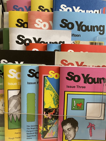
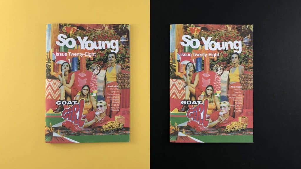
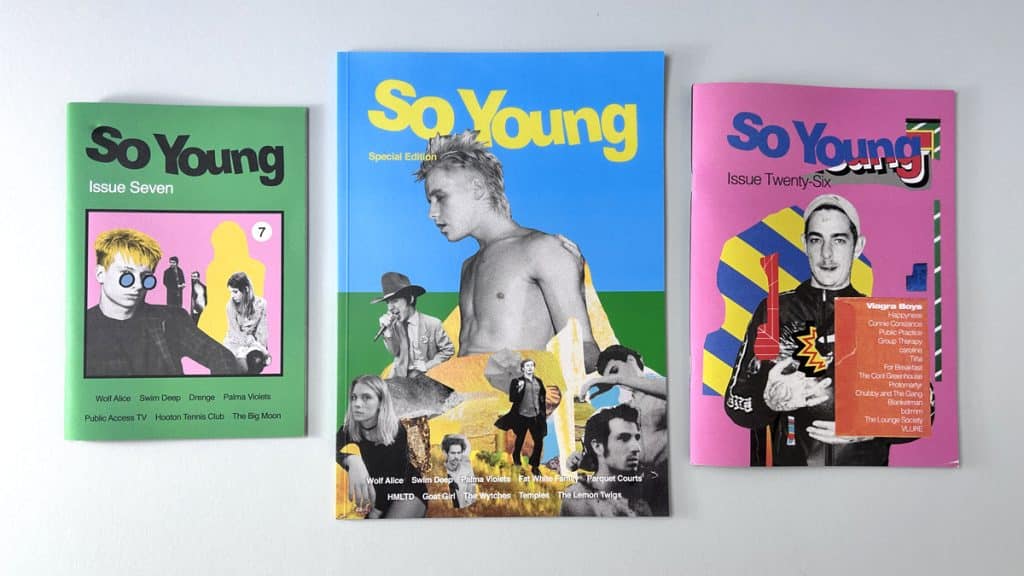
So Young Magazine began as a compact A5 zine, with each issue featuring around 44 to 52 pages of content. The creators, who were new to the world of zine printing, brought their project to Ex Why Zed, where we helped them navigate the often daunting marketplace of print. Over time, the magazine has evolved, growing in size and content, and increasing its print run with each issue. The magazine's iconic masthead has remained a constant throughout its evolution, providing a strong visual identity that is instantly recognisable. The masthead, along with the unique colour scheme of each issue, has helped to create a sense of progression through the series. This visual consistency, combined with the magazine's commitment to showcasing the best of indie music, has made So Young a staple in the indie music scene.
The Evolution of Format and Size
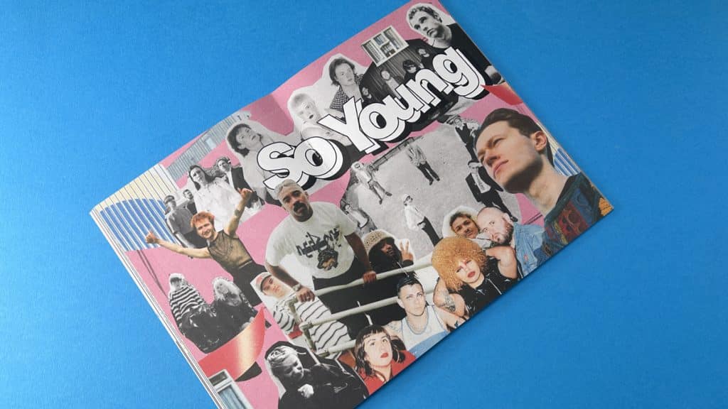
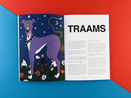
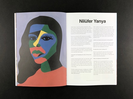
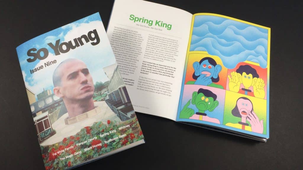
As So Young grew in popularity, the format and size of the magazine evolved. By issue ten, the magazine had expanded to a perfect bound special edition, A4 size. This larger format allowed for more content and featured a stunning double-page spread in the middle, showcasing the musical artists featured in that issue. By issue eleven, the magazine had made another step up in size to B5 (250x176mm), allowing even more content to be squeezed in. This format continued through to issue 23, with each issue featuring a different photography, illustration, or colour backdrop. This creative approach to zine design ensured that each issue of So Young was unique, while still maintaining the magazine's distinctive visual identity.
Litho Printing a Zine
With the magazine's increasing print run, we made the decision to start litho printing So Young. This allowed us to trim a little off the height and width of the magazine, making it a more competitive size for printing. This change meant we could print more copies for less, increasing the magazine's margins while still maintaining its high-quality look and feel. Despite these changes, So Young has remained committed to its original design ethos. The magazine still features its iconic double-page spread in the centre and continues to use 200gsm uncoated for the cover and 120gsm uncoated for the inside pages. The result is a neat, tactile zine that smells as magnificent as it looks.

So Young Magazine: The Voice of Indie Music and Culture
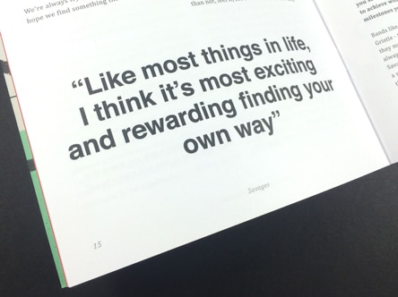
Over the years, So Young Magazine has played a significant role in the indie music scene. The magazine has helped to give exposure to up-and-coming bands, contributing to their success and growth. Bands like Wolf Alice, who graced the cover of So Young issue 7, have gone on to achieve world domination, demonstrating the impact that a feature in So Young can have. So Young Magazine is more than just a music zine; it's a celebration of indie music culture. Each issue is a testament to the passion and creativity of the indie scene, showcasing the best of emerging talent and providing a platform for artistic expression. If you haven't yet experienced So Young Magazine, we encourage you to grab a print edition or check it out online. It's a rock n roll journey you won't want to miss.
The Impact of So Young Magazine on Indie Music Culture
So Young Magazine has become an integral part of the indie music scene, not just as a platform for emerging artists, but also as a source of inspiration for music lovers and creatives alike. The magazine's commitment to showcasing the best of indie music, combined with its unique visual aesthetics and editorial choices, has made it a definitive voice in indie music culture. The magazine's evolution from a compact A5 zine to a larger, litho-printed publication is a testament to its success and the growing demand for high-quality, indie-focused content. Each issue is a testament to the magazine's creative rigour, with its iconic masthead, unique colour schemes, and stunning double-page spreads creating a distinctive visual identity and a perfect example of a printed music publication.
The Future of So Young Magazine
As So Young Magazine continues to evolve, its commitment to showcasing the best of indie music remains unwavering. With each new issue, the magazine continues to push the boundaries of what a music zine can be, offering a platform for emerging artists and providing a unique perspective on the indie music scene. Whether you're an artist looking for exposure, a music lover in search of new bands, or a creative seeking inspiration, So Young Magazine is a must-read. Its unique blend of music, art, and culture makes it a standout publication in the world of music zines. And with each new issue, So Young continues to prove that print is far from dead—it's alive, vibrant, and rocking the indie music scene. So, if you're about to print a music magazine or any other creative project, don't hesitate to get in touch with us at Ex Why Zed. We're here to guide you through the process, from choosing the right format and paper to ensuring your artwork is print-ready. Let's create something amazing together.
