235x180mm Case Bound Books
Cover onto Winter&Co Buckram
Silver foiling to outer
Wrapped over greyboard case
2x 4pp End Papers printed onto 170gsm Uncoated
138 inside pages onto 130gsm Silk
Full colour print throughout
Trimmed, collated and case bound
In this case study, we delve into the creation of Bait Gritain, a hardback photography book by Bisky Rusiness, showcasing Ex Why Zed's exceptional printing prowess. We explore the elegant design elements, from the sophisticated silver-foiled cover to the high-quality silk pages within, which vividly bring to life the world of street and architectural photography. Our exploration includes an in-depth analysis of the book's design and aesthetic choices, as well as a summary of the collaborative process between the author and Ex Why Zed, highlighting their expertise in turning creative visions into tangible artistry.
Hardcover as Canvas: The Art of First Impressions
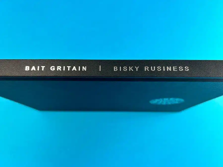
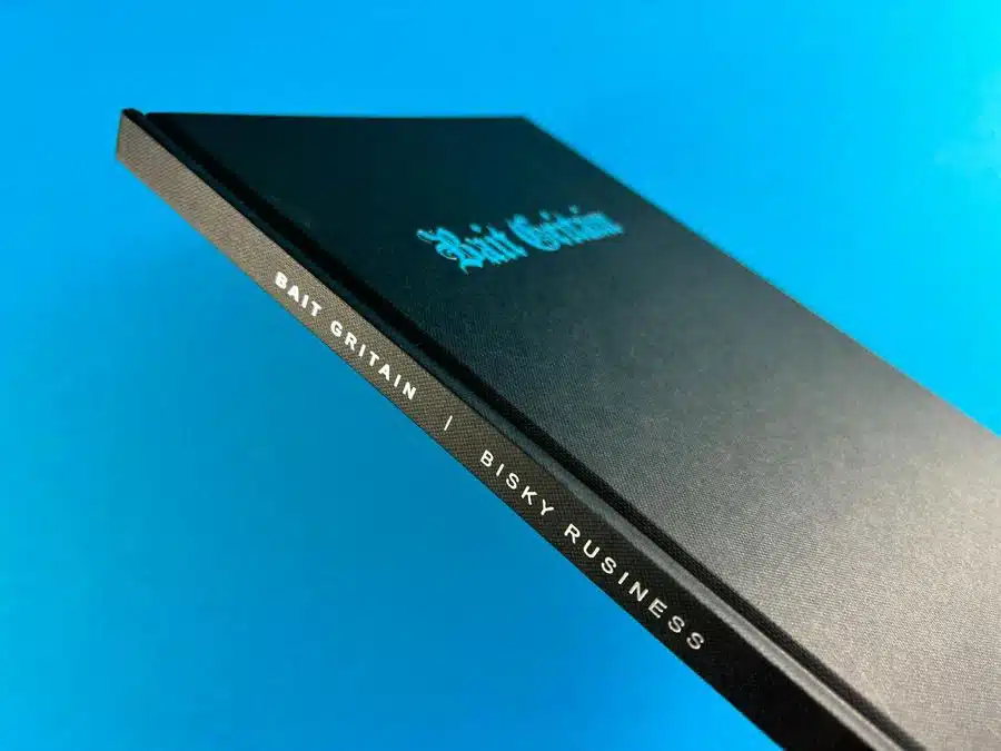
The spine of 'Bait Gritain' presents a compelling first impression with its clean, silver foiled typography on a rich black canvas. This design choice by Bisky Rusiness reflects a meticulous consideration of how a book communicates its identity even when shelved. It is a bold statement of minimalism and sophistication that invites curiosity.
Foiling with Intent: The Subtlety of Shine
Upon closer examination of the cover foiling, one can appreciate the precise application that captures light in a way that is both understated and striking. It is a testament to the craftsmanship involved in the book's production, ensuring that the title resonates with a sense of prestige.
Abstract Endpapers: A Portal to Another World
The endpapers serve as a portal, transitioning the reader from the physical world into the realm of 'Bait Gritain'. The abstract design, resonating with vivid colours and a sense of fluid motion, sets the stage for the photographic journey within. The choice of a glossy finish on these pages adds a layer of depth and reflection, enhancing the viewer's experience.
Typography and Messaging: A Symbiotic Relationship
The typographic selection within the book is deliberate, with quotes like "Britain looks gritty, but the slums still pretty" set in a clean serif typeface. This design element ensures that the messaging is not lost within the vivid photography but stands as a narrative anchor, grounding the reader in the artist's perspective.
Juxtaposition of Urbanity: A Study in Contrast
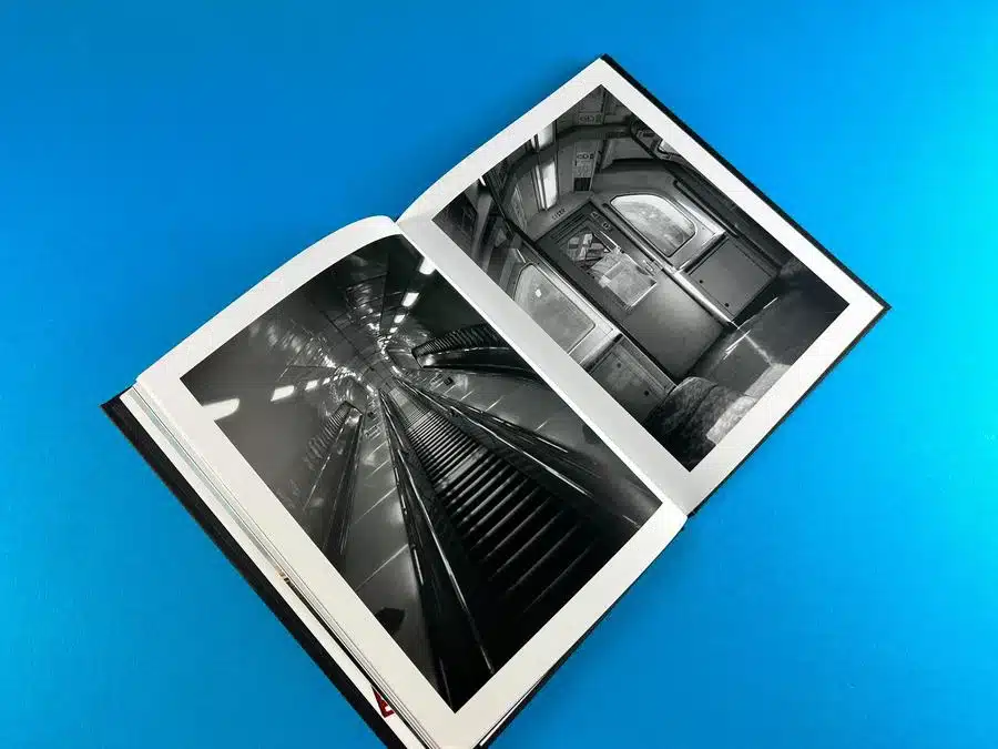
'Bait Gritain' masterfully juxtaposes the ruggedness of urban landscapes with the elegance of its production. The photography, capturing scenes of England's varied urban environment, is presented with a clarity and sharpness that belies the often gritty subject matter. The contrast between the subject and the medium is a central theme, offering a unique perspective on the beauty found in urban decay.
Monochrome and Colour: A Dialogue in Imagery
The interplay between monochrome and colour images within the book is a narrative device in itself. Black-and-white photography, with its timeless quality, coexists with the immediacy of colour shots. This duality invites the reader to explore the textural details and emotional undertones of the scenes captured.
Binding and Construction: The Backbone of Storytelling
The physical construction of 'Bait Gritain'—from the binding to the paper quality—complements the narrative woven through its pages. The robust binding ensures a lasting structure, while the paper quality provides a medium for crisp imagery and colour fidelity.
Actionable Insights:
- The spine design can serve as a powerful branding tool, especially when executed with precision foiling.
- Endpapers are not merely functional; they can set the emotional tone for the book.
- Typography should work in harmony with imagery to convey a clear narrative.
- The contrast in subject matter and presentation can elevate the thematic depth of a book.
- A thoughtful balance of monochrome and colour imagery can enrich the visual narrative.
- High-quality binding and paper choices are not just aesthetic choices but narrative ones.
The Print Journey of Bisky Rusiness and Ex Why Zed
Key Takeaways:
- Ex Why Zed's detailed and clear communication with the client.
- Focus on providing high-quality printing solutions tailored to the project's needs.
- Efficient handling of technical queries and constructive feedback.
- The ability of Ex Why Zed to translate artistic concepts into tangible, high-quality print formats.
Understanding the Project Vision
The email exchange reveals Bisky Rusiness's concern for quality and detail in printing "Bait Gritain." Rusiness inquired about print specifications, pricing options, and timelines. Ex Why Zed responded with comprehensive details, offering various options and clear guidance on printing specifications and costs.
Addressing Technical Aspects
Ex Why Zed's expertise shone through in handling technical aspects like file formats, colour settings, and printing processes. They provided step-by-step guidance on preparing artwork for printing, ensuring the final product would align with Rusiness's expectations.
Collaboration and Flexibility
The correspondence highlights Ex Why Zed's flexibility in accommodating the client's budget and preferences. They suggested alternative options when necessary and worked collaboratively to achieve the desired outcome within the client's budget.
Positive Client Feedback
The interaction concluded with positive feedback from Rusiness, expressing satisfaction with the final product and appreciation for Ex Why Zed's assistance and guidance throughout the process.
Showcasing Ex Why Zed’s Commitment to Excellence
This interaction exemplifies Ex Why Zed's commitment to customer satisfaction, their expertise in high-quality printing, and their ability to effectively communicate and collaborate with clients to bring their vision to life.
"Bait Gritain" stands as a testament to the synergy of artistic vision and printing excellence. The book's captivating design, from the tactile Buckram cover to the dynamic layout of its pages, illustrates the impact of thoughtful choices in bookmaking. The positive interaction between Bisky Rusiness and Ex Why Zed further exemplifies the importance of a collaborative approach in achieving a high-quality hardback photography book for a specific local area.. This case study encapsulates the essence of successful book production, where attention to detail, customer engagement, and expertise converge.