
Your page count decides first: stapled for 8–72 pages, perfect bound from 32 pages in total, and hardback from 28 inside pages.
Stapled opens completely flat and keeps costs down, perfect bound gives you a printable spine for the shelf, and hardback is the premium keepsake. Got 32–72 pages? All three are on the table.
Your page count decides first
Before you fall in love with a binding style, count your pages. Each method only becomes possible at certain page counts. As Mike says on the phone most days, the number one deciding factor isn’t taste, budget or deadline. It’s how many pages you have.
In print-speak, hardbacks and perfect bound books are books, and stapled projects are booklets. Zines, photobooks and children’s books all live inside those three.
Good news: all three binding styles are on the table. Read on to see which one suits how your book will be read, sold and shelved.
One number to keep in mind. Past about 40 pages, a stapled booklet starts to bounce open, so from there it’s worth weighing up perfect binding.
Booklets are stapled. Books are perfect bound or hardback.
Every niche we print, from zines and photobooks to children’s books, catalogues and magazines, is one of these three underneath.
Fast, light and budget-friendly. Spreads open completely flat, so nothing is lost in the middle. The natural home of zines, event programmes and slimmer photobooks.
A square, glued spine and a thick card cover: the classic “real book” feel of paperbacks, magazines and catalogues. Your title gets a spine to live on.
The keepsake. Rigid boards, endpapers and serious shelf presence for children’s books, cookbooks, photography monographs and special editions.
Stapled booklets: the fast, flat-opening favourite
Also known as saddle stitching or wire stitching: folded sheets with two neat staples through the spine. It’s the simplest way to get your work into print, and the easiest to supply artwork for.
Front cover, inside pages and back cover, all in a single PDF of single pages (not spreads) in reading order, with 3mm bleed wherever colour touches the edge. That’s it. No cover spread, no spine to calculate.
Spreads open completely flat
This is stapling’s big advantage. Because the pages are folded and stitched rather than glued, a stapled booklet opens fully flat and nothing is lost in the centre. The full width of a double-page spread is yours to design across: a panoramic photo, an illustration that runs edge to edge, a bold headline straddling both pages. On a glued book, the middle of that spread would dip into the spine.
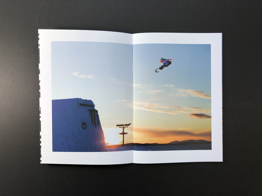
One honest trade-off: the silver staples are visible down the side. Most designers embrace them as part of the zine look, but if you want an uninterrupted spine, that’s a vote for perfect binding.
Watch out for bounce
Bounce catches out a lot of first-timers. The more pages you add to a stapled booklet, the more the pages curl at the centre and push the booklet open. It resists sitting flat. We call it bounce, and past about 40 pages it starts to show.
Counter-intuitively, the smaller the booklet, the more pronounced the bounce. A rigid 300 or 350gsm cover on an A6 booklet (just 105mm wide) has very little width to bend across, so the cover fights the fold and springs open. The same cover weight on an A4 booklet has twice the width to relax over. The stiffness of the card and the size of the page decide how neatly your booklet sits.
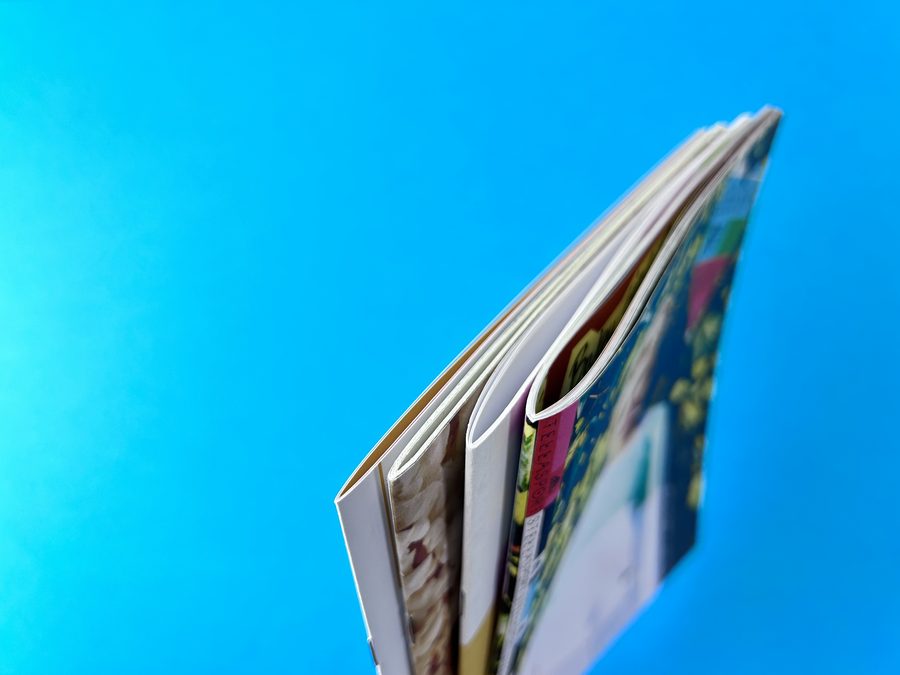 Slim sits flat, thick springs open
Same staples, different page counts. The slim booklet sits flat while its thicker neighbour springs open.
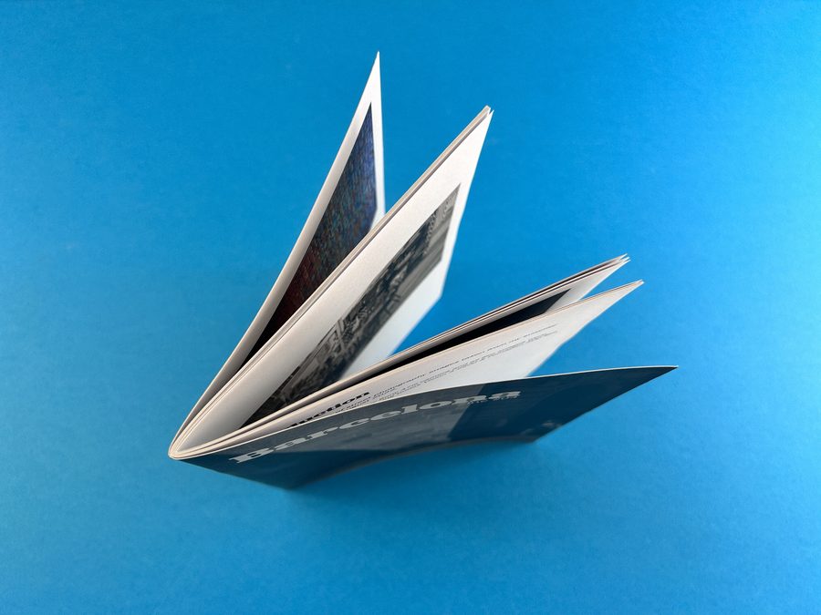 The centre curl in full flow
A stiff cover and a small format fan the pages open.
The leading-edge trim
Once your booklet is folded and stitched, we trim the outer edge to leave a clean, neat finish. Before that trim, the pages nearest the centre naturally jut out further than the outer ones. The trim brings everything level, which means the centre pages end up a touch narrower than the outer pages. It’s millimetres, but if your page numbers hug the edge, you’ll spot the difference. We call it creep.
Fix: A high page count plus a stiff cover on a small format springs open on the table. Drop the cover weight, trim the page count, or step up to perfect binding from 32 pages.
Fix: Every folded sheet makes four pages, so 30 pages simply can’t staple. Add or cut to the nearest multiple of four, 28 or 32. A blank page or an extra image page usually solves it.
Fix: The centre pages end up fractionally narrower, so keep page numbers and anything precious 8mm or more from the outer edge.
Perfect bound books: the square-spined professional
Inside pages glued into a wrap-around card cover, with a flat spine your title can live on. You need 32 pages in total, a 4-page cover plus at least 28 inside pages, and from there any even number works. This is where the design details really matter.
Supply your cover as a spread
Your cover arrives as one spread with the spine through the centre. Not as single pages, and never tucked inside your inside-page PDF. If your inside covers are printed, add them as a second page. Your inside pages come as a second PDF, single pages in reading order.
Find your spine width with our spine calculator, or just ask us. Downloadable InDesign templates are in our cover file guide.
Can I put text down the spine?
Yes, and it’s worth planning for. The more inside pages you add, the wider your spine becomes, and the more room you have for a title. Think about where your book will be sold. A shop, café or bookshop that displays books spine-out effectively requires one, and a spine with even a little writing on it is far more alluring on a shelf than a stapled booklet with nothing.
It matters most for picture books, which are often 32 pages, the perfect bound minimum, so their spines are slim. If your spine is under 5mm, keep it clean: small text on a narrow spine risks sliding round onto the front or back cover when the book is bound.
Cover trimming: respect the trim line
Keep important content a safe distance from the trim line. A word placed exactly on the page edge, like the “top” and “bottom” labels on our example cover, is a clever design element right up until the blade moves by a millimetre or two. Then it disappears off the page entirely. The same rule applies along the trim edge of your inside pages.
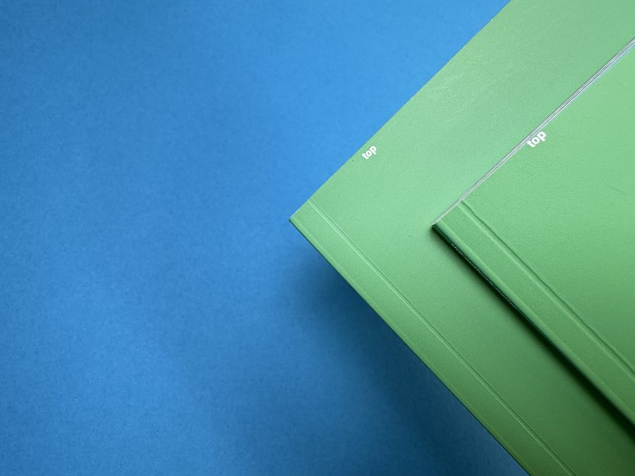
And yes: 3mm bleed
Add 3mm of bleed wherever colour touches the edge: on the outside edges of your cover spread and on any inside page that runs to the edge. We say this so often we should get it tattooed. If you’ve never printed before, bleed is an odd idea: it’s the extra sliver of artwork that runs past the page edge, so that when the blade trims the sheet, colour runs cleanly off the page instead of leaving a white hairline. Our bleed guide walks you through it in minutes.
Designing around the hinge and the gutter
A perfect bound book doesn’t open flat, so two areas near the spine need a little respect. Get these right and your book looks like you’ve done this a hundred times.
The spine hinge: the strip nobody expects
When your cover is glued on, the glue doesn’t stop at the spine. It grips a strip of the inside front cover and of your first inside page, and the same at the back. Anything in that strip is swallowed by the hinge, so keep words well away from it.
Images can run right up to the spine, but think twice before spanning a photo across the inside cover and page one. The middle of the image goes missing into the hinge, and lining up the two halves will demand your very finest InDesign acrobatics.
The spine gutter: where content goes to hide
On every spread of a perfect bound book, the pages curve down into the glued spine. That valley is the gutter, and text and images get eaten there. A face placed near the middle of a spread becomes a “where’s his head gone?” moment, and a sentence that crosses the gutter loses characters and stops making sense.
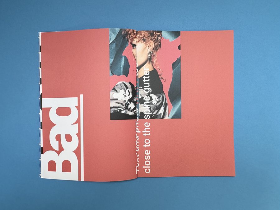 The bad exampleSwallowed by the gutter
On this spread from our own binding demo book, the caption and the photo run straight through the fold, and the gutter simply swallows them.
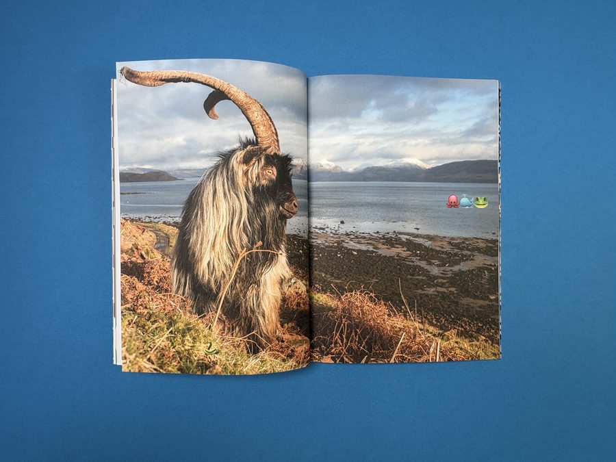 The good exampleDesigned around the gutter
The subject sits confidently on the left-hand page, the landscape carries the spread across the fold, and nothing that matters goes near the gutter. The goat keeps his head.
For a full-spread image, split it in two and nudge the left half 2–3mm to the left and the right half 2–3mm to the right. In the bound book, they’ll appear to line up perfectly.
Keep faces, headlines and captions well clear of the centre, and never run small text across the fold.
White borders: the frame your photos deserve
A white border frames an image perfectly, and gives your content natural breathing room away from both the trim edge and the gutter. Make borders a minimum of 8mm; 10–12mm looks great.
Hardback books: the keepsake
Rigid boards, a spine from about 9mm and real shelf presence. If your book is meant to be kept, gifted or sold at a premium, this is its natural home. You’ll need at least 28 inside pages.
The trim line rule applies here too
Exactly as with perfect binding, don’t put text right on the trim line. What reads as a clever design element in your layout file becomes a casualty with a small amount of movement on the guillotine, and it’s gone. Keep important content a safe distance from the trim edge, on the cover and the inside pages alike.
Glued or section sewn?
Hardback inside pages come two ways. Glued is cheaper to produce and perfect for most books. Section sewn stitches the pages into folded sections with thread before binding: more hard-wearing, happier being pressed flat, and more expensive.
The upside of that upgrade is that you can shout about it when you promote the book. “Section sewn” belongs on a premium book’s sales page, and readers value a book that’s visibly built to last.
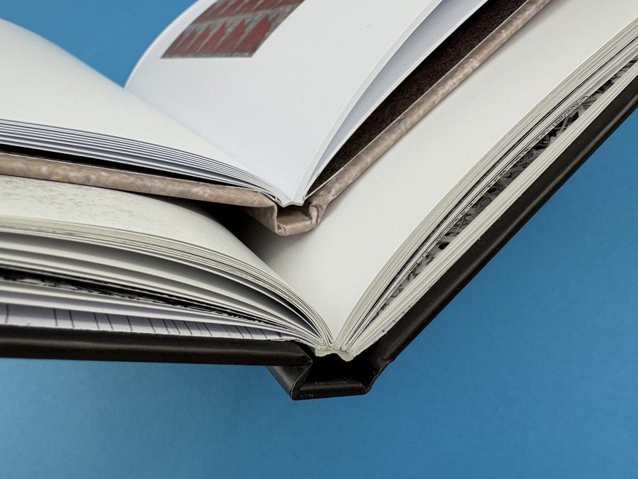
The details that make a hardback feel special
Endpapers are the sheets that join your inside pages to the boards. Leave them plain, print them edge to edge, or ask us about a coloured stock, for a moment of theatre every time the cover opens. Head and tail bands, the tiny fabric rolls at the top and bottom of the spine, are a small cost with an outsized effect on how finished the book feels. We can add them, and section sew, on any quantity; head and tail bands just need a text block at least 10mm thick, so there’s enough spine to fix them to.
Your cover is a wrap, not just a spread
Like perfect binding, the cover has the spine through the centre. The difference is that it wraps right round rigid boards, so it needs a much bigger allowance than 3mm bleed, and hardback spines use different maths from paperbacks. We’ll send you the exact cover dimensions once your page count is final. If your endpapers are printed, they come as two more files. Our hardback set-up guide has the details.
The three styles compared
| Stapled booklet | Perfect bound | Hardback | |
|---|---|---|---|
| Page count | 8–72 in total, a multiple of 4 | 32 in total (28 inside + 4pp cover), then in twos | 28 inside pages minimum, then in twos |
| Spine | Stapled edge | Square, from about 3mm. Room for a title from 5mm | Square, from about 9mm. Printable |
| Opens flat? | Completely, so full spreads work | No, so design around the gutter | Section sewn helps |
| Files we need | One PDF, in reading order | Cover spread + inside pages | Cover wrap + inside pages (+ endpapers if printed) |
| Feel | Light, zine energy | Professional paperback | Premium keepsake |
| Budget | £ | ££ | £££ |
Watch the three bindings side by side
More short videos comparing the bindings on real books:
 4:10Binding styles for photo book printing at Ex Why Zed31.4K views · opens on YouTube
 2:42Binding styles for children's book printing at Ex Why Zed7.3K views · opens on YouTube
 2:04Choosing softback or hardback for photobooks at Ex Why Zed436 views · opens on YouTube
 8:50Deep Dive into Binding Options for Art Book, Artist Catalogue and Degree Show Printing | Ex Why Zed1.1K views · opens on YouTube
Prefer to read? Try our full binding options resource, perfect binding vs saddle stitch, and how a hardback book is case bound.
I loved working with ExWhyZed. Everyone was very helpful and patient with my questions, and everything worked perfectly to take my zine from an idea to a printed object.
The questions we answer every day
How do I find out my spine size?
Finish your artwork first, because if the page count changes, the spine changes with it. Then check our spine calculator, or simply tell us your page count and paper and we’ll give you the exact number. Hardbacks use different maths, so ask us for your cover size.
What if I don’t have enough pages for the binding I want?
Two options: add pages (a few well-placed blanks or extra images feel intentional, not padded) or switch style. Under 32 pages and dreaming of a spine? Get to 32 in total, a 4pp cover plus 28 inside pages. Sitting at 30 for a stapled booklet? Go to 28 or 32: multiples of four only.
Can I put text down the spine?
On perfect bound and hardback books, yes. Once the spine is around 5mm or wider there’s room for a title. Below that, we recommend leaving it clean so the text can’t creep round onto the covers.
Exactly what files do you need?
Stapled booklet: one PDF, cover to cover, single pages in reading order. Perfect bound: one PDF for the cover as a spread (spine through the centre) and a second PDF of inside pages, single pages in reading order. Hardback: a cover wrap, your inside pages, and two endpaper files if they’re printed. Add 3mm bleed wherever colour touches the edge.
Do my pages have to be a multiple of four?
Only for stapled booklets, where each folded sheet makes four pages. Perfect bound and hardback books just need an even number, so you can go up in twos.
Which binding is best for a children’s book?
All three work, depending on your market. Stapled opens completely flat for reading aloud and keeps costs down, perfect bound earns you a spine for the bookshop shelf, and hardback is the classic gift edition. Plenty of authors print a stapled or perfect bound run alongside a hardback edition.
Tell us your page count. We’ll tell you your options.
Then a real person checks your file by hand, for free, whichever binding you choose. There’s no minimum, so you can print one copy to test first.