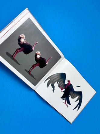
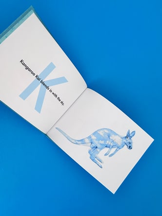
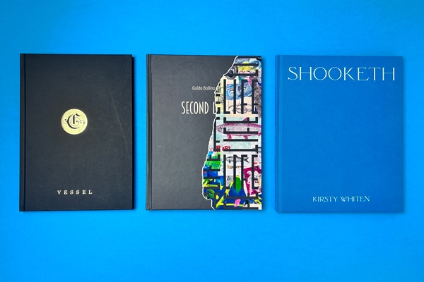
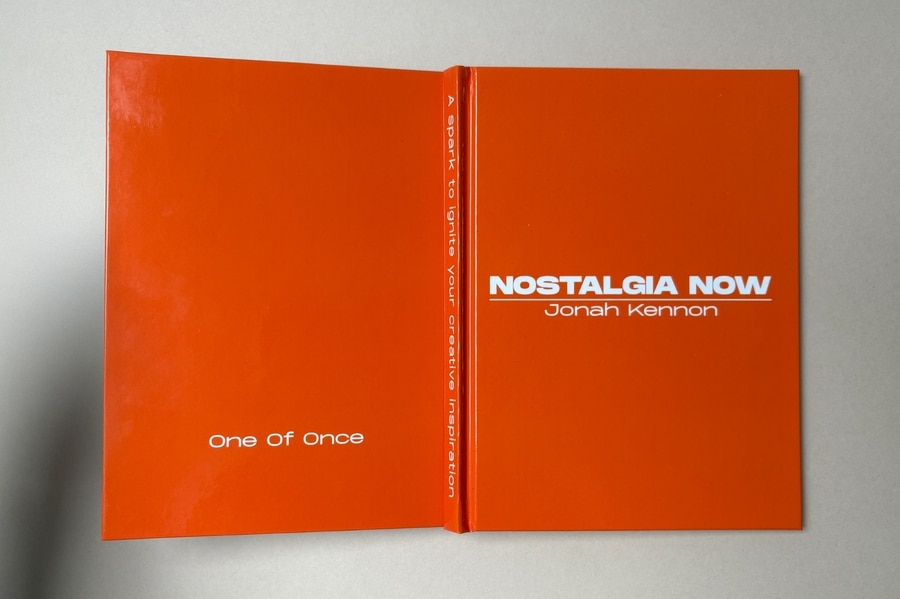
If you can do these five things confidently, you can design a book that’s professional, consistent, and print-ready. Nothing fancy. Just the fundamentals done properly — which, honestly, is where most book files win or lose.
In 5 minutes you will know how to:
1️⃣ Create a New Document 2️⃣ Add Images 3️⃣ Add Text 4️⃣ Set-Up 3mm Bleed 5️⃣ Export your finished design as a print ready PDF
We’ve outlined each skill with clear, exact steps and screenshots to illustrate the process.
🤩 Don’t be intimidated by InDesign. It’s made for print layouts — books, magazines, brochures, the lot. It is paid software, but Adobe currently offers a 7-day free trial.
If you’d rather use something free (or already on your computer), you can build simple layouts in other tools. Try Affinity Publisher, Canva, Quark Express, Word, Publisher or Powerpoint (listed in order of efficiency). For proper multi-page book design, InDesign and Affinity Publisher are the smoothest options.
1️⃣ Create a New Document Properly (size + pages)
This is where you decide the physical reality of the book: trim size, page count, and whether you’re working as spreads or single pages.
Go to the File menu → New → Document
File → New → Document — start your book file the right way.
• Set Intent: Print
Choose the Print tab so InDesign uses print-friendly defaults.
• Set your Width / Height to the trim size (the finished size after trimming).
• Set Pages to your total page count.
• Tick Facing Pages. This is a visually easier way to design a book so you can see double-page spreads.
• Set Bleed as 3mm (we’ll cover this properly in Skill 4).
A5 example setup: 40 pages, Facing Pages on, 3mm bleed added.
⚠️ Two small but important notes
Perfect Bound Books: If you’re printing a perfect bound book, we need one file for the cover spreads, and a second file for the inside pages: Set up perfect bound book artwork.
Page count reality check: If you’re designing a stapled booklet/zine, the page counts work in multiples of 4 (because of how sheets fold). Stapled is also known as saddle-stitched or wire stitched. Preparing artwork for stapled booklets.
2️⃣ Place Images Into Frames (and control what’s inside the box)
InDesign is frame-based: you don’t “drop an image on the page” — you place an image into a frame. That’s what gives you control.
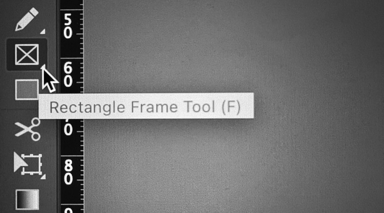
• Make a frame using the Rectangle Frame Tool (frame with an X), or
Use the Rectangle Frame Tool (F) to create picture boxes fast.
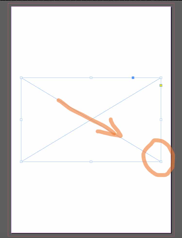
• Draw your frame. To do this, select the Rectangle Frame Tool, click on the page, then hold and drag to create a rectangle (or square) at the size you need.
Draw an image frame first (the box with an X).
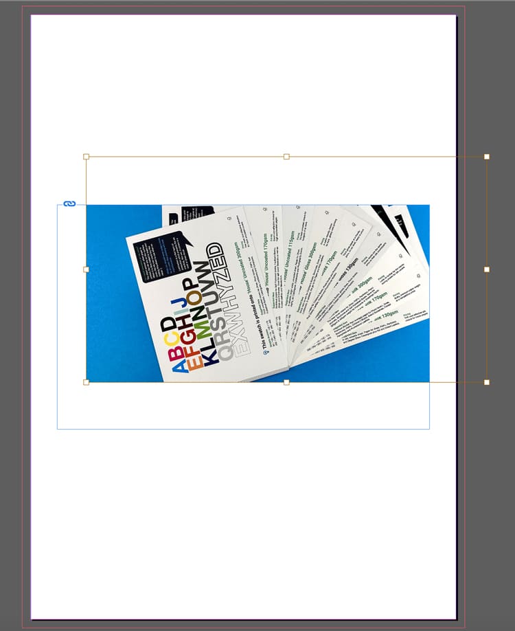
• Next, use Cmd+D (Mac) / Ctrl+D (Windows) or File Menu> Place. Choose the image from your computer and it will appear in the frame.
Import images via File → Place (or Cmd/Ctrl + D).Frame vs image: the frame crops, the image sits inside it.
• To move the image inside the frame:
Use the Direct Selection Tool (the white arrow) and drag the image content within the box until you are happy with its position.
A placed image sitting neatly in the layout — controlled and aligned.
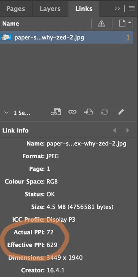
⚠️ Check the Image Quality (300 pixels per inch prints crystal clear)
Open Window → Links and check image quality. The Effective Pixels Per Inch (PPI) should be at least 300. Low-res images (typically under 200ppi) will look fine on screen but appear fuzzy and out of focus when printed.
Check quality in Window → Links — aim for ~300ppi at final size.
3️⃣ Create Text Frames and Format Typography
Yes: you can draw a text box, type, select-all, choose a font… and it will “work”.
But for books, the real skill is getting consistent type across dozens (or hundreds) of pages without manually fiddling.
The basics (still important)
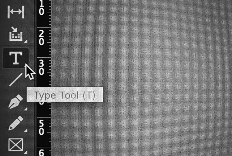
• Hit the T icon for the Type Tool.
Pick the Type Tool (T) to start adding text to your page.
• Click-and-drag to draw a text frame. To do this, click on the page, then hold and drag to create a text frame at the size you need.
• Type or paste your text into the frame.
A simple page build: heading text frame above a placed image.
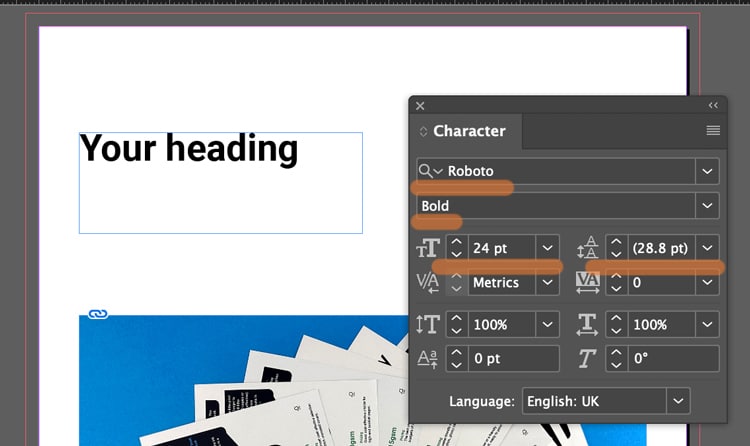
• Use the Character and Paragraph controls (Found in the Type menu) to set font, size, leading (spacing between each line of text), alignment (left, right justified or centre).
Style a heading by adjusting weight + size in the Character panel.
Not sure what size to make your text? Generally 8-10pt is good for main body text. 16-32pt is large enough for headings and titles. (For children's book, choose 16pt for the main story).
If you text frame isn't big enough, you can click the black arrow tool and drag out the corner handles to make it bigger.
Text frame too small? Use the black arrow and drag the handles.
⚠️ Book Design Hacks (still beginner-friendly)
Create Paragraph Styles for body text, headings, captions. One change updates the whole book.
Use character styles for small repeats (like italic emphasis) so you’re not hunting inconsistencies later.
If you have text running across pages, learn threading: click the out-port of one text frame and flow into the next.
4️⃣ Set Up 3mm Bleed (doing this now saves so much time later)
Bleed is an extra 3mm of artwork beyond the trim edge, so when our guillotine trims the printed sheets, you don’t get accidental white borders around the page edges.
The rule
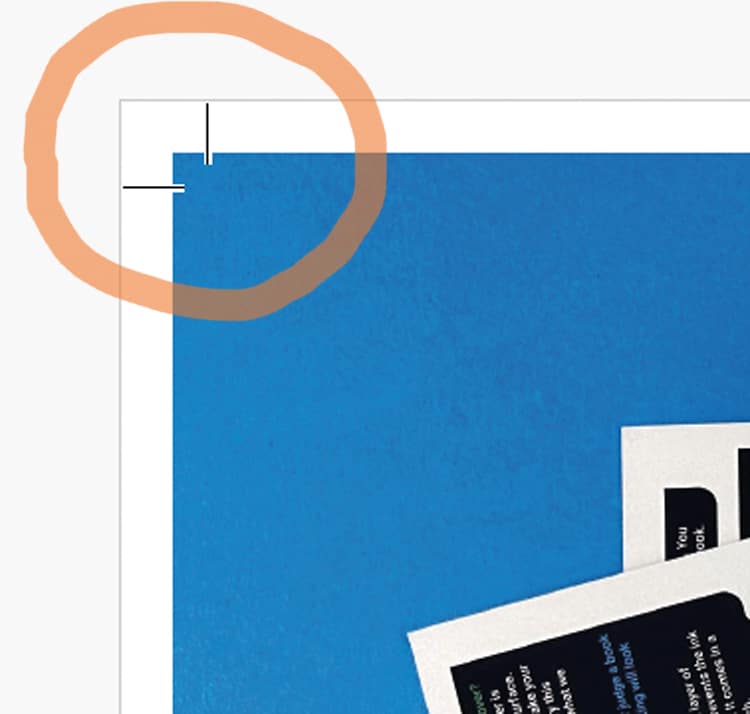
If something should print to the edge, it must extend 3mm past the trim line on that edge. The trim line is generally indicated by the white artwork edge and inner pink line on your InDesign artwork. The outer magenta line shows the 3mm extra. (This will be visible if you have added '3 mm' into the bleed boxes during Step 1 when you created your new document).
The magenta bleed guide sits outside the page edge — that’s your extra 3mm.
CRUCIAL STEP: How to ADD bleed to your content in InDesign
Select the Black Arrow tool and drag the outer handles of your image frame to the magenta line. This extends the image by 3mm outside the trim line.
Correct setup: artwork extends past trim into the bleed area.
Following this repositioning, you might need to make some small adjustments to the image within its box: these include changing the size of the image, or moving it over using the White Arrow tool.
The example below ISN'T Bleed. Notice the image stops at the trim line.
Incorrect: artwork stops at trim — this risks white slivers after trimming.
However, this example below shows a page with generous white borders, so you don't need bleed. The content stops well within the trim line so there is no need for bleed because no content will go right to the edge of the finished pages.
Lets repeat that again: If none of the content is intended to go to the edge of your finished book's pages, you don't need to worry about the extra 3mm because you'll have lovely white borders around your artwork.
If your design has white borders, you don’t need bleed on that page.
⚠️ STOP AND READ
If you don't have bleed on the PDF and your images go to the edge, we will ask you to add it. We won't go to print without bleed on your PDFs so lets add it now.
For further guidance, here is Adobe’s own guide to creating a PDF with bleeds is a further handy reference.
5️⃣ Export your artwork as a Print Ready PDF (this makes us happy)
This is the handover. The file can be beautifully designed — and still fail here if the export is wrong.
The dependable export steps
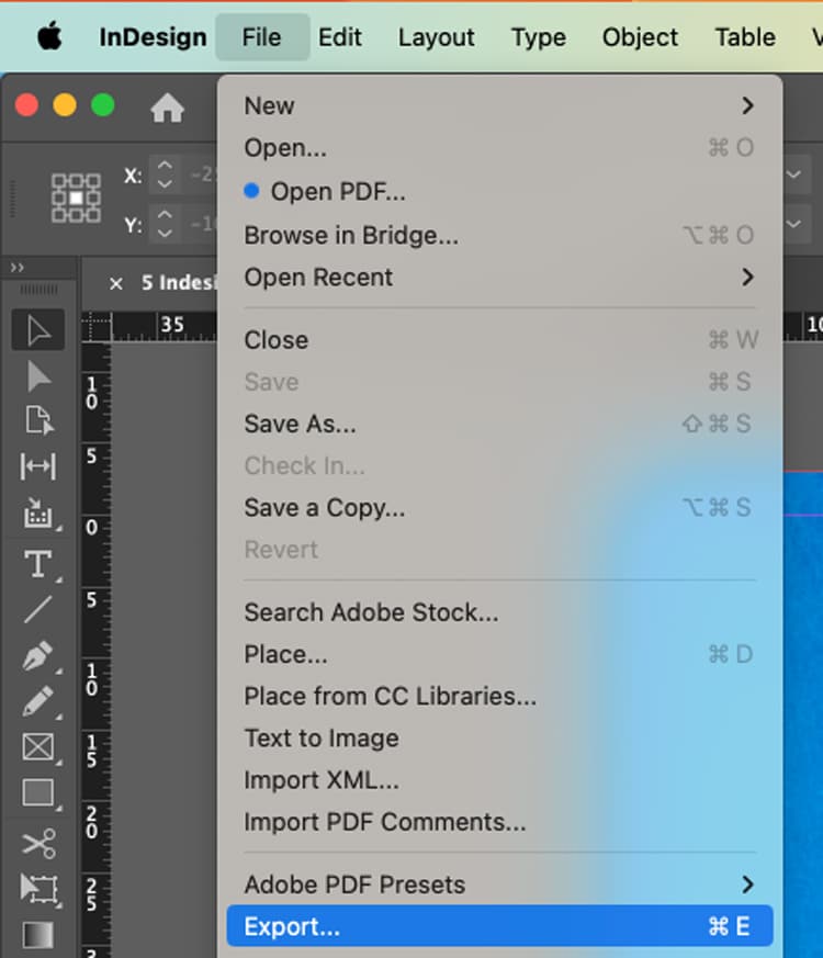
File → Export (or the keyboard shortcut Cmd+E)
Export your PDF via File → Export (Cmd/Ctrl + E).
Name your file, choose Adobe PDF (Print) as the Format, then click Save.
Choose Adobe PDF (Print) — not an interactive PDF.
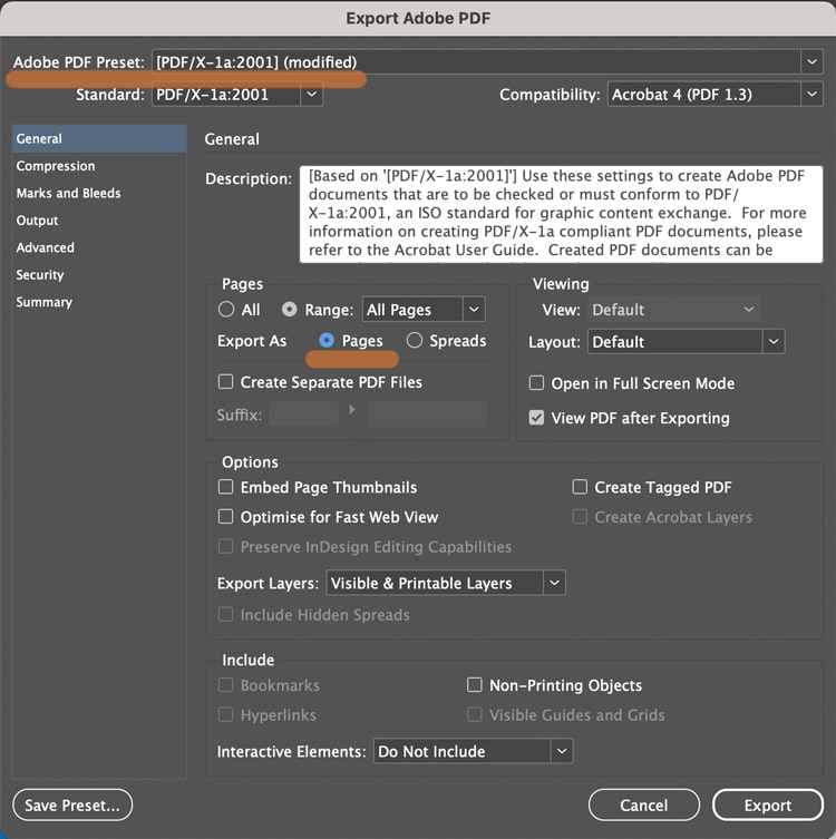
In the next box...choose Adobe PDF Preset: PDF/X-1a:2001 Further down the box, choose 'Pages'.
In General: select PDF/X-1a:2001 and export as Pages.
In the Marks and Bleeds tab (found by clicking it down the left):
Tick Crop Marks (they increase the PDF page size to make room for marks).
In the Bleed boxes, add '3 mm' into the Top, Bottom, Inside and Outside box.
Click Export.
In Marks & Bleeds: set 3mm bleed and add crop marks if requested.
What the finished PDF should look like. On the images below, notice the artwork goes past the crops marks on the correct example, but stops at the crop marks on the incorrect version>>>
Correct result. Artwork runs past crop marks — bleed is included.
Wrong result. Artwork stops at crop marks — add bleed and export again.
⚠️ Bleed Fix
If your artwork stops at the crop marks, to correct the problem, you need to amend one of two things (it is always one or the other of these):
➡️ Have you dragged the background image out 3mm beyond the trim line on your Indesign file into the bleed area? Try that then export again.
➡️ OR you have done the above, but then when you're exporting you need to click the Marks and Bleeds menu, then type '3mm' into the four bleed boxes. This will add the bleed to the pdf.
A quick “print-ready” checklist (save this bit)
Before you export:
✅ Correct trim size + page count set
✅ Images placed via frames, no missing links
✅ Text uses styles (or at least is consistent)
✅ 3mm bleed set, and full-bleed artwork extends to it
✅ Exported as Adobe PDF (Print) with bleed included
Any questions, do give us a shout, remember we are here to help on email, phone and live chat.
Helpful Ex Why Zed links to pair with this article
Hardback book printing combines premium materials, sturdy binding, and precise finishes to create long-lasting, professional-quality books.
The right cover choice, printed, cloth, or sustainable material, sets the tone for your design and durability.
Interior paper types such as uncoated, silk, and gloss influence readability, texture, and overall presentation.
Print quality options, including black and white, greyscale, and full colour, allow you to tailor results to your content style.
Proper artwork setup and print-ready files ensure flawless alignment, colour accuracy, and finish.
Factors like page count, printing method, and materials affect overall cost and turnaround time.
One-off and short-run hardback printing offer flexibility, personalisation, and professional results for any project size.
With expert guidance and attention to detail, it’s easy to produce a hardback book that looks as impressive as it feels.
Ever picked up a beautifully bound hardback book and wondered why it feels so special? The weight, texture, and finish instantly signal quality. For authors, designers, and publishers, achieving that same professional look can feel overwhelming with so many printing terms, paper types, and layout rules to navigate.
The real challenge isn’t just printing a book; it’s creating one that looks and feels exceptional. Every choice, from the cover design to the paper finish, shapes the final result. Without the right guidance, colours may print off, spines can misalign, or pages might not have the premium feel you imagined.
This guide will simplify every stage of hardback book printing. You’ll learn how to choose materials, prepare your artwork, set up print-ready files, and select finishes that make your book stand out. By the end, you’ll know exactly how to turn your vision into a beautifully bound hardback worth showing off.
What Is Hardback Book Printing?
Hardback book printing, also known as casebound printing, is the process of creating books with sturdy, durable covers. These rigid covers protect the pages and give the book a premium, long-lasting finish. Unlike paperbacks, hardbacks are built into a sturdy case made of thick board wrapped in printed paper or cloth for a strong, elegant finish.
This printing style is ideal for projects that deserve a high-end look and feel, such as art collections, photo books, corporate presentations, and graphic novels. With the option to add finishes like foiling, dust jackets, or textured cloth, hardback books stand out for their strength, visual appeal, and timeless design.
What Are The Benefits Of One-Off Hardback Book Printing?
One-off hardback book printing is a great option for authors, artists, and designers who want premium quality without committing to large quantities. Whether you’re producing a prototype, a gift, or a personal project, it combines flexibility with a high-end finish. Here’s why it’s worth considering:
Durability: Hardback books are built to last. Their rigid covers and strong binding protect pages from wear and tear, ensuring your book stands the test of time.
Professional Appearance: A hardback cover instantly gives your book a refined, bookstore-quality look, perfect for portfolios, presentations, or first editions.
Higher Value: Although production costs are higher, hardbacks can be sold at a premium price, often delivering better returns per copy.
Collector Appeal: Hardcovers are prized by collectors and readers alike, often seen as timeless keepsakes or display pieces.
Customisation: One-off printing allows complete creative control over materials, finishes, size, and layout, giving your project a truly personal touch.
Whether you’re printing a single copy or testing a new design, one-off hardback book printing lets you create a professional, durable, and fully customised edition that reflects your vision perfectly before scaling up to larger runs.
How To Choose The Right Cover And Material For Your Hardback Book
When creating a hardback book, the cover and its material define your book’s first impression; how it looks, feels, and lasts. The right combination can elevate a simple print project into a timeless keepsake.
1. Printed Covers
A printed hardback cover gives you complete design freedom. Your artwork or photography is printed in full colour on coated paper such as silk or gloss, laminated for protection, and wrapped around a rigid case.
Best for: art books, brand catalogues, and illustrated works.
Finishing choices include:
Matt or gloss lamination
Spot UV for selective shine
Dust jackets for a professional touch
Printed covers are also ideal when you want to print hardback book from PDF files directly, streamlining the setup process.
2. Cloth And Linen Covers
A cloth or linen cover brings warmth and texture, perfect for designs that value craftsmanship over gloss. These materials come in a variety of colours and weaves, giving your book a classic, elegant appeal.
Cloth and linen covers pair beautifully with hardback book with box print options for added luxury and protection.
3. Specialist And Sustainable Materials
For something distinctive, consider buckram, textured paper, or eco-friendly materials like FSC-certified boards and recycled cloths. At Ex Why Zed, all papers are FSC certified, reflecting a genuine commitment to sustainable printing. This ensures your book not only looks exceptional but is produced responsibly, an increasingly important factor for authors, brands, and publishers today.
Whether you prefer the sleek polish of coated paper or the heritage feel of woven cloth, your cover material sets the tone for the story inside. It’s the finishing touch that transforms a printed book into a lasting piece of craftsmanship.
What Are The Best Paper Types And Finishes For Hardback Book Interiors?
The interior pages of a hardback book are just as important as the cover; they shape how readers experience your content. Paper choice influences everything from colour vibrancy and readability to overall weight and feel. Selecting the right finish ensures your book looks professional and feels balanced in the hand.
1. Uncoated Paper
Uncoated paper offers a smooth, natural texture that makes reading comfortable and glare-free. It’s perfect for novels, poetry collections, or text-heavy books where clarity and readability are key. The ink sinks slightly into the fibres, giving a soft, tactile finish that feels organic and timeless.
2. Silk Finish
Silk paper strikes a balance between text and imagery. It has a subtle sheen that enhances printed colours without being overly glossy, making it ideal for illustrated books, educational materials, or mixed-content projects. It reproduces photos and graphics with crisp definition while keeping text sharp and easy on the eyes.
3. Gloss Paper
Gloss paper provides high colour depth and strong contrast, giving images a vibrant, polished appearance. It’s the go-to choice for hardback photo book printing, art catalogues, or promotional pieces that rely on striking visuals. The reflective surface makes colours pop, adding a premium, professional finish.
How to Choose The Right Paper Weights And Finishing Details?
Once you’ve chosen your paper type, it’s time to consider thickness and finishing touches. For hardback interiors, paper weight typically ranges from 115gsm to 170gsm, depending on how substantial you want your book to feel.
115–130gsm works best for text-based books that need flexibility and ease when turning pages.
150–170gsm suits image-heavy or luxury editions that benefit from thicker, more durable stock.
The Role Of Endpapers
Endpapers connect the inner pages to the cover, adding both structure and aesthetic value. They can be blank for simplicity or printed to complement your design. Coloured or patterned endpapers give keepsake and limited-edition books an elegant, personalised finish.
How To Choose The Right Paper?
Your paper and finish choices should align with your book’s purpose:
Choose uncoated for readability and warmth.
Go for silk if you want a smooth balance between text and images.
Opt for gloss to make visuals stand out with high contrast and shine.
If you’re uncertain, Ex Why Zed offers sample packs to help you compare textures and finishes before printing. Selecting the right stock ensures your hardback book printing project feels balanced, durable, and beautifully produced.
What Print Quality And Colour Options Are Available For Hardback Book Printing?
The print quality you choose has a big impact on how your book looks and feels. Whether you’re creating a text-heavy novel, a photo-rich art book, or a professional report, selecting the right colour option ensures your content stands out exactly as intended.
Popular options include:
Print Quality
Advantages
Black & White
Cost-effective and ideal for text-based books such as novels, manuals, and academic content.
Greyscale
A balanced option that adds depth to illustrations or images without the full cost of colour printing. Great for graphic novels or sketch collections.
Full Colour
Premium quality with vibrant tones, perfect for cookbooks, children’s stories, and hardback photo book printing projects.
Your print choice should match your content. Text-focused publications, like dissertations or novels, often look best in black and white or greyscale. However, books that rely on imagery, such as art portfolios, photo books, or marketing materials, truly shine in full colour.
How To Set Up Artwork For Hardback Book Printing
Setting up your artwork correctly is one of the most important parts of preparing a professional hardback book. A well-prepared file ensures your covers align perfectly, pages print cleanly, and the final product looks polished. Here’s how to do it step by step.
1. Create The Cover Spread
Design your cover as a single flat spread that includes the front cover, back cover, spine, and flaps (if any). Extend your artwork into the bleed area to avoid white edges after trimming. Add a 3 mm bleed on all sides and include crop marks for precise cutting.
Make sure your cover file accounts for spine width, which depends on your total page count and paper weight. For instance, a 40-page book printed on 130gsm silk will have a thicker spine than one printed on 115gsm uncoated stock.
What to Avoid: Forgetting bleed, misaligned spines, or text placed too close to the edges; these are the most common causes of layout errors.
2. Add Endpaper Files (If Printed)
If your book includes printed endpapers, design them as separate two-page spreads. These attach the text block to the inside of the front and back covers and can feature colours, patterns, or subtle artwork that complements your book’s theme. If your endpapers are blank, you can skip this step.
What to Avoid: Using artwork that runs too close to the fold or placing essential details near the edges.
3. Prepare Inside Pages
Set up your inside pages as single pages in reading order. The first page of your PDF should be the first right-hand page of the book. Keep text and important design elements at least 5 mm inside the trim edge to prevent them from being cut off during binding.
What to Avoid: Exporting your inside pages as spreads or leaving insufficient margins: both can cause cutting or alignment issues during production.
4. Export For Print
When your artwork is finalised, export each file as a high-quality print PDF (PDF/X-1a). This ensures all fonts and images are embedded and that colours are correctly converted to CMYK. Check that each file includes the 3 mm bleedand crop marks before submission.
What to Avoid: Exporting files in RGB colour mode or skipping the printer’s file setup guidelines, which can lead to unexpected colour shifts or layout problems.
By taking the time to prepare your artwork carefully, you’ll ensure your hardback book printing project comes out perfectly aligned, vibrant, and truly professional.
How Should You Prepare And Submit Files For Hardback Book Printing?
Getting your files right is key to achieving a clean, professional finish. Here’s what you need to prepare and how to submit it properly.
Step 1: Gather Your Files
You’ll typically need three main files:
Cover file: A flat spread including the front, spine, back, and flaps (if any)
Inside pages: A single PDF in reading order (set up as single pages, not spreads)
Endpapers: Only if printed, provided as two additional two-page spreads
If your endpapers are blank, you can skip them and just send the cover and inside page files.
Step 2: Follow The Right Technical Specifications
Before exporting, double-check your settings:
Format: PDF (PDF/X-1a preferred)
Bleed: 3 mm on all sides
Crop Marks: Required
Colour Mode: CMYK
Resolution: 300 dpi
Safe Zone: Keep text and key elements 5 mm from trim and spine
These settings ensure crisp text, accurate colours, and perfect alignment during binding.
Step 3: Submit Your Files For Printing
Once ready, compress your files into a single .zip folder and send them via WeTransfer or Dropbox. Include details like book size, paper type, quantity, and any special finishes. At Ex Why Zed, we also offer a free file check to confirm your artwork is fully print-ready before production begins.
Step 4: Run A Final Check Before Sending
Before you hit send, review your files one last time to avoid small but costly mistakes:
Fonts and images are embedded correctly
Page numbers and spine alignment are accurate
Image resolution and colour consistency are maintained
A careful final review ensures a smooth production process and a hardback book that looks just as polished in print as it does on screen.
What Are The Different Types Of Hardback Books And Their Uses?
Hardback books come in many forms, each designed to suit a specific purpose, from storytelling and research to preserving memories. Here’s how different types of hardbacks serve unique needs:
Hardcover Novels: Add a sense of substance and elegance to storytelling.. Their sturdy design protects pages and gives a premium feel, making them ideal for collectors, special editions, and well-loved classics.
Dissertations and Theses: Offer professionalism and long-term protection for academic work. Hardback binding keeps research safe while meeting university standards, giving your work a polished, lasting finish.
Photo Albums And Art Books: Bring images to life with vibrant colour and fine detail. The rigid cover protects delicate pages, perfect for portfolios, exhibitions, and hardback photo book printing projects.
Yearbooks: Preserve memories worth revisiting with yearbooks. Durable covers protect the pages while allowing for creative, personalised designs that capture each milestone or graduating year.
No matter the purpose, hardback book printing blends strength, style, and longevity, turning every project into something worth keeping.
Thinking about printing a yearbook? Check out our detailed guide on How Much Does It Cost to Print a Yearbook to explore pricing, options, and tips for creating a yearbook that truly stands out.
What Factors Affect The Cost And Turnaround Time Of Hardback Book Printing?
When planning your hardback book printing, it’s important to understand what influences both cost and production time. Factors such as page count, printing method, materials, and finishes all play a part in determining your final budget and delivery schedule.
1. Page Count And Printing Method
The number of pages in your book directly affects cost and turnaround time. More pages mean more paper, longer print runs, and higher binding costs.
Your printing method also makes a difference:
Offset printing is ideal for large print runs, offering lower costs per unit once setup is complete.
Digital printing suits smaller quantities, with minimal setup but a slightly higher per-copy cost.
If your project has a very low page count, booklet printing can be a better fit, perfect for short stories, children’s books, zines, or small catalogues.
2. Unit Cost Considerations
The unit cost (cost per book) depends on several key factors, including:
Cover finishes and extras (like foiling or ribbon markers)
For instance, a 200-page black-and-white book will cost less per unit than a 100-page full-colour edition. Balancing these choices helps you stay on budget while maintaining quality.
3. Royalty And Profit Considerations
If you’re publishing commercially, factor in your royalty rates: the percentage earned from each sale. These rates vary based on publisher agreements and book pricing. Understanding production costs upfront allows you to price your book fairly while still earning a reasonable return.
Bring Your Hardback Book To Life With Ex Why Zed
If you’re looking for professional hardback book printing that blends creativity, quality, and care, Ex Why Zed is your ideal partner. We make it easy for authors, designers, and businesses to transform their ideas into beautifully bound books that leave a lasting impression.
Here’s what sets us apart:
Premium Quality: Every book is printed using top-tier digital and litho technology for exceptional colour accuracy and detail.
Sustainable Materials: All our papers are FSC certified, and we use eco-conscious inks to keep your project planet-friendly.
Short-Run & One-Off Options: Whether you need a single copy or a full print run, we deliver consistent quality every time.
Flexible Customisation: Choose from printed or cloth covers, silk or uncoated papers, foiling, ribbons, dust jackets, and more.
Free File Check: Our team reviews your artwork before production to ensure your book is perfectly print-ready.
UK-Based Expertise: With years of experience and a hands-on approach, we guide you through every step, from setup to delivery.
At Ex Why Zed, we don’t just print books; we help you create something worth keeping. Start your hardback book printing project today and see how easy it can be to turn your vision into a timeless, professionally finished masterpiece.
Ready To Get Started?Get in touch with our team to discuss your project, request a quote, or ask a question; we’re here to help you every step of the way.
Conclusion
Hardback book printing gives your work the durability, finish, and presence it deserves. Once you’ve chosen your paper options, finalised your design, and prepared your print file, the printing process becomes straightforward. Whether your project calls for a perfect bound softcover or a casebound edition, planning the inner pages and materials carefully will make all the difference to the final result.
Remember, hardbacks remain a popular choice for authors and creators who want long-lasting quality and visual impact. Once you’ve approved your files, a professional printer will take care of the rest, ensuring a smooth workflow and fast turnaround so your finished book arrives exactly as you envisioned, ready to be opened, displayed, and treasured.
Frequently Asked Questions
What are the benefits of printing a novel in hardcover?
Printing a novel in hardcover adds durability, elegance, and long-term value. It protects the pages from damage, enhances presentation, and appeals to collectors and readers who appreciate premium-quality editions that feel substantial and look professional on any shelf.
Is it possible to print a hardcover book on a regular printer?
A regular home printer cannot produce a true hardcover book. Professional hardback printing requires specialised binding equipment, durable materials, and precise alignment to create the rigid cover, spine, and finish that define a high-quality hardcover edition.
How much does hardback book printing typically cost?
The cost of hardback book printing depends on page count, paper type, colour options, and quantity. Prices are generally higher than paperbacks due to materials and binding, but bulk or short-run printing options make it affordable for various project sizes.
How long does it take to print and receive a hardback book?
Production time varies by project, but most hardback books are printed and delivered within seven to ten working days. Custom finishes, complex designs, or large quantities may take slightly longer to ensure quality and consistency in every copy.
Can I order a small print run of hardback books in the UK?
Yes, small or short-run hardback book printing is available in the UK. This option is ideal for authors, artists, and businesses who want professional-quality books in limited quantities without the high setup costs of traditional large-volume printing.
Why are hardback books more expensive to print than paperback books?
Hardback books cost more to print because they use thicker cover materials, extra binding layers, and higher-grade finishes. The production process is more complex, ensuring strength and durability, which naturally increases cost but enhances overall quality and longevity.
Key Highlights
The RGB colour space is best for digital work viewed on screens like monitors and smartphones.
For any project you plan to print, the CMYK mode is the industry standard.
Understanding the difference between these colour models is crucial for achieving colour accuracy.
You should convert RGB files to CMYK before the printing process to get predictable results.
File formats like JPEG and PNG are ideal for digital devices, while PDF and TIFF are better for print.
Using the correct colour profile from the start ensures your final product looks exactly as you envisioned.
Have you ever designed something on your computer, only to find the printed colours look completely different? This common frustration often comes down to the difference between RGB and CMYK colour profiles.
Understanding which colour space to use for your project is the key to getting the colours you expect.
Getting colour right starts long before you hit “print” or “publish.” Choose the right mode from the start, and you’re already on your way to flawless, true-to-life colour results. Read this blog to learn more about how to achieve perfect color accuracy in every project.
What Is the Difference Between RGB and CMYK Color?
The main difference between the RGB and CMYK colour models is how they create colours. The RGB color mode (Red, Green, Blue) is an additive process. It starts with a black screen and adds different intensities of red, green, and blue light to produce a wide spectrum of colours. When all three primary colours of light are combined at full intensity, they create pure white. This is how your computer screen, phone, and TV display images.
On the other hand, the CMYK mode (Cyan, Magenta, Yellow, Key/Black) is a subtractive process used for printing. It works by starting with white paper and subtracting colours from white light. Inks absorb certain light wavelengths, so as you layer cyan, magenta, and yellow ink, the result gets darker.
Black ink is used to create deep, rich shadows and true black tones, as mixing the other three colors alone produces a muddy brown. These different color models are designed for very different applications.
When Should You Use RGB Or CMYK And When Should You Convert?
When working on digital projects, use RGB for vibrant colours, while CMYK is essential for print to ensure colour accuracy. Convert between modes when preparing files for printing or sharing online to maintain the intended look across different platforms and media.
When To Use RGB (digital)
You should always use the RGB colour space when your design will be displayed on digital devices. Screens on computer monitors, smartphones, and televisions create images by emitting light, which is exactly what the RGB model is based on. Using RGB files for digital work ensures your colours appear as vibrant and bright as intended.
Because it is an additive model, RGB has a wider range of colours (or gamut) than CMYK, allowing for the brilliant and high-contrast visuals we are used to seeing on social media and the web. Since you are designing for a light-based medium, staying in this colour mode is the best way to control the final look of your digital images.
Use RGB for projects like:
Web and app design (buttons, icons, graphics)
Social media images (posts, banners, profile pictures)
Digital advertisements
Videos and animated GIFs
Sticking with the RGB colour mode ensures your digital designs look crisp, bright, and true to life across all screens, helping your visuals maintain the same impact and vibrancy your audience sees online.
When To Use CMYK (print)
You should always use the CMYK colour space when your design will be physically printed. Printers use four inks, cyan, magenta, yellow, and black, to reproduce colours on paper, which is why CMYK is known as a subtractive colour model.
Using CMYK ensures that the colours you see on-screen translate accurately in print. Designs created in RGB can look overly bright or washed out once printed, since screens emit light while paper reflects it. Converting your digital artwork to CMYK before printing helps maintain colour consistency and prevents unexpected shifts in tone or saturation.
Because CMYK is designed for ink-based reproduction, it’s perfect for professional print materials that demand precise colour matching and high-quality finishes.
Use CMYK for projects like:
Business cards and stationery
Brochures and flyers
Posters and banners
Magazines and product packaging
Staying in the CMYK colour mode gives you better control over how your final printed piece looks, ensuring crisp, accurate colours that align with your brand and design intent.
When Should You Convert RGB Color To CMYK Before Sending To Print?
You should always convert your design from an RGB colour space to CMYK before you send it to a printer. While many printers can perform this conversion automatically, doing it yourself gives you control over the final outcome. The RGB colour gamut is much larger than CMYK's, meaning some bright RGB colours simply cannot be reproduced with ink.
Yes, your colours will almost certainly look different if you print an RGB file directly. They often appear duller or less vibrant. By managing the conversion process yourself using the right tools in your design software, you can see these colour shifts and make adjustments. This step is a critical part of the design process to ensure colour accuracy.
Convert from RGB to CMYK to:
Preview how colours will look when printed.
Adjust any colours that fall outside the CMYK gamut.
Maintain control over the final appearance.
Avoid unwelcome surprises in your printed project.
How Can You Tell If Your File Is In RGB Or CMYK?
Choosing the right colour mode ensures your design looks consistent across screens and print. RGB and CMYK handle colour differently, and selecting the correct one early helps prevent faded tones or unexpected colour shifts later.
Here's how you check your colour mode;
In Photoshop: Go to Image > Mode to view or change between RGB and CMYK.
In Illustrator: Open File > Document Colour Mode to confirm your setting.
In InDesign: Open Window > Colour> Colour Panel to check if your swatches show RGB or CMYK values.
Once you know your colour mode, save your file in a format suited to it.
What Are the Best File Formats for CMYK?
When designing for print, you need formats that preserve colour accuracy and detail.
Choosing the right file format matters because CMYK files are used for physical printing, where precision counts. The wrong format can flatten colours, dull your design, or cause pixelation once it’s on paper, especially if the file was originally saved in RGB mode.
PDF (Portable Document Format): The go-to choice for professional printing. It embeds colour profiles, keeps vector and raster data intact, and ensures what you see on-screen matches the printed result.
AI (Adobe Illustrator): Best for vector graphics like logos or brand elements. It preserves editable layers and colour accuracy, giving printers maximum flexibility.
EPS (Encapsulated PostScript): A versatile alternative to AI that works across different design programs while maintaining vector quality and colour consistency.
TIFF (Tagged Image File Format): Ideal for high-resolution photography or detailed artwork. It’s lossless, meaning no image quality is sacrificed during saving or printing.
These formats ensure your CMYK files print cleanly, with vibrant, true-to-colour results that reflect your design perfectly.
What Are the Best File Formats for RGB?
When designing for digital use, you need formats that maintain sharpness and vibrant on-screen colour.
RGB is made for screens, websites, apps, and social media. Using print-oriented formats can lead to unnecessarily large files or muted colours that don’t pop online. Choosing the right format helps your visuals stay crisp, consistent, and easy to share.
JPEG (Joint Photographic Experts Group): Great for web and social media. Compresses images efficiently while retaining good visual quality.
PNG (Portable Network Graphics): Ideal for logos, icons, and images needing transparency or sharper edges. Keeps colours bright and clear on any display.
SVG (Scalable Vector Graphics): Perfect for web graphics and responsive designs. Scales infinitely without losing quality, ensuring sharp visuals on all screen sizes.
PSD (Adobe Photoshop Document): Best for editable RGB artwork. Keeps layers intact for future adjustments and exports easily to web-friendly formats.
These formats help your RGB designs look polished and professional across every screen, preserving the clarity and colour depth your audience expects.
How Can You Convert Between RGB And CMYK (And What Changes Should You Expect)?
Converting between RGB and CMYK is a straightforward process in most design software, but you should be prepared for some changes in your colours.
Because the RGB colour gamut is larger, some bright, vibrant colours may appear duller or less saturated after the conversion process to CMYK. This is one of the most common colour shifts.
By converting the file yourself, you can adjust these colours to improve colour consistency in the final print and maintain colour accuracy.
How To Change Color Mode In Photoshop?
Switching colour modes in Photoshop is easy and can be done by following these steps;
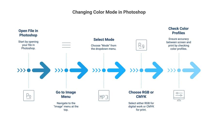
Open your file in Photoshop.
Go to the “Image” menu at the top.
Select “Mode” from the dropdown menu.
Choose RGB for digital work (like web or social media).
Choose CMYK for print materials (like brochures or business cards).
Check your colour profiles to ensure accuracy between screen and print.
If you're preparing a vibrant design for social media, stick with RGB. However, for business cards or brochures, CMYK is your best bet for rich colours.
How To Change Color Mode In Illustrator?
Switching the colour mode in Adobe Illustrator can be easily done by following these steps;
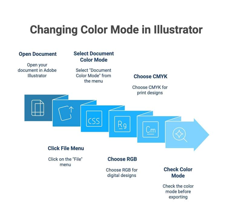
Open your document in Adobe Illustrator.
Click on the “File” menu.
Select “Document Colour Mode.”
Choose RGB for digital designs with bright, vivid colors.
Choose CMYK when creating artwork intended for print.
Using the right colour mode improves colour accuracy and media consistency.
Always remember to check the mode of the image before exporting, as it can make a significant difference in the final product’s image quality.
How To Change Colour Mode In InDesign?
Adobe InDesign is primarily used for layout projects like magazines and brochures, so it's built to handle CMYK color modes from the start. However, if you import RGB images, you'll need to convert them. The best way to do this in InDesign is during the export process.
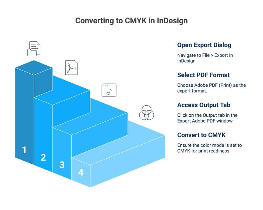
Here’s how to convert to CMYK when exporting from InDesign:
Go to File > Export.
Choose Adobe PDF (Print) the format and click "Save."
In the Export Adobe PDF window, select the "Output" tab on the left.
Under "Colour Conversion," choose "Convert to Destination" and select a CMYK profile.
Understanding how to change colour modes in Photoshop, Illustrator, and InDesign ensures your designs appear exactly as intended across digital and print platforms. Choosing the right mode, RGB for screens or CMYK for print, preserves colour accuracy and visual consistency. With these simple steps, you can confidently prepare any creative project for its perfect final output.
How Ex Why Zed Will Ensure You Get The Best Prints?
At Ex Why Zed, we know how important it is for your final product to match your vision. Our team of print experts is dedicated to ensuring you get the best results every time. We pay close attention to colour accuracy and colour consistency, guiding you through the printing process to avoid common pitfalls. We're here to help you get your colours just right.
We'll review your files and help you make sure they are in the desired colour space for printing. Whether you have questions about rich black or need help converting your files, we provide the support you need.
Our goal is to make the printing process smooth and deliver a final product that you'll be proud of, with vibrant, accurate colours that truly stand out. Contact us today to learn how Zed can ensure you get the best prints!
Conclusion
Understanding the distinction between RGB and CMYK is crucial for achieving optimal results in your printing projects. As we've explored, each colour model serves a specific purpose depending on the medium: RGB for digital displays and CMYK for print. By knowing when to use and convert these colour modes, you can ensure that your designs translate accurately from screen to paper.
Frequently Asked Questions
Is there a preferred colour profile for professional print projects (RGB or CMYK for print)?
CMYK is the preferred colour profile for all professional print projects. Because printers use cyan, magenta, yellow, and black inks, designing in CMYK colour modes ensures the highest colour accuracy. This helps you get a reliable preview of how your colours will look on physical print materials.
Can I convert designs from CMYK color to RGB for digital use?
The conversion process from CMYK to the RGB colour mode is simple in most design software. This is often done when you want to use a print design, like a logo, for digital designs like a website or social media. This will restore the brighter, more vibrant range of colours suitable for screens.
What are the most common problems in RGB vs CMYK color printing?
The most common problems are unexpected colour shifts, where bright screen colours appear dull in print. This lack of colour consistency and poor colour accuracy happens when a file in the RGB colour model is printed without a proper conversion, as the different colour models reproduce colours in fundamentally different ways.
Will my colours look different if I print an RGB image without converting to CMYK?
Your colours will likely look very different. The printer's automatic conversion from the RGB colour space to CMYK mode is often unpredictable. This can lead to dull or inaccurate colour reproduction, as many vibrant tones in the RGB colour mode simply don't exist in the CMYK gamut.
How can I easily convert RGB colours to CMYK values?
You can easily convert RGB colours to CMYK values using design tools like Adobe Photoshop or Illustrator. Simply change your document’s colour mode to CMYK under “Edit” or “Image” settings for accurate print results.
Why is understanding the difference between RGB vs CMYK colours important for designers?
Understanding RGB vs CMYK colour ensures accurate visual output across media. RGB suits digital screens using light, while CMYK suits print using ink. Designers must choose correctly to maintain colour consistency, vibrancy, and professional-quality results.
What should you know about CMYK vs RGB printing when preparing files for professional printing?
For CMYK vs RGB printing, files must match the intended medium. Convert RGB images to CMYK before printing, embed colour profiles, check saturation limits, and proof colours. This ensures accurate colour reproduction, avoiding unexpected shifts and costly reprints.
How is RGB in CMYK conversion handled, and what colour shifts should I expect?
Converting RGB in CMYK is a colour-space transformation where colours defined by light (RGB) are mapped to ink-based values (CMYK). Expect saturated blues and bright greens to shift or appear duller, so always soft-proof and adjust colours for professional prints.
How Can You Print A Rich Black Correctly For Best Results?
To print a rich black correctly, combine black ink with CMY values for deeper tones. A professional mix like 60% Cyan, 40% Magenta, 40% Yellow, and 100% Black ensures vibrant, saturated results without dullness or ink oversaturation.
Key Highlights
Here’s a quick look at what you need to know for perfect printing results with your Canva design:
Always export your final file as a PDF Print to ensure a high-resolution, 300 DPI output.
For professional printing, select the CMYK colour profile if you have Canva Pro for more accurate colours.
Remember to add crop marks and bleed to your design to avoid white edges on the final product.
Bleed and crop marks are essential for projects like a business card, where the design goes to the edge.
Understanding these settings is key to bridging the gap between graphic design and physical print.
Ever spent hours perfecting a design in Canva, only to print it and find the colours are faded or the text looks blurry? It’s a frustrating moment, especially when you’ve put real effort into making it look right.
Canva makes design easy and accessible for everyone, from small business owners to beginners, but printing isn’t always as straightforward as creating.
The truth is, getting your Canva design to look professional in print takes a little planning, from choosing the right file type to setting up bleed and colour profiles correctly.
In this blog, we’ll walk you through the exact steps to make sure your Canva designs print beautifully every single time.
What Are the Basics of Printing a Canva Project?
Since Canva is primarily designed for digital work, its default settings are optimised for screens, not for paper. This means that to get a great Canva print, you need to adjust a few key print settings.
Before we get into the details of downloading, let's explore the settings you need to configure within Canva itself for the best results.
File Colour Modes: RGB vs. CMYK in Canva
One of the most critical print settings to adjust is the file's colour mode. Your computer screen uses RGB (Red, Green, Blue) to display colours, which is how Canva operates by default. However, a professional printer uses CMYK (Cyan, Magenta, Yellow, Key/Black).
Printing an RGB file in CMYK can make colours appear faded or slightly off, so that bright blues might turn purplish and vibrant tones lose their original depth on paper.
If you have a Canva Pro account, you can convert your design to the CMYK colour mode when you download it as a 'PDF Print'. Users with a free account will have their files in RGB, but many print shops can perform the conversion for you.
Still confused about RGB vs. CMYK? Here's a quick breakdown of what each colour mode does, and when to use it:
Color Mode
Best For
How it Works
RGB
Digital screens (websites, social media)
Adds light to a black screen to create colour.
CMYK
Professional printing (flyers, business cards)
Subtracts light by adding ink to white paper.
Resolution and Quality Settings for Print
Have you ever printed an image that looked blurry? That’s usually a resolution issue. For your Canva print to look crisp and professional, it needs to be high resolution. Web graphics are typically 96 DPI (Dots Per Inch), but printed materials require a much higher 300 DPI. You can absolutely print at home without losing quality, provided you export your file correctly.
Canva makes achieving high resolution simple. By choosing the ‘PDF Print’ option, Canva automatically exports your design at 300 DPI.
To ensure the best quality:
Always download your design as a ‘PDF Print’.
Double-check that any uploaded images or graphics are high-quality to begin with.
Review the downloaded PDF at 100% zoom on your computer to check for any blurriness before printing.
How Do You Set Up Personalised Canva Prints in Canva?
Getting your Canva design ready to print starts long before you hit the print button. A personalised Canva print needs more than creativity; it depends on careful setup to ensure the right size, clean edges, and sharp, high-quality results.
Two of the most important steps are:
Adjusting Bleed and Adding Crop Marks
If your design goes right to the edge of the page, you’ll need to add a bleed. This is a small margin (usually 3mm or 0.125 inches) that ensures no white lines appear after trimming. Crop marks are guides that show the printer exactly where to cut.
Canva automatically applies the standard bleed amount, but always check with your printer in case they require a custom amount.
Choosing the Correct Paper Size and Orientation
Getting your sizing right from the start can save you from printing issues like blurry images, stretched layouts, or cropped edges. Here’s what to keep in mind:
Select the right paper size. Canva offers standard options like A4, Letter, and business card sizes, but you can also enter custom dimensions. Always confirm with your printer which size works best for their setup.
Set your orientation early. Choose between portrait (vertical) and landscape (horizontal) under Canva’s Resize menu. Pick the layout that best fits your design’s purpose: portrait for posters and flyers, or landscape for wider visuals or product images.
Choose the right paper type. The paper finish affects the final look. Matte paper offers a smooth, non-reflective surface that’s great for text-heavy designs. Glossy paper makes colours more vibrant, while thick cardstock adds durability and a premium touch.
Request samples when unsure. If you’re not certain which option to choose, ask your printer for paper samples. Seeing and feeling them helps you make sure your final print matches your creative vision.
How To Print Out a Canva Project?
Your Canva design is ready to go, but before you hit print, there’s one last step that really matters: exporting it the right way. The file type you choose can be the difference between a sharp, professional print and one that looks a bit off. Canva gives you options like PDF, PNG, and JPG, but only one gives you true print-quality results.
Let’s walk through how to choose the right format and download your design so it looks just as good on paper as it does on your screen.
Selecting the Ideal File Format (PDF, PNG, JPG)
When downloading your Canva design for print, you'll see a few file format options. What should you choose? Let's
To make it simple, here’s a quick guide:
PDF Print: Always choose this option for professional printing. It delivers high-resolution (300 DPI) quality and preserves sharp text, rich colours, and layout accuracy. Perfect for projects like business cards, brochures, book covers, or marketing materials that need to look crisp and polished.
JPG: A solid choice for home printing if you’re working on photo-heavy designs such as posters, wedding invitations, calendars, or flyers. Just keep in mind that JPGs are compressed files, so there can be a slight loss in quality compared to a PDF.
PNG: Best reserved for digital use, such as sharing on social media or websites. Avoid using PNGs for print unless your printer specifically requests it, as they’re optimised for screens, not paper. Ultimately, sticking with the PDF Print format will give you the most reliable and high-quality results for your Canva print project.
Saving and Downloading for Professional and Home Printing
Canva saves your work automatically, so you can always return to your project later. When you’re ready to download, the steps differ slightly for professional printing and home printing.
If you’re sending your design to a professional printer, here’s what to do:
Go to Share → Download
Select PDF Print as the file type
Tick Crop Marks and Bleed
If you have Canva Pro, change the colour profile from RGB to CMYK
Do not tick “Flatten PDF”
If you’re printing your project at home, the process is simpler:
Go to Share → Download
Select PDF Print for the best quality
Skip crop marks and colour profile changes
Download the file, open it, and print from your computer
Before you print a large batch, it’s always worth doing a test print to make sure colours, margins, and sizing appear exactly how you expect.
Why Choose Ex Why Zed for Every Printing Demand?
At Ex Why Zed, we don’t just print, we elevate your ideas. While Canva Print is convenient, it often comes with limits on paper types, finishes, and consistency. That’s where we stand apart.
When you print with us, you gain a specialist partner who checks every detail before it goes to press. From spotting low-resolution images to fine-tuning colour profiles, we make sure your project looks flawless.
Our catalogue of options is wide open: custom sizes, premium paper stocks, unique coatings, and tailored finishes that Canva simply can’t match. And unlike mass-outsourced services, every order with Ex Why Zed is handled with consistency, so your reprints look just as sharp as your first run.
Whether you’re printing business cards, photobooks, zines, or marketing materials, you can expect expert oversight, reliable quality, and a professional finish every single time.
Ready to upgrade from “good enough” to exceptional? Contact us today and see your print ideas come to life exactly as you imagined.
Conclusion
Printing a Canva project with perfect results requires careful consideration of various factors, from file colour modes and resolution to the right paper size and export formats.
By following the steps outlined in this guide, you can ensure that your designs not only look stunning on screen but also translate beautifully onto print.
Remember, taking the time to adjust settings like bleed and crop marks can make all the difference in achieving a professional finish.
Frequently Asked Questions
Can I print my Canva project at home without losing quality?
Yes, you can. To maintain quality, download your Canva design as a ‘PDF Print’ file. This ensures it’s saved at a high resolution (300 DPI) suitable for printing. Open the PDF on your computer and use your home printer’s highest quality print settings for the best possible outcome.
How do I order prints of my Canva design directly from Canva?
Canva offers a professional printing service directly through their platform. After finishing your design, click the ‘Print’ button (if available for your design type) or ‘Share’, then ‘Print your design’. Follow the prompts to select your options, and Canva will handle the printing and deliver it to your doorstep.
What should I check before sending my Canva file to a professional printer?
Before sending your file, ensure it is downloaded as a ‘PDF Print’. Confirm that you have included bleed and crop marks in the download settings. If you have Canva Pro, change the colour profile to CMYK. A final check of the exported PDF for any errors is also highly recommended.
Are there recommended paper sizes or types for printing Canva designs?
Canva provides templates for standard paper sizes like business cards and flyers. However, the best paper size and type depend on your project. It's always a good idea to check with your professional printer for their recommendations, as they can advise on paper weight and finish (matte, gloss) for best results.
How can I preview my Canva project before sending it to print?
You can preview your Canva project by clicking the “Preview” or “Present” option in the editor. This lets you check layout, colours, and alignment before downloading or sending for print.
How to print exact size in Canva?
To print the exact size in Canva, set custom dimensions before designing. Even with the free version of Canva, exporting as PDF Print is a good option for better results.
Can you explain the steps to print my Canva project directly from my printer?
Open your Canva project, click Share → Download, choose PDF Print, then open the file on your computer and select Print from your printer settings for high-quality results.
TL;DR
A photo book is shaped by its purpose, whether it’s a keepsake, wedding album, gift, or professional portfolio.
The format matters, with softcovers being affordable, hardcovers more premium, and layflat best for panoramic spreads.
Book size influences both budget and impact, with smaller books costing less and larger formats creating a stronger impression.
Costs depend on format, page count, and finishes, with Ex Why Zed’s instant quote tool making budgeting in GBP simple.
Turnaround times average 7–14 days, but Ex Why Zed delivers faster, with softcovers in 5 days and hardbacks in 7.
Scrolling through endless folders of photos isn't the same as holding them in a book. Yet for many people, figuring out how to make a photo book can feel confusing. When you start planning, it’s easy to feel overwhelmed. Should you make your own wedding photo book or turn your camera roll into a hardcover edition? What about the cost of photo book printing, and how long does a photo book take to print?
Creating a professional-looking photo book is easier than you might think. In this guide, we'll break down the steps so you know exactly how to make a photo book in the UK, from design, cover type, and budgeting to where to get a personalised photo book printed, with real examples from Ex Why Zed.
How to Make a Photo Book: Step-by-Step Guide
To simplify the process, we've broken it down into clear steps that guide you from your first idea to a finished photo book you'll be proud of.
Step 1: Define Your Purpose and Audience
Every great photo book starts with a purpose. Here are some of the most common ones to consider:
Personal Keepsake: A memory book of a holiday, family milestone, or your child's early years, capturing those special memories.
Creative Portfolio: For photographers, designers, or artists, a photo book serves as a professional showcase.
Gift: Photo books make thoughtful, personalised presents for birthdays, anniversaries, or Christmas.
Limited-Edition Project: Artists and self-publishers often use photo books to sell small runs of their work.
By clarifying the purpose, you'll make better decisions about the style, size, and level of customisation. A wedding album may call for a luxury hardcover, while a holiday memory book could be a more affordable softcover.
Defining your audience also helps set the right tone, whether elegant and polished for clients or casual and fun for family and friends.
Step 2: Decide on the Style of Photo Book
Once you know your purpose, it's time to choose the style of book that best suits you. This decision has the biggest influence on the overall feel of your project.
Softcover Books: Lightweight, flexible, and cost-effective. Great for travel books or quick projects. Our small softcover photo book is an excellent choice for anyone looking for a compact option.
Hardcover Books: Durable and premium-looking, perfect if you want to make your own custom photo books or a small photo book. They're ideal for portfolios and projects you'll use often.
Layflat Photo Books: Printed on thick paper that opens completely flat, making them ideal for panoramic images and wedding photography due to their layflat binding. Our XXL Landscape photo books, which are considered large photo books, have plenty of space and are perfect for this.
Wedding Photo Books: Usually hardcover or layflat, often with added finishes like foil stamping, embossed titles, or luxury papers. If you're planning to create your own wedding photo book to showcase your beautiful photos, this format will have the most impact.
At Ex Why Zed, both hardcover and softcover formats are available, along with options for lamination, foiling, and FSC-certified papers. That means you can tailor the style of your book to match your purpose without compromising on quality.
Step 3: Choose the Size and Orientation
When people ask how do I make a versatile photo book that looks professional, size and orientation are two of the first choices to consider. These decisions affect both the design possibilities and the overall feel of the finished book.
Here are some options to help you decide:
Square Photo Books: Work well for Instagram-style images and balanced layouts.
Landscape Books: Ideal for panoramic photos, weddings, or travel photo album.
Portrait Books: Give a more traditional feel and are often chosen for portfolios or personalised photo albums.
Pocket-Sized Editions: Compact and fun for gifting, while A3 photo books make an impressive statement piece.
If you want to make a photo book UK that is cost-effective but still impactful, smaller sizes are more affordable, while larger formats naturally increase printing costs. At Ex Why Zed, you can choose from a wide variety of formats, making it easy to match the design to your purpose.
Step 4: Select Your Photos Carefully
One of the most common mistakes people make when creating a photo book is trying to include too many images. The best photo books tell a story, which means editing down to your strongest shots. To get it right, follow these guidelines:
Curate with Purpose: Instead of adding every photo from an event, focus on the images that capture key moments and emotions.
Balance Quantity with Quality: A photo book with fewer but more powerful images will feel more polished.
Sequence Matters: Arrange photos to create a narrative flow, whether that is a chronological story, such as a wedding day, or a thematic approach for a creative portfolio.
Balance Wide Shots and Close-Ups: Creates contrast and keeps the design engaging.
Pro Tip: If you are creating a wedding album and want to make your own wedding photo book, choose images that capture both the big events and the intimate, candid details. For travel or portfolio books, highlight a mix of landscapes, portraits, and detail shots to show depth.
At Ex Why Zed, many creators choose to order a proof copy first. This allows you to see how your photos look on paper before committing to a larger print run. Order your proof copy today and get complete peace of mind before you go to print.
Step 5: Plan the Layout and Add Text
The layout is where your photo book starts to come alive. Think of it as visual storytelling: how your images, page layouts, and words work together to guide the reader through your book.
Here are some layout tips to keep in mind:
Keep It Simple: Avoid cramming too many images on a single page. White space makes photos stand out.
Add Meaningful Text: Captions, short quotes, or even full stories can give context. For example, in a wedding album, add names, dates, or snippets from vows.
Choose Fonts Carefully: Stick to one or two clean, legible fonts so the text complements your images rather than distracting from them.
Maintain Consistency: Use the same alignment, spacing, and font style throughout to create a polished, professional feel.
If you've been asking how do you make a photo book that feels more personal, adding text is the answer. Even a simple caption can transform a collection of photos into a meaningful narrative.
Step 6: Pick Your Paper and Finishes
The paper you choose will significantly influence both the look and feel of your photo book, especially on the inside pages. High gloss paper enhances colours and adds a unique sumptuous depth, while matte photographic paper or uncoated finishes, including a deep-matte finish, create a softer, more sophisticated style.
At Ex Why Zed, we offer a range of quality paper options, including classic photographic paper for high-detail projects. A UV gloss coating can further enhance brilliant colour vibrance for books with bold, colourful images.
Here are some popular paper choices to consider:
Gloss: Ideal for bright, colourful images, such as travel or holiday books.
Silk or satin: Offers a balance between vibrancy and subtlety, perfect for a wide range of projects.
Uncoated: Gives a more natural look, often favoured for art or minimalist portfolios.
Textured papers: Add a tactile quality, making books feel more premium.
Finishes such as lamination, embossing, or foil stamping can further elevate your project. This is especially useful if you're planning to make your own hardcover photo book or create a wedding album with extra luxury.
The choice of paper and finishes also affects the cost of photo book printing. Premium papers and specialist finishes add to the expense but give your book a lasting, professional quality.
Step 7: Understand the Cost of Photo Book Printing
Budget is often the deciding factor when people ask how to make a photo book or how to make a photo book in the UK. The cost of photo book printing varies depending on several elements:
Size and Format: Larger books or layflat styles cost more than smaller, simpler editions.
Binding Type: Softcovers are more affordable, while hardcovers and wedding albums with custom finishes are premium options.
Page Count: The number of pages can significantly impact costs, as more pages typically result in higher costs.
Paper Choice: Upgrading from standard silk to textured or uncoated paper adds to the price.
Finishes: Extras like lamination, foiling, or embossing also increase the overall cost.
When planning your book, set a realistic budget and decide where you're willing to invest. For example, you might choose a standard paper but upgrade to a hardcover if durability is your top priority.
Ex Why Zed makes budgeting simple with an instant quote tool that shows costs upfront in GBP. Try the instant quote tool now!
Step 8: Consider the Timeline
Another common question is how long it takes to print a photo book. On average, photo books take 7 to 14 days from order to delivery. This includes:
Production time: Usually 4 to 7 working days for printing and binding.
Shipping: An additional 2-7 days, depending on the courier and location.
The type of book also matters. A softcover can be ready faster, while a hardcover or layflat version takes a little longer due to the added finishing steps. Seasonal peaks, such as Christmas or wedding season, can also extend timelines.
Knowing this helps you plan. If your photo book is a gift or tied to a special event, order it early to ensure it arrives on time.
Step 9: Where to Get a Photo Book Printed
Once your design is ready, the next decision is where to get a photo book printed in the highest quality. The choice of printer has a significant impact on quality, cost, and the level of customisation you’ll have for your book.
in the highest quality. The choice of printer has a significant impact on quality, cost, and the right size of customisation you’ll have for your book.
Giant Online Services: Companies like Photobox or CEWE are convenient and offer fast, template-based design tools. They're a good fit for casual projects, but can feel limited if you want more control over the process.
Specialist Printers: If you want a professional finish, especially for portfolios, art books, or wedding albums, working with a specialist gives you more choice in paper, binding, and finishes.
For example, Ex Why Zed offers both softcover and hardcover photo books, as well as FSC-certified papers and extras like foil stamping and lamination. Every file is given a free preflight check, helping to ensure your book is print-ready before production starts. This mix of flexibility and attention to detail makes it easier to create a book that feels uniquely yours.
Step 10: Prepare Your Files and Place the Order
The final step is to ensure your files are ready for printing. This is where a little preparation saves a lot of frustration later.
Export Correctly: Save your final design as a high-resolution PDF. Check margins, bleeds, and image quality to avoid blurry or cropped results.
Check Colours: What you see on screen may differ from print. Use CMYK colour settings for more accurate results.
Proofread Carefully: Review every page for typos, layout issues, or missing images before submitting.
Submit to Your Printer: Once your files are ready, upload them to your chosen service. Some providers, including Ex Why Zed, offer free file checks before printing, which gives peace of mind.
After that, it's just a matter of waiting for your book to be produced and delivered. With the proper preparation, you'll receive a photo book that looks professional and preserves your memories for years to come.
Why Creators Prefer Printing with Ex Why Zed?
Many photo book printers offer limited options, slow turnaround times, or unclear pricing. Ex Why Zed provides a specialist service with professional quality, fast delivery, and transparent costs in GBP.
Here are the main types of photo books we create:
Softcover Photo Books: Perfect-bound with a durable square spine and modern look. Usually ready in 5 working days.
Hardcover Photo Books: Premium finish built to last. Ideal for wedding albums, portfolios, or coffee table books. Produced in about 7 working days.
Tested Specifications for Cost and Quality
Format
Details
Approx. Cost (per copy)
A5 Perfect Bound
60 pages on uncoated paper with a laminated cover
£3.10 for 100 copies / £2.10 for 500 copies
Square (210x210mm) Perfect Bound
Thick laminated cover with 76 silk pages
Contact us for bulk pricing
Wire-Stitched (Stapled) Booklets
Slim, affordable option for smaller sets
£3.60 for 100 copies
This mix of quality, flexibility, and support is why designers, photographers, and self-publishers across the UK choose Ex Why Zed for their photo books.
Start your photo book today with Ex Why Zed. Get an instant online quote and see how simple professional printing can be!
Final Words
Learning how to make a photo book doesn’t have to feel overwhelming. With a clear purpose, the right format, and thoughtful photo selection, you can choose from different formats, add your own photos, and create something that feels both professional and personal.
From wedding photo albums to creative portfolios or perfect keepsakes, each decision, from layout to finishes, shapes the final result of your unique photo book. A well-planned photo book not only preserves your favourite moments but also tells a story that lasts for years to come.
Frequently Asked Questions
How much text should I include in my photo book?
Though there's no fixed rule, moderation is essential. Your text shouldn't overshadow your images. Instead, it should amplify the story your photos are telling. While some pages may require lengthy narratives, others can be conveyed with a few lines or a single word; it's all about balance.
How do I choose the correct font size and style for my photo book?
Choosing font size and style primarily depends on the overall theme, layout, and intended readability of your photo book. Keep the font readable, complementary to your images, and consistent throughout the book. Also, balance decorative fonts for headings and simple ones for body text.
Can I add text to an existing photo book design?
Yes, most photo book maker allow you to add or modify text on an existing design via a mobile app. The software often provides an 'Add text' button or similar option, which you can use to insert new text boxes into your layout.
What options are there for printing a photo book with a discount?
You can save on photo book printing through bulk orders, seasonal sales, promo codes, or student discounts. Many online providers also offer discounted proof copies or loyalty rewards, helping you cut costs without compromising on quality for your favourite photos.
What options are there for printing a photo book with a discount?
You can save by ordering in bulk, using seasonal promotions, or checking for student discounts. Ex Why Zed also helps reduce costs with competitive bulk pricing and clear quotes upfront.
What's the best platform to create personal photo books?
The best platform is one that offers flexibility, quality, and easy customization. Ex Why Zed is a trusted choice in the UK, giving you professional finishes, multiple formats, and fast turnaround times.
What is the best company to make a photo book?
If you want high-quality printing, a wide range of options, and reliable support, Ex Why Zed is one of the best companies to make a photo book in the UK.
Can I make a photo book directly from my phone or tablet?
Yes, you can upload and design your photo book straight from your mobile device. It’s a quick and convenient way to create without needing a computer.
How do I organise my photos by events or dates in a photo book?
Group images by occasion or timeline and arrange them in sequence for a clear story flow. This helps your book feel more structured and easy to follow.
Choosing the right book size can feel like picking an outfit for a first date — too tight and uncomfortable, too loose, and not looking right. But, unlike a date, you don't have a second chance to make a great first impression with your book.
Whether you're a seasoned self-publisher or this is your first literary adventure, your book size impacts everything from readability to printing costs and even how it'll be stacked on a shelf. But hey, we are not saying this to make you feel stressed about what to do next!
If you're already excited with your work but are just stuck with choosing the right book size, don't worry at all as we've got your back! Let's break it down and find the perfect fit for your masterpiece.
What Are Standard Book Sizes?
When considering self-publishing, "trim size" refers to your book's final printed dimensions, usually measured in inches. It's more than just the book's size—it impacts the overall look, feel, readability, and even the cost of printing. A well-chosen trim size can enhance the reader's experience and make your book more straightforward while affecting how it fits on bookstore shelves and competes in your genre.
In essence, trim size helps set the tone of your book and influences everything from design to pricing. Smaller sizes can increase page count, while larger sizes may boost printing costs. It's a balancing act that requires thinking about both aesthetics and practicality.
To make it a bit clearer, let's look at how trim size plays out in familiar industry terms:
Mass-market paperbacks: These are the little guys—compact, affordable, and perfect for tossing in a bag. They usually measure around 4.25" x 6.87" and are often the books you find on grocery store racks or on that table near the checkout. Think of quick reads or impulse buys.
Trade paperbacks: A step up in quality, these are the books you'd find in stores like Barnes & Noble. These range from 5.5" x 8.5" (digest size) to 6" x 9" (the typical "trade" size). It's where most novels, memoirs, and non-fiction books comfortably sit.
Hardcovers: These are your premium "look-at-me" books. Hardcover books come in various sizes, ranging from 6" x 9" to 8.5" x 11". You know, the ones with sturdy bindings that look impressive on a shelf and feel like a treat to hold.
Ideas on Ex Why Zed Book Sizes
In the two images here, we have showcased a wide range of sizes that are possible with hardback book printing.
From left to right:
Gin Foundry Event Books. A6 Portrait. Perfect Bound. Max size possible for Portrait Perfect Bound Books is A4 (297x210mm) or US Letter (279x216mm)
Onoe Caponoe Art Books. A5 Portrait. Hard Back. Printed Cover.
Street Tools Photography Books. 160x240mm Landscape. Hard Back. Printed Cover.
Elemental Photography Books. 210x210mm. Hard Back. Cover onto Buckram Graphite.
No Hands Football Art Books. A4 (297x210mm) Portrait. Hard Back. Printed Cover.
If Nothing Changes Street Photography Books. 340x240mm Portrait. Hard Back. Cover onto Balacron Spectrum. ⚠️ This size is the maximum we can bind as a hardback but is significantly more expensive for 500 copies+ because we have to litho print it.
How Book Sizes Affect Different Aspects of Publishing?
The choice of book size significantly influences various aspects of the publishing process, including different sizes that can shape the reader's experience, affect cover design, impact printing costs, and influence how the book is marketed. Understanding these nuances is essential for making an informed decision.
1. Page Count and Readability
Trim size directly affects how your words fit on each page, influencing page count and readability. A minor trim size results in more pages, while squeezing too many words onto a page can make the text feel cramped. For example, why not get influenced by the 5.2" x 8" used in The Sun Also Rises. It's a compact trim that strikes a balance—giving a short book more substance without sacrificing readability.
2. Cover Design and Overall Presentation
The right trim size enhances your cover's impact. Larger sizes offer space for bold designs, while smaller sizes require more thoughtful proportioning. Your book's cover must be visually appealing in any format—paperback, perfect bound, hardcover, or eBook—so consider the trim size when designing.
At ExWhyZed, we understand the significance of these choices. Our services cater to a variety of formats, including zines, photobooks, children's books, and hardback books. We offer guidance on selecting the right size to enhance your cover's impact and ensure your book stands out in its genre.
For more insights into our offerings and to explore how we can assist with your project's specific needs, please visit our Portfolio section to see how others have printed their books.
3. Printing Expenses
Your trim size can impact printing costs, as these are often linked to page count. Larger book printing sizes can reduce page count, which may cut printing costs. Additionally, various page types can also influence the price. You must thus ensure that your size aligns with your audience's expectations for the genre.
For example, with Ex Why Zed, a softback, perfect bound book featuring a 300gsm uncoated cover and 120gsm or 120gsm uncoated inside pages, a single copy may cost around $112, while printing 100 copies would bring the total to approximately $392. To get a customized quote that best suits your project, request a quote now.
Readers are drawn to familiar sizes in their favorite genres. While unique trim sizes can stand out, they can also make your book feel out of place. Sticking to standard book printing sizes ensures marketability, but if your audience demands something different, don't hesitate to get creative—keep balance in mind.
How to Choose the Right Book Size Based on Genre?
Deciding on the trim size involves multiple factors, but one critical consideration should be the book's genre. Let's examine the average book sizes for various genres.
1. Fiction and Non-Fiction Book Sizes
Fiction books typically measure 5.5" x 8.5" or 6" x 9" to provide a comfortable reading experience.
Depending on the content, nonfiction books have standard sizes of 5.5" x 8.5", 6" x 9", or 7" x 10".
A memoir, usually more personal, can follow smaller trim sizes like 5.25" x 8" or 5.5" x 8.5".
Size selection for these genres should consider the balance between reader comfort, aesthetic appeal, and readability.
2. Children's Book Sizes
Children's books are specifically crafted for younger readers; hence, their sizes are set at 7.5" x 7.5", 7" x 10", or 10" x 8".
The larger format permits vibrant and engaging spreads to showcase the illustrations that are a key element of such books.
Books with more illustrations or fewer text blocks allow for greater flexibility with book sizes.
Essentially, ensure that the chosen trim size allows the imagery to engage children while permitting easy handling by tiny hands.
3. Cookbook and Art Book Sizes
Larger trim sizes, such as 8" x 10" or even more significant, are more suitable for cookbooks and art books known for rich visuals.
Larger sizes allow for a better showcase of vivid imagery or complex art forms, enhancing reader engagement.
The glossy, high-quality paper is generally preferred for these genres to render a premium feel.
However, consider your target market's requirements, as larger books might not fit standard bookshelves.
What Are Some Tips for Picking the Perfect Book Size?
Selecting the right trim size for your book can feel like navigating a maze, but with a few key insights, you can make a well-informed choice that aligns with your vision and audience. Here's how to approach this critical decision in a way that feels intuitive, not overwhelming:
1. Know Your Readers Inside Out
First things first: who are you writing for? Picture your ideal reader—are they like to throw a book in their bag and take it everywhere, or are they the type to carefully study a larger format on a desk, perhaps with a coffee and a highlighter in hand? If you're writing a novel for a young adult audience, they might appreciate a more compact size that fits comfortably into a backpack.
Conversely, if your book is a comprehensive guide or textbook, readers may expect a larger, more spacious design that allows for clear visuals, detailed charts, or room for notes. Understanding this is the key to getting your trim size just right.
2. Consider How You'll Get Your Book Into Readers' Hands
Your distribution channel plays a significant role in shaping your book's format. If you plan to partner with local bookstores or libraries, understanding their shelf space and size preferences is essential. Some stores have size constraints, meaning a smaller or more standardized trim is the most practical.
If you're focusing on online platforms like Amazon KDP or other e-commerce sites, getting creative with size is easier. However, you still want to ensure your book's dimensions comply with their guidelines. Consider your distribution method as the stage where your book will perform—ensure it fits the space.
3. Learn from the Competition
Now, look at the books already out there in your genre when printing your next book. What trim sizes are popular among your competitors? Whether your book is a thriller, a cookbook, or a self-help guide, seeing what has worked for others can spark ideas. Pay close attention to books that have made an impact, not just in content but also in how they're physically presented.
The right trim size can contribute to a book's success, helping it stand out on shelves or in online listings. If a similar-sized book has soared to the top of bestseller lists, there's likely a reason it works well for that audience.
Boost Your Book's Appeal with Ex Why Zed's Ideal Book Size Selection
Although you now have a clear understanding of how to choose the right book size, the process can still feel overwhelming—especially if you're new to it. That’s where we come in, providing expert guidance to make it easier for you. At Ex Why Zed, we specialize in helping authors select the ideal book size that maximizes readability, reduces production costs, and boosts market appeal. Whether you're aiming for a classic format or something unique, our expert team will guide you in choosing the perfect dimensions to make your book shine.
Contact us today to get started and create a book that captivates your readers and stands out in the market!
Conclusion
Every element of your book—from the title and cover design to its content and trim size—plays a crucial role in its success. The right trim size does more than just improve aesthetics and readability; it directly influences printing costs and marketability.
By carefully considering these factors, you can ensure that your book doesn't just capture attention but stands out in a competitive market. Ultimately, your attention to detail will help create a book that resonates with readers and thrives on bookstore shelves.
Frequently Asked Questions
What are the most common and average book sizes?
The common sizes for fiction and nonfiction are 5.5" x 8.5" and 6" x 9". Standard dimensions for children's books are 7.5" x 7.5", 7" x 10", or 10" x 8".
How do I choose the right book size for my manuscript?
Consider your genre, the readability of your content, and your printing budget, and then select a size that best meets industry standards and your prospective readers' expectations.
What size is a six-by-nine book?
A 6" x 9" book measures six inches wide and nine inches tall. This size is often preferred for trade paperbacks, including most novels and non-fiction titles.
What sizes are established publishers using for their books in your category?
Established publishers usually follow genre-specific standard sizes. For instance, fiction and non-fiction books typically measure 5.5" x 8.5" or 6" x 9", while children's books are usually 7.5" x 7.5", 7" x 10", or 10" x 8".
You've poured your heart and soul into your manuscript. Late nights, early mornings, countless revisions—and now, finally, your story is ready to meet the world. But wait. How do you transform that digital document into a physical book that readers will treasure? One that stands proudly on bookstore shelves, catches the eye, and feels professional to the touch?
Welcome to the art and science of book design—where your words become a visual experience.
Whether you're a first-time novelist with a literary gem, a poet crafting a collection of verses, or a photographer assembling a stunning visual narrative, the design of your book speaks volumes before a single word is read. In this comprehensive guide, we'll walk you through the essential resources that will elevate your self-publishing journey from amateur to impressive. From captivating covers to perfectly balanced typography, from spine design to illustration collaboration—we've curated expert advice that puts professional-quality design within your reach.
Let's turn your literary dream into a beautifully designed reality that readers won't be able to resist.
Start Strong: Lay the Foundation for Self-Publishing Success
Your step-by-step guide to self-publishing a book
If you’re at the beginning of your self-publishing journey, our comprehensive How to Self-Publish a Book UK Guide is your roadmap. It breaks down each step—from editing and formatting to ISBNs and marketing—into manageable chunks.
Track your progress with a printable self-publishing checklist
To ensure you don’t miss any critical details, our Self-Publishing Checklist serves as your companion document, offering a systematic approach from manuscript to printed book.
Design Like a Pro: Choosing Tools That Work for You
Select the right graphic design software
When it comes to book layout and covers, having the right tools makes all the difference. Our Essential Graphic Design Software Tools for Success guide helps you choose programs that suit your skill level—whether you're DIYing or working with a pro.
Craft a Captivating Cover: Make Your Book Stand Out
Your back cover is vital real estate. Learn how to write a compelling blurb, position your barcode, and style the layout with Crafting the Perfect Book Back Cover.
Choose the Right Typography: Fonts That Feel Professional
Designing for Young Audiences: Children’s Book Covers That Shine
If you’re publishing a picture book or illustrated story, your cover must appeal to both kids and parents. Discover how to create joyful, colourful covers with Engaging Children’s Book Covers: A Visual Delight, packed with genre-specific design advice.
Bringing It All Together: From Vision to Printed Reality
Designing your self-published book isn’t just about making it look good—it’s about building a meaningful reading experience. Each design decision contributes to how your story is received, remembered, and loved.
With the expert guides linked above, you’re equipped to make confident, informed choices. Good design expresses your unique voice and brings your story to life on the printed page.
Your words deserve to be wrapped in design that amplifies their power. Your story deserves a format that invites readers in. And you deserve to hold a finished book that reflects the care, creativity, and effort you’ve poured into it.
Book Printing from PDF
We will just need a high res PDF file to go ahead. SO do use the program you are most comfortable with laying out the artwork in. Ensure that you are happy with how everything looks on the page, then Export or Save As PDF. Easy!
We'll give the files a thorough check and preflight when they arrive and at that stage we will flag up anything that doesn't look right so you can change it before printing.
Have you ever run your fingers across the embossed title of a beautiful hardcover book and felt that unmistakable thrill? That moment when a story transcends digital pixels to become something you can hold, cherish, and pass down through generations? At Ex Why Zed, we don't just print books—we transform creative visions into tangible treasures that readers can fall in love with page after page.
Reclaim Your Creative Power Through Self-Publishing
The publishing landscape has been democratised, placing unprecedented creative control in your hands. No more compromising your vision to fit a publisher's mold. Our eye-opening exploration of the pros and cons of self-publishing reveals how this path grants you not just creative sovereignty, but direct connection with your audience. We don't shy away from the challenges either—from marketing hurdles to distribution logistics—equipping you with clear strategies to overcome each one so your story reaches precisely who it needs to.
The Sensory Magic of Print Storytelling
In a world of fleeting digital content, printed books offer something increasingly precious: permanence. Our deep dive into storytelling through print explores how the weight of paper, the texture of a cover, and even the sound of turning pages creates an immersive experience digital formats simply cannot replicate. Discover how thoughtful design choices and quality materials transform reading from a mere activity into a multi-sensory journey that readers won't just remember—they'll revisit again and again.
Navigate the Book Printing Process with Confidence
What once seemed like an intimidating technical maze becomes an empowering creative adventure with the right guide. Our meticulously crafted step-by-step guide to printing your book eliminates confusion and builds confidence at every stage. From preparing your manuscript for professional printing to selecting finishing touches that make your book unmistakably yours, you'll move through each phase with clarity and purpose—no publishing degree required.
Book Printing Possibilities Unveiled
Dive into our curated collection of real-world print projects—each analysed to reveal the techniques, materials, and decisions that made them exceptional. Whether you prefer watching videos or reading articles, this resource hub empowers your printing journey with practical insights from diverse specialist niches, helping you envision and achieve your own remarkable printed piece.
The dimensions, format, and physical characteristics of your book are not mere technical decisions—they're powerful storytelling tools. Our accessible breakdowns in book sizes made easy and book format: a beginner's guide translate industry jargon into clear choices that enhance your narrative. Whether you're creating a pocket-sized poetry collection or a coffee table art book, you'll understand exactly how your book's physical form can amplify its emotional impact.
The Art of Booklet Architecture
Creating professional booklets requires a specific expertise in page arrangement that can make or break the reader's experience. Our visual tutorial on how to arrange pages for booklet printing transforms this technical challenge into an intuitive process. With clear examples and practical tips, you'll master the structural elements that ensure your booklet flows naturally, impressing readers with its professional polish.
Perfect Binding: Professional Finishes in Minutes, Not Years
The sleek spine of a perfectly bound book signals quality before a single word is read. Our streamlined guide to mastering perfect bound artwork in 5 minutes distills years of professional knowledge into actionable steps anyone can follow. Learn the precise file setup and design considerations that result in books that not only look professional on a shelf but maintain their integrity through years of reading and sharing.
Bridging Digital and Physical: From Screen to Bookshelf
Your carefully crafted PDF contains a world waiting to be experienced in three dimensions. Our practical article on how to print a PDF as a book ensures nothing is lost in translation during this critical transformation. Follow our guidance to preserve every nuance of your digital creation as it becomes a physical reality that readers can experience with all their senses.
Your Self-Publishing Power Tools
Behind every successful self-published author stands an arsenal of carefully selected tools that amplify their creative capabilities. Our curated collection of top self-publishing tools for success introduces you to platforms and resources that handle everything from professional editing to global distribution. These tools don't just streamline your workflow—they elevate your entire publishing journey, allowing your creative genius to shine without technical frustrations.
The Investment in Your Literary Legacy
Understanding the financial landscape of book printing empowers you to make choices that honor both your vision and your budget. Our transparent analyses of how much it costs to print a book and how much a custom hardcover book costs provide the clarity needed for confident decision-making. We break down every expense category, reveal potential savings opportunities, and help you invest wisely in elements that truly enhance your book's value to readers.
Your Masterpiece Awaits: The Ex Why Zed Difference
The journey from manuscript to masterpiece is one of the most rewarding creative adventures you'll ever undertake. At Ex Why Zed, we walk beside you not just as service providers, but as fellow book lovers who understand the profound significance of what you're creating.
Every page we print carries not just ink, but ideas, emotions, and experiences that will touch lives in ways neither of us can fully imagine. That's why we approach each project with reverence for your vision and commitment to exceptional craftsmanship.
Your book isn't just another product rolling off our presses—it's the culmination of your creative journey, and the beginning of countless reading journeys to come. Let's create something extraordinary together that will find its way into hands, hearts, and bookshelves for generations.
Ready to transform your manuscript into a masterpiece? Explore our resources, reach out with questions, or take that exhilarating first step toward holding your book in your hands. Your readers are waiting.
In today's digital-centric world, print materials like booklets continue to play a crucial role in marketing strategies. While digital content is widely consumed, the tactile nature of a booklet offers a more personal and engaging experience. Booklets allow businesses to present detailed information in a structured, easy-to-digest format that can capture their audience's attention.
Whether used for product catalogues, event programs, or educational materials, they provide an excellent opportunity to communicate a brand's message effectively. Beyond their versatility, booklets offer significant advantages regarding brand visibility and recall. Their physical presence ensures that the message reaches the audience in a memorable way, making it more likely for the content to be retained.
In this blog, we will delve deeper into the various benefits booklets offer to all. Stay tuned to learn these advantages right away!
What Makes Print Media Stand Out In A Sea Of Digital Content?
With digital content dominating the marketing landscape, physical materials like booklets continue to stand out. Print offers a tactile experience that digital platforms can't replicate in a world driven by screens. This resurgence highlights the lasting value of traditional marketing, showing that a well-designed booklet can leave a lasting impression on potential customers.
Moreover, unlike fleeting digital ads, booklets stay in the hands of your audience, fostering greater engagement and stronger brand recall. All in all, booklet printing offers a unique way to build meaningful connections with customers in a digital world.
What Are the Types of Booklets?
Booklets are versatile marketing tools that offer ample space for information and customisation. They cater to different needs, from educational content to advertising strategies, and can be tailored to target specific audiences.
Types of Booklets include:
Informational Booklets: These booklets provide detailed, structured information on a specific topic, product, or service. They are great tools for presenting complex details in a digestible format. Informational booklets help customers make informed decisions by offering straightforward, organised content.
Educational Booklets: Designed to teach or train, educational booklets include lessons, exercises, and assessments. They are commonly used in schools, universities, or corporate training environments. These booklets help facilitate learning and ensure content is easy to follow and absorb.
Marketing Booklets: Marketing booklets are used to promote a product, service, or brand with compelling visuals and persuasive messaging. They aim to capture attention and drive action, such as purchases or engagement. These booklets are ideal for campaigns like direct mail or trade shows.
Welcome Booklets: Welcome booklets introduce new employees or customers to a company's culture and offerings. They provide essential information, such as policies or product details, to ensure a smooth onboarding experience. These booklets create a positive first impression and help establish connections.
Interactive Booklets: Interactive booklets engage readers through features like QR codes, quizzes, or surveys. These elements encourage active participation and enhance the reader's experience. They are particularly effective for marketing campaigns or educational purposes, fostering deeper interaction.
To help you make informed print choices when you embark on your exciting booklet printing journey, we have curated, analysed and dissected a series of recent booklet projects to show you what can be achieved.
What Are the 5 Key Benefits of Booklets?
Tangible and impactful marketing, cost-effective promotion, versatile use across industries, enhanced brand visibility and customer engagement, and environmentally friendly options make booklets valuable in any marketing strategy. Let's discuss these advantages in the following sections.
1. Tangible and impactful marketing
Using booklets for marketing offers a tangible and impactful way to reach potential customers. These physical assets leave a lasting impression and can significantly enhance your marketing strategy. Through booklet printing, you can create a valuable tool that serves as a reference for your target audience.
By including interactive elements such as QR codes, testimonials, quizzes, and more, booklets become a powerful marketing medium that engages customers in a unique and memorable manner. Besides focusing on your print journey, distributing booklets strategically ensures visibility and brand awareness.
2. Cost-effective promotion
Booklets offer a cost-effective way to promote businesses, products, or services. With booklet printing, organisations can reach their target audience efficiently. Booklets serve as valuable tools in marketing strategies without incurring extra costs.
These promotional materials provide ample space for customisation and diverse content, making them a budget-friendly option for brand awareness. In comparison to other forms of advertising, booklet marketing stands out as a sustainable and economical choice for boosting visibility and engaging potential customers.
3. Versatile use across industries
Booklets offer a versatile marketing strategy catering to various industries' needs. From serving as reference tools for assessment opportunities in education to welcome packs for new staff in corporate settings, booklets provide interactive elements and ample space for content.
They are valuable tools at trade shows, offering forms of advertising beyond just brochures. With various custom booklet printing options, it helps organisations effectively tailor messages to target audiences, making them visually appealing marketing solutions across various industries.
4. Enhanced brand visibility and customer engagement
Booklets are valuable tools for enhancing visibility at strategic locations, generating brand awareness, and igniting customer engagement. You can utilise them to elevate brand recognition and foster customer interaction. Additionally, by incorporating interactive elements and providing ample space for content, booklets can captivate your audience effectively.
They even come with customisation options that allow tailored messaging for targeted audiences, enhancing the overall impact. Use the power of booklets to leave a lasting impression on potential customers, reinforcing brand loyalty and maximising marketing effectiveness.
5. Environmentally-friendly options
Booklets can be easily made environmentally friendly. Choosing environmentally friendly options for booklet printing is a commendable step towards sustainability. You can reduce your carbon footprint and demonstrate your commitment to the planet by opting for recycled paper or eco-friendly inks.
Incorporating QR codes or digital elements in your booklets can minimise paper usage while engaging tech-savvy audiences. Embracing sustainable practices showcases your corporate responsibility and resonates positively with eco-conscious consumers, enhancing your brand reputation in an environmentally friendly manner.
Design Smarter: 5 Creative Ways to Elevate Your Booklet with Ex Why Zed
Stuck staring at a blank page? This article unlocks five powerful layout techniques to transform your next booklet from standard to standout. From bold white-on-colour sections and accordion folds to retro-modern hybrids and cut-out reveals, Ex Why Zed’s design-forward approach makes your content sing. You’ll learn pro tips on balancing whitespace, integrating visuals, and choosing fonts that flow. With textured pages, vivid palettes, and expert guides on bleeds and margins, this post is a must-read for zine makers, indie publishers, and creatives looking to make print pop. When you’re ready to turn your ideas into impact, Ex Why Zed has you covered.
Printing a Booklet from Word
It’s not InDesign, but with the right tweaks, Word can still produce a booklet that impresses.
This article takes a refreshingly honest look at using Microsoft Word to create printed booklets—and actually making them look professional. While Word isn’t the ideal design tool, it can get the job done with careful formatting, the right page setup, and proper double-sided print settings. You’ll learn how to manage bleed, avoid misaligned pages, and troubleshoot common preview errors. Plus, the guide covers built-in templates, how to create custom ones, and tips to avoid the most frequent mistakes.
Need top-tier results? Export your PDF and let Ex Why Zed handle the printing. We’ll make sure your Word-made booklet looks like a studio-quality publication.
Reach Out to Ex Why Zed - Your Ideal Partner for Booklet Printing
When it comes to printing booklets that leave a lasting impression, Ex Why Zed is the perfect choice. We go beyond just printing; we work with you to create a high-quality, customised booklet tailored to your needs. Whether it's a small-run project or a large-scale production, we offer a variety of options to ensure your booklet stands out.
Our team provides expert guidance every step of the way, from preparing your artwork to recommending the best layouts. With our professional-grade printing and commitment to quality, your booklet will have a polished, professional appearance. Reach out to us via email, phone, or live chat for personalised assistance to bring your booklet vision to life within your desired budget.
Conclusion
Booklets remain a powerful tool in modern marketing strategies. Their versatility, cost-effectiveness, and tangible nature make them a valuable asset for any business. From trade shows to direct mail campaigns, they provide a unique way to engage with the target audience.
With the option for customisation and eco-friendly printing choices, booklets can also align with the growing focus on sustainability. Lastly, embracing booklet marketing can leave a lasting impression and boost brand awareness effectively. So make them a vital part of your marketing arsenal from now onwards.
Frequently Asked Questions
Are Booklets an Effective Way of Marketing?
Booklets are an effective marketing tool due to their tangible nature and versatility. They offer cost-effective promotion, enhance brand visibility, engage customers, and provide eco-friendly options. Embracing this print medium can significantly boost your marketing strategies.
How do I design an effective marketing booklet?
To design an effective marketing booklet, focus on clear messaging, eye-catching visuals, and a cohesive layout. Incorporate your brand identity, use high-quality images, and ensure engaging content. Consider professional printing for a polished finish.
Which businesses benefit most from booklet marketing?
Businesses in industries like real estate, travel, and education benefit most from booklet marketing. These sectors thrive on detailed information and visuals, making booklets an ideal choice for showcasing services and products effectively.
What are some environmentally friendly printing options for booklets?
Some environmentally friendly booklet printing options include using recycled paper, soy-based inks, and waterless printing techniques. These choices help reduce carbon footprint and promote sustainability in the printing industry.
Can you print your own booklet at Ex Why Zed?
DIY sounds tempting—but will it deliver the quality your content deserves? Let’s break it down.
Sure, printing your own booklet at home seems easy—just fire up Word and hit print, right? But if you’re aiming for professional results, there’s more to consider. This article weighs the trade-offs between DIY booklet printing and pro-grade printing, highlighting the importance of top-tier print quality, proper binding, and the hidden cost of your time. Spoiler: unless you’re confident with bleeds, paper stocks, and saddle-stitching, it’s best to leave it to the experts.
With high-spec digital and litho presses, quick turnaround, and crystal-clear guidance, Ex Why Zed booklet printing ensures your project looks polished, not patchy. Ready to upgrade your print game? Let’s make your booklet shine.
Is There Cheap Brochure Printing in the UK?
Affordable doesn't have to mean amateur—here’s how to cut costs without compromising quality.
Finding budget-friendly brochure printing in the UK can feel like a race to the bottom—but it doesn’t have to be. This blog smartly unpacks three cost-saving routes: ordering in bulk, working with brochure specialists who pass on material savings, or opting for full-service printing for a bit more polish. Crucially, it warns against cutting corners that sabotage your design, finish, or user experience.
At Ex Why Zed, you're not just getting competitive pricing—you’re getting expert design advice, fast turnaround, and premium finishes without the premium price tag. Whether you're printing mini brochures, pamphlets, or full-service folded artwork, your content deserves to shine. Let us help you do it, affordably and brilliantly.
Printing a PDF as a book involves more than just pressing print. Choosing the right software, adjusting the layout, and setting up your printer correctly are all crucial for a professional finish.
This guide covers everything—from why printing your PDF as a book is beneficial to preparing your document, selecting margins, print quality, and binding options, including the number of pages you have. Follow these steps, and you'll have a well-formatted, professionally printed book in no time! Ex Why Zed provides premium book printing services in the UK, offering the highest quality paper and binding options, along with a print preview before finalizing your order.
How to Print a PDF as a Book: A Step-by-Step Guide
Turning a digital PDF into a beautifully printed book in PDF format is an excellent way to bring your content to life. Whether you’re a self-published author, a business creating manuals, or a photographer assembling a portfolio, a well-printed book adds a professional touch. However, achieving high-quality results requires careful formatting, choosing the right materials, and selecting a trusted printing partner.
In this guide, we’ll walk you through the entire process, from formatting your PDF to selecting the best printing service—with a special focus on Ex Why Zed, a premier book printing service in the UK that ensures top-tier results.
1. Format Your PDF for Printing
Proper formatting is key to ensuring your book prints exactly as you envision. Here’s what you need to consider:
Set the Page Size & Bleed
Your book’s dimensions should be set before designing the content for pdf printing. Common sizes include:
A5 (148mm × 210mm) – A popular choice for novels and journals, especially when formatted in a PDF file.
A4 (210mm × 297mm) – Ideal for workbooks, manuals, and portfolios.
Custom Sizes – If you have a unique vision, custom dimensions can be accommodated by professional printers like Ex Why Zed.
If your book includes images or background colours that extend to the edge of the page, you need to set a 3-5mm bleed to prevent unwanted white borders during trimming.
Margins & Layout
To avoid content being cut off, leave sufficient inner margins (especially for bound books) and ensure enough spacing for readability. If your book will be perfect bound, the inner margin should be at least 15mm to account for the binding process.
Embed Fonts & Use High-Resolution Images
Fonts should be embedded to maintain consistency across different devices and printers. Additionally, images should be at least 300 DPI to prevent pixelation in print.
Check Page Order & Numbering
Odd-numbered pages should appear on the right, even-numbered pages on the left.
If your book has a blank page, ensure it’s placed correctly to maintain proper flow.
2. Choose the Right Binding Type
Your book’s purpose and page count will determine the best binding option:
Saddle Stitching – Common for booklets, zines, and short-form publications.
Wire-O Binding (Spiral) – Perfect for workbooks, manuals, and notebooks that need to lie flat.
Hardcover Binding – The most durable and premium choice, ideal for special editions and coffee table books.
Pro Tip:Ex Why Zed offers a variety of binding styles to match your project’s needs, ensuring durability and a high-quality finish.
3. Select a Trusted Printing Service
Choosing a reliable and experienced book printing company is crucial. Here’s why Ex Why Zed stands out in the UK printing industry:
Expert Craftsmanship – Whether you need a small batch or bulk printing, Ex Why Zed ensures precision and quality at every step. Customisation Options – From paper types to cover finishes, ExWhyZed provides tailored solutions. Eco-Friendly Printing – If sustainability matters to you, Ex Why Zed offers environmentally conscious printing options. Fast Turnaround – Quick production times without compromising quality, so you get your books when you need them.
Once your document is formatted correctly, it’s time to prepare it for submission and printer settings.
Convert to a Print-Ready PDF
To ensure your file meets printing standards, save it in PDF/X format (such as PDF/X-1a or PDF/X-4), which locks in fonts, colours, and layout.
Request a Proof Copy
Before printing a large order, always ask for a proof copy (digital or physical). A test print allows you to spot errors and make necessary adjustments. We can either bind this or send it out as flat sheets.
Define Printing Preferences
Paper Type: Matte, gloss, or uncoated? Choose based on your book’s purpose.
Cover Finish: Softcover, hardcover, lamination (glossy or matte).
Color vs. Black & White: Full-colour pages cost more but enhance visuals.
Need help deciding?ExWhyZed’s expert team can advise you on the best materials and finishes for your book.
5. Review and Finalise Your Order
Before placing your final order: Proofread thoroughly for typos, misaligned elements, or missing pages. Confirm Binding & Material Choices to match your vision. Check the Delivery Timeline so you receive your books on time. You can pay using a credit card or other payment methods.
Once everything is in place, place your order and track your shipment.
Ex Why Zed offers nationwide UK delivery with excellent customer support to keep you informed every step of the way.
🇺🇸 We now have two print hubs in the States - one on the East Coast, one on the West. So we can now deliver overland in 5/6 working days saving you both time and cost compared with shipping from the UK. Win win! You can choose which shipping method depending on how fast you need the books, but we tend to use UPS.
So our print price will be the same as we have already quoted but shipping will be much faster and cheaper (and no import Tariffs either, in case Trump launches them before you go ahead).
Ex Why Zed: Premium Book Printing in the UK
At Ex Why Zed, we bring your vision to life with beautifully printed books crafted to perfection. Whether you're dreaming of a striking hardback, a sleek softcover, or a bold coffee table book, we provide bespoke printing solutions tailored just for you.
With eco-friendly options, premium finishes, and meticulous attention to detail, your book will truly stand out. Let’s create something amazing together! Feel free to email us at hello@exwhyzed.com or call us on 01206 766647
Conclusion
Printing multiple PDFs as a book at home or in the office is easier than you think. Understanding the printing process, including page sizing, ensures a polished result within the printable area, whether it's a manual, booklet, or blog novel. You can use software like Adobe Reader in the process, including steps like folding.
From preparing your PDF with Adobe Acrobat or Microsoft Publisher to selecting paper size, print quality, and binding options like saddle stitch or perfect binding, each step matters.
We hope this guide helps you create high-quality booklets with confidence. Happy printing!
Frequently Asked Questions
Can I use my home printer to print a PDF as a booklet?
Yes, you can! If your home printer supports automatic duplex printing (double-sided printing) or manual duplex printing, including duplex printers, you can produce a simple booklet by printing on both sides of the paper, including the front side and back side. However, you may be limited by factors such as the maximum paper size your printer can handle and the print output quality.
Can I print a book-style PDF without special software?
Yes, some printers have built-in booklet printing options. However, software like Adobe Acrobat or Microsoft Publisher gives more control over layout and formatting.
How do I avoid blank pages in my printed booklet?
Ensure your page count is a multiple of four. If not, intentionally add blank pages to prevent awkward formatting. Your pdf file should be supplied with all the pages in reading order. If you need blanks in there to ensure the double-page spreads match up, please do include them in the PDF too.
What’s the best paper type for booklet printing?
For a professional look, use 100-120gsm paper for inside pages and 250-300 GSM for covers. Matte paper reduces glare, while glossy paper enhances colors.
Crafting an impeccable piece of literature is half the battle won. The other half lies in presenting it to the world in the most captivating manner, and this is where the role of book cover art and design comes into play. It's often remarked, 'Don't judge a book by its cover,' but let's be candid: that's precisely what readers do initially. An eye-catching book cover acts as the facade of your literary work, tempting potential readers to delve deeper.
If you are venturing into the world of self-publishing, nailing your book cover design is more than necessary; it's essential. It's okay if you're not a wizard graphic designer; good book cover design doesn't equate to intricate designs and heavy detailing.
Often, simple yet thought-out compositions can work wonders when it comes to tempting the reader to pick up your book. This blog will guide you through several aspects of crafting a unique book cover design, so let's get started!
What Is the Importance of Book Cover Design in Self-Publishing?
In the field ofself-publishing, the book cover is the foremost marketing tool at one's disposal. While your literary merit will be the ultimate determining factor, the cover catalyses the reader's journey from glancing to browsing to eventually purchasing the book. Let's delve deeper into the need for book cover design in self-publishing.
1. First Impressions Matter
In book publishing, a captivating cover is crucial. It's the first thing readers notice, often determining whether they'll explore further or move on, even when purchasing a Kindle version on Amazon. Even a significant story risks being overlooked without an engaging cover.
Thus, investing in a well-designed cover ensures your book makes a strong first impression. It can spark curiosity and draw readers into discovering what lies beyond the cover. Remember, your book cover is your silent salesperson.
2. Attracting the Target Audience
A good cover grabs attention and appeals to your target audience. Genre-specific designs—like warm tones for romance or dark, mysterious themes for thrillers—create familiarity and attract the right readers.
By reflecting on the book's theme and genre, the cover sets clear expectations for readers. It becomes essential for creating emotional connections before they even turn the first page.
What Are the Key Elements of Eye-Catching Book Covers?
Excellent book cover ideas are not just about flamboyance but involve smart integration of various key elements—each playing a significant role in setting the tone through effective lighting, shading, and the detail of your cover for your book. Let's discuss these elements in the following sections.
1. Striking Imagery
Imagery is the focal point of any book cover, whether it's a photograph, illustration, or an interesting play on unique colour. It should visually represent the essence of your book's theme or setting, even if it doesn't depict the plot directly.
For example, a high-fantasy book might showcase a mystical realm or a dragon, instantly conveying its genre. Since imagery is the first non-verbal interaction with potential readers, it must effectively capture the book's core essence.
2. Readable and Appropriate Typography
Typography is another key aspect of a great book cover that stands out on a bookshelf. Font style, size, and colour should align with the design and genre. The book’s title, being the most prominent text, must grab attention and remain legible—even at thumbnail size for online displays.
Besides, a clear text hierarchy is crucial to emphasise the title text over other details like subtitles or the author name. Choose fonts that enhance readability while matching the book's tone and style.
3. Relevant Colour Schemes
Colour theory plays a fundamental role in effective book cover design. The colours you choose can evoke specific emotions in your prospective readers, making them more or less inclined to learn more about your book. A thoughtful colour scheme can elicit the desired mood and help your book appeal better to the target audience.
Romance: Soft, warm hues such as pink or red, symbolising love and passion.
Sci-fi & Fantasy: Bold, vibrant colours like purple, black, or neon hues to evoke a sense of mystery and intrigue.
Thriller & Horror: Dark shades like black, grey, and red signalling suspense and terror.
Non-fiction: Usually simple, solid colours that offer a professional and crisp look.
How Do Book Formats Impact Cover Design?
Designing your own covers requires considering the intended format—E-book, Paperback, or Hardcover. Ebooks must prioritise straightforward typography and eye-catching imagery for digital thumbnails. In contrast, paperbacks and hardcovers need additional design elements, like back and spine covers, tailored to their physical dimensions and format-specific requirements. Let's learn the differences in detail in the following sections.
Difference Between Hardcover and Paperback
Hardcovers and paperbacks differ in more than cover material. Hardcovers are sturdy, often with dust jackets, offering design options like embossing and inside flaps for a premium feel. Paperbacks are lighter, simpler to handle, and have straightforward design needs.
Aspect
Hardcover
Paperback
Feel
Sturdy, high-end
Light, practical
Design Opportunities
Inside flaps, embossing
Cover bends easily
Price
More expensive
More affordable
Ebooks vs. Print Books
Ebooks are preferred for their portability and ease, requiring covers optimised for small screens, clarity in black and white, and thumbnail impact. In contrast, print books—paperbacks and hardcover books—require attention to factors like paper quality, finish, and physical dimensions, including considerations for print copies in a bookstore. Each format has unique design needs, especially when publishing in multiple formats.
Aspect
Ebook
Print Book
Design Opportunities
Optimised for small screens, clarity, and thumbnail impact
Includes spine and back cover design, paper quality, and finish options
Price
More affordable
Hardcover: Expensive, Paperback: Affordable
How to Design the Front, Back, and Spine?
We often limit book cover design to the 'cover,' focusing only on the front. However, a holistic book design goes beyond just the front cover—it involves careful thought and artistic input on the back cover and the spine, too. Let's discuss these concepts in the below sections.
When you export to PDF can you set the bleed to 3mm on the right and left and 10mm on the top and bottom - this way the hairlines will show on the PDF and we'll know where to fold the spine. We have locked the hairlines and white box so drop your artwork in over those.
Ultimately, we only need a PDF laid out as a spread to print the cover, so do use whichever design/layout program you are most comfortable with. We’ll give the file a good check and preflight when it arrives and will flag up any potential issues. So don’t worry if you’re not 100% sure you’ve done it correctly.
There is a slightly different process between designing the cover for a perfect bound softback book and a hardback book. The hardback book cover design requires extra 17mm flaps around the edge which are the parts of the printed cover which fold around and are glued to the inside of your hardback case. You can just about see on the image below, the 17mm of the cover which has been tucked around and glued down underneath the orange endpapers.
1. Front Cover Design Concepts
The front cover should offer a clear, intuitive glimpse into your book's content, immediately capturing the viewer's interest. It must blend compelling imagery and the two main parts of your front cover, genre-appropriate fonts, and colours that evoke the intended emotions. The goal is to create a visual narrative that intrigues potential readers, compelling them to explore the book further.
Key Considerations while designing the front cover:
The central image should reflect the story's essence.
Fonts and colours must suit the genre and tone.
Keep the design simple to avoid clutter.
Balance attention-grabbing elements with clarity.
2. Back Cover Content and Layout
The back cover provides additional details, including the book's description, author bio, and book reviews, similar to what you would find on an ebook’s description page. The layout should be organised and flow logically, starting with a brief synopsis or blurb. The goal is to smoothly guide the reader from learning about the book's story to getting to know the author.
Key Considerations while designing the back cover:
Organise sections clearly for the description, reviews, and author bio.
Ensure the content flows logically from the book description to the author's bio.
Place the barcode and ISBN unobtrusively.
Maintain an organised and readable layout.
3. Spine Design Considerations
The spine width calculator is pivotal in making your book stand out when aligned with others on a shelf. It carries the book's title, the author's name, and often, the publisher's logo or imprint.
Key considerations while designing the spine are:
The title should be the most prominent text.
Keep text alignment intuitive—usually top to bottom- so the text reads from left to right when the book is placed horizontally.
Colour and fonts should align with the overall book cover design.
Ensure text size such that it remains legible even at a distance.
4. The Power of Typography: Choosing the Best Font for Your Self-Published Book
Your book’s font is more than just a design choice—it shapes how readers experience your words. The right typeface enhances readability, sets the tone, and ensures a professional, polished final product. Whether you're writing a gripping thriller, an insightful non-fiction book, or a whimsical children's story, selecting the perfect font is crucial for both aesthetics and accessibility.
This deep dive guide explores the best fonts for self-publishing, breaking down serif vs. sans-serif styles, genre-specific recommendations, and font-pairing strategies. You’ll learn why classics like Garamond and Baskerville work beautifully for fiction, while Helvetica and Avenir are ideal for modern non-fiction. We also cover key technical considerations, such as font size, spacing, and licensing, ensuring your book is both visually appealing and easy to read.
What Are Some Book Cover Design Tips and Trends?
Whether you're opting for professional assistance or going the DIY route, learning specific book design’s top tips and trends can guide you towards creating an impactful book cover. Read on to learn these fantastic design tips and trends.
1. Understand Your Genre and Audience
Understanding your book's genre and audience is essential for effective cover design, as it sets the appropriate dominant tone of your book. Each genre, including those with bright colours and cartoonish illustrations, has its own visual style that resonates with readers. For example, thrillers often feature darker tones and intense imagery, while romance novels use warm colours to evoke emotion.
Similarly, knowing your audience's age, tastes, and expectations helps shape the design. A young adult novel, for instance, requires a different approach than one aimed at mature readers. Focus on these elements to create a cover that appeals to your target demographic.
2. Keep It Simple and Attention-Grabbing
Avoid the temptation to cram too many elements on your cover—remember, simplicity sells. Your book's narrative may have multiple themes, characters, and settings—however, resist illustrating them all on the cover. Instead:
Opt for a single theme or symbol from your book for your cover.
Keep the colour scheme simple, ideally with two to three primary hues.
The title font should be bold and easily legible.
Avoid image clutter—opt for one striking image or graphic representation.
What's the Difference between DIY and Hiring a Professional Designer?
Whether to attempt a DIY book cover design or hire a professional designer depends on your level of comfort with design software, creative abilities, and budget. Let's check out more details on both of them.
Attempting a DIY Design
DIY design provides a hands-on approach to your book cover design, maintaining complete control over the creative process. However, there are specific pros and cons when opting for a DIY design, which we shall discuss in the following table.
Pros
Cons
Full creative control
Time-consuming
Cost-effective
Limited design skills may impact the output
Variable revision times
The learning curve for design software
We will just need a high res PDF file to go ahead. SO do use the program you are most comfortable with laying out the artwork in. Ensure that you are happy with how everything looks on the page, then Export or Save As PDF. Easy!
We'll give the files a thorough check and preflight when they arrive and at that stage we will flag up anything that doesn't look right so you can change it before printing.
Hiring a Professional Designer
When you hire a professional designer for your book cover, you essentially invest in their expertise and experience. They deeply understand design principles, genre-based trends, and audience preferences and can seamlessly blend these factors into an appealing design. However, there are both advantages and disadvantages to hiring them, which we shall learn in the table below.
Pros
Cons
Expertise in design software and tools.
It can be expensive.
Transforms vision into polished, high-quality cover.
It may not match your personal design style.
Access to premium resources.
Longer collaboration and revision time.
It can boost book sales and attract readers.
Doesn’t need design skills or a limited budget.
Choose Ex Why Zed for Designing an Eye-Catchy Book Cover Design
As you decide to seek professional help, why not choose Ex Why Zed? We specialise in creating visually stunning, brand-aligned covers that genuinely reflect the essence of your book. Whether you need a simple design or a more intricate, creative approach, we ensure your cover stands out from the crowd.
Our team uses various techniques, from vibrant colour schemes to clever typography, to make your cover as captivating as your story. We also handle all your other publishing needs, so Reach out to us today to collaborate and bring your book to life!
Conclusion
Creating a compelling book cover is crucial in self-publishing, as it serves as the first visual impression of your story. The cover should effectively capture your book's essence through imagery, typography, and colours while aligning with your book’s genre and appealing to your target audience.
Whether you hire a professional or design it yourself, ensure the cover is a professionally designed cover that is engaging and relevant to make a substantial impact on potential readers. Your book cover is your story's first impression—make it count!
Frequently Asked Questions
How to design a book cover for self-publishing?
You can design a book cover for self-publishing through professional services, utilising online design platforms with customisable templates like Canva or by learning the basic book design skills in Adobe InDesign for a more hands-on approach to selling copies of your book. A great way to ensure success is by understanding your genre and audience and using sound design principles, particularly sharing your designs on Instagram to check how your followers initially interact with the designs.
How much does it cost to hire a designer for a book cover?
The cost of hiring a professional book cover designer can vary significantly based on experience level, complexity of the design, revisions, and licensing fees for images or fonts. It can range from a few hundred to a few thousand dollars depending on how complex your brief is and how many pages there are in your book to typeset and design.
How do I format my book for self-publishing?
To format your book for self-publishing, use professional design software like Adobe InDesign or hire a designer. Ensure proper margins, fonts, and sizes for a polished look. Convert the file to PDF for submission. Consider hiring a professional formatter for best results.
When it comes to how to make a book cover, what's the best approach?
The best approach to creating a book cover is combining a clear understanding of your book's essence, genre, and target audience with strong design principles, including the rules of design that showcase a distinct style and give readers a sneak peek of what's to come. This might involve professional help, online design tools, or learning graphic design software for a personal touch.
What are Some Free DIY Book Cover Design Tools?
Various free DIY book cover design tools are available online. Canva is a popular choice, offering a plethora of templates and graphic elements. GIMP offers advanced photo editing, while Adobe Spark and Microsoft Word are other accessible options providing customisations in design templates.