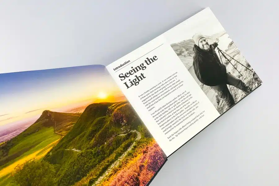
Recently, the print industry has undergone exciting changes, moving away from the past to embrace innovation. If you’re a designer, artist, publisher, or print business owner, you’ve likely noticed that print has evolved beyond ink on paper. In 2025, it’s not just about what you print, but how and why you print it.
From AI-powered workflows and sustainable materials to hyper-personalized prints and short-run flexibility, the print world is undergoing a creative and technological renaissance.
Whether you're navigating rising material costs, exploring new revenue streams, or just trying to keep your production process efficient, staying ahead of the trends is no longer optional—it’s essential.
The good news? There’s never been a more exciting time in this industry. In this post, we break down the top 10 print trends shaping 2025—so you can work smarter, create better, and stay ahead of the curve.
Print nowadays is smarter, faster, and more sustainable than ever. From AI automation to eco-conscious materials, the industry transforms how we design, produce, and deliver print. Here are the top ten trends that's making waves in the print industry:
You're not alone if you’ve ever guessed how much stock to print and ended up with unsold material. Print on Demand, as a business model, fixes that for your online business and supports your business growth. Print on Demand trends 2025 is a must-have for small brands and indie creators who want to sell unique products in high demand and creative designs.
You upload a design, someone places an order, and it gets printed—it's that simple. There’s no upfront inventory cost, storage stress, or pressure for massive runs, contributing to a favorable average profit margin. This makes it ideal for testing products or running a lean eCommerce brand in an online store.
The best part? It syncs perfectly with personalization, especially for high demand products. Whether it's art prints, tees, or merch, customers want unique items including home decor items.To fulfill these needs, POD delivers fast, high-quality results without locking you into bulk.
If you’re an author ready to publish or a creative launching new designs, POD gives you the freedom to test and grow without the upfront risk. At Ex Why Zed, we specialize in high-quality short runs, offering the flexibility and professional finish independent creators need. With a helpful team and no-pressure order sizes, it’s a reliable way to bring your work to life, your way.
Let’s be real—time is money, especially when clients want results yesterday. Digital printing provides the speed, precision, and personalization modern businesses need without setup headaches or long delays.
Forget large minimum orders. Whether you're printing brochures for a pop-up or custom labels for a product launch, digital printing scales effortlessly.
Tech upgrades in inkjet and toner mean print quality now rivals traditional offset. You get sharp color, quick turnarounds, and happy customers, minus the waste or waiting.
If you're exploring digital printing for your creative work, ExWhyZed offers a flexible, high-quality solution. Our HP Indigo presses are ideal for short runs—whether it's one copy or a few hundred. You’ll get sharp, professional results without the bulk commitment.
We also offer free file checks and paper samples to help you get it right the first time. Plus, with fast turnaround and optional fulfillment, the process stays smooth from start to finish. You can check out the complete details of digital printing here.
Think 3D printing is still just for models? Not anymore. Currently, it’s reshaping everything—from jewelry and packaging to prosthetics and product parts—with custom, on-demand designs that actually work.
Picture this: a designer creating made-to-order metal rings. A startup printing functional product samples in hours, not weeks. 3D printing makes it real and fast.
It’s perfect for one-offs, short runs, and complex ideas that traditional methods can’t afford. If your business thrives on innovation or personalization, this is your playground.
And it’s not just plastic anymore. With materials like ceramics, metal, and biocompatible materials in the mix, 3D printing is unlocking design freedom across industries.
AI and ML aren’t just buzzwords—they’re changing how print businesses operate day to day. In 2025, these technologies will power a smarter, faster printing process, boosting efficiency and personalizing outputs.
AI-led automation streamlines tasks and allocates resources better, so your team spends less time fixing errors and more time delivering results over a long time. Marketing efforts are enhanced as ML analyzes customer data to create tailored print materials that include product recommendations, boosting engagement and loyalty.
Technically, AI improves print quality by automatically optimizing colors, resolution, and sharpness—no extra steps are needed.
Thanks to predictive maintenance, ML helps identify equipment issues before they cause downtime, keeping operations smooth. With all this built in, AI and ML aren’t future upgrades—they’re tools helping print companies work smarter and save money today.
Cloud printing is a game-changer. In 2025, it is helping businesses stay lean, creative, and responsive by connecting print processes with the flexibility of the cloud.
Need to fulfill a custom tote bag order from across the country? No problem. Cloud printing lets you design, approve, and send jobs from anywhere—perfect for remote teams and eCommerce sellers.
It also supports real-time collaboration and helps automate production queues, so deadlines are met faster with fewer errors. Plus, it cuts infrastructure costs and scales as you grow.
Cloud printing offers freedom, efficiency, and a competitive edge to businesses looking to move fast and stay ahead in the print industry.
Sustainability nowadays isn’t optional anymore—it’s a value customers expect. Eco-friendly printing will go mainstream, with print shops using smarter materials like compostable phone cases and cleaner processes to cut their environmental footprint.
Think recycled paper, water-based inks, and energy-efficient machines. It’s not just about going green—it’s about staying relevant to conscious buyers who care how products are made. These changes, from reduced waste to lower emissions, show your commitment to the planet and build long-term customer trust.
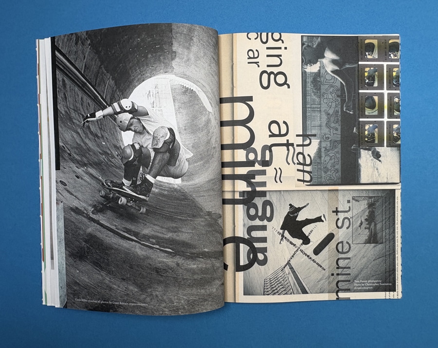
ExWhyZed is committed to eco-friendly printing and is exemplified in their collaboration with Moof Magazine. For Issue 12, we have utilized 100% recycled Evolution Uncoated paper for both the 160gsm cover and 90gsm inner pages, achieving a sustainable yet high-quality finish.
This approach demonstrates that environmentally conscious choices can coexist with vibrant design and professional production. ExWhyZed's dedication to sustainability ensures that creators can produce compelling print materials without compromising their environmental values. Check it yourself here.
Everyone wants something made just for them. That’s why personalization is a powerhouse trend, turning generic prints into meaningful experiences customers connect with.
Using digital printing and variable data, brands can tailor every piece—from names on mailers to custom colors on packaging—without slowing down production.
Personalization is more than a design tweak. It increases emotional connection, boosts response rates, and builds loyalty. Customers feel seen, and they keep coming back.
As AI and machine learning evolve, expect even deeper personalization at scale. The future of print isn’t one-size-fits-all—it’s tailor-made, every time.
Technology is reshaping print, and innovative packaging is leading the charge in 2025. It blends digital features into products, offering interaction and visual storytelling beyond basic information. Smart packaging connects with smartphones to deliver nutritional data, usage tips, or even augmented reality experiences.
Consumers can scan codes or tap embedded chips to access brand videos or games, enhancing their experience with product descriptions that attract target customers. It also boosts authenticity and traceability, fighting counterfeiting and showing the product’s journey. Interactive packaging builds brand affinity by offering engaging experiences.
Smart packaging adds value beyond the label as expectations rise, redefining what print means in a connected world.
Pocket printers are booming currently, offering sleek, mobile printing for those who need quick results anywhere. Compact and wireless, these devices enhance the shopping experience by freeing users from bulky desktop printers. From photos to labels, the convenience is unmatched.
They’re more than gadgets—they spark creativity. Print a photography on a trip becomes a real-time memory.
Moreover, these printers redefine how people engage with physical media, making print personal and accessible.
As digital life speeds up, portable printers highlight how print remains relevant—agile, fun, and fully integrated into modern lifestyles.
In 2025, data is essential for print businesses seeking efficiency and growth. Analytics tracks performance, trims costs, and reveals opportunities. It empowers smarter decisions by highlighting production output, satisfaction levels, and operational gaps.
Understanding trends and customer behavior uncovers innovation paths. Predictive tools help forecast demand, improving planning.
Besides, data-driven resource allocation cuts waste and boosts performance. Lastly, analytics provides the clarity needed to pivot quickly, optimize services, and stay competitive.
Data ensures it moves forward with purpose and precision as the print industry evolves.
As the print industry evolves, Ex Why Zed is your strategic partner for staying ahead in the market. Our expertise in various printing media helps streamline your operations smoothly as we deliver innovative, customized solutions, keeping in mind various industry trends.
Plus, our ability to seamlessly integrate eco-friendly practices and personalization into print operations makes our client stand out in the industry.
Let us help you stay ahead of the curve, streamline your processes, and create lasting impressions with customers in the world of print. Contact us now!
The print world isn’t what it used to be—and that’s good. In 2025, printers aren’t just pushing ink on paper anymore; they’re pushing boundaries. Whether battling fierce competition or responding to what today’s customer really wants (think: fast, personal, and eco-friendly), the industry is in full-on transformation mode.
We’re seeing way more than just sleeker machines. AI, machine learning, and 3D printing are baked into everyday print workflows. It's not just about speed—it’s about smart, data-driven choices. And let’s talk about customization. From personalized packaging that tells a story to pocket printers that fit in your palm, everything’s getting more personal, mobile, and interactive.
Even traditional setups are evolving. Cloud printing, digital workflows, and Print on Demand Market Trends 2025 models are helping businesses move faster, reduce waste, and stay profitable in a tough market. This isn’t just progress—it’s a total reimagining of what print can do.
Artificial Intelligence (AI) significantly impacts the print industry by automating complex tasks, optimizing operational processes, and enhancing quality control in the manufacturing process. It allows real-time adjustments, predictive maintenance, and personalized print content, increasing efficiency, decreasing waste, and lowering operational costs.
Eco-friendly printing significantly reduces the industry's environmental footprint by utilizing sustainable materials and practicing energy-efficient operations. It minimizes waste, decreases toxic emissions, conserves natural resources, and promotes a healthier planet.
Small print businesses can integrate sophisticated e-commerce solutions by partnering with all-in-one production software platforms. These platforms can automate print production, enhance quality control, offer online ordering, payment processing, and shipping automation, providing an effective way to improve efficiency and scalability in print production, graphic design, and distribution.
To stay competitive in 2025, print businesses in the printing industry should embrace advanced technologies like AI and data analytics, adopt practical ways for eco-friendly printing practices, utilize the right tools to offer personalized printing solutions with sustainable printing partners, integrate smart packaging technology, leverage digital and cloud printing services, and respond quickly to changing consumer preferences.
Personalization greatly enhances consumer engagement in the print industry. It enables businesses to deliver unique designs and tailored experiences that resonate with individual customer preferences. By providing personalized print materials, enterprises enhance customer experience, increase customer loyalty, and ultimately drive sales growth.
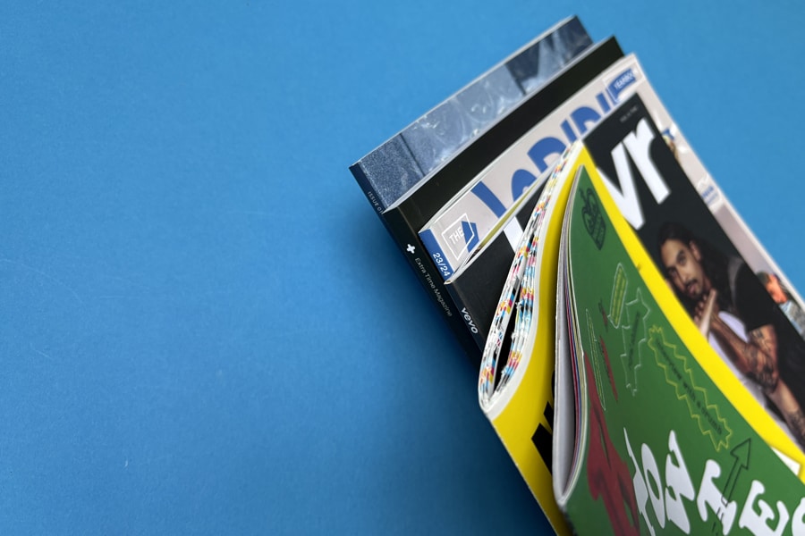
So, you’ve poured your heart into designing your magazine—curated the content, nailed the visuals, and now it’s time to bring it to life. But here’s the thing: a magazine isn’t just about what’s on that piece of paper. It’s about how those pages feel, how the images pop, and how the entire piece holds together in a reader’s hands.
Whether you’re publishing a niche editorial, a creative showcase, or a branded magazine for your audience, the final product should reflect your vision with precision and polish. And to do that, every choice matters—from layout planning and paper texture to binding style and print method.
This blog will walk you through that process—what to consider, what to prioritize, and how to bring your magazine from concept to a printed piece that truly connects with your readers. Let's get started!
Before diving into layouts and paper types, start with a clear plan. Define why you’re printing your own magazine, who it’s for, and how much you can spend on diverse fonts. These decisions will shape everything—from design and content to printing choices, ultimately contributing to a consistent professional look.
Your magazine’s purpose sets the tone. Long before you think on how to print out a magazine, know the purpose behind it. Are you informing, entertaining, promoting, or educating? Once that’s clear, identify your audience—think beyond age and focus on interests, profession, and lifestyle.
For example, if you're creating a fashion magazine, your audience might include style enthusiasts, fashion students, or industry professionals.
Why this matters:
The better you know your readers, the better your magazine connects with them.
Now that you’ve nailed down your magazine’s purpose and target audience, it’s time to tackle a big decision: how to print a magazine at home. Your printing method will affect everything—from cost and turnaround time to image quality and paper feel.
While there are multiple printing techniques, most magazine projects come down to two heavy hitters: digital and offset printing. Each has its perks and trade-offs, and the best choice depends on your project’s size, timeline, and quality expectations.
Digital printing is the go-to option for smaller print runs and tight deadlines. It works a lot like your home printer—just way more advanced. Files are sent straight from your computer to the printer, skipping the whole plate-making process.
It’s fast, flexible, and affordable—especially when you're not printing thousands of copies. And while offset printing still holds the crown for razor-sharp image quality, most readers won’t spot the difference in a well-executed digital print. The key is using the right paper and thickness to elevate the final product.
Aspect | Description |
Speed | Faster setup and quicker print turnaround |
Quality | High-quality prints with minimal compromise |
Cost-Effective | Ideal for smaller quantities; lower upfront cost |
Offset printing is the old-school master of volume. It’s a bit more of a process—creating plates and transferring ink via rubber blankets—but the result is hard to beat. If your magazine has a high page count or you’re printing in bulk, the offset is likely the more cost-effective route.
The real win here is precision. Offset delivers crisp, vibrant prints with zero smudging or toner streaks. It's the method major publishers swear by for glossy magazines. Just know: it’s slower to set up and usually not worth it for short runs.
Aspect | Description |
Speed | Longer setup time; better for scheduled runs |
Quality | Exceptional image clarity and color fidelity |
Cost-Effective | Best value for large-volume print jobs |
No matter which printing method you choose, Ex Why Zed's Magazine Printing Service has got you covered. From rich satin paper (300 gsm cover, 130 gsm inside) to expert binding, we make your vision print-perfect.
Just upload your PDF, and we’ll handle the rest with lightning-speed turnarounds—3 days for stapled, 5 for perfect bound. Need a few copies? Instant pricing makes it simple and hassle-free.
Additionally, with free paper samples, file checks, and actual humans on standby, we don’t just print—we impress.
When we talk about standard magazine size in the U.S., 8.5 x 11 inches is the industry go-to. It’s familiar, print-friendly, and fits neatly into shelves, bags, and mailers, making it a practical choice for both readers and distributors.
Internationally, the A4 size (8.27 x 11.69 inches) dominates. It’s slightly taller and narrower than the U.S. standard, offering a sleeker visual appeal. Many global brands prefer A4 for its compatibility with design templates and cost-efficient print setups outside the U.S.
Other formats, like digest size (5.5 x 8.5 inches), are gaining traction for niche or budget-friendly publications. They’re portable, cheaper to print, and ideal for zines, how-to guides, or compact lifestyle mags targeting younger, on-the-go audiences who crave convenience without sacrificing content quality.
The timeline for printing a magazine greatly depends on key factors such as the volume, the printing option you chose, and the complexity of your magazine's design and layout. Short-run printing jobs involving around 1,500 - 2,000 copies generally can expect faster turnaround times due to less demanding equipment setup.
On the other hand, more significant projects requiring more than 2,000 copies usually take more time due to the detailed setup of offset printing. However, digital printing offers faster turnaround times even for substantial projects in scenarios where speed overrules cost.
Print volume and method significantly affect your magazine’s cost, but they’re just the beginning. Several other elements quietly shape your final price tag, including paper type, page count, and binding style. Each choice you make adds up—visually, tactically, and financially. Let’s break down these factors so you can plan smarter.
The paper you pick isn’t just about feeling—it’s about first impressions. Want something sleek and photo-forward? Gloss paper delivers punchy colors and crisp images for your artwork. Do you prefer a calmer, high-end vibe? Matte paper mutes the shine and elevates readability for text-heavy layouts. Craving texture? The uncoated paper brings a raw, organic feel that stands out in a digital world.
Just remember: thicker or premium-grade paper costs more, including your cover stock. For example, for 100 copies, ExWhyZed offers A4 Softback (also available in 210x210mm) with both Wire Stitched (Saddle Stitched) and Perfect Bound (PUR) options. You can choose from premium paper with a 300gsm Silk cover and 130gsm Silk satin for the inside pages. All of this for just £135.70.
Every page adds to your story—and also your invoice. The more content you pack in, the more paper, ink, and time it takes to bring your vision to life. Since one sheet equals two pages (front and back), your total count should ideally be divisible by four—this keeps things printer-friendly and cost-efficient.
Also, don’t overlook the physical bulk. A slim 24-page lookbook and a 100-page feature mag won’t use the same binding—and yes, that matters for pricing, too. Aim for a page count that supports your message without bloating your budget.
Binding does more than hold your magazine together—it shapes the entire finish. Saddle stitch (stapled fold) is wallet-friendly and ideal for low page counts, specifically great for smaller magazines under 48 pages. But if you’re going thick or want a polished, bookstore-style feel, perfect bound binding (flat spine) delivers that pro edge.
Choose your binding based on function, aesthetics, and how you want readers to experience your publication, from the first glance to the final page flip.
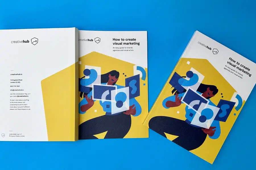
At Ex Why Zed, magazine printing isn’t just a service — it’s a partnership. We guide you through every step, from choosing the right materials to delivering a stunning final product that reflects your vision.
Whether you're producing a niche publication, an art magazine, or a corporate issue, our expert team ensures exceptional quality, sharp color accuracy, and reliable turnaround times.
Ready to bring your magazine to life? Contact us today and let us help you create something truly worth flipping through.
Printing a magazine isn’t just a technical task—it’s a creative journey that blends strategy, design, and thoughtful decision-making. From selecting the proper printing method to choosing the perfect paper and defining the ideal size and page count, each choice shapes the final product’s quality, cost, and impact, especially when considering print magazines as part of the overall strategy, including the use of software like Adobe InDesign for layout design.
By understanding these core elements, you’re not just streamlining your process—you’re setting the stage for a publication that’s visually stunning, cost-effective, and tailored to your audience’s experience. Factor in timelines and prepare for common challenges, and you’re already a step ahead.
The more thoughtfully you plan, the more confidently you’ll produce a magazine that doesn't just inform, but impresses, connects, and leaves a lasting impression.
Digital printing is the most cost-effective for shorter print runs due to its faster setup times and lower initial costs. However, offset printing is often more economical for significant quantities despite the initial setup cost.
Smartly choosing your paper type, judiciously planning the number of pages, and opting for a cost-effective binding method can help reduce costs. Combine this with an appropriate printing method based on your volume to save costs without sacrificing quality.
Choosing less expensive paper types or reducing paper weight can help minimize costs. However, remember that this might affect your magazine's overall feel and durability.
You can print a PDF magazine on your Mac by simply sending the PDF file to your printer via email. Ensure your file complies with the printer's specifications, including correct dimensions, bleed settings, a back cover design, and color encoding, to avoid unprinted edges. It is best to confirm these details with your printer before initiating the print.
You've poured your heart and soul into your manuscript. Late nights, early mornings, countless revisions—and now, finally, your story is ready to meet the world. But wait. How do you transform that digital document into a physical book that readers will treasure? One that stands proudly on bookstore shelves, catches the eye, and feels professional to the touch?
Welcome to the art and science of book design—where your words become a visual experience.
Whether you're a first-time novelist with a literary gem, a poet crafting a collection of verses, or a photographer assembling a stunning visual narrative, the design of your book speaks volumes before a single word is read. In this comprehensive guide, we'll walk you through the essential resources that will elevate your self-publishing journey from amateur to impressive. From captivating covers to perfectly balanced typography, from spine design to illustration collaboration—we've curated expert advice that puts professional-quality design within your reach.
Let's turn your literary dream into a beautifully designed reality that readers won't be able to resist.
If you’re at the beginning of your self-publishing journey, our comprehensive How to Self-Publish a Book UK Guide is your roadmap. It breaks down each step—from editing and formatting to ISBNs and marketing—into manageable chunks.
To ensure you don’t miss any critical details, our Self-Publishing Checklist serves as your companion document, offering a systematic approach from manuscript to printed book.
When it comes to book layout and covers, having the right tools makes all the difference. Our Essential Graphic Design Software Tools for Success guide helps you choose programs that suit your skill level—whether you're DIYing or working with a pro.
Start with the 6 Steps to Mastering Book Cover Design to understand how concept, composition, and genre expectations work together.
Learn what makes a design pop with Eye-Catching Book Cover Design for Self-Publishing Success, and draw inspiration from our Best Book Covers: Top 20 Designs That Will Amaze.
If you’re handling the design yourself, How to Make a Book Cover for Self-Publishing offers file setup instructions that ensure your cover prints perfectly.
Our guide to Designing a Perfect Bound Book Cover walks you through accurate spine width, bleeds, and layout essentials.
Your back cover is vital real estate. Learn how to write a compelling blurb, position your barcode, and style the layout with Crafting the Perfect Book Back Cover.
Typography plays a huge role in how your book is perceived. The Ultimate Guide to the Best Fonts for Self-Published Books helps you select readable, polished fonts that match your genre and tone.
For extra creativity, our Creative Book Cover Ideas explores how imaginative font pairings and title styling can grab attention instantly.
Looking to commission illustrations? Our guide on How to Find an Illustrator for a Self-Published Book covers how to brief an artist, where to find talent, and tips for creative alignment.
For more tailored support, use our Design Brief for Children’s Book Illustration to bring young readers' stories to life, or refer to our Design Brief for Photography Book Artwork for stunning, high-impact visual books.
If you’re publishing a picture book or illustrated story, your cover must appeal to both kids and parents. Discover how to create joyful, colourful covers with Engaging Children’s Book Covers: A Visual Delight, packed with genre-specific design advice.
Designing your self-published book isn’t just about making it look good—it’s about building a meaningful reading experience. Each design decision contributes to how your story is received, remembered, and loved.
With the expert guides linked above, you’re equipped to make confident, informed choices. Good design expresses your unique voice and brings your story to life on the printed page.
Your words deserve to be wrapped in design that amplifies their power. Your story deserves a format that invites readers in. And you deserve to hold a finished book that reflects the care, creativity, and effort you’ve poured into it.
We will just need a high res PDF file to go ahead. SO do use the program you are most comfortable with laying out the artwork in. Ensure that you are happy with how everything looks on the page, then Export or Save As PDF. Easy!
We'll give the files a thorough check and preflight when they arrive and at that stage we will flag up anything that doesn't look right so you can change it before printing.
Ready to place an order? Click Here and Let’s Go!
Writing a book is a major accomplishment; proper formatting ensures a professional, readable final product. Formatting covers font choice, spacing, alignment, title pages, page numbers, and chapter headings. It enhances both aesthetics and readability.
Even a great story can suffer from poor formatting, making it essential for self-published authors to get it right, especially when considering elements like book cover design. This guide breaks down the basics and offers tips to help you confidently format your best book.
Proper formatting is an integral part of creating a readable and attractive book. It ensures smooth flow and cohesion throughout the book, making it easier for readers to follow the storyline or grasp the arguments.
Formatting enhances the reader's experience by ensuring intuitive navigation. A well-formatted book signals professionalism and commitment to quality, thus attracting more readers, reviewers, and publishers. Moreover, it meets the technical requirements of different publishing platforms and makes your book inclusive for readers of all abilities. Lastly, it allows for unique author identity across all your books.
Formatting is just as important as the story itself when publishing a book. A well-formatted book enhances readability, ensures a professional appearance, and keeps readers engaged from start to finish.
Whether you're self-publishing or preparing a manuscript for traditional publishing, understanding the key components or parts of your book formatting—like margins, font choices, spacing, and chapter structure—can make all the difference.
Let’s break down the essential elements that give a book its polished, reader-friendly look.
Trim size refers to the final dimensions of your book after it has been printed and trimmed to size. , ensuring that content extends to the edge of the page. Page size and margins are the blank spaces that frame your page, crucial for preventing important text or images from being cut off during printing. Trim size and margins influence each other and must be chosen sensitively, considering your target audience, genre, and print specifications.
The trim size you choose influences the margins you set. To give you a sense of typical margin settings for different page counts, refer to the text table below:
Page Count | Inside (gutter, inside margin) Margins | Outside Margins |
|---|---|---|
24-150 pages | 0.375 in (9.6 mm) | 0.25 in (6.4 mm) or more if bleed is needed |
151-300 pages | 0.5 in (12.7 mm) | 0.25 in (6.4 mm) or more if bleed is needed |
The gutter margin is used to accommodate the space taken up by the binding process.
Fonts do more than just look good—they shape readability and style! For body text, serif fonts like Times New Roman or Adobe Garamond Pro keep things classic and easy on the eyes. Chapter headings? Keep them distinct and consistent for smooth navigation.
Thinking of a fancy font? Make sure it fits your book’s tone and genre—whimsical for kids, sleek and professional for serious topics. And don’t forget size matters—too small, and it’s a strain; too big, and you lose space.
Want a deeper dive into typography for self-publishing? Check out our expert guide!
Our comprehensive guide delves into the nuances of typography, offering insights into how font choices can enhance the visual allure of your book and facilitate a seamless reading experience. We explore the impact of font size, spacing, and style on reader perception, emphasizing the importance of aligning your typography with your book's genre and target audience.
The guide also provides curated recommendations for top fonts suitable for various genres, such as Garamond, Caslon, and Janson for classic elegance, and Arial and Calibri for modern readability. Additionally, we address crucial considerations like font licensing and effective font pairing strategies to ensure a cohesive and professional book design. By following the insights shared in this guide, you'll be equipped to make informed typography decisions that enhance your self-published book's appeal and readability.
The way text sits on a page affects readability and flow. Most books, including your own books, use justified alignment, which keeps both left and right edges neat and polished.
Spacing matters just as much! A 1.5 or double line spacing ensures readability, while consistent paragraph spacing keeps everything organized. Typically, the first line of each paragraph is indented, except for the first paragraph of a new chapter or section.
A well-formatted book isn’t just easier to read—it looks professional too!
Clear formatting helps readers navigate and absorb your book effortlessly. Chapters serve as main divisions, while sections break them into digestible parts, keeping the flow smooth.
Need to shift time, place, or perspective within a chapter? Scene breaks are your go-to tool! These subtle pauses prevent confusion and maintain engagement.
Well-structured formatting makes your book easier to read—and harder to put down!Here are some points to guide you when formatting these elements:
Provide clear and consistent chapter headings or titles. This could be numeric ("Chapter 1"), alphanumeric ("Chapter One"), or thematic ("The Lost City").
Consider using distinct symbols, blank space, or lines to denote scene breaks. This visually cues the reader about a change in narrative flow.
Ensure that new chapters always start on a new page.
So, how to format a book to print? Different books require different formatting. While core principles apply to all, genres like novels, non-fiction, and anthologies have unique structures. Specialized books—academic, cookbooks, and children's books—demand even more tailored formatting.
In case of novels, nonfiction books, and fiction, formatting should maximize the flow and immersive reading experience. Body text is typically set in a simple, easy-to-read font size of around 9 to 12 points, depending on the chosen font. It is crucial to consider how many lines of text can fit comfortably on a page. Serif fonts are often preferred due to their legibility and classical aesthetic.
The standard practice is to start a new chapter, especially the first chapter, on a new page, usually odd-numbered or right-side pages for print books. Many fiction books also include scene breaks within chapters, denoted by blank space or symbols.
Proper dialogue formatting keeps conversations clear—start a new paragraph for each speaker to avoid confusion. Consistency in tense and viewpoint strengthens the reader’s connection to your story.
Nonfiction works serve to inform and often present complex information in an easy-to-follow format. Clear headings and subheadings are crucial in breaking up the text into digestible sections. Compared to fiction, nonfiction typically uses more line spacing and larger fonts, easing the reading of dense, informative content.
It is common to include design elements such as tables, diagrams, bulleted lists and text boxes. These should be consistently formatted for ease of reference. Chapters may be further divided into sections, each marked out by subheadings.
A detailed table of contents, index, and bibliography are also essential components. They assist in navigation and provide due credit and further reading resources.
Anthologies are collections of shorter works, like poems, short stories, or essays, by one or multiple authors. Each individual piece usually starts on a new page. The table of contents plays a significant role, providing an easy reference to the diverse inclusions.
Each piece may have its title and author name, often centered on the page. Consider adding distinct dividers, illustrations, or motifs to differentiate each work.
In a multi-author anthology, providing a brief author bio at the start or end of each contribution is standard practice. If the anthology holds an overarching theme, the collection may have an introduction that sets the tone and intention of the assembled works.
At ExWhyZed, we bring stories to life with elite novel printing services in the UK. Let’s make your novel stand out! Check out our different printing-related products here.
The front matter introduces your book with elements like the title page, copyright, acknowledgments, and point of view. The back matter wraps it up with appendices, endnotes, a bibliography, and an author bio. Clear, standard formatting ensures a professional, organized presentation.
The front matter sets the stage for your book. Here are some elements you might consider including:
The title page is generally the first page of your book, presenting the book's title, subtitle (if any), and author’s name.
The copyright page generally follows the title page, carrying the copyright notice, edition information, publication information, and the ISBN.
The dedication page is an optional inclusion, allowing the author to dedicate the book to a person or cause.
The table of contents provides an outline of the sections or chapters in your book.
The visual presentation and order of these components significantly influence initial impressions of the book for potential readers, librarians, and reviewers.
The back matter concludes your book, with supporting or supplementary material that may be too detailed or tangential to include in the work. Here are some common elements of back matter:
An appendix or appendices offers additional information germane to the text, such as tables, research data, or explanations of jargon.
Notes or endnotes can clarify specific passages or concepts covered in the main content.
The index is particularly central in academic or technical books, where it can help readers find specific topics or keywords within the body of text.
Non-fiction books typically have more elaborate back matter than fiction, owing to their educative purpose.
Authors use various software to streamline book formatting. Microsoft Word offers accessibility, InDesign provides advanced design tools, and Scrivener caters to writers. Choose based on your needs, skills, and budget.
Microsoft Word is a highly accessible and versatile word processor and an excellent tool for basic book formatting for new writers. Its familiarity to many potential authors can make the formatting process significantly less daunting.
Word offers many essential features, including styling and formatting text and paragraphs, inserting images and tables, and setting up page layouts. While it’s a generic office tool and not specifically designed for book formatting, Word is capable of admirably completing the job for most self-published authors.
However, Word doesn't support more sophisticated book designs or formats without substantial manual work or add-ins. Its auto-formatting sometimes contributes to incorrect formatting styles, calling for careful manual checks.
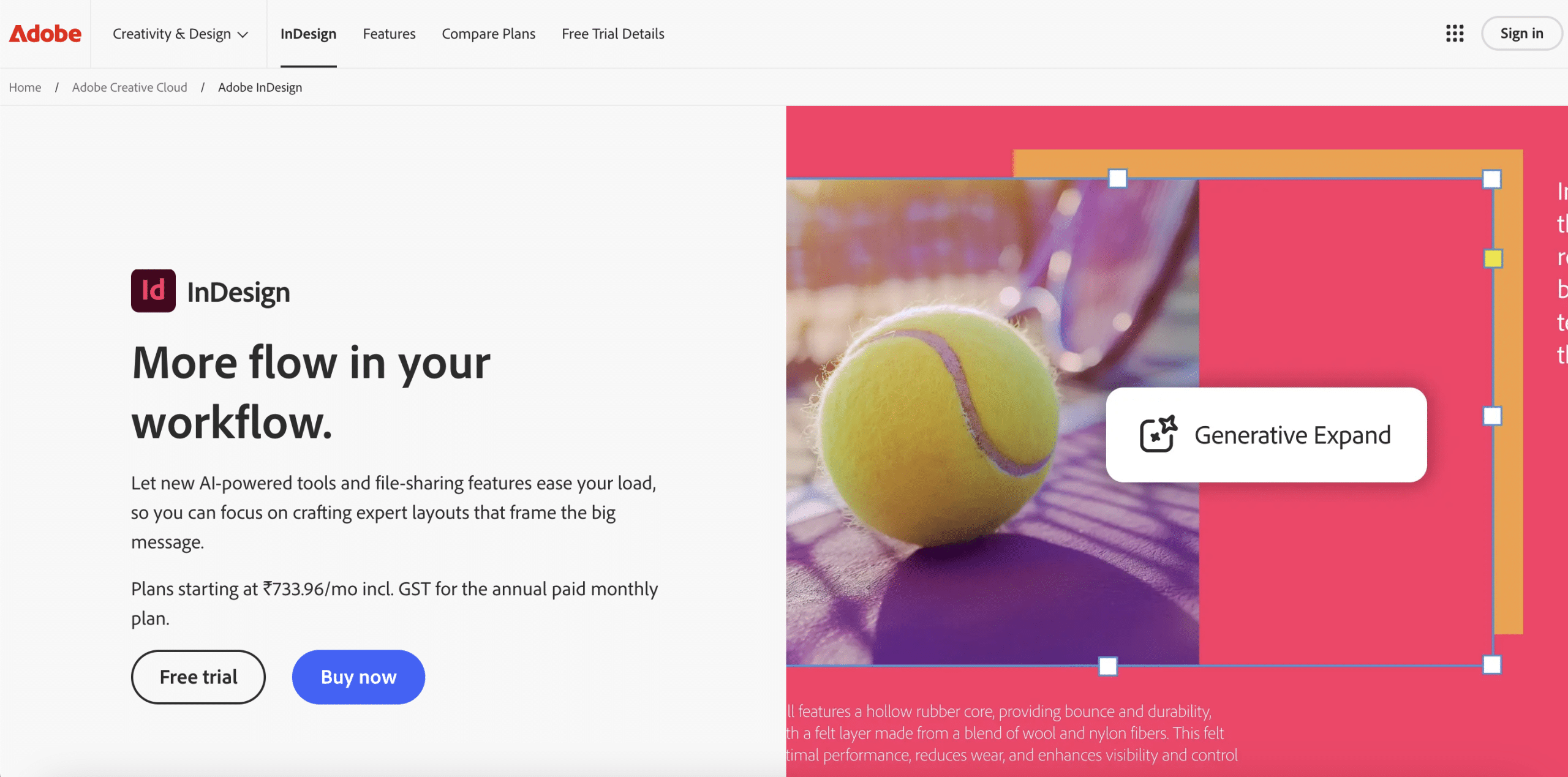
Adobe InDesign is a professional-level graphic design and layout software and considered a standard in the publishing industry. It delivers exceptional control over every aspect of the layout and formatting, catering proficiently to books, magazines, posters, and interactive PDFs.
InDesign supports rich typography, versatile page layouts, and various multicolumn, sidebars, and pull-quote designs. It allows easy management of master pages, nested styles, and object styles, which can greatly accelerate the formatting process of long and complex books.
While InDesign has an extensive set of features, it has a steep learning curve as compared to Word or Scrivener. It may be an overkill for simple text-based novels but is a potent tool for authors seeking highly customized formatting or dealing with heavy graphical content.
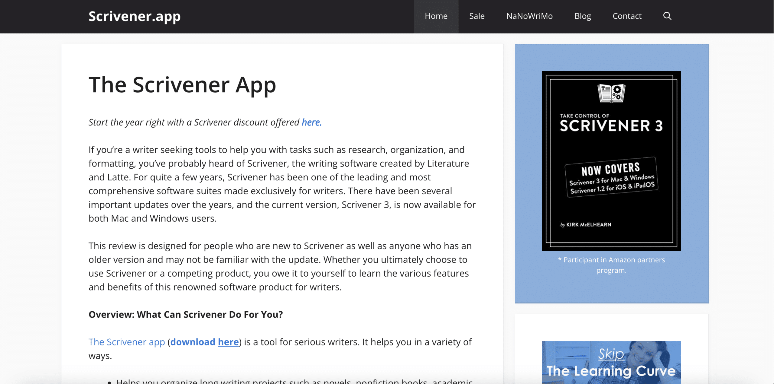
Scrivener is a comprehensive writing tool designed specifically for authors. Apart from offering powerful formatting capabilities, Scrivener provides an improved writing experience with its innovative writing workspace. This includes a corkboard view to visualize and restructure your work, a research area to keep reference materials at hand, and advanced composition tools to focus on writing.
Scrivener's Compile feature lets you export your work into multiple formats, including Microsoft Word, PDF, EPUB, and MOBI. The tool’s powerful style system and custom templates allow great flexibility and control during formatting.
However, like InDesign, Scrivener also has a learning curve. New users might find the extensive features somewhat overwhelming. Despite this, many authors swear by Scrivener for managing complex writing projects and producing professionally formatted books.
Digital publishing has made e-books a popular alternative to print. While both follow core formatting principles, print books require trim size and margins, while e-books need reflowable text and linkable navigation. Adapting to each ensures a polished, readable book.
While at their core, e-books and print books deliver the same content, the way readers interact with them differs significantly. This necessitates different approaches to formatting for each medium:
Aspect | E-book | Print Book |
|---|---|---|
Pagination | Flexible, depends on device settings | Fixed, consistent across all copies |
Images & Graphics | Must be compatible with various screens, less emphasis on high-resolution | High-resolution is essential for clear printing, precise positioning and alignment is important |
Text | Reflowable, adjusts to various screen sizes | Fixed, does not adjust to book dimensions |
Navigation | Interactive Table of Contents, hyperlinks utilized | Non-interactive, physical navigation |
Fonts | Limited ability to embed fonts, depends on reader’s device | Full control over font selection |
Understanding these nuances will ensure that your work looks and functions well in the chosen format.
When transitioning from print to e-book or vice versa, it's crucial to adapt your book to meet the unique formatting requirements of each file format. Reflowable e-book formats such as EPUB and MOBI enable the text to adjust to varying screen sizes, making it reader-friendly. When converting to an e-book, one also needs to replace the static table of contents with a dynamic, linkable one.
Conversely, converting from an e-book to print requires adding elements like page numbers, headers and footers and adhering to strict alignment and positioning for graphics and illustrations. Attention must be paid to trim size and margins, and ensuring high-resolution images for optimal printing while considering printing costs.
While several tools help automate conversion between formats, manual checks and adjustments are usually necessary to maintain high quality.
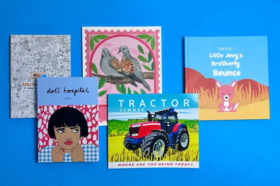
At ExWhyZed, we specialize in premium book printing services for authors, publishers, and businesses across the UK. Whether you're producing novels, art books, photography collections, or corporate publications, we deliver exceptional quality with sharp printing, durable binding, and a professional finish.
Our bespoke printing solutions cater to both small and large print runs, offering a range of paper stocks, finishes, and binding options to bring your vision to life. With fast turnaround times, eco-friendly printing options, and dedicated customer support, ExWhyZed ensures a seamless printing experience from start to finish.
Partner with ExWhyZed to make your book stand out. Get in touch today for a quote!
Transforming your manuscript into a finished book can feel overwhelming, but understanding the basics of formatting, including the chapter title, makes it easier. Focus on trim size, margins, fonts, alignment, spacing, and chapter structure. Adapt your approach based on the book type—novel, non-fiction, or anthology. Well-formatted front and back matter enhance readability and provide key information.
Use the right tools and software to streamline the process and ensure a polished result. Differentiate between e-book and print formatting to meet their unique requirements, including the necessary ebook format specifications. Book formatting blends aesthetics with technical precision—mastering both ensures a professional, reader-friendly book.
Common book formatting mistakes include using too many different fonts or font sizes, inconsistent line spacing and indentation, not using scene breaks, having text that is too close to the edges of the page (outside the margins), and not starting new chapters on a new page, which can go a long way in greatly affecting readability.
The time it takes to format a book largely depends on its length and complexity, and your familiarity with the process and the software used. Formatting a simple novel using a tool like Microsoft Word might take a beginner a lot of time and a few days.
Yes, e-books require different formatting than print books. Unlike print books, e-books are reflowable and allow for resizable text, so page numbers, headers and footers, and multi-column layouts don't apply. They also need a clickable table of contents that helps navigate to different sections.
Most self-publishing platforms offer a preview tool to examine your e-book before publishing. This allows you to review the formatting on various virtual devices, including alignment, spacing, and navigation. Ensure that your e-book is compatible with standard e-readers to guarantee a seamless reader experience.
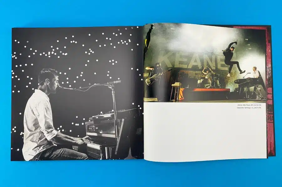
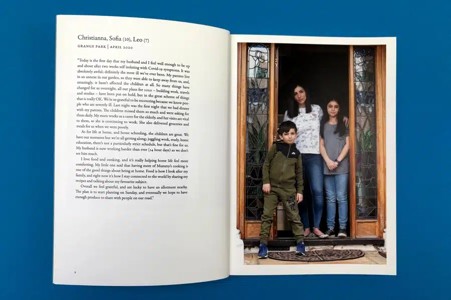
Are you struggling to add meaning to your premium photo books? Text can enhance special moments, creating lasting memories and capturing your most memorable moments. Whether it's a birthday, a trip, or daily life, each photo has a story. Personalise your photo book with heartfelt captions, and honour these moments when you decide on the book size. Follow our guide to create text-filled photo books that showcase memories and tales, adding a personal touch to your keepsakes.
Creating a custom photo book with text lets you capture the magic of special moments beyond the visual aspect. It breathes life into your photographs, depicting emotions, contexts, and nuances that a picture alone may not fully express. Whether it’s a quirky overlay on an Instagram-worthy shot, a nostalgic note reminiscing about a shared memory, or a simple date indicating a special day, text enriches your photos by adding an extra layer of storytelling.
Creating a hardcover photo book with text and a stunning gloss photo book cover made with the highest quality can be daunting at first, but we've got you covered! Follow our step-by-step guide to choose templates, paper, and fonts, customise layouts and colours, and use pre-designed options. Unlock the secrets to crafting a vibrant photo book with text.
The first crucial step in creating your personalised photo book is choosing the right template, including options like softcover and various photo book styles. Many online photo bookmakers offer templates for different occasions and sizes, such as lay-flat designs.
Consider content type (text-heavy or photo-focused), event theme (wedding, travel, birthday), preferred style, and photo quantity. Your template sets the tone, so choose wisely.
Choosing the right font size, style, colour, and paper type is essential for readability and aesthetics in your photo book. For text-heavy content, opt for softcover books with matte finishes, such as our matte paper options, to minimise glare and ensure easy reading. Glossy finishes work well for vibrant images, enhancing colour depth.
Consider font legibility based on paper type. Serif fonts like Times New Roman offer a classic feel, while sans-serif fonts like Arial or Verdana provide a modern touch. Avoid overly decorative or cursive fonts that may be difficult to read. Maintain strong colour contrast between text and background to ensure clarity without causing eye strain.
When customising your photo book with text, focus on positioning, formatting, colours, and sizes for a polished look. Strategically place text with captions, overlays, bottom notes, or entire pages, effectively balancing photos and text layers.
Use bold, underline, or italics formatting options to highlight key elements. Choose text colours and sizes that match your book's theme, avoiding fonts too small to read or too large that might overpower images. These tips will help you create a unique, visually appealing photo book with text.
Now that your layout is set, crafting your story should be taken care of. Adding captions or stories provides context to your images, preserving emotions and details for years. Keep your text concise. Let the photos take centre stage while your words complement them.
Evoke feelings with sentimental notes, funny anecdotes, or unique insights. Include details like dates, names, and locations while maintaining a consistent tone.
Ready to create your perfect photo book? Use Ex Why Zed's Printed Project Builder to easily customise layouts, select paper, and get a quote for your project. Our platform ensures high-quality printing with beautiful templates for any occasion. Start designing today and request a quote to bring your memories to life!
Personalising your photo book involves more than selecting images and text. It's about showcasing your unique style, creating a cohesive theme, and paying attention to details like fonts, colours, audience, embellishments, and purpose. Balancing text with photos is key to crafting a captivating narrative in your photo book.
When creating a photo book with text, match fonts and colours to your theme for visual coherence. Consider the event—for children's birthdays, choose vibrant colours and fun fonts; for weddings, opt for elegant fonts and light colours. Colours evoke emotions—blues for calmness, reds for passion. Consistency is key—use a consistent colour palette and limited fonts for a cohesive look that enhances visual appeal while maintaining readability.
Tailor the tone to suit the intended readers, whether it's a family album, travel photobook, or wedding album. Align captions with the book's purpose, be it storytelling a journey or capturing special moments. Engage your readers emotionally to enhance their connection with your book.
Balancing text and photos in your photo book is crucial for visual appeal. Avoid overcrowding pages with too many elements. Place text strategically to complement the photos, creating a seamless connection. Maintain a balance between picture-heavy and text-heavy pages for variety and reader interest. Keep the layout clean to enhance the viewing experience.
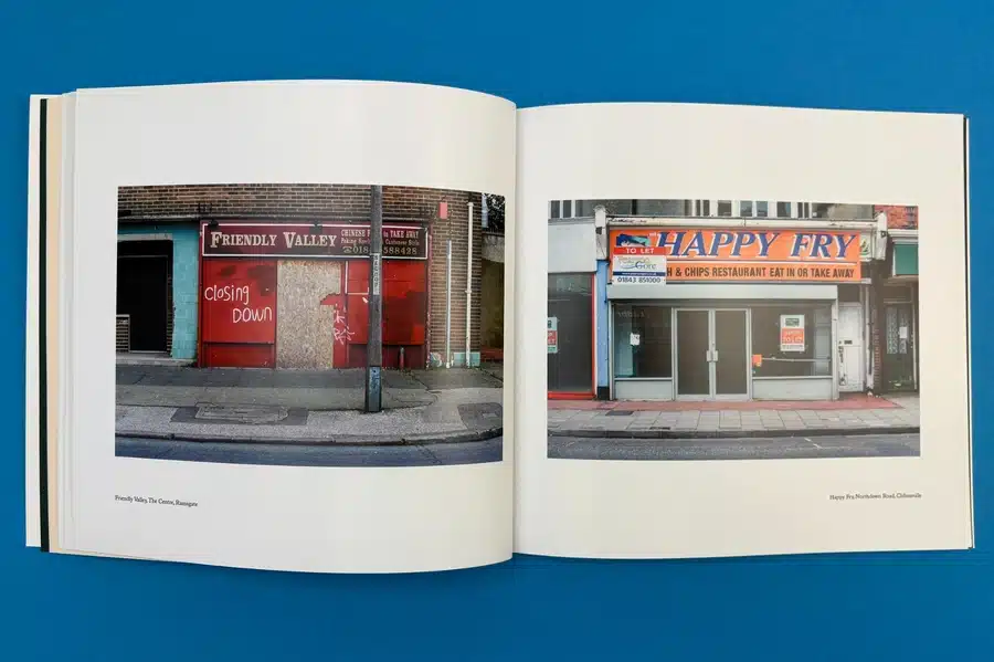
Creating a quality photo book, especially the best one with text, opens up endless possibilities for including beautiful photos printed on glossy photo paper. These can be travel books rich in stories, life event books capturing emotions, or family recipe books preserving heritage. See how combining beautiful photos with pictures and text enhances the narrative for a more engaging experience.
A travel photo book goes beyond stunning landscapes, sharing your experiences and stories. Combining photos with engaging text transforms it into a memory keepsake with travel logs, surprising encounters, facts, or amusing anecdotes. Supportive narratives bring your photos to life, creating exciting stories for your readers.
Life event photo books capture sentimental moments like birthdays, weddings, and baby showers, preserving precious memories and special times. Combining photos with text adds depth to the celebration. For example, in a wedding photo book album, include the bride's emotions as she walks down the aisle. Narratives alongside photos of your baby's first birthday convey the excitement and joy of the occasion. These personal touches preserve events and the associated emotions and stories close to our hearts.
A family recipe or heritage photo book blends photos with text, like a curated collection of grandma's secret recipes alongside images of the dishes. Each page combines a photo of the dish with ingredients, cooking steps, and family stories. It's about sharing love through food, preserving traditions, and passing them down. This book becomes a unique heirloom and culinary guide that connects you to your roots.
Looking to create a stunning photo book with text? Ex Why Zed makes it simple and enjoyable. Our intuitive platform offers a variety of pre-designed templates that perfectly balance photos and text. Whether capturing memories, telling a story or showcasing a portfolio, Ex Why Zed’s easy-to-use tools ensure a professional, personalised result. Start crafting your photo book masterpiece today! For inquiries or support, contact us now and bring your vision to life with Ex Why Zed!
Creating a personalised photo book with your text adds depth to your story through memorable pictures and narrative, as well as on every page of your photo book. Following simple steps and crafting text carefully can transform your photo book into a vibrant, emotional journey. Choosing the right template, fonts, and colours makes creating a personalised photo book more effortless than ever, helping you relive memories and express creativity in an elegant keepsake.
Though there's no fixed rule, moderation is essential. Your text shouldn't overshadow your images. Instead, it should amplify the story your photos are telling. While some pages might demand lengthy narratives, others could do with a few lines or a single word; it's all about balance.
Choosing font size and style primarily depends on your photo book’s overall theme, layout, and intended readability. Keep the font readable, complementary to your images, and consistent throughout the book. Also, balance decorative fonts for headings and simple ones for body text.
Yes, most photo book creation platforms allow you to add or modify text on an existing design via a mobile app. The software often provides an 'Add text' button or similar option, which you can use to insert new text boxes into your layout.

