A design portfolio is your most powerful tool for showcasing your skills, visual identity, and creative thinking.
Curating your strongest work helps you make a sharper, more memorable impression.
Detailed case studies and clear project descriptions reveal your process and problem-solving approach.
A user-friendly, visually consistent layout ensures your portfolio feels professional and easy to navigate.
Different design fields require tailored portfolio styles, from UX case studies to interior or fashion storytelling.
Creating an online design portfolio helps you reach more clients through a polished, accessible digital format.
Keeping your portfolio updated regularly shows growth, commitment, and evolving design expertise.
A printed, professionally bound portfolio from Ex Why Zed can elevate your presentation and leave a lasting impression.
Every designer wants their work to be noticed, but standing out in a crowded creative industry can feel incredibly challenging. Even with strong ideas and polished skills, your work can fall flat if it isn't presented with clarity and intention. That disconnect often leads to frustration; you know you're capable, yet your current presentation doesn't fully reflect your talent.
The struggle usually begins with figuring out what to include, how to organise your projects, and how to express your process without overwhelming the viewer. Many designers also feel unsure about how to shape a narrative that feels cohesive, professional, and true to their design style, especially when starting from scratch or updating an outdated portfolio.
This blog will walk you through how to create a design portfolio that genuinely represents your abilities, strengthens your personal brand, and helps you stand out with confidence, both online and in print.
What Makes a Design Portfolio Essential for Your Creative Career Today?
A well-crafted portfolio shapes how the world sees you as a designer. Before we explore the deeper sections, here are the key ways your portfolio plays a crucial role in elevating your creative career, whether it's presented digitally or as a beautifully finished printed book with perfect binding for a polished, professional feel:
Establishes Your Creative Identity: Your portfolio expresses your style, thinking, and visual voice, giving people a clear sense of who you are as a designer.
Helps Aspiring Designers Break Into the Industry: Self-initiated projects and redesigns show your ability to create purposeful work even without client briefs.
Becomes the Centrepiece of Your Professional Brand: A strong portfolio shows your evolution, making it easier for clients to trust your expertise and creative direction.
Demonstrates How You Solve Real Problems: Case studies reveal your process, from research to refinement, proving you can think strategically, not just aesthetically.
Shows Your Versatility and Strengths Clearly: Curated projects highlight the range of styles or disciplines you work in, helping clients decide if you're the right fit.
Acts as Your Visual CV: Instead of listing responsibilities, your portfolio shows real outcomes, giving employers a richer understanding of your abilities.
Which Elements Are Crucial for a Professional Design Portfolio?
A portfolio only makes an impact when its structure supports the work inside it. To help you build one that feels clear, confident, and well-thought-out, here are the key elements every designer should include:
A Curated Selection of Your Best Projects: Choose quality over quantity by highlighting the most relevant work that represents your strongest creative skills. Whether you're experienced or just starting, focus on pieces that align with the roles or clients you want to attract.
Clear and Insightful Project Descriptions: Go beyond visual elements by explaining the brief, your crucial role, the challenges involved, and the outcomes. These short narratives help viewers understand your thinking and the value you brought to the project.
A Transparent Look at Your Design Process: Include moodboards, early sketches, wireframes, drafts, prototypes, and explorations. Showing how your ideas evolved builds trust and demonstrates that you can think critically, not just design beautifully.
Consistent Layout and Visual Styling: Cohesive colours, typography, spacing, and layout rhythm make your portfolio feel polished. Clean navigation and thoughtful structure ensure your work is easy to browse and leaves a strong impression.
Accessible Contact and About Information: Make it simple for viewers to get in touch or learn more about your background. A clear bio, links to your digital portfolio website menu or socials, and a visible email help build trust and open opportunities.
Smooth, User-Friendly Navigation: Whether digital or printed, a portfolio should feel effortless to move through. Simple menus, logical structure, and clean page transitions keep attention on your work, not the interface.
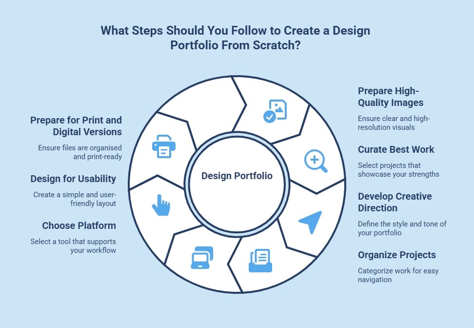
What Steps Should You Follow to Create a Design Portfolio From Scratch?
Before you begin designing your portfolio, lay the foundations so your work is easy to present both online and in print. Here are the essentials you need to start strong:
Prepare High-Quality Images and Files: Clear photos and high-resolution exports ensure your projects look polished on screen and transition easily into a print-ready format later.
Curate Work That Reflects Your Best Thinking: Gather academic, freelance, and personal projects, then keep only the pieces that truly represent your unique style, process, and creative strengths.
Develop a Clear Creative Direction: Explore other designers' portfolios to define the tone and layout style you want to achieve, whether minimalist, editorial, or expressive.
Organise Projects Into Clean Categories: Sorting your work into groups like branding, UX, interiors, or fashion helps viewers navigate smoothly and see your strengths at a glance.
Choose a Platform That Supports Your Workflow: Website builders, portfolio platforms, or AI tools make it easy to create clean layouts you can update regularly as your work evolves.
Design With Simplicity and Usability in Mind: Use consistent spacing, hierarchy, and short descriptions so your projects are easy to follow and leave a strong first impression.
Prepare for Both Digital and Printed Versions: Keeping files organised and print-ready from the start makes it effortless to create a beautifully bound physical portfolio in standard paper sizes later on.
How Do You Decide What Type of Design Portfolio You Need?
The type of design portfolio you need depends heavily on your specialisation and career goals. A graphic designer might focus on branding projects and illustrations, while an interior designer will showcase finished spaces and design concepts. A UX designer targeting a product manager role, on the other hand, should emphasise case studies that detail user research and problem-solving. When creating a design portfolio, your digital showcase should be tailored to highlight the skills most relevant to your field.
Customising your portfolio for a specific job or client is a powerful strategy. Before applying for a role, research the company and identify the type of work they do. Then, adjust your portfolio to showcase the range of projects that are most relevant to their needs and style. This shows you've done your homework and are genuinely interested in the opportunity. By curating your content this way, you can demonstrate how your unique skills are a perfect fit for that specific role.
How To Create a Graphic Design Portfolio?
A professional graphic design portfolio should present your visual thinking with clarity and intention. Here are the important elements that help your work feel polished and professional:
Select Projects That Reflect Strong Visual Strategy: Choose pieces that show purposeful decisions and a clear design rationale. This helps clients see that every choice you make serves a strategic purpose.
Create Clear Before-and-After Comparisons: Showing the original versus your redesign demonstrates your ability to solve problems visually. It also highlights how your work improves clarity and impact.
Use Consistent Presentation Frames for Your Work: Keeping margins, backgrounds, and mock-up styles uniform creates harmony across your portfolio. This consistency helps your projects feel part of a cohesive identity.
Highlight Multi-Platform Applications of Your Designs: Show how a single concept adapts to print, social, and digital formats. This proves your versatility and understanding of brand systems.
Add Short Insights on Challenges You Solved: Mention colour limitations, layout issues, or messaging constraints you worked through. These details show how you turn creative obstacles into thoughtful solutions.
How To Create an Interior Design Portfolio?
An interior design portfolio should communicate atmosphere, detail, and spatial intelligence. These points offer a great way to help you bring your spaces to life when creating an interior design portfolio:
Present Spaces From Multiple Angles for Depth: Wide shots paired with close-ups help viewers understand both the overall layout and the details that complete the space. This reveals the fullness of your creative approach.
Include Lighting Variations to Show Mood and Ambience: Displaying daytime, evening, and artificial lighting highlights your sensitivity to how environments shift. This demonstrates your understanding of mood and spatial experience.
Show Sample Boards to Reveal Material Awareness: Including textures, surfaces, and colour schemes helps convey how you build atmosphere through material choices. It also shows clients your attention to physical detail.
Explain Zoning and Layout Decisions Clearly: Discuss how you improved flow, defined functions, or maximised space usage. This communicates your ability to balance beauty with practical needs.
Use Annotated Diagrams for Quick Visual Clarity: Adding subtle labels to images makes your expertise instantly understandable. These annotations guide viewers through your reasoning without overwhelming them.
How To Create a Web Design Portfolio?
A web design portfolio should reflect usability, structure, and modern visual design. These elements communicate your digital expertise effectively:
Show Full User Creative Journeys Instead of Static Screens: Displaying step-by-step pathways helps viewers understand how your designs support users through tasks. It highlights your ability to create intuitive navigation flows.
Document Accessibility Considerations You Applied: Mentioning colour contrast decisions, font sizing, or ARIA labels shows that you design with inclusivity in mind. This instantly elevates your credibility in a digital-first world.
Create Visual Breakdowns of Your Layout Grid: Sharing the underlying grid or spacing system proves your mastery of structure. It also gives clients insight into how you maintain alignment and consistency.
Use Animated GIFs to Display Interactions: Showing hover states, button transitions, and micro-interactions reveals your attention to detail. These small moments help define the overall user experience.
Present Redesigns With Clear Justifications: If showcasing conceptual work, explain what wasn't working and how your changes improved clarity or usability. This shows strategic thinking beyond aesthetics.
How To Create a Fashion Design Portfolio?
A fashion design portfolio should express style, craftsmanship, and storytelling. The following points help you communicate your creative identity with depth while creating a fashion design portfolioeffectively.
Combine Digital Illustrations With Hand-Drawn Sketches: Showing both mediums proves you can ideate through multiple techniques. This blend also gives viewers insight into how your concepts evolve.
Show Development of Silhouettes Across Collections: Presenting early shape studies after final garments reveals your ability to refine ideas. It highlights progression and consistency in your design language.
Use Fabric Movement Shots to Show Fit and Flow: Dynamic images demonstrate how your garments behave in motion, which is essential in fashion storytelling. They also bring energy and life to your photo portfolio.
Create Colour and Trend Analysis Boards: Include research boards that show how you study palettes, seasons, and cultural influences. This demonstrates awareness of industry trends and design direction.
Add Notes About Construction Challenges You Solved: Mention specific stitching choices, pattern corrections, or material adjustments. These details show craftsmanship and technical understanding.
How To Create a UX Design Portfolio?
A UX portfolio should communicate process, iteration, and user-centred thinking. So, these points help you present your skills with clarity:
Share Problem Statements With Clear Success Metrics: Defining what you aimed to solve and how success was measured sets a strong context. It also shows that your solutions are tied to real outcomes.
Include User Interview Highlights and Relevant Quotes: Pull short insights from your research that shaped your designs. These snippets prove you base decisions on real user behaviour, not assumptions.
Show Multiple Iteration Rounds for Transparency: Present early sketches, mid-fidelity wireframes, and final prototypes side-by-side. This visual progression highlights your ability to evolve ideas thoughtfully.
Explain How You Compared and Evaluated Concepts: Share why some ideas were rejected and others refined. This demonstrates strategic decision-making and your ability to prioritise user needs.
End Each Case Study With Reflection and Learning: Briefly outline what you gained from the project or what you'd improve next time. This shows maturity and a growth mindset that employers value.
How Can You Leverage AI Tools for Portfolio Creation?
AI tools can streamline and elevate the way you build a standout design portfolio. They help you organise projects, refine layouts, and even generate clean visual mockups that enhance presentation quality. AI writing assistants can support you in crafting concise project descriptions, improving clarity without losing your creative voice. Image-enhancing tools can also correct lighting, remove distractions, or upscale visuals to ensure every project looks polished.
These tools don't replace your creativity, but they can save time and strengthen the overall impact of your portfolio. By using AI to handle repetitive tasks, you can focus more on storytelling, curation, and showcasing the thinking behind your work. When used intentionally, AI becomes a valuable partner in building a portfolio that truly stands out.
How To Create Your Online Design Portfolio?
Creating your online portfolio starts with choosing a platform that showcases your work effectively. A dedicated website gives you full control over your branding, layout, and the overall viewing experience. Tools like Wix make it easy to create design portfolio online using customisable templates, even if you don't code.
As you build your site, keep navigation simple, visuals consistent, and your contact details easy to find. While your own website offers the most creative freedom, portfolio platforms can also boost your visibility within design communities.
Platform Options to Create a Design Portfolio Online
Platform Type
Pros
Cons
Personal Website Builder (e.g., Wix)
Full customisation, professional domain, integrated tools.
May have subscription costs.
Portfolio Platforms (e.g., Behance)
Large creative community, easy to upload projects.
Limited customisation, high competition.
Social Media (e.g., Instagram)
Great for visual sharing and engagement.
Not a professional portfolio format, lacks case study features.
Although your online presence is essential, pairing it with a printed portfolio can strengthen your overall presentation. Many creative leads still appreciate the tactile experience of a well-crafted physical book, especially during interviews or detailed project reviews. Preparing your work in print-ready formats, with binding options such as wire-stitched, perfect-bound, or spiral binding, ensures you can confidently showcase your designs in both digital and physical settings.
What to Include and Avoid in a Design Portfolio?
To help you refine your selection with confidence, here's a clear look at what belongs in a strong portfolio and what's better left out.
Include
Why It Matters
Avoid
Why It Hurts Your Portfolio
A clear introduction that defines your design focus
Helps employers instantly understand your strengths, specialism, and creative direction.
Generic introductions without a defined niche
Leaves clients unsure about your expertise or the type of work you excel in.
Process work that shows how your ideas develop
Reveals your thinking, problem-solving, and the evolution of your concepts.
Only showcasing polished final outputs
Makes your portfolio feel surface-level and doesn't reflect your full capability.
Cohesive layouts suitable for both digital and print
Ensures your portfolio is easy to browse online and ready to convert into a printed format.
Disorganised spacing or inconsistent layouts
Creates a fragmented viewing experience and weakens professionalism.
Short explanations centred on decisions, not tools
Demonstrates your reasoning and design maturity beyond software knowledge.
Long paragraphs that focus on software lists
Makes your work appear technical rather than strategic or thoughtful.
A downloadable PDF or print-ready version
Gives clients and employers an easy way to review your work offline or during meetings.
Unoptimised files that are slow or awkward to open
Signals poor attention to detail and reduces your chances in formal reviews.
What Final Checks Should You Do Before Sharing Your Portfolio?
Before publishing your portfolio, take time for a careful final review. Treat it like proofreading a vital document. A clean, error-free portfolio reflects professionalism and strong attention to detail. Check every page to ensure visuals, links, and layouts work perfectly.
For an extra layer of polish, ask a friend, mentor, or colleague to review it. Fresh eyes can spot broken links, typos, or gaps you might overlook. This matters even more when you're about to start an application process where first impressions are everything.
Before sharing, make sure you check:
All links are working correctly.
There are no typos or grammatical errors in your case studies.
Your contact details are correct and easy to find.
Your website is responsive and looks great on mobile devices.
All images are high-quality and load quickly.
How Can You Keep Your Portfolio Updated as Your Skills Grow?
Your portfolio should be a living document that grows with you. As you complete new projects and gain more work experience, it's important to add them to your online portfolio. This not only keeps your content fresh but also demonstrates your continuous development and evolving design skills. Set a schedule for yourself, perhaps every 3-6 months, to review and refresh your work.
Don't just add new work; also consider removing older pieces that no longer represent your best abilities or current style. Each project is a learning experience, and your digital art portfolio should reflect that growth. Regularly updating your portfolio shows potential clients that you are an active and engaged designer who is constantly honing your craft and staying current with industry trends.
What Makes Ex Why Zed the Ideal Choice for Portfolio Printing?
Once your online portfolio is complete, translating it into a beautifully printed book can add a new dimension to how people experience your work. A physical portfolio feels intentional, immersive, and memorable, offering the kind of tactile engagement that the print industrycontinues to excel at. This shift from digital to print creates a stronger connection and sets the stage for a more polished presentation.
That's where Ex Why Zed shines. Our Printed Project Builder makes it effortless to turn a simple PDF into a professionally bound portfolio, complete with free file checks, designer-led support, and beautifully finished formats. From stapled booklets to perfect-bound showcases, we help you choose the right size, paper, and structure for your style.
With fast turnaround times, free sample packs, and meticulous attention to detail, we ensure your portfolio looks every bit as polished as the work inside. If you're ready to present your creativity with confidence, now is the perfect moment to start your print journey today at Ex Why Zedand bring your portfolio to life.
Conclusion
Creating a standout design portfolio comes down to presenting your work with clarity and intention. When your projects are well-curated and supported by strong storytelling, your portfolio becomes a true expression of your creative identity and the way you think.
As your skills grow, keep refining and updating your portfolio so it evolves with you. Treat it as a living document that highlights your best ideas and aligns you with the opportunities you want.
And when you're ready to take your presentation beyond the screen, a beautifully printed portfolio can add an extra layer of impact. High-quality prints make your work feel tangible, memorable, and unmistakably professional.
Frequently Asked Questions
How many projects should I include in my portfolio?
Include 8–12 of your strongest projects to showcase range and skill. Beginners can start with 3–6 solid case studies. Focus on quality over quantity and choose work that reflects your style and aligns with your target audience.
Can you give examples of standout design portfolios for inspiration?
Great examples include designers who combine strong visuals with clear process storytelling, such as those on Behance and Dribbble. Look for portfolios with balanced layouts, well-structured case studies, and consistent branding to inspire your own approach.
How can I tailor my portfolio for specific jobs or clients?
Research the company, understand their style, and select projects that match their needs. Reorder or adjust case studies to highlight relevant strengths. This customisation shows intention, preparation, and a clear connection between your work and their expectations.
How Should You Structure Each Case Study for Maximum Impact?
Use a simple story format: define the problem, explain your role, outline your process, and present the final outcome. Include visuals that show evolution, insights, and results. This structure clearly communicates your thinking and design value.
How can I create a design portfolio if I'm just starting out and have no client work?
Create personal projects, redesign existing brands, or participate in design challenges. These self-initiated pieces demonstrate creativity, skill development, and passion. They effectively showcase your process and thinking, even without formal client work.
How should I organise and lay out my graphic design portfolio for maximum impact?
Use a clean, consistent layout with clear sections and logical project categories. Prioritise user-friendly navigation, cohesive colours, and readable typography. This ensures viewers can explore your work effortlessly and quickly understand your strengths.
What common mistakes should I avoid when creating my design portfolio?
Avoid overcrowding your portfolio with outdated work or writing long, unclear descriptions. Check for broken links, typos, and confusing navigation. These mistakes weaken professionalism and distract from your strongest projects.
What is the best way to showcase my process and skills in a portfolio?
Present your process through sketches, moodboards, iterations, and prototypes. Explain design decisions and highlight challenges you solved. Showing evolution and reasoning helps clients understand your approach and strengthens the impact of your final work.
How to create a good design portfolio?
A good portfolio highlights your best work, uses clear case studies, and reflects your personality. Focus on strong visuals, simple navigation, and concise descriptions. Make sure your contact details are accessible so viewers can easily reach you.
Should you include personal projects or only client work?
Include both of them. Personal projects showcase curiosity, passion, and experimentation, while client work demonstrates professionalism and real-world application. Together, they create a balanced, authentic picture of your abilities and creative growth.
If you can do these five things confidently, you can design a book that’s professional, consistent, and print-ready. Nothing fancy. Just the fundamentals done properly — which, honestly, is where most book files win or lose.
In 5 minutes you will know how to:
1️⃣ Create a New Document 2️⃣ Add Images 3️⃣ Add Text 4️⃣ Set-Up 3mm Bleed 5️⃣ Export your finished design as a print ready PDF
We’ve outlined each skill with clear, exact steps and screenshots to illustrate the process.
🤩 Don’t be intimidated by InDesign. It’s made for print layouts — books, magazines, brochures, the lot. It is paid software, but Adobe currently offers a 7-day free trial.
If you’d rather use something free (or already on your computer), you can build simple layouts in other tools. Try Affinity Publisher, Canva, Quark Express, Word, Publisher or Powerpoint (listed in order of efficiency). For proper multi-page book design, InDesign and Affinity Publisher are the smoothest options.
1️⃣ Create a New Document Properly (size + pages)
This is where you decide the physical reality of the book: trim size, page count, and whether you’re working as spreads or single pages.
Go to the File menu → New → Document
File → New → Document — start your book file the right way.
• Set Intent: Print
Choose the Print tab so InDesign uses print-friendly defaults.
• Set your Width / Height to the trim size (the finished size after trimming).
• Set Pages to your total page count.
• Tick Facing Pages. This is a visually easier way to design a book so you can see double-page spreads.
• Set Bleed as 3mm (we’ll cover this properly in Skill 4).
A5 example setup: 40 pages, Facing Pages on, 3mm bleed added.
⚠️ Two small but important notes
Perfect Bound Books: If you’re printing a perfect bound book, we need one file for the cover spreads, and a second file for the inside pages: Set up perfect bound book artwork.
Page count reality check: If you’re designing a stapled booklet/zine, the page counts work in multiples of 4 (because of how sheets fold). Stapled is also known as saddle-stitched or wire stitched. Preparing artwork for stapled booklets.
2️⃣ Place Images Into Frames (and control what’s inside the box)
InDesign is frame-based: you don’t “drop an image on the page” — you place an image into a frame. That’s what gives you control.
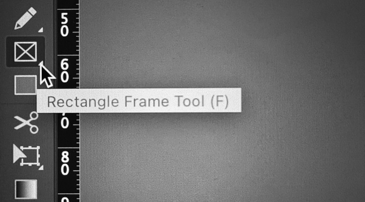
• Make a frame using the Rectangle Frame Tool (frame with an X), or
Use the Rectangle Frame Tool (F) to create picture boxes fast.
• Draw your frame. To do this, select the Rectangle Frame Tool, click on the page, then hold and drag to create a rectangle (or square) at the size you need.
Draw an image frame first (the box with an X).
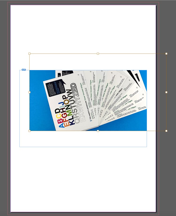
• Next, use Cmd+D (Mac) / Ctrl+D (Windows) or File Menu> Place. Choose the image from your computer and it will appear in the frame.
Import images via File → Place (or Cmd/Ctrl + D).Frame vs image: the frame crops, the image sits inside it.
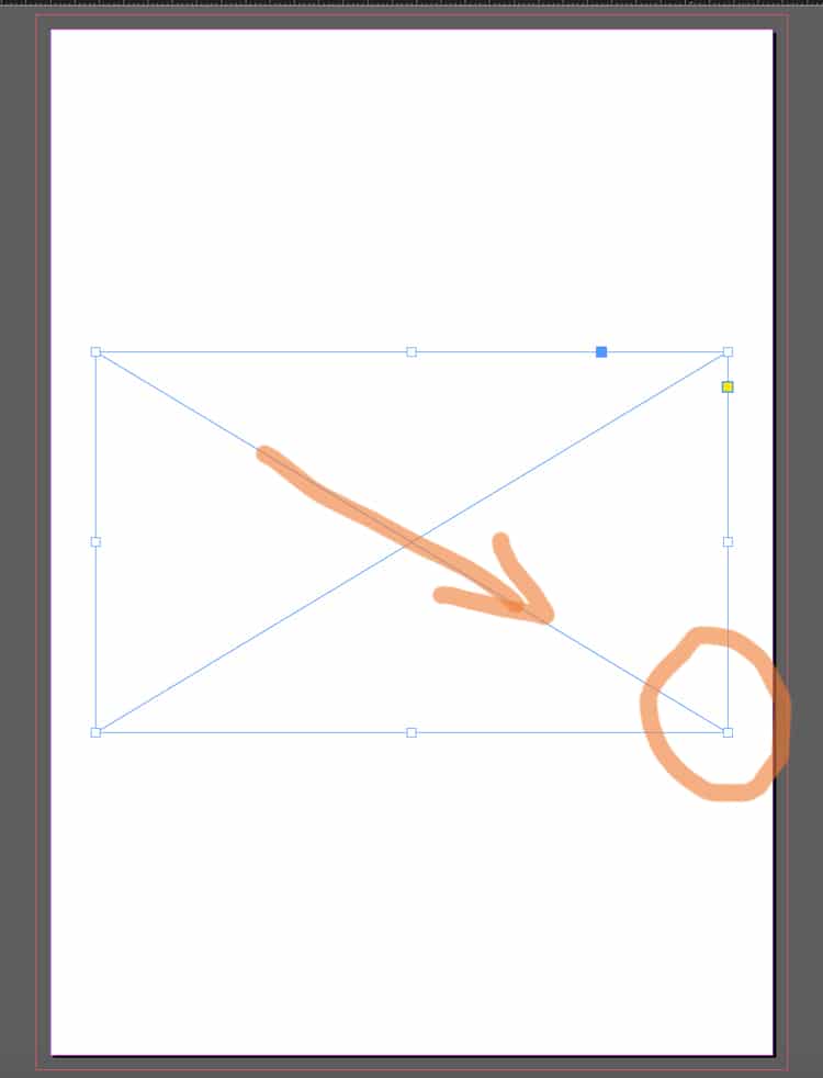
• To move the image inside the frame:
Use the Direct Selection Tool (the white arrow) and drag the image content within the box until you are happy with its position.
A placed image sitting neatly in the layout — controlled and aligned.
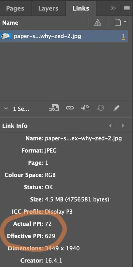
⚠️ Check the Image Quality (300 pixels per inch prints crystal clear)
Open Window → Links and check image quality. The Effective Pixels Per Inch (PPI) should be at least 300. Low-res images (typically under 200ppi) will look fine on screen but appear fuzzy and out of focus when printed.
Check quality in Window → Links — aim for ~300ppi at final size.
3️⃣ Create Text Frames and Format Typography
Yes: you can draw a text box, type, select-all, choose a font… and it will “work”.
But for books, the real skill is getting consistent type across dozens (or hundreds) of pages without manually fiddling.
The basics (still important)
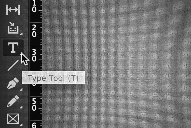
• Hit the T icon for the Type Tool.
Pick the Type Tool (T) to start adding text to your page.
• Click-and-drag to draw a text frame. To do this, click on the page, then hold and drag to create a text frame at the size you need.
• Type or paste your text into the frame.
A simple page build: heading text frame above a placed image.
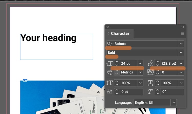
• Use the Character and Paragraph controls (Found in the Type menu) to set font, size, leading (spacing between each line of text), alignment (left, right justified or centre).
Style a heading by adjusting weight + size in the Character panel.
Not sure what size to make your text? Generally 8-10pt is good for main body text. 16-32pt is large enough for headings and titles. (For children's book, choose 16pt for the main story).
If you text frame isn't big enough, you can click the black arrow tool and drag out the corner handles to make it bigger.
Text frame too small? Use the black arrow and drag the handles.
⚠️ Book Design Hacks (still beginner-friendly)
Create Paragraph Styles for body text, headings, captions. One change updates the whole book.
Use character styles for small repeats (like italic emphasis) so you’re not hunting inconsistencies later.
If you have text running across pages, learn threading: click the out-port of one text frame and flow into the next.
4️⃣ Set Up 3mm Bleed (doing this now saves so much time later)
Bleed is an extra 3mm of artwork beyond the trim edge, so when our guillotine trims the printed sheets, you don’t get accidental white borders around the page edges.
The rule
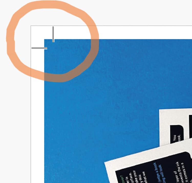
If something should print to the edge, it must extend 3mm past the trim line on that edge. The trim line is generally indicated by the white artwork edge and inner pink line on your InDesign artwork. The outer magenta line shows the 3mm extra. (This will be visible if you have added '3 mm' into the bleed boxes during Step 1 when you created your new document).
The magenta bleed guide sits outside the page edge — that’s your extra 3mm.
CRUCIAL STEP: How to ADD bleed to your content in InDesign
Select the Black Arrow tool and drag the outer handles of your image frame to the magenta line. This extends the image by 3mm outside the trim line.
Correct setup: artwork extends past trim into the bleed area.
Following this repositioning, you might need to make some small adjustments to the image within its box: these include changing the size of the image, or moving it over using the White Arrow tool.
The example below ISN'T Bleed. Notice the image stops at the trim line.
Incorrect: artwork stops at trim — this risks white slivers after trimming.
However, this example below shows a page with generous white borders, so you don't need bleed. The content stops well within the trim line so there is no need for bleed because no content will go right to the edge of the finished pages.
Lets repeat that again: If none of the content is intended to go to the edge of your finished book's pages, you don't need to worry about the extra 3mm because you'll have lovely white borders around your artwork.
If your design has white borders, you don’t need bleed on that page.
⚠️ STOP AND READ
If you don't have bleed on the PDF and your images go to the edge, we will ask you to add it. We won't go to print without bleed on your PDFs so lets add it now.
For further guidance, here is Adobe’s own guide to creating a PDF with bleeds is a further handy reference.
5️⃣ Export your artwork as a Print Ready PDF (this makes us happy)
This is the handover. The file can be beautifully designed — and still fail here if the export is wrong.
The dependable export steps
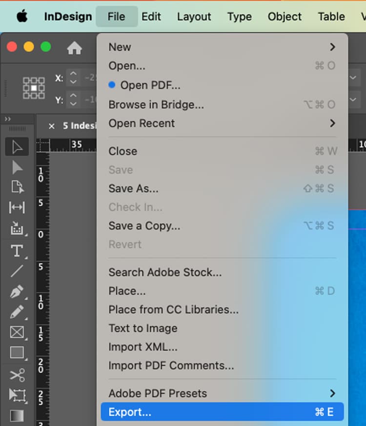
File → Export (or the keyboard shortcut Cmd+E)
Export your PDF via File → Export (Cmd/Ctrl + E).
Name your file, choose Adobe PDF (Print) as the Format, then click Save.
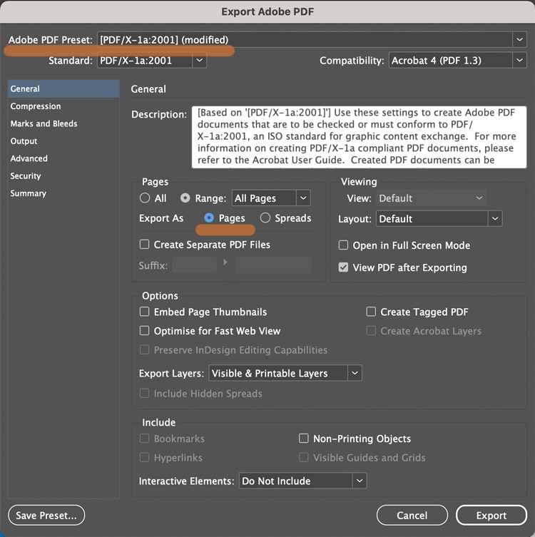
Choose Adobe PDF (Print) — not an interactive PDF.
In the next box...choose Adobe PDF Preset: PDF/X-1a:2001 Further down the box, choose 'Pages'.
In General: select PDF/X-1a:2001 and export as Pages.
In the Marks and Bleeds tab (found by clicking it down the left):
Tick Crop Marks (they increase the PDF page size to make room for marks).
In the Bleed boxes, add '3 mm' into the Top, Bottom, Inside and Outside box.
Click Export.
In Marks & Bleeds: set 3mm bleed and add crop marks if requested.
What the finished PDF should look like. On the images below, notice the artwork goes past the crops marks on the correct example, but stops at the crop marks on the incorrect version>>>
Correct result. Artwork runs past crop marks — bleed is included.
Wrong result. Artwork stops at crop marks — add bleed and export again.
⚠️ Bleed Fix
If your artwork stops at the crop marks, to correct the problem, you need to amend one of two things (it is always one or the other of these):
➡️ Have you dragged the background image out 3mm beyond the trim line on your Indesign file into the bleed area? Try that then export again.
➡️ OR you have done the above, but then when you're exporting you need to click the Marks and Bleeds menu, then type '3mm' into the four bleed boxes. This will add the bleed to the pdf.
A quick “print-ready” checklist (save this bit)
Before you export:
✅ Correct trim size + page count set
✅ Images placed via frames, no missing links
✅ Text uses styles (or at least is consistent)
✅ 3mm bleed set, and full-bleed artwork extends to it
✅ Exported as Adobe PDF (Print) with bleed included
Any questions, do give us a shout, remember we are here to help on email, phone and live chat.
Helpful Ex Why Zed links to pair with this article
There’s a moment in almost every print project where you can feel the momentum wobble.
You’ve got a PDF. You’ve got a vision. You’ve even got a rough idea of what you want it to feel like in someone’s hands. And then the questions start piling up:
“Should this be uncoated or silk?”
“Will this page count work with wire stitching?”
“How thick will the spine be?”
“Is this cover stock strong enough?”
“Do the colours need a tweak before we commit?”
These are good questions — they’re the difference between a book that looks “fine” and a book that lands exactly as intended. The snag is that email isn’t always the best place to solve them.
That’s where a Zoom print chat changes everything.
Why a Zoom call beats 67 emails
Print is visual. Tactile. Full of small decisions that are much easier to make when you can see what someone’s talking about.
On Zoom, we can:
Share screens and review your file together (layout, margins, spreads, cover setup — the lot).
Use visual cues to explain formats, bindings, and how page count affects thickness and handling.
Show you real printed examples from the thousands of books, zines, catalogues and publications we’ve produced and keep in our studio.
Translate specs into real-world feel, so you understand the “why” behind a paper or binding choice — not just the numbers.
Instead of a long chain of “what do you think?”, you get a single conversation that ends with: clear decisions, clear next steps, and a spec that fits your project.
Who it’s for (spoiler: almost everyone)
We run Zoom print chats with:
Novice authors and first-time self-publishers who want reassurance and a straight answer.
Rockstar authors who know what they like, but want a printer who can keep up and refine the details.
Designers who want to talk through production possibilities quickly, with real examples to hand.
Indie presses who need reliability, consistency, and a print partner who actually gets the intent behind the work.
If you’re trying to make something readers will keep, share, sell, gift, or put on a shelf with pride — it’s worth talking it through.
What we actually cover on the call
Every project is different, but most Zoom chats naturally land on a few core areas:
1) Format: size, page count, and how it’ll handle
We’ll help you pick a size that suits the content and the way the book will be used. Pocketable? Coffee-table? Mail-friendly? Gallery-shop ready? Then we’ll sense-check the page count so you don’t end up fighting a binding method that was never meant for it.
2) Paper: what looks good and feels right
Paper is where books become physical. We can talk you through the difference between a smooth coated stock for crisp images and a more tactile uncoated paper for a warmer, softer read — and show examples live so you’re not guessing.
If you’ve never ordered samples before, we’ll point you to the right next step. Request Paper Samples.
3) Binding: the right build for your book
Wire stitched, perfect bound, hardback — each comes with strengths. On Zoom we can explain it with real books in hand, so the pros/cons aren’t abstract.
Cover choices are half design, half durability. We’ll talk through what’s sensible for your budget and how the finish will behave in the real world (scuffs, fingerprints, handling, shine vs no shine).
5) File setup: the practical stuff that prevents pain later
Bleed, spine width, export settings, black values, image resolution… not glamorous, but crucial. A quick screen share can catch issues early and save you a reprint later.
The big difference: we’re a printer you can actually talk to
A lot of print companies hide behind a website. You fill in a form, get a number, and hope the end result matches what you pictured.
We do it differently.
Ex Why Zed is powered by people who handle books all day, every day — people who enjoy the details, and can explain them clearly. Zoom is simply the most direct way to share that experience with you.
It’s friendly, it’s visual, and it gets your project moving.
How to book a Zoom print chat
If you’d like to talk your book through, here are three easy ways to start:
Bring your questions, your PDF (even if it’s still in progress), and a rough idea of what you want the book to do in the world.
We’ll bring the print brains, the samples, and the honest advice.
Have you Zoomed us yet?
Crucial Points to Act On
We need one PDF with the pages in reading order.
When the design is complete. export your Word file to PDF
You need to add an extra 3mm on each edge to help with trimming
Key Highlights
Microsoft Word offers built-in tools like the Book Fold layout to simplify booklet design and printing.
Setting up margins, gutters, and page order correctly ensures pages fold and align perfectly.
Adding consistent fonts, clear spacing, and visual dividers helps create a professional finish.
Previewing your layout and adjusting margins prevents misaligned or cut-off pages.
Saving your booklet as a PDF keeps formatting intact and ready for print.
Common issues such as blank pages or incorrect layouts can be fixed easily in Page Setup.
Printed booklets remain a versatile and effective format for manuals, catalogues, and programmes.
Once your file is ready, you can send it to Ex Why Zed for expert, high-quality printing.
You’ve spent hours designing your booklet. The layout looks perfect on screen, the content is ready, and you can already picture holding the printed version in your hands. But when it comes to actually printing it, things suddenly get confusing. The pages print out of order, the text runs too close to the fold, or worse, the entire layout shifts. Sound familiar?
Many people assume printing a booklet in Word will be simple, only to find it’s trickier than expected. Between page setup, margins, and double-sided printing, there are plenty of small details that can throw your project off if you don’t get them right. And when you’re aiming for a professional finish, whether it’s a company brochure, an event programme, or a personal project, those details matter.
The good news is that creating a well-formatted, print-ready booklet in Word isn’t complicated once you know the steps. In this guide, you’ll learn how to print booklet in Word from start to finish, including how to design, set up, and save it as a PDF ready to send to Ex Why Zed for professional printing.
Why Use Microsoft Word To Create And Print Booklets?
Most of us already have Microsoft Word on our computers, which makes it one of the easiest tools to use for creating a booklet. You can quickly set up your pages with features like the Book Fold layout and duplex printing, making printing a booklet in Word simple and accurate.
You can also add images, covers, headers, and footers to give your booklet a polished, professional look. When you’re happy with the design, simply export it as a PDF to keep your layout intact and ready for printing. If you’d like a high-quality finish, you can then send your file to Ex Why Zed for professional printing.
How To Set Up Booklet Layout In Microsoft Word?
Getting your booklet layout right from the start is crucial. Correct setup ensures your pages fold correctly and everything prints in the proper order.
Let’s go through the essential steps to set up your booklet layout in Word.
Step 1 – Open A New Document
Start by opening a new blank document in Word so you have a fresh page to build your booklet on. Next, set the page size according to the paper you will be using, such as A4 or Letter. This ensures your booklet will print at the correct dimensions and fold neatly.
Crucial Step - Add 3mm Bleed
We do need an extra 3mm around each edge to help with trimming. This is called 'bleed' If you have not printed anything before or set a file up for print then we understand 'bleed' will be a completely alien concept. Here is the video guide that will help you do it.
So, for example if you are printing an A5 booklet (210x148mm) then with the 3mm extra on each edge, the Word page needs to 216x154mm.
If you are printing a 210x210mm booklet, the Word page needs to be 216x216mm. For A4 booklets (297x210mm), you should set up the Word page as 303x216mm.
Step 2 – Choose The Total Number Of Pages
Before adding any content, decide how many pages your booklet will contain. A good rule of thumb is to have a total page count divisible by 4. This makes sure the pages align properly when folded and avoids any blank pages at the end.
Step 3 – Adjust Page Setup For Booklet Printing
Now it’s time to format your document for booklet printing. Go to Layout > Margins > Custom Margins. Under Multiple Pages, select Book Fold. This will automatically arrange your pages in the correct order for folding.
Next, adjust the Gutter to leave extra space for binding. This prevents text from getting too close to the fold. Finally, set the orientation to Landscape, which is essential for the booklet format to work properly.
Step 4 – Customise Margins And Paper Size
For a professional finish, tweak your inside and outside margins. This makes sure your content looks balanced on every page. Double-check your paper size under Layout > Size to match the sheets you plan to print on.
At this stage, your document is ready for content, and you’ve completed the main steps on how to print a booklet in Microsoft Word correctly.
Not sure which size works best for your project? Read our Guide to Booklet Sizes for Printing to find the perfect fit for your design and budget.
How to Design Your Booklet In Word?
Once your layout is set, it’s time to bring your booklet to life. Now we’ll look at how to add your text, images, page numbers, and create a professional cover, as well as organising your content effectively.
Step 5 – Add Text, Images And Page Numbers
Start by adding the main content of your booklet. Use Insert > Page Number to number your pages automatically, so readers can navigate easily. Apply Styles to headings and body text to keep your fonts consistent throughout the booklet.
Images can make your booklet more engaging. Insert them via Insert > Pictures, and adjust their size and position so they complement the text without crowding the page.
Step 6 – Create A Cover Page
The cover is the first thing readers see, so make it count. Use Insert > Cover Page for a ready-made template, or design one manually for a custom look. Include your title, logo, and background image to give your booklet a polished, professional appearance.
Step 7 – Organise Content Into Sections
For a structured booklet, use Section Breaks to separate chapters or different sections. This makes it easier to manage page layouts, headers, and footers.
Add Headers and Footers to include page numbers, titles, or other branding elements. This ensures your booklet feels cohesive and professionally formatted from start to finish.
How Can I Print A Booklet In Word?
Now comes the most important part: how do I print a booklet in Word? Before sending your booklet to the printer, it’s important to make sure everything looks just right. Taking a few minutes to preview and adjust your document can save you from misaligned pages or printing errors.
Step 8 – Preview The Booklet Layout
Start by going to File > Print > Preview. This allows you to see how your pages will appear once printed. Check carefully that odd and even pages are positioned correctly so your booklet will fold in the right order.
Step 9 – Set Print Margins And Clean Up Artefacts
Next, adjust your margins if needed, selecting Narrow to make sure the content fits neatly on the page. Take a moment to remove any formatting artefacts or extra blank spaces. Doing this now ensures your booklet looks clean and professional.
Step 10 – Choose The Correct Print Settings
Finally, choose the appropriate print settings. Select Booklet Printing in your printer settings, and make sure to choose Print on Both Sides (Flip Pages On Short Edge). Adjust the paper source if necessary to match your printer setup.
Once you have completed these steps, your booklet is now ready to be printed!
Looking for affordable printing options in the UK? Read our guide on cheap booklet printing UK to find out how to get great quality at a lower cost.
How To Save Your Word Booklet As A PDF?
Saving your booklet as a PDF is a great way to share it digitally or ensure it prints exactly as you intended. PDFs preserve your layout, fonts, and images, making your booklet look professional every time.
Step 11 – Export As PDF
Go to File > Save As > PDF. Before saving, select Options > Book Fold Printing to make sure the booklet layout is retained. Saving as a PDF is perfect for sharing with others or sending to a professional printer. It keeps your pages in order and ensures your design stays intact.
Step 12 – Double-Check Before Printing
Before sending your booklet to print, take a moment to review everything. Verify the margins, images, and page order to ensure nothing is out of place. Completing this step helps avoid errors and ensures a polished, professional booklet.
Once your PDF is ready, you can send it to Ex Why Zed for professional booklet printing. Request an instant quote to see how straightforward and efficient our printing process is.
Where Do You Commonly Use Printed Booklets?
Printed booklets are incredibly versatile and can be used for so many different purposes, both personal and professional. Some of the most common uses include:
Event Programmes: Set the tone for your event by outlining schedules, speakers, or performances in a format guests can easily follow and keep.
Training Manuals: Give employees or students structured guidance that’s easy to refer back to, whether in classrooms or on-site.
Activity Books: Engage children or learners with hands-on content like puzzles, colouring pages, or challenges they can complete offline.
Product Catalogues: Present your products or services clearly, helping customers browse and compare in a tactile, professional format.
Branded Magazines: Share company stories, interviews, and updates that strengthen brand identity and keep readers connected.
Staff Handbooks: Communicate policies, procedures, and workplace culture in a format that feels clear, consistent, and approachable.
Coffee Table Books: Showcase photography, design, or creative projects in a stylish format that invites people to pick it up and browse.
Newsletters: Keep your audience informed with updates and insights they can flip through at their own pace, making it a tangible break from the digital noise.
Whether for professional use or personal projects, printed booklets are a simple way to share information in an organised and visually appealing way.
What Are the Common Issues You Might Face When Printing Booklets In Word?
Even with careful setup, some issues can occur when printing a booklet in Word. Being aware of these common problems can save time and ensure a professional result.
Pages Out Of Order: This usually happens if the Book Fold settings are incorrect. Double-check that this option is selected in your page setup.
Blank Pages: Blank pages often appear when the total page count is not divisible by 4. Either adjust the number of pages or add filler content to correct this.
Margins Cut Off: If text or images are too close to the fold, increase the gutter width in your page setup to provide extra space.
PDF Layout Issues: When exporting to PDF, make sure Book Fold printing is selected. This keeps your layout intact and prevents pages from printing in the wrong order.
By addressing these issues before sending your PDF to Ex Why Zed for printing, you can ensure your booklet looks polished and professional.
How Can You Make Your Booklet Look More Professional? (4 Tips)
Creating a polished, professional booklet is about more than just getting the pages to print correctly. Here are some practical tips to make your booklet look its best:
Keep Fonts and Sizes Consistent: Use the same font family and size for headings and body text throughout your booklet. This makes your content easier to read and gives a cohesive, professional appearance.
Maintain White Space: Avoid crowding your pages. Leaving enough space around text and images improves readability and gives your booklet a clean, balanced look.
Add Borders or Dividers for Style: Simple visual elements like lines, borders, or section dividers can help organise content and make your booklet visually appealing.
Test Print a Few Pages First: Before printing the entire booklet, print a few sample pages. This allows you to check alignment, margins, and overall design, helping you avoid surprises in the final print.
Following these tips will make your booklet not only functional but visually professional. If you’d like expert guidance or help preparing your file for print, contactthe Ex Why Zed team today; we’re here to make sure your booklet turns out perfectly.
Conclusion
Designing and formatting your own booklet in a Word document is easier than most people think. Once you understand how to print a document as a booklet in Word, you can confidently create professional-looking programmes, manuals, or catalogues without needing complex design software.
If you’ve been wondering, can you print a booklet in Word, the answer is yes, and the steps you’ve followed in this guide show exactly how. Now that your booklet is designed and saved as a PDF, your next step is simple: send it to Ex Why Zed for professional booklet printing. We’ll ensure your hard work looks just as impressive on paper as it does on screen.
Frequently Asked Questions
How do I print a booklet in Word 2010?
Open your document and go to the File menu, then select Print. In the Print dialog box, under Page setup options, choose the Book fold option to arrange pages correctly. For the best results, print on both sides of the paper and select your preferred paper size.
How to print a 4 page booklet in Word?
To print a short, 4-page booklet, use the Book fold option in Page setup. This automatically arranges pages in order. Check your print setup to ensure double-sided printing is enabled, and preview before printing to avoid alignment issues.
How to print an A5 booklet in Word?
In Page setup options, choose A5 as your paper size and select the Book fold option. Printing an A5 booklet is ideal for small brochures or manuals. Ensure your printer is set to flip on the short edge for the best results.
How to print a booklet in Word 2007?
In Word 2007, go to the Page Layout tab, select Margins, then Custom Margins. Choose the Book fold option under Multiple Pages. Once complete, go to the File menu and print using duplex settings to print on both sides of the paper.
How to print a booklet in Word for Mac?
Open your document on a Mac, then select File > Page Setup. Under Layout, choose Book fold option. In Print setup, enable double-sided printing. This ensures both sides of the paper print correctly for a folded booklet.
Which Word templates are best for creating and printing booklets?
You can use any booklet template available in Microsoft Office or download one online. Templates designed for brochures, event programmes, or manuals work perfectly. They make layout design easier and ensure professional results for your writing project.
How to print to a booklet with correct page order?
Go to Page setup options and select Book fold option to automatically arrange pages in the right order. In your print setup, ensure duplex printing is enabled so both sides of the paper are used on each sheet of paper.
Can you create and print a booklet in Google Docs similar to Word?
Yes, but Google Docs doesn’t have a built-in book fold option like Word. You’ll need to adjust margins manually and export your document as a PDF. For the best results, use your printer’s print setup to print on both sides of the paper.
Key Highlights
Here’s a quick look at what you need to know for perfect printing results with your Canva design:
Always export your final file as a PDF Print to ensure a high-resolution, 300 DPI output.
For professional printing, select the CMYK colour profile if you have Canva Pro for more accurate colours.
Remember to add crop marks and bleed to your design to avoid white edges on the final product.
Bleed and crop marks are essential for projects like a business card, where the design goes to the edge.
Understanding these settings is key to bridging the gap between graphic design and physical print.
Ever spent hours perfecting a design in Canva, only to print it and find the colours are faded or the text looks blurry? It’s a frustrating moment, especially when you’ve put real effort into making it look right.
Canva makes design easy and accessible for everyone, from small business owners to beginners, but printing isn’t always as straightforward as creating.
The truth is, getting your Canva design to look professional in print takes a little planning, from choosing the right file type to setting up bleed and colour profiles correctly.
In this blog, we’ll walk you through the exact steps to make sure your Canva designs print beautifully every single time.
What Are the Basics of Printing a Canva Project?
Since Canva is primarily designed for digital work, its default settings are optimised for screens, not for paper. This means that to get a great Canva print, you need to adjust a few key print settings.
Before we get into the details of downloading, let's explore the settings you need to configure within Canva itself for the best results.
File Colour Modes: RGB vs. CMYK in Canva
One of the most critical print settings to adjust is the file's colour mode. Your computer screen uses RGB (Red, Green, Blue) to display colours, which is how Canva operates by default. However, a professional printer uses CMYK (Cyan, Magenta, Yellow, Key/Black).
Printing an RGB file in CMYK can make colours appear faded or slightly off, so that bright blues might turn purplish and vibrant tones lose their original depth on paper.
If you have a Canva Pro account, you can convert your design to the CMYK colour mode when you download it as a 'PDF Print'. Users with a free account will have their files in RGB, but many print shops can perform the conversion for you.
Still confused about RGB vs. CMYK? Here's a quick breakdown of what each colour mode does, and when to use it:
Color Mode
Best For
How it Works
RGB
Digital screens (websites, social media)
Adds light to a black screen to create colour.
CMYK
Professional printing (flyers, business cards)
Subtracts light by adding ink to white paper.
Resolution and Quality Settings for Print
Have you ever printed an image that looked blurry? That’s usually a resolution issue. For your Canva print to look crisp and professional, it needs to be high resolution. Web graphics are typically 96 DPI (Dots Per Inch), but printed materials require a much higher 300 DPI. You can absolutely print at home without losing quality, provided you export your file correctly.
Canva makes achieving high resolution simple. By choosing the ‘PDF Print’ option, Canva automatically exports your design at 300 DPI.
To ensure the best quality:
Always download your design as a ‘PDF Print’.
Double-check that any uploaded images or graphics are high-quality to begin with.
Review the downloaded PDF at 100% zoom on your computer to check for any blurriness before printing.
How Do You Set Up Personalised Canva Prints in Canva?
Getting your Canva design ready to print starts long before you hit the print button. A personalised Canva print needs more than creativity; it depends on careful setup to ensure the right size, clean edges, and sharp, high-quality results.
Two of the most important steps are:
Adjusting Bleed and Adding Crop Marks
If your design goes right to the edge of the page, you’ll need to add a bleed. This is a small margin (usually 3mm or 0.125 inches) that ensures no white lines appear after trimming. Crop marks are guides that show the printer exactly where to cut.
Canva automatically applies the standard bleed amount, but always check with your printer in case they require a custom amount.
Choosing the Correct Paper Size and Orientation
Getting your sizing right from the start can save you from printing issues like blurry images, stretched layouts, or cropped edges. Here’s what to keep in mind:
Select the right paper size. Canva offers standard options like A4, Letter, and business card sizes, but you can also enter custom dimensions. Always confirm with your printer which size works best for their setup.
Set your orientation early. Choose between portrait (vertical) and landscape (horizontal) under Canva’s Resize menu. Pick the layout that best fits your design’s purpose: portrait for posters and flyers, or landscape for wider visuals or product images.
Choose the right paper type. The paper finish affects the final look. Matte paper offers a smooth, non-reflective surface that’s great for text-heavy designs. Glossy paper makes colours more vibrant, while thick cardstock adds durability and a premium touch.
Request samples when unsure. If you’re not certain which option to choose, ask your printer for paper samples. Seeing and feeling them helps you make sure your final print matches your creative vision.
How To Print Out a Canva Project?
Your Canva design is ready to go, but before you hit print, there’s one last step that really matters: exporting it the right way. The file type you choose can be the difference between a sharp, professional print and one that looks a bit off. Canva gives you options like PDF, PNG, and JPG, but only one gives you true print-quality results.
Let’s walk through how to choose the right format and download your design so it looks just as good on paper as it does on your screen.
Selecting the Ideal File Format (PDF, PNG, JPG)
When downloading your Canva design for print, you'll see a few file format options. What should you choose? Let's
To make it simple, here’s a quick guide:
PDF Print: Always choose this option for professional printing. It delivers high-resolution (300 DPI) quality and preserves sharp text, rich colours, and layout accuracy. Perfect for projects like business cards, brochures, book covers, or marketing materials that need to look crisp and polished.
JPG: A solid choice for home printing if you’re working on photo-heavy designs such as posters, wedding invitations, calendars, or flyers. Just keep in mind that JPGs are compressed files, so there can be a slight loss in quality compared to a PDF.
PNG: Best reserved for digital use, such as sharing on social media or websites. Avoid using PNGs for print unless your printer specifically requests it, as they’re optimised for screens, not paper. Ultimately, sticking with the PDF Print format will give you the most reliable and high-quality results for your Canva print project.
Saving and Downloading for Professional and Home Printing
Canva saves your work automatically, so you can always return to your project later. When you’re ready to download, the steps differ slightly for professional printing and home printing.
If you’re sending your design to a professional printer, here’s what to do:
Go to Share → Download
Select PDF Print as the file type
Tick Crop Marks and Bleed
If you have Canva Pro, change the colour profile from RGB to CMYK
Do not tick “Flatten PDF”
If you’re printing your project at home, the process is simpler:
Go to Share → Download
Select PDF Print for the best quality
Skip crop marks and colour profile changes
Download the file, open it, and print from your computer
Before you print a large batch, it’s always worth doing a test print to make sure colours, margins, and sizing appear exactly how you expect.
Why Choose Ex Why Zed for Every Printing Demand?
At Ex Why Zed, we don’t just print, we elevate your ideas. While Canva Print is convenient, it often comes with limits on paper types, finishes, and consistency. That’s where we stand apart.
When you print with us, you gain a specialist partner who checks every detail before it goes to press. From spotting low-resolution images to fine-tuning colour profiles, we make sure your project looks flawless.
Our catalogue of options is wide open: custom sizes, premium paper stocks, unique coatings, and tailored finishes that Canva simply can’t match. And unlike mass-outsourced services, every order with Ex Why Zed is handled with consistency, so your reprints look just as sharp as your first run.
Whether you’re printing business cards, photobooks, zines, or marketing materials, you can expect expert oversight, reliable quality, and a professional finish every single time.
Ready to upgrade from “good enough” to exceptional? Contact us today and see your print ideas come to life exactly as you imagined.
Conclusion
Printing a Canva project with perfect results requires careful consideration of various factors, from file colour modes and resolution to the right paper size and export formats.
By following the steps outlined in this guide, you can ensure that your designs not only look stunning on screen but also translate beautifully onto print.
Remember, taking the time to adjust settings like bleed and crop marks can make all the difference in achieving a professional finish.
Frequently Asked Questions
Can I print my Canva project at home without losing quality?
Yes, you can. To maintain quality, download your Canva design as a ‘PDF Print’ file. This ensures it’s saved at a high resolution (300 DPI) suitable for printing. Open the PDF on your computer and use your home printer’s highest quality print settings for the best possible outcome.
How do I order prints of my Canva design directly from Canva?
Canva offers a professional printing service directly through their platform. After finishing your design, click the ‘Print’ button (if available for your design type) or ‘Share’, then ‘Print your design’. Follow the prompts to select your options, and Canva will handle the printing and deliver it to your doorstep.
What should I check before sending my Canva file to a professional printer?
Before sending your file, ensure it is downloaded as a ‘PDF Print’. Confirm that you have included bleed and crop marks in the download settings. If you have Canva Pro, change the colour profile to CMYK. A final check of the exported PDF for any errors is also highly recommended.
Are there recommended paper sizes or types for printing Canva designs?
Canva provides templates for standard paper sizes like business cards and flyers. However, the best paper size and type depend on your project. It's always a good idea to check with your professional printer for their recommendations, as they can advise on paper weight and finish (matte, gloss) for best results.
How can I preview my Canva project before sending it to print?
You can preview your Canva project by clicking the “Preview” or “Present” option in the editor. This lets you check layout, colours, and alignment before downloading or sending for print.
How to print exact size in Canva?
To print the exact size in Canva, set custom dimensions before designing. Even with the free version of Canva, exporting as PDF Print is a good option for better results.
Can you explain the steps to print my Canva project directly from my printer?
Open your Canva project, click Share → Download, choose PDF Print, then open the file on your computer and select Print from your printer settings for high-quality results.
You've poured your heart and soul into your manuscript. Late nights, early mornings, countless revisions—and now, finally, your story is ready to meet the world. But wait. How do you transform that digital document into a physical book that readers will treasure? One that stands proudly on bookstore shelves, catches the eye, and feels professional to the touch?
Welcome to the art and science of book design—where your words become a visual experience.
Whether you're a first-time novelist with a literary gem, a poet crafting a collection of verses, or a photographer assembling a stunning visual narrative, the design of your book speaks volumes before a single word is read. In this comprehensive guide, we'll walk you through the essential resources that will elevate your self-publishing journey from amateur to impressive. From captivating covers to perfectly balanced typography, from spine design to illustration collaboration—we've curated expert advice that puts professional-quality design within your reach.
Let's turn your literary dream into a beautifully designed reality that readers won't be able to resist.
Start Strong: Lay the Foundation for Self-Publishing Success
Your step-by-step guide to self-publishing a book
If you’re at the beginning of your self-publishing journey, our comprehensive How to Self-Publish a Book UK Guide is your roadmap. It breaks down each step—from editing and formatting to ISBNs and marketing—into manageable chunks.
Track your progress with a printable self-publishing checklist
To ensure you don’t miss any critical details, our Self-Publishing Checklist serves as your companion document, offering a systematic approach from manuscript to printed book.
Design Like a Pro: Choosing Tools That Work for You
Select the right graphic design software
When it comes to book layout and covers, having the right tools makes all the difference. Our Essential Graphic Design Software Tools for Success guide helps you choose programs that suit your skill level—whether you're DIYing or working with a pro.
Craft a Captivating Cover: Make Your Book Stand Out
Your back cover is vital real estate. Learn how to write a compelling blurb, position your barcode, and style the layout with Crafting the Perfect Book Back Cover.
Choose the Right Typography: Fonts That Feel Professional
Designing for Young Audiences: Children’s Book Covers That Shine
If you’re publishing a picture book or illustrated story, your cover must appeal to both kids and parents. Discover how to create joyful, colourful covers with Engaging Children’s Book Covers: A Visual Delight, packed with genre-specific design advice.
Bringing It All Together: From Vision to Printed Reality
Designing your self-published book isn’t just about making it look good—it’s about building a meaningful reading experience. Each design decision contributes to how your story is received, remembered, and loved.
With the expert guides linked above, you’re equipped to make confident, informed choices. Good design expresses your unique voice and brings your story to life on the printed page.
Your words deserve to be wrapped in design that amplifies their power. Your story deserves a format that invites readers in. And you deserve to hold a finished book that reflects the care, creativity, and effort you’ve poured into it.
Book Printing from PDF
We will just need a high res PDF file to go ahead. SO do use the program you are most comfortable with laying out the artwork in. Ensure that you are happy with how everything looks on the page, then Export or Save As PDF. Easy!
We'll give the files a thorough check and preflight when they arrive and at that stage we will flag up anything that doesn't look right so you can change it before printing.