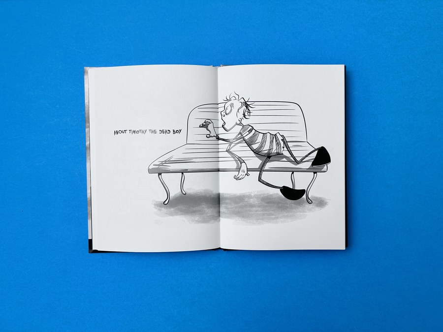
Timothy the Dead Boy is a book about a misfit, written and illustrated by an artist who has said he sees himself in his hero. Kevin Mc Hugh described it to us as “a darkly humorous reminder that we all just need a friend no matter what our current mortal situation may be”. Timothy is a lanky, stitched together zombie boy with one drooping eye and a halo of flies. On the cover he rests a hand on a skull while a black graveyard silhouette swallows the lower third of the board, and the title drips as if the ink were still wet. There is no colour anywhere: just black, white and a range of greys.
We printed it as an A5 hardback for House on Hollow Hill, Kevin’s own imprint. Monochrome books look simple on screen. On press they are some of the least forgiving jobs we handle, and this one turned on a single question about black ink.
Kevin knew the territory. His earlier book, The Twins’ Little Book of Death, had black backgrounds on every page, and we had advised building those big solid areas from all four inks (30/30/30/100 CMYK) so they printed dense, with the text in black alone. Timothy was the reverse: white pages, fine black outlines, soft grey shading. While drawing the front cover, Kevin noticed he had used plain black for every inside illustration and asked Harriet whether to switch them all to the richer mix.
Her answer was to leave them. Fine strokes should stay as pure black ink (0/0/0/100). Build a hairline from four colours and, if cyan, magenta and yellow land even a fraction off the black, the line picks up a yellow or magenta fringe. Printed in black alone, each stroke stays sharp and dark on white paper. The rich mix belongs on large solids, such as the sweep of graveyard on the cover. Kevin replied: “Another hurdle jumped.” Harriet also sent him our short film on the pitfalls of black and white printing.
If your own book is line art on white, check how your blacks are built before you export. It takes a few minutes, and it protects every stroke you drew.
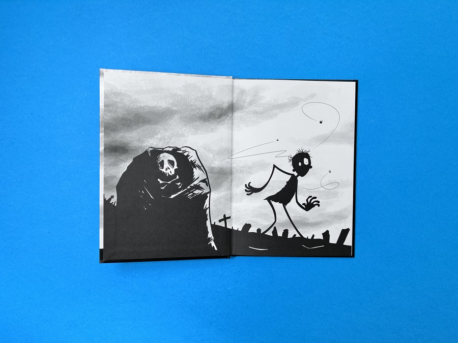
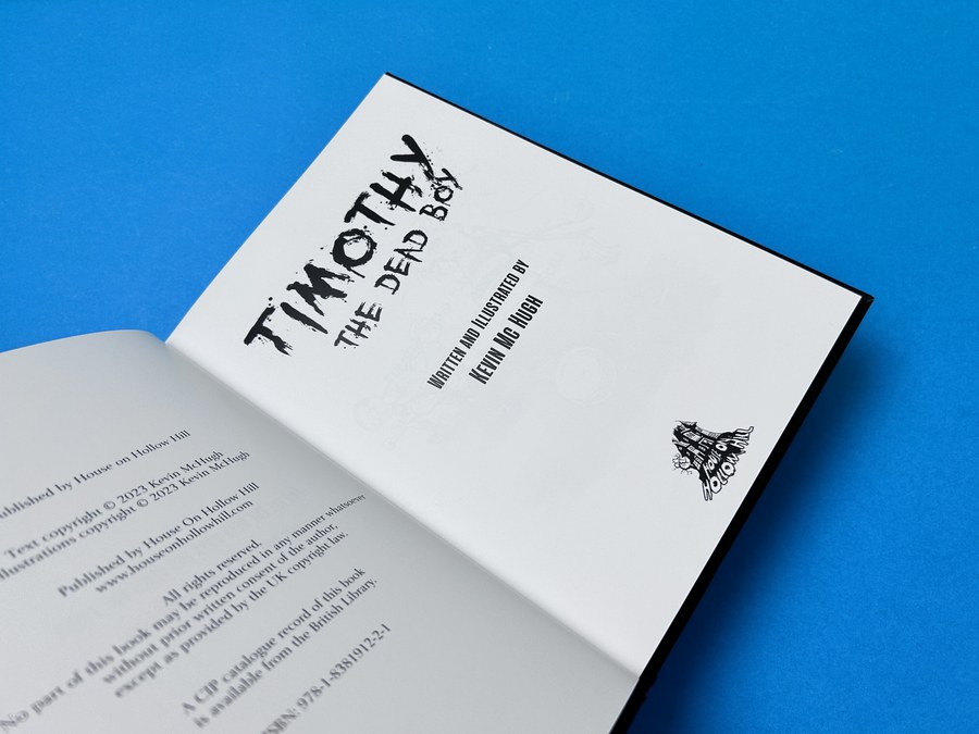
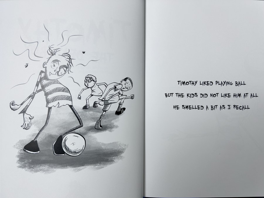
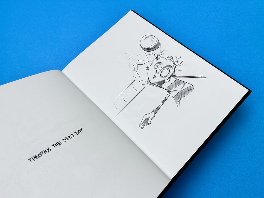
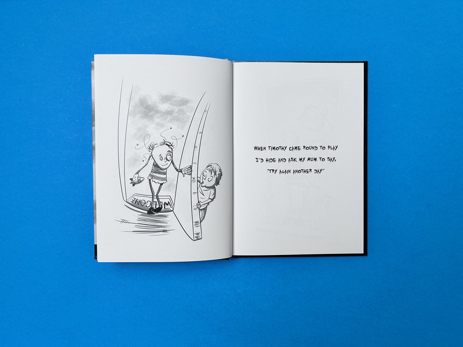
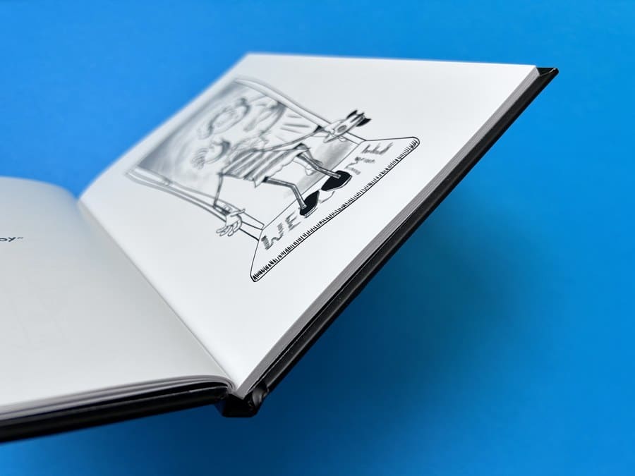
Inside, the layout keeps to one rhythm: an illustration on one side of the spread and, facing it, a few lines of hand lettered verse on white. In one rhyme Timothy just wants to play ball, but the other kids keep away because he smells a bit. The drawings mix thin ink lines with soft grey washes, and 170gsm silk carries both well. Its smooth surface holds the finest strokes without spreading and keeps the greys even, while the weight gives a book of 60 inside pages real body. Turn the front board and a printed graveyard scene runs right across the opening spread, with a hooded reaper on one side and Timothy shambling over the graves on the other. Even the title page has a faint ghost of a drawing behind the type.
A heavier paper is a quick win for a short hardback. With a modest page count, ask about stepping up the weight; the book sits more solidly in a reader’s lap and every page turn has some heft. Our range of small hardbacks for illustrators and comic makers starts at A5.
Kevin sent his files on 10 May 2023, aiming to launch at Enniskillen Comic Fest on 2 June. Harriet’s preflight that afternoon found the text and endpapers spot on, apart from the images being saved in CMYK. In a book printed with black ink only, a grey drawing stored as colour can carry stray traces of other inks, so she offered to convert the inside pages to greyscale, and Kevin agreed.
The cover was trickier. Kevin had dropped his artwork onto a template Mike made for an earlier book, yet the PDF arrived without bleed: the design stopped dead at the trim line. Harriet sent screenshots showing the gap and a fresh InDesign template. When that would not open on his machine, Kevin added 3mm of bleed to his original file himself, and the next morning Harriet confirmed it was right. On a cover with a solid black base, that extra margin is what stops a sliver of bare board appearing at the edge after casing in. Here is how far artwork should run past the trim, and why. Mike sent the proof that day, and the books reached Kevin on 22 May.
In September Kevin came back for more copies. He had decided Timothy needed “a proper book launch” and was planning “a proper Irish wake for him! Coffin and all.” Harriet still had the corrected files, so nothing needed resupplying. She also remembered that the cover had gone to press in full colour rather than black only, and quoted both ways. Kevin chose to repeat it, because full colour was what had given the cover “that deep, rich black”.
The reprint arrived on 6 October. On 22 October, mourners dressed in black gathered round a coffin in Charlie’s Bar, Enniskillen, while Kevin read from the book with his illustrations displayed behind him. The local paper covered the wake.
Drawing a monochrome book of your own? Plan your blacks first, then the paper, then the deadline. You can cost an A5 hardback with our instant calculator.