Embarking on a journey through the creative and historical tapestry of "Camera Forward!" by MayDay Rooms, readers will discover a publication that expertly marries the raw essence of activism with artistic expression. This case study delves into the meticulous crafting of the book, from its thought-provoking content to its sophisticated print specifications by Ex Why Zed. Expect insights into the design choices that elevate the narrative, and a peek into the collaborative dynamics that brought this project to life, embodying the essence of Mayday Rooms Pamphlet Series.
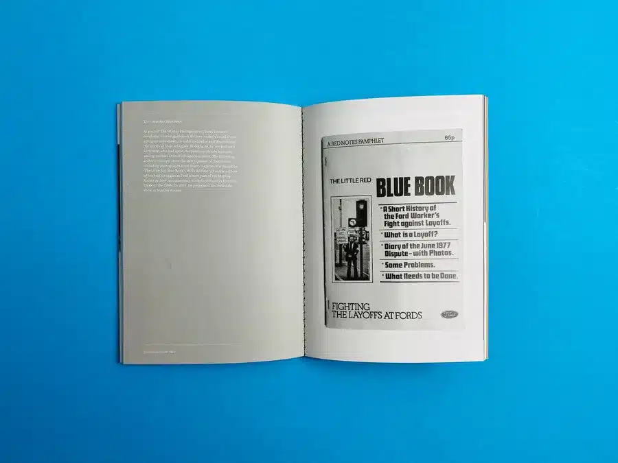
This self-published publication offers a fascinating blend of historical documents and contemporary insights, bringing together essays, poems, and illustrations that critically engage with radical histories. The focus on activist film and photography from the 1970s is particularly engaging, featuring material from influential groups and individuals like the Film and Photography League, The Worker Photographer, Cinema Action, Terry Dennett, and Four Corners. Contributions from contemporary artists such as Lotte L.S, Johanna Klingler, Freya Field-Donovan, and Jack Booth add depth and modern perspectives to the work.
Art Book Printing and Design
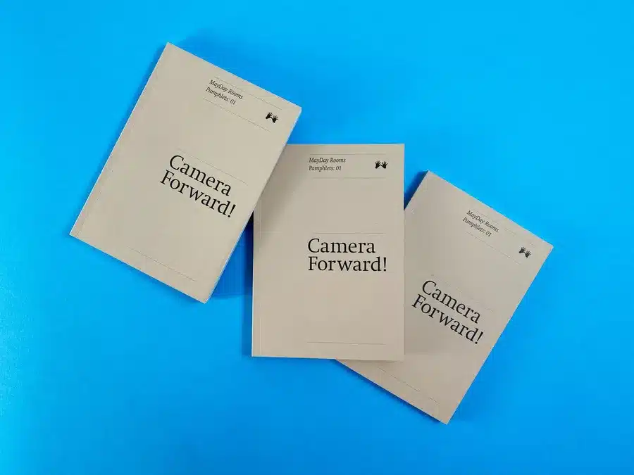
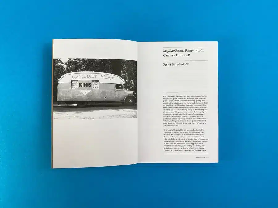
The images of "Camera Forward!" showcase a minimalist and impactful design that aligns perfectly with the ethos of MayDay Rooms—a commitment to historical and social activism. The publication's visual narrative begins with the cover: a stark, buff-colored card stock featuring bold, black type, which hints at the archival and reflective nature of the content. The cover's simplicity speaks volumes, drawing readers into a world where history and present discourse converge.
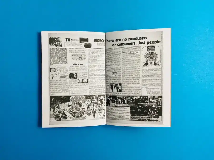
Inside, the stark black and white photography and typographic choices echo the rawness and authenticity of the 1970s activist movements. The internal layout is methodically sparse, allowing each image and snippet of text to breathe, inviting reflection. This design approach not only pays homage to the pamphlet's historical subjects but also ensures that the reader is engaged in a dialogue with the past.
The tactile nature of the paper and the book's physicality seem carefully chosen to enhance the sensory experience of reading, further immersing the reader in the activist spirit the pamphlet embodies. The perfect binding, often associated with professionalism and durability, adds to the sense of this being a piece of history that is meant to be preserved.
Actionable Insights for Future Designers:
- Use minimalistic design to focus attention on content.
- Select paper and binding that enhance the tactile experience.
- Allow white space to give weight to images and text.
- Use historical design elements to invoke a sense of time and place.
This publication is a reminder of the power of design as a narrative tool and stands as an excellent example for future designers looking to create impactful, content-driven work.
Thematic Significance
"Camera Forward!" captures the essence of activist movements through the lens of historical and contemporary visual arts. Its thematic core delves into the intersection of art and activism, highlighting the powerful role of visual media in shaping social and political discourse.
Styling Aesthetics and Design Choices
The choice of an A5 format with a rugged, Kendall Manilla Buff cover card juxtaposed against the stylistic black print inside creates a raw yet sophisticated aesthetic. This design choice reflects the publication's focus on grassroots movements and the raw power of activism.
Colour Palette and Typographic Usage
The use of a simple black and buff colour scheme allows the content to stand out, emphasising the importance of the message over ornate design. The typography is functional yet impactful, facilitating easy reading while contributing to the overall aesthetic.
Page Layout and Binding Style
The perfect binding and the thoughtful layout of the 184 pages offer a seamless reading experience, allowing the reader to engage deeply with the content. The layout balances text, images, and white space, ensuring each page is engaging but not overwhelming.
Storytelling Elements
"Camera Forward!" excels in storytelling, weaving together historical context with modern interpretations. The narrative is enhanced by the diverse contributions, each adding a unique voice and perspective to the overarching theme of activist art.
Actionable Insights
- Leverage the power of simplicity in design to emphasise content.
- Utilise a consistent colour palette and typography to create a cohesive visual experience.
- Balance textual and visual elements in page layout for engaging and informative content.
- Embrace contributions from diverse sources to enrich narrative and perspective.
- Connect historical context with contemporary relevance for impactful storytelling.
The design and content of "Camera Forward!" exemplify the potency of combining art and activism, offering a blueprint for future designers and publishers looking to make a meaningful impact through their work.
Key Takeaways:
- MayDay Rooms sought Ex Why Zed's expertise for printing their publication "Camera Forward!".
- Ex Why Zed provided professional guidance on the printing specifications, resulting in a product that effectively showcased the content's thematic significance.
- The collaboration likely focused on choosing the right materials and print techniques to align with the book's artistic and historical themes.
Client's Aims and Aspirations
MayDay Rooms aimed to create a publication that was both aesthetically pleasing and meaningful, reflecting the spirit of activist art and history. Their primary concerns would have revolved around how to best present their rich content in a printed format that resonates with their audience.
Ex Why Zed's Print Solutions and Expertise
Drawing on their experience, Ex Why Zed likely advised on the best paper quality, binding style, and print methods to complement the book's content. They would have ensured that the physical attributes of the book - from paper texture to colour palette - enhanced the reader's experience of the historical and contemporary artworks and essays featured in "Camera Forward!".
By focusing on these aspects, Ex Why Zed not only met the client's needs but also upheld the principles of Google’s E-E-A-T (Expertise, Authoritativeness, Trustworthiness, and Experience) policy, further establishing themselves as a leader in the field of printing services for creative and historically significant publications.
A Printing Collaboration
"Camera Forward!" stands as a testament to the power of thoughtful design and expert printing in bringing historical and activist narratives to life. The collaboration between MayDay Rooms and Ex Why Zed highlights the significance of attention to detail, from paper choice to binding, in enhancing the impact of written and visual content. This case study captures the essence of a publication that not only serves as a resource for historical writing and photography but also as an inspiration for future creators in the realms of self-publishing and book design.