Some photography books document a place. This one inhabits it. Liverpool Volume 1 is Phil Maxwell's love letter to the city he has photographed for over 50 years — a quietly extraordinary A4 landscape book that pairs archive images from the 1970s and 80s with photographs taken in the 2020s, placing them side by side so that the decades talk to each other across the gutter. The result is smile-inducing, sometimes surprising, and always deeply human.
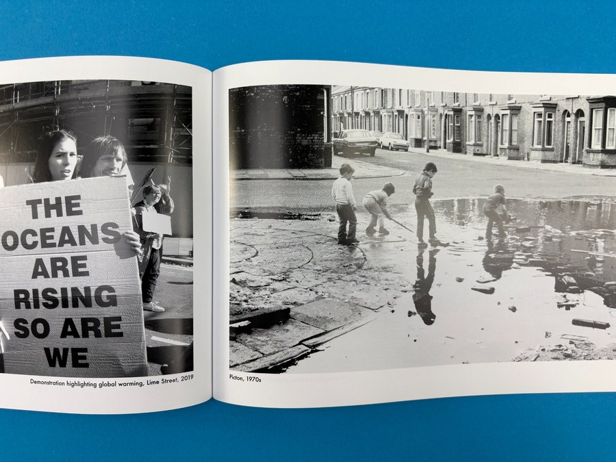
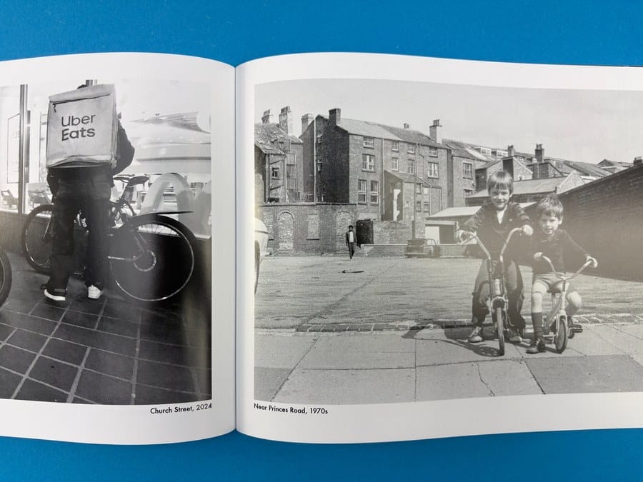
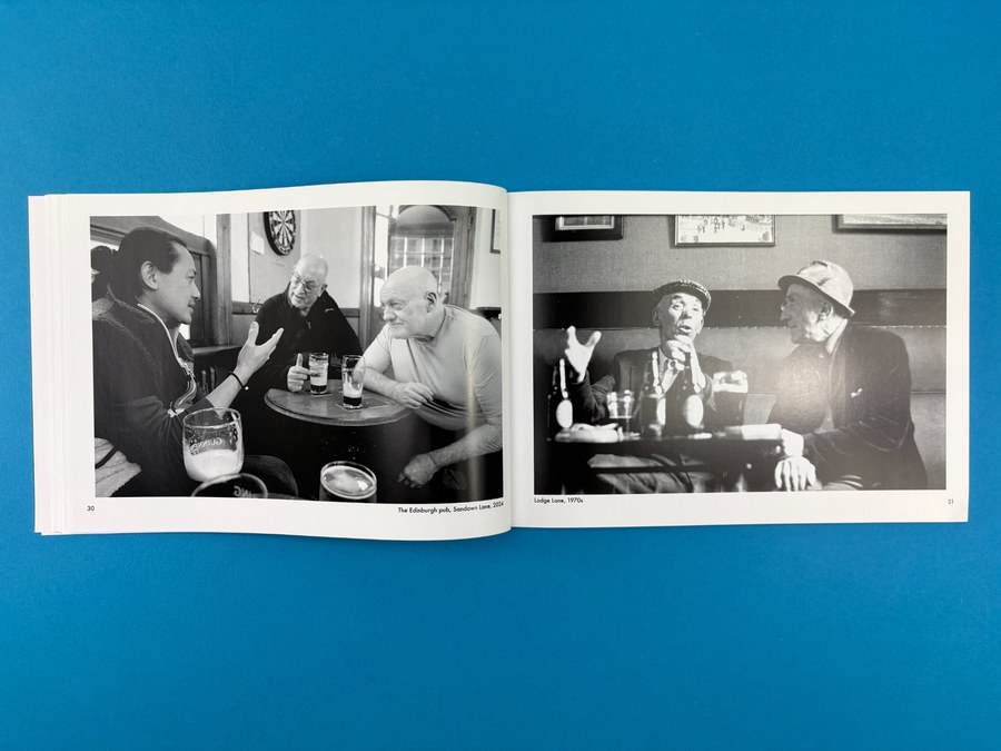
What lifts this book into the very top drawer of photography publications is the curation. The juxtapositions are not random: they have been composed with genuine intelligence, matching subject matter, location, gesture and mood across half a century. A crowd of children playing in a Picton puddle in the 1970s faces a 2019 protest placard reading "The Oceans Are Rising / So Are We." Two pub conversations — one from Lodge Lane in the 70s, one from The Edinburgh on Sandown Lane in 2024 — mirror each other with an intimacy that stops you in your tracks. The book was a joy to print.
About the Book
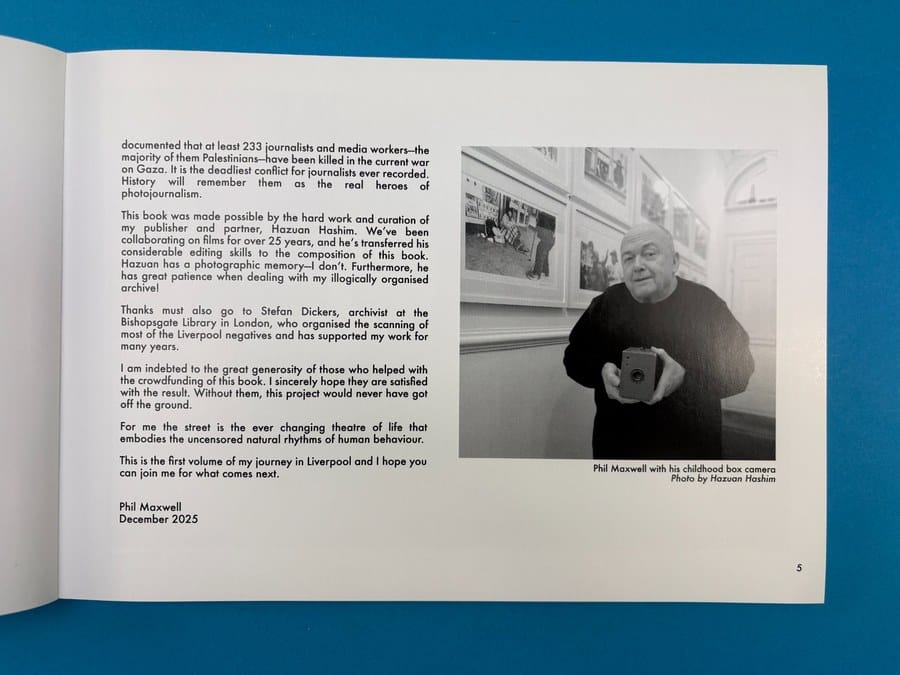
Phil Maxwell has spent decades working as a photojournalist, and his archive of Liverpool is extraordinary in its breadth and warmth. Liverpool Volume 1 is the first in a planned series, produced in collaboration with his publisher and long-time filmmaking partner Hazuan Hashim, who brought his considerable editing skills to the sequencing and composition. The book was crowdfunded, supported by Scousers and friends of the city everywhere — and it shows in the generous, community spirit that runs through every spread.
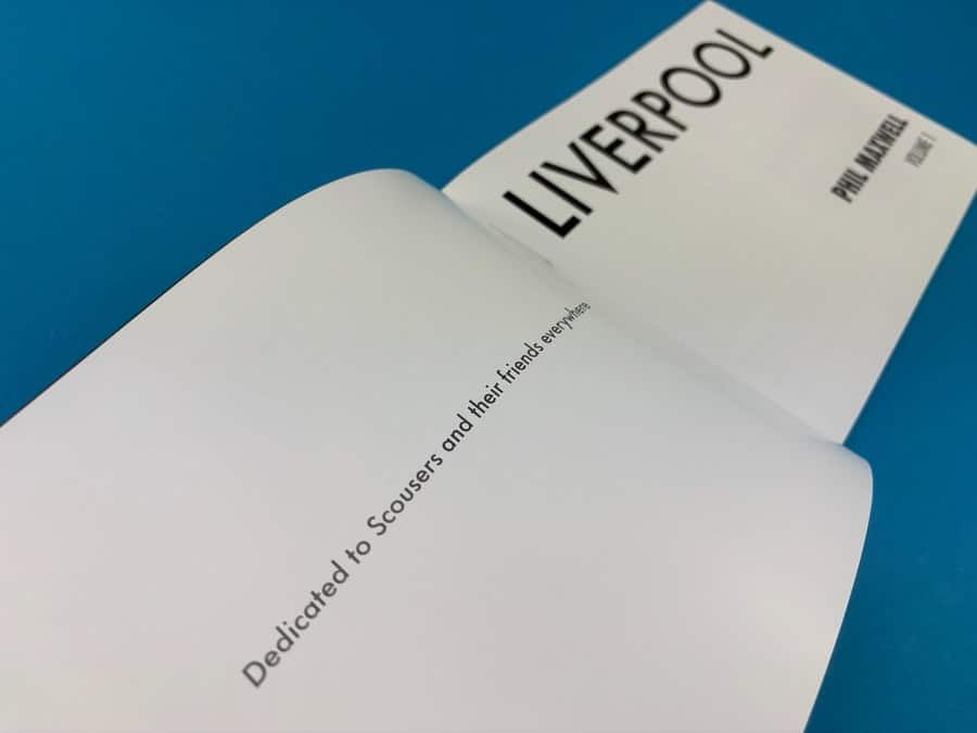
The photographs span terraced streets and shopping centres, pubs and protests, children on bikes and cyclists on modern city roads. Each spread is anchored by a location caption and a date, letting the reader navigate time whilst holding on to the geography. It is published under the dedication: "Dedicated to Scousers and their friends everywhere" — which sets the tone perfectly.
This is Volume 1. We are looking forward to seeing where the archive takes us next.
Print Specification & Materials
Hazuan and Phil chose their spec with care, and it was the right call. The A4 landscape format gives each photograph the room it deserves — images sit within generous white margins, breathing quietly on the page rather than bleeding edge to edge. The landscape orientation mirrors the way we actually scan a cityscape: wide, unhurried, left to right.
The 120 inside pages are printed on 170gsm gloss, which delivers crisp, punchy black and white reproduction. Printing in black ink only — rather than using a composite of colour inks to simulate monochrome — was a decision we guided Hazuan through early in the process. It matters enormously for tonal consistency and sharpness, and the results speak for themselves. The cover is a substantial 350gsm gloss board with gloss lamination to the outer, giving it a confident, almost cinematic feel in the hand.
The book is perfect bound with a spine width of 8mm — slender enough to feel edited and considered, thick enough to hold its own on a shelf. We ran a digitally printed first copy first for Hazuan to check layout and overall feel before the full litho run went to press. He signed it off the same day it arrived.
Design & Curation
The design is bold and direct — like the subject matter, and like the Scouse nation in general. The cover says LIVERPOOL in large, weighted capitals across the top, underpinned by a silhouetted fishing boat on the Mersey with the iconic waterfront skyline behind it. Phil Maxwell's name sits in the lower right in a contrasting bold serif. There is no fuss. The cover knows exactly what it is.
Inside, the layout is consistent and disciplined. Images are placed within white borders, one per page, facing their paired counterpart across the gutter. The location and year captions are set small and quietly, below or beside each photograph, letting the images carry the weight. This restraint is what makes the juxtapositions land so hard: without visual noise, the connections between eras are impossible to miss.
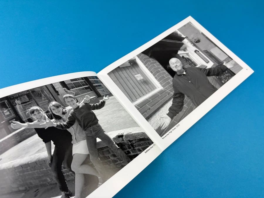
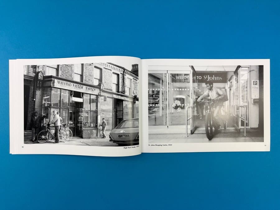
The image edit itself is exceptional. Hazuan's sequencing draws on 50 years of material, finding not just visual echoes but emotional ones — joy, community, resilience, change. The Smithdown Road children from 1976 and the Wavertree man throwing his arms wide in 2022. The High Park Street scene from 1979 and St Johns Shopping Centre 2022. Each pairing rewards looking twice. This is a book that functions as a record, an artwork and a conversation all at once — and our photography book printing team was glad to be part of it.
The Client's Print Journey
Hazuan came to us in April 2025 with a clear creative vision but some important technical questions. His first query was about black and white printing — specifically whether printing in "black and white" meant he needed to prepare all files in greyscale. We pointed him straight to our dedicated video on the battle of printing black and white images, explaining the critical difference between printing true black-ink-only files versus printing composite-CMYK images that appear monochrome on screen. He took that guidance on board immediately, and it shaped the entire production process.
He used Affinity Publisher and Affinity Photo to design the book, sending us a sample 8-page PDF early on for us to review. Our team confirmed the files were set up correctly — A4 landscape with the right margins and all images in black ink only — and the project moved forward with confidence. He later caught a handful of pages where text had been left in CMYK and updated the files himself before we went to final print. That kind of diligence makes a real difference to the finished result.
The order grew from 1,000 copies to 2,000 as the launch drew closer — a confident vote of faith in the book. We ran a digitally printed proof copy first, which arrived with Hazuan in Liverpool on the Friday morning. He loved it, signed off the artwork that same day, and we went straight to litho for the full run. The books — all 2,000 of them — were palletted and on their way to Liverpool in time for the launch event on 3rd December 2025, with the copies heading directly to our warehouse for ongoing fulfilment and distribution.
How Ex Why Zed Helped
From the first email, our team gave Hazuan clear, direct guidance on the things that really matter for a book like this. The black and white printing question is one we see often, and our proactive video resource meant Hazuan could solve the problem himself before sending files — saving time and avoiding a situation where the final print looks greyer or less punchy than intended.
We reviewed his sample file personally, confirmed his setup was correct, and gave him the spine measurement so he could design his cover accurately. When an issue with a faint box artefact on the front cover was spotted on the first 500 bound copies, we flagged it immediately and reprinted the covers for the remaining 1,500 at cost price — no fuss, no argument, just the right thing to do. The photography book printing experience our team brings to every project means we catch these things before they become problems.
With a firm launch deadline of 3rd December 2025, we kept Hazuan updated on every stage of the delivery, tracked the pallet ourselves on the day, and confirmed a 14:00–16:30 delivery window when he needed certainty. The books arrived exactly when they needed to.
Takeaways for Your Next Photography Book
Get your black and white printing right before you do anything else. If your images look monochrome on screen but are saved as CMYK or RGB files, they will not print the same way as true black-ink-only files. Watch our video on printing black and white images and set your workflow in Affinity, InDesign or Photoshop accordingly. It is the single biggest factor in how a book like this looks on the press.
Landscape format is underused in photography books. Most photographers default to portrait or square. A4 landscape gives you a panoramic quality that suits street photography, architecture, cityscapes — anything where the horizontal line matters. It also creates a natural diptych when you work with paired spreads.
Sequencing is as important as the photographs. The curation in this book — pairing images by subject, location and gesture across decades — is what transforms a collection of photographs into a book. Invest time in the edit. Print a dummy. Live with it for a week before you finalise the order.
Gloss stock for black and white prints is a bold, rewarding choice. Uncoated paper gives a softer, more journalistic feel. Gloss amplifies contrast and clarity, making the shadows deeper and the highlights crisper. For a book built around the drama of city life, it works perfectly. If you are unsure, order a paper sample pack from us and compare them in person.
A proof copy is not optional — it is essential. For a run of 2,000 copies, a single proof copy is a small investment. It lets you check layout, text rendering, image tone and overall feel in the real world, not just on a screen. Hazuan approved his proof the same day it arrived. That kind of confidence only comes from holding the real thing.
If you are planning your own photography book, our photobook printing service and this overview of photography book printing insights are a great place to start. When you are ready to get a price, our instant quote tool (up to 20 copies) will have numbers in front of you in seconds.