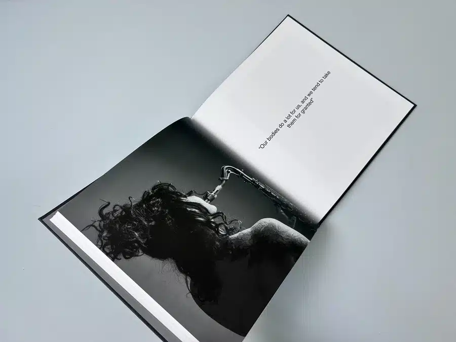
210x210 Case Bound Books
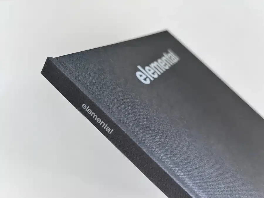
Cover onto Winters binding cloth (Buckram Graphite)
with foil blocking (614 grey)
Wrapped over greyboard case
2x 4pp End Papers printed onto 170gsm Uncoated
60 inside pages onto 170gsm Silk (10mm spine)
Cloth cover no printing
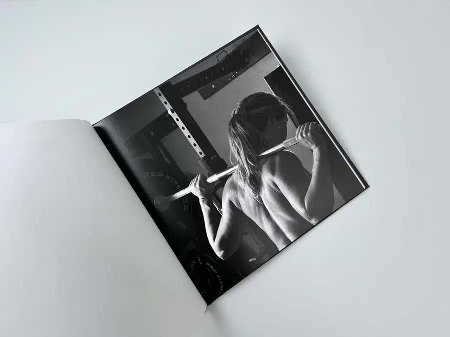
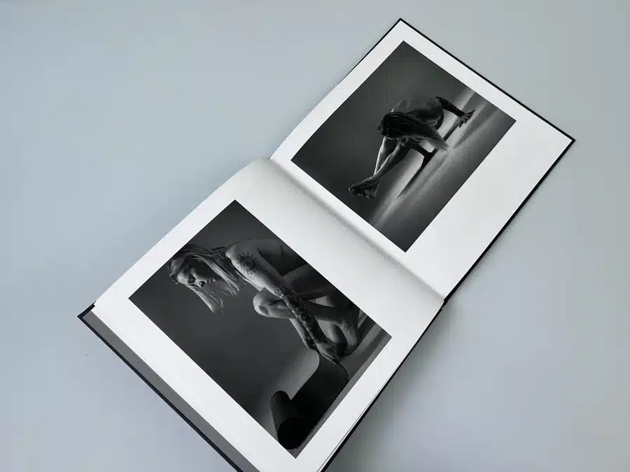
Inners & endpapers printed in Black and White throughout
Trimmed, collated and case bound
"Elemental" by Adam Sheridan is a stunning hardback photography book that redefines the depiction of the female form through a fine-art lens. This premium, hardback coffee table book showcases women engaged in their passions in a nude, empowering manner. Created in collaboration with Ex Why Zed, the project involved meticulous planning and expert advice on print quality, paper choices, and binding. The result is a sophisticated, high-quality book that reflects Adam's artistic vision. Discover how we transformed Adam's ideas into a tangible case bound book through our professional printing services at exwhyzed.com.
"I am so excited to have this project completed and to be printing with you for it. You've been tremendous to work with and I'm so excited to see the finished product!"
Thematic Significance "Elemental" is a profound exploration of the female form, stripping away the over-sexualised lens often imposed on women's bodies. The theme revolves around empowerment and authenticity, showcasing women in their natural state while engaged in various passions like yoga, volleyball, painting, and reading. This approach not only redefines beauty but also challenges societal norms about female nudity and sexuality.
Styling Aesthetics The aesthetic of "Elemental" is minimalistic yet powerful. The use of black and white photography accentuates the raw beauty and strength of the subjects. The choice to keep the cover simple with a graphite texture and subtle grey foiling adds a touch of elegance and sophistication, reflecting the high-class nature of the book.
Design Choices Adam Sheridan’s design choices for "Elemental" are meticulous. The book’s size (210x210) and case-bound format give it a substantial feel, ideal for a coffee table book. The cover, wrapped in Winters binding cloth with foil blocking, provides a tactile experience that enhances its premium quality. The decision to have no printing on the cloth cover keeps the focus on the tactile and visual elements of the book.
Colour Palette The colour palette is restrained, relying primarily on monochromatic shades which bring out the textures and contours of the female form. This choice underscores the book’s fine-art approach and keeps the focus on the subject matter without the distraction of vibrant colours.
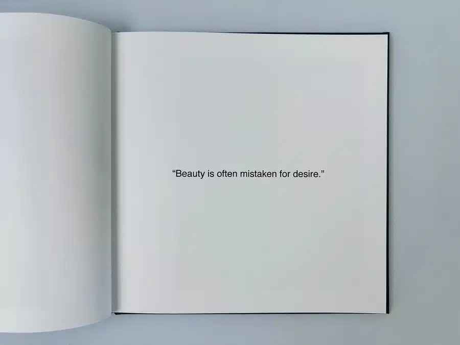
Typographic Usage Typography in "Elemental" is sparingly used but highly effective. The text is minimal, allowing the images to take center stage. When text is present, it is clean and modern, complementing the overall aesthetic of the book. Quotes like "Beauty is often mistaken for desire" resonate deeply and are placed strategically to enhance the narrative.
Page Layout The page layout of "Elemental" is designed to provide a seamless viewing experience. Each photograph is given ample space, often occupying a full page, which allows for a deeper connection with the image. The use of white space around the images adds to the book’s sophisticated look and ensures that each photo can be appreciated without distraction.
Binding Style The binding style of "Elemental" is case-bound, which is known for its durability and premium feel. The 10mm spine and the use of greyboard case wrapped in Buckram Graphite cloth provide a robust structure that protects the contents while adding to the aesthetic appeal. The choice of a case-bound format also signifies the book's status as a collector's item.
Storytelling Elements "Elemental" tells a story through its powerful imagery. Each photograph captures a moment of passion, strength, and vulnerability, presenting a narrative that is both personal and universal. The absence of extensive text allows the viewer to create their own interpretations, making the experience of viewing the book deeply personal.
Client’s Aims and Aspirations Adam Sheridan aimed to create a high-class, hardback photography book titled "Elemental" that showcases the female form in a fine-art style, devoid of over-sexualization. His goal was to produce a statement piece with a tactile, sophisticated cover and high-quality black-and-white images. Adam sought professional advice on print quality, paper choices, and binding to ensure the final product met his high standards.
Featured Comment Adam Sheridan expressed his appreciation multiple times throughout the email exchange:
"I am so excited to have this project completed and to be printing with you for it. You've been tremendous to work with and I'm so excited to see the finished product!"
In summary, "Elemental" by Adam Sheridan is a remarkable example of a hardback photography book that combines artistic vision with expert craftsmanship. Our detailed analysis revealed the thematic significance, minimalist styling aesthetics, and high-quality design choices that make this book stand out. The email interaction between Adam and Ex Why Zed highlights our commitment to providing comprehensive support and flexible solutions, ensuring the final product meets the highest standards. This project showcases our ability to transform creative ideas into beautifully printed books, making us the number one choice for hardback photography book printing.
