A5 Books
4pp Cover onto 300gsm Silk
Matt Lamination to outer
36pp Text onto 130gsm Silk
Four colour print throughout
Trimmed, collated and perfect bound
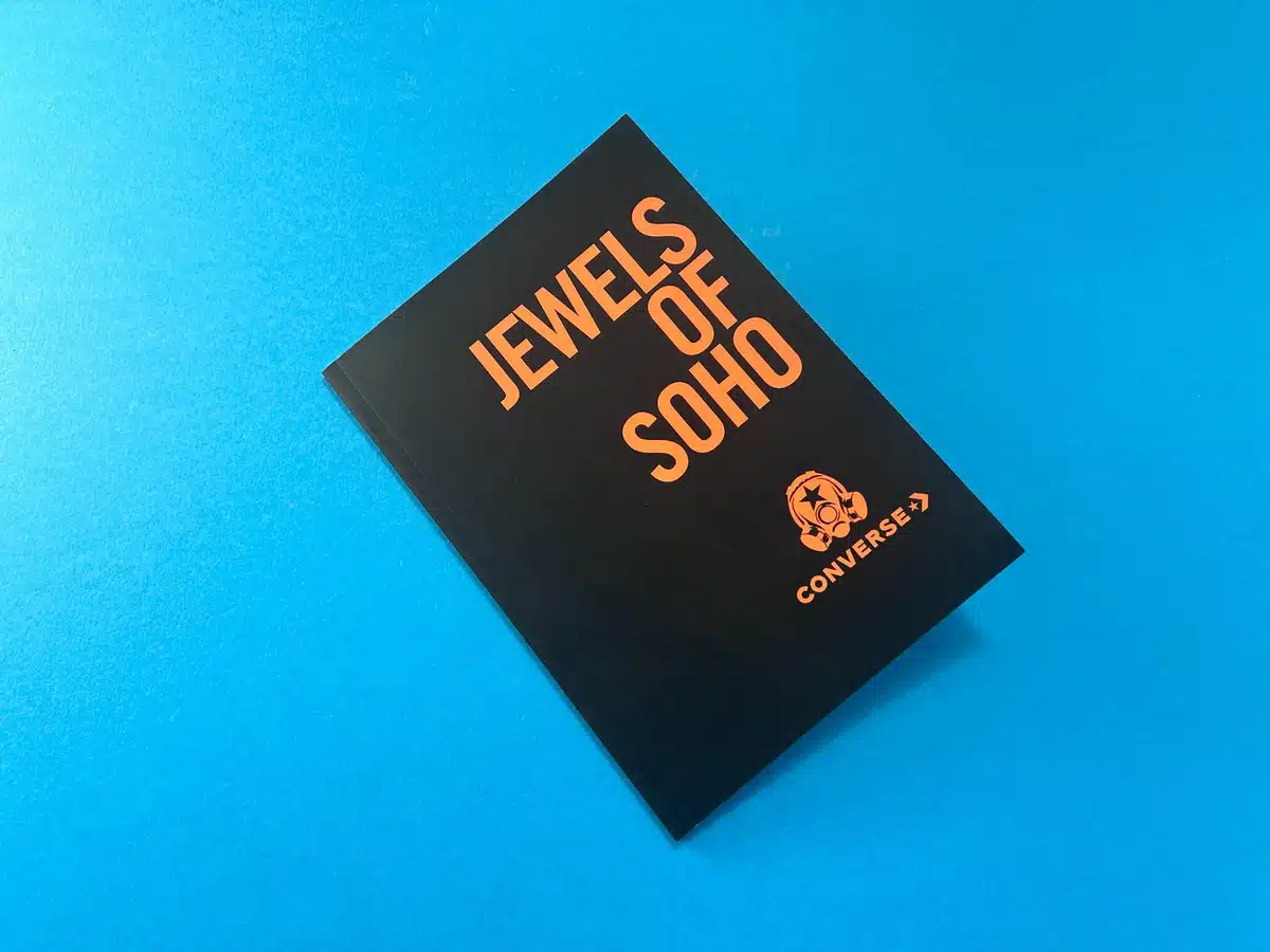
The Jewels of Soho book designed by Footpatrol, and printed by Ex Why Zed, exudes a vibrant, street-smart aesthetic combined with a professional finish. The book serves as a cultural tribute to Soho, encapsulating the ethos of Footpatrol's brand within a striking, high-quality publication.
The book is perfect bound, a thoughtful choice considering the need for durability and a clean finish, particularly given the weight and quality of the interior pages. The use of 300gsm uncoated paper for the cover, with matt lamination, creates a sleek, professional exterior that complements the bold visuals used in the cover design. The text pages are printed on 115gsm uncoated stock, which offers a tactile and authentic feel when flicking through the 80 pages. This choice of material echoes the gritty, authentic streets of Soho, aligning with the book's subject matter. The perfect binding ensures longevity, while the paper selection adds a touch of sophistication.
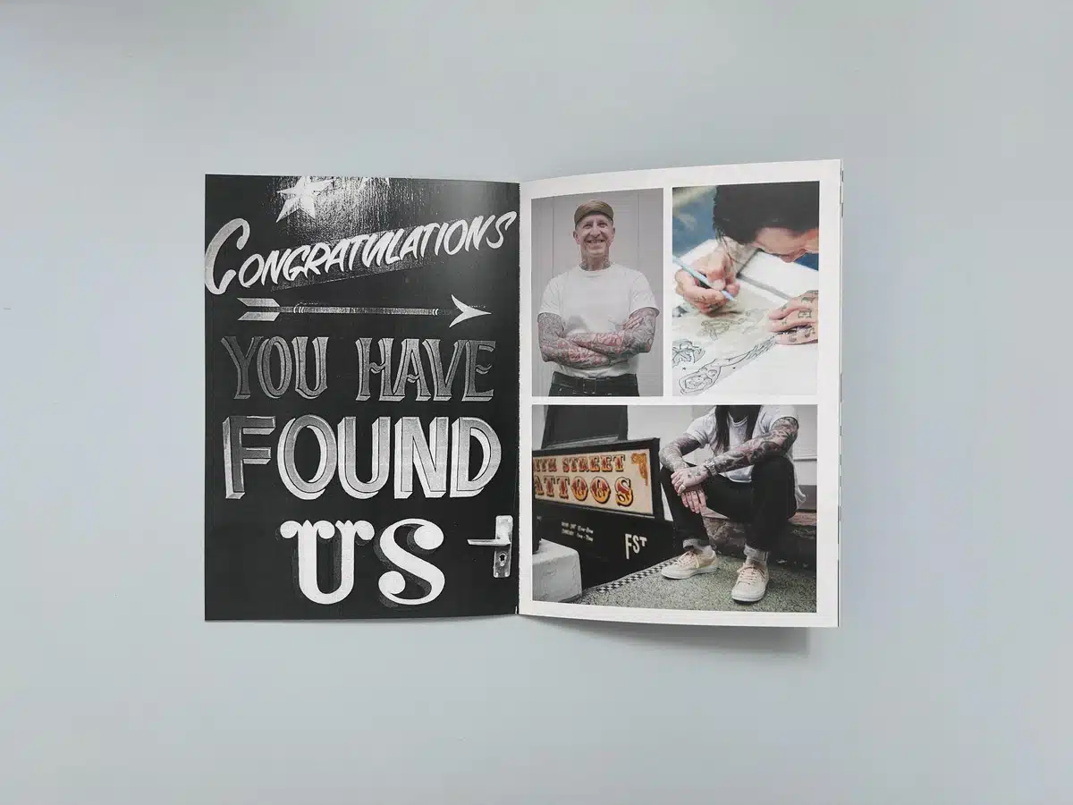
The page layout is clean and bold, with impactful use of typography and photography. The large, modern typography seen in headers like "Congratulations You Have Found Us" conveys a feeling of urban excitement and discovery, while the minimalistic layout around images of tattooed individuals and shoe designers reinforces the street culture vibe. The oversized typography on the cover ("Jewels of Soho") paired with Footpatrol’s logo highlights brand identity in a powerful, no-frills manner.
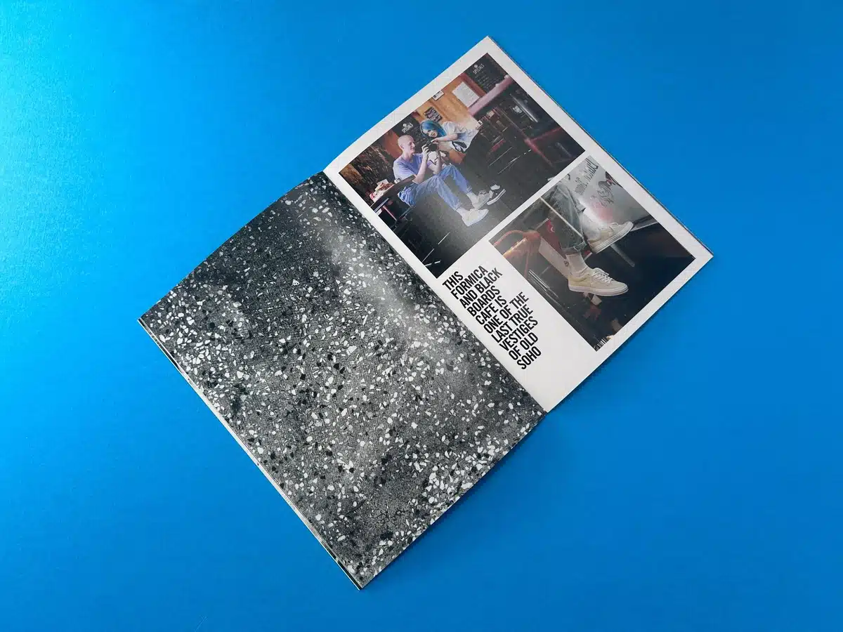
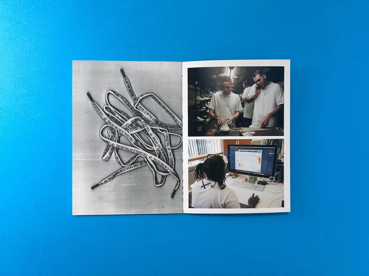
The book’s combination of full-page imagery with smaller, grid-like photo layouts captures the essence of Soho’s street culture and Footpatrol’s craft. Visual storytelling is at the heart of the book, with images carrying as much weight as the textual elements. The juxtaposition of photos, like those of tattooed arms and sketches, conveys an organic creative process, while carefully considered white space ensures the design remains uncluttered and accessible.
The colour palette is predominantly monochromatic with bold accents, such as the vivid orange used in the cover title and logo, against the black backdrop. This creates a dramatic contrast, making the book pop visually and adding to the urban aesthetic. Inside, the colour tones are muted but precise, with sharp black-and-white photography dominating several spreads, adding to the raw, edgy feel of the book. The decision to print in full colour yet limit it primarily to images helps draw the reader’s attention exactly where it’s needed, such as key interviews or product shots.
Typography plays a critical role in the book's overall aesthetic. The fonts used are contemporary and bold, fitting for a brand like Footpatrol that resonates with street culture. The interplay between large, impactful headers and smaller body text is seamless, guiding the reader's eye through the content with ease. The typography feels hand-crafted, an essential touch for a brand heavily focused on personalisation and design integrity.
The book is highly effective in capturing the essence of Footpatrol’s identity and the culture of Soho. The strategic use of visuals and minimal text allows the images to speak for themselves, promoting Footpatrol as a brand deeply embedded in creativity, community, and craftsmanship. The balance between slick, professional presentation and raw, urban imagery makes the book a dynamic representation of the brand's ethos.
Ex Why Zed’s collaboration with Footpatrol on Jewels of Soho has resulted in a publication that is not only visually striking but also reflects the brand's culture and ethos with authenticity. The careful balance between bold design elements, material choices, and an underlying urban aesthetic ensures that this book makes a lasting impression on its readers, providing a tactile and immersive experience. The perfect binding, the use of matt lamination, and dynamic typography choices all contribute to a premium product that will no doubt resonate with Footpatrol’s audience and beyond.
The journey with Footpatrol to bring the Jewels of Soho zine to life encapsulates the challenges and triumphs of working on a tight deadline while delivering premium-quality print work. The project began with an urgent request from Footpatrol’s graphic designer, Tarik Halil, to print 70 zines in perfect bound A5 portrait format, with a delivery deadline set for the end of the week—a clear production challenge due to the timing coinciding with the Easter bank holiday.
Tarik’s initial email laid out the project specifications, including the page count (84 pages), the cover stock (300gsm uncoated with matt lamination), and the inner pages (115gsm uncoated). His first query revolved around confirming the spine size for the zines, as well as delivering the artwork in spreads with 3mm bleed. This opened up a crucial point of collaboration, with Ex Why Zed stepping in to advise on artwork modifications to ensure the best possible print result.
We recommended that the inside pages be supplied as single pages rather than spreads to avoid issues during the printing process. Additionally, Ex Why Zed provided a custom template with a 6mm spine and detailed instructions on bleed settings to guide the designer in preparing the files correctly. We flagged that some of the content crossed over double-page spreads, which would be obscured by the spine gutter. To remedy this, we offered practical advice on adjusting the artwork to avoid losing important details to the binding.
As the project evolved, the timing challenge became apparent. Tarik requested an urgent quote and confirmation of whether the job could be delivered by Friday. However, due to the Easter weekend, Ex Why Zed informed Footpatrol that deliveries on Friday would not be possible, and the earliest achievable delivery date would be Thursday, provided the order was finalised within the next hour. Footpatrol was under pressure, and a further email from Natalie Kinchin, Production Director at Generation.works, requested an extension to the 4 pm deadline to accommodate last-minute adjustments. Ex Why Zed responded flexibly, allowing a slight extension to ensure the files were correctly prepared without compromising the print schedule.
The sense of urgency was clear throughout the project. After numerous exchanges regarding artwork corrections—such as sending updated files and correcting transparency issues—we managed to maintain clear communication with Tarik and Natalie. When issues with the proof arose, such as the transparency errors in some parts of the artwork, we recommended exporting the files using the PDFx1a:2001 standard, which resolved the problem and ensured that the final print output would meet Footpatrol’s high standards.
Before going to print, we provided Footpatrol with a detailed digital proof for final approval. Throughout this stage, there were further refinements, including corrections to the transparency settings in the files and adjustments to avoid any issues with visual elements crossing over the spine gutter. Despite these hurdles, Footpatrol was satisfied with the proof and provided final approval, albeit later than planned. To accommodate the delay, we agreed to move the delivery date to the following Tuesday, ensuring that all quality checks were thoroughly completed before the job went to press.
On the day of production, Ex Why Zed kept Footpatrol informed of the progress. The print run was completed successfully, and the prints were dispatched ahead of schedule. Although there was some concern over the delivery due to the bank holidays, the zines were delivered on the Saturday and signed for by a member of Footpatrol's team.
Tarik and Natalie were both highly appreciative of Ex Why Zed’s flexibility and professionalism throughout the project. They acknowledged the patience and quick problem-solving that went into ironing out artwork issues under a tight deadline. After receiving the prints, Tarik expressed gratitude for the high-quality outcome and mentioned that Footpatrol would keep Ex Why Zed in mind for future projects.
The collaborative nature of this project highlights Ex Why Zed’s commitment to maintaining open communication, offering expert advice on file preparation, and being adaptable to the client’s evolving needs—all while delivering on time and without compromising on quality.
The Footpatrol Jewels of Soho project is a perfect example of Ex Why Zed’s ability to manage complex print jobs under tight deadlines. By guiding the client through artwork adjustments and being responsive to changing requirements, we were able to deliver a product that exceeded expectations. The successful completion of this project not only solidified our relationship with Footpatrol but also demonstrated our expertise in handling urgent and high-stakes print jobs.
For more examples of Ex Why Zed's work, check out these other case studies:
Each of these projects showcases Ex Why Zed's commitment to quality, creativity, and customer satisfaction. Whether you're looking for lookbook printing, magazine printing, or any other type of creative industry printing, Ex Why Zed has the expertise and the passion to deliver results that exceed expectations.
If you think this spec would work for your upcoming lookbook or brochure then take a note of the print spec above and ping it over on email to hello@exwhyzed.com or drop the details into our quote form.


