A5 Booklets
4pp Cover onto 300gsm Uncoated FSC Certified
Matt Lamination to outer
20pp Text onto 115gsm Uncoated FSC Certified
Four colour print throughout
Trimmed, collated and wire stitched
The booklet "Gwaed Ar Y Ser" produced by Matchbox Cine showcases a dynamic and retro-inspired visual aesthetic. This booklet combines bold typography, hand-drawn illustrations, and a playful use of colour to evoke a nostalgic feel reminiscent of 1970s TV guides, perfectly in sync with the publication’s retro theme and ethos.
The booklet appears to be A5-sized with wire-stitched binding. This binding method ensures durability while allowing the booklet to lie flat when opened, which is an excellent choice for programme booklets intended for frequent handling. The wire stitching also complements the zine-like aesthetic, reinforcing the low-fi, accessible vibe associated with underground media publications.
The layout is varied yet structured, creating an engaging reading experience. Each page offers a different design approach, with large, bold titles, varying image sizes, and a mix of colour palettes that transition between monochrome and vibrant hues. This non-linear layout makes the booklet feel lively and engaging, guiding the reader through an eclectic mix of content while maintaining visual interest.
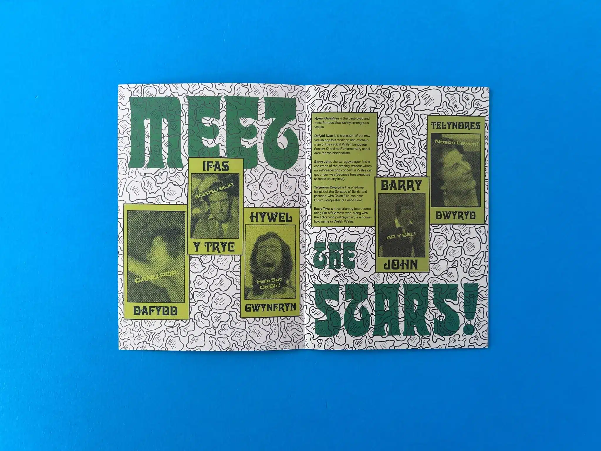
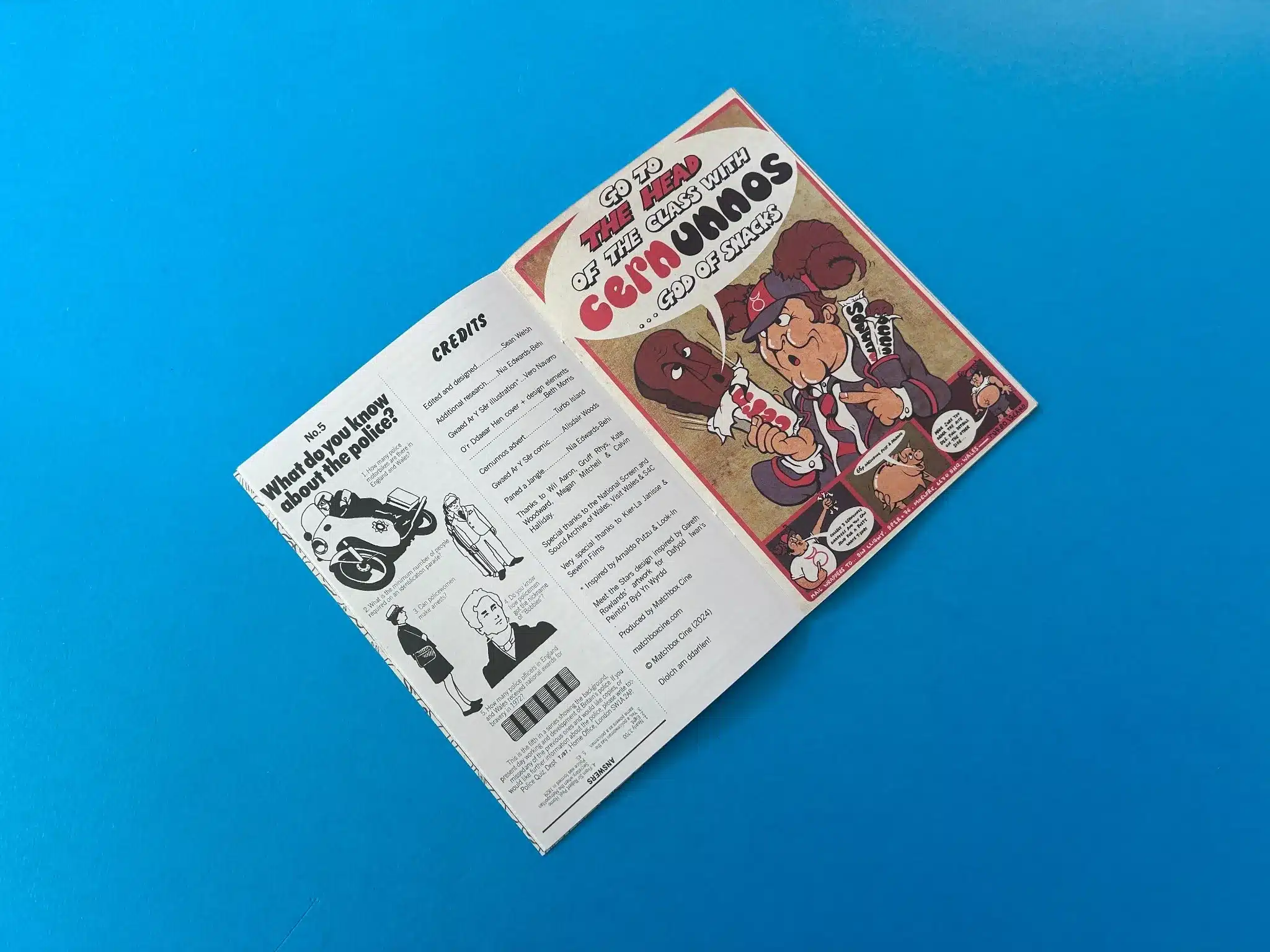
One of the standout features is the bold, contrasting colour palette. For example, green and yellow are paired for maximum impact in the first image, while the red and beige tones of the final covers evoke a retro pop-art vibe. This use of colour isn't just decorative; it helps to divide content sections and provide emphasis. The bright hues jump off the page, ensuring that key areas of text, such as the character introductions or credits, are immediately noticeable.
Typography plays a crucial role in shaping the tone of this booklet. Bold, large display fonts give the headings a sense of importance while also aligning with the retro theme. The main titles like "Meet the Stars!" use a wavy, bold type that enhances the zine-like, informal feel, drawing the reader in with a sense of fun and creativity. The combination of all-caps, sans-serif fonts, and hand-drawn elements gives the booklet a cohesive yet relaxed aesthetic. This mix works well to give the entire booklet a vibrant, fun, and accessible look.
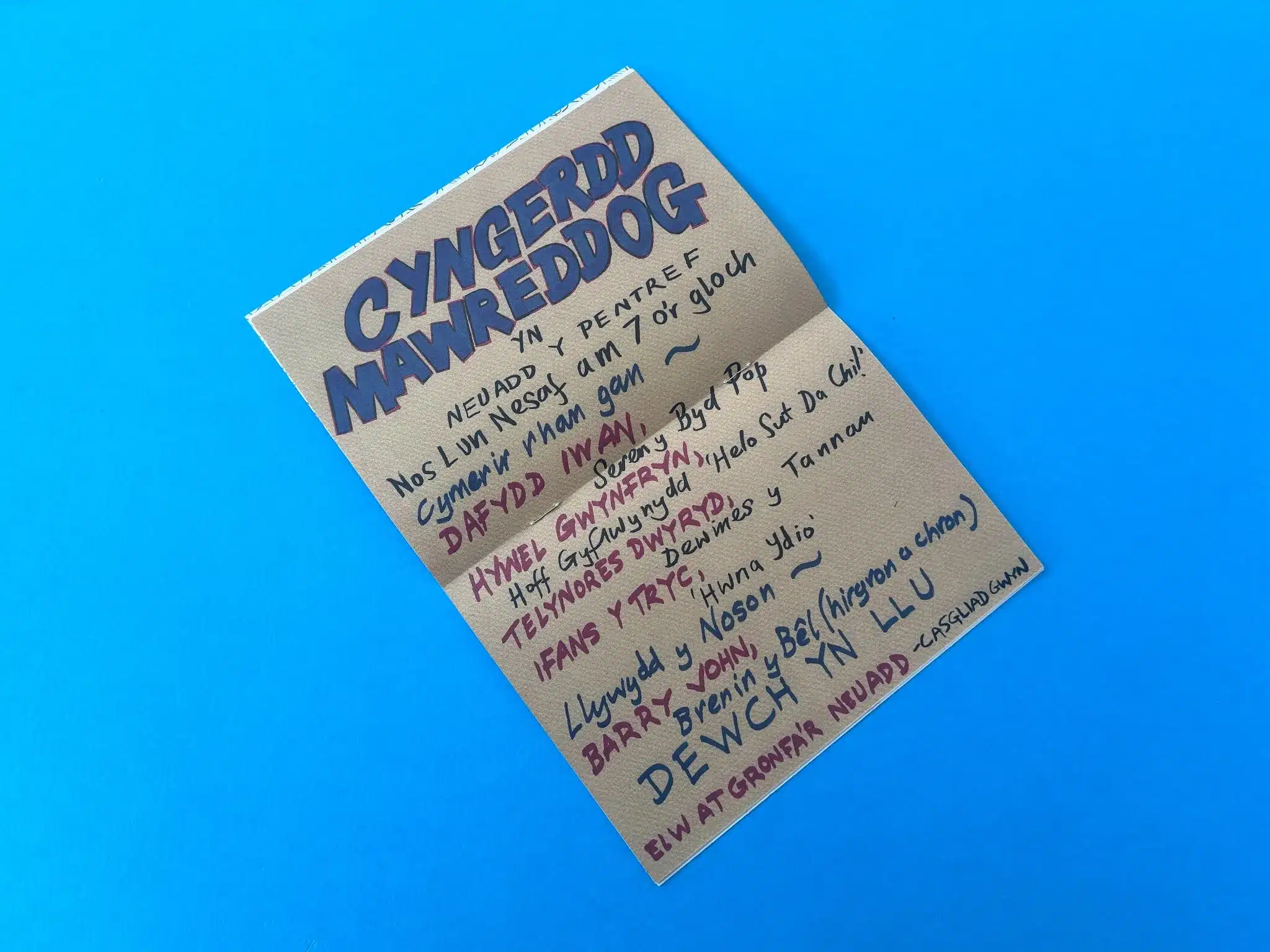
Illustrations in the booklet feel hand-drawn, maintaining the authentic, DIY aesthetic that is typical of zines. The comic-style drawings are bold, evocative, and humorous, reflecting the light-hearted tone of the programme content. The black-and-white portraits against colour-block backgrounds add a vintage touch, reminiscent of old TV promotional materials. This blend of image and text successfully conveys the nostalgic, yet cheeky tone of the publication.
The author and designer have skillfully used these visual elements to immerse the reader in the world of Welsh media and culture, particularly drawing upon 1970s nostalgia. The retro style of the booklet matches the thematic content of celebrating old TV favourites. The playful design and use of period-appropriate visuals and typography effectively communicate the booklet's intent to be both entertaining and informative.
Here are the winning features of this project that future designers and authors could follow:
The collaboration between Matchbox Cine and Ex Why Zed for the production of the "Gwaed Ar Y Ser" booklet showcases how thorough communication and print expertise can result in an outstanding final product, despite a few logistical challenges.
Sean Welsh from Matchbox Cine approached Ex Why Zed to print the "Gwaed Ar Y Ser" zine, with an A5 format and a retro design aimed at capturing the essence of 1970s Welsh media. From the very beginning, Ex Why Zed took a proactive approach, welcoming Sean to their service with a detailed overview of the print journey. Harriet Powell, a key point of contact at Ex Why Zed, emphasised the company’s commitment to guiding clients through the print process from start to finish. Their communication was personable, professional, and highly informative, giving Sean the confidence to proceed with Ex Why Zed as the printing partner for his project.
Ex Why Zed provided Sean with a clear and detailed print quote tailored to his specific requirements. The quote included eco-friendly material choices, such as FSC-certified paper, and a matte lamination for the cover, aligning with modern environmental standards. The pricing was transparent, without any hidden costs, and the free UK delivery was a definite plus. This openness in communication set the tone for a seamless collaboration.
As with any creative project, Sean faced some delays in finalising the artwork, and Ex Why Zed was accommodating throughout this period. They followed up with Sean periodically to check on the project’s progress and offer assistance with artwork setup. Ex Why Zed’s attention to detail shone through in their file preparation advice, including tailored guides for setting up wire-stitched booklets. They provided easy-to-follow instructions and additional resources for designers unfamiliar with the nuances of print preparation, ensuring the final product would meet all technical specifications.
This attention to detail extended to the additional zine project Sean requested, with Ex Why Zed offering a separate quote for a black-and-white booklet. Harriet even assured Sean that should any technical issues arise, they were on hand to provide immediate support, reinforcing their customer-centric approach.
Once the artwork was submitted, Sean opted for a print run of 1,000 copies. Ex Why Zed's response was quick and efficient, acknowledging the file receipt and providing a preflight check to ensure the artwork was print-ready. Mike, an account manager from Ex Why Zed, praised the booklet design in Adobe InDesign, recognising the creativity behind the project, which further strengthened the positive relationship between the client and the printer.
The production process was smooth, with Ex Why Zed completing the printing and arranging for deliveries to both the UK and the US. The final booklet featured the high-quality print and finish that Ex Why Zed is known for, combining their HP Indigo Digital and Heidelberg Litho Printing technology for superior colour accuracy and consistency.
Despite the smooth production, there were some logistical challenges related to the international shipping of the booklets. While the UK delivery arrived successfully, one of the boxes destined for the US was damaged during transit, resulting in approximately 175 copies being compromised. Sean informed Ex Why Zed, and they promptly addressed the issue by offering either a pro rata refund or a reprint of the damaged copies. Sean opted for a reprint, which Ex Why Zed facilitated quickly to ensure the project could still fulfil its distribution orders.
This incident demonstrated Ex Why Zed’s commitment to customer service. Their swift response to a difficult situation highlights their professionalism and ability to adapt to challenges, ensuring the client's needs were always met, even under less-than-ideal circumstances.
The final result of this collaboration was met with high praise from Sean, who described the printed booklet as "brilliant" and "really amazing work." This positive feedback confirmed that Ex Why Zed had successfully translated Sean’s creative vision into a tangible product. The retro design of "Gwaed Ar Y Ser" was brought to life with vibrant colours, smooth finishes, and high-quality binding, ensuring the booklet would make a lasting impression on its audience.
The project not only met the technical and aesthetic goals but also cemented a strong working relationship between Matchbox Cine and Ex Why Zed. With the positive outcome of this collaboration, there is potential for future projects, as hinted by Sean’s inquiry about another zine with similar specifications.
The collaboration between Matchbox Cine and Ex Why Zed exemplifies how a client-centric approach, technical expertise, and excellent communication can lead to the successful completion of a complex print project. From guiding the client through the intricacies of file setup to resolving logistical issues with professionalism and care, Ex Why Zed's print journey for "Gwaed Ar Y Ser" highlights their dedication to producing high-quality, bespoke print solutions.
The "Gwaed Ar Y Ser" booklet is not only a testament to Sean's creative vision but also a shining example of Ex Why Zed's capability to bring ambitious projects to life, reinforcing their position as the premier choice for creative print solutions.