250x170mm Booklets
4pp Cover onto 170gsm Uncoated
20pp Text onto 115gsm Uncoated
Four colour print throughout
Trimmed, collated and wire stitched
The What's Happening at The Place booklet is a vibrant and engaging programme, showcasing upcoming events at The Place Newport, a community hub in Wales. The booklet effectively reflects the essence of the venue—a welcoming, inclusive, and lively space for a wide range of activities. It achieves this through a combination of playful design choices, an inviting colour palette, and dynamic typography.
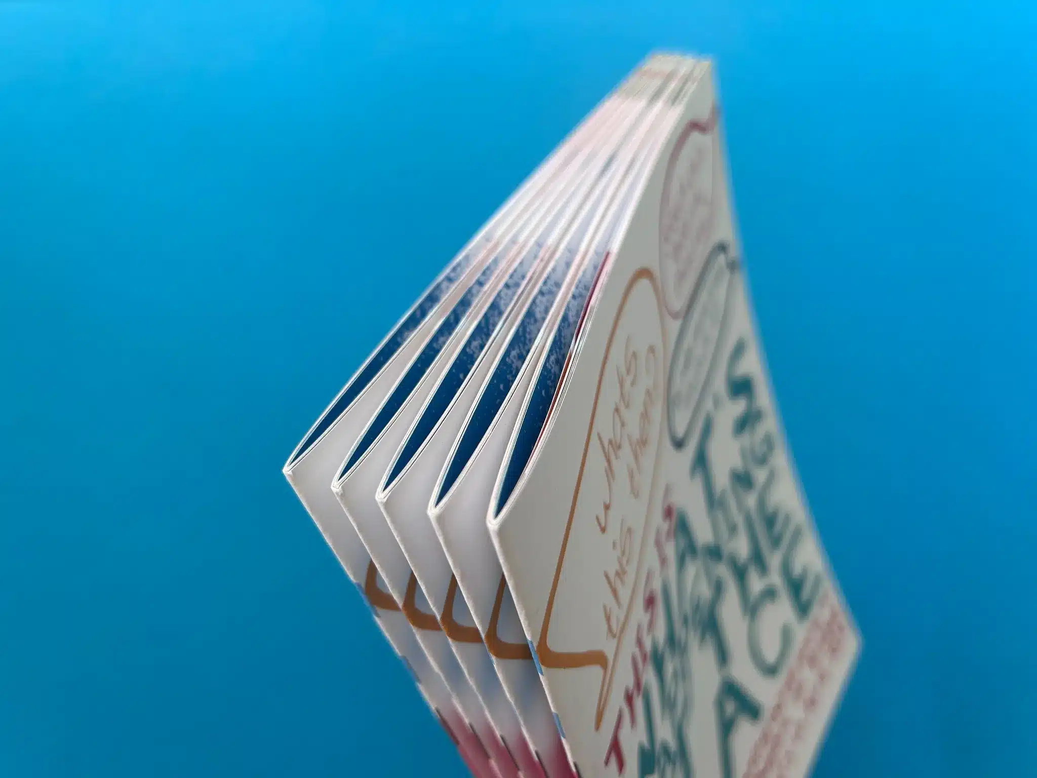
The binding of the booklet is wire-stitched, providing a practical yet polished finish. The stitching ensures durability for frequent handling, making it suitable for distribution within a busy community setting. The 250x170mm format is a good choice for this type of publication, offering ample space for both text and images without feeling overwhelming. The size also allows for easy portability, ensuring that community members can carry the booklet and reference it on the go.
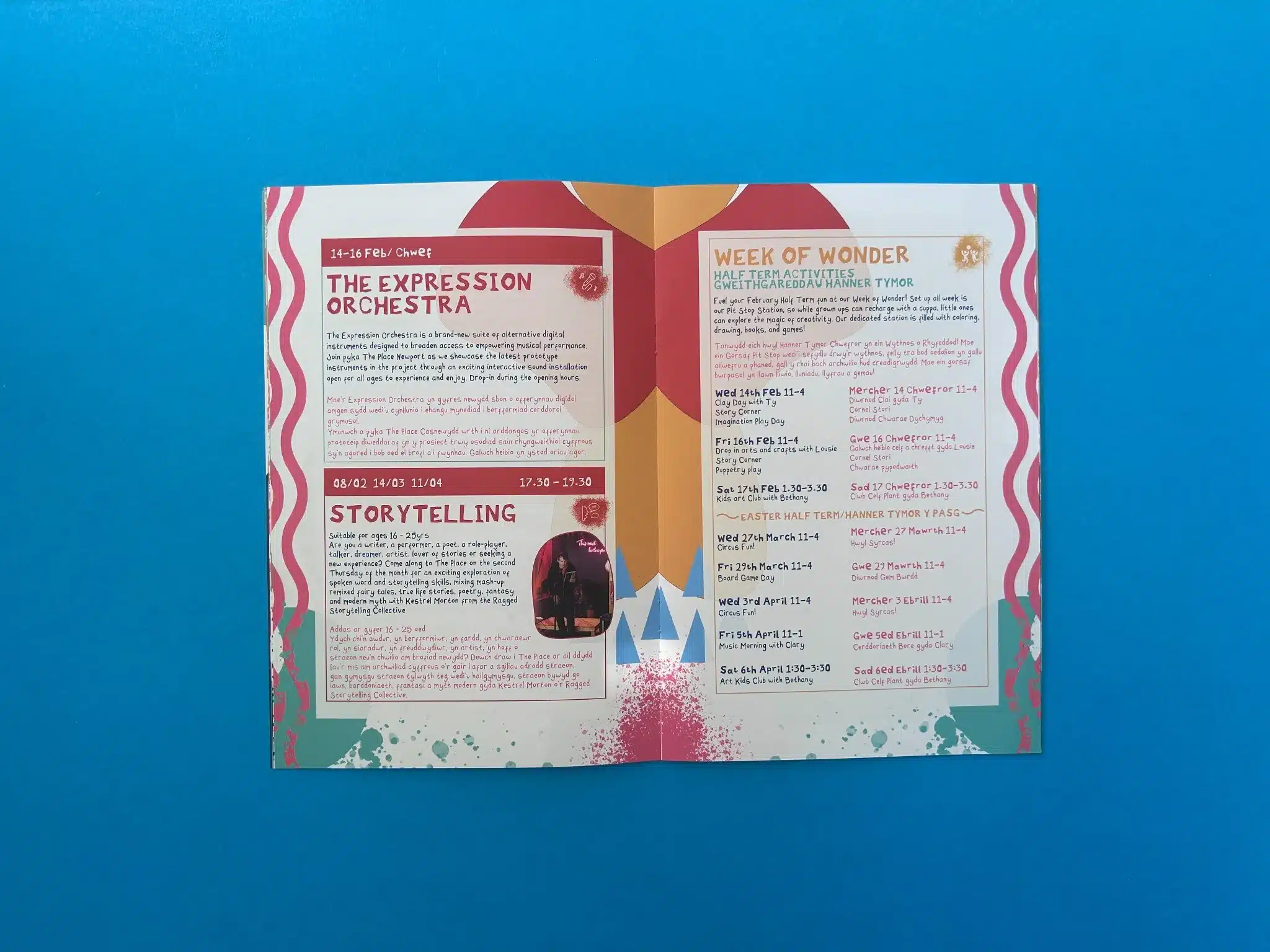
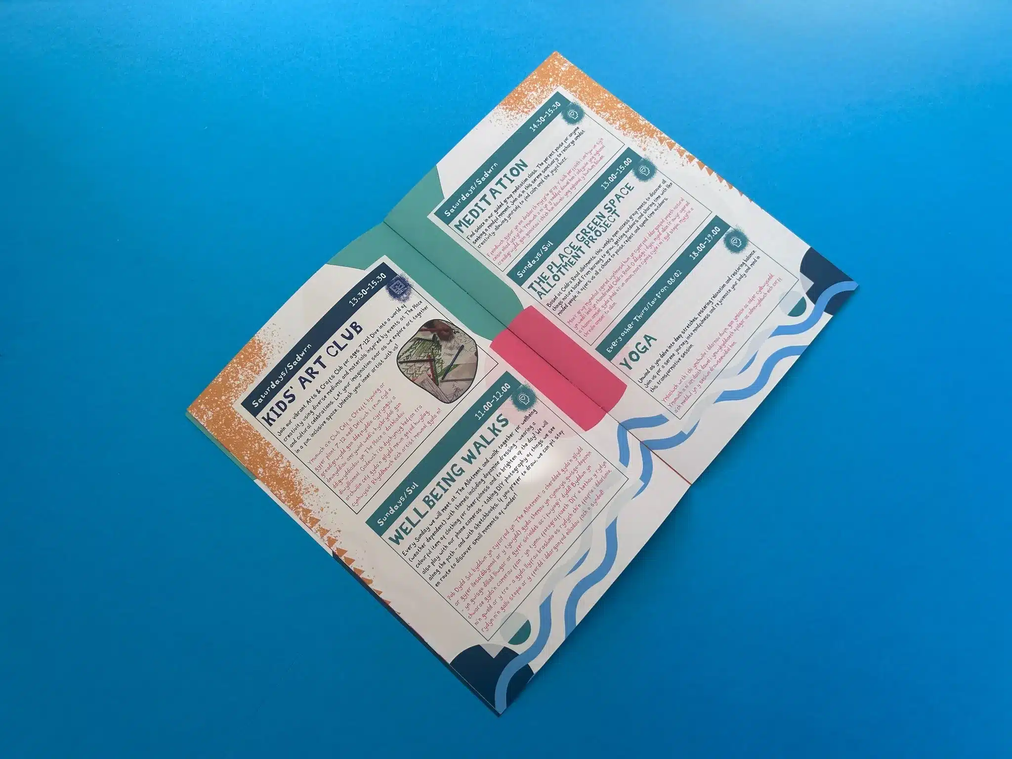
The interior pages are arranged in a structured yet accessible manner. The use of columns and clearly defined sections helps readers easily navigate the event listings. The layout supports visual flow by balancing text blocks with ample white space, avoiding the feeling of clutter, despite the content-rich nature of the booklet.
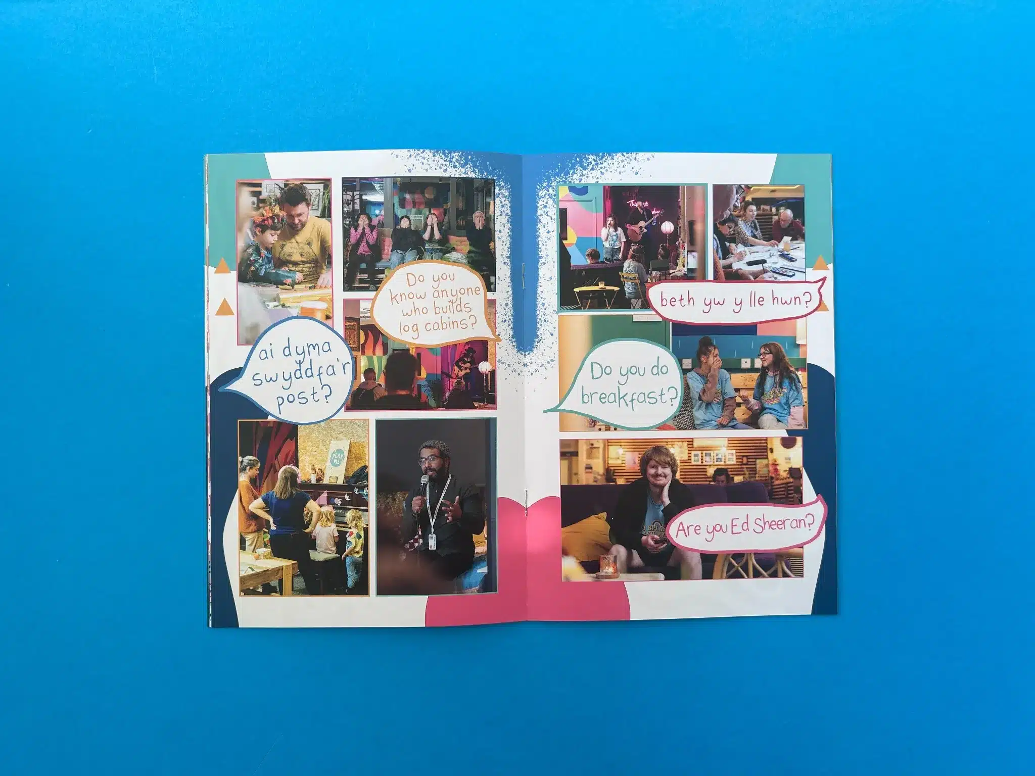
The cover immediately grabs attention with bold typography and speech bubbles—a distinctive design choice that contributes to the conversational and approachable feel of the publication. The combination of teal, red, and orange on the front cover sets a lively tone, reinforced by the informal speech bubbles posing community-centric questions such as, "What's this then?" and "Do you sell toasties?" The speech bubbles, which also include some Welsh language elements, are a subtle nod to the bilingual nature of Newport’s community, making the booklet more inclusive and representative.
Inside, the colour palette remains consistent, with variations of teal, orange, and pink used to delineate different sections. This helps create a sense of cohesion while also keeping the reader engaged. The typography is modern and playful, with a mixture of bold headings and friendly sans-serif fonts for the body text. This combination is effective in maintaining readability while contributing to the energetic aesthetic.
The booklet also features light illustrations and photos of community members, which humanise the publication and reflect the community-oriented purpose of The Place Newport. The images, such as people enjoying activities or participating in events, enhance the booklet's appeal, making it feel more like an invitation rather than a formal programme.
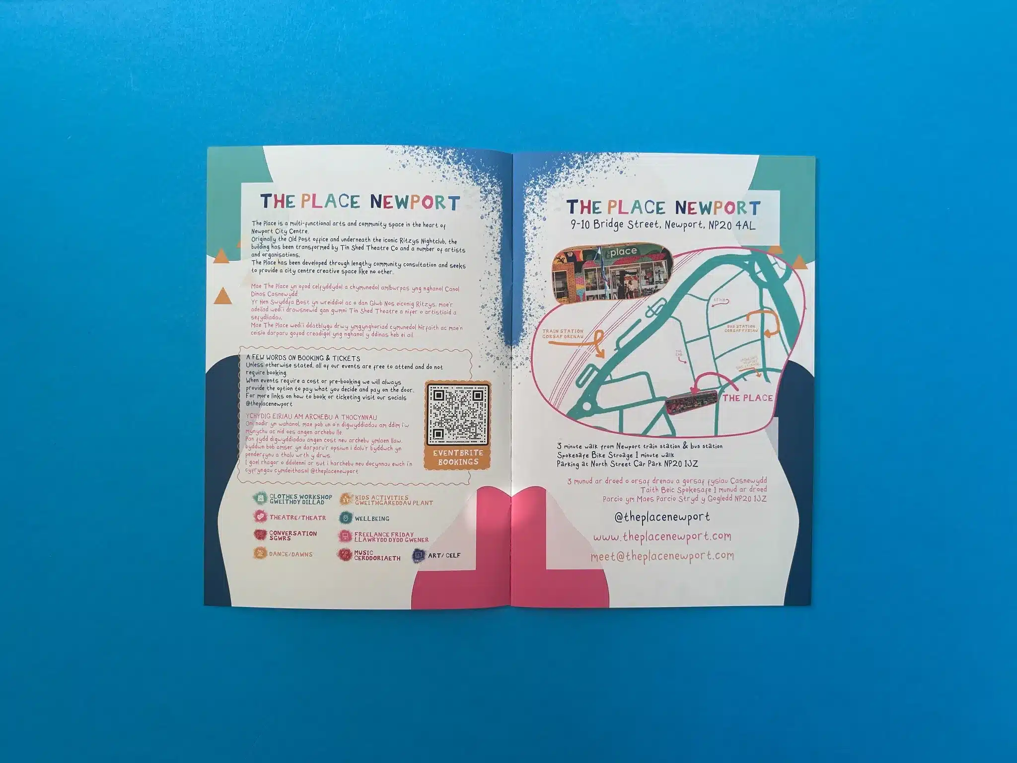
The use of bilingual text throughout the booklet is particularly impactful. It not only acknowledges the cultural and linguistic diversity of the audience but also makes the booklet more inclusive and accessible. This attention to detail reflects a commitment to community engagement.
Here are some key takeaways from the production of the What's Happening at The Place booklet that can guide future design and print projects:
By considering these actionable insights, future projects can adopt a similar approach to enhance community engagement and inclusivity, while also ensuring high production quality.
The collaboration between Ex Why Zed and The Place Newport, led by Josh Davis, was marked by seamless communication, attention to detail, and a focus on delivering a high-quality product. The project centred on printing the What's Happening at The Place programme booklet, a vibrant and bilingual guide to upcoming events at The Place Newport, a community-focused arts space.
The print journey began when Josh Davis reached out to Ex Why Zed with a new print request. Having previously worked together, the tone of communication was friendly and casual. In his email, Josh expressed satisfaction with the earlier programme runs, noting they looked "fricking awesome"—a clear indicator of the high regard for Ex Why Zed's past work. The new project specifications were laid out with clarity, including the booklet's dimensions (250x170mm), paper stock (170gsm uncoated for the cover, 115gsm uncoated for the text), and print style (four colour throughout, trimmed, collated, and wire-stitched).
Josh provided a link to the artwork without any notable issues in file setup. However, Ex Why Zed’s response ensured any potential hiccups were preemptively addressed. Harriet guided Josh through the proofing process, highlighting the importance of checking resolution on a desktop for optimal clarity, especially when proofs might appear off on mobile devices. This attention to detail shows Ex Why Zed’s expertise in ensuring client satisfaction at every step of the process.
Before proceeding with print, Ex Why Zed sent Josh a final PDF proof to review and approve. The proofing process was simplified with a web-based interface, ensuring quick and easy approval while still maintaining a thorough check for accuracy.
Once Josh approved the proof, the project was queued for print. Ex Why Zed’s production team executed the project swiftly, ensuring the booklet was printed and finished to the highest standard. Wire stitching, used for the booklet’s binding, provided durability and allowed for frequent handling—crucial for a community-oriented publication that is likely to be well-used.
Throughout the production and delivery stages, Ex Why Zed maintained clear communication. Josh was informed the project had left the printing facility and was given a delivery window to ensure someone could be present to sign for the package. This level of detail helped avoid any potential delivery issues, reflecting Ex Why Zed’s commitment to meeting client expectations and deadlines.
The entire process—from the initial request to delivery—was completed efficiently and with professionalism. Josh’s positive feedback at the start of the project, referring to the previous work as “fricking awesome,” underlines the trust and satisfaction that had already been established. While there is no direct feedback provided after delivery in the email exchange, the client’s enthusiasm in returning to Ex Why Zed for another project speaks volumes about the high quality of service and product received.
This project exemplifies how Ex Why Zed not only meets but exceeds client expectations through clear communication, attention to detail, and timely delivery. By focusing on these elements, we continue to strengthen long-term relationships with clients like The Place Newport, becoming their go-to partner for all printing needs.
The final product, a 250x170mm, 24-page booklet, was printed with exceptional precision and attention to detail. Given the positive feedback from Josh regarding previous work, it is safe to conclude that the latest booklet maintained, if not exceeded, the expected quality. The bilingual nature of the booklet, along with its playful design and practical binding, makes it a valuable asset for the community, ensuring that it can be distributed widely and withstand frequent handling.
The client, Josh Davis, was satisfied with both the production process and the end result, as evidenced by his proactive communication and immediate approval of the project at various stages. Ex Why Zed’s role in guiding the project to success, from file setup to final delivery, showcases the level of expertise and service that continues to delight clients.
This successful print journey reinforces Ex Why Zed’s position as a reliable partner for community-driven publications, solidifying our role in supporting cultural and creative spaces like The Place Newport.
In summary, the client collaboration journey was smooth, with open communication ensuring that all potential challenges were addressed promptly. The end result—a vibrant, community-focused booklet—was delivered on time and to the client’s satisfaction. Based on this project’s success, further collaborations with The Place Newport are likely, as Ex Why Zed continues to deliver high-quality print solutions that meet the unique needs of each client.