240x170mm Booklets
4pp Cover onto 250gsm Gloss
Gloss Lamination to outer
16pp Inside pages onto 120gsm Uncoated
Four colour printing (CMYK Ink)
Staple Bound
“The printing is wonderful.”
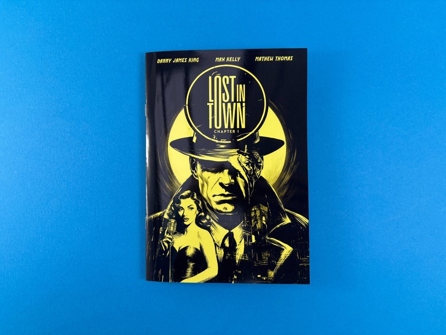
Lost in Town – Chapter 1 is a gritty, noir-inspired comic that doubles as an introduction to the Lost in Town Brewery universe. Created by Danny James King, Max Kelly and Mathew Thomas, it’s aimed at comic lovers, story obsessives and illustration fans who enjoy a moody, cinematic read. We worked with the team to refine the spec, test a sample copy and then litho print 1,000 copies of a custom-size booklet that feels every bit as polished as the artwork deserves.
About the Comic Printing
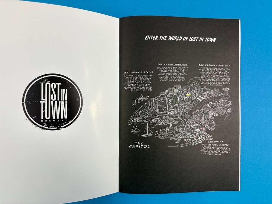
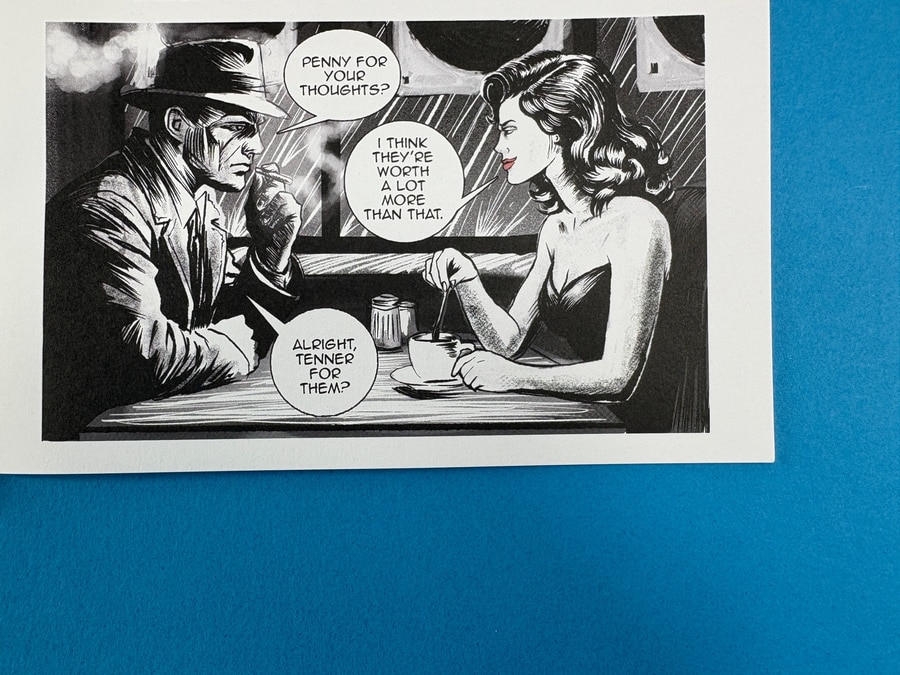
Lost in Town is steeped in classic noir: trench coats, smoky bars, whispered deals and late-night journeys through rain-slick streets. The opening spread drops readers straight into the world with a brewery logo on the left and a dense illustrated map of the city on the right, inviting you to explore its districts before the story even begins.
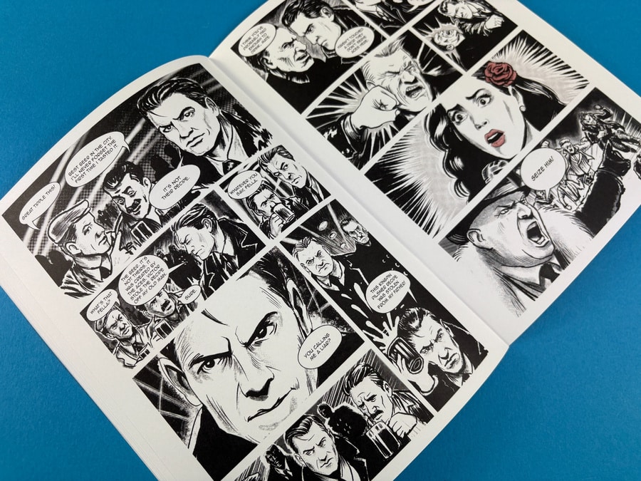
Across the pages, chunky brushwork and expressive faces carry the drama, while the panel layouts keep the pacing tight and readable. From tense alleyway standoffs to intimate café conversations, the story feels like a black-and-white film flickering to life on paper.
Print Specification & Materials
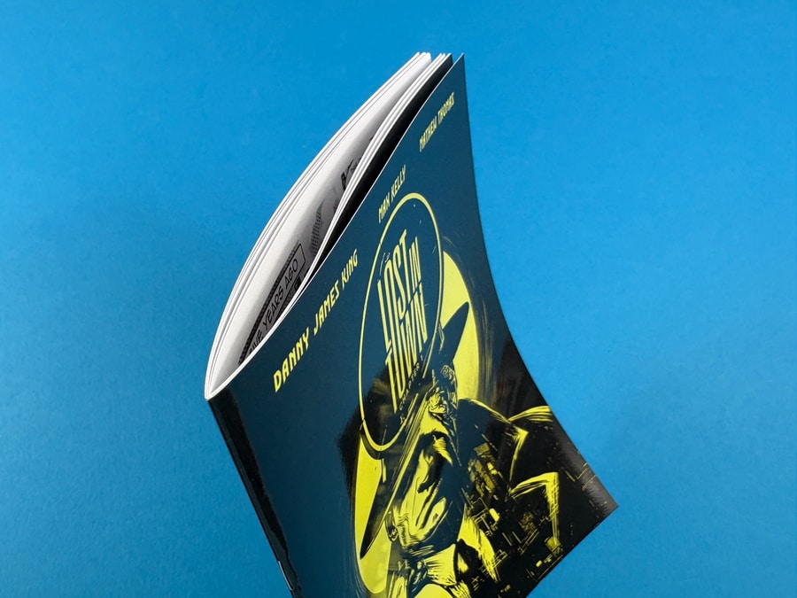
The creators wanted something more interesting than standard A4, so we settled on a 240 x 170mm custom size – big enough for detailed artwork, compact enough to feel like a true graphic novel chapter.
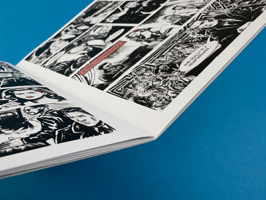
The gloss-laminated cover adds depth and shine to the black-and-yellow illustration, making the neon-style title and moonlit figure pop. Inside, the shift to uncoated stock is a deliberate contrast: it softens the ink slightly, suits the monochrome artwork and makes the book feel more tactile in the hand.
Design Details That Make It Sing
The front cover is an absolute showstopper. A lone detective fills the frame, hat brim cutting into a glowing moon, while a singer and city skyline fade into the shadows below. The fierce black-and-yellow combination grabs attention from across the room, and the gloss lamination amplifies the highlights and deep blacks.
Open the booklet and there’s an instant gear change: smooth, matt-feeling uncoated pages with a generous white border around each page of artwork. That breathing space keeps the storyboards clear and stops the spreads feeling cluttered, even when the panels are busy.
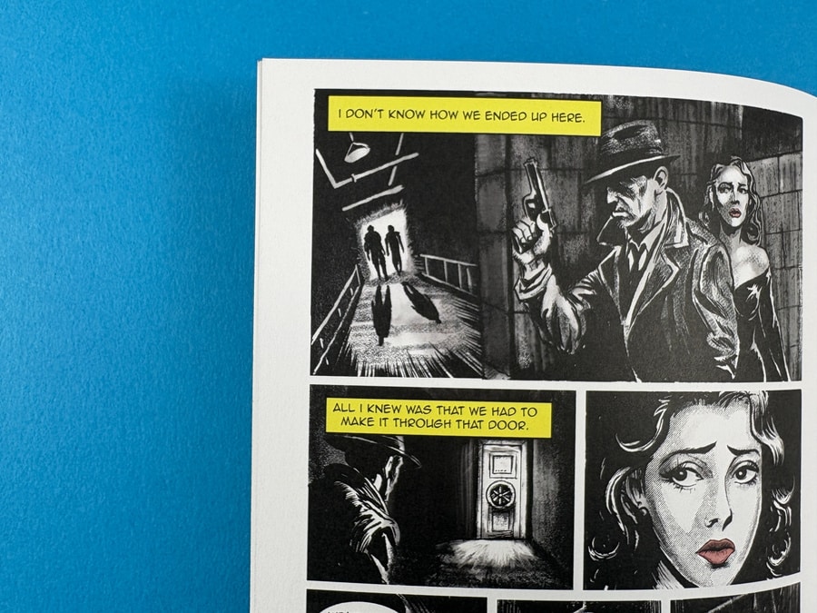
The internal palette leans heavily on black and white, with selective splashes of yellow and red to emphasise captions, signage and key dramatic beats. A red flower, a glowing club sign, a highlighted text box – each accent colour guides the reader’s eye and adds drama without overwhelming the page.
The Client’s Print Journey
Adriel first got in touch looking for 1,000 copies and thinner pages to keep the comic user friendly and easy to flick through. We provided quotes for both A4 and a smaller 240 x 170mm format, explaining how paper weight would affect feel and page turn.
Next came artwork and size decisions. The early files arrived at a different trim size to the quote, so we talked through bleed, borders and the benefits of a consistent finished size. Once the team confirmed 240 x 170mm, we checked the PDFs, requested 3mm bleed and helped tidy up crop marks that had crept onto the trim line.
Because the comic needed to launch alongside an event, we produced a single physical proof first – a digitally printed sample that let the team check layout, pacing and overall feel in hand. After Mathew confirmed everything was working and shared the final artwork, we moved into litho production for the full 1,000-copy run and organised delivery to their London studio ahead of the weekend.
How Ex Why Zed Helped
Our role was to make sure Lost in Town read as smoothly in print as it did on screen, while staying within the timeline for the launch. We:
- Advised on switching to thinner 120gsm uncoated text to keep the book light and easy to handle.
- Suggested the 240 x 170mm custom size for a more considered, graphic-novel feel.
- Provided clear guidance on bleed, borders and crop marks so the artwork would sit correctly once trimmed.
- Produced a one-off sample copy so the team could see the comic in real life before committing to the full litho run.
- Kept communication flowing when there was confusion over “final” files and dates, confirming that Friday’s artwork was the approved version and pressing ahead to hit the Thursday delivery window.
The result is a brilliant first chapter that feels professional, considered and ready to sit alongside any indie comic on the shelf.
Takeaways for Your Next Comic or Graphic Novel
- Pick a custom size like 240 x 170mm to give your book a distinctive, bookshelf-friendly presence without the bulk of A4.
- Mix finishes for contrast – gloss-laminated covers and uncoated text pages give you impact on the outside and a comfortable reading experience inside.
- Keep white space around panels so even dense spreads remain readable and your lettering has room to breathe.
- Limit your accent colours; a splash of yellow or red against black and white can do more storytelling than a full rainbow palette.
- Order a single proof copy before a large litho run so you can check pacing, typography and fine detail in real life.
- Agree deadlines and “final files” clearly with your printer so production can be scheduled reliably around events or launches.
- Use 3mm bleed and correct crop marks from the start to avoid last-minute tweaks and keep trims clean.
More inspiration and resources for your eyes to enjoy