A4 Books
4pp Cover onto 200gsm Gloss
Gloss Lamination to outer
80pp Text onto 115gsm Gloss
Printed in full colour throughout (CMYK Ink)
Perfect bound
We printed this as an A4, perfect bound portfolio with a gloss-on-gloss recipe that suits punchy, modern photography.
Why it works
➡️ Gloss cover + gloss lamination gives immediate pop and durability — ideal for a portfolio that’s going to be handled a lot.
➡️ 115gsm gloss text keeps the book slim and easy to flip, while still letting the images jump off the page. It’s a very “magazine” move: energy first, bulk second.
If you’re weighing up paper options, our paper samples page is a helpful starting point.
This one is pure impact: a fearless cover that leads with bold typography, then a run of portraits that feel immediate, human, and properly confident. The gloss stocks give it that true magazine snap — and the lighter 115gsm text proves a point we love: if the edit is strong, you don’t need heavy pages to make it land.
Client Quote
“Thanks for your help with this — I’m really excited to see it!”
About the Portfolio
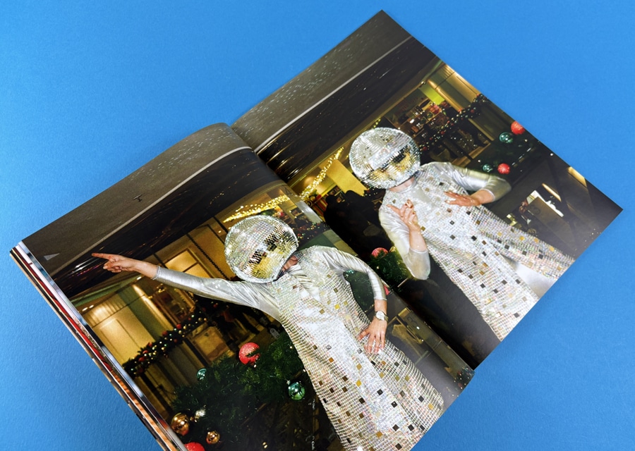
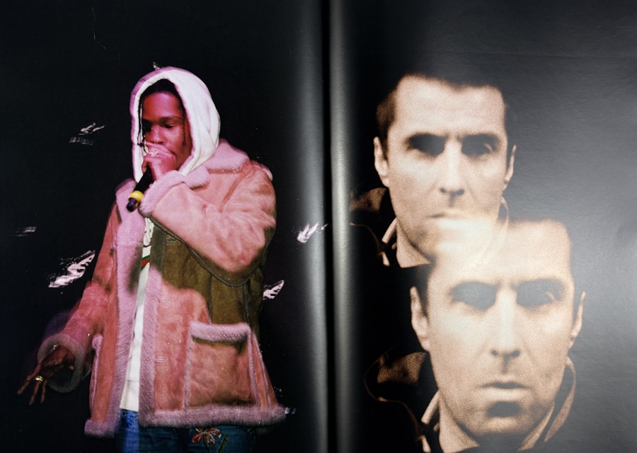
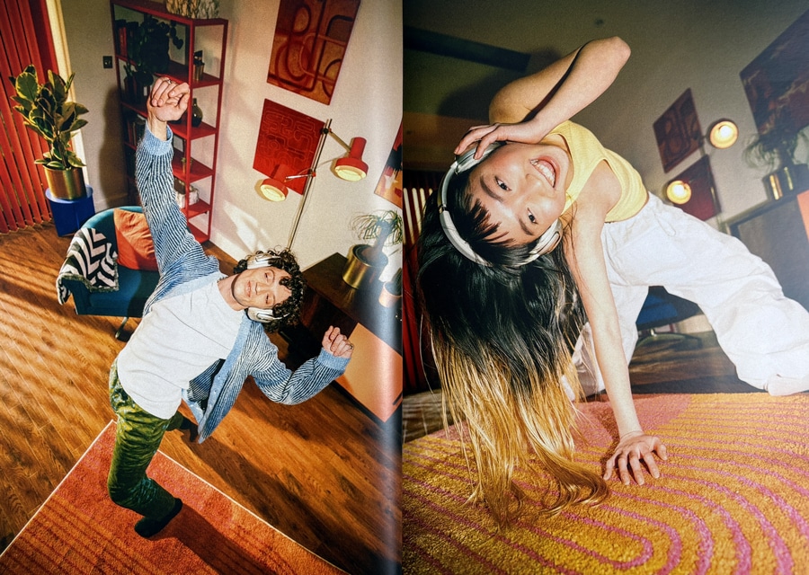
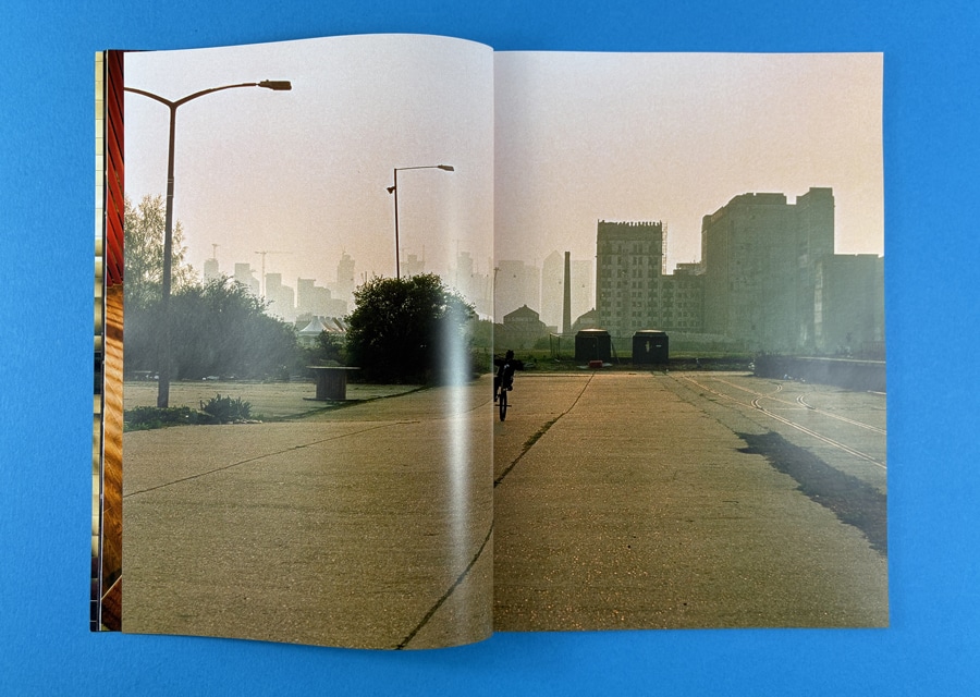
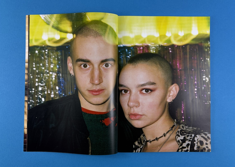
Henry Dean’s portfolio is designed as a glossy, magazine-style showcase for photography clients, friends, and people already following the work on Instagram (@hhhhhhhhhhhhenry). It’s image-led from the first second: big portraits, confident pacing, and enough punch in the colour to stop you mid-flip.
A portfolio like this isn’t trying to feel precious. It’s trying to be grabbed, skimmed, re-opened, and passed across a table — which is exactly why the spec leans into gloss and a clean perfect bound spine.
If you’re planning something similar, explore our portfolio printing
Or browse more ideas on the main portfolio page
Magazine Design Details
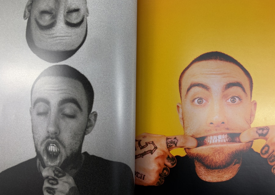
The cover is the hook: oversized red typography over a photographic image, with the title doing the heavy lifting. Inside, the edit is mostly portraits — people in their own spaces, with colour that’s bright, lively, and unafraid of saturation. On gloss stock, that kind of work reads fast and hits hard.
A small but important technical note came up in proofing: some images that looked black and white were actually supplied as colour. Clean monochrome reproduction in digital print can be tricky if files aren’t truly set up for it, so we flagged it early and asked for updated artwork before going to press.
Internal links / CTAs
For file prep help, our file set-up knowledge base is worth bookmarking.
The Client’s Print Journey
This project moved quickly and smoothly, with the right checks in the right places.
- Henry shared the brief for a glossy, magazine-style portfolio and sent files over via WeTransfer.
- He asked smart, common questions about CMYK colour shift (especially purples/blues looking washed on-screen) and how they’d translate to print.
- We flagged the black-and-white file issue early, then supplied a final digital proof for full-page approval before going into the print queue.
- Turnaround and delivery were communicated clearly, with shipping confirmed as included.
If you like a guided process like this, our overview of the Ex Why Zed print journey explains how we run proofs, approvals and production: /print-journey/
How Ex Why Zed Helped
A strong portfolio doesn’t just need good printing — it needs the annoying little technical stuff handled before it becomes expensive.
On this job, that meant:
- Pre-press eyes on the files (spotting “B&W that isn’t really B&W”).
- Clear proofing steps so Henry could approve confidently, page by page, before we printed.
- Straight answers on colour expectations (CMYK vs screen) and what to adjust if certain hues matter.
If you’re building an A4 perfect bound book, our perfect binding set-up guide helps avoid last-minute fixes: /resource/perfect-binding-set-up-guide/
Takeaways for Your Next Photography Portfolio
- Let the edit do the flex. A thinner 115gsm gloss can feel brilliant when the imagery is strong — it keeps the portfolio quick to handle and easy to revisit.
- Gloss is a deliberate vibe. If you want “magazine energy” and punchy colour, gloss stocks make that job easier.
- Treat monochrome as its own workflow. If you want true black and white, prep it intentionally (and don’t assume “looks grey” = “is grey”).
- Expect CMYK to behave differently to your screen. If purples/blues are critical, do a check early and proof carefully.
- Always build in a proper proofing moment. It’s the calm step that protects the whole run.
Ready to price up your own run? Our instant printing quote calculator is a good place to start.