176x250mm Landscape Books
4pp Cover onto 300gsm Silk (4mm spine)
Matt Lamination to outer
44pp Text + Photos onto 170gsm Silk
Printed in Black and White throughout
Trimmed, collated and perfect bound
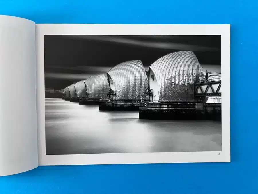
Opera In The Dark by photographer Robert James, in collaboration with poet Phyl Harris, is a compelling exploration of urban landscapes and architectural subjects through black and white photography. The book’s design and aesthetic are rooted in a dramatic, high-contrast monochrome theme that pairs perfectly with Harris’ poetry, creating a meditative, reflective experience for the reader. The images and text work symbiotically, allowing each to breathe, with neither overpowering the other. The zine-like quality of the book allows for an intimate, almost cinematic feel, as readers explore themes of isolation, the passage of time, and industrial beauty.
The book's size, 176x250mm in landscape format, offers a balance between portability and ample space for detailed imagery. Its perfect binding ensures durability while allowing for clean, seamless spreads that enhance the immersive nature of the photography. The 4mm spine also provides enough room for the title, which is neatly placed without clutter.
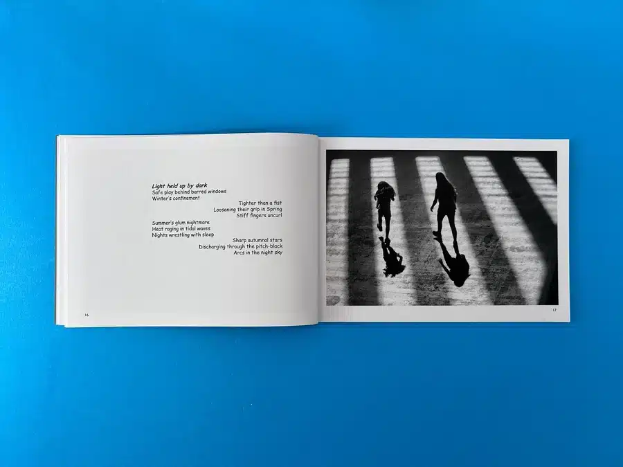
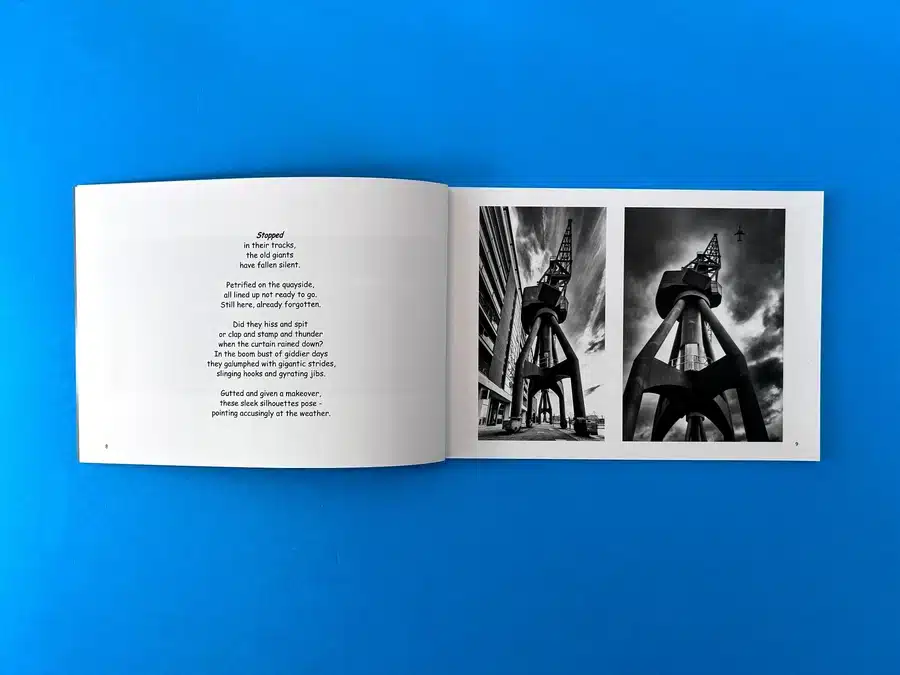
The layout is simple and functional, adhering to a well-organised structure that avoids overwhelming the reader. On the left side, the text is presented in clear, spaced typography, making it easy to read and creating visual pauses between the evocative imagery on the right side of most spreads. This alternating rhythm between image and text offers a calming flow throughout the book, guiding the reader through visual and literary narratives simultaneously.
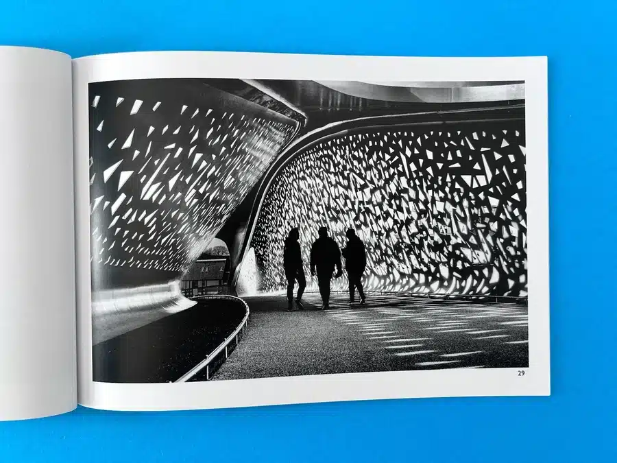
Given that the book is printed entirely in black and white, the use of contrast is of utmost importance. The images are striking, with deep blacks and crisp whites enhancing the architectural subjects’ textures and forms. The lack of colour brings out the starkness of the urban environments captured, emphasising light, shadow, and composition.
The typography is clean and sans-serif, matching the modern, minimalist aesthetic of the photography. The font choice mirrors the boldness of the imagery but remains understated enough not to detract from the photographs. Each poem, thoughtfully aligned with its respective image, is given ample breathing space, allowing the reader to engage with the text before absorbing the photograph fully.
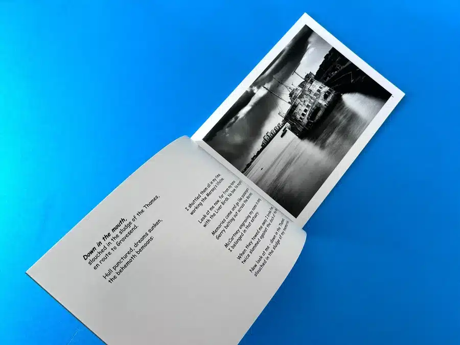
The book's aesthetic is cohesive, maintaining a uniform, contemplative tone throughout. The photographs chosen for the book highlight abandoned industrial giants, looming cityscapes, and quiet urban scenes that create a sense of stillness and introspection. This mood is further deepened by the accompanying poetry, which echoes themes of time, decay, and transformation. The use of long exposure in several images creates an ethereal, almost ghostly quality to the urban spaces, further aligning with the poetic content.
The decision to keep the imagery black and white underscores a timeless quality, making the structures and environments feel both historical and contemporary at once. This deliberate design choice helps communicate the book’s exploration of the passage of time in urban spaces.
By carefully considering these aspects, future authors and designers can replicate the success of Opera In The Dark in their own projects, ensuring that their vision is brought to life through a well-thought-out, high-quality publication.
Robert James’ Opera in the Dark began with a clear vision: to craft a high-quality photozine blending his striking black-and-white photography with evocative poetry. Throughout the project, Ex Why Zed worked closely with Robert to ensure his artistic vision was perfectly translated into print, tackling technical challenges and providing expert guidance along the way. The result was a collaborative journey that balanced creative expression with technical precision, ultimately producing a beautifully bound zine that reflects the depth of Robert’s work.
The journey began when Robert reached out to Ex Why Zed inquiring about printing options for his photozine. His initial queries were focused on whether we could handle the specific dimensions he had in mind—landscape format at 176x250mm—and how to best handle the high-contrast black-and-white images. Robert was particularly concerned about the final output of these images, as he wanted them to retain their dramatic contrast when printed.
We provided Robert with a sample pack comparing grayscale and CMYK printing on both silk and gloss paper, allowing him to see the different effects for himself. Our account manager, Harriet, advised Robert to use PDF files for the final print, rather than TIFF or InDesign formats, to ensure compatibility and ease of production.
One of the key challenges in the project revolved around how best to print Robert’s high-contrast images. After reviewing the samples, Robert found that grayscale alone did not achieve the desired level of contrast for his photography. He requested test prints of one of his images in both CMYK and grayscale on silk and gloss paper to make an informed decision.
Our team promptly arranged these tests and supplied Robert with flat sheet proofs for comparison. However, a miscommunication regarding labelling caused confusion. Robert expected clear markings differentiating between CMYK and grayscale prints, but the delivered proofs lacked this clarity. Although disappointed initially, Robert worked with our team to resolve this, ultimately making his choice based on the difference in gloss and silk finishes. This situation demonstrated the importance of precise communication, especially when managing detailed creative projects.
As Robert prepared to finalise his photozine, he encountered several technical issues, including how to correctly set up his grayscale images in InDesign. He was unsure how to import these files without converting them to RGB or CMYK. We guided him through the process, ensuring that his grayscale images were preserved correctly during the PDF export, avoiding unwanted colour conversion.
Another aspect that required attention was the layout. Robert initially expressed concern about ensuring the quality of the printed photographs, especially given the visual demands of his high-contrast imagery. We reassured him by offering pre-flight checks on the submitted files, which allowed us to identify any technical issues before proceeding to print.
Robert eventually confirmed the print specifications for Opera in the Dark: a 176x250mm landscape book with a 4mm spine, 300gsm silk cover with matt lamination, and 44 pages of black-and-white images and poetry printed on 170gsm silk. After receiving our detailed quote and reviewing the pre-production PDF proof, he approved the final artwork. At this stage, Robert made a final decision to upgrade the cover paper to 350gsm silk for a more premium feel, a choice we swiftly accommodated.
Throughout the production process, we kept Robert updated with delivery estimates and progress. The finished product was printed, trimmed, and bound to perfection, maintaining the crispness and contrast of his photography while ensuring that the book had a polished, professional aesthetic.
Upon receiving the printed zine, Robert expressed satisfaction with the final product, noting how well the images and poetry were presented on the silk paper. The collaboration between Robert and Ex Why Zed resulted in a photozine that captured the moody, immersive atmosphere he sought to convey, with each image reproduced with the level of detail and depth required for black-and-white photography. Although there were a few technical bumps along the way, the open communication and commitment to quality ensured that the final result exceeded expectations.
The success of Opera in the Dark has set the stage for potential future collaborations with Robert James. His appreciation of our attention to detail, responsiveness, and ability to navigate the challenges of high-contrast black-and-white printing highlights the strength of Ex Why Zed’s customer-centric approach to printing complex, visually demanding projects.
This project showcases Ex Why Zed’s commitment to delivering high-quality, custom print solutions while maintaining an open and collaborative dialogue with clients. Our expertise in handling technical challenges, coupled with our ability to deliver on creative vision, ensures that each project meets or exceeds client expectations. The journey with Robert James and his Opera in the Dark photozine is a testament to the transformative power of collaboration between artist and printer.
