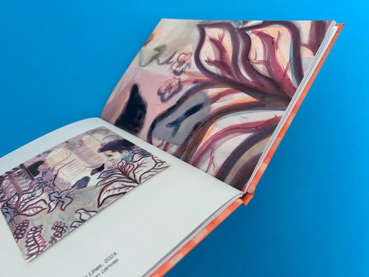
A5 Casebound Books
Cover Printed onto 170gsm Silk
Matt Lamination to outer
Wrapped over greyboard case
2x 4pp End Papers Printed onto 170gsm Uncoated
40 inside pages onto 170gsm Uncoated (9mm Spine)
Four colour print throughout
Trimmed, collated and case bound
The book, Miko Veldkamp: Buketan, is an A5 casebound art publication, crafted to showcase the dreamlike, immersive quality of Veldkamp’s work. Its production demonstrates exceptional attention to detail and cohesion between the visual narrative and print design.
The hardcover design reflects a high-end approach. Printed on 170gsm silk with matt lamination, the cover has a tactile softness that contrasts the vivid colours and layered textures of the artwork. This contrast subtly echoes the themes of memory and identity present in Veldkamp's art. The greyboard case underneath provides durability while ensuring a sleek aesthetic.
The typography is minimal yet intentional. The clean sans-serif typeface on the cover is positioned delicately, ensuring it doesn’t compete with the bold and dynamic artwork. It complements the contemporary and global perspective of Veldkamp’s paintings.
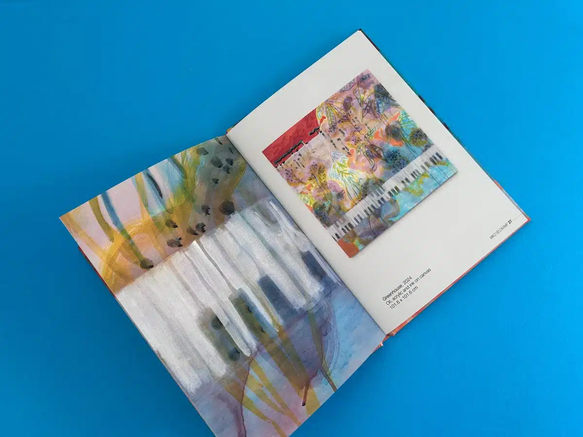
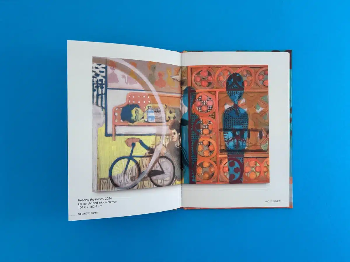
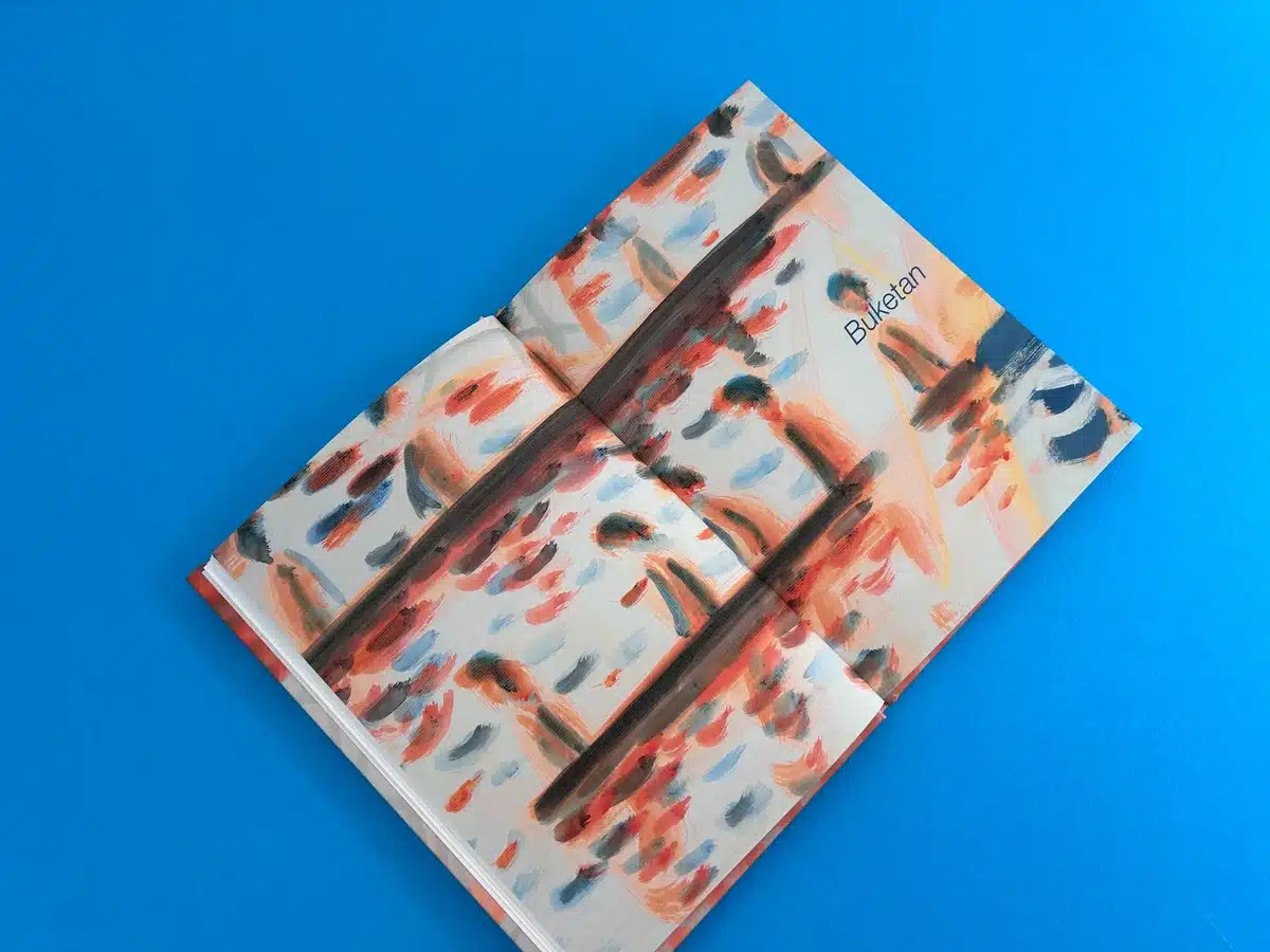
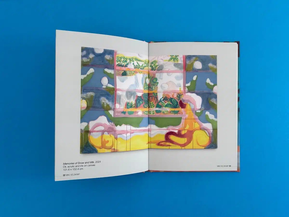
The internal pages are printed on 170gsm uncoated stock, enhancing the vibrancy of the artwork while providing a natural texture that complements the layered, painterly quality of Veldkamp’s work. The endpapers, also printed on 170gsm uncoated paper, provide a seamless transition between the cover and content, echoing the visual language of the paintings. Inside, the layout is uncluttered, allowing the art to breathe. Captions are placed unobtrusively, offering context without overshadowing the visual elements.
The interplay between opacity and translucency in Veldkamp's art is mirrored in the production choices. The four-colour print throughout captures the artist’s nuanced palette—ranging from muted tones to bursts of vivid hues—ensuring the artwork retains its depth and complexity. The contrast between soft washes of colour and sharper details mirrors the themes of memory and identity in flux.
Veldkamp’s paintings are deeply introspective, blending cultural signifiers from Suriname, the Netherlands, and NYC. The designer amplifies this narrative through a fluid and seamless layout, emphasising the artwork’s dynamism. By balancing minimalist typography and bold visuals, the book reflects the artist’s themes of memory, identity, and the act of looking.
The structure also reflects Veldkamp’s oscillation between realism and abstraction. For instance:
The synergy between the production values and artistic intent ensures the book is both a visually compelling and emotionally resonant experience. It effectively portrays Veldkamp’s work while elevating it through thoughtful design.
The journey of transforming Miko Veldkamp: Buketan into a striking A5 casebound art book began with Alice Amati Gallery’s vision of crafting a publication that could reflect the nuanced layers of Veldkamp’s work. This project was a seamless blend of creativity, precision, and collaboration, underscored by Ex Why Zed’s commitment to exceptional print quality and attentive client support.
Alice Amati’s initial request outlined a specification for an A4 hardback art book. After an engaging exchange of ideas, she opted for an A5 format to align with her gallery's established catalogue style. Ex Why Zed quickly adapted, offering revised quotes and maintaining an open line of communication to address her queries about turnaround times, artwork setup, and print options.
The decision to go with A5 not only reduced costs but also enhanced portability and accessibility for the gallery's audience. This highlights the importance of tailoring print solutions to meet both creative and practical needs.
Recognising that casebound books can be technically challenging to set up, we shared detailed guides tailored for both professional designers and beginners. These resources covered artwork preparation, running orders for hardbacks, and tips for layout alignment. Alice’s reassurance about working with her usual designer simplified the process further, ensuring a smooth transition from vision to execution.
When additional queries arose, such as incorporating coloured paper for endpapers, we provided swift and clear options. While G.F Smith Colorplan colours were considered, time constraints and stock availability led Alice to retain the uncoated white paper option. This flexibility in problem-solving ensured deadlines were not compromised.
Midway through the project, Alice requested an increase in internal pages from 36 to 40. We promptly recalculated costs and provided updated quotes. Despite these changes, Ex Why Zed maintained its commitment to transparency, avoiding hidden fees and communicating every detail.
The collaborative spirit shone during the file review stage. We encouraged Alice’s designer to share a work-in-progress file for early feedback, which helped preempt potential issues. The final proof, reviewed thoroughly by Alice, received her approval without delay, paving the way for smooth production.
The book production exemplified meticulous attention to detail, from the matt-laminated silk cover to the uncoated interiors that captured Veldkamp’s vibrant palette. Despite the tight timeline, the project proceeded without a hitch, and the books were dispatched ahead of schedule.
Delivery logistics were closely monitored, and updates were shared with Alice to ensure the gallery received the books in time for their launch event. When minor uncertainties arose regarding delivery times, our proactive approach reassured Alice and reinforced our dedication to client satisfaction.
Alice was impressed with the final product, describing the orange cover as a "dream" and expressing satisfaction with the smooth process. The artist, Miko Veldkamp, appreciated how the book faithfully represented his work, providing a tangible extension of his artistic vision. The gallery’s audience also responded positively, with the book garnering interest both as an art piece and a collector’s item.
This collaboration underscored the importance of communication, adaptability, and precision. From Alice’s initial email to the final delivery, we worked to understand and elevate her vision while adhering to stringent timelines and budget considerations. The success of Miko Veldkamp: Buketan exemplifies our ability to deliver bespoke, high-quality print solutions that meet the unique needs of artists and galleries.
