A6 Books
4pp Cover onto 300gsm Silk
Matt Lamination to outer
46pp Text onto 170gsm Silk
Four colour throughout
Trimmed, collated and perfect bound
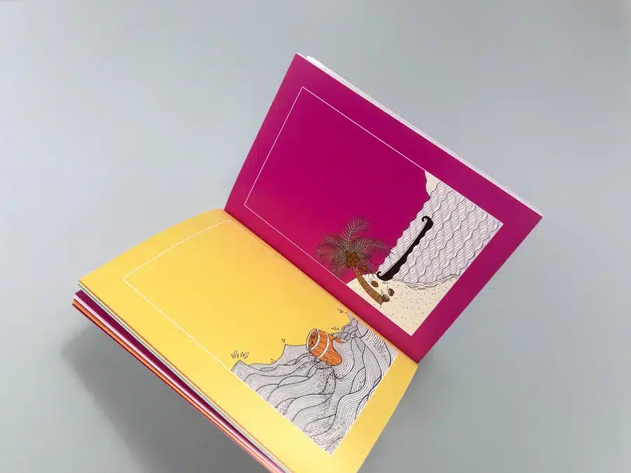
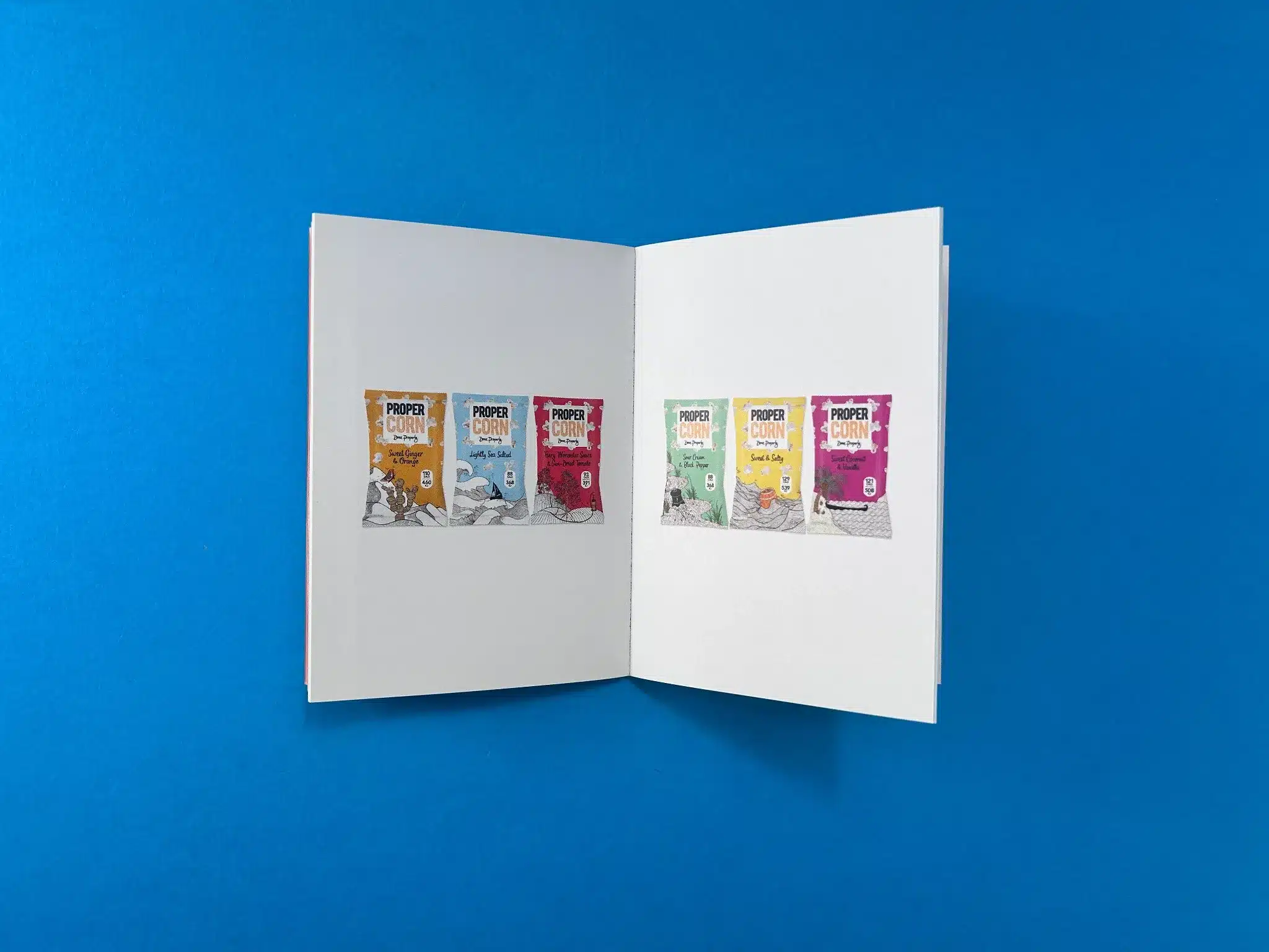
The images from the "Propercorn" booklet demonstrate a clean and cohesive design, which showcases the brand's identity and style with precision. The booklet, titled Design Guideline Booklets, has been produced with a focus on aesthetics and functionality, reflecting Propercorn's core values and branding ethos.
The booklet uses perfect binding, which adds a polished and professional finish to the publication. Perfect binding is a durable choice that allows the booklet to lay flat when opened, making it user-friendly and easy to navigate through the various pages of design guidelines.
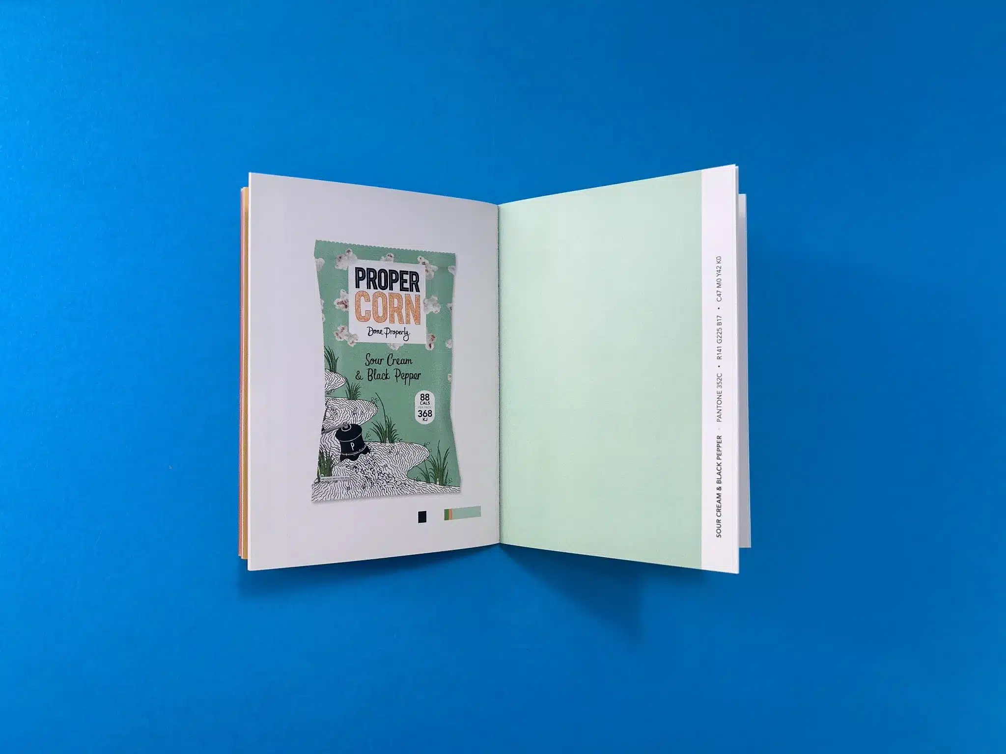
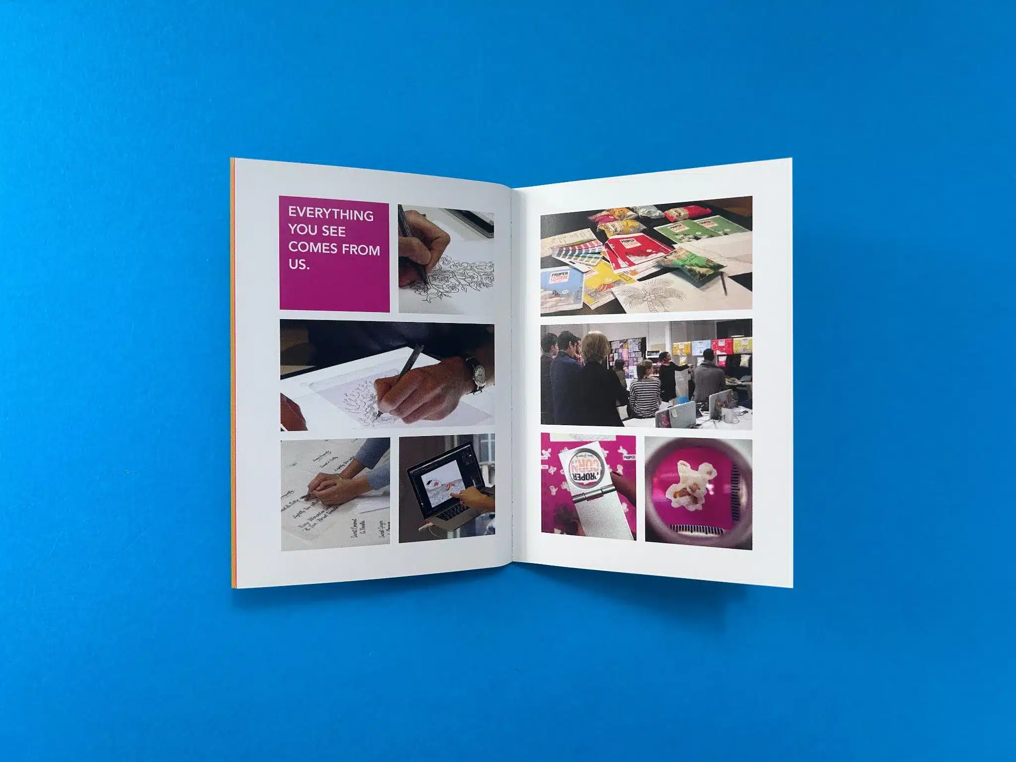
The page layout is minimalist yet striking, utilising white space effectively to draw attention to the content. The use of colour is carefully controlled to complement the Propercorn brand, while the arrangement of elements on each page maintains a sense of balance and symmetry. The product images are centred on clean backgrounds, making them the focal point of each spread.
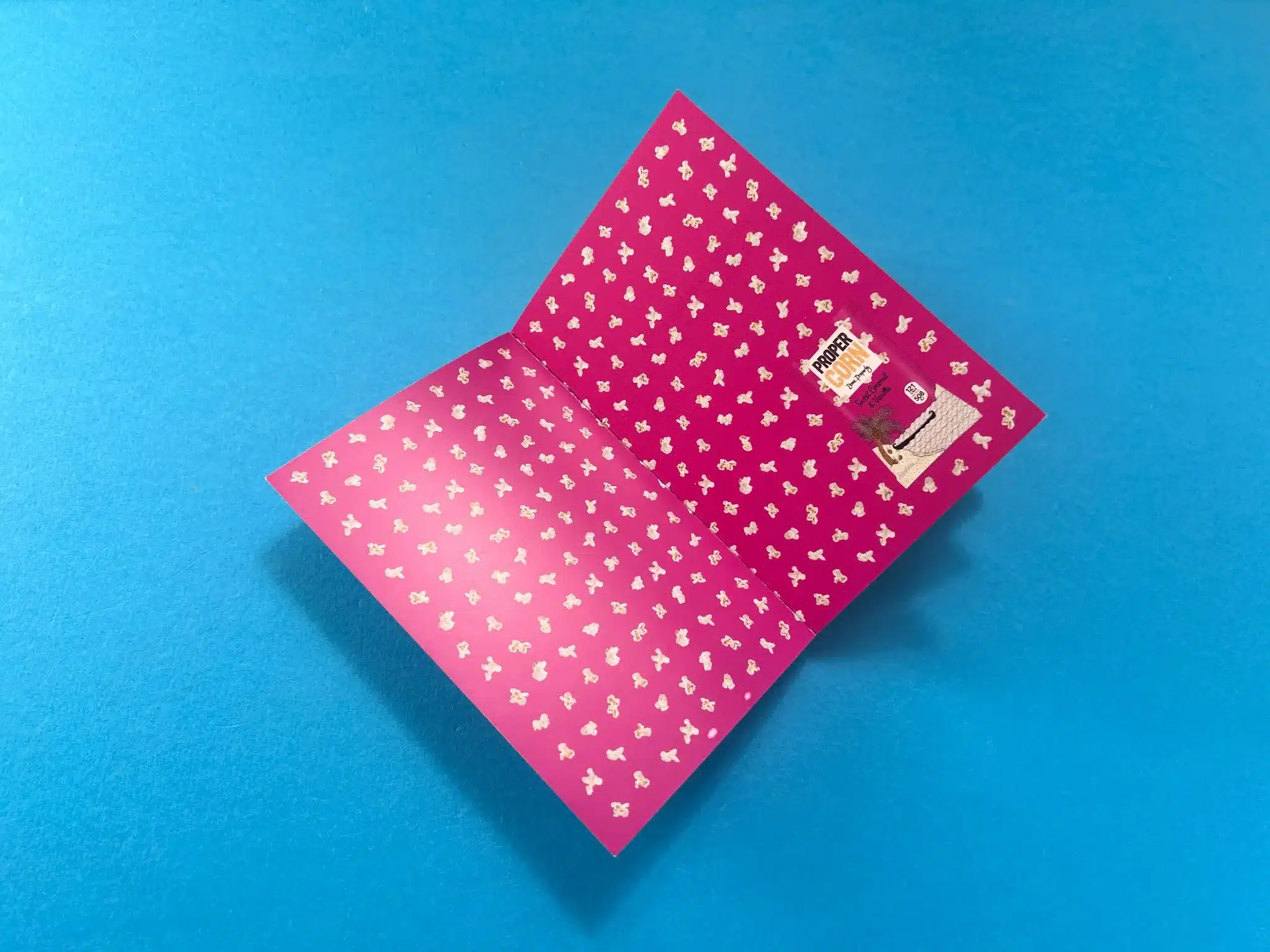
The colour palette throughout the booklet mirrors the bold and vibrant tones of Propercorn's packaging. Each spread integrates the colours of the popcorn packets, reflecting the brand's distinct flavours. For instance, the contrasting bright pink on one of the interior covers (seen in image 6) is emblematic of the more playful side of Propercorn, while still maintaining a professional look. This mix of bright, engaging colours paired with more muted tones like white and grey maintains a balance between creativity and clarity.
The typography is bold, modern, and highly legible, supporting the brand's energetic yet polished image. The sans-serif fonts used across the pages are easy to read, maintaining consistency with Propercorn's product packaging. This typographic choice aligns with the approachable, everyday product identity of Propercorn, making the booklet not only visually appealing but also practical for its intended audience.
The design team has effectively conveyed Propercorn’s message of fun, flavour, and creativity, while also providing clear, professional guidelines for brand consistency. Each product shot is presented without unnecessary clutter, focusing the reader’s attention on the key visuals and design elements. The use of imagery that showcases behind-the-scenes elements (such as sketches and product development meetings) adds authenticity to the booklet, showing that every element of the brand is meticulously crafted.
The production of Propercorn’s Design Guideline Booklet exemplifies a project rooted in communication, problem-solving, and precision. This print collaboration revolved around meticulous brand guidelines that Propercorn needed to communicate their distinct visual identity. The journey from initial consultation to delivery encapsulated various creative and logistical challenges, from ensuring colour accuracy to meeting a tight deadline.
The conversation between Nathan Joyce of Propercorn and Ex Why Zed began with a request for a booklet printing quote. Nathan outlined the specifications for the Design Guideline Booklet that Propercorn needed. The team at Ex Why Zed promptly provided a quote, offering guidance on file preparation and sharing resources to help ensure smooth file setup. This proactivity in offering setup guides displayed Ex Why Zed’s commitment to making the process seamless for their clients, especially when technical aspects could cause confusion.
Ex Why Zed provided detailed instructions on artwork preparation, including setting up files with the correct bleed, page order, and export format. These resources proved crucial later when issues with the artwork emerged, helping to resolve them quickly.
As the project progressed, technical hurdles arose. Nathan initially submitted the artwork as specified but noted the need to ensure the correct colour profile, as past orders had encountered issues with colour discrepancies. Ex Why Zed conducted pre-flight checks to assess any potential problems, offering the reassurance that they would monitor the printing process for any colour issues.
A significant challenge emerged when Propercorn’s team updated the booklet artwork late in the process. The updated artwork increased the booklet's length, requiring revisions to both the print files and the original quote. This caused a slight delay, as Ex Why Zed needed to run new checks and adjust the specifications.
Despite the last-minute revisions, Ex Why Zed worked quickly to accommodate the changes. Heather from Ex Why Zed kept open lines of communication, ensuring that Propercorn was aware of the implications for their tight deadline. Faraz Aghaei, Propercorn’s designer, stepped in to finalise the updated artwork and manage the payment process while Nathan was away, highlighting the collaboration between multiple team members at Propercorn to push the project through.
Throughout the process, Ex Why Zed’s attention to detail and expertise were evident. From explaining the importance of bleed and crop marks to clarifying PDF export settings, Ex Why Zed empowered Propercorn with the knowledge needed to avoid common pitfalls in print production. These technical consultations were critical, as the booklet required high-quality visuals to reflect Propercorn's branding accurately.
When the artwork was found to be improperly sized in the final stages (the dimensions and bleed were incorrect), Ex Why Zed promptly notified the Propercorn team, allowing them to make the necessary changes before going to press. This intervention, despite the time pressures, ensured that the booklet would be printed to the highest standard without compromising quality.
The project culminated with Propercorn confirming payment and addressing the final details of artwork corrections. Despite the challenges and delays caused by the multiple artwork revisions, Ex Why Zed managed to keep the project on track for delivery, thanks to swift communication and prioritising the Propercorn project in their production schedule.
Ultimately, Ex Why Zed delivered the Design Guideline Booklet on time, meeting Propercorn’s deadline. Propercorn’s team was pleased with the final product, appreciating the meticulousness of the printing process and the collaborative efforts to resolve any issues along the way.
This project underscores Ex Why Zed’s ability to navigate tight deadlines, complex technical requirements, and last-minute changes with ease. Their deep understanding of print processes, combined with their commitment to exceptional service, ensured that Propercorn received a booklet that reflected their brand in the best possible way. The relationship built during this project demonstrates Ex Why Zed’s client-first approach, helping Propercorn not only meet their objectives but exceed expectations in print quality and service.
The positive rapport between both teams suggests potential future collaborations, especially given the excellent problem-solving, support, and flexibility Ex Why Zed demonstrated throughout the process.
