A5 Booklets
4pp Cover onto 200gsm Uncoated
Matt lamination to outer
90pp Text onto 90gsm Uncoated
Full colour print throughout
Trimmed, collated and perfect bound
2 cover versions x 25 of each
When it comes to A5 zine printing, nothing embodies the independent spirit of music journalism better than Still Listening Issue 9, crafted by the talented Eliot Odgers. This visually arresting publication features two bold cover designs and showcases seven emerging artists in a way that captivates readers from start to finish. For this project, we at Ex Why Zed collaborated closely with Eliot to bring his creative vision to life, using our expertise in magazine printing services to ensure a professional, high-quality result. Whether you’re producing a music zine or a custom magazine, our tailored approach ensures each project is unique, vibrant, and professionally finished.
Still Listening Issue 9 is an immersive publication with a bold aesthetic that draws immediate attention with its vibrant colour choices and eclectic design approach. The magazine presents two alternative covers, each with a distinct mood: one is a pink and green retro pixelated backdrop, featuring a dynamic shot of Lime Garden, while the other adopts a cooler blue palette with a more introspective black-and-white portrait of Aaron Frazer. This choice of two covers not only provides a collectable aspect for the audience but also reflects the diverse music content housed within the zine, showcasing a spectrum of emerging artists.
The magazine is printed in A5 format, offering a compact yet accessible size that is ideal for zine collectors and enthusiasts alike. The matte lamination on the cover gives it a soft, tactile quality, making it comfortable to hold while adding durability. The use of 200gsm uncoated stock for the cover and 90gsm uncoated paper for the inner pages reflects a preference for a natural, textured feel, eschewing glossy finishes for a more raw, authentic look. This aligns with the indie, grassroots vibe that music zines are known for, where the feel of the paper is as much a part of the experience as the content itself.
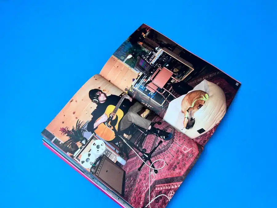
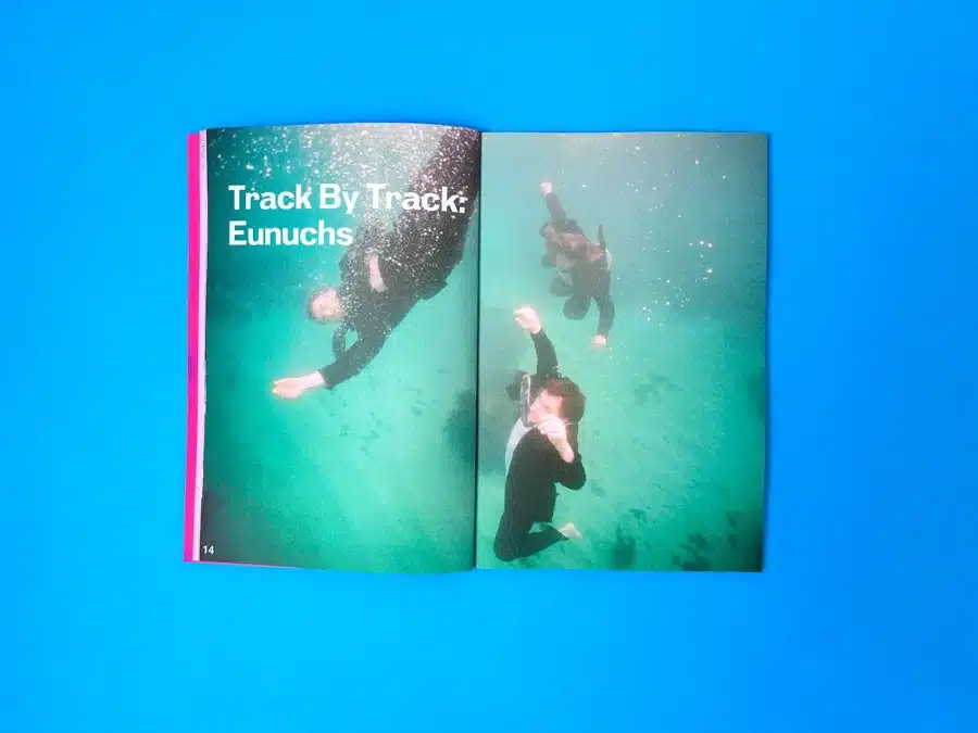
Inside, the zine maintains a consistent design language with full-colour printing throughout, punctuated by bold typography and experimental layouts. The track-by-track feature stands out, particularly with its full-bleed images, such as the underwater photo accompanying the Eunuchs article. This visual break from traditional layouts enhances the reader’s immersion, giving them a fresh visual narrative with each turn of the page. The choice to pair large, striking images with clean, white sans-serif typography adds a modern touch, juxtaposing the playful retro exterior.
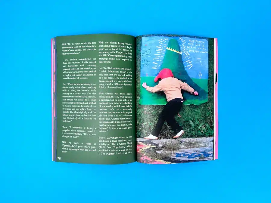
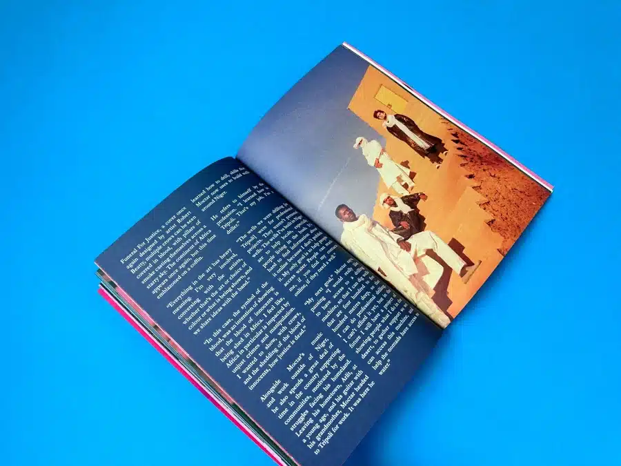
The pages dedicated to interviews and band features show a clear understanding of visual hierarchy. The design leans heavily on the use of negative space, ensuring the reader’s attention is focused on both the photography and text without overwhelming them. For example, the interview spread featuring a desert scene with strong oranges contrasts sharply with the text-heavy dark blue pages, creating visual rhythm throughout the publication.
Typographically, Still Listening Issue 9 opts for a clean and readable sans-serif typeface throughout, with headings often set in large, bold weights to create impact. This is paired with a playful script font for the cover masthead, which reinforces the indie zine vibe. Inside, smaller text is neatly justified, making the articles feel organised and professional while allowing the vibrant images to take centre stage.
The colour palette throughout the zine plays on contrasts — the cover leans heavily into vivid, high-energy hues of pink and green on one version, and blue on the other, while the interior often returns to calmer, more subdued tones, allowing content to breathe and remain visually coherent. The alternating use of warm and cool tones gives the reader a varied yet cohesive visual journey.
The decision to use perfect binding for the zine was a considered choice, particularly for a publication with nearly 90 pages. This method gives the zine a professional, polished look, distinguishing it from saddle-stitched alternatives often used for shorter booklets. The binding not only contributes to the longevity of the zine but also ensures that it remains easy to open and read, with no risk of pages falling out after heavy use — a must for a publication that is designed to be handled and shared.
Designers looking to replicate the success of Still Listening Issue 9 should take note of the following:
The email conversation between Eliot Odgers, the director of Still Listening Magazine, and Ex Why Zed reveals a smooth and collaborative working relationship, culminating in the successful production of Still Listening Issue 9.
Eliot’s primary goal was to produce a high-quality A5 zine with two different cover versions, highlighting emerging music talent. The project required 50 copies, split between 25 copies of each cover design. The specifications for the magazine were meticulously detailed, with Eliot requesting:
Eliot reached out to Ex Why Zed, having already established a working relationship, to seek a quote and move forward with production.
Mike from Ex Why Zed responded promptly, ensuring that the project stayed on track and within Eliot’s desired timeline. He confirmed the print specifications and provided a quote for the full 50-copy print run, which included the two different cover versions. Notably, Ex Why Zed offered free delivery within the UK, ensuring transparency in the cost breakdown with "no hidden costs, no sneaky add-ons."
In addition to the competitive pricing, Ex Why Zed facilitated the artwork upload process by guiding Eliot to use WeTransfer, simplifying the file submission and ensuring the artwork was ready for print. Mike also reassured Eliot that a final PDF proof would be provided for sign-off before the project went to print, maintaining Ex Why Zed’s high standard of quality assurance.
A minor hiccup occurred when Eliot caught Covid and was temporarily delayed in sending the artwork files. Despite this, the project proceeded smoothly, and Ex Why Zed was able to accommodate Eliot’s request for a fast turnaround, aiming to deliver the printed zines by Friday of that week. This responsiveness ensured that the project timeline remained intact, even amidst unforeseen challenges.
Ex Why Zed also provided flexibility in payment methods, offering an online transfer option or a ‘Pay Online’ button, making the process as convenient as possible for Eliot. Additionally, a quick address correction was handled efficiently to ensure that the magazines were delivered to the correct location.
The zines were successfully delivered on the promised date, with Ex Why Zed keeping Eliot informed of the exact delivery time through a DPD notification. Eliot expressed his satisfaction with the finished product, emailing shortly after delivery to say:
“Thanks a lot for these! They came out great! :)”
– Eliot Odgers
This testimonial highlights the successful collaboration between Ex Why Zed and Eliot, resulting in a high-quality, visually stunning music magazine that met the client’s expectations.
This successful collaboration underscores Ex Why Zed’s commitment to delivering excellent service, making them a top choice for independent zine publishers like Eliot.
From advising on paper stock to helping Eliot navigate the print setup, we delivered a seamless experience. With perfect binding and a striking blend of uncoated stock, the magazine delivers both in terms of style and substance, further emphasising the indie roots of this publication. You can explore how we work with independent publishers like Eliot in our other zine print projects, such as Zine Printing and Exploring the Impact of Independent Music Zines.