Choosing the right book size can feel like picking an outfit for a first date — too tight and uncomfortable, too loose, and not looking right. But, unlike a date, you don't have a second chance to make a great first impression with your book.
Whether you're a seasoned self-publisher or this is your first literary adventure, your book size impacts everything from readability to printing costs and even how it'll be stacked on a shelf. But hey, we are not saying this to make you feel stressed about what to do next!
If you're already excited with your work but are just stuck with choosing the right book size, don't worry at all as we've got your back! Let's break it down and find the perfect fit for your masterpiece.
What Are Standard Book Sizes?
When considering self-publishing, "trim size" refers to your book's final printed dimensions, usually measured in inches. It's more than just the book's size—it impacts the overall look, feel, readability, and even the cost of printing. A well-chosen trim size can enhance the reader's experience and make your book more straightforward while affecting how it fits on bookstore shelves and competes in your genre.
In essence, trim size helps set the tone of your book and influences everything from design to pricing. Smaller sizes can increase page count, while larger sizes may boost printing costs. It's a balancing act that requires thinking about both aesthetics and practicality.
To make it a bit clearer, let's look at how trim size plays out in familiar industry terms:
Mass-market paperbacks: These are the little guys—compact, affordable, and perfect for tossing in a bag. They usually measure around 4.25" x 6.87" and are often the books you find on grocery store racks or on that table near the checkout. Think of quick reads or impulse buys.
Trade paperbacks: A step up in quality, these are the books you'd find in stores like Barnes & Noble. These range from 5.5" x 8.5" (digest size) to 6" x 9" (the typical "trade" size). It's where most novels, memoirs, and non-fiction books comfortably sit.
Hardcovers: These are your premium "look-at-me" books. Hardcover books come in various sizes, ranging from 6" x 9" to 8.5" x 11". You know, the ones with sturdy bindings that look impressive on a shelf and feel like a treat to hold.
Ideas on Ex Why Zed Book Sizes
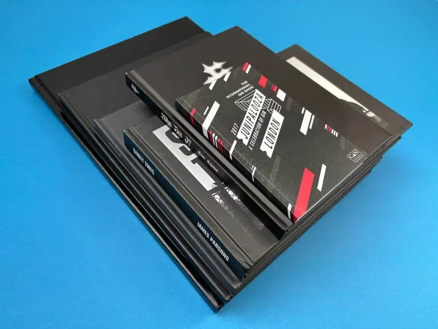
In the two images here, we have showcased a wide range of sizes that are possible with hardback book printing.
From left to right:
Gin Foundry Event Books. A6 Portrait. Perfect Bound. Max size possible for Portrait Perfect Bound Books is A4 (297x210mm) or US Letter (279x216mm)
Onoe Caponoe Art Books. A5 Portrait. Hard Back. Printed Cover.
Street Tools Photography Books. 160x240mm Landscape. Hard Back. Printed Cover.
Elemental Photography Books. 210x210mm. Hard Back. Cover onto Buckram Graphite.
No Hands Football Art Books. A4 (297x210mm) Portrait. Hard Back. Printed Cover.
If Nothing Changes Street Photography Books. 340x240mm Portrait. Hard Back. Cover onto Balacron Spectrum. ⚠️ This size is the maximum we can bind as a hardback but is significantly more expensive for 500 copies+ because we have to litho print it.
How Book Sizes Affect Different Aspects of Publishing?
The choice of book size significantly influences various aspects of the publishing process, including different sizes that can shape the reader's experience, affect cover design, impact printing costs, and influence how the book is marketed. Understanding these nuances is essential for making an informed decision.
1. Page Count and Readability
Trim size directly affects how your words fit on each page, influencing page count and readability. A minor trim size results in more pages, while squeezing too many words onto a page can make the text feel cramped. For example, why not get influenced by the 5.2" x 8" used in The Sun Also Rises. It's a compact trim that strikes a balance—giving a short book more substance without sacrificing readability.
2. Cover Design and Overall Presentation
The right trim size enhances your cover's impact. Larger sizes offer space for bold designs, while smaller sizes require more thoughtful proportioning. Your book's cover must be visually appealing in any format—paperback, perfect bound, hardcover, or eBook—so consider the trim size when designing.
At ExWhyZed, we understand the significance of these choices. Our services cater to a variety of formats, including zines, photobooks, children's books, and hardback books. We offer guidance on selecting the right size to enhance your cover's impact and ensure your book stands out in its genre.
For more insights into our offerings and to explore how we can assist with your project's specific needs, please visit our Portfolio section to see how others have printed their books.
3. Printing Expenses
Your trim size can impact printing costs, as these are often linked to page count. Larger book printing sizes can reduce page count, which may cut printing costs. Additionally, various page types can also influence the price. You must thus ensure that your size aligns with your audience's expectations for the genre.
For example, with Ex Why Zed, a softback, perfect bound book featuring a 300gsm uncoated cover and 120gsm or 120gsm uncoated inside pages, a single copy may cost around $112, while printing 100 copies would bring the total to approximately $392. To get a customized quote that best suits your project, request a quote now.
Readers are drawn to familiar sizes in their favorite genres. While unique trim sizes can stand out, they can also make your book feel out of place. Sticking to standard book printing sizes ensures marketability, but if your audience demands something different, don't hesitate to get creative—keep balance in mind.
How to Choose the Right Book Size Based on Genre?
Deciding on the trim size involves multiple factors, but one critical consideration should be the book's genre. Let's examine the average book sizes for various genres.
1. Fiction and Non-Fiction Book Sizes
Fiction books typically measure 5.5" x 8.5" or 6" x 9" to provide a comfortable reading experience.
Depending on the content, nonfiction books have standard sizes of 5.5" x 8.5", 6" x 9", or 7" x 10".
A memoir, usually more personal, can follow smaller trim sizes like 5.25" x 8" or 5.5" x 8.5".
Size selection for these genres should consider the balance between reader comfort, aesthetic appeal, and readability.
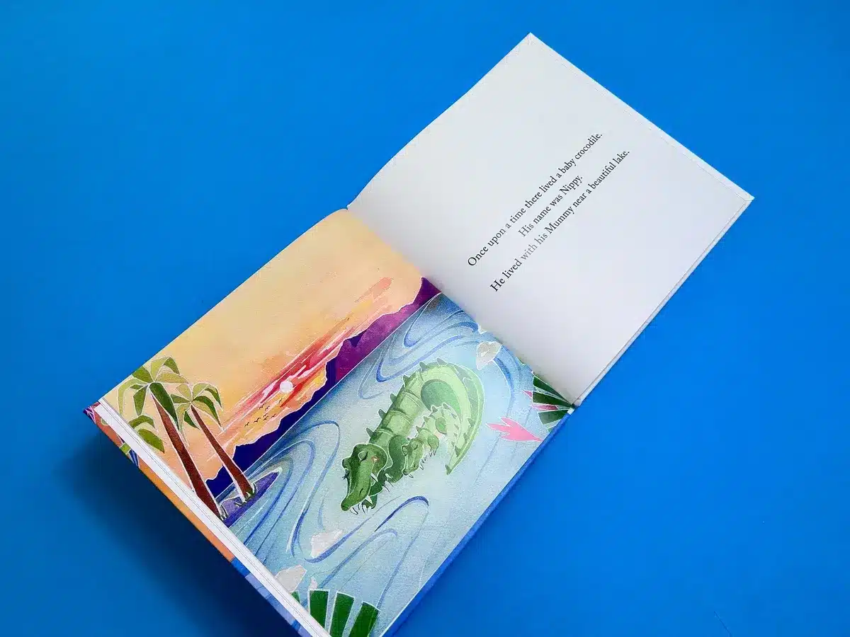
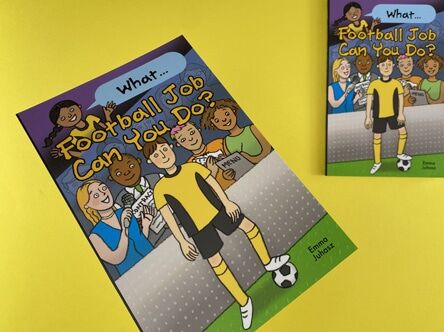
2. Children's Book Sizes
Children's books are specifically crafted for younger readers; hence, their sizes are set at 7.5" x 7.5", 7" x 10", or 10" x 8".
The larger format permits vibrant and engaging spreads to showcase the illustrations that are a key element of such books.
Books with more illustrations or fewer text blocks allow for greater flexibility with book sizes.
Essentially, ensure that the chosen trim size allows the imagery to engage children while permitting easy handling by tiny hands.
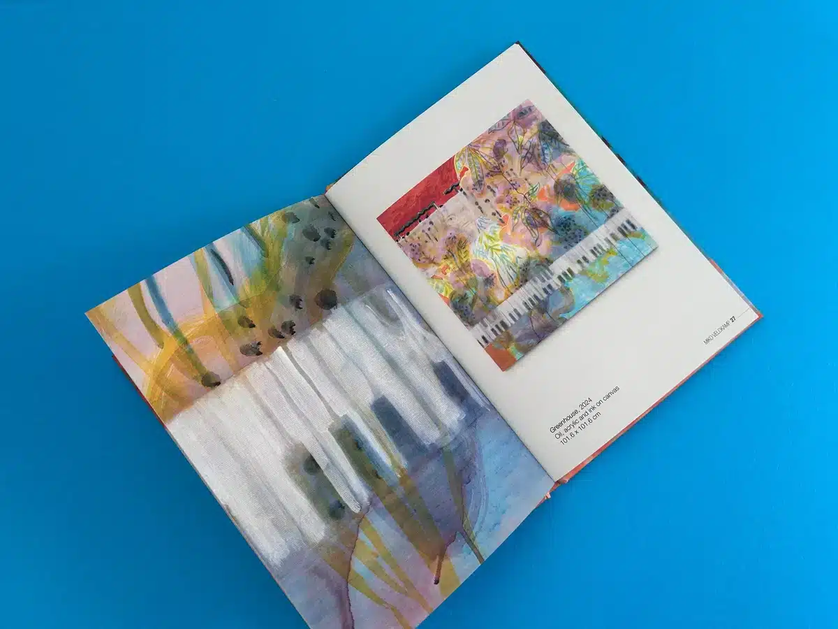
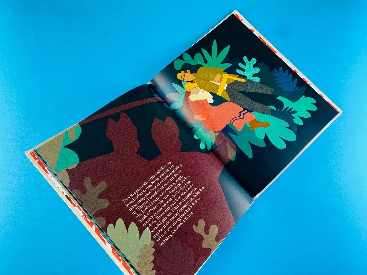
3. Cookbook and Art Book Sizes
Larger trim sizes, such as 8" x 10" or even more significant, are more suitable for cookbooks and art books known for rich visuals.
Larger sizes allow for a better showcase of vivid imagery or complex art forms, enhancing reader engagement.
The glossy, high-quality paper is generally preferred for these genres to render a premium feel.
However, consider your target market's requirements, as larger books might not fit standard bookshelves.
What Are Some Tips for Picking the Perfect Book Size?
Selecting the right trim size for your book can feel like navigating a maze, but with a few key insights, you can make a well-informed choice that aligns with your vision and audience. Here's how to approach this critical decision in a way that feels intuitive, not overwhelming:
1. Know Your Readers Inside Out
First things first: who are you writing for? Picture your ideal reader—are they like to throw a book in their bag and take it everywhere, or are they the type to carefully study a larger format on a desk, perhaps with a coffee and a highlighter in hand? If you're writing a novel for a young adult audience, they might appreciate a more compact size that fits comfortably into a backpack.
Conversely, if your book is a comprehensive guide or textbook, readers may expect a larger, more spacious design that allows for clear visuals, detailed charts, or room for notes. Understanding this is the key to getting your trim size just right.
2. Consider How You'll Get Your Book Into Readers' Hands
Your distribution channel plays a significant role in shaping your book's format. If you plan to partner with local bookstores or libraries, understanding their shelf space and size preferences is essential. Some stores have size constraints, meaning a smaller or more standardized trim is the most practical.
If you're focusing on online platforms like Amazon KDP or other e-commerce sites, getting creative with size is easier. However, you still want to ensure your book's dimensions comply with their guidelines. Consider your distribution method as the stage where your book will perform—ensure it fits the space.
3. Learn from the Competition
Now, look at the books already out there in your genre when printing your next book. What trim sizes are popular among your competitors? Whether your book is a thriller, a cookbook, or a self-help guide, seeing what has worked for others can spark ideas. Pay close attention to books that have made an impact, not just in content but also in how they're physically presented.
The right trim size can contribute to a book's success, helping it stand out on shelves or in online listings. If a similar-sized book has soared to the top of bestseller lists, there's likely a reason it works well for that audience.
Boost Your Book's Appeal with Ex Why Zed's Ideal Book Size Selection
Although you now have a clear understanding of how to choose the right book size, the process can still feel overwhelming—especially if you're new to it. That’s where we come in, providing expert guidance to make it easier for you. At Ex Why Zed, we specialize in helping authors select the ideal book size that maximizes readability, reduces production costs, and boosts market appeal. Whether you're aiming for a classic format or something unique, our expert team will guide you in choosing the perfect dimensions to make your book shine.
Contact us today to get started and create a book that captivates your readers and stands out in the market!
Conclusion
Every element of your book—from the title and cover design to its content and trim size—plays a crucial role in its success. The right trim size does more than just improve aesthetics and readability; it directly influences printing costs and marketability.
By carefully considering these factors, you can ensure that your book doesn't just capture attention but stands out in a competitive market. Ultimately, your attention to detail will help create a book that resonates with readers and thrives on bookstore shelves.
Frequently Asked Questions
What are the most common and average book sizes?
The common sizes for fiction and nonfiction are 5.5" x 8.5" and 6" x 9". Standard dimensions for children's books are 7.5" x 7.5", 7" x 10", or 10" x 8".
How do I choose the right book size for my manuscript?
Consider your genre, the readability of your content, and your printing budget, and then select a size that best meets industry standards and your prospective readers' expectations.
What size is a six-by-nine book?
A 6" x 9" book measures six inches wide and nine inches tall. This size is often preferred for trade paperbacks, including most novels and non-fiction titles.
What sizes are established publishers using for their books in your category?
Established publishers usually follow genre-specific standard sizes. For instance, fiction and non-fiction books typically measure 5.5" x 8.5" or 6" x 9", while children's books are usually 7.5" x 7.5", 7" x 10", or 10" x 8".
Writing a book is a major accomplishment; proper formatting ensures a professional, readable final product. Formatting covers font choice, spacing, alignment, title pages, page numbers, and chapter headings. It enhances both aesthetics and readability.
Even a great story can suffer from poor formatting, making it essential for self-published authors to get it right, especially when considering elements like book cover design. This guide breaks down the basics and offers tips to help you confidently format your best book.
What is the Importance of Proper Formatting in Books?
Proper formatting is an integral part of creating a readable and attractive book. It ensures smooth flow and cohesion throughout the book, making it easier for readers to follow the storyline or grasp the arguments.
Formatting enhances the reader's experience by ensuring intuitive navigation. A well-formatted book signals professionalism and commitment to quality, thus attracting more readers, reviewers, and publishers. Moreover, it meets the technical requirements of different publishing platforms and makes your book inclusive for readers of all abilities. Lastly, it allows for unique author identity across all your books.
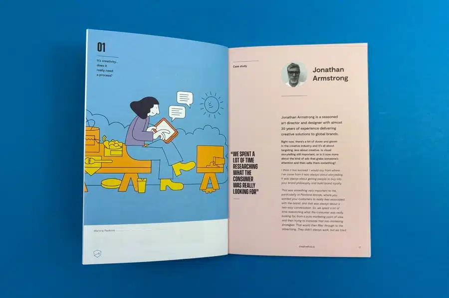
What Are The Key Components of Book Formatting?
Formatting is just as important as the story itself when publishing a book. A well-formatted book enhances readability, ensures a professional appearance, and keeps readers engaged from start to finish.
Whether you're self-publishing or preparing a manuscript for traditional publishing, understanding the key components or parts of your book formatting—like margins, font choices, spacing, and chapter structure—can make all the difference.
Let’s break down the essential elements that give a book its polished, reader-friendly look.
The trim size you choose influences the margins you set. To give you a sense of typical margin settings for different page counts, refer to the text table below:
Page Count
Inside (gutter, inside margin) Margins
Outside Margins
24-150 pages
0.375 in (9.6 mm)
0.25 in (6.4 mm) or more if bleed is needed
151-300 pages
0.5 in (12.7 mm)
0.25 in (6.4 mm) or more if bleed is needed
The gutter margin is used to accommodate the space taken up by the binding process.
Mastering Typography: Top Font Choices for Self-Published Authors
Fonts do more than just look good—they shape readability and style! For body text, serif fonts like Times New Roman or Adobe Garamond Pro keep things classic and easy on the eyes. Chapter headings? Keep them distinct and consistent for smooth navigation.
Thinking of a fancy font? Make sure it fits your book’s tone and genre—whimsical for kids, sleek and professional for serious topics. And don’t forget size matters—too small, and it’s a strain; too big, and you lose space.
Our comprehensive guide delves into the nuances of typography, offering insights into how font choices can enhance the visual allure of your book and facilitate a seamless reading experience. We explore the impact of font size, spacing, and style on reader perception, emphasizing the importance of aligning your typography with your book's genre and target audience.
The guide also provides curated recommendations for top fonts suitable for various genres, such as Garamond, Caslon, and Janson for classic elegance, and Arial and Calibri for modern readability. Additionally, we address crucial considerations like font licensing and effective font pairing strategies to ensure a cohesive and professional book design. By following the insights shared in this guide, you'll be equipped to make informed typography decisions that enhance your self-published book's appeal and readability.
Proper Alignment and Spacing
The way text sits on a page affects readability and flow. Most books, including your own books, use justified alignment, which keeps both left and right edges neat and polished.
Spacing matters just as much! A 1.5 or double line spacing ensures readability, while consistent paragraph spacing keeps everything organized. Typically, the first line of each paragraph is indented, except for the first paragraph of a new chapter or section.
A well-formatted book isn’t just easier to read—it looks professional too!
Chapters, Sections, and Scene Breaks
Clear formatting helps readers navigate and absorb your book effortlessly. Chapters serve as main divisions, while sections break them into digestible parts, keeping the flow smooth.
Need to shift time, place, or perspective within a chapter? Scene breaks are your go-to tool! These subtle pauses prevent confusion and maintain engagement.
Well-structured formatting makes your book easier to read—and harder to put down!Here are some points to guide you when formatting these elements:
Provide clear and consistent chapter headings or titles. This could be numeric ("Chapter 1"), alphanumeric ("Chapter One"), or thematic ("The Lost City").
Consider using distinct symbols, blank space, or lines to denote scene breaks. This visually cues the reader about a change in narrative flow.
Ensure that new chapters always start on a new page.
How To Format A Book?
So, how to format a book to print? Different books require different formatting. While core principles apply to all, genres like novels, non-fiction, and anthologies have unique structures. Specialized books—academic, cookbooks, and children's books—demand even more tailored formatting.
Novels and Fiction
In case of novels, nonfiction books, and fiction, formatting should maximize the flow and immersive reading experience. Body text is typically set in a simple, easy-to-read font size of around 9 to 12 points, depending on the chosen font. It is crucial to consider how many lines of text can fit comfortably on a page. Serif fonts are often preferred due to their legibility and classical aesthetic.
The standard practice is to start a new chapter, especially the first chapter, on a new page, usually odd-numbered or right-side pages for print books. Many fiction books also include scene breaks within chapters, denoted by blank space or symbols.
Proper dialogue formatting keeps conversations clear—start a new paragraph for each speaker to avoid confusion. Consistency in tense and viewpoint strengthens the reader’s connection to your story.
Non-fiction Works
Nonfiction works serve to inform and often present complex information in an easy-to-follow format. Clear headings and subheadings are crucial in breaking up the text into digestible sections. Compared to fiction, nonfiction typically uses more line spacing and larger fonts, easing the reading of dense, informative content.
It is common to include design elements such as tables, diagrams, bulleted lists and text boxes. These should be consistently formatted for ease of reference. Chapters may be further divided into sections, each marked out by subheadings.
A detailed table of contents, index, and bibliography are also essential components. They assist in navigation and provide due credit and further reading resources.
Anthologies and Collections
Anthologies are collections of shorter works, like poems, short stories, or essays, by one or multiple authors. Each individual piece usually starts on a new page. The table of contents plays a significant role, providing an easy reference to the diverse inclusions.
Each piece may have its title and author name, often centered on the page. Consider adding distinct dividers, illustrations, or motifs to differentiate each work.
In a multi-author anthology, providing a brief author bio at the start or end of each contribution is standard practice. If the anthology holds an overarching theme, the collection may have an introduction that sets the tone and intention of the assembled works.
The front matter introduces your book with elements like the title page, copyright, acknowledgments, and point of view. The back matter wraps it up with appendices, endnotes, a bibliography, and an author bio. Clear, standard formatting ensures a professional, organized presentation.
Front Matter: Title Page, Copyright Page, and More
The front matter sets the stage for your book. Here are some elements you might consider including:
The title page is generally the first page of your book, presenting the book's title, subtitle (if any), and author’s name.
The copyright page generally follows the title page, carrying the copyright notice, edition information, publication information, and the ISBN.
The dedication page is an optional inclusion, allowing the author to dedicate the book to a person or cause.
The table of contents provides an outline of the sections or chapters in your book.
The visual presentation and order of these components significantly influence initial impressions of the book for potential readers, librarians, and reviewers.
Back Matter: Appendices, Notes, and Index
The back matter concludes your book, with supporting or supplementary material that may be too detailed or tangential to include in the work. Here are some common elements of back matter:
An appendix or appendices offers additional information germane to the text, such as tables, research data, or explanations of jargon.
Notes or endnotes can clarify specific passages or concepts covered in the main content.
The index is particularly central in academic or technical books, where it can help readers find specific topics or keywords within the body of text.
Non-fiction books typically have more elaborate back matter than fiction, owing to their educative purpose.
What Are Some Book Formatting Tools and Software?
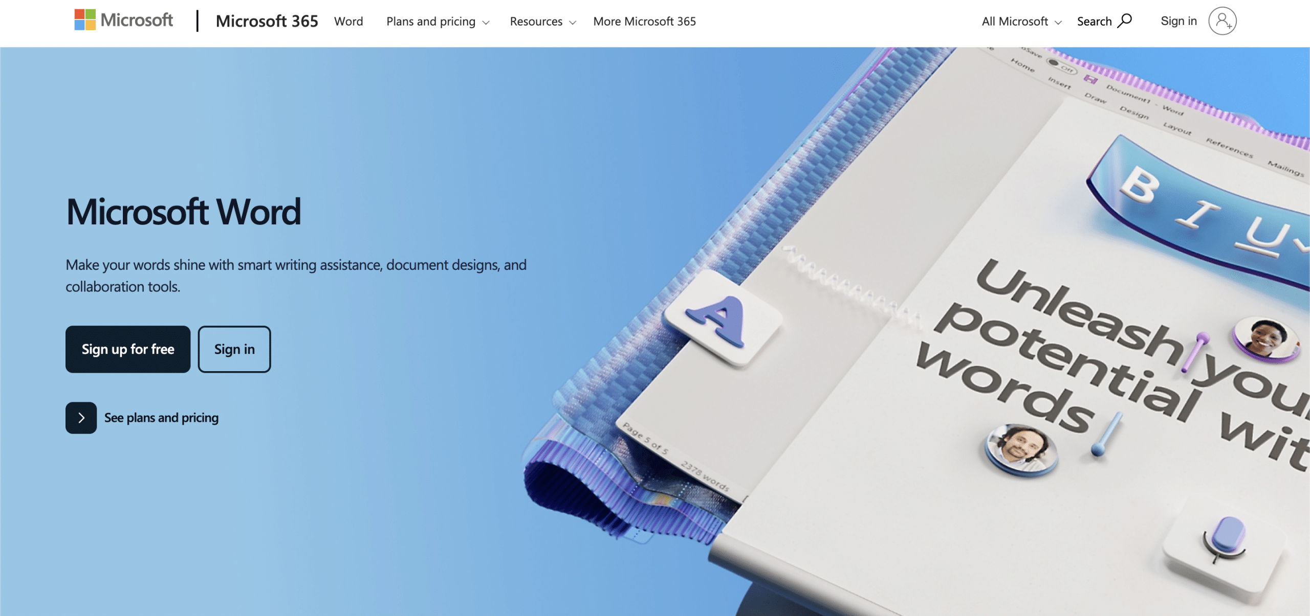
Authors use various software to streamline book formatting. Microsoft Word offers accessibility, InDesign provides advanced design tools, with easy to learn basic skills needed to design a book. Choose based on your needs, skills, and budget.
Microsoft Word is a highly accessible and versatile word processor and an excellent tool for basic book formatting for new writers. Its familiarity to many potential authors can make the formatting process significantly less daunting.
Word offers many essential features, including styling and formatting text and paragraphs, inserting images and tables, and setting up page layouts. While it’s a generic office tool and not specifically designed for book formatting, Word is capable of admirably completing the job for most self-published authors.
However, Word doesn't support more sophisticated book designs or formats without substantial manual work or add-ins. Its auto-formatting sometimes contributes to incorrect formatting styles, calling for careful manual checks.
Adobe InDesign is a professional-level graphic design and layout software and considered a standard in the publishing industry. It delivers exceptional control over every aspect of the layout and formatting, catering proficiently to books, magazines, posters, and interactive PDFs.
InDesign supports rich typography, versatile page layouts, and various multicolumn, sidebars, and pull-quote designs. It allows easy management of master pages, nested styles, and object styles, which can greatly accelerate the formatting process of long and complex books.
While InDesign has an extensive set of features, it has a steep learning curve as compared to Word or Scrivener. It may be an overkill for simple text-based novels but is a potent tool for authors seeking highly customized formatting or dealing with heavy graphical content.
Scrivener is a comprehensive writing tool designed specifically for authors. Apart from offering powerful formatting capabilities, Scrivener provides an improved writing experience with its innovative writing workspace. This includes a corkboard view to visualize and restructure your work, a research area to keep reference materials at hand, and advanced composition tools to focus on writing.
Scrivener's Compile feature lets you export your work into multiple formats, including Microsoft Word, PDF, EPUB, and MOBI. The tool’s powerful style system and custom templates allow great flexibility and control during formatting.
However, like InDesign, Scrivener also has a learning curve. New users might find the extensive features somewhat overwhelming. Despite this, many authors swear by Scrivener for managing complex writing projects and producing professionally formatted books.
How To Format for E-books and Print Books?
Digital publishing has made e-books a popular alternative to print. While both follow core formatting principles, print books require trim size and margins, while e-books need reflowable text and linkable navigation. Adapting to each ensures a polished, readable book.
Key Differences between E-book and Print Book Formatting
While at their core, e-books and print books deliver the same content, the way readers interact with them differs significantly. This necessitates different approaches to formatting for each medium:
Aspect
E-book
Print Book
Pagination
Flexible, depends on device settings
Fixed, consistent across all copies
Images & Graphics
Must be compatible with various screens, less emphasis on high-resolution
High-resolution is essential for clear printing, precise positioning and alignment is important
Text
Reflowable, adjusts to various screen sizes
Fixed, does not adjust to book dimensions
Navigation
Interactive Table of Contents, hyperlinks utilized
Non-interactive, physical navigation
Fonts
Limited ability to embed fonts, depends on reader’s device
Full control over font selection
Understanding these nuances will ensure that your work looks and functions well in the chosen format.
Mastering Book Formats: How to Meet Any Publishing Requirement
When transitioning from print to e-book or vice versa, it's crucial to adapt your book to meet the unique formatting requirements of each file format. Reflowable e-book formats such as EPUB and MOBI enable the text to adjust to varying screen sizes, making it reader-friendly. When converting to an e-book, one also needs to replace the static table of contents with a dynamic, linkable one.
Conversely, converting from an e-book to print requires adding elements like page numbers, headers and footers and adhering to strict alignment and positioning for graphics and illustrations. Attention must be paid to trim size and margins, and ensuring high-resolution images for optimal printing while considering printing costs.
While several tools help automate conversion between formats, manual checks and adjustments are usually necessary to maintain high quality.
High-Quality Book Printing Services in the UK – ExWhyZed
At ExWhyZed, we specialize in premium book printing services for authors, publishers, and businesses across the UK. Whether you're producing novels, art books, photography collections, or corporate publications, we deliver exceptional quality with sharp printing, durable binding, and a professional finish.
Our bespoke printing solutions cater to both small and large print runs, offering a range of paper stocks, finishes, and binding options to bring your vision to life. With fast turnaround times, eco-friendly printing options, and dedicated customer support, ExWhyZed ensures a seamless printing experience from start to finish.
Transforming your manuscript into a finished book can feel overwhelming, but understanding the basics of formatting, including the chapter title, makes it easier. Focus on trim size, margins, fonts, alignment, spacing, and chapter structure. Adapt your approach based on the book type—novel, non-fiction, or anthology. Well-formatted front and back matter enhance readability and provide key information.
Use the right tools and software to streamline the process and ensure a polished result. Differentiate between e-book and print formatting to meet their unique requirements, including the necessary ebook format specifications. Book formatting blends aesthetics with technical precision—mastering both ensures a professional, reader-friendly book.
Frequently Asked Questions
What are some common book formatting mistakes?
Common book formatting mistakes include using too many different fonts or font sizes, inconsistent line spacing and indentation, not using scene breaks, having text that is too close to the edges of the page (outside the margins), and not starting new chapters on a new page, which can go a long way in greatly affecting readability.
How long does it take to format a book?
The time it takes to format a book largely depends on its length and complexity, and your familiarity with the process and the software used. Formatting a simple novel using a tool like Microsoft Word might take a beginner a lot of time and a few days.
Should I format an e-book differently than a print book?
Yes, e-books require different formatting than print books. Unlike print books, e-books are reflowable and allow for resizable text, so page numbers, headers and footers, and multi-column layouts don't apply. They also need a clickable table of contents that helps navigate to different sections.
How can I test my e-book's formatting before publishing?
Most self-publishing platforms offer a preview tool to examine your e-book before publishing. This allows you to review the formatting on various virtual devices, including alignment, spacing, and navigation. Ensure that your e-book is compatible with standard e-readers to guarantee a seamless reader experience.