Are you struggling to add meaning to your premium photo books? Text can enhance special moments, creating lasting memories and capturing your most memorable moments. Whether it's a birthday, a trip, or daily life, each photo has a story. Personalise your photo book with heartfelt captions, and honour these moments when you decide on the book size. Follow our guide to create text-filled photo books that showcase memories and tales, adding a personal touch to your keepsakes.
Creating a custom photo book with text lets you capture the magic of special moments beyond the visual aspect. It breathes life into your photographs, depicting emotions, contexts, and nuances that a picture alone may not fully express. Whether it’s a quirky overlay on an Instagram-worthy shot, a nostalgic note reminiscing about a shared memory, or a simple date indicating a special day, text enriches your photos by adding an extra layer of storytelling.
Creating a hardcover photo book with text and a stunning gloss photo book cover made with the highest quality can be daunting at first, but we've got you covered! Follow our step-by-step guide to choose templates, paper, and fonts, customise layouts and colours, and use pre-designed options. Unlock the secrets to crafting a vibrant photo book with text.
The first crucial step in creating your personalised photo book is choosing the right template, including options like softcover and various photo book styles. Many online photo bookmakers offer templates for different occasions and sizes, such as lay-flat designs.
Consider content type (text-heavy or photo-focused), event theme (wedding, travel, birthday), preferred style, and photo quantity. Your template sets the tone, so choose wisely.
Choosing the right font size, style, colour, and paper type is essential for readability and aesthetics in your photo book. For text-heavy content, opt for softcover books with matte finishes, such as our matte paper options, to minimise glare and ensure easy reading. Glossy finishes work well for vibrant images, enhancing colour depth.
Consider font legibility based on paper type. Serif fonts like Times New Roman offer a classic feel, while sans-serif fonts like Arial or Verdana provide a modern touch. Avoid overly decorative or cursive fonts that may be difficult to read. Maintain strong colour contrast between text and background to ensure clarity without causing eye strain.
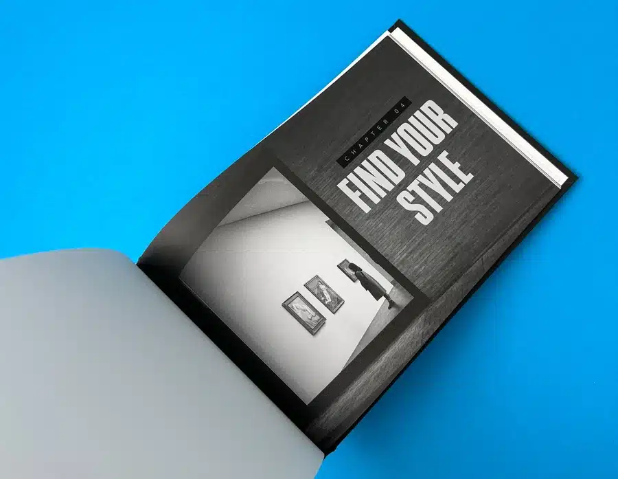
When customising your photo book with text, focus on positioning, formatting, colours, and sizes for a polished look. Strategically place text with captions, overlays, bottom notes, or entire pages, effectively balancing photos and text layers.
Use bold, underline, or italics formatting options to highlight key elements. Choose text colours and sizes that match your book's theme, avoiding fonts too small to read or too large that might overpower images. These tips will help you create a unique, visually appealing photo book with text.
Now that your layout is set, crafting your story should be taken care of. Adding captions or stories provides context to your images, preserving emotions and details for years. Keep your text concise. Let the photos take centre stage while your words complement them.
Evoke feelings with sentimental notes, funny anecdotes, or unique insights. Include details like dates, names, and locations while maintaining a consistent tone.
Ready to create your perfect photo book? Use Ex Why Zed's Printed Project Builder to easily customise layouts, select paper, and get a quote for your project. Our platform ensures high-quality printing with beautiful templates for any occasion. Start designing today and request a quote to bring your memories to life!
Personalising your photo book involves more than selecting images and text. It's about showcasing your unique style, creating a cohesive theme, and paying attention to details like fonts, colours, audience, embellishments, and purpose. Balancing text with photos is key to crafting a captivating narrative in your photo book.
When creating a photo book with text, match fonts and colours to your theme for visual coherence. Consider the event—for children's birthdays, choose vibrant colours and fun fonts; for weddings, opt for elegant fonts and light colours. Colours evoke emotions—blues for calmness, reds for passion. Consistency is key—use a consistent colour palette and limited fonts for a cohesive look that enhances visual appeal while maintaining readability.
Tailor the tone to suit the intended readers, whether it's a family album, travel photobook, or wedding album. Align captions with the book's purpose, be it storytelling a journey or capturing special moments. Engage your readers emotionally to enhance their connection with your book.
Balancing text and photos in your photo book is crucial for visual appeal. Avoid overcrowding pages with too many elements. Place text strategically to complement the photos, creating a seamless connection. Maintain a balance between picture-heavy and text-heavy pages for variety and reader interest. Keep the layout clean to enhance the viewing experience.
Creating a quality photo book, especially the best one with text, opens up endless possibilities for including beautiful photos printed on glossy photo paper. These can be travel books rich in stories, life event books capturing emotions, or family recipe books preserving heritage. See how combining beautiful photos with pictures and text enhances the narrative for a more engaging experience.
A travel photo book goes beyond stunning landscapes, sharing your experiences and stories. Combining photos with engaging text transforms it into a memory keepsake with travel logs, surprising encounters, facts, or amusing anecdotes. Supportive narratives bring your photos to life, creating exciting stories for your readers.
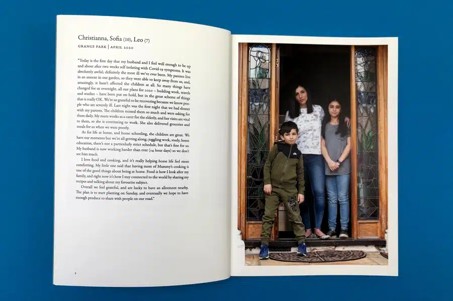
Life event photo books capture sentimental moments like birthdays, weddings, and baby showers, preserving precious memories and special times. Combining photos with text adds depth to the celebration. For example, in a wedding photo book album, include the bride's emotions as she walks down the aisle. Narratives alongside photos of your baby's first birthday convey the excitement and joy of the occasion. These personal touches preserve events and the associated emotions and stories close to our hearts.
A family recipe or heritage photo book blends photos with text, like a curated collection of grandma's secret recipes alongside images of the dishes. Each page combines a photo of the dish with ingredients, cooking steps, and family stories. It's about sharing love through food, preserving traditions, and passing them down. This book becomes a unique heirloom and culinary guide that connects you to your roots.
Looking to create a stunning photo book with text? Ex Why Zed makes it simple and enjoyable. Our intuitive platform offers a variety of pre-designed templates that perfectly balance photos and text. Whether capturing memories, telling a story or showcasing a portfolio, Ex Why Zed’s easy-to-use tools ensure a professional, personalised result. Start crafting your photo book masterpiece today! For inquiries or support, contact us now and bring your vision to life with Ex Why Zed!
Creating a personalised photo book with your text adds depth to your story through memorable pictures and narrative, as well as on every page of your photo book. Following simple steps and crafting text carefully can transform your photo book into a vibrant, emotional journey. Choosing the right template, fonts, and colours makes creating a personalised photo book more effortless than ever, helping you relive memories and express creativity in an elegant keepsake.
Though there's no fixed rule, moderation is essential. Your text shouldn't overshadow your images. Instead, it should amplify the story your photos are telling. While some pages might demand lengthy narratives, others could do with a few lines or a single word; it's all about balance.
Choosing font size and style primarily depends on your photo book’s overall theme, layout, and intended readability. Keep the font readable, complementary to your images, and consistent throughout the book. Also, balance decorative fonts for headings and simple ones for body text.
Yes, most photo book creation platforms allow you to add or modify text on an existing design via a mobile app. The software often provides an 'Add text' button or similar option, which you can use to insert new text boxes into your layout.
In the digital age, where flicking through images on a screen has become second nature, the tangible allure of a beautifully printed photography book remains unmatched. The subtle sound of a turning page, the gentle texture of premium paper, and the richness of ink-soaked images all contribute to a reading experience that no online gallery can replicate. At Ex Why Zed, we believe in the enduring power of print as a medium that adds depth, permanence, and intimacy to every photograph. Our process goes beyond ink on paper—we collaborate closely with creators, advising on paper stock, colour fidelity, layout precision, and binding methods, ensuring that each book is a timeless testament to the photographer’s vision.
To help you make informed print choices when you self publish a book, we have analysed and dissected a series of recent projects. Each case study offers a window into the intricate considerations behind photography book printing: from selecting the right bindings for perfect bound photography books and choosing formats like A5 photobook editions, to the subtle artistry of finishing touches such as foil stamping and the careful management of colour profiles. Whether you’re producing a landscape photo book, experimenting with stapled photography books, or aiming to showcase stunning street photography in a hardback format, these examples will guide you through the nuances of bringing your printed vision to life.
Once your book is finished, let Ex Why Zed handle your book fulfilment, storage, and distribution.
Street Tools epitomises what happens when a photographer’s artistic intent meets exceptional print craftsmanship. Designed as a landscape casebound book, this project demonstrates how cover materials, lamination, and interior stock choices can reinforce the raw energy of street photography. With a matte-laminated cover wrapped over greyboard, the book conveys substance and durability, allowing it to hold its own among well-thumbed collections. The interior pages, printed on uncoated stock, complement the gritty aesthetic, giving each full-colour image a tactile, organic feel. Bold typography and strategic annotations highlight compositional techniques, making the book both an educational tool and a gallery-quality showcase.
Print Insights and Challenges:
The design of Street Tools is a masterclass in balancing aesthetics with practical instruction. The bold headers and annotated images show how text and visuals can coexist harmoniously, ensuring readers gain immediate value from each spread. Instead of dazzling readers with gloss or varnish, the project relies on a minimalist layout that places full trust in the imagery and typography. Colour management is critical in maintaining the tonal depth and contrast so integral to street imagery. Here, the uncoated paper not only softens glare but also translates subtle greyscales and vibrant hues with pleasing authenticity. The result is a photo book printing triumph that guides readers to truly "see" as they learn.
Key Takeaways for Self Publishers:
Street Tools reminds us that sometimes the quiet confidence of a matte finish and an uncoated interior can speak volumes. If you’re looking to self publish a photo book focusing on dynamic cityscapes, consider how tactile stocks and bold, minimalist layouts can heighten engagement. Let your design choices serve the content, ensuring readers can immerse themselves in your images without distraction.
Enjoy the full Street Tools case study >
Avanipok by Conor McDonnell is a shining example of an A5 photobook delivering monumental visual impact. Printed on uncoated stock with a sturdy 300gsm laminated cover, this small-format book harnesses the power of colour photography to immerse readers in wildlife and natural scenes. The compact size complements the sense of intimacy, encouraging readers to hold the book close and savour each image. Vibrant landscapes and animal portraits spring to life through careful colour management, proving that even a smaller format can exude gallery-grade quality.
Print Insights and Challenges:
A key challenge with Avanipok was retaining the vibrancy of its wildlife shots on uncoated paper, a stock that tends to absorb more ink and can slightly mute colours. By leveraging the precision of our HP Indigo digital press, we ensured that each hue—be it a lush green rainforest or the deep blue of ocean waters—maintained its integrity. The result? A tactile, visually compelling object that sold out rapidly, demonstrating that photo book printing done right can create instant demand. This project is a testament to the power of mixing sustainable materials, premium lamination, and four-colour reproduction on a petite scale.
Key Takeaways for Self Publishers:
Avanipok underlines the importance of testing and fine-tuning your print approach for maximum colour fidelity, especially in smaller formats. When aiming for a pocket-friendly, self publish a photo book endeavour, remember that size need not limit impact. With thoughtful paper choices and impeccable colour management, even a compact volume can deliver outsized visual punch.
Enjoy the Avanipok perfect bound photo book case study >
The 100 by Tom Lee is a monochrome gem demonstrating the elegance of perfect bound photography books. Its softcover design at approximately 210x210mm, coupled with 170gsm gloss pages, creates an immersive visual flow through a carefully curated selection of black-and-white images. The understated cover design and lack of distraction ensure readers focus on the interplay of light and shadow captured in each photograph. By scaling the images uniformly and maintaining consistent spacing, The 100 presents a cohesive narrative that pays homage to the timeless aesthetic of monochrome photography.
Print Insights and Challenges:
Black-and-white photography demands absolute precision in print. Any colour cast or tonal inconsistency can disrupt the desired mood. Here, converting images required meticulous attention, ensuring that deep blacks and crisp highlights reproduced faithfully. The gloss pages imbue the images with subtle sheen, enhancing contrast while preserving texture and mid-tone detail. Perfect binding provides a sleek spine, creating a streamlined visual presence that underscores the modernity and simplicity of Lee’s work.
Key Takeaways for Self Publishers:
For those producing monochrome images, do not underestimate the importance of test prints and proofs to fine-tune contrast and tone. The 100 illustrates how minimal graphic design and a solid binding approach can transform a compilation of images into a beautifully unified whole, ideal for anyone looking to produce an elegant, monochrome photo book printing masterpiece.
Read the 210x210mm Photo Book Case Study >
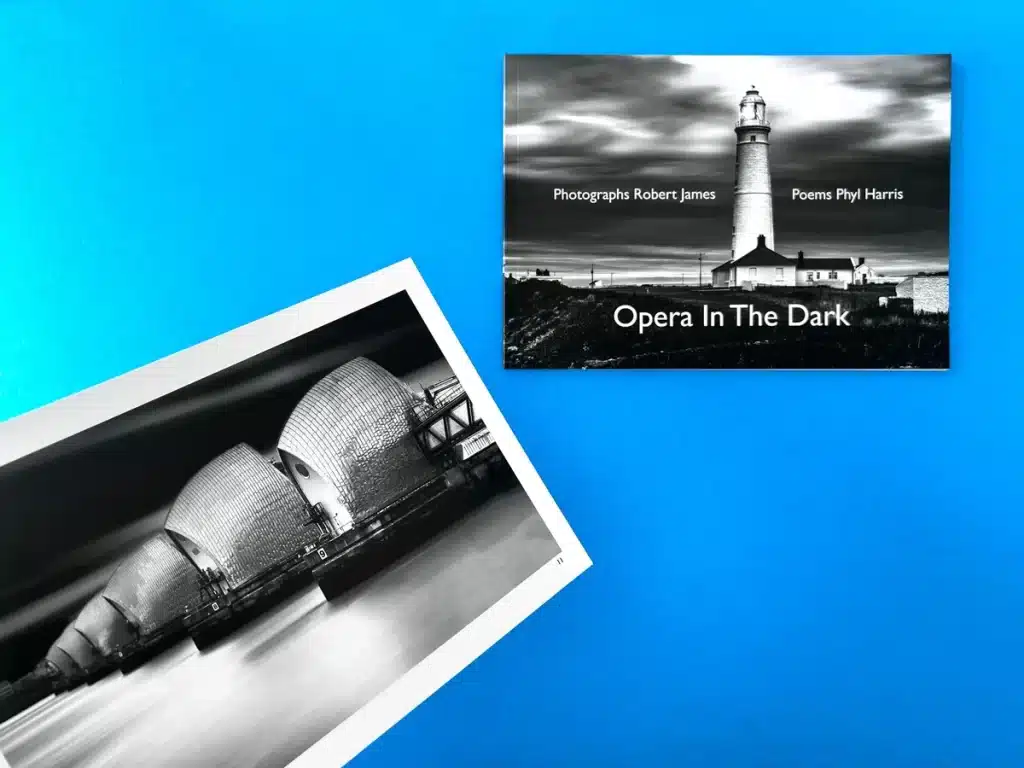
Opera In The Dark by Robert James pairs atmospheric black-and-white photography with poetry and annotations, resulting in a layered, educational experience. Printed as a zine-like book with perfect binding and silk stock, it offers a tactile quality that enhances the drama of urban landscapes and industrial textures. The thoughtfully arranged text and images maintain a delicate equilibrium—allowing readers to pause at each spread, interpret visual cues, and then read annotations to deepen their understanding.
Print Insights and Challenges:
Maintaining crisp contrasts in a book that heavily relies on black, white, and grey tones can be challenging. By opting for a silk stock, the project achieved a subtle sheen that enriched the tonal range. The annotations, set in understated typography, required careful placement to avoid overshadowing the imagery. Opera In The Dark showcases how typography, layout, and print material selection collectively influence a reader’s interaction, offering a balance between instruction and inspiration.
Key Takeaways for Self Publishers:
If you plan to integrate annotations or instructional text into a self publish a photo book project, Opera In The Dark exemplifies how to weave text and imagery together without compromising visual integrity. By using high-quality stock and minimalist design, you can guide readers’ understanding without diluting the power of the photographs themselves.
Digest the full Black and White Photo Book Case Study >
Sorrento and Puglia is a travel-inspired landscape photo book, merging photography and minimal typography to create an oasis of calm. With uncoated stock and a perfect-bound format, the images—ranging from rustic coastal scenes to intricate village details—feel textured and authentic. The generous white margins and minimal captions allow readers to linger in each moment, evoking the serenity of the Italian countryside.
Print Insights and Challenges:
Achieving cohesive colour fidelity across a diverse range of landscapes, from azure coastlines to earthen village façades, required careful colour calibration. The uncoated stock toned down overly saturated hues, ensuring a natural and soothing palette. This approach captures the essence of slow travel, allowing images to speak for themselves. Sorrento and Puglia also demonstrates how strategic use of negative space can enhance a book’s pacing, making page turns feel like contemplative pauses.
Key Takeaways for Self Publishers:
For projects that rely on atmosphere and mood, consider uncoated stock for a softer, more intimate aesthetic. Minimal typography and ample breathing space can guide readers into a meditative journey, reinforcing your thematic vision and encouraging reflection—ideal when creating your own tranquil photo book printing experience.
Read the perfect bound photography book case study >

Learning to See by Mike Chudley exemplifies the premium end of photography book printing, featuring a hardback casebound cover with foiled details. Bound with Winter&Co fabric and adorned with reflective silver and black foils, the cover is a tactile and visual feast, setting a high-end tone even before the pages are turned. Inside, 170gsm silk pages capture street photography scenes with crisp clarity and balanced contrast, giving readers a front-row seat to candid urban narratives.
Print Insights and Challenges:
Hardback binding, especially when incorporating foils and custom fabrics, involves detailed planning and absolute precision. Ensuring foil alignment, testing different foils for best legibility, and colour matching images to maintain authenticity are critical steps. The result is a book that both looks and feels luxurious, with the durability to remain a cherished keepsake. Learning to See proves that finishing techniques aren’t just embellishments; they communicate the book’s ethos and elevate the overall reader experience.
Key Takeaways for Self Publishers:
For those eyeing a premium look, investing in specialty covers, foil stamping, or embossed titles can transform your self publish a photo book project into a collector’s item. High-quality internal stock ensures that the content matches the cover’s promise, delivering a well-rounded presentation worthy of gallery shelves.
Read the case study of Mike Chudley's hardback photo books >
Illumination by Adam Karnacz weds exquisite materials—Wibalin Napura Canvas, bespoke endpapers—with a four-colour print process that honours the subtle tonal shifts of natural landscapes. Presenting a hardback collector’s edition that feels as graceful as the scenes it contains, this is photography book printing at its most refined. The design balances text and imagery, giving viewers room to contemplate each panoramic scene, while the lush materials reflect the richness of the world Karnacz captures.
Print Insights and Challenges:
Reproducing nuanced hues—soft dawn light, misty horizons, and lush greenery—required delicate calibration to maintain natural realism. Premium binding materials and flawless section sewing ensured that the book would lie flat, providing uninterrupted vistas. Illumination demonstrates how every production choice, from cover fabric to paper grain, influences the reading experience. The end result is both a gallery in book form and a tactile journey into the heart of the landscape.
Key Takeaways for Self Publishers:
When aiming for a collector’s feel, consider premium fabrics, high-end paper stocks, and thoughtful finishing touches. Illumination proves that with careful planning, you can create a book that feels less like a product and more like an heirloom.
Get inspired with the Illumination Photo Book case study >
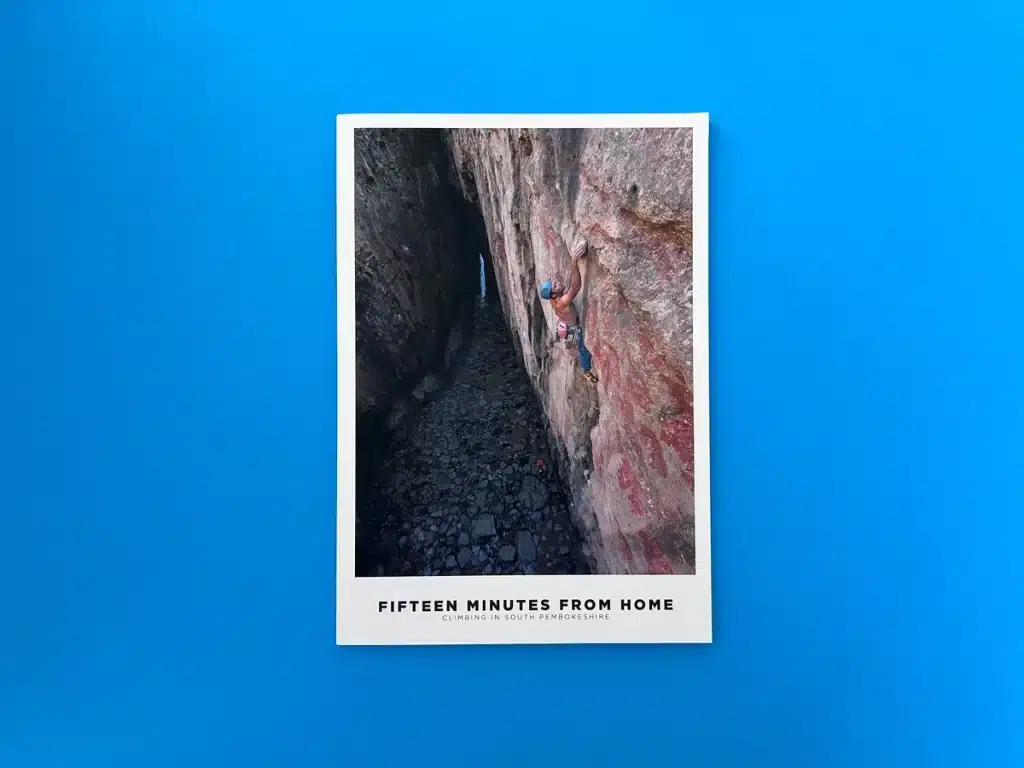
Fifteen Minutes from Home captures outdoor climbing scenes in South Pembrokeshire. At A4 size, perfect bound, and printed in full colour on silk stock, it conveys scale and depth, providing readers with an immersive sense of place. Double-page spreads highlight the soaring cliff lines and minute details of climbing gear, while minimal text gently orients viewers without distracting from the raw power of nature.
Print Insights and Challenges:
Translating the grandeur of natural landscapes onto the printed page involves balancing large format images with binding integrity. Perfect binding here supports seamless spreads without losing crucial details in the gutter. Managing colour accuracy for landscapes—ensuring the rugged cliffs, vibrant skies, and deep ocean hues remain authentic—was key. Fifteen Minutes from Home shows how thoughtful sizing and paper choices can turn an adventurous theme into a dynamic visual story.
Key Takeaways for Self Publishers:
If your images rely on scale and detail, consider a larger format to give them breathing room. An A4 size, combined with a suitable paper stock and minimal typography, can accentuate the immersive nature of your content, drawing readers into your photographic narrative.
Gain further insight into this perfect bound photography book >
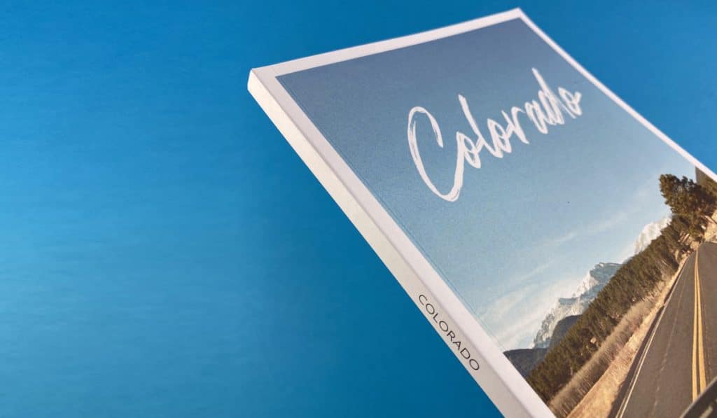
Colorado by Alex Matragos proves that eco-conscious materials can complement stunning visuals. Printed on 100% recycled uncoated paper, this perfect bound volume celebrates the rugged textures and organic forms of the Colorado landscape. Unlike glossy finishes, the uncoated stock accentuates the earthy feel of the images, making them more tangible and grounded. Readers experience a pleasing interplay between the sustainable material choices and the natural subject matter.
Print Insights and Challenges:
Maintaining colour vibrancy on recycled uncoated stock is no small feat. By meticulously adjusting ink levels and reviewing proofs, we preserved the visual integrity of each scene. The result is a book that marries sustainability with artistry, resonating with readers who value environmental considerations. Colorado shows that eco-friendliness and technical excellence can go hand in hand, broadening the appeal of photo book printing for conscientious creators.
Key Takeaways for Self Publishers:
If environmental responsibility is a priority, consider recycled or FSC-certified stocks. With the right print partner, you won’t sacrifice colour fidelity or image quality. This approach enhances storytelling by harmonising subject matter, materials, and message into a cohesive whole.
Read further about this uncoated perfect bound photo book >

Tiffany Roubert’s photobooks embody the charm of limited runs and personal touches. These A5, perfect-bound editions feature a 300gsm silk cover with matte lamination and 130gsm silk interiors that display intimate travel images spanning Europe to Brazil. Hand-signed by Tiffany, each copy feels like a keepsake, forging a personal connection between creator and reader. The silk finish gives images a smooth polish, subtly enhancing colours without overshadowing delicate details.
Print Insights and Challenges:
Combining the precision of four-colour print with a manageable A5 size, these books effortlessly slip into personal collections. Ensuring that portraits and landscapes retain their authenticity on silk stock required careful proofing and minor tonal adjustments. The end product is a vivid yet intimate publication that engages readers both visually and emotionally. This project stands as a testament to how limited editions and personal signatures can add genuine value and exclusivity.
Key Takeaways for Self Publishers:
If you’re aiming to create a personal bond with your audience, limited editions and hand-signed copies can elevate your brand. Compact formats, quality lamination, and carefully selected stock ensure that your self publish a photo book project has a professional finish, encouraging readers to treasure it for years to come.
Enjoy more information about this personal photography book portfolio >
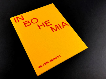
In Bohemia by Willem Jaspert is the epitome of hardback photography printing. Bound in Wicotex Dunkengelb with red foiling, this book exudes immediate character before a single page is turned. Inside, the four-colour print on 150gsm silk pages showcases a quiet, rural corner of Bohemia. The combination of Colorplan Vermillion endpapers, carefully chosen binding materials, and vibrant foils results in a book that’s as much a design statement as it is a photographic record.
Print Insights and Challenges:
Hardback binding requires great attention to detail—material textures, foil stamping precision, and consistent trimming are all crucial. The consistent reproduction of lush fields and subdued village life demanded careful colour management. By blending artisanal binding with technical expertise, In Bohemia emerges as a collector’s item that inspires many to follow its lead. It’s an example often referenced by those seeking to replicate its striking, off-kilter size and tactile appeal.
Key Takeaways for Self Publishers:
For those aiming high, a hardback edition with specialty materials and bespoke formatting can set your book apart. Consider unique sizing, bold colour contrasts, and foiling to elevate the visual dialogue between cover and content.
The result? A photography book that makes a powerful, lasting impression.
At Ex Why Zed, we’re passionate about more than just producing beautiful books—we’re dedicated to empowering creators. Our commitment to communication, technical guidance, and craftsmanship ensures that every client feels supported, whether they’re producing their first stapled photography book or a high-end collector’s edition. We understand that photography book printing is both an art and a science, requiring expertise in paper stocks, binding methods, colour management, and finishing techniques.
As we look at our office shelves for examples of photography books and photo books, it is easy to spot that the majority of them are A5. 240x170mm and 280x200mm are popular sizes and very few are at unwieldy and predictable A4 dimensions.
Our case studies highlight how we help clients navigate these decisions. Together, we can transform your vision into a tactile narrative that resonates deeply with audiences—one that stands the test of time on any bookshelf.
Whether you’re planning a personal project, a commercial release, or simply exploring the possibilities of self publish a photo book, Ex Why Zed is here to guide you. Reach out to us today for a bespoke consultation and let’s bring your images to life in print, creating a work of art your readers will treasure, revisit, and celebrate.
Let Ex Why Zed handle your book fulfilment, storage, and distribution! Click to read more.


