A captivating children’s book cover can spark curiosity, set the tone, and draw young readers in before they turn the first page.
Colour, typography, illustration style, and layout work together to create visual balance and emotional connection.
The blog features 20 standout examples of childrens book covers that range from timeless classics to playful modern designs.
Each example shows how visual storytelling and thoughtful design bring a story’s theme and main character to life.
Common cover mistakes include unreadable fonts, cluttered layouts, mismatched tones, and designs unsuited to the target age group.
The guide explains when to collaborate with book cover designers and how to make the most of professional resources like templates and size guides.
Authors can find actionable tips to create covers that are visually appealing, age-appropriate, and emotionally true to their story.
The takeaway: a well-designed cover is more than art; it’s the bridge between your story and its readers.
You know that feeling when you hold your finished story for the first time? The one you’ve poured your heart into, crafting every rhyme, character, and twist until it feels just right. It’s a moment of pride, but also one of uncertainty. How do you make sure your children’s book catches a reader’s eye before they even turn the first page?
Every author faces that same question. The words may be full of magic, but it’s the cover that makes the first impression. The wrong colours, fonts, or illustrations can hide a beautiful story from view. Maybe the design feels too crowded, or the tone doesn’t quite fit the age group. In a world full of bright, imaginative stories, the challenge isn’t just writing one; it’s making it look like one too.
The good news is you don’t need to be a design expert to create something special. With a bit of guidance and a clear sense of your story’s heart, you can craft a cover that truly connects. In this guide, we’ll explore what makes a great children’s book cover, common pitfalls to avoid, and inspiring examples that show how design can bring imagination to life.
Why Is a Captivating Book Cover So Important For Children’s Books?
For children, a book’s cover is the first spark of curiosity. Before they can read the title or know the story, it’s the colours, characters, and emotions on the cover that pull them in. A well-crafted design doesn’t just decorate a story; it invites young readers into it.
A memorable cover helps children connect emotionally, whether through playful illustrations, expressive faces, or a sense of adventure. In bookshops and classrooms, childrens book covers images with warmth or humour often stand out, encouraging little hands to reach for them.
Simply put, a captivating cover can turn a book into a beloved favourite before the first page is even turned.
What Are The 20 Most Captivating Children’s Book Covers That Inspire Young Readers?
A beautifully designed book cover can transport children into a story before they even turn the first page. From timeless classics to bright, modern favourites, these children’s book covers capture emotion, imagination, and the pure joy of reading. Let’s take a closer look at 20 exceptional examples that continue to delight young readers and adults alike.
Classic And Timeless Children’s Book Covers
These covers have a charm that never fades. Their illustrations, colours, and typography instantly remind readers of simpler, more magical times that feel as comforting today as they did decades ago.
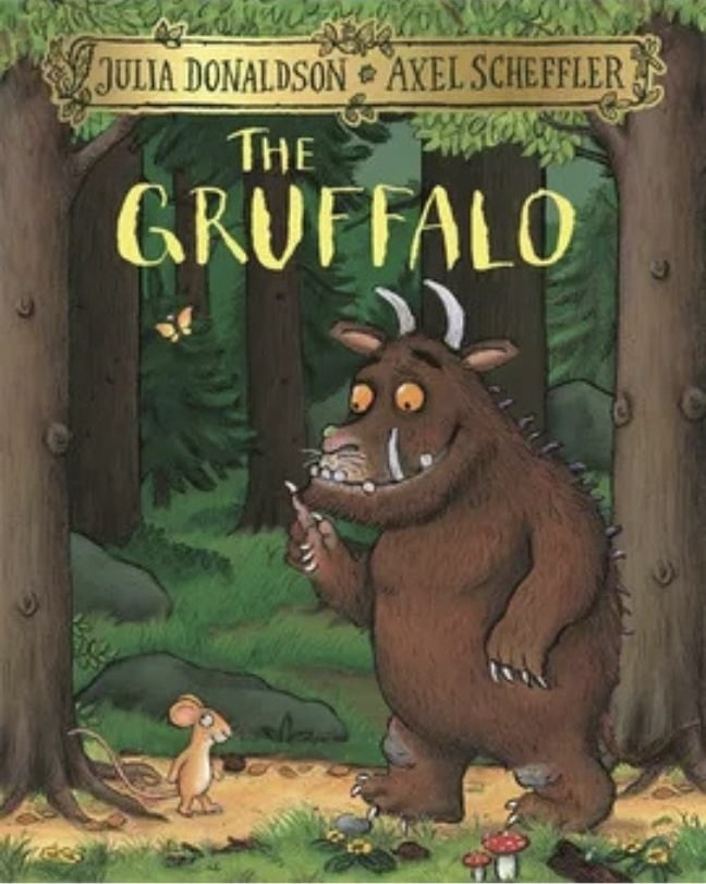
1. The Gruffalo by Julia Donaldson & Axel Scheffler
With its warm woodland tones and expressive characters, this children's book front cover perfectly captures the charm of storytelling. The forest scene feels alive with detail, from the textured bark and leafy greens to the small, curious mouse.
The Gruffalo’s friendly yet slightly fearsome face strikes the ideal balance between humour and a touch of tension, sparking curiosity about the story ahead. Every visual element feels intentional, inviting children to explore a world that is both magical and mischievous in equal measure.
2. The Very Hungry Caterpillar by Eric Carle
Bright, textured collage art gives this children's book cover design an instantly recognisable charm. The colourful caterpillar, set against a clean white background, stands out with a handmade, tactile quality that appeals across generations. Its simplicity is its strength, with no distractions, just bold shapes and cheerful energy that pull the reader in.
The balance of colour and white space gives it timeless appeal, while the playful brushstrokes remind us of the joy found in curiosity and transformation, perfectly reflecting the story within.
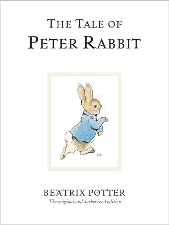
3. The Tale of Peter Rabbit by Beatrix Potter
This classic children's book cover blends soft watercolours with elegant serif typography, creating a sense of timeless grace. The gentle hues and delicate illustration of Peter capture innocence and adventure in perfect harmony.
Every brushstroke adds warmth, echoing the rural calm of the English countryside where the tale unfolds. Its simplicity is both its beauty and its power, proving that subtlety can hold more magic than excess. The design feels both familiar and refined, a comforting nod to generations of storytelling tradition.
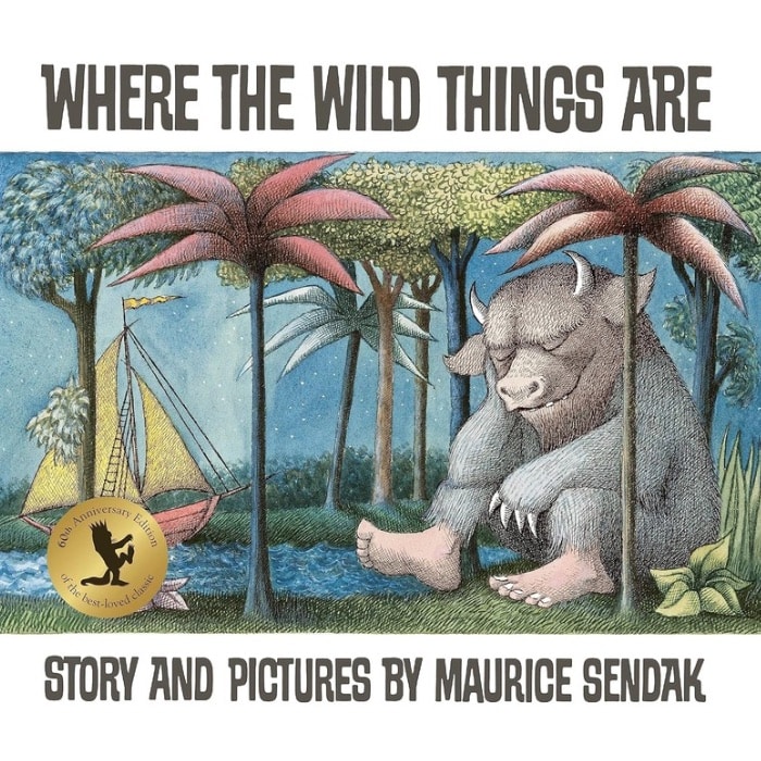
4. Where the Wild Things Are by Maurice Sendak
This iconic children's book cover design sets the tone for adventure and imagination with its earthy palette and intricate detail. The image of Max resting among the Wild Things captures the quiet after chaos, a moment of reflection and curiosity. The slightly muted tones evoke nostalgia and depth, balancing wildness with calm.
It beautifully mirrors childhood emotions such as curiosity, rebellion, and wonder. The composition draws you in slowly, hinting that there is more beyond the page, making it one of the most emotionally resonant covers in children’s literature.
5. Goodnight Moon by Margaret Wise Brown & Clement Hurd
Rich greens and warm oranges fill this famous childrens book cover design with comfort and familiarity. The cosy room scene glows softly under the moonlight, creating a peaceful bedtime atmosphere. Every tiny detail, from the little bunny to the flicker of the fire, adds to its charm.
The composition is simple yet endlessly inviting, with a nostalgic quality that feels like a warm embrace. It perfectly captures the soothing rhythm of bedtime, wrapping readers in calm before they drift into dreams.
6. One Fish, Two Fish, Red Fish, Blue Fish by Dr Seuss
This popular childrens book cover design bursts with colour and movement, instantly catching the eye of both children and adults. The playful fish characters dance across the page in bright, contrasting shades that perfectly reflect Dr Seuss’s whimsical storytelling. The bold typography adds rhythm and fun, echoing the sing-song verses inside.
Every element feels light-hearted and joyful, reminding readers that imagination has no limits. It is a design that celebrates creativity, laughter, and the freedom to see the world a little differently.
Modern And Playful Cover Designs
These covers use bold colour palettes, quirky illustrations, and humour to spark excitement and curiosity in today’s readers. They’re lively, joyful, and full of personality, just like the stories they introduce.
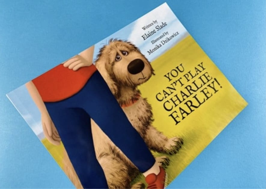
7. You Can’t Play, Charlie Farley! by Elaine Slade & Monika Dzikowicz
This children's book front cover captures emotion through a simple yet powerful image of a shy dog peeking from behind his owner. The expressive eyes and soft, textured details instantly connect with readers, conveying Charlie’s longing to belong. Gentle countryside colours bring warmth, while clean typography keeps the focus on the heartfelt illustration.
The balance between innocence and hope is beautifully handled, showing how visual simplicity can express deep emotion. It is a tender and relatable design that mirrors the story’s gentle message of friendship and acceptance.
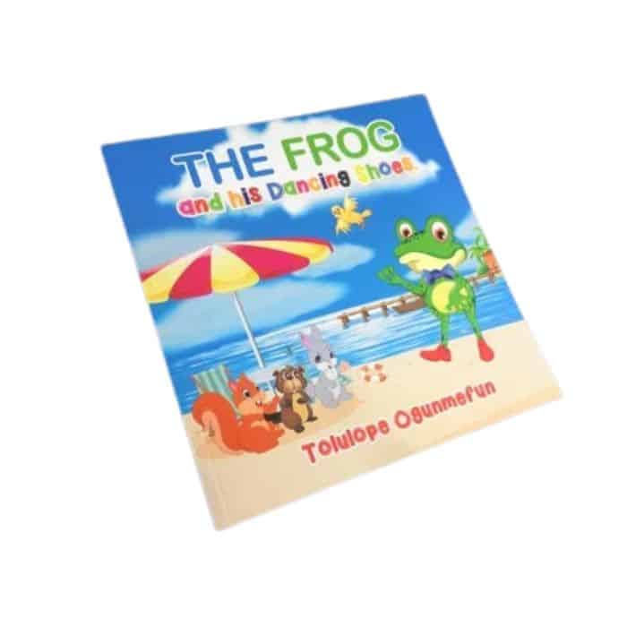
8. The Frog and His Dancing Shoes by Tolulope Ogunmefun
This children’s book front cover shines with cheerful energy and bold character design. The confident frog, dressed in his bow tie and bright shoes, instantly radiates joy and playfulness. The sunny beach backdrop adds a sense of movement and adventure, while the lively colour palette of yellows, blues, and greens draws the eye.
Each detail feels full of life, perfectly reflecting the story’s upbeat tone. It is a design that captures the joy of dancing, the fun of friendship, and the spirit of self-expression.
9. The Smart Cookie by Jory John & Pete Oswald
This childrens book cover is a wonderful example of how minimalism can feel full of warmth and personality. The bright yellow background and cheerful cookie character immediately communicate optimism and positivity. The simple composition gives space for the expression and typography to shine, creating balance and clarity.
It feels clean, modern, and approachable, reflecting a message of kindness and self-belief. The design proves that sometimes the simplest covers can make the biggest emotional impact, reminding readers that confidence begins from within.
10. Tiny T. Rex and the Impossible Hug by Jonathan Stutzman & Jay Fleck
Soft pastel tones and an irresistibly cute dinosaur make this cover an instant favourite among young readers. Tiny T. Rex’s determined expression adds emotion and humour, perfectly capturing the story’s uplifting spirit. The gentle background hues of pink, teal, and cream give it a soothing yet playful quality.
Its simplicity allows the character’s personality to shine through, making it feel both intimate and inviting. This is a design that radiates warmth, showing how perseverance and love can feel larger than life, even in small packages.
11. Nippy the Baby Crocodile by David Markee
This children's book front cover bursts with vibrant blues and greens that mirror the lively setting of the story. The cheerful crocodile, with his wide grin and bright eyes, feels both friendly and full of character. The surrounding water and playful ripples give a sense of movement, instantly drawing readers into Nippy’s adventure.
The typography is clear and inviting, complementing the joyful illustration. The cover’s warmth and energy capture the curiosity of childhood perfectly, making it an endearing and memorable design.
Whimsical And Artistic Children’s Book Covers
These covers blend emotion and artistry, drawing children into gentle, imaginative worlds with every brushstroke. They’re the kind you linger over, enjoying the artwork as much as the words.
12. Returning Home by Cat O’Neil
This children’s book front cover blends emotional depth with stunning artistry. The intricate linework and soft coral and green tones create a rich visual landscape that speaks of heritage, belonging, and self-discovery. The layered design, with a city skyline merging into rolling hills, reflects the book’s message about home and identity.
Every detail feels intentional and reflective. It is a thoughtful, beautifully balanced piece that resonates with both children and adults, showing how illustration can bridge personal emotion and universal themes.
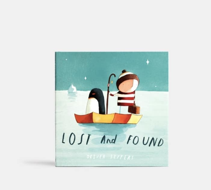
13. Lost and Found by Oliver Jeffers
Muted blues and delicate textures make this children's book front and back cover unforgettable in its simplicity. The small boy and his penguin companion instantly evoke feelings of friendship, curiosity, and gentle adventure. The vast, open sea creates both a sense of wonder and quiet loneliness, allowing readers to feel the story before reading it.
The understated typography and clean layout enhance its emotional depth. It is a design that proves how restraint and emotion can create something timeless and deeply moving.
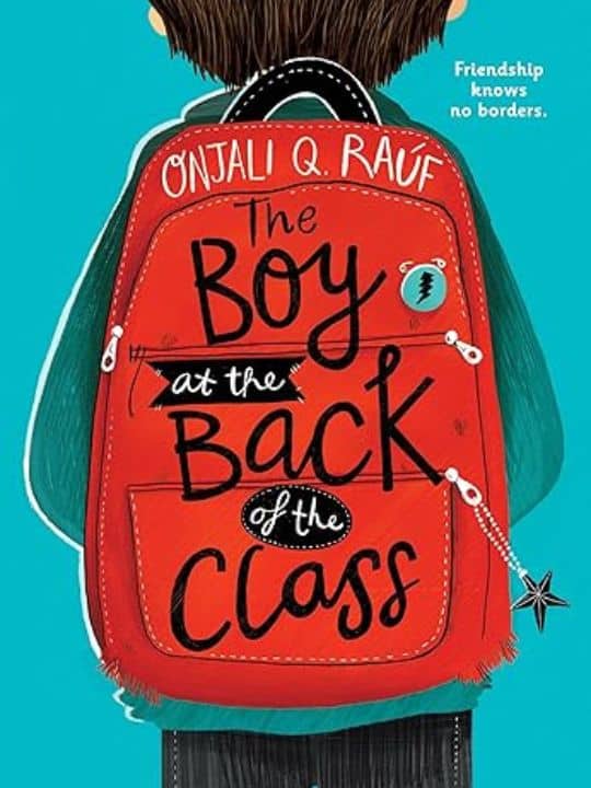
14. The Boy at the Back of the Class by Onjali Q. Raúf
The red backpack against the cool blue background makes this cover instantly iconic. The contrast draws the eye while the faceless character invites readers to see themselves in the story. The simple design and thoughtful colour palette reflect both innocence and resilience.
The clean typography adds modernity without losing warmth. It captures the emotional heart of the story with subtlety and strength, symbolising empathy, courage, and understanding. This is a cover that speaks volumes before a single page is turned.
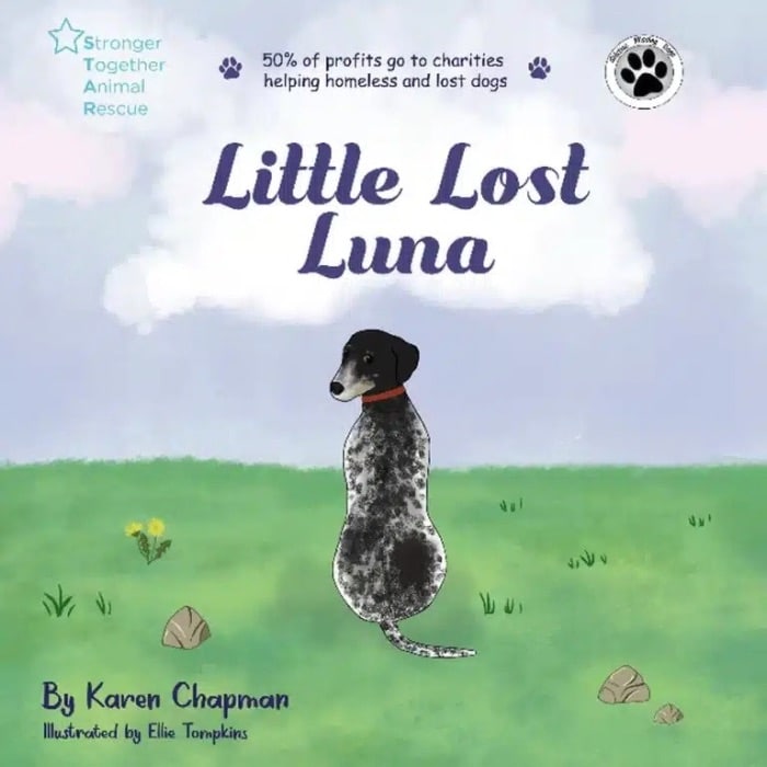
15. Little Lost Luna by Karen Chapman & Ellie Tompkins
This children's book front cover radiates tenderness through its soft watercolour textures and gentle pastel tones. Luna’s kind expression and the dreamy sky behind her create a feeling of hope and comfort. The composition is simple but powerful, drawing the viewer straight to her eyes and the quiet strength they convey.
The design perfectly mirrors the story’s themes of compassion, rescue, and belonging. It is a delicate yet emotionally rich cover that reminds readers how small acts of kindness can light the darkest moments.
Diverse And Imaginative Cover Art
These covers celebrate inclusivity, courage, and creativity. They’re visually bold, emotionally expressive, and designed to reflect the world as children see it today.
16. Hair Love by Matthew A. Cherry
This childrens book cover design radiates warmth, confidence, and joy. The tender illustration of a father and daughter celebrating natural hair tells a powerful story of love and identity before a word is even read.
The rich purples and golds add depth and vibrancy, while the characters’ expressive faces capture the closeness of their bond. The artwork feels uplifting and proud, inspiring children to embrace who they are. It is both a visual celebration and an empowering reflection of modern family life.
17. A Long Walk to Water by Linda Sue Park
This children's book front cover uses muted browns and sandy tones to tell a story of strength and perseverance. The lone figure walking beneath the vast sky evokes solitude and hope, mirroring the emotional depth of the story inside. Its minimalist composition leaves room for reflection, inviting readers to pause and feel.
The simplicity of the design captures the magnitude of the journey, showing that quiet visuals can convey powerful messages. It is a moving, contemplative cover that speaks of endurance and courage.
18. The Lightning Thief by Rick Riordan
This popular childrens book cover explodes with energy and drama, setting the stage for an epic adventure. The stormy sea, swirling clouds, and towering city skyline create a sense of danger and excitement. The young hero, standing tall with a lightning bolt, captures the courage and determination that drive the story.
The dynamic perspective and bold colours pull the viewer straight into the action. It is a design that perfectly combines fantasy and realism, promising readers a thrilling journey into another world.
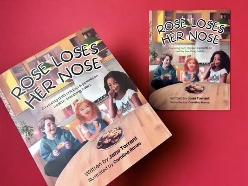
19. Rose Loses Her Nose by Jane Tarrant & Carolina Banza
This book cover design bursts with personality, blending humour and education through bright, cheerful illustrations. The expressive characters and colourful setting make learning feel fun and approachable. The clear layout keeps the focus on Rose and her curious expression, giving the cover instant appeal.
Every detail feels alive and engaging, perfectly suited for young readers. It is a cover that teaches while entertaining, showing that storytelling and playfulness can work hand in hand to make learning truly enjoyable.
20. My Wonder Line by Vicky Gooden & Angela Mayers
This children's book front cover uses soft pastel tones and gentle illustrations to create an atmosphere of calm and confidence. The smiling girl at its centre radiates positivity, surrounded by sparkles that suggest growth and self-discovery.
The composition is uncluttered, giving space for emotion to shine through. Its soothing colour palette mirrors the story’s themes of self-acceptance and healing. It is a graceful, empowering design that feels both tender and hopeful, encouraging children to see beauty in their uniqueness.
A great children’s book cover doesn’t just look good; it feels good. It stirs curiosity, joy, and wonder before a single word is read. Every colour, shape, and line plays a part in creating that spark of connection, inviting young readers to dream, explore, and imagine what might happen next.
1. Colour
Colour is often the heartbeat of a children’s cover. Bright, playful hues bring excitement and energy, while soft tones create calm and comfort. Think of the bold greens and oranges in The Gruffalo that burst with woodland life, or the soothing blues in Lost and Found that whisper of friendship and discovery. The right palette doesn’t just decorate a story; it captures its emotion.
2. Typography
Words on a children’s book cover do more than name the story; they join in the fun. Rounded, bouncy letters feel welcoming, while handwritten styles add a touch of personality and warmth. The best typography feels alive, as if it could jump right off the page and start talking to you.
3. Illustration Style
Illustration is where the magic truly begins. From soft watercolours that feel like dreams to bold digital art that pops with personality, illustration sets the emotional tone. A smiling character, a swirl of clouds, or a mischievous wink can tell more of the story than words ever could.
4. Composition and Layout
A good layout guides the eye and heart at once. The placement of the title, the space around the character, even a trail of stars can lead the reader into the story world. The best covers use simplicity to create focus, where every detail has a reason to be there.
The most memorable childrens book covers don’t just show a story; they share it. They spark curiosity, invite laughter, and wrap readers in wonder. When a child feels something before they even turn the first page, that’s when you know you’ve created a truly great book cover.
What Mistakes Should You Avoid When Designing a Children’s Book Cover?
Designing a children’s book cover can feel like a joyful mix of art and storytelling. But sometimes, even with the best intentions, a few small choices can make your design feel off balance. Understanding what to look out for helps you create something that feels just right for your readers and your story.
1. Hard-To-Read Fonts
It’s easy to get drawn to decorative fonts, especially when you want your cover to look unique. But if the title is hard to read, it loses its magic. For the best font for your book, choose clear, friendly typography that fits your story’s tone and helps young children recognise your title easily.
2. Too Many Elements
When you love your story, you want every detail on the cover to shine. But sometimes, less really is more. A single character, a strong image, or a simple background can say more than a crowded design ever could. Clarity lets your message breathe and your story’s heart shine through.
3. Ignoring Age Appropriateness
Children connect to colours, shapes, and styles differently as they grow. What delights a toddler might not resonate with a ten-year-old. Think about your target age group and design for their world, whether that means soft watercolours for a bedtime story or bold, playful energy for an adventure tale.
4. Mismatch With The Story
Your cover should feel like a reflection of what’s inside. If the imagery or colours don’t match your story’s tone, readers can feel confused before they even open the book. Let your cover echo your story’s heart, its emotions, lessons, and magic, so the first glance feels like a promise of what’s to come.
At Ex Why Zed, we know how much heart goes into creating a children’s book. From the first sketch to the final printed copy, every detail matters, especially the cover. That’s why we’re here to help you turn your vision into something young readers will love to pick up again and again.
Whether you already have your artwork ready or need guidance setting up your files, we make printing simple and stress-free. You can use our free book cover templates, choose from premium finishes, and even print short runs to see your story come to life exactly as you imagined.
If you’re ready to create a children’s book that looks as magical as it reads, get an instant quote today and start bringing your story to life with Ex Why Zed.
Conclusion: Bringing Your Children’s Book Cover to Life
A captivating cover is the doorway into your story. Every detail, from colour to layout, helps young readers connect before they even begin to read.
If you are creating a children’s book, start by deciding what emotion you want your cover to spark. Collaborate with an illustrator who understands your story and can bring its spirit to life. Explore childrens book covers images for inspiration and note what captures your attention.
Before finalising your design, share it with parents, teachers, or children to see what resonates. A thoughtful, well-designed cover not only attracts attention but also builds excitement for the story waiting inside.
Printing AI-Created Children’s Book Images: From Digital Story Spark to Beautifully Finished Book
Artificial intelligence has opened an exciting new doorway for self-publishing authors, illustrators and creative storytellers who have a children’s book idea bubbling away but feel unsure how to bring the visuals to life. Our guide on how to use AI to illustrate a children’s book explored how image-generation tools can help creators move from a loose concept to fully developed scenes, characters and page ideas far faster than traditional routes alone. The real strength of AI was not simply speed, but creative exploration: testing multiple illustration styles, refining the mood of a story, developing consistent characters and shaping a visual language before committing to final artwork. For authors who may have previously felt held back by illustration costs, long lead times or uncertainty about art direction, this approach offered a practical starting point. Crucially, the article also made clear that strong results still depended on human judgment: structured prompts, careful selection, image refinement and a clear understanding of how those illustrations would eventually live on the printed page.
That is where the journey naturally progressed into our companion article on how to use ChatGPT to print a children’s book. This piece widened the lens beyond image creation and showed how AI could support the full early-stage workflow, from generating a story idea and shaping characters to dividing a manuscript into spreads, planning the page rhythm and preparing artwork with print in mind. The key message was reassuringly grounded: ChatGPT could speed up brainstorming and drafting, but it could not replace the craft needed to make a children’s book feel polished, age-appropriate and professionally produced. A successful book still needed pacing, page turns, readable typography, clean layouts, suitable dimensions, and illustrations designed with breathing room for text rather than squeezed in afterwards. For creators using AI-generated images, this distinction matters. A collection of attractive pictures is not yet a book. It becomes a book when the story, artwork and physical format start pulling in the same direction.
For anyone planning to print a children’s book from AI-created images, these two articles together offered a highly actionable roadmap. They unpacked the design nuances that affect final quality: maintaining character consistency across scenes, working with a coherent colour palette, generating several options for each illustration rather than settling for the first result, and ensuring images are refined to a suitable standard for professional print. They also covered the practical production factors that shape both budget and outcome, including page count, trim size, full-colour printing, paper quality, binding choice and the difference between a lean test version and a more premium finished edition. The ChatGPT printing guide explained that print-ready files need proper structure, CMYK colour preparation, 300 dpi imagery, bleed, embedded fonts and thoughtful layout choices, while the AI illustration article showed why planning those details early leads to better artwork decisions later. Together, they helped demystify a process that can otherwise feel like a tangle of tabs, tools and technical jargon.
At Ex Why Zed, we saw this emerging workflow as a lively fusion of imagination and practical print craft. AI could help authors crack open the creative shell, but our role was to help turn that digital momentum into a children’s book that looked assured in the hand. These guides highlighted the value of professional support at the final stretch: pre-print file checks to spot layout or bleed issues, paper and binding choices suited to illustrated work, flexible print runs from one-off proof copies to larger quantities, consistent colour reproduction, and fast turnaround when creators were ready to move. For older first-time authors, family storytellers, retired creatives or illustrators experimenting with new tools, that support could make the difference between “I made some images” and “I made a book.” The result was a clearer, calmer route to publication: use AI thoughtfully, refine with care, prepare files properly, then print with confidence.
Expert takes:
AI illustration works best as a guided creative partner, not an autopilot. Clear prompts, repeated character details and a consistent visual style produce far stronger children’s book artwork.
A polished children’s book depends on structure as much as imagination. Story pacing, page planning and age-appropriate readability remain essential, even when ChatGPT helps with drafting.
Print quality begins long before the file reaches the press. CMYK colour, 300 dpi imagery, bleed, image sharpness and thoughtful text placement all influence how AI-created illustrations reproduce on paper.
Costs are shaped by creative and physical choices. Size, page count, paper stock, full-colour printing, binding and quantity all affect the final price, so early planning prevents expensive detours.
Ex Why Zed helped bridge the gap between screen and shelf. Our file checks, flexible quantities, paper expertise, reliable finishing and quick production routes helped authors move from AI-assisted concept to professionally printed children’s book.
Frequently Asked Questions
How to design children’s book covers that stand out in the UK market?
A standout cover connects instantly with its target audience through vivid colours, engaging visual elements, and thoughtful design elements. The style of the cover should reflect the story’s tone, helping potential readers feel curious before they even open the book.
Where to get professional help with children’s book covers in the UK?
You can find skilled book cover designers and illustrators who specialise in children’s publishing. Many UK services, like Ex Why Zed, provide printing, templates, and file setup for printable childrens book covers, ensuring professional-quality results for authors and publishers.
Should I hire a professional or design my own children’s book cover?
Hiring a professional or graphic designer is often the best choice, as they understand cover illustration, typography, and layout. However, designing your own can work for a first book if you study what makes a good book cover appealing to younger readers.
What are the key elements of a successful children’s book cover?
A successful cover highlights the main character, uses clear imagery, and balances colour, text, and composition. Great book cover design plays a pivotal role in storytelling, helping communicate emotion and theme to both early readers and older kids.
How much does a children’s book cover cost in the UK?
Costs vary depending on experience, style, and detail. Simple, funny childrens book covers may start from around £150, while a great book cover with bespoke illustration and finishing can reach several hundred pounds for professional-quality design work.
How do I find a children’s book illustrator in the UK?
Look for illustrators whose work suits your target age group and the book’s content. Review portfolios focusing on book cover art or childrens books covers to ensure their cover image style aligns with your story’s theme, tone, and central character.
If you can do these five things confidently, you can design a book that’s professional, consistent, and print-ready. Nothing fancy. Just the fundamentals done properly — which, honestly, is where most book files win or lose.
In 5 minutes you will know how to:
1️⃣ Create a New Document 2️⃣ Add Images 3️⃣ Add Text 4️⃣ Set-Up 3mm Bleed 5️⃣ Export your finished design as a print ready PDF
We’ve outlined each skill with clear, exact steps and screenshots to illustrate the process.
🤩 Don’t be intimidated by InDesign. It’s made for print layouts — books, magazines, brochures, the lot. It is paid software, but Adobe currently offers a 7-day free trial.
If you’d rather use something free (or already on your computer), you can build simple layouts in other tools. Try Affinity Publisher, Canva, Quark Express, Word, Publisher or Powerpoint (listed in order of efficiency). For proper multi-page book design, InDesign and Affinity Publisher are the smoothest options.
1️⃣ Create a New Document Properly (size + pages)
This is where you decide the physical reality of the book: trim size, page count, and whether you’re working as spreads or single pages.
Go to the File menu → New → Document
File → New → Document — start your book file the right way.
• Set Intent: Print
Choose the Print tab so InDesign uses print-friendly defaults.
• Set your Width / Height to the trim size (the finished size after trimming).
• Set Pages to your total page count.
• Tick Facing Pages. This is a visually easier way to design a book so you can see double-page spreads.
• Set Bleed as 3mm (we’ll cover this properly in Skill 4).
A5 example setup: 40 pages, Facing Pages on, 3mm bleed added.
⚠️ Two small but important notes
Perfect Bound Books: If you’re printing a perfect bound book, we need one file for the cover spreads, and a second file for the inside pages: Set up perfect bound book artwork.
Page count reality check: If you’re designing a stapled booklet/zine, the page counts work in multiples of 4 (because of how sheets fold). Stapled is also known as saddle-stitched or wire stitched. Preparing artwork for stapled booklets.
2️⃣ Place Images Into Frames (and control what’s inside the box)
InDesign is frame-based: you don’t “drop an image on the page” — you place an image into a frame. That’s what gives you control.
• Make a frame using the Rectangle Frame Tool (frame with an X), or
Use the Rectangle Frame Tool (F) to create picture boxes fast.
• Draw your frame. To do this, select the Rectangle Frame Tool, click on the page, then hold and drag to create a rectangle (or square) at the size you need.
Draw an image frame first (the box with an X).
• Next, use Cmd+D (Mac) / Ctrl+D (Windows) or File Menu> Place. Choose the image from your computer and it will appear in the frame.
Import images via File → Place (or Cmd/Ctrl + D).Frame vs image: the frame crops, the image sits inside it.
• To move the image inside the frame:
Use the Direct Selection Tool (the white arrow) and drag the image content within the box until you are happy with its position.
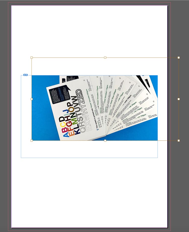
A placed image sitting neatly in the layout — controlled and aligned.
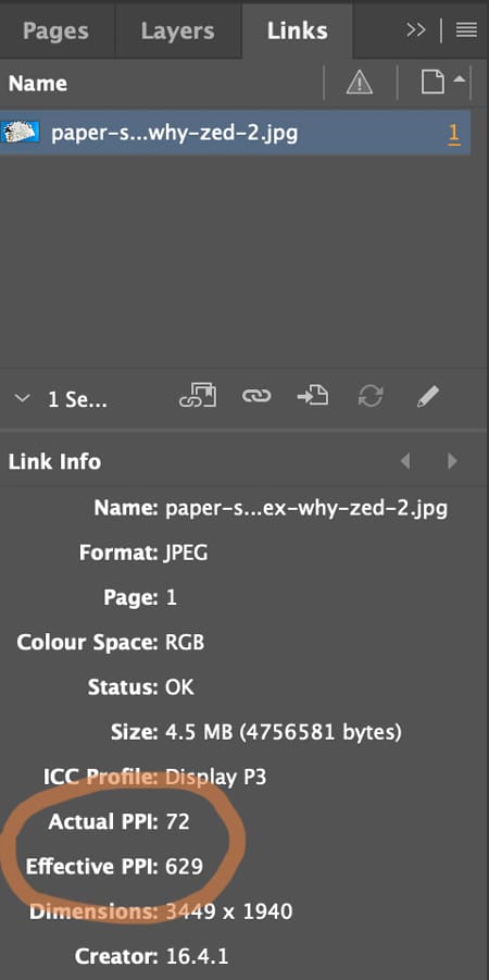
⚠️ Check the Image Quality (300 pixels per inch prints crystal clear)
Open Window → Links and check image quality. The Effective Pixels Per Inch (PPI) should be at least 300. Low-res images (typically under 200ppi) will look fine on screen but appear fuzzy and out of focus when printed.
Check quality in Window → Links — aim for ~300ppi at final size.
3️⃣ Create Text Frames and Format Typography
Yes: you can draw a text box, type, select-all, choose a font… and it will “work”.
But for books, the real skill is getting consistent type across dozens (or hundreds) of pages without manually fiddling.
The basics (still important)
• Hit the T icon for the Type Tool.
Pick the Type Tool (T) to start adding text to your page.
• Click-and-drag to draw a text frame. To do this, click on the page, then hold and drag to create a text frame at the size you need.
• Type or paste your text into the frame.
A simple page build: heading text frame above a placed image.
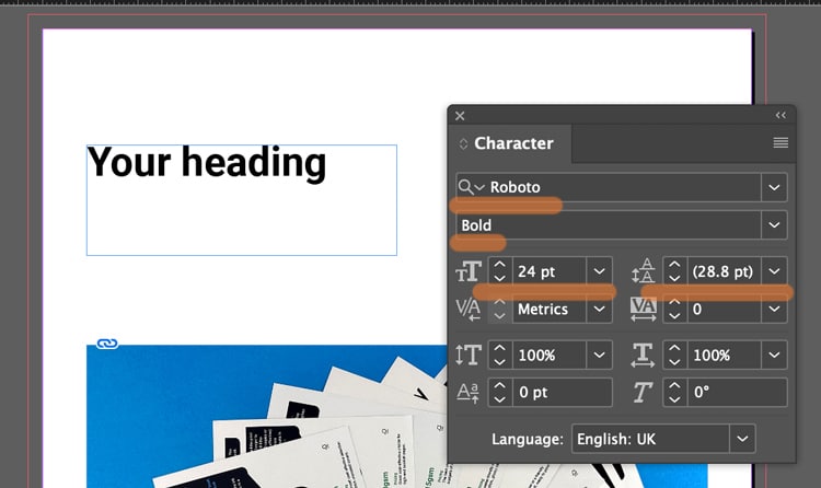
• Use the Character and Paragraph controls (Found in the Type menu) to set font, size, leading (spacing between each line of text), alignment (left, right justified or centre).
Style a heading by adjusting weight + size in the Character panel.
Not sure what size to make your text? Generally 8-10pt is good for main body text. 16-32pt is large enough for headings and titles. (For children's book, choose 16pt for the main story).
If you text frame isn't big enough, you can click the black arrow tool and drag out the corner handles to make it bigger.
Text frame too small? Use the black arrow and drag the handles.
⚠️ Book Design Hacks (still beginner-friendly)
Create Paragraph Styles for body text, headings, captions. One change updates the whole book.
Use character styles for small repeats (like italic emphasis) so you’re not hunting inconsistencies later.
If you have text running across pages, learn threading: click the out-port of one text frame and flow into the next.
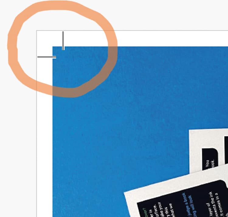
4️⃣ Set Up 3mm Bleed (doing this now saves so much time later)
Bleed is an extra 3mm of artwork beyond the trim edge, so when our guillotine trims the printed sheets, you don’t get accidental white borders around the page edges.
The rule
If something should print to the edge, it must extend 3mm past the trim line on that edge. The trim line is generally indicated by the white artwork edge and inner pink line on your InDesign artwork. The outer magenta line shows the 3mm extra. (This will be visible if you have added '3 mm' into the bleed boxes during Step 1 when you created your new document).
The magenta bleed guide sits outside the page edge — that’s your extra 3mm.
CRUCIAL STEP: How to ADD bleed to your content in InDesign
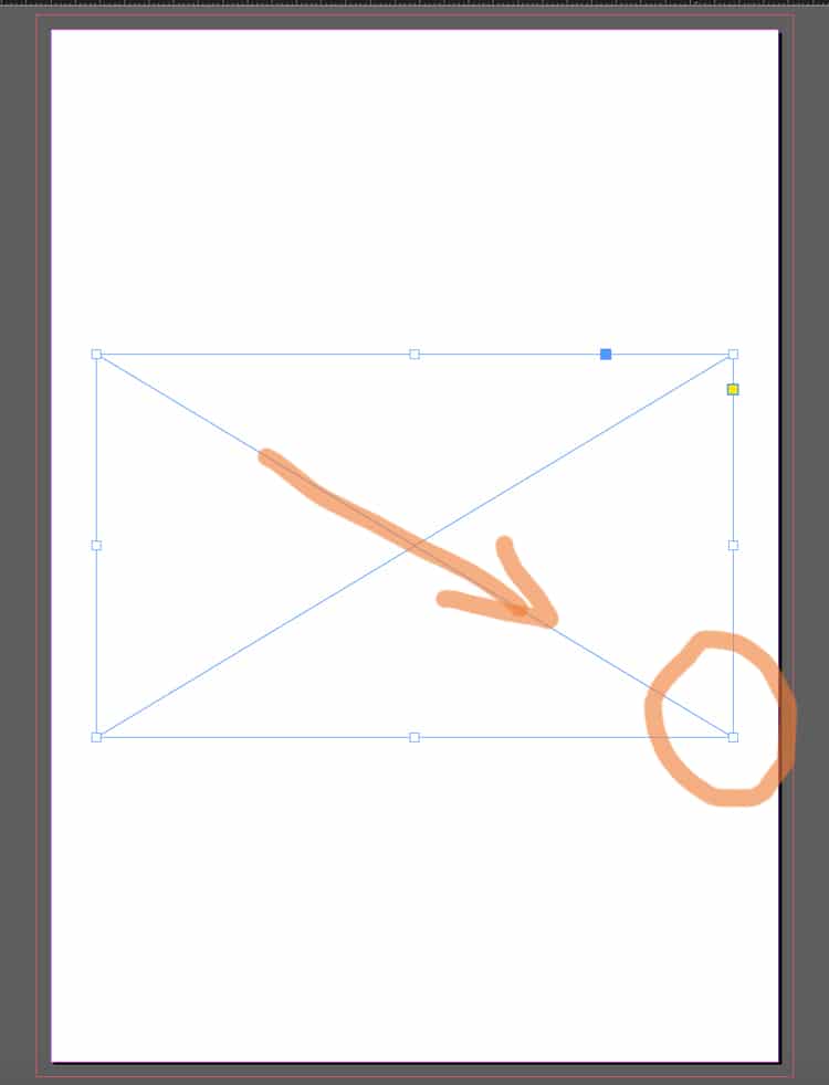
Select the Black Arrow tool and drag the outer handles of your image frame to the magenta line. This extends the image by 3mm outside the trim line.
Correct setup: artwork extends past trim into the bleed area.
Following this repositioning, you might need to make some small adjustments to the image within its box: these include changing the size of the image, or moving it over using the White Arrow tool.
The example below ISN'T Bleed. Notice the image stops at the trim line.
Incorrect: artwork stops at trim — this risks white slivers after trimming.
However, this example below shows a page with generous white borders, so you don't need bleed. The content stops well within the trim line so there is no need for bleed because no content will go right to the edge of the finished pages.
Lets repeat that again: If none of the content is intended to go to the edge of your finished book's pages, you don't need to worry about the extra 3mm because you'll have lovely white borders around your artwork.
If your design has white borders, you don’t need bleed on that page.
⚠️ STOP AND READ
If you don't have bleed on the PDF and your images go to the edge, we will ask you to add it. We won't go to print without bleed on your PDFs so lets add it now.
For further guidance, here is Adobe’s own guide to creating a PDF with bleeds is a further handy reference.
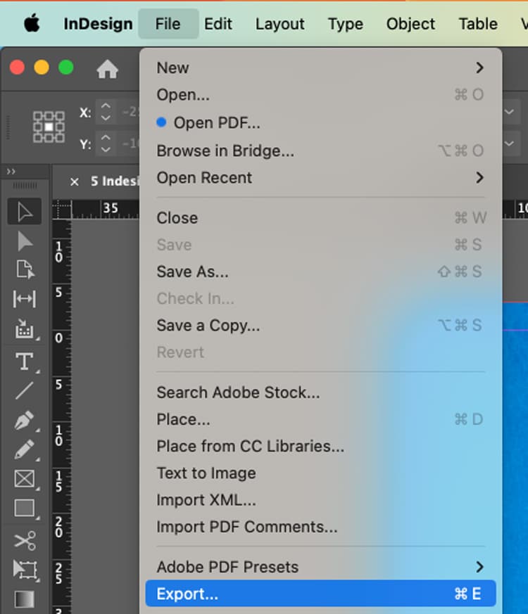
5️⃣ Export your artwork as a Print Ready PDF (this makes us happy)
This is the handover. The file can be beautifully designed — and still fail here if the export is wrong.
The dependable export steps
File → Export (or the keyboard shortcut Cmd+E)
Export your PDF via File → Export (Cmd/Ctrl + E).
Name your file, choose Adobe PDF (Print) as the Format, then click Save.
Choose Adobe PDF (Print) — not an interactive PDF.
In the next box...choose Adobe PDF Preset: PDF/X-1a:2001 Further down the box, choose 'Pages'.
In General: select PDF/X-1a:2001 and export as Pages.
In the Marks and Bleeds tab (found by clicking it down the left):
Tick Crop Marks (they increase the PDF page size to make room for marks).
In the Bleed boxes, add '3 mm' into the Top, Bottom, Inside and Outside box.
Click Export.
In Marks & Bleeds: set 3mm bleed and add crop marks if requested.
What the finished PDF should look like. On the images below, notice the artwork goes past the crops marks on the correct example, but stops at the crop marks on the incorrect version>>>
Correct result. Artwork runs past crop marks — bleed is included.
Wrong result. Artwork stops at crop marks — add bleed and export again.
⚠️ Bleed Fix
If your artwork stops at the crop marks, to correct the problem, you need to amend one of two things (it is always one or the other of these):
➡️ Have you dragged the background image out 3mm beyond the trim line on your Indesign file into the bleed area? Try that then export again.
➡️ OR you have done the above, but then when you're exporting you need to click the Marks and Bleeds menu, then type '3mm' into the four bleed boxes. This will add the bleed to the pdf.
A quick “print-ready” checklist (save this bit)
Before you export:
✅ Correct trim size + page count set
✅ Images placed via frames, no missing links
✅ Text uses styles (or at least is consistent)
✅ 3mm bleed set, and full-bleed artwork extends to it
✅ Exported as Adobe PDF (Print) with bleed included
Any questions, do give us a shout, remember we are here to help on email, phone and live chat.
Helpful Ex Why Zed links to pair with this article