“We’re so thrilled with it!”
Where’s Petunia? is a concertina-folded, search-and-find leaflet created as a speaker gift for the HLTH Europe conference in Amsterdam. Packed with playful illustration and tiny details, it needed to work as both a smart, book-like giveaway and a huge unfolding puzzle. Our team helped HLTH and their illustrator turn an ambitious concept into a robust, 12-panel concertina booklet that feels premium in the hand and stands up to plenty of unfolding on the show floor.
About the Project
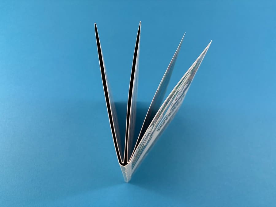
From the outside, Where’s Petunia? looks like a compact custom-size zine: a neat 210x148mm booklet with a playful unicorn mascot on the cover and HLTH branding along the spine. Pick it up, though, and the illusion disappears as the “spine” gives way to a long, concertina-folded map of the HLTH world.
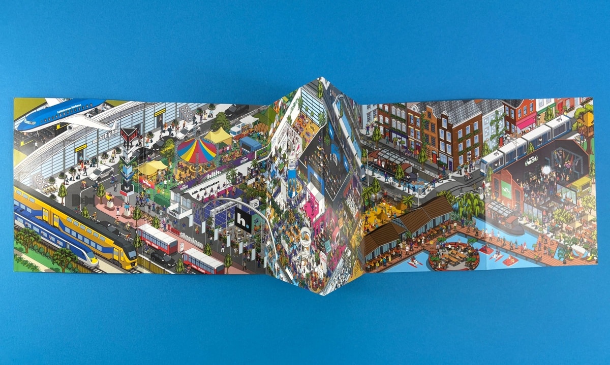
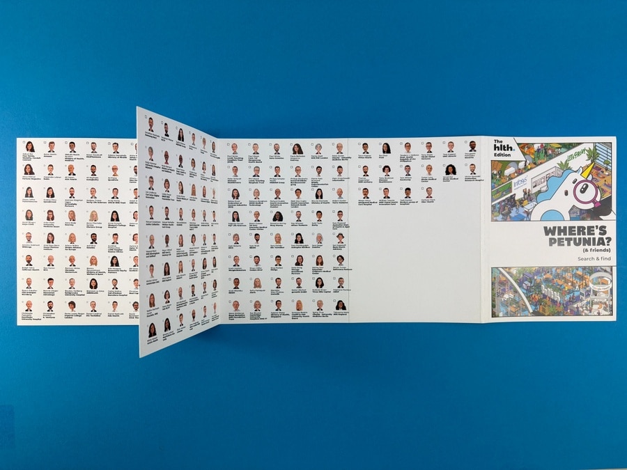
One side presents a richly detailed cityscape – planes landing, trains rushing past and the buzz of the conference itself. Flip it over and you find rows of caricature portraits of attendees. Every face appears somewhere in the main illustration, turning the piece into an interactive “find yourself” game for delegates.
This format makes the leaflet both a keepsake and an ice-breaker, encouraging people to gather round, search for familiar faces and spend real time with the HLTH brand.
Print Specification & Materials
HLTH needed generous width for the artwork without ending up with an unwieldy poster. We proposed a 210x898mm flat size, trimmed with six vertical folds and finished as a 12pp concertina at 210x148mm. A 10mm false spine area after the first fold line keeps the front cover looking like a slim booklet on the stand.
The leaflet is printed full colour on both sides onto 300gsm silk FSC-certified stock. Silk card was chosen for two reasons: it holds the huge amount of vector detail crisply, and it allows strong, saturated colour across the whole spread. With panels this tall and folds this tight, we added matt lamination to both sides to protect the ink from cracking along the folds and to give the surface a smooth, durable feel.
We also produced 220 matching belly bands on 200gsm silk with matt lamination to one side. These were supplied flat so HLTH could wrap them around gift bundles and future reprints of the leaflet.
Design Details That Make It Sing
The illustrations are gloriously dense. Bold blocks of colour – blue skies, yellow trains, fairground tents and neon signage – sit on top of a finely drawn isometric scene that captures the journey to and from the conference as well as the event itself. On press, the silk stock and CMYK set-up keep tiny facial expressions and signage legible, even when characters are just a few millimetres high.
Inside, the concertina format really earns its keep. Fully unfolded, the piece spans nearly a metre, creating an “epic panorama” that feels closer to a wall print than a leaflet. Folds have been planned so key focal points don’t fall into creases; the HLTH team worked from our layout template to position landmarks and text away from the vertical fold lines.
Turn the leaflet over and the experience changes gear. Here, simple rows of portraits and names echo a yearbook, giving players a checklist for the search-and-find challenge. This back-and-front pairing – busy world on one side, clean index on the other – keeps the piece readable despite the sheer amount of content.
The Client’s Print Journey
The project started with Millie and the HLTH Europe team exploring ways to turn a complex illustration into a tactile conference gift. We quoted a range of options on silk card at 250gsm and 300gsm, explaining how heavier stocks benefit from lamination to prevent cracking on folds.
From there, we supplied a custom 210x898mm concertina template, showing each panel, the 10mm false spine area and where the folds would land. This gave HLTH’s artist and in-house designers a clear structure to work within and helped avoid awkward panel breaks.
Before committing to the full run, HLTH ordered test prints on both 300gsm silk and 300gsm recycled uncoated so they could compare clarity and feel. That first round confirmed silk as the best match for the intricate artwork. We then moved into pre-press, checking bleed, resizing early files to the correct dimensions and advising on removing thin borders that could highlight trimming tolerances.
Once the final artwork landed, we dropped it into our internal layout mock-up to check that no faces crossed fold lines and that the spine area was kept completely clear of text. Screenshots of this mock-up reassured the client before proof sign-off. After approval, the concertinas and belly bands went into production, with delivery aligned to the HLTH Europe timeline.
How Ex Why Zed Helped
This project played to our strengths in problem-solving and format tweaking. We:
- Recommended the concertina size and panel structure to balance artwork impact with practicality.
- Talked through stock and lamination choices, highlighting the risk of ink cracking on heavier weights without a protective film.
- Provided a clear artwork template and folding guide, then double-checked every panel in pre-press so faces and text landed cleanly.
- Produced test runs on multiple stocks so the HLTH team could judge character visibility and colour before committing to 400 copies.
Throughout, Millie described our calls and follow-ups as “super helpful”, and the team’s final reaction – “we’re absolutely thrilled with it” – says the rest.
Takeaways for Your Next Concertina Leaflet
- Use a false spine if you want your concertina to masquerade as a booklet on first glance.
- Choose silk stock for detail-heavy illustration, especially when characters and text are tiny – it keeps edges crisp.
- Add matt lamination on heavier card to protect folds from cracking and keep colours looking fresh after repeated handling.
- Work from a printer’s template so panel sizes, fold lines and any “hidden” spine areas are crystal clear from day one.
- Order a short test run if you’re unsure about legibility at scale; it’s the fastest way to confirm that faces, logos and tiny details read well.
- Avoid tight borders near folds, as even a couple of millimetres of movement can make them look uneven.
- Consider extras like belly bands to turn a leaflet into a complete gift or launch pack for your event.
Handy Links to Explore Next
Ready to plan your own event giveaway? Start with the Printed Project Builder