Some books arrive on our table and you just know. Treble Champions is one of those: substantial, heavyweight, and built to do justice to a treble-winning season, without losing the human detail that makes club rugby hit so hard.
The square format gives the photography room to breathe, the pacing carries you from early optimism to a full-volume finale, and the production choices do exactly what they should: let the images land with colour, power and clarity. This genuinely got the “book of the year” nod in our studio. Mic drop.
If you’re planning your own commemorative sports book or photography title, start with our hardback book set-up guide and get a feel for formats. When you’re ready, our print journey page shows how we’ll guide you from files to finished books.
Client Quote
“It was a little stressful to place such a large order without ordering a mock-up first… but I needn’t have worried, the books came out perfectly.”
About the Book
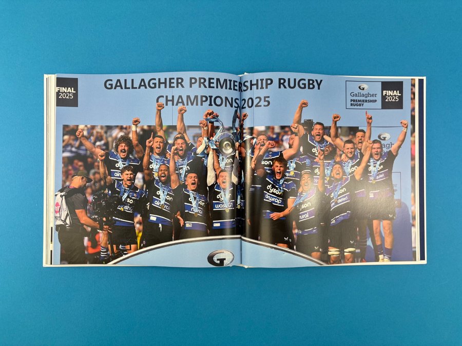
Treble Champions – The Story of the 2024/25 Season is a coffee table photography book created for Bath Rugby supporters — fans, players, management, and anyone who loves rugby storytelling told through stills.
The photography (shot by Bath Rugby’s club photographer) captures what the best sports work always catches: not just the big moments, but the near moments — the close-up detail, the tension, the grind, the joy. Our favourite kind of brief: ambitious, meaningful, and designed to be handled again and again.
Print Specification & Materials
This is a premium hardback made to feel like a proper keepsake — sturdy in the hands, confident on a shelf, and practical enough to survive the real world (being passed round, signed, gifted, re-opened).
Key spec summary
- Trim size: 250 × 250mm
- Format: Case bound hardback, section sewn for strength and longevity
- Endpapers: 2 × 4pp, unprinted Wibalin Natural Blueberry (WBN565)
- Text pages: 212pp on 130gsm silk, four colour throughout
- Finishing: Trimmed, collated, sewn and case bound
The logic is spot on:
- Silk text stock helps match photography look and performance — crisp detail, rich colour, and that slight sheen that suits match-day lighting and night-game contrast.
- The blue endpapers are a perfect “branded nod” at the start and end of the book — a clean, confident colour hit before the story even begins (and a brilliant detail for supporters who want it signed).
If you want to compare paper finishes before committing, our paper samples page is a helpful starting point. And for more projects like this, browse the wider hardback book portfolio.
Design Details (what makes it work)
Treble Champions is designed for impact and momentum.
1) The edit has a narrative spine
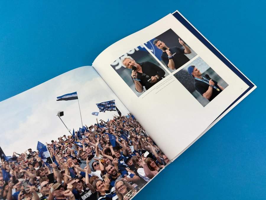
The book doesn’t just throw highlights at you. It blends narrative beats, match stats, fan photos and behind-the-scenes moments so the season builds properly — hope early on, belief, then the crescendo. That structure is what turns “a season review” into “a story you want to re-live”.
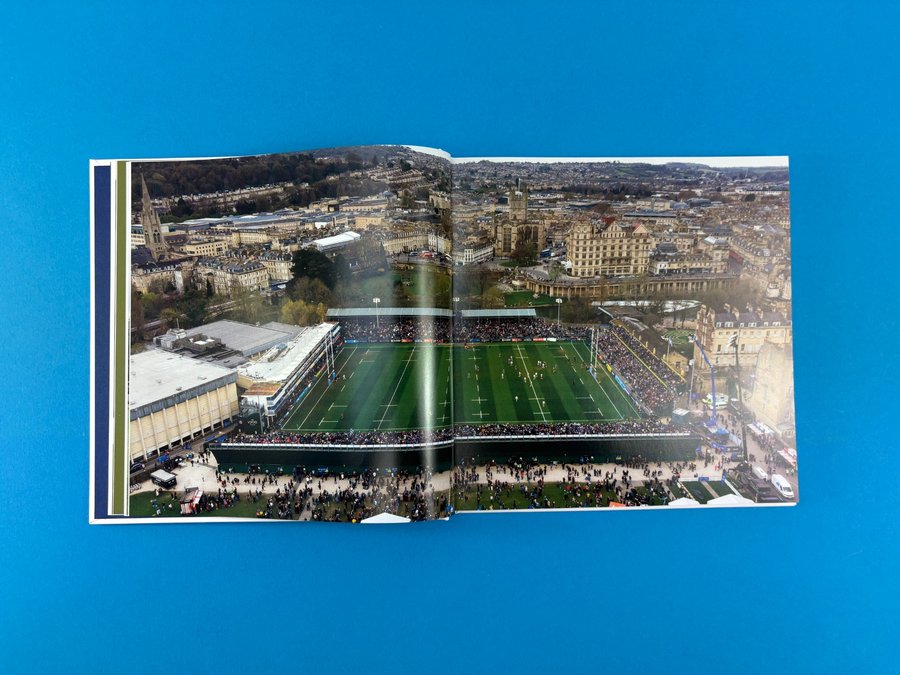
2) Full-bleed is used as punctuation
When a spread goes edge-to-edge, it feels like a shout. When the layout pulls back into white space, it gives you breath. That contrast matters in sport — it’s how you control pace on the page.
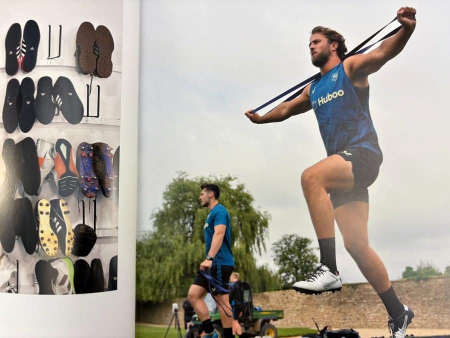
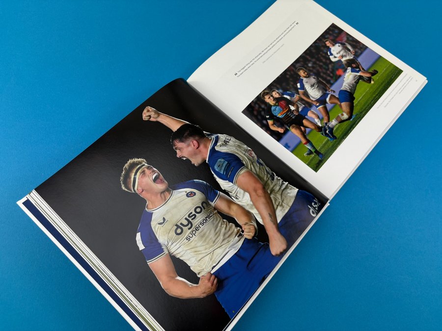
3) The detail shots are doing heavy lifting
Close-ups, quieter training moments, and club-life fragments give the big wins more meaning. You can feel that this was made by someone who’s inside the environment, not parachuted in.
Inside the Pages (silk stock + sports photography = fireworks)
If you’ve ever tried to print sports imagery, you’ll know the pain points:
- strong club colours that can dull down in conversion
- tricky lighting (stadium spill, mixed temps, deep shadows)
- skin tones next to saturated kits
- monochrome moments that look black-and-white but aren’t truly neutral
This is where the material choice shines. 130gsm silk gives a smooth surface for sharp halftones and clean colour reproduction, so the images don’t sink into the page. The result is exactly what the project needed: detail, colour, and power that leap off the spread.
The Client’s Print Journey (from first sizing question to “go live”)
This project is a brilliant example of what we’re here for: clear advice, calm problem-solving, and making a big print decision feel manageable.
Step 1: The size conversation (and keeping costs realistic)
The first question was exactly the right one: “Do you have standard sizes that keep costs down?”
We talked through sheet efficiency and what happens when you go custom. Square formats can be great for photography, but we still need to make the maths work on press.
After exploring options, the direction became clear: a 25 × 25cm hardback — bold, modern, and ideal for sport photography layouts.
Step 2: Hardback file set-up, without the headache
Once the project moved into InDesign build and export territory, we supported with:
- cover measurements based on page count + spine width
- proper templates for multiple spine sizes (so changes in pagination didn’t derail the cover)
- guidance on bleed, spreads vs single pages, and what “fly sheets” actually are (endpapers)
This is the unglamorous part of bookmaking — and it’s exactly where good support saves you days.
Step 3: Colour, conversion, and the reality of blues + monochrome
Sports books are a perfect storm: saturated kit colours + high-contrast lighting + occasional black-heavy layouts.
In the thread we covered:
- why Mac Preview can lie to you (Acrobat is the proper check)
- how to approach CMYK conversion (including a print-profile prompt)
- keeping rich blacks from looking charcoal by adjusting values on dark pages
- why black-and-white images can misbehave in digital print — and how to avoid nasty surprises
- nudging Bath’s blues so they stay lively after conversion (trialling adjustments, then rolling them out consistently)
Step 4: Proofing vs confidence (and budget honesty)
A single physical proof copy was discussed as an option — useful for checking layout and feel — but it comes with real set-up costs at quantity one.
In the end, the files were checked thoroughly and the project moved forward without a physical mock-up, under a tight Christmas timeline.
Step 5: Two editions + fulfilment (the “grown-up” version of a big print run)
As demand grew, the plan shifted to:
- a standard edition (printed hardback cover, matt finish)
- a limited edition concept with specialist cover material + foil, plus a small interior change for numbering/edition marking
We also introduced fulfilment support via Despatch Bros, which took a huge operational weight off the project.
Step 6: Delivery updates, real-world logistics, and a proper December ending
As release week approached, we kept comms practical — prioritising stock going to fulfilment first so customers received books on time.
We shared production snapshots (including a binding-line clip), which the client loved.
After delivery, the response was exactly what you hope for:
- “Pictures look crisp and vibrant… the cover is top notch.”
- Permission to promote the project, plus the note every printer wants to hear: the books came out perfectly.
Even when a couple of real-world issues popped up (minor transit damage; one odd binding error), we helped diagnose it, and we’d already supplied extra copies into fulfilment stock so replacements could go straight out.
And the best bit? Plans for the next run were already forming — with the book proving “extremely popular” and comments about how premium it feels.
How Ex Why Zed Helped (what we actually did)
This project is a great snapshot of our day-to-day value:
- Account-managed support from first sizing question through to dispatch priorities
- Templates and measurements that removed cover set-up stress when pagination shifted
- Print-literate file advice (spreads vs single pages, bleed behaviour, rich black handling)
- Colour reality-checks (especially around blues and monochrome behaviour)
- Practical fulfilment direction so the project could scale to real customer shipping
If you want the same kind of help on your own project, our Helping Hand and Rockstar pathways live here.
Takeaways for Your Next Sports Photography Book
1) Choose format for the images, not tradition
Square isn’t a gimmick — it’s a layout advantage for sport photography, especially when you’re balancing full-bleed, stats, and quieter documentary moments.
2) Use endpapers as your first “branding moment”
A strong colour endpaper is clean, affordable impact — and in this case, it doubles as a signature-friendly detail for supporters.
3) Silk stock is a safe bet for high-energy photography
If you want punch, crisp detail, and strong colour in a full-colour sports book, silk is hard to beat.
4) Don’t judge print from Mac Preview
It’s a small thing that saves big panic. Use Acrobat for reliable checking.
5) Plan your blacks and monochrome early
Dark backgrounds and “almost black-and-white” images need intent — rich black handling and consistent conversions stop nasty surprises.
6) Fulfilment matters as much as printing once you scale
If you’re shipping hundreds of books, getting a fulfilment partner in place makes the project survivable — and keeps you focused on marketing, not tape guns.