Ex Why Zed Print logo

Sultan + Shepard Endless Dawn. Perfect Bound A4 Zine

Love the Print Spec? Note it down and we can quote the same for your next project 📝

A4 Zines
4pp Cover onto 300gsm Gloss
Matt Lamination to outer
64pp Text onto 170gsm Gloss
Four colour print throughout
Trimmed, collated and perfect bound

Book Overview and Analysis:

“Sultan + Shepard Endless, Dawn” is a visually immersive and conceptually thoughtful publication, designed to reflect the ethereal beauty and atmospheric quality of Sultan + Shepard’s musical journey. The book presents itself as a fine example of how modern graphic design, music, and storytelling can converge to create a meaningful print artefact.

  • Binding Type and Physical Presentation: The book is perfect bound, ensuring a clean and polished appearance that complements its minimalist and high-concept content. The A4 zine format brings an elegant yet approachable feel, balancing between being a coffee-table book and a personal keepsake. The matte lamination on the outer cover enhances the tactile experience, adding a level of sophistication without overshadowing the visual narrative.
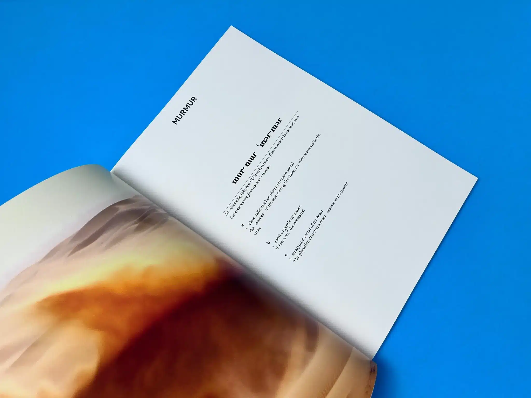
  • Cover Design: The cover features a dreamlike desert landscape, painted in warm, earthy tones of orange and brown that evoke a sense of vastness, isolation, and introspection. This image seamlessly conveys the idea of a “dawn” rising over a boundless desert, effectively aligning with the album’s thematic tones of transition, renewal, and reflection. The white, minimalist typography in all caps (“SULTAN + SHEPARD / ENDLESS, DAWN”) contrasts strikingly against the deeper hues of the cover image. This minimal approach allows the image to dominate while ensuring the title stands out clearly, creating a sense of calm and focus.
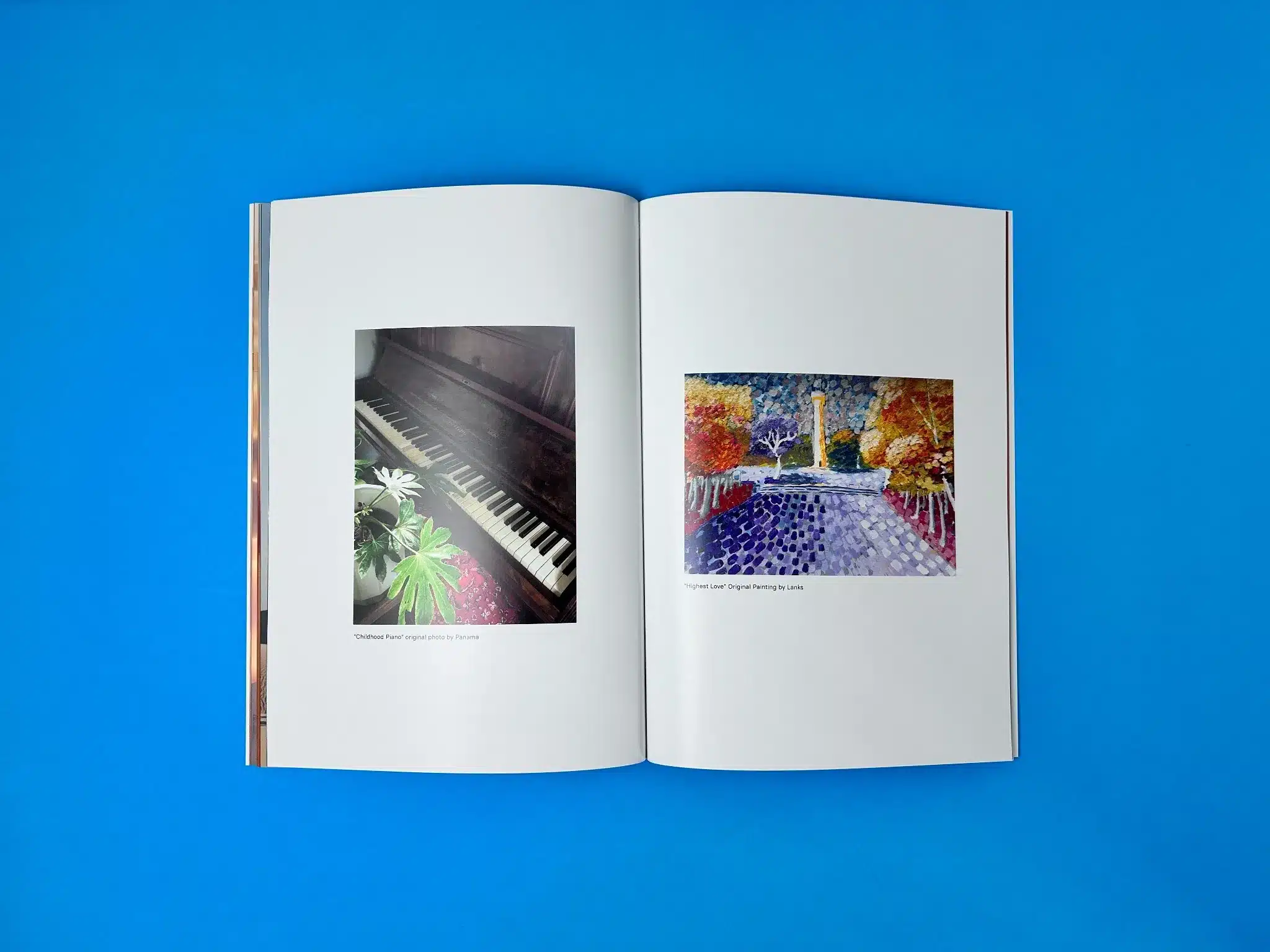
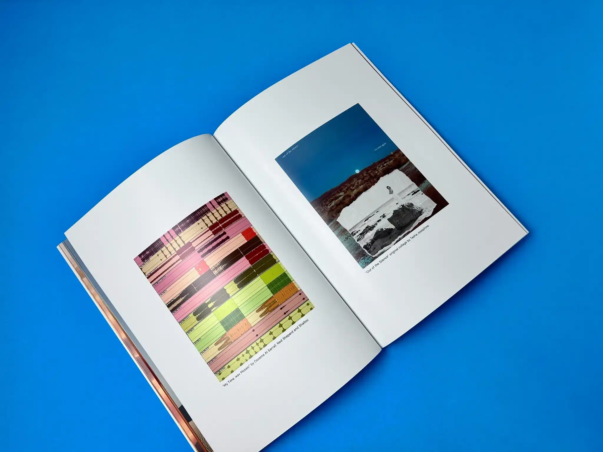
  • Page Layout and Typography: The inner layout is kept simple and uncluttered, allowing the imagery and text to breathe. The pages alternate between full-bleed photographs, graphic elements, and blocks of text that are framed with generous white space, giving the book a contemporary and minimalist design aesthetic. The typography is minimalistic, leaning towards modern serif fonts, offering clarity and a sophisticated edge. Words like “MURMUR” and “SUPPLEMENT FACTS” are styled to evoke a sense of editorial flair, playing with scale and negative space to engage the reader.
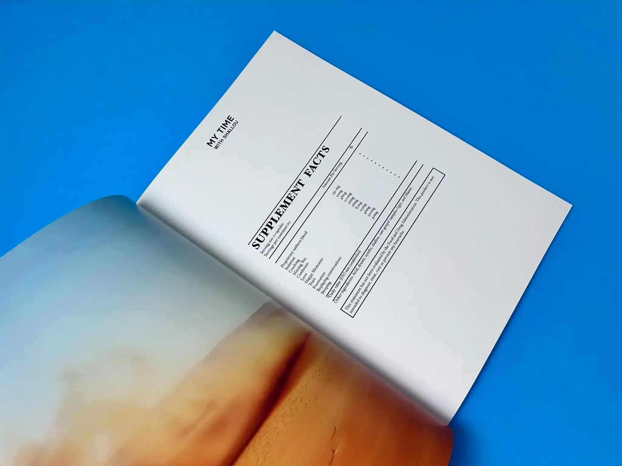
    In particular, the SUPPLEMENT FACTS page (as seen in one of the images) mimics the format of a nutrition label, a playful and innovative design choice that reflects the conceptual creativity behind the book.
  • Use of Colour: The colour palette inside the book is carefully chosen to be soft yet captivating, transitioning between muted shades of sandy beige, burnt orange, and earthy browns, mimicking a desert landscape. The occasional pops of brighter colours in specific artwork (such as abstract graphic designs and landscape photography) keep the visuals dynamic and engaging, without overpowering the overall aesthetic. The careful use of four-colour printing ensures that these images maintain high vibrancy and precision throughout the publication.
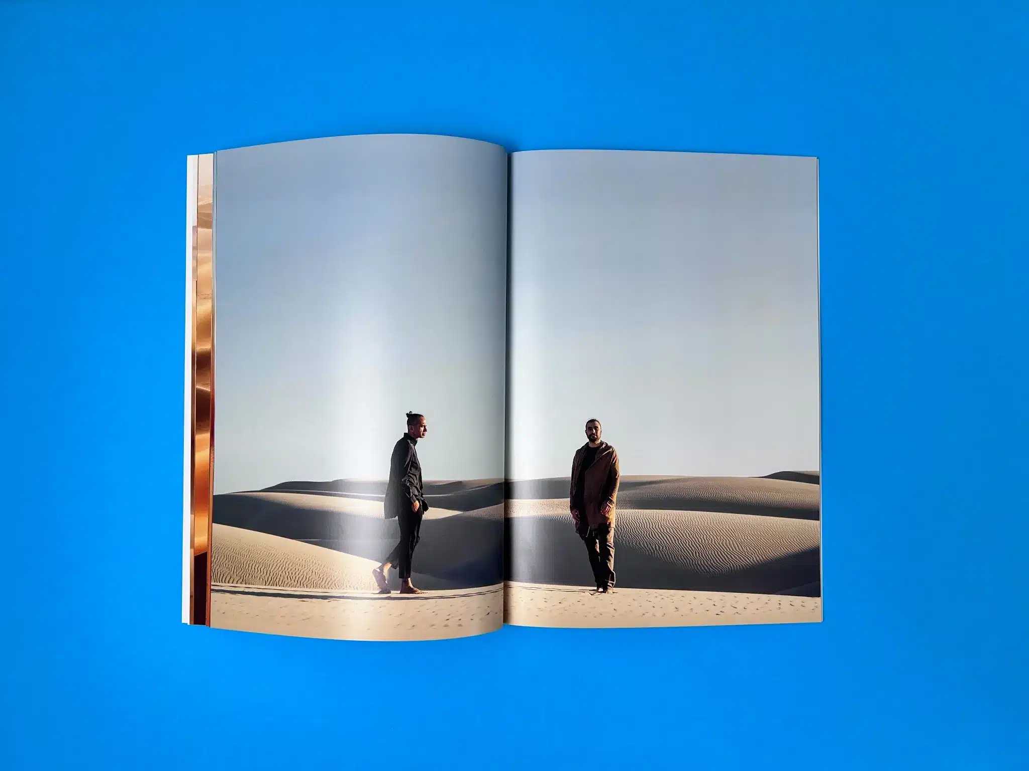
  • Imagery and Storytelling: The full-page images of Sultan + Shepard walking through dunes, seen in the last spreads, offer not just photographic beauty but also reinforce the musical and thematic journey of the book. These images are used sparingly and with intention, ensuring each visual element resonates deeply with the reader, rather than being a distraction.

Effectiveness of the Design

The design and aesthetic of the book effectively align with Sultan + Shepard’s artistic vision. By focusing on simplicity and clean, modern design principles, the book allows the content—both visual and textual—to shine. The use of minimalist typography, combined with carefully curated photography and abstract graphics, portrays a story of musical immersion, giving the reader not just a book but a sensory experience.

The effectiveness lies in the design’s restraint, relying on the power of empty space and high-quality imagery to evoke emotion, rather than bombarding the reader with unnecessary complexity. It allows for a contemplative engagement with the content, much like the music of Sultan + Shepard.

Unique Production Values

Several unique selling points (USPs) stand out in this publication:

  1. Perfect Binding with Matte Lamination: The smooth finish of the cover paired with perfect binding gives the book a professional, high-end feel, ideal for music collectors and fans. The durable and attractive matte finish adds to the tactile appeal, encouraging readers to interact with the book on a physical level.
  2. Full-Bleed Imagery: The impactful use of full-bleed pages for the desert landscapes and portraits of Sultan + Shepard create a sense of vastness and immersion, drawing the reader deeper into the artistic vision.
  3. Playful, Conceptual Layout Choices: The “Supplement Facts” section is an example of how design can be both functional and fun. It invites readers to engage with the content more creatively, reminiscent of zines and indie publications, which add a layer of interactivity to the reader’s experience.
  4. Textured Content Flow: The flow of images and text is dynamic yet cohesive, making the publication not only visually compelling but also conceptually fluid. The book invites the reader to move from one spread to the next, almost like a narrative unfolding across a visual landscape.

Actionable Insights

  1. Innovative Binding Choices: Matte lamination and perfect binding create a premium feel that makes a book more collectible and long-lasting. This is an effective strategy for limited-edition publications and albums, creating an artefact that can stand the test of time.
  2. Use of Negative Space: Allowing for large margins and negative space around text helps in creating a sense of sophistication and readability. It can be applied to any design where clarity and simplicity are key.
  3. Incorporating Playful Design Elements: The ‘Supplement Facts’ layout showcases how a touch of humour or playfulness can enhance reader engagement without detracting from the book’s overall serious aesthetic. Designers and authors can apply similar elements to break away from conventional layouts.
  4. Strong Visual Hierarchy: The bold, minimal typography used throughout the book creates a strong visual hierarchy, helping guide the reader through the content. The contrast between the scale of text sizes adds drama and focal points, a technique that can be used in any design to emphasise important information effectively.

Each of these insights reflects how careful design and production choices contribute to making “Sultan + Shepard Endless, Dawn” a visually arresting and immersive experience that resonates deeply with its audience.

The Print Journey of Sultan + Shepard’s Endless, Dawn

After the successful completion of previous projects, Sultan + Shepard entrusted Ex Why Zed with the production of their latest zine, Endless, Dawn. This collaboration showcases the attention to detail and commitment to excellence that both the client and the print company bring to their work.

Initial Consultation and Creative Challenges

The print journey for Endless, Dawn began with an email from Willis Daellenbach of Produkt, Sultan + Shepard’s production team. With their previous zine projects a great success, the new order was aimed at replicating the same high-quality results. The print specifications for this project included a 64-page A4 zine, with 300gsm gloss cover stock finished with matte lamination, and 170gsm gloss paper for the inner pages. Perfect binding was chosen to add durability and a polished look to the product.

However, one of the first challenges identified was the cover finish. The client pointed out a mix-up from a previous print order where the finish on the covers was gloss instead of the intended matte. This resulted in a reprint, and this time, the team was particularly careful to ensure that the correct matte lamination was applied.

Ex Why Zed’s responsiveness and collaborative spirit were evident in how we quickly addressed the issue. In an email to the client, Mike confirmed that the matte lamination would be applied correctly this time. The communication demonstrated Ex Why Zed’s professionalism, with a commitment to ensuring customer satisfaction from the outset.

File Setup and Print Consultation

A significant part of the project involved ensuring that the design files were optimised for print. During this stage, Ex Why Zed advised the client on best practices for text setup. Mike suggested that the text be set in 100% black (0/0/0/100 on the CMYK slider) to avoid unnecessary use of multiple colours in text print, improving sharpness and reducing ink costs. Willis passed this feedback on to the designer, Richard Robinson, who then provided revised artwork files.

This collaboration between the client’s design team and Ex Why Zed exemplified how meticulous attention to detail can enhance the final product. The team’s open dialogue about these revisions ensured the file setup was flawless before going to print. A slight technical issue with the text—where it was mistakenly set to full colour on some pages—was identified, but the designer quickly resolved it, thanks to Ex Why Zed’s eagle-eyed proofing process.

Production and Quality Control

Once the final artwork was approved, the project moved swiftly into production. The zine was printed using four-colour process printing for the visuals, ensuring vibrant, high-quality imagery throughout. During this stage, the proofing process continued to play a critical role. Ex Why Zed provided the client with a digital proof, allowing for a final check before committing to print.

After a minor issue with the previous proof was corrected, Willis gave the final approval, and the zines were sent to press. This seamless back-and-forth ensured that there were no surprises, and the client was confident that the final product would meet their expectations.

Delivery and Success

Upon completion of the print run, the zines were shipped promptly to the U.S., with tracking information provided to the client. The efficiency of the shipping and handling process added to the smooth customer experience, ensuring the zines arrived in pristine condition and on schedule.

Feedback from the client was overwhelmingly positive. The zines were well-received by Sultan + Shepard’s fanbase, with Willis expressing satisfaction not only with the product but also with the customer service that Ex Why Zed provided. In his email, Willis praised the “awesome front cover,” reinforcing the importance of attention to the matte finish detail that was carefully corrected during production.

Project Success and Future Collaborations

The final result of Endless, Dawn was an elegant and immersive publication, expertly produced by Ex Why Zed. The detailed communication, precise file handling, and expert print production ensured that Sultan + Shepard’s vision was brought to life. The client’s appreciation for the meticulous care that went into the project is a testament to Ex Why Zed’s dedication to quality.

The ongoing success of this collaboration, spanning multiple projects, highlights the trust built between Ex Why Zed and Produkt. This relationship paves the way for potential future collaborations, with Willis already hinting at further projects in subsequent emails.

Client Feedback

The client was particularly pleased with how the Ex Why Zed team handled the cover finish issue, reprinting the initial run to meet the correct specifications. Willis’ positive feedback on the final product and the way the book was received stateside suggests that the zine was a hit among fans.

Conclusion

The production of Endless, Dawn demonstrates Ex Why Zed’s ability to handle complex print projects with precision and professionalism. From resolving cover finish challenges to guiding file setup for optimal print quality, the journey reflects a seamless collaboration. The final zine serves as a tangible example of how Ex Why Zed brings visions to life with expert craftsmanship and a client-first approach, laying the groundwork for more successful projects in the future.
Ready for a Quote?

We hope you find this case study inspirational.

For more information on this book or to discuss your upcoming project, do get in touch on:
hello@exwhyzed.com01206 766647
Enjoy more of our , work
RODNEY MATTHEWS, LEGENDARY CONCEPTUAL ARTIST
Ex Why Zed makes self publishing a truly pleasurable experience!
Brilliant communication from start to finish. Mike had endless patience for the many questions we asked. The guides provided were easy to follow and super helpful (the video guides are a must watch too). Our order of hardback illustrated children's books was delivered expertly packaged and on time. As for the finished product itself - stunning - a real joy to finally hold, beautifully made and perfectly printed! We couldn't have asked for more. Well, we did - we instantly placed an order for paperback children's colouring books too, which we are equally as happy with. Look forward to working with Ex Why Zed again in the future.
trustpilot 5 star review
Excellent! Based on 480+ reviews
© 2023 Ex Why Zed Ltd. All Rights Reserved | A suggestion to the rest of the print industry - why not use some brain power and creativity to write your own content rather than copying ours again? | Website by Catchfish Online