254x203mm Case Bound Books.
Cover onto 170gsm Silk.
Matt Lamination to outer.
Gloss Spot UV Varnish to outer.
Wrapped over greyboard case.
2x 4pp End Papers Printed onto 170gsm Uncoated.
114 inside pages onto 170gsm Silk.
Four colour print throughout.
Trimmed, collated and case bound.
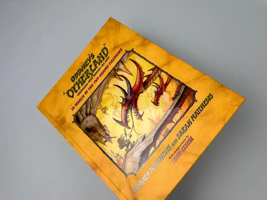
Welcome to an enchanting journey through the creation of "Oddney's Otherland," a masterfully crafted illustration book by Rodney and Sarah Matthews. This case study delves into the intricate process of bringing a whimsical narrative to life, from vibrant illustrations to high-quality printing. Discover how Ex Why Zed, a leading name in custom size book printing, played a pivotal role in transforming vivid artwork into a tangible masterpiece. Engage with a detailed analysis of the book's design, thematic richness, and the collaborative efforts that ensured its success.
"Oddney’s Otherland" is not merely a children’s book; it is an immersive experience into a fantastical universe, crafted by the combined talents of Rodney and Sarah Matthews. The analysis below delves into the thematic significance, aesthetic styling, and design choices that make this book a standout piece in the realm of illustrated children's literature.
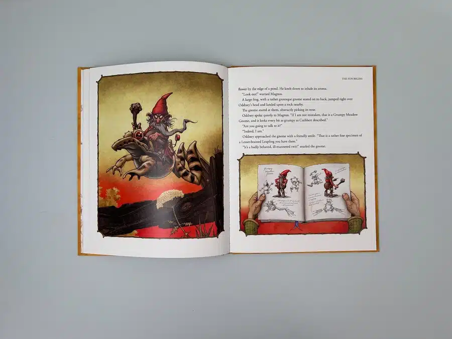
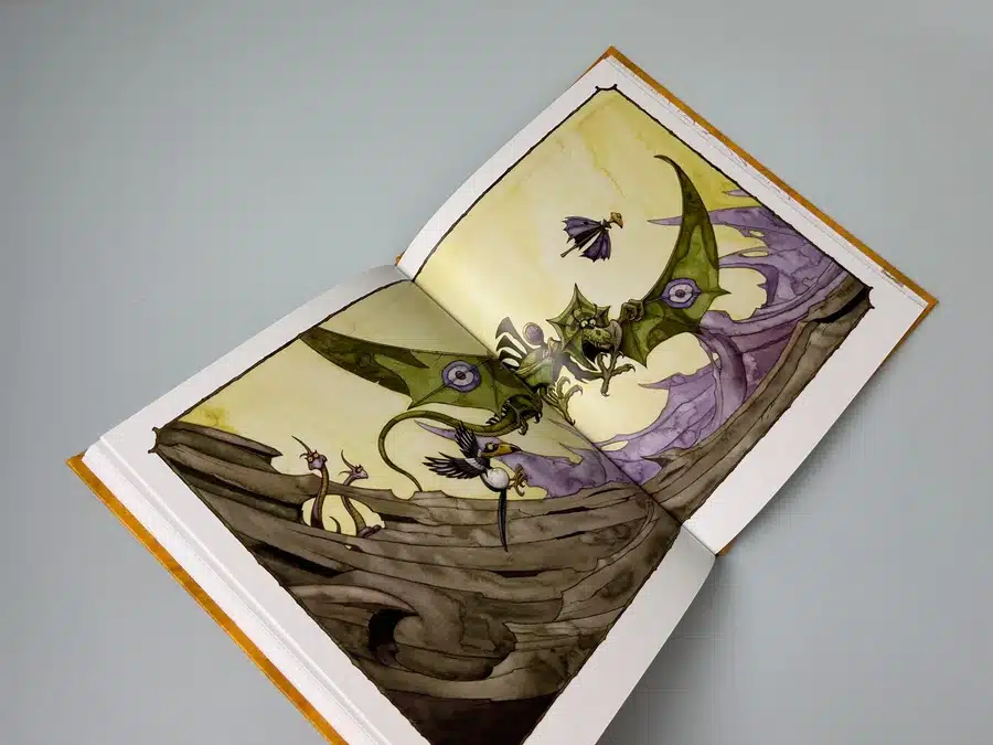
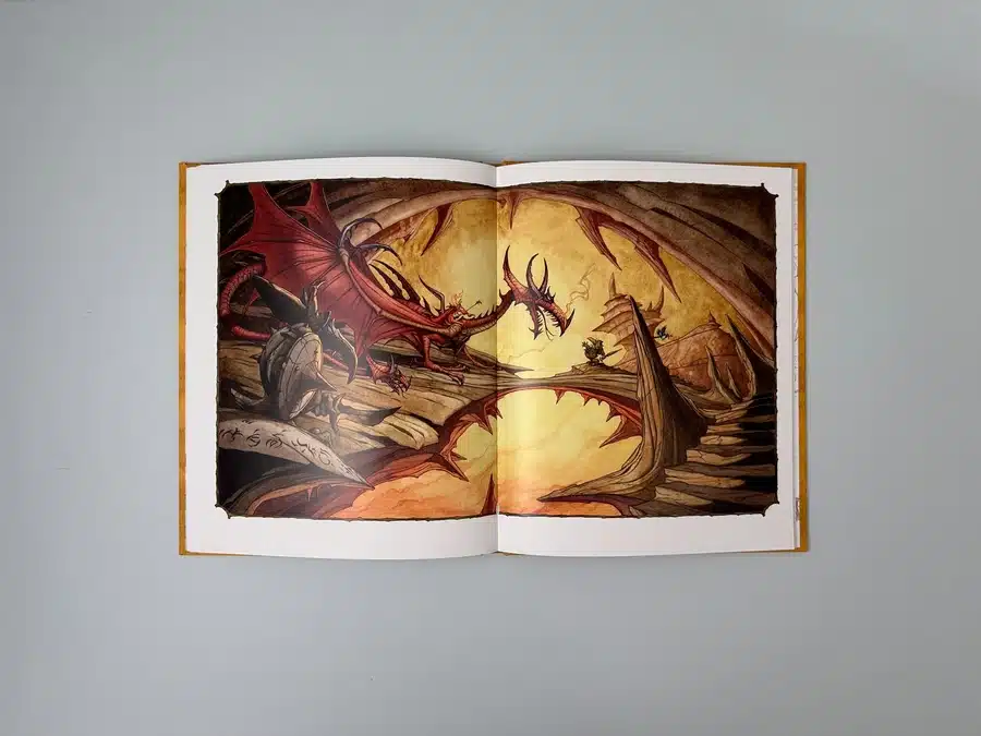
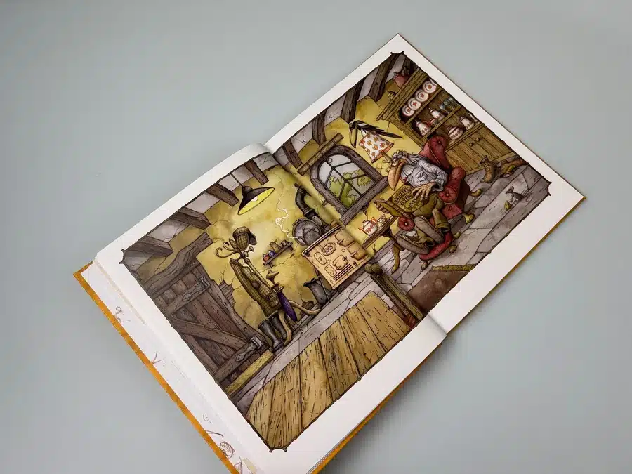
The storyline of "Oddney’s Otherland" serves as a narrative backbone, guiding the readers through a world brimming with odd goblins, mystical dragons, and a uniquely whimsical professor and his magpie companion. The themes explored are rich in fantasy yet resonate with the real-world dynamics of companionship, adventure, and curiosity. It’s a journey that reflects the explorative spirit of its authors, who have embedded parts of their own life into the characters and settings, making the narrative both personal and universally appealing.
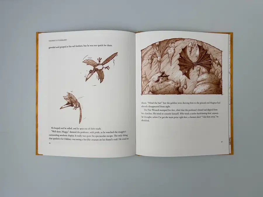
The book’s illustrations are a testament to Rodney Matthews' renowned artistic skill, each page a canvas that blends vibrant colors with detailed line work. The colour palette uses a mix of warm tones to depict fiery dragon scenes and cooler hues for darker, mysterious segments, setting a visual tone that matches the narrative mood of each chapter.
From the fiery reds and oranges used in the dragon scenes to the muted browns and greens in illustrations of earthy, gnome-inhabited landscapes, the book uses colour to convey emotion and action. This strategic use of a dynamic colour palette helps in keeping the reader visually engaged.
The typographic choices in "Oddney’s Otherland" are carefully considered to complement the illustrative elements. The body text is set against a clean background, ensuring that the words are easy to read without distracting from the accompanying visuals. The layout often incorporates full-page illustrations with overlay text, making each spread a dramatic piece of art.
The case binding of "Oddney’s Otherland" is not only practical but also aesthetic. It ensures that the book can withstand the test of time and repeated handling, which is essential for a children's book. The glossy spot UV varnish on the cover catches the light, drawing attention and adding a tactile element that children and adults alike will appreciate.
"Oddney’s Otherland" is an exemplar of how thoughtful design and quality printing can transform a simple story into a cherished keepsake. This book stands as a beacon for aspiring creators and printers alike, showcasing what is possible when passion meets precision in the art of book making.
The email conversations between Ex Why Zed and the creators of "Oddney's Otherland," Rodney and Sarah Matthews, offer a detailed glimpse into the collaborative process of bringing a creative book project to fruition. Here, we break down the key interactions and insights from these discussions.
Rodney and Sarah Matthews aimed to produce a high-quality illustrated book that could stand the test of time both in physical durability and aesthetic appeal. Their primary concerns revolved around the choice of materials, binding options, and print quality, highlighting their commitment to producing an exceptional product.
Throughout the project, Rodney and Sarah encountered several technical and decision-making challenges:
The interaction between Ex Why Zed and Rodney and Sarah Matthews was characterised by mutual respect, professionalism, and a shared goal of excellence. This collaboration not only resulted in a beautifully crafted book but also exemplified how effective communication and expert knowledge can lead to a successful print project. The experience, highlighted by the detailed email conversations, positions Ex Why Zed as a leader in custom book printing services, fully capable of transforming creative ideas into tangible, high-quality printed works.
"Oddney's Otherland" stands as a testament to the power of creative synergy between visionary authors and adept printers. The book's journey from concept to print exemplifies how meticulous attention to detail, in both design and execution, can result in a product that delights audiences and withstands the test of time. This case study highlights the seamless integration of aesthetic choices—from typography and layout to binding and material quality—that contribute to the book's allure. Rodney and Sarah Matthews' collaboration with Ex Why Zed reflects a perfect blend of artistic vision and technical expertise, culminating in a printed work that is not only visually stunning but also structurally sound.