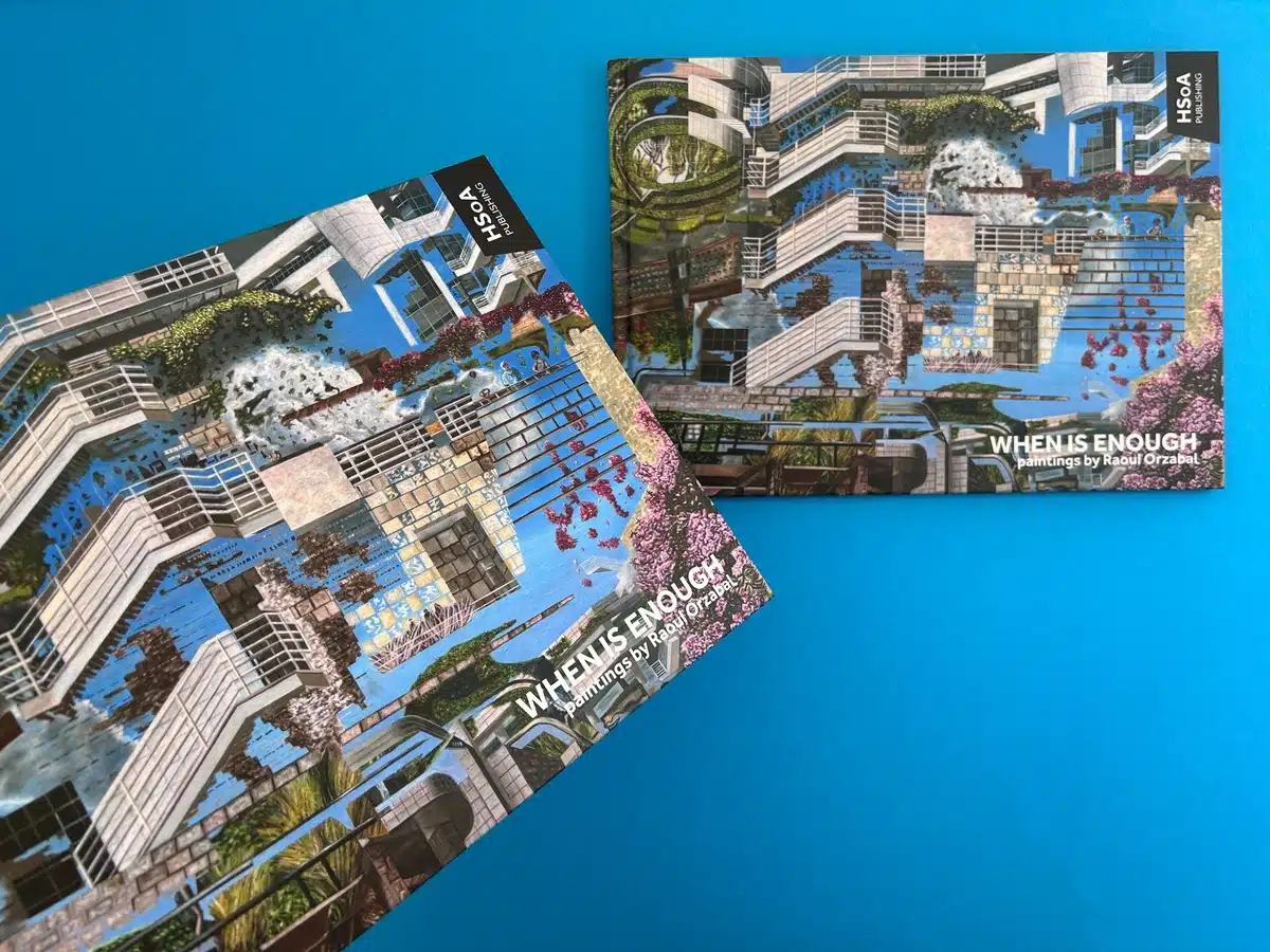
A4 Landscape Case Bound Books
Cover onto 170gsm Silk
Wrapped over greyboard case
Matt laminated to the outer
2x 4pp End Papers Printed onto 170gsm Uncoated
38 inside pages onto 170gsm Silk (9mm Spine)
Four colour print throughout
Trimmed, collated and case bound
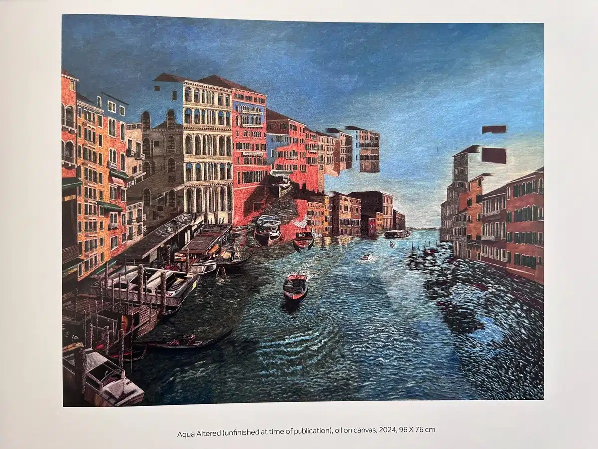
The book "When is Enough" is a visually striking and immaculately crafted A4 landscape case-bound publication. Its design speaks directly to the artistic ethos of Raoul Orazabal, whose detailed and multi-dimensional paintings dominate its pages. The meticulous attention to both form and function in the book production reflects the complexity and depth of Orazabal's work, with each design element carefully curated to showcase the art at its best.
The binding—a case-bound hardcover wrapped in a matt-laminated silk cover—exudes durability and sophistication. The 170gsm silk cover provides a smooth, premium feel, which aligns with the gallery-focused nature of the book. Inside, the two sets of 4pp endpapers printed on uncoated stock add textural variety and enhance the tactile experience. The decision to print the 38 inside pages on 170gsm silk ensures a balance between sturdiness and flexibility, with the paper weight providing a luxurious canvas for Orazabal's highly detailed paintings.
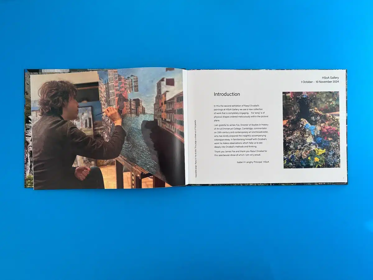
The landscape format is particularly noteworthy. This choice complements Orazabal's panoramic and layered compositions, allowing each spread to feel expansive and immersive. The typography is clean and unobtrusive, using a sans-serif font that maintains readability while allowing the artwork to take centre stage. Titles and captions are elegantly understated, ensuring they guide the reader without overpowering the imagery.
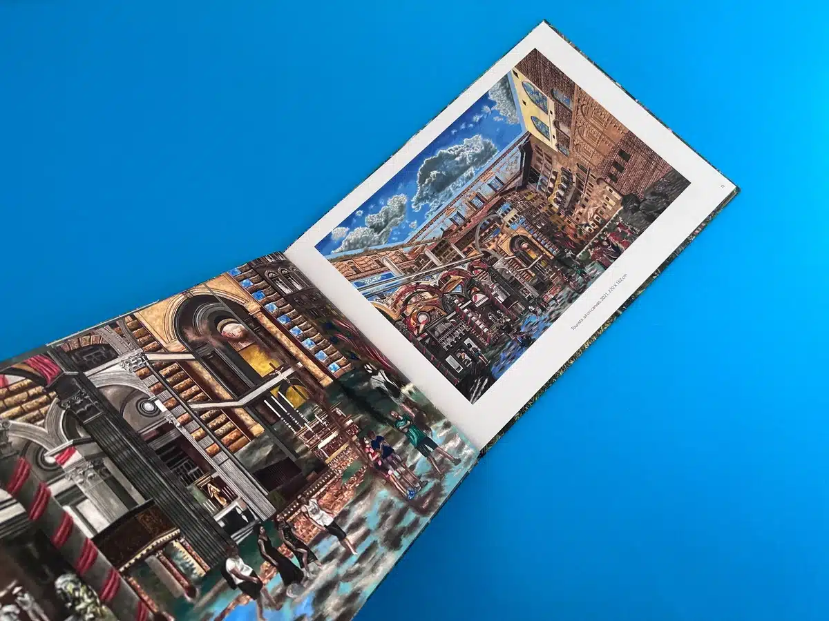
The use of colour throughout the publication is exemplary. The matt lamination on the cover enriches the vibrant hues of Orazabal's paintings while softening the overall finish to avoid glare—a crucial consideration for a book intended to be a visual repository of art. Internally, the colours of the paintings are vivid and true to life, thanks to precise four-colour printing techniques that bring out the intricate layering and textural nuances.
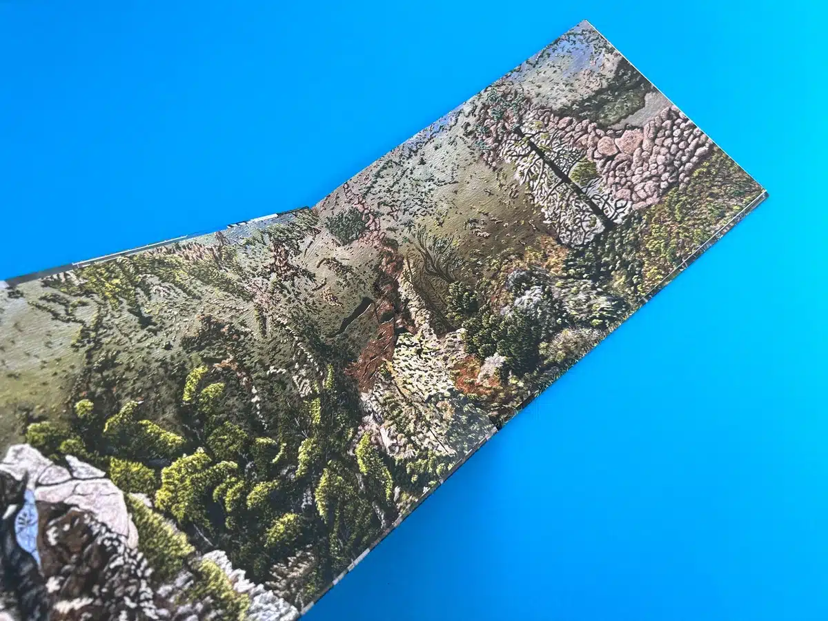
The page layouts alternate between full-bleed spreads that immerse the viewer in Orazabal's world and carefully arranged compositions where paintings are complemented by text. This variation ensures an engaging rhythm throughout the book, preventing visual fatigue while maintaining a cohesive narrative flow. Particularly impactful is the inclusion of full-page and close-up views of artworks, which allows readers to appreciate both the overall composition and the finer details of each piece.
Orazabal’s work, characterised by its surreal, fractured cityscapes and tension between natural and man-made elements, is mirrored in the book’s production choices. The multi-dimensional effect of his paintings is enhanced by the precise colour reproduction and thoughtful layout. The endpapers, with their uncoated texture, provide a grounding contrast to the silk pages, symbolically representing the dichotomy of natural vs. constructed worlds—a recurring theme in Orazabal’s work.
The artist's ability to create "alternate and parallel realities" is given a tangible form through the book’s design. The choice of an understated typographic style and expansive white space enhances the feeling of entering another dimension, where the viewer is invited to reflect on the themes of decay, environmental tension, and the fragility of human creations.
These design principles set a high bar for future art books and demonstrate how meticulous planning and attention to detail can translate an artist’s vision into an equally compelling printed format.
The creation of the art catalogue "When is Enough" by Raoul Orazabal was a collaborative triumph, showcasing how Ex Why Zed’s expertise transformed a time-sensitive and technically intricate project into a stunning reality. Malcolm Willett, representing the Hampstead School of Art, approached us with a tight deadline and ambitious requirements, but through clear communication, adaptability, and precision, the book was delivered on time and exceeded expectations.
Malcolm’s first email reflected a blend of urgency and creative ambition. He sought a hardback A4 landscape book with a gallery-quality finish for the exhibition. The challenge lay not only in meeting the tight timeline for the Private View on October 1st but also in adhering to high production standards. To mitigate risks, Ex Why Zed offered alternatives, including a softback option, ensuring flexibility for Malcolm in case of delays.
Key early exchanges focused on critical decisions:
The artwork preparation process involved detailed back-and-forth communication. Ex Why Zed provided file setup guides, particularly for the endpapers, to ensure all elements were aligned for case binding. Malcolm’s submission was reviewed meticulously:
The final specifications included:
These choices showcased the vivid colours and fine details of Orazabal’s dystopian, multi-layered compositions. Our state-of-the-art four-colour printing ensured accurate reproduction of the complex artworks, maintaining their depth and dynamism.
Malcolm’s response encapsulated the success of the project: "Thank you for the lovely catalogues you produced for Raoul Orzabal's show at Hampstead School of Art. They were much admired." The positive reception underscored the impact of Ex Why Zed’s technical expertise and customer-centric approach. Furthermore, the collaboration opened doors to future projects, with Malcolm immediately inquiring about a new catalogue for another artist, Rachel Scott Bowling, showcasing the trust built through this partnership.
This project highlighted Ex Why Zed’s ability to balance creativity with precision under tight deadlines. By providing proactive communication, innovative solutions, and flawless execution, we delivered a product that matched the artistic vision while fostering a lasting client relationship.
Through this journey, we demonstrated why Ex Why Zed is the first choice for hardback art gallery book printing — an ethos built on understanding, expertise, and unwavering commitment to excellence .
