203x203mm (8x8") Casebound Books
Cover onto 170gsm Silk FSC Certified
Wrapped over greyboard case
Matt laminated to the outer
2x 4pp End Papers unprinted onto 170gsm Uncoated FSC Certified
56 inside pages onto 130gsm Silk FSC Certified
Full colour print throughout
Trimmed, collated and case bound.
Welcome to a comprehensive case study that delves into the journey of Rachelle Luna's debut book, "First Words: Mixing ABCs & Filipino Heritage," crafted in partnership with Ex Why Zed. This analysis explores the intricacies of Educational Phonics Book Printing and illustrates Ex Why Zed's prowess in transforming a simple concept into a tangible educational tool that bridges cultural gaps. With a detailed look at the design and print processes, coupled with the client's aspirations and the collaborative efforts to overcome challenges, this case study exemplifies a successful partnership aimed at delivering educational content through superior book printing services.
This children's learning book seamlessly blends educational content with vibrant cultural heritage, fostering a bilingual foundation for its young readers. Let's delve into the thematic significance, styling aesthetics, design choices, colour palette, typographic usage, page layout, binding style, and storytelling elements of this unique publication.
"First Words" is more than just a children's book; it's a bridge connecting young Filipino-Americans to their heritage. Rachelle Luna's work addresses a personal gap in Filipino history and culture knowledge, and aims to spark that initial curiosity and learning desire in children. The book not only introduces the alphabet but also integrates words from Filipino culture, showing children the beauty of bilingualism and bicultural identity.
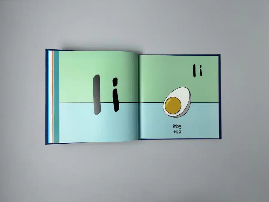
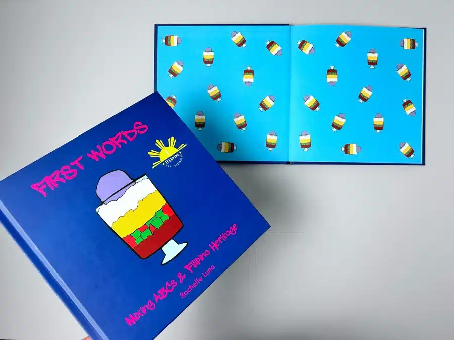
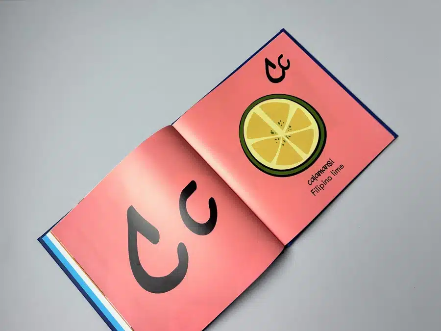
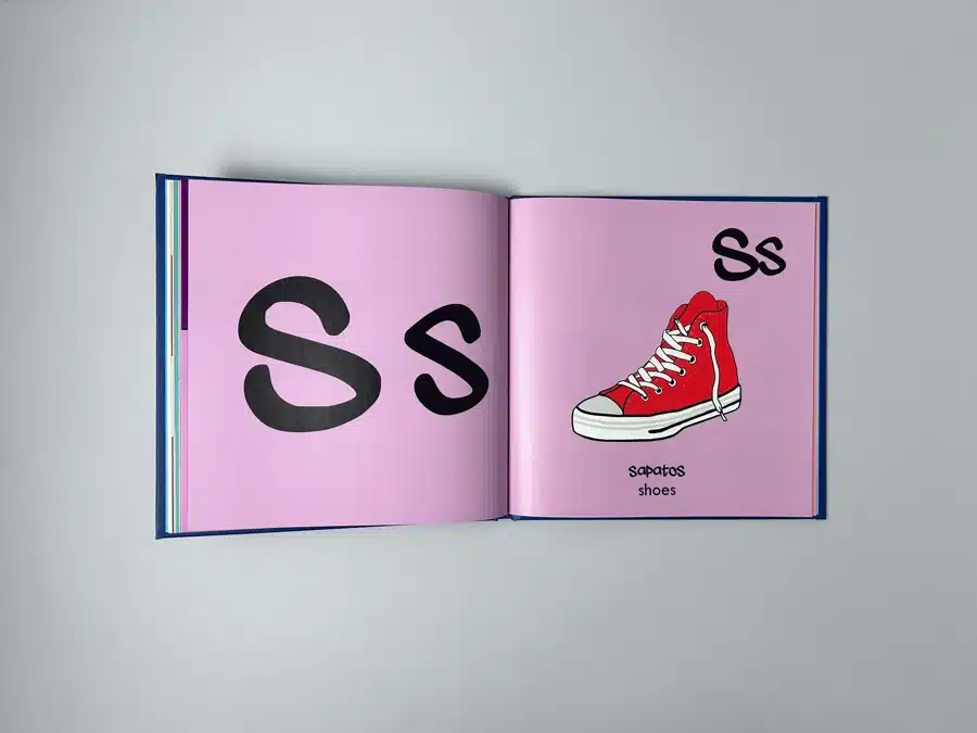
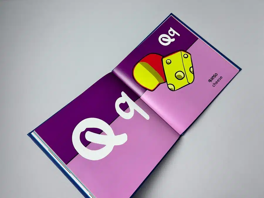
The book’s cover features a vibrant and playful illustration of a traditional Filipino dessert, setting the tone for what's inside. This colourful motif is consistent throughout the book, with each page splashed in bright, engaging colors. The illustrations are simple yet captivating, designed to catch the eye of a child and possibly even nostalgic to Filipino parents. Each letter of the alphabet is paired with a culturally significant Filipino word alongside its English counterpart, making it both educational and deeply personal.
"First Words" employs a bold and bright color palette that stands out in its category. The usage of vivid colors not only makes each page more engaging but also helps in memory retention for young readers. The typography is clear and playful, suitable for children learning to read. Each character is designed to be easily recognisable, with ample spacing to avoid any visual confusion.
Each page is thoughtfully laid out with large, easy-to-read letters and corresponding illustrations that directly reflect the word's meaning. This thoughtful design ensures that children can connect the visual elements with the words, enhancing their learning experience. The book is casebound with a hardcover, giving it durability and a quality feel that withstands the test of time and the hands of eager young readers.
Though primarily an educational tool, "First Words" subtly incorporates storytelling through its illustrations. Each depicted item or concept tells a story about Filipino life, inviting parents to engage further by sharing stories about each element with their children. This aspect turns reading time into an interactive session of cultural exploration.
These insights provide a blueprint for future designers aiming to create educational books that are not only visually appealing but also culturally enriching and pedagogically sound.
Rachelle Luna embarked on her first self-publishing venture with the intent to connect her children and other young readers to their Filipino heritage through a bilingual educational book. Her aspirations were to produce a high-quality, engaging, and culturally enriching hardcover children's book.
A standout element in the interactions was Rachelle's consistent appreciation for the responsive and detailed support provided by Ex Why Zed. Her feedback underscores the importance of customer service excellence in the print industry.
Rachelle Luna's journey from concept to print with Ex Why Zed is a testament to the power of collaboration and expertise in the field of Educational Phonics Book Printing. This case study not only highlights the aesthetic and functional aspects of the book but also showcases the meticulous attention to client needs and the technicalities involved in producing a high-quality educational tool. From engaging email interactions that reveal the dedication to client satisfaction to the final execution of the book that marries vibrant design with educational content, this narrative serves as an invaluable resource for authors and publishers aiming to make their mark in the industry.