“Thanks for being such great printers :)”
Beach Days is a sun-drenched A5 photo zine by photographer Yannick Schutz, celebrating laid-back surf culture and long afternoons on the sand. Our team produced a compact, tactile booklet that feels as relaxed as the images inside, with soft touch lamination on the cover and uncoated pages that suit both colour and black-and-white photography. From first quote to final proofs, we helped Yannick shape his artwork into a beach-ready zine that’s easy to share and satisfying to hold.
About the Book
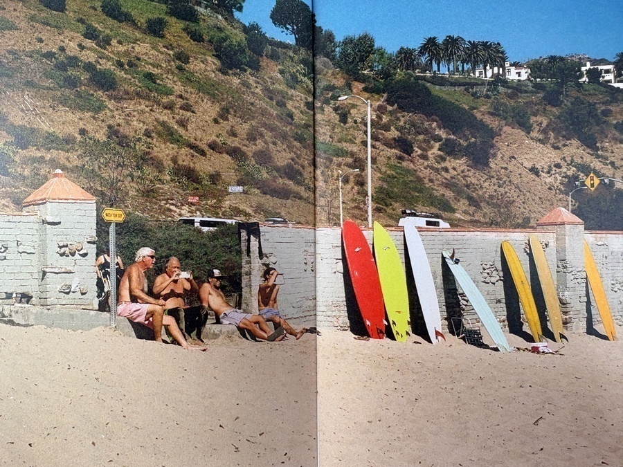
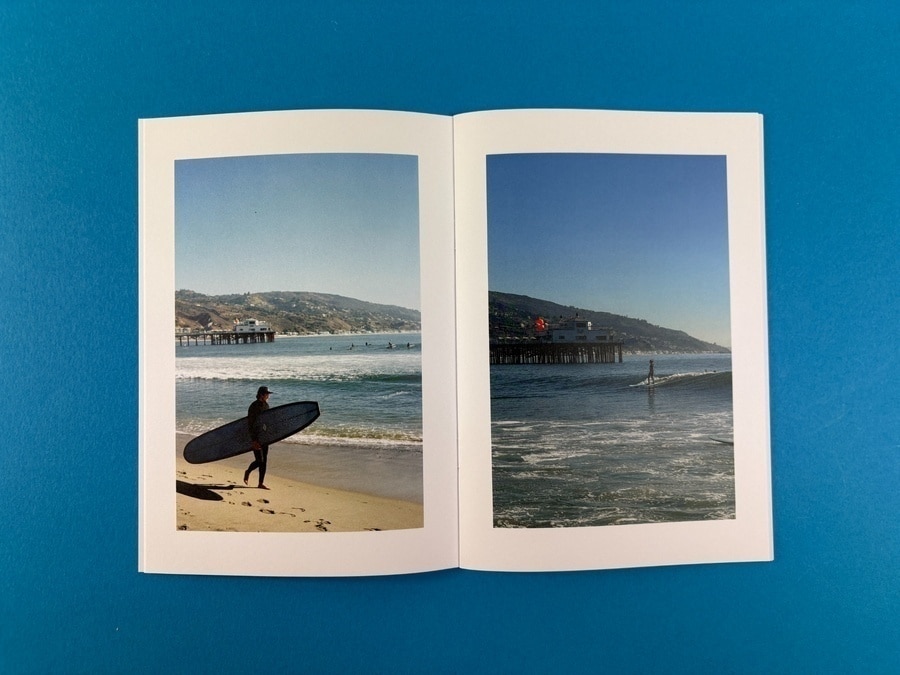
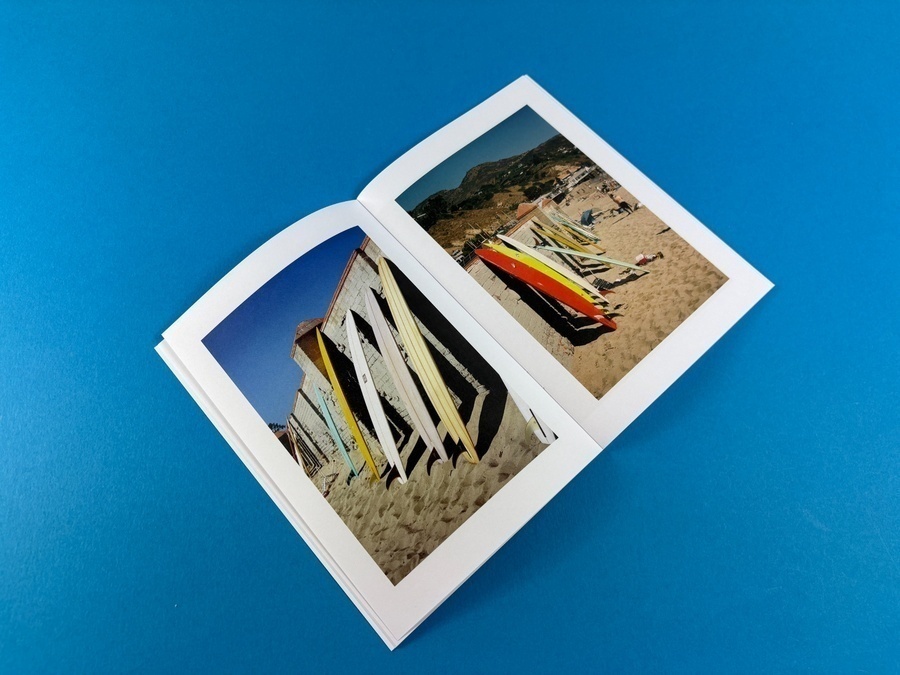
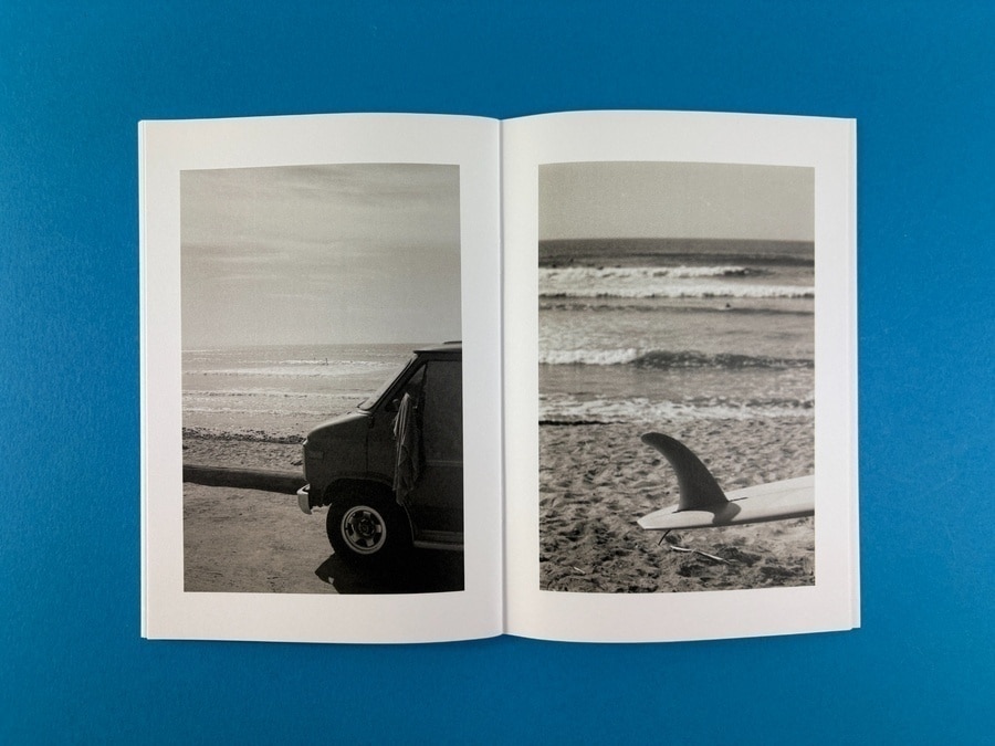
Beach Days brings together a series of surf and shoreline photographs – boards lined up against sea walls, friends talking in the sun, quiet moments watching the waves roll in. The A5 format keeps everything intimate and portable, like a sketchbook of summer memories. Inside, Yannick mixes full-colour shots with monochrome spreads, giving the zine a rhythm that moves from bright, saturated afternoons to more contemplative scenes.
The cover typography is bold and playful, with “BEACH DAYS” set large over a photograph of boards and umbrellas. A small smiling “YS” motif repeats through the piece, acting as a relaxed brand mark that fits the carefree theme perfectly.
Print Specification & Materials
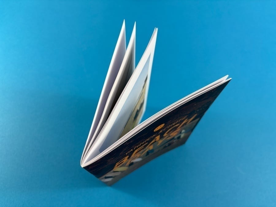
We produced Beach Days as an A5 stapled booklet – a cost-effective choice that still feels substantial in the hand. The cover is printed on a sturdy 300gsm uncoated stock, then finished with soft touch lamination on the outside. That velvety coating gives the zine a smooth, premium feel while protecting it from scuffs in bags and rucksacks.
Inside, 36 pages run on 120gsm uncoated paper. It’s a bright white sheet that keeps textural character without being rough, so the photographs retain good detail while still feeling like a tactile art object rather than a glossy magazine. Full colour printing throughout handles the punchy blues and greens of the ocean just as well as the grain and contrast in the black-and-white images.
All stocks are FSC certified, so the project balances high production values with responsible material choices.
Design Details That Make It Sing
The wraparound cover image is a standout feature: surfboards marching across the sand from back cover to front, with a soft gradient of pink and white on the left that feels like light leaking across a camera frame. It’s simple, cinematic and instantly sets the tone.
Inside, each photograph sits within generous white margins, echoing a gallery print on a mounting board. This gives the reader space to breathe between shots and keeps fingerprints away from the image area. Occasional full-bleed and double-page spreads drop you right onto the beach – boards stacked in the sun, friends talking in front of the sea wall – making the zine feel like a mini exhibition you can leaf through.
The recurring smiley “YS” icon, printed cleanly on the uncoated stock, adds a small but memorable piece of branding without getting in the way of the photography.
The Client’s Print Journey
Yannick first got in touch for a detailed quote on two binding options – staple bound booklet or perfect bound book – and decided that a stapled A5 zine in a run of 50 copies was the ideal format for this project. He was working in Affinity Publisher rather than Adobe, and wanted reassurance on export settings, colour profiles and how to supply a stapled booklet file.
Our team talked him through keeping the page count as a multiple of four, supplying one PDF in reading order, and checked preview files before he committed. Once the artwork was ready, we carried out our usual preflight checks and shared an online proof, including trim lines and guidance on how to review spreads properly on screen.
From approval to dispatch, production moved quickly. We kept Yannick updated at each stage and confirmed when the finished zines were ready to ship, making the whole process feel smooth rather than stressful. His response – “Colour me so excited” – says everything about how eager he was to receive the finished stack.
How Ex Why Zed Helped
For Beach Days we combined practical production advice with hands-on support for a mixed colour and black-and-white photo sequence. We helped Yannick decide between binding styles, steered the artwork towards a clean staple-bound layout and made sure the cover and inside pages would print consistently on uncoated stock.
Our clear guidance on exporting from Affinity Publisher, setting page order and working with a single PDF file removed a lot of the technical guesswork. We also used our online proofing system to give Yannick a final, zoomable check of every spread before going to press, highlighting where trims would fall so he could review his compositions with confidence.
Behind the scenes, our production team looked after colour management and finishing, pairing soft touch lamination with the right uncoated sheet so the blues of the ocean and the warm skin tones held their punch. The result is a relaxed, summery zine that still feels tightly produced.
Takeaways for Your Next Photo Zine Project
- Keep it compact. An A5 format is easy to carry, post and store, and it keeps production costs in check for small runs.
- Choose uncoated for a tactile feel. A bright uncoated stock works beautifully for photography when you want a more art-book, less glossy-mag vibe.
- Match the finish to the theme. Soft touch lamination on the cover gives a smooth, almost sandy feel that suits calm, atmospheric imagery.
- Plan your page count early. For stapled zines you’ll need a multiple of four pages; build your image sequence with this in mind to avoid last-minute padding.
- Use margins creatively. Framing each photo with white space can echo the feel of prints on a gallery wall and protect the image area from handling.
- Ask for help with file setup. Whether you design in Affinity, InDesign or something else, lean on your printer for guidance on exporting clean PDFs.
- Mix colour and monochrome thoughtfully. Alternating full-colour and black-and-white spreads can create a strong visual rhythm through your zine.
- Test your branding gently. A small logo or motif, repeated sparingly, can build recognition without pulling focus from the photographs.
Suggested Further Reading>>>
Get instant prices with our booklet quote calculator