A4 Books
4pp Cover onto 300gsm Uncoated FSC
Matt Lamination to outer
46pp Text onto 115gsm Uncoated FSC
Four colour print throughout
Trimmed, collated and perfect bound
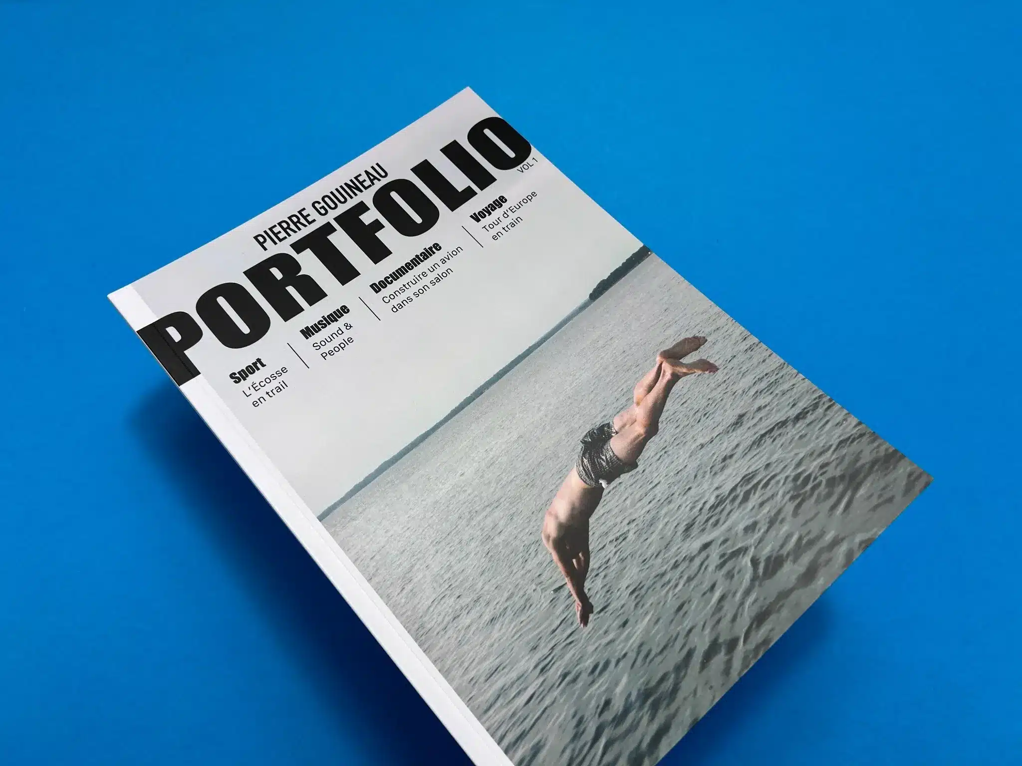
This portfolio book, titled Self Promotional Portfolio, is a beautifully crafted A4 photography zine designed by Pierre Gouineau. The print reflects an exceptional balance between functionality and aesthetic appeal. The portfolio contains 46 pages of stunning visuals, enhanced by careful attention to layout, typography, and binding.
The perfect binding used for the book provides a polished and durable structure, ideal for maintaining the visual integrity of the high-quality photography throughout. The combination of a 300gsm uncoated FSC-certified paper for the cover, laminated with a matte finish, offers a sophisticated, tactile feel. Meanwhile, the inner pages are printed on 115gsm uncoated FSC-certified paper, giving the portfolio a rich, organic texture while ensuring environmental responsibility—a subtle but meaningful detail for contemporary print projects.
The clean and modern layout of the portfolio is a key highlight. On the cover, the bold, sans-serif typography of the word “PORTFOLIO” instantly grabs attention. This strong design choice conveys a sense of professionalism and self-assurance. Pierre’s name appears in a smaller font size above, allowing the focus to remain on the project’s title while still giving credit to the creator.
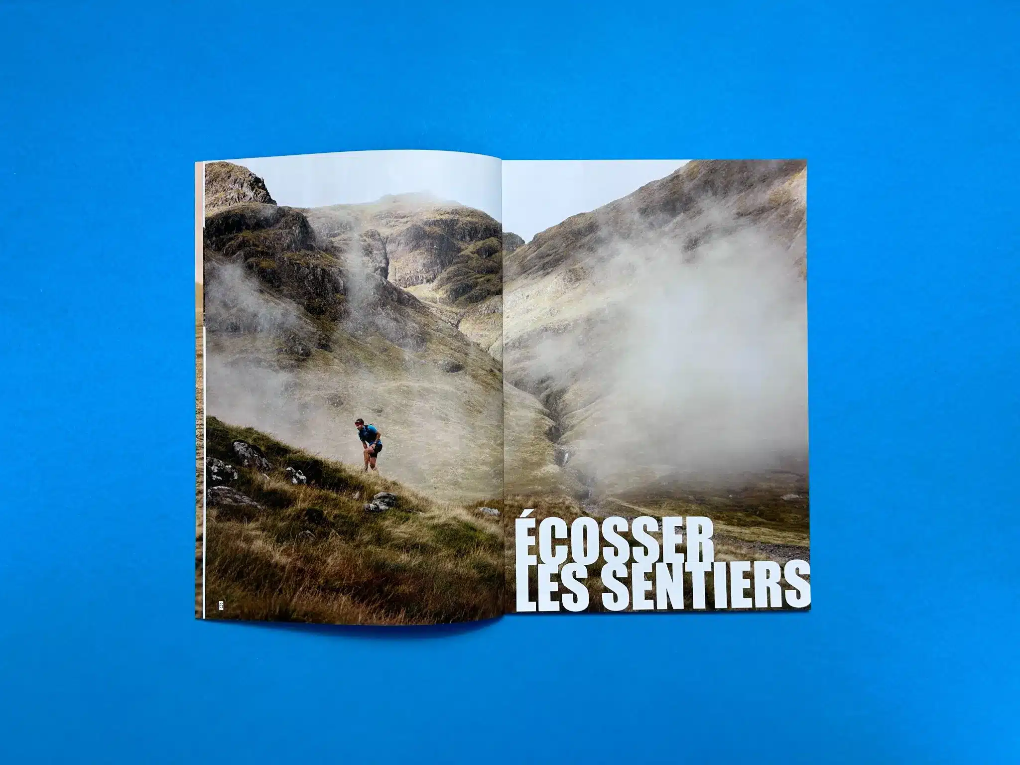
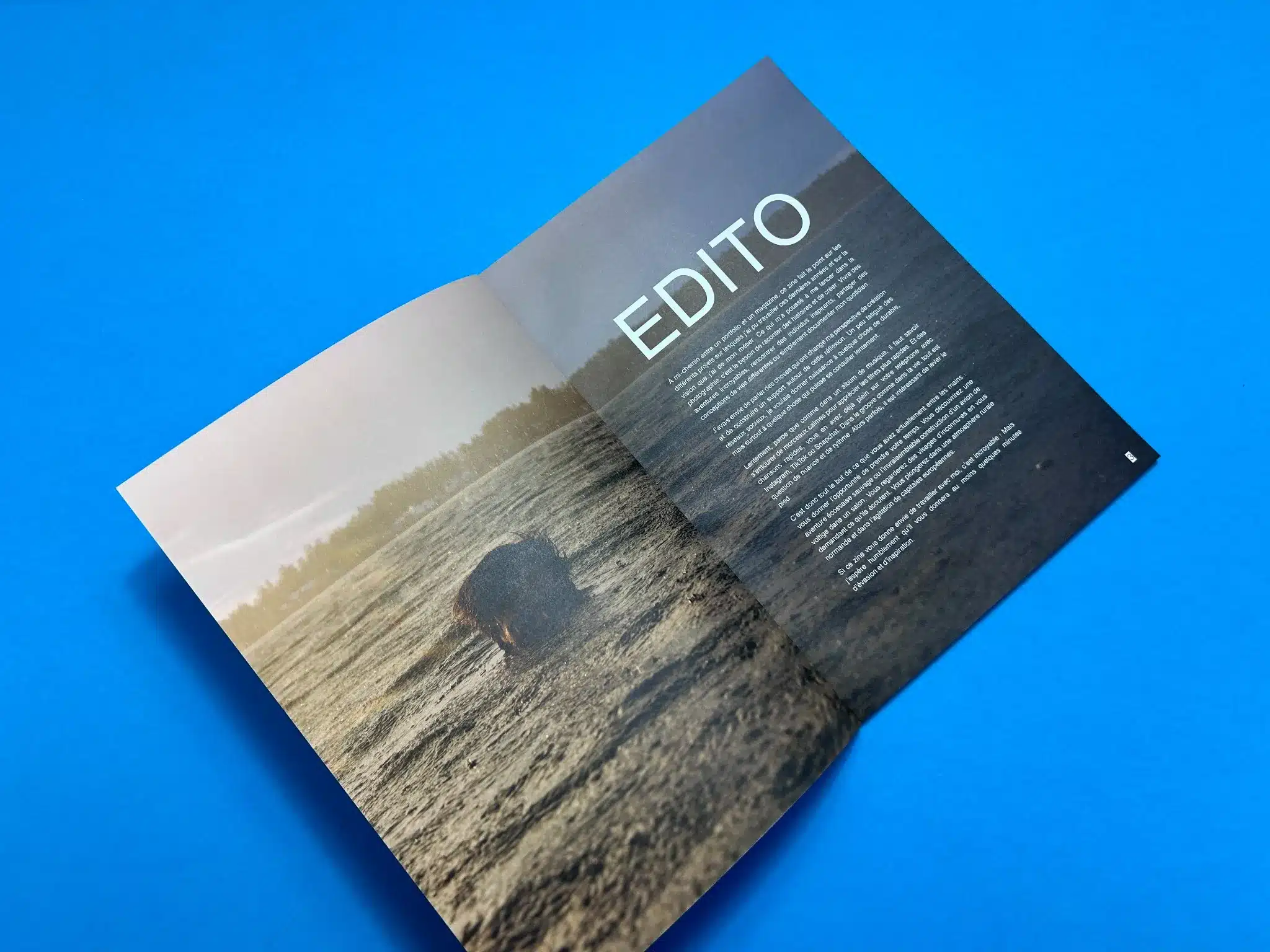
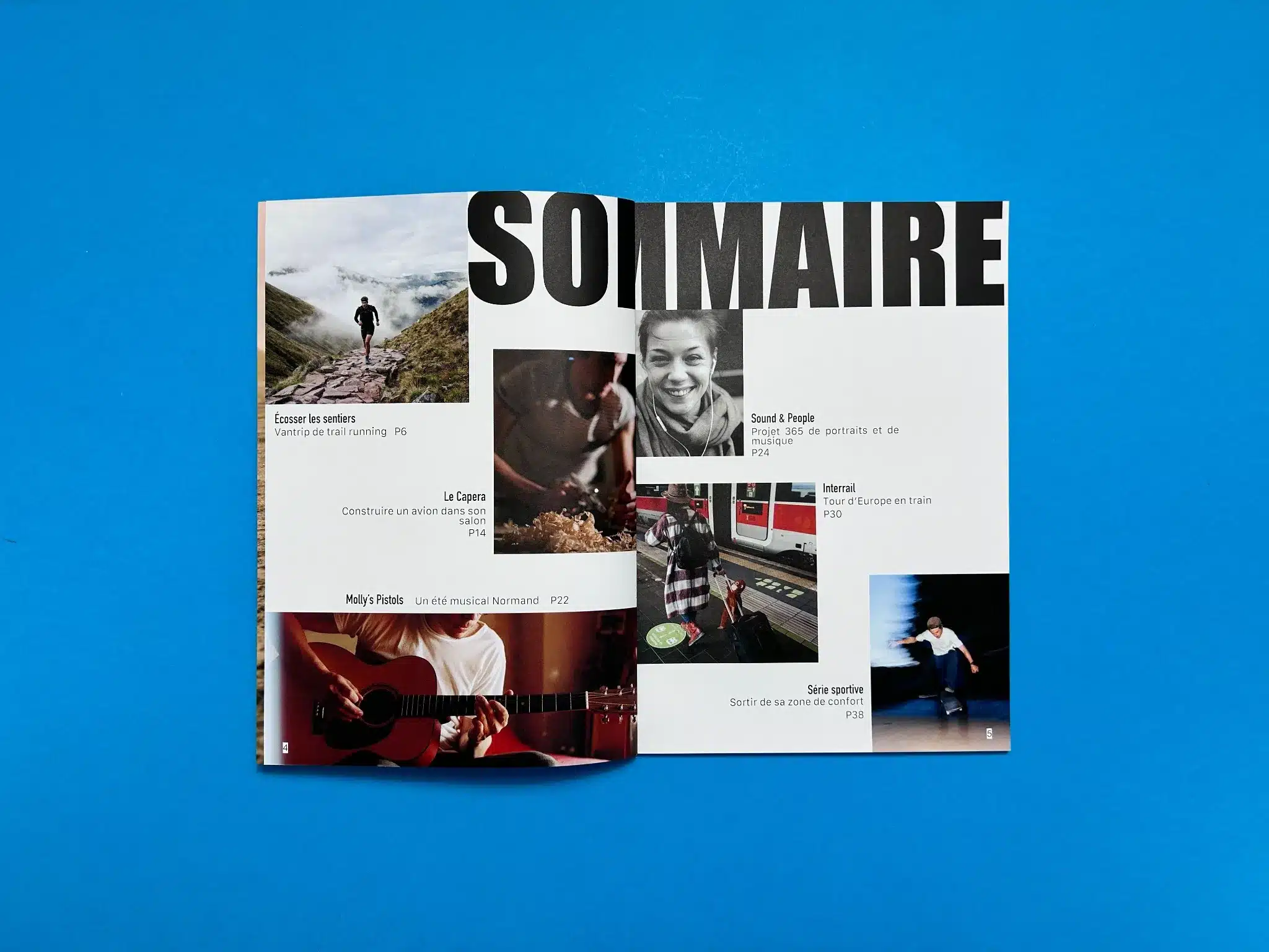
Inside the portfolio, the design remains consistent with large, high-resolution images accompanied by minimalist text sections. The editorial section, for instance, uses ample white space around the body text to allow the photographs to breathe and emphasise their significance. The typography complements the imagery without overwhelming it. The use of larger font sizes for headings, such as in the SOMMAIRE and Écosser les Sentiers spreads, creates a strong visual hierarchy that guides the reader naturally through the content.
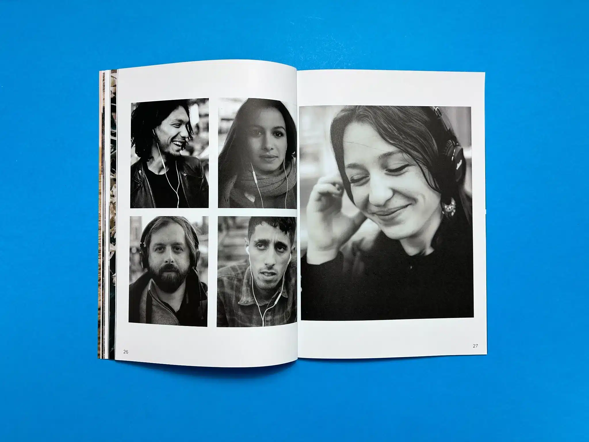
The cover photo of a man diving into the sea contrasts well against the grey tones of the water and the muted sky, making the book feel alive and full of energy. Inside, the photography varies between rich colours and black-and-white portraits, offering a dynamic viewing experience. The colour choices, often warm and natural tones, reflect the personal and authentic nature of the portfolio’s content—ranging from music, travel, and sports to everyday moments.
Pierre Gouineau’s portfolio excels in visual storytelling. Each photograph tells a story that connects with the theme of the portfolio: diverse subjects that explore human interaction with their environments. From an adventurous trail runner in the Scottish Highlands to the black-and-white portraits in Sound & People, the book takes the reader on a journey through different lenses of life and art. Gouineau has successfully curated a selection of images that feel cohesive while remaining diverse in subject matter.
When Pierre Gouineau, an independent photographer with a diverse portfolio, approached us with his first self-promotional zine, we knew this would be a special project. Pierre’s Self Promotional Portfolio is a carefully curated collection of his photography work, and it was our mission to help him transform this digital creation into a tangible masterpiece. From start to finish, we provided guidance, suggestions, and solutions to ensure his vision was transformed in to print. Below is a narrative of how we collaborated with Pierre to make this portfolio a success.
The conversation started with a warm welcome from our team, accompanied by a detailed outline of what the print journey would look like. Pierre expressed his desire to create a high-quality zine, and we provided him with a custom quote that outlined the print specifications for an A4, 46-page portfolio with a 4pp cover. At this stage, we suggested Pierre refer to our Preparing Artwork for Perfect Bound Book Printing guide, making sure that his files were set up properly for print.
Pierre was initially nervous about using the correct file settings and requested a brief consultation to make sure his Affinity Publisher setup was on point. We assured him that the process was straightforward and provided additional resources on paper types to help him visualise the final product. These preliminary steps are crucial in ensuring that the print process starts smoothly, reducing the likelihood of errors down the line.
As Pierre worked through his zine, he sought advice about how to handle specific design challenges. For example, when creating a double-page spread with a single large image, he was concerned about how the bleed between pages would affect the final output. We reassured him that Affinity Publisher handles bleeds automatically for double-page spreads, similar to how InDesign works. This reassurance helped Pierre move forward with confidence.
Once Pierre sent over the artwork for his zine, our team reviewed it thoroughly. We noticed a minor issue: the text on page 7 was very close to the spine, which could affect readability. We suggested reducing the text size slightly and moving it a few millimetres to the right. Pierre appreciated this attention to detail and made the necessary adjustments. We also pointed out that some of his images, which appeared to be black and white, were in full colour, and offered guidance on how to ensure true black-and-white reproduction in digital print.
When Pierre sent over his final PDF, we immediately set to work preparing a digital proof for him to review. Our proofing process includes a detailed preflight check to catch any issues before going to print. After Pierre’s review, he was excited to move forward. However, in a follow-up email, he realised there were two small spelling errors in the document. Despite having already approved the proof, Pierre quickly sent over the corrected files, and we assured him that this last-minute change would not disrupt the print schedule.
After confirming the updated proof, Pierre was thrilled with how everything looked, giving us the green light to proceed with production. His satisfaction and excitement were evident as he expressed trust in our ability to "do your magic".
Once the artwork was finalised and approved, we moved swiftly into production. We printed 75 copies of Pierre’s Self Promotional Portfolio on 300gsm uncoated FSC-certified paper for the cover, with matte lamination to give it a sophisticated feel. The interior pages were printed on 115gsm uncoated FSC-certified paper, using four-colour printing to bring his photographs to life. Perfect binding was used to give the book a professional finish.
Pierre received his zine shortly after, with delivery included as part of our service. The final product was a beautifully bound, visually striking collection of his work, embodying his talent and creativity as a photographer.
Pierre’s feedback was overwhelmingly positive. He was particularly impressed by the print quality, especially how we handled the tricky aspects of black-and-white printing. His portfolio is now a tangible representation of his artistic vision, which he can proudly use for self-promotion. Given the success of this project, Pierre has expressed interest in collaborating with us again on future print projects.
Pierre Gouineau’s Self Promotional Portfolio was a rewarding collaboration from beginning to end. Our dedication to quality and customer support ensured that his first venture into print was smooth, professional, and successful. We look forward to future collaborations with Pierre and other photographers looking to bring their portfolios to life through print
