Overview of the Book: Semblance Vol 1 by Tom Healy
Styling and Design
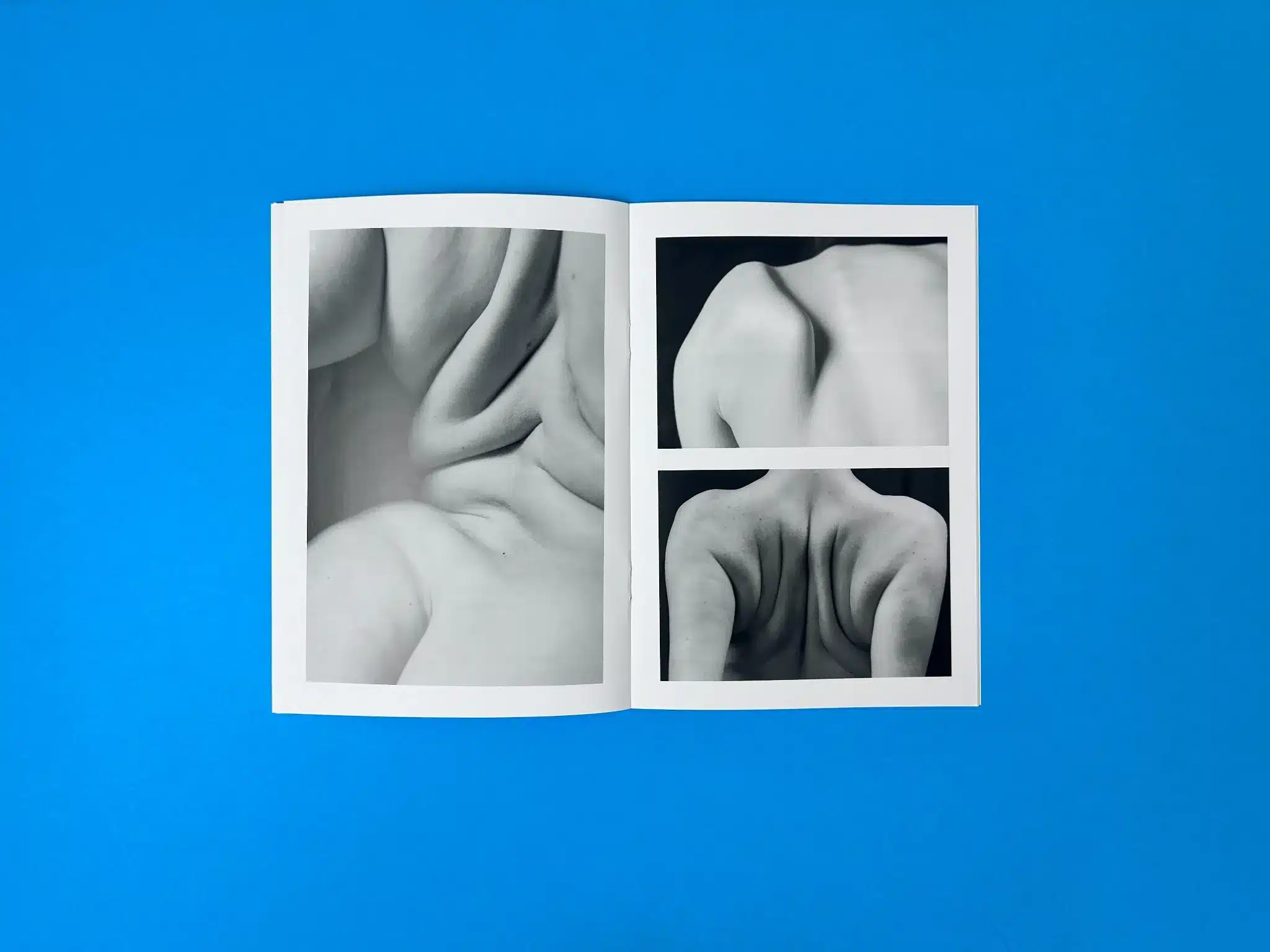
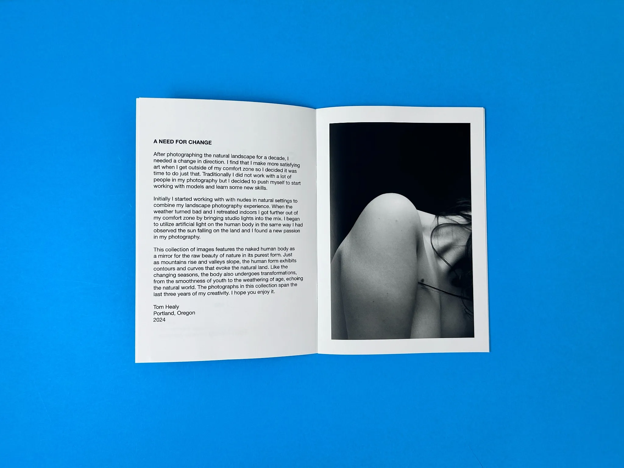
Semblance Vol 1 presents a refined aesthetic through its monochromatic imagery and minimalist design. The cover is immediately striking, with a close-up black-and-white photograph of a human body’s contours, which ties into the title of the book, Semblance. This subtle play between form and abstraction suggests an exploration of physicality and identity. The cover text—set in a modern sans-serif font—complements the stark imagery, maintaining a clean, polished look. The use of the high-contrast photo, against the simplicity of the title typography, sets an intimate yet formal tone for the content within.
The A5 booklet size lends itself to a more intimate reader experience, making the human form appear more personal and direct. The gloss lamination on the 300gsm silk cover enhances the deep blacks of the photograph, making the curves and textures of the human form even more striking.
Binding and Layout
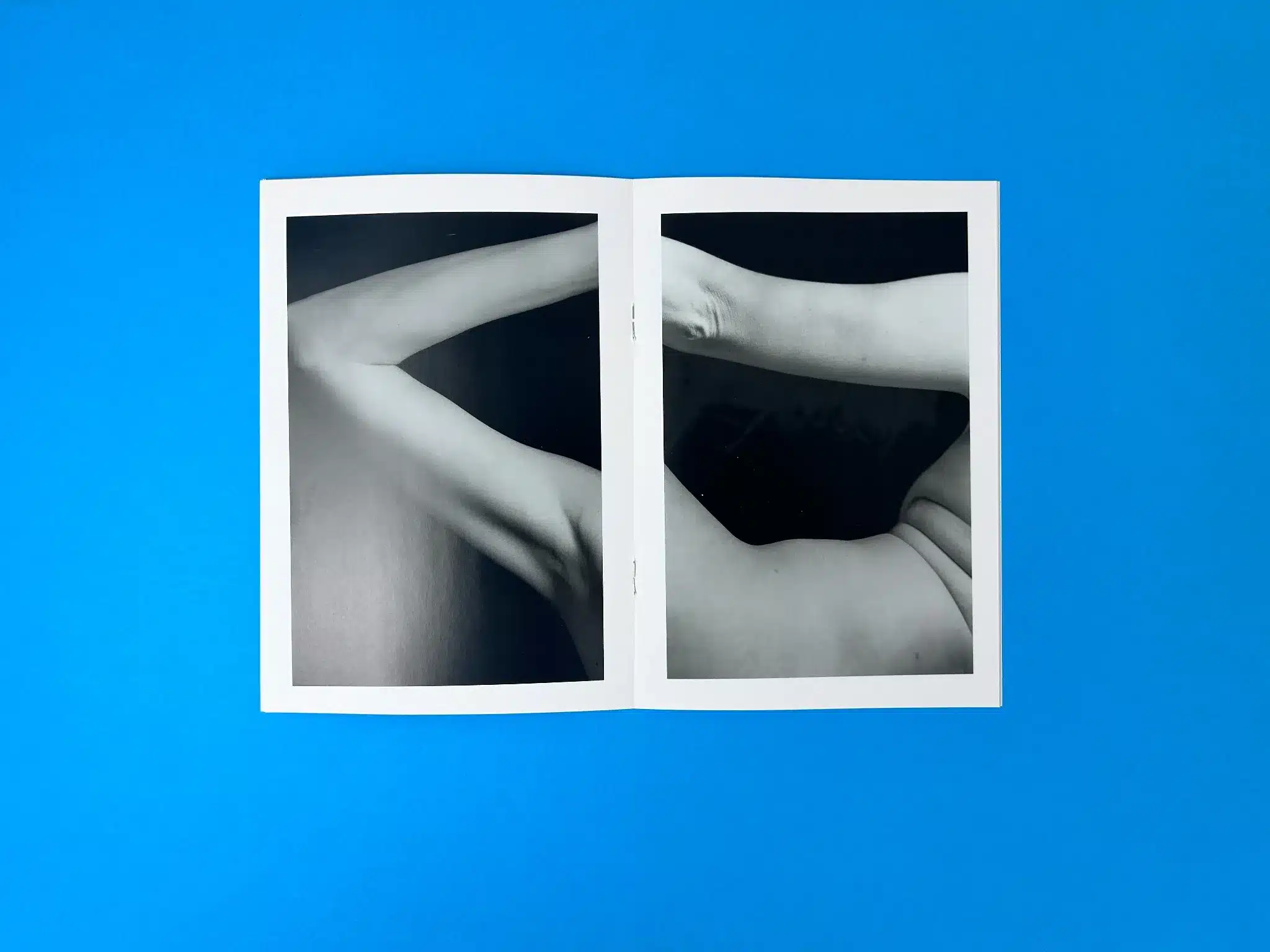
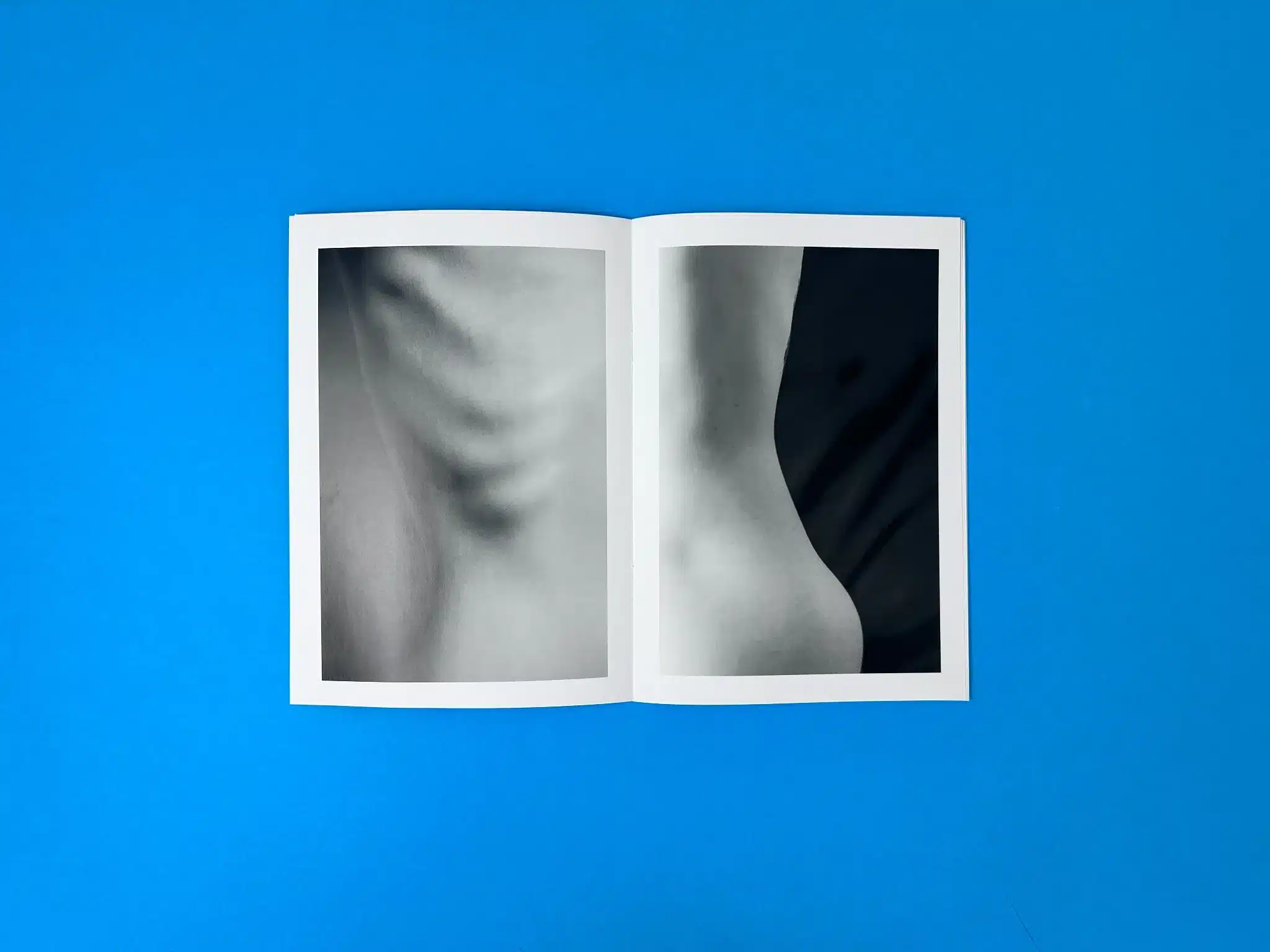
The wire-stitched binding supports a tactile experience that allows the booklet to be easily flipped through while still feeling robust. The internal pages are printed on 150gsm silk stock, which is smooth and soft to the touch, enhancing the ethereal quality of the images. The page layout is consistent, with each spread offering ample white space around the images, letting the content breathe and giving readers a chance to pause and absorb the visuals without feeling overwhelmed. The spread across pages maintains a balance between minimalism and artistic expression, emphasising the subtleties of the human form.
Use of Colour and Imagery
While the book is printed entirely in black and white, the lack of colour amplifies the textures and curves of the human body. The images explore themes of softness, tension, and transformation, using the absence of colour to create a heightened awareness of light, shadow, and form. The tonal contrast, expertly captured in each photograph, evokes the natural beauty of the human form as analogous to the landscapes Healy describes in his foreword—mountains and valleys, rivers and slopes.
Typography
The typography remains understated, used sparingly to convey essential information without detracting from the primary focus: the photography. The font choice is clean, contemporary, and fits with the overall modern aesthetic of the book. The minimalist design of the text further complements the book's thematic focus on simplicity and purity of form.
Effectiveness in Storytelling
Healy’s foreword introduces the book as a personal shift in his artistic journey, from landscapes to the human form, and this narrative is effectively conveyed through both the design and the photographic content. The transition from detailed landscapes to the micro-landscapes of the human body is mirrored in the book’s format and presentation. By using a monochromatic palette, Healy emphasises the transformative nature of the body, drawing parallels between natural and human landscapes. This thematic cohesion makes the book not only visually captivating but also conceptually rich.
Unique Selling Points (USPs)
- Gloss Lamination for Enhanced Contrast: The choice of gloss lamination on the cover amplifies the deep blacks of the images, making the photographs truly stand out, especially in a black-and-white print.
- Minimalist Aesthetic: The clean, minimalist design highlights the photography without unnecessary distractions, letting the reader focus entirely on the imagery.
- High-Quality Print Materials: The combination of 300gsm silk cover stock and 150gsm internal pages strikes a balance between durability and luxury. The texture of the silk paper enhances the photographic detail, while also feeling substantial in hand.
- Expert Use of Black and White Imagery: The lack of colour, paired with high-contrast black-and-white images, creates a timeless aesthetic that invites deep contemplation of the form and shadows of the human body.
Actionable Insights
- Gloss Lamination on the Cover: This is a great choice for photography books as it enhances the depth of black-and-white images. In Semblance Vol 1, it makes the cover’s imagery pop, attracting attention and drawing readers in.
- Wire Stitching for Smaller Booklets: Wire stitching provides a cost-effective yet durable binding solution for short-run photography books, making it ideal for booklets like this one where the focus is on ease of reading and handling.
- High-Quality Silk Stock for Internal Pages: The choice of 150gsm silk for the internal pages offers a premium feel without adding too much bulk. This is especially effective for books focused on high-contrast imagery, as the silk finish subtly enhances the depth and clarity of the images.
- Consistent Use of White Space: The liberal use of white space around the photographs offers breathing room for the content, ensuring that the reader can focus on each image without distraction. This layout strategy enhances the contemplative nature of the book.
- Effective Typography: Keeping the typography minimalist and modern ensures that the focus remains on the visuals. The clean font style and sparing use of text allow the photographs to communicate the story effectively.
These insights offer a clear path for other authors and designers who are looking to create similar visually-driven, high-impact booklets.
In this project, Ex Why Zed’s meticulous attention to detail—from the choice of materials to the final gloss finish—has resulted in a tactile and visually stunning product that elevates Tom Healy’s artistic vision.
Client Collaboration Journey: Tom Healy and the Creation of Semblance Vol 1
The journey to print Tom Healy's Semblance Vol 1 began with the initial inquiry for a booklet printing quote, which set the tone for a highly collaborative and transparent process. Ex Why Zed’s dedication to offering expert guidance was evident from the very first email, ensuring Tom felt supported throughout the project. The email exchange demonstrates the clear, step-by-step communication, reinforcing Ex Why Zed’s commitment to easing the print process for both seasoned creators and those new to print.
Initial Consultation and Print Quote
The project started with a detailed quote for an A5 booklet with 300gsm silk cover and 150gsm silk text pages, printed entirely in black and white. Ex Why Zed’s immediate engagement showcased their customer-centric approach, offering transparency regarding pricing, timeline, and potential shipping concerns. For instance, after receiving Tom’s specifications for 100 copies, Ex Why Zed responded promptly with a clear breakdown, including free delivery within the UK and options for international shipping, which would ultimately factor into the final cost.
File Setup and Pre-Press Support
Ex Why Zed didn’t leave Tom to figure out the technical aspects on his own. A comprehensive guide on how to prepare artwork for wire-stitched booklets was provided, along with personalised recommendations for design software. This proactive approach demystified the print process for Tom, ensuring his files were correctly formatted and ready for production. As he expressed in the emails, Ex Why Zed’s YouTube tutorials were particularly helpful, eliminating confusion and instilling confidence.
In addition, when Tom inquired about a test proof, the Ex Why Zed team provided transparent advice, noting the cost of shipping a proof internationally to the US would likely be prohibitive. This honest communication allowed Tom to make an informed decision, opting to move forward with the full print run instead of incurring additional costs for a test copy.
Artworking and Final Proof
Once Tom had uploaded his final artwork via Google Drive, the team at Ex Why Zed swiftly moved into action, ensuring the print-ready files were properly processed. A final proof was sent for Tom’s review, complete with clear instructions on how to check each page and approve the project. The Ex Why Zed team also reassured Tom that the low resolution on his device would not affect the print quality, demonstrating their expertise in managing client concerns and expectations.
Adjustments and Invoicing
There was a moment of confusion regarding the final invoice, where Tom initially misunderstood the costs. The initial quote for 100 copies was £170, but with international shipping added, the total was £278. Ex Why Zed’s team responded immediately, providing a breakdown of the invoice and the shipping costs. This level of transparency ensured that Tom felt reassured and fully understood where the additional charges had come from, further building trust in Ex Why Zed’s service.
Production and Delivery
Despite being based in the US, Tom was surprised by how quickly the booklets were completed and shipped. Ex Why Zed kept him informed throughout the entire process, including shipping notifications and tracking updates. When Tom was away during the delivery, Ex Why Zed worked closely with him to ensure a smooth handover of the booklets, exemplifying their dedication to client satisfaction. Once the booklets arrived, they were in perfect condition, despite some damage to the outer packaging. Tom praised the print quality, even though he mentioned minor personal critiques, none of which affected his satisfaction with the final product.
Final Feedback and Continued Collaboration
After receiving his booklets, Tom expressed gratitude for the help and smooth communication throughout the process. He appreciated Ex Why Zed’s willingness to showcase Semblance Vol 1 on their website and social media, giving him additional exposure as a photographer and self-published artist. This demonstrates how Ex Why Zed goes beyond just delivering a print product—they actively support their clients in promoting their work as well.
Tom’s inquiry about future shipping options highlights his intent to continue working with Ex Why Zed, valuing their flexibility in both production and logistics. The client’s satisfaction with the final result, combined with the ease of the process, sets the stage for future collaborations.
Client Feedback
“I really shouldn’t read things in a hurry. Totally didn’t see the shipping line. Thanks for the explanation!” — Tom Healy
“The print is great (I have some personal issues that no one else will notice but the quality is awesome!). Thanks again for all the help and great communication, I will definitely print with you again.” — Tom Healy
Assessment of Final Product Reception
Tom Healy was thoroughly impressed with the quality of his booklets and the efficiency of the printing process. His feedback reflects a positive experience, from the clarity of communication to the final product. His request for slower and cheaper shipping options for future projects indicates that he values the partnership with Ex Why Zed and sees potential for future collaborations.
By assisting Tom not only with printing but also with promotion through their social media platforms, Ex Why Zed enhanced their client’s visibility, further contributing to the project’s success. This collaborative effort resulted in a product that exceeded Tom’s expectations and led to ongoing opportunities for growth and partnership.