A3 'Booklets'
8pp Self Cover onto 100gsm Revive Uncoated
Black print throughout
Nested, not bound
The Dyke Express is a bold, unapologetic, and evocative publication that celebrates lesbian identity and community. From the imagery and typography used in the design, it becomes immediately apparent that the book is intended to be both visually striking and message-driven. The book's styling, content, and design choices work together to create a powerful narrative that reflects the energy, anger, pride, and empowerment of the lesbian movement.
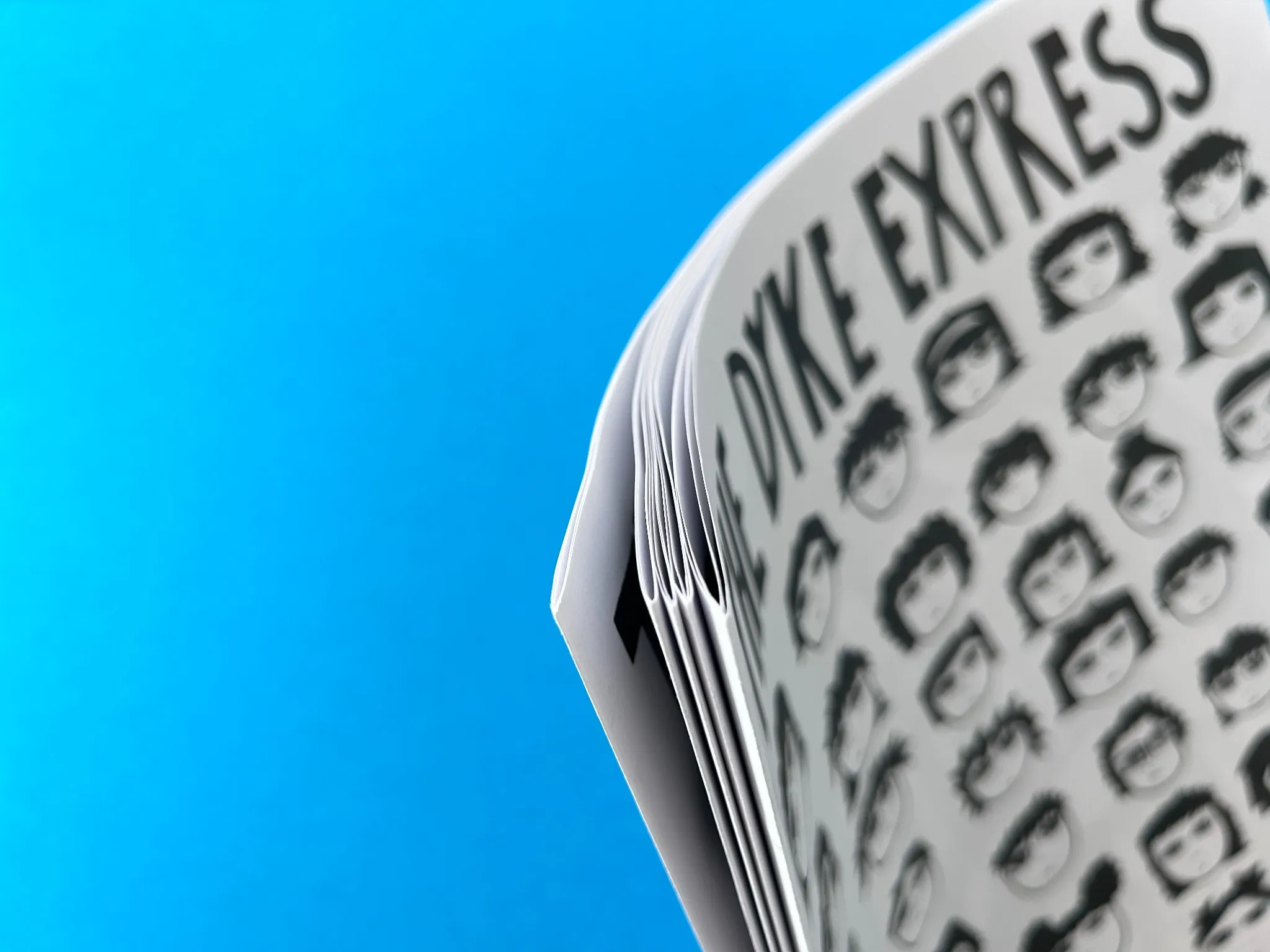
The publication is produced as an A3 booklet, 8 pages in length, printed on 100gsm Revive Uncoated paper, and not bound, but nested. This simple, yet effective binding choice allows the reader to engage with the book easily, flipping through the oversized pages in a manner reminiscent of traditional zines. The oversized A3 format amplifies the visual impact, giving ample space for the large, bold graphics and type to dominate the page.
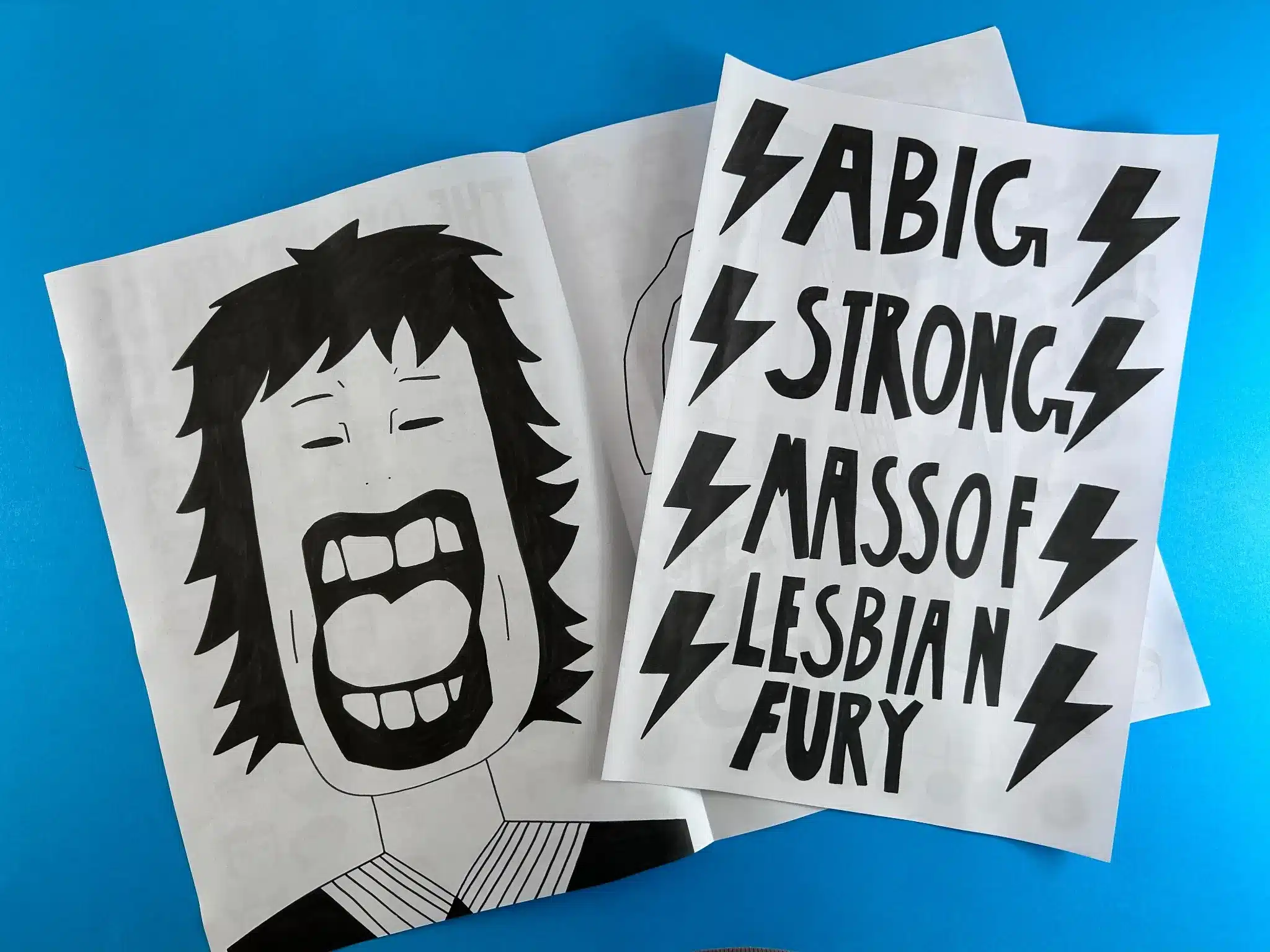
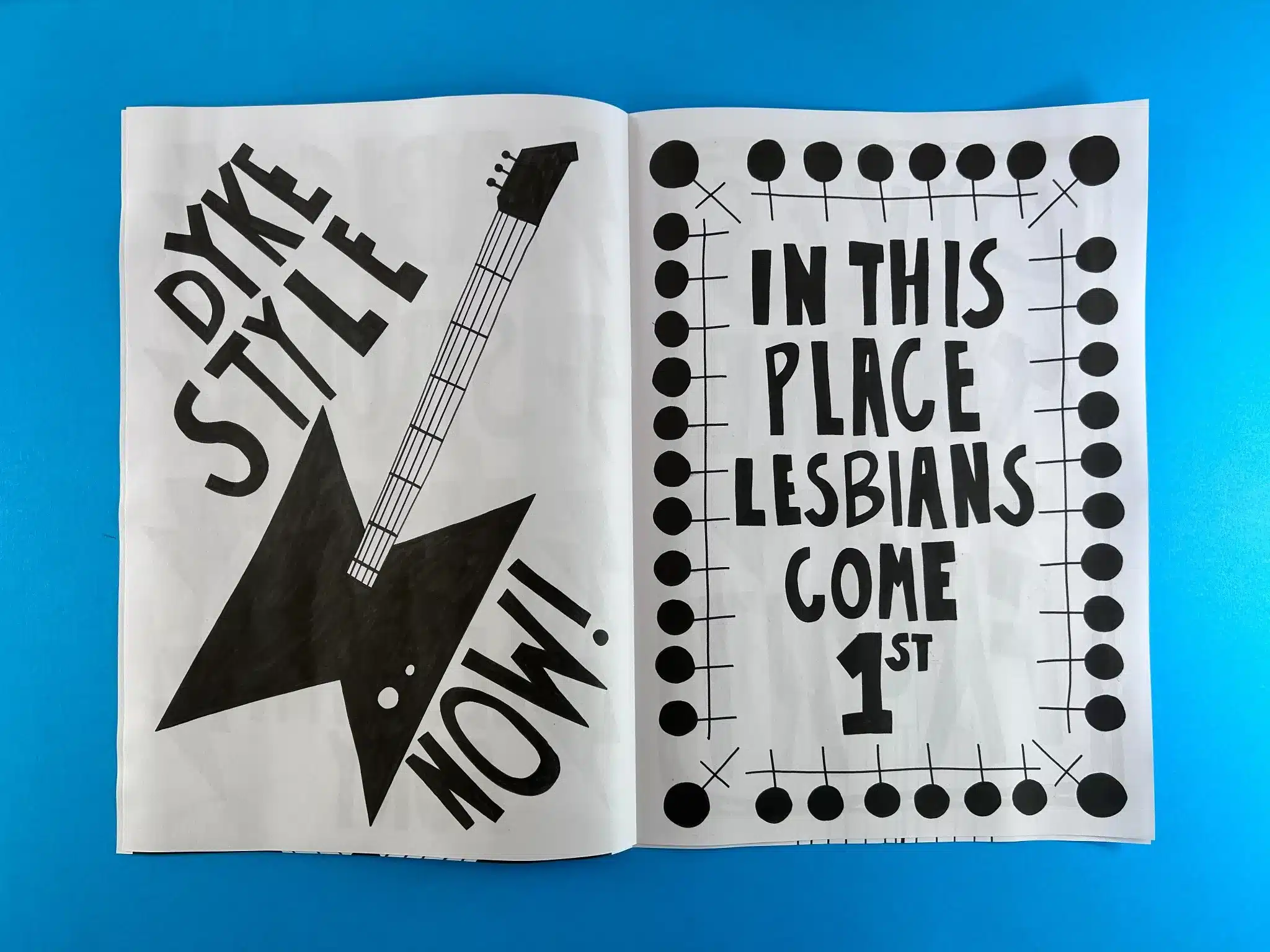
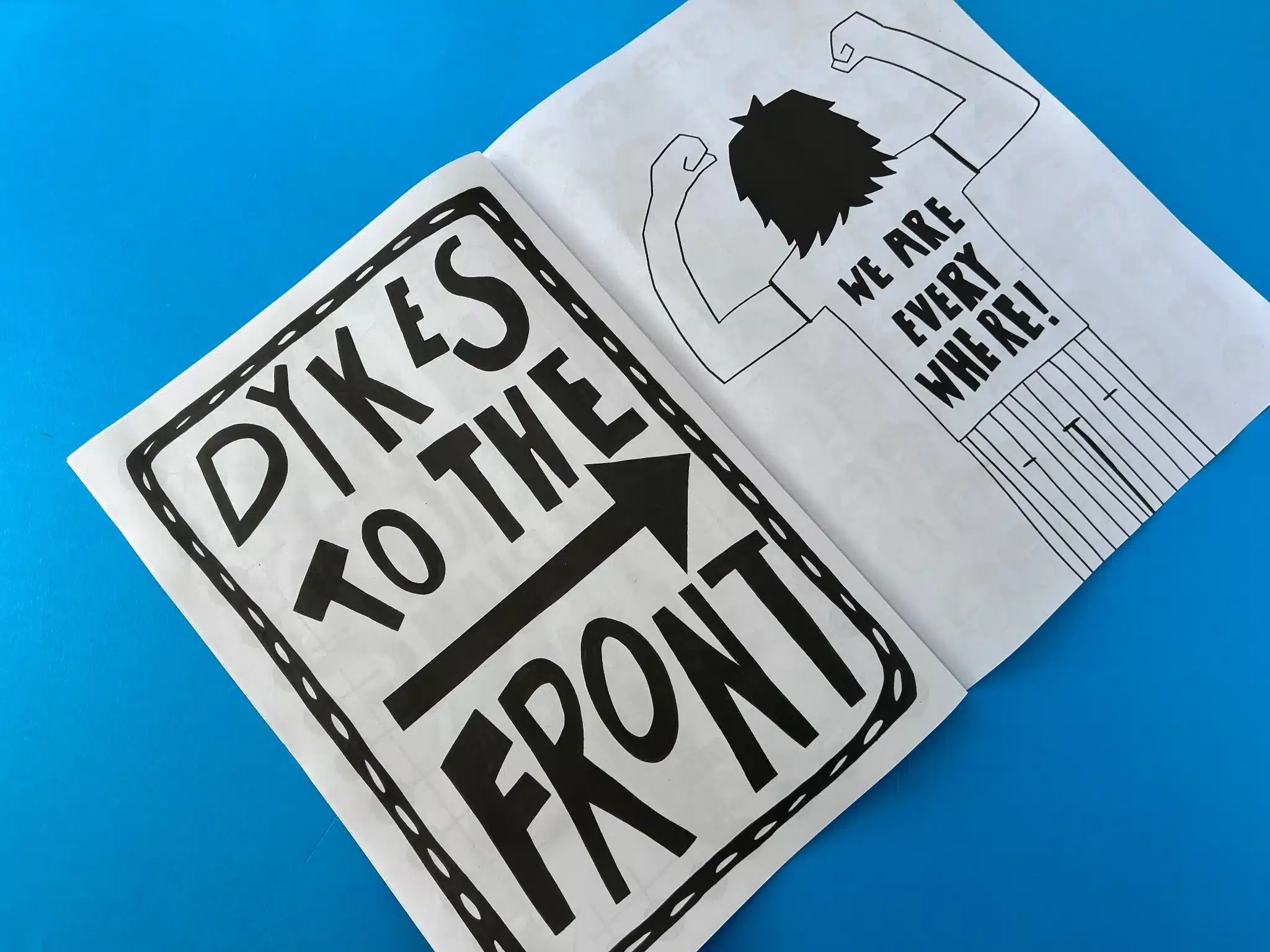
The typography throughout the book is impactful, with bold, hand-drawn lettering that adds a raw, personal touch. Statements like "A Big Strong Mass of Lesbian Fury" and "Dykes to the Front" are rendered in thick, angular letters that practically leap off the page, capturing the unapologetic tone of the message. The use of black ink on uncoated white paper enhances the stark contrast, which adds to the visual intensity.
Each page is a high-energy expression, with statements filling entire pages in a manner that feels loud, deliberate, and confrontational, aligning with the ethos of the message. The hand-drawn typefaces reinforce a DIY, zine-like quality, but the consistency in style across the pages speaks to a well-thought-out design strategy.
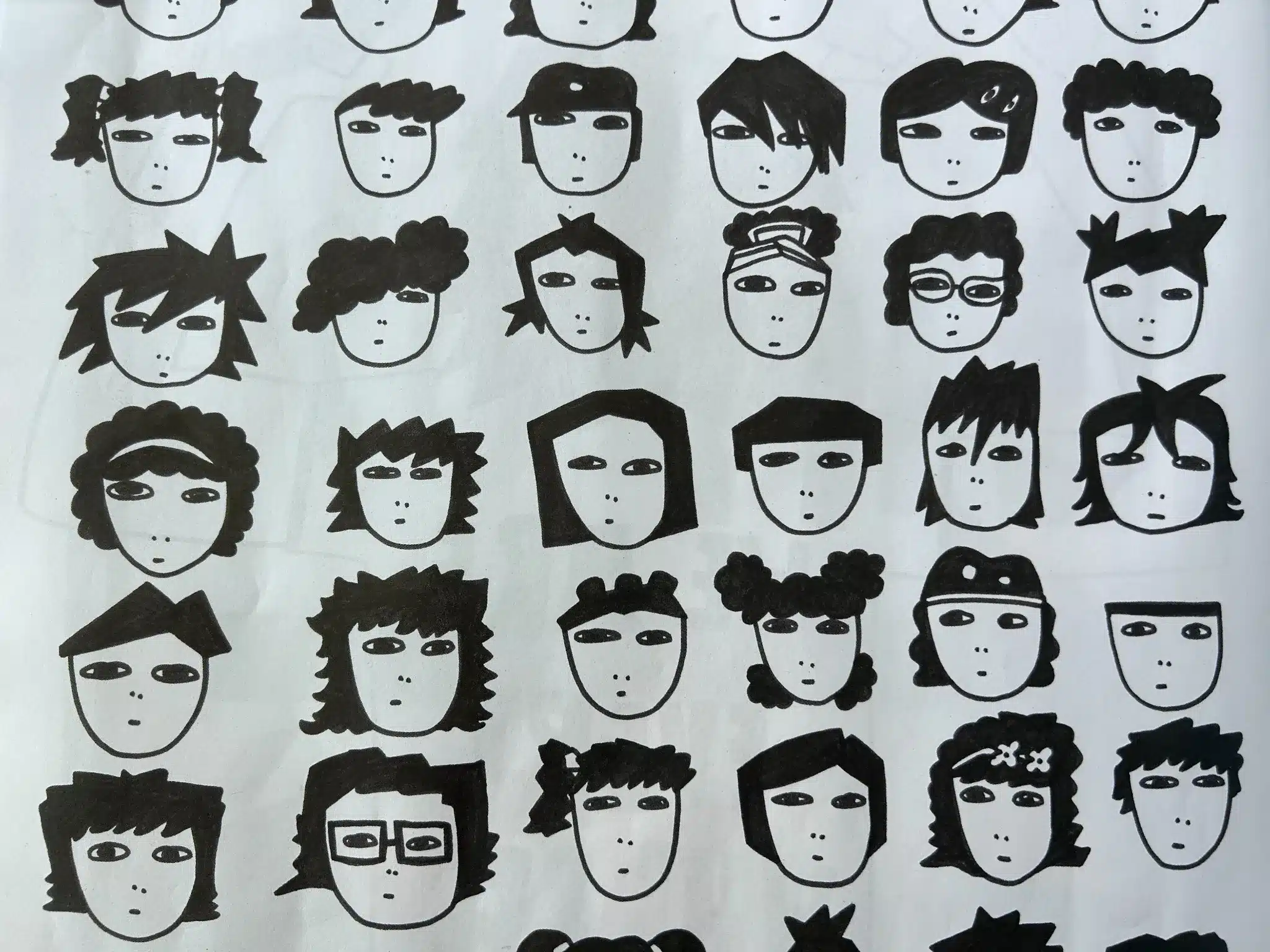
The book opts for a purely black-and-white colour scheme, which feels deliberate. This lack of colour doesn’t diminish the vibrancy of the content but instead focuses attention on the messaging and illustrations. The hand-drawn illustrations of various faces (stylised in a minimalist, almost iconographic style) reflect diversity within the community, suggesting a collective unity. Despite their simplicity, these faces convey individuality, which reinforces the celebration of varied lesbian identities.
A significant illustration is the large, screaming figure with an open mouth. This image not only adds a sense of rebellion but also echoes the strong emotions behind the statements, such as "Lesbians Come 1st." The visuals are evocative and expressive, capturing the anger, pride, and defiance of the lesbian community.
The overall design is purposefully raw, and it works in favour of the newspaper's message. The combination of stark, black-and-white imagery, bold typography, and uncoated paper creates an aesthetic reminiscent of punk zines, which were also a form of rebellion and self-expression.
The unbound, nested design reflects a sense of impermanence and flexibility—fitting for a zine, a format historically rooted in grassroots movements and counter-culture. It suggests that this publication is meant to be shared, passed around, and consumed by as many as possible.
The designer and author have successfully created a visually cohesive piece that aligns with the message. The design choices amplify the content, not just in terms of typography and layout, but in how the overall aesthetic evokes an emotional response. The large format, hand-drawn typography, and illustrations, alongside the raw black-and-white colour scheme, make a bold, uncompromising statement about the strength and fury of the lesbian community.
These insights can serve as guidance for future designers and authors aiming to create bold, impactful works. The unique aspects of The Dyke Express demonstrate how thoughtful design can amplify the message and resonate deeply with its intended audience.
Kiera Steere, the client behind The Dyke Express, approached Ex Why Zed with a clear vision of printing an A3 newspaper-style booklet. From the initial email conversation, Ex Why Zed's team established a welcoming and supportive relationship, offering Kiera an in-depth guide to the Ex Why Zed Print Journey, which provided clear directions and expectations for the upcoming process.
Mike, representing Ex Why Zed, responded swiftly with a detailed print quote for 500 copies of the A3 booklet, featuring 8 pages of 100gsm Revive Uncoated paper with black print throughout. The booklet would be nested but not bound, which aligned perfectly with the raw, DIY aesthetic of Kiera's project. The transparency in communication ensured there were no hidden costs, and the inclusion of free UK delivery added to the appeal.
Kiera showed interest but initially inquired about the price for printing 300 copies instead of 500. After some back and forth, she decided to move forward with the original 500-copy order, which demonstrated that the pricing was competitive and suited her budget.
One of the standout features of Ex Why Zed's service is the patient and detailed guidance they provide to clients who may be less familiar with the intricacies of preparing print files. Kiera, though confident in her design, had multiple questions about file setup. Mike reassured her by sharing Ex Why Zed’s comprehensive guide on preparing artwork, even offering tips for wire-stitched booklet printing to make the process as straightforward as possible. This demonstrates Ex Why Zed’s emphasis on customer support, which is one of their key strengths.
Throughout the back-and-forth communication, Ex Why Zed offered specific advice about the bleed and crop marks, which Kiera initially missed. Despite minor challenges with her artwork not adhering to the exact technical requirements (such as missing bleed on some pages and images being too close to the trim line), Ex Why Zed worked collaboratively with Kiera to rectify these issues. This included making quick adjustments to the artwork, such as resizing certain images, and offering to rebuild parts of the design where bleed was missing.
The exchange highlights Ex Why Zed’s hands-on approach to quality control. Rather than simply sending files to print without question, they took the time to review the artwork and ensure it was print-ready, providing specific feedback and offering solutions to technical problems.
Once the artwork was corrected, production moved forward smoothly. Kiera was kept informed every step of the way, including final file checks and the timing of production. The final stage of the process involved coordinating delivery. Ex Why Zed was quick to accommodate Kiera when she realised she wouldn’t be home for the first scheduled delivery attempt, arranging a more convenient time the following day.
Kiera expressed gratitude throughout the process, particularly for Ex Why Zed’s attention to detail and for catching potential issues in her artwork that might have gone unnoticed. This level of engagement ensured that the final product—500 copies of The Dyke Express—was exactly as envisioned.
From the initial query to the successful print and delivery of the project, the partnership between Ex Why Zed and Kiera Steere was collaborative and positive. This project not only demonstrated Ex Why Zed’s ability to manage technical challenges and provide detailed guidance but also their flexibility in meeting the client's needs and deadlines.
The final product was a success, thanks to the seamless collaboration between Kiera and Ex Why Zed. Kiera’s unique vision for The Dyke Express was realised through Ex Why Zed’s meticulous attention to detail, expert advice on file preparation, and high-quality printing services. The transparent pricing, step-by-step guidance, and ability to adapt to client needs resulted in a product that met both aesthetic and technical expectations.
This journey reflects Ex Why Zed’s commitment to supporting independent creators and ensuring their work is produced to the highest standards. Kiera’s satisfaction with the project opens the door for potential future collaborations and demonstrates why Ex Why Zed is the go-to newspaper printer for creative projects requiring that extra level of care and expertise.