The cover of your zine is the first thing that people see. It's your chance to make a bold, attention-grabbing statement. One of the most effective ways to do this is through the use of colour. But not just any colour - we're talking about CMYK colours. CMYK stands for Cyan, Magenta, Yellow, and Key (Black), the four inks used in the traditional method of printing hard copies.
While coloured paper can certainly add a unique touch to your zine cover, it comes with its own set of challenges. For one, there are only a limited number of colours available. And even if you find the perfect shade, the cost can be prohibitive, especially for indie presses.
Instead of using coloured paper, we recommend printing a flat colour as a background. This technique allows you to achieve the same visual appearance as coloured paper, but with more flexibility and at a lower cost. You can choose from millions of colours, and you can even print different graphics on the reverse side of the page.
Here is a quick video to Printing a coloured cover as a cost-saving alternative to using a premium coloured card.
• The best black to use for text is 0/0/0/100. This is 0% cyan, 0% magenta, 0% yellow and 100% black.
• For a dynamic jet black background colour, go for 30/30/30/100.
• If you want to print a right colourful red in CMYK then select your content to 0/100/100/10.
• A bright CMYK is 100/40/0/0, a medium blue is 100/80/10/0 and navy is 100/70/0/70.
• Royal Blue is very hard to print in CMYK.
• Bright yellow you can stick to 0/0/100/0 - easy!
• Gold is not easy to replace because CMYK inks are not metallic or as dynamic as foiling so don't have the shine.
• A mid tone, grass green would be 50/0/80/0 and for a dark, Racing Green use 90/0/100/70.
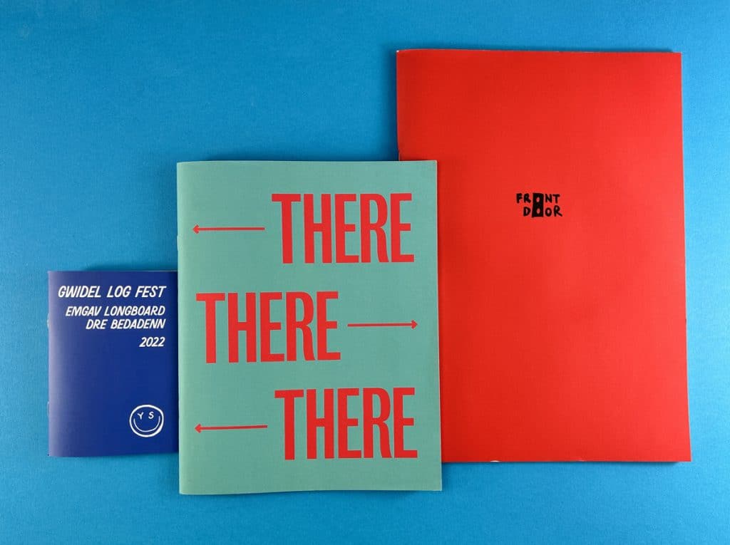
When it comes to printing a flat colour, uncoated paper is the way to go. The matte finish and slight grain of uncoated paper lend themselves well to overall background colours. It gives the impression that the paper itself is the actual colour, which is the effect we're trying to achieve.
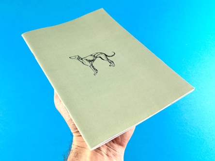
If you're using a cover weight of 170gsm or thicker, we recommend applying a matt lamination to the front cover. This thin layer of film protects the fibres of the paper, allowing us to fold it without any issues of cracking.
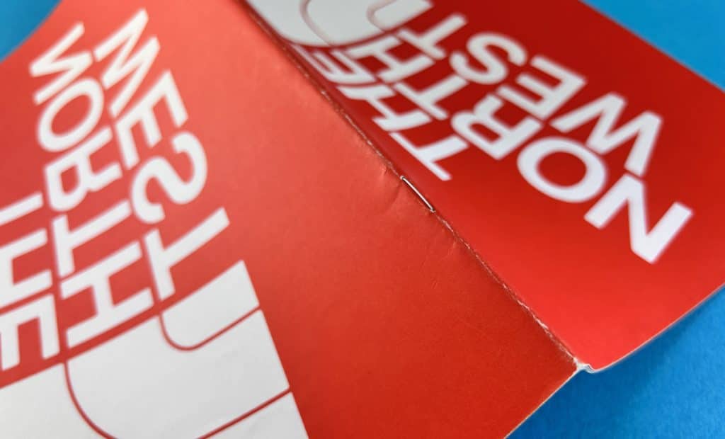
Below is a cover with a solid red background colour and you can see when we folded the sheet, the fibres of the card have opened up. Lamination prevents against this happening.

If you're looking for a way to give your zine cover a premium feel without the premium price tag, we have a hack for you. You can download high-resolution close-ups of papers from the G. F Smith website and use them as the background on your InDesign artwork. This gives the appearance of coloured, textured paper or card.
What is a CMYK colour guide for printing?
CMYK stands for Cyan, Magenta, Yellow, and Key (Black). These are the four inks used in the traditional method of printing. All printers use CMYK ink.
• The best black to use for text is 0/0/0/100. This is 0% cyan, 0% magenta, 0% yellow and 100% black.
• For a dynamic jet black background colour, go for 30/30/30/100.
• If you want to print a bright colourful red in CMYK then select your content to 0/100/100/10.
• A bright CMYK blue is 100/40/0/0, a medium blue is 100/80/10/0 and navy is 100/70/0/70.
• Royal Blue is very hard to print in CMYK.
• For Bright Yellow you can stick to 0/0/100/0 - easy!
• Again, gold is not easy to replace because CMYK inks are not metallic so don't have the shine. We can print metallic gold on our litho press but this process is more effective for 500 copies or more (the set-up costs are higher on that machine).
Which colours print well in CMYK?
Most colours print well in CMYK, but it's important to note that CMYK cannot reproduce all the colours that you can see on your computer screen in RGB (Red, Green, Blue) mode.
Our free paper sample swatches come with an alphabet on the reverse. Each letter is printed with a different CMYK setting to help you choose which will work best. The front card has a key of CMYK% of each letter so note that down and drop it in on your artwork. Easy!
To print vibrant colours in CMYK, it is best to convert any images in Photoshop then adjust the color balance, brightness and levels to boost them up after conversion.
In your design software, you can usually find the option to set your artwork in CMYK in the colour settings or preferences.
Bright colours, fluorescents, neons, metallics and royal blues tend to look more muted in CMYK ink.
Creating a standout zine cover is an exciting process that allows your imagination to run wild. By understanding the nuances of CMYK printing, you can create vibrant, attention-grabbing covers that truly represent your unique vision. So go ahead, experiment with different colours, textures, and finishes. The world of zine printing is your oyster!
When it comes to creating a zine, one of the most crucial aspects to consider is the cover. It's the first thing that your readers will see, and it can significantly impact their first impression of your work. One way to ensure that your zine cover stands out and remains durable is through lamination. In this post, we'll delve into the world of lamination for zine covers, discussing its benefits and the options available to you.
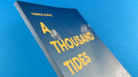
Lamination is a process that involves applying a thin layer of film to the cover of your zine. This film doesn't alter the colour of your printing underneath but serves to protect the fibres of the paper, allowing us to fold it without any issues of cracking. If you've got ink coverage where the sheets are folded, the paper, made of fibres, doesn't like being folded. So when they are folded, if there's ink on that area, the ink and the paper tend to crack. Lamination prevents this, ensuring that your zine cover remains neat and professional. Choosing to go without lamination could result in the cover cracking, which can make it look scruffy and a bit of a mistake. It's especially important to laminate the front cover of your publication if you go for a cover weight of 170gsm or thicker.
You can immediately see cracking on the cover of this wire stitched zine, below. When the cover card has been folded, the ink has cracked and this has opened up the fibres of the sheet to leave a series of scuffed marks down the spine. You shouldn't judge a book by its cover, but when it looks like this....
There are four choices for the lamination finish. Each option offers a different aesthetic appeal and texture, allowing you to customise your zine cover to your liking.
Matt Lamination
Matt lamination is the most common type of lamination used for zine covers. It offers a smooth and non-shiny finish, which can give your zine a sophisticated and professional look. Matt lamination is a solid accompaniment for uncoated or silk - not much of a sheen and it just feels professional.
Gloss Lamination
Gloss lamination, on the other hand, provides a shiny and reflective finish. This type of lamination can make your illustrations and colours really jump through, making it an excellent choice for comics or graphic novels.
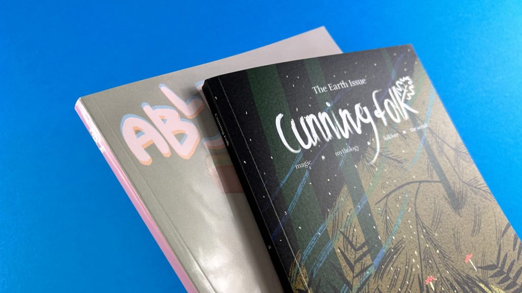
In the image below we have gloss lamination on 'Able' on the left and matt lamination on Cunning Folk in the foreground. The gloss lamination has more shine and really jumps towards the reader but arguably makes the content harder to see when tilted towards the light. The matt lamination is more subtle and you wouldn't really know it is there.
Soft Touch Lamination
Soft touch lamination provides a velvet feel to the cover, offering a unique and professional aesthetic. However, this type of lamination is arguably not suited to zines, as old school Zines would not have even entertained the idea of using Soft Touch lamination.
Anti-Scuff Lamination
Anti-scuff lamination is a less common option, chosen probably once a year. Despite its name, it doesn’t really stop scuffing. It is an option, but we would advisee you to opt for matt lamination instead.
What is the best paper for zine covers?
The best paper for zine covers depends on your personal preference and the aesthetic you're aiming for. However, if you're planning to laminate your cover, we recommend going for a cover weight of 170gsm or thicker.
What is the difference between matt lamination and velvet lamination?
Matte lamination provides a smooth and non-shiny finish, while velvet (or soft touch) lamination gives a soft, velvet-like feel to the cover.
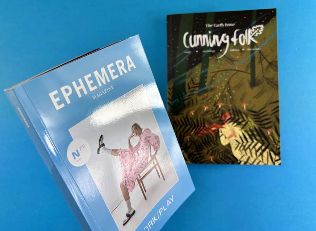
In the photo below, Ephemera has gloss lamination and Cunning Folk is noticeably softer when compared against it.
What does lamination do for printing?
Lamination adds a protective layer to the printed material, preventing it from cracking when folded. It also enhances the aesthetic appeal of the printed material, giving it a professional and high-quality finish.
What is velvet lamination?
Velvet lamination, also known as soft touch lamination, provides a soft, velvet-like feel to the cover. It offers a unique and professional aesthetic