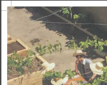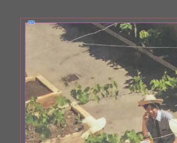
For example, if you are preparing an A5 page it will be trimmed to 210x148mm but we print your work on oversize SRA3 sheets which are then trimmed to the correct size. (If you have ordered an A5 book, we don't print on to A5 sheets).
You might be printing many copies of a book - hundreds, maybe even thousands and when printed all the pages will be stacked on top of each other.
There could be thousands of sheets in the pile. We'll aim to trim to the precise crop marks on your artwork but with that many sheets they might not all be in exactly the same position all the way down the pile. Watch the video here to get an idea on the trimming process. You can see that outside the crop marks and around the edge of the artwork there is additional white space. If some sheets slip and are slightly out of position when we trim the pages, this white area will then be included within the trimmed page and will ultimately show up on your final printing. This doesn't look very professional if the photography, graphics or background colour was meant to go right to the edge of the page.
Therefore, the way to get round this is by adding the extra 3mm of your content around the edge so if the guillotine blade or the paper sheet moves slightly during trimming then this extra section of content will appear on the final printing.
Can you just go ahead without it? We prefer not to. We want to print the best possible work for you and without bleed the finished printing can look unprofessional.
We hope that makes sense?
Let's set up an A5 page in Indesign and include scope for the bleed.
Follow the settings on the screengrab here:

(This is for a 36 page file but change this number accordingly for your publication).
We choose the A5 size by making the page 210mm high and 148mm wide.
You'll see we've told the document to include bleed by typing '3 mm' in to the four bleed boxes (inside, outside, top and bottom) then we need to add it on the artwork file itself.
Click 'Create' and the new 36 page file opens. ![]()
Next, add a photo to the page. Click the Rectangle Frame Tool icon to choose an image box.

With this selected, click and drag on the page from the top left pink outline to the bottom right pink outline.


On the indesign document, the black line shows the A5 page and is where we will trim each page. The pink line is the bleed area. If you want to make sure that the box is precisely positioned on the bleed area then check the measurements box and it should appear like the box below (-3, -3, 154mm, 216mm):

Let's go ahead and add a photo to the page. You can do this by clicking the new image box with the black arrow tool ![]() and clicking CMD+D on the keyboard. A dialog box will open, choose the image you want to drop in from your files and choose 'Open'.
and clicking CMD+D on the keyboard. A dialog box will open, choose the image you want to drop in from your files and choose 'Open'.
The image will in appear in your frame box. You can now use the white arrow tool ![]() to resize the image within the frame. Hold the shift key and drag the top left and bottom right corners til it is the correct size and position.
to resize the image within the frame. Hold the shift key and drag the top left and bottom right corners til it is the correct size and position.

If you prefer to have a coloured background rather than an image. Then lets go back a few stages...drag in your Rectangle Frame to the right size and then in the Color Menu select the colour you would like to fill it with. Always work in CMYK - choose this by clicking the horizontal lines in the top right hand corner of the colour menu.

Then toggle the numbers or select a colour from the spectrum below. In the top left hand corner of the Color Menu there are two little squares - the one with the red line across the centre helps you change the border of the Rectangle Frame, the solid white square helps you change the colour within the box. Here we have picked a really delicious bright orange colour which you can see extends up to the edge of the bleed area:

Excellent, so that's the first page completed. You can obviously now go ahead and add text, other images and style the page accordingly.
Go ahead and do this for the other pages in your book too.
An important point to consider is that if you would like your images to have a decent white border around the page then you would stop them at least 10-15mm short of the trim edge. As they wont be going to the edge of the page you don't need to worry about bleed at all. Easy!
PLEASE NOTE: If you have a white background on your artwork file or you intend your images to have a nice, generous 15mm border of white space around them then you do not need to worry about bleed because none of your content will be going to the edge of your finished book's pages.
As a side note, keep any important text at least 5mm from the trim edge of the page and 6-8mm away on the spine side of the page. This is good design practise and ensures all of your important content is legible to the reader without them having to crane their neck or press the pages really flat to see it all.
The Indesign file is now complete so let's export it to pdf ready for print.
Click CMD+E or File>Export.
Type in the name you would like to call the file. At the bottom of the dialog box select Adobe PDF (Print) then click Save.
A new dialog box opens up with some more options. On the top Adobe PDF Preset menu choose drop down box choose 'PDF/x-1a:2001). Choose 'Pages' rather than 'Spreads' and you can also click 'View PDF after Exporting' which will open the pdf up on screen after it has been created. On the left hand side click 'Marks and Bleeds' menu. Tick 'Crop Marks' and in the Bleed box type '3 mm' into the top, bottom, inside and outside box. That's it, then click Export. Your computer will whirr away for a short time (maybe a few minutes if it is a big file) then a print ready PDF will appear on your computer.
Your finished pdf should look like this with crop marks in the four corners and the artwork extending past the crop marks.

If you pdf DOESN'T look like that and it is missing bleed then it might appear like this:


It's one of two things:
If your Indesign page looks like this:

Then you need to drag the background image out 3mm beyond the black line on your Indesign file so that is extends right out to the pink line of the bleed area. Try that then export to PDF again.
OR you have added the correct bleed and completed the process above but then when you're exporting you need to click the Marks and Bleeds menu, then type '3mm' into the four bleed boxes. This will add the bleed to the pdf. The example below has 0 mm bleed when exporting to pdf - you need to make sure the top, bottom, left and right boxes show '3 mm'.

Choosing the right graphic design software is a crucial step in your creative journey. But with so many options out there, how do you know which one is the best fit for you? Our detailed comparison of Adobe InDesign, Affinity Publisher, QuarkXPress, and Scribus can help you make an informed decision. Dive in and find the perfect tool for your design needs.