A4 Landscape Hardback book
Cover onto 170gsm Silk
Matt laminated to the outer
Wrapped over greyboard case
2x 4pp End Papers printed onto 170gsm Uncoated
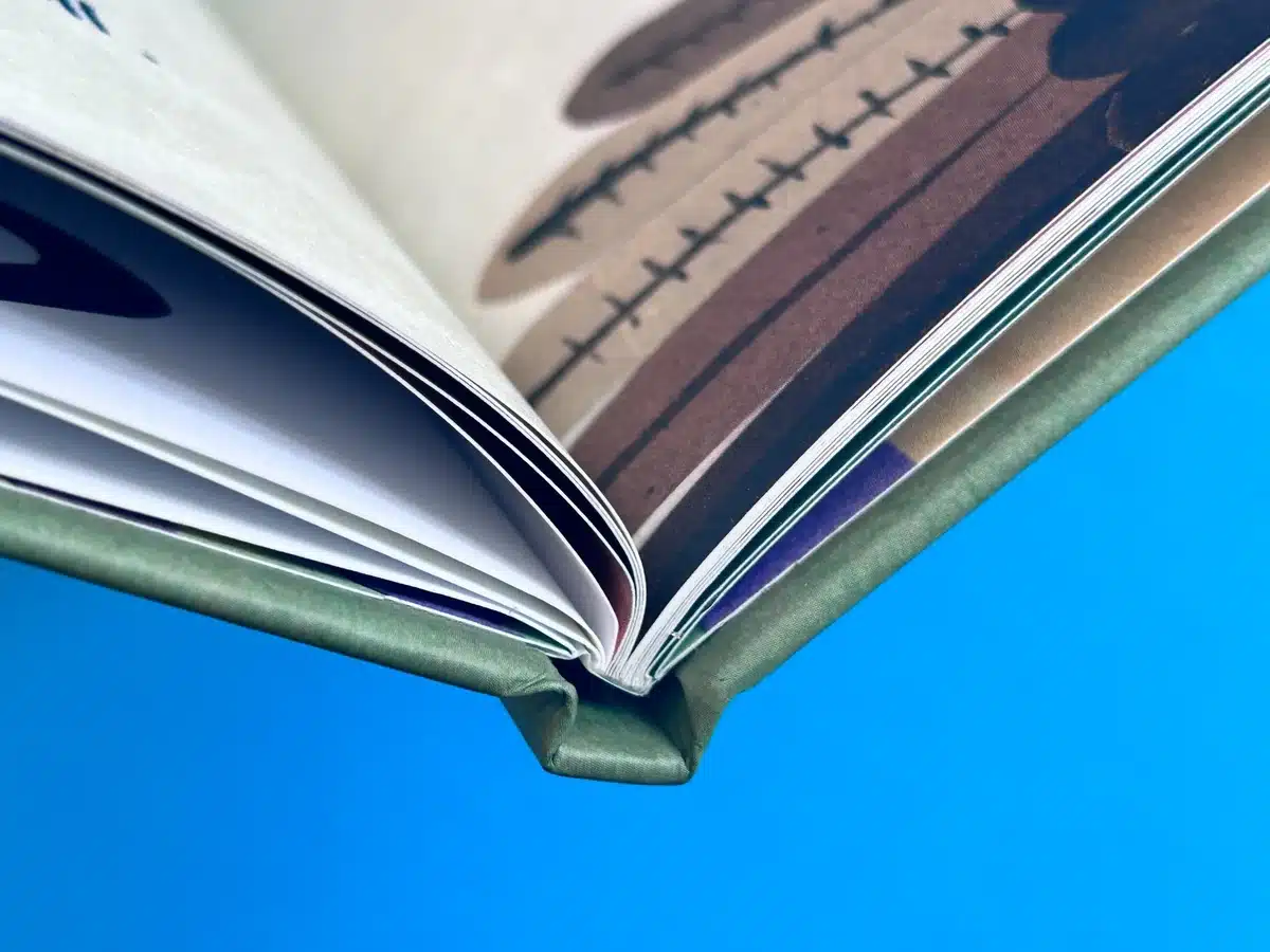
30 inside pages onto 170gsm Uncoated (9mm spine)
Full-colour print throughout
Case Bound
Kittiwake Kingdom: A Visual Journey Through Creativity and Craftsmanship
"Really pleased with the books—it’s wonderful to finally see this project in print after so many years."
Analysis of the Uploaded Images and Project
- Overview of the Book Design
The book "Kittiwake Kingdom: Fliff-Miffle's Escape" stands out as a striking example of an A4 landscape hardback, blending a playful narrative with inventive visuals. The thoughtful design is complemented by robust print specifications that enhance the tactile and visual appeal of the book. The cover, printed on 170gsm silk with matt lamination, offers a polished, professional finish, while the uncoated paper inside pages convey a soft, inviting texture. This meticulous selection of materials aligns perfectly with the whimsical and dynamic storytelling style.
- Styling, Content, and Aesthetic
- Cover Design: The cover presents a minimalistic yet captivating aesthetic, with playful typography that immediately reflects the book's tone. The title font combines childlike innocence with professional refinement, balancing accessibility with sophistication. The central illustration—a red creature holding an acorn—evokes curiosity and warmth, inviting readers into the story.
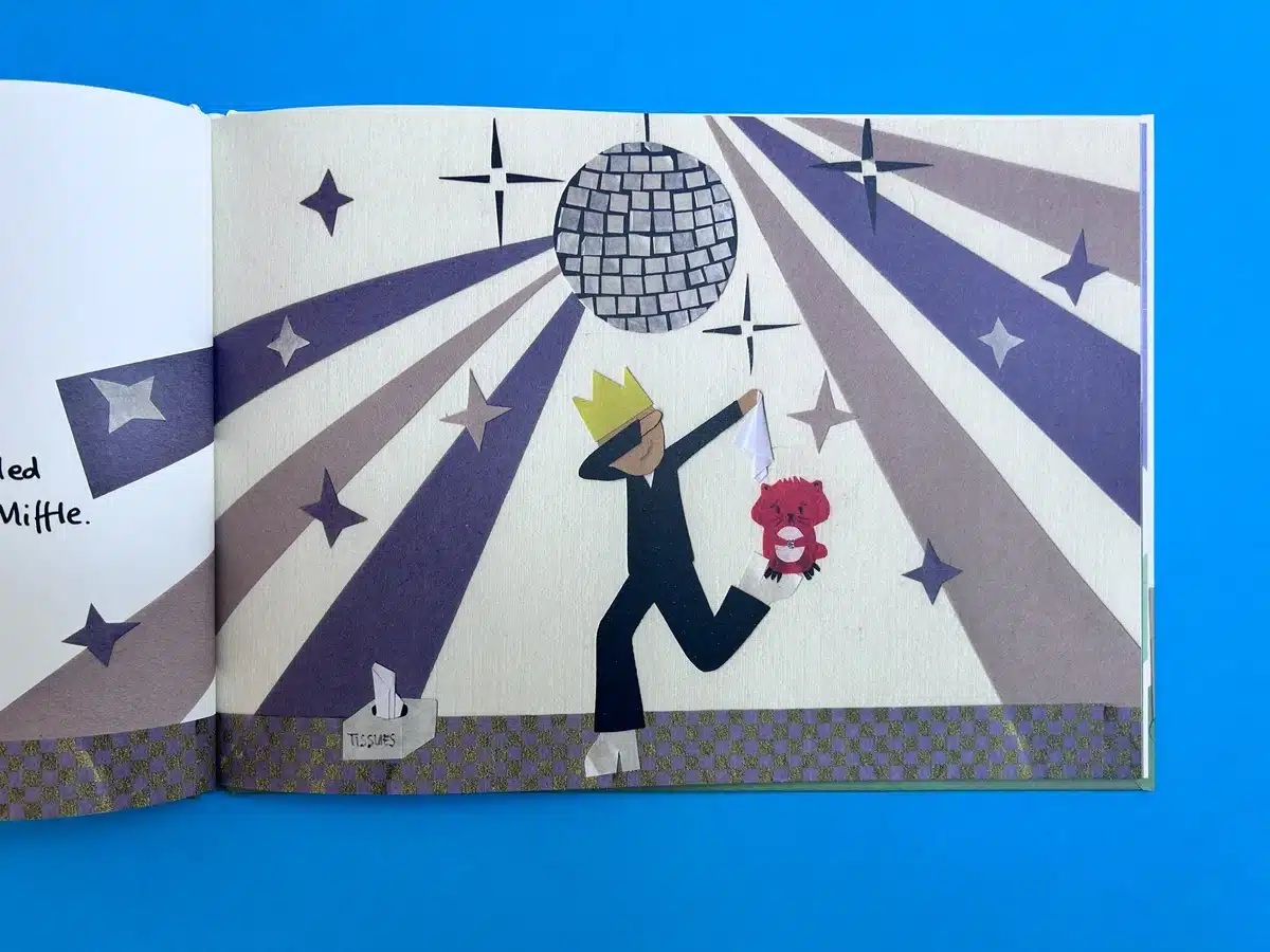
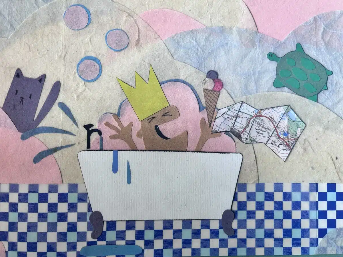
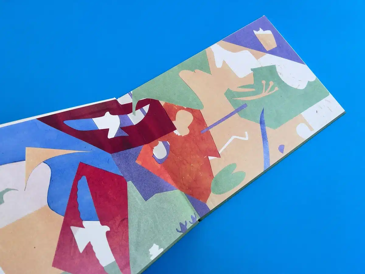
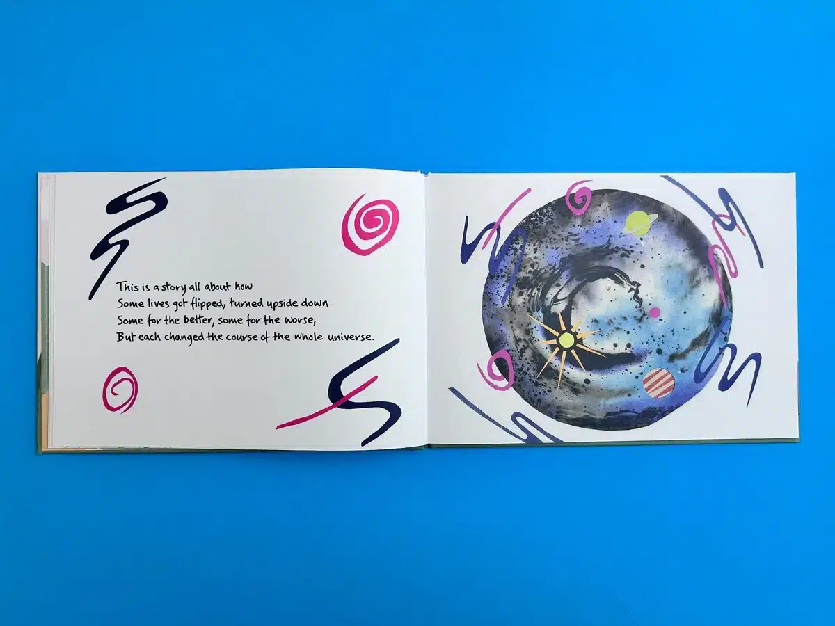
- Interior Illustrations: Inside, the book features diverse visual styles, such as abstract geometric patterns, surreal planetary designs, and whimsical hand-cut collage aesthetics. Each page breathes creativity and energy, showcasing the illustrator's ability to evoke emotion and wonder through dynamic colour schemes and imaginative elements.
- Typography: The text layout is clean and legible, carefully balanced with the illustrations. The narrative typography reflects a playful personality, reinforcing the book's child-friendly appeal while maintaining clarity.
- Binding and Production Excellence
The hardback case-bound structure is not only durable but also adds an air of quality and permanence. The 9mm spine offers a sturdy backbone, ensuring the book can withstand repeated use—essential for its target audience of children and families. The inclusion of 4pp printed endpapers adds an extra layer of aesthetic richness, making the opening and closing moments of the book as engaging as its core content.
- Unique Selling Points (USPs)
- Vibrant Visuals: The illustrations are not only colourful but highly dynamic, blending traditional and modern design techniques to create a captivating visual narrative.
- Innovative Materials: The combination of silk and uncoated stocks highlights Ex Why Zed’s commitment to balancing aesthetics and practicality.
- Engaging Layout: The creative use of double-page spreads—such as the abstract cosmic designs and character-driven scenes—keeps the reader visually stimulated throughout.
- Exceptional Binding: The seamless integration of the greyboard case with matt lamination ensures the book feels premium while remaining functional.
Actionable Insights
- Material Selection Matters:
- The decision to use silk for the cover and uncoated for the interior pages demonstrates the importance of aligning tactile qualities with a book’s intended use. This combination is perfect for a children’s book, balancing visual appeal with durability.
- Application: Future authors should consider their audience's sensory expectations and choose complementary materials.
- Bold Colours and Geometric Patterns:
- Vibrant colour schemes paired with playful, abstract designs are eye-catching and memorable. These elements lend a timeless appeal to the book.
- Industry Insight: When targeting younger audiences, incorporate dynamic imagery that sparks imagination and complements the storyline.
- Typography’s Role in Storytelling:
- The use of varied, playful typography aligns with the book's light-hearted narrative while maintaining readability.
- Tip: Always ensure typography enhances, rather than competes with, illustrations.
- Endpapers as Storytelling Tools:
- The 4pp printed endpapers bookend the narrative with thematic relevance, setting the stage for the story and leaving a lasting impression.
- Future Insight: Use endpapers to reinforce branding or enhance the narrative experience.
- Hardback Durability for Longevity:
- The case-bound approach ensures a durable and professional product, ideal for projects where quality and longevity are paramount.
- Suggestion: Designers and authors should consider case binding for premium projects targeting long-term use.
By adhering to these insights, future self-publishers can craft standout publications that engage audiences and showcase their vision effectively.
This analysis highlights the artistic and technical merits of "Kittiwake Kingdom" while providing actionable takeaways for aspiring creators. Ex Why Zed's expertise in materials, design, and execution ensures every project reflects the client's vision at its finest. Let’s move to TASK2 to dive into the collaborative journey behind this unique project.
The Print Journey of Kittiwake Kingdom: Fliff-Miffle's Escape
The Collaborative Process: From Concept to Completion
Introduction
Tash Pearce, the creative mind behind Kittiwake Kingdom: Fliff-Miffle's Escape, approached Ex Why Zed with a vision to create a visually striking, case-bound children’s book that could delight readers of all ages. What followed was a seamless and dynamic collaboration, blending meticulous design support, technical guidance, and state-of-the-art printing to bring this enchanting project to life.
Step-by-Step Collaboration
- Initial Consultations and Creative Support
From the outset, our focus was on providing Tash with a clear and reassuring roadmap. Our initial emails detailed everything from print specifications to file setup guides, ensuring Tash felt confident navigating her first foray into hardback book production.
- Personalised Quote: We offered flexible pricing for various print runs, helping Tash make informed decisions based on her budget.
- Sample Pack: A curated sample pack introduced her to the premium materials we use, allowing her to visualise the finished product.
- Artwork Guidance and File Setup
Tash's charming paper-cut illustrations required precise technical adjustments to ensure perfect print quality. Our detailed cover template highlighted areas for bleed and trim, which initially posed challenges in achieving the correct size for the wrap-around artwork.
- Challenge: Tash's cover artwork needed to accommodate a 17mm wrap-around for the case-bound design. Early submissions lacked sufficient bleed, requiring revisions.
- Solution: We provided tailored feedback and step-by-step corrections. Adjustments included recalibrating dimensions for bleed and providing insights into how background designs could be extended without losing their artistic integrity.
- Proofing and Pre-Press Checks
Acknowledging Tash’s request for absolute precision, we produced flat sheet proofs for selected pages and the cover. This allowed her to evaluate colour fidelity and overall layout before committing to the final print.
- Transparent Feedback: While the proofs looked excellent, we flagged areas with insufficient bleed on the endpapers, ensuring Tash could make revisions to avoid visible white edges post-trim.
- Affordable Solutions: We offered proofing at cost price, reflecting our commitment to supporting self-publishers on a budget.
- Print Production and Quality Assurance
Once the final files were approved, the book moved to production. Our case-bound process used high-quality greyboard with a matt-laminated silk cover, complemented by uncoated 170gsm paper for the interior.
- Durability Meets Elegance: The 9mm spine and premium materials ensured the book’s structural integrity, while vibrant full-colour printing brought Tash’s illustrations to life.
- Delivery and Feedback
A slight weather delay in dispatching the books was resolved with a same-day courier, ensuring Tash received the books on her preferred date. The final delivery was met with resounding approval, with Tash describing the result as "wonderful" and "a dream realised after so many years."
Impact and Client Success
Client Feedback
Tash praised Ex Why Zed’s attentive support and expertise throughout the process:
"Really pleased with the books—it’s wonderful to finally see this project in print after so many years."
Audience Reception
Fliff-Miffle's Escape debuted in local shops, generating buzz for its inventive design and engaging storytelling. Ex Why Zed’s ability to faithfully reproduce Tash’s unique paper-cut artwork ensured the book stood out as a vibrant addition to the children’s literature market.
Reflection on the Project
This collaboration showcases Ex Why Zed's hallmark strengths:
- Expert Guidance: From file setup to final delivery, we empowered Tash to overcome technical hurdles, ensuring her creative vision was realised.
- Flexibility and Patience: Tailored solutions and ongoing support fostered trust and ensured a smooth process.
- Exceptional Results: The final product’s quality affirmed our position as the go-to choice for self-published authors.
With Kittiwake Kingdom, Tash Pearce has not only created a beautiful book but also cemented a partnership with a print team that shares her passion for quality storytelling.
