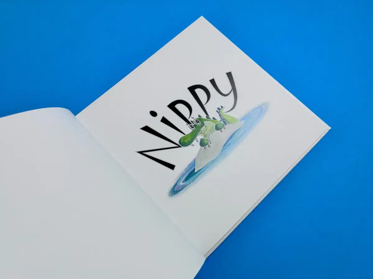
210x210mm Books
Cover onto 170gsm Silk
Matt laminated to the outer
2x 4pp End Papers printed onto 170gsm Uncoated
28 inside pages onto 170gsm Silk
Full colour print, case bound
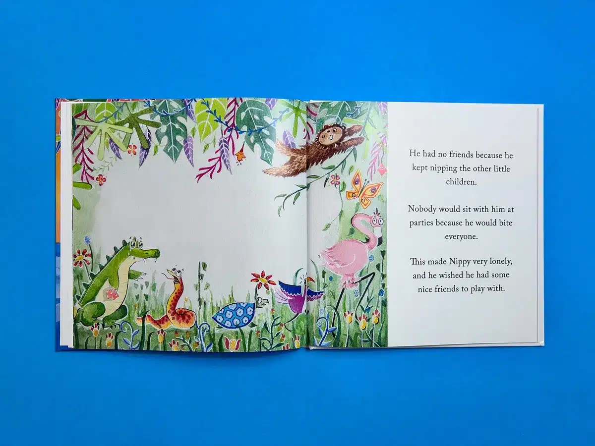
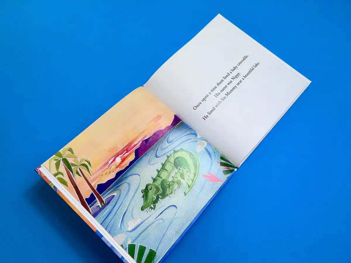
"Nippy the Baby Crocodile," authored by Jessi Cox, is an enchanting hardcover children’s book printed at 210x210mm. It features 28 vibrant inside pages on 170gsm silk, complemented by a sturdy case binding with matt lamination on the outer cover. The book is an outstanding example of how print design can breathe life into a story, especially for a younger audience.
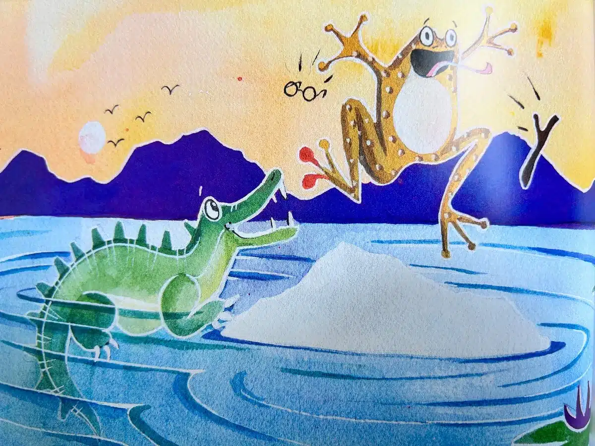
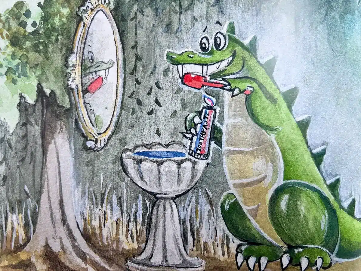
The visual identity of the book combines dynamic imagery and thoughtful use of colour, instantly captivating its target readers. Each page brims with energy and movement, as illustrated by the adorable green crocodile, Nippy, and his journey. The colours are striking yet harmoniously balanced, with sunsets, lush foliage, and playful animal characters forming an immersive narrative environment. The typefaces chosen for the title and text are whimsical and approachable, enhancing the overall playfulness while ensuring readability.
At Ex Why Zed, our role went beyond just printing the book; it was about transforming Jessi Cox’s creative vision into a tangible product. Our expertise in children’s book printing ensured that every detail, from the colour fidelity of the illustrations to the durability of the binding, exceeded expectations. By offering consultation on paper choices and finishing techniques, we contributed to the book’s enduring quality and engaging aesthetic. Our cutting-edge printing technology brought out the richness of the illustrations while maintaining eco-conscious standards.
Here are lessons future authors and designers can glean from this project:
"Nippy the Baby Crocodile" is a testament to how thoughtful design and expert printing can elevate a children’s story. It highlights Ex Why Zed’s commitment to delivering high-quality, visually stunning publications that resonate with readers. Jessi Cox’s creative vision, paired with our technical expertise, resulted in a book that not only delights its audience but also sets a benchmark for quality in children’s book publishing.
This collaboration embodies our philosophy: turning imaginative ideas into exceptional printed works that endure.
The print journey for "Nippy the Baby Crocodile" began with an inquiry from Jessi Cox, facilitated by Heather Champion, seeking to create a visually captivating children’s book. Jessi’s vision was clear: a vibrant, durable hardcover book that would bring Nippy's jungle adventures to life. Ex Why Zed immediately stepped in with expert advice, providing detailed quotes, technical guidance on artwork setup, and tailored support for producing a premium-quality product.
Our initial response included comprehensive specifications for a 210x210mm casebound book, outlining materials such as 170gsm silk for inside pages and uncoated paper for the endpapers. Jessi was encouraged to explore similar works in our portfolio and was provided with resources such as file setup guides and video tutorials, ensuring a seamless transition from design to print.
The collaboration encountered a few hurdles during the file preparation phase. For instance:
Throughout the production process, we provided options to suit the project’s budget and style:
Before final production, we conducted a free preflight check of the submitted files, flagging potential issues and ensuring optimal print results. The final proofs were approved after meticulous checks, and production began in earnest. The use of high-quality silk paper and matt lamination contributed to the book’s polished finish, while our state-of-the-art printing technology ensured vivid reproduction of the illustrations.
The finished books were delivered promptly, meeting the tight deadline. Jessi and Heather were thrilled with the outcome, praising the quality and professionalism of our service. This collaboration laid the groundwork for future projects, including a follow-up book in the series, demonstrating the enduring value of our partnership.
The success of "Nippy the Baby Crocodile" is a testament to our dedication to customer service and technical expertise. By blending Jessi’s creative vision with our tailored advice and cutting-edge production methods, we transformed her story into a stunning printed product that resonates with its young audience.
This project illustrates the value of clear communication, proactive problem-solving, and a commitment to quality—principles that underpin every collaboration at Ex Why Zed.
