A4 Landscape Casebound Books
Cover onto 170gsm Silk FSC Certified
Wrapped over greyboard case
Matt laminated to the outer
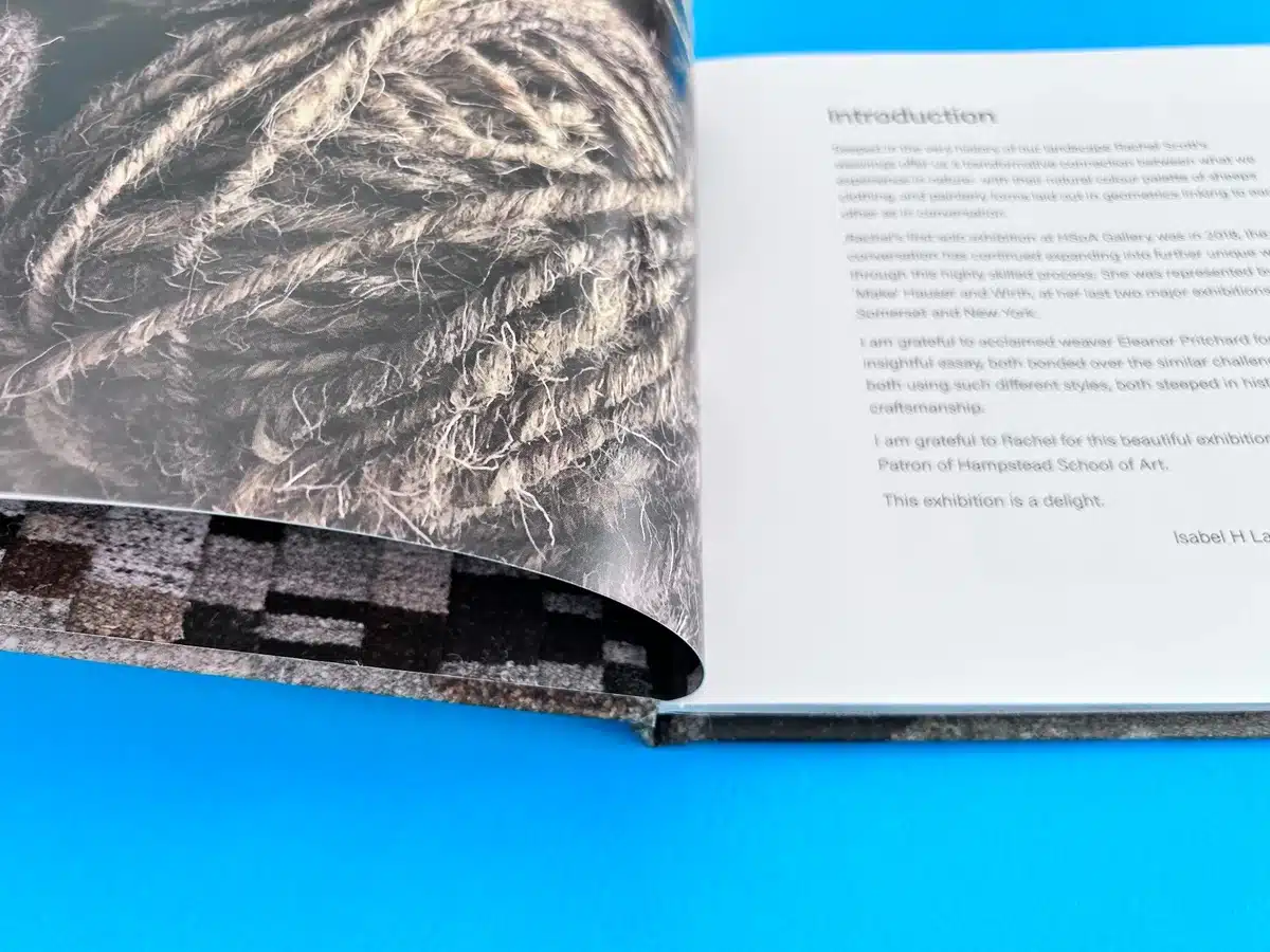
2x 4pp End Papers printed onto 170gsm Uncoated FSC Certified
54 inside pages onto 170gsm Silk FSC Certified (10mm spine)
Printed in full colour throughout
Trimmed, collated and case bound
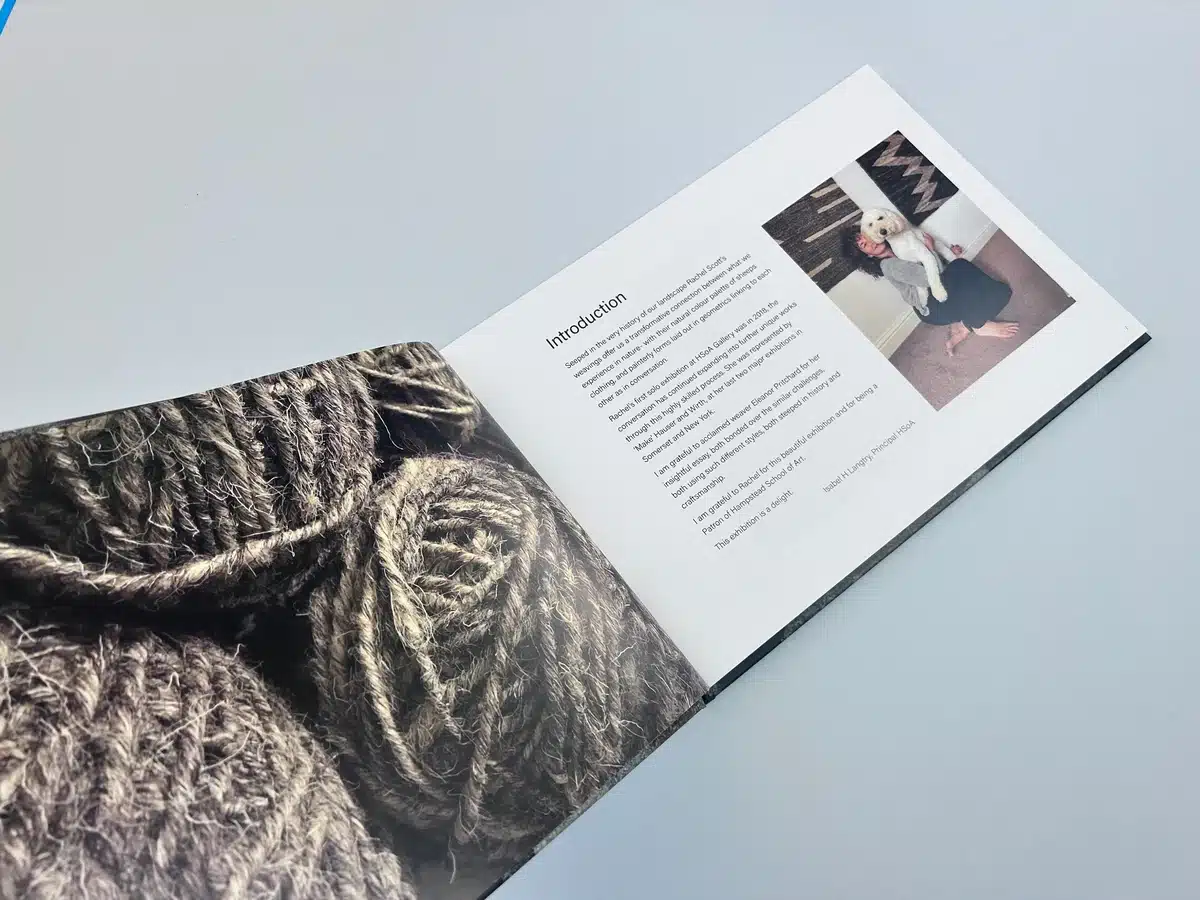
"I am grateful to Rachel for this beautiful exhibition and for being a Patron of Hampstead School of Art. This exhibition is a delight."
—Isabel H. Langtry, Principal of Hampstead School of Art
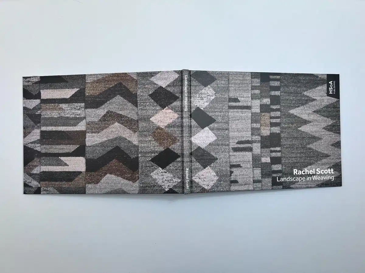
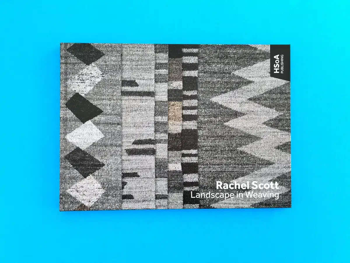
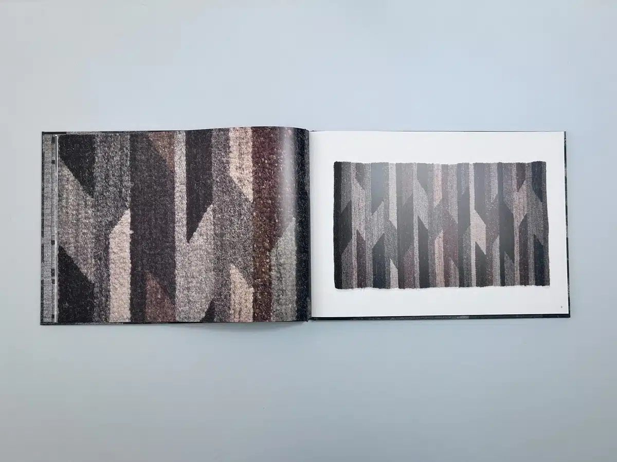
"Landscape in Weaving" is a masterclass in presenting traditional craftsmanship through a contemporary design lens. The book's A4 landscape format reflects an intentional choice to showcase Rachel Scott's intricate woven designs, offering ample space for the reader to appreciate the scale and detail of her works. Wrapped in a textured casebound hardback, the cover features a rhythmic sequence of geometric patterns inspired by the natural world. The interplay of muted browns, greys, and blacks mirrors earthy landscapes, creating a visual dialogue between the subject matter and its physical manifestation.
Typography: The typeface used throughout is clean and understated, ensuring that the focus remains on the woven works. On the cover, the elegant sans-serif typeface complements the dynamic patterns while maintaining clarity and balance. Inside, a slightly more delicate sans-serif font is used to enhance readability without detracting from the visual weight of the photography.
Colour Palette: The tonal harmony of the book is striking. The muted tones convey a sense of serenity and timelessness. The juxtaposition of earthy browns and greys with stark blacks generates an impactful aesthetic balance, reminiscent of the interplay between light and shadow in natural landscapes.
Page Layout: The spreads are thoughtfully designed to emphasise visual breathing space. Full-page imagery alternates with white-bordered photographs, giving the reader an immersive yet structured experience. The use of 170gsm Silk FSC Certified paper heightens the textural quality of the images, allowing the tactile essence of the woven works to shine through.
The nuanced execution of "Landscape in Weaving" captures the essence of Rachel Scott's artistry while demonstrating the power of exceptional book design. Ex Why Zed's craftsmanship not only honours the artist’s vision but also sets a benchmark for premium art catalogues.
The project began with Malcolm Willett, a freelance designer representing Hampstead School of Art, reaching out to Ex Why Zed to produce a new hardback catalogue for Rachel Scott’s exhibition. Malcolm’s glowing feedback on a previous project set the tone for a collaborative and professional interaction, reinforcing trust and familiarity.
From the outset, the specifications mirrored a previous project for Raoul Orzabal’s catalogue. Malcolm requested a casebound A4 landscape format with silk FSC-certified pages, matt lamination, and printed endpapers. An important point of clarification emerged regarding the omission of Spot Gloss UV from the cover, an adjustment that reflected both Malcolm's precision and Ex Why Zed's adaptability.
Ex Why Zed responded promptly, revising quotes and specifications without hesitation. The meticulous breakdown of costs for 200, 250, and 300 copies, alongside assurances of free UK delivery and realistic timelines, demonstrated professionalism and clarity. This approach allowed the client to make informed decisions without stress.
File preparation can often be an area of confusion, but Ex Why Zed proactively guided Malcolm through a wealth of resources, including a 5-minute guide on artwork preparation and expert tips on hardback book layouts. These resources were instrumental in ensuring the artwork was print-ready and aligned with industry standards.
Even after the initial proofs were shared, the need for last-minute artwork revisions emerged—a common scenario in collaborative print projects. Malcolm’s request to adjust files was met with understanding, and the team efficiently managed the rejected proof to integrate the changes. This interaction underscored Ex Why Zed's dedication to accommodating real-world client needs without compromising on deadlines.
After receiving final approval, Ex Why Zed pushed the project to print with impressive speed, maintaining a transparent dialogue throughout. The consistent updates—from confirming the receipt of payment to proof approval and printing completion—created a seamless process for the client.
The environmentally conscious production materials, including 170gsm Silk FSC-certified paper and uncoated endpapers, aligned with the eco-friendly ethos of both Ex Why Zed and the Hampstead School of Art. These details added depth to the narrative of sustainability, an important aspect for modern art catalogues.
The project concluded with Ex Why Zed’s hallmark touch of care—tracking information, reminders about delivery logistics, and even a celebratory tone upon dispatch. The finished catalogues arrived on time for the private viewing, allowing Rachel Scott’s intricate woven designs to be showcased in their full glory.
Client feedback emphasised satisfaction not only with the final product but also with the journey itself. Malcolm’s trust in Ex Why Zed’s expertise was evident, and the professionalism displayed in handling tight timelines, last-minute changes, and high expectations reinforced their reputation.
Ex Why Zed’s approach to this project highlights the importance of clear communication, flexibility, and attention to detail. By ensuring the client was guided at every stage—from specification clarification to artwork preparation and proofing—they delivered a stunning, bespoke catalogue that elevated the exhibition experience.
The collaboration’s success is a testament to Ex Why Zed’s ability to merge technical precision with personalised service, showcasing why they remain a trusted partner for high-end art publication printing. Rachel Scott’s "Landscape in Weaving" catalogue stands as a testament to both the beauty of her work and the print excellence that brought it to life.
