230x230mm Books
Cover onto 170gsm Silk
Wrapped over greyboard case
Matt laminated to the outer
2x 4pp End Papers printed onto 170gsm Uncoated
28pp Text onto 170gsm Silk
Four colour print throughout
Trimmed, collated and case bound
"Absolutely thrilled with the book – LOVE the finish of the matt cover... the colour reproduction/richness/hues/contrast of the printing are absolutely spot on."
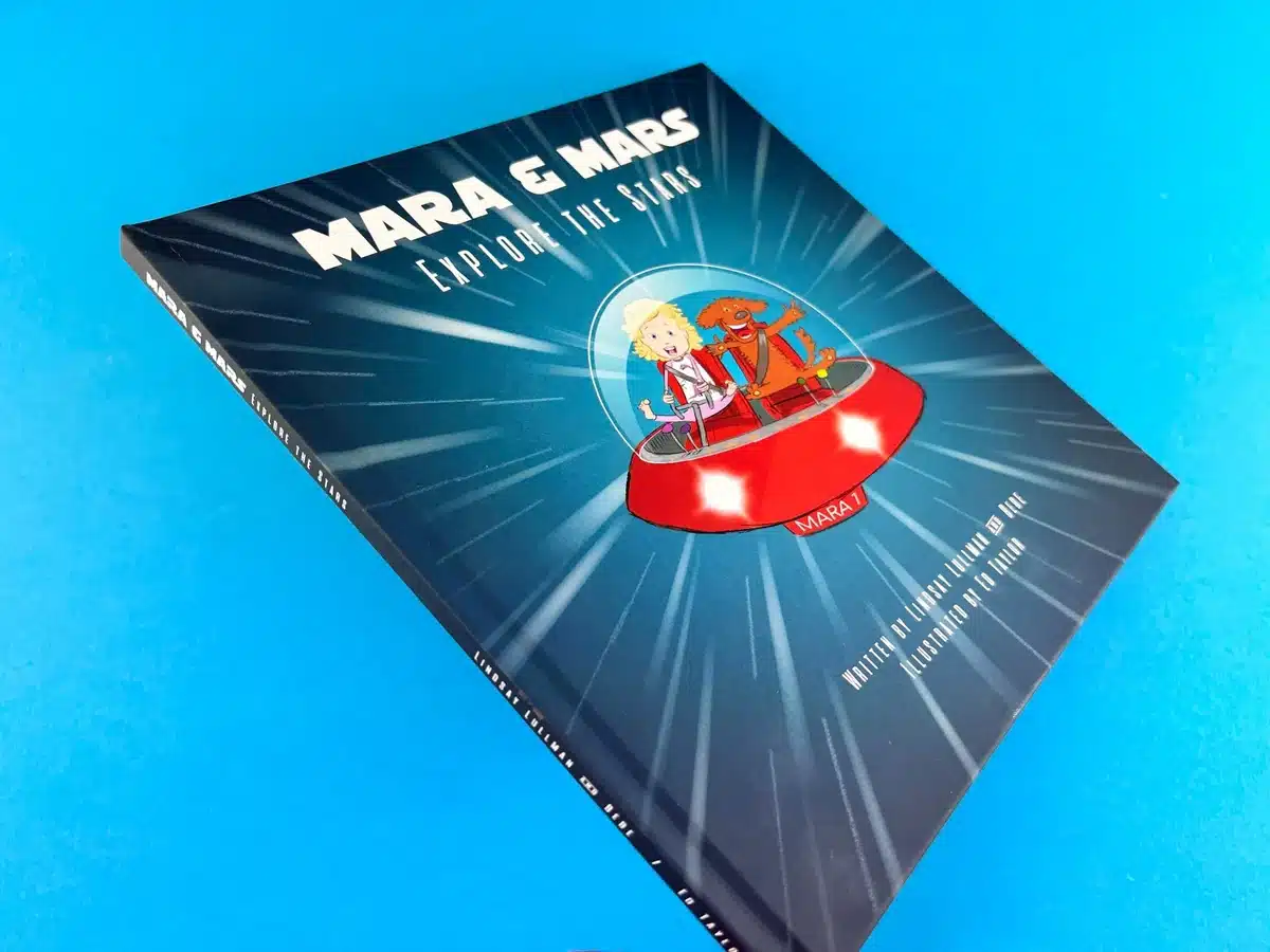
The book, Mars and Mara Explore The Stars, features a high-quality case binding. The cover is wrapped over greyboard, with a matt laminated finish, which gives the book a sturdy yet soft texture. The binding is well-executed, providing durability, especially for a children's book that will likely see frequent use. The case-bound format also gives the publication a sense of permanence and professionalism, an excellent choice for a children’s book intended to have a lasting impact.
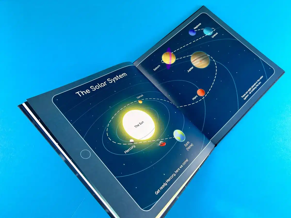
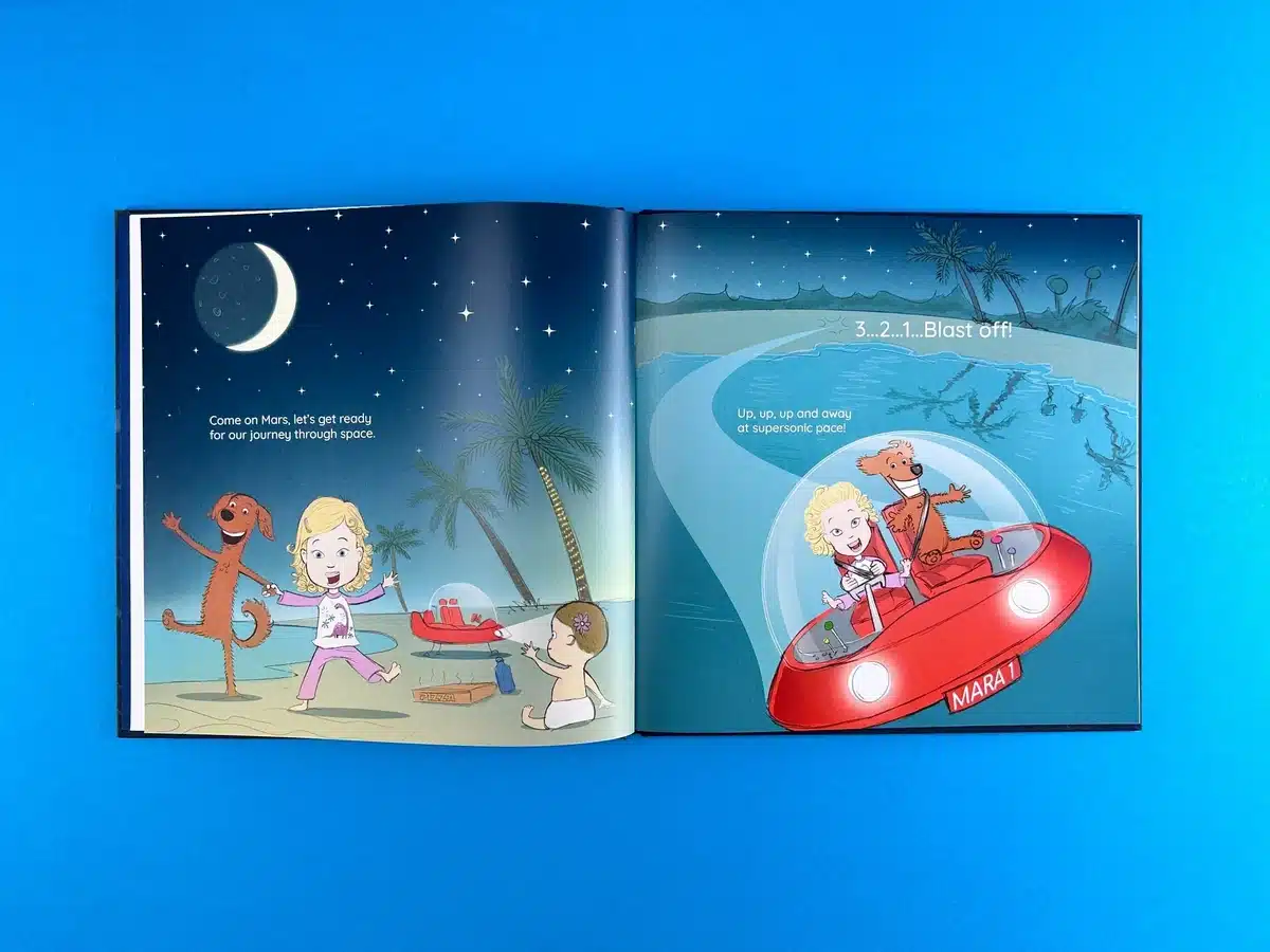
The interior layout is thoughtfully designed, balancing illustrations and text to create an immersive reading experience for children. The use of large, full-bleed illustrations grabs attention and provides visual engagement with the story. The text is positioned in a way that allows it to remain legible while harmonising with the artwork. For instance, in the double-page spreads, the text is arranged with generous margins around the central images, helping it pop without cluttering the visual storytelling. There is a clear, intuitive progression across the pages, ensuring smooth storytelling.
Colour is a dominant feature in this book. From the bright, playful outer cover to the cosmic, space-themed spreads inside, the colours are vibrant and engaging, perfectly suited to capture a child's imagination. The deep blues of space, contrasted by the oranges and reds of the rocket ship and planets, create a visually striking contrast. This not only helps convey the space adventure theme but also makes it easier for young readers to follow the characters’ journey through visually distinct environments. The choice of rich, deep colours enhances the sense of wonder and exploration.
The typography throughout the book is simple and clean, using large, easy-to-read fonts that are well-suited to younger readers. The typeface complements the illustrations without overpowering them, and the text is laid out in short, digestible sections, which is essential for the intended audience. The playful nature of the font used for headers and key phrases like "Blast off!" adds to the excitement and fits seamlessly with the lively illustrations.
The illustrations, created by Ed Taylor, are vibrant and whimsical, matching the imaginative tone of Lindsay Lullman's writing. The characters, Mara and her dog, Mars, are full of personality, conveyed through expressive drawings. The visual depictions of outer space—from the solar system to planets like Mars—are engaging but not overly complex, making the content accessible to its young audience. There is a consistent balance between playfulness and educational content, such as the accurate yet simplified diagram of the solar system. The narrative is light, fun, and inspirational, promoting curiosity about space and science in a way that feels effortless.
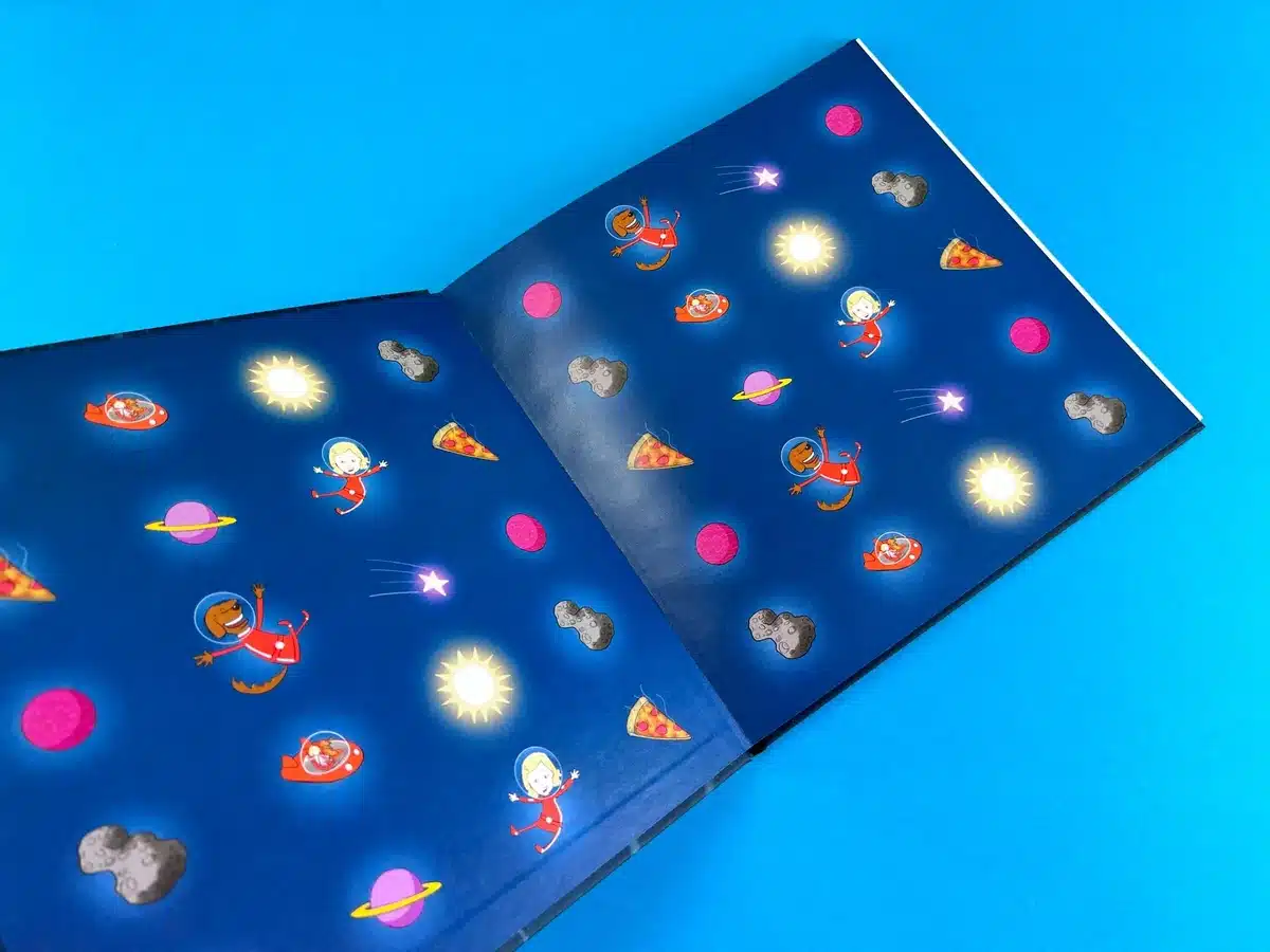
One of the standout features of the book is the exceptional production quality. The combination of the matt laminated cover, high-grade paper (170gsm silk), and vibrant four-colour printing results in a premium feel. The full-bleed illustrations and the clarity of the print ensure that the vibrant, engaging artwork jumps off the page. Additionally, the inclusion of printed endpapers on uncoated 170gsm stock adds an extra layer of detail and refinement to the overall design.
Another notable point is the book’s size—230x230mm—which is perfect for children’s hands, making it easy to handle while providing a large enough canvas for the illustrations to shine. This, combined with the thoughtful choice of materials, makes the book feel substantial without being cumbersome.
These insights highlight how thoughtful design choices in materials, layout, colour, and typography can dramatically improve the reader’s experience, especially in children's books. The careful blend of educational content with vibrant illustrations and high production standards ensures that Mars and Mara Explore The Stars stands out in the market.
The journey of bringing Mars and Mara Explore The Stars to life was a rewarding and carefully managed print project, showcasing the importance of collaboration between the client and the printing team. The dialogue between Ex Why Zed and the authors, Lindsay Lullman and Ed Taylor, exemplifies the detailed process and dedication required to turn a vision into a high-quality children's book. From the initial consultation to the final product, every step was handled with care and expertise.
The conversation began with a quote provided by Ex Why Zed that outlined different book sizes and specifications to suit the project’s needs. Originally, the book was quoted in two formats—210x210mm and 216x216mm—before it was adjusted to the final size of 230x230mm, a perfect square format that provides ample space for vibrant illustrations without compromising portability. The switch to a hardback design significantly elevated the book's presentation, with a 170gsm silk cover wrapped over greyboard and matt laminated for durability.
One of the key factors was Ex Why Zed's guidance on the layout and file setup. The client was encouraged to explore the company’s comprehensive guides for artwork preparation, which simplified the process and ensured that Ed and Lindsay could easily adapt their files to fit print requirements. Ex Why Zed's helpful resources, such as illustrated file setup guides and video tutorials, were instrumental in avoiding potential errors and streamlining the creative process.
Throughout the project, a few creative challenges arose, most notably regarding the page count. Initially, the book had only 24 pages, which was insufficient for a hardback format. Ex Why Zed identified this issue early and recommended adding an additional four to eight pages to ensure the book’s thickness would be suitable for binding. This crucial advice allowed the project to move forward smoothly, and the authors were quick to make the necessary adjustments, adding content to reach the optimal page count.
Ed’s ongoing collaboration with Ex Why Zed showed an appreciation for the team’s problem-solving approach, especially in navigating artwork details like bleed requirements and endpaper setups. The team’s patience and flexibility stood out as they offered alternatives for artwork configuration while staying true to the client’s creative vision.
Once the artwork was prepared, a few additional revisions were necessary. Ex Why Zed's pre-press team noticed that the bleed was missing from some pages, and the font SFDistantGalaxy on the cover wasn’t embedded correctly. These technical issues were promptly flagged and corrected by Ed, who appreciated the team's thoroughness in reviewing every aspect of the file before proceeding. The attention to detail during pre-press checks was critical in ensuring that the final product met the highest quality standards.
Another key element was the endpaper design, which required its own set of templates due to the uncoated stock. Ex Why Zed provided custom templates, guiding the authors to correctly position the panels and create cohesive front and back endpapers. This meticulous level of support not only solved technical issues but also enhanced the final product’s visual and tactile appeal.
Shipping logistics added another layer of complexity to the project, with copies needed in both the UK and Barcelona. Ex Why Zed facilitated these arrangements, offering different courier options and providing clear communication on the shipping rates, which were influenced by post-Brexit customs requirements.
Despite the challenges, the authors opted to receive a hard copy proof before printing the entire run of 30 copies. When Ed received the proof, his enthusiastic response reflected the success of the collaboration. He praised the matt laminated cover and the colour reproduction throughout the book, particularly the richness and vibrancy of the illustrations, which were vital for a children’s storybook. His satisfaction with the print quality was a testament to the careful work of Ex Why Zed's print and production team.
The final result was a beautifully crafted, 230x230mm hardback book that met and exceeded the client's expectations. Both Lindsay and Ed expressed their excitement about the finished product, with Ed particularly thrilled about the overall print quality and how the matt cover and vibrant colours brought the illustrations to life.
Lindsay was equally excited, reaching out to Ex Why Zed to express her appreciation and immediately inquire about future print runs. The success of Mars and Mara Explore The Stars highlights the critical role of communication, expertise, and flexibility in a complex creative project.
This case not only demonstrates the high standards maintained by Ex Why Zed but also underscores the value of offering clients a comprehensive, step-by-step print journey that empowers them to produce their best work.
Ed Taylor's feedback after receiving the hardback proof underscored the success of the project. He stated, "Absolutely thrilled with the book – LOVE the finish of the matt cover... the colour reproduction/richness/hues/contrast of the printing are absolutely spot on." He was deeply appreciative of the team’s guidance throughout the entire process, from solving page count issues to adjusting for the bleed.
The Mars and Mara Explore The Stars project is an excellent example of Ex Why Zed's commitment to delivering high-quality children's books with careful attention to detail. By working closely with Ed Taylor and Lindsay Lullman, Ex Why Zed was able to create a stunning, durable, and vibrant publication that will captivate its young audience. This successful collaboration is a reflection of Ex Why Zed's ability to combine technical expertise, responsive customer service, and cutting-edge print solutions to meet the unique needs of each client. The positive reception and immediate request for future print runs further cement Ex Why Zed's reputation as a leading printer in the children's book market.


