A4 Case Bound Books
Cover onto 170gsm Silk FSC Certified
Wrapped over greyboard case
Anti Scuff Laminated to the outer
2x 4pp End Papers Unprinted onto 170gsm Uncoated FSC Certified
128 inside pages onto 130gsm Silk FSC Certified
Four colour print throughout
Trimmed, collated and case bound.
Book Design and Aesthetic
"Naughty" by Dominic Marley showcases an effortlessly stylish design with a distinct personality, drawing attention through its clean, minimalist yet bold aesthetic. The hardback case-bound book exudes a premium feel, with a striking cover that immediately captures the eye. The central design motif on the cover, a large "00" in a subtle cyan gradient, sets a contemporary tone, while the title "NAUGHTY" in bold, white typography contrasts sharply against the blue background. This juxtaposition of elements—oversized graphic shapes and a solid, all-caps typeface—creates a visual hierarchy that leads the eye to the title and the author’s name below it. This deliberate simplicity not only emphasises the title but also exudes confidence in its content.
The book’s binding speaks to its high-quality craftsmanship, with the cover printed onto 170gsm silk FSC-certified paper, laminated with an anti-scuff coating, ensuring durability and a sleek finish. The combination of heavy-duty materials and sustainable paper choices reflects thoughtful production choices, which, while understated, are sophisticated. This fits within the tone of the work, hinting at the timelessness and care embedded in each page.
Typography and Colour Use
The typography is deliberately kept simple and bold throughout. The sharp and straightforward choice for the title font complements the energetic and rebellious nature of skateboarding, the thematic core of this work. The contrasting white type against cyan tones throughout the cover keeps the design minimalistic while maintaining visual impact. The palette sticks predominantly to monochrome tones within the interior images, allowing for vivid, dynamic black-and-white photography to take centre stage.
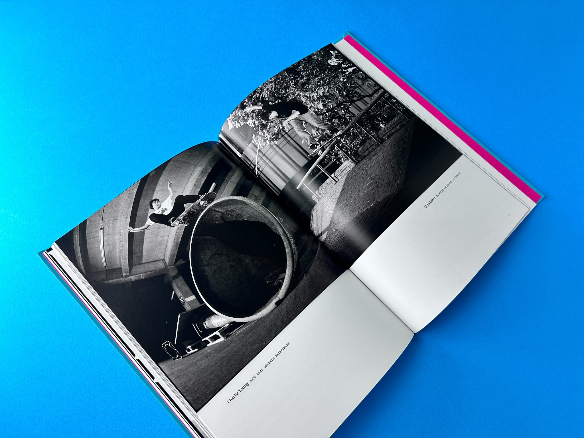
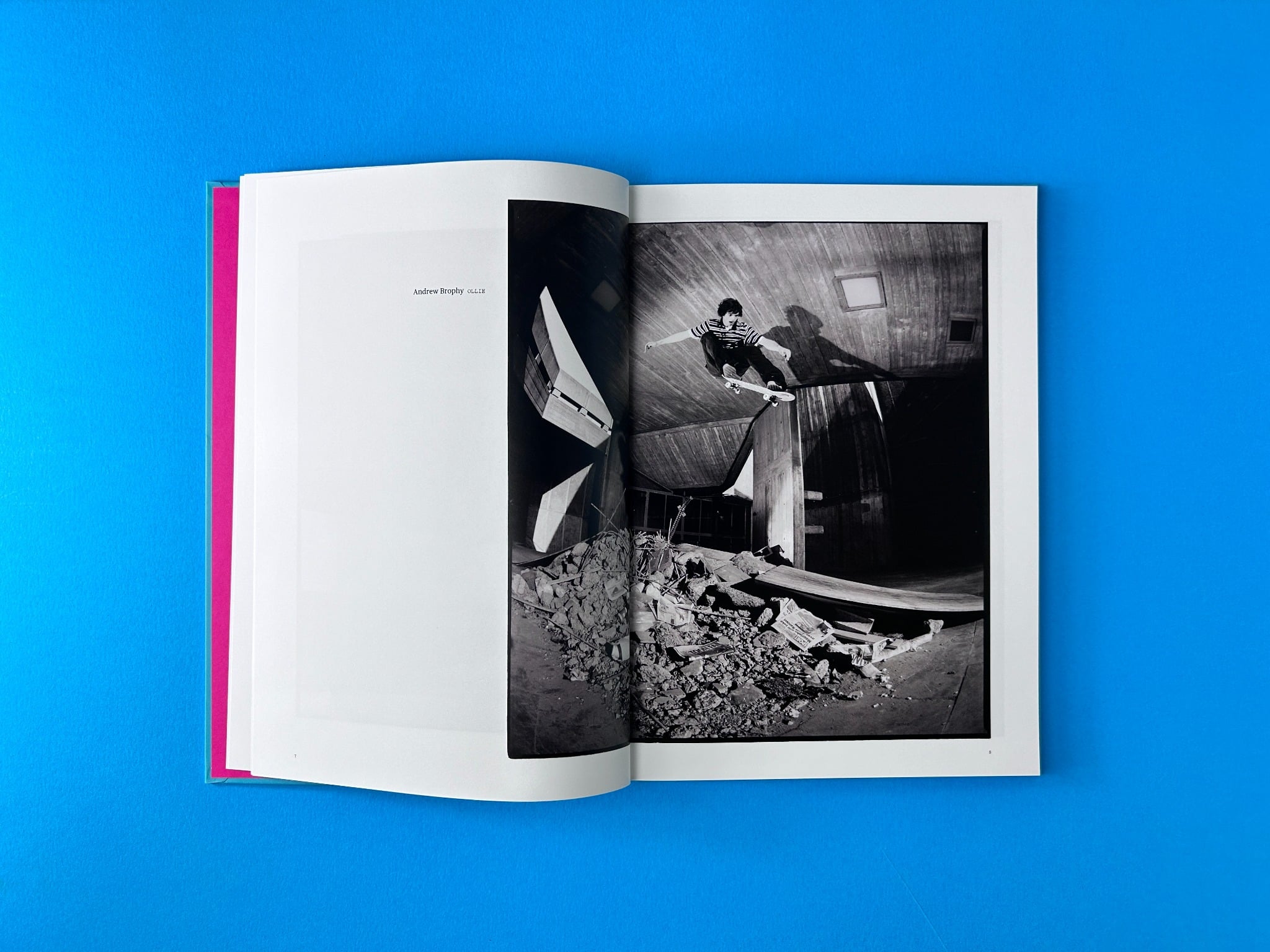
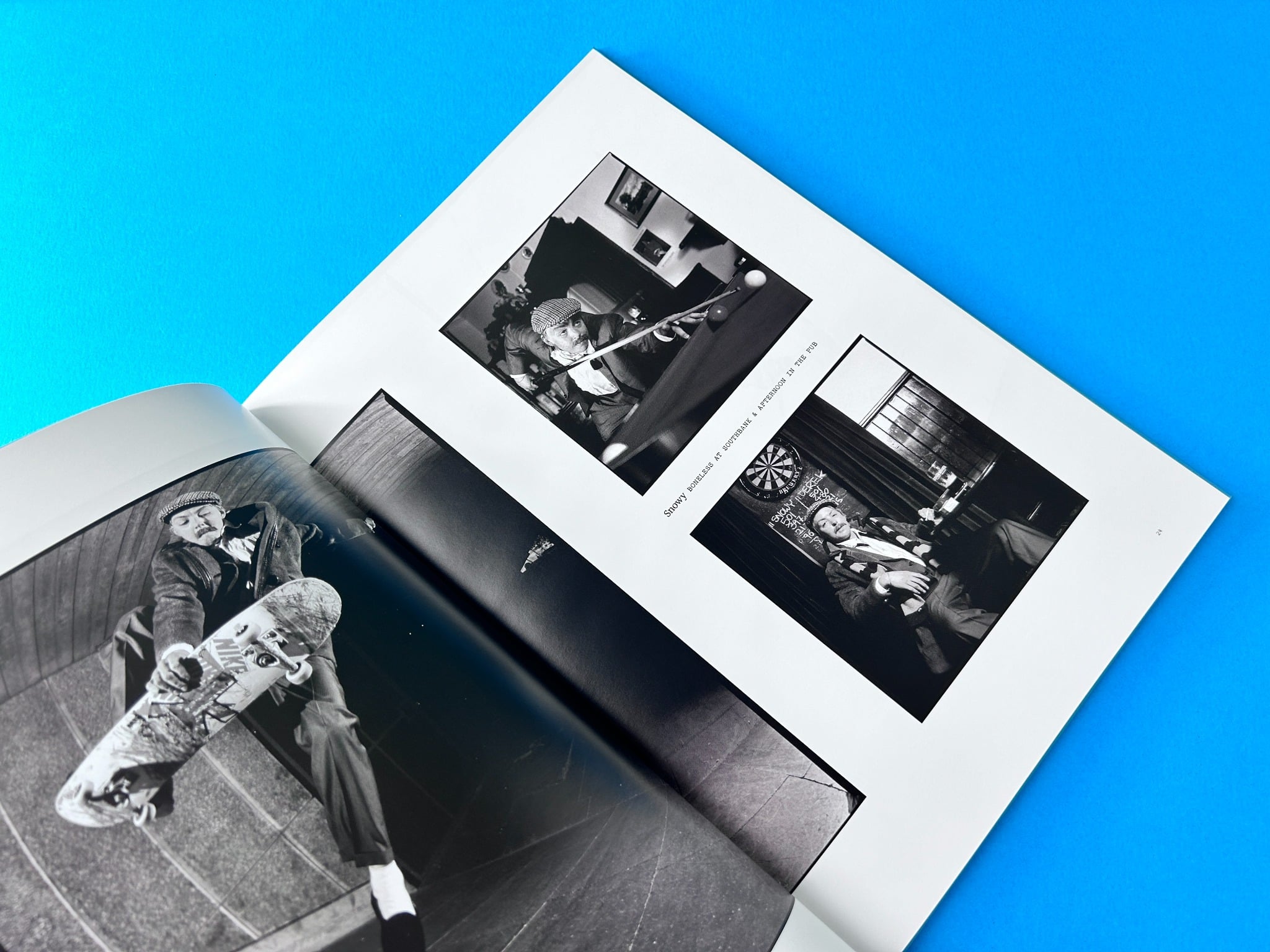
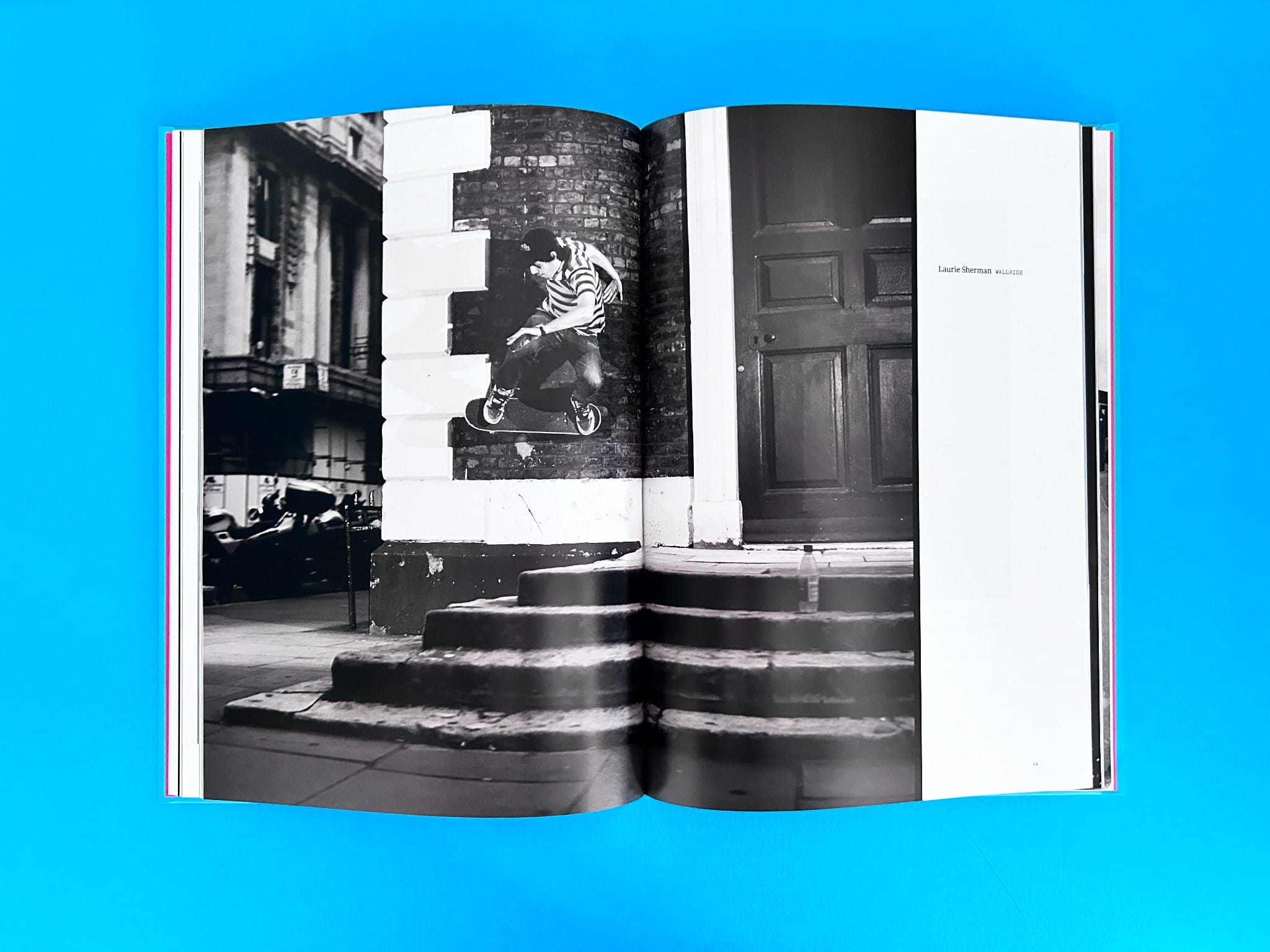
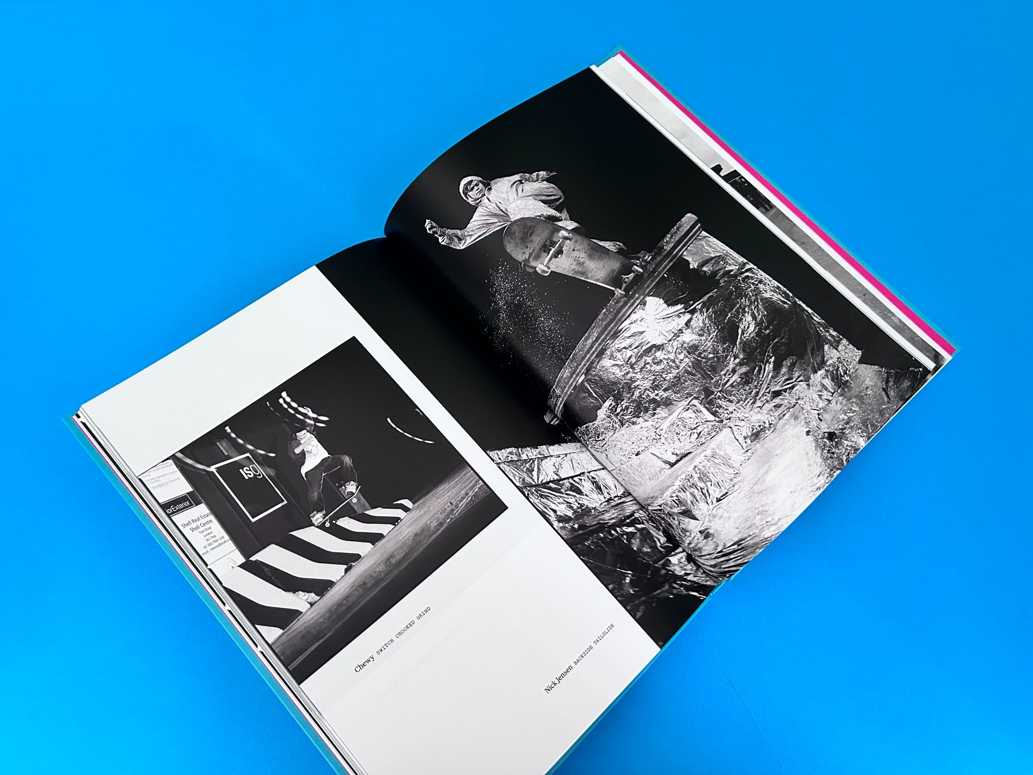
Inside, the layout remains consistent with the cover’s minimalist ethos, ensuring the photographs are the main focus. Pages are bordered with ample white space, offering the reader's eye space to absorb the detail in the action shots of skateboarders. Each black-and-white photograph is given full-page treatment, often with a simple caption such as the skater’s name and trick. This enhances the storytelling aspect by drawing attention to the skater and the movement captured, rather than overloading the pages with unnecessary text or distracting elements.
Photography and Content
The photography is a masterclass in movement and atmosphere. Dominic Marley’s choice to capture the grit and energy of skate culture in black and white adds a timeless quality to the images. The book creates an immersive experience with high-impact skateboarding shots, capturing not just tricks but the environments and personalities of the riders, lending authenticity to the work. The decision to shoot in black and white amplifies the tension and power of each image, creating a visceral sense of movement and texture.
In terms of layout, the variety of photo spreads—from full-page action shots to smaller montage formats—gives the book a dynamic flow, keeping the reader engaged. The use of black and white allows the action in each image to stand out sharply, while the overall consistency in tone and contrast across the photos gives the book a cohesive look.
Standout Production Values
The production choices for this book enhance its overall impact. Key details such as the anti-scuff laminated cover add durability, ensuring the book will maintain its sleek appearance even after extensive handling. The choice of FSC-certified silk paper for both the cover and interior ensures the tactile quality of the book is premium, while also making a statement about sustainability. These thoughtful choices highlight Ex Why Zed’s commitment to both quality and environmental responsibility, aspects that resonate with contemporary publishing values.
The addition of uncoated endpapers further elevates the tactile experience when opening the book, offering a contrast between the smoothness of the interior silk pages and the raw feel of the uncoated stock. The entire production is an ode to premium yet understated craftsmanship, showing how a restrained design can allow the content—specifically the stunning photography—to shine.
The book "Naughty" by Dominic Marley, with its clean lines, bold colour contrast, and expertly captured skateboarding moments, is a masterclass in how minimalism can elevate storytelling. Ex Why Zed’s expertise in production and thoughtful material choices clearly set this publication apart, merging style with sustainability in a package that resonates with both visual and tactile sensibilities.
The journey for Dominic Marley’s Naughty, a case-bound photographic book documenting his skateboarding history, began in February 2024. Dominic initially expressed concerns over rising costs in the print industry, seeking a solution that maintained premium quality without exceeding his tight budget. Having previously worked with Ex Why Zed on other projects like his Sportfolio series, Dominic trusted the company’s expertise. He was upfront about feeling overwhelmed and losing motivation for the book, which had stalled due to high printing costs. Nevertheless, Dominic remained passionate about seeing the project through and emphasised the need for high-end results to match the calibre of his photography.
Ex Why Zed’s Print Expert Mike responded swiftly, offering a quote and detailing the case-bound book specifications. Recognising the importance of cost, Mike suggested shifting to a smaller format to lower production costs without compromising the final output's quality. Throughout the process, Mike’s communication was detailed and transparent, offering multiple options while making Dominic feel confident that his project was in capable hands.
As the project moved forward, Dominic involved designer Justin Day, who was responsible for the book’s layout and cover design. Justin and Mike collaborated seamlessly to ensure the technical aspects, such as file preparation and colour profiles, were executed flawlessly. Mike shared Ex Why Zed’s file setup guides and colour profiles to ensure that Justin could optimise his designs, particularly the black-and-white photography that required the four-colour print process to maintain detail and contrast.
This collaborative spirit was vital as Dominic and Justin fine-tuned the book’s layout. At one point, the number of inside pages was adjusted to 148, and the endpapers were considered for printing. Even minor changes—such as shifting the type colour to something “wild” like pink—were handled efficiently. Dominic’s enthusiasm reignited when Mike reassured him by producing test runs to confirm the book's appearance, especially for critical elements like contrast and midtones in the photography. Mike’s proactive approach ensured Dominic’s trust was maintained, and issues like the effect of the four-colour process on black-and-white images were addressed through video explanations and sample proofs.
Throughout the process, Ex Why Zed’s team maintained clear communication, offering Dominic flexibility with deadlines and providing detailed insights into production. Issues such as artwork placement and ensuring bleed on the cover were handled quickly. When Dominic noticed two versions of the same print during the proof stage, Mike humorously explained that the press minder had simply run off extra copies due to excitement—an example of the close-knit, enthusiastic approach that characterised Ex Why Zed’s customer service.
The project culminated in a significant moment when Dominic viewed the final proof and expressed overwhelming gratitude, admitting he was emotionally moved by the result. This reaction is a testament to Ex Why Zed’s ability to not only meet but exceed client expectations, ensuring that every aspect of the final product—from the binding to the print quality—was perfectly executed.
Dominic’s enthusiasm was mirrored by his collaborators. Even his son, Sam, jumped in with excitement, acting as the “final approver” and giving his own thumbs up for the project’s completion. When Dominic received the physical copies of Naughty, his feedback was glowing. He praised Ex Why Zed’s work, claiming that the result exceeded his expectations. His emotional response—“WOW and simply WOW”—is a reflection of the journey’s success.
Dominic highlighted how critical Ex Why Zed’s transparency and expertise were throughout the process, and he even invited Mike to the book launch. His praise wasn’t just about the print quality but the support he received at every stage, from quotes and budget adjustments to proofs and final production. The project ended on a high note, with Dominic securing distribution for the book, crediting Ex Why Zed’s print video as a crucial tool for generating excitement around the project.
Dominic’s response is perhaps the most powerful testimony to Ex Why Zed’s impact on this project. He was not only impressed by the technical aspects of the print but emotionally touched by the final product. His feedback—“There is no way I can believe this, I’m not good enough to have a book like that”—reveals the deep connection between an artist’s vision and the realisation of that vision through quality printing. Ex Why Zed had facilitated a seamless and successful journey from concept to completion.
Dominic’s book launch was a success, and his satisfaction led to further collaborations, as he hinted at continuing his relationship with Ex Why Zed for future projects. His reaction, paired with the collaborative effort between Ex Why Zed, himself, and his designer, highlights how Ex Why Zed’s approach to customer service, high-quality production, and personalised solutions can leave a lasting impression.
The Naughty project stands as a testament to how Ex Why Zed’s expertise can transform a client’s vision into a stunning physical product, reinforcing their position as a go-to partner for bespoke and high-end publishing .
