Newspaper Design for Print Masterclass: Concept to Creation

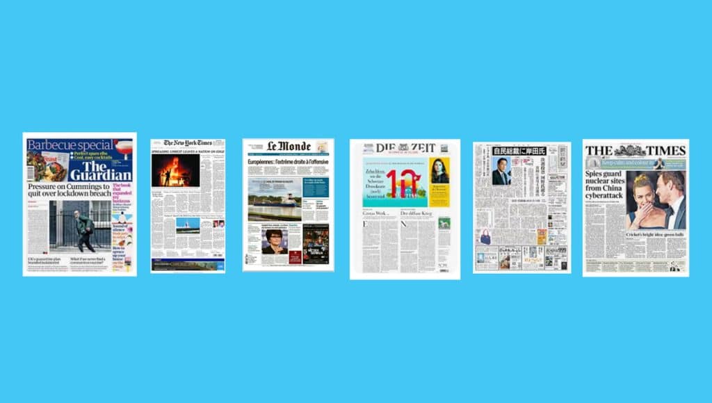
Welcome to your Newspaper Design for Print Masterclass – a gateway to the exhilarating world of newspaper printing! Dive deep into the art and science of crafting compelling newspapers that captivate and inform. Whether you're a budding designer or a seasoned pro, this masterclass will elevate your skills, transforming your ideas into print-ready masterpieces. Get ready to embark on a journey that melds creativity with technique, ensuring your newspaper printing projects stand out in a crowd. Let's turn those design dreams into tangible realities!
Ah, the allure of printing a newspaper! ?
When it comes to seeking inspiration, there are a few iconic names that immediately spring to mind. Let's dive into the world of newspaper printing and uncover the magic behind these iconic newspapers:

The Guardian (UK):
- Best At: Progressive journalism and modern design.
- Iconic Because: Over the years, The Guardian has been at the forefront of investigative journalism, often breaking stories that have global implications. Their commitment to truth and transparency has earned them a loyal readership.
- Graphic Design Standout: Their use of bold colours, innovative typography, and a modular grid system makes the content both accessible and engaging. The Guardian's design evolution, especially their digital transformation, showcases adaptability while maintaining brand identity.
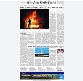
The New York Times (US):
- Best At: In-depth reporting and cultural commentary.
- Iconic Because: The NYT sets the gold standard for journalistic excellence. Their commitment to "All the News That's Fit to Print" has made them a trusted source for generations.
- Graphic Design Standout: A masterclass in minimalism. The NYT uses a consistent, clean layout with a focus on typography. Their use of photography is strategic, ensuring that visuals complement, not overshadow, the content.
Le Monde (France):
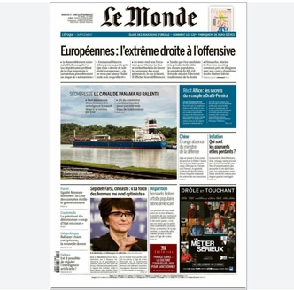
- Best At: Global news coverage with a French perspective.
- Iconic Because: Le Monde offers a unique blend of domestic and international news, making it a go-to source for readers worldwide.
- Graphic Design Standout: Their design exudes European sophistication. The use of white space, combined with elegant typography, gives the content room to breathe, making it a pleasure to read.
Die Zeit (Germany):
- Best At: Thought-provoking commentary and analysis.
- Iconic Because: As a weekly publication, Die Zeit dives deep into topics, offering readers a comprehensive view. Their editorial stance is often reflective, encouraging readers to think critically.
- Graphic Design Standout: A harmonious blend of traditional and modern. Their layouts often play with asymmetry, creating dynamic pages that captivate the reader's attention.

The Times (UK):
- Best At: Balanced reporting with a rich history.
- Iconic Because: With roots dating back to the 18th century, The Times has been a witness to history. Their legacy is built on journalistic integrity and a commitment to the truth.
- Graphic Design Standout: A nod to tradition with a contemporary twist. Their design is a seamless blend of classic elements, like their signature font, Times New Roman, with modern layout techniques.

Asahi Shimbun (Japan):
- Best At: Comprehensive news coverage with a focus on Asia.
- Iconic Because: Asahi Shimbun offers a unique East Asian perspective, making it an essential read for those interested in the region.
- Graphic Design Standout: Their design is a reflection of Japanese aesthetics – clean, orderly, and efficient. The use of grids ensures content is structured, while subtle design elements add a touch of flair.

In a world awash with publications, these newspapers have carved a niche for themselves through a combination of journalistic prowess and design excellence. Their ability to evolve while staying true to their roots is a testament to their enduring appeal. And, as we craft content in the style of Ex Why Zed, we can draw inspiration from these giants, ensuring our work is not just read, but remembered.
Taking A Design Lead from Winning Publications
Step aside, mainstream media, and make way for the unsung heroes of the print world! Dive into a realm where design meets storytelling in its most avant-garde form. These niche publications aren't just magazines; they're masterpieces, each page a canvas of creativity, innovation, and passion. As you embark on this journey, prepare to be enthralled by the genius of these under-the-radar gems. From the art of slow living to the intricacies of tech and humanity, you're about to uncover tales that resonate, designs that captivate, and content that leaves an indelible mark. Ready to be inspired? Let's turn the page!
- Best At: Global affairs, business, culture, and design.
- Why It's Striking: Monocle's design is the epitome of sophistication. With its matte paper finish, rich photography, and meticulous attention to detail, it's as much a collector's item as it is a magazine.
- Design Standout: The layout is clean, with a mix of long-form articles and bite-sized snippets. The use of infographics and illustrations adds depth to the content.

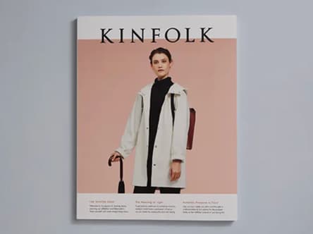
- Best At: Lifestyle, design, and slow living.
- Why It's Striking: Kinfolk is a celebration of minimalism. Its content delves into the art of living slowly and intentionally.
- Design Standout: The magazine is known for its serene photography and muted colour palette. The layout is spacious, allowing each element to shine.
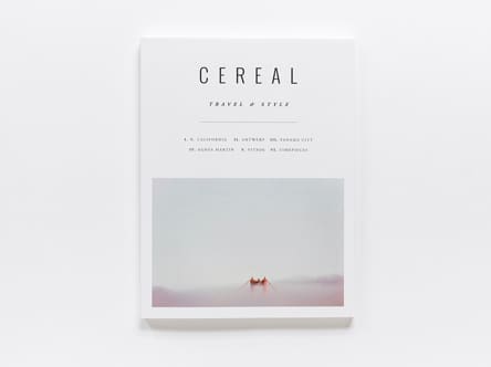
- Best At: Travel and style.
- Why It's Striking: Cereal is a visual treat. Each issue takes readers on a journey, exploring destinations through a unique lens.
- Design Standout: The use of white space is masterful, giving prominence to the stunning photography. The typography is understated, complementing the visuals.
- Best At: Food and culture.
- Why It's Striking: The Gourmand is a feast for the senses. It delves into the world of food, exploring its cultural and social implications.
- Design Standout: The magazine plays with layout conventions, often juxtaposing images and text in unexpected ways. The use of bold colours and quirky illustrations adds a touch of whimsy.

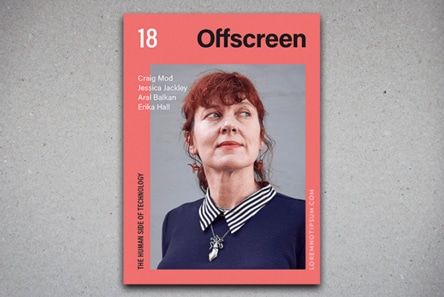
- Best At: Tech and humanity.
- Why It's Striking: In a digital age, Offscreen offers a tangible exploration of how technology impacts our lives.
- Design Standout: The design is clean and modern, with a focus on in-depth interviews and essays. The layout is structured, yet flexible, allowing for a seamless reading experience.
Each of these publications, in their own way, challenges the status quo. They're not just magazines; they're experiences.
3 Websites for Typographic Inspiration
Looking for font inspiration? Look no further than these three websites, which are overflowing with creative ideas for masthead design and newspaper page layout. Each site offers a unique perspective on typography and can provide you with fresh concepts to incorporate into your own designs. Whether you're looking for classic elegance or modern flair, these websites have something for everyone!
Creative Market Blog:
- Description: A platform that offers a collection of inspiring fonts and typographic ideas. An absolute dream of an archive to stumble across and fill your eyes with all manner of typographic styling.
- Description: Want to hone your typography skills? These sites will set you in the right direction. A resource-packed website with multiple pages dedicated to gorgeous typography and design resources.
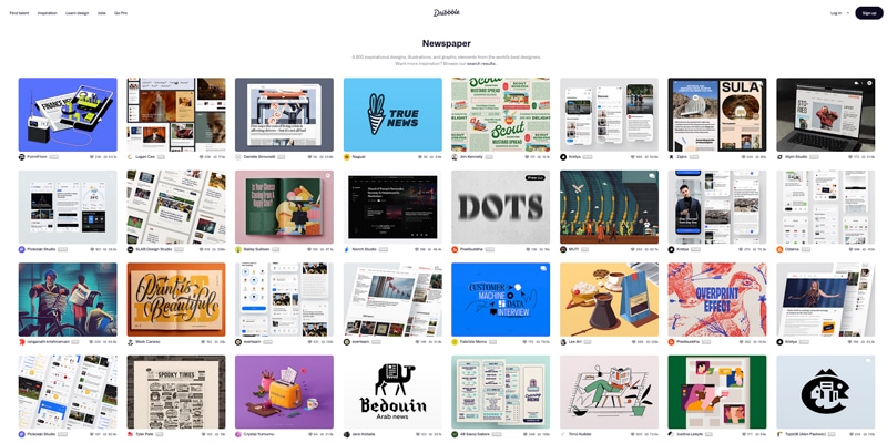
- Description: A treasure trove of thousands of examples of newspaper design, styling and winning ideas. Poor yourself a drink and enjoy scrolling through this encyclopedia or inspiration.
Each of these websites offers a unique perspective on typography and design, ensuring that you're equipped with a plethora of ideas and inspiration as you embark on your newspaper design journey.
Engage Your Audience With An Attention Grabbing Masthead
First up, what is a Masthead?
A masthead is a crucial element in the world of print and digital publishing. It refers to:
- Print Media: In print newspapers and magazines, the masthead typically refers to the section at the top of the front page that includes the publication's name, logo, and sometimes other details like the date, issue number, and key personnel. It's a distinct design element that helps establish the publication's brand and identity.
- Digital Media: In the context of websites, the masthead often refers to the header section, which includes the website's name, logo, and main navigation menu.
In essence, the masthead serves as a publication's visual signature, helping readers instantly recognize and connect with the brand. Mastheads are the crowning glory of any publication, often becoming as iconic as the content they represent. They form a newspaper template for all future issues - nail it one issue 1 and it is synonymous going forward.
10 Legendary Mastheads from Around the Globe
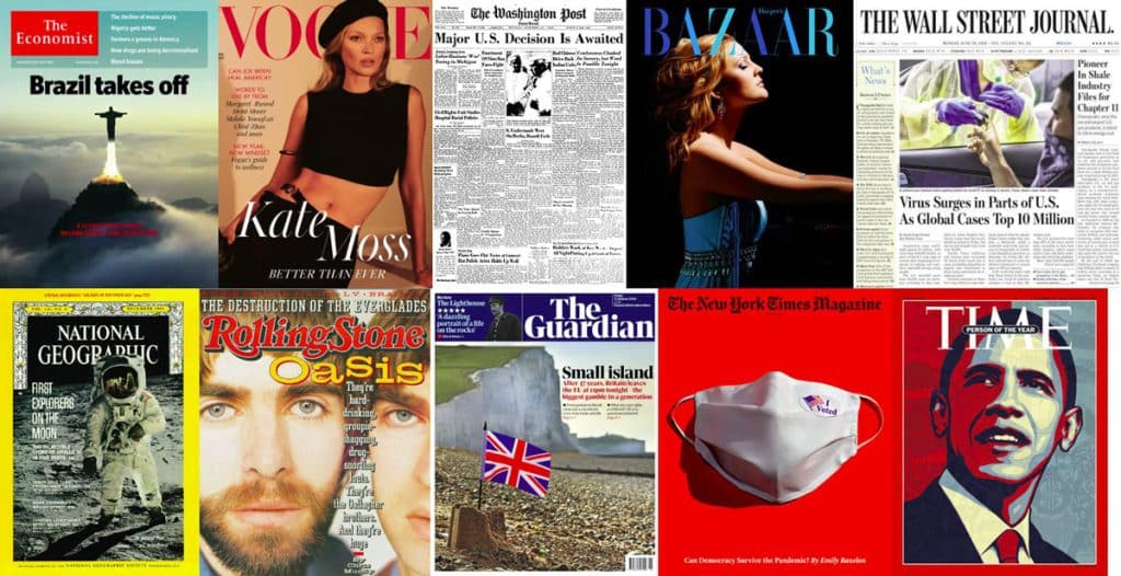
- Time: A weekly news magazine, its bold red border and simple typeface have made it instantly recognisable worldwide.
- Vogue: The fashion bible, its elegant and sophisticated masthead is synonymous with style and luxury.
- The New York Times: With its classic black and white design, this newspaper's masthead is a testament to its long-standing journalistic legacy.
- The Guardian: A modern and dynamic design, it reflects the newspaper's progressive and forward-thinking approach.
- Rolling Stone: Representing the world of music and pop culture, its masthead has a certain edginess and flair.
- National Geographic: Known for its iconic yellow border and simple typeface, it's a beacon for explorers and nature enthusiasts.
- The Wall Street Journal: A financial daily with a masthead that exudes authority and trustworthiness.
- Harper's Bazaar: Another titan in the fashion world, its masthead is sleek and chic, reflecting the magazine's high-fashion content.
- The Washington Post: A newspaper with a rich history, its masthead is both traditional and modern.
- The Economist: A weekly magazine that covers global affairs, its red and white masthead is bold and instantly recognisable.
Each of these mastheads has stood the test of time, evolving with their respective publications while maintaining their iconic status.
Typographic Styling for the Inside Pages
Capturing the attention of readers is the cornerstone of crafting the best-designed newspapers. The first step? Choosing the perfect typeface that not only meets the specifications of a printed newspaper but also infuses it with a unique character. Will you opt for the timeless elegance of a classic Serif, or venture into the contemporary realm with a Modern Sans-serif? Perhaps the titles on each page demand a bolder, more dynamic font that instantly draws the eye. The art of typography is more than just letters on a page; it's about creating a visual narrative that makes people pause, engage, and immerse themselves in the content. So, as you embark on this typographic journey, ask yourself: How will my choices ensure the newspaper doesn't just inform but also captivates?
Most Legible Fonts for Body Text:
Serif Fonts:
- Times New Roman: A classic choice, often used in print media.
- Georgia: Designed specifically for screen readability.
- Garamond: A timeless font, often used in book publishing.
Sans-serif Fonts:
- Arial: A clean and straightforward font, widely used in digital media.
- Verdana: Designed for clarity on computer screens.
- Helvetica: A popular choice for its neutral and clean design.
- Roboto: A modern font, designed for both print and digital.
Slab Serif Fonts:
- Rockwell: Its strong presence makes it easily readable.
- Courier New: A monospace font, often used for coding but also offers good readability in print.
Best Font Size for Designing Your Own Newspaper:
Body Text:
- Print: Typically, 10-12 points. However, for publications targeting older demographics, 12-14 points can enhance readability.
- Digital: 16px is often considered a readable standard, but it can vary based on the device and platform.
Headings:
- Print: Depending on the hierarchy, headings can range from 14 points (for subheadings) to 22 points or even larger for main headlines.
- Digital: 24px-32px for main headings, with subheadings slightly smaller, around 18px-22px.
Break convention and make your headings as large as you feel they need to be. They will certainly be more attention grabbing if you made the masthead 100pt and the interior headings over 40pt.
Additional Specifications and Tips:
- Line Spacing: Adequate spacing between lines, typically 1.2 to 1.5 times the font size, can significantly improve readability.
- Contrast: Ensure there's a good contrast between the text and the background. Black text on a white background is a classic choice, but other high-contrast combinations can work effectively.
- Column Width: For print, columns should be between 40-50 characters wide. For digital, 50-75 characters are optimal. This ensures the reader's eyes can easily move from one line to the next.
Download Your Fonts
Most of the fonts above can be found on legacy websites and are available for free download.
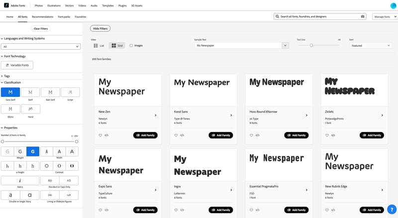
If you have a Creative Cloud Subscription, then full 20,000 choices in the Adobe Fonts library can be used for both personal and commercial projects.
Printing Your Newspaper from PDF
Ultimately we need a high res PDF to make and print your newspaper. Most, if not all design programs from Microsoft Word to Adobe InDesign can Save as PDF or Export to PDF. Once your design is finished, you are just a couple of clicks from a print-ready PDF.
What are the key elements of good newspaper design for print?
The key elements of good newspaper design for print include a clear and visually appealing layout, legible typography, proper use of headlines and subheadings, effective use of images and graphics, consistency in design elements, and attention to detail in spacing and alignment.
Immerse Yourself In Design Inspiration
Remember, the journey to print your own newspaper is as much about absorbing inspiration as it is about execution. By immersing oneself in diverse sources of knowledge and creativity, one can ensure that their publication isn't just another piece of print, but a testament to the power of design and storytelling.
Ah, the quest for creative inspiration! Before diving headfirst into the newspaper design and print journey, it's essential to immerse oneself in a myriad of sources to truly grasp the art and science of it all. Here's a curated list to fuel that creative fire:
Typography Workshops:
Typography is the backbone of any print publication. Engage in workshops or online courses to understand font pairings, hierarchy, and the nuances of type design.
Historical Archives:
Delve into the archives of renowned libraries or online platforms. Exploring vintage newspapers and magazines can offer a wealth of design inspiration and a lesson in evolution.
Design Books & Journals:
Publications like "Designing News" by Francesco Franchi or "The History of Graphic Design" can provide insights into the ever-evolving world of design.
Digital Design Platforms:
Websites like Behance, Dribbble, or Awwwards showcase cutting-edge design work from around the world, offering a fresh perspective and modern inspiration.
Art Galleries & Exhibitions:
Art movements have often influenced design trends. Exploring galleries can provide a broader understanding of colour, composition, and visual storytelling.
Cultural Immersion:
Attend local events, festivals, or even travel. Experiencing different cultures can offer unique design perspectives and storytelling techniques.
Feedback Sessions:
Engage with fellow designers or potential readers. Regular feedback can refine your design approach, ensuring it resonates with your target audience.
Sustainability in Print:
With a growing emphasis on eco-friendly practices, understanding sustainable printing methods and materials is crucial.
Digital Mockups & Prototyping:
Before going to print, use digital tools to prototype your newspaper. This allows for iterative design tweaks and ensures the final product aligns with your vision.

