A5 Books
4pp Cover onto 250gsm Silk
Gloss Lamination to outer
166pp Text onto 170gsm Silk
Four colour print throughout
Perfect bound
Book Overview & Aesthetic: "Punk as F*ck," authored by Micky Cassidy, captures the raw, unfiltered spirit of the Belfast punk scene between 1978 and 1982. The book's design is a visual ode to the anarchic and rebellious ethos of the punk movement, blending memoir with photography to create an immersive experience for readers. From the cover to the interior layout, the book feels like a gritty, heartfelt homage to a bygone era of loud, unapologetic self-expression.
Binding Type & Material: The book is perfect bound, offering a sleek and professional finish that suits the standard A5 size. The binding choice aligns well with the need for durability, given the relatively thick 166-page count, ensuring that the book remains intact despite frequent use. The perfect binding also adds to the book's aesthetic appeal, giving it a polished edge, ideal for display on bookshelves.
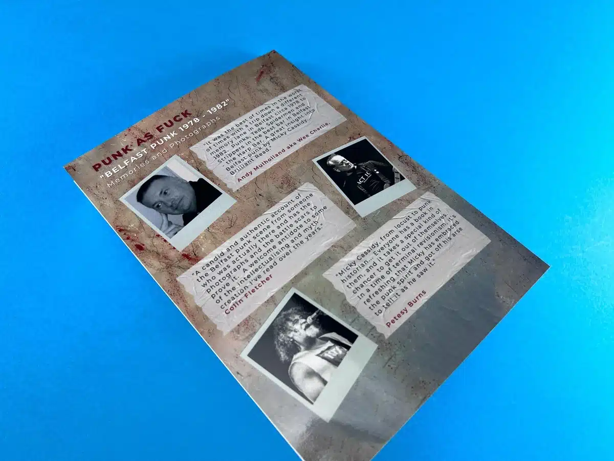
Cover Design: The cover sets the tone immediately. It uses a grunge texture that simulates distressed concrete, with the title presented in a typewriter-like font that seems deliberately worn, resembling graffiti or a DIY punk zine. This visual choice reinforces the rough, rebellious essence of punk culture. The subtle gloss lamination on the 250gsm Silk cover provides a slight sheen, which enhances the vivid red accents, drawing attention without overwhelming the overall rawness of the design.
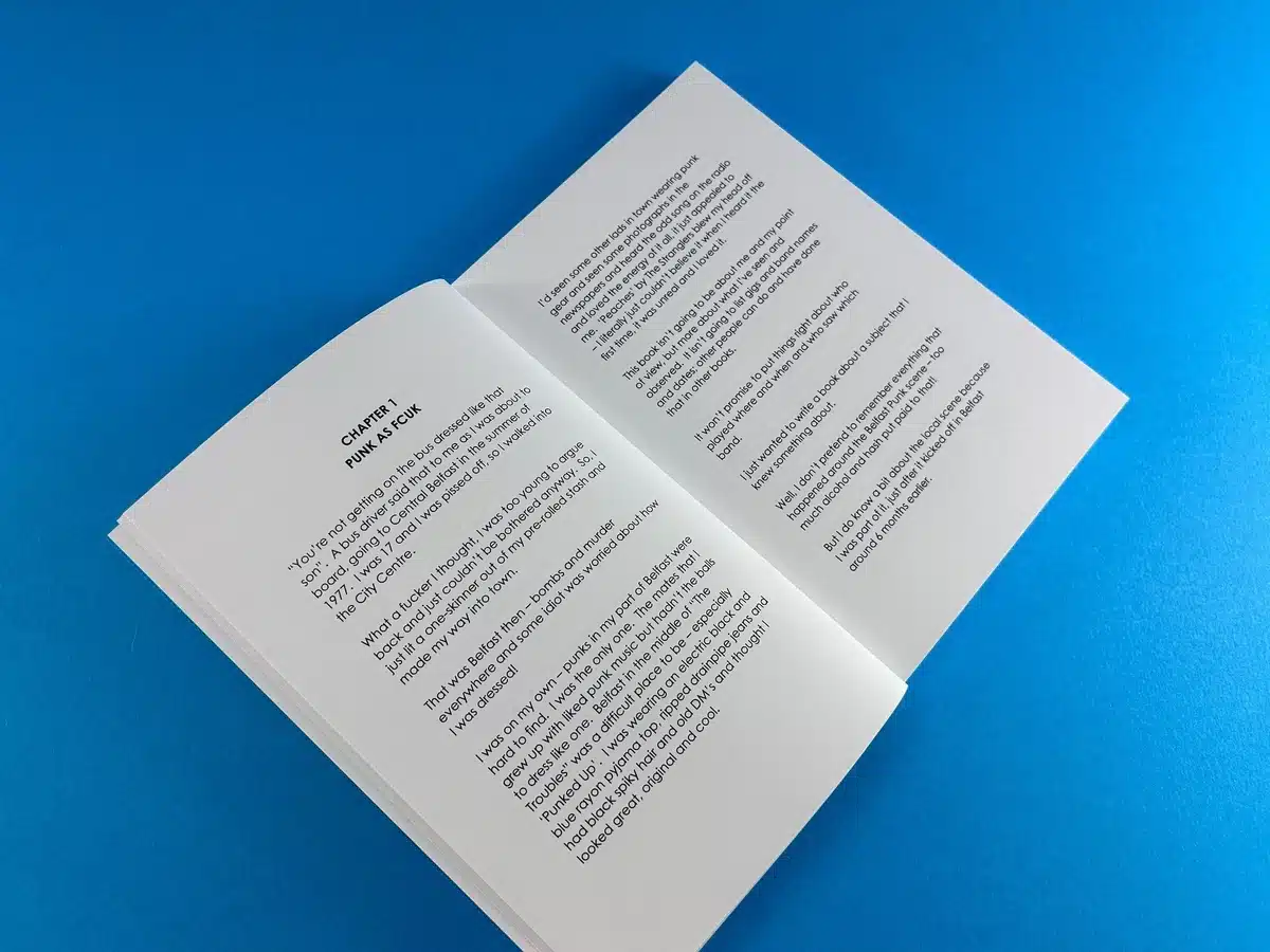
Typography & Layout: Internally, the typography is simple and readable, but not without character. The choice of typeface mirrors the cover's typewriter style, which feels nostalgic yet timeless, bridging the gap between personal memoir and historical documentation. The clean, straightforward layout ensures that the text is accessible, maintaining clarity while still evoking the chaotic punk atmosphere. Each chapter starts with a bold, centred heading, keeping a consistent structure throughout the book. This structure ensures that readers can navigate the content easily without disrupting the flow of the narrative.
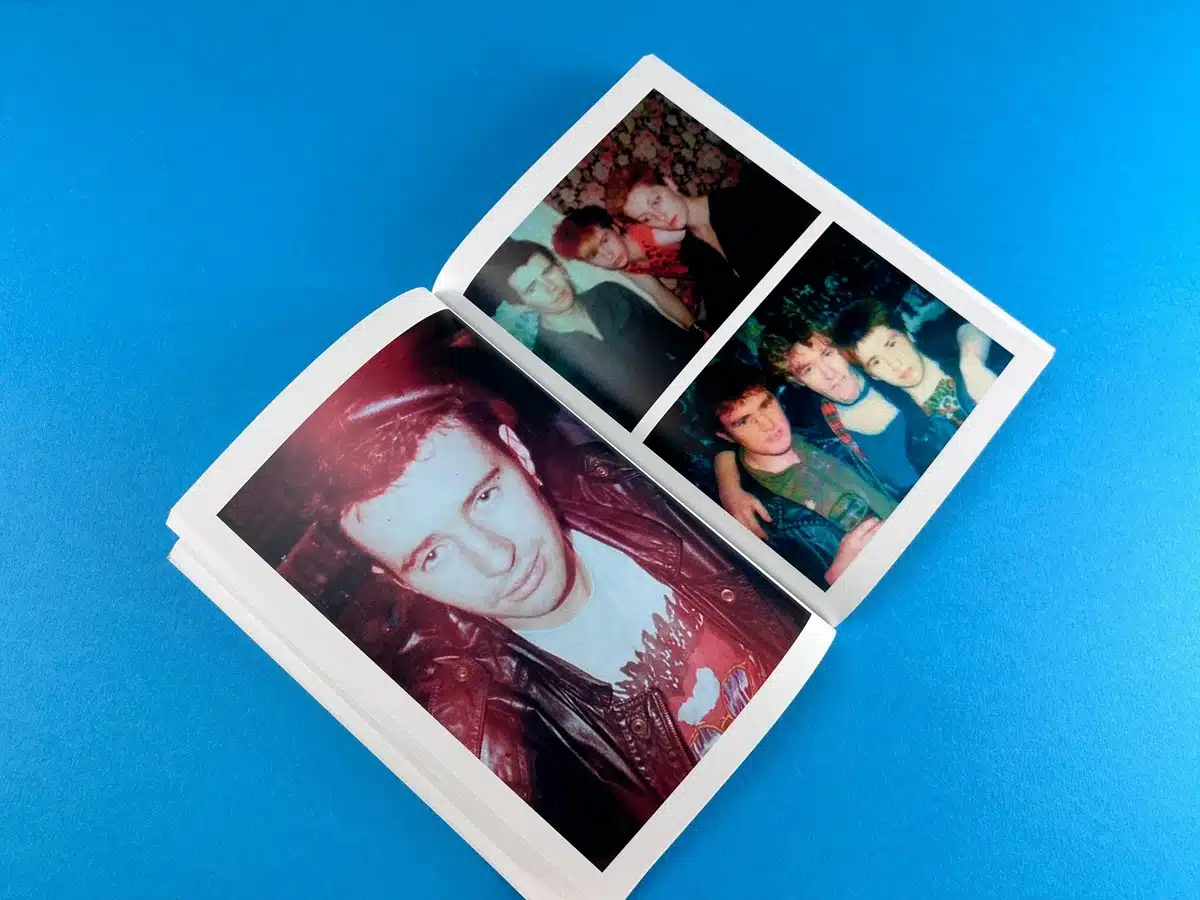
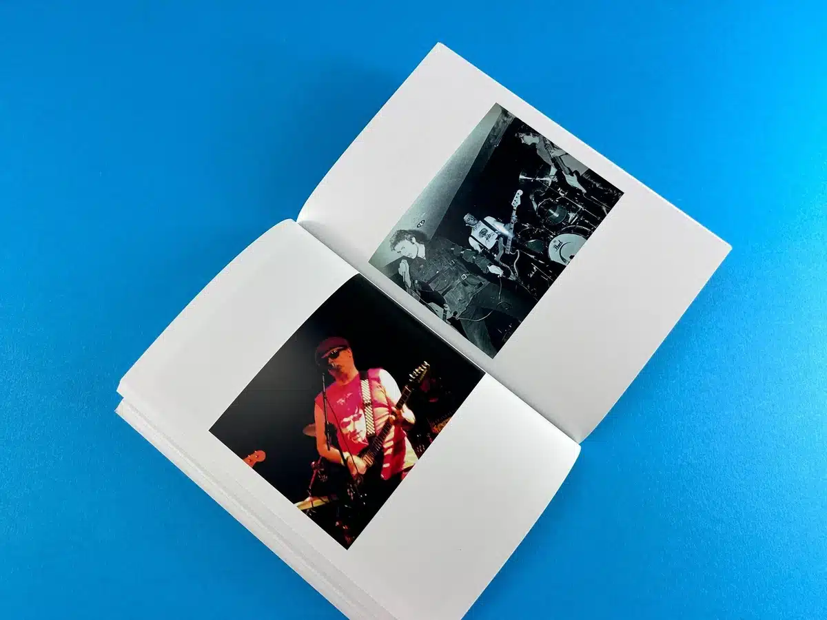
Use of Colour & Imagery: The interior’s four-colour print throughout is a highlight, particularly in the way it brings Micky Cassidy's photographs to life. Vibrant images of bands, friends, and punk gatherings are interspersed with black-and-white shots, adding visual rhythm to the book. The colour choices capture the vibrant chaos of punk gigs, with dark, moody tones that convey the raw energy of the era. The decision to use 170gsm Silk for the text pages ensures that the images maintain a high-quality finish, with sharp details and no bleed-through, even on the full-colour pages.
Design Effectiveness: Overall, the design's effectiveness lies in its ability to transport readers back to the late '70s and early '80s. The combination of textured typography, thoughtful use of colour, and striking images creates an evocative, almost tactile sense of nostalgia. It feels personal, as if readers are thumbing through a scrapbook of memories, inviting them into the scenes captured by Micky Cassidy. The book successfully blends narrative and visual elements, offering a comprehensive look at a unique cultural period.
The design choices in "Punk as F*ck" reflect a sophisticated understanding of the punk era, embracing both the grunge and the glamour of that scene. By leveraging thoughtful material selections and strategic design, Ex Why Zed has helped Micky Cassidy present his memories with striking clarity and nostalgic appeal, making this book a vibrant chronicle of Belfast's punk history.
From the initial concept to the final delivery, the production of "Punk as F*ck" was a journey of collaboration, creativity, and meticulous attention to detail. Our work with Micky Cassidy exemplified the dedication of Ex Why Zed to bringing a unique vision to life, ensuring that every aspect of the book reflected the raw energy of Belfast's punk scene.
Initial Consultations: Establishing the Vision The journey began with Micky reaching out to us, seeking advice on how to bring his vivid memories of the punk era into a tangible form. Our first discussions centred on the print specifications and initial artwork Micky shared. As he collaborated with a graphic artist, Micky wanted to ensure that the final product stayed true to the punk aesthetic—bold, raw, and impactful. This was clear from his initial query, asking for guidance on suitable fonts and templates for the artwork setup.
To ensure the book's visual integrity, we proposed a heavier 170gsm Silk for the interior pages, coupled with a 250gsm Silk cover enhanced with gloss lamination. This setup provided a polished yet durable finish, echoing the raw yet refined energy of the punk movement. The cover templates we shared were designed to streamline the process, allowing Micky’s graphic artist to craft the perfect layout.
Overcoming Challenges: File Setup and Quality Assurance File preparation is crucial, and early on, it became evident that some of the images in the book were of lower resolution, a common issue when dealing with photographs over 40 years old. We flagged this potential issue to Micky and his team, explaining that images under 100dpi might appear pixelated and urging them to provide higher resolution alternatives or consider reducing the size of certain images to maintain clarity.
Colin Fletcher, assisting Micky, engaged in several discussions with us to address these concerns. While we suggested ways to improve image quality, including resizing or sourcing higher-resolution images, we also respected their decision to keep the photographs as authentic as possible, even if it meant some imperfections. "It might add character to the book," we advised, allowing the decision to rest with Micky while ensuring they were aware of the possible outcome.
Customising Solutions: Adapting to Client Needs The collaboration continued with discussions on the cover's spine size, as adjustments were needed to ensure a seamless finish. Our team worked closely with Colin to refine these details, providing a template that accommodated changes. Although it required rebuilding the cover, the end result was a precise fit that maintained the book's aesthetic balance.
Despite the challenges, including a busy holiday season and some last-minute text corrections, we maintained constant communication with Micky and his team, ensuring the project proceeded smoothly. We provided proofs for review, making sure that Micky had the opportunity to make any final adjustments before committing to print.
Final Checks and Going to Press Once all files were finalised, we conducted a preflight check to catch any potential issues before production. Micky, keen to ensure everything was perfect, even opted for a test print, allowing him to see a physical copy and confirm the visual quality. This extra step, though it extended the timeline slightly, exemplified our commitment to customer satisfaction—no detail was too small, and every effort was made to align with Micky’s vision.
With the final go-ahead, we moved the book to production, carefully managing the print process to ensure high-quality results. Each book was printed, trimmed, and perfectly bound, ready for distribution. On January 13th, the books were shipped, ensuring timely delivery to Micky and his associates.
Client Feedback and Project Impact The success of "Punk as F*ck" was evident not just in its completion but in the reception it received. Micky was thrilled with the final product, and the collaboration has paved the way for potential future projects. His gratitude was clear when he confirmed the final order, appreciating our patience, expertise, and dedication throughout the process. The book’s release also garnered attention from various media, reflecting the widespread appeal of its content and design. Reviews highlighted how well the design choices captured the essence of the punk era, a testament to the careful print decisions made during the project.
The production of "Punk as F*ck" demonstrated the strengths of Ex Why Zed in delivering high-quality, customised print solutions. Our ability to navigate design challenges, provide expert guidance, and maintain clear, supportive communication throughout the process ensured that Micky Cassidy's vision was realised in a way that honoured the spirit of Belfast's punk history. The final product was more than just a book; it was a tangible piece of cultural nostalgia, brought to life through a partnership defined by creativity, respect, and craftsmanship.
The collaborative print journey of "Punk as F*ck" encapsulates how Ex Why Zed excels in producing projects that are not only visually striking but also true to the client’s vision. By leveraging our print expertise, clear communication, and adaptability, we helped Micky Cassidy bring his punk memoir to life. The book stands as a testament to the unique, nostalgic character of Belfast's punk scene, made possible through the thoughtful and strategic print solutions we provided.


