


Key Highlights
- Print and screens render images differently, using ink versus emitted light
- Resolution and DPI directly impact print sharpness, not screen clarity
- Colour shifts are expected due to the RGB to CMYK conversion and paper choice
- Print quality excels in longevity and physical impact, not immediacy
- Most screen-to-print issues stem from poor preparation, not printing faults
- Ex Why Zed helps translate digital designs into reliable, high-quality print
Have you ever designed something that looked sharp and vibrant on your screen, only to feel disappointed when the printed version arrived? Colours shift, details soften, and the final result does not match what you expected. This disconnect is a common frustration for designers, marketers, and brands working in a screen-first environment.
The challenge lies in understanding that digital displays and printed materials behave very differently. Screens use light to display colour, while print relies on ink and surface interaction. Without understanding these differences, even well-designed visuals can appear flatter, less accurate, or inconsistent when printed.
This guide explores the real differences between print quality and digital image quality. It explains why these changes happen, how printing methods affect results, and what steps you can take to ensure your designs translate accurately and confidently into high-quality printed materials.


What Is the Difference Between Print Quality and Digital Screen Quality?
Print quality and digital screen quality are built on two fundamentally different systems. Print quality is created by ink applied to a physical surface, while digital screen quality is produced by light emitted through pixels. Because one reflects light and the other generates it, the way colour, contrast, and sharpness appear will always differ.
This difference sits at the centre of the print quality vs digital screens conversation. What looks vibrant on a screen may appear softer or flatter in print, not because of an error, but because each medium interacts with light in a completely different way.
Why Does Print Look Different From Digital Screens?


The gap between print and screen is not caused by poor design or printing alone. It comes from how the human eye interprets light, colour, and texture across digital and physical surfaces.
Screens produce their own light, pushing colour directly toward the viewer. Print depends on the surrounding light reflecting off the ink and the material. This single distinction changes how intensity, contrast, and detail are perceived.
In practice, this means:
- Screens naturally appear brighter and more saturated
- Printed colours are influenced by lighting conditions
- Fine details behave differently across materials
1. Light Emission on Screens vs Light Reflection in Print
Digital screens rely on backlighting to enhance visibility. This makes colours feel more vivid, and contrast appears stronger, even at lower resolutions.

Print works differently. Ink absorbs and reflects light based on:
- Ink density
- Paper or substrate colour
- Surface finish
As a result, printed designs often appear more natural and restrained compared to their on-screen versions. This difference is a key reason why print quality vs digital screens cannot be judged by brightness alone.
2. Material Texture and Surface Finish Effects
Print quality is also shaped by the physical surface it sits on. Unlike screens, print interacts directly with texture and coating, which affects how ink spreads and how light is reflected.


Common material influences include:
- Glossy finishes, which reflect more light and enhance contrast
- Matte finishes, which diffuse light and soften colours
- Textured papers, which can reduce sharpness but add tactile value
These material factors play a major role in how print is perceived, helping explain why the same design can look different across various print formats when comparing print quality vs digital screens.
Ultimately, print and screens are designed to do different things. Understanding these physical and visual differences is the first step toward setting the right expectations and achieving better results when moving from screen to print.
How Do Resolution, DPI, and PPI Affect Print Quality vs Screens?
Resolution is one of the most misunderstood factors when comparing print quality vs digital screens. Many print quality issues happen because designs are evaluated based on how sharp they look on a screen, without considering how those same files behave when converted into physical print.
To avoid quality loss, it is important to understand how DPI and PPI function differently in print and digital environments.

What DPI Means for Print Sharpness?
DPI, or dots per inch, controls how much ink detail is placed within a printed area. Higher DPI allows finer detail, cleaner edges, and sharper text, especially for small or intricate designs.
In practical print use:
- 300 DPI is the standard for most professional print viewed at close range
- Lower DPI is often acceptable for large-format prints, as they are designed to be viewed from a distance
DPI directly affects the clarity and precision of the final printed output.
Why Screen Resolution Does Not Translate to Print?
Screens rely on PPI, or pixels per inch, which measures pixel density rather than ink density. A design that looks sharp on screen at 72 or 96 PPI may still lack the detail required for high-quality printing.
When files are not adjusted for print:
- Fine details can appear soft or blurred
- Text edges may lose definition
- The final print may feel less sharp than expected
This disconnect explains why print quality vs digital screens comparisons often lead to disappointment when files are prepared only for digital display.
By treating screen resolution and print resolution as separate requirements, brands can significantly improve print consistency and overall output quality.
Why Do Colours Change From Screen to Print?


Colour shift is one of the most noticeable differences when comparing print quality vs digital screens. In most cases, this shift is not caused by printing errors. It happens because screens and print rely on entirely different colour systems and materials to reproduce colour.
RGB vs CMYK: Why Screen Colours Do Not Always Print the Same?
Digital screens create colour using RGB light, combining red, green, and blue at varying intensities. Print relies on CMYK ink, layering cyan, magenta, yellow, and black on a physical surface.
Because these systems work differently:
- Certain bright or highly saturated screen colours fall outside the printable CMYK range
- Colour conversions compress or adjust values to fit print limitations
- Designs that look vibrant on screen may appear more muted in print
This conversion gap explains many colour mismatches between digital previews and printed output.
How Paper and Ink Influence Final Colour?
Unlike screens, print output is shaped by the material it is printed on. Ink reacts differently depending on surface properties, which directly affects colour depth and contrast.
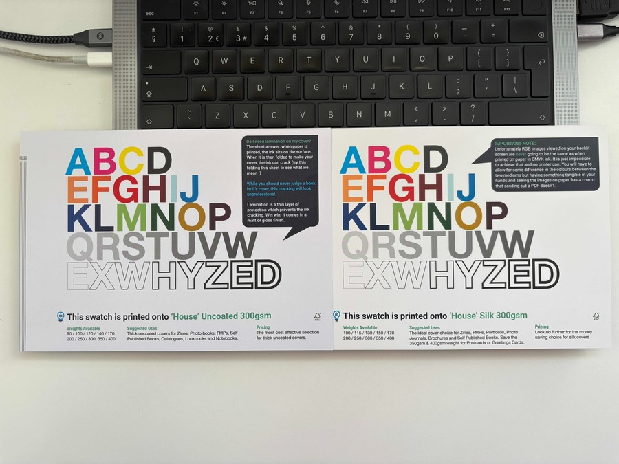
Key material factors include:
- Paper coating: Coated stocks retain colour and sharpness, while uncoated papers soften tones
- Ink absorption: Highly absorbent fibres pull ink inward, reducing vibrancy
- Surface texture: Rough textures scatter light, changing how colour is perceived
These physical interactions play a major role in how print quality vs digital screens ultimately compares.
Colour differences are a natural result of light-based screens and ink-based materials working within different physical limits.
Is Print Quality Better Than Digital Screens?
Print quality is not inherently better or worse than digital screens. The difference comes down to context, environment, and intent. When comparing print quality vs digital screens, each medium delivers strengths that suit specific use cases rather than competing on a single definition of quality.
To understand this clearly, it helps to compare how each medium behaves visually and physically.
| Criteria | Print Quality | Digital Screens |
|---|---|---|
| Image formation | Ink applied to physical materials | Light emitted through pixels |
| Perceived sharpness | Influenced by DPI and viewing distance | Enhanced by backlighting |
| Texture | Tangible and tactile | Flat |
| Consistency | Dependent on the material and print process | Dependent on device settings |
| Longevity | Designed to last | Limited by device lifespan |
| Emotional impact | Permanent and deliberate | Immediate and dynamic |
This comparison shows that print quality vs digital screens is not a question of superiority, but of suitability.
Where Digital Screens Perform Better?
Digital screens are strongest when speed and flexibility are required. Content can be updated instantly, shared widely, and adapted in real time. High brightness and contrast make screens especially effective for:
- Presentations and live demonstrations
- Video and animated content
- Short-term or rapidly changing information
In these scenarios, screens deliver clarity and impact with minimal delay.
Where Print Quality Excels?
Print performs best when physical presence and longevity matter. Unlike screens, printed materials do not rely on power, devices, or settings to be experienced. In the context of print quality vs digital screens, print often feels more intentional and credible, particularly for:
- Brochures and marketing collateral
- Packaging and product labels
- Signage and branded environments
Because print is tangible and lasting, it often leaves a stronger impression and reinforces brand trust in ways digital formats cannot fully replicate.
The choice between print quality and digital screens is not about which looks better, but which fits the message, setting, and audience. The strongest results come from understanding how each medium works and using it with intention.
Digital Printing vs Screen Printing Quality: Which Is Better?
When comparing digital printing vs screen printing quality, the difference is less about overall superiority and more about what kind of quality the project demands. Each printing method is built to prioritise specific outcomes, whether that is fine detail, production efficiency, or long-term durability.
In practical terms, the choice often comes down to a few key quality drivers:
- Level of detail required: Digital printing handles fine text, gradients, and complex visuals more accurately
- Durability expectations: Screen printing produces thicker ink layers that last longer under wear
- Print volume and flexibility: Digital printing suits short runs and variable designs, while screen printing favours consistency at scale
Understanding these factors helps avoid mismatched expectations and ensures the chosen method aligns with the intended use of the printed material.
| Aspect | Digital Printing | Screen Printing |
|---|---|---|
| Detail reproduction | High, suitable for intricate designs | Moderate, best for simple graphics |
| Colour gradients | Smooth and consistent | Limited |
| Ink thickness | Thin | Thick |
| Durability | Moderate | High |
| Setup cost | Low | Higher |
| Best suited for | Short runs and detailed designs | Bold, long-lasting prints |
This approach keeps the comparison focused on quality outcomes rather than treating one method as universally better.
Does Print Quality Still Matter in a Screen-First World?
Even in a digital-first environment, print quality vs digital screens remains an important consideration for brands that care about perception, trust, and long-term impact. Print serves a different purpose than screens, rather than competing directly with them.
1. Print as a Signal of Trust and Professionalism
Printed materials often communicate intent and investment. High-quality print suggests:
- Attention to detail
- Brand confidence
- Long-term commitment
This is why print continues to play a strong role in packaging, signage, and corporate communications.
2. Print for Longevity and Brand Recall
Screens are temporary by nature. Printed pieces stay visible, get handled, and remain in physical spaces over time. A well-produced print item:
- Outlasts a single viewing session
- Creates tactile engagement
- Reinforces brand memory through repeated exposure
This durability gives print a lasting advantage in brand recall, even alongside digital channels.
Print remains relevant because its physical presence creates a lasting impact that screens cannot replicate.
What Are the Most Common Screen-to-Print Mistakes?


Many challenges linked to print quality vs digital screens are caused by preventable decisions during the design and preparation stage. When digital designs are moved straight to print without adjustment, differences in colour, sharpness, and clarity become more noticeable.
1. Designing Only for Screens
Designs created solely for digital viewing often fail to translate well into print. Working in RGB colour mode, relying on screen brightness, and ignoring print scale can lead to muted colours and loss of detail once ink is applied to physical materials.
2. Using Low-Resolution Assets
Images that look sharp on screen may not contain enough detail for print. Without sufficient DPI, printed visuals can appear soft or pixelated, especially in close-view applications such as brochures or packaging.
3. Ignoring Print Materials and Finishes
Paper type, coating, and surface texture significantly influence how ink behaves. Matte, gloss, and uncoated materials all affect colour depth and contrast differently, making material selection a key factor in print quality.
4. Skipping Proofing and Print Tests
Relying only on digital previews removes an important quality checkpoint. Without physical proofs, colour shifts, alignment issues, and layout inconsistencies often go unnoticed until final production.
5. Overlooking Viewing Distance and Usage
Print is experienced in real-world environments, not on backlit screens. Large format signage, handheld materials, and packaging all require different resolutions and design considerations based on how and where they will be viewed.
Addressing these common mistakes early helps reduce the gap between digital designs and printed results. With proper preparation and experienced print guidance, brands can achieve consistent outcomes across both media.
How Ex Why Zed Helps Bridge the Gap Between Screen and Print
Bridging print quality vs digital screens takes more than technical setup. It requires a print partner that understands creative intent, production limits, and real-world output. This is where the right production expertise makes a measurable difference.
Ex Why Zed stands out:
- Specialists focus on books, zines, catalogues, and art-led print projects
- Deep experience working with designers, publishers, and creative studios
- Colour managed workflows tailored to each project rather than one-size settings
- In-house proofing and test runs to validate colour, detail, and finish before production
- Wide paper stock and binding options curated for visual and tactile quality
- Support for short runs, limited editions, and complex print specifications
- Hands-on project guidance from file prep through final delivery
By combining creative sensitivity with production expertise, Ex Why Zed helps ensure digital designs translate into print that feels intentional, consistent, and true to the original vision.
Contact us to discuss your print project and get expert guidance on moving from screen to print.
Final Thoughts
Print quality vs digital screens is not about choosing one medium over the other, but understanding how each behaves and where expectations often break down. Screens rely on light and immediacy, while print depends on ink, materials, and physical interaction.
By accounting for resolution, colour systems, materials, and viewing conditions early, brands can avoid costly mistakes and achieve reliable, high-quality print results that reflect their original design intent.
Frequently Asked Questions
Why do my print colours not match what I see on screen?
Print uses CMYK ink, while screens display colour using RGB light. Screens can show brighter colours that ink cannot reproduce. Designing in CMYK and reviewing physical proofs helps reduce unexpected colour differences in print.
What is the best file format for sharp print quality from digital images?
High-quality PDF files deliver the best print results. JPEG and TIFF can be used if saved at maximum quality to avoid compression-related detail loss before being dropped into Adobe InDesign or Affinity Publisher to layout and export as PDF.
Can I achieve professional print results at home?
Good home print results are possible with a high-quality printer, correct ink, and premium paper. Images should be prepared at 300 DPI, and printer settings must match the selected paper type for consistent output.
What lasts longer, screen printing or digital printing?
Screen printing typically lasts longer because it applies thicker ink layers that bond strongly with the material. This makes it more resistant to fading and wear compared to digital printing, especially for apparel and frequently handled items.
How does image resolution affect print quality?
Image resolution determines how much detail appears in print. Higher DPI means more ink dots per inch, resulting in sharper images. Low-resolution files lose clarity when printed, which is why 300 DPI is recommended for professional quality.
What factors affect image resolution?
Image resolution depends on camera quality, total pixel count, and file compression. For print, DPI settings also matter, as they determine how pixels are distributed across a physical surface, directly affecting sharpness and detail.